United States
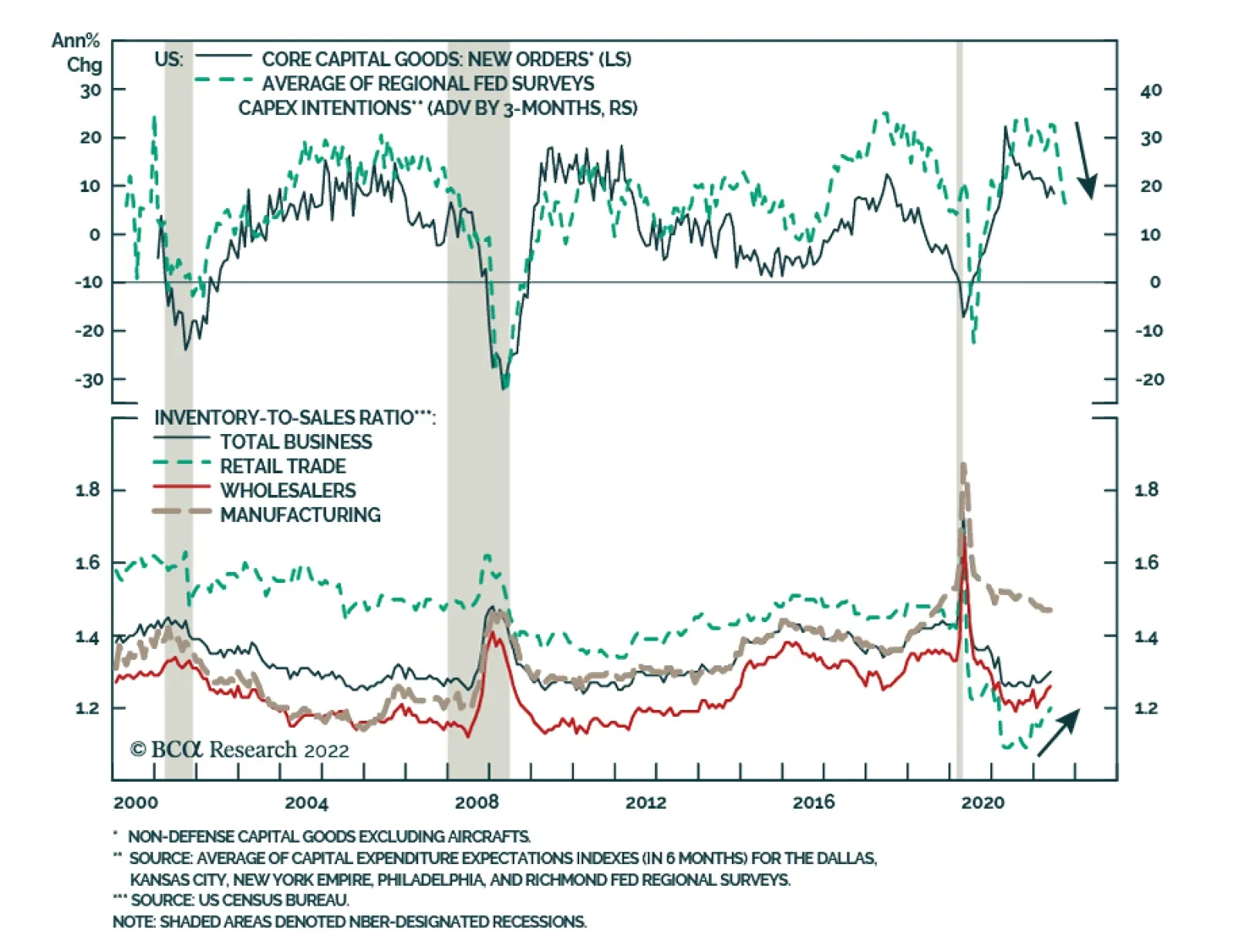
Preliminary estimates indicate that US durable goods orders unexpectedly firmed in June, accelerating from 0.8% m/m to 1.9% m/m and surprising expectations they would contract. However, the underlying details of this seemingly positive headline figure…
As expected, the Fed delivered another “unusually large” 75bp rate hike on Thursday to combat persistent inflationary pressures. Although the central bank acknowledged that spending and activity indicators have softened recently, it also highlighted that the…
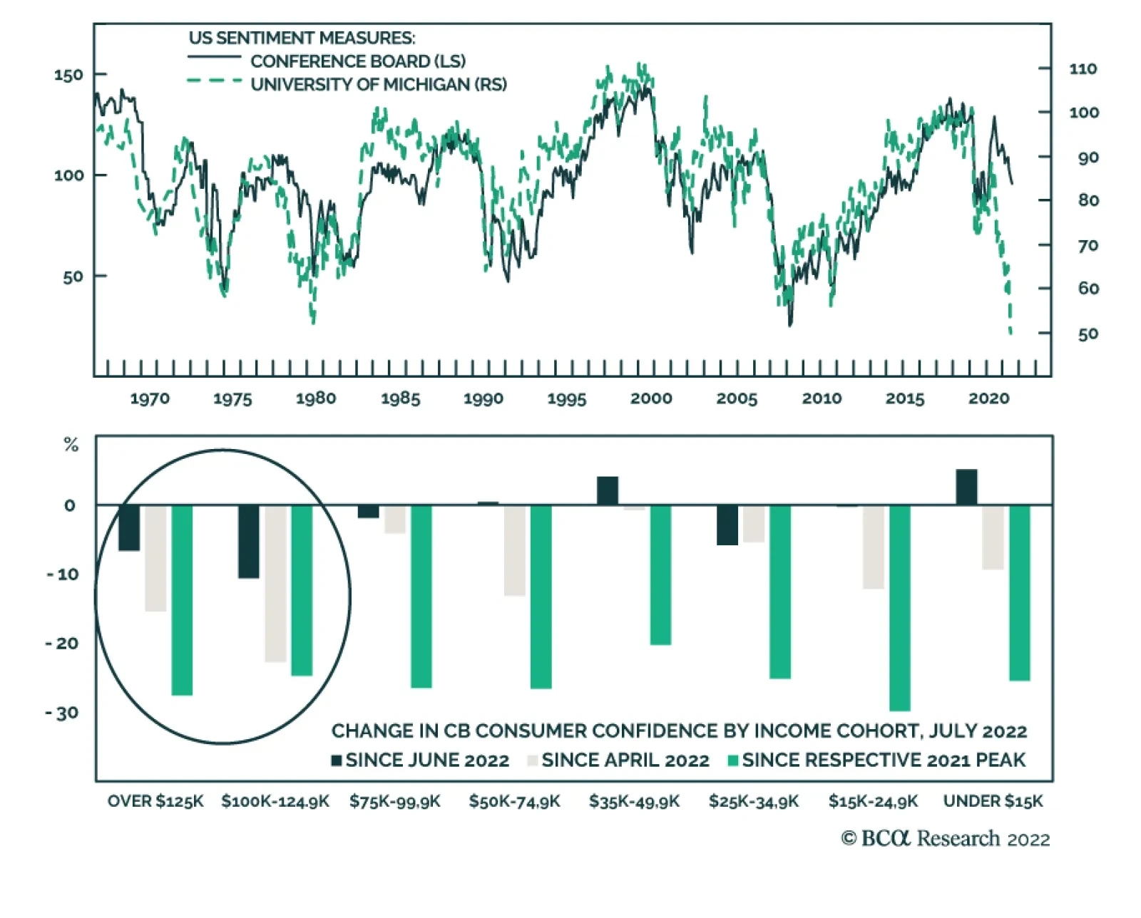
The Conference Board Consumer Confidence Index fell for a third consecutive month to a lower-than-expected 95.7 in July, down from 98.4. The Present Situation Index drove the bulk of the decline, dropping to 141.3 from 147.2 in June. Expectations six months…
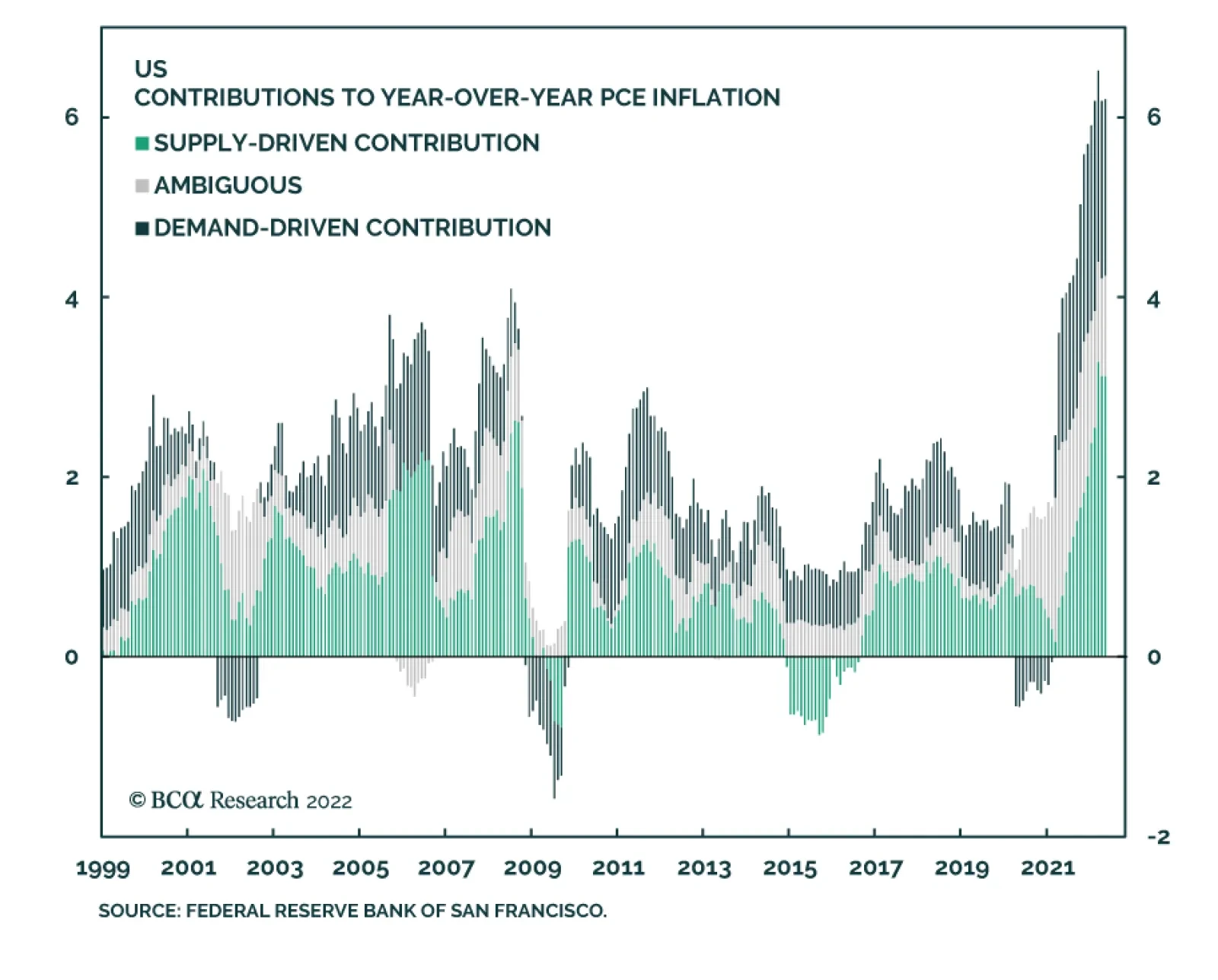
The Federal Reserve Bank of San Francisco estimates that about half of the inflationary pressures this year resulted from supply-side dislocations. The implication is that going forward, a normalization of economic activity and supply chains will…
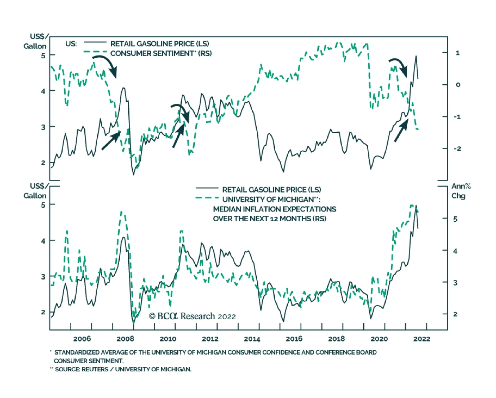
The top panel of the chart above highlights that the relationship between gasoline prices and consumer sentiment is not stable. The correlation between gas prices and sentiment is typically positive. This is not surprising: improving economic conditions…
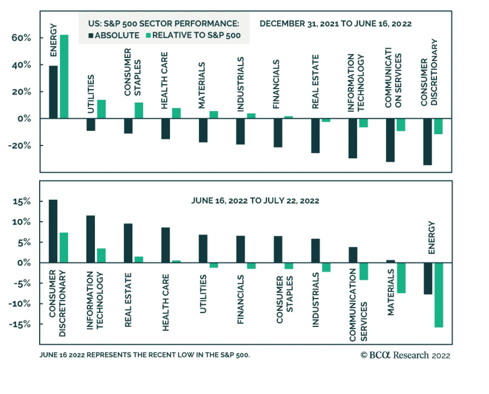
This year’s US equity selloff has been broad-based. Energy is the only S&P 500 sector that has posted year-to-date gains. The indiscriminate nature of the slump highlights that macro forces are behind the weakness. The Fed’s abrupt hawkish pivot has…

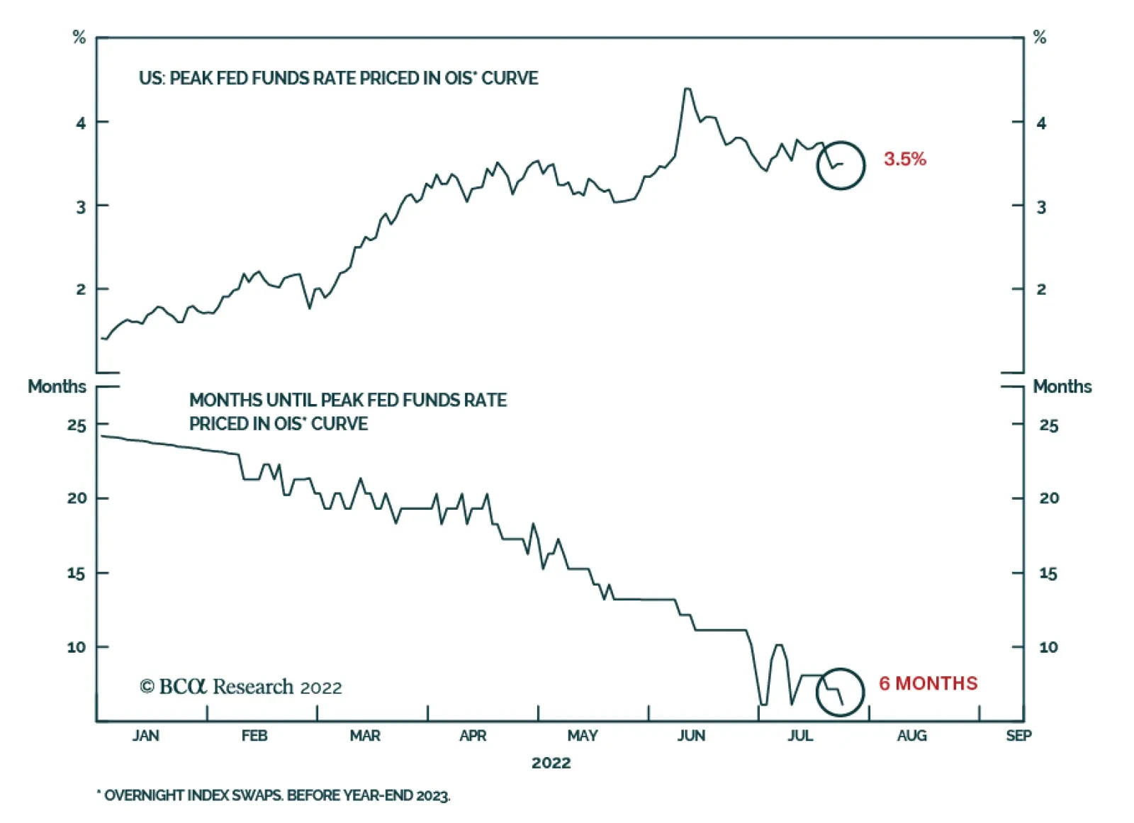
According to BCA Research’s US Bond Strategy service, the peak fed funds rate that is currently priced in the market for 2023 is too low, and the funds rate will also likely peak later than what is priced in the curve. To make sense of all the different…

Executive Summary Peak Fed Funds?
Peak Fed Funds?
Peak Fed Funds?
The bond market is priced for a fed funds rate that will peak in February 2023 at 3.44% before trending down. We survey several interest rate cycle indicators and conclude that the market’s expected peak is too low and occurs too early. These indicators include: the unemployment rate, financial conditions, PMIs, the yield curve and housing starts. We also update our default rate forecast and are now looking for the default rate to rise to between 4.7% and 5.9% during the next 12 months. While our default rate forecasts imply a reasonably attractive 12-month junk bond valuation, we hesitate to turn too bullish on high-yield given that the next peak in the default rate is still not in sight. Bottom Line: We recommend keeping portfolio duration close to benchmark for the time being, though we will be looking for opportunities to reduce duration in the second half of this year. Similarly, we recommend a neutral (3 out of 5) allocation to junk bonds but will recommend reducing exposure if spreads rally back to average 2017-19 levels. Feature Last week’s report presented three conjectures about the US economy.1 One of those was that a recession will be required to get inflation back to 2%. But when will that recession occur? The question of timing is a vital one for bond investors. Are we on the cusp of recession right now? If so, then bond investors should extend portfolio duration in anticipation of Fed rate cuts and a return to 2% inflation. Conversely, if the recession is delayed, interest rates probably move higher before the cycle ends and investors should consider reducing portfolio duration. This week’s report addresses the topic of timing the next recession and discusses the implications for bond portfolio construction. Timing The Interest Rate Cycle From a bond market perspective, the question of whether the economy is in recession is less important than whether the Fed is hiking or cutting rates. Therefore, for the purposes of this report we will define a “recession” as an economic slowdown that is significant enough for the Fed to start cutting interest rates. Chart 1Peak Fed Funds?
Peak Fed Funds?
Peak Fed Funds?
Now, let’s start by looking at what sort of interest rate cycle is priced in the market. The overnight index swap curve is currently discounting a peak fed funds rate of 3.44% (Chart 1). It is also priced for that peak to occur in 7 months, or by February 2023 (Chart 1, bottom panel). As bond investors, the question we must ask is whether this pricing seems reasonable. To do so, we will perform a survey of different indicators that have strong track records of sending signals near the peaks of interest rate cycles. Unemployment The first indicator we’ll look at is the unemployment rate. Economist Claudia Sahm has shown that a recession always occurs when the 3-month moving average of the unemployment rate rises to 0.5% above its trailing 12-month minimum.2 Table 1 dispenses with the moving average and simply shows the deviation of the unemployment rate from its trailing 12-month minimum on the dates of first Fed rate cuts since 1990. We see that the Fed has typically started to cut rates once the unemployment rate is 0.3-0.4 percentage points off its low. The exception is 2019 when the unemployment rate was only 0.1% off its low, but when inflation was below the Fed’s 2% target. Table 1Unemployment And Inflation When The Fed Starts Easing
Recession Now Or Recession Later?
Recession Now Or Recession Later?
At 3.6%, the unemployment rate is currently at its cycle low. Based on the numbers shown in Table 1, this means that we should only expect the Fed to cut interest rates if the unemployment rises to at least 3.9% or 4.0%. We say “at least” because it’s also important to note that the inflation picture is a lot different today than it was during the periods shown in Table 1. With inflation so much higher, it is reasonable to think that the Fed will tolerate a greater increase in the unemployment rate before pivoting to rate cuts. Looking ahead, initial unemployment claims appear to have bottomed for the cycle and changes in initial claims are highly correlated with changes in the unemployment rate (Chart 2). That said, the trend in claims is currently consistent with a leveling-off of the unemployment rate, not a large increase. Financial Conditions Second, we turn to financial conditions. Fed officials often assert that monetary policy works through its impact on broad financial conditions. Therefore, it’s not too surprising that rate cuts tend to occur only after the Goldman Sachs Financial Conditions Index has moved into restrictive territory. Currently, despite the Fed’s dramatic hawkish shift, the index still shows financial conditions to be accommodative (Chart 3). Chart 2Jobless Claims Moving Higher
Jobless Claims Moving Higher
Jobless Claims Moving Higher
Chart 3Financial Conditions
Financial Conditions
Financial Conditions
The same caveat we applied to the unemployment rate applies to financial conditions. As long as inflation is above the Fed’s target, it’s highly likely that the Fed will be comfortable with financial conditions that are somewhat restrictive. Therefore, the Fed may not pivot as soon as the Goldman Sachs index moves above 100, as has been the pattern in the recent past. Yield Curve Third, we note that an inverted Treasury curve almost always precedes the start of a Fed rate cut cycle, and the Treasury curve is certainly inverted today (Chart 4). The logic behind this indicator is somewhat circular in the sense that an inverted Treasury curve simply tells us that the market anticipates Fed rate cuts. If data emerge to suggest that Fed rate cuts will be postponed, then the Treasury curve could re-steepen. It’s for this reason that the Treasury curve often inverts well in advance of an economic recession and Fed rate cuts. We explored the relationship in more detail in a recent Special Report.3 Chart 4Interest Rate Cycle Indicators
Interest Rate Cycle Indicators
Interest Rate Cycle Indicators
Chart 5Manufacturing PMIs
Manufacturing PMIs
Manufacturing PMIs
PMIs Typically, the ISM Manufacturing PMI is below 50 by the time of the first Fed rate cut (Chart 4, panel 3). Currently, the ISM Manufacturing PMI is a healthy 53.0, but it has been falling quickly and trends in regional PMI surveys suggest that it will dip below 50 within the next few months (Chart 5). Interestingly, both the ISM and regional PMI surveys show that manufacturing supplier delivery times have come down a lot (Chart 5, panel 2). This gives some hope that goods inflation will trend lower during the next few months, as is our expectation. Recently, there’s also been an unusual divergence between the employment components of the ISM and regional Fed surveys. The New York and Philadelphia Fed surveys are showing strength in their employment components. Meanwhile, the ISM employment figure is below 50 (Chart 5, bottom panel). This divergence likely boils down to labor shortages that complicate how firms are responding to the employment question in the surveys. For example, despite the sub-50 employment figure, the latest ISM release noted that “an overwhelming majority of panelists […] indicate that their companies are hiring.”4 Housing In a recent report, we developed a rule of thumb that says that Fed rate cuts typically don’t occur until after the 12-month moving average of housing starts falls below the 24-month moving average.5 That indicator is coming down, but it still has a lot of breathing room before it dips into negative territory (Chart 4, bottom panel). That same report also outlined that we see the housing market slowdown proceeding in three stages. First, higher mortgage rates will suppress housing demand. This is already happening at a rapid pace as indicated by trends in mortgage purchase applications and existing home sales (Chart 6A). Second, lower housing demand will push up inventories and send prices lower. This has not yet shown up in the data (Chart 6B). Finally, once lower prices and higher inventories sufficiently disincentivize construction, we will see a marked deterioration in housing starts. Currently we see that housing starts have dipped, and homebuilder confidence has plummeted, but starts still haven’t decisively broken their uptrend (Chart 6C). Chart 6AHousing Demand
Housing Demand
Housing Demand
Chart 6BPrices & Inventories
Prices & Inventories
Prices & Inventories
Chart 6CBuilding Activity
Building Activity
Building Activity
Putting It All Together To make sense of all the different indicators that could signal a Fed pivot toward rate cuts, we turn to our Fed Monitor. The Fed Monitor is a composite indicator that includes many of the individual indicators we have already examined in this report, as well as some others. The Fed Monitor is constructed so that a positive reading suggests that the Fed should be hiking rates and a negative reading suggests the Fed should be cutting rates. As can be seen in Chart 7, the Monitor is currently deep in positive territory. Chart 7Fed Monitor Calls For Tighter Money
Fed Monitor Calls For Tighter Money
Fed Monitor Calls For Tighter Money
The Fed Monitor consists of three main sub-components, an economic growth component, an inflation component and a financial conditions component (Chart 7, bottom 3 panels). We see that the economic growth component of the Monitor is consistent with a neutral Fed policy stance – neither hikes nor cuts - and financial conditions point to a mildly restrictive stance. However, unsurprisingly, the inflation component is the highest it has been since the early-1980s and this is applying a ton of upward pressure to the Monitor. While our Fed Monitor is not a perfect indicator, it does speak to the tradeoff between inflation and economic growth that we have already hinted at in this report. Specifically, the Monitor illustrates that as long as inflation remains elevated it will take a significant deterioration in economic growth and financial conditions before the overall Monitor recommends a dovish Fed pivot. To us, this argues for a higher and later peak in the fed funds rate than is currently priced in the curve. Bottom Line: The peak fed funds rate that is currently priced in the market for 2023 is too low, and the funds rate will also likely peak later than what is priced in the curve. That said, falling inflation and economic growth concerns will probably keep a lid on bond yields during the next few months. We advise investors to keep portfolio duration close to benchmark for the time being, but to look for opportunities to reduce exposure. We will consider reducing our recommended portfolio duration stance to ‘below-benchmark’ if the 10-year Treasury yield falls to 2.5% or if core inflation reverts to our estimate of its 4%-5% underlying trend. Timing The Default Rate Cycle The interest rate cycle is not the only important one for bond investors. The default rate cycle is also crucial for spread product allocations because default trends are responsible for a significant amount of the volatility in corporate bond spreads. In this section we consider the outlook for corporate defaults and high-yield bond performance. We model the trailing 12-month speculative grade default rate using gross leverage (total debt over pre-tax profits) and C&I lending standards (Chart 8). Conservatively, if we assume 5% corporate debt growth for the next 12 months and corporate profit growth of between -10% and -20%, our model projects that the default rate will rise to between 4.7% and 5.9% (Chart 8, top panel). It’s notable that, like us, banks are also preparing for an increase in corporate defaults by raising their loan loss provisions (Chart 8, panel 2). Meanwhile, job cut announcements – another reliable indicator of corporate defaults – still don’t point to a higher default rate (Chart 8, bottom panel). Chart 8The Default Rate Has Troughed
The Default Rate Has Troughed
The Default Rate Has Troughed
Interestingly, our model’s conservative projections suggest that in 12 months the default rate will be lower than its typical recession peak. Given today’s cheap junk valuations, this sort of analysis is encouraging a lot of people to turn bullish on high-yield bonds. Chart 9Default-Adjusted Spread
Default-Adjusted Spread
Default-Adjusted Spread
This line of reasoning is not totally unfounded. Using the same forecasted default rate scenarios from Chart 8 along with an assumed 40% recovery rate on defaulted debt, we calculate that the excess spread available in the junk index after subtracting 12-month default losses is between 136 bps and 208 bps. This is below the historical average (Chart 9), but still above the 100 bps threshold that often delineates between junk bond outperformance and underperformance versus duration-matched Treasuries.6 More specifically, Chart 10 shows the relationship between our default-adjusted spread and high-yield excess returns versus Treasuries for each calendar year going back to 1995. We see that, in general, there is a positive relationship between spread and returns and that excess returns are more often positive than negative whenever the default-adjusted spread is above 100 bps. However, Chart 10 also shows periods when a pure analysis of junk bond performance based on the 12-month default-adjusted spread didn’t pan out. The year 2008 is a prime example. The default-adjusted spread came in at 249 bps for 2008, above the historical average. However, junk spreads widened dramatically in 2008 and excess returns were dismal. Chart 10The Default-Adjusted Spread And High-Yield Returns
Recession Now Or Recession Later?
Recession Now Or Recession Later?
The reason the default-adjusted spread valuation framework failed in 2008 is that while the default rate only moved up to 4.9% in 2008, it wasn’t done increasing for the cycle. In fact, the rise in the default rate accelerated in 2009 until it hit 14.6% in November of that year. So, while default losses were low compared to the starting index spread in 2008, junk index spreads widened sharply in 2008 as the market prepared for worse default losses in 2009. The lesson we draw from the 2008 example is that even if the junk bond market is attractively priced relative to expected default losses on a 12-month horizon, unless we can forecast a peak in the default rate it is unwise to be overly bullish on high-yield bonds. Even if a recession doesn’t occur within the next 6-12 months, it will likely occur within the next 12-24 months. In that environment, investors are unlikely to realize the full potential of today’s attractive 12-month junk bond valuations. Chart 11Junk Spreads
Junk Spreads
Junk Spreads
The bottom line is that we maintain a neutral (3 out of 5) allocation to high-yield within US fixed income portfolios for now. Junk spreads are elevated compared to past rate hike cycles and could tighten during the next few months as inflation converges to its underlying 4%-5% trend. That said, we will not turn outright bullish on junk bonds until we can reasonably forecast a peak in the default rate. In the meantime, a sell on strength strategy is more appropriate. We will reduce our recommended allocation to high-yield bonds if the average index spread tightens to its average 2017-19 level (Chart 11) or once inflation converges with its underlying 4%-5% trend. Ryan Swift US Bond Strategist rswift@bcaresearch.com Footnotes 1 Please see US Bond Strategy Weekly Report, “Three Conjectures About The US Economy”, dated July 19, 2022. 2 https://www.hamiltonproject.org/assets/files/Sahm_web_20190506.pdf 3 Please see US Bond Strategy / US Investment Strategy / US Equity Strategy Special Report, “The Yield Curve As An Indicator”, dated March 29, 2022. 4 https://www.ismworld.org/supply-management-news-and-reports/reports/ism… 5 Please see US Bond Strategy Weekly Report, “The Bond Market Implications Of A 5% Mortgage Rate”, dated April 26, 2022. 6 For a more complete analysis of the link between the default-adjusted spread and excess high-yield returns please see US Bond Strategy / Global Fixed Income Strategy Special Report, “Turning Defensive On US Corporate Bonds,” dated April 12, 2022. Recommended Portfolio Specification Other Recommendations Treasury Index Returns Spread Product Returns
The ongoing normalization of consumption patterns is one of the factors responsible for deteriorating global manufacturing activity (see Market Focus). The pandemic binge has satiated Americans’ demand for goods (excluding autos). The global manufacturing…
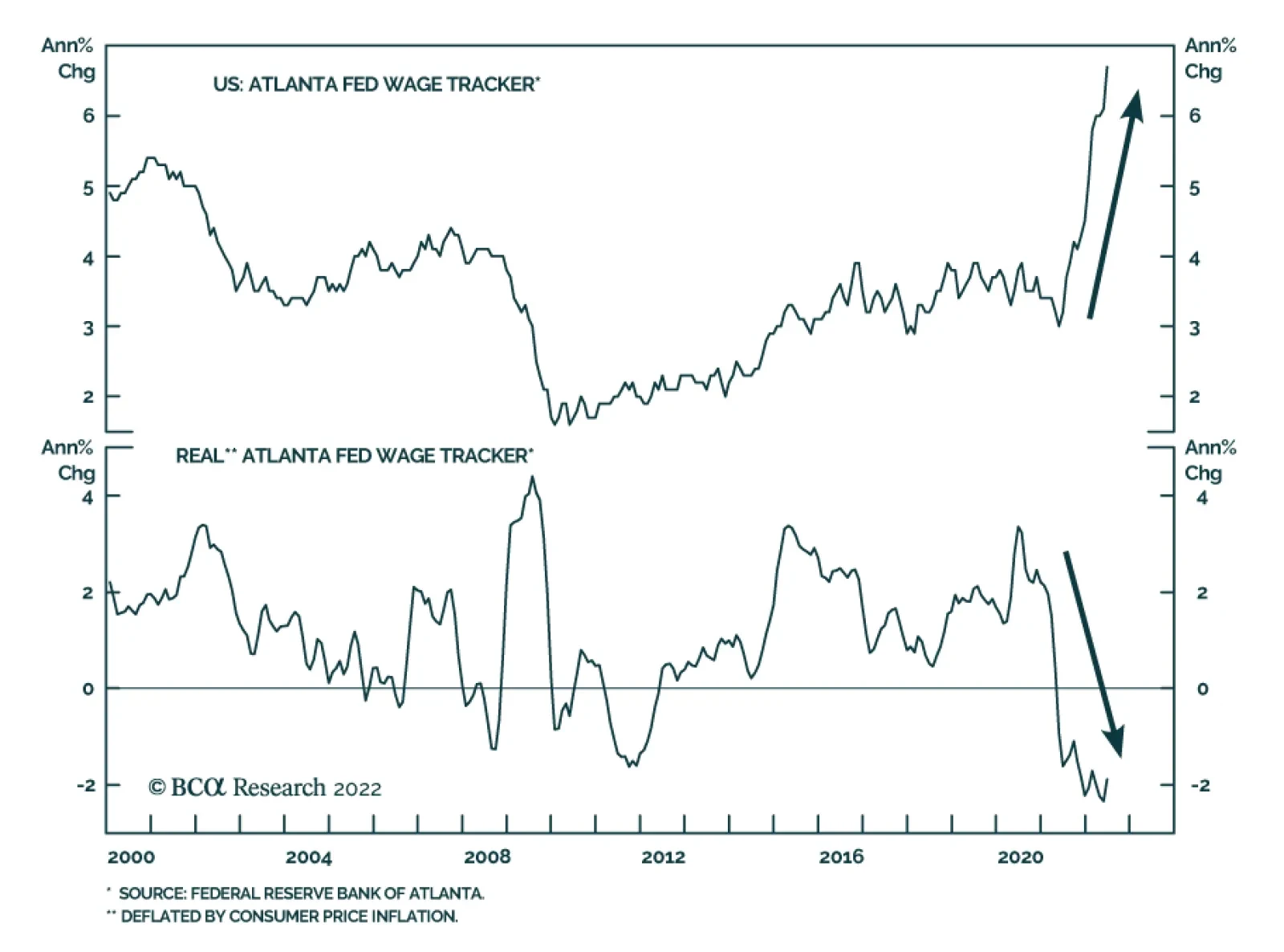
Soaring price pressures and tight labor market conditions – characterized by the difficulty employers are facing in finding qualified workers – are a recipe for robust wage growth (see Country Focus). With labor costs accounting for over 50% of sales…