United States
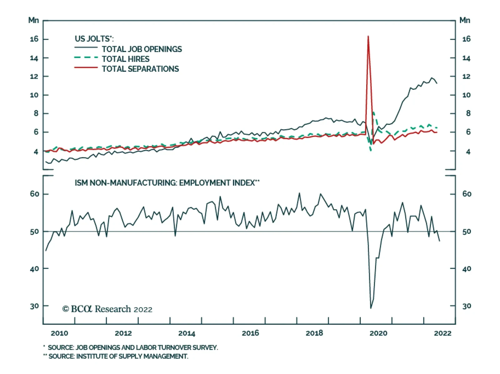
Results from both the June ISM Services PMI and the JOLTS survey highlight that a non-recessionary outcome remains a viable scenario for the US economy. The ISM services PMI remains relatively resilient at 55.3 – slightly below 55.9 in May, but above…
Minutes of the FOMC’s June policy meeting underscore that for now, taming inflation and salvaging the central bank’s credibility remains the Fed’s top priority. Notably, “many participants judged that a significant risk now facing the Committee was that…
The S&P 500 has fallen by an additional 5% since the hotter-than-expected May CPI release, which prompted the Fed’s latest mega rate hike. This brings the year-to-date decline to 20% with the S&P 500 concluding its worst H1 since 1970. On the one…
The dollar continues to post positive abnormal returns in June, powered by expectations of a relatively more hawkish Fed as well as safe haven portfolio flows. Year-to-date, the broad trade-weighted dollar and the DXY Index have returned 5.7% and 9.6%,…
BCA Research’s US Bond Strategy service recommends a neutral allocation to high-yield bonds within US fixed income portfolios. High-Yield underperformed the duration-equivalent Treasury index by 591 basis points in June, dragging year-to-date excess…

Executive Summary Analysts Have Little Confidence In Their Forecasts
Analysts Have Little Confidence In Their Forecasts
Analysts Have Little Confidence In Their Forecasts
In the front section of the sector chart pack, we conduct cross-sectional comparisons. Profitability: Earnings expectations for the cyclical sectors are too high and will come down since analysts have little confidence in their forecasts. But despite their bullishness, analysts also expect margins of the most cyclical sectors to contract over the next 12 months. Balance sheet quality: Post-pandemic demand has resulted in a free cash flow windfall for companies in multiple sectors, which they used to repair their balance sheets. Tech, Materials, and Financials have improved the most. Valuations and technicals: Cyclical sectors appear inexpensive (both in absolute terms and relative to history) because multiples have contracted. Technicals signal that the market is oversold. Much of the bad news is priced in, but “new” bad news is likely on the way: We are still in the early stages of the monetary tightening cycle, there is talk about earnings and economic recessions, rates have not stabilized yet, and inflation has not peaked. Bottom Line: We continue to recommend that investors remain patient and pad the more defensive and quality allocations in their portfolios at the expense of cyclical sectors that are geared to a slowdown. Companies with strong and resilient earnings and quality balance sheets will be able to better weather the storm, if it arrives. This week we are sending you a Sector Chart Pack, which offers macro, fundamentals, valuations, technicals, and uses of cash charts for each sector. In the front section of this publication, we will focus on cross-sectional comparisons. As investors are starting to shift their attention away from worries about intransigent inflation toward concerns about slowing growth, they will seek out companies and sectors that offer the strongest and most resilient earnings growth, pristine balance sheets, and strong cash yield. In other words, companies that have the highest chance of surviving the downturn unscathed and of outperforming the market. Performance vs. Our Portfolio Positioning Chart 1Looking Under The Hood...
Taking Stock Of Sectors And Industry Groups
Taking Stock Of Sectors And Industry Groups
The S&P 500 is down roughly 20% off its January 2022 peak. However, 11 industry groups have performed even worse, with Automobiles and Components down as much as 39% off peak. The rest of this inglorious list is dominated by Consumer Cyclicals, Technology, and Financials (Chart 1). We were foreseeing headwinds, and have preempted some of the damage by shifting our portfolio positioning away from the most cyclical areas of the market: We underweighted Semiconductors back in January, observing that Semis are both highly economically sensitive and “growthy” and will be hit by a double whammy of slowing growth and rising rates. We have been underweight Hardware and Equipment since last summer, moving to this trade a bit too early. We downgraded Consumer Durables And Retailing in February, observing that demand for goods, pulled forward by the pandemic, is waning and consumption is shifting away from goods to services. More recently, we downgraded Media and Entertainment. The sector has fallen significantly, but we reasoned that if an economic downturn is indeed on the way, advertisement expense is one of the first that companies curtail when they are tightening their belts. Last week, we downgraded Travel to underweight: Even well-heeled consumers are starting to feel the pinch of surging prices. And while most will take that long-awaited post-COVID vacation, the outlook beyond summer is bleak with surging costs of fuel and labor. As for Autos, we were complacent in our thinking that car shortages will eventually translate into strong earnings growth. Despite the disappointing performance, the EV Revolution remains a long-term investment theme for us. Also having opened the position in June 2021, we are still in the green at +7% in relative terms. We have also upgraded our position in Staples to overweight on a premise that many Americans are reeling from surging prices of food, fuel, and shelter. Consumer Staples is the only likely beneficiary, and its pricing power is on the rise. Bottom Line: We have been able to contain some of the damage incurred by market rotation away from cyclicals. Profitability Earnings Growth Expectations As we have written extensively in the past (e.g., “Is Earnings Recession In The Cards”,) the analysts' earnings growth forecast for the S&P 500 of 10% is too high, especially considering the number of adverse events that have taken place since the beginning of the year, and the overall trajectory of monetary policy and economic growth. The analysts are yet again missing the turning point, just as they did back in 2008, and even in 2020. Chart 2Earnings Forecasts For Cyclicals Are Still Way Too High
Taking Stock Of Sectors And Industry Groups
Taking Stock Of Sectors And Industry Groups
We have noticed that the cyclical industries with the highest EPS growth forecasts, such as Consumer Services, Transportation, and Auto, are most prone to earnings disappointment. To be fair, EPS growth expectations for Consumer Services and Transportation are down from December when they stood at 550% and 143% respectively (Chart 2). Earnings Uncertainty So how certain are analysts about their projections? A short answer is – not particularly. We gauge earnings uncertainty by looking at the dispersion of analyst EPS expectations scaled by the magnitude of EPS. In a way, this is a measure of analyst consensus, with estimates clustered around a certain number indicating extreme certainty of forecasts. We notice that the advent of COVID-19 rendered panic among analysts with the rate of uncertainty surging. More recently, uncertainty has decreased but remains elevated by historical standards (Chart 3). Looking at earnings projections by industry group (Chart 4), we notice that earnings uncertainty is the highest in the cyclical pockets of the market where the highest EPS growth is still expected: Consumer Services, Transportation, and Retailing. Chart 3Analysts Have Little Confidence In Their Forecasts...
Analysts Have Little Confidence In Their Forecasts
Analysts Have Little Confidence In Their Forecasts
Chart 4... Especially For Cyclical Industry Groups
Taking Stock Of Sectors And Industry Groups
Taking Stock Of Sectors And Industry Groups
Implications? Analysts as a group have little confidence in cyclical sector growth, and downward revisions are imminent. Margins In the “Marginally Worse” and subsequent “Sector Margin Scorecard” reports in October, we called for margins to roll over as early as 2022. Curiously, despite their bullishness, analysts expect the margins of most cyclical sectors to contract over the next 12 months (Chart 5). Chart 5Despite Their Bullishness, Analysts Expect Margins To Contract
Taking Stock Of Sectors And Industry Groups
Taking Stock Of Sectors And Industry Groups
Chart 6Pricing Power Is Declining But There Are Exceptions
Taking Stock Of Sectors And Industry Groups
Taking Stock Of Sectors And Industry Groups
Pricing Power As we observed early on, one of the key reasons for margin contraction is a decline in companies’ pricing power, i.e., their ability to pass costs on to their customers (Chart 6). The Materials sector experienced the most significant decline in pricing power, likely a positive as this may be an early sign that inflation is abating. It is also important to note that three sectors – Consumer Staples, Utilities, and Tech–are still growing their pricing power. Consumer Staples and Utilities are necessities, demand for which is fairly inelastic, while Tech is offering services that are still in high demand, as they help improve productivity and substitute labor, which is in short supply, for capital, which is still abundant. Degree of Operating Leverage Chart 7Low Operating Leverage Helps In Case Of Downturn
Taking Stock Of Sectors And Industry Groups
Taking Stock Of Sectors And Industry Groups
If pricing power is waning, what else can come to the rescue? After all, with inflation in the high single digits, nominal sales growth is to remain robust. The crucial piece of the puzzle is the ability of companies to convert sales into profits, i.e., operating leverage (Chart 7). Companies with high fixed costs enjoy higher operating leverage, and a small increase in sales translates into significant earnings growth (and vice versa). However, in case of an outright sales contraction, we are better off holding industries and sectors with low operating leverage, such as Staples and Healthcare. Earnings Stability Chart 8Defensives Have The Most Resilient Earnings
Taking Stock Of Sectors And Industry Groups
Taking Stock Of Sectors And Industry Groups
What sectors have the most resilient earnings, that won’t let investors down in a downturn? To answer this question empirically, we looked at a historical variation in EPS-realized growth rates by sector1 (Chart 8). We found that Staples, Healthcare, and Technology have had the most stable earnings growth rates. However, the last 12 years or so, characterized by low yields and nearly non-existent inflation, were a boon for long-duration technology stocks – so our experiment may not be pure. Bottom Line: Earnings expectations for the cyclical sectors are too high and will come down as analysts have little confidence in their forecasts. Balance Sheet Quality Free Cash Flow Chart 9Post-pandemic Surge In Demand Resulted In Free Cash Flow Windfall...
Taking Stock Of Sectors And Industry Groups
Taking Stock Of Sectors And Industry Groups
Post-pandemic demand has resulted in a free cash flow windfall for companies in multiple sectors. Technology benefited from the transition to remote working. Energy and Materials have not been able to meet the “reopening” demand after years of underinvestment, which resulted in constrained supply, and soaring prices (Chart 9). Chart 10...Which Companies Used To Repair Their Balance Sheets
Taking Stock Of Sectors And Industry Groups
Taking Stock Of Sectors And Industry Groups
Interest Coverage The companies used this profits windfall to repair their balance sheets and reduce their levels of debt. As a result, the interest coverage ratio has picked up across the board (Chart 10). Bottom Line: Corporate balance sheets across most sectors look strong. Tech, Materials, and Financials have improved the most. Cash Yield Companies that pay dividends and buy back their stocks not only enhance the returns of their shareholders but also signal their confidence in future earnings and the strength of their balance sheets (Chart 11). That is one of the reasons income funds were strong performers over the past few months as investors were seeking out quality investments (Chart 12). Chart 11Cash Yield Has Not Been This Attractive In Years...
Taking Stock Of Sectors And Industry Groups
Taking Stock Of Sectors And Industry Groups
Chart 12High Dividend Yield Signals Corporate Confidence
Taking Stock Of Sectors And Industry Groups
Taking Stock Of Sectors And Industry Groups
Valuations A corollary to our conclusion that earnings estimates are hardly trustworthy, is that forward multiples are not a great valuation metric on the verge of an earnings contraction. Trailing multiples are a better measure of value at this point in the cycle. We sorted PE multiples by their Z-score to 10 years of history (Chart 13) and notice the most cyclical sectors are rather inexpensive, both in absolute terms and relative to history as markets are forward looking. Chart 13High Dividend Yield Signals Corporate Confidence
Taking Stock Of Sectors And Industry Groups
Taking Stock Of Sectors And Industry Groups
Technicals Chart 14US Equities Appear Oversold
Taking Stock Of Sectors And Industry Groups
Taking Stock Of Sectors And Industry Groups
And last, but not least: The US equity market is oversold, and most industry groups are several standard deviations below the neutral reading (Chart 14). Bottom Line: Technicals signal that the market is oversold. Yet, a sustainable rebound may still be months away. Investment Conclusion Is it finally time for bottom fishing? We believe that oversold conditions and sectors trading at 30-40 percent of their peak are “necessary but insufficient conditions.” For the equity market to rebound, all the bad news needs to be fully priced in – however, we are still in the early stages of the monetary tightening cycle, and there is talk about earnings and economic recessions, the severity of which is impossible to gauge at this point. Rates have not stabilized yet, and inflation has not peaked. Much of the bad news is priced in, but “new” bad news is likely on the way. Bottom Line We recommend that investors remain patient and pad the more defensive and quality allocations in their portfolios at the expense of cyclical sectors that are geared to a slowdown. Companies with strong and resilient earnings and quality balance sheets will be able to better weather the storm, if it arrives. Irene Tunkel Chief Strategist, US Equity Strategy irene.tunkel@bcaresearch.com S&P 500 Chart II-1Macroeconomic Backdrop
Macroeconomic Backdrop
Macroeconomic Backdrop
Chart II-2Profitability
Profitability
Profitability
Chart II-3Valuations And Technicals
Valuations And Technicals
Valuations And Technicals
Chart II-4Uses Of Cash
Uses Of Cash
Uses Of Cash
Communication Services Chart II-5Macroeconomic Backdrop
Macroeconomic Backdrop
Macroeconomic Backdrop
Chart II-6Profitability
Profitability
Profitability
Chart II-7Valuations And Technicals
Valuations And Technicals
Valuations And Technicals
Chart II-8Uses Of Cash
Uses Of Cash
Uses Of Cash
Consumer Discretionary Chart II-9Macroeconomic Backdrop
Macroeconomic Backdrop
Macroeconomic Backdrop
Chart II-10Profitability
Profitability
Profitability
Chart II-11Valuations And Technicals
Valuations And Technicals
Valuations And Technicals
Chart II-12Uses Of Cash
Uses Of Cash
Uses Of Cash
Consumer Staples Chart II-13Macroeconomic Backdrop
Macroeconomic Backdrop
Macroeconomic Backdrop
Chart II-14Profitability
Profitability
Profitability
Chart II-15Valuations And Technicals
Valuations And Technicals
Valuations And Technicals
Chart II-16Uses Of Cash
Uses Of Cash
Uses Of Cash
Energy Chart II-17Macroeconomic Backdrop
Macroeconomic Backdrop
Macroeconomic Backdrop
Chart II-18Profitability
Profitability
Profitability
Chart II-19Valuations And Technicals
Valuations And Technicals
Valuations And Technicals
Chart II-20Uses Of Cash
Uses Of Cash
Uses Of Cash
Financials Chart II-21Macroeconomic Backdrop
Macroeconomic Backdrop
Macroeconomic Backdrop
Chart II-22Profitability
Profitability
Profitability
Chart II-23Valuations And Technicals
Valuations And Technicals
Valuations And Technicals
Chart II-24Uses Of Cash
Uses Of Cash
Uses Of Cash
Health Care Chart II-25Sector vs Industry Groups
Sector vs Industry Groups
Sector vs Industry Groups
Chart II-26Profitability
Profitability
Profitability
Chart II-27Valuations And Technicals
Valuations And Technicals
Valuations And Technicals
Chart II-28Uses Of Cash
Uses Of Cash
Uses Of Cash
Industrials Chart II-29Macroeconomic Backdrop
Macroeconomic Backdrop
Macroeconomic Backdrop
Chart II-30Profitability
Profitability
Profitability
Chart II-31Valuations And Technicals
Valuations And Technicals
Valuations And Technicals
Chart II-32Uses Of Cash
Uses Of Cash
Uses Of Cash
Information Technology Chart II-33Macroeconomic Backdrop
Macroeconomic Backdrop
Macroeconomic Backdrop
Chart II-34Profitability
Profitability
Profitability
Chart II-35Valuations And Technicals
Valuations And Technicals
Valuations And Technicals
Chart II-36Uses Of Cash
Uses Of Cash
Uses Of Cash
Materials Chart II-37Macroeconomic Backdrop
Macroeconomic Backdrop
Macroeconomic Backdrop
Chart II-38Profitability
Profitability
Profitability
Chart II-39Valuations And Technicals
Valuations And Technicals
Valuations And Technicals
Chart II-40Uses Of Cash
Uses Of Cash
Uses Of Cash
Real Estate Chart II-41Macroeconomic Backdrop
Macroeconomic Backdrop
Macroeconomic Backdrop
Chart II-42Profitability
Profitability
Profitability
Chart II-43Valuations And Technicals
Valuations And Technicals
Valuations And Technicals
Chart II-44Uses Of Cash
Uses Of Cash
Uses Of Cash
Utilities Chart II-45Macroeconomic Backdrop
Macroeconomic Backdrop
Macroeconomic Backdrop
Chart II-46Profitability
Profitability
Profitability
Chart II-47Valuations And Technicals
Valuations And Technicals
Valuations And Technicals
Chart II-48Uses Of Cash
Uses Of Cash
Uses Of Cash
Table II-1Performance
Taking Stock Of Sectors And Industry Groups
Taking Stock Of Sectors And Industry Groups
Table II-2Valuations And Forward Earnings Growth
Taking Stock Of Sectors And Industry Groups
Taking Stock Of Sectors And Industry Groups
Footnotes 1 Scaled and inverted Recommended Allocation
Highlights Chart 1Are Expectations Too Dovish?
Are Expectations Too Dovish?
Are Expectations Too Dovish?
The dominant market narrative has clearly shifted in the last few days. The primary concern among investors used to be that the Fed had fallen behind the curve on inflation. Now, asset prices are telling us that investors are more worried about an overly hawkish Fed and an increased risk of recession. The shift is evident in bond market prices. The yield curve is now priced for only 176 basis points of rate hikes over the next 12 months and only 90 bps of tightening over the next 24 months (Chart 1). What’s more, long-dated market-based inflation expectations have plunged to below the Fed’s target range (bottom panel). We recommend keeping portfolio duration close to benchmark for now, as bond yields could still have some downside during the next few months as both inflation and economic growth slow. That said, we suspect that the market is now pricing-in an overly dovish Fed tightening path for the next couple of years, a change that may soon warrant a shift back to below-benchmark portfolio duration. Stay tuned. Feature Table 1 Recommended Portfolio Specification Table 2Fixed Income Sector Performance
A Narrative Shift
A Narrative Shift
Investment Grade: Underweight Chart 2Investment Grade Market Overview
Investment Grade Market Overview
Investment Grade Market Overview
Investment grade corporate bonds underperformed the duration-equivalent Treasury index by 168 basis points in June, dragging year-to-date excess returns down to -379 bps. The average index option-adjusted spread widened 28 bps on the month and it currently sits at 158 bps. Similarly, our quality-adjusted 12-month breakeven spread moved up to its 61st percentile since 1995 (Chart 2). A report from a few months ago made the case for why investors should underweight investment grade corporate bonds on a 6-12 month investment horizon.1 The main rationale for this recommendation is that the slope of the Treasury curve is very flat, signaling that we are in the mid-to-late stages of the credit cycle. Corporate bond performance tends to be weak during such periods unless spreads start from very high levels. Despite our underweight 6-12 month investment stance, there’s a good chance that spreads will narrow during the next few months as inflation falls. That said, the persistent removal of monetary accommodation and flatness of the yield curve will limit how much spreads can compress. A recent report dug deeper into the corporate bond space and concluded that investment grade-rated Energy bonds offer exceptional value on a 6-12 month horizon.2 That report also concluded that long maturity investment grade corporates are attractively priced relative to short maturity bonds. Table 3A Corporate Sector Relative Valuation And Recommended Allocation* Table 3BCorporate Sector Risk Vs. Reward*
A Narrative Shift
A Narrative Shift
High-Yield: Neutral Chart 3High-Yield Market Overview
High-Yield Market Overview
High-Yield Market Overview
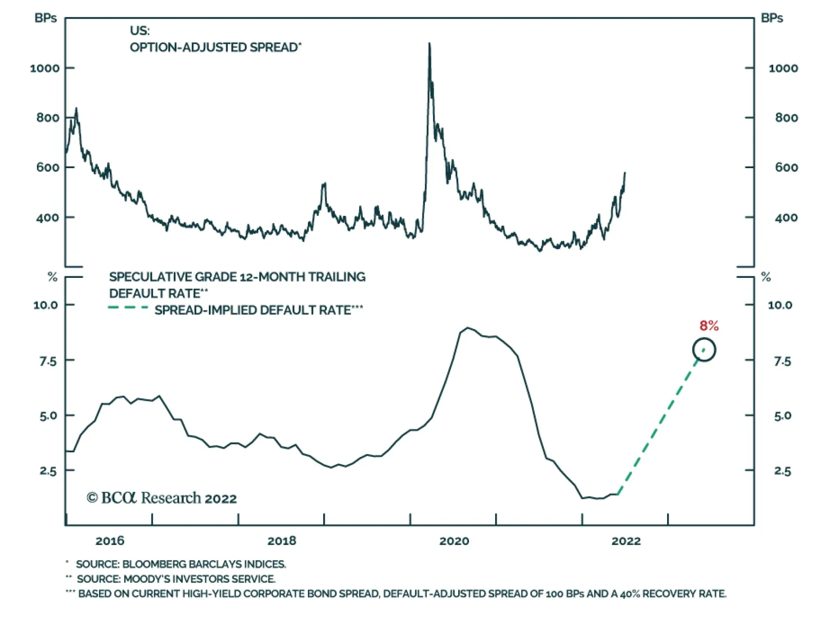
High-Yield underperformed the duration-equivalent Treasury index by 591 basis points in June, dragging year-to-date excess returns down to -889 bps. The average index option-adjusted spread widened 172 bps on the month to reach 578 bps, 209 bps above the 2017-19 average and 41 bps above the 2018 peak. The 12-month spread-implied default rate – the default rate that is priced into the junk index assuming a 40% recovery rate on defaulted debt and an excess spread of 100 bps – moved higher in June. It currently sits at 8% (Chart 3). As is the case with investment grade, there’s a good chance that high-yield spreads will stage a relief rally in the back half of this year as inflation falls. But due to the flatness of the yield curve, we think it will be difficult for spreads to move below the average seen during the last tightening cycle (2017-19). But even a move back to average 2017-19 levels would equate to roughly 11% of excess return for the junk index if it is realized over a six month period. This potential return is the main reason to prefer high-yield over investment grade in a US bond portfolio. While we maintain a neutral (3 out of 5) allocation to high-yield for now, we would be inclined to downgrade the sector if spreads tighten to the 2017-19 average or if core inflation falls back to 4%.3 MBS: Underweight Chart 4MBS Market Overview
MBS Market Overview
MBS Market Overview
Mortgage-Backed Securities underperformed the duration-equivalent Treasury index by 63 basis points in June, dragging year-to-date excess returns down to -171 bps. We discussed the outlook for Agency MBS in a recent report.4 We noted that MBS’s poor performance in 2021 and early-2022 was driven by duration extension. Fewer homeowners refinanced their loans as mortgage rates rose, and the MBS index’s average duration increased (Chart 4). But now, the index’s duration extension is at its end. The average convexity of the MBS index is close to zero (panel 3), meaning that duration is now insensitive to changes in rates. This is because hardly any homeowners have the incentive to refinance at current mortgage rates (panel 4). The implication is that excess MBS returns will be stronger going forward. That said, we still don’t see enough value in MBS spreads to increase our recommended allocation. The average index spread for conventional 30-year Agency MBS remains close to its lowest level since 2000 (bottom panel). At the coupon level, we observe that low-coupon MBS have much higher duration than high-coupon MBS and that convexity is close to zero for the entire coupon stack. This makes the relative coupon trade a direct play on bond yields. Given that we see some potential for yields to fall during the next six months, we recommend favoring low-coupon MBS (1.5%-2.5%) within an overall underweight allocation to the sector. Emerging Market Bonds (USD): Underweight Chart 5Emerging Markets Overview
Emerging Markets Overview
Emerging Markets Overview
Emerging Market bonds underperformed the duration-equivalent Treasury index by 182 basis points in June, dragging year-to-date excess returns down to -737 bps. EM Sovereigns underperformed the Treasury benchmark by 280 bps on the month, dragging year-to-date excess returns down to -925 bps. The EM Corporate & Quasi-Sovereign Index underperformed by 122 bps, dragging year-to-date excess returns down to -617 bps. The EM Sovereign Index underperformed the duration-equivalent US corporate bond index by 99 bps in June. The yield differential between EM sovereigns and duration-matched US corporates remains negative. Further, the relative performance of EM sovereigns versus US corporates has been tracking the performance of EM currencies versus the dollar and our Emerging Markets Strategy service sees further headwinds for EM currencies in the near term (Chart 5).5 The EM Corporate & Quasi-Sovereign Index outperformed duration-matched US corporates by 1 bp in June. The index continues to offer a significant yield advantage versus duration-matched US corporates (bottom panel), and as such, we continue to recommend a neutral (3 out of 5) allocation to the sector. Municipal Bonds: Overweight Chart 6Municipal Market Overview
Municipal Market Overview
Municipal Market Overview
Municipal bonds underperformed the duration-equivalent Treasury index by 89 basis points in June, dragging year-to-date excess returns down to -167 bps (before adjusting for the tax advantage). We view the municipal bond sector as better placed than most to cope with the recent bout of spread volatility. As we noted in a recent report, state & local government revenue growth has been strong and yet governments have also been slow to hire.6 The result is that net state & local government savings are incredibly high (Chart 6) and it will take some time to deplete these coffers even as economic growth slows and federal fiscal thrust turns to drag. On the valuation front, munis have cheapened up relative to both Treasuries and corporates during the past few months. The 10-year Aaa Muni / Treasury yield ratio is currently 94%, up significantly from its 2021 trough of 55%. The yield ratio between 12-17 year munis and duration-matched corporate bonds is also up significantly off its lows (panel 2). We reiterate our overweight allocation to municipal bonds within US fixed income portfolios, and we continue to have a strong preference for long-maturity munis. The yield ratio between 17-year+ General Obligation Municipal bonds and duration-matched US corporates is 92%. The same measure for 17-year+ Revenue bonds stands at 97%, just below parity even without considering municipal debt’s tax advantage. Treasury Curve: Buy 5-Year Bullet Versus 2/10 Barbell Chart 7Treasury Yield Curve Overview
Treasury Yield Curve Overview
Treasury Yield Curve Overview
The Treasury curve bear-flattened in June. The 2-year/10-year Treasury slope flattened 26 bps on the month and the 5-year/30-year slope flattened 13 bps. The 2/10 and 5/30 slopes now stand at 4 bps and 23 bps, respectively. In a recent Special Report we noted the unusually large divergence between flat slopes at the long end of the curve and steep slopes at the front end.7 This divergence has narrowed in recent weeks, but it remains wide by historical standards. For example, the 5-year/10-year Treasury slope is currently 0 bps while the 3-month/5-year slope is 122 bps. The divergence is happening because the market moved quickly to price-in a rapid near-term pace of rate hikes, but the Fed has only delivered 150 bps of tightening so far and this is holding down the very front-end of the curve. The oddly shaped curve presents us with an excellent trading opportunity. Specifically, we recommend buying the 5-year Treasury note versus a duration-matched barbell consisting of the 2-year and 10-year notes. The 5 over 2/10 butterfly spread has narrowed during the past month, but the trade continues to look attractive on our model (Chart 7). We also continue to recommend a position long the 20-year bullet versus a duration-matched 10/30 barbell as an attractive carry trade. TIPS: Underweight Chart 8TIPS Market Overview
TIPS Market Overview
TIPS Market Overview
TIPS underperformed the duration-equivalent nominal Treasury index by 246 basis points in June, dragging year-to-date excess returns down to -14 bps. The 10-year TIPS breakeven inflation rate fell 31 bps on the month, landing back inside the Fed’s 2.3% - 2.5% comfort zone (Chart 8). Consistently, our TIPS Breakeven Valuation Indicator is drifting toward neutral territory, signaling that TIPS are becoming less expensive (panel 2). At the front-end of the yield curve, the 2-year TIPS breakeven inflation rate fell 57 bps in June – from 3.86% to 3.29% - and the 2-year TIPS yield rose 96 bps – from -1.33% to -0.37% (bottom 2 panels). The large drop in short-maturity breakevens is the result of increasing investor conviction that inflation has indeed peaked. In a recent report we made the case that core CPI inflation can fall to a range of 4%-5% (from its current 6.0% rate) without the Fed needing to cause a recession. We also argued that a recession will be required to push inflation from 4% back down to 2%.8 The upshot for bond investors is that TIPS breakeven inflation rates will drop further as core inflation rolls over. This will be particularly true at the front-end of the yield curve. We also noted in last week’s report that Fed policymakers have increasingly indicated a desire for positive real yields across the entire curve.9 This tells us that investors should continue to short 2-year TIPS, targeting a positive real 2-year yield. ABS: Overweight Chart 9ABS Market Overview
ABS Market Overview
ABS Market Overview
Asset-Backed Securities outperformed the duration-equivalent Treasury index by 21 basis points in June, bringing year-to-date excess returns up to -42 bps. Aaa-rated ABS outperformed by 25 bps on the month, bringing year-to-date excess returns up to -33 bps. Non-Aaa ABS underperformed by 5 bps on the month, dragging year-to-date excess returns down to -93 bps. During the past two years, substantial federal government support for household incomes caused US households to build up an extremely large buffer of excess savings. Nowhere is this more evident than in the steep drop in the amount of outstanding credit card debt that was witnessed in 2020 and 2021 (Chart 9). In 2022, consumers have started to re-lever. The personal savings rate was just 5.4% in May and the amount of outstanding credit card debt has recovered to its pre-COVID level (bottom panel). But while household balance sheets are starting to deteriorate, they remain exceptionally strong in level terms. In other words, it will be some time before we see enough deterioration to cause a meaningful uptick in consumer credit delinquencies. Investors should remain overweight consumer ABS and should take advantage of the high quality of household balance sheets by moving down the quality spectrum, favoring non-Aaa rated securities over Aaa-rated ones. Non-Agency CMBS: Overweight Chart 10CMBS Market Overview
CMBS Market Overview
CMBS Market Overview
Non-Agency Commercial Mortgage-Backed Securities underperformed the duration-equivalent Treasury index by 5 basis points in June, dragging year-to-date excess returns down to -194 bps. Aaa Non-Agency CMBS outperformed Treasuries by 12 bps on the month, bringing year-to-date excess returns up to -141 bps. Non-Aaa Non-Agency CMBS underperformed by 52 bps on the month, dragging year-to-date excess returns down to -340 bps. CMBS spreads remain wide compared to other similarly risky spread products and are currently slightly above their historic averages (Chart 10). Meanwhile, weak commercial real estate (CRE) investment continues to drive strong CRE price appreciation (panel 4). Agency CMBS: Overweight Agency CMBS outperformed the duration-equivalent Treasury index by 32 basis points in June, bringing year-to-date excess returns up to 9 bps. The average index option-adjusted spread tightened 3 bps on the month. It currently sits at 47 bps, close to its long-term average (bottom panel). Agency CMBS spreads also continue to look attractive compared to other similarly risky spread products. Stay overweight. Appendix A: The Golden Rule Of Bond Investing We follow a two-step process to formulate recommendations for bond portfolio duration. First, we determine the change in the federal funds rate that is priced into the yield curve for the next 12 months. Second, we decide – based on our assessments of the economy and Fed policy – whether the change in the fed funds rate will exceed or fall short of what is priced into the curve. Most of the time, a correct answer to this question leads to the appropriate duration call. We call this framework the Golden Rule Of Bond Investing, and we demonstrated its effectiveness in the US Bond Strategy Special Report, “The Golden Rule Of Bond Investing”, dated July 24, 2018. Chart 11 illustrates the Golden Rule’s track record by showing that the Bloomberg Barclays Treasury Master Index tends to outperform cash when rate hikes fall short of 12-month expectations, and vice-versa. Chart 11The Golden Rule's Track Record
The Golden Rule's Track Record
The Golden Rule's Track Record
At present, the market is priced for 176 basis points of rate hikes during the next 12 months. We can also use our Golden Rule framework to make 12-month total return and excess return forecasts for the Bloomberg Barclays Treasury index under different scenarios for the fed funds rate. Excess returns are relative to the Bloomberg Barclays Cash index. To forecast total returns we first calculate the 12-month fed funds rate surprise in each scenario by comparing the assumed change in the fed funds rate to the current value of our 12-month discounter. This rate hike surprise is then mapped to an expected change in the Treasury index yield using a regression based on the historical relationship between those two variables. Finally, we apply the expected change in index yield to the current characteristics (yield, duration and convexity) of the Treasury index to estimate total returns on a 12-month horizon. The below tables present those results, along with excess returns for a front-loaded and a back-loaded rate hike scenario. Excess returns are calculated by subtracting assumed cash returns in each scenario from our total return projections.
A Narrative Shift
A Narrative Shift
Appendix B: Butterfly Strategy Valuations The following tables present the current read-outs from our butterfly spread models. We use these models to identify opportunities to take duration-neutral positions across the Treasury curve. The following two Special Reports explain the models in more detail: US Bond Strategy Special Report, “Bullets, Barbells And Butterflies”, dated July 25, 2017, available at usbs.bcaresearch.com US Bond Strategy Special Report, “More Bullets, Barbells And Butterflies”, dated May 15, 2018, available at usbs.bcaresearch.com Table 4 shows the raw residuals from each model. A positive value indicates that the bullet is cheap relative to the duration-matched barbell. A negative value indicates that the barbell is cheap relative to the bullet. Table 4Butterfly Strategy Valuation: Raw Residuals In Basis Points (As Of June 30, 2022)
A Narrative Shift
A Narrative Shift
Table 5 scales the raw residuals in Table 4 by their historical means and standard deviations. This facilitates comparison between the different butterfly spreads. Table 5Butterfly Strategy Valuation: Standardized Residuals (As Of June 30, 2022)
A Narrative Shift
A Narrative Shift
Table 6 flips the models on their heads. It shows the change in the slope between the two barbell maturities that must be realized during the next six months to make returns between the bullet and barbell equal. For example, a reading of -9 bps in the 5 over 2/10 cell means that we would expect the 5-year to outperform the 2/10 if the 2/10 slope flattens by less than 9 bps during the next six months. Otherwise, we would expect the 2/10 barbell to outperform the 5-year bullet. Table 6Discounted Slope Change During Next 6 Months (BPs)
A Narrative Shift
A Narrative Shift
Appendix C: Excess Return Bond Map The Excess Return Bond Map is used to assess the relative risk/reward trade-off between different sectors of the US bond market. It is a purely computational exercise and does not impose any macroeconomic view. The Map’s vertical axis shows 12-month expected excess returns. These are proxied by each sector’s option-adjusted spread. Sectors plotting further toward the top of the Map have higher expected returns and vice-versa. Our novel risk measure called the “Risk Of Losing 100 bps” is shown on the Map’s horizontal axis. To calculate it, we first compute the spread widening required on a 12-month horizon for each sector to lose 100 bps or more relative to a duration-matched position in Treasury securities. Then, we divide that amount of spread widening by each sector’s historical spread volatility. The end result is the number of standard deviations of 12-month spread widening required for each sector to lose 100 bps or more versus a position in Treasuries. Lower risk sectors plot further to the right of the Map, and higher risk sectors plot further to the left. Chart 12Excess Return Bond Map (As Of June 30, 2022)
A Narrative Shift
A Narrative Shift
Ryan Swift US Bond Strategist rswift@bcaresearch.com Footnotes 1 Please see US Bond Strategy / Global Fixed Income Strategy Special Report, “Turning Defensive On US Corporate Bonds”, dated April 12, 2022. 2 Please see US Bond Strategy / Global Fixed Income Strategy Special Report, “Looking For Opportunities In US & European Corporates After The Recent Selloff”, dated May 31, 2022. 3 For more details on this call please see US Bond Strategy Weekly Report, “When The Dual Mandates Clash”, dated June 28, 2022. 4 Please see US Bond Strategy Weekly Report, “The Bond Market Implications Of A 5% Mortgage Rate”, dated April 26, 2022. 5 Please see Emerging Markets Strategy Charts That Matter, “Beware Of Another Downleg In Risk Assets”, dated June 30, 2022. 6 Please see US Bond Strategy Weekly Report, “Echoes Of 2018”, dated May 24, 2022. 7 Please see US Bond Strategy / US Investment Strategy / US Equity Strategy Special Report, “The Yield Curve As An Indicator”, dated March 29, 2022. 8 Please see US Bond Strategy Weekly Report, “No End In Sight For Fed Tightening”, dated June 21, 2022. 9 Please see US Bond Strategy Weekly Report, “When Dual Mandates Clash”, dated June 28, 2022. Recommended Portfolio Specification Other Recommendations Treasury Index Returns Spread Product Returns
The ISM Manufacturing PMI painted a bleak picture of the US manufacturing sector in June. The headline index dropped 3.1 points to 53.0 and fell short of expectations of 54.5. Moreover, new orders dropped 5.9 points to contractionary territory of 49.2, the…
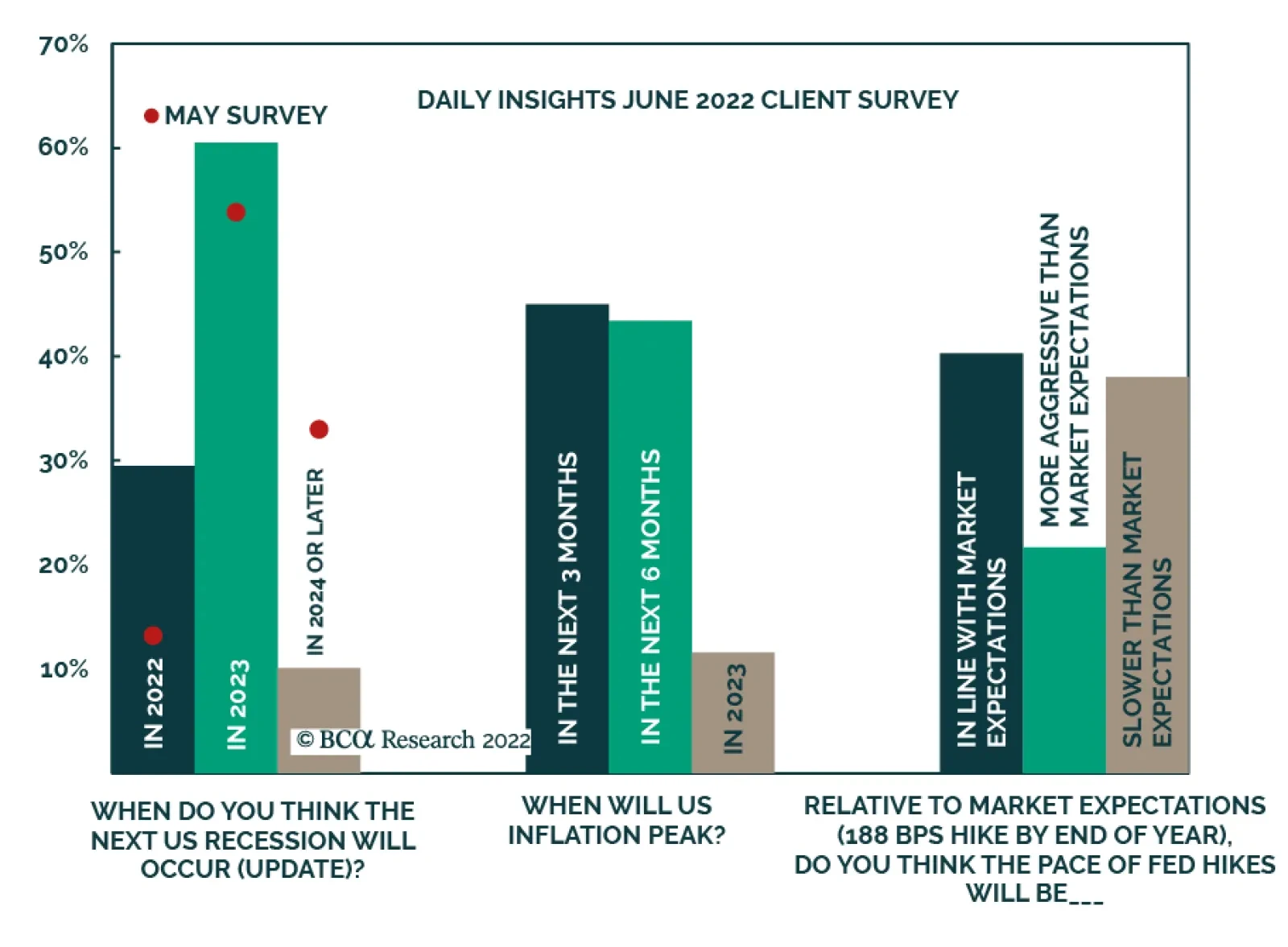
Given the more aggressive pace of Fed tightening in June (in light of hotter-than-expected CPI inflation and preliminary long-dated consumer inflation expectations from the University of Michigan survey), we asked our readers for updated expectations…
Executive Summary Financial markets have buckled under the weight of 40-year highs in inflation that have forced the Fed and other major central banks to promise no quarter in their fight against inflation, spooking investors with visions of Volcker-like monetary policy. Well-anchored long-run inflation expectations suggest that the Fed may not have to throttle the economy before the year is out to achieve “clear and convincing evidence” that inflation is trending lower. The labor market may be in a sweet spot in which jobs are plentiful, but workers lack the leverage to drive compensation high enough to initiate a wage-price spiral. Corporate earnings may be more resilient than many investors fear. An earnings recession is not inevitable, as S&P 500 earnings have grown at a robust rate when year-over-year consumer prices have risen between 3.5 and 7%. Not As Bad As We First Thought
Not As Bad As We First Thought
Not As Bad As We First Thought
Bottom Line: A once-in-a-century global pandemic, unprecedented fiscal and monetary policy responses and war have produced an especially uncertain macroeconomic backdrop. We acknowledge that financial markets could go either way, but we think the bearish consensus presents an opportunity to outperform by overweighting risk assets over the next twelve months. Feature 2022 has been a gloomy year for the economy and financial assets of all stripes. The reckoning from the excessive monetary and fiscal stimulus that allowed the economy to come through the pandemic mostly unscathed while fueling the greatest eight-quarter stretch of real household net worth gains on record, arrived ahead of schedule, hurried along by war in eastern Europe. Russia’s invasion of Ukraine took a bite out of global grain and energy supplies, sending the prices of select commodities soaring and contributing to the worst developed-nation inflation in four decades. Global equity and bond markets have been upended by apprehension over just how forcefully the Fed and other central banks will have to squeeze their economies to keep inflation from taking lasting root. No investor should take the Fed lightly, but the sense of gloom pervading general media, financial media, Wall Street broker-dealers, our clients and their clients is at risk of going a little too far if it hasn’t already. This is a fraught moment, and the uncertainty is heightened by the unprecedented events of the last two years, but we perceive the backdrop as far more mixed than it’s being made out to be. As a result, we think there’s much more potential for positive surprises over the next year than most investors perceive. To give clients a chance to see it our way, we are getting out of the way. This week’s report belongs to the charts and we present them with a minimum of commentary. We do not know how things will turn out – the backdrop is unprecedented and leaves all of us to find our way without historical antecedents to guide us – and we are approaching our job with elevated humility and lower-than-normal conviction. We have been advising clients to be prepared to shorten the holding periods of their positions just as we are prepared to change our mind swiftly if incoming data fail to validate our view. For now, however, we continue to believe that the potential for positive surprises is greater than market pricing acknowledges and we recommend overweighting equities in multi-asset portfolios over the next twelve months. Doug Peta, CFA Chief US Investment Strategist dougp@bcaresearch.com Chart 1Omicron Has Produced A Lot Of Infections,...
Omicron Has Produced A Lot Of Infections,...
Omicron Has Produced A Lot Of Infections,...
Chart 2... But They've Been Decidedly Less Serious
... But They've Been Decidedly Less Serious
... But They've Been Decidedly Less Serious
Chart 3Core Inflation Will Cool As Demand Shifts To Services, ...
Core Inflation Will Cool As Demand Shifts To Services, ...
Core Inflation Will Cool As Demand Shifts To Services, ...
Chart 4...And Households Maintain Their Discipline
...And Households Maintain Their Discipline
...And Households Maintain Their Discipline
Table 1The Term Structure Of Inflation Expectations …
Chartbook
Chartbook
Chart 5… Remains Comfortably Inverted
Chartbook
Chartbook
Chart 6Households See It Like Investors ...
Households See It Like Investors ...
Households See It Like Investors ...
Chart 7... For Now, Anyway
... For Now, Anyway
... For Now, Anyway
Chart 8Real Wages Have Been Falling For A Year And A Half ...
Real Wages Have Been Falling For A Year And A Half ...
Real Wages Have Been Falling For A Year And A Half ...
Chart 9... As Workers Are At The Bottom Of A Steep Structural Hill
... As Workers Are At The Bottom Of A Steep Structural Hill
... As Workers Are At The Bottom Of A Steep Structural Hill
Table 2Excess Savings Provide A Cushion Against Rising Food And Fuel Costs
Chartbook
Chartbook
Chart 10High-End Households Have Had A Good Pandemic, Too
High-End Households Have Had A Good Pandemic, Too
High-End Households Have Had A Good Pandemic, Too
Chart 11Businesses Haven't Taken Down The Help Wanted Signs ...
Businesses Haven't Taken Down The Help Wanted Signs ...
Businesses Haven't Taken Down The Help Wanted Signs ...
Chart 12... And There's No Lack Of Supply To Fill The Positions
... And There's No Lack Of Supply To Fill The Positions
... And There's No Lack Of Supply To Fill The Positions
Table 3Inflation Isn’t So Bad For Nominal Earnings …
Chartbook
Chartbook
Chart 13... And Companies May Be Re-Learning That Now
... And Companies May Be Re-Learning That Now
... And Companies May Be Re-Learning That Now
Chart 14Originators Have Lent To Good Borrowers …
Chartbook
Chartbook
Chart 15... On Proper Terms This Time Around
... On Proper Terms This Time Around
... On Proper Terms This Time Around
Footnotes