United States
The European energy crisis remains a dark cloud over the Eurozone economy. Indeed, our European Investment strategists have shown that since Q2 2021, the performance of Euro Area financial assets relative to their US counterparts has been inversely correlated…
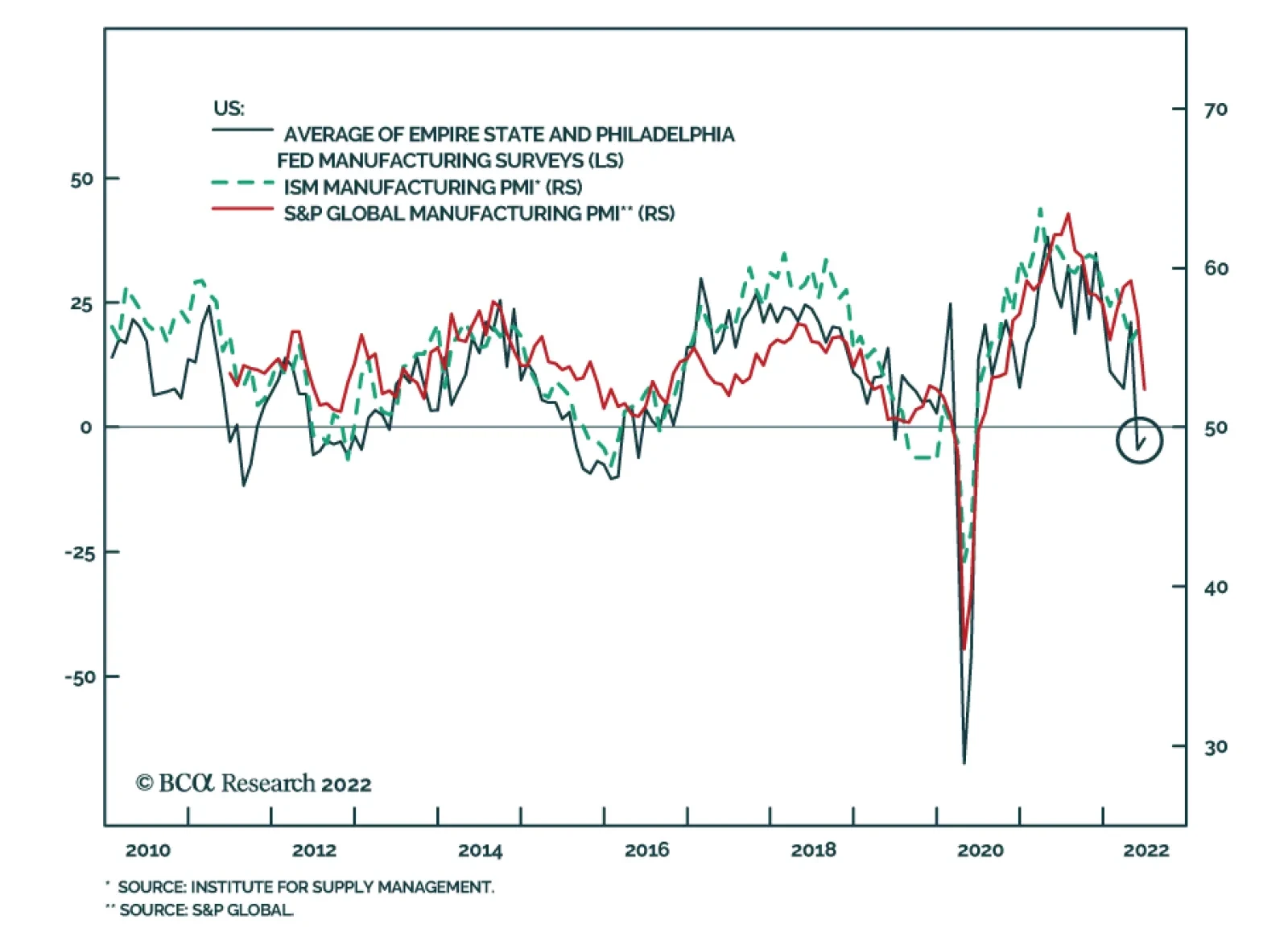
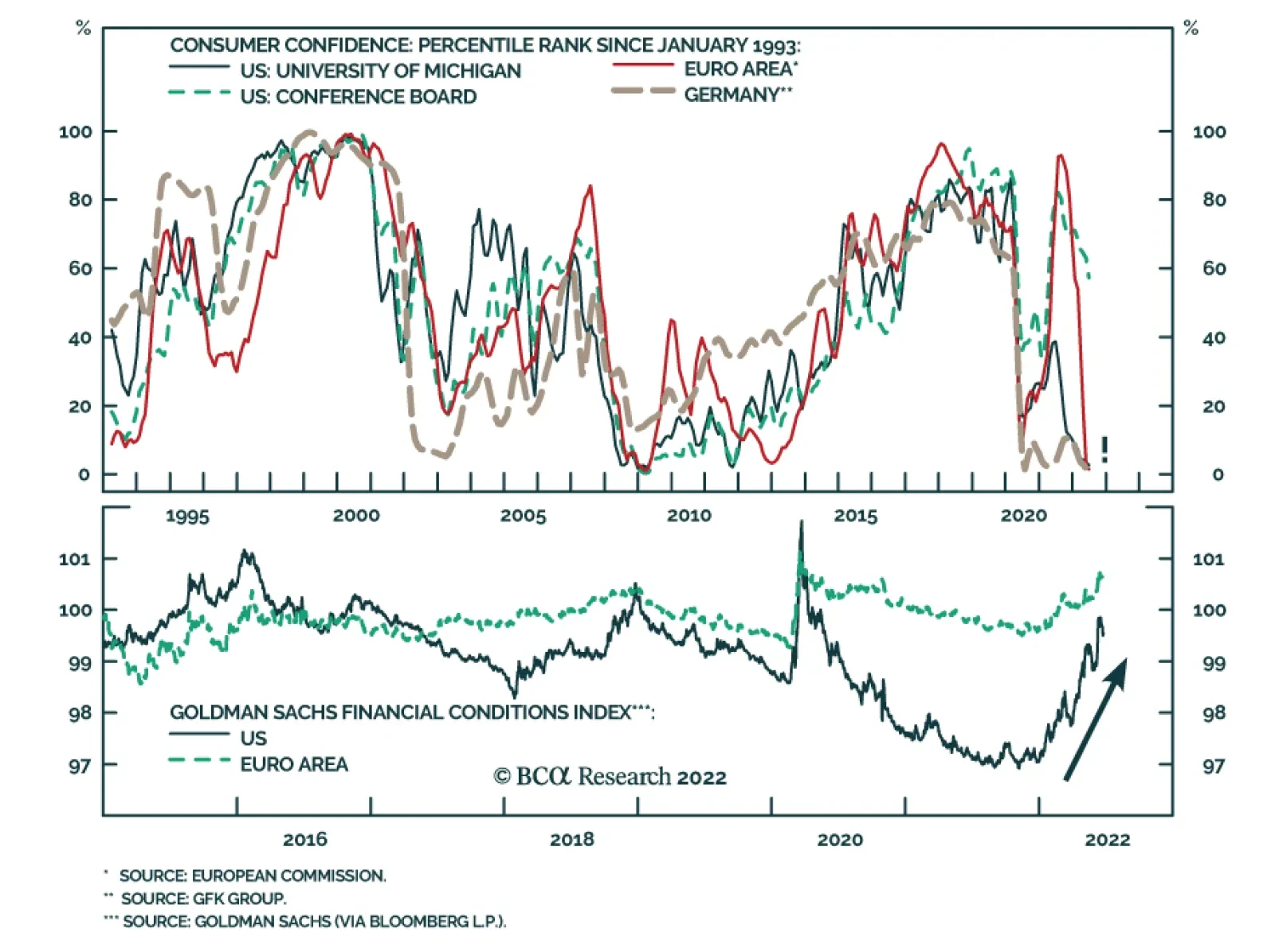
US labor market data – such as the 3.6% unemployment rate and monthly nonfarm payroll growth hovering around 400 thousand – paint a robust picture of the economy. Similarly, the widely-watched ISM Manufacturing PMI, which is a key indicator of the state of…
Our US equity team has been among the more cautious within BCA Research. They recently highlighted that they expect persistent inflationary pressures, aggressive monetary tightening, and the withdrawal of liquidity to weigh down on US stocks. Cyclical sectors…
BCA Research’s US Bond Strategy service cautions against turning overly bullish on bonds even if you anticipate a recession within the next 6-12 months. There is a risk that the Fed’s two mandates of price stability and maximum employment could come into…

Executive Summary An Optimal Control Policy
An Optimal Control Policy
An Optimal Control Policy
We could see some modest near-term downside in Treasury yields as inflation rolls over during the next few months, but we caution against turning overly bullish on bonds even if you anticipate a recession. An optimal control approach to monetary policy tells us that the Fed should be willing to accept a significant increase in the unemployment rate to tame inflation. The implication is that the next recession may not be met with the dramatic easing of monetary policy we have become accustomed to. Short-maturity real yields remain deeply negative, but they will move into positive territory before the end of the economic cycle. Indicators of corporate balance sheet health are not flashing red, but they are moving in the wrong direction. Bottom Line: Investors should keep portfolio duration close to benchmark, maintain a defensive posture on corporate bonds and short 2-year TIPS. The Return Of Optimal Control Bonds rallied into the close last week and, as of Monday morning, their gains have only been partially unwound. The 2-year Treasury yield is down to 3.07% from its recent high of 3.45% and the 10-year yield is down to 3.16% from its recent high of 3.49% (Chart 1). The 2-year/10-year Treasury slope remains close to inversion at 9 bps (Chart 1, bottom panel). Increasingly, the message from the Treasury market is that the Fed is no longer playing catch-up to runaway inflation. Rather, the dominant market narrative is that the Fed may have to moderate its hiking pace to avoid an economic recession. With the unemployment rate at 3.6% and nonfarm payroll growth averaging +408k during the past three months, the US economy is clearly not in a recession today. That said, leading indicators are pointing to increased risk of a downturn within the next 12 months. For example, the S&P Global Manufacturing PMI fell sharply last week from 57.0 to 52.4 (Chart 2). The more widely tracked ISM Manufacturing PMI remains elevated at 56.1, but regional Fed surveys and trends in financial conditions suggest that the ISM could dip into contractionary territory during the next few months (Chart 2, bottom 2 panels). Chart 1Treasury Yields
Treasury Yields
Treasury Yields
Chart 2Recession Risk Is Rising
Recession Risk Is Rising
Recession Risk Is Rising
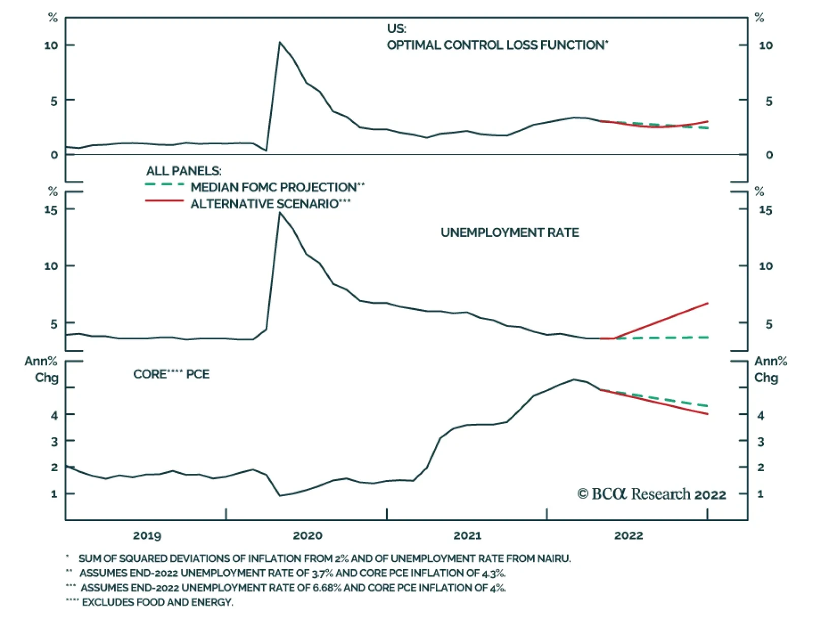
This is obviously a tricky situation for the Fed as there is a risk that its two mandates of price stability and maximum employment could come into conflict. Not surprisingly, the Fed has a playbook for these sorts of situations, one that was described by Janet Yellen as “optimal control” in a 2012 speech.1 Under an optimal control approach to policymaking the Fed specifies a loss function that is based on deviations of inflation from its 2% target and of the unemployment rate from its estimated full employment level. Understanding that it will be impossible to perfectly achieve both of its objectives, the Fed attempts to set policy so that the output of the loss function is minimized. One example of a simple loss function was given by St. Louis Fed President James Bullard in a speech from 2014.2 That function is as follows: Distance From Goals = (π – π*)2 + (μ - μ*)2 Where: π = inflation π* = The Fed’s target inflation rate μ = the unemployment rate μ* = The Fed’s estimate of the unemployment rate consistent with full employment Chart 3An Optimal Control Policy
An Optimal Control Policy
An Optimal Control Policy
Let’s apply Bullard’s loss function to the present-day economic situation. The top panel of Chart 3 shows the square root of the function’s output. The Fed’s goal, of course, is to get that line as close to zero as possible. First, let’s see what happens if we input the median FOMC member’s forecast for core PCE inflation and the unemployment rate. That forecast has core PCE inflation falling to 4.3% by the end of this year and it has the unemployment rate edging up to 3.7%. Not surprisingly, this scenario leads to a modest improvement in Bullard’s loss function. Now let’s examine an alternative scenario where core PCE inflation falls to 4% by the end of the year but we set the loss function to remain at its current level. That outcome can be achieved even with the unemployment rate rising to 6.68%. This scenario is instructive. It tells us that, from an optimal control perspective, the Fed would be willing to tolerate an increase in the unemployment rate all the way up to 6.68% if it meant that inflation would fall back down to 4%. Why is this example important? It’s important because it gives us some perspective on what sort of labor market pain the Fed may be willing to tolerate to tame inflation. More specifically, there is a growing sense among some market participants that the US economy will soon fall into recession and that recessions are usually accompanied by Fed rate cuts. However, the magnitude of the increase in the unemployment rate that is shown in our alternative scenario would almost certainly be classified as a recession, but an optimal control perspective tells us that the Fed shouldn’t back away from tightening if that were to occur. The bottom line is that while we could see some modest near-term downside in Treasury yields as inflation rolls over during the next few months, we caution against turning overly bullish on bonds even if you anticipate a recession within the next 6-12 months. Given where inflation is today, there are strong odds that the Fed would respond to a rising unemployment rate by simply tempering its pace of rate hikes or perhaps temporarily pausing. Optimal control tells us that we would need to see an extremely large employment shock for the Fed to consider reversing course and cutting rates. Investors should stick with ‘at benchmark’ portfolio duration for the time being. A Quick Note On Real Yields Chart 4Short 2-Year TIPS
Short 2-Year TIPS
Short 2-Year TIPS
The 2-year real yield has risen to -0.70% from a 2021 low of -3.05%, but we have high conviction that it has further to run (Chart 4). At the press conference following the June FOMC meeting, Fed Chair Powell hinted that he viewed positive real yields across the entire Treasury curve as a reasonable intermediate-term goal. He then made similar claims when testifying before the Senate last week: It’s really only the very short end of the curve where our rates are still in negative territory from a real perspective. If you look further out, real rates are positive right across the curve and that’s really what you’re trying to achieve in a situation like this where we have 40 year highs in inflation.3 One way or another, we think it is highly likely that the Fed will achieve its goal of positive real yields across the entire curve. This could happen in a benign scenario where falling inflation expectations push short-maturity real yields higher. Or, it could happen in a more dramatic fashion where inflation expectations remain elevated but that only quickens the pace of Fed tightening. In that scenario, rising short-maturity nominal yields would drag real yields with them. Either way, investors should continue to hold outright short positions in 2-year TIPS. Corporate Health Check-Up In prior reports we noted the extremely good condition of corporate balance sheets, while also suggesting that balance sheet health would deteriorate going forward.4 An updated read on the status of corporate balance sheets suggests that conditions are still favorable, but much less so than even a few months ago. We begin with our Corporate Health Monitor (CHM), a composite indicator of six financial ratios calculated from the US National Accounts data for the nonfinancial corporate sector. This indicator was deep in “improving health” territory at the end of 2021, but it moved close to neutral in 2022 Q1 (Chart 5). Ratings trends, meanwhile, send a similar message. Through the end of May, upgrades continued to dramatically outpace downgrades in the investment grade space (Chart 5, panel 2), but the rate of net upgrades slowed somewhat in high-yield (Chart 5, bottom panel). Digging deeper, we find that the main culprit behind the CHM’s recent jump is a large drop in the ratio of Free Cash Flow to Total Debt (Chart 6). This drop occurred because after-tax cash flows held roughly flat in Q1 but capital expenditures surged, causing free cash flow to dip (Chart 6, panel 2). Chart 5Corporate Health Monitor
Corporate Health Monitor
Corporate Health Monitor
Chart 6Capex Surged In Q1
Capex Surged In Q1
Capex Surged In Q1
This trend is confirmed by another important indicator of corporate balance sheet health, the financing gap. The financing gap is the difference between capital expenditures and retained earnings. A positive financing gap means that retained earnings are insufficient to cover capital expenditures and firms therefore have an incentive to tap debt markets. We see that the financing gap jumped sharply in Q1, from deeply negative into positive territory (Chart 7). Chart 7The Financing Gap Is Positive
The Financing Gap Is Positive
The Financing Gap Is Positive
A positive financing gap on its own does not send a negative signal for corporate defaults. However, when a positive financing gap coincides with tightening lending standards, then an increase in the default rate becomes likely. For now, lending standards are close to unchanged (Chart 7, bottom panel), but there is a strong chance that continued Fed hiking will push them into ‘net tightening’ territory in the months ahead. Investment Implications Chart 8Attractive Value In HY
Attractive Value In HY
Attractive Value In HY
Corporate balance sheet health isn’t quite flashing red, but it is certainly trending in the wrong direction. With continued Fed tightening likely to weigh on lending standards and interest coverage going forward, a defensive posture toward corporate bonds is warranted. We continue to recommend an underweight allocation (2 out of 5) to investment grade corporate bonds in US fixed income portfolios. We maintain a somewhat higher neutral (3 out of 5) allocation to high-yield bonds for the time being. This is because high-yield valuation is quite attractive, and we see potential for some near-term spread tightening as inflation rolls over (Chart 8). That said, the sector’s long-term return prospects are not good, and we will consider turning more defensive should the average high-yield spread narrow to its 2017-19 average or should core inflation move closer to our 4% target. Ryan Swift US Bond Strategist rswift@bcaresearch.com Footnotes 1 https://www.federalreserve.gov/newsevents/speech/yellen20120606a.htm 2 https://www.stlouisfed.org/from-the-president/-/media/project/frbstl/stlouisfed/files/pdfs/bullard/remarks/bullardowensborokychamberofcommerce17july2014final.pdf 3 https://www.c-span.org/video/?521106-1/federal-reserve-chair-jerome-powell-testifies-inflation-economy 4 Please see US Bond Strategy / Global Fixed Income Strategy Special Report, “Turning Defensive On US Corporate Bonds”, dated April 12, 2022. Recommended Portfolio Specification Other Recommendations Treasury Index Returns Spread Product Returns
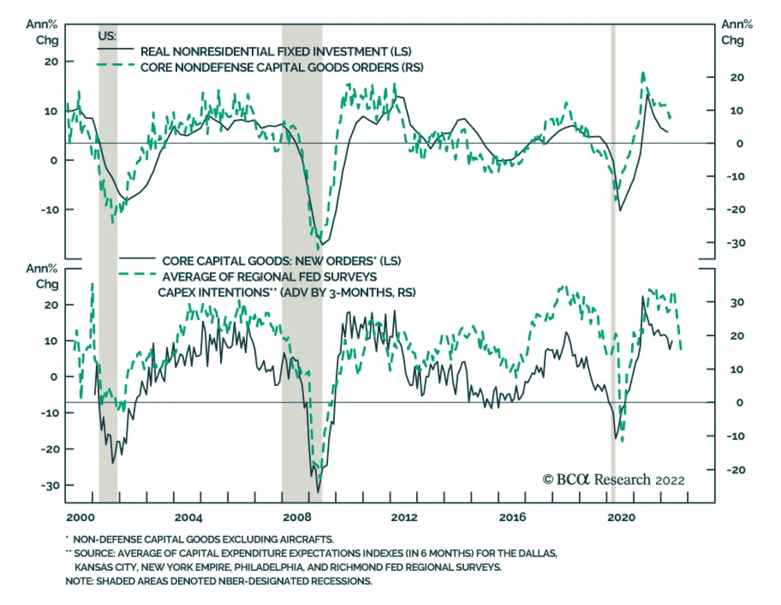
Preliminary estimates indicate that US durable goods orders accelerated by 0.7% m/m in May from 0.4% m/m in April, surprising expectations they would ease. Orders of primary metals and machinery were among the main contributors. Notably, nondefense capital…
BCA Research’s US Equity Strategy service concludes that small caps face significant macroeconomic headwinds. US economic growth is already slowing and is surprising on the downside. Small caps tend to underperform larger companies during the slowdown…
US equities rallied sharply on Friday with the S&P 500 gaining 3%. The proximate cause for this rebound is the final release of the University of Michigan June consumer survey results. Specifically, 5-10 year household inflation expectations eased back to…
Executive Summary Small Do Poorly During The Slowdown Phase
Will Small Get Even Smaller?
Will Small Get Even Smaller?
Small Caps are a more cyclical and high-octane version of Large Caps. Small underperforms Large during the slowdown stage of the business cycle. The yield curve is flattening and is close to inversion – a signal that does not bode well for the outperformance of Small vs. Large either. Rising high-yield spreads are a bad omen for the outperformance of small caps. Small caps are incredibly cheap both in real and absolute terms. They are also oversold. The profitability of both small and large companies is under pressure, but small companies have fewer resources and are less resilient. Earnings growth estimates for both Large and Small are unrealistically high and misleading. We expect an earnings recession, and negative earnings growth is likely for both asset classes. Bottom Line: Small caps are a more cyclical, lower quality, high-octane asset class than Large caps and face significant macroeconomic headwinds from slowing economic growth. We recommend underweighting Small relative to Large, despite attractive valuations, until macroeconomic uncertainty dissipates, inflation turns, and earnings deceleration gets priced in. Feature In the front section of our June 6, Style Chart Pack, we upgraded Growth and downgraded Value both to equal weight, making the case that Growth vs Value divergence in performance has likely run its course – with economic growth slowing, companies with strong fundamentals and stable earnings are much more valuable. We also stated that once macroeconomic uncertainty dissipates, we will be able to pounce and shift Growth to overweight, and Value to underweight. In this week’s report, we will revisit our overweight Small/underweight Large allocation – a position that has been bleeding red ink since November. The question on our mind is what to do with an underperforming position – be patient or have losses? We ground this report in an analysis we conducted a year ago in the “Is It A Small World After All” report. Sneak Preview: The macroeconomic backdrop for Small is unfavorable, and its earnings growth is about to decelerate – yet much of the bad news is already priced in. However, Small is unlikely to outperform in a sustainable way until inflation turns, and economic uncertainty dissipates. We shift Small to underweight and Large to overweight. Premise For Our Call Last Fall We will start this report by reviewing the history of the call. We upgraded the allocation of Small vs. Large to overweight, making a case based on valuations, strong earnings growth, and demonstrated ability to outperform under duress. We also relied on the empirical analysis that showed that Small held its own in the environment of rising rates. In the “2022 Outlook” report, we highlighted risks to our call. We quote: ”If economic growth disappoints, and the yield curve continues its relentless flattening, signifying a Fed policy mistake or the onset of another COVID Greek, Small is bound to underperform. Margins are narrow and continued cost pressures, especially surging labor costs, have the potential to dent small caps’ profitability. Yet, on a balance of probabilities of such an outcome vs. attractive valuations and fundamentals, this is a risk we are willing to take.” Unfortunately, most of the risks we highlighted have come to pass. Since October 4, the S&P 600 has underperformed the S&P 500 by 5.5%, with most losses accumulating between December and February (Chart 1). Small is down 26% off its peak in November, 2021. However, recently its relative performance has stabilized (Table 1). What’s next? Chart 1Small Outperformed On The Back of Post-Covid Recovery, But Has Been Lagging Ever Since
Small Outperformed On The Back of Post-Covid Recovery, But Has Been Lagging Ever Since
Small Outperformed On The Back of Post-Covid Recovery, But Has Been Lagging Ever Since
Table 1Performance Summary
Will Small Get Even Smaller?
Will Small Get Even Smaller?
Small Vs. Large Sector Composition The differences in sector composition of the S&P 500 vs. the S&P 600 have profound implications for relative performance during different stages of the business cycle and various macroeconomic regimes. On a sector level, Small has a higher allocation to Financials, Industrials, and Real Estate, while Large has more weight in Technology and Healthcare (Chart 2). Chart 2Small Vs. Large Sector Breakdown
Will Small Get Even Smaller?
Will Small Get Even Smaller?
By grouping sectors into the cyclical vs. defensive categories, we observe that Small has a lower allocation to Defensives, and a higher allocation to Cyclicals: The Cyclical/Defensive gap between the asset classes is roughly 18%. This also indicates that Small has higher operating leverage than Large. Small is also overweight early cyclical sectors by 8% (Chart 3), which explains the underperformance of small-capitalization stocks at times of strain (corrections, economic contraction, a risk-off environment), as well as the “out-of-the-gate” behavior during recoveries and bear market rallies. Small’s higher weight in Financials increases its sensitivity to the slope of the yield curve. Chart 3Small Vs. Large Style Breakdown
Will Small Get Even Smaller?
Will Small Get Even Smaller?
Bottom Line: Small is a more cyclical and high-octane version of Large. Macroeconomic Backdrop Nothing matters more for the relative performance of Small vs. Large than a macroeconomic backdrop that highlights differences in sector composition, credit quality, and intrinsic profitability of these asset classes. Large Caps Reign During The Slowdown Stage Of The Business Cycle The May inflation surprise has solidified the Fed’s resolve to fight inflation, which it executes by aggressive tightening of monetary conditions. A tighter monetary policy is designed to slow economic growth and curtail demand (Chart 4). As we have written over the past several months, US economic growth is already slowing and is surprising on the downside (Chart 5). Bloomberg consensus expects the economy to grow at 2.5% over the next 12 months, which is a sharp slowdown from 2021. Chart 4Financial Conditions Are Tight...
Financial Conditions Are Tight...
Financial Conditions Are Tight...
Chart 5...And Economic Growth Is Slowing
...And Economic Growth Is Slowing...
...And Economic Growth Is Slowing...
Small caps tend to underperform larger companies during the slowdown stage of the business cycle (Chart 6) due to their overweight in Early Cyclicals and shortage of Defensive Growth. In addition, slower economic growth hits smaller and less profitable companies much harder than their larger brethren. Bottom Line: Small underperforms Large during the slowdown stage of the business cycle. Chart 6Small Do Poorly During The Slowdown Phase
Will Small Get Even Smaller?
Will Small Get Even Smaller?
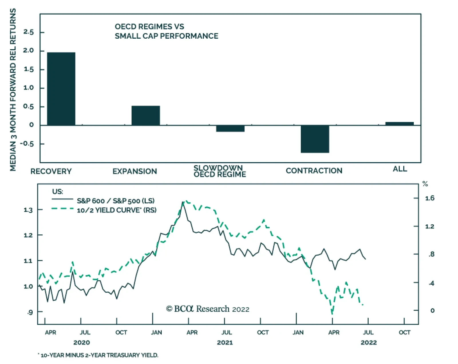
Yield Curve Flattening Is Unfavorable For The Outperformance Of Small Small caps thrive in an environment of accelerating growth, which is a necessary tailwind for smaller, younger, and less profitable companies. A flatter yield curve signals upcoming growth deceleration, which is a drop of poison in the outlook for Small (Chart 7). In addition, small caps have a higher allocation to regional banks, which are extremely sensitive to the shape of the yield curve. The spread between the borrowing rate (the short-term rate on deposits) and the lending rate (on long-term loans) is the source of profitability and determines the bank’s net income margins. Prior empirical analysis validates this: During periods of a flattening yield curve, Small underperformed Large over the following three months (Chart 8). Chart 7Flattening Yield Curve Drags Down Relative Performance Of Small Vs Large
Flattening Yield Curve Drags Down Relative Performance Of Small Vs Large
Flattening Yield Curve Drags Down Relative Performance Of Small Vs Large
Chart 8Small Underperforms When Yield Curve Is Flattening
Will Small Get Even Smaller?
Will Small Get Even Smaller?
Recently the Treasury 10-2Y curve has flattened, coming down from 0.9% in January to 0.1% by the end of June, and is dangerously close to inversion, which is a classical predictor of a looming recession. Bottom Line: The yield curve is flattening and is close to inversion – a signal that does not bode well for the outperformance of Small vs. Large. HY Spreads Also Signal Underperformance Another important signal for Small vs. Large is the direction of change in HY spreads. Small caps are riskier and more leveraged than their large-cap peers (Chart 9). Not surprisingly, they also tend to have lower credit ratings: Indeed, the median rating for a small-cap stock is B+, which falls straight into the high-yield territory. As a result, the fate of small caps is closely tied to that of HY debt and is linked to both its spreads and its default trends. Higher yields and higher defaults would be a sign of distress for the small-cap universe. Therefore, the relative performance of small caps is inversely correlated to HY spreads (Chart 10A). Chart 9Small Caps Are More Leveraged Than Large Caps
Small Caps Are More Leveraged Than Large Caps
Small Caps Are More Leveraged Than Large Caps
Over the past several months, HY spreads have blown out from 2.8% to 5.2% and will continue widening in the near future: As the US economy is edging towards a recession, historically low default rates are likely to rise. Spreads widening off an already high level of 500 bps historically have been followed by relative underperformance of Small over the next three months 60% of the time (Chart 10B). Bottom Line: Rising high yield spreads are a bad omen for the outperformance of small caps. Chart 10ASmall Caps Performance...
Small Caps Performance...
Small Caps Performance...
Chart 10B...Is Inversely Correlated With HY Spreads
Will Small Get Even Smaller?
Will Small Get Even Smaller?
Inflation Regimes Having razor-thin margins, smaller companies hate inflation. Not only do they have difficulty budgeting and planning ahead but also they are often not able to convert sales growth into earnings growth, i.e., their costs may grow faster than their revenues. According to the most recent NFIB survey, 28% of small businesses consider inflation their biggest problem compared to 1-2% in 2019 (Chart 11). The second largest problem is labor quality concerns at 23%. Of course, these two problems are inherently interlinked, igniting a wage-price spiral. Empirical analysis of the relative performance of Small vs. Large in different inflation regimes since 1984 suggests that unless inflation rolls over, Small is likely to continue to underperform (Chart 12). Bottom Line: Small will outperform once inflation turns the corner. Until then, it will lead bear market rallies that will be spurred by hopes of falling inflation and a less hawkish Fed. Chart 11No Comments Needed
No Comments Needed
No Comments Needed
Chart 12Inflation Is A Major Headwind
Will Small Get Even Smaller?
Will Small Get Even Smaller?
Valuations And Fundamentals Small Caps’ Valuations Are At The Lowest Level In A Decade Small caps were very cheap back in October, but they have gotten even cheaper since then. Yet another example of valuation being a poor timing tool: All too often, cheap assets just keep getting cheaper, and expensive assets get more expensive. Currently, small caps trade with a nearly 30% discount to Large both on a forward and on a trailing earnings basis, while historically, a small-cap premium was more of the norm (Table 2). The small caps’ valuations have hit the lowest level in 10 years, both on an absolute and relative basis. The BCA valuations indicator is trading more than two standard deviations below its historical average (Chart 13, top panel). The BCA technical indicator signals oversold conditions (Chart 13, bottom panel). Chart 13Cheap For A Reason
Cheap For A Reason
Cheap For A Reason
Table 2Valuations Summary
Will Small Get Even Smaller?
Will Small Get Even Smaller?
Bottom Line: Small caps are incredibly cheap both in real and absolute terms. They are also oversold. Small-Cap Margins Are Under Pressure Small companies are always less profitable than their large-cap brethren as they lack economies of scale, and many of these companies are either younger or less successful than bigger companies. As a result, the margins of smaller companies are usually about 500 bps lower than those of their larger peers (Chart 14). Having thin margins, small caps don’t have much room for error in dealing with the same challenges larger companies are facing, i.e., rising costs of transportation, raw materials, and energy. Yet, it is the cost of labor, which is stickier than other components and is the largest component of cost structure, that has the potential to dent the profitability of small caps. The NFIB survey shows that 25% of small businesses intend to raise employee wages, which are growing at over 5.5%. It is not surprising, that on a net basis, nearly 25% of small companies reported declining profitability (Chart 15). Therefore, it is unsurprising that margins of Small have also started to contract. Chart 14Margins To Contract
Margins To Contract
Margins To Contract
Chart 15Profits Are Collapsing
Profits Are Collapsing
Profits Are Collapsing
Bottom Line: The profitability of both small and large companies is under pressure, but small companies have fewer resources and are less resilient. Earnings Expectations For Small Have Turned Down, Albeit From High Levels The market expects the S&P 500 and the S&P 600 to grow earnings by 10% and 13% respectively over the next 12 months (Table 3). Small is getting more analyst upgrades than Large (Chart 16). Table 3The Street's Forecasts
Will Small Get Even Smaller?
Will Small Get Even Smaller?
We concluded in the “Is Earnings Recession Likely?” report that earnings expectations are unreasonably high and don’t reconcile with the underlying economic conditions. Slowing economic growth is bound to weigh on earnings growth (Chart 17). We believe that an earnings recession is likely and estimates just do not reflect the reality on the ground and need to come down. Chart 16But Sell-side Analysts Are Optimistic
But Sell-side Analysts Are Optimistic
But Sell-side Analysts Are Optimistic
Chart 17Earnings Have Turned
Earnings Have Turned
Earnings Have Turned
Arguably, small-cap earnings growth will contract more than that of large caps, as Small is a high-octane, high-beta asset class with high exposure to cyclicals and a higher degree of operating leverage. Bottom Line: Earnings growth estimates for both Large and Small are unrealistically high and are misleading. We expect an earnings recession and negative earnings growth is likely for both asset classes. Investment Implications To sum up the analysis, we have put together a Small/Large scorecard (Table 4). Table 4Scorecard
Will Small Get Even Smaller?
Will Small Get Even Smaller?
We conclude that the macroeconomic backdrop is extremely unfavorable for Small compared to Large. Small caps tend to underperform in the environment of slowing growth as lower levels of profitability make this asset class vulnerable in a downturn. Rising high yield spreads and the increasing probability of defaults don’t bode well for Small as it is a lower-quality asset class. Inflation is also a headwind. And last, earnings expectations for both Small and Large are too high and do not reflect the reality on the ground – earnings growth will decelerate, and earnings of Small will contract further than Large. On the positive side, Small is incredibly cheap both in relative and absolute terms. It is also oversold relative to Large. It is fair to conclude that much of the adversity is already priced in, and Small is unlikely to fall much further. On the first whiff of lower inflation, Small will bounce and will outperform Large and other asset classes. However, sustainable outperformance is unlikely until inflation rolls over and monetary conditions stabilize. We believe that for patient investors with a long investment horizon, buying Small at this level is attractive. However, on a tactical basis, we will underweight Small relative to Large until macroeconomic headwinds clear. Bottom Line Small caps are a more cyclical, lower quality, high-octane asset class than Large caps and face significant macroeconomic headwinds from slowing economic growth. Their profitability is also under pressure from rising costs of raw materials and spiraling labor costs. We recommend underweighting Small relative to Large, despite attractive valuations, until macroeconomic uncertainty dissipates, inflation turns, and earnings deceleration gets priced in. We also want to highlight that Small will be a certain leader in the bear market rallies. Irene Tunkel Chief Strategist, US Equity Strategy irene.tunkel@bcaresearch.com Recommended Allocation Recommended Allocation: Addendum
Will Small Get Even Smaller?
Will Small Get Even Smaller?
Executive Summary Though the BCA House View has downgraded global equities to neutral, US Investment Strategy still recommends overweighting equities in US multi-asset portfolios over the coming twelve months. We believe that financial markets have prematurely discounted a sharp economic downturn. The selloff is an opportunity to get long equities if the recession fails to begin this year and/or turns out to be mild. We were surprised and disappointed by the May CPI report but view it as merely a delay in the flow of evidence confirming our view that inflation is peaking, not a repudiation of it. Inflation expectations will shape the intensity of the Fed’s efforts to lean against the economy, but the University of Michigan consumer survey that placed it on high alert was only preliminary and market-based measures of longer-run inflation expectations remain contained. History, folklore and popular culture all suggest that wage-price spiral fears are overdone. The Bear's Here; Where's The Recession?
The Bear's Here; Where's The Recession?
The Bear's Here; Where's The Recession?
Bottom Line: Although the odds of an adverse outcome are rising, we maintain a constructive base-case view on the twelve-month prospects for US equities and the US economy, subject to a meaningful decline in inflation over the rest of the year. Feature At our monthly editorial view meeting last Monday, BCA researchers voted to downgrade the 6-to-12-month House View on equities to neutral from overweight. The US Investment Strategy team argued for an overweight recommendation and cast our vote with the minority to maintain it. Though we are on the opposite side of the slight plurality that voted to underweight equities, we acknowledge that the risks to our constructive view have risen. The difference between our view and the BCA consensus is mainly a matter of timing – while we believe the US economy is on its way to a recession, we think the journey will be more winding than expected. The Timing And Severity Of The Gathering Storm Recession was the key economic issue informing our investment strategy decision: When will it begin (if it hasn’t already) and how severe will it be? The domestic economy is clearly slowing, and the Eurozone and China face sizable pressures. As Chief Global Strategist and Director of Research Peter Berezin highlighted, every one-third-percentage-point increase in the three-month moving average of the unemployment rate has been followed by a recession. Mean reversion and the Fed’s campaign to combat inflation by cooling off demand suggest that the unemployment rate will soon be rising, en route to crossing the one-third-of-a-point threshold. Related Report US Investment StrategyThe Yield Curve As An Indicator Though we noted last week that a return to the pre-pandemic labor force participation rate would allow payrolls to expand despite a rising unemployment rate, the expansion’s days are numbered. A broad range of series, from payroll employment (Chart 1, top panel) to the Leading Economic Index (Chart 1, middle panel) and consumer confidence (Chart 1, bottom panel), echoes the unemployment rate’s message: once the economy begins to move in the wrong direction, a recession eventually follows. Our read is that financial markets have overlooked the eventual aspect in their headlong rush to price in the effects of the Fed’s promised tightening campaign. While no one can pinpoint the equilibrium fed funds rate’s exact position, all agree that it’s nowhere near the current 1.5-1.75% target. Tight monetary policy is a necessary (but not sufficient) precondition for a recession; based on the latest guidance provided by Chair Powell and the dots, it looks like it won’t be met until around the end of the year. Once it is, the start of the recession will be subject to debate (Chart 2, top panel), along with its impact on the economy (Chart 2, middle panel) and equities (Chart 2, bottom panel). Chart 1Recessions Occur Once Key Metrics Roll Over
Recessions Occur Once Key Metrics Roll Over
Recessions Occur Once Key Metrics Roll Over
Chart 2Predictions About The Future Are Hard
Predictions About The Future Are Hard
Predictions About The Future Are Hard
As it dawns on investors that the recession is approaching at a meandering pace, and that it may turn out to be mild, equities will likely retrace some of their losses. The vicious May/June selloff was predicated on forecasts that a Category 4 or 5 hurricane could be arriving soon. If the storm system is downgraded to a Category 2 or 3 event, and the date that it’s due to make landfall is pushed back by two or three quarters, we expect that a playable rally will unfold. 4% Is Easy, 2% Will Be A Bear Our relatively constructive base-case view is predicated on the idea that core inflation has peaked and will soon begin declining toward 4% of its own accord. If inflation shows clear and convincing evidence of trending down over the rest of the year, the Fed will not feel obligated to race to push the fed funds rate to a restrictive level. The longer it takes for monetary policy to become restrictive, the longer it will take for the recession to begin. The further the recession can be pushed out into the future, the harder it will be for restless investors and asset allocators to stay on the sidelines as the dire scenario discounted in equity prices fails to materialize. Conversely, if the Fed has to proceed as rapidly as possible to regain the upper hand over inflation, the recession timetable will be accelerated, and the downturn may be more severe than anticipated. We were therefore relieved to hear our Chief US Bond Strategist, Ryan Swift, reiterate his team’s view that inflation will recede to 4% independent of any policy intervention, provided that pandemic-driven supply constraints unwind. Ryan cites the Atlanta Fed’s decomposition of core inflation into flexible and sticky components to illustrate how pandemic-fueled inflation in flexible categories that tend to experience more pricing variability, like new and used vehicles, hotel room rates and airfares, have pushed up the overall series to double-digit levels. The sticky subset, including rent and medical care, is elevated itself, but if the flexibles undershoot on their way back to the mean, year-over-year core CPI can end the year in the 4% neighborhood (Chart 3, top panel). Chart 3Not As Bad As It Looks
Not As Bad As It Looks
Not As Bad As It Looks
An 8% trailing four-quarter increase in unit labor costs – a wage measure that considers compensation per unit of output instead of compensation per unit of time – would suggest on its face that inflation isn’t likely to dip to 4% any time soon. The four-quarter measure has been skewed by wild post-pandemic swings in productivity growth, however. Smoothing out those swings by using the annualized trailing five-year trend in productivity to deflate the 12-month growth rate in average hourly earnings yields a much easier to stomach 3.8% rate of compensation growth (Chart 3, bottom panel). With reference to other more nuanced measures of the underlying inflation trend and a deeper dive into the outlook for automobile prices, which will fall as demand wanes and supply increases, our bond strategists expect core CPI to move toward 4% across the rest of this year while the expansion continues, albeit at a slower pace. Unfortunately, sticky shelter is the largest component of core CPI, and labor market strength will keep residential rents growing at an elevated level consistent with 4% inflation. The Fed will have to lean heavily on the economy to get inflation from 4% back down to its 2% long-run target, and that should induce the recession markets have discounted. Our position is that the recession won’t begin until the second half of 2023 or the first half of 2024. Expectations Are Still Well Anchored Chart 4Still Anchored
Still Anchored
Still Anchored
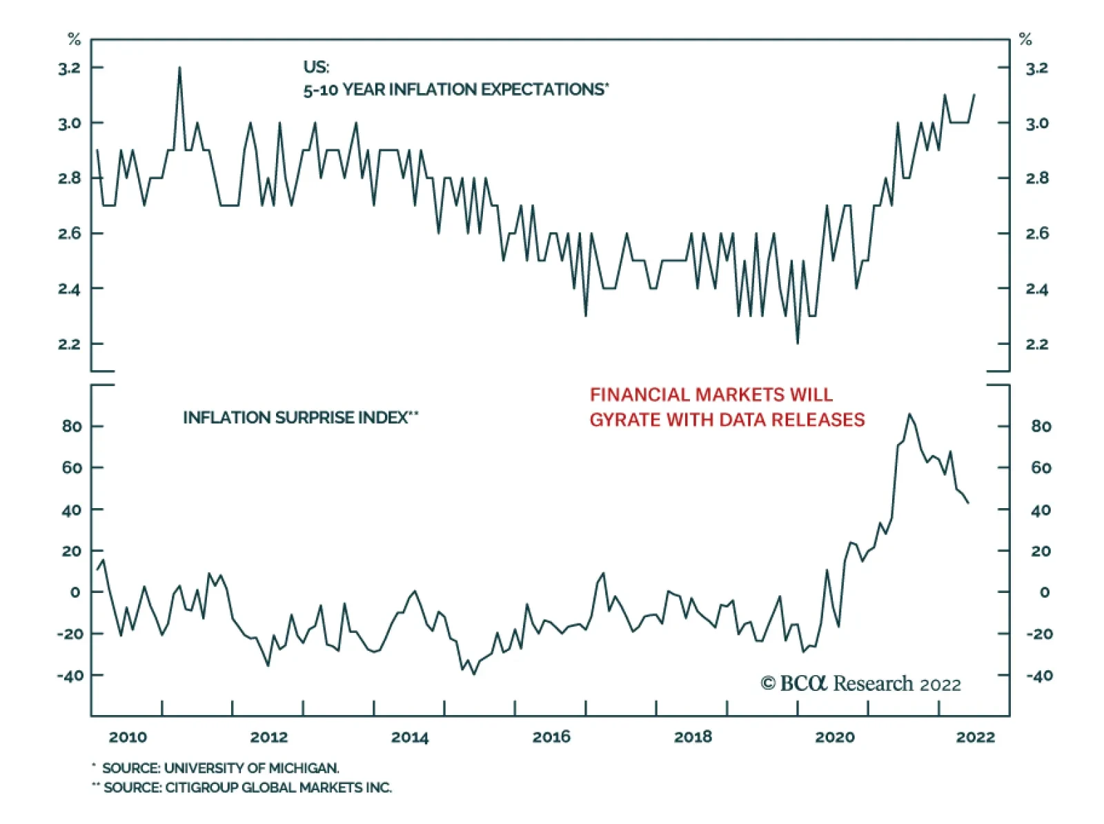
Chair Powell repeatedly cited increasing household inflation expectations as a driver of this month’s 75-basis-point rate hike following the preliminary June University of Michigan consumer sentiment survey’s sharp move higher (Chart 4, bottom panel). The Michigan survey is not the last word on inflation expectations, however, and 5-year-on-5-year TIPS breakeven rates are in line with the Fed’s 2% target (Chart 4, top panel). 5-year-on-5-year CPI swap rates have also remained well behaved (Chart 4, middle panel) despite the volatility in reported inflation and near-term expectations measures. We have been watching the evolution of inflation expectations carefully and will continue to do so; if they remain well anchored, and measured inflation comes down in line with our expectations, we are likely to remain constructive. A Half Century Of Bear Markets The fact that the S&P 500 has entered a bear market despite rising earnings estimates has stimulated a lot of discussion within BCA. More bearish observers’ general take has been, “If stocks are down almost 25% while earnings are up 8% since the start of the year, they’re in real trouble once the inevitable earnings declines arrive.” We have countered that a 30% valuation haircut on inchoate recession expectations could be considered extreme. A review of the empirical record might advance the discussion. Table 1 lists the ten bear markets of the last 60 years, defined as a peak-to-trough decline in closing prices of at least 20% (1990's 19.9% decline has been rounded up). Half of the bear markets lasted between one-and-a-half and two years, while the remainder, excepting the current unfinished one, have been relatively sudden events, persisting for less than six months. Table 1US Equity Bear Markets, 1968 -2022
A Difference Of Opinion
A Difference Of Opinion
Drawdowns have ranged from 20 to 57%, with average and median losses of 36% and 34%, respectively. The mean and median duration of the bear markets have been 12 and 17 months. Bear markets and recessions tend to coincide, as we’ve frequently noted, with only the first leg of the Volcker double dip in 1980 lacking ursine company and the Black Monday bear market of late 1987 occurring outside of a recession (Chart 5). The magnitude of the 1987 bear market was no different from the 50-year average, however, though it did end swiftly. Chart 5The Bear Arrived Ahead Of Its Escort
The Bear Arrived Ahead Of Its Escort
The Bear Arrived Ahead Of Its Escort
Even though the specter of restrictive monetary settings triggered the current bear, Chart 2 demonstrated that there is not a clear parallel between the intensity or duration of rate hiking cycles and the severity of the economic or market declines. Mild recessions can produce mild drawdowns, as in 1990, or severe ones, as at the turn of the millennium. Bad recessions may occur alongside terrible stock market declines (1973-74 and 2007-09) or comparatively modest ones (1980-82). All we can say now is that equities and many other public assets were priced dearly at the start of the selloff and were therefore more vulnerable while the lack of glaring imbalances suggests the economy is reasonably well insulated. The bear markets only begin to show some resemblance to one another in terms of the relative share of the declines accounted for by earnings and multiple contractions. Valuations absorb the full force of the decline during bear markets, falling 30%, while forward earnings estimates are barely revised lower. The pattern is consistent no matter where starting multiples began, though the dot-com bust produced the biggest valuation haircut of the forward earnings era (Table 2). Table 2Bear Market Earnings And Multiple Changes
A Difference Of Opinion
A Difference Of Opinion
The multiple/earnings breakout is mostly a function of the fact that analysts do not adjust their forward estimates in real time while prices can change from moment to moment while markets are open. The result is that the numerator of the price-earnings ratio immediately resets, while the earnings denominator adjusts only after an extended lag. Considering the peak-to-trough changes in earnings estimates, which typically play out beyond the bounds of the strictly defined bear phases, the pain is nearly equally shared. The takeaway for today is that the nearly 30% forward multiple decline is partially a placeholder for future earnings revisions and downward revisions should not be viewed as an add-on to the valuation haircut that’s already occurred. John Henry And The Wage-Price Spiral Many of our colleagues and clients are concerned about rising wages. Nominal compensation is already growing at its fastest pace in decades. Though none of the major wage series has managed to keep pace with inflation, the labor market remains undeniably tight. Rising wages threaten to squeeze corporate profits, exacerbate demand-over-supply imbalances, and act as the linchpin of a vicious circle in which rising prices beget rising prices. The wage-price spiral of the seventies and early eighties lurks at the edge of all our inflation discussions, and nearly all investors seem to view the seventies as something of a baseline. A careful read of history highlights that the spiral took hold near the end of organized labor’s 50-year heyday, however, and challenges the received wisdom that the subsequent 40-year Reagan era is an anomaly at risk of being overturned. Those waiting for labor to be delivered from the depredations of the last 40 years might do well to consider the legend of John Henry, a nineteenth-century railroad laborer in West Virginia or Virginia who drove steel drill bits into mountain rockfaces to create openings for tunnel-blasting explosives. Henry competed against the newly invented steam shovel to see if a man could hew his way through the rock faster than a machine. Henry won the race but succumbed to exertion while doing so. Songwriter Jason Isbell’s take on the legend deftly links the pre-New Deal days with today. Labor may have the numbers, but management has the capital and the incentive to automate every process it can. We contend that wages will rise less than expected over the rest of this expansion and in the early stages of the coming recession, as labor faces a steeper climb than is widely recognized. A few years of cyclical labor market tightness will not be enough to overcome the structural advantages that employers have obtained over the last four decades and guarded jealously in John Henry’s time, before New Deal legislation temporarily leveled the playing field. It didn’t matter if he’d won/ If he’d lived or if he’d run/ They’d changed the way his job was done/ Labor costs were high That new machine was cheap as hell/ Only John would work as well/ So they left him layin’ where he fell/ The day John Henry died “The Day John Henry Died” (Isbell) Doug Peta, CFA Chief US Investment Strategist dougp@bcaresearch.com