United States

Executive Summary Hiring is slowing and layoffs have begun to rise, but today's robust net increases in non-farm payrolls are inconsistent with an approaching recession. The demise of the American consumer has been greatly exaggerated. Households have lots of savings to spend and the capacity to borrow against them if they choose. The extensive forward guidance that the Fed has been at pains to provide to markets may have fueled a sharp preemptive tightening in financial conditions that might prove premature if it reduces the Fed's need to cool the economy itself. None of the three components of our simple recession indicator (the slope of the yield curve, the year-over-year change in the Leading Economic Index and our assessment of monetary policy settings) is sounding the alarm, or even flashing yellow. No Recession Warning In This Series
No Recession Warning In This Series
No Recession Warning In This Series
Bottom Line: Although gloom is increasingly pervasive among investors, we remain constructive on risk assets and the economy over the next twelve months, and reiterate our recommendation to overweight equities in a balanced portfolio. Feature Per the mosaic theory of security analysis, analysts, portfolio managers and independent investors piece together fragments of publicly available information to form a thesis about a company’s prospects. After appraising the company’s securities based on that thesis, the analyst/PM/investor determines whether they’re overvalued, undervalued or fairly valued and takes the appropriate action in his/her portfolio. All market participants are in a race to be among the first to see the outline of the complete picture as the opportunities to exploit mispricings are inversely related to the available share of relevant data. Security fair values become more apparent as more bits of colored glass begin to circulate and alpha-seeking investors have to move on to the next mostly incomplete puzzle to find an edge. Related Report US Investment StrategyAll The Way To Ticker Symbols The same framework applies to macroeconomic analysis. It’s especially apt now, given the lack of a close precedent for the monetary and fiscal support policy makers lavished on the economy to protect it from COVID-19’s potential ravages and the way that data flows have refused to conform to a well-defined trend supported by a stable narrative theme. Macro data and news from individual companies are stuck in a one-step-forward, one-step-back pattern as embodied by stagnant stock indexes. The S&P 500 paced the same 100-point path between 4,075 and 4,175 for two full weeks before tumbling through the bottom of the range last Thursday and losing contact with it on Friday after the May CPI report showed that inflation remains stubbornly high (Chart 1). Chart 1Stocks See The Glass As Half-Empty
Assembling The Mosaic
Assembling The Mosaic
The details of the May CPI report weren’t as bad as the headlines, though we were surprised and disappointed by its failure to confirm our view that inflation is peaking. From the full range of puzzle pieces we already have, however, we continue to think the picture for risk assets and the economy one year from now will be encouraging. We spent last week speaking and mingling at a conference and meeting with clients one-on-one last week, confirming that our sanguine view is decidedly in the minority as investors have become increasingly resigned to the idea that inflation cannot be brought down to a tolerable level without squeezing the economy. We think there is a middle way, at least over the next twelve months, as we highlight below by reviewing some of the largest and most important factors. Employment If a recession were imminent, we would expect to see hiring begin to sputter. Year-over-year payrolls growth has slowed, but it remains more than a standard deviation above the mean (Chart 2, top panel), at its highest level in 38 years. Annualized month-over-month growth is strong as well, if not as much of an outlier as year-over-year growth (Chart 2, bottom panel). Going forward, payrolls growth is poised to remain strong (Chart 3, top panel), as small businesses’ hiring intentions are very high (Chart 3, second panel), temporary employment is still elevated (Chart 3, third panel) and initial unemployment claims, while rising, are extremely low (Chart 3, bottom panel). Chart 2Payrolls Are Growing At A Nice Clip ...
Payrolls Are Growing At A Nice Clip ...
Payrolls Are Growing At A Nice Clip ...
Chart 3... And Will Continue To Do So
... And Will Continue To Do So
... And Will Continue To Do So
Consumption Chart 4Solid Footing
Solid Footing
Solid Footing
We have stressed that households’ massive pandemic savings have provided them with ample ability to consume. They have worked down the debt they took on ahead of the financial crisis, restoring the household debt-to-GDP ratio to its 2002 level (Chart 4, second panel), which is much more lightly borne today than it was then, thanks to interest rates that remain extremely low despite their recent backup (Chart 4, bottom panel). It is an open question, subject to occasionally fierce debate within BCA, if households have the willingness to consume the mountain of savings they have amassed since COVID-19 reached the US. Our answer has been an unequivocal yes, and we have been working under the purposely conservative assumption that households will spend just half of their $2 trillion-plus stash. So far, the data are on our side: consumers have not lost their appetite for dining out, returning to restaurants at their pre-pandemic pace once the Omicron coast was clear (Chart 5, top panel). Travelers are returning to the skies, as well, undeterred by soaring airfares (Chart 5, bottom panel). Although passenger levels have not made it all the way back to their 2019 levels, nearly 60% more passengers have passed through TSA checkpoints so far this year than they did at this point in 2021, and credit card usage indicates that reduced business travel is responsible for the shortfall, as individuals have eagerly sought to cure their cabin fever (Chart 6). Chart 5Back To Restaurants, Bars ...
Back To Restaurants, Bars ...
Back To Restaurants, Bars ...
Chart 6... And The Friendly Skies
... And The Friendly Skies
... And The Friendly Skies
Private Investment/Credit Spreads Although consumption accounts for two-thirds of overall US output, or three-and-a-half times more than investment, the latter is slightly more likely to bring about a contraction in GDP because it is considerably more volatile.1 Nonresidential investment accounts for the lion’s share of private investment and BCA’s capex model projects that it will remain robust over the next two quarters (Chart 7). Residential investment will have to grapple with the housing slowdown imposed by the sudden and significant increase in mortgage rates, but we agree with our Bank Credit Analyst colleagues’ assessment that housing is unlikely to tank the economy.2 Homes remain undersupplied after several years of insufficient construction and the spread between the baseline 30-year fixed mortgage rate and the 10-year Treasury yield has become so stretched that it appears that the mortgage rate may have already reached its 2022 peak (Chart 8). Chart 7Capex Prospects Are Good ...
Capex Prospects Are Good ...
Capex Prospects Are Good ...
Wider corporate bond spreads and intimations that banks are becoming less eager to lend could signal a further tightening of financial conditions. There have been three major spread-widening episodes in the high yield era (Chart 9, top panel) and none began until three preconditions had been met. Chart 8... And Mortgage Borrowers Are Due For A Break
... And Mortgage Borrowers Are Due For A Break
... And Mortgage Borrowers Are Due For A Break
The Fed had to have completed its rate hiking cycle (Chart 9, second panel), our proprietary Corporate Health Monitor (CHM) had to have crossed into deterioration (Chart 9, third panel) and the Fed’s quarterly Senior Loan Officer survey had to indicate that a majority of banks was imposing tighter credit standards on business borrowers (Chart 9, bottom panel). None of those conditions is in place yet, though banks' lending appetites may be shrinking and the first quarter was not great for corporate health. Chart 9Perhaps Forward Guidance Was TMI
Perhaps Forward Guidance Was TMI
Perhaps Forward Guidance Was TMI
Broad Recession Probability Pulling back to 30,000 feet, none of the key recession prerequisites we constantly monitor is yet signaling any distress. The 3-month bill/10-year note segment of the Treasury yield curve remains solidly upward sloping (Chart 10). The Leading Economic Index (LEI) is nowhere close to contracting on a year-over-year basis (Chart 11), and the target fed funds rate is far below our estimate of the equilibrium fed funds rate (Chart 12). Each series has issued its own false signal – an above-equilibrium fed funds rate has been a necessary, but hardly sufficient, recession condition – but they have a perfect track record when considered together. Chart 10When The Yield Curve Inverts, ...
When The Yield Curve Inverts, ...
When The Yield Curve Inverts, ...
Chart 11... Year-Over-Year LEI Contracts ...
... Year-Over-Year LEI Contracts ...
... Year-Over-Year LEI Contracts ...
Chart 12... And Monetary Policy Settings Are Restrictive, A Recession Soon Follows
... And Monetary Policy Settings Are Restrictive, A Recession Soon Follows
... And Monetary Policy Settings Are Restrictive, A Recession Soon Follows
Investment Implications The May CPI report only strengthened the conviction of those holding bearish views and will at least temporarily fuel a barrage of gloomy headlines that might sway the uncommitted. It has reduced the marginal probability that the Fed will be able to thread the needle and meet its price stability mandate without taking direct aim at its full employment goals. We still expect that the Fed will be able to maintain its balancing act for another twelve months because we think inflation will begin to come down on its own once the fevers in new and used auto prices and airfares finally break. The more remote that prospect seems to investors, the more stock prices will fall and bond yields will rise if the bullish view, or something slightly less bearish than discounted, comes to pass. The University of Michigan’s consumer sentiment survey made an all-time low in the preliminary June data released Friday morning. We are less concerned about the headline number – Open Table reservations and busy TSA security lines suggest investors are better served by focusing on what consumers do than how they feel, and the Michigan gloom is contradicted by the Conference Board survey's modest optimism – than we are about the upward turn in consumers’ long-run inflation expectations. Respondents to the Michigan survey increased their median estimate for inflation in five to ten years to 3.3% from 3% over the previous four months (the estimate had been between 2.9 and 3.1% for ten months beginning last August). If workers’, businesses’, investors’ and consumers’ long-run inflation expectations become unmoored, an inflation mindset in which high prices beget still higher prices could threaten to take hold, forcing the Fed to channel its inner Paul Volcker, shattering our temporary thread-the-needle thesis. For now, the term structure of inflation expectations remains sharply inverted. That’s to say that TIPS breakevens, CPI swaps and survey respondents continue to expect that intermediate- and long-term inflation will slow considerably from its currently elevated levels. If they begin to lose faith that very high inflation readings are a temporary phenomenon, we will have to revisit our glass-half-full perspective. We are not irresolute, but like Lord Keynes, when the data change, we change our minds. Doug Peta, CFA Chief US Investment Strategist dougp@bcaresearch.com Footnotes 1 The probability that investment could decline enough in any given quarter to zero out 2% growth in consumption and government spending is 23%, based on its historical distribution. The probability that consumption could wipe out 2% growth in investment and government spending is 17.6%. Government spending, which is one-fourth the size of consumption and considerably more stable than comparably sized investment, has just a 2.3% probability of negating trend growth in the other components. (All calculations disregard net exports.) 2 "Is The US Housing Market Signaling An Imminent Recession?" Bank Credit Analyst Special Report, June 2022.
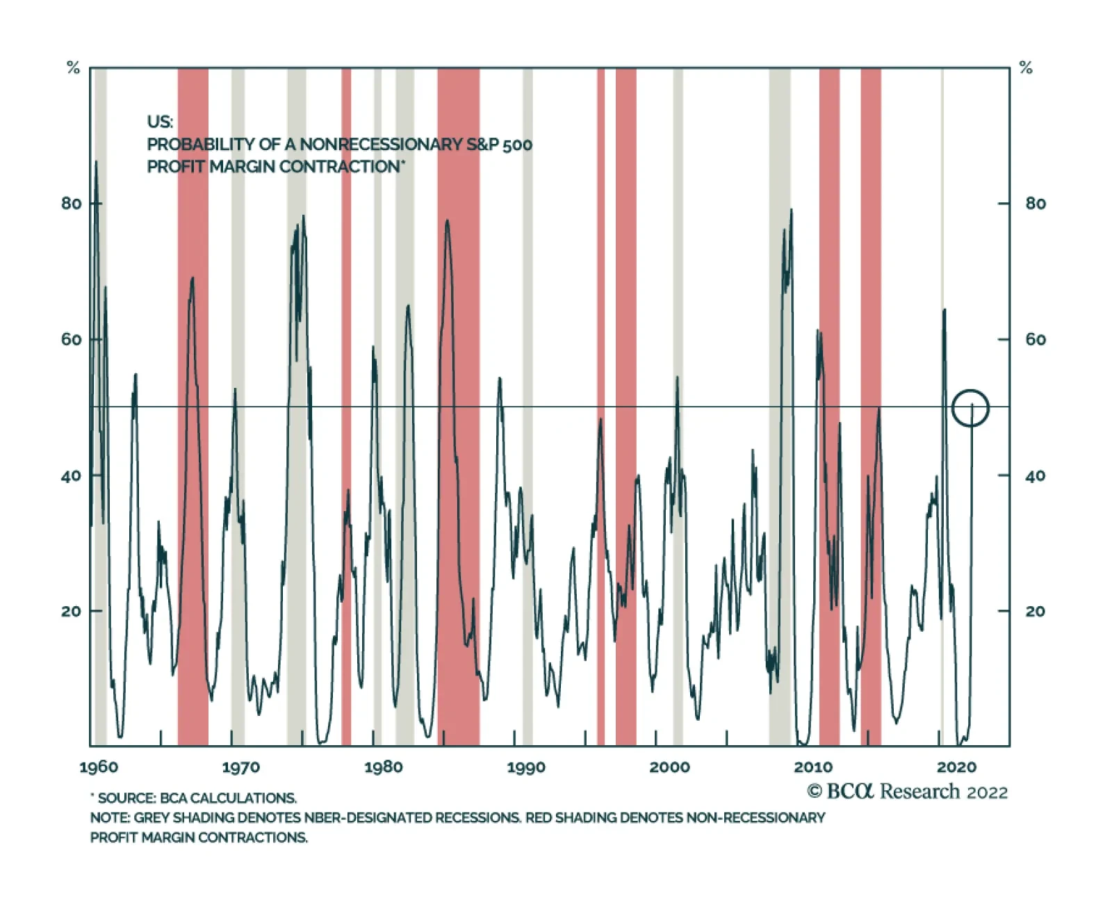
Earnings contractions and recessions typically go hand in hand. Nevertheless, there have been five instances since the 1960s in which there have been non-recessionary year-on-year negative EPS growth. In four of these occurrences, revenue growth remained…
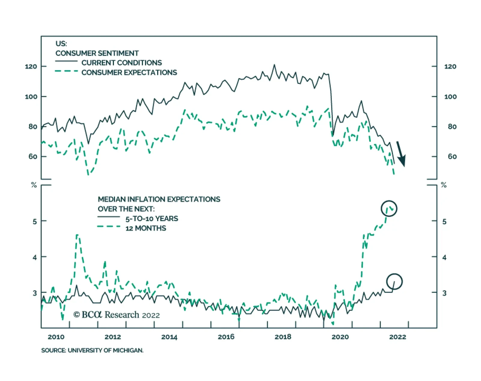
The preliminary release of the University of Michigan’s June Consumer survey sent a negative signal about US household sentiment. The headline index dropped 8.2 points to a record low of 50.2. Notably, both the Current Conditions and Expectations sub-indices…
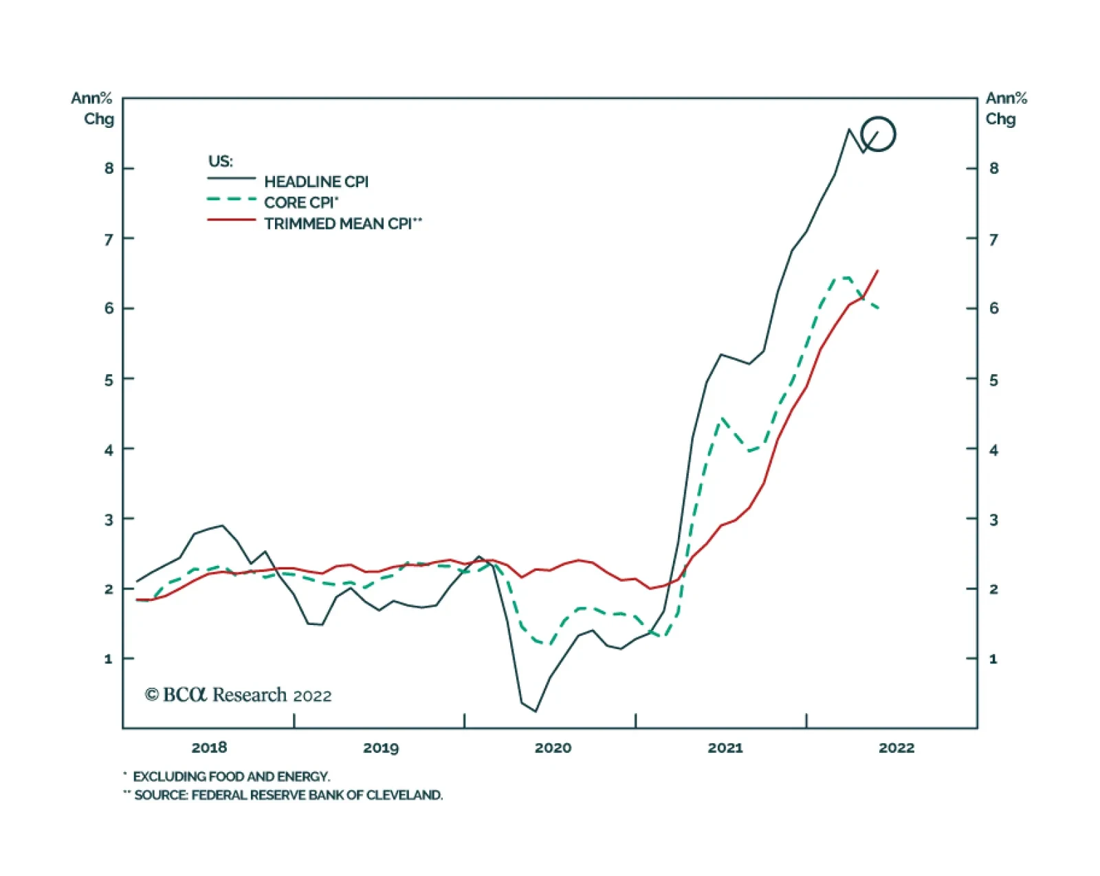
After easing in April, US headline CPI inflation surged at a faster-than-expected pace of 8.6% y/y (1.0% m/m) in May. Accelerating energy (34.6% y/y), food (10.1% y/y) and used vehicles (16.1% y/y) prices led this increase. Although core CPI was unchanged at…
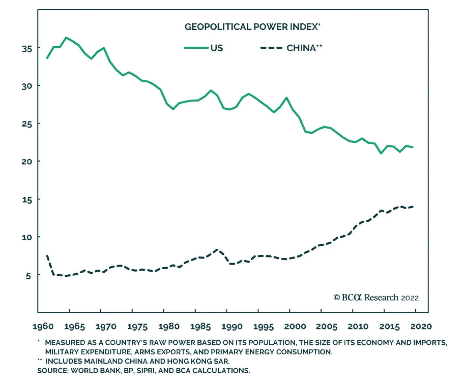
According to BCA Research’s Geopolitical Strategy service, there is little basis for a substantial US-China re-engagement that improves the global macroeconomic environment over the coming years. The Biden administration is focused on fighting inflation…
Executive Summary The Efficient Market Hypothesis (EMH) is flawed. This Holy Grail of financial economics assumes that investors are a homogenous bunch with identical investment horizons, when the reality is that investors have a wide spectrum of time horizons. The alternative but less well-known Fractal Market Hypothesis (FMH) recognizes that investors with different time horizons interpret the same facts and information differently. The key conclusion of the FMH is that when the different investment horizons are all active in the market, the price reflects all available information, meaning that the market is efficient, liquid, and stable. But when the different investment horizons start to converge and coalesce, the market becomes inefficient, illiquid, and vulnerable to a trend reversal. Using the FMH over the past six months, 5 structured recommendations were closed in profit: Short ILS/GBP, Short Coffee versus Cocoa, Short World Basic Resources versus Market, Long EUR/CHF, and Short Semiconductors versus Tech. Against this, 3 structured recommendations were closed in loss: Short Nickel versus Silver, Long Polish Bonds versus US Bonds, and Short World Semiconductors versus Biotech. Within the 10 open trades, 3 are in healthy profit, 4 are flat, and 3 are in loss. The Efficient Market Hypothesis Does Not Describe The Truth; The Fractal Market Hypothesis Does
Fractal Trading Update - June 2022
Fractal Trading Update - June 2022
Bottom Line: As few investors are aware of the Fractal Market Hypothesis, it gives a competitive advantage to those that use it to identify potential trend reversals. Feature For nations and societies, disagreement and conflict are unhealthy. But for financial markets, the opposite is true – it is the lack of disagreement and conflict that is unhealthy. This is because the market needs disagreement to generate liquidity, the ability to trade quickly and in large volume without destabilizing the market price. If I want to buy a share, then somebody must sell me that share. It follows that I and the seller must disagree about the attractiveness of the share at the current price. Likewise, if I and like-minded individuals want to buy ten million shares, it follows that lots of market participants must disagree with us. If lots of market participants do not disagree with us, there will be insufficient liquidity to complete the transaction without a price change. And if too many people are engaged in groupthink, the price change could be extreme. Markets Become Inefficient When There Is Not Enough Disagreement How can there be major disagreement about the attractiveness of an investment when we all have access to the same facts and information? According to the Efficient Market Hypothesis (EMH) there cannot be, because asset prices always reflect all available information.1 Unfortunately, the Efficient Market Hypothesis is flawed. This Holy Grail of financial economics assumes that investors are a homogenous bunch with identical investment horizons, when the reality is that investors have a wide spectrum of time horizons – ranging from the milliseconds of momentum-driven high-frequency trading (HFT) to the decades of a value-driven pension fund. The market is efficient only when a wide spectrum of investment horizons is setting the price, signified by the market having a rich fractal structure. The alternative but less well-known Fractal Market Hypothesis (FMH) recognizes the reality of different time horizons. Crucially, the FMH acknowledges that investors with different time horizons interpret the same facts and information differently. In other words, they disagree (Box I-1). Box 1-1The Efficient Market Hypothesis Does Not Describe The Truth; The Fractal Market Hypothesis Does
Fractal Trading Update - June 2022
Fractal Trading Update - June 2022
For example, the momentum-based high frequency trader might interpret a sharp one-day sell-off as a sell signal, but the value-based pension fund might interpret the same information as a buying opportunity. This disagreement will create liquidity without requiring a big price adjustment. Thereby it also fosters market stability. The key conclusion of the Fractal Market Hypothesis is that when the different investment horizons are all active in the market, the price does reflect all available information, meaning that the market is efficient, liquid, and stable. But when the different investment horizons start to converge and coalesce, the market becomes inefficient, illiquid, and vulnerable to a trend reversal. Buy and sell orders will no longer match without a price change, possibly extreme. Can we measure the loss of efficiency in a specific investment, and thereby anticipate a potential trend reversal? The answer is yes, by monitoring its fractal dimension, using the expression in the Appendix. Although many readers may find the concept of a fractal dimension intimidating, the idea is simple and intuitive. It just measures the complexity – or information content – in an object or structure. Thereby, when an investment’s fractal dimension reaches its lower limit, it warns that the information content of longer-term investors is missing from the price. When the longer-term investors do ultimately re-enter the price setting process, the question is: will they endorse the recent trend because of some major change in the fundamentals – such as the start of the Russia/Ukraine war? Or will they reject it, as an unjustified deviation from a fundamental anchor. In most cases, it is the latter: a rejection and a trend reversal. As few investors are aware of the Fractal Market Hypothesis, it gives a competitive advantage to those that use it to identify potential trend reversals. Fractal Trading Update Using the Fractal Market Hypothesis over the past six months, 5 structured recommendations were closed in profit: Short ILS/GBP, Short Coffee versus Cocoa, Short World Basic Resources versus Market, Long EUR/CHF, and Short Semiconductors versus Tech. A fragile fractal structure warns of a crowded trade. One structured recommendation was closed flat: Short Personal Goods versus Consumer Services. Against this, 3 structured recommendations were closed in loss: Short Nickel versus Silver, Long Polish Bonds versus US Bonds, and Short World Semiconductors versus Biotech. Within the 10 open trades, 3 are in healthy profit, 4 are flat, and 3 are in loss. As for the unstructured recommendations, for which we do not define profit targets or expiry dates, we are pleased to report that out of 31 recommendations, only 2 failed to experience a countertrend reversal. Wins 1) November 18th: Short ILS/GBP Achieved its profit target of 4.2 percent. 2) November 25th: Short Coffee versus Cocoa (Chart I-1) Achieved almost half of its 30 percent profit target at expiry. Chart I-1Fractal Analysis Correctly Predicted A Reversal In Coffee Versus Cocoa
Fractal Analysis Correctly Predicted A Reversal In Coffee Versus Cocoa
Fractal Analysis Correctly Predicted A Reversal In Coffee Versus Cocoa
3) January 20th: Short World Semiconductors versus Tech (Chart I-2) Achieved its profit target of 6 percent. Chart I-2Fractal Analysis Correctly Predicted A Reversal In World Semiconductors Versus Technology
Fractal Analysis Correctly Predicted A Reversal In World Semiconductors Versus Technology
Fractal Analysis Correctly Predicted A Reversal In World Semiconductors Versus Technology
4) March 10th: Long EUR/CHF Achieved its profit target of 3.6 percent. 5) April 14th: Short World Basic Resources versus Market (Chart I-3) Achieved its profit target of 11.5 percent. Chart I-3Fractal Analysis Correctly Predicted A Reversal In World Basic Resources Versus Market
Fractal Analysis Correctly Predicted A Reversal In World Basic Resources Versus Market
Fractal Analysis Correctly Predicted A Reversal In World Basic Resources Versus Market
In addition, Short World Personal Goods versus Consumer Services which was opened on December 9th reached a high-water mark of 10.5 percent but expired flat. Losses 1) December 2nd: Short World Semiconductors versus Biotech Hit its stop loss of 9.5 percent. 2) January 13th: Long Poland versus US: 10-Year Government Bonds Reached a high-water mark of 3.7 percent, but then reversed to hit its stop loss of 8 percent. In the current geopolitical crisis, Poland has been a casualty due to its lengthy border with Ukraine. 3) February 3rd: Short Nickel versus Silver (Chart I-4) Hit its stop loss at 20 percent following an explosive short-squeeze rally in the Nickel price. Chart I-4Nickel's Short-Squeeze Rally Forced A Price Trend Prolongation
Nickel's Short-Squeeze Rally Forced A Price Trend Prolongation
Nickel's Short-Squeeze Rally Forced A Price Trend Prolongation
Open Trades 1) January 27th: Long MSCI Korea versus All-Country World (Chart I-5) Open, in profit, having reached a high-water mark of 6 percent (versus an 8 percent target). Chart I-5Fractal Analysis Correctly Predicted A Rebound In Korea Versus All-Country World
Fractal Analysis Correctly Predicted A Rebound In Korea Versus All-Country World
Fractal Analysis Correctly Predicted A Rebound In Korea Versus All-Country World
2) February 24th: Long US Biotech versus US Tech Open, in profit, having reached a high-water mark of 10.5 (versus a 17.5 percent target). 3) March 3rd: Short World Banks versus Consumer Services Reached a high-water mark of 7.3 percent (versus a 12 percent target), but then reversed and is in loss. 4) March 24th: Long 5-Year T-bond Open, in modest loss. 5) April 7th: Short World Non-Life Insurance versus Homebuilders (Chart I-6) Open, in profit having reached a high-water mark of 12.4 percent (versus a 14 percent target). Chart I-6Fractal Analysis Correctly Predicted A Reversal In World Non-Life Insurance Versus Homebuilders
Fractal Analysis Correctly Predicted A Reversal In World Non-Life Insurance Versus Homebuilders
Fractal Analysis Correctly Predicted A Reversal In World Non-Life Insurance Versus Homebuilders
6) April 7th: Long JPY/CHF Reached a high-water mark of 3.4 percent versus a 4 percent target, but then reversed into modest loss. This suggests that the trade needed a narrower profit target. 7) April 28th: Short High Dividend ETF versus US 10-Year T-bond Open, in modest loss, having reached a high-water mark of 2.9 percent (versus a 6 percent target). 8) May 19th: Short FTSE 100 versus STOXX Europe 600 Open, and flat. 9) June 2nd: Long JPY/USD (Chart I-7) Open, and flat. Chart I-7The Sell-Off In JPY/USD Has Reached A Potential Turning Point
The Sell-Off In JPY/USD Has Reached A Potential Turning Point
The Sell-Off In JPY/USD Has Reached A Potential Turning Point
10) June 2nd: Short Australia Basic Resources versus World Market (Chart I-8) Open, and flat. Chart I-8The Australian Basic Resources Sector Is Vulnerable To Reversal
The Australian Basic Resources Sector Is Vulnerable To Reversal
The Australian Basic Resources Sector Is Vulnerable To Reversal
Our full watchlist of 29 investments that are at, or approaching turning points, is available on our website: cpt.bcaresearch.com Appendix: Calculating The Fractal Dimension Of A Financial Market
Fractal Trading Update - June 2022
Fractal Trading Update - June 2022
Chart 1AUD/KRW Is Vulnerable To Reversal
AUD/KRW Is Vulnerable To Reversal
AUD/KRW Is Vulnerable To Reversal
Chart 2Canada Versus Japan Is Reversing
Canada Versus Japan Is Reversing
Canada Versus Japan Is Reversing
Chart 3Canada's TSX-60's Outperformance Might Be Over
Canada's TSX-60's Outperformance Might Be Over
Canada's TSX-60's Outperformance Might Be Over
Chart 4US Healthcare Providers Vs. Software At Risk of Reversal
US Healthcare Providers Vs. Software At Risk of Reversal
US Healthcare Providers Vs. Software At Risk of Reversal
Chart 5BRL/NZD At A Resistance Point
BRL/NZD At A Resistance Point
BRL/NZD At A Resistance Point
Chart 6Homebuilders Versus Healthcare Services Has Turned
Homebuilders Versus Healthcare Services Has Turned
Homebuilders Versus Healthcare Services Has Turned
Chart 7CNY/USD Has Reversed
CNY/USD Has Reversed
CNY/USD Has Reversed
Chart 8CAD/SEK Is Vulnerable To Reversal
CAD/SEK Reversal Has Started
CAD/SEK Reversal Has Started
Chart 9Financials Versus Industrials To Reverse
Financials Versus Industrials To Reverse
Financials Versus Industrials To Reverse
Chart 10The Outperformance Of Resources Versus Biotech Has Started To Reverse
The Outperformance Of Resources Versus Biotech Has Started To Reverse
The Outperformance Of Resources Versus Biotech Has Started To Reverse
Chart 11The Outperformance Of Resources Versus Healthcare Is Vulnerable To Reversal
The Outperformance Of Resources Versus Healthcare Is Vulnerable To Reversal
The Outperformance Of Resources Versus Healthcare Is Vulnerable To Reversal
Chart 12FTSE100 Outperformance Vs. Euro Stoxx 50 Is Reversing
FTSE100 Outperformance Vs. Euro Stoxx 50 Is Reversing
FTSE100 Outperformance Vs. Euro Stoxx 50 Is Reversing
Chart 13Netherlands Underperformance Vs. Switzerland Is Ending
Netherlands Underperformance Vs. Switzerland Has Been Exhausted
Netherlands Underperformance Vs. Switzerland Has Been Exhausted
Chart 14The Sell-Off In The 30-Year T-Bond Is Approaching Fractal Fragility
The Sell-Off In The 30-Year T-Bond Is Approaching Fractal Fragility
The Sell-Off In The 30-Year T-Bond Is Approaching Fractal Fragility
Chart 15The Sell-Off In The NASDAQ Is Approaching Fractal Fragility
The Sell-Off In The NASDAQ Is Approaching Fractal Fragility
The Sell-Off In The NASDAQ Is Approaching Fractal Fragility
Chart 16Food And Beverage Outperformance Exhausted
Food And Beverage Outperformance Has Been Exhausted
Food And Beverage Outperformance Has Been Exhausted
Chart 17The Strong Trend In The 18-Month-Out US Interest Rate Future Is Fragile
The Strong Trend In The 18-Month-Out US Interest Rate Future Is Fragile
The Strong Trend In The 18-Month-Out US Interest Rate Future Is Fragile
Chart 18The Strong Trend In The 3 Year T-Bond Is Fragile
The Strong Trend In The 3 Year T-Bond Is Fragile
The Strong Trend In The 3 Year T-Bond Is Fragile
Chart 19A Potential Switching Point From Tobacco Into Cannabis
A Potential Switching Point From Tobacco Into Cannabis
A Potential Switching Point From Tobacco Into Cannabis
Chart 20Biotech Is A Major Buy
Biotech Is A Major Buy
Biotech Is A Major Buy
Chart 21Norway's Outperformance Could End
Norway's Outperformance Could End
Norway's Outperformance Could End
Chart 22Cotton Versus Platinum Is Reversing
Cotton Versus Platinum Is Reversing
Cotton Versus Platinum Is Reversing
Chart 23Switzerland's Outperformance Vs. Germany Has Ended
Switzerland's Outperformance Vs. Germany Has Started To End
Switzerland's Outperformance Vs. Germany Has Started To End
Chart 24The Rally In USD/EUR Has Ended
The Rally In USD/EUR Has Ended
The Rally In USD/EUR Has Ended
Chart 25The Outperformance Of MSCI Hong Kong Versus China Is Vulnerable To Reversal
The Outperformance Of MSCI Hong Kong Versus China Is Vulnerable To Reversal
The Outperformance Of MSCI Hong Kong Versus China Is Vulnerable To Reversal
Chart 26A Potential New Entry Point Into Petcare
A Potential New Entry Point Into Petcare
A Potential New Entry Point Into Petcare
Chart 27Czech Outperformance Near Exhaustion
Czech Outperformance Near Exhaustion
Czech Outperformance Near Exhaustion
Chart 28US REITS Are Oversold Versus Utilities
US REITS Are Oversold Versus Utilities
US REITS Are Oversold Versus Utilities
Chart 29GBP/USD At A Turning Point
GBP/USD At A Turning Point
GBP/USD At A Turning Point
Dhaval Joshi Chief Strategist dhaval@bcaresearch.com Hadi Elzein Research Associate hadi.elzein@bcaresearch.com Footnotes 1 Strictly speaking, the EMH assumes there is some disagreement, but that this disagreement is random and follows a standard Gaussian (bell-curve) distribution. Therefore, the EMH assumes that a share price just follows a random walk until new (unpredictable) fundamental information arrives. Fractal Trades
Fractal Trading Update - June 2022
Fractal Trading Update - June 2022
6-Month Recommendations Structural Recommendations Closed Fractal Trades Indicators To Watch - Bond Yields Chart II-1Indicators To Watch - Bond Yields - Euro Area
Indicators To Watch - Bond Yields - Euro Area
Indicators To Watch - Bond Yields - Euro Area
Chart II-2Indicators To Watch - Bond Yields - Europe Ex Euro Area
Indicators To Watch - Bond Yields - Europe Ex Euro Area
Indicators To Watch - Bond Yields - Europe Ex Euro Area
Chart II-3Indicators To Watch - Bond Yields - Asia
Indicators To Watch - Bond Yields - Asia
Indicators To Watch - Bond Yields - Asia
Chart II-4Indicators To Watch - Bond Yields - Other Developed
Indicators To Watch - Bond Yields - Other Developed
Indicators To Watch - Bond Yields - Other Developed
Indicators To Watch - Interest Rate Expectations Chart II-5Indicators To Watch - Interest Rate Expectations
Indicators To Watch - Interest Rate Expectations
Indicators To Watch - Interest Rate Expectations
Chart II-6Indicators To Watch - Interest Rate Expectations
Indicators To Watch - Interest Rate Expectations
Indicators To Watch - Interest Rate Expectations
Chart II-7Indicators To Watch - Interest Rate Expectations
Indicators To Watch - Interest Rate Expectations
Indicators To Watch - Interest Rate Expectations
Chart II-8Indicators To Watch - Interest Rate Expectations
Indicators To Watch - Interest Rate Expectations
Indicators To Watch - Interest Rate Expectations
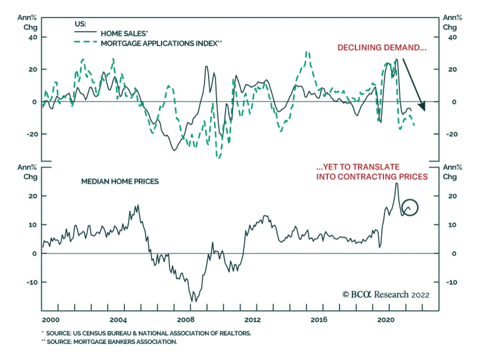
Mortgage applications contracted 6.5% in the past week, reflecting weakness in both home purchase applications and refinancing. The former declined 18% year-on-year and underscore slower demand for housing amid surging mortgage rates. These dynamics are…
Executive Summary Competing Forces On Global Bond Yields
Competing Forces On Global Bond Yields
Competing Forces On Global Bond Yields
Bond yields in the developed world have ticked higher recently, due to a renewed increase in oil prices and the spillover effect from more hawkish policy expectations out of Europe. The competing forces of slowing global growth momentum and geopolitical uncertainty on one side, and high inflation with tightening monetary policies on the other, will keep global government bond yields rangebound over the next several months. UK investment grade corporate bonds now offer an intriguing combination of higher yields, attractive spread valuations and strong financial health. By maturity, shorter-maturity corporates offer the best value. At the industry level, spreads look most attractive for Financials. A hawkish Bank of England, both through rate hikes and upcoming outright sales of corporate debt the central bank has purchased via quantitative easing, remains a major headwind to UK corporate bond returns. Sectors most at risk to central bank sales are Water, Consumer Cyclicals and Consumer Non-Cyclicals. Bottom Line: Stay neutral on overall duration exposure in global bond portfolios. Maintain a neutral stance on UK corporates, favoring shorter-maturity bonds and Financial names, but look to upgrade once UK inflation peaks and the Bank of England pauses on tightening. Trendless, Friendless Bond Markets Chart 1Recovering From The Ukraine War Shock...
Recovering From The Ukraine War Shock...
Recovering From The Ukraine War Shock...
Although it may not feel like it given the ferocity of some daily price swings, many important financial markets have not moved all that much, cumulatively, since the first major shock of 2022 – the start of the Russian invasion of Ukraine on February 24. For example, the S&P 500 is only down around -2% from the pre-invasion level, while the VIX index of equity option volatility is at 24, seven points below the closing level on February 23 (Chart 1). The Bloomberg US investment grade corporate bond index spread is only 12bps above its pre-invasion level, down 20bps from the peak seen in mid-May. More recently, even US bond yields have shown signs of stabilization. The 10-year US Treasury yield has traded in a 2.70-3.15% range since the start of April, while the MOVE index of US Treasury option volatility has fallen by one-quarter since its most recent peak in early May. Not all markets, however, have seen this kind of relative stability. Global oil prices are trading close to post-invasion highs, as are government bond yields in Germany and the UK. High-yield credit spreads in the US and Europe are both still around 50bps above where they were pre-invasion. The DXY US dollar index is 6% above the pre-invasion level, led by the USD/JPY currency pair that has appreciated to levels last seen in 2002. Given the mix of slowing global growth momentum and ongoing geopolitical uncertainty, but with persistent high inflation and tightening global monetary policy, it is unsurprising that financial markets are having a difficult time formulating a consistent message. This is especially true for global government bond yields. Chart 2Competing Forces On Global Bond Yields
Competing Forces On Global Bond Yields
Competing Forces On Global Bond Yields
Even as market-based inflation expectations have eased a bit in recent weeks, bond yields across the developed world have been unable to decline because markets continue to discount more rate hikes (Chart 2). Yet with such a significant amount of monetary tightening now priced in across all countries, global bond yields are more likely to stay rangebound over the next 3-6 months than begin a new trend. Chart 3DM Bond Yields Discounting Tight Monetary Policy
DM Bond Yields Discounting Tight Monetary Policy
DM Bond Yields Discounting Tight Monetary Policy
10-year government bond yields and 2-year-ahead interest rate expectations in overnight index swap (OIS) curves are trading in lockstep in the US, Europe, UK, Canada and Australia (Chart 3). This correlation indicates that longer-term bond yields have become a pure play on future policy rate expectations, rather than a reflection of rising inflation expectations as was the case in 2021. However, both yields and rate expectations are now trading close to, or even well above, plausible estimates of neutral nominal policy rates in all regions - including estimates provided by central bankers themselves. For example, in Australia, where the RBA just delivered a 50bp rate hike this week, markets are pricing in a peak Cash Rate between 3.5-4%, even with RBA Governor Philip Lowe stating that the neutral rate is likely in the 2-3% range – a view that we agree with. The situation is even more extreme in the euro area, with the euro area OIS curve now pricing in a peak policy rate between 1.5-2%, with most of that increase coming over the next 12 months. While we expect the ECB to fully exit the negative (deposit) rate era by September, rate hikes beyond that are far less likely given slowing euro area growth momentum and still-moderate euro area inflation beyond the spillover effects from energy costs. Only in the US are markets potentially underestimating the potential peak in the fed funds rate for this tightening cycle. Estimates of the longer-run (neutral) funds rate from the latest set of FOMC projections back in March ranged from 2.0-3.0%. Thus, the current level of 10-year bond yields, and 2-year-ahead rates discounted in the US OIS curve, are only at the top end of that range. It is possible that the Fed will have to raise rates to restrictive levels (i.e. above 3%) given the size of the current US inflation overshoot. More importantly, the US neutral rate is likely higher than the Fed thinks it is, possibly as high as 4% according to BCA Research’s Chief Global Strategist, Peter Berezin. We continue to see the US as the one major government bond market where there is a risk that markets are underestimating the neutral policy rate. For that reason, we remain underweight US Treasuries in the BCA Research Global Fixed Income Strategy model bond portfolio. Don’t Dismiss The QT Effect One other factor that has likely kept global bond yields elevated, even as global growth has softened, has been the shift away from central bank asset purchases towards quantitative tightening (QT). As policymakers have moved to slow, or even stop, the buying of government bonds, the term premium component of longer-term bond yields has risen. The moves have been quite large. Using our own in-house estimates, the term premium on 10-year government bond yields have jumped by about 100bps on average in the US, UK, Canada, Australia and Europe since the lows seen during the 2020 COVID global recession (Chart 4). The jump in term premiums is occurring at the same time as markets have moved to price in more rate hikes and a higher path for real interest rates (bottom panel). Chart 4Yields Repricing As QE Moves To QT
Yields Repricing As QE Moves To QT
Yields Repricing As QE Moves To QT
Chart 5Stay Neutral Global Duration Exposure
Stay Neutral Global Duration Exposure
Stay Neutral Global Duration Exposure
That combined effect of the upward repricing of term premiums – especially as more price-sensitive private investors replace the demand for bonds from price-insensitive central banks - but with less upward movement in already elevated interest rate expectations will keep longer-term bond yields in trading ranges during the “Global QT Phase” over at least the next six months and likely longer. That message is reinforced by our Global Duration Indicator, which is heralding a peak in global bond yield momentum over the latter half of 2022 (Chart 5). Bottom Line: Stay neutral on overall duration exposure in global bond portfolios, with yields in the major developed markets likely to stay rangebound over the next few months. Assessing The Value In UK Investment Grade Corporates Chart 6A Big Jump In UK Investment Grade Corporate Yields
A Big Jump In UK Investment Grade Corporate Yields
A Big Jump In UK Investment Grade Corporate Yields
Global credit markets have had a rough time in 2022, and UK corporate debt is no exception. The Bloomberg UK Corporate index of investment grade corporate debt has delivered a year-to-date total return of -11%, as the index yield-to-maturity rose 174bps to 4% - the highest level since 2014 (Chart 6). Relative to UK Gilts, the results have also been grim as corporate credit spreads have widened, with the Bloomberg UK corporate index realizing an excess return of -3% since the start of the year. We have maintained a neutral stance on UK corporate bond exposure in our global model bond portfolio during the selloff. This was the result of a relative value opinion, as we have concentrated our more defensive view on global investment grade corporate debt with an underweight to US corporates. However, after the significant repricing of UK investment grade credit, it is now a good time to reassess our opinion on the asset class. Spread Valuation From a pure spread valuation perspective, UK investment grade now looks more attractive. Our preferred valuation metric – 12-month breakeven spreads - shows that the UK investment grade corporate index spread, on a duration-adjusted basis, is now in the 75th percentile of its history over the past 25 years (Chart 7). Chart 7UK Corporate Spreads Now Offer Some Value
UK Corporate Spreads Now Offer Some Value
UK Corporate Spreads Now Offer Some Value
We find 12-month breakevens to a useful spread valuation measure, as they show how much spreads would need to widen to make the expected one-year-ahead return on a credit product equal to that of a duration-matched position in government bonds. In other words, breakevens measure the spread “cushion” against excess return losses from spread widening. What makes the current attractive reading on UK investment grade spread valuation so interesting is that the absolute level of spreads is still relatively low. The Bloomberg UK investment grade corporate index spread is currently 170bps, but during previous episodes where the 12-month breakeven as near the top quartile ranking – as is currently the case – the index spread ranged from 200-350bps. The reason for that relates to the index duration which, at 7.3 years, is down 1.5 years from the 2020 peak and at the lowest level since 2011. Some of that lower duration is related to the convexity effect from higher corporate bond yields. But there has also been a reduction in the average maturity of the UK investment grade corporate bond universe, with the index average maturity now at 10.4 years, down a full year lower over the past 12 months and the lowest average maturity since 1999. UK companies appear to have shortened up the maturity profile of their bond issuance, which helped reduce the riskiness (duration) of corporate bond returns to rising yields. Thus, the message from the 12-month breakevens is correct – UK investment grade corporate bond yields are attractive from a historical perspective, on a duration-adjusted basis. Chart 8UK Credit Curves Are Relatively Flat
UK Credit Curves Are Relatively Flat
UK Credit Curves Are Relatively Flat
When looking within the UK investment grade universe, the messages on valuation are a bit more mixed. The UK credit curve is not particularly steep, when looking at the spread differences by credit rating within the benchmark index universe (Chart 8). There is a similar message when looking at 12-month breakevens broken down by credit rating, where there is little difference between the percentile rankings (Chart 9). However, the 12-month breakeven percentile rankings broken down by maturity buckets show that shorter-maturity bonds have noticeably higher percentile rankings than longer-maturity UK corporates (top panel). From a cross-country perspective, UK corporate breakeven percentile rankings are much higher than equivalent rankings for US corporates, but are lower than those of the euro area. Chart 9Shorter-Maturity UK Spreads Are More Attractive
Mixed Messages & Range-Bound Bond Yields
Mixed Messages & Range-Bound Bond Yields
Corporate Financial Health Our top-down UK Corporate Health Monitor (CHM) - which uses data on non-financial corporate sector revenues, expenses and balance sheets taken from GDP accounts – has shown a very strong improvement in UK corporate financial health over the past few years (Chart 10). The biggest improvements are in the categories related to debt service, with interest coverage at the highest level since 2002 and debt coverage is at the highest level since 1999. Chart 10UK Corporates Can Withstand Higher Borrowing Rates
UK Corporates Can Withstand Higher Borrowing Rates
UK Corporates Can Withstand Higher Borrowing Rates
Chart 11Stay Neutral UK Corporates Until The BoE Is Done
Stay Neutral UK Corporates Until The BoE Is Done
Stay Neutral UK Corporates Until The BoE Is Done
The message from our top-down UK CHM is similar to the conclusions from an October 2021 BoE report that analyzed the UK corporate sector from a financial stability perspective. In that report, the BoE used a bottom-up sample of 500 UK companies and concluded that corporate borrowing rates could rise as much as 400bps before the share of companies with a “distressed” interest coverage ratio below 2.5 would rise to the past historical peak. Within our top-down UK CHM, relatively wide corporate profit margins are also contributing to the strong reading on UK corporate health. Like the interest/debt coverage ratios, those margins provide some cushion to profits in the current environment of high inflation and elevated input costs for businesses. The all-in message from our UK CHM is that financial health is a fundamental tailwind for UK corporate bond performance. Monetary Policy Attractive spread valuations and strong financial health metrics would normally justify an overweight stance on any corporate bond market. However, the monetary policy cycle is also an important factor that drives corporate bond performance. Currently, with the BoE not only hiking rates but also moving to QT on asset purchases, monetary policy is a severe headwind to UK corporate bond returns. Related Report Global Fixed Income StrategyIt’s Time To Flip The Script - Upgrade UK Gilts The annual growth rate of the BoE’s balance sheet has proven to be a reliable leading indicator of UK corporate bond annual excess returns. With the growth in the balance sheet set to turn negative in the latter half of 2022 (Chart 11), it will prove difficult for UK credit spreads to narrow in a way that will boost excess returns. The BoE’s aggressive (by its standards) rate hiking cycle, in response to UK inflation that is nearing 10% alongside a very tight labor market, remains a threat to UK economic growth that is already losing some momentum. As we discussed in a recent Special Report, the UK neutral interest rate is likely no more than 1.5-2%. If the BoE were to follow current market pricing and push Bank Rate toward 2.5%, this would be a restrictive policy stance that would likely result in a sharp growth slowdown if not a full-blown recession. Importantly, our UK Central Bank Monitor is showing signs of peaking (bottom panel), due to signs of slower economic growth and tightening financial conditions. A peak in UK inflation would help reduce the Monitor even further, and would likely correspond to a pause on BoE rate hikes – a necessary condition before we would upgrade our recommended stance on UK investment grade corporates to overweight. Some Final Thoughts On Industry Sector Valuation Our UK investment grade corporate sector valuation model is a cross-sectional analysis of individual industry/sector corporate credit spreads, after controlling for differences in duration, convexity and credit rating. The model is currently signaling that there are few compelling valuation stories with positive “risk-adjusted” spreads (Chart 12). Only Financials look cheap, while Consumer Cyclicals, Consumer Non-Cyclicals and Capital Goods are all trading at expensive risk-adjusted spreads. Chart 12Not Many Compelling Values Within UK Corporates By Industry
Mixed Messages & Range-Bound Bond Yields
Mixed Messages & Range-Bound Bond Yields
An additional risk to UK corporate bond performance relates to the BoE’s decision to unwind its corporate bond portfolio. The BoE has announced that there will be outright sales from the corporate holdings accumulated over the past couple of years, with a goal of having the stock of debt fully unwound by the end of 2023. This is important for much of the UK investment grade corporate bond universe, where the BoE holds between 8-10%, on average, of outstanding debt (Chart 13).1 Chart 13The BoE Has Become An Important Corporate Bondholder
Mixed Messages & Range-Bound Bond Yields
Mixed Messages & Range-Bound Bond Yields
When we compare our risk-adjusted spreads versus the BoE ownership share by sector, we conclude that Consumer Cyclicals, Consumer Non-Cyclicals and Other Utilities offer the most unattractive combination of expensive spreads and high BoE concentration (Chart 14). We recommended underweight allocations to those sectors within an overall neutral allocation to UK corporates. Chart 14BoE Asset Sales Are A Major Risk For Some UK Corporate Sectors
Mixed Messages & Range-Bound Bond Yields
Mixed Messages & Range-Bound Bond Yields
Bottom Line: Maintain a neutral stance on UK corporates, given the mix of attractive valuations but tighter monetary policy. Favoring shorter-maturity bonds and Financial names, but look to upgrade once UK inflation peaks and the Bank of England pauses on tightening. Robert Robis, CFA Chief Fixed Income Strategist rrobis@bcaresearch.com Footnotes 1 In Chart 13, we use the market capitalization of each sector from the Bloomberg UK corporate bond index in the numerator of all ratios shown, as a proxy for outstanding debt. GFIS Model Bond Portfolio Recommended Positioning Active Duration Contribution: GFIS Recommended Portfolio Vs. Custom Performance Benchmark
Mixed Messages & Range-Bound Bond Yields
Mixed Messages & Range-Bound Bond Yields
The GFIS Recommended Portfolio Vs. The Custom Benchmark Index Global Fixed Income - Strategic Recommendations* Cyclical Recommendations (6-18 Months)
Mixed Messages & Range-Bound Bond Yields
Mixed Messages & Range-Bound Bond Yields
On S&P 500 EPS Downgrades
On…
Highlights Chart 1Wage Growth Is Cooling
Wage Growth Is Cooling
Wage Growth Is Cooling
In a speech last week, Fed Governor Christopher Waller presented the theoretical underpinnings for how the Fed plans to achieve a soft landing for the US economy.1 The Fed’s hope is that tighter monetary policy will slow demand enough to reduce the number of job openings – of which there are currently almost two for every unemployed person – without leading to a significant increase in layoffs and the unemployment rate. A reduction in the ratio of job openings to unemployed will lead to softer wage growth and lower inflation. The May employment report – released last Friday – provides some evidence that the Fed’s plan may be working. In May, an increase in labor force participation led to strong employment gains and kept the unemployment rate flat. We also saw continued evidence of a deceleration in average hourly earnings (Chart 1). Fifty basis point rate hikes are all but assured at the June and July FOMC meetings, but softer wage growth and falling inflation make it more likely that the Fed will downshift to a pace of 25 bps per meeting starting in September. Feature Table 1 Recommended Portfolio Specification Table 2Fixed Income Sector Performance
The Case For A Soft Landing
The Case For A Soft Landing
Investment Grade: Underweight Chart 2Investment Grade Market Overview
Investment Grade Market Overview
Investment Grade Market Overview
Investment grade corporate bonds outperformed the duration-equivalent Treasury index by 79 basis points in May, bringing year-to-date excess returns up to -215 bps. The average index option-adjusted spread tightened 5 bps on the month and it currently sits at 131 bps. Similarly, our quality-adjusted 12-month breakeven spread downshifted to its 45th percentile since 1995 (Chart 2). A recent report made the case for why investors should underweight investment grade corporate bonds on a 6-12 month horizon.2 The main rationale for this recommendation is that the slope of the Treasury curve is very flat, signaling that we are in the mid-to-late stages of the credit cycle. Corporate bond performance tends to be weak during such periods unless spreads start from very high levels. Despite our underweight 6-12 month investment stance, we see a high likelihood that spreads will narrow during the next few months as inflation falls and the Fed tightens by no more than what is already priced in the curve. That said, the persistent removal of monetary accommodation and flatness of the yield curve will limit how much spreads can compress. Last week’s report dug deeper into the corporate bond space and concluded that investment grade-rated Energy bonds offer exceptional value on a 6-12 month horizon.3 That report also concluded that long maturity investment grade corporates are attractively priced relative to short maturity bonds. Table 3A Corporate Sector Relative Valuation And Recommended Allocation* Table 3BCorporate Sector Risk Vs. Reward*
The Case For A Soft Landing
The Case For A Soft Landing
High-Yield: Neutral Chart 3High-Yield Market Overview
High-Yield Market Overview
High-Yield Market Overview
High-Yield underperformed the duration-equivalent Treasury index by 35 basis points in May, dragging year-to-date excess returns down to -316 bps. More specifically, high-yield sold off dramatically early in the month – the junk index lagged Treasuries by 368 bps between May 1 and May 20 – but then staged a rally near the end of May, outperforming Treasuries by 333 bps between May 20 and May 31. The 12-month spread-implied default rate – the default rate that is priced into the junk index assuming a 40% recovery rate on defaulted debt and an excess spread of 100 bps – moved higher in May. It currently sits at 5.1% (Chart 3). Last week’s report reiterated our view that investors should favor high-yield over investment grade within an overall underweight allocation to spread product versus Treasuries.4 Our main rationale for this view is that there are historical precedents for high-yield bonds outperforming investment grade during periods when the yield curve is very flat but when corporate balance sheet health is strong. The 2006-07 period is a prime example. With that in mind, our outlook for corporate profit and debt growth is consistent with a default rate of 2.7% to 3.7% during the next 12 months, well below the 5.1% that is currently priced in the index. MBS: Underweight Chart 4MBS Market Overview
MBS Market Overview
MBS Market Overview
Mortgage-Backed Securities outperformed the duration-equivalent Treasury index by 70 basis points in May, bringing year-to-date excess returns up to -109 bps. We discussed the outlook for Agency MBS in a recent report.5 We noted that MBS’s poor performance in 2021 and early-2022 was driven by duration extension. Fewer homeowners refinanced their loans as mortgage rates rose, and the MBS index’s average duration increased (Chart 4). But now, the index’s duration extension is at its end. The average convexity of the MBS index is close to zero (panel 3), meaning that duration is now insensitive to changes in rates. This is because hardly any homeowners have the incentive to refinance at current mortgage rates (panel 4). The implication is that excess MBS returns will be stronger going forward. That said, we still don’t see enough value in MBS spreads to increase our recommended allocation. The average index spread for conventional 30-year Agency MBS remains close to its lowest level since 2000 (bottom panel). At the coupon level, we observe that low-coupon MBS have much higher duration than high-coupon MBS and that convexity is close to zero for the entire coupon stack. This makes the relative coupon trade a direct play on bond yields. Given that we see some potential for yields to fall somewhat during the next six months, we recommend favoring low-coupon MBS (1.5%-2.5%) within an overall underweight allocation to the sector.ext 12 months, well below the 5.1% that is currently priced in the index. Emerging Market Bonds (USD): Underweight Chart 5Emerging Markets Overview
Emerging Markets Overview
Emerging Markets Overview
Emerging Market (EM) bonds outperformed the duration-equivalent Treasury index by 29 basis points in May, bringing year-to-date excess returns up to -565 bps. EM sovereigns outperformed the Treasury benchmark by 125 bps on the month, bringing year-to-date excess returns up to -664 bps. The EM Corporate & Quasi-Sovereign Index underperformed by 28 bps, dragging year-to-date excess returns down to -501 bps. The EM Sovereign Index underperformed the duration-equivalent US corporate bond index by 27 bps in May. The yield differential between EM sovereigns and duration-matched US corporates remains negative (Chart 5). As such, we continue to recommend a maximum underweight allocation to EM sovereigns. The EM Corporate & Quasi-Sovereign Index underperformed duration-matched US corporates by 109 bps in May, but it continues to offer a significant yield advantage (panel 4). As such, we maintain our neutral allocation (3 out of 5) to the sector. Despite modest weakness in the trade-weighted US dollar in May, EM currencies continue to struggle (bottom panel). If the Fed tightens no more quickly than what is already priced in the curve for the next six months – as we expect – it could limit the upward pressure on the US dollar and benefit EM spreads in the near term. Municipal Bonds: Overweight Chart 6Municipal Market Overview
Municipal Market Overview
Municipal Market Overview
Municipal bonds outperformed the duration-equivalent Treasury index by 61 basis points in May, bringing year-to-date excess returns up to -78 bps (before adjusting for the tax advantage). We view the municipal bond sector as better placed than most to cope with the recent bout of spread product volatility. As we noted in a recent report, state & local government revenue growth has been strong and yet governments have also been slow to hire.6 The result is that net state & local government savings are incredibly high (Chart 6) and it will take some time to deplete those coffers even as economic growth slows and federal fiscal thrust turns to drag. On the valuation front, munis have cheapened up relative to both Treasuries and corporates during the past few months. The 10-year Aaa Muni/Treasury yield ratio is currently 83%, up significantly from its 2021 trough of 55%. The yield ratio between 12-17 year munis and duration-matched corporate bonds is also up significantly off its lows (panel 2). We reiterate our overweight allocation to municipal bonds within US fixed income portfolios, and we continue to have a strong preference for long-maturity munis. The yield ratio between 17-year+ General Obligation Municipal bonds and duration-matched corporates is 85%. The same measure for 17-year+ Revenue bonds stands at 92%, just below parity even without considering municipal debt’s tax advantage. Treasury Curve: Buy 5-Year Bullet Versus 2/10 Barbell Chart 7Treasury Yield Curve Overview
Treasury Yield Curve Overview
Treasury Yield Curve Overview
The Treasury curve bull-steepened in May. The 2-year/10-year Treasury slope steepened 13 bps on the month and the 5-year/30-year slope steepened 22 bps. The 2/10 and 5/30 slopes now stand at 30 bps and 16 bps, respectively. In a recent Special Report we noted the unusually large divergence between flat slopes at the long end of the curve and steep slopes at the front end.7 For example, the 5-year/10-year Treasury slope is currently 1 bp while the 3-month/5-year slope is 178 bps. The divergence is happening because the market has moved quicky to price-in a rapid near-term pace of rate hikes. However, so far, the Fed has only delivered 75 bps of tightening and this is holding down the very front-end of the curve. The oddly shaped curve presents us with an excellent trading opportunity. Specifically, we recommend buying the 5-year Treasury note versus a duration-matched barbell consisting of the 2-year and 10-year notes. This trade looks attractive on our model (Chart 7) and will profit if the rate hike cycle moves more slowly than what is currently priced but lasts longer. We also continue to recommend a position long the 20-year bullet versus a duration-matched 10/30 barbell as an attractive carry trade. TIPS: Underweight Chart 8TIPS Market Overview
TIPS Market Overview
TIPS Market Overview
TIPS underperformed the duration-equivalent nominal Treasury index by 144 basis points in May, dragging year-to-date excess returns down to +237 bps. The 10-year TIPS breakeven inflation rate fell 25 bps last month, but it remains above the Fed’s 2.3% - 2.5% comfort zone (Chart 8). Our TIPS Breakeven Valuation Indicator shows that TIPS remain “expensive”, but not as expensive as they were a month ago (panel 2). While TIPS have become less expensive during the past month, we think TIPS breakeven inflation rates will continue to fall during the next few months as inflation moves lower. This will be particularly true at the front-end of the curve where breakevens remain disconnected from the Fed’s target (panel 4) and where breakevens exhibit a stronger correlation with the incoming inflation data. To take advantage of falling inflation between now and the end of the year, investors should position for a steeper TIPS breakeven curve (bottom panel) and/or a flatter real (TIPS) curve. We also recommend that investors hold outright short positions in 2-year TIPS. ABS: Overweight Chart 9ABS Market Overview
ABS Market Overview
ABS Market Overview
Asset-Backed Securities underperformed the duration-equivalent Treasury index by 26 basis points in May, dragging year-to-date excess returns down to -63 bps. Aaa-rated ABS underperformed by 26 bps on the month, dragging year-to-date excess returns down to -59 bps. Non-Aaa ABS underperformed by 22 bps on the month, dragging year-to-date excess returns down to -88 bps. During the past two years, substantial federal government support for household incomes caused US households to build up an extremely large buffer of excess savings. Nowhere is this more evident than in the steep drop in the amount of outstanding credit card debt that was witnessed in 2020 and 2021 (Chart 9). In 2022, consumers have started to re-lever. The personal savings rate was just 4.4% in April, the lowest print since September 2008, and the amount of outstanding credit card debt has almost recovered its pre-COVID level. But while household balance sheets are starting to deteriorate, they remain exceptionally strong in level terms. In other words, it will be some time before we see enough deterioration to cause a meaningful uptick in consumer credit delinquencies. Investors should remain overweight consumer ABS and should take advantage of the high quality of household balance sheets by moving down the quality spectrum, favoring non-Aaa rated securities over Aaa-rated ones. Non-Agency CMBS: Overweight Chart 10CMBS Market Overview
CMBS Market Overview
CMBS Market Overview
Non-Agency Commercial Mortgage-Backed Securities underperformed the duration-equivalent Treasury index by 105 basis points in May, dragging year-to-date excess returns down to -189 bps. Aaa Non-Agency CMBS underperformed Treasuries by 84 bps on the month, dragging year-to-date excess returns down to -152 bps. Non-Aaa Non-Agency CMBS underperformed by 165 bps on the month, dragging year-to-date excess returns down to -290 bps. CMBS spreads remain wide compared to other similarly risky spread products. However, after several quarters of easing, commercial real estate lending standards shifted closer to ‘net tightening’ territory in Q1 (Chart 10). This trend will bear monitoring in the coming quarters. Agency CMBS: Overweight Agency CMBS outperformed the duration-equivalent Treasury index by 19 basis points in May, bringing year-to-date excess returns up to -23 bps. The average index option-adjusted spread tightened 2 bps on the month. It currently sits at 49 bps, not that far from its average pre-COVID level (bottom panel). Agency CMBS spreads also continue to look attractive compared to other similarly risky spread products. Stay overweight. Appendix A: The Golden Rule Of Bond Investing We follow a two-step process to formulate recommendations for bond portfolio duration. First, we determine the change in the federal funds rate that is priced into the yield curve for the next 12 months. Second, we decide – based on our assessments of the economy and Fed policy – whether the change in the fed funds rate will exceed or fall short of what is priced into the curve. Most of the time, a correct answer to this question leads to the appropriate duration call. We call this framework the Golden Rule Of Bond Investing, and we demonstrated its effectiveness in the US Bond Strategy Special Report, “The Golden Rule Of Bond Investing”, dated July 24, 2018. Chart 11 illustrates the Golden Rule’s track record by showing that the Bloomberg Barclays Treasury Master Index tends to outperform cash when rate hikes fall short of 12-month expectations, and vice-versa. At present, the market is priced for 251 basis points of rate hikes during the next 12 months. Chart 11The Golden Rule's Track Record
The Golden Rule's Track Record
The Golden Rule's Track Record
We can also use our Golden Rule framework to make 12-month total return and excess return forecasts for the Bloomberg Barclays Treasury index under different scenarios for the fed funds rate. Excess returns are relative to the Bloomberg Barclays Cash index. To forecast total returns we first calculate the 12-month fed funds rate surprise in each scenario by comparing the assumed change in the fed funds rate to the current value of our 12-month discounter. This rate hike surprise is then mapped to an expected change in the Treasury index yield using a regression based on the historical relationship between those two variables. Finally, we apply the expected change in index yield to the current characteristics (yield, duration and convexity) of the Treasury index to estimate total returns on a 12-month horizon. The below tables present those results, along with excess returns for a front-loaded and a back-loaded rate hike scenario. Excess returns are calculated by subtracting assumed cash returns in each scenario from our total return projections.
The Case For A Soft Landing
The Case For A Soft Landing
Appendix B: Butterfly Strategy Valuations The following tables present the current read-outs from our butterfly spread models. We use these models to identify opportunities to take duration-neutral positions across the Treasury curve. The following two Special Reports explain the models in more detail: US Bond Strategy Special Report, “Bullets, Barbells And Butterflies”, dated July 25, 2017, available at usbs.bcaresearch.com US Bond Strategy Special Report, “More Bullets, Barbells And Butterflies”, dated May 15, 2018, available at usbs.bcaresearch.com Table 4 shows the raw residuals from each model. A positive value indicates that the bullet is cheap relative to the duration-matched barbell. A negative value indicates that the barbell is cheap relative to the bullet. Table 4Butterfly Strategy Valuation: Raw Residuals In Basis Points (As Of May 31, 2022)
The Case For A Soft Landing
The Case For A Soft Landing
Table 5 scales the raw residuals in Table 4 by their historical means and standard deviations. This facilitates comparison between the different butterfly spreads. Table 5Butterfly Strategy Valuation: Standardized Residuals (As Of May 31, 2022)
The Case For A Soft Landing
The Case For A Soft Landing
Table 6 flips the models on their heads. It shows the change in the slope between the two barbell maturities that must be realized during the next six months to make returns between the bullet and barbell equal. For example, a reading of -51 bps in the 5 over 2/10 cell means that we would expect the 5-year to outperform the 2/10 if the 2/10 slope flattens by less than 51 bps during the next six months. Otherwise, we would expect the 2/10 barbell to outperform the 5-year bullet. Table 6Discounted Slope Change During Next 6 Months (BPs)
The Case For A Soft Landing
The Case For A Soft Landing
Appendix C: Excess Return Bond Map The Excess Return Bond Map is used to assess the relative risk/reward trade-off between different sectors of the US bond market. It is a purely computational exercise and does not impose any macroeconomic view. The Map’s vertical axis shows 12-month expected excess returns. These are proxied by each sector’s option-adjusted spread. Sectors plotting further toward the top of the Map have higher expected returns and vice-versa. Our novel risk measure called the “Risk Of Losing 100 bps” is shown on the Map’s horizontal axis. To calculate it, we first compute the spread widening required on a 12-month horizon for each sector to lose 100 bps or more relative to a duration-matched position in Treasury securities. Then, we divide that amount of spread widening by each sector’s historical spread volatility. The end result is the number of standard deviations of 12-month spread widening required for each sector to lose 100 bps or more versus a position in Treasuries. Lower risk sectors plot further to the right of the Map, and higher risk sectors plot further to the left. Chart 12Excess Return Bond Map (As Of May 31, 2022)
The Case For A Soft Landing
The Case For A Soft Landing
Ryan Swift US Bond Strategist rswift@bcaresearch.com Footnotes 1 https://www.federalreserve.gov/newsevents/speech/waller20220530a.htm 2 Please see US Bond Strategy / Global Fixed Income Strategy Special Report, “Turning Defensive On US Corporate Bonds”, dated April 12, 2022. 3 Please see US Bond Strategy / Global Fixed Income Strategy Special Report, “Looking For Opportunities In US & European Corporates After The Recent Selloff”, dated May 31, 2022. 4 Please see US Bond Strategy / Global Fixed Income Strategy Special Report, “Looking For Opportunities In US & European Corporates After The Recent Selloff”, dated May 31, 2022. 5 Please see US Bond Strategy Weekly Report, “The Bond Market Implications Of A 5% Mortgage Rate”, dated April 26, 2022. 6 Please see US Bond Strategy Weekly Report, “Echoes Of 2018”, dated May 24, 2022. 7 Please see US Bond Strategy / US Investment Strategy / US Equity Strategy Special Report, “The Yield Curve As An Indicator”, dated March 29, 2022. Recommended Portfolio Specification Other Recommendations Treasury Index Returns Spread Product Returns