United States
Minutes from the May 3-4 FOMC meeting reveal that Fed officials discussed the possibility of tightening monetary policy to restrictive levels “depending on the evolving economic outlook and the risks to the outlook.” However, given “the high degree of…
Durable goods orders rose 0.4% m/m in April, from a downwardly revised 0.6% in March (previously 1.1%), and below expectations of 0.6% growth. A 0.6% m/m increase in transportation equipment orders led this increase. Nevertheless, the less volatile durable…
BCA Research’s US Investment Strategy service estimates that the forward multiple’s fair value is one or two points above its current level. Although no one should expect that any given financial instrument should trade at its fair value at any particular…
US bond yields have been trending lower in recent weeks. Following Tuesday’s 10 basis point decline, the 10-year Treasury yield is now 37.5 basis points below its May 6 peak. Weaker-than-expected economic data – as well as a dim economic outlook from…

Executive Summary First IG, Then HY
First IG, Then HY
First IG, Then HY
Corporate bonds are following the 2018 roadmap. Investment grade underperformed Treasuries as interest rate expectations rose from low levels, then junk joined the selloff once rate expectations moved above estimates of neutral. Inflation is too high for the Fed to abandon its tightening cycle, as it did in 2018/19, but the Fed will move more slowly than what is priced in the curve for 2022. Underlying economic growth is stronger than it was in 2018 and corporate balance sheets are in better shape. That being the case, even a modest dovish surprise from the Fed will be sufficient for corporate bond returns to form a bottom. Municipal bonds are attractively priced versus both Treasuries and credit, and state & local government balance sheets are in excellent condition. Stay overweight. Bottom Line: We maintain our cautious stance on corporate bonds for the time being, but are now on upgrade watch. Signs of peaking inflation and/or dovish signals from the Fed could cause us to increase exposure in the relatively near term. Stay tuned. Feature The similarities between recent market action and what occurred in 2018 are striking. Back in 2018, the Fed was in the process of lifting the policy rate back toward estimates of neutral. The yield curve flattened as a result, and investment grade corporate bonds responded to the removal of policy accommodation by underperforming duration-matched Treasuries (Chart 1). Chart 1The 2018 Experience
The 2018 Experience
The 2018 Experience
Despite the Fed’s actions, high-yield initially performed well in 2018. That is, until the market started to believe that the Fed would over-tighten. Recession fears increased in late 2018 as near-term rate expectations surpassed estimates of neutral and high-yield sold off sharply, giving back all of its gains from earlier in the year and then some. Now let’s turn to the present day (Chart 2). Once again, investment grade corporates underperformed Treasuries as near-term rate expectations moved higher and the yield curve flattened. For its part, high-yield performed well during the early stages of the interest rate adjustment but returns plunged once 12-month forward rate expectations moved above survey estimates of neutral. Chart 2First IG, Then HY
First IG, Then HY
First IG, Then HY
What’s Different This Time? While we think the 2018 roadmap is a good one, it’s important to consider the differences between 2018 and today before drawing any firm conclusions about future credit market performance. The first obvious difference is that the Fed had already been lifting rates for some time in 2018. In fact, the fed funds rate was above 2%. Today, the Fed is still in the early stages of its tightening cycle and the fed funds rate is only 0.83%. We think this difference is less significant than it initially appears because the level of the fed funds rate itself is less important than the perceived restrictiveness of monetary policy. Today, the market is priced for the fed funds rate to hit 3.18% in 12 months, higher than at any point in 2018 (Chart 3). We also see that the Treasury slope beyond the 2-year maturity point is about as flat today as it was in 2018 (Chart 3, bottom panel). This strongly suggests that the market perceives monetary policy as about as restrictive today as it was in late 2018. The second difference we identify is that inflation is much higher today than it was in 2018 (Chart 4). This is potentially bad news for future credit market performance. High inflation gives the Fed a strong incentive to keep lifting rates even if risky assets sell off. In 2018, the Fed reversed course on its tightening cycle once broad financial conditions tightened into restrictive territory. That’s an easy decision to make when inflation is close to 2%. It’s much more difficult to do with inflation where it is now. Chart 3Monetary Conditions Are Similar
Monetary Conditions Are Similar
Monetary Conditions Are Similar
Chart 4Inflation Is Much Higher …
Inflation Is Much Higher ...
Inflation Is Much Higher ...
High inflation makes it unlikely that the Fed will pull a 180 on its tightening cycle. But on the flipside, today’s strong underlying economic growth means that a complete reversal on rate hikes is probably not necessary to avoid a recession. Just look at the labor market. Labor market utilization, as measured by both the unemployment rate and the prime-age employment-to-population ratio, is in a similar place today as it was in 2018 (Chart 5). However, despite a tight labor market, job growth is running at a much stronger pace this year. Nonfarm payroll gains have averaged 523 thousand during the past three months. In 2018, in a similarly tight labor market, monthly job growth averaged just 191 thousand. Now turn to housing, arguably the most important channel through which interest rates impact the economy. In a prior report we identified that the 12-month moving average of housing starts dipping below the 24-month moving average is a good indicator for the end of a Fed rate hike cycle.1 In 2018, our housing starts indicator was barely positive. Today, it is extremely elevated (Chart 5, bottom panel). Chart 5… But Growth Is Much Stronger
... But Growth Is Much Stronger
... But Growth Is Much Stronger
The key point is that with employment growth and housing starts trending at much better levels than in 2018, we can conclude that the Fed has a fair amount of scope to tighten policy before threatening to push the economy into recession. The upshot for corporate bond markets is that the threshold for Fed capitulation is also different. While a full backtracking away from rate hikes was necessary to avoid a recession and spur corporate bond outperformance in 2018, both the economy and financial markets likely require less of a Fed reversal today. The final difference we identify between 2018 and today relates to the health of corporate balance sheets (Chart 6). Compared to 2018, nonfinancial corporations are carrying much less debt as a percentage of net worth, have significantly higher interest coverage and are benefiting from net ratings upgrades. Much like with the labor market and housing indicators, there’s every reason to believe that corporations are better equipped to handle higher interest rates today than they were in 2018. Chart 6Balance Sheets Are Healthier
Balance Sheets Are Healthier
Balance Sheets Are Healthier
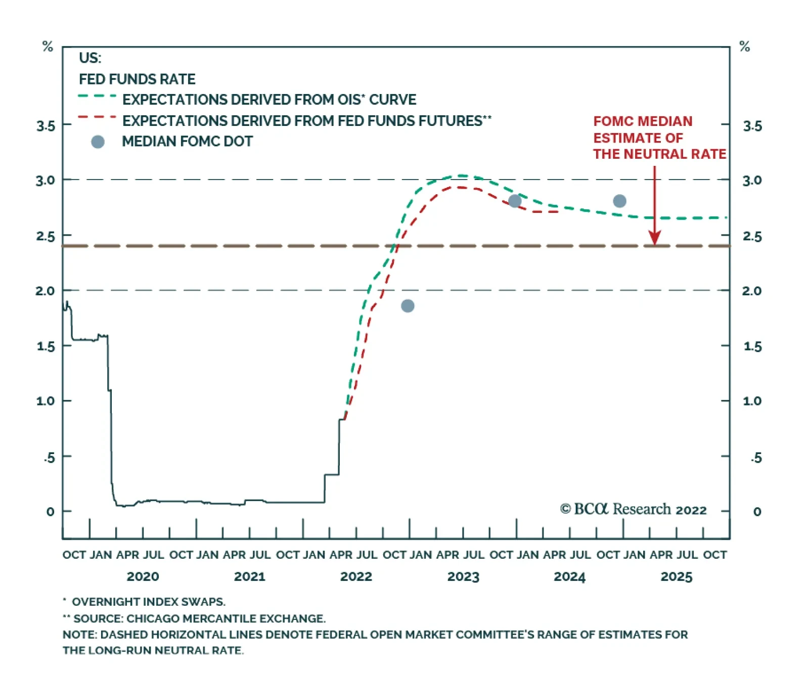
The Way Forward If we look back at Chart 1, we see that the 2018 roadmap is for the Fed to abandon its tightening cycle, leading to a sharp drop in near-term rate expectations and a V-shaped bottom in excess corporate bond returns. We won’t get such a swift Fed reversal this year, but there are strong odds that the Fed will lift rates by less than what is currently discounted in the market between now and the end of 2022. As we noted in last week’s Webcast, we expect the Fed to deliver two more 50 basis point rate hikes (in June and July) before shifting to 25 bps per meeting increments in September once it’s clear that inflation is trending down (Chart 7).2 We also see potential for relief at the long-end of the yield curve, where 5-year/5-year forward Treasury yields have room to fall back toward survey estimates of the long-run neutral rate (Chart 8). Chart 7Rate Expectations
Rate Expectations
Rate Expectations
Chart 8Yields Above Fair Value
Yields Above Fair Value
Yields Above Fair Value
It’s also worth noting that corporate bond valuations have improved markedly during the past few weeks. The 12-month breakeven spread for investment grade corporates is back above its historical median, and the junk index is priced for a 6.3% default rate during the next 12 months (Chart 9). Investment grade and high-yield index spreads are also now well above their respective 2017-19 averages, as is the spread differential between high-yield and investment grade (Chart 10). Chart 9Corporate Bond Valuation
Corporate Bond Valuation
Corporate Bond Valuation
Chart 10Favor HY Over IG
Favor HY Over IG
Favor HY Over IG
The bottom line is that we are slowly turning more positive on corporate bonds. Falling inflation will cause the Fed to tighten by less than what is expected this year, and it will soon become apparent that – as was the case in 2018 – the US economy is not close to tipping into recession. Spreads also present an increasingly attractive opportunity. That said, with the Fed still poised to deliver 100 bps of tightening within the next two months, we are not yet ready to abandon our relatively cautious corporate bond allocation. We maintain our underweight (2 out of 5) allocation to investment grade corporate bonds and our neutral (3 out of 5) allocation to high-yield, but we are now firmly on upgrade watch. Signs of peaking inflation and/or signals that the Fed will pivot to a hiking pace of 25 bps per meeting could cause us to increase our recommended corporate bond exposure in the relatively near term. Stay tuned. Seek Refuge In Municipal Bonds While we wait for clearer signs of a bottom in corporate credit, investors can more confidently deploy capital in the municipal bond market. Municipal / Treasury yield ratios have jumped in recent weeks, and they are now back above post-2010 averages across the entire yield curve (Chart 11). Long-maturity municipal bonds are even trading at a before-tax premium relative to US Treasuries (Chart 11, top 2 panels). Municipal bonds are also trading at above-average yields relative to credit rating and duration-matched corporate bonds (Chart 12). This is despite the recent back-up we’ve witnessed in corporate bond spreads. Chart 11Muni / Treasury Yield Ratios
Muni / Treasury Yield Ratios
Muni / Treasury Yield Ratios
Chart 12Munis Cheap Versus Credit
Munis Cheap Versus Credit
Munis Cheap Versus Credit
Not only are munis attractively priced versus both Treasuries and corporates, but state & local government balance sheet indicators show that municipal credit quality is sky high (Chart 13). Tax revenues have accelerated since the pandemic, but state & local governments have remained cautious about spending their windfalls. Despite being flush with cash, state & local governments have re-hired only a small fraction of the employees that were let go during the pandemic (Chart 13, panel 2). The result of this lack of spending is that state & local government net savings are the highest they’ve been in years (Chart 13, panel 3). Chart 13State & Local Government Health
State & Local Government Health
State & Local Government Health
Bottom Line: Municipal bonds are attractively valued versus both Treasuries and investment grade corporates, and state & local government balance sheets are in superb condition. Investors should overweight municipal bonds in US fixed income portfolios. Ryan Swift US Bond Strategist rswift@bcaresearch.com Footnotes 1 Please see US Bond Strategy Weekly Report, “The Bond Market Implications Of A 5% Mortgage Rate”, dated April 26, 2022. 2 https://www.bcaresearch.com/webcasts/detail/537 Recommended Portfolio Specification Other Recommendations Treasury Index Returns Spread Product Returns
Executive Summary Real Estate Is A Poor Inflation Hedge
The Real Estate Sector Deep Dive
The Real Estate Sector Deep Dive
The real estate sector is experiencing a robust post-pandemic recovery fueled by easy monetary and fiscal policy, with vacancy rates falling, earnings growing, and balance sheets looking healthy. Despite being a real asset, our in-depth analysis shows that the sector appears to be a poor inflation hedge and underperforms the market when inflation is elevated. There is a great dispersion within the sector – correlations across REIT segments are low. Residential REITs offer solid protection against inflation: Rent growth outpaces inflation thanks to chronic housing underbuilding and a recent rebound in new household formation. Likewise, we expect the Industrial REITs segment to offer inflation protection. Following recent supply disruptions, companies are shifting away from the “just-in-time” to “just-in-case” model, spurring strong demand for warehousing, fulfillment, and logistics centers, and pushing up rents. Office and Retail REITs segments will be the two industry laggards due to structural shifts in consumer and worker behavior. Bottom Line: Today we downgrade the S&P Real Estate sector from overweight to neutral while keeping a granular intra-sector allocation. Specifically, we recommend investors overweight Specialized, Industrial, and Residential REITs, while underweighting Office and Retail segments. Feature Related Report US Equity StrategyHave US Equities Hit Rock Bottom? The last few months have been marred by a violent sell-off in US equities, with stubbornly high inflation, and the Fed’s well-telegraphed hawkishness being front and center of the market rout. While this is a toxic brew for most equity sectors, Real Estate finds itself in a crosscurrent of two opposing trends. It is a high-yielding real asset that, at least in principle, is well-positioned to withstand inflation (most landlords are able to raise rents at least in line with inflation). However, tightening monetary policy and rising mortgage rates present unique challenges for the sector, suppressing demand for real estate and compressing the present value of future cash flows, thus handicapping capital appreciation. The recent downside surprise in the NAHB housing market reading is a case in point: 69 reported while the consensus range was 75 -77, signaling a sharp deceleration in house price growth. There is also a pronounced turn in sales activity (Chart 1). However, just as the real economy is not the stock market, the housing market is only one of the segments of the Real Estate sector. In this report, we will provide an overview of the entire sector, including valuations and fundamentals, and will consider the effects of inflation and rate regimes on sector performance. We will also take a look at the various segments of the REIT equity sector and the key drivers of their performance in our quest for the best inflation hedge. Chart 1Real Estate Sales Have Turned Down
Real Estate Sales Have Turned Down
Real Estate Sales Have Turned Down
The US REIT Overview The REIT Sector Has Experienced Strong Growth Over The Past Decade There are more than 225 REITs in the US registered with the SEC, 175 of which trade on the NYSE. The ever-expanding cohort of NYSE-traded REITs has experienced explosive growth over the past 10 years, as a result of investors' search for yield, and this cohort now has a combined equity market capitalization of more than $1.4 trillion (Chart 2). These are mostly equity REITs – trusts that own and operate income-producing assets and earn income mostly through rents. Thirty of these equity REITs comprise the S&P 500 Real Estate sector. The Real Estate sector is small at 3% of S&P 500 market capitalization but its share has been growing steadily over time (Chart 3). Chart 2Equity REITs Have Gained Popularity Over The Past Decade
The Real Estate Sector Deep Dive
The Real Estate Sector Deep Dive
Chart 3Real Estate Is A Small Sector But Its Share Has Been Growing Steadily
Real Estate Is A Small Sector But Its Share Has Been Growing Steadily
Real Estate Is A Small Sector But Its Share Has Been Growing Steadily
REITs Are Equities, But Not Quite The business model of most REITs is rather simple: Lease space and collect rent on the properties, then distribute income as a dividend to shareholders. There are a number of IRS provisions that REITs have to comply with, of which the following are most relevant to investors: Invest at least 75% of total assets in real estate, cash, or US Treasuries; Derive at least 75% of gross income from rents, interest on mortgages that finance property, or real estate sales; and Pay a minimum of 90% of taxable income in the form of shareholder dividends each year.1 REITs are total return investments as they provide income as well as capital appreciation. Sector Composition The S&P 500 Real Estate sector consists of two industries – REITs, which represent roughly 98% of the sector, and Real Estate Management and Development, which is about 2% of the sector. We will focus on the REITs. The S&P 500 REIT industry is comprised of eight broad categories (Chart 4), of which Specialized REITs are by far the largest, at 45% of the sector market capitalization. The composition of the REIT market has changed over the years. While the traditional retail and residential segments dominated the market in the first years of the millennium, structural changes have shifted the balance towards specialized segments such as infrastructure, data centers, as well as industrial REITs (Chart 5). The pandemic and a shift toward remote work have accelerated many of the existing trends, such as a decline in the office segment. Consolidations of health care facilities and hospitals have reduced the Health Care REIT segment. Chart 4The S&P 500 REIT Industry Composition
The Real Estate Sector Deep Dive
The Real Estate Sector Deep Dive
Chart 5REITs Composition Is Changing Over Time
The Real Estate Sector Deep Dive
The Real Estate Sector Deep Dive
Sector Performance Since 2010, in the aftermath of the GFC, the Real Estate sector has underperformed the S&P 500 by 20% (Chart 6). However, within the sector, there is a wide divergence in relative performance, with Industrial REITs beating the index by 10%, while Office, Hotels, and Health Care REITs lagging by some 50%. More recently, the Real Estate Sector has performed more or less in line with the S&P 500 (Table 1), in contrast to the wild swings in relative performance experienced by other sectors. Like their corporate brethren in the Health Care sector, defensive Health Care REIT performance was stellar, beating the S&P 500 by 10% over the past 12 months. Hotel REITs bounced back strongly after a prolonged period of underperformance because of a nascent post-pandemic recovery in travel. Clearly, there is significant dispersion in both long- and short-term performance within the sector – correlations across segments are low (Chart 7). It is important to understand the key drivers of each segment for better asset selection. Chart 6In The Aftermath Of The GFC, The Real Estate Sector Has Underperformed
In The Aftermath Of The GFC, The Real Estate Sector Has Underperformed
In The Aftermath Of The GFC, The Real Estate Sector Has Underperformed
Chart 7Correlations Across REIT Segments Are Low
Correlations Across REIT Segments Are Low
Correlations Across REIT Segments Are Low
Table 1Performance Relative To The S&P 500
The Real Estate Sector Deep Dive
The Real Estate Sector Deep Dive
REIT Dividend Yield And TINA One of the main attractions of REITs is their IRS-mandated high dividend payout. Indeed, currently, the Real Estate sector dividend yield is 2.9%, a whole 130 bps higher than for the S&P 500. In fact, all REIT sectors and subsectors (with the exception of the lodging/resorts sector) currently have dividend yields higher than those of public equities (Chart 8). However, for many investors, yield comparison goes beyond equities alone. For multi-asset investors, the REIT yield is usually competing with the yield on other fixed-income instruments (Chart 9). Currently, REITs offer yields on par with investment-grade bonds, but arguably they are more attractive thanks to capital appreciation potential. Chart 8Almost All REIT Segments Yield More Than The S&P 500
The Real Estate Sector Deep Dive
The Real Estate Sector Deep Dive
Chart 9REIT Yield Is Attractive
The Real Estate Sector Deep Dive
The Real Estate Sector Deep Dive
Performance Of The Real Estate Sector In Different Inflation And Rate Regimes Real estate is a real asset and resilience to inflationary pressures is literally embedded in its name. Unfortunately, empirical analysis of the performance of Real Estate sectors during periods of high inflation disappoints. Chart 10 demonstrates that Real Estate is quite simply not a good inflation hedge. The sector tends to have the strongest performance when inflation is in the 2-3.5% range, beating the S&P 500 54% of the time. As inflation rises, RE tends to lag the broad market. This result is surely confounding. The likely explanation is that rising inflation is literally an invitation to tighter monetary policy. As rates rise, Real Estate underperforms (Chart 11). Higher interest rates decrease the value of real estate assets by discounting future cash flows at a higher rate, thus impairing the capital appreciation component of the Real Estate total return. As such, cap rates and interest rates move in lockstep (Chart 12). Chart 10Real Estate Is A Poor Inflation Hedge
The Real Estate Sector Deep Dive
The Real Estate Sector Deep Dive
Chart 11REITs Tend To Underperform When Rates Are Rising
The Real Estate Sector Deep Dive
The Real Estate Sector Deep Dive
Thus, when inflation is high and rates are on the rise, the sector is caught in the crosscurrents: While overall, the ability to raise rents insulates the sector from the adverse effects of inflation, higher rates dampen capital appreciation. Hence, it is not surprising that high inflation and the rising rate regime are unfavorable for the sector (Chart 13), with the sector’s median three-month performance in this regime since 1970 lagging the S&P 500 by 1.8%. In this regime, RE beats the market only 38% of the time. Chart 12Cap Rates And Interest Rates Move In Lockstep
Cap Rates And Interest Rates Move In Lockstep
Cap Rates And Interest Rates Move In Lockstep
Chart 13High Inflation And Rising Rates Are Unfavorable For Real Estate
The Real Estate Sector Deep Dive
The Real Estate Sector Deep Dive
While the S&P 500 Real Estate Sector is a poor inflation hedge, for investors with the ability to be more granular in REIT allocations, drilling down to sub-categories of the market might be beneficial. The real estate market is diverse and different segments do not react the same way to rising interest rates or inflation. Bottom Line: It appears that in a battle between inflation (favorable for the sector yield) and rising rates (unfavorable for capital appreciation), rates have the upper hand. Fundamentals And Valuations Even though REITs are technically equities, their analysis requires different metrics. Whereas equity investors rely on multiples such as price-to-earnings (P/E) or price-to-book (P/B), for REITs price-to-funds from operations (P/FFO) is a more important valuation tool. FFO is favored over earnings since it adds back depreciation and amortization expense. FFO also adds any gains (or subtracts any losses) from sales of underlying assets to net income. REITs traded at a steady 17x FFO between the end of the GFC and the start of the pandemic. FFO fell by 30% in the first two quarters of 2020 compared to Q4 2019, pushing the P/FFO multiple to 24.7 – a level that appears to be an expensive “post-pandemic normal” (Chart 14). The risk premium for REITs (calculated as the FFO yield minus the real 10-year Treasury yield) – currently at 5.4% – remains higher than the pre-GFC bottom of 3.5%. Consider Chart 15: On this basis, REITs are attractive. Chart 14REITs Are Trading At An Easy Money Post-Pandemic High
REITs Are Trading At An Easy Money Post-Pandemic High
REITs Are Trading At An Easy Money Post-Pandemic High
Chart 15Risk Premium Is Still Reasonable
Risk Premium Is Still Reasonable
Risk Premium Is Still Reasonable
In terms of profitability, the sector appears to be thriving: Occupancy rates are rising (Chart 16) and FFO is growing. However, it is important to note that US economic growth is slowing, and that may reverse the fortunes of the sector, weakening demand for properties, and lifting vacancy rates. Bottom Line: Earnings continue to rise, and cap rates – while declining – remain high compared to the risk-free rate. A post-pandemic recovery is underway. However, slowing economic growth has a potential to reverse these favorable trends. Chart 16Occupancy Rates Are Rising Again
Occupancy Rates Are Rising Again
Occupancy Rates Are Rising Again
REIT Balance Sheets Are Healthy The real estate sector has historically been seen as risky due to its high leverage, but leverage has been on the decline. Over the past decade, REIT reliance on equity capital has increased, with the equity/asset ratio rising from 32% in 2008 to 45% in 2022. The ratio of debt-to-book assets stands at around 48% , much lower than 58% during the GFC (Chart 17). REITs have also extended the average maturity of their debt from five years in 2008 to over 7.5 years today. The fall in interest rates over the past two decades has benefited equity REITs: As rates fell, so did the interest they paid on their debt. Liquidity ratios also improved, with coverage ratio (earnings relative to interest expense) rising to a solid 6.5x. Bottom Line: REIT balance sheet health has improved significantly as the share of equity financing continues to grow. Also, a downward trend in interest rates has made existing debt more manageable. Chart 17A Shift Towards Equity Financing And Falling Rates Have Fortified REIT Balance Sheet
A Shift Towards Equity Financing And Falling Rates Have Fortified REIT Balance Sheet
A Shift Towards Equity Financing And Falling Rates Have Fortified REIT Balance Sheet
REIT Segments And Their Economic Drivers The pandemic has accelerated some existing trends in the real estate sector and established new ones. Some sectors will struggle in this new environment, while others will flourish. There is a broad dispersion across the REIT segments in terms of yield vs capitalization, and the ability to withstand inflation and rising rates. REIT Segments In Charts – Residential and Industrial Appear Most Attractive Vacancy Rates are declining across all segments. The industrial segment has the lowest vacancy rate at 4.1%, followed by residential at 4.9%. Offices have the highest vacancy rates at 12.2% (Chart 18). Rents are rising. Apartments have experienced the steepest increase from 1.3% growth in 2020 to 11.3% in Q1-2022. Industrial rent growth has accelerated from 5.3% to 11%. Office rent growth is decelerating (Chart 19). Chart 18Vacancy Rates Recovered For All Segments But Office
The Real Estate Sector Deep Dive
The Real Estate Sector Deep Dive
Chart 19Residential And Industrial Rent Increases Outpace Inflation
The Real Estate Sector Deep Dive
The Real Estate Sector Deep Dive
Acquisitions are increasing at a robust pace with apartments experiencing the most activity (Chart 20). Sales Prices are also increasing (Chart 21). Industrial sales prices on average were up 15% from one year ago, while multifamily property prices rose 10.5%. Both these assets are earning rental income and returns that are higher than the current inflation rate, which makes them attractive assets to hold at a time of high inflation. Chart 20Sales Activity Is Robust
The Real Estate Sector Deep Dive
The Real Estate Sector Deep Dive
Chart 21Industrial And Residential Properties Are Most Popular Among Investors
The Real Estate Sector Deep Dive
The Real Estate Sector Deep Dive
The Cap Rate is experiencing compression (Chart 22) as higher rents boost sales prices, making properties more expensive. As a result, multi-family properties, which boast the highest rent growth and the lowest occupancy rate, have the lowest cap rate at 3.2%. Low demand for office space due to the pandemic has pushed the cap rate to 4.9%. Total Return is a combination of the rising value of a property and its yield, which moves in the opposite direction. As of April, Apartments had the highest total annual return of 12.7%, followed by Industrial at 10.7%. The total return of all commercial segments, except for Office, has exceeded the rate of inflation. Furthermore, we will comment on each of the segments to explain the trends observed in the charts (Chart 23). Chart 22Cap Rates Are Relatively Low Across The Board
The Real Estate Sector Deep Dive
The Real Estate Sector Deep Dive
Chart 23Industrial and Residential Produced The Highest Total Returns
The Real Estate Sector Deep Dive
The Real Estate Sector Deep Dive
Specialized REITs Are A Play On The Digitalization Of The Economy While other segment names are self-explanatory, Specialized is a little trickier. The specialized REITs segment accounts for properties not classified elsewhere. These REITs own and manage a unique mix of property types such as movie theaters, farmland, and energy pipelines. Also, a REIT that consists of, say, both office and retail properties, would also be classified as Specialized. This is the broadest and most diversified category, and it is not surprising that it accounts for nearly half of the sector by market cap. It is also the highest-yielding category with a dividend yield of 4.7%. The specialized category is particularly attractive as it includes many high-tech geared categories, such as communication networks and data centers. Properties that support the digital economy have attracted a lot of demand over the past couple of years, and FFO growth is strong (Chart 24). With a host of new technologies in the wings, demand for data centers is expected to continue to grow. Due to the high and complex technical set-up specifications, leases are usually longer (upwards of five years). Since lease terms are long, owners can’t reset rent to keep up with inflation. On the other hand, strong demand for data centers is pushing new rents up. Fundamentals for the segment are supportive: The cap rate, at 4.4%, is in line with the REIT benchmark (Chart 25). Chart 24Strong Demand For Data Centers
Strong Demand For Data Centers
Strong Demand For Data Centers
Chart 25Data Center Cap Rate Is In Line With The Benchmark
Data Center Cap Rate Is In Line With The Benchmark
Data Center Cap Rate Is In Line With The Benchmark
Bottom Line: We favor the Specialized REIT segment. It is well diversified and resilient to market swings. It also has significant exposure to the technology sector and benefits from a shift towards a more digitalized economy. This should also immunize the sector over the economic cycle as dependence on data increases structurally. Key tickers for this segment are: AMT, CCI. Retail REITs Are Battling Headwinds From E-commerce The “death of retail” is not a new phenomenon – consumer spending continues to shift from in-store to online. Over the past two decades, non-store retail sales in the US have grown at an annualized 9.5%, compared to 3.1% for in-store sales. E-commerce has risen to almost 14% of total retail sales. This shift is reflected in the halving of the weight of retail REITs in the Real Estate sector over the past decade. The headwinds facing the sector – particularly shopping centers – have not abated. The retail REIT occupancy rate is among the lowest in the CRE: 96% as of Q4-2021. However, with little construction underway, rent growth is not likely to decline, and will rise to mid-3%. With rents not keeping up with inflation, retail properties are a poor inflation hedge. Bottom Line: We recommend investors underweight the retail sector within their broad real estate exposure. The structural headwinds are not likely to disappear, while inflation will remain a major headwind. Key tickers for this segment are: O, SPG. Office REITs – Workers Are Not Coming Back There has long been a close link between office demand and employment. As the labor market tightens, demand for offices increases, and rents rise. However, “this time is different” due to the tectonic shift brought about by the pandemic. According to the NAR, not all workers are returning to the office (Chart 26): 17% of office employees are still telecommuting. Worse yet, there is an ongoing decline in small business formatting, impairing demand for new office space. As a result, the sector is currently flush with supply, and the occupancy rate is down from 94% to 89% (Chart 27). Yet, asking rents continue to recover, albeit slowly, and lag the rate of inflation: As of April 2022, the average year-over-year growth was 1.3%.2 Given the ongoing construction of about 150 MSF, the vacancy rate will likely remain above 10%, but rents will continue to increase modestly as more workers return to the office.3 Chart 26Many Workers Are Not Returning To The Office
The Real Estate Sector Deep Dive
The Real Estate Sector Deep Dive
Chart 27The Pandemic Has Changed Office Demand Dynamics
The Pandemic Has Changed Office Demand Dynamics
The Pandemic Has Changed Office Demand Dynamics
Bottom Line: Underweight the office sector within broad real estate exposure. A shift to remote work, elevated vacancy rates, and ongoing construction are likely to put the brakes on rent growth. Real rent growth is expected to be negative – this segment is a poor inflation hedge. Key tickers for this segment are: ARE, BXP. Residential REITs – Housing Shortages Are A Tailwind Residential REITs are primarily focused on apartments, but single-family homes and mobile homes fall under the same category (Chart 28). This segment is the closest proxy to the US housing market. The housing sector has been undersupplied for decades: The ratio of annual housing starts to the total number of households is 1.2 – 0.7 percentage points below its pre-GFC average (Chart 29). Chart 28Apartments Make Up The Majority Of Residential REITs
Apartments Make Up The Majority Of Residential REITs
Apartments Make Up The Majority Of Residential REITs
Chart 29Housing Undersupply Is Not A New Issue...
Housing Undersupply Is Not A New Issue...
Housing Undersupply Is Not A New Issue...
This has pushed up prices, increasing unaffordability, particularly for first-time buyers (Chart 30). This increased the percentage of US housing inventory occupied by renters rather than owners (Chart 31). Chart 30...Making Home Prices Unaffordable
...Making Home Prices Unaffordable
...Making Home Prices Unaffordable
Chart 31Pushing More People Towards Renting
Pushing More People Towards Renting
Pushing More People Towards Renting
Recently, housing shortages have been further exacerbated by a post-pandemic rebound in new household formation (Chart 32). Rising mortgage rates tend to further increase the demand for rental units. Vacancy rates are bound to fall further, leading to sustained double-digit rent and price growth. As of April, multi-family rents are up 9.4% year-over-year, higher than this inflation rate of 8.5%. Bottom Line: Chronic underbuilding and a recent rebound in new household formation have spurred demand for housing, putting upward pressure on rents, making the category an excellent inflation hedge. Key tickers for this segment are: AVB, EQR. Chart 32Household Formation Has Rebounded
Household Formation Has Rebounded
Household Formation Has Rebounded
Industrial Property Industrial REITs manage industrial facilities, with the logistics segment being a key growth driver thanks to high exposure to e-commerce. Industrial properties include warehouses, fulfillment centers, and last-mile delivery and distribution. Research by Prologis shows that e-commerce requires more than 3x the logistics space of brick-and-mortar sales. That is why occupancy rates have been rising over the past decade, and are currently at an all-time high, four percentage points higher than their 20-year average (Chart 33). The pandemic has also revealed how vulnerable current supply chains are and has accelerated a trend BCA Research has highlighted for years: The decline of globalization. Going forward, companies will move to re-shore some of their production to gain greater control over supply chains transitioning from “just-in-time” to “just-in-case” inventory management to minimize supply disruptions. This shift will amplify the need for industrial space. As a result, Industrial REIT rent growth has been robust, with rents up 11% year-over-year, with 37% of 390 markets posting double-digit rent growth. Rent growth lower down the value chain closer to the end-consumer has been particularly strong: Asking rents for logistics space are up on average 12.4% year-over-year mostly due to the scarcity of permittable land (Chart 34). Chart 33Increase Demand For Warehouses Pushed Up Occupancy Rates
Increase Demand For Warehouses Pushed Up Occupancy Rates
Increase Demand For Warehouses Pushed Up Occupancy Rates
Chart 34Logistics Rent Growth Is The Fastest Due To Scarcity
The Real Estate Sector Deep Dive
The Real Estate Sector Deep Dive
Bottom Line: We expect the Industrial sector to continue to outperform the broad REIT market, supported by strong demand for fulfillment and logistics centers which is pushing rents up. Industrial REITs are an excellent inflation hedge. Key tickers for this segment are: PLD, DRE. Investment Implications The real estate sector is experiencing a robust post-pandemic recovery fueled by easy monetary and fiscal policy, with vacancy rates falling, earnings growing, and balance sheets looking healthy. However, despite being a real asset, the sector appears to be a poor inflation hedge, underperforming the market when inflation is elevated. High inflation is often accompanied by rising rates, which reduce the value of future cash flows, impair capital appreciation, and offset income gains brought about by rent increases. Further, slowing growth may become a significant headwind, reversing gains in occupancy rates. Out of an abundance of caution, we are downgrading Real Estate from overweight to equal weight. However, Real Estate is a diverse sector, with segments almost uncorrelated to each other. As such, we recommend a granular allocation within the sector. Overweight Specialized, Industrial, and Residential segments which benefit from positive long-term trends, enjoy low vacancy rates, and positive real rent growth. We also recommend underweight allocations to Office and Retail segments, which suffer from adverse trends brought about by changes in consumer behavior, that translate into elevated vacancy rates and negative real rent growth. Bottom Line: The Real Estate sector is sensitive to rising rates and is a poor inflation hedge. We are downgrading the sector from overweight to equal weight. However, the sector is diverse, and commercial real estate sectors have a low correlation to each other. Within the sector, we favor Specialized, Industrial, and Residential segments that benefit from favorable long-term trends, and offer strong wage growth and potential for capital appreciation. These segments are likely to be strong inflation hedges. Irene Tunkel Chief Strategist, US Equity Strategy irene.tunkel@bcaresearch.com Footnotes 1 Investopedia 2 Commercial Market Insights, April 2022, National Association of REALTORS® Research Group 3 Ibid Recommended Allocation Recommended Allocation: Addendum
The Real Estate Sector Deep Dive
The Real Estate Sector Deep Dive
Executive Summary The sharp slide in the S&P 500 forward multiple has been painful, but it's only two-thirds of the way to its 1987 and 2002 declines. The inverse correlation between interest rates and the index P/E multiple is well established; if rates stop backing up, the multiple will stop being squeezed. Stocks would really be in trouble if their gains had entirely been a function of multiple inflation, but earnings growth has done the heavy lifting since 2008. Earnings growth will likely decelerate over the rest of the year, but it will remain a tailwind. A model regressing the index's forward multiple against a proprietary measure of inflation expectations and consumer perceptions of the labor market does a good job of explaining past valuation moves. If inflation has peaked and labor demand remains strong, multiples may be able to retrace some of their losses. De-Rating May Have Gone A Little Too Far
De-Rating May Have Gone A Little Too Far
De-Rating May Have Gone A Little Too Far
Bottom Line: Although the 23% de-rating in equity valuations has been severe, it is not unprecedented – larger declines occurred in 1987 and 2002. While we estimate that the forward multiple’s fair value is one or two points above its current level, there is no timetable for when the actual multiple will return to it. Feature Our client conversations over the last few weeks have ultimately found their way to the issue that is front of mind for nearly all investors: Is the equity selloff almost finished, and how far will it go if it’s not? When analyzing equity performance, we find it useful to decompose the S&P 500 into expected earnings and the multiple investors are willing to pay for them. Solid full-year US growth remains our base-case scenario, even if our conviction has declined as inflation has bounded higher, Russia’s invasion of Ukraine has turbo-charged geopolitical tensions while crimping commodity supplies, and China’s response to its COVID surge threatens to undo tentative supply-chain progress. We therefore view moves in the S&P 500’s forward P/E multiple as the key swing factor. This report gathers our responses to several client questions that touch on multiples and presents some new research related to them. Our goal is to bring some fresh insights to the discussion while encouraging more clients to engage with it. Previous De-Rating Episodes Multiples have lost a lot of ground in a short period of time. Is there any precedent for what we’ve seen so far this year? Reliable consensus earnings estimates have only been compiled since 1979, so the entire history of forward multiple data is confined to the last 40-plus years. Over that timeframe, there have been two other periods when the month-end index multiple fell at least as much over a similarly brief stretch (Chart 1, top panel). The first occurred in 1987, when the forward multiple fell five points from 14.8 at the end of August to 9.8 at the end of November, a stunning three-month 33% valuation haircut that largely unfolded during Black Monday’s single-session bear market. The second occurred as the bear market that followed the dotcom bust careened to its conclusion, with the forward multiple again falling by a third, from 21.6 at year-end 2001 to 14.5 at the end of September 2002. Chart 1Multiples Can Reverse Suddenly
Multiples Can Reverse Suddenly
Multiples Can Reverse Suddenly
The year-to-date decline of just under five multiple points, from 21.6 at year-end to 16.7 as of Wednesday’s close, has amounted to a 23% valuation adjustment in four-and-a-half months that has driven the index 18% lower. In standardized terms, the index multiple has matched 1987 with a 1.15-standard-deviation tumble, but it is still a half of a standard deviation shy of 2002’s swoon (Chart 1, bottom panel). The multiple’s 1.5-standard-deviation slide from its August 2020 month-end peak is a full standard deviation less than the 2.5-standard-deviation peak-to-trough flogging it endured during the dotcom bust. Bottom Line: The current selloff has been severe, but it is not unprecedented. Multiples can compress swiftly, especially when they are as elevated as they have been since stocks bottomed amidst the initial shock of the pandemic. Matching 1987's and 2002's 33% haircuts would involve lopping off another two multiple points and knocking the index down to the low 3,400s. Multiples And Interest Rates The history is scary. 3,400 would take us right back to where we were before the vaccines arrived and wipe out a year and a half of gains, but I take some comfort from still-low interest rates. Stocks may not be cheap relative to the whole 43-year history, but am I wrong to think they look pretty appealing given a 3% 10-year Treasury yield? Related Report US Investment StrategyQ&A About Rate Hikes And Stocks Interest rates provide the means for discounting future cash flows back to their present value and the theoretical link between multiples and interest rates is rock solid. When long-dated Treasury yields fall, the present value of a company’s future earnings rises, all else equal, and when yields rise, present value falls. All is not equal, of course, and earnings are prone to moving with interest rates, but the inverse relationship between interest rates and the present value of a fixed series of future cash flows is as constant as the tides. The empirical history shows that the theory holds up in the real world. The inverse relationship between S&P 500 forward multiples and 10-year Treasury yields is robust, with the level of yields explaining 46% of the variation in S&P 500 valuations since the forward multiple series began (Chart 2, top panel). The simple regression fit is undermined by the circled cluster of outlying observations with yields between 4.5 and 6.75% and forward multiples of 18 and above, all of which occurred between January 1997 and May 2002, when the dotcom mania severed the link between valuations and rates. When those observations are removed, the relationship becomes even stronger, with the level of yields explaining 69% of the variation in S&P 500 valuations (Chart 2, bottom panel). Chart 2When Rates Zig, Multiples Zag
Equity Multiples Q&A
Equity Multiples Q&A
Removing the dotcom observations from the datasets highlights the variability of forward valuations within the 0.5-4% range of Treasury yields that has prevailed since 2008. The observations well below the best-fit regression line occurred soon after the onset of the global financial crisis, when a growth shortfall loomed as the biggest threat and deflation was a plausible outcome. The observations well above the best-fit line were recorded since the pandemic, as the economy rode a wave of fiscal and monetary steroids whose potentially inflationary side effects were beyond the marginal price-setters’ decision horizon. We note that multiples are most likely headed back below the best-fit line if stagflation risks are perceived to grow in line with many investors’ fears. The equity risk premium (ERP), calculated as the forward earnings yield (the inverse of the forward multiple) less the real 10-year Treasury yield, offers a rosier perspective for viewing the interaction between interest rates and equity valuations. It supports the notion that equity prices are attractive, given the current yield backdrop, and draws a sharp distinction between the pandemic’s 20-plus multiples and the dotcom era’s (Chart 3). Simple regression against the 10-year Treasury yield suggests that the S&P 500 is now fairly valued, while the ERP argues that it’s somewhat cheap. Equity valuations are vulnerable to further yield backups under both approaches, however. Chart 3Compared To Bonds, Equities Are Cheap
Compared To Bonds, Equities Are Cheap
Compared To Bonds, Equities Are Cheap
Bottom Line: Multiples deserve to be elevated, relative to their history, given that long-dated Treasury yields remain near the bottom of their historical range, but they face more de-rating pressure if yields continue to rise. What Goes Around Comes Around The de-rating that’s occurring right now shouldn’t surprise anyone who’s stopped believing in Santa Claus and the tooth fairy. The Fed has manufactured the entire post-crisis rally with zero interest rates and QE and we’re simply witnessing the inevitable unwind. How can you argue that the selloff doesn’t have further to go? We hear the manufactured/manipulated argument a lot but we do not believe that the data support it. The advance in the S&P 500 since January 1, 2008 (Chart 4, top panel) has comfortably surpassed nearly everyone’s contemporaneous expectations and we do not dispute that ample monetary accommodation played a large part in smoothing the way for the US economy’s comparatively rapid recovery. In our view, however, the boost to the economy, as proxied by the potent rise in expected S&P 500 earnings (Chart 4, middle panel), was more important than investors’ increased willingness to pay up for them (Chart 4, bottom panel). Rebasing both series to 100 as of January 1, 2008 shows that consensus earnings estimates have risen by four more times than forward multiples since the onset of the global financial crisis. A similar analysis obtains for the current pandemic era, especially now that the S&P 500’s forward multiple has dipped back below its January 1, 2020 level (Chart 5, bottom panel). The index’s annualized 9.7% return has surpassed most investors’ wildest hopes when stocks were crumbling in the middle of March 2020 (Chart 5, top panel). The gain is entirely attributable to the 12.9% annualized increase in consensus earnings expectations (Chart 5, middle panel). Lavishly generous fiscal and monetary accommodation deserves the credit for the earnings snapback. Though excessive aid may eventually cause the economy to overheat, we disagree with the idea that the pandemic rally has been built on a house of monetary stimulus cards. Chart 4Earnings Have Driven The Post-Crisis ...
Earnings Have Driven The Post-Crisis ...
Earnings Have Driven The Post-Crisis ...
Chart 5... And Post-Pandemic Bull Markets
... And Post-Pandemic Bull Markets
... And Post-Pandemic Bull Markets
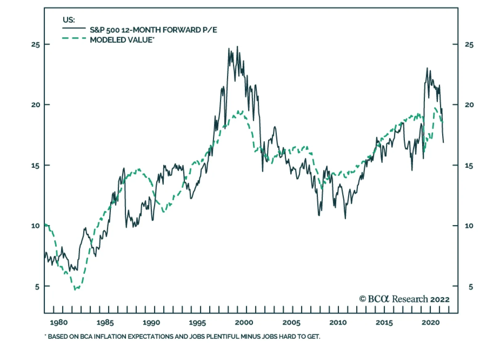
An Index Valuation Model Where do you think the S&P 500’s forward multiple should be right now? Although no one should expect that any given financial instrument should trade at its fair value at any particular moment in time, it is useful to have approximate fair value estimates to gauge assets’ relative attractiveness and future return prospects. To apply some quantitative rigor to answering this question, we set out to build a regression model that would point the way to an appropriate valuation range. We started with the 10-year Treasury yield as our first independent variable and examined various inflation, equity sentiment and consumer sentiment series to discover other variables that could enhance its explanatory powers. To most nearly isolate the multiple impact, we passed over measures of economic activity for variables that would not be expected to exert an equal or greater impact on S&P 500 earnings. Inflation measures in themselves failed to contribute to the cause, but inflation expectations series proved more availing. None of the major equity sentiment surveys nor BCA’s composite sentiment indicator contributed to the other variables’ explanatory power. Consumer confidence surveys showed some promise, and the difference in the Conference Board’s Jobs Plentiful/Jobs Hard to Find series performed the best in backtests. Much to our surprise, the 10-year Treasury yield lost its statistical significance along the way and we duly jettisoned it, leaving us with a model that regressed the index forward multiple against the exponentially smoothed long-run moving average of measured inflation used by our fixed income strategists to assess Treasury fair values and the net Jobs Plentiful measure. Chart 6 shows the historical path of the S&P 500’s forward four-quarter earnings multiple and the fitted value from our regression. The backtested fit is quite good, as befits the model’s 72% r-squared. Encouragingly, the model suggests that the de-rating has gone too far. It returned an 18.5 value at the end of April, a full point above the actual 17.5 reading and nearly two points above the 16.7 multiple as of Wednesday’s close. Chart 6Estimating What The S&P 500's Forward Multiple Should Be
Estimating What The S&P 500's Forward Multiple Should Be
Estimating What The S&P 500's Forward Multiple Should Be
We take any modeled point estimate with a grain of salt and are dyed-in-the-wool skeptics about any quantitative model’s persistence as a practical investment guide. We nonetheless performed this modeling exercise to provide a quantitative historical basis for estimating the fair value of the S&P 500’s forward multiple. The fact that we threw the 10-year Treasury yield overboard does not invalidate Chart 2; multiples and long-maturity yields are plainly inversely related, but our internal inflation expectations measure apparently conveys all of the 10-year yield’s information about the forward multiple’s historical moves and then some. Like every conscientious evidence-based researcher, we will go wherever the data lead us, independent of any preconceptions we might bring to a particular study. The Road Ahead When will the selloff end? We don’t know the date, the time or the level at which the equity selloff will eventually end. If our view that earnings will hold up is correct, however, the answer will turn on when the de-rating ends. The equity risk premium, a simple regression against the level of long Treasury yields and a multi-factor regression incorporating BCA’s proprietary inflation expectations model and consumers’ perceptions of the jobs market all suggest that de-rating has gotten ahead of itself. A 23% haircut over four-and-a-half months seems extreme when we think an adverse inflection point is over a year away. We have never counted on settling down with TINA, figuring that it wasn’t her nature to stick around for the long haul. Sentiment is fickle, and one day investors will discover that she’s left without a by-your-leave. Despite the upheaval so far this year, however, we think equities still hold considerable relative allure. With inflation mauling the value of cash holdings and high-duration bonds, one could argue that the alternatives to equities are even less appealing than they were when she first appeared on the scene. Our Global Investment Strategy service tactically upgraded global equities to overweight from neutral two weeks ago and we are more inclined to add equity exposure than reduce it when we revisit our ETF portfolio holdings in next week’s month-end report. There is no shortage of obvious concerns from Beijing to Moscow to Bentonville, Arkansas, but we think the factors that could go right are getting short shrift. Russian forces bogged down in eastern Ukraine are less likely to pursue expanded military adventures, reducing the potential that western Europe and the US could be drawn into a larger conflict. China’s zero-COVID policy may be doomed to futility, but headway on domestic production of an mRNA vaccine and the global ramp-up of anti-viral medication production could limit future outbreaks’ impact on the supply chain. The bottom line is that we remain constructive over the cyclical 3-to-12-month timeframe, while sharing the house view that the tactical equity outlook has improved. If the backup in bond yields has run its course for the time being, we expect that equity de-rating has as well. Doug Peta, CFA Chief US Investment Strategist dougp@bcaresearch.com
Executive Summary Villains Still Lurking
Villains Still Lurking
Villains Still Lurking
European assets and the euro already discount a significant worsening of Europe’s economic outlook. If the global economic situation were to stabilize, then European assets would be a buy at current levels. However, there remain very large risks lurking over the outlook. First, a further deterioration in energy flows between Russia and the EU is a major threat to the European economic outlook. Second, the ECB delivering the seven rate hikes priced in the June 2023 Euribor contract would be painful for the European economy. Third, further selloff in the US equity market could translate into more pain for European equities. And fourth, the weakness in the Chinese economy and aggressive monetary tightening in the broader EM space outside China are additional risks. These risks loom large enough, so that investors should avoid bottom-fishing the market. Wait until greater clarity emerges or valuations improve further. Bottom Line: Don’t be a hero. European assets and the euro are probably in the process of bottoming. However, the probability of a very significant additional decline is large enough that investors should continue to emphasize capital preservation over return maximization. Also, continue to favor defensives over cyclical assets. After declining nearly 8% since its January 2021 peak, the euro is down another 7% so far this year. Meanwhile, the Dow Jones Euro STOXX 50, which has plunged 17% since its January 5, 2022 apex, or 22% in US dollar terms, trades at 11.2 times 2023 earnings estimates. At these valuations, European assets already discount a major growth slump in Europe. Is it time to buy European assets, to favor cyclicals versus defensives, and to buy the euro? At face value, the answer is “yes,” but uncertainty abounds, which means that capital preservation remains paramount. As a result, we recommend investors avoid bottom-fishing European assets. They should wait for a safer entry point, rather than trying to pick through the market trough. Plenty Of Risks Four main risks cast a long shadow on the performance of European assets: The evolution of the energy crisis, the potential for an ECB policy mistake, the threat of a worsening US selloff, and the instability in EM. The Energy Crisis It’s official: Sweden and Finland are applying to join NATO. Turkey’s objection will create delays in the process, but it will not stop it. Turkey needs protection against Russia, and it needs help to support the lira. Turkey’s acquiescence, therefore, will be bought. What is genuinely surprising is Russia’s silence. President Putin threatened to flex Russia’s military muscles if Sweden and Finland were to abandon their neutrality. Yet, he now has “no problem” with their bid to join the alliance. We are skeptical, especially as the EU is aiming to ban Russian oil imports by the end of the year. Based on these observations, we continue to see a further deterioration in energy flows between Russia and the EU as a major threat to the European economic outlook. It is far from a guaranteed outcome, but its probability is elevated enough (more than 30%) and so impactful that any investment strategy must account for it. Chart 1Rebuilding Nat Gas Stocks Is A Must
Don’t Be A Hero
Don’t Be A Hero
Chart 2Low-Income Households Are At Risk
Don’t Be A Hero
Don’t Be A Hero
Moreover, European nations continue to pay a premium for their energy and are trying to rebuild their natural gas inventory ahead of winter (Chart 1). Thus, the energy market continues to carry a significant recession risk for the Eurozone. Lower-income households already spend a substantial portion of their income on utilities and transportation costs, and their consumption is highly sensitive to the evolution of energy prices (Chart 2). A Policy Mistake We consider a rate hike in July a policy mistake, but it would be a true error if the ECB ratified the pricing currently embedded in the €STR curve (Chart 3). Why would a rate hike constitute a policy mistake? The EU’s inflation spike is not a reflection of strong domestic demand. It reflects foreign factors over which the ECB has no control. Energy prices drive European inflation and are passing-through to core CPI (Chart 4). Yet, wage growth remains tepid at 2.6%. Hiking rates will not bring about the additional energy supply Europe needs to tame inflation. Chart 3Too Far Too Fast
Too Far Too Fast
Too Far Too Fast
Chart 4European Inflation Is Energy inflation
European Inflation Is Energy inflation
European Inflation Is Energy inflation
Chart 5The US Is Lifting Prices Around The World
The US Is Lifting Prices Around The World
The US Is Lifting Prices Around The World
Even the analysis of the ECB is conflicted. On May 11, Executive Board Member Isabel Schnabel highlighted the need for an imminent interest rate hike, yet she also underscored the global nature of the current inflation outbreak. Goods prices in Europe not only reflect higher input costs, but they also bear the imprint of the excess demand in the US, which is lifting the price of goods prices around the world (Chart 5). However, an ECB rate hike will do little to tame US demand for manufactured goods. In the monetary policy realm, only aggressive tightening by the Fed will have the desired effect, which will trickle down to lower European inflation. Thus, European interest rate hikes will accentuate consumption weaknesses already visible across the region more than they will slow inflation. While a few rate hikes will not have a major impact, the seven rate hikes priced in the June 2023 Euribor contract would be disastrous as long as Europe is hamstrung by the current relative price shock. We remain long this contract. Worsening US Equity Selloff Investors seem to be waking up to the reality that US consumers are facing the same difficult predicament as European consumers: rising energy and food prices and contracting real incomes. The recent earnings call by Walmart was a shock that caused an 8% drubbing for consumer staples and a 7% fall in consumer discretionary equities. Until US inflation clearly peaks, investors will have to evaluate how much deeper the pain for consumers may run. Moreover, since consumers have begun to cut their discretionary spending in response to strained budgets, the ability of firms to pass on rising input costs is dwindling. Hence, investors will have to handicap the risks to margins as well. Chart 6Fed Put Not Exercised
Fed Put Not Exercised
Fed Put Not Exercised
US inflation also impacts the Fed’s outlook. Until inflation has decelerated for a few months, the Fed will remain comfortable with tighter financial conditions. This means that the strike price of the so-called Fed put is inversely proportional to inflation, especially since FCIs are far from tight (Chart 6). As a result, inflation or energy prices must soften before the Fed can begin to send comforting signals to the market. Chart 7Where Walmart Goes, So Does The Market?
Where Walmart Goes, So Does The Market?
Where Walmart Goes, So Does The Market?
The US market has cheapened significantly, and a floor should be close; but the risks remain considerable. A very smart investor with whom we regularly chat highlighted that we have not yet seen a full-fledged liquidation. Only once energy stocks have also been purged will the necessary condition for a bottom be met (since only then will all the speculative activity have been cleared). In fact, the recent poor performance of Walmart highlights the risk that the S&P 500 could suffer one last down leg to 3500, since over the past 12 years, WMT often leads the SPX (Chart 7). Another 300 points decline in the US benchmark could translate into significant selling pressure in the Euro STOXX, because it sports an elevated beta. EM Instability EM are still facing ample risks, which could easily dislodge the prospects of European firms servicing these economies. As a result, EM constitute another major threat for European equities. Chart 8Less COVID In Shanghai and Jilin
Less COVID In Shanghai and Jilin
Less COVID In Shanghai and Jilin
The outlook for China remains fraught with risks. National COVID cases are declining as a result of the collapse in cases in the Shanghai and Jilin provinces (Chart 8). However, Omicron is spreading around the nation, with broadening lockdowns in Beijing and Tianjin. The one certainty is that the Chinese Communist Party remains wedded to its zero-COVID policy. Considering the size of the country and how contagious the various Omicron variants are, rolling lockdowns and their deleterious impact on activity are here to stay. China therefore remains a source of downside risk for global goods demand. Unemployment is surging, and the PMIs are extremely weak, suggesting a contraction in GDP is coming. Moreover, households continue to deleverage (Chart 9). The CNY’s weakness confirms the risks to earnings growth in Europe, and the yield spread between China and the US points to further downside in the RMB (Chart 10, top panel). Interestingly, the weakness of the yen could also drag the CNY lower because of competitive pressures. Chester Ntonifor, BCA’s Chief Foreign Exchange strategist recommends investors sell CNY/JPY. Historically, a depreciating CNY/JPY portends weakness in European stock prices (Chart 10, bottom panel). Chart 9Chinese Growth Problems
Chinese Growth Problems
Chinese Growth Problems
Chart 10A Weaker CNY Augurs Poorly For European Stocks
A Weaker CNY Augurs Poorly For European Stocks
A Weaker CNY Augurs Poorly For European Stocks
The broader EM space outside of China is also a source of risk. EM countries are tightening monetary policy, which is slowing economic activity in nations already exposed to declining Chinese imports. Additionally, as Arthur Budaghyan shows, the strength in the dollar is tightening EM financial conditions and invites further increases in EM policy rates because of the inflationary impact of depreciating currencies. An additional tightening in EM financial conditions in response to this toxic mix will invite greater downside for European equities (Chart 11). Bottom Line: European equities already reflect enough of a valuation cushion to compensate for a significant slowdown in European growth. However, ample risks to global growth still lurk in the background. If these risks materialize, European stocks could selloff another 15% or so. Moreover, the overvaluation of cyclical stocks relative to defensive ones has now been purged, but China’s economic weakness remains a major handicap (Chart 12). Consequently, don’t be hero: avoid bottom-fishing European assets, especially cyclical ones. Chart 11Brewing EM Troubles
Brewing EM Troubles
Brewing EM Troubles
Chart 12Cyclicals At Risk From China
Cyclicals At Risk From China
Cyclicals At Risk From China
Is it Time to Buy the Euro? After falling below 1.04, EUR/USD has rebounded to 1.055. Is it time to buy the euro? The euro now embeds a large discount that reflects fears of a recession and stagflation in the Eurozone. A purchasing power parity model developed by BCA’s Foreign Exchange Strategy team that accounts for the differences in consumption baskets in Europe and the US shows that EUR/USD is trading at its deepest discount to fair value since 2001. Moreover, BCA’s Intermediate-term timing model, which is based on an augmented interest rate parity framework, confirms that EUR/USD is cheap. Additionally, BCA’s Intermediate-Term Technical Indicator is massively oversold (Chart 13). For the euro to bottom durably, the dollar needs to reverse its rally. The combination of net speculative positions on the DXY and BCA’s Dollar Capitulation Index point to elevated chances of an imminent peak (Chart 14). Chart 13The Euro's Large Risk Premium
The Euro's Large Risk Premium
The Euro's Large Risk Premium
Chart 14The Over Extended Dollar
The Over Extended Dollar
The Over Extended Dollar
Despite this backdrop, three of the aforementioned risks to European stocks translate into threats to the euro: A Russian energy embargo would cause a much more severe European recession. Two weeks ago, we highlighted a Bundesbank study which showed that such a cutoff would curtail German growth by 5% point for 2022. We also highlighted that this shock would cause a temporary but significant increase in inflation. This combination would be poisonous for the euro, and it carries a roughly 30% probability. A policy mistake in the Euro Area would cause a period of significant spread widening in the periphery. Such shocks often prompt a widening in the breakup risk-premium for the euro. This risk premium pushes EUR/USD lower. Chart 15Chinese Assets Matter To The Euro
Chinese Assets Matter To The Euro
Chinese Assets Matter To The Euro
Chinese growth problems often hurt the euro as well as European stocks. A fall in the Chinese stock-to-bond ratio often leads to a weaker EUR/USD, since both variables are correlated to Chinese economic activity. Additionally, a depreciating CNY is also synonymous with a softer euro because a declining renminbi hurts European exporters (Chart 15). Further weaknesses in the S&P 500 no longer guarantee a fall in EUR/USD. Investors are worried about the US equity outlook because they are extrapolating the impact on consumers of rising energy and food prices. They are applying the template of what is going on in Europe to US households, which means that they are pricing in a convergence of US growth toward European growth (barring the three additional shocks highlighted in the bullet points above). Related Report European Investment StrategyIs UK Stagflation Priced In? Bottom Line: From a technical and valuation perspective, the rebound in the euro that began this week could last longer. However, several exceptional risks could prevent this bounce from morphing into a durable rally. The significant odds of a Russian energy embargo stand at the top of the list of concerns, but so does the possibility of a policy mistake in Europe as well China’s problems. Thus, even if the euro is bottoming, don’t be a hero and wait on a safer entry point to focus on capital preservation. In fact, BCA’s Foreign Strategy team is now selling EUR/JPY. Within a European context, a short GBP/CHF position is attractive as a portfolio hedge. The Swiss National Bank seems more tolerant of a higher CHF as a vehicle to tame growing inflationary pressures, while the UK faces significant risks. Mathieu Savary, Chief European Strategist Mathieu@bcaresearch.com Tactical Recommendations Cyclical Recommendations Structural Recommendations
According to BCA Research’s Global Investment Strategy service, although the unemployment rate has never risen by more than one-third of a percentage point in the US without a recession occurring, there are three reasons to think that a soft landing can be…
Inflation continues to put pressure on the US consumers. Negative real wage growth (Chart 1) and soaring prices of food and energy are pushing many low and middle-class Americans to shift spending away from discretionary items toward necessities (Chart 2). We have written about this here. Chart 1CHART 1
CHART 1
CHART 1
Chart 2
On The US Consumer, Powell, And Retailers Carnage
On The US Consumer, Powell, And Retailers Carnage
Table 1
On The US Consumer, Powell, And Retailers Carnage
On The US Consumer, Powell, And Retailers Carnage
The recent earnings commentary from Walmart and Target are attesting the trend. Both noted that consumers are switching from the high-margin items (non-necessities) to the lower-margin necessity items like food. Both companies have also commented on the ongoing supply chain challenges and rising costs of both goods (COGS) and wages. Target reported a 430bps contraction in gross margins. Peak margins for the sector are surely in the rear-view mirror. Both Walmart and Target provided negative guidance. As a result, a retail “carnage” has ensued, WMT is down 20%, COST 15%, and TGT 30% over the past three days. The sell-off was exacerbated by the Powell’s comments that combating inflation is likely to incur economic pain, hinting at a possibility of a recession on the back of the Fed’s actions. These comments have reiterated the Fed’s hawkish stance, and have removed any hope of the Fed’s put, i.e., the Fed coming to the rescue of the spluttering equity market. What’s next? We believe that the markets can continue to fall. A few conditions of our Equity Capitulation scorecard have not been yet met (Table 1). Rate stabilization – The Fed’s hawkish stance and a plan to front-load a rate hiking cycle suggest that monetary conditions will continue to tighten (-1) Economic growth expectations do not yet reflect the deteriorating economic backdrop. US GDP forecasts will be further downgraded (-1) Earnings growth expectations need to come down to reflect supply disruptions, raging input prices, and the stronger dollar (-1) Oil prices have somewhat stabilized (+1) Valuations have retraced, signaling that the market is reasonably priced. However, earnings downgrades will push forward multiples higher (0) Technicals signal that the market is oversold (+2) “Black swans” – headwinds from the war in Ukraine and lockdowns in China (-2) Bottom Line: On balance, risks for US equities slightly outweigh the upside opportunity. A market bottom is still a few weeks, or even months, away.