United States
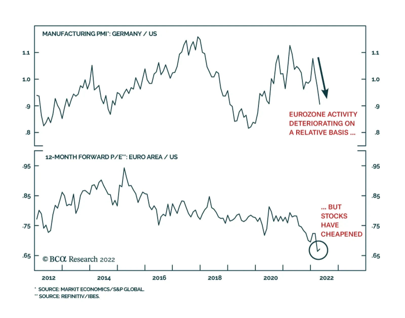
The German Manufacturing PMI has been declining relative to its US counterpart since January, underscoring that the Eurozone economy is facing stronger headwinds. Hard data corroborates this dynamic. The Euro Area’s Q1 GDP and CPI releases suggest that the…

Listen to a short summary of this report. Executive Summary The Number Of Babies Born In China Has Fallen By Close To 30% Since 2019
The Number Of Babies Born In China Has Fallen By Close To 30% Since 2019
The Number Of Babies Born In China Has Fallen By Close To 30% Since 2019
The number of births collapsed during the pandemic. While the preliminary evidence suggests that fertility rates are starting to recover in most developed economies, they remain well below the level necessary to maintain a stable population. Aging populations are putting strain on pension and health care systems. They are also threatening to undermine geopolitical influence. The conventional wisdom is that there is not much that can be done to lift fertility rates. While it is true that government subsidies to encourage parents to have more children are not especially effective, other policies, such as cheaper child care, are more promising. Rather than discouraging property investment, China is likely to increase housing supply in order to make family formation more affordable. This could boost commodity demand. More contentiously, the use of IVF technologies to select for certain traits such as higher intelligence in children could open up a new front on the geopolitical battlefield that few analysts are expecting. Regardless of government policy, birth rates will eventually rise of their own accord because both cultural and genetic evolution will select for families that wish to have more children. In the long run, faster population growth will lead to stronger corporate sales, which is a plus for equities. Over a shorter-term horizon, however, the global dependency ratio could end up increasing, as the number of retirees rises while the number of children that parents need to support goes up. This could put upward pressure on interest rates and bond yields. Bottom Line: Contrary to popular opinion, global fertility rates may be bottoming and could rise significantly over the long run. While this trend will eventually benefit stocks, it is likely to come at the expense of higher bond yields. Dear Client, We tactically downgraded global equities from overweight to neutral on February 28th. As we discussed last week in our report entitled “Here Comes Goldilocks,” we see a more fortuitous environment emerging in the second half of the year, which suggests that stocks will likely be higher over a 12-month horizon. This week, we step back from recent market action to focus on a long-term investment theme of great importance: demographic change. Contrary to the conventional wisdom that sees birth rates continuing to fall over the next few decades, we argue that developed economies may be on the cusp of a strong and sustained baby boom. I will be visiting clients in the San Francisco Bay Area next week. Instead of our regular report, we will be sending you a Special Report written by Irene Tunkel, BCA’s Chief US Equity Strategist. Irene will discuss inflation regimes and their implications for US equities. Best regards, Peter Berezin, Chief Global Strategist Baby Bust At the start of the pandemic, some speculated that with little else to do, couples would spend more time in bed, leading to a mini baby boom. As it turned out, the exact opposite happened: Birth rates plunged around the world. In the US, the number of babies born in January 2021 was about 10% lower than one would have expected based on the pre-pandemic trend. Similar shortfalls were observed in the UK, France, Italy, Spain, and Japan (Chart 1). In China, the number of births fell by almost 30% between 2019 and 2021 to the lowest level since 1949 (Chart 2). Chart 1The Birth Rate Has Recovered Since The Start Of The Pandemic But Remains Below Levels Consistent With A Stable Population
The Coming Stork Wars
The Coming Stork Wars
Chart 2The Number Of Babies Born In China Has Fallen By Close To 30% Since 2019
The Number Of Babies Born In China Has Fallen By Close To 30% Since 2019
The Number Of Babies Born In China Has Fallen By Close To 30% Since 2019
While the pandemic continues to restrain fertility in China, the latest data from developed economies suggest births have rebounded. Nevertheless, birth rates remain far below the level necessary to maintain stable populations. A recent study in The Lancet estimated that more than three-quarters of countries would have below-replacement fertility rates by the end of the century. The study estimated that the global population would peak at 9.7 billion in 2064 and decline to 8.8 billion by 2100. Alarm Over Low Birth Rates Low birth rates have become a major cause of concern for policymakers. Aging populations are putting strain on pension and health care systems. The OECD expects the old-age dependency ratio to double from 30% to 60% by 2075 (Chart 3). Pension spending in the OECD is projected to rise by 1.4% of GDP over the next 40 years. Chart 3Conventional Forecasts Expect The Population To Grey Over The Coming Decade
The Coming Stork Wars
The Coming Stork Wars
Chart 4The UN Projects China's Working-Age Population Will Shrink By 400 Million Over The Remainder Of The Century
The UN Projects China's Working-Age Population Will Shrink By 400 Million Over The Remainder Of The Century
The UN Projects China's Working-Age Population Will Shrink By 400 Million Over The Remainder Of The Century
Health care spending is likely to grow at an even faster pace. In the US, the Congressional Budget Office sees federal government-financed health care spending rising from 5.7% of GDP to 9.4% of GDP by 2050. As has been the case in Japan and Russia, and could be the case in China, a shrinking population threatens to undermine geopolitical influence. The UN estimates that China’s working-age population will decline from about 1 billion to less than 600 million by the end of the century. By 2100, Nigeria’s working-age population is projected to approach China’s (Chart 4). It is difficult to be an economic and military superpower if you do not have enough workers and soldiers. Pro-Natal Subsidies: Little Bang for the Buck Governments are responding by adopting increasingly aggressive pro-natal policies. According to the UN, more than 50 countries have officially declared their intention to increase fertility rates (Chart 5). Chart 5Governments Are Actively Trying To Raise Fertility Rates
The Coming Stork Wars
The Coming Stork Wars
Chart 6Fertility Rates Keep Dropping In OECD Countries Amid Rising Government Incentives
Fertility Rates Keep Dropping In OECD Countries Amid Rising Government Incentives
Fertility Rates Keep Dropping In OECD Countries Amid Rising Government Incentives
Various European countries, ranging from Estonia, Germany, Greece, Finland, France, Italy, and Lithuania to the UK offer varying bonus payments to new parents. Japan and Singapore both have baby bonus schemes. South Korea, which has the lowest fertility rate in the world, recently increased the reward it pays to mothers from US$500 to US$1,700. The most significant pro-natal shift has come from China. After having officially abandoned its one-child policy in 2016, China announced last year that it will allow couples to have up to three children. We expect China to introduce generous subsidies to encourage childbirth over the next few years. Will such policies arrest the decline in birth rates? There are certainly reasons to be skeptical. Chart 6 shows that spending on family benefits in OECD economies rose from 1.5% to 2.1% of GDP over the past 40 years. Yet, the fertility rate fell from 2.25 to 1.66 over this period. Can Anything Turn the Tide? A number of structural forces have contributed to lower fertility rates. These include increased female labor market participation, readily available birth control, falling child mortality, and rising housing and educational costs. The availability of government-provided income support and health care has also arguably reduced the historic role that children have played in supporting their parents in old age. The conventional wisdom is that these forces will only strengthen in the future, ensuring that fertility rates keep dropping. I am not so sure. Are Children Inferior, Normal, or Veblen goods? While it is rather awkward to think of the decision to have children in economic terms, there is some logic to this approach. Economists tend to distinguish between substitution and income effects. The substitution effect for children is negative: As wages rise, the opportunity cost of having children goes up. In contrast, a number of studies have documented that the income effect is positive: Give a couple an extra $1 million, no strings attached, and that could push them over the line in deciding to have an additional child (in economic parlance, children are “normal” rather than “inferior”). Economists have long known that labor supply curves tend to be “backward bending” (Charts 7A & B). The classic example is that of leisure. As wages initially rise from low levels, people may seek to work more (and hence, consume less leisure). Eventually, however, if wages rise enough, people will cut back on work in order to enjoy the fruits of their labor. Chart 7ABackward-Bending Demand Curves May Also Apply To Children
The Coming Stork Wars
The Coming Stork Wars
Chart 7BLower Child-Rearing Costs Would Improve The Demographic Problem
The Coming Stork Wars
The Coming Stork Wars
The same sort of backward-bending demand curve may apply to children. As wages rise above a certain threshold, parents may decide that they can afford to have more children. Chart 8 shows that the correlation between per capita income and realized fertility has turned positive in developed economies. Chart 8Correlation Between Incomes And Realized Fertility Has Turned Positive In Developed Countries
The Coming Stork Wars
The Coming Stork Wars
Looking out, it is possible that children will become “Veblen” goods, named after nineteenth-century economist Thorstein Veblen, who coined the term “conspicuous consumption.” With many luxury goods now available to the masses, what better way to signal that one has made it to the top than to have five kids in Manhattan or Beverly Hills? How Expensive Are Children, Really? Across most developed economies, women tend to end up having fewer children than they would like (Chart 9). While difficulty in finding a suitable spouse is sometimes cited as a reason, the financial hardship associated with parenting usually ranks higher. Chart 9Most Women Are Having Fewer Children Than They Desire
The Coming Stork Wars
The Coming Stork Wars
Chart 10Depression Rates Among Children And Teenagers Have Been Increasing Over The Past Decade
The Coming Stork Wars
The Coming Stork Wars
According to one recent estimate, it costs nearly $300,000, excluding college tuition, to raise a child in the US. This number, however, is conditional on what society currently deems appropriate for rearing children. If the incremental cost of a child were to decline, the slope of the budget constraint in Chart 7B would become flatter, implying that both the income and substitution effects would reinforce each other in the direction of having more children. Could society eventually conclude that the cost of having a child is not as large as widely perceived? The idea is not as far-fetched as it sounds. Having turned 50 this week, I find it interesting to look back at how much cultural norms towards kids have changed over the past few decades. Growing up in Hamilton Ontario, I remember taking the public bus alone at the age of 10 to school, the pool, or anywhere else I wanted to go. Are kids even allowed to leave the house unattended anymore? As Derek Thompson points out in a recent article in The Atlantic, American parents have nearly doubled the amount of time spent raising their kids. And what has the advent of helicopter parenting achieved? It is difficult to point to any concrete benefits. Depression rates among children and teenagers have soared (Chart 10). While the proliferation of social media has exacerbated childhood angst, the tendency for parents to try to shield their children from hardship and failure has probably only made things worse. Does Schooling Matter Much? Sticking with the issue of schooling, to what extent does the modern parental preoccupation with education actually benefit children? Probably a lot less than parents realize. IQ is highly correlated with educational achievement and many other favorable life outcomes (Chart 11). IQ scores are by far the best predictors of job performance, much better than fashionable concepts such as “emotional intelligence” (Chart 12). Chart 11IQ Tests Don’t Just Measure How Well You Can Do On An IQ Test
The Coming Stork Wars
The Coming Stork Wars
Chart 12Cognitive Ability Matters A Lot For Job Performance
The Coming Stork Wars
The Coming Stork Wars
In healthy, well-nourished populations, genetics explains about 50% of IQ variation at age ten and 80% in adulthood (Chart 13). In fact, IQ is almost as heritable as height (Chart 14). Chart 13The Heritability Of IQ Reaches 80% By Adulthood
The Coming Stork Wars
The Coming Stork Wars
Chart 14IQ Is Almost As Heritable As Height
The Coming Stork Wars
The Coming Stork Wars
When a child suffers from economic or social deprivation, improvements to their environment can have a large positive impact on their cognitive performance. However, beyond a certain environmental threshold, there is not much that parents can do. A recent study concluded that “there is only a marginal and inconsistent influence of parenting on offspring IQ in adolescence and young adulthood.” Table 1A Poisoned Chalice? Genetic Screening Can Raise IQ
The Coming Stork Wars
The Coming Stork Wars
Even musical training, which parents often spend a fortune on, does not appear to generate any knock-on benefits for math or language skills. As much as I hate to say it, the evidence suggests that the most reliable way to enhance a child’s educational prospects is to endow them with high IQ genes. I will not speak to the questionable ethics of doing so, but as I discussed in my report on the rise and fall of human intelligence a few years ago, the technology is coming. Carl Shulman and Nick Bostrom estimate that genetic screening could boost average IQs by up to 65 points in five generations (Table 1). The Stork Wars The ability to engineer high-IQ children through IVF technologies could open up a front on the geopolitical battlefield that few analysts are expecting. Such a battlefield for geopolitical supremacy will take place at a time when China and Russia, on the one side, and much of the West, on the other side, are moving in polar opposite directions on a variety of cultural issues. The empirical evidence suggests that there is a U-shaped relationship between gender equality and fertility rates. Both patriarchal societies, such as those in parts of the Middle East, and egalitarian societies, such as those in Scandinavia, have been able to maintain relatively high fertility levels. Between these two extremes, fertility rates are typically well below replacement. Whereas most Western nationals have sought to promote gender equality in recent years, China and Russia have shifted in a more traditionalist direction. Last April, China’s government shut down a number of feminist social media groups. This followed a statement by China's Education Ministry that the government would seek to “cultivate masculinity.” Boys were becoming “delicate, timid and effeminate,” a key government advisor declared. Ironically, both the traditionalist and egalitarian approaches could lift fertility rates, but at the cost of an ever-wider cleavage in the global culture wars. The Long-Term Outlook for Fertility Rates: Up, Up, and Away? In a world of abundant material resources, a steady or declining population is not an evolutionary stable equilibrium. As long as there are some selection pressures towards having more offspring, in the absence of offsetting forces, evolution will push up fertility rates. In the pre-industrial era, parents with many children often struggled to keep enough food on the table. The correlation between parent and child fertility was close to zero, meaning that children who came from big families did not have more surviving offspring than children from small families. After the Industrial Revolution, the correlation turned positive, and by most indications, has been rising over the past few decades. Were it not for the positive correlation between parent and child fertility, global population levels would be even lower today. How high could birth rates climb if the cultural forces, which have suppressed fertility over the past century, abate? The natural tendency is to think that evolution works too slowly to matter. However, this represents a misreading of the evidence. When there are evolutionary disequilibria – that is, when the environment changes in ways that renders existing reproductivity strategies suboptimal – natural selection can work surprisingly fast. Contrary to the widespread notion that human evolution stopped before the Agricultural Revolution, a recent study in Nature found that 88% of physiological traits have undergone polygenic change during the past 2,000 to 3,000 years. Using plausible estimates of intergenerational fertility correlations, Jason Collins and Lionel Page calibrate a model of global population growth. In contrast to more conventional demographic models, they conclude that global population growth, rather than turning negative later this century, will accelerate. In their baseline model without any heritability effects, the global total fertility rate falls to 1.82 by the end of the century. Once heritability effects are included, the projected total fertility rate rises to 2.21 (Chart 15). The largest effects are for Europe and North America, the first two regions to undertake a demographic transition to (temporarily) low birth rates. The authors see the European median total fertility rate rising to 2.46 by the end of the century, with the North American rate increasing to 2.67. Chart 15Natural Selection Could End Up Boosting Fertility Rates Over The Long Run
The Coming Stork Wars
The Coming Stork Wars
Notably, the support ratio – the ratio of workers-to-consumers – continues to fall in their model over the remainder of the century. They conclude: “Once the increase in number of children is taken into consideration, the higher number of children in the heritability model merely shifts the nature of the burden rather than ameliorating it.” Investment Conclusions The world is at a demographic inflection point. After rising steadily for four decades, the global support ratio has peaked (Chart 16). Baby boomers are beginning to leave the labor market en masse. While they were working, they accumulated a lot of assets. In the US, baby boomers hold more than half of all household wealth (Chart 17). Chart 16Less Workers And More Consumers Over The Next Decades
Less Workers And More Consumers Over The Next Decades
Less Workers And More Consumers Over The Next Decades
Chart 17Baby Boomers Hold More Than Half Of Wealth In The US
The Coming Stork Wars
The Coming Stork Wars
Going forward, rather than working and saving, baby boomers will spend down their wealth. The global pool of savings will shrink, putting upward pressure on equilibrium real interest rates and bond yields. Faced with the prospect of shrinking work forces, strained social security systems, and declining geopolitical influence, countries with low or negative population growth will offer increasingly generous subsidies to encourage couples to have more children. The resulting bigger budget deficits will further drain national savings. In and of themselves, government subsides are unlikely to significantly boost birth rates. More holistic policies will be needed, including steps to reduce the cost of child care and housing. Rather than discouraging property investment, China is likely to increase housing supply in order to make family formation more affordable. This could help support commodity demand. Governments will try to influence the social and cultural narrative on family matters.In some cases, the impact could be quite innocuous, such as China’s decision to ban for-profit tutoring companies in order to ease pressure on students and parents. In other cases, the impact could be very contentious, leading to an escalation in the so-called culture wars. Regardless of the policy measures that governments adopt, birth rates will eventually rise of their own accord because both cultural and genetic evolution will select for families that wish to have more children. In the long run, faster population growth will lead to stronger corporate sales, which is a plus for equities. Over a shorter-term horizon, however, the global dependency ratio could end up increasing, as the number of retirees rises while the number of children that parents need to support goes up. On balance, therefore, we see demographic trends as being somewhat negative for stocks over the next one-or-two decades. Peter Berezin Chief Global Strategist peterb@bcaresearch.com Follow me on LinkedIn Twitter View Matrix
The Coming Stork Wars
The Coming Stork Wars
Special Trade Recommendations Current MacroQuant Model Scores
The Coming Stork Wars
The Coming Stork Wars
Dear Client, This week, we present our inaugural report on ESG investing and the global energy transition. Henceforth, we will be publishing this research on the last Thursday of every month. Our principal ESG focus will be on the Environmental aspects of climate change, and the policies and actions undertaken to arrest the rise in the Earth's temperature via decarbonization. To date, the goal of Environmental policy in many jurisdictions – e.g., the US and EU – has been to disincentivize exploration, production, refining and transportation investment in hydrocarbons. At the same time, it has strongly incentivized investment in renewable-power generation. This has produced volatile marginal effects, forcing commodity markets to allocate increasingly scarce energy and metals supplies against a backdrop of increasing demand. It is at this nexus where investment opportunities will emerge. ESG's Social and Governance pillars are slower-moving change agents, with long-duration effects. Human-rights failures can destroy lives and lead to social unrest. Failed corporate governance and national governance can sharply alter firms' abilities and willingness to invest in environmentally responsible resource development. Failure in both dimensions can profoundly affect commodity supply-demand balances, and imperil the energy transition. Much of what passes for ESG measurement and compliance is self-reported – when data are available – and differs little from PR or virtue signaling. This is starting to change. Over the next 2-3 years, we expect a continued increase in government involvement in standardizing ESG reporting – cf, the SEC's recent proposal for reporting Scope 1, 2 and 3 emissions, and an increased focus on carbon pricing, which we believe will require a global carbon tax or carbon-price floor. This will be needed to incentivize investment in renewables and carbon-reduction and -capture technology, given the near-impossibility of harmonizing local and regional carbon-trading schemes. Otherwise climate clubs – i.e., trading blocs comprising states with shared ESG goals – will emerge, which will further fragment global trade. We are hopeful you will find this research useful in your decision making and investing. Bob Ryan Managing Editor, Commodity & ESG Strategy Executive Summary Fossil Fuels Dominate Global Energy Mix
Fossil Fuels Dominate Global Energy Mix
Fossil Fuels Dominate Global Energy Mix
Whether or not the SEC's proposal to disclose Scope 1, 2 and 3 emissions and other risk factors by firms it regulates will be adopted in whole or in part, we are confident it foreshadows deeper government involvement in the ESG arena in the near term in the US and EU. Carbon pricing will become increasingly important in global climate-change policy. We believe this will require a global carbon tax or carbon-price floor to incentivize investment in renewables and carbon-reduction and -capture technology. Failure to agree on at least a carbon price floor over the next 2-3 years almost surely will lead to the formation of climate clubs. In such clubs, like-minded states with similarly rigorous carbon-pricing and ESG disclosure requirements will allow trade among each other, but will levy tariffs against firms in states lacking such policies. Bottom Line: Governments are approaching a reckoning on their commitments to reduce or slow CO2 and greenhouse-gas (GHG) emissions. These are meant to hold the rise in the Earth's temperature to less than 2° C, or to approach the 1.5° C goal of the Paris Agreement. Reporting mandates like the EU's and the SEC's proposed CO2/GHG reports will help, as will increased subsidies and tax support for carbon-capture and hydrogen technology. However, a global carbon tax or carbon-price floor will be required to incentivize the investment needed to meet climate-change goals. Feature Voluntary programs and self-reporting are not reducing the concentration of CO2 and other GHGs fast enough to stay on track to meet Paris Agreement targets of holding the rise in the Earth's temperature to less than 2° C vs, pre-industrial levels, or preferably to 1.5° C. Over the next couple of years, we believe states will have to mandate additional ESG reporting – particularly on CO2 and other GHG emissions – and will require audits of programs and reports connected to GHG emissions, given the scope of what they are trying to accomplish. The EU got the ball rolling on reporting emissions, and now the US SEC is proposing new regulations as well. These will require the firms it regulates to disclose Scope 1, 2 and 3 emissions and other climate-related factors that constitute material risks to revenues and profits.1 Regardless of whether this proposal makes it through the legislative process, firms with operations in the EU will have to comply with similar reporting requirements if similar proposals are approved. Growing Energy Demand Fuels Higher CO2 Emissions World electricity demand – the principal focus of the global energy transition – grew 6% last year, on the back of strong GDP growth and weather-related demand. 2021 saw the highest electricity demand growth recorded by the IEA in the post-GFC recovery that began in 2010, amounting to 1,500 Twh year-on-year. Coal covered more than half of the growth in global electricity demand last year, and has constituted a major chunk of the electricity mix over a longer historical sample. Based on data starting in 2000, the world – primarily EM – has been net positive coal-fired power capacity (Chart 1) which reached an all-time high in 2021 as well, rising 9% y/y, while gas-fired generation grew 2%. The increase in fossil fuel generation pushed CO2 emissions globally up almost 6% to record highs. Renewable generation grew by 6% last year and is expected to meet most of the increase in electricity demand over the 2022-24 period with 8% p.a. growth, according to the IEA. Coal demand surged on the back of robust economic growth and weather-related factors, which helped propel global CO2 emissions to a record high at just over 36 billion MT in 2021, according to the IEA. This reversed the downturn in 2020 caused by the COVID-19 pandemic (Chart 2). Higher methane and nitrous oxide emissions, plus CO2 released by oil and gas flaring, lifted total energy-related GHG emissions to record levels last year as well. Chart 1Coal-Fired Power Has Been A Constant
Looking Through ESG Virtue Signaling
Looking Through ESG Virtue Signaling
Chart 2Fossil Fuels Dominate Global Energy Mix
Fossil Fuels Dominate Global Energy Mix
Fossil Fuels Dominate Global Energy Mix
We find evidence of a long-run relationship between real GDP and carbon dioxide emissions (Chart 3). This likely plays out through cointegration between oil consumption with real GDP, a relationship we exploit when estimating our monthly oil balances. While the income elasticity for emerging economies reliant on manufacturing – e.g., India and China – is positive, for the EU, a bloc of developed nations, that elasticity turns negative. This is consistent with the hypothesis of the Environmental Kuznets Curve, which states that initial increases in GDP per capita are associated with environmental degradation, however, beyond a point, income increases are associated with lower environmental damage.2 Interesting, as well, is the lack of any cointegration between GDP and US CO2 emissions. That may be due to the increased use of natgas vs. coal, and the fact that the energy intensity of US GDP continues to fall. Energy demand levels, including electricity, continues to exceed renewables supply. So even though renewable-energy generation growth is expected to meet 90% of energy demand growth from 2022 to 2024, the accumulation of CO2 and other GHGs will continue keeping the level of pollutants rising over that period. Chart 3CO2 Closely Tied To GDP
CO2 Closely Tied To GDP
CO2 Closely Tied To GDP
Recent research on global CO2 emissions growth for different countries based on historical values for population, GDP per capita and carbon intensity (measured as CO2 emissions per unit of GDP) projects median annual CO2 emissions in 2100 will be 34 Gigatons (Chart 4).3 This is significantly higher than the emissions required to keep temperature increases under 2° C by the end of the forecast period. The forecast is accompanied by four other CO2 emission scenarios provided by the Intergovernmental Panel on Climate Change (IPCC). Chart 4CO2 Projected Increases Overshoot Paris Agreement Targets
Looking Through ESG Virtue Signaling
Looking Through ESG Virtue Signaling
Carbon Tax Needed One of our high-conviction views is governments worldwide need to agree a global carbon tax that can be applied directly to CO2 emissions.4 If a global carbon tax cannot be agreed, a global carbon-price floor also could be used to incentivize the investment needed to meet climate-change goals. An IMF analysis entitled "Five Things To Know About Carbon Pricing" published in September notes: "An international carbon price floor can be strikingly effective. A 2030 price floor of $75 a ton for advanced economies, $50 for high-income emerging market economies such as China, and $25 for lower-income emerging markets such as India would keep warming below 2°C with just six participants (Canada, China, European Union, India, United Kingdom, United States) and other G20 countries meeting their Paris pledges." There may be legitimate grounds for arguing over the point at which the tax is collected – i.e., at the production or consumption stages – but, in our view, this would be far superior (and quicker to implement) than trying to harmonize the different carbon-trading schemes worldwide. In addition, the revenues generated by the tax would allow governments to protect the interests of lower-income constituencies, which are most adversely affected by such regressive taxes. We also have maintained failure to agree a carbon tax of some form over the next 2-3 years almost surely will lead to the formation of climate clubs, a notion pioneered by William Nordhaus, the 2018 Nobel Laurate.5 In Nordhaus's clubs, like-minded states with similarly rigorous carbon-pricing and ESG disclosure requirements will allow trade among each other, but will levy tariffs against firms in states lacking such measures. There is some evidence China already is preparing for this eventuality by limiting the export of high-carbon products to consumer states with strong climate-protection laws. For example, the EU last year rolled out a Carbon Border Adjustment Mechanism (CBAM), which it describes as "a climate measure that should prevent the risk of carbon leakage and supports the EU's increased ambition on climate mitigation, while ensuring WTO compatibility."6 Investment Implications Governments are moving quickly to address shortcoming in existing CO2 and GHG reduction policies. Among other things, the EU and US are proposing mandatory reporting on these emissions covering Scope 1, 2 and 3 emissions. In addition, China is refining its five-year plan to limit high-carbon exports, so that it does not run afoul of the EU's CBAM. We expect more of such measures going forward, as CO2 and GHG emissions continue to accumulate in the atmosphere at a rate that cannot be offset by existing policy. Robert P. Ryan Chief Commodity & Energy Strategist rryan@bcaresearch.com Ashwin Shyam Research Analyst Commodity & Energy Strategy ashwin.shyam@bcaresearch.com Paula Struk Research Associate Commodity & Energy Strategy paula.struk@bcaresearch.com Footnotes 1 Scope 1 covers GHG emissions firms directly generate on their own; Scope 2 applies to emissions indirectly created a purchasing electricity and other forms of energy; and Scope 3 covers indirect emissions produced up and down the firms' supply chain. These are deemed to be material risks that could impact firms' revenues and profitability, hence necessary information for investors and market participants generally. Please see SEC Proposes Rules to Enhance and Standardize Climate-Related Disclosures for Investors, published by the SEC on March 21, 2022. 2 For more information on this, please see ScienceDirect’s page on the Environmental Kuznets Curve. 3 Please see Country-based rate of emissions reductions should increase by 80% beyond nationally determined contributions to meet the 2 degree Celsius target (Liu and Rafter, 2021), published in Nature. 4 Please see Surging Metals Prices And The Case For Carbon-Capture, which we published on May 13, 2021. It is available at ces.bcaresearch.com. 5 Please see Nordhaus, William (2015), "Climate Clubs: Overcoming Free-riding in International Climate Policy," American Economic Review 105:4, pp. 1339–1370. 6 Please see Carbon Border Adjustment Mechanism: Questions and Answers, published by the European Commission on July 14, 2021. See also China issues guidelines under 14th 5-year plan to limit high-carbon product exports, published by S&P Global Platts on April 7, 2022. Platts notes this likely will be China's first FYP to include limits on "high-carbon products from the (refining and petrochemical) industry amid China's carbon neutrality journey. This comes amid expectations that foreign countries may levy tariffs like the EU's Cross Border Adjustment Mechanism, or CBAM, on such products in the future." Investment Views and Themes Recommendations Strategic Recommendations Trades Closed in 2022
Image
The US economy contracted by an annualized 1.4% in Q1, well short of markets’ expectations of a 1.0% expansion. This advance estimate of US growth follows a positive surprise in the previous quarter, which brought last year’s growth to a 37-year high of 5.7%…
Highlights All four of our US Equity indicators are currently pointing in a bearish direction. Our Monetary Indicator has fallen to a three decade low, our Technical Indicator has broken into negative territory, our Valuation Indicator still signals extreme equity pricing, and our Speculation Indicator does not yet support a contrarian buy signal. Still, we do not expect a US recession over the coming year, which implies that S&P 500 revenue growth will stay positive. Nonrecessionary earnings contractions are rare, and are almost always associated with a significant contraction in profit margins. Our new profit margin warning indicator currently suggests the odds of falling margins are low, although the risks may rise later this year. Stocks are extremely expensive, but rich valuations are being driven by extremely low real bond yields, rather than investor exuberance. Valuation is unlikely to impact US stock market performance significantly over the coming year unless long-maturity bond yields rise substantially further. Technical analysis of stock prices has a long and successful history at boosting investment performance, which ostensibly suggests that investors should be paying more attention to technical conditions in the current environment. However, technical trading rules have been less helpful in expansionary environments when inflation is above average and when stock prices and bond yields are less likely to be positively correlated (as is currently the case). As such, the recent technical breakdown of the US equity market may simply reflect a reduced signal-to-noise ratio associated with these economic and financial market regimes. For now, we see our indicators as supportive of a cautious, minimally-overweight stance toward stocks within a multi-asset portfolio over the coming 6 to 12 months. Rising odds of a recession, declining profit margins, and a large increase in investor or Fed expectations for the neutral rate of interest are the most significant threats to the equity market, the risks of which should be monitored closely by investors. Feature In Section 1 of our report, we reviewed why a recession in the US is unlikely over the coming 6 to 12 months. However, we also highlighted that the risks to the economic outlook are meaningful and that an aggressively overweight stance toward risky assets is currently unwarranted. During times of significant uncertainty, investors should pay relatively more attention to long-term economic and financial market indicators with a reliable track record. In this report we begin by briefly reviewing the message from our US Equity Indicators, and then turn to a deeper examination of the top-down outlook for earnings, the determinants of rich valuation in the US stock market, and whether investors should rely on technical indicators in the current environment. We conclude that, while an indicator-based approach is providing mixed signals about the US equity market, we generally see our indicators as supportive of a cautious, minimally-overweight stance toward stocks within a multi-asset portfolio. Aside from tracking the risk of a recession, investors should be closely attuned to signs of a contraction in profit margins or shifting neutral rate expectations as a basis to reduce equity exposure to below-benchmark levels. A Brief Review Of Our US Equity Indicators Chart II-1Our Equity Indicators Are Pointing In A Bearish Direction
Our Equity Indicators Are Pointing In A Bearish Direction
Our Equity Indicators Are Pointing In A Bearish Direction
Chart II-1 presents our US Equity Indicators, which we update each month in Section 3 of our report. We highlight our observations below: Chart II-1 shows that our Monetary Indicator has fallen to its lowest level since 1995, when the Fed surprised investors and shifted rapidly in a hawkish direction. The indicator is most acutely impacted by the speed of the rise in 10-year Treasury yields and a massive surge in the BCA Short Rate Indicator to levels that have not prevailed since the late 1970s (Chart II-2). Our Technical Indicator has recently broken into negative territory, which we have traditionally interpreted as a sign to sell stocks. The indicator has been dragged lower by a deterioration in stock market breadth across several tracked measures and by weak sentiment (Chart II-3). The momentum component of the indicator is fractionally positive but is exhibiting clear weakness. Our Valuation Indicator continues to highlight that US equities are extremely overvalued relative to their history, despite the recent sell-off in stock prices. Our Speculation Indicator arguably provides the least negative signal of our four indicators, at least from a contrarian perspective. In Q1 2021, the indicator nearly reached the all-time high set in March 2000, but it has since retreated significantly and has exited extremely speculative territory. While this may eventually provide a positive signal for stocks, equity returns have historically been below average during months when the indicator declines. Thus, the downtrend in the Speculation Indicator still points to weakness in stock prices, at least over the nearer term. Chart II-2Our Monetary Indicator Is Falling In Part Because Of Surging Interest Rate Expectations
Our Monetary Indicator Is Falling In Part Because Of Surging Interest Rate Expectations
Our Monetary Indicator Is Falling In Part Because Of Surging Interest Rate Expectations
Chart II-3All Three Components Of Our Technical Indicator Are Falling
All Three Components Of Our Technical Indicator Are Falling
All Three Components Of Our Technical Indicator Are Falling
In summary, all four of our US Equity indicators are currently pointing in a bearish direction, which clearly argues against an aggressively overweight stance favoring equities within a multi-asset portfolio. At the same time, we reviewed the odds of a US recession over the coming year in Section 1 of our report and argued that a recession is not likely over the coming 12 months. Thus, one key question for investors is whether a nonrecessionary contraction in earnings is likely over the coming year. We address this question in the next section of our report, before turning to a deeper examination of the relative importance of equity valuation and technical indicators. Gauging The Risk Of A Nonrecessionary Earnings Contraction Chart II-4Nonrecessionary Earnings Declines Usually Occur Due To Falling Margins
Nonrecessionary Earnings Declines Usually Occur Due To Falling Margins
Nonrecessionary Earnings Declines Usually Occur Due To Falling Margins
Based on S&P data, there have been five cases since 1960 when 12-month trailing earnings per share fell year-over-year, while the economy continued to expand (Chart II-4). Sales per share growth remained positive in four of these cases (panel 2), underscoring that falling profit margins have been mostly responsible for these nonrecessionary earnings declines. We have noted our concern about how elevated US profit margins have become and have argued that a significant further expansion is not likely to occur over the coming 12-24 months.1 To gauge the risk of a sizeable decline in margins over the coming year, we construct a new indicator based on the seven instances when S&P 500 margins fell outside the context of a recession. This includes two cases when margins fell but earnings did not (because of buoyant revenue growth). We based the indicator on these five factors: Changes in unit labor cost growth to measure the impact of wage costs on firm profitability; Lagging changes in commodity prices as a proxy for material costs; The level of real short-term interest rates as a proxy for borrowing costs; Changes in a sales growth proxy to measure the impact of operating leverage on margins; And changes in the ISM manufacturing index to capture any residual impact on margins from the business cycle. Chart II-5The Odds Of A Nonrecessionary Profit Margin Contraction Are Currently Low
The Odds Of A Nonrecessionary Profit Margin Contraction Are Currently Low
The Odds Of A Nonrecessionary Profit Margin Contraction Are Currently Low
Chart II-5 presents the indicator, which is shaded both for recessionary periods and the seven nonrecessionary margin contraction episodes we identified. While the indicator does not perfectly predict margin contractions outside of recessions, it did signal 50% or greater odds of a margin contraction in four of the seven episodes we examined, and signals high odds of a contraction in margins during recessions. Among the three cases in which the indicator failed to indicate falling margins during an expansion, two of those failures were episodes when earnings growth did not ultimately contract. The inability to explain the 1997-1998 margin contraction is the most relevant failure of the indicator, in addition to two false signals in 1963 and 1988. Still, the approach provides a useful framework to gauge the risk of falling profit margins, and the results provide an interesting and somewhat surprising message about the relative importance of the factors we included. We would have expected that accelerating wages would have been the most significant factor explaining nonrecessionary profit margin declines. Wages were highly significant, but they were the second most important factor behind our sales growth proxy. Lagged commodity prices were the third most significant factor, followed by real short-term interest rates. Changes in the ISM manufacturing index were least significant, underscoring that our sales growth proxy already captures most of the effect of the business cycle on profit margins. This suggests that operating leverage is an important determinant of margins during economic expansions, and that investors should be most concerned about declining profit margins when both revenue growth is slowing significantly and wage growth is accelerating. The indicator currently points to low odds of a nonrecessionary margin contraction, but this is likely to change over the coming year. We expect that all five of the factors will evolve in a fashion that is negative for margins over the coming twelve months: While the pace of its increase is slowing, median wage growth continues to accelerate, even when adjusting for the fact that 1st quartile wage growth is growing at an above-average rate (Chart II-6). Combining the latter with higher odds of at or below-trend growth this year implies that unit labor costs may rise further over the coming twelve months. Analysts expect S&P 500 revenue growth to slow nontrivially over the coming year (Chart II-7). Current expectations point to growth slowing to a level that would still be quite strong relative to what has prevailed over the past decade; however, accelerating wage costs in lockstep with decelerating revenue growth is exactly the type of combination that has historically been associated with falling margins during economic expansions. Chart II-6Wage Growth Is Accelerating...
Wage Growth Is Accelerating...
Wage Growth Is Accelerating...
Chart II-7...And Revenue Growth Is Set To Slow
...And Revenue Growth Is Set To Slow
...And Revenue Growth Is Set To Slow
Although these are less impactful factors, the lagged effect of the recent surge in commodity prices will also weigh on margins over the coming year, as will rising real interest rates and a likely slowdown in manufacturing activity in response to slower goods spending. In addition to our new indicator, we have two other tools at our disposal to track the odds of a decline in profit margins over the coming year. First, Chart II-8 illustrates that an industry operating margin diffusion index does a decent job at leading turning points in S&P 500 profit margins, despite its volatility. And second, Chart II-9 highlights that changes in the sales and profit margin diffusion indexes sourced from the Atlanta Fed’s Business Inflation Expectations Survey have predicted turning points in operating sales per share and margins over the past decade. Chart II-9 does suggest that profit margins may not rise further, but flat margins are not likely to be a threat to earnings growth over the coming year if a recession is avoided (as we expect). Chart II-8Sector Diffusion Indexes Are Not Signaling A Major Warning Sign For Margins...
Sector Diffusion Indexes Are Not Signaling A Major Warning Sign For Margins...
Sector Diffusion Indexes Are Not Signaling A Major Warning Sign For Margins...
Chart II-9...Neither Are The Atlanta Fed Business Sales And Margin Diffusion Indexes
...Neither Are The Atlanta Fed Business Sales And Margin Diffusion Indexes
...Neither Are The Atlanta Fed Business Sales And Margin Diffusion Indexes
The conclusion for investors is that the odds of a decline in profit margins over the coming year are elevated and should be monitored, but are seemingly not yet imminent. In combination with expectations for slowing revenue growth, this implies, for now, that earnings growth over the coming year will be low but positive. Valuation, Interest Rates, And The Equity Risk Premium As noted above, our Valuation Indicator continues to highlight that US Equities are extremely overvalued relative to their history. Our Valuation Indicator is a composite of different valuation measures, and we sometimes receive questions from investors asking about the seemingly different messages provided by these different metrics. For example, Chart II-10 highlights that equity valuation has almost, but not fully, returned to late-1990 conditions based on the Price/Earnings (P/E) ratio, but is seemingly more expensive based on the Price/Book (P/B) and especially Price/Sales (P/S) ratios. In our view, this apparent discrepancy is easily resolved. Relative to the P/E ratio, both the P/B and especially P/S ratios are impacted by changes in aggregate profit margins, which have risen structurally over the past two decades because of the rising share of broadly-defined technology companies in the US equity index (Chart II-11). Barring a major shift in the profitability of US tech companies over the coming year, we do not see discrepancies between the P/E, P/B, or P/S ratios as being particularly informative for investors. As an additional point, we also do not see the Shiller P/E or other cyclically-adjusted P/E measures as providing any extra information about the richness or cheapness of US equities today, as these measures tend to move in line with the 12-month forward P/E ratio (Chart II-12). Chart II-10US Equities Are Extremely Overvalued, Based On Several Valuation Metrics
US Equities Are Extremely Overvalued, Based On Several Valuation Metrics
US Equities Are Extremely Overvalued, Based On Several Valuation Metrics
Chart II-11Tech Margins Have Caused Stocks To Look Especially Expensive On A Price/Sales Basis
Tech Margins Have Caused Stocks To Look Especially Expensive On A Price/Sales Basis
Tech Margins Have Caused Stocks To Look Especially Expensive On A Price/Sales Basis
In our view, rather than focusing on different measures of valuation, it is important for investors to understand the root cause of extreme US equity prices, as well as what factors are likely to drive equity multiples over the coming year. As we have noted in previous reports, the reason that US stocks are extremely overvalued today is very different from the reason for similar overvaluation in the late 1990s. Charts II-13 and II-14 present two different versions of the equity risk premium (ERP), one based on trailing as reported earnings (dating back to 1872), and one based on twelve-month forward earnings (dating back to 1979). Chart II-12The Shiller P/E Ratio Does Not Convey Any 'New' Information About Valuation
The Shiller P/E Ratio Does Not Convey Any 'New' Information About Valuation
The Shiller P/E Ratio Does Not Convey Any 'New' Information About Valuation
Chart II-13The Equity Risk Premium Is In Line With Its Historical Average…
The Equity Risk Premium Is In Line With Its Historical Average
The Equity Risk Premium Is In Line With Its Historical Average
The ERP accounts for the portion of equity market valuation that is unexplained by real interest rates, and the charts highlight that the US ERP is essentially in line with its historical average based on both measures, in sharp contrast to the stock market bubble of the late 1990s. This underscores that historically low interest rates well below the prevailing rate of economic growth are the root cause of extreme equity overvaluation in the US (Chart II-15), meaning that very rich pricing can be thought of as “rational exuberance.” Chart II-14…In Sharp Contrast To The Late 1990s
...In Sharp Contrast To The Late 1990s
...In Sharp Contrast To The Late 1990s
Chart II-15US Equities Are Extremely Expensive Because Bond Yields Are Extremely Low
US Equities Are Extremely Expensive Because Bond Yields Are Extremely Low
US Equities Are Extremely Expensive Because Bond Yields Are Extremely Low
Chart II-16The Equity Risk Premium Is Fairly Well Explained By The Misery Index
The Equity Risk Premium Is Fairly Well Explained By The Misery Index
The Equity Risk Premium Is Fairly Well Explained By The Misery Index
Over the longer term, the risks to US equity valuation are clearly to the downside, as we detailed in our October 2021 report.2 But over the coming 6 to 12 months, US equity multiples are likely to be flat or modestly up in the US. As we noted in Section 1 of our report, a significant further rise in long-maturity bond yields will likely necessitate a major shift in neutral rate expectations on the part of investors and the Fed, which we think is more likely a story for next year than this year. And Chart II-16 highlights that the ERP has historically been well explained by the sum of unemployment and inflation (the Misery Index), which should come down over the coming several months as inflation moderates and the unemployment rate remains low. To conclude, it is absolutely the case that US equities are extremely expensive, but this fact is unlikely to impact US stock market performance significantly unless long-maturity bond yields rise substantially further. Technical Analysis Amid A Shifting Economic Regime Technical analysis of financial markets, and especially stocks, has a long history. It has also provided disciplined investors with significant excess returns over time. A simple stock / bond switching rule based on whether stock prices were above their nine-month moving average at the end of the previous month has significantly outperformed since the 1960s, earning an average excess annual return of 1.3% relative to a 60/40 stock/bond benchmark portfolio (Chart II-17). This outsized performance has come at the cost of only a minor increase in portfolio volatility. Ostensibly, then, investors should be paying more attention to equity technical conditions in the current environment, which we noted above are not positive. Our Technical Indicator has recently broken into negative territory, and the S&P 500 has clearly fallen back below its 200-day moving average. However, Chart II-17 presented generalized results over long periods of time. Over the past two decades, investors have been able to rely on a durably negative correlation between stock prices and bond yields to help boost portfolio returns from technically-driven switching rule strategies. Chart II-18 highlights that this correlation has been much lower over the past two years than has been the case since the early 2000s, raising the question of whether similar switching strategies are viable today. In addition, there is the added question of whether technical analysis is helpful to investors during certain types of economic and financial market regimes, such as high inflation environments. Chart II-17Technically-Driven Trading Rules Have Historically Provided Investors With A Lot Of Alpha
Technically-Driven Trading Rules Have Historically Provided Investors With A Lot Of Alpha
Technically-Driven Trading Rules Have Historically Provided Investors With A Lot Of Alpha
Chart II-18Switching-Rule Strategies May Not Work As Well When Stock Prices And Bond Yields Are Not Positively Correlated
Switching-Rule Strategies May Not Work As Well When Stock Prices And Bond Yields Are Not Positively Correlated
Switching-Rule Strategies May Not Work As Well When Stock Prices And Bond Yields Are Not Positively Correlated
To test whether the message from technical indicators may be relied upon today, we examine the historical returns from a technically-driven portfolio switching strategy during nonrecessionary months under four conditions that reflect the economic and political realities currently facing investors: months when both stock and bond returns are negative; months of above-average inflation; months of above-average geopolitical risk; and the 1970s, when the Misery Index was very elevated. In all the cases we consider, the switching rule is simple: whether the S&P 500 index was above its nine-month moving average at the end of the previous month. If so, the rule overweights equities for the subsequent months; if not, the rule overweights a comparatively risk-free asset. We consider portfolios with either 10-year Treasurys or 3-month Treasury bills as the risk-free asset, as well as a counterfactual scenario in which cash always earns a 1% annual rate of return (to mimic the cash returns currently available to investors). Table II-1 presents the success and whipsaw rate of the trading rule. Table II-2 presents the annualized cumulative returns from the strategy. The tables provide three key observations: As reflected in Chart II-17, both Tables II-1 and II-2 highlight that simple technical trading rules have historically performed well, and that outperformance has occurred in both recessionary and nonrecessionary periods. Relative to nonrecessionary periods overall, technical trading rules have underperformed during the particular nonrecessionary regimes that we examined. It is the case not only that these strategies have performed in inferior ways during these regimes, but also that they were less consistent signals in that they generated significantly more “whipsaws” for investors. Among the four nonrecessionary regimes that we tested, technical indicators underperformed the least during periods of above-average geopolitical risk, and performed abysmally during nonrecessionary (but generally stagflationary) months in the 1970s. Table II-1During Expansions, Technically-Driven Switching Rules Underperform…
May 2022
May 2022
Table II-2…When Inflation Is High And When Stocks And Bonds Lose Money
May 2022
May 2022
The key takeaway for investors is that technical analysis is likely to be helpful for investors to improve portfolio performance as we approach a recession but may be less helpful in an expansionary environment in which inflation is above average and when stock prices and bond yields are less likely to be positively correlated. Investment Conclusions Echoing the murky economic outlook that we detailed in Section 1 of our report, our analysis highlights that an indicator-based approach is providing mixed signals about the US equity market. On the one hand, all four of our main equity indicators are currently providing a bearish signal, and the risk of a nonrecessionary contraction in S&P 500 profit margins over the coming year is elevated – albeit seemingly not imminent. On the other hand, our expectation that the US will not slip into recession over the coming year implies that revenue growth will stay positive, which has historically been associated with expanding earnings. In addition, US equity multiples are likely to be flat or modestly up, and the recent technical breakdown in the S&P 500 may simply reflect a reduced signal-to-noise ratio that appears to exist in expansionary environments in which inflation is high and the stock price / bond yield correlation is near-zero or negative. Netting these signals out, we see our equity indicators as supportive of a cautious, minimally-overweight stance toward stocks within a multi-asset portfolio. The emergence of a recession, declining profit margins, and a significant increase in investor or Fed expectations for the neutral rate of interest are the most significant threats to the equity market. We will continue to monitor these risks and adjust our investment recommendations as needed over the coming several months. Stay tuned! Jonathan LaBerge, CFA Vice President The Bank Credit Analyst Gabriel Di Lullo Research Associate Footnotes 1 Please see The Bank Credit Analyst “OUTLOOK 2022: Peak Inflation – Or Just Getting Started?” dated December 1, 2021, available at bca.bcaresearch.com 2 Please see The Bank Credit Analyst “The “Invincible” US Equity Market: The Longer-Term Outlook For US Stocks In Relative And Absolute Terms,” dated September 30, 2021, available at bca.bcaresearch.com
Highlights Several factors point to both an improvement and a deterioration in economic and financial market conditions, underscoring that the 6- to 12-month investment outlook is unavoidably uncertain. On the one hand, the US will likely avoid a recession over the coming year, slowing headline inflation will boost real wages and lower the equity risk premium, bond yields will not move much higher this year, and US services spending will support consumption as the pandemic continues to recede in importance. These are positive factors that will work to support economic activity and risky asset prices. On the other hand, the US will likely experience a recession scare focused on the housing market, the European economy may contract, Omicron’s spread in China threatens a further rise in shipping costs and a trade shock for Europe, and US inflation expectations may unanchor despite a falling inflation rate. For now, investors should remain minimally-overweight stocks over a 6- to 12-month time horizon, although that assessment may change in either a bullish or bearish direction over the coming several months. Within a global equity allocation, we recommend that investors maintain a neutral regional stance. The larger risk of a recession in Europe than in the US would normally imply that investors should be overweight US stocks, but euro area stocks have already underperformed global stocks significantly since Russia’s invasion of Ukraine. Within a fixed-income portfolio, we recommend that investors maintain a modestly short duration stance despite our forecast that long-maturity bond yields will not increase much this year. More nimble investors should be neutral duration, and should test a long stance if US data releases begin to exhibit meaningfully negative surprises. The US dollar is likely to strengthen over the near term, but we expect it to be lower a year from today. The Scourge Of Harry Truman US President Truman famously lamented the need for “one-handed” economists. His complaint reflected how essential it is for economic policymakers to receive clear advice about the best path forward. Investors understandably have even less tolerance for ambiguity than Truman did about the macro landscape and the attendant investment implications. However, there are times when the economic and financial market outlook is unavoidably uncertain. The current economic and geopolitical environment easily qualifies as one of those instances. Several factors point to both an improvement and a deterioration in economic and financial market conditions, which we review in detail below. The likely avoidance of a recession in the US over the coming year suggests that investors should remain minimally-overweight stocks over a 6- to 12-month time horizon, although that assessment may change in either a bullish or bearish direction over the coming several months. What Could Go Right The US Will Likely Avoid A Recession Over The Coming Year Chart I-1The Odds Of A US Recession Are Currently Low
The Odds Of A US Recession Are Currently Low
The Odds Of A US Recession Are Currently Low
We downgraded our odds of an above-trend 2022 growth scenario in last month’s report,1 but noted that a stagflation-lite environment of below-trend growth and above-target inflation was a more likely outcome than recession. We based this assessment on our view that the US neutral rate of interest is likely higher than the Fed and investors expect, which we discussed at length in past reports.2 Chart I-1 highlights that our recession probability indicator also supports this view, as it does not yet signal that a recession is on the horizon.3 Table I-1 highlights the components of the model (which is significantly influenced by the Conference Board’s LEI), and shows that the model is not providing a meaningful warning signal. The Fed funds rate component of the model will likely flash red next month following the FOMC meeting, and we have listed it as providing a warning signal in Table I-1. But rising rates themselves have not proven to be a particularly timely indicator of a recession; this is similarly true with rising inflation expectations and oil prices. We noted in last month’s report that a surge in oil prices has not been an especially consistent indicator of a recession since 2000. Table I-1The Components Of Our Recession Model Are Not Yet Flashing A Warning Sign
May 2022
May 2022
The yield curve component of the model is based on the spread between the 10-year Treasury yield and the 3-month T-bill yield in order to minimize false recession signals, and we agree that the 10-year / 2-year spread has better leading properties. But even the latter curve measure has recently moved back into positive territory (Chart I-2), which will certainly qualify as a false yield curve signal if a recession is avoided over the coming 18 months. Within the components of the Conference Board’s LEI, Table I-1 highlights that there have been signs of weakness from the manufacturing sector, consumer expectations, and the credit market. Chart I-3 aggregates the deviation of six of these components from their trend, and shows that they have indeed been consistent with a significant slowdown in economic activity. Chart I-2The 2/10 Yield Curve Is No Longer Inverted
The 2/10 Yield Curve Is No Longer Inverted
The 2/10 Yield Curve Is No Longer Inverted
Chart I-3The Weakest Components Of The Conference Board's LEI Are Not Yet Signaling A Recession
The Weakest Components Of The Conference Board's LEI Are Not Yet Signaling A Recession
The Weakest Components Of The Conference Board's LEI Are Not Yet Signaling A Recession
However, two caveats are warranted. First, part of this weakness reflects the ongoing shift from goods to services spending, unraveling the massive surge in goods spending that occurred during the pandemic (Chart I-4). Second, Chart I-3 highlights that similar weaknesses occurred in the past outside of the context of a recession, most notably in 1995/1996, in the aftermath of the 1994 bond market crisis; in 1998/1999, following the Long-Term Capital Management (LTCM) crisis; in 2015, following the collapse in oil prices; and, finally, in 2018/2019, in response to the Trump administration’s trade war. None of these instances resulted in a contraction in output. Headline Inflation Is Likely To Come Down Headline consumer price inflation is currently extremely high in the US. Rising prices do not just reflect energy, food, or pandemic-related effects. Chart I-5 highlights that trimmed mean CPI and PCE inflation rates have accelerated significantly since last summer, and are currently running at 6% and 3.6% year-over-year rates, respectively. Chart I-4Part Of The Weakness In Manufacturing Activity Indicators Reflects A Shift In Spending From Goods To Services
Part Of The Weakness In Manufacturing Activity Indicators Reflects A Shift In Spending From Goods To Services
Part Of The Weakness In Manufacturing Activity Indicators Reflects A Shift In Spending From Goods To Services
Chart I-5There Is More To High Inflation Than Food, Energy, And Pandemic-Related Effects...
There Is More To High Inflation Than Food, Energy, And Pandemic-Related Effects...
There Is More To High Inflation Than Food, Energy, And Pandemic-Related Effects...
However, it seems likely that inflation has peaked in the US (or is about to do so), even abstracting from base effects.Chart I-6 highlights that the one-month rate of change in trimmed mean measures seemingly peaked in October and January, and shows that the level of used car prices also appears to be trending lower (panel 2). The ongoing shift away from goods to services spending noted above will also push core ex-COVID-related consumer prices lower. Finally, BCA’s Commodity & Energy strategy service is forecasting that Brent crude oil prices will average roughly $90/bbl for the remainder of the year, which would likely bring US gasoline prices back toward $3.50/gallon and will lower both headline inflation and energy passthrough effects to core prices (Chart I-7). Chart I-6... But The Rate Of Headline Inflation Has Likely Peaked
... But The Rate Of Headline Inflation Has Likely Peaked
... But The Rate Of Headline Inflation Has Likely Peaked
Chart I-7Our Forecast For Oil Implies US Gasoline Prices Will Fall
Our Forecast For Oil Implies US Gasoline Prices Will Fall
Our Forecast For Oil Implies US Gasoline Prices Will Fall
A meaningful deceleration in inflation will help reverse some of the recent decline in real wage growth that has occurred, and will likely lower the equity risk premium (see Section 2 of this month’s report). Long-Maturity Bond Yields Will Not Move Much Higher This Year Chart I-8Our Inflation Probability Model Is Signaling Core Inflation That Is Roughly In Line With The Fed's Latest Forecast
Our Inflation Probability Model Is Signaling Core Inflation That Is Roughly In Line With The Fed's Latest Forecast
Our Inflation Probability Model Is Signaling Core Inflation That Is Roughly In Line With The Fed's Latest Forecast
Chart I-8 highlights that our inflation probability model is currently signaling core PCE inflation of roughly 4.3% over the coming year. This is only moderately above the Fed’s forecast for this year, suggesting that a moderation in the rate of inflation makes it more likely that the Fed will raise rates in line with, or only moderately above, what was projected in the March Summary of Economic Projections (1.9% by the end of this year, and 2.8% by the end of 2023). By contrast, Chart I-9 highlights that the OIS curve is pricing the Fed funds rate at 80 basis points higher by the end of this year than what the Fed projected in March, suggesting that the bar for further hawkish surprises is quite high. We agree that the Fed will likely front-load a good portion of its planned tightening this year, and we agree that a 50 basis point hike is likely next month and also possibly in June. However, it is quite possible that the Fed will ultimately raise rates over the coming year at a slower pace than investors currently anticipate, which would lower yields at the front end of the curve. Chart I-9The Bar For Further Hawkish Surprises From The Fed Is Quite High
May 2022
May 2022
If short-maturity yields are flat or trend modestly lower over the coming year, then a significant further rise in long-maturity yields would likely necessitate a major shift in neutral rate expectations on the part of investors or the Fed. We believe that such a shift will eventually occur, as the economic justification for long-maturity bond yields well below trend rates of economic growth disappeared in the latter half of the last economic expansion. However, we noted in last month’s Special Report that a low neutral rate outlook has become entrenched in the minds of investors and the Fed, and is only likely to change once the Fed funds rate rises meaningfully and a recession does not materialize.4 BCA’s fixed-income team currently recommends that investors maintain a neutral duration stance; the Bank Credit Analyst service is more inclined to recommend a modestly short stance. However, the key point for investors is that another significant rise in long-maturity bond yields is unlikely over the coming year, which is positive for economic activity and investor sentiment. The Pandemic Will Recede In Importance, Supporting Services Spending Chart I-10COVID Hospitalizations And Deaths Remain Low In The DM World
COVID Hospitalizations And Deaths Remain Low In The DM World
COVID Hospitalizations And Deaths Remain Low In The DM World
While the pandemic is clearly not over in China (discussed below), it is likely to continue to recede in importance in the US and other highly vaccinated, and relatively highly exposed DM economies. Despite the fact that confirmed cases of COVID-19 have risen in the DM world in March and April, Chart I-10 highlights that there has been very little increase in ICU patients or deaths. A recent study from the US CDC suggests that 58% of the US population overall and more than 75% of younger children have been infected with the SARS-COV-2 virus since the start of the pandemic.5 When combined with a vaccination rate close to 70%, that signals an extraordinarily high national immunity to severe illness from the disease. Chart I-11 also highlights that deliveries of Pfizer’s Paxlovid continue to climb in the US, a drug that seemingly works against all known variants and has been found to reduce hospitalizations from COVID significantly if taken within the first five days of symptoms. Given that the decline in services spending that we showed in Chart I-4 has been clearly linked to the pandemic, we expect that a slowing pandemic will continue to support services spending. Goods spending is normally a more forceful driver of economic activity than is the case for services spending, but the magnitude of the recent contribution to growth from services spending has been absolutely unprecedented in the post-World War II economic environment (Chart I-12). This underscores that a continued recovery in services spending relative to its pre-pandemic trend will provide a ballast to overall consumer spending as goods spending continues to normalize. Chart I-11Paxlovid To The Rescue!
Paxlovid To The Rescue!
Paxlovid To The Rescue!
Chart I-12Real Services Spending Will Continue To Be A Forceful Driver Of US Economic Activity
Real Services Spending Will Continue To Be A Forceful Driver Of US Economic Activity
Real Services Spending Will Continue To Be A Forceful Driver Of US Economic Activity
What Could Go Wrong The US Will Likely Experience A Recession Scare Chart I-13US Housing Affordability Has Cratered, In Large Part Due To Surging House Prices
US Housing Affordability Has Cratered, In Large Part Due To Surging House Prices
US Housing Affordability Has Cratered, In Large Part Due To Surging House Prices
Despite our view that the US economy will avoid a recession over the coming year, it seems likely that investors will experience a recession scare at some point over the coming 6 to 12 months. Even though it has recently moved back into positive territory, the inversion of the 2-10 yield curve has set the scene for a recessionary overtone to any visible weakness in the US macro data over the coming months. We noted above that the manufacturing and goods-producing sectors of the US economy are likely to slow as spending returns to services. More importantly, the extremely sharp increase in mortgage rates will likely cause at least a temporary slowdown in US housing activity, even if that slowdown does not ultimately prove to be contractionary.Chart I-13 highlights that the recent increase in mortgage rates will cause US housing affordability to deteriorate back to 2007 levels. While rising mortgage rates will be the proximate cause of this deterioration in affordability, panel 2 highlights that the real culprit has been a significant increase in house prices relative to income. There is strong evidence pointing to the fact that US real residential investment has been too weak since the global financial crisis (GFC).6 We agree that high prices will likely spur additional housing construction (which will support growth). But over the nearer-term, the sharp deterioration in affordability may imply that house price appreciation will have to fall below the rate of income growth, which would represent a very sharp correction in house price gains that would almost assuredly appear recessionary for a time. The European Economy May Contract We have discussed the risk of a European recession in past reports, and noted that it would be almost certain to occur in a scenario in which Russia’s energy exports to Europe were to be completely cut off. We continue to see this as an unlikely scenario, although the odds have increased significantly of late in light of Russia’s halt of gas supplies to Bulgaria and Poland and Germany’s apparent acceptance of an oil embargo against Russia. However, Chart I-14 highlights that a recession, at least a technical one, may occur in Germany even if its imports of Russian natural gas are not interrupted. The chart shows that the German IFO business climate indicator for manufacturing has deteriorated more than the Markit PMI has, and panel 2 highlights that IFO-reported service sector sentiment is considerably worse than what was suggested by the Markit services PMI. Chart I-15 highlights that European stocks are not fully priced for a European recession, either in relative or absolute terms. This underscores the risk to global equities if real euro area growth falls meaningfully below current consensus expectations of 1.9% this year. Chart I-14German Business Sentiment Suggests A Possible Recession
German Business Sentiment Suggests A Possible Recession
German Business Sentiment Suggests A Possible Recession
Chart I-15Euro Area Stocks Are Not Fully Priced For A European Recession
Euro Area Stocks Are Not Fully Priced For A European Recession
Euro Area Stocks Are Not Fully Priced For A European Recession
Omicron Will Continue To Spread In China Table I-2The Ports Of Shanghai and Ningbo Are Quite Important To Chinese Trade Flows
May 2022
May 2022
Confirmed cases of COVID-19 have surged in China over the past two months, and it is now clear that the country’s zero-tolerance policy will fail to contain the spread of the disease. We initially downgraded the odds of our above-trend growth scenario in our January report specifically in response to the risk that the Omicron variant of the virus posed to China.7 That risk that is now manifesting itself most acutely in Shanghai, but also increasingly in other coastal and northeastern provinces. Chart I-16COVID Restrictions In China Are Causing Significant Delays In Suppliers' Delivery Times
COVID Restrictions In China Are Causing Significant Delays In Suppliers' Delivery Times
COVID Restrictions In China Are Causing Significant Delays In Suppliers' Delivery Times
China’s COVID surge has two implications for the global economic and financial market outlook. The first is that the surge has led to increased port congestion and shipping delays, which clearly threaten to cause a further rise in global shipping costs. We have noted in past reports that shipping costs from China to the West Coast of the US surged following the one month shutdown of the port of Yantian last year. Table I-2 highlights that the ports of Shanghai and nearby Ningbo handle nearly 30% of China’s total ocean shipping volume. Chart I-16 highlights that road traffic restrictions in the Yangtze River Delta have caused significant delays in suppliers’ delivery times, further raising the risk of bottlenecks that may take months to clear. Chart I-17China's Battle With Omicron Further Raises The Risk Of A Euro Area Recession
China's Battle With Omicron Further Raises The Risk Of A Euro Area Recession
China's Battle With Omicron Further Raises The Risk Of A Euro Area Recession
The second implication of China’s COVID surge is that China’s contribution to global growth is at risk of declining significantly further, at least for a time. If Chinese economic activity slows sharply in response to the lockdowns and a further spread of the disease, we fully expect Chinese policymakers to provide further stimulus to support household income in line with what occurred in DM countries two years ago. In addition, some investors have argued that reduced commodity demand from China is actually desirable in the current environment, as it would further reduce inflationary pressure in the US and other developed economies. However, Chart I-17 highlights that Chinese import growth has already slowed very significantly, which has clearly impacted euro area exports. European exports to China are not predominantly commodity-based, and it is yet unclear whether the form of stimulus that Chinese policymakers will introduce will be particularly import-intensive. As such, China’s failure to contain Omicron further adds to the risk of the European recession we noted above, and threatens our view that US headline inflation will trend lower this year. Inflation Expectations May Unanchor Despite Slowing Inflation We discussed above that US inflation will decelerate this year and that this may allow the Fed to raise interest rates at a slower pace than currently expected by market participants. One risk to this view is the possibility that inflation expectations may unanchor to the upside, despite an easing in inflation. Even though inflation expectations have not trended in a different direction than actual inflation since the GFC, Chart I-18 highlights that this has occurred in the past (from 2001-2006). In our view, the level of inflation that is likely to prevail over the coming two years will be an extremely important determinant of whether inflation expectations break above their post-2000 range. For now, Chart I-18 highlights that the Fed’s expectation for core inflation this year is reasonable, but it remains an open question whether core inflation will decelerate below 3% next year as the Fed is forecasting. This is notable, because US core PCE inflation peaked at a rate of 2.6% during the 2002-2007 economic expansion, which is the period when stable long-dated inflation expectations were prevalent. Chart I-19 highlights that market-based inflation expectations are currently challenging or have risen above their 2004-2014 average. We noted in last month’s report that long-dated household inflation expectations will be historically low, even if inflation decelerates in line with what near-dated CPI swaps are forecasting. Chart I-18Inflation Expectations May Still Unanchor Even If The Inflation Rate Comes Down
Inflation Expectations May Still Unanchor Even If The Inflation Rate Comes Down
Inflation Expectations May Still Unanchor Even If The Inflation Rate Comes Down
Chart I-19Market-Based Inflation Expectations May Soon Rise Above Pre-GFC Range
Market-Based Inflation Expectations May Soon Rise Above Pre-GFC Range
Market-Based Inflation Expectations May Soon Rise Above Pre-GFC Range
The bottom line for investors is that a slowing of inflation over the coming several months may not be enough to prevent long-term inflation expectations from rising. That raises the risk of an even more aggressive pace of interest rates than currently expected by investors, because the Fed is determined to avoid repeating the mistakes of the 1970s when rising inflation expectations led to a wage-price spiral that required years of comparatively tight monetary policy to correct. By contrast, the Fed will view a temporary income-statement recession stemming from a sharp rise in interest rates as the lesser of two evils. A recession to prevent a long-lasting wage-price spiral would also probably be better for investors over the longer run, but a recession would clearly imply a significant decline in risky asset prices at some point over the coming two years were it to occur. Investment Conclusions Chart I-20Despite The Risks Facing Europe, Euro Area Stocks Are Not A Clear Underweight Candidate
Despite The Risks Facing Europe, Euro Area Stocks Are Not A Clear Underweight Candidate
Despite The Risks Facing Europe, Euro Area Stocks Are Not A Clear Underweight Candidate
From the perspective of allocating to risky assets, the most important question for investors to answer is whether the US is likely to experience a recession over the coming year. As we noted above, in our view the answer is “no”, which implies that US earnings growth will remain positive and that investors should not be underweight stocks within a global multi-asset portfolio. It is true that earnings can decline outside of the context of a recession, but we discuss in Section 2 of our report that this has almost always been associated with a significant contraction in profit margins. The factors that have historically been associated with a nonrecessionary decline in profit margins may occur later this year, but our indicators so far point more to flat margins rather than a significant decline. For now, investors should remain minimally-overweight stocks over a 6 to 12 month time horizon, although that assessment may change in either a bullish or bearish direction over the coming several months. Within a global equity allocation, we recommend that investors maintain a neutral regional allocation. The larger risk of a recession in Europe than in the US would normally imply that investors should be overweight US stocks, but euro area stocks have already underperformed global stocks significantly since Russia’s invasion of Ukraine. Chart I-15 highlighted that they will underperform further if euro area growth turns negative. It is not clear, however, if that risk warrants an underweight stance today, especially considering the enormous valuation advantage offered by euro area stocks versus their US counterparts and the fact that the euro has already fallen to a five-year low (Chart I-20). Chart I-21Favor A Neutral Stance Towards Cyclical Stocks Versus Defensives
Favor A Neutral Stance Towards Cyclical Stocks Versus Defensives
Favor A Neutral Stance Towards Cyclical Stocks Versus Defensives
Within the dimensions of the equity market, Chart I-21 highlights that the outperformance of cyclicals versus defensives was already late at the onset of Russia’s invasion of Ukraine, and that the uptrend in relative performance has seemingly ended. Still, a moderately overweight stance toward stocks overall does not especially support an underweight stance toward cyclicals; therefore, we recommend a neutral stance over the coming year. We continue to recommend that investors (modestly) favor value stocks over growth stocks on the basis of better value and as a hedge against potentially higher long-maturity yields, although we acknowledge that most of the outsized outperformance of growth stocks during the pandemic has already reversed. Despite their recent underperformance, we continue to favor global small-cap stocks over their large-cap peers, as they are now unequivocally inexpensive and have seemingly already priced in a likely recession scare in the US later this year (Chart I-22). Within a fixed-income portfolio, we recommend that investors maintain a modestly short duration stance despite our forecast that long-maturity bond yields will not increase much this year. We are wary of recommending a neutral duration stance given the possibility that investors or the Fed may upwardly revise their neutral rate expectations earlier than we anticipate; however, investors are also likely to see long-maturity yields come down for a time in response to a housing market slowdown over the coming several months. More nimble investors should be neutral duration, and should test a long stance if US data releases begin to exhibit meaningfully negative surprises. Finally, while we are bearish toward the dollar on a 6- to 12-month time horizon, it is likely to strengthen over the near term. Chart I-23 highlights that our composite technical indicator for the US dollar is now clearly in overbought territory. We expect that a downtrend will begin once the war in Ukraine reaches a durable conclusion and clarity about the economic impact of the spread of Omicron in China – and the likely policy response – emerges. Chart I-22The Selloff In Small Caps Seems Overdone
The Selloff In Small Caps Seems Overdone
The Selloff In Small Caps Seems Overdone
Chart I-23US Dollar And Indicator The Dollar Is Ripe For A Major Pullback Beyond Likely Near-Term Strength
US Dollar And Indicator The Dollar Is Ripe For A Major Pullback Beyond Likely Near-Term Strength
US Dollar And Indicator The Dollar Is Ripe For A Major Pullback Beyond Likely Near-Term Strength
Jonathan LaBerge, CFA Vice President The Bank Credit Analyst April 28, 2022 Next Report: May 26, 2022 II. The US Equity Market: A Fundamental, Technical, And Value-Based Review All four of our US Equity indicators are currently pointing in a bearish direction. Our Monetary Indicator has fallen to a three decade low, our Technical Indicator has broken into negative territory, our Valuation Indicator still signals extreme equity pricing, and our Speculation Indicator does not yet support a contrarian buy signal. Still, we do not expect a US recession over the coming year, which implies that S&P 500 revenue growth will stay positive. Nonrecessionary earnings contractions are rare, and are almost always associated with a significant contraction in profit margins. Our new profit margin warning indicator currently suggests the odds of falling margins are low, although the risks may rise later this year. Stocks are extremely expensive, but rich valuations are being driven by extremely low real bond yields, rather than investor exuberance. Valuation is unlikely to impact US stock market performance significantly over the coming year unless long-maturity bond yields rise substantially further. Technical analysis of stock prices has a long and successful history at boosting investment performance, which ostensibly suggests that investors should be paying more attention to technical conditions in the current environment. However, technical trading rules have been less helpful in expansionary environments when inflation is above average and when stock prices and bond yields are less likely to be positively correlated (as is currently the case). As such, the recent technical breakdown of the US equity market may simply reflect a reduced signal-to-noise ratio associated with these economic and financial market regimes. For now, we see our indicators as supportive of a cautious, minimally-overweight stance toward stocks within a multi-asset portfolio over the coming 6 to 12 months. Rising odds of a recession, declining profit margins, and a large increase in investor or Fed expectations for the neutral rate of interest are the most significant threats to the equity market, the risks of which should be monitored closely by investors. In Section 1 of our report, we reviewed why a recession in the US is unlikely over the coming 6 to 12 months. However, we also highlighted that the risks to the economic outlook are meaningful and that an aggressively overweight stance toward risky assets is currently unwarranted. During times of significant uncertainty, investors should pay relatively more attention to long-term economic and financial market indicators with a reliable track record. In this report we begin by briefly reviewing the message from our US Equity Indicators, and then turn to a deeper examination of the top-down outlook for earnings, the determinants of rich valuation in the US stock market, and whether investors should rely on technical indicators in the current environment. We conclude that, while an indicator-based approach is providing mixed signals about the US equity market, we generally see our indicators as supportive of a cautious, minimally-overweight stance toward stocks within a multi-asset portfolio. Aside from tracking the risk of a recession, investors should be closely attuned to signs of a contraction in profit margins or shifting neutral rate expectations as a basis to reduce equity exposure to below-benchmark levels. A Brief Review Of Our US Equity Indicators Chart II-1Our Equity Indicators Are Pointing In A Bearish Direction
Our Equity Indicators Are Pointing In A Bearish Direction
Our Equity Indicators Are Pointing In A Bearish Direction
Chart II-1 presents our US Equity Indicators, which we update each month in Section 3 of our report. We highlight our observations below: Chart II-1 shows that our Monetary Indicator has fallen to its lowest level since 1995, when the Fed surprised investors and shifted rapidly in a hawkish direction. The indicator is most acutely impacted by the speed of the rise in 10-year Treasury yields and a massive surge in the BCA Short Rate Indicator to levels that have not prevailed since the late 1970s (Chart II-2). Our Technical Indicator has recently broken into negative territory, which we have traditionally interpreted as a sign to sell stocks. The indicator has been dragged lower by a deterioration in stock market breadth across several tracked measures and by weak sentiment (Chart II-3). The momentum component of the indicator is fractionally positive but is exhibiting clear weakness. Our Valuation Indicator continues to highlight that US equities are extremely overvalued relative to their history, despite the recent sell-off in stock prices. Our Speculation Indicator arguably provides the least negative signal of our four indicators, at least from a contrarian perspective. In Q1 2021, the indicator nearly reached the all-time high set in March 2000, but it has since retreated significantly and has exited extremely speculative territory. While this may eventually provide a positive signal for stocks, equity returns have historically been below average during months when the indicator declines. Thus, the downtrend in the Speculation Indicator still points to weakness in stock prices, at least over the nearer term. Chart II-2Our Monetary Indicator Is Falling In Part Because Of Surging Interest Rate Expectations
Our Monetary Indicator Is Falling In Part Because Of Surging Interest Rate Expectations
Our Monetary Indicator Is Falling In Part Because Of Surging Interest Rate Expectations
Chart II-3All Three Components Of Our Technical Indicator Are Falling
All Three Components Of Our Technical Indicator Are Falling
All Three Components Of Our Technical Indicator Are Falling
In summary, all four of our US Equity indicators are currently pointing in a bearish direction, which clearly argues against an aggressively overweight stance favoring equities within a multi-asset portfolio. At the same time, we reviewed the odds of a US recession over the coming year in Section 1 of our report and argued that a recession is not likely over the coming 12 months. Thus, one key question for investors is whether a nonrecessionary contraction in earnings is likely over the coming year. We address this question in the next section of our report, before turning to a deeper examination of the relative importance of equity valuation and technical indicators. Gauging The Risk Of A Nonrecessionary Earnings Contraction Chart II-4Nonrecessionary Earnings Declines Usually Occur Due To Falling Margins
Nonrecessionary Earnings Declines Usually Occur Due To Falling Margins
Nonrecessionary Earnings Declines Usually Occur Due To Falling Margins
Based on S&P data, there have been five cases since 1960 when 12-month trailing earnings per share fell year-over-year, while the economy continued to expand (Chart II-4). Sales per share growth remained positive in four of these cases (panel 2), underscoring that falling profit margins have been mostly responsible for these nonrecessionary earnings declines. We have noted our concern about how elevated US profit margins have become and have argued that a significant further expansion is not likely to occur over the coming 12-24 months.8 To gauge the risk of a sizeable decline in margins over the coming year, we construct a new indicator based on the seven instances when S&P 500 margins fell outside the context of a recession. This includes two cases when margins fell but earnings did not (because of buoyant revenue growth). We based the indicator on these five factors: Changes in unit labor cost growth to measure the impact of wage costs on firm profitability; Lagging changes in commodity prices as a proxy for material costs; The level of real short-term interest rates as a proxy for borrowing costs; Changes in a sales growth proxy to measure the impact of operating leverage on margins; And changes in the ISM manufacturing index to capture any residual impact on margins from the business cycle. Chart II-5The Odds Of A Nonrecessionary Profit Margin Contraction Are Currently Low
The Odds Of A Nonrecessionary Profit Margin Contraction Are Currently Low
The Odds Of A Nonrecessionary Profit Margin Contraction Are Currently Low
Chart II-5 presents the indicator, which is shaded both for recessionary periods and the seven nonrecessionary margin contraction episodes we identified. While the indicator does not perfectly predict margin contractions outside of recessions, it did signal 50% or greater odds of a margin contraction in four of the seven episodes we examined, and signals high odds of a contraction in margins during recessions. Among the three cases in which the indicator failed to indicate falling margins during an expansion, two of those failures were episodes when earnings growth did not ultimately contract. The inability to explain the 1997-1998 margin contraction is the most relevant failure of the indicator, in addition to two false signals in 1963 and 1988. Still, the approach provides a useful framework to gauge the risk of falling profit margins, and the results provide an interesting and somewhat surprising message about the relative importance of the factors we included. We would have expected that accelerating wages would have been the most significant factor explaining nonrecessionary profit margin declines. Wages were highly significant, but they were the second most important factor behind our sales growth proxy. Lagged commodity prices were the third most significant factor, followed by real short-term interest rates. Changes in the ISM manufacturing index were least significant, underscoring that our sales growth proxy already captures most of the effect of the business cycle on profit margins. This suggests that operating leverage is an important determinant of margins during economic expansions, and that investors should be most concerned about declining profit margins when both revenue growth is slowing significantly and wage growth is accelerating. The indicator currently points to low odds of a nonrecessionary margin contraction, but this is likely to change over the coming year. We expect that all five of the factors will evolve in a fashion that is negative for margins over the coming twelve months: While the pace of its increase is slowing, median wage growth continues to accelerate, even when adjusting for the fact that 1st quartile wage growth is growing at an above-average rate (Chart II-6). Combining the latter with higher odds of at or below-trend growth this year implies that unit labor costs may rise further over the coming twelve months. Analysts expect S&P 500 revenue growth to slow nontrivially over the coming year (Chart II-7). Current expectations point to growth slowing to a level that would still be quite strong relative to what has prevailed over the past decade; however, accelerating wage costs in lockstep with decelerating revenue growth is exactly the type of combination that has historically been associated with falling margins during economic expansions. Chart II-6Wage Growth Is Accelerating...
Wage Growth Is Accelerating...
Wage Growth Is Accelerating...
Chart II-7...And Revenue Growth Is Set To Slow
...And Revenue Growth Is Set To Slow
...And Revenue Growth Is Set To Slow
Although these are less impactful factors, the lagged effect of the recent surge in commodity prices will also weigh on margins over the coming year, as will rising real interest rates and a likely slowdown in manufacturing activity in response to slower goods spending. In addition to our new indicator, we have two other tools at our disposal to track the odds of a decline in profit margins over the coming year. First, Chart II-8 illustrates that an industry operating margin diffusion index does a decent job at leading turning points in S&P 500 profit margins, despite its volatility. And second, Chart II-9 highlights that changes in the sales and profit margin diffusion indexes sourced from the Atlanta Fed’s Business Inflation Expectations Survey have predicted turning points in operating sales per share and margins over the past decade. Chart II-9 does suggest that profit margins may not rise further, but flat margins are not likely to be a threat to earnings growth over the coming year if a recession is avoided (as we expect). Chart II-8Sector Diffusion Indexes Are Not Signaling A Major Warning Sign For Margins...
Sector Diffusion Indexes Are Not Signaling A Major Warning Sign For Margins...
Sector Diffusion Indexes Are Not Signaling A Major Warning Sign For Margins...
Chart II-9...Neither Are The Atlanta Fed Business Sales And Margin Diffusion Indexes
...Neither Are The Atlanta Fed Business Sales And Margin Diffusion Indexes
...Neither Are The Atlanta Fed Business Sales And Margin Diffusion Indexes
The conclusion for investors is that the odds of a decline in profit margins over the coming year are elevated and should be monitored, but are seemingly not yet imminent. In combination with expectations for slowing revenue growth, this implies, for now, that earnings growth over the coming year will be low but positive. Valuation, Interest Rates, And The Equity Risk Premium As noted above, our Valuation Indicator continues to highlight that US Equities are extremely overvalued relative to their history. Our Valuation Indicator is a composite of different valuation measures, and we sometimes receive questions from investors asking about the seemingly different messages provided by these different metrics. For example, Chart II-10 highlights that equity valuation has almost, but not fully, returned to late-1990 conditions based on the Price/Earnings (P/E) ratio, but is seemingly more expensive based on the Price/Book (P/B) and especially Price/Sales (P/S) ratios. In our view, this apparent discrepancy is easily resolved. Relative to the P/E ratio, both the P/B and especially P/S ratios are impacted by changes in aggregate profit margins, which have risen structurally over the past two decades because of the rising share of broadly-defined technology companies in the US equity index (Chart II-11). Barring a major shift in the profitability of US tech companies over the coming year, we do not see discrepancies between the P/E, P/B, or P/S ratios as being particularly informative for investors. As an additional point, we also do not see the Shiller P/E or other cyclically-adjusted P/E measures as providing any extra information about the richness or cheapness of US equities today, as these measures tend to move in line with the 12-month forward P/E ratio (Chart II-12). Chart II-10US Equities Are Extremely Overvalued, Based On Several Valuation Metrics
US Equities Are Extremely Overvalued, Based On Several Valuation Metrics
US Equities Are Extremely Overvalued, Based On Several Valuation Metrics
Chart II-11Tech Margins Have Caused Stocks To Look Especially Expensive On A Price/Sales Basis
Tech Margins Have Caused Stocks To Look Especially Expensive On A Price/Sales Basis
Tech Margins Have Caused Stocks To Look Especially Expensive On A Price/Sales Basis
In our view, rather than focusing on different measures of valuation, it is important for investors to understand the root cause of extreme US equity prices, as well as what factors are likely to drive equity multiples over the coming year. As we have noted in previous reports, the reason that US stocks are extremely overvalued today is very different from the reason for similar overvaluation in the late 1990s. Charts II-13 and II-14 present two different versions of the equity risk premium (ERP), one based on trailing as reported earnings (dating back to 1872), and one based on twelve-month forward earnings (dating back to 1979). Chart II-12The Shiller P/E Ratio Does Not Convey Any 'New' Information About Valuation
The Shiller P/E Ratio Does Not Convey Any 'New' Information About Valuation
The Shiller P/E Ratio Does Not Convey Any 'New' Information About Valuation
Chart II-13The Equity Risk Premium Is In Line With Its Historical Average…
The Equity Risk Premium Is In Line With Its Historical Average
The Equity Risk Premium Is In Line With Its Historical Average
The ERP accounts for the portion of equity market valuation that is unexplained by real interest rates, and the charts highlight that the US ERP is essentially in line with its historical average based on both measures, in sharp contrast to the stock market bubble of the late 1990s. This underscores that historically low interest rates well below the prevailing rate of economic growth are the root cause of extreme equity overvaluation in the US (Chart II-15), meaning that very rich pricing can be thought of as “rational exuberance.” Chart II-14…In Sharp Contrast To The Late 1990s
...In Sharp Contrast To The Late 1990s
...In Sharp Contrast To The Late 1990s
Chart II-15US Equities Are Extremely Expensive Because Bond Yields Are Extremely Low
US Equities Are Extremely Expensive Because Bond Yields Are Extremely Low
US Equities Are Extremely Expensive Because Bond Yields Are Extremely Low
Chart II-16The Equity Risk Premium Is Fairly Well Explained By The Misery Index
The Equity Risk Premium Is Fairly Well Explained By The Misery Index
The Equity Risk Premium Is Fairly Well Explained By The Misery Index
Over the longer term, the risks to US equity valuation are clearly to the downside, as we detailed in our October 2021 report.9 But over the coming 6 to 12 months, US equity multiples are likely to be flat or modestly up in the US. As we noted in Section 1 of our report, a significant further rise in long-maturity bond yields will likely necessitate a major shift in neutral rate expectations on the part of investors and the Fed, which we think is more likely a story for next year than this year. And Chart II-16 highlights that the ERP has historically been well explained by the sum of unemployment and inflation (the Misery Index), which should come down over the coming several months as inflation moderates and the unemployment rate remains low. To conclude, it is absolutely the case that US equities are extremely expensive, but this fact is unlikely to impact US stock market performance significantly unless long-maturity bond yields rise substantially further. Technical Analysis Amid A Shifting Economic Regime Technical analysis of financial markets, and especially stocks, has a long history. It has also provided disciplined investors with significant excess returns over time. A simple stock / bond switching rule based on whether stock prices were above their nine-month moving average at the end of the previous month has significantly outperformed since the 1960s, earning an average excess annual return of 1.3% relative to a 60/40 stock/bond benchmark portfolio (Chart II-17). This outsized performance has come at the cost of only a minor increase in portfolio volatility. Ostensibly, then, investors should be paying more attention to equity technical conditions in the current environment, which we noted above are not positive. Our Technical Indicator has recently broken into negative territory, and the S&P 500 has clearly fallen back below its 200-day moving average. However, Chart II-17 presented generalized results over long periods of time. Over the past two decades, investors have been able to rely on a durably negative correlation between stock prices and bond yields to help boost portfolio returns from technically-driven switching rule strategies. Chart II-18 highlights that this correlation has been much lower over the past two years than has been the case since the early 2000s, raising the question of whether similar switching strategies are viable today. In addition, there is the added question of whether technical analysis is helpful to investors during certain types of economic and financial market regimes, such as high inflation environments. Chart II-17Technically-Driven Trading Rules Have Historically Provided Investors With A Lot Of Alpha
Technically-Driven Trading Rules Have Historically Provided Investors With A Lot Of Alpha
Technically-Driven Trading Rules Have Historically Provided Investors With A Lot Of Alpha
Chart II-18Switching-Rule Strategies May Not Work As Well When Stock Prices And Bond Yields Are Not Positively Correlated
Switching-Rule Strategies May Not Work As Well When Stock Prices And Bond Yields Are Not Positively Correlated
Switching-Rule Strategies May Not Work As Well When Stock Prices And Bond Yields Are Not Positively Correlated
To test whether the message from technical indicators may be relied upon today, we examine the historical returns from a technically-driven portfolio switching strategy during nonrecessionary months under four conditions that reflect the economic and political realities currently facing investors: months when both stock and bond returns are negative; months of above-average inflation; months of above-average geopolitical risk; and the 1970s, when the Misery Index was very elevated. In all the cases we consider, the switching rule is simple: whether the S&P 500 index was above its nine-month moving average at the end of the previous month. If so, the rule overweights equities for the subsequent months; if not, the rule overweights a comparatively risk-free asset. We consider portfolios with either 10-year Treasurys or 3-month Treasury bills as the risk-free asset, as well as a counterfactual scenario in which cash always earns a 1% annual rate of return (to mimic the cash returns currently available to investors). Table II-1 presents the success and whipsaw rate of the trading rule. Table II-2 presents the annualized cumulative returns from the strategy. The tables provide three key observations: As reflected in Chart II-17, both Tables II-1 and II-2 highlight that simple technical trading rules have historically performed well, and that outperformance has occurred in both recessionary and nonrecessionary periods. Relative to nonrecessionary periods overall, technical trading rules have underperformed during the particular nonrecessionary regimes that we examined. It is the case not only that these strategies have performed in inferior ways during these regimes, but also that they were less consistent signals in that they generated significantly more “whipsaws” for investors. Among the four nonrecessionary regimes that we tested, technical indicators underperformed the least during periods of above-average geopolitical risk, and performed abysmally during nonrecessionary (but generally stagflationary) months in the 1970s. Table II-1During Expansions, Technically-Driven Switching Rules Underperform…
May 2022
May 2022
Table II-2…When Inflation Is High And When Stocks And Bonds Lose Money
May 2022
May 2022
The key takeaway for investors is that technical analysis is likely to be helpful for investors to improve portfolio performance as we approach a recession but may be less helpful in an expansionary environment in which inflation is above average and when stock prices and bond yields are less likely to be positively correlated. Investment Conclusions Echoing the murky economic outlook that we detailed in Section 1 of our report, our analysis highlights that an indicator-based approach is providing mixed signals about the US equity market. On the one hand, all four of our main equity indicators are currently providing a bearish signal, and the risk of a nonrecessionary contraction in S&P 500 profit margins over the coming year is elevated – albeit seemingly not imminent. On the other hand, our expectation that the US will not slip into recession over the coming year implies that revenue growth will stay positive, which has historically been associated with expanding earnings. In addition, US equity multiples are likely to be flat or modestly up, and the recent technical breakdown in the S&P 500 may simply reflect a reduced signal-to-noise ratio that appears to exist in expansionary environments in which inflation is high and the stock price / bond yield correlation is near-zero or negative. Netting these signals out, we see our equity indicators as supportive of a cautious, minimally-overweight stance toward stocks within a multi-asset portfolio. The emergence of a recession, declining profit margins, and a significant increase in investor or Fed expectations for the neutral rate of interest are the most significant threats to the equity market. We will continue to monitor these risks and adjust our investment recommendations as needed over the coming several months. Stay tuned! Jonathan LaBerge, CFA Vice President The Bank Credit Analyst Gabriel Di Lullo Research Associate III. Indicators And Reference Charts As discussed in this month’s Section 2, BCA’s equity indicators do not paint an optimistic picture for stock prices. Our monetary indicator is at its weakest point in almost three decades, our valuation indicator continues to highlight that stocks are overvalued, and both our sentiment and technical indicators have broken down. An eventual easing in the latter two measures will ultimately prove positive for equities, but this will likely happen only once they reach extremes. Investors should be at most modestly overweight stocks versus bonds over the coming year. Forward equity earnings are likely pricing in too much of an increase in earnings per share over the coming year. Net earnings revisions and net positive earnings surprises have rolled over considerably, although there is no meaningful sign yet of a decline in the level of forward earnings. Earnings growth is more likely than not to be positive over the coming year, but will be modest. Within a global equity portfolio, we recommend a neutral stance towards cyclicals versus defensives, as well as a neutral regional equity stance. Euro area stocks are not a clear underweight candidate despite the risk of a European recession. Within a fixed-income portfolio, the 10-Year Treasury Yield has very little further upside over the coming year, arguing for a modestly short duration stance. We do not believe that the Fed will end up raising rates to a level higher than investors are forecasting over the coming year. Commodity prices continue to rise in a broad-based fashion following Russia’s invasion of Ukraine, and our composite technical indicator highlights that they remain significantly overbought. We expect oil and food prices to come down over the coming year, but there is a risk to that assessment. Russia aggression has very likely sped up Europe’s decarbonization timeline, suggesting that investors should be tactically, cyclically, and structurally bullish on industrial metals prices. US and global LEIs have rolled over from very elevated levels. Our global LEI diffusion index has declined very significantly, but this likely reflects the outsized impact of a few emerging market countries. Leading and coincident indicators remain decently strong, and we do not expect a recession in the US over the coming year. However, the odds of a stagflationary-lite outcome of above-target inflation and at-or-below-trend growth have increased because of the war. EQUITIES: Chart III-1US Equity Indicators
US Equity Indicators
US Equity Indicators
Chart III-2Willingness To Pay For Risk
Willingness To Pay For Risk
Willingness To Pay For Risk
Chart III-3US Equity Sentiment Indicators
US Equity Sentiment Indicators
US Equity Sentiment Indicators
Chart III-4US Stock Market Breadth
US Stock Market Breadth
US Stock Market Breadth
Chart III-5US Stock Market Valuation
US Stock Market Valuation
US Stock Market Valuation
Chart III-6US Earnings
US Earnings
US Earnings
Chart III-7Global Stock Market And Earnings: Relative Performance
Global Stock Market And Earnings: Relative Performance
Global Stock Market And Earnings: Relative Performance
Chart III-8Global Stock Market And Earnings: Relative Performance
Global Stock Market And Earnings: Relative Performance
Global Stock Market And Earnings: Relative Performance
FIXED INCOME: Chart III-9US Treasurys And Valuations
US Treasurys And Valuations
US Treasurys And Valuations
Chart III-10Yield Curve Slopes
Yield Curve Slopes
Yield Curve Slopes
Chart III-11Selected US Bond Yields
Selected US Bond Yields
Selected US Bond Yields
Chart III-1210-Year Treasury Yield Components
10-Year Treasury Yield Components
10-Year Treasury Yield Components
Chart III-13US Corporate Bonds And Health Monitor
US Corporate Bonds And Health Monitor
US Corporate Bonds And Health Monitor
Chart III-14Global Bonds: Developed Markets
Global Bonds: Developed Markets
Global Bonds: Developed Markets
Chart III-15Global Bonds: Emerging Markets
Global Bonds: Emerging Markets
Global Bonds: Emerging Markets
CURRENCIES: Chart III-16US Dollar And PPP
US Dollar And PPP
US Dollar And PPP
Chart III-17US Dollar And Indicator
US Dollar And Indicator
US Dollar And Indicator
Chart III-18US Dollar Fundamentals
US Dollar Fundamentals
US Dollar Fundamentals
Chart III-19Japanese Yen Technicals
Japanese Yen Technicals
Japanese Yen Technicals
Chart III-20Euro Technicals
Euro Technicals
Euro Technicals
Chart III-21Euro/Yen Technicals
Euro/Yen Technicals
Euro/Yen Technicals
Chart III-22Euro/Pound Technicals
Euro/Pound Technicals
Euro/Pound Technicals
COMMODITIES: Chart III-23Broad Commodity Indicators
Broad Commodity Indicators
Broad Commodity Indicators
Chart III-24Commodity Prices
Commodity Prices
Commodity Prices
Chart III-25Commodity Prices
Commodity Prices
Commodity Prices
Chart III-26Commodity Sentiment
Commodity Sentiment
Commodity Sentiment
Chart III-27Speculative Positioning
Speculative Positioning
Speculative Positioning
ECONOMY: Chart III-28US And Global Macro Backdrop
US And Global Macro Backdrop
US And Global Macro Backdrop
Chart III-29US Macro Snapshot
US Macro Snapshot
US Macro Snapshot
Chart III-30US Growth Outlook
US Growth Outlook
US Growth Outlook
Chart III-31US Cyclical Spending
US Cyclical Spending
US Cyclical Spending
Chart III-32US Labor Market
US Labor Market
US Labor Market
Chart III-33US Consumption
US Consumption
US Consumption
Chart III-34US Housing
US Housing
US Housing
Chart III-35US Debt And Deleveraging
US Debt And Deleveraging
US Debt And Deleveraging
Chart III-36US Financial Conditions
US Financial Conditions
US Financial Conditions
Chart III-37Global Economic Snapshot: Europe
Global Economic Snapshot: Europe
Global Economic Snapshot: Europe
Chart III-38Global Economic Snapshot: China
Global Economic Snapshot: China
Global Economic Snapshot: China
Jonathan LaBerge, CFA Vice President The Bank Credit Analyst Gabriel Di Lullo Research Associate Footnotes 1 Please see The Bank Credit Analyst "April 2022," dated March 31, 2022, available at bca.bcaresearch.com 2 Please see The Bank Credit Analyst "Do Excess Savings Explain Low US Interest Rates?" dated March 31, 2022, and "R-star, And The Structural Risk To Stocks," dated March 31, 2021, available at bca.bcaresearch.com 3 Please see US Investment Strategy/ US Bond Strategy Special Report "Gauging The Risk Of Recession: Slowdown Or Double-Dip?" dated August 16, 2010, available at usbs.bcaresearch.com 4 Please see The Bank Credit Analyst "Do Excess Savings Explain Low US Interest Rates?" dated March 31, 2022, available at bca.bcaresearch.com 5 Clarke, KE, JM Jones, Y Deng, et al. Seroprevalence of Infection-Induced SARS-CoV-2 Antibodies — United States. September 2021–February 2022. 6 Please see The Bank Credit Analyst "Global House Prices: A New Threat For Policymakers," dated May 27, 2021, available at bca.bcaresearch.com 7 Please see The Bank Credit Analyst "January 2022," dated December 23, 2021, available at bca.bcaresearch.com 8 Please see The Bank Credit Analyst “OUTLOOK 2022: Peak Inflation – Or Just Getting Started?” dated December 1, 2021, available at bca.bcaresearch.com 9 Please see The Bank Credit Analyst “The “Invincible” US Equity Market: The Longer-Term Outlook For US Stocks In Relative And Absolute Terms,” dated September 30, 2021, available at bca.bcaresearch.com
Executive Summary Using the real yield on inflation protected bonds as a gauge of the long-term real interest rate is possibly the biggest mistake in finance. The ultra-low real yield on inflation protected bonds captures nothing more than a stampede for inflation protection overwhelming a tiny supply of inflation protected bonds. The long-term real interest rate embedded in the US bond and US stock markets is likely to be significantly higher than the -0.2 percent real yield on US inflation protected bonds. Long-term investors should overweight conventional bonds and stocks versus inflation protected bonds. On a 6-12 month horizon, overweight both US bonds and US stocks. With core inflation on the cusp of rolling over and global growth decelerating, the end is in sight for the sell-offs both in long duration bonds and in the stock market. Fractal trading watchlist: High dividend stocks, and MSCI Hong Kong versus MSCI China. The Low ‘Real Bond Yield’ Just Reflects A Massive Demand For Inflation Protection
The Low 'Real Bond Yield' Just Reflects A Massive Demand For Inflation Protection
The Low 'Real Bond Yield' Just Reflects A Massive Demand For Inflation Protection
Bottom Line: The end is in sight for the sell-offs both in long duration bonds and in the stock market. Feature “It ain’t what you don’t know that gets you into trouble. It’s what you know for sure that just ain’t so” One of my favourite quotes, ostensibly attributed to Mark Twain, warns us that trouble doesn’t come from what you don’t know. Rather, trouble comes from what you think you know for certain but turns out to be wrong. In economics and finance the “what you know for sure that just ain’t so” is the long-term real interest rate. In economics and finance the “what you know for sure that just ain’t so” is the long-term real interest rate. The long-term real interest rate is arguably the most fundamental concept in economics and finance. It encapsulates the risk-free real return on savings, and it is embedded in the returns offered by all assets such as bonds and equities. The trouble is, the way that most people quantify the long-term real interest rate turns out to be wrong. Specifically, most people define the long-term real interest rate as the real yield on (10-year) inflation protected bonds, which now stands at -0.2 percent in the US and -2.3 percent in the UK. US and UK inflation protected bonds will of course deliver the negative long-term real returns that their yields offer. So, most people believe that the long-term real interest rate is still depressed, permitting many rate hikes from the Federal Reserve and Bank of England before monetary policy becomes ‘restrictive’, and providing a massive cushion to asset valuations before they become expensive.This commonly held belief is arguably the biggest mistake in finance. The Long-Term Real Interest Rate Is Not What You Think The biggest mistake in finance stems from the confluence of two factors: first, the inflation protected bond market is the only true hedge against inflation; and second, it is tiny. Compared with the $45 trillion US equity market and the $25 trillion T-bond market, the Treasury Inflation Protected Securities (TIPS) market is worth just $1.5 trillion. Many other economies do not even have an inflation protected bond market! The ultra-low real yield on inflation protected bonds captures nothing more than the massive imbalance between huge demand for inflation hedges and tiny supply. When the price level surges, as it has recently, stock and bond investors have a fiduciary duty to seek an inflation hedge, even if they are shutting the stable door after the horse has bolted (Chart I-1). With at least $70 trillion worth of investors all wanting a piece of the $1.5 trillion TIPS market, the demand for TIPS surges, meaning that their real yield collapses. Therefore, the ultra-low real yield on inflation protected bonds captures nothing more than the massive imbalance between huge demand for inflation hedges and tiny supply. Chart I-1When The Price Level Surges, Investors Flood Into Inflation Protected Bonds
When The Price Level Surges, Investors Flood Into Inflation Protected Bonds
When The Price Level Surges, Investors Flood Into Inflation Protected Bonds
The proof comes from the perfect positive correlation between the oil price and so-called ‘inflation expectations.’ As a surging oil price drives down the 10-year TIPS yield relative to the 10-year T-bond yield, this difference in yields – which is the commonly accepted definition of expected inflation through 2022-32 – also surges (Chart I-2and Chart I-3). This perfect positive correlation also applies to the so-called ‘5-year, 5-year forward’ inflation rate, the expected inflation rate through 2027-32 (Chart I-4). Chart I-2Inflation Expectations Just Track The Oil Price
Inflation Expectations Just Track The Oil Price
Inflation Expectations Just Track The Oil Price
Chart I-3Inflation Expectations Are Just A Mathematical Function Of The Oil Price
Inflation Expectations Are Just A Mathematical Function Of The Oil Price
Inflation Expectations Are Just A Mathematical Function Of The Oil Price
Chart I-4Even The ‘5-Year, 5-Year Forward’ Inflation Expectation Just Tracks The Oil Price
Even The '5-Year, 5-Year Forward' Inflation Expectation Just Tracks The Oil Price
Even The '5-Year, 5-Year Forward' Inflation Expectation Just Tracks The Oil Price
Yet this observed positive correlation between the oil price and inflation expectations is nonsensical, because the reality is the exact opposite! The higher the price level at a given moment, the lower will be the subsequent inflation rate. This is just basic maths. The subsequent inflation rate is the future price divided by the current price, so dividing by a higher price results in a lower number. The empirical evidence over the last 50 years confirms this. The higher the oil price, the lower the subsequent inflation rate (Chart I-5). Chart I-5But A Higher Oil Price Means Lower Subsequent Inflation
But A Higher Oil Price Means Lower Subsequent Inflation
But A Higher Oil Price Means Lower Subsequent Inflation
As the price level surges, subsequent inflation declines, both in theory and in practice. Hence, we should subtract a smaller number from the nominal bond yield to get a higher long-term real interest rate. In other words, all else being equal, the impact of a higher price level is to lift the long-term real interest rate. To repeat, the very low real yield on inflation protected bonds just captures the stampede of inflation hedging demand overwhelming a tiny supply (Chart I-6). Given this distortion, the real yield on inflation protected bonds is likely not the long-term real interest rate embedded in the much larger bond and stock markets. Right now, the long-term real interest rate embedded in the bond and stock markets is likely to be significantly higher than the -0.2 percent real yield on TIPS. Chart I-6The Low ‘Real Bond Yield’ Just Reflects A Massive Demand For Inflation Protection
The Low 'Real Bond Yield' Just Reflects A Massive Demand For Inflation Protection
The Low 'Real Bond Yield' Just Reflects A Massive Demand For Inflation Protection
To which the obvious rejoinder is: if the real yield embedded in conventional bonds and stocks is much higher than in inflation protected bonds, why does the market not arbitrage it away? The simple answer is that the market will arbitrage it away, but in slow motion. This is because the mispricing between expected and realised inflation will crystallise in real time, and not ahead of it. Nevertheless, this slow motion arbitrage provides a compelling opportunity for patient long-term investors. Overweight conventional bonds and stocks versus inflation protected bonds. The Best Way To Value The Stock Market Given that we cannot use the yield on inflation protected bonds as a reliable measure of the long-term real interest rate embedded in stock prices, it is also a big mistake to value equities versus the real bond yield. In The Case Against A ‘Super Bubble’ (And The Case For) we explained the much better way to value equities. The basic idea is that the cashflows of any investment can be condensed into one future ‘lump sum payment’. So, we just need to know the size of this lump sum payment, and then to calculate its present value. The US stock market tracks (the 30-year T-bond price) multiplied by (profits expected in the year ahead). For a stock market, the size of the payment just tracks current profits multiplied by ‘a structural growth constant’, and the present value just tracks the value of an equal duration bond. For example, the duration of the US stock market is the same as that of the 30-year T-bond, at around 25 years.1 It follows that the US stock market price should track: (The 30-year T-bond price) multiplied by (profits expected in the year ahead) multiplied by (a structural growth constant) To the extent that the structural growth outlook for profits does not change, we can simplify the expression to: (The 30-year T-bond price) multiplied by (profits expected in the year ahead) This approach might seem simplistic, yet it perfectly explains the US stock market’s evolution both over the past 40 years (Chart I-7) and over the past year (Chart I-8). Specifically, in 2022 to date, the major drag on the US stock market has been the sell-off in the 30-year T-bond. Chart I-7The US Stock Market = The 30-Year T-Bond Price Times Profits (40 Year Chart)
The US Stock Market = The 30-Year T-Bond Price Times Profits (40 Year Chart)
The US Stock Market = The 30-Year T-Bond Price Times Profits (40 Year Chart)
Chart I-8The US Stock Market = The 30-Year T-Bond Price Times Profits (1 Year Chart)
The US Stock Market = The 30-Year T-Bond Price Times Profits (1 Year Chart)
The US Stock Market = The 30-Year T-Bond Price Times Profits (1 Year Chart)
For the foreseeable future, we expect profit growth to be lacklustre, keeping the 30-year T-bond price as the dominant driver of the US stock market. With core inflation on the cusp of rolling over and global growth decelerating, the end is in sight for the sell-off in long duration bonds and therefore for the sell-off in the stock market. On a 6-12 month horizon, overweight both US bonds and US stocks. Fractal Trading Watchlist This week, we note that the MSCI index outperformance of Hong Kong versus Chinese has reached a point of fragility on its 260-day fractal structure that has signalled previous major turning points in 2015, 2016, 2018, 2019, and 2020. Therefore, we have added this to our watchlist of investments that are at or approaching turning points, which is available in full on our website: cpt.bcaresearch.com We also highlight that the strong rally in high dividend stocks (the ETF is HDV) is vulnerable to correction if, as we expect, bond yields stabilise or reverse (Chart I-9). Accordingly, the recommended trade is to short high dividend stocks (HDV) versus the 10-year T-bond, setting the profit target and symmetrical stop-loss at 6 percent. Chart I-9The Outperformance Of High Dividend Stocks Is Vulnerable To Reversal
The Outperformance Of High Dividend Stocks Is Vulnerable To Reversal Fractal Trading Watch List
The Outperformance Of High Dividend Stocks Is Vulnerable To Reversal Fractal Trading Watch List
The Outperformance Of MSCI Hong Kong Versus China Is Vulnerable To Reversal
The Outperformance Of MSCI Hong Kong Versus China Is Vulnerable To Reversal
The Outperformance Of MSCI Hong Kong Versus China Is Vulnerable To Reversal
Chart 1The Strong Trend In The 18-Month-Out US Interest Rate Future Is Fragile
The Strong Trend In The 18-Month-Out US Interest Rate Future Is Fragile
The Strong Trend In The 18-Month-Out US Interest Rate Future Is Fragile
Chart 2The Strong Trend In The 3 Year T-Bond Is Fragile
The Strong Trend In The 3 Year T-Bond Is Fragile
The Strong Trend In The 3 Year T-Bond Is Fragile
Chart 3AUD/KRW Is Vulnerable To Reversal
AUD/KRW Is Vulnerable To Reversal
AUD/KRW Is Vulnerable To Reversal
Chart 4Canada Versus Japan Is Reversing
Canada Versus Japan Is Reversing
Canada Versus Japan Is Reversing
Chart 5Canada's TSX-60's Outperformance Might Be Over
Canada's TSX-60's Outperformance Might Be Over
Canada's TSX-60's Outperformance Might Be Over
Chart 6US Healthcare Providers Vs. Software At Risk of Reversal
US Healthcare Providers Vs. Software At Risk of Reversal
US Healthcare Providers Vs. Software At Risk of Reversal
Chart 7Bitcoin's 65-Day Fractal Support Is Holding For Now
Bitcoin's 65-Day Fractal Support Is Holding For Now
Bitcoin's 65-Day Fractal Support Is Holding For Now
Chart 8A Potential Switching Point From Tobacco Into Cannabis
A Potential Switching Point From Tobacco Into Cannabis
A Potential Switching Point From Tobacco Into Cannabis
Chart 9Biotech Is A Major Buy
Biotech Is A Major Buy
Biotech Is A Major Buy
Chart 10CAD/SEK Reversal Has Started
CAD/SEK Reversal Has Started
CAD/SEK Reversal Has Started
Chart 11Financials Versus Industrials To Reverse
Financials Versus Industrials To Reverse
Financials Versus Industrials To Reverse
Chart 12Norway's Outperformance Could End
Norway's Outperformance Could End
Norway's Outperformance Could End
Chart 13Greece's Brief Outperformance To End
Greece's Brief Outperformance To End
Greece's Brief Outperformance To End
Chart 14BRL/NZD At A Resistance Point
BRL/NZD At A Resistance Point
BRL/NZD At A Resistance Point
Chart 15The Outperformance Of Resources Versus Healthcare Is Vulnerable To Reversal
The Outperformance Of Resources Versus Healthcare Is Vulnerable To Reversal
The Outperformance Of Resources Versus Healthcare Is Vulnerable To Reversal
Chart 16The Outperformance Of Resources Versus Biotech Has Started To Reverse
The Outperformance Of Resources Versus Biotech Has Started To Reverse
The Outperformance Of Resources Versus Biotech Has Started To Reverse
Chart 17Cotton's Outperformance Is Vulnerable To Reversal
Cotton's Outperformance Is Vulnerable To Reversal
Cotton's Outperformance Is Vulnerable To Reversal
Chart 18US Homebuilders' Underperformance Has Reached A Potential Turning Point
US Homebuilders' Underperformance Has Reached A Potential Turning Point
US Homebuilders' Underperformance Has Reached A Potential Turning Point
Chart 19Switzerland's Outperformance Vs. Germany Has Started To End
Switzerland's Outperformance Vs. Germany Has Started To End
Switzerland's Outperformance Vs. Germany Has Started To End
Chart 20The Rally In USD/EUR Could End
The Rally In USD/EUR Could End
The Rally In USD/EUR Could End
Chart 21The Outperformance Of MSCI Hong Kong Versus China Is Vulnerable To Reversal
The Outperformance Of MSCI Hong Kong Versus China Is Vulnerable To Reversal
The Outperformance Of MSCI Hong Kong Versus China Is Vulnerable To Reversal
Dhaval Joshi Chief Strategist dhaval@bcaresearch.com Footnotes 1 The duration of any investment quantifies how far into the future its cashflows lie, by averaging those cashflows into one theoretical future ‘lump sum’. Defined mathematically, it is the weighted average of the times of its cashflows, in which the weights are the present values of the cashflows. For a bond, the duration also equals the percentage change in the bond price for every 1 percent change in its yield. Fractal Trading System Fractal Trades
This Is The Biggest Mistake In Finance: The Real Interest Rate
This Is The Biggest Mistake In Finance: The Real Interest Rate
This Is The Biggest Mistake In Finance: The Real Interest Rate
This Is The Biggest Mistake In Finance: The Real Interest Rate
6-Month Recommendations Structural Recommendations Closed Fractal Trades Indicators To Watch - Bond Yields Chart II-1Indicators To Watch - Bond Yields - Euro Area
Indicators To Watch - Bond Yields - Euro Area
Indicators To Watch - Bond Yields - Euro Area
Chart II-2Indicators To Watch - Bond Yields - Europe Ex Euro Area
Indicators To Watch - Bond Yields - Europe Ex Euro Area
Indicators To Watch - Bond Yields - Europe Ex Euro Area
Chart II-3Indicators To Watch - Bond Yields - Asia
Indicators To Watch - Bond Yields - Asia
Indicators To Watch - Bond Yields - Asia
Chart II-4Indicators To Watch - Bond Yields - Other Developed
Indicators To Watch - Bond Yields - Other Developed
Indicators To Watch - Bond Yields - Other Developed
Indicators To Watch - Interest Rate Expectations Chart II-5Indicators To Watch - Interest Rate Expectations
Indicators To Watch - Interest Rate Expectations
Indicators To Watch - Interest Rate Expectations
Chart II-6Indicators To Watch - Interest Rate Expectations
Indicators To Watch - Interest Rate Expectations
Indicators To Watch - Interest Rate Expectations
Chart II-7Indicators To Watch - Interest Rate Expectations
Indicators To Watch - Interest Rate Expectations
Indicators To Watch - Interest Rate Expectations
Chart II-8Indicators To Watch - Interest Rate Expectations
Indicators To Watch - Interest Rate Expectations
Indicators To Watch - Interest Rate Expectations
Executive Summary Allies Still Have Faith In USD
Allies Still Have Faith In USD
Allies Still Have Faith In USD
The Biden administration’s use of sanctions has prompted market speculation about the longevity of the dollar. Yet the DXY has hit 100 and could break out, in the context of rising interest rates and safe-haven demand. The US’s increasingly frequent recourse to economic sanctions is a sign of growing foreign policy challenges. US rivals will continue to diversify away from dollar-denominated reserves. However, from a big picture point of view, there is no clear case that the dollar suffers from US sanctions. When global growth reaccelerates, the dollar can weaken. But until then it will remain resilient. Recommendation (Tactical) Inception Level Inception Date Return Long DXY 96.19 23-FEB-22 5.8% Bottom Line: Tactically stay long DXY and defensives over cyclicals. Feature The US’s aggressive use of sanctions against Russia, in response to its invasion of Ukraine, has prompted market speculation about the future of the global financial and monetary system. Related Report US Political StrategyBiden's Foreign Policy And The Midterms It is helpful to begin with facts – what we really know – before launching into grandiose predictions for the future. For example, while some analysts are predicting the demise of the US dollar’s position as the leading reserve currency, so far global investors have bid up the dollar in the face of rising policy uncertainty (Chart 1). In this report we conduct a short overview of US sanctions policy and draw a few simple investment conclusions. Chart 1US Political Risk And The Dollar
US Political Risk And The Dollar
US Political Risk And The Dollar
US Extra-Territorialism Not Yet Hurting The USD The DXY is now trading at 101.2, above the psychological threshold of 100, suggesting that it could break out above its 2016 102.2 peak. The drivers are an expected sharp rise in real interest rates, in both absolute and relative terms, as the Federal Reserve starts on a rate hike cycle that is expected to add 225 basis points to the Fed funds rate this year alone to combat core inflation of 6.5%. This monetary backdrop must be combined with extreme global political and economic instability to explain the dollar’s potential breakout. The global situation is growing less stable, as EU-Russia energy trade breaks down while China imposes lockdowns to stop the spread of Covid-19. Over the past twenty years, the US has struggled to maintain its global leadership. Washington became distracted by wars in the Middle East and South Asia, a national property market crash and financial crisis, and a spike in political polarization and populism. The US public grew war-weary, while the US faced growing challenges from large and powerful nations that it could not confront militarily. Therefore US policymakers turned to economic tools to try to achieve their objectives: namely sanctions but also tariffs and export controls. Many economists and political scientists have warned that the US’s expanding use of economic sanctions – and broader trend of international, extra-territorial, law enforcement – would drive other countries to sell the US dollar and buy other assets, so as to reduce their vulnerability to US tools. This reasoning is sound, as we can see with Russia, which has reduced its dollar-denominated foreign exchange reserves from 41% to 16% since 2016, while increasing its gold holdings from 15% to 22% over the same period. Other major countries vulnerable to US sanctions could follow in Russia’s footsteps. However, so far, the dollar is not suffering excessively from such moves. On the contrary it is rising. The US started using sanctions aggressively with North Korea in 2005, Iran in 2010, and Russia since 2012. The dollar has fluctuated based on other factors, namely rising when the global commodity and industrial cycle was falling (Chart 2). Chart 2TWUSD And DXY Since 2000
TWUSD And DXY Since 2000
TWUSD And DXY Since 2000
Sanctions are a limited prism through which to examine the dollar. But if there is any observable effect of the US’s turn toward sanctions against major players like Russia in 2012 and China in 2018, it is that it has boosted the dollar rather than hurt it. Obviously that trend could change someday. But for now, as the Ukraine war dramatically heightens the US struggle with its rivals, investors should observe that the dollar is on the verge of a breakout. If the dollar continues to rise, it suggests that the US’s structural turn toward more aggressive economic and financial sanctions is not negative for the dollar. It may be neutral or positive. Cyclically the trade-weighted dollar is nowhere near its 2020 peak and could still fall short of that peak, especially if global tensions subside. But the collapse in the euro has caused the DXY to break above its 2020 peak already. Bottom Line: Stay tactically long DXY while watching whether it can break sustainably above 100 to determine whether our cyclically neutral view should be upgraded. US Sanctions On North Korea In this century, the US began to turn more aggressive in its use of sanctions when it confronted the “Axis of Evil” following the terrorist attacks on September 11, 2001. North Korea withdrew from the Nuclear Non-Proliferation Treaty in 2003 and began to pursue a nuclear and ballistic missile program more intently. The US responded by levying serious sanctions on that state beginning in 2005. Gradually tougher US sanctions never caused a change in the North Korean regime or foreign policy. On the contrary North Korea achieved nuclear weaponization and is today outlining an expansive nuclear doctrine. US sanctions on North Korea were never going to drive global macro trends. However, they could have had an impact on South Korean trends. Initially none of the US sanctions reversed the dollar’s decline against the Korean won. After the global financial crisis in 2008, when the dollar began an uptrend against the won, we observe periods of significant new sanctions in which the won rises and the dollar falls (Chart 3, top panel). The same can be said for the outperformance of US equities relative to South Korean equities – if sanctions had any impact, they simply reinforced the flight to US assets in a globally disinflationary context. The trend was mirrored within the US equity market by the rise of tech versus industrials (Chart 3, bottom panel). Chart 3US Sanctions On North Korea
US Sanctions On North Korea
US Sanctions On North Korea
Since Covid-19, the outperformance of US tech is now being overturned by high inflation, which has triggered a vicious selloff in tech. In 2022, global growth is slowing, stagflation is taking shape, and the odds of a recession are rising. Stagflation is negative for both industrials and tech, but more so tech. However, South Korea is still suffering from a deteriorating global macro and geopolitical backdrop, as globalization falters, US-China competition rises, and the US fails to contain North Korean ambitions. Sanctions are a symptom rather than a cause. Bottom Line: US sanctions on North Korea pose no threat to the US dollar. Tactically US industrials can continue to outperform tech but both sectors will suffer in a stagflationary context. US Sanctions On Venezuela The US has slapped sanctions on Venezuela since the early 2000s but these sanctions kicked into high gear in 2015 after President Nicolas Maduro took power and eliminated the last vestiges of democratic and constitutional order. The US recognized the opposition as the legitimate government so sanctions relief will not be easy or convenient. Sanctions have not changed the regime’s behavior, but the regime has all but collapsed and major changes could happen sooner than people expect. Moreover any short-term sanction relief prompted by high oil prices will not be sustainable: the Republican Party will oppose it, hence private US corporations will doubt its durability, and Venezuela’s failing oil industry cannot be revived quickly anyway (Chart 4, top panel). The US has strong relations with Venezuela’s neighbor Colombia. Yet Colombia faces the greatest economic and security risks from Venezuelan instability. The US dollar vastly outstripped the Colombian peso over the past decade, consistent with the US energy sector’s underperformance (Chart 4, bottom panel). Chart 4US Sanctions On Venezuela
US Sanctions On Venezuela
US Sanctions On Venezuela
With Covid-19, this trend reversed because of the global energy squeeze and inflationary environment. The implication was positive for the Colombian peso as well as global (and US) energy sector relative performance. But the peso only marginally improved against the dollar, while US energy outperformance is now stretched. Bottom Line: Energy sector still enjoys macro tailwinds but it is no longer clear that US energy stocks will outperform the broad market for much longer. Favor energy by staying long US energy small caps versus large caps. Also stay long oil and gas transportation and storage sub-sector relative to the broad market. The Biden administration is unlikely to give sanction relief to Venezuela. If it does, it will be ineffective at reducing oil prices in the short term. Either way, there will be little impact on the US dollar. US Sanctions On Iran US policy toward Iran is critical to global stability and energy prices in 2022 and the coming years. US sanctions did not change Iran’s behavior alone, but in league with the P5+1 (the UK, France, China, Russia, plus Germany) sanctions forced Iran to accept limit on its nuclear program in 2015. However, the Trump administration withdrew from that agreement and imposed “maximum pressure” sanctions on Iran in 2018, leading to a sharp depreciation in the market exchange rate of the Iranian toman (Chart 5, top panel). The Saudi Arabian riyal, by contrast, is pegged to the dollar and remains steady except when oil prices collapse (Chart 5, middle panel). The Saudis still rely on the Americans for national security so they are unlikely to abandon the dollar, though they may marginally diversify their foreign exchange reserves. The Biden administration wants to rejoin the 2015 deal but first is trying to extract concessions from Iran. Iran feels limited pressure: while its currency is still weak and inflation high, Iran has not succumbed to social unrest. Iranian oil production and exports are rising amid global high prices (Chart 5, bottom panel). Ultimately Iran wants to continue to advance its nuclear program in line with the North Korean strategy. Hence Biden can rejoin the deal unilaterally if he wants to avoid Middle Eastern instability ahead of the midterm elections. But it would be a short-term, stop-gap agreement and the reduction in oil prices would be fleeting. By contrast, if Biden fails to lift Iran’s sanctions, then the risk of oil disruptions from the Middle East goes way up. Tactically investors should expect upside risks to the oil price, but that would kill more demand and weigh on global growth. Over the past decade the outperformance of US equities relative to Saudi and Emirati equities falls in line with the outperformance of US tech relative to energy sectors. As mentioned, this trend has largely run its course, although it can go further in the short run. But there is a broader trend related to growth versus value styles. The UAE’s stock market is heavily weighted toward financials, while the US is heavily weighted toward tech. The US tech sector has collapsed relative to financials (Chart 6). Chart 5US Sanctions On Iran
US Sanctions On Iran
US Sanctions On Iran
Chart 6US Sanctions On Iran
US Sanctions On Iran
US Sanctions On Iran
Bottom Line: US energy and financials sectors can fare reasonably well in a stagflationary context but their outperformance relative to tech is largely priced from a cyclical point of view. US maximum pressure sanctions on Iran never hurt the US dollar. US Sanctions On Russia The US’s extraordinary sanctions against Russia in 2022 – including freezing its dollar-denominated foreign exchange reserves – have sparked market fears that countries will divest from US dollars to protect themselves from any future US sanctions. To be clear, the US has confiscated foreign enemies’ property and foreign exchange reserves in the past. True, Russia is qualitatively different from other countries, such as Iran, because it is one of the world’s great powers. Yet the US closed off all economic and financial linkages with Russia from 1949-1991 because of the Cold War, the very period when the US dollar rose to prominence as the global reserve currency. In 2022, sanctions on Russia have primarily hurt the Russian ruble, not the US dollar (Chart 7). The Russians divested from the dollar after invading Ukraine in 2014 to reduce the impact of sanctions. But they were not able to divest fast enough to prevent the 2022 sanctions from pummeling their financial system and economy. Chart 7US Sanctions On Russia
US Sanctions On Russia
US Sanctions On Russia
Going forward Russia will be much more insulated from the US dollar but at a terrible cost to long-term productivity. The lesson for other US rivals may be to diversify away from the dollar – but that will be a secondary lesson. The primary lesson will be to take economic stability into account when making strategic security decisions. Economic stability requires ongoing engagement in the global financial system and US dollar system. US sanctions on Russia have benefited US equities and dollar relative to Russian assets as one would expect. Russia’s invasion of Ukraine exacerbated the trend. The takeaway for US investors is that the energy sector’s outperformance sector’s outperformance can continue in the short run but is becoming stretched from a cyclical perspective. Bottom Line: Investors should expect oil and the energy sector to remain strong in the short run, while tech will suffer in an inflationary and stagflationary environment. But energy may not outperform tech for much longer. US Sanctions On China US policy toward China is the critical question today. China holds $1 trillion in dollar-denominated exchange reserves and must recycle around $200 billion in current account surpluses every year into global assets. The US has imposed sweeping sanctions on Iran since 2010, Russia since 2012, and China since 2018. China began diversifying away from dollar-denominated foreign exchange reserves in 2011 in the wake of the Great Recession. The US-initiated trade war in 2018 solidified the change in China’s foreign reserve strategy. The US sanctions against Russia will further solidify it. There are some signs that US punitive measures affected the USD-CNY exchange rate but global economic cycles are far more powerful. The yuan appreciated from 2005 until the global financial crisis, during the height of US-China economic and diplomatic engagement. It depreciated through the manufacturing slowdown of 2015 and the US-China trade war. It appreciated again with the pandemic stimulus and global trade rebound. The yuan was affected by US sanctions and tariffs on the margin amid these larger macro swings (Chart 8, top panel). Still, the overarching trend since 2014 points to a rising dollar and falling yuan. Globalization is in retreat and US-China strategic competition is heating up. As with South Korea, these trends are negative for Chinese assets. US sanctions are a symptom rather than a cause of the underlying macro and geopolitical dynamics. The same point can be made with regard to US equity performance relative to Chinese – and hence US tech outperformance relative to US industrial stocks (Chart 8, bottom panel). However, as with Korea, the cyclical takeaway is to favor industrials over technology in a stagflationary environment. Chart 8US Sanctions On China
US Sanctions On China
US Sanctions On China
Bottom Line: Tactically favor US industrials over tech until the world’s stagflationary trajectory is corrected. US-China relations are one area where US sanction policy can hurt the dollar, as China will seek to diversify over time. But so far the evidence is scant. US Sanctions And Foreign Holdings Of Treasuries Having examined US sanctions on a country-by-country basis, we should now turn toward holdings of US dollars and Treasury securities. Are US economic sanctions jeopardizing the willingness of states to hold US assets? First, Americans hold 74% of outstanding treasuries. Foreigners hold the remaining 26% (Chart 9, top panel). This is a large degree of foreign ownership that reflects the US’s openness as an economy, as well as the size of the treasury market, which makes it attractive to foreign savers who need a place to store their wealth. Of this 26%, defense allies hold about 36%. Theoretically up to 17% of treasuries stand at risk of rapid liquidation by non-allied states afraid of US sanctions. But a conservative estimate would be 6%. Notably the share of foreign-held treasuries held by non-allies has fallen from 40% in 2009 to 23% today. Non-allies are reducing their share fairly rapidly (Chart 9, middle panel). What this really means is that China and Hong Kong are reducing their share – from 26% in 2008 to 16% today. Brazil and India have maintained a steady 6% of foreign-held treasuries. Notably the offshore financial centers see a growing share, suggesting that trust in the dollar remains strong even among states and entities that wish to hide their identity. Some of the divestment that has occurred from non-allied states may be overstated due to rerouting through these third parties. Looking at the data in absolute terms, only China – and arguably Brazil – can be said with any certainty to be pursuing a dedicated policy of divesting from US dollar reserves (Chart 10). This makes sense, as China, like Russia, is engaged in geopolitical competition with the US and therefore must take precautions against future US punitive measures. But these measures are not so far generating a worldwide flight from the dollar, either at the micro level or the macro level. Chart 9Foreign Purchases Of US Treasuries
Foreign Purchases Of US Treasuries
Foreign Purchases Of US Treasuries
Chart 10Foreigners With Large Treasury Holdings
Foreigners With Large Treasury Holdings
Foreigners With Large Treasury Holdings
In fact, the biggest competitor to the US dollar is the euro. This is clear from looking at the share of global currency reserves – the two are inversely proportional (Chart 11). And yet it is the European Union, not the US, that could suffer a long-term loss of security, productivity, and stability as a result of Russia’s invasion of Ukraine. The euro is losing status as a reserve currency and the war could exacerbate that trend. Chart 11Global Reserve Currency Basket
Global Reserve Currency Basket
Global Reserve Currency Basket
Europe does not provide protection from US sanctions. The EU, like the US, utilizes economic sanctions and the two entities share many similar foreign policy objectives. Europe is also allied with the US through NATO. When the US withdrew from the Iran nuclear deal, the EU did not withdraw, yet EU entities enforced the sanctions, as their economic linkages with the US were much more valuable than those with Iran. In the case of Russia, the two have imposed sanctions in league, as they will likely do toward other small or great powers that attempt to reshape the global order through military force. The next competitors to the dollar and euro are grouped together in Chart 11 above because they are the US’s “maritime allies,” such as Japan, the United Kingdom, and Australia. These countries will pursue a similar foreign policy to the United States and they do not offer protection from US sanctions during times of conflict or war. The true competitor is the Chinese renminbi. The renminbi will grow as a share of global reserves. But it faces serious obstacles from China’s economic policy, currency controls, closed capital account, and geopolitical competition with the United States. Washington’s sanctions have already targeted China yet the US dollar has remained resilient. Bottom Line: The US’s erratic foreign policy in recent decades has potentially weighed on the US’s commanding position as a global reserve currency, with its share of reserves falling from 71% in 2000 to 59% today. But US allies have mostly picked up the slack. And the dollar’s top competitor, the euro, is likely to suffer more than the dollar from the Ukraine war. Still it is true that US sanctions are alienating China, which will continue to diversify away from the dollar. Investment Takeaways Tactically stay long the US dollar (DXY). The combination of monetary policy tightening and foreign policy challenges is driving a dollar rally that could result in a breakout. US sanctions policy is not a convincing reason to sell the dollar in today’s context. Over the medium term dollar diversification poses a risk, although the dollar will still remain the single largest reserve currency over a long-term, strategic horizon. For further discussion see the Special Report by our Foreign Exchange Strategy and Geopolitical Strategy, “Is The Dollar’s Reserve Status Under Threat?” Given US domestic policy uncertainty in an election year, and foreign policy challenges, stay long defensive sectors, namely health care, over cyclical sectors. Tactically our renewable energy trade has dropped sharply. But cyclically it remains attractive, as our recent Special Report with our US Equity Strategy team demonstrates. If Congress fails to succeed in promoting its new climate and energy bill, then this trade could suffer bad news in the near term. Tactically US industrials can continue to outperform the tech sector, given the stagflationary context that is developing. Energy’s outperformance, especially relative to tech, is becoming stretched, at least from a cyclical point of view. But geopolitical trends suggest oil risks are still to the upside tactically. For now, maintain exposure to high energy prices by staying long energy small caps versus large caps and O&G transportation and storage. Matt Gertken Senior Vice President Chief US Political Strategist mattg@bcaresearch.com Strategic View Open Tactical Positions (0-6 Months) Open Cyclical Recommendations (6-18 Months) Table A2Political Risk Matrix
US Sanctions And The Market Impact
US Sanctions And The Market Impact
Table A3US Political Capital Index
US Sanctions And The Market Impact
US Sanctions And The Market Impact
Chart A1Presidential Election Model
US Sanctions And The Market Impact
US Sanctions And The Market Impact
Chart A2Senate Election Model
US Sanctions And The Market Impact
US Sanctions And The Market Impact
Table A4APolitical Capital: White House And Congress
US Sanctions And The Market Impact
US Sanctions And The Market Impact
Table A4BPolitical Capital: Household And Business Sentiment
US Sanctions And The Market Impact
US Sanctions And The Market Impact
Table A4CPolitical Capital: The Economy And Markets
US Sanctions And The Market Impact
US Sanctions And The Market Impact
In our recent publications (see here and here), we have advocated a balanced allocation between cyclicals and defensives, to make portfolios resilient to heightened volatility and investor risk aversion. In order to balance out our own portfolio positioning, we have downgraded the Transportation industry group (ex airlines). Our rotation away from cyclicals and toward defensives continues: Today, we are upgrading Utilities from underweight to neutral. The Utilities sector is a quintessential defensive sector, with a stable revenue stream, significant pricing power, and profitability controlled by the regulators. This is a sector that is unexciting but offers protection in uncertain times. The recent rally in Utilities was supported by investors seeking safe haven in defensive parts of the market to wait out a rout in cyclical and growth equities, a repricing triggered by the Fed’s tightening. Recent market turbulence indicates that the process has not yet run its course, and investors are still absorbing the news of an increasingly hawkish Fed policy. Further, over the past five months, S&P 500 earnings growth expectations have increased from 8% to just under 10%. This ramping up of expectations, albeit modest, signifies that the analysts have not yet priced in a host of recent bad news, such as tighter monetary policy, intransigent inflation, slowing growth, and a reticent consumer, into their forecasts, setting up a stage for the earnings disappointment. In such a case, investor flows will continue to gravitate towards defensives, such as Utilities. Chart 1 highlights the tight inverse relationship between EPS revisions and the Utilities sector. Finally, the reason we are not pulling the trigger and outright buying Utilities is due to the impressive run they have already had, sending technicals into the overbought territory. A near term retracement is likely at this point that should be used as an entry. Bottom Line: We upgrade Utilities from underweight to neutral. Chart 1
Upgrading Utilities
Upgrading Utilities
Executive Summary Summarizing Our Main Investment Themes In One Chart
Summarizing Our Main Investment Themes In One Chart
Summarizing Our Main Investment Themes In One Chart
Our current strategic recommendations are centered around four key themes: global inflation will slow over the rest of 2022, Europe remains too weak to handle significantly higher interest rates, corporate default risk in the US and Europe is relatively low, and the fundamental backdrop for emerging markets is poor. If we are going to be proven wrong on any of those themes, it will most likely be because global inflation remains high for longer due to resilient commodity prices and lingering supply chain disruptions. A sluggish economy will handcuff the ECB’s ability to raise rates as fast as markets are discounting over the next year. The state of corporate balance sheet health in the developed world is not problematic, on average, even with some sectors taking on more leverage in response to the 2020 COVID downturn. A sustainable rebound in EM markets would require a “perfect storm” combination of events to occur – aggressive China stimulus, a de-escalation of Russia/Ukraine tensions, a weaker US dollar and diminished global inflation pressures. Bottom Line: We remain comfortable with our main fixed income investment recommendations: maintaining neutral global portfolio duration, overweighting core European bonds versus US Treasuries, favoring high-yield corporates over investment grade (both in the US and Europe), and underweighting EM hard currency debt. Feature One of the foundations of a sound medium-term investment process is to allocate capital towards highest conviction views, while constantly assessing - and reassessing - if those views are unfolding as expected. Trades that are not going according to plan may need to be reconstructed, if not exited entirely, to avoid losses. We feel the same way about the investment recommendations highlighted in the pages of our reports, which represent our portfolio, as it were. With this in mind, in this report we identify the four most critical themes underpinning our current main investment recommendations and evaluate the potential risks that our views will not turn out as expected. Theme #1: Global Inflation Will Decline In The Latter Half Of 2022 Our biggest theme for the rest of this year is that global inflation will cool off after the massive acceleration over the past year. Many of our current fixed income investment recommendations across the developed markets – maintaining neutral overall global duration exposure, underweighting global inflation-linked bonds versus nominal government debt, betting against additional yield curve flattening (especially in the US) – are predicated on reduced inflationary pressure on interest rates. Related Report Global Fixed Income StrategyA Crude Awakening For Bond Investors The expectation of lower inflation is based on some easing of the forces that first caused the current inflationary overshoot – booming commodity prices and rapidly accelerating goods prices due to supply-chain disruptions. Already, the commodity price factor is starting to fade, on an annual rate-of-change basis that matters for overall inflation, thanks to more favorable comparisons to the commodity surge in 2021 (Chart 1). The year-over-year growth rate of the CRB index has decelerated from a peak of 54.4% in June 2021 to 19.3% today, even with many commodity prices seeing big increases in response to the Russia/Ukraine war. This is because the increases in commodity prices were even larger one year ago when much of the global economy reopened from COVID-related economic restrictions. Favorable base effect comparisons are not the only reason why commodity inflation has slowed. Commodities are priced in US dollars, and the steady appreciation of the greenback, with the trade-weighted dollar up 5% on an year-over-year basis, has also helped to slow commodity price momentum (Chart 2). Slower global growth, coming off the overheated pace of 2021, has also acted as a drag on overall commodity price inflation (middle panel). Beyond the commodity space, some easing of global supply chain tensions has resulted in indicators of shipping costs seeing meaningful declines even with supplier delivery times still elevated (bottom panel). Chart 1Our Main Strategic Theme: Decelerating Global Inflation
Our Main Strategic Theme: Decelerating Global Inflation
Our Main Strategic Theme: Decelerating Global Inflation
Chart 2Disinflationary Momentum From Commodities Already Underway
Disinflationary Momentum From Commodities Already Underway
Disinflationary Momentum From Commodities Already Underway
A more fundamental factor that should help moderate global inflation momentum this year beyond the commodity/supply chain effects relates to a lack of broad-based global "excess demand", even as the world economy continues to recover from the massive pandemic shock in 2020. The IMF’s latest projections on output gaps – estimates of the amount of spare economic capacity – show that few major developed or emerging market economies are expected to have positive output gaps over 2022 and 2023 (Chart 3). The US is the most notable exception, with an output gap projected to average +1.6% this year and next. Most other developed market countries are projected to have an output gap close to zero. This suggests that the US is facing the most inflationary pressure from an overheating economy, which is why we continue to see the Fed as being the most hawkish major developed market central bank over the next couple of years. Chart 3Few Countries Expected To Have Inflationary Output Gaps In 2022/23
Assessing The Risks To Our Main Views
Assessing The Risks To Our Main Views
Yet even with so much of the macro backdrop supporting our call for slower global inflation in the coming months, there are several potential risks to that view. Chart 4A Risk To Our Lower Inflation View: Resilient Oil Prices
A Risk To Our Lower Inflation View: Resilient Oil Prices
A Risk To Our Lower Inflation View: Resilient Oil Prices
Another war-related upleg in global oil prices Our commodity strategists continue to see oil prices settling down to the low $90s by year-end. Yet oil has seen tremendous volatility since the Ukraine war began as prices had to factor in the potential loss of Russian oil supplies in an already tight crude market. The benchmark Brent oil price briefly hit $140 in the immediate aftermath of the Russian invasion. A similar move sustained over the latter half of 2022 would trigger a reacceleration of oil momentum, putting upward pressure on overall global inflation rates. A renewed bout of energy-induced inflation would push global interest rate expectations, and bond yields, even higher from current levels – a challenge to both our neutral duration stance and underweight bias on global inflation-linked bonds (Chart 4). More supply-chain disruption from China Chinese authorities are clamping down hard on the current COVID wave sweeping across China. The current lockdowns in major cities like Shanghai could shave as much as one percentage point off Chinese real GDP growth for 2022, according to our China strategists. Those same lockdowns in a major transportation and shipping hub like Shanghai are already causing supply chain disruption within China. Supplier delivery times saw big increases in the March PMI data (Chart 5), while the number of cargo ships stuck outside Shanghai has soared. The longer this lasts, the greater the risk that supply chains beyond China would be disrupted, erasing the improvements in global supplier delivery times seen over the past few months. That could keep goods price inflation elevated for longer. Stubbornly resilient services inflation A big part of our lower inflation view is related to a rebalancing of consumer demand in the developed world away from goods towards services as economies move away from COVID restrictions. This implies an easing of the excess demand pressures that have triggered supply shortages for cars and other big-ticket consumer goods. The result would be a sharp slowing of goods price inflation, with the result that overall inflation rates in the major economies would gravitate towards the slower rate of services inflation. The latter, however, is accelerating in the US, UK and Europe (Chart 6) – largely because of soaring housing costs – which raises the risk that overall inflation will fall to a higher floor in 2022 as goods inflation slows. Chart 5Another Risk To Our Lower Inflation View: China Lockdowns
Another Risk To Our Lower Inflation View: China Lockdowns
Another Risk To Our Lower Inflation View: China Lockdowns
Chart 6One More Risk To Our Lower Inflation View: Sticky Service Prices
One More Risk To Our Lower Inflation View: Sticky Service Prices
One More Risk To Our Lower Inflation View: Sticky Service Prices
In the end, we see the balance of risks still tilted towards much slower global inflation this year. However, if we are going to be proven wrong on any of our major investment themes in 2022, it will most likely be because global inflation remains resilient for longer. Theme #2: Europe’s Economy Is Too Fragile To Handle Higher Interest Rates Beyond the global inflation call, our next highest conviction view right now is that markets are overestimating the ECB’s ability to tighten euro area monetary policy. Markets are now pricing in 85bps of ECB rate hikes by the end of 2022, according to the euro area overnight index swap (OIS) curve, which would take policy rates back to levels last seen before the 2008 financial crisis. The war has put the ECB in a difficult spot vis-à-vis its next policy move. High euro area inflation, with annual headline HICP inflation climbing to 7.4% in March and core HICP inflation reaching 2.9%, the highest level of the ECB era dating back to 1996, would justify a move to begin hiking policy interest rates as soon as possible. However, European growth momentum has slowed significantly so far in 2022. Initially this was due to the spread of the Omicron COVID variant that resulted in a wave of economic restrictions. That was followed by the shock of the Russian invasion of Ukraine, that has hit European economic confidence and raised fears that Europe would lose access to Russian energy supplies. Our diffusion indices of individual country leading economic indicators and inflation rates within the euro area highlight the pickle the ECB finds itself in (Chart 7). All countries have headline and core inflation rates above the ECB’s 2% target, yet only 60% of euro area countries have an OECD leading economic indicator that is higher than year ago levels. In the three previous tightening cycles of the “ECB era” since the inception of the euro in 1998, the diffusion indices for both growth and inflation reached 100% - in other words, every euro area economy was seeing faster growth and above-target inflation. Chart 7The ECB Will Have Difficulty Hiking As Much As Expected
The ECB Will Have Difficulty Hiking As Much As Expected
The ECB Will Have Difficulty Hiking As Much As Expected
Chart 8Warning Signs On European Growth
Warning Signs On European Growth
Warning Signs On European Growth
Other economic data are also sending worrying messages. The euro area manufacturing PMI fell to the lowest level since January 2021 in March, while the European Commission consumer confidence index and the ZEW expectations index have plunged to levels last seen during the depths of the 2020 COVID recession (Chart 8). Euro area export growth has also decelerated sharply, with exports to China contracting on a year-over-year basis. Simply put, these are not the kind of growth data consistent with a central bank that needs to begin tightening policy aggressively. The inflation data also does not paint a clean picture for the ECB. ECB President Christine Lagarde has repeatedly noted that the central bank is on the lookout for any “second round effects” from the current commodity-fueled surge in European inflation on more lasting inflationary measures like wages. On that front, European wage growth remains stunningly subdued. European annual wage growth was only 1.6% in Q4/2021, despite the unemployment rate for the whole euro area falling below the OECD’s full employment NAIRU estimate of 7.7% (Chart 9). Unit labor costs only grew at an 1.5% annual rate at the end of 2021, suggesting little underlying pressure on European inflation from wages. Chart 9No Inflationary Pressures From Wages In Europe
No Inflationary Pressures From Wages In Europe
No Inflationary Pressures From Wages In Europe
Chart 10European Bond Yields Discount Too Much ECB Hawkishness
European Bond Yields Discount Too Much ECB Hawkishness
European Bond Yields Discount Too Much ECB Hawkishness
Without a bigger inflation boost from labor costs, the ECB will feel less pressured to begin tightening monetary policy as rapidly and aggressively as markets are discounting – especially if global goods/commodity inflation slows as we expect. We remain comfortable with our overweight recommendation on core European government bonds (Germany and France), both within a global bond portfolio but especially versus the US. The Fed is far more likely to deliver the aggressive rate hikes discounted in money markets compared to the ECB (Chart 10). Theme #3: Corporate Default Risk In The US And Europe Is Relatively Low Another of our main investment themes relates to corporate credit risk. Specifically, we see high-yield debt in the US and Europe as being relatively more attractive than investment grade credit, even in a typically credit-unfriendly environment of tightening global monetary policy and slowing global growth momentum. Our Corporate Health Monitors are highlighting that corporate finances are in relatively good shape on either side of the Atlantic (Chart 11). This is primarily related to strong readings on interest coverage, free cash flow generation and profit margins, all of which are helping to service higher levels of corporate leverage. Defaults are expected to rise over the next year in response to slowing growth momentum, but the increase is projected to be moderate. Moody’s is forecasting the US and European high-yield default rates to be virtually identical, climbing to 3.1% and 2.6%, respectively, by February 2023. Those relatively low default rates, however, are for the aggregate of all high-yield borrowers. Default risks may be higher for some companies and industries that were more severely impacted by the pandemic. Chart 11US/Europe Default Risk Remains Relatively Modest
US/Europe Default Risk Remains Relatively Modest
US/Europe Default Risk Remains Relatively Modest
Chart 12The IMF Sees Fewer Financially Vulnerable Firms
The IMF Sees Fewer Financially Vulnerable Firms
The IMF Sees Fewer Financially Vulnerable Firms
Chart 13Default-Adjusted HY Spreads Still Offer Some Value
Default-Adjusted HY Spreads Still Offer Some Value
Default-Adjusted HY Spreads Still Offer Some Value
An analysis of global private sector debt included in the latest IMF World Economic Report highlighted that companies that suffered the most significant declines in revenues in 2020 also took on greater amounts of debt than companies whose businesses were least impacted by the 2020 growth shock (Chart 12). Industries that were “worst-hit” by COVID also saw significant worsening of debt servicing capability, described by the IMF analysts as the percentage of firms among the “worst-hit” that had interest coverage ratios less than one (middle panel). Importantly, the IMF report noted that the “worst-hit” industries have seen significant improvements in interest coverage since 2020, reducing the number of financially vulnerable firms (those with high debt-to-assets ratios and interest coverage less than one). The IMF analysis uses corporate data from a whopping 71 countries, but the conclusions are like those from our Corporate Health Monitors for the US and Europe – corporate credit quality has improved, on the margin, since the dark days of the 2020 COVID recession for an increasing number of borrowers. Default-adjusted spreads for high-yield bonds in the US and Europe, which subtract expected default losses from high-yield index spread levels, show that high-yield bonds currently offer decent compensation for expected credit losses (Chart 13). This is especially true for European high-yield, where the default-adjusted spread is just below the average level since 2000. This fits with our current recommendation to maintain neutral allocations to both US and European high-yield. We have a bias to favor the latter, however, due to better valuation metrics and a more dovish outlook on ECB monetary policy compared to the Fed. Theme #4: The Fundamental Backdrop For Emerging Markets Is Poor Chart 14The Backdrop Remains Challenging For EM
The Backdrop Remains Challenging For EM
The Backdrop Remains Challenging For EM
We have been negative on emerging market (EM) credit dating back to the latter months of 2021. Specifically, we are now underweight EM USD-denominated debt, both sovereigns and corporates. This is a high-conviction view and one that remains fundamentally supported. A sustainable rebound in EM markets would require a “perfect storm” combination of events to occur – aggressive China policy stimulus, a de-escalation of Russia/Ukraine tensions, a weaker US dollar and diminished global inflation pressures. While we expect the latter to occur in the coming months, there are meaningful risks to that view, as described earlier. Meanwhile, the situation in Ukraine appears to be worsening with Russia pushing the offensive and showing no desire for reengaging talks with Ukraine. Chinese policymakers are starting to respond to slowing Chinese growth, made worse by the COVID lockdowns, with some easing measures on monetary policy. Credit growth has also started to pick up, but the credit impulse remains too weak to warrant a more positive view on Chinese growth and import demand from EM countries (Chart 14). Finally, the US dollar remains well supported by a hawkish Fed and widening US/non-US interest rate differentials. This may be the most critical variable to watch before turning more positive on EM credit, given the strong historical correlation between the US dollar and EM hard currency spreads (bottom panel). For now, the trend of the US dollar remains EM-negative. Concluding Thoughts Chart 15Summarizing Our Main Investment Themes In One Chart
Summarizing Our Main Investment Themes In One Chart
Summarizing Our Main Investment Themes In One Chart
Our four main investment themes, and associated recommendations, are summarized in Chart 15. The credit-related themes – underweighting high-yield bonds in the US and Europe versus investment grade equivalents, and underweighting EM USD-denominated debt – are already performing as expected. The interest rate related themes – slower global inflation and fading European rate hike expectations – should unfold in favor of our recommendations over the balance of 2022. Robert Robis, CFA Chief Fixed Income Strategist rrobis@bcaresearch.com GFIS Model Bond Portfolio Recommended Positioning Active Duration Contribution: GFIS Recommended Portfolio Vs. Custom Performance Benchmark
Assessing The Risks To Our Main Views
Assessing The Risks To Our Main Views
The GFIS Recommended Portfolio Vs. The Custom Benchmark Index Global Fixed Income - Strategic Recommendations* Cyclical Recommendations (6-18 Months)
Assessing The Risks To Our Main Views
Assessing The Risks To Our Main Views
Tactical Overlay Trades