United States

Executive Summary We have been constructive-to-bullish on financial markets and the economy since policymakers marshaled the full force of their resources to protect the economy from the pandemic in the spring of 2020. The policymakers-versus-the-virus framework, and the view that policymakers would triumph, stood us in good stead across 2020 and 2021. Now, however, the Fed is shifting from countering COVID’s adverse economic effects to reinforcing them. The near-term silver lining is that monetary policy works with a lag, just like fiscal transfers that are saved for future use. Although the Fed is in the process of dialing back monetary stimulus, it will be a while before the fed funds rate reaches a level that restrains economic activity. In the meantime, the lagged effects of extraordinarily stimulative monetary and fiscal policy are likely to keep the economy growing above trend. Runaway inflation is the clear and present danger to our base-case view, and the war in Ukraine and a COVID outbreak in China could exacerbate inflationary pressures. We expect that equities and high-yield corporate bonds will outperform Treasuries and cash over the rest of the year, but inflation could spoil the party. It's Not A Spiral Yet
It's Not A Spiral Yet
It's Not A Spiral Yet
Bottom Line: We remain constructive on the economy and financial markets over a six-to-twelve-month timeframe, though we have more conviction in our view at the near end of the range. We fully expect that the Fed will kill this expansion, but not before the middle of 2023 unless geopolitics and/or China’s COVID response accelerate the timetable. Feature Policymakers versus the virus, and our conviction that the Fed and Congress had the means and the will to do whatever it took to protect the economy from the ravages of COVID, proved to be the right macro template for making investment decisions in 2020 and 2021. Now a new battle has been joined – the Fed versus inflation – and we anticipate that it will end in a recession and an equity bear market. Before Russia invaded Ukraine, crimping global supplies of grains, base metals, crude oil, natural gas and coal, and China began experiencing its worst COVID outbreak, imperiling the nascent improvement in global supply chains, we were confident that the party wouldn’t break up before the second half of 2023 at the earliest. Although we remain constructive over a cyclical 3-to-12-month timeframe, we recognize that Eurasian developments may foreshorten the current expansion. The Global Unknowns The indirect effects of the war in Europe are readily apparent but it is difficult to predict if Russian actions will lead to more sanctions and/or extend hostilities to a wider theater, deepening the European slowdown, exerting additional upward pressure on commodity prices and casting a larger shadow over global activity. China’s confrontation with COVID is riddled with unknowns: How effective is its Sinopharm vaccine against the currently dominant strain of the virus, and how effective will it be against subsequent mutations? When will China abandon its zero-tolerance policy? How stringent will lockdowns be? Could they be localized, allowing most industrial activity to continue, or will they be more sweeping? Is there any chance that the country will license the proven mRNA vaccine technology or the Pfizer pills that neutralize the severity of the disease in those who have become infected? The Eurasian factors are important, albeit hard to forecast, and we will have to monitor them in real time to get the soonest possible jump on their impacts. Several threats closer to home keep surfacing in our ongoing conversations with investors, however, and the rest of this week’s report examines them in the context of our constructive base-case view. The Wage-Price Spiral Employment data have consistently pointed to an increasingly tight labor market. Job openings are at record levels and consumer and small business surveys indicate that it is unusually easy for job seekers to find a job, and unusually difficult for employers to attract workers. All else equal, the dearth of labor supply strengthens workers’ bargaining power and supports further wage growth acceleration. With the US labor market already so tight that it squeaks, many observers are convinced that a wage-price spiral is a foregone conclusion. They can cite various wage series as evidence that a spiral might already have begun. The Atlanta Fed Wage Tracker and comprehensive measure of the Employment Cost Index are growing by 6% and 4.4% year-on-year, respectively. As large as the nominal gains are, however, they’re lagging the increase in consumer prices. Despite the voracious demand for workers, wage growth adjusted for inflation has decelerated since the early days of the pandemic, when front-line workers received the equivalent of combat pay in bonuses and temporary hourly increases, and has mostly contracted since last spring (Chart 1). Chart 1They're Not Exactly Chasing Each Other Higher Now
They're Not Exactly Chasing Each Other Higher Now
They're Not Exactly Chasing Each Other Higher Now
Amidst the disruptions of the pandemic, many workers left the labor force. Census Department surveys attributed many of the departures to a lack of childcare or fear of infection, while print media and the Internet were awash with stories of people who’d re-examined their lives and determined that their existing work was unfulfilling. Supported by generous fiscal transfers, the subjects of the stories regularly professed indifference about returning to work. The Great Resignation narrative gained currency as an explanation of declining labor force participation and suggested that the shortage of workers might endure until today’s high school and college students grew old enough to step in themselves. Recent evidence undermines the idea that the Great Resignation marked a structural change in labor force participation. It looks much more like the decline was cyclical, tied to the ups and downs of infection rates and fiscal appropriations. The prime-age (25-to-54-year-old) participation rate has recovered to within a percentage point of its pre-pandemic high and appears to have plenty of momentum (Chart 2). Workers in the 55-to-64 age group, fueling the Great Retirement unit of the Great Resignation battalion, have come back to the workforce in droves, with the 55-to-59 cohort setting a 10-year participation high (Chart 3, middle panel) and its 60-to-64 peer group nearing one (Chart 3, bottom panel). Workers over 65 may remain on the sidelines, but the early retirement thesis is faltering as well. Chart 2The Great Resignation Is Unwinding ...
The Great Resignation Is Unwinding ...
The Great Resignation Is Unwinding ...
Chart 3... And So Is The Early Retirement Wave
... And So Is The Early Retirement Wave
... And So Is The Early Retirement Wave
Finally, a resumption of more normal immigration patterns may also boost labor supply. The Department of Homeland Security states that it granted 228,000 lawful permanent residencies in the first quarter of 2022, a 72% increase from one year ago.1 Widespread pandemic business closures led some immigrants to return home, while keeping others who may have emigrated from crossing the border. We have no illusions that immigration is on the cusp of a step-function increase, but any uptick will help at the margin, especially in low and unskilled jobs where supply is especially strained. The bottom line for investors is that the labor market is tight, but real declines in wages and further supply relief may keep a wage-price spiral from taking root. It is too soon to conclude that wages and prices will chase each other higher in a repeat of the bad old days of the seventies. Inflation And The US Consumer Chart 4An Unprecedented Divergence
An Unprecedented Divergence
An Unprecedented Divergence
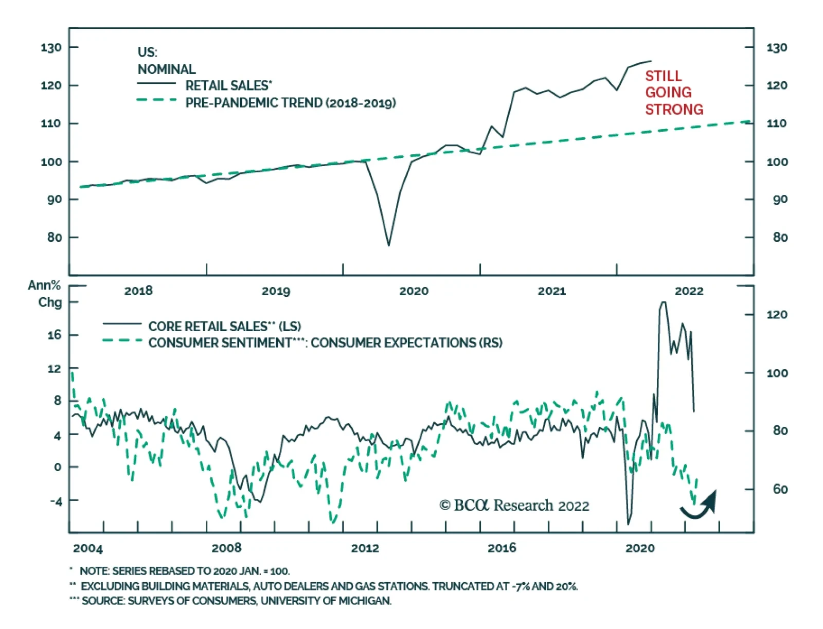
Consumer confidence has been flagging, especially in the University of Michigan survey, which is approaching all-time lows two standard deviations below its mean (Chart 4, top panel). Though the Conference Board’s measure has come off of its pandemic highs, it is considerably more optimistic and remains above its mean (Chart 4, bottom panel). The Michigan survey places much more emphasis on inflation, which may explain why the two series are sending such sharply divergent messages. The implication is that high and/or rising inflation dents households’ confidence as it erodes their purchasing power, posing a dual threat to consumption and overall economic growth. In our view, the lagged effects of emergency pandemic stimulus measures have fortified households with enough dry powder (via fiscal transfers) and provided a powerful enough financial conditions tailwind (via low interest rates and asset appreciation) to ensure that their spending will underpin potent 2022 growth. We estimate that US households in the aggregate have $2.2 trillion in excess pandemic savings2 (Table 1). They have begun to deploy those savings, fueling consumption above our estimate of no-pandemic baseline consumption by $30 billion in both January and February, and they have ample capacity to spend more. The excess savings derive nearly equally from increased income and foregone consumption and are predominantly held by households in the bottom seven deciles of the income distribution because they received nearly all of the fiscal transfers that drove income increases across 2020 and the first half of 2021. Table 1Tracking Excess Savings
Risks To Our View
Risks To Our View
Those households have a higher marginal propensity to consume than the wealthiest households, but the wealthy have benefitted mightily from the surge in the value of equities and other financial instruments. Most of the stellar eight-quarter increase in real household net worth (Chart 5) has thus been reserved to households in the top deciles but the home-price-appreciation boom has helped the two-thirds of households across the income distribution who own their homes (Chart 6). The bottom line is that American consumers are flush and the entire cross-section of households has shared in the bounty. The gains are unprecedented, just like the fiscal and monetary stimulus packages that gave rise to them, and they provide a buffer of dry powder that can withstand some purchasing power erosion from the 5.2% annualized increase in consumer prices since February 2020. Chart 5Household Wealth Has Never Grown So Much, So Fast ...
Household Wealth Has Never Grown So Much, So Fast ...
Household Wealth Has Never Grown So Much, So Fast ...
Chart 6... And Ordinary Joes Benefitted, Too
... And Ordinary Joes Benefitted, Too
... And Ordinary Joes Benefitted, Too
Quantitative Tightening Clients ask about the potential adverse effects of quantitative tightening (QT) in nearly every meeting, regularly citing the way the stocks swooned at the end of 2018, about a year into the FOMC’s previous balance sheet reduction foray. QT was at the scene of the crime in December 2018 and may well have been an accessory to the near murder of the equity bull market, but we would argue that a too-high fed funds rate was the true culprit. Although most investors recollect that the Fed ceased QT when equities hit an air pocket, the balance sheet continued shrinking until the summer of 2019, when the Fed resumed cutting rates. After the stock swoon, the Fed only stopped hiking the fed funds rate (at 2.5%). Related Report US Investment StrategyHawks, Houses And Harried Workers As we discussed last week, we don’t think changes in the size of the Fed’s balance sheet lead to much more than marginal changes in the level of long-term interest rates. They fall a little when a large, price-insensitive buyer enters the marketplace, and they rise a little when it exits. Ultimately, we think asset purchases (QE) have the most impact as a signaling device: they communicate to investors and economic actors that zero interest rate policy will remain in place as long as QE continues and for some period after it ends. QE is therefore a leading indicator, while QT is no more than a coincident indicator, playing a nearly undetectable supporting role. QT may contribute to volatility in the rates market, but investors shouldn’t let it take their focus from the Fed’s more powerful fed funds rate lever. The Vulnerable Housing Market We discussed our constructive take on the housing market and residential investment last week, noting that homes are still affordable and mortgage rates are still low from a historical perspective, while the single-family home market remains undersupplied. Talk of a housing bubble has died down, but we still hear occasional references to housing’s role in the financial crisis and concerns about the economy’s vulnerability to a rate-induced decline in home prices. In our view, those concerns can easily be put to rest. Investors should remember that the subprime bust was principally a story about prodigally extended credit; houses just happened to be the collateral against which the loans were made. Chart 7Flight To Quality
Risks To Our View
Risks To Our View
Those loans, the worst of which exceeded underlying property values and were extended to buyers who were not even remotely creditworthy, were tantamount to a house of cards by 2007. From 2004 through 2007 (Chart 7), more than a fifth of all new home mortgage originations went to near-prime (credit score between 620 and 659) and subprime (less than 620) borrowers, while not much more than half were issued to super-prime (greater than 720). Since the pandemic, near-prime and subprime borrowers have been limited to an average 5% share of loans, while super-primes have accounted for 84% of them and the upper tier of super-primes, with credit scores of 760 and above, have accounted for 70%. The change in lending standards can also be seen from using the Fed’s household balance sheet data to calculate an aggregate loan-to-value ratio (LTV) for the entire stock of owner-occupied single-family homes. The aggregate LTV currently stands at 31%, in the middle of the tight range it observed in the seventies and eighties, before policymakers began actively encouraging banks to make mortgage loans available to an expanded pool of borrowers (Chart 8). LTV exploded higher from 2006 through 2009 as lending peaked in 2006-7 and home values subsequently fell faster than mortgage balances in the 2008-9 bust. The record LTV of the subprime crisis, ginned up by loans that matched or exceeded underlying home values, amplified the distress from a downturn in home prices; today’s ‘70s-style LTV will help to absorb them. Chart 8High Prices Weren't The Problem, High LTVs Were
High Prices Weren't The Problem, High LTVs Were
High Prices Weren't The Problem, High LTVs Were
Portfolio Construction Takeaways Our Global Fixed Income and US Bond Strategy services have adjusted their recommended tactical positioning on Treasuries and spread product and we are adjusting our ETF portfolio to align with their view with a slight exception. Our in-house bond strategists recommend a modest tactical overweight in Treasuries and we are curing our Treasury underweight while maintaining benchmark duration. We are reducing our allocation to hybrid debt securities by halving our position in variable-rate preferreds (VRP) on the rationale that we have less need for credit exposure and duration protection over the immediate term. We are trimming our high yield overweight (JNK) to a mere 100 basis points and allocating our sales proceeds that aren’t going to Treasuries into mortgage-backed securities (MBB) to reduce that underweight by 140 basis points. We are parting company with our fixed income team by maintaining a small high yield overweight on the grounds that above-trend economic growth will hold down delinquencies and defaults until a recession is nearly at hand. The position is vulnerable to spread widening, but we expect the positive carry over duration-matched Treasuries will allow high yield to generate positive excess returns for the rest of the year. All of the changes are detailed in Table 2 and will be reflected on BCA’s website soon after today’s New York open. Doug Peta, CFA Chief US Investment Strategist dougp@bcaresearch.com Jennifer Lacombe Associate Editor JenniferL@bcaresearch.com Footnotes 1 https://www.dhs.gov/immigration-statistics/special-reports/legal-immigr…, accessed April 12, 2022. Data obtained from Table 1A. 2 Table 1 calculates household excess savings by subtracting our estimate of baseline no-pandemic savings from actual savings as compiled by the Bureau of Economic Analysis in its monthly Personal Income report. Our baseline estimate assumes that personal income would have grown at an annualized 4% pace (2% real trend growth plus 2% inflation) and that the savings rate would have remained constant at its 8.3% February 2020 level.
The US economy is in the midst of an economic growth slowdown, exacerbated by the nascent monetary tightening cycle, a war in Ukraine, and COVID-19 lockdowns in China. To protect our portfolio against the negative economic backdrop, we have been gradually shifting exposure away from cyclicals and towards more defensive allocations. Recent downgrades of the Consumer Durables and Retail, and upgrades of the S&P Consumer Staples sector, are a case in point. Today, we downgrade the S&P Transportation industry group from overweight to underweight. As the Fed proceeds with an aggressive tightening cycle to combat inflation, and China's and Ukraine's human tragedy continues to unfold, economic growth is likely to disappoint while supply disruptions become entrenched, making transportation of goods one of the early casualties. Already, intermodal rail freight, which is a major rail traffic category, is showing major signs of weakness (Chart 1). Finally, Chart 2 illustrates the tight relationship between the broad economic activity and the performance of the overall transportation industry we are alluding to. Given that ISM Manufacturing PMI is likely headed to the low 50s, it will continue weighing on transportation stocks. When it comes to valuations, there is only a marginal discount for the industry group that is currently trading at 17.4x compared to the 19.3x forward P/E multiple for the S&P 500: Risk premium does not justify owning the sector, and further multiple contraction is likely. Bottom Line: Today we downgrade the S&P Transportation index from overweight to underweight on the back of the economic slowdown and relentless supply chain disruptions. Chart 1
CHART 1
CHART 1
Chart 2
CHART 2
CHART 2
Executive Summary The unemployment rate in the US stands at 3.6%, 0.4 percentage points below the FOMC’s estimate of full employment. Historically, the Fed’s efforts to nudge up the unemployment rate have failed: The US has never averted a recession when the 3-month average of the unemployment rate has increased by more than a third of a percentage point. Despite this somber fact, there are reasons to think it will take longer for a recession to arrive than widely believed. Unlike in the lead-up to many past recessions, the US private sector is currently running a financial surplus. If anything, there are indications that both households and businesses are set to expand – rather than retrench – spending over the coming quarters. Investors should pay close attention to the housing market. As the most interest-rate sensitive sector of the economy, it will dictate the degree to which the Fed can raise rates. The US housing market has cooled, but remains in reasonably good shape, supported by rising incomes and low home inventories. Stocks will likely rise modestly over the next 12 months as inflation temporarily dips and the pandemic recedes from view. However, equities will falter towards the end of 2023. Stocks Tend To Fare Well When There Is No Recession On The Horizon
Stocks Tend To Fare Well When There Is No Recession On The Horizon
Stocks Tend To Fare Well When There Is No Recession On The Horizon
Bottom Line: The US may not be able to avoid a recession, but an economic downturn is unlikely until 2024. Stay modestly overweight stocks over a 12-month horizon. Jobs Aplenty The US unemployment rate fell from 3.8% in February to 3.6% in March, bringing it close to its pre-pandemic low of 3.5%. Adding job openings to employment and comparing the resulting sum with the size of the labor force, the excess of labor demand over labor supply is now the highest since July 1969 (Chart 1). Chart 1Labor Demand Is Outstripping Labor Supply By The Largest Margin Since 1969
Is A Recession Inevitable?
Is A Recession Inevitable?
Granted, the labor force participation rate is still one full percentage point below where it was prior to the pandemic. If the participation rate were to rise, the gap between labor demand and supply would shrink. Some of the decline in the participation rate is permanent in nature, reflecting ongoing population aging, which has been compounded by an increase in early retirements during the pandemic (Chart 2). Some workers who dropped out will probably re-enter the workforce. Chart 3 shows that employment among low-wage workers has been slower to recover than for other groups. With expanded unemployment benefits no longer available, the motivation to find gainful employment will escalate. Chart 2Not All Of The Decline In Labor Participation During The Pandemic Was Due To Increased Early Retirements
Not All Of The Decline In Labor Participation During The Pandemic Was Due To Increased Early Retirements
Not All Of The Decline In Labor Participation During The Pandemic Was Due To Increased Early Retirements
Chart 3Low-Wage Workers Have Not Returned In Full Force
Low-Wage Workers Have Not Returned In Full Force
Low-Wage Workers Have Not Returned In Full Force
Nevertheless, it is doubtful that the entry of low-wage workers into the labor force will do much to reduce the gap between labor demand and supply. Low-wage workers tend to spend all of their incomes (Chart 4). Thus, while an increase in the number of low-wage workers will allow the supply of goods and services to rise, this will be counterbalanced by an increase in the demand for goods and services. Chart 4Richer Households Tend To Save More Than Poorer Ones
Is A Recession Inevitable?
Is A Recession Inevitable?
To cool the labor market, the Fed will need to curb spending, and that can only be achieved by raising interest rates. Trying to achieve a soft landing in this manner is always easier said than done. The US has never averted a recession when the 3-month average of the unemployment rate has increased by more than a third of a percentage point. Rising unemployment tends to produce a negative feedback loop: A weaker labor market depresses spending. This, in turn, leads to less hiring and more firing, resulting in even higher unemployment. Where is the Choke Point? How high will interest rates need to rise to trigger such a feedback loop? Markets currently expect the Fed to raise rates to 3% by mid-2023 but then cut rates by at least 25 basis points over the subsequent months (Chart 5). So, the market thinks the neutral rate of interest – the interest rate consistent with a stable unemployment rate – is around 2.5%. The Fed broadly shares the market’s view. The median dot for the terminal Fed funds rate stood at 2.4% in the March Summary of Economic Projections (Chart 6). When the Fed first started publishing its dot plot in 2012, it thought the terminal rate was 4.25%. Chart 5The Markets See The Fed Funds Rate Reaching 3% Next Year
Is A Recession Inevitable?
Is A Recession Inevitable?
Chart 6The Fed's Estimate Of The Terminal Rate Has Fallen Over The Years
The Fed's Estimate Of The Terminal Rate Has FalLen Over The Years
The Fed's Estimate Of The Terminal Rate Has FalLen Over The Years
Low Imbalances Imply a Higher Neutral Rate We have discussed the concept of the neutral rate extensively in the past, so we will not regurgitate the issues here (interested readers should consult the Feature Section of our latest Strategy Outlook). Instead, it would be worthwhile to dwell on the relationship between the neutral rate and economic imbalances. Simply put, when an economy is suffering from major imbalances, it does not take much monetary tightening to push it over the edge. The private-sector financial balance measures the difference between what households and firms earn and spend. A recession is more likely to occur when the private-sector financial balance is negative — that is, when spending exceeds income — since households and firms are more prone to cut spending when they are living beyond their means. In the lead-up to the Great Recession, the private-sector financial balance hit a deficit of 3.9% of GDP in the US. Leading up to the 2001 recession, it reached a deficit of 5.4% of GDP. Today, the US private-sector financial balance, while down from its peak during the pandemic, still stands at a comfortable surplus of 3% of GDP. Rather than looking to retrench, households and businesses are poised to increase spending over the coming quarters (Chart 7). Private-sector financial balances are also positive in Japan, China, and most of Europe (Chart 8). Chart 7Consumers And Businesses Are Set To Spend More
Consumers And Businesses Are Set To Spend More
Consumers And Businesses Are Set To Spend More
Chart 8Private-Sector Financial Balances Are Positive In Most Major Economies
Is A Recession Inevitable?
Is A Recession Inevitable?
Watch Housing Chart 9Rising Interest Rates In The Early 1980s Had Much More Of A Negative Effect On Housing Than Business Investment
Rising Interest Rates In The Early 1980s Had Much More Of A Negative Effect On Housing Than Business Investment
Rising Interest Rates In The Early 1980s Had Much More Of A Negative Effect On Housing Than Business Investment
At the 2007 Jackson Hole conference, Ed Leamer presented what turned out to be a very prescient paper. Titled “Housing is the Business Cycle,” Leamer concluded that “Of the components of GDP, residential investment offers by far the best early warning sign of an oncoming recession.” Housing is a long-lived asset, and one that is usually financed with debt. To a much greater extent than nonresidential investment, the housing sector is very sensitive to changes in interest rates. When the Fed hiked rates in the early 1980s, residential investment collapsed but business investment barely contracted (Chart 9). The jump in mortgage yields has started to weigh on housing (Chart 10). Mortgage applications for home purchases have fallen by 25% from their highs. Pending home sales have dropped. Homebuilder confidence has dipped. Homebuilder stocks are down 29% year-to-date. Housing is likely to slow further in the months ahead, even if mortgage yields stabilize. Chart 11 shows that changes in mortgage yields lead home sales and housing starts by about six months. Chart 10The Jump In Mortgage Rates Has Weighed On The Housing Market
The Jump In Mortgage Rates Has Weighed On The Housing Market
The Jump In Mortgage Rates Has Weighed On The Housing Market
Chart 11Swings In Mortgage Rates Explain Short-Term Fluctuations In Housing Activity
Swings In Mortgage Rates Explain Short-Term Fluctuations In Housing Activity
Swings In Mortgage Rates Explain Short-Term Fluctuations In Housing Activity
The key question for investors is whether the housing market will enter a deep freeze or merely cool down. We think the latter is more likely. The 30-year fixed mortgage rate has increased nearly two percentage points since last August, but at around 5%, it is still below the average of 6% that prevailed during the 2000-2006 housing boom (Chart 12).
Image
Moreover, unlike during the housing boom, when homebuilders flooded the market with houses, the supply of new homes remains contained. The nationwide homeowner vacancy rate stands at record lows. Building permits are near cycle highs (Chart 13). Granted, real home prices are close to record highs. However, relative to incomes, US home prices have not broken out of their historic range (Chart 14). Chart 13The Homeowner Vacancy Rate Is Near Record Lows
The Homeowner Vacancy Rate Is Near Record Lows
The Homeowner Vacancy Rate Is Near Record Lows
Chart 14Homes In The US Are Relatively Cheap
Homes In The US Are Relatively Cheap
Homes In The US Are Relatively Cheap
Home affordability is much more stretched outside of the United States. The Bank of Canada, for example, has less scope to raise rates than the Fed. Chart 15Some Signs Of Easing In Supply-Side Pressures
Some Signs Of Easing In Supply-Side Pressures
Some Signs Of Easing In Supply-Side Pressures
Investment Conclusions As investors, we need to be forward looking. The widespread availability of Paxlovid later this year — which, in contrast to the vaccines, is effective against all Covid strains — will help boost global growth while relieving supply-chain bottlenecks. Shipping costs, used car prices, and ISM supplier delivery times have already come down from their highs (Chart 15). Central banks have either started to raise rates or are gearing up to do so. However, monetary policy is unlikely to turn restrictive in any major economy over the next 12 months. Stocks usually go up outside of recessionary environments (Chart 16). Global equities are trading at 17-times forward earnings. The corresponding earnings yield is about 630 basis points higher than the real global bond yield – a very wide gap by historic standards (Chart 17). Chart 16Stocks Tend To Fare Well When There Is No Recession On The Horizon
Stocks Tend To Fare Well When There Is No Recession On The Horizon
Stocks Tend To Fare Well When There Is No Recession On The Horizon
Chart 17AThe Equity Risk Premium Remains Elevated (I)
The Equity Risk Premium Remains Elevated (I)
The Equity Risk Premium Remains Elevated (I)
Chart 17BThe Equity Risk Premium Remains Elevated (II)
The Equity Risk Premium Remains Elevated (II)
The Equity Risk Premium Remains Elevated (II)
Investors should remain modestly overweight equities over a 12-month horizon and look to increase exposure to non-US stock markets, small caps, and value stocks over the coming months. Government bond yields are unlikely to rise much over the next 12 months but will increase further over the long haul. The dollar should peak during this summer, and then weaken over the subsequent 12 months. A complete discussion of our market views is contained in our recently published Second Quarter Strategy Outlook. Peter Berezin Chief Global Strategist peterb@bcaresearch.com Global Investment Strategy View Matrix
Is A Recession Inevitable?
Is A Recession Inevitable?
Special Trade Recommendations Current MacroQuant Model Scores
Is A Recession Inevitable?
Is A Recession Inevitable?
The US retail sales report was somewhat mixed in March. Overall retail sales increased by 0.5% m/m, broadly in line with expectations. Notably, the February figure was revised up sharply. Moreover, retail sales ex autos advanced 1.1% m/m, marking an…
On Wednesday, Delta signaled a positive outlook for airline stocks. Although the company reported a quarterly loss in Q1, it returned to profitability in March and benefitted from the best sales month on record. It also noted that it expects to be able to…
On Tuesday, President Biden announced that sales of 15% ethanol gasoline blends would be permitted this summer, suspending a federal rule that prohibits the sale of higher ethanol blend gasoline. The waiver is an attempt to lower gasoline prices for US…
Executive Summary The structural downtrend in Chinese bond yields has a lot further to go, because it is helping to let the air out gently of stratospheric valuations in the real estate sector, and thereby preventing a hard landing for the Chinese economy. In the US, flagging mortgage and housing market activity is weighing on an already slowing economy. Buy US T-bonds. The long T-bond yield is close to a peak. Switch equity exposure into long-duration sectors such as healthcare and biotech. Go overweight US homebuilders versus US insurers. The peak in bond yields will also take pressure off US homebuilder shares whose recent collapse has been the mirror-image of the surge in the 30-year mortgage rate. Fractal trading watchlist: Basic resources; Switzerland versus Germany; and USD/EUR. The Collapse In US Homebuilder Shares Is The Mirror-Image Of The Surge In The Mortgage Rate
The Collapse In US Homebuilder Shares Is The Mirror-Image Of The Surge In The Mortgage Rate
The Collapse In US Homebuilder Shares Is The Mirror-Image Of The Surge In The Mortgage Rate
Bottom Line: The global bond yield cannot rise much further before it destabilises the $350 trillion global real estate market and thereby destabilises the global economy. Feature Quietly and largely unnoticed, Chinese long-dated bond yields have been drifting lower (Chart I-1 and Chart I-2). At a time that surging bond yields elsewhere in the world have grabbed all the attention, the largely unnoticed contrarian move in Chinese bond yields through the past year is significant because of something else that has gone largely unnoticed: Chinese real estate has become by far the largest asset-class in the world, worth $100 trillion.1 Chart I-1The Contrarian Downdrift In The Chinese 30-Year Bond Yield
The Contrarian Downdrift In The Chinese 30-Year Bond Yield
The Contrarian Downdrift In The Chinese 30-Year Bond Yield
Chart I-2The Contrarian Downdrift In The Chinese 10-Year Bond Yield
The Contrarian Downdrift In The Chinese 10-Year Bond Yield
The Contrarian Downdrift In The Chinese 10-Year Bond Yield
Chinese Real Estate Is Trading On A Stratospheric Valuation The $100 trillion valuation of Chinese real estate market is greater than the $90 trillion global economy, is more than twice the size of the $45 trillion US real estate market and the $45 trillion US stock market, and dwarfs the $18 trillion Chinese economy. Suffice to say, Chinese real estate’s pre-eminence as the world’s largest asset-class is mostly due to its stratospheric valuation. Prime residential rental yields in Guangzhou, Shanghai, Hangzhou, Shenzhen and Beijing have collapsed to 1.5 percent, the lowest rental yields in the world and less than half the global average of 3 percent. Versus rents therefore, Chinese real estate is now twice as expensive as in the rest of the world (Chart I-3). Chart I-3Versus Rents, Chinese Real Estate Is The Most Expensive In The World
$350 Trillion Of Global Real Estate Can’t Swallow Higher Bond Yields
$350 Trillion Of Global Real Estate Can’t Swallow Higher Bond Yields
To corroborate this point, while the US real asset market is worth around two times US annual GDP, the Chinese real estate market is worth more than five times China’s annual GDP! The structural downtrend in Chinese bond yields has a lot further to go. Crucially, the downward drift in Chinese bond yields is alleviating some of the pressure on the extremely highly valued Chinese real estate market – as it helps to let the air out gently of the stratospheric valuations, and thereby avoid a hard landing for the Chinese economy. Hence, the structural downtrend in Chinese bond yields has a lot further to go. The Surge In US Mortgage Rates Is Taking Its Toll Meanwhile, in the rest of the world, the surge in bond yields poses a major threat to the decade long housing boom. Versus rents, US house prices are the most expensive ever – more expensive even than during the early 2000s so-called ‘housing bubble’. For the first time since 2008, the US 30-year mortgage rate is higher than the prime residential rental yield. Until recently, the historically low rental yield on US real estate was justified by an extremely low bond yield. But the recent surge in the bond yield has changed all that. For the first time since 2008, the US 30-year mortgage rate is higher than the prime residential rental yield2 (Chart I-4). Chart I-4The US 30-Year Mortgage Rate Is Now Higher Than The Prime Residential Rental Yield
The US 30-Year Mortgage Rate Is Now Higher Than The Prime Residential Rental Yield
The US 30-Year Mortgage Rate Is Now Higher Than The Prime Residential Rental Yield
The surge in US mortgage rates is taking its toll. Since the end of January, US mortgage applications for home purchase have fallen by almost a fifth (Chart I-5), and the lower demand for home purchase mortgages is starting to weigh on home construction (Chart I-6). Building permits for new private housing units were already falling in February, but a more up-to-date sign of the pain is the 35 percent collapse in US homebuilder shares. Chart I-5US Mortgage Applications For Home Purchase Have Fallen By Almost A Fifth
US Mortgage Applications For Home Purchase Have Fallen By Almost A Fifth
US Mortgage Applications For Home Purchase Have Fallen By Almost A Fifth
Chart I-6The Lower Demand For Home Purchase Mortgages Is Starting To Weigh On Home Construction
The Lower Demand For Home Purchase Mortgages Is Starting To Weigh On Home Construction
The Lower Demand For Home Purchase Mortgages Is Starting To Weigh On Home Construction
$350 Trillion Of Global Real Estate Can’t Swallow Higher Bond Yields Mortgage rates drive real estate rental yields because of the arbitrage between buying versus renting a similar home. Given a fixed annual budget for housing, I must choose between how much home I can buy – which depends on the mortgage rate, versus how much home I can rent – which depends on the rental yield. The arbitrage should make me indifferent between the two options. As a simple example of this arbitrage, let’s assume my annual budget for housing is $10k, and both the mortgage rate and rental yield are 4 percent. I will be indifferent between spending the $10k on interest on a $250k mortgage loan to buy the home, or spending the $10k to rent a similar $250k home. If the mortgage rate rises to 5 percent, then the maximum loan that my $10k of interest payment will afford me falls to $200k, reducing my maximum bid to buy the home. If I am the marginal bidder, then the home price will fall to $200k, so that the $10k rent on the similar valued home will also equate to a higher rental yield of 5 percent. In practice, the simple arbitrage described above is complicated by several factors: the maximum loan-to-value that a lender will offer on the home; the different transaction costs of buying versus renting; and the fact that people prefer to buy than to rent because buying a home is an investment which also provides a consumption service – shelter, whereas renting a home only provides the consumption service. Nevertheless, these complications do not diminish the overarching connection between mortgage rates and rental yields. The lion’s share of the real estate boom has come from a massive valuation uplift, which in turn has come from structurally lower bond yields. All of which brings us to the decade long global real estate boom that has doubled the value of global real estate market to an eye-watering $350 trillion, four times the size of the $90 trillion global economy. During this unprecedented boom, global rents have risen by 40 percent, tracking world nominal GDP, as they should. This means that the lion’s share of the real estate boom has come from a massive valuation uplift, which in turn has come from structurally lower bond yields (Chart I-7). Chart I-7The Lion's Share Of The Global Real Estate Boom Has Come From A Massive Uplift In Valuations
The Lion's Share Of The Global Real Estate Boom Has Come From A Massive Uplift In Valuations
The Lion's Share Of The Global Real Estate Boom Has Come From A Massive Uplift In Valuations
Since the global financial crisis, there has been an excellent empirical relationship between the global long-dated bond yield (US/China average) and the global rental yield. The important takeaway is that the global bond yield cannot rise much further before it destabilises the $350 trillion global real estate market and thereby destabilises the global economy (Chart I-8). Chart I-8The Global Bond Yield Cannot Rise Much Further Before It Destabilises The $350 Trillion Global Real Estate Market
The Global Bond Yield Cannot Rise Much Further Before It Destabilises The $350 Trillion Global Real Estate Market
The Global Bond Yield Cannot Rise Much Further Before It Destabilises The $350 Trillion Global Real Estate Market
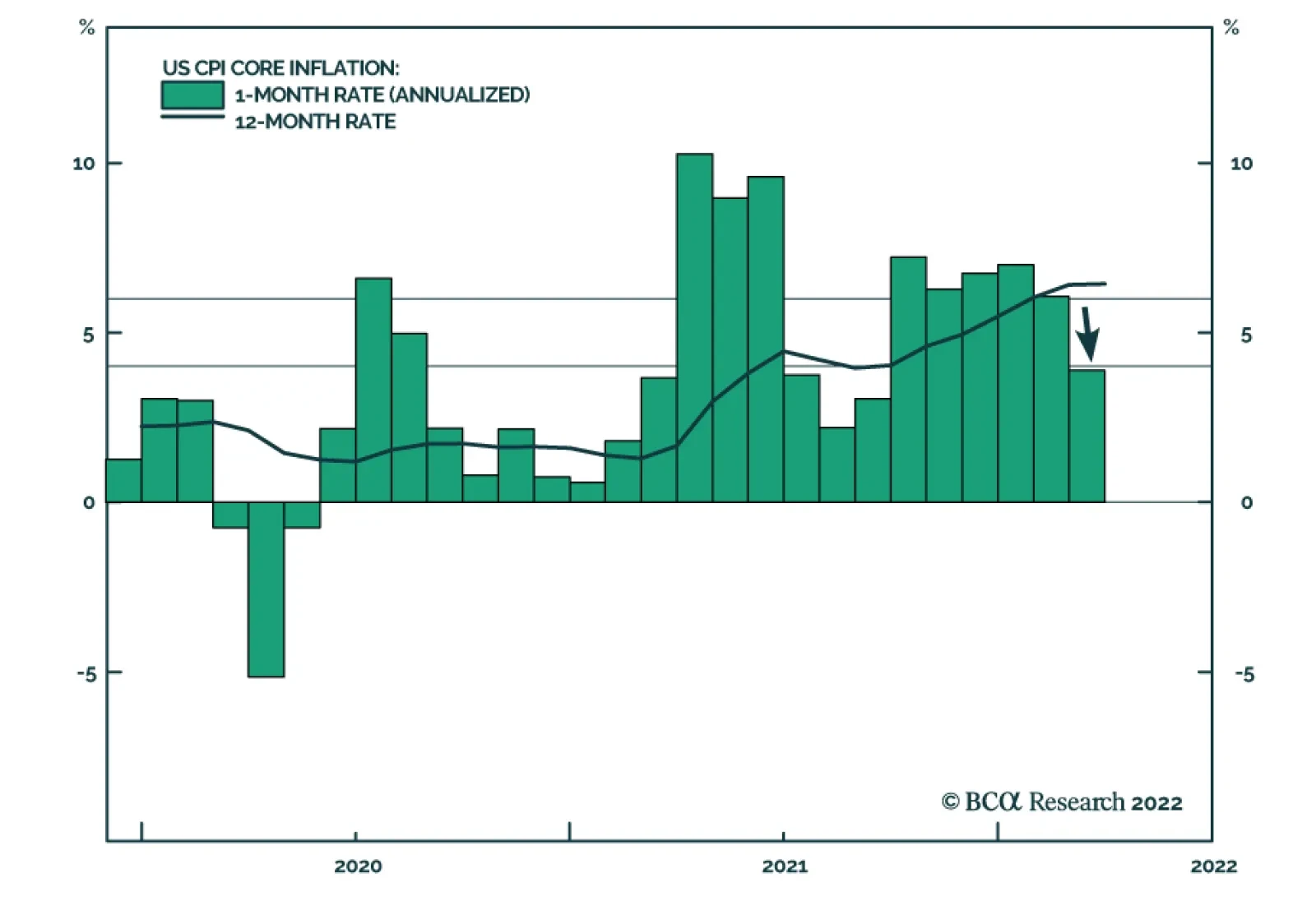
Some Investment Conclusions The good news is that the recent rise in the global bond yield has been limited by the downdrift in Chinese bond yields. Given the massive overvaluation of Chinese real estate, the structural downtrend in Chinese bond yields has a lot further to go. Meanwhile in the US, unless bond yields back down quickly, flagging mortgage and housing market activity will weigh on an already slowing economy. If US bond yields don’t back down quickly, the feedback from consequent slowdown in the economy will ultimately bring yields down anyway. As I explained last week in Fat-Tailed Inflation Signals A Peak In Bond Yields I do expect the long T-bond yield to back down relatively quickly. The sharp drop in US core inflation to just 0.3 percent month-on-month in March signals that inflation is peaking. Hence, medium to long term investors should be buying US T-bonds, and switching equity exposure into long-duration sectors such as healthcare and biotech. Finally, a peak in bond yields will also take pressure off US homebuilder shares whose recent collapse has been the mirror-image of the surge in the 30-year mortgage rate (Chart I-9). Hence, go overweight US homebuilders versus US insurers. Chart I-9The Collapse In US Homebuilder Shares Is The Mirror-Image Of The Surge In The Mortgage Rate
The Collapse In US Homebuilder Shares Is The Mirror-Image Of The Surge In The Mortgage Rate
The Collapse In US Homebuilder Shares Is The Mirror-Image Of The Surge In The Mortgage Rate
Fractal Trading Watchlist Given that inflation hedging investment demand has driven at least part of the strong rally in basic resources, a peak in inflation and bond yields threatens to unwind the recent outperformance of basic resources shares. This is corroborated by the extremely fragile 130-day fractal structure (Chart I-10). Accordingly, the recommended trade is to short basic resources (GNR) versus the broad market, setting the profit target and symmetrical stop-loss at 11.5 percent. This week we are also adding to our watchlist: Switzerland versus Germany; and USD/EUR. The full list of 20 investments that are experiencing or approaching turning points is available on our website: cpt.bcaresearch.com Chart I-10The Outperformance Of Basic Resources Is Vulnerable To Reversal
The Outperformance Of Basic Resources Is Vulnerable To Reversal
The Outperformance Of Basic Resources Is Vulnerable To Reversal
Switzerland's Outperformance Vs. Germany Could End
Switzerland's Outperformance Vs. Germany Could End
Switzerland's Outperformance Vs. Germany Could End
The Rally In USD/EUR Could End
The Rally In USD/EUR Could End
The Rally In USD/EUR Could End
Chart 1The Strong Trend In The 18-Month-Out US Interest Rate Future Is Fragile
The Strong Trend In The 18-Month-Out US Interest Rate Future Is Fragile
The Strong Trend In The 18-Month-Out US Interest Rate Future Is Fragile
Chart 2The Strong Trend In The 3 Year T-Bond Is Fragile
The Strong Trend In The 3 Year T-Bond Is Fragile
The Strong Trend In The 3 Year T-Bond Is Fragile
Chart 3AUD/KRW Is Vulnerable To Reversal
AUD/KRW Is Vulnerable To Reversal
AUD/KRW Is Vulnerable To Reversal
Chart 4Canada Versus Japan Is Vulnerable To Reversal
Canada Versus Japan Is Vulnerable To Reversal
Canada Versus Japan Is Vulnerable To Reversal
Chart 5Canada's TSX-60's Outperformance Might Be Over
Canada's TSX-60's Outperformance Might Be Over
Canada's TSX-60's Outperformance Might Be Over
Chart 6US Healthcare Providers Vs. Software At Risk of Reversal
US Healthcare Providers Vs. Software At Risk of Reversal
US Healthcare Providers Vs. Software At Risk of Reversal
Chart 7Bitcoin's 65-Day Fractal Support Is Holding For Now
Bitcoin's 65-Day Fractal Support Is Holding For Now
Bitcoin's 65-Day Fractal Support Is Holding For Now
Chart 8A Potential Switching Point From Tobacco Into Cannabis
A Potential Switching Point From Tobacco Into Cannabis
A Potential Switching Point From Tobacco Into Cannabis
Chart 9Biotech Is A Major Buy
Biotech Is A Major Buy
Biotech Is A Major Buy
Chart 10CAD/SEK Reversal Has Started
CAD/SEK Reversal Has Started
CAD/SEK Reversal Has Started
Chart 11Financials Versus Industrials To Reverse
Financials Versus Industrials To Reverse
Financials Versus Industrials To Reverse
Chart 12Norway's Outperformance Could End
Norway's Outperformance Could End
Norway's Outperformance Could End
Chart 13Greece's Brief Outperformance To End
Greece's Brief Outperformance To End
Greece's Brief Outperformance To End
Chart 14BRL/NZD At A Resistance Point
BRL/NZD At A Resistance Point
BRL/NZD At A Resistance Point
Chart 15The Outperformance Of Resources Versus Healthcare Is Vulnerable To Reversal
The Outperformance Of Resources Versus Healthcare Is Vulnerable To Reversal
The Outperformance Of Resources Versus Healthcare Is Vulnerable To Reversal
Chart 16The Outperformance Of Resources Versus Biotech Is Vulnerable To Reversal
The Outperformance Of Resources Versus Biotech Is Vulnerable To Reversal
The Outperformance Of Resources Versus Biotech Is Vulnerable To Reversal
Chart 17Cotton's Outperformance Is Vulnerable To Reversal
Cotton's Outperformance Is Vulnerable To Reversal
Cotton's Outperformance Is Vulnerable To Reversal
Chart 18US Homebuilders' Underperformance Is At A Potential Turning Point
US Homebuilders' Underperformance Is At A Potential Turning Point
US Homebuilders' Underperformance Is At A Potential Turning Point
Chart 19Fractal Trading Watch List
Fractal Trading Watch List
Fractal Trading Watch List
Chart 20Fractal Trading Watch List
Fractal Trading Watch List
Fractal Trading Watch List
Dhaval Joshi Chief Strategist dhaval@bcaresearch.com Footnotes 1 We estimate the value of Chinese real estate at the end of 2021 to be $97 trillion, comprising residential $85 trillion, commercial $6 trillion, and agricultural $6 trillion. The source is: the Savills September 2021 report ‘The total value of global real estate’, which valued the global real estate market to the end of 2020; and the February 2022 report ‘Savills Prime Residential Index: World Cities’ which allowed us to update the valuations to the end of 2021. 2 The US prime residential rental yield is the simple average of the prime residential rental yields in New York, Miami, Los Angeles and San Francisco. Source: Savills. Fractal Trading System Fractal Trades
$350 Trillion Of Global Real Estate Can’t Swallow Higher Bond Yields
$350 Trillion Of Global Real Estate Can’t Swallow Higher Bond Yields
$350 Trillion Of Global Real Estate Can’t Swallow Higher Bond Yields
$350 Trillion Of Global Real Estate Can’t Swallow Higher Bond Yields
6-Month Recommendations Structural Recommendations Closed Fractal Trades Indicators To Watch - Bond Yields Chart II-1Indicators To Watch - Bond Yields - Euro Area
Indicators To Watch - Bond Yields - Euro Area
Indicators To Watch - Bond Yields - Euro Area
Chart II-2Indicators To Watch - Bond Yields - Europe Ex Euro Area
Indicators To Watch - Bond Yields - Europe Ex Euro Area
Indicators To Watch - Bond Yields - Europe Ex Euro Area
Chart II-3Indicators To Watch - Bond Yields - Asia
Indicators To Watch - Bond Yields - Asia
Indicators To Watch - Bond Yields - Asia
Chart II-5Indicators To Watch - Bond Yields - Other Developed
Indicators To Watch - Bond Yields - Other Developed
Indicators To Watch - Bond Yields - Other Developed
Indicators To Watch - Interest Rate Expectations Indicators To Watch - Interest Rate Expectations
Indicators To Watch - Interest Rate Expectations
Indicators To Watch - Interest Rate Expectations
Chart II-6Indicators To Watch - Interest Rate Expectations
Indicators To Watch - Interest Rate Expectations
Indicators To Watch - Interest Rate Expectations
Chart II-7Indicators To Watch - Interest Rate Expectations
Indicators To Watch - Interest Rate Expectations
Indicators To Watch - Interest Rate Expectations
Chart II-8Indicators To Watch - Interest Rate Expectations
Indicators To Watch - Interest Rate Expectations
Indicators To Watch - Interest Rate Expectations
US headline CPI inflation surged from 7.9% y/y to a 40-year high of 8.5% y/y in March, slightly above expectations of 8.4% y/y. However, energy and food which increased by 32% y/y and 8.8% y/y, respectively are responsible for 40% of this year-on-year…
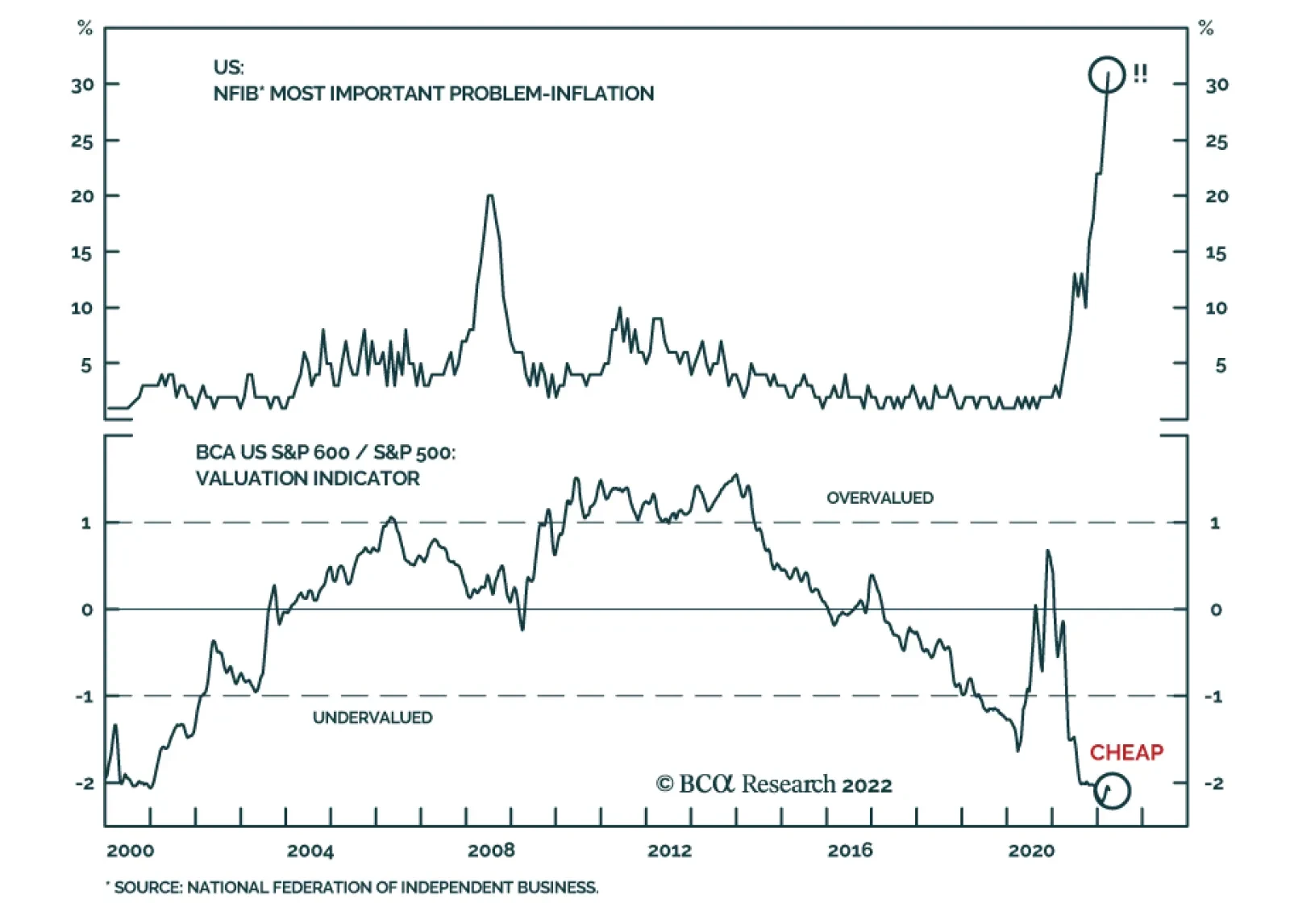
For the past year, US small cap stocks have been underperforming their large cap peers. More recently, the S&P 600 is down 1.5% over the past month versus the S&P 500’s 5.0% increase. This underperformance likely reflects investor concerns about…
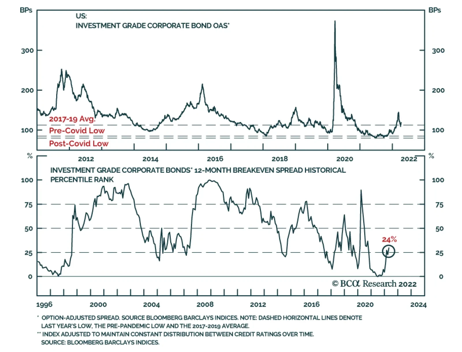
According to BCA Research’s US Bond Strategy service, investment grade corporate bonds are quite expensive. Starting with a simple examination of the average investment grade index OAS, the team observes that the spread has widened somewhat off its pre-…