United States
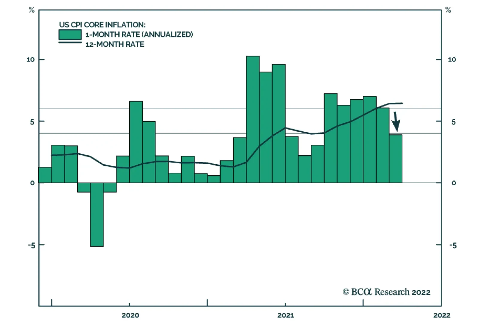
US headline CPI inflation surged from 7.9% y/y to a 40-year high of 8.5% y/y in March, slightly above expectations of 8.4% y/y. However, energy and food which increased by 32% y/y and 8.8% y/y, respectively are responsible for 40% of this year-on-year…

Executive Summary Spreads Near 2017-19 Average
Spreads Near 2017-19 Average
Spreads Near 2017-19 Average
The main indicators that determine corporate bond performance are valuation, the cyclical/monetary environment and corporate balance sheet health. US corporate bond valuation is quite expensive. Spreads are off their post-COVID lows, but consistent with the 2017-19 average. The flat 2-year/10-year Treasury curve indicates that the cyclical/monetary backdrop is relatively poor. What’s more, the yield curve could easily invert within the next few months as the Fed tightens. This would send an even more negative signal for corporate bond returns. Corporate balance sheets are currently in excellent shape, but their health will deteriorate within the next 12 months as profit growth slows and interest rates rise. Relative valuation favors high-yield over investment grade corporates, and high-yield has a track record of outperformance during periods of restrictive monetary conditions and strong corporate balance sheets. Bottom Line: Investors should cyclically reduce exposure to US corporate bonds while retaining a preference for high-yield over investment grade. We recommend downgrading investment grade corporates from neutral (3 out of 5) to underweight (2 out of 5) and high-yield corporates from overweight (4 out of 5) to neutral (3 out of 5). Feature Chart 1A Rapid Recovery
A Rapid Recovery
A Rapid Recovery
US corporate bonds have had a very good run since the March 2020 peak in spreads. Investment grade corporates outperformed a duration-matched position in US Treasuries by 23% during the first 12 months of the recovery, the best 12-month excess return since 2010 (Chart 1). That same period also saw an extremely rapid re-normalization of credit spreads. It took just 11 months for the investment grade corporate index option-adjusted spread (OAS) to reach 90 bps following its March 2020 peak, and the index delivered an annualized excess return of 26% during that period. In contrast, it took 109 months for the index OAS to reach 90 bps following the 2008 recession and corporates only beat duration-matched Treasuries by an annualized 4% during that time (Table 1). Table 1US Investment Grade Corporate Bond Returns From Spread Peak Until 90 BPs
Turning Defensive On US Corporate Bonds
Turning Defensive On US Corporate Bonds
The outlook for US corporate bond returns looks much different today. Spreads are tighter and the Fed is rapidly removing policy accommodation. Against this backdrop, we decided last week to cyclically reduce our corporate bond exposure.1 Specifically, we recommended downgrading investment grade corporates from neutral (3 out of 5) to underweight (2 out of 5) and high-yield corporates from overweight (4 out of 5) to neutral (3 out of 5) within US bond portfolios. This Special Report discusses the rationale for our recent decision. First, we examine trends in the main indicators that determine corporate bond performance. These indicators fall into three categories: (i) valuation, (ii) cyclical/monetary indicators and (iii) balance sheet health. We then discuss the outlook for the relative performance of high-yield versus investment grade corporates. Valuation Starting with a simple examination of the average investment grade index OAS, we see that the spread has widened somewhat off its pre- and post-pandemic lows, but remains close to the average level seen between 2017 and 2019 (Chart 2). The index OAS is a reasonable gauge of value relative to recent history, but for a longer historical perspective we should adjust the index to account for its changing average credit rating and duration. To do this, we first re-weight the index to maintain a constant distribution between the different credit rating buckets. Next, we control for the index’s changing duration by calculating a 12-month breakeven spread. The 12-month breakeven spread is the spread widening that must occur during the next 12 months for the corporate index to perform in line with a duration-matched position in Treasuries. It can be approximated by dividing the index OAS by average index duration. Finally, Chart 3 presents the 12-month breakeven spread as a percentile rank since 1995. It shows that, after controlling for credit rating and duration, the investment grade corporate index has only been more expensive than current levels 24% of the time since 1995. Notice that the spread bounced off the 0% line in late-2021, indicating that it had reached all-time expensive levels. Chart 2Spreads Near 2017-19 Average
Spreads Near 2017-19 Average
Spreads Near 2017-19 Average
Chart 3Investment Grade Valuation
Investment Grade Valuation
Investment Grade Valuation
All in all, we can conclude that investment grade corporate bonds are quite expensive. Spreads aren’t so low that they would justify an underweight allocation in a supportive cyclical/monetary environment. But they are tight enough that it makes sense to proceed cautiously in a neutral or negative cyclical/monetary environment, like the one we are in today. Cyclical/Monetary Indicators The slope of the yield curve is the key variable we use to assess the current state of the cyclical/monetary environment. A very flat or inverted yield curve signals a relatively restrictive monetary policy backdrop, and we have shown that such a backdrop tends to coincide with poor excess corporate bond returns. Conversely, we have found that corporate bonds perform best early in the economic recovery when the yield curve is very steep. This steep yield curve signals that monetary conditions are highly accommodative, and thus supportive of credit spread tightening. Today, the yield curve is sending a somewhat confusing message. The 2-year/10-year Treasury slope briefly inverted last week, and it remains flat at 22 bps. Meanwhile, the 3-month/10-year Treasury slope is very steep, up above 200 bps (Chart 4)! Chart 4Conflicting Signals From The Yield Curve
Conflicting Signals From The Yield Curve
Conflicting Signals From The Yield Curve
We discussed how to interpret the signals from different yield curve segments in a recent Special Report.2 We found that the 2-year/10-year Treasury slope sends the most useful signal for corporate bond excess returns, and we therefore view current cyclical/monetary conditions as negative for corporate bonds. In Table 2 we split each of the past six economic cycles into phases based on the 2-year/10-year Treasury slope. We define Phase 1 of the cycle as the period from the end of the prior recession until the 2-year/10-year slope breaks below 50 bps. Phase 2 of the cycle encompasses the time when the slope is between 0 bps and 50 bps. Phase 3 of the cycle spans from when the yield curve inverts until the start of the next recession. Table 2US Corporate Bond Performance In Different Phases Of The Cycle
Turning Defensive On US Corporate Bonds
Turning Defensive On US Corporate Bonds
The table shows annualized excess returns for both investment grade and high-yield corporate bonds in each of the three phases, and those returns exhibit a clear pattern. Returns are best in Phase 1 when the yield curve is steep. They take a step down in Phase 2 when the slope is between 0 bps and 50 bps, though they usually stay positive. Negative returns are most likely in Phase 3, after the yield curve inverts. Chart 5Limited Room For Curve Steepening
Limited Room For Curve Steepening
Limited Room For Curve Steepening
With the 2-year/10-year Treasury slope at 22 bps, we are firmly in Phase 2 of the cycle. However, we could easily see the 2-year/10-year slope invert within the next few months while a breakout above 50 bps seems less likely. In fact, there are only two ways in which the 2-year/10-year Treasury slope can steepen further from current levels. First, the market could bid up its expectation of the long-run neutral fed funds rate, pushing long-dated bond yields higher. Second, expectations for the pace of near-term Fed tightening could diminish, pulling short-dated yields down. At the long-end, the 5-year/5-year forward Treasury yield is already above survey estimates of the long-run neutral rate (Chart 5). At the front-end, the market is discounting a rapid pace of 272 bps of tightening during the next 12 months (Chart 5, bottom panel), but that pace has limited room to fall given current extremely high inflation readings. Turning back to a comparison of the signals from the 2-year/10-year slope and 3-month/10-year slope, it is worth pointing out that the 3-month/10-year slope is influenced by yield movements at the very front-end of the curve. Meanwhile, the 2-year/10-year slope is purely a function of rate expectations beyond the next two years. As a result, we can view the 3-month/10-year slope as sending a timelier signal about Fed rate hikes and cuts, while the 2-year/10-year slope gives a better reading of how the market views the ultimate economic impact of Fed actions. For example, the 3-month/10-year Treasury slope inverted in 2019 just before the Fed started cutting rates (Chart 6A). The 2-year/10-year slope, however, only briefly dipped below zero. The message from the market was that the Fed would cut rates, but those cuts would be sufficient to sustain the economic recovery. As a result, corporate bonds performed well during this period, consistent with the message from the 2-year/10-year slope. Another interesting example occurred in early 2000 (Chart 6B). This time, the 2-year/10-year Treasury slope inverted while the 3-month/10-year slope remained steep. In this case, the 3-month/10-year slope was telling us that Fed rate hikes would continue, while the 2-year/10-year slope was telling us that those hikes would eventually kill the economic recovery. Once again, corporate bonds took their cues from the 2-year/10-year Treasury slope and performed poorly during this period. Chart 6AStrong Performance In 2019
Strong Performance In 2019
Strong Performance In 2019
Chart 6BPoor Performance In 2000
Poor Performance In 2000
Poor Performance In 2000
Obviously, the current situation looks more like 2000 than 2019, but with the 2-year/10-year slope still positive there remains scope for positive excess corporate bond returns in the near-term. That said, with high odds of 2-year/10-year curve inversion within the next few months and spreads at relatively tight levels, it makes sense to scale back exposure today in advance of the worst phase of the cycle. Balance Sheet Health The final factor we consider is the health of nonfinancial corporate sector balance sheets, and in fact, this is currently the lone bright spot for corporate bond investors. Our Corporate Health Monitor (CHM), a composite indicator of six key balance sheet ratios, is deep in “improving health” territory (Chart 7). This positive signal is driven by exceptionally high Interest Coverage (Chart 7, panel 2) and Free Cash Flow-To-Debt that is just off its highs (Chart 7, panel 3). Return On Capital is up sharply since 2020 but has not recovered its previous peak (Chart 7, bottom panel). Chart 7Balance Sheets Are In Great Shape
Balance Sheets Are In Great Shape
Balance Sheets Are In Great Shape
While corporate balance sheets are in excellent shape right now, their health will certainly deteriorate going forward as profit growth comes down off its highs and interest rates rise. The only question is whether this deterioration will happen slowly or quickly. Turning to history, two relevant periods stand out (Chart 8). First is the mid-1990s when investment grade corporate bond excess returns peaked in July 1997, 16 months before our CHM moved into “deteriorating health” territory. Conversely, the CHM sent a negative signal before the excess return peak in 2007. But even then, investment grade corporates only outperformed Treasuries by an annualized 0.8% between when the 2-year/10-year slope fell below 50 bps in 2005 and when the CHM moved above zero in 2006. In other words, investors didn’t sacrifice much return by heeding the yield curve’s signal even when the CHM was deep in “improving health” territory. Chart 8Cyclical Corporate Bond Performance
Cyclical Corporate Bond Performance
Cyclical Corporate Bond Performance
Investment Conclusions In summary, we view corporate bond valuations as expensive, and the flat 2-year/10-year Treasury slope suggests that the economic recovery is in its mid-to-late stages. Corporate balance sheets are currently in excellent shape, but they will deteriorate going forward as profit growth slows and interest rates rise. The above three factors suggest that corporate bonds could continue to outperform duration-matched Treasuries in the near-term. However, with spreads already at tight levels, we likely aren’t sacrificing much in the way of excess returns by turning cyclically defensive today. This move also ensures that we will not be invested when the credit cycle eventually turns and corporate bond spreads move significantly wider. Retain A Preference For High-Yield Versus Investment Grade While we recommend downgrading allocations for both investment grade (from neutral to underweight) and high-yield (from overweight to neutral), we think investors should still retain a preference for high-yield corporates over investment grade. To see why, let’s return to the 2005-06 period we looked at in the previous section. The yield curve dipped below 50 bps in 2005 when the CHM was still deep in “improving health” territory, and while investment grade corporate bond returns were low during the time between the signal from the yield curve and the signal from the CHM, junk excess returns were very strong (Chart 9). This makes some sense intuitively. Higher-rated investment grade corporates responded negatively to the Federal Reserve’s removal of monetary policy accommodation, but lower-rated junk spreads stayed well bid because actual default risk was benign. It wasn’t until after the CHM rose above zero that junk bonds started to underperform. In terms of present-day valuations, much like for investment grade, junk spreads are up off their 2021 lows. However, they remain close to their pre-pandemic trough (Chart 10). We also note that the differential between high-yield and investment grade spreads was much tighter in 2006-07. Given the similarities between that period and today, we wouldn’t be surprised to see junk spreads compress further relative to investment grade. Chart 9The Bullish Case For Junk
The Bullish Case For Junk
The Bullish Case For Junk
Chart 10High-Yield Valuation
High-Yield Valuation
High-Yield Valuation
Another way to approach high-yield bond valuation is through the lens of our Default-Adjusted Spread. The Default-Adjusted Spread is the difference between the junk index OAS and 12-month default losses, and we have shown that it has a strong correlation with excess returns (Table 3). Specifically, a Default-Adjusted Spread above 100 bps usually coincides with positive excess junk returns versus Treasuries, and higher spreads tend to coincide with higher returns. Table 3The Default-Adjusted Spread & High-Yield Excess Returns
Turning Defensive On US Corporate Bonds
Turning Defensive On US Corporate Bonds
To estimate the Default-Adjusted Spread for the next 12 months we need assumptions for the default and recovery rates (Chart 11). To do this, we model the 12-month speculative grade default rate as a function of gross nonfinancial corporate leverage – total debt over pre-tax profits – and lagged C&I lending standards. We then model the 12-month recovery rate based on the default rate itself. Chart 11Default And Recovery Rate Models
Default And Recovery Rate Models
Default And Recovery Rate Models
Corporate pre-tax profit growth was exceptionally strong during the past 12 months, and we expect it to slow significantly going forward. Profit growth can be modeled as a function of nominal GDP growth and unit labor costs (Chart 12). If we assume that nominal GDP growth comes in at 7.3% this year (the Fed’s median 2.8% real GDP estimate plus 4.5% inflation) and that unit labor cost growth rises to 6%, then profit growth will fall to 0.5% during the next 12 months. If we assume that corporate debt growth remains close to its current level (Chart 12, bottom panel), then we calculate that gross leverage will rise to 6.5 during the next 12 months. Chart 12Profit Growth Will Slow Significantly
Profit Growth Will Slow Significantly
Profit Growth Will Slow Significantly
Table 4 shows the output from our default and recovery rate models under the base case assumption described above. It also shows results for an optimistic case where leverage is 6.0 and a pessimistic case where it is 7.0. The Default-Adjusted Spread is fairly low in the base and pessimistic cases, but it is comfortably above the key 100 bps threshold in all three scenarios. This suggests that junk bonds should deliver positive excess returns versus duration-matched Treasuries during the next 12 months. Table 4Default-Adjusted Spread Scenarios
Turning Defensive On US Corporate Bonds
Turning Defensive On US Corporate Bonds
Ryan Swift US Bond Strategist rswift@bcaresearch.com Footnotes 1 Please see US Bond Strategy Portfolio Allocation Summary, “The Beginning Of The End”, dated April 5, 2022. 2 Please see US Bond Strategy / US Investment Strategy / US Equity Strategy Special Report, “The Yield Curve As An Indicator”, dated March 29, 2022. Treasury Index Returns Spread Product Returns Recommended Portfolio Specification
Turning Defensive On US Corporate Bonds
Turning Defensive On US Corporate Bonds
Other Recommendations
Turning Defensive On US Corporate Bonds
Turning Defensive On US Corporate Bonds
The M&A Boom Is Over
The M&A…
The New York Fed’s Survey of Consumer Expectations shows median one-year ahead inflation expectations among US households rising to a new record high of 6.6% in March from February 6.0%. This acceleration comes on the back of expectations of higher food…
Dear client, In lieu of April 18 publication, I will be hosting our quarterly webcast. Our regular weekly publication will resume Monday, April 25. Kind Regards, Irene Tunkel Chief Strategist, US Equity Strategy Executive Summary R&D Is Paying Off
Is It Time To Invest In "Green And Clean"?
Is It Time To Invest In "Green And Clean"?
What Is Renewable Energy: It consists of new utilities companies that generate electricity using clean technologies including wind, solar, hydro, biomass, geothermal, nuclear and other. Currently, renewables are becoming a dominant source of new power generation as their costs becoming comparable to the ones of traditional fossil fuels. Industry Breakthroughs: Increased renewables adaptation is possible due to several technological advancements including improved battery storage, implementation of smart grid networks, and an increase in carbon capture activities. Renewables And Cleantech Investment Characteristics: The majority of renewable energy and cleantech companies tend to be smaller than established utilities. As a result, they are highly correlated with the small-cap growth indices. Key Macroeconomic Drivers: Just like small caps, renewables are highly sensitive to economic growth and monetary conditions. Currently, rolling over global PMIs as well as tightening liquidity conditions spell trouble for the sensitive green-tech stocks. Fundamentals Overview: The industry is characterized by extremely volatile fundamental data, once again underscoring its small-cap growth-like nature. That said, margins are healthy, capex growth is in the positive territory, while valuations are on the expensive side. The policy backdrop is also favorable, as we will show in a sequel to this report. Bottom Line: On a structural basis, renewable energy and cleantech companies are at the core of the global push to diversify energy sources and mitigate climate change. They enjoy a temporary tailwind from the US administration and a more lasting tailwind from the geopolitical need for energy security. However, over the near term, renewables face headwinds from tighter monetary policy and slowing growth. Feature Introduction Climate change is at the forefront of many investors’ minds. BCA Research has covered some of the key trends and challenges in the Climate Change Special Report, published three years ago, and in its coverage of the Biden administration. But this subject is just as relevant today. For much of the past decade, renewable energy and clean technology companies have flourished, enjoying tailwinds from a secular push towards green and renewable energy (Chart 1). However, in February 2021, the group collapsed with many clean energy stocks down more than 50% off-peak. Recently, renewables have rebounded on the back of the war in Ukraine and the surge in energy prices and diversification (Chart 2). Chart 1The Industry's Performance...
The Industry's Performance...
The Industry's Performance...
Chart 2...Is Very Volatile
Is It Time To Invest In "Green And Clean"?
Is It Time To Invest In "Green And Clean"?
In this report, we conduct a “deep dive” into various types of renewable energy and clean technologies, to gauge their commercial potential and investment attractiveness. We will try to get to the bottom of the question of whether “green and clean” is a lucrative investment theme, and when may be a good entry point. What Is “Green And Clean”? According to International Renewable Energy Agency (IRENA), 90% of all decarbonization in 2050 will involve renewable energy through a direct supply of low-cost power, efficiency, electrification, bioenergy with carbon capture, and green hydrogen. All of these technologies fall into one of the two intertwined tracks: Renewables and Cleantech. Renewable Energy Companies Are The New Utilities Renewable energy is mostly represented by the companies in the Utilities sector that generate power from sustainable sources, such as solar photovoltaic (PV), wind, hydropower, and renewable hydrogen in fuel cells. These companies then sell that electricity at either market or contracted rates. Despite the novel technologies they leverage, from an investment standpoint, these companies are not much different than traditional utilities in terms of their business model. However, a whole ecosystem has developed around solar and wind energy-producing companies: Producers of raw materials, manufacturers of solar batteries, wind turbines, and systems and components, along with companies that offer installation and maintenance services. Many of these companies may be described as Cleantech. Cleantech Is A High Tech Take On Solving Climate Change Cleantech uses nascent technologies to reduce the carbon footprint of mundane human activities, such as heating homes, driving, and growing food supplies. Technologies being developed are energy storage batteries, smart grid implementation, carbon capture, energy efficiency, and many others. In addition, the Cleantech sector includes renewable energy equipment manufacturers that produce such components as wind turbines, solar panels and cells, and solar inverters. Clearly, Cleantech has a broad reach and spans a wide range of sectors, such as Technology, Material, and Industrials (Table 1). Cleantech offers more tech-like higher-risk, higher-reward potential payoffs than renewable energy production. Let’s take a close look at these technologies. Table 1Renewables Performance Statistics Versus S&P Sectors
Is It Time To Invest In "Green And Clean"?
Is It Time To Invest In "Green And Clean"?
Renewable Energy Renewable Energy Sources Are Replacing Fossil Fuels Over the past 20 years, this country has made significant strides in shifting its energy generation toward renewable sources away from fossil fuels, increasing the share of clean energy from 3.7% in 2000, to 10% in 2020 (Chart 3). Non-hydro renewable generation, which includes wind, solar, geothermal, and biomass sources of power, accounted for 65% of US renewable electricity production in 2020. Chart 3A Structural Trend
Is It Time To Invest In "Green And Clean"?
Is It Time To Invest In "Green And Clean"?
New Installations Are Dominated By Renewables Chart 4Share Of New Electricity Capacity
Is It Time To Invest In "Green And Clean"?
Is It Time To Invest In "Green And Clean"?
Renewables are becoming a dominant source of new power generation. In terms of new electricity capacity installations, over 80% in the US and 72% globally are renewables, and their share is growing steadily over time (Chart 4). In terms of growth, wind and solar dominate the category, with production increasing nearly exponentially over the past decade (Chart 5). Chart 5USA Renewable Energy Sources Breakdown
Is It Time To Invest In "Green And Clean"?
Is It Time To Invest In "Green And Clean"?
Power Generated By Renewables Is Cheaper Than Power Generated By Fossil Fuels The key reason for the proliferation of green energy generation is that renewable electricity is becoming cheaper than electricity produced by fossil fuels – according to IRENA, 62% of the added renewable power generation capacity had lower electricity costs than the cheapest source of new fossil fuel-fired capacity. Costs for renewable technologies continued to fall significantly over the past year:1 Concentrating solar power (CSP) fell by 85 percent Onshore wind by 56 percent Solar PV by 85 percent Offshore wind by 48 percent This trend is bolstering the economic case for transitioning to cleaner energy resources (Chart 6). Chart 6R&D Is Paying Off
Is It Time To Invest In "Green And Clean"?
Is It Time To Invest In "Green And Clean"?
Higher Production Translates Into Lower Prices Why are the prices of renewable alternatives falling so fast? Like traditional utilities, renewables require a massive upfront investment and, as a result, enjoy substantial operating leverage. However, with such high upfront costs, to achieve profitability, these companies need high production volumes. In addition, high production levels help these relatively young industries move up the experiential learning curve towards operational efficiencies. From 2010 to 2020, capacity increased nearly 4x for wind, 17.5x for solar PV,2 and 22x for lithium-ion batteries. With the rapid scaling of these technologies, cost declines range between 65-and 90%.3 Solar PV cumulative capacity vs price dynamic is a perfect illustration (Chart 7). Chart 7Solar PV Module Prices Versus Cumulative Capacity
Is It Time To Invest In "Green And Clean"?
Is It Time To Invest In "Green And Clean"?
Key Challenges Of Solar And Wind While solar and wind are the fastest growing and most promising renewable technologies, they are also facing some significant challenges, which imperil their wider adoption. There are limitations in grid connection and flexibility, fluctuations in amounts of energy these sources generate, and a dire need for technological innovation in battery storage and digital tools for demand-side management. Outlook For The Renewables Industry IRENA expects renewables to scale up from 14% of total energy today to around 40% in 2030. Global annual additions of renewable power would triple by 2030 as recommended by the Intergovernmental Panel on Climate Change (IPCC). Solar and wind power will attract a lion’s share of investments (Chart 8). Chart 8Renewable Energy Investment Breakdown
Is It Time To Invest In "Green And Clean"?
Is It Time To Invest In "Green And Clean"?
Breakthroughs In Cleantech Over the past few years, we have seen broad-based commercialization of novel climate-friendly technologies for fueling—no, charging our cars; warming our homes; and cleaning up greenhouse gases resulting from human activities. The following are just a few of the most prominent ones. Battery Storage Renewables like wind and solar are considered variable energy sources as the amount of energy they generate fluctuates over time. Energy supplies could be stabilized if excess supplies of energy could be stored quite literally for a rainy day. Utility-scale lithium-ion battery storage, which has gotten cheaper over time with battery prices decreasing on average by 18% annually from 2010 to 2019, is emerging as a viable option for storing excess energy for future use. Pairing lithium-ion batteries with nearby solar plants is known as “solar plus storage.” The dollar value of the US energy storage market is expected to grow more than twentyfold to nearly $11.5 billion by 2026, from an estimated $513 million in 2018, according to Wood Mackenzie, a global research and consultancy firm. Hydrogen Fuel Hydrogen is a clean fuel that, when consumed in a fuel cell, produces only water. Hydrogen can be produced from a variety of domestic resources, such as natural gas, nuclear power, biomass, and renewable power such as solar and wind. These qualities make it an attractive fuel option for transportation and electricity generation applications. It can be used in cars, in houses, for portable power, and in many more applications. Hydrogen is an energy carrier that can be used to store, move, and deliver energy produced from other sources.4 Today, hydrogen fuel can be produced through several methods. The most common methods are natural gas reforming (a thermal process), and electrolysis. Other methods include solar-driven and biological processes. A hydrogen fuel cell combines hydrogen and oxygen to produce electricity, heat, and water. As hydrogen is high in energy and produces almost no pollution, it can be used as fuel. Fuel cells are similar to batteries in that they produce electricity without combustion or emissions. Unlike batteries, fuel cells do not run down or need to recharge—as long as there’s a constant source of fuel and oxygen. Carbon Capture And Storage Carbon capture and storage (CCS) is the process of capturing carbon dioxide (CO2) before it enters the atmosphere, transporting it, and storing it (carbon sequestration) for centuries. Usually, the CO2 is captured from large point sources, such as a coal-fired power plant, a chemical plant, or a biomass power plant, and then stored in an underground geological formation. The aim is to prevent the release of CO2 from heavy industry with the intent of mitigating the effects of climate change.5 CCS efforts are targeted to neutralize emissions from manufacturing and power generation industries, which together account for about 70% of the world’s emissions.6 Companies like ExxonMobil are exploring direct air capture technology to scrub emissions out of the air and carbonate fuel cells to capture industrial emissions from flue gas streams of power plants or manufacturing facilities. Once considered fringe climate change mitigation methods, these processes are seeing wider acceptance as effective complements to conventional interventions. Smart Grid The smart grid is a planned nationwide network that uses information technology to deliver electricity efficiently, reliably, and securely. It's been called "electricity with a brain," "the energy internet," and "the electronet." Unlike today's grid, which primarily delivers electricity in a one-way flow from generator to outlet, the smart grid will permit the two-way flow of both electricity and information.7 Smart grid development will require investment across a wide range of technologies (Chart 9). Chart 9Smart Grid Investments Breakdown
Is It Time To Invest In "Green And Clean"?
Is It Time To Invest In "Green And Clean"?
Renewables And Cleantech Investment Characteristics The majority of renewable energy and cleantech companies tend to be smaller market cap-wise than established utilities or industrial companies and tend to inhabit small-cap and mid-cap indices. Life span-wise, these are younger companies, many of which are commercializing novel technologies and have high growth potential. It is not surprising that they are highly correlated with the small-cap growth indices (Chart 10). As quintessential growth companies, they reinvest aggressively into their business: Capex growth, while volatile, is high (Chart 11). As a result, many of these companies are highly indebted, although recently many of them have cleaned up their balance sheets (Chart 12). Chart 10Renewables Often Behave Like Small-cap Growth Stocks
Renewables Often Behave Like Small-cap Growth Stocks
Renewables Often Behave Like Small-cap Growth Stocks
Chart 11Volatile Capex
Volatile Capex
Volatile Capex
Chart 12Improving Balance Sheets
Improving Balance Sheets
Improving Balance Sheets
And it is worthwhile to point out that while many renewable energy companies fit squarely into the “utilities” category, don’t expect them to be boring, i.e., be a low volatility investment, or to pay dividends. Sales And Profitability Renewable energy generation and cleantech are good businesses with companies in the Wind index enjoying double-digit margins (Chart 13). Their earnings are also expected to grow at more than 30% per annum, which is consistent with IRENA’s high growth rate forecasts for the industry. Chart 13Steady Margins
Steady Margins
Steady Margins
Valuations Chart 14Cheaper, Yet Still Pricey
Cheaper, Yet Still Pricey
Cheaper, Yet Still Pricey
Valuations have come down substantially from the peak (Chart 14) but remain elevated. Trailing PEs for all renewable ETFs look rich (Table 2). High expected earnings growth and elevated valuations are highly consistent with the small-cap growth profile of these stocks.Table 2Cheaper, Yet Still Pricey
Is It Time To Invest In "Green And Clean"?
Is It Time To Invest In "Green And Clean"?
Therefore, we believe that fundamentals are unlikely to be a driver of the performance of these stocks, while macroeconomic and political backdrops are truly important. Key Macroeconomic Drivers As we have established, renewable energy and cleantech stocks are small-cap growth and, like the rest of their brethren, must be highly sensitive to economic growth and monetary conditions. As providers of alternative energy, they are also highly sensitive to the price of oil. Economic growth The pursuit of new technologies requires deep pockets. Without a benefactor, such as the government, renewables need strong economic growth that translates into strong sales and earnings growth to pursue lucrative new projects and develop their business (Chart 15). However, lately, global PMIs have turned down, signaling growth deceleration, which does not bode well for the industry. Chart 15Global Growth Headwinds Coupled With...
Global Growth Headwinds Coupled With...
Global Growth Headwinds Coupled With...
Monetary Conditions The survival and prosperity of renewable energy stocks are also tied to their ability to access cheap capital. As a result, their market performance is closely linked to liquidity (Chart 16). The industry is still in the early stages of its innovation cycle and requires significant Capex outlays to develop its offerings. As financial conditions tighten and liquidity shrinks, renewable companies can no longer access cheap funding and may have to postpone projects. Many of these companies are heavily indebted and may struggle to meet their financial obligations without cheap funding. As a result, these companies’ growth prospects and immediate bottom line may take a hit. Withdrawal of liquidity will also hurt highly inflated multiples of the group. Since the US is in the early innings of a steep tightening cycle, we consider monetary conditions a major headwind for renewables. Chart 16...A Liquidity Drought Spells Trouble
...A Liquidity Drought Spells Trouble
...A Liquidity Drought Spells Trouble
Cost of Oil And Alternative Energy Sources Oil and other fossil fuels are substitute goods from a renewable energy standpoint, providing customers with alternatives (Chart 17). Since resulting electricity is highly commoditized, customers are inclined to choose a cheaper option. Also, at times of shortages, either type of energy provider may be able to step in and pick up the slack. A recent spike in the performance of alternative energy stocks on the back of an energy crisis triggered by the war is a case in point. As long as supply disruptions in the energy space continue, renewables will outperform. However, the price of oil is a geopolitical gamble, and the probability of a downside move is higher than the probability of an upside move. Especially if geopolitical tensions are reduced or resolved faster than the market expects. Chart 17Keep An Eye On Energy When Investing In Renewables
Keep An Eye On Energy When Investing In Renewables
Keep An Eye On Energy When Investing In Renewables
How To Invest In Cleantech? There is a host of ETFs that offer investors a wide range of choices for access to renewable energy and cleantech themes (Table 3). These ETFs differ in geographic span, industry focus, liquidity, and cost, but all are viable investment options. Table 3Clean Tech ETFs
Is It Time To Invest In "Green And Clean"?
Is It Time To Invest In "Green And Clean"?
Investment Implications Renewable energy and cleantech companies are at the core of the global push to increase energy security and contain climate change. They enjoy a substantial tailwind from China and the EU, as well as a temporary tailwind from the Biden administration, which has put its weight behind a goal of swift transition of the economy to clean sources of energy. However, stocks of these companies fall squarely into the small-cap growth style bucket, and the macroeconomic backdrop characterized by slowing growth and tightening monetary conditions is highly unfavorable for the group. The surging price of oil is the only pillar supporting the recent outperformance of the group – however, a change in a geopolitical backdrop may send the price of oil spinning, taking renewables with it. While we believe that on a structural basis, renewables and cleantech present a tremendous opportunity to partake in a monumental energy transition, we also believe that over the short investment horizon, the probability of downside risk in performance is elevated. Bottom Line: “Green and Clean” are at the forefront of the global transition to renewable energy and clean technology and expected growth rates are unparalleled. However, over the near term, the group faces headwinds from tighter monetary policy and slowing growth, while the price of energy is a hostage to geopolitics and presents a downside risk if geopolitical tensions are reduced faster than expected. Irene Tunkel Chief Strategist, US Equity Strategy irene.tunkel@bcaresearch.com Appendix: Types Of Renewable Energy Solar Energy Photovoltaics (PV), also called solar cells, are electronic devices made of semiconducting material that convert sunlight directly into electricity. Solar panels were invented in the US in 1954 at Bell Labs. Today, PV is one of the fastest-growing renewable energy technologies. Solar PV installations can be combined to provide electricity on a commercial scale or arranged in smaller configurations for mini-grids or personal use. The cost of manufacturing solar panels has plummeted dramatically in the last decade, making them not only affordable but often the cheapest form of electricity. Concentrated solar power (CSP) uses mirrors to concentrate solar rays, which heat fluid into steam to drive a turbine and generate electricity. One of the main advantages of a CSP power plant over a solar PV power plant is that it can be equipped with molten salts in which heat can be stored, allowing electricity to be generated after the sun has set. Looking at solar power, the installed capacity of solar energy sources increased by 17.6x (1,763%) between 2010 and 2020 and is expected to increase sevenfold by 2030. The lifetime costs of solar modules are continuing to fall as innovations in PV cells continue to improve efficiency, which has improved by about 200% since the 1950s to around 15-16% today for commercially available panels. Lab results show cells can achieve efficiencies of over 40%. Wind energy is when the wind is harnessed to produce electricity using the kinetic energy created by air in motion. This is transformed into electrical energy using wind turbines or wind energy conversion systems. The output is proportional to the dimensions of the rotor and to the cube of the wind speed. Wind turbine capacity has increased over time. According to IRENA, global installed onshore and offshore wind generation capacity has tripled in the past decades. In 2016, wind energy accounted for 16% of the electricity generated by renewables. The wind will be one of the largest generation sources by 2030, supplying 24% of total electricity needs.8 Much of this recent growth can be attributed to innovation and the rapidly decreasing costs of underlying technologies. In 2019, 75% of the new onshore wind projects commissioned had a Levelized Cost Of Electricity (LCOE)9 lower than the cheapest new source of fossil fuel-fired power generation as, over the past 10 years, the LCOE of wind power decreased by 55%. Growth of wind power generation is expected to continue as economies of scale, greater investment, supportive policies, and market forces further reduce the cost of components, installation, and operation of wind energy sources. Hydropower The basic principle of hydropower is using water to drive turbines. Hydroelectric sources like dams and run-of-the-river power generators represented the lion’s share of renewable power generation. Hydroelectric power represented 82% of all renewable power generation in 2010; however, this share has contracted in recent years. The installed capacity of hydro has remained flat over the past decade, largely because energy sources are restricted by location and an already-prominent reliance on hydroelectric power limits its growth. This is the slowest growing renewable energy segment. Other Renewables Over the longer-term, bioenergy, geothermal, and ocean energy may also be important sources of renewable energy. Yet, at present these technologies account for no more than 5% of the renewables market; strong R&D efforts will be needed in the coming decades to bring their costs down and expand their share. IRENA expects these technologies to grow sixfold by 2030. Footnotes 1 IRENA, “World Energy Transitions Outlook 2022” 2 IRENA, “Installed Capacity Trends” 3 European Commission, “Lithium-ion batteries for mobility and stationary storage applications,” 2018. 4 Hydrogen Fuel Basics | Department of Energy 5 Carbon capture and storage - Wikipedia 6 Helping decarbonize industry with carbon capture and storage – Energy Factor (exxonmobil.com) 7 Smart Grid: A Beginner's Guide | NIST 8 Ibid 9 LCOE refers to the revenue required to build and operate a power source over a specified cost recovery period Recommended Allocation Recommended Allocation: Addendum
Sector Chart Pack Commentary
Sector Chart Pack Commentary
Executive Summary Fed officials maintained the drumbeat of hawkish commentary last week, reiterating their commitment to use the full might of their tools to bring inflation to heel. Stock and bond markets reacted adversely when dovish Governor Brainard joined the chorus, but no one should have been surprised. The FOMC is unanimous in its resolve to combat inflation before long-run expectations become unmoored. Markets may also have been discomfited by the coming shrinking of the Fed’s balance sheet. Though balance sheet runoff should exert some modest upward pressure on bond yields, we do not expect markets to dwell on it for long. Housing activity is squarely in the crosshairs of tighter monetary policy. Mortgage rates are extremely low relative to history, however, and homes remain quite affordable. We expect the housing market will weather the backup in rates. A plucky band of first-time organizers spurred workers in a New York City Amazon warehouse to vote to form a union. Labor advocates rejoiced, but it is premature to mark the event as a turning point for organized labor. What Goes Up Must Come Down
What Goes Up Must Come Down
What Goes Up Must Come Down
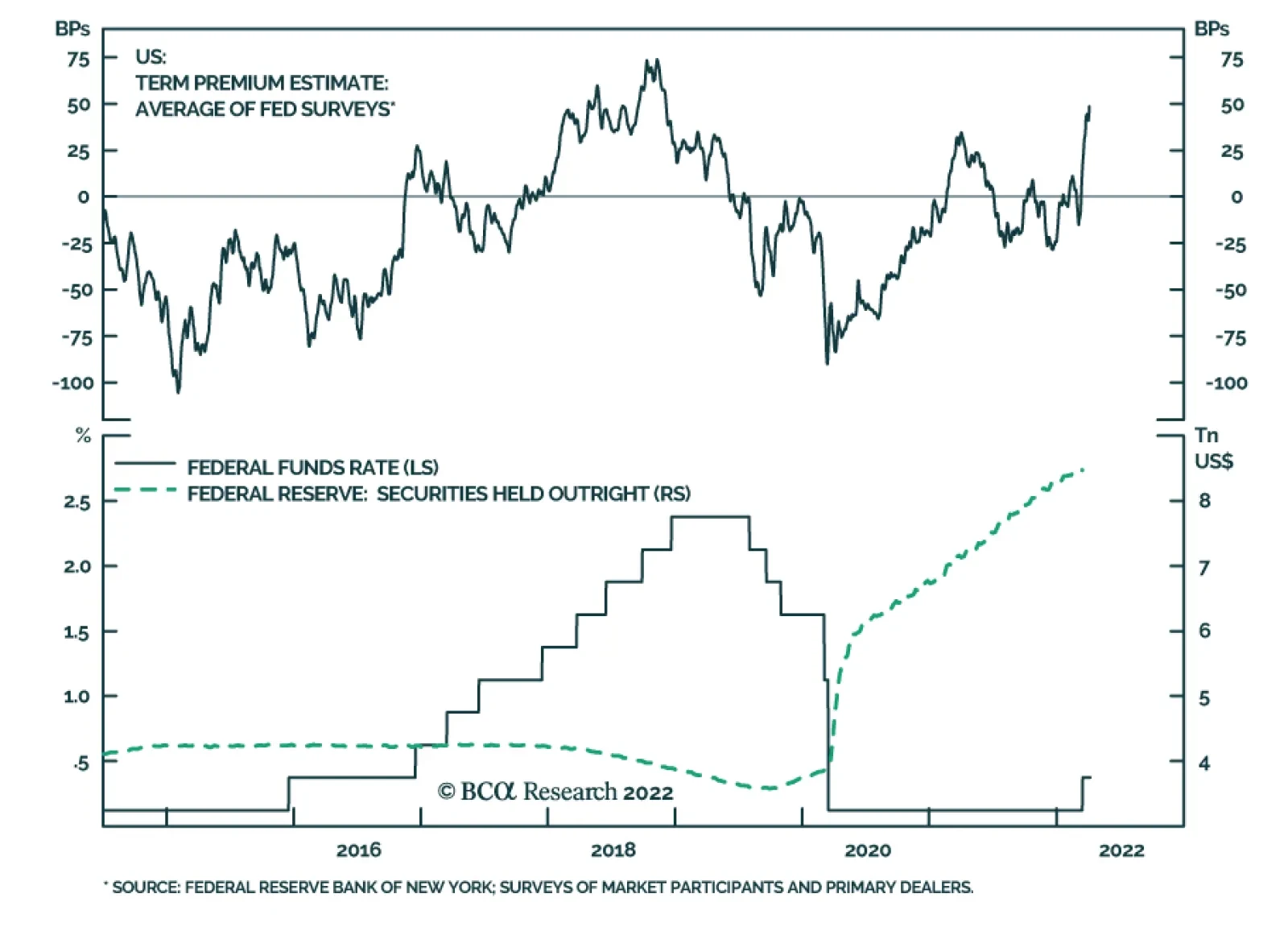
Bottom Line: Last week’s Fed “news” was not particularly newsworthy. The FOMC will prioritize its inflation mandate over its full employment mandate until further notice, but the economy is well suited to withstand higher rates and even the housing market won’t buckle in the face of them. Feature Just when you thought it was safe to go back in the water, Fed speakers roiled rates markets again last week, pushing the 10-year Treasury yield over 2.6% for the first time in three years. Although Fed Governor Brainard was simply lining up behind every other governor and district president who’s been in range of a microphone over the last several weeks, her tough talk on inflation in a Tuesday morning speech jolted the 10-year yield 10 basis points (bps) higher, from 2.45% to 2.55%, and it tacked on another 10 bps overnight, hitting 2.65% as New York-based fixed income traders switched on their terminals Wednesday morning. Stocks tumbled after Brainard’s remarks, as well, with the S&P 500 shedding 1% in back-to-back sessions. Both markets got a respite after the March FOMC meeting minutes contained no further revelations but the 10-year yield marched to 2.70% on Friday. The market action demonstrated that investors remain on edge, despite the S&P 500’s 10% bounce. From our perspective, there was nothing too notable in Brainard’s comments. She may be seen as one of the more reliably dovish members of the FOMC, but Chair Powell has been at pains to stress that the entire committee is “determin[ed],” as the minutes put it, “to take the measures necessary to restore price stability.” With inflation readings persisting well above the FOMC’s target level, one participant after another has hammered home the message in speeches and interviews that the committee is unanimously resolved to wield its tools to bring it to heel. Related Report US Investment StrategyIt All Depends On Whom You Ask Hiking the fed funds rate is the committee’s foremost weapon in the fight against inflation, and it has guided investors to discount a more rapid pace of 2022 increases and a modestly higher end point for this tightening cycle. We think the fixed income market is underestimating the terminal, or peak, rate but expect that it will require hard evidence before it reassesses its conviction that the economy cannot withstand a fed funds rate above 2.5%. It will take time to gather that evidence, as it won’t be available until the funds rate is at least 2%, so we expect that the 10-year yield will soon peak in tandem with inflation, but investors are especially uncertain and volatile financial markets reflect it. The FOMC can also adjust the size of its balance sheet to regulate the stimulus it’s providing to the economy. This tool pales in importance relative to the funds rate and despite Ben Bernanke’s smug remark at BCA’s 2015 conference that “quantitative easing works in practice but not in theory,” definitive evidence of its effects remains elusive. We therefore do not expect that curtailing reinvestment of principal repayments from the Fed’s stockpile of securities holdings will have a meaningful direct effect on the economy. Last week’s guidance that the runoff will be faster than it was in 2018-19 makes sense, given that the Fed’s securities holdings are twice as large (Chart 1), and that flush households and businesses are in markedly better shape than they were in the aftermath of the crisis. Chart 1The Funds Rate Matters More Than The Size Of The Balance Sheet
The Funds Rate Matters More Than The Size Of The Balance Sheet
The Funds Rate Matters More Than The Size Of The Balance Sheet
There is no settled consensus on what the Fed’s balance sheet reduction will mean for the economy and markets. The US Investment Strategy view is that asset purchases are mainly a signaling device; they let economic participants and investors know that zero interest rate policy will remain in place until some period after they end. Balance sheet runoff doesn’t provide any similar information about the future; it simply indicates that the FOMC will be pursuing a supplemental stimulus reduction measure alongside its far more influential increases in short rates. Removing a price-insensitive buyer from the marketplace should put modest upward pressure on interest rates because they should have to rise, all else equal, to induce other buyers to step in to replace it. We expect, therefore, that the runoff will tighten financial conditions at the margin and exert a modest drag on economic activity. Some of that marginal tightening must have already occurred, as the Fed has taken pains to telegraph the balance sheet runoff, but it will likely contribute to volatility as markets try to settle on the proper outcome to discount. What About Housing? Interest rates affect the entire economy, but housing is the most rate-sensitive industry. Houses are the ultimate big-ticket items – they are the most expensive purchase most households will make and nearly all of them are financed via mortgages. Demand for single-family housing, away from the post-GFC phenomenon of investment buyers paying cash, is acutely sensitive to interest rates. The tide of available buyers ebbs and flows as monthly mortgage payments rise and fall. The housing market therefore finds itself in the crosshairs of the Fed’s tough talk about inflation and the homebuilder stocks have been demolished so far this year, losing a third of their value to lag every other subindustry group in the S&P 500 except closely related home furnishings (Chart 2). The stock rout contrasts with the upbeat housing market outlook we offered two months ago. Though we acknowledge that housing’s prospects have dimmed somewhat since mid-to-late February, we remain more optimistic than the consensus and are confident that a pronounced slowdown is not in store. Chart 2A Brutal Selloff ...
A Brutal Selloff ...
A Brutal Selloff ...
The subsequent 75-bps surge in Freddie Mac’s national 30-year fixed-rate mortgage proxy (Chart 3, middle panel) has made homes less affordable for the median buyer (Chart 3, top panel). The drop in affordability has been modest, however, as it has been cushioned by a narrowing of the gap between median income and median home prices (Chart 3, bottom panel). Despite the last two months’ dip, homes remain quite affordable relative to history. Chart 3... Despite Solid Affordability
... Despite Solid Affordability
... Despite Solid Affordability
Since its predecessor index began in 1971, affordability had only ever surpassed the 140 level that has marked the bottom of the post-crisis range for a brief period in the early seventies (Chart 4, top panel). While mortgage rates are clearly moving in the wrong direction, they remain extremely low. One must squint to register their current advance in the context of the series’ entire history (Chart 4, third panel). Despite rising rates, median income gains have kept the mortgage servicing burden steady – and historically light – for several months (Chart 4, second panel). Though we expect that mortgage rates will stop vaulting upward and possibly even retrace some of their advance as inflation peaks, their recent move has been unfriendly to the housing market. Viewed from the perspective of the National Association of Realtors’ affordability index, however, their level remains quite favorable, and we do not worry that great swaths of would-be buyers are going to be shut out of the market. The respondents to the NAHB’s homebuilder sentiment survey agree. While the forward sales component swooned by ten points from January to February (Chart 5, bottom panel), current sales largely kept pace (Chart 5, second panel) and potential buyer traffic rose (Chart 5, third panel). The overall index slipped a bit since January but – stop us if you’ve heard this before – remains very strong relative to history (Chart 5, top panel). Chart 4The American Dream Is Not Out Of Reach
The American Dream Is Not Out Of Reach
The American Dream Is Not Out Of Reach
Chart 5Homebuilders See Clear Skies Ahead ...
Homebuilders See Clear Skies Ahead ...
Homebuilders See Clear Skies Ahead ...
Though demand has surely waned, as rising rates sideline some marginal buyers, we expect it will remain robust, especially as the sizzling rental market offers little relief. Supplies of new and existing homes remain constrained. Restrictive zoning laws, sporadically soaring input costs, supply chain issues and difficulty finding skilled workers have hampered new home construction. Inventories of existing homes remain historically depleted (Chart 6, middle panel) and the share of homes that are vacant remains at all-time lows (Chart 6, bottom panel). Chart 6... As Their Product Is In Short Supply
... As Their Product Is In Short Supply
... As Their Product Is In Short Supply
Chart 7Real Mortgage Rates Are Not A Problem
Real Mortgage Rates Are Not A Problem
Real Mortgage Rates Are Not A Problem
The bottom line is that the housing picture has worsened somewhat but we still believe conditions are better than the gloomy consensus perception. Construction and sales activity will surprise to the upside over the rest of the year and residential investment will augment economic activity, not detract from it. Although the ITB homebuilder ETF has been a drag on performance since we added it to our cyclical ETF portfolio last month, we will continue to hold it as a pure play on the resilience of domestic demand. It is hard to see demand evaporating in the fashion implied by the homebuilders’ skid when real mortgage rates are at such extreme lows, no matter how they are adjusted for inflation (Chart 7). David Wins A Round Against Goliath Workers at a fulfillment center in Staten Island voted two weeks ago to become the first domestic Amazon employees to form a union. The vote, along with a concurrent re-vote at a Bessemer, Alabama warehouse that union organizers lost, was closely watched by labor relations experts. Amazon is the second-largest private employer in the US, with more than a million employees, and its size and reputedly trying working conditions make it an especially appealing target for unions. Labor advocates were quick to characterize the vote as a watershed moment, but it is far too early to call an inflection point. The outcome of the Amazon vote was front-page news because it was so improbable. Despite a cyclically favorable labor market, wage earners trying to unionize confront a gaping structural resource disparity with multinational companies. The fledgling Amazon Labor Union’s (ALU) victory in Staten Island was startling but it still faces an arduous climb to bring Amazon to the negotiating table and work out a contract agreement. Amazon will be able to introduce delays at every step of the process, eroding ALU’s meager resources while pursuing a strategy of running out the clock on the current labor-friendly administration. One of the key takeaways from our January-February 2020 Special Reports on US labor relations history was that employees are only to achieve gains when the government – courts, legislatures and the executive branch – does not favor employers. The series of reports were meant to alert investors to the possibility that Democratic wins in the 2020 election could send the pendulum swinging back in employees’ favor after 40 years of tilting toward employers, carrying important implications for corporate profit margins and inflation. Chart 8The Tortoise And The Hare
The Tortoise And The Hare
The Tortoise And The Hare
The election did mark a change in the White House’s attitude toward labor, installing the self-declared “most pro-union president leading the most pro-union administration in American history.1” Since President Biden took office, the National Labor Relations Board has forcefully asserted itself in its role as the official referee of union elections to the point that Amazon has accused it of taking the unions’ side instead of serving as a neutral arbiter. The president himself would seem to have been taking sides last week when he took the rare step of calling out Amazon by name during remarks to a group of unionized workers. “The choice to join a union belongs to workers alone,” he said. “By the way, Amazon, here we come. Watch.” The White House press secretary quickly walked back the comments, placing them in the context of the president’s established support for unionization and collective bargaining. “What he was not doing is sending a message that he or the U.S. government would be directly involved in any of these efforts or take any direct action.2” Regardless of whether President Biden was attempting to send a message or had ventured off-topic as is his wont, it is unclear how much his administration can do to tilt the scales in workers’ favor. New Deal-era laws endowed workers with the right to organize and employers are not allowed to obstruct their efforts to do so. There are multiple gray areas in union election campaigns, however, and employers regularly deploy a wide range of actions that are not explicitly prohibited to keep unions out of their workplace. Most importantly, this administration may only be in charge until January 2025. It can use the NLRB, OSHA, the Department of Labor and the Department of Justice to try to advance workers’ cause for four years but labor has been on the back foot for four decades. It is likely to lose its legislative majorities in November’s midterms, the federal bench is populated by a majority of judges disposed to see things from employers’ point of view and many state legislatures are markedly anti-union. Without another term, the jury is out on the administration’s ability to effect durable change. The takeaway for investors is that a wage-price spiral has not yet taken hold and our bet is that it won’t. The tight labor market has endowed workers with more leverage than they’ve had in many cycles, but structurally the labor relations landscape bears more characteristics of the Reagan Era (1980-2020) than the New Deal Era (1933-1980). Real average hourly earnings have risen since the pandemic arrived in the US (Chart 8, top panel), but we find it telling that all of the real wage growth occurred in the first year of the pandemic. Across Year 2, nominal wages have failed to keep up with consumer price inflation (Chart 8, bottom panel), despite White House support in the midst of a labor market so tight that it squeaks. Doug Peta, CFA Chief US Investment Strategist dougp@bcaresearch.com Footnotes 1 Remarks by President Biden in Honor of Labor Unions | The White House Accessed April 7, 2022. 2 Biden Appears to Show Support for Amazon Workers Who Voted to Unionize - The New York Times (nytimes.com) Accessed April 7, 2022.
In an Insight earlier last week, we noted that comments from Fed Governor Lael Brainard and the release of the minutes from the March FOMC meeting impacted yields at the long-end of the US Treasury curve. Both Brainard’s comments and the minutes were focused…
According to BCA Research’s Foreign Exchange Strategy service, most central banks continue to dial up their hawkish rhetoric, led by the Fed. This is putting upward pressure on the dollar. The key data releases the Federal Reserve watches continue to…
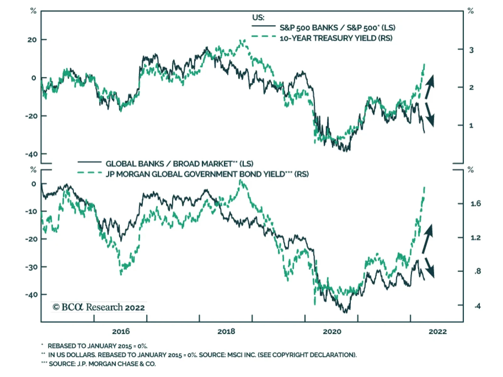
US bank stocks are down 16.6% since mid-February, underperforming the S&P 500 by 18.5% over this period. Notably, this underperformance occurred as the 10-year Treasury yield increased by 74 bps. This marks a break in the typically positive relationship…
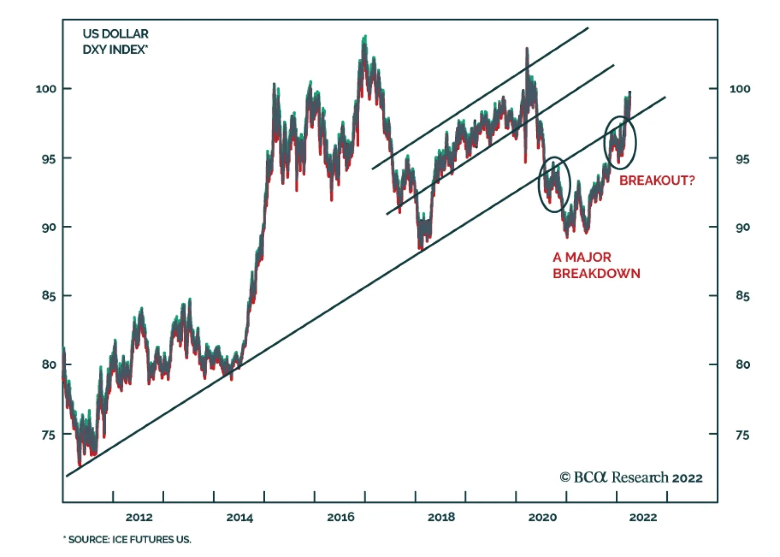
Executive Summary The Dollar Has Broken Above Overhead Resistance
The Dollar Has Broken Above Overhead Resistance
The Dollar Has Broken Above Overhead Resistance
Most central banks continue to dial up their hawkish rhetoric, led by the Fed. This is putting upward pressure on the dollar (Feature Chart). The big surprise has been resilient inflationary pressures across many economies. In our view, the market has already priced in an aggressive path for interest rates in the US, putting the onus on the Fed to deliver on these expectations. Meanwhile, other central banks that are also facing domestic inflationary pressures will play catch up. Our short USD/JPY position was triggered at 124. While there are no immediate catalysts for yen bulls, the currency is very cheap, and speculators are very short. Look to sell the DXY soon. RECOMMENDATIONS INCEPTION LEVEL inception date RETURN Short DXY 102 2022-04-07 - SHORT USD/JPY 124 2022-04-05 0.02 Bottom Line: Technically, the dollar has broken above overhead resistance, putting it within striking distance of the March 2020 highs at 103. However, given stretched positioning, our bias is that incremental increases in the DXY will require much more upside surprises in US interest rates. This is not our base case. Feature The dollar performed well in the first quarter of this year. Year-to-date, the DXY index is up 3.9%. Remarkably, this has coincided with strength in many commodity currencies such as the BRL, ZAR, COP, CLP, and AUD, that tend to be high beta plays on a falling dollar (Chart 1). Technically, the dollar has broken above overhead resistance, putting it within striking distance of the March 2020 highs of 103 (Chart 2). However, given stretched positioning, our bias is that incremental increases in the DXY will require much more upside surprises in US interest rates. This is not our base case. Chart 1The Dollar And Commodity Currencies Have Been Strong This Year
Month In Review: A Continued Hawkish Shift
Month In Review: A Continued Hawkish Shift
Chart 2The Dollar Has Broken Above Overhead ##br##Resistance
The Dollar Has Broken Above Overhead Resistance
The Dollar Has Broken Above Overhead Resistance
As we have highlighted in past reports, the dollar continues to face a tug of war. If rates rise substantially in the US, and that undermines the US equity market leadership (Chart 3), the dollar could suffer. If US rates rise by less than what the market expects, record high speculative positioning in the dollar will surely reverse. Chart 3Dollar Tailwinds Remain Intact
Dollar Tailwinds Remain Intact
Dollar Tailwinds Remain Intact
This week’s Month-In Review report goes over our take on the latest G10 data releases, and the implication for currency strategy both in the near term and longer term. US Dollar: The Fed Stays Hawkish Chart 4The Case For More Tightening
The Case For More Tightening
The Case For More Tightening
The dollar DXY index is up 3.9% year-to-date. The key data releases the Federal Reserve watches continue to suggest a hawkish path for interest rates going forward. Inflation remains strong in the US. Headline CPI came in at 7.9% year-on-year in February and is expected to accelerate in next week’s release. Nonfarm payrolls are still robust. The US added 431K jobs in March, nudging the unemployment rate to a cycle low of 3.6%. Wages are inflecting higher, which is pulling up unit labor costs. The Atlanta Fed Wage Growth Tracker currently sits at 6%. These developments continue to underpin market expectations for aggressive interest rate increases. The market now expects the Fed to raise rates to 2.25% by December 2022. Speculators are also very long the dollar. The mispricing in the dollar comes from the fact that markets are expecting the Fed to be more aggressive than other central banks in curtailing monetary accommodation this year (as proxied by two-year yield spreads). However, the reality is that other central banks are also ratcheting up their hawkish rhetoric. As such, we expect policy convergence to be a theme that will play out in 2022, putting downward pressure on the dollar. In conclusion, our 3-month view on the dollar is neutral, based on the risk of further escalation in the Ukrainian crisis and robust inflation prints, but our 9-month assessment will be to sell the dollar on any strength. We are revising our year-end target on the DXY to 95. The Euro: Stagflation Chart 5Euro Area Real Yields Are Too Low
Euro Area Real Yields Are Too Low
Euro Area Real Yields Are Too Low
The euro continues to weaken, down 4.2% this year, after hitting an intraday low of 1.08 last month. Economic data in the eurozone has been soft, especially on the back of a surge in the number of new Covid-19 cases, rising energy costs driven by the military conflict between Ukraine and Russia, and a weak euro adding to upward pressure on inflation. This is pinning the euro area in a stagflationary quagmire. More specifically: The headline HICP (harmonized index of consumer prices) index for the euro area was 7.5% for March. The hawks in the ECB are very uncomfortable with last week’s HICP release of 9.8% in Spain, 7.3% in Germany, and 7% in Italy. House prices in the euro area are accelerating on the back of very low real rates. This is increasing the unaffordability of homes across the eurozone. One of our favorite measures of economic activity, the Sentix Economic Index, tumbled in April. At -18, this is the lowest since July 2020, a negative surprise vis-à-vis the expected -9.4. Faced with a deteriorating economic backdrop, but strong inflationary pressures, the ECB has chosen a hawkish path to maintain credibility. Asset purchases will be tapered this year, and rate hikes are on the table. Forward markets are now pricing 53 bps of interest rate increases this year. In our view, while the ECB will not deliver the pace of rate hikes anticipated by markets in the near term, pricing of interest rate differentials between the eurozone and the US will narrow, as the ECB plays catch up. We are neutral on the euro over a 3-month horizon but are buyers over 9 months and beyond. Stay long EUR/GBP as a play on policy convergence between the ECB and BoE. Our year-end target for EUR/USD is 1.18. The Japanese Yen: A Contrarian View Chart 6Too Many Yen Bears
Too Many Yen Bears
Too Many Yen Bears
The Japanese Yen: A Contrarian View The Japanese yen is down 7% year-to-date. This pins it as the worst performing G10 currency this year. The story for Japan (and the yen) has been a very slow emergence from the latest Covid-19 wave. This has kept domestic inflation very subdued, allowing the BoJ to stay dovish, even as the external environment has done better. This has pushed interest rate differentials against the Japanese yen. The latest trigger for the selloff in the yen was the BoJ’s commitment to maintain yield curve control as global interest rates have been surging. This pushed USD/JPY above 125, the highest since 2015. On the back of this move, incoming economic data justified the BoJ’s stance. Headline inflation has picked up (still at 0.9%), but core “core” inflation remains at -1%. At 1.21, the job-to-applicant ratio is well below its pre-pandemic level of around 1.6. Ergo, the labor market is not as tight as a 2.7% unemployment rate suggests. Wage growth is improving, currently at 1.2% for February. That said, is it hard to argue that Japanese workers have bargaining power and can trigger a wage/inflation spiral that will allow the BoJ to pivot. Related Report Foreign Exchange StrategyThe Yen In 2022 Despite these negatives, we are constructive on the yen because the downside is well priced in, while upside surprises are not. Real rates remain higher in Japan than for other G10 countries. Speculators are also very short the yen. As we highlighted last week, the yen is also extremely cheap. We went short USD/JPY at 124. Our view is that interest rate expectations for the US are overdone in the near term. As such a stabilization/retracement in global yields could be a bullish development for yen bulls. Our target is 110 with a stop at 128. British Pound: A Hawkish BoE Chart 7The Case For A Hawkish BoE
The Case For A Hawkish BoE
The Case For A Hawkish BoE
The pound is down 3.4% year-to-date. The Bank of England has been one of the more aggressive central banks, raising interest rates to 0.75% last month. Inflation continues to soar in the UK - headline CPI was at 6.2% in February while core inflation clocked in at 5.2%. This prompted the governor to send a letter to the Chancellor of the Exchequer, explaining why monetary policy has allowed inflation to deviate from the BoE’s mandate of 2%. According to the BoE’s projections, inflation will rise above 8% this year before peaking. At the same time, taxes are slated to rise in the UK this month. While the labor market continues to heal, the combination will be a hit to consumer sentiment in the near term. The SONIA curve in the UK is pricing 130 bps of price hikes this year. While the BOE must contain inflationary pressures (in accordance with their mandate), the risks of a policy mistake have risen. Tight monetary and fiscal policy in the UK could stomp out any budding economic green shoots. The pound is also very sensitive to global financial conditions, and an equity market correction, especially on the back of heightened tensions in Ukraine, will put pressure on cable. We are short sterling, via a long EUR position. In our view, the EUR/GBP cross is heavily underpricing the risks to the UK economy in the near term. Australian Dollar: A Commodity Story Chart 8The RBA Will Stay Patient
The RBA Will Stay Patient
The RBA Will Stay Patient
The Australian dollar is up 3% year-to-date, making it the best performing G10 currency. The Reserve Bank of Australia kept rates on hold at its April 5th meeting, but it ratcheted up its hawkish tone. The two critical measures that the RBA is focusing on, inflation and wages, have been improving. As a result, the shift in the RBA stance was justified. Since its March meeting, home prices have continued to accelerate, rising 23.7% year-on-year in Q4. Meanwhile, the unemployment rate has fallen to a cycle low of 4% in Q4. This is below many measures of NAIRU. The RBA expects inflationary pressures to remain persistent in 2022, but ultimately fall to 2.75% in 2023. This will still be at the upper bound of their 2%-3% target range. Admittedly, wages are still low by historical standards, but as Governor Philip Lowe has highlighted, the behavior of the Phillip’s Curve at these low levels of unemployment is unpredictable. The external environment is also AUD bullish. The RBA Index of Commodity prices soared by 40.9% year-on-year in March, widening the gap with a rather muted AUD (up 3.4% this year). In our view, the market is concerned about the zero-Covid policy in China (Australia’s biggest export partner), which could dim Australia’s economic outlook in the near term. On the flip side, many speculators are now short the Aussie which is bullish from a contrarian perspective. A healthy trade balance is also putting upward pressure on the currency. We are lifting our limit buy on AUD/USD to 72 cents, after being stopped out for a modest profit earlier this year. New Zealand Dollar: Positive Catalysts, But Overvalued Chart 9Home Price Inflation In New Zealand Is Rolling Over
Home Price Inflation In New Zealand Is Rolling Over
Home Price Inflation In New Zealand Is Rolling Over
The New Zealand dollar is up 1% year-to-date. The Reserve Bank of New Zealand is among the most hawkish within the G10. The cash rate is at 1%, the highest among major developed economies on the back of economic data which remains robust. Home prices, a metric the RBNZ monitors to calibrate monetary policy, are rising 23.4% year-on-year as of March. While we are modestly positive on the Kiwi, it has become very expensive according to most of our models. The result is that the trade balance continues to print a deficit, with the latest data point in February deteriorating to NZ$ -8.4 billion. Kiwi bonds also offer the highest yield in the G10, meaning the market has already priced a hawkish path of interest rates by the RBNZ. Given the crosscurrents mentioned above, we are neutral the kiwi versus the dollar over both a 3-month and 9-month horizon. Canadian Dollar: The BoC Will Stay Hawkish Chart 10The BoC Will Hike Next Week
The BoC Will Hike Next Week
The BoC Will Hike Next Week
The CAD is up 0.4% year-to-date. The Bank of Canada is expected to raise interest rates by 50bps to 1% at next week’s meeting. This is not a surprise, since all the measures the BoC looks at to calibrate monetary policy are robust. Both headline and core inflation are well above the midpoint of the 1%-3% target range. The common, trim, and median inflation prints are either at or above the upper bound of the central bank’s target at 2.6%, 4.3%, and 3.5%, respectively. This suggests inflationary pressures in Canada are broad based. Employment in Canada is back above pre-pandemic levels, with the unemployment rate slated to come in at 5.4% with today’s release, close to estimates of NAIRU. House price inflation is raging across many cities in Canada, which argues that monetary policy is too easy and mortgage rates are too low. We have always highlighted that the key driver of the CAD remains the outlook for monetary policy and the path of energy prices. In the near term, oil prices will stay volatile as the situation in Ukraine continues to be very fluid, but the CAD has not priced in the fact that the BoC is leading the interest rate cycle vis-à-vis the US this time around. Speculators are only neutral the CAD, an appropriate stance over the next three months. That said, we are buyers of CAD over a 9-to-12-month horizon, with a target of 0.84. Swiss Franc: A Safe Haven Chart 11The SNB Will Lean Against Franc Strength
The SNB Will Lean Against Franc Strength
The SNB Will Lean Against Franc Strength
The Swiss economy continued to fare well in the first quarter. The manufacturing PMI jumped to 64 in March. Retail sales were up 12.8% year-on-year in February. The labor market remains strong with unemployment near pre-pandemic levels. Switzerland’s direct exposure to the war appears relatively limited with little inflationary spillovers. CPI stood at 2.4% year-on-year in March, with about 1% of the increase coming from energy prices. The Swiss economy is still generating a record trade surplus, coming in at CHF 5.7bn in February. Safe-haven inflows into the franc have dampened inflationary dynamics. This leaves room for the SNB to continue easing monetary policy for longer relative to other central banks in the developed world. In terms of monetary policy, the SNB kept interest rates unchanged at -0.75% at its Q1 meeting. The SNB has also described the franc as “highly valued” and said that it is willing to intervene in FX markets as necessary to counter the upward pressure in the currency. Sight deposits have been rising in March. We are neutral CHF on both a 3-month and 9-month horizon but will be buyers of EUR/CHF at current levels. Norwegian Krone: Bullish On A 12-18 Month Horizon Chart 12NOK Has A Policy Tailwind
NOK Has A Policy Tailwind
NOK Has A Policy Tailwind
The NOK is flat this year. In March, the Norges Bank raised the policy rate by 25 bps to 0.75%, in line with policymakers’ previous statements. Citing rising import prices and a tight labor market, the committee now expects to increase rates to 2.5% by the end of 2023, up from an assessment of 1.75% in December. Inflation accelerated again in February, with headline and core CPI at 3.7% and 2.1% year-on-year respectively. Despite the removal of all Covid-19 restrictions in mid-February, consumer demand data remained soft with retail sales, household consumption, and loan growth all down in February. Still, the overall economy remains strong, and the Bank expects a rebound in demand going forward. The manufacturing PMI jumped to 59.6 in March after a three-month decline. Industrial production rose 1.6% year-on-year in February, after lackluster performance in January. The trade surplus remains robust. Registered unemployment fell to 2% in March and with rising wage expectations, the case for tighter monetary policy remains intact. The uncertainty over energy-related sanctions can keep oil prices volatile in the near time, as well as the NOK. That said, our commodity team expects oil to average $93/bbl next year, which is higher than what the forward markets are pricing. That will be bullish for the NOK. Swedish Krona: Lower Now, Strong Later Chart 13The SEK Is Not Pricing Rate Hikes By The Riksbank
The SEK Is Not Pricing Rate Hikes By The Riksbank
The SEK Is Not Pricing Rate Hikes By The Riksbank
SEK is down 4% year-to-date. The Riksbank remains one of the most dovish central banks in the G10, keeping the repo rate at 0% at its February meeting, with no hikes projected until 2024. Since then, inflation data has come in well above expectations and several board members have spoken out on the need to reevaluate monetary policy. The OIS curve is now pricing about two hikes by the end of the year. CPIF was 4.5% year-on-year in February and the measure excluding energy jumped to 3.4%, up from 2.5% in January. With fears that the conflict in Ukraine will exacerbate this trend, a survey of 12-month inflation expectations stood at a record 10.2% in March. While inflation is surprising to the upside, underlying economic data has been on the weaker side. The Swedish new orders-to-inventory ratio has fallen sharply. Consumer confidence also dipped in March, to the lowest point since the Global Financial Crisis. Sweden remains highly sensitive to eurozone economic conditions. As such, it is also in the direct firing range of any economic turbulence in the euro area, though it will also benefit from growth stabilization later this year, should macroeconomic risks abate. SEK is the second most undervalued currency based on our Purchasing Power Parity models and is likely positioned for a coiled spring rebound when the Riksbank eventually turns more hawkish. We are neutral SEK over a 3-month horizon but are bullish longer term. Chester Ntonifor Foreign Exchange Strategist chestern@bcaresearch.com Trades & Forecasts Strategic View Cyclical Holdings (6-18 months) Tactical Holdings (0-6 months) Limit Orders Forecast Summary