United States

Highlights There is no evidence of a decline in US corporate credit or bank lending spreads over the past few decades, meaning that any excess savings effect structurally depressing interest rates is occurring in the Treasury market. We note the possible mechanisms of action for excess savings to lower government bond yields, by lowering the current policy rate, expectations for the policy rate in the future, or the term premium on long-maturity bonds. To investigate the impact that excess savings may be having on bond yields, we define historical periods of abnormal yields based on the gap between long-maturity Treasury yields and the potential rate of economic growth. This reflects our view that potential growth is the equilibrium interest rate under normal economic conditions. Since 1960, there have been three major episodes when the difference between bond yields and economic growth was large and persistent, but the first two seem to be easily explained by the stance of US monetary policy rather than by a savings/investment imbalance. The excess savings story better fits the facts after 2000. We do find evidence that a global savings glut lowered bond yields during the early-2000s, and it may have even modestly contributed to the excessive household credit demand that ultimately caused the global financial crisis. But as a deviation from equilibrium, the effect of the global savings glut was relatively insignificant compared to what has prevailed over the past decade. Excess savings did certainly play a role in lowering long-term investor expectations for the Federal funds rate during the last economic cycle, but it did so for cyclical reasons that spanned several years rather than as a result of demographic effects or other structural factors unrelated to the business cycle. That is an important distinction, as long-term investor expectations for the Fed funds rate remained low in the second half of the last economic expansion despite a reduction in savings and significantly stronger growth. The historical impact of FOMC meetings on the structural decline in long-maturity US Treasury yields strongly implies that fixed-income investors have been guided by the Fed to expect a lower average Fed funds rate. It is our view that the Fed has a backward-looking neutral rate outlook, informed by an incomplete understanding of the economic circumstances of the latter half of the last expansion. A low neutral rate narrative has become entrenched in the minds of investors and the Fed itself, and we regard this as the primary factor anchoring yields at the long-end of the maturity spectrum. This phenomenon is only likely to dissipate once short-term interest rates rise and a recession does not materialize. While the nearer-term outlook more likely favors a neutral or at best modestly short duration stance within a fixed-income portfolio, investors should remain structurally short duration in response to a potentially rapid shift in long-term interest rate expectations from the Fed and fixed-income investors over the coming few years. Feature Chart II-110-Year US Treasury Yields Are The Lowest Relative To Headline Inflation In Over 60 Years
10-Year US Treasury Yields Are The Lowest Relative To Headline Inflation In Over 60 Years
10-Year US Treasury Yields Are The Lowest Relative To Headline Inflation In Over 60 Years
For many investors, one of the most striking features of the pandemic, especially over the past year, is how low US long-maturity government bond yields have remained in the face of the highest headline consumer price inflation in four decades (Chart II-1). To many investors, this has provided even further evidence of a structural “excess savings” effect that has kept interest rates well below the prevailing rate of economic activity. The theory of secular stagnation, revived by Larry Summers in late 2013, is a related concept, but many investors believe that interest rates will remain low even in a world in which the US economy is growing at or even above its trend. The fundamental basis for this view is the idea that over the longer term, the real rate of interest is determined by the balance (or imbalance) between desired savings and investment, and that advanced economies have and will continue to experience excess savings – defined as a chronically high level of desired savings relative to the investment opportunities available. According to this view, in order for the actual level of savings to equal investment, interest rates must fall. Chart II-2Do Excess Savings Explain This Gap? (Spoiler: No)
Do Excess Savings Explain This Gap? (Spoiler: No)
Do Excess Savings Explain This Gap? (Spoiler: No)
This report challenges the view that excess savings are mostly responsible for the current level of long-term bond yields in the US. We agree that excess savings have played a role in explaining changes in long-term bond yields at different points over the past 20 years; we also agree that it is normal for interest rates in advanced economies to trend down over time in response to a demographically-driven decline in potential growth. But our goal is not to explain the downtrend in interest rates over time. Instead, we aim to explain the gap between the level of long-term bond yields today and the prevailing rate of economic activity, or consensus forecasts of the trend rate of growth (Chart II-2). We do not believe that this gap is economically justified, nor do we believe that it is driven by excess savings. We conclude that the Fed’s backward-looking neutral rate outlook is the primary factor anchoring US Treasury yields at the long-end of the maturity spectrum. This is only likely to change once short-term interest rates rise and a recession does not materialize; it suggests that investors should remain structurally short duration in response to a potentially rapid shift in long-term interest rate expectations from the Fed and fixed-income investors over the coming few years. Excess Savings And Interest Rates: Defining A “Mechanism Of Action” Households, businesses, and governments can directly purchase debt securities in capital markets, but they do not typically provide loans directly to borrowers. Direct lending usually occurs through the banking system, which means that excess savings would only lower interest rates in the economy through one of the following ways: By lowering the Fed funds rate By lowering long-maturity government bond yields relative to the Fed funds rate, by reducing either the term premium or investors’ expectations for the average Fed funds rate in the future By lowering corporate bond yields relative to duration-matched government bond yields By lowering lending rates on bank loans relative to banks’ cost of borrowing Charts II-3-II-5 highlight that there is no evidence of a structural decline in corporate credit spreads or bank lending rates relative to the Fed funds rate, so we can rule out this effect as a mechanism of action for excess savings to have structurally lowered interest rates. Chart II-6 highlights that interest paid on bank deposits lags the Fed funds rate, so we can also rule out the idea that excess deposits force the Fed to keep the effective Fed funds rate low. Chart II-3No Evidence Of A Structural Decline In Corporate Credit Spreads…
No Evidence Of A Structural Decline In Corporate Credit Spreads...
No Evidence Of A Structural Decline In Corporate Credit Spreads...
Chart II-4…Or Auto Loan Rate Spreads…
...Or Auto Loan Rates Spreads...
...Or Auto Loan Rates Spreads...
Chart II-5…Or Personal Loan Rate Spreads…
...Or Personal Loan Rate Spreads...
...Or Personal Loan Rate Spreads...
Chart II-6...Or Bank Deposit Rate Spreads
...Or Bank Deposit Rate Spreads
...Or Bank Deposit Rate Spreads
This means that if excess savings are depressing interest rates in the US, that the effect is truly occurring in the Treasury market. As noted, this could occur by lowering the current policy rate, expectations for the policy rate in the future, or the term premium on long-maturity bonds. Related Report The Bank Credit AnalystR-star, And The Structural Risk To Stocks All of these effects are certainly possible. Keynes’ paradox of thrift highlights that excess savings can manifest itself as a chronic shortfall in aggregate demand, which would persistently lower the Fed funds rate as the Fed responds to a long period of high unemployment. This could also lower the term premium on long-maturity bond yields in a scenario in which the Fed repeatedly engages in asset purchases to help stabilize aggregate demand. As well, domestic excess savings could lower the term premium on long-maturity bond yields, as aging savers directly purchase government securities as part of their retirement portfolios. Finally, foreign capital inflows could also cause this effect, especially if they originate from countries with chronic current account surpluses that use an increase in US dollar reserves to purchase long-maturity US government securities. Table II-1 summarizes these possible mechanisms of action for excess savings to lower US government bond yields. With these mechanisms in mind, we review the past 60 years to identify periods of “abnormal” bond yields, with the goal of understanding whether excess savings appear to explain major gaps. Table II-1Possible Mechanisms Of Action For Excess Savings To Lower Long-Term Government Bond Yields
April 2022
April 2022
Identifying Periods Of “Abnormal” Long-Maturity Bond Yields Chart II-7There Have Been Three Distinct Periods Of Abnormal Long-Maturity Bond Yields
There Have Been Three Distinct Periods Of Abnormal Long-Maturity Bond Yields
There Have Been Three Distinct Periods Of Abnormal Long-Maturity Bond Yields
Chart II-7 shows the difference between nominal 10-year US Treasury yields and nominal potential GDP growth. Panel 2 shows an alternative version of this series using the ten-year median annualized quarterly growth rate of nominal GDP in lieu of estimates of potential growth, which highlights a generally similar relationship. This approach to defining “abnormal” long-maturity bond yields reflects our view that the potential rate of economic growth is the equilibrium interest rate under normal economic conditions. To see why, given that GDP also effectively represents gross domestic income, an interest rate that is persistently below the potential growth rate of the economy would create a strong incentive to borrow on the part of households and especially firms. Chart II-7 makes it clear that the relationship has been mean-reverting over time, but that there have been three major episodes when the difference between bond yields and economic growth was large and persistent. The first episode occurred from 1960 to the late 1970s, and saw government bond yields average well below the prevailing rate of economic growth. We do not see this period as having been caused by an excess of desired savings relative to investment. As we discussed in our November Special Report,1 this gap represented a period of persistently easy monetary policy which contributed to excessive aggregate demand and a structural rise in inflation. The second major episode is also easily explained, as it occurred in response to the first. Following a decade of high inflation, Fed chair Paul Volcker raised interest rates aggressively beginning in 1979 to combat inflationary expectations, which led to a two-decade period of generally tight monetary policy. Like the first period, this was not caused by an imbalance between desired savings and investment. The third episode has prevailed since the late-1990s, and has seen a negative yield/growth gap on average – albeit one that has been smaller than what occurred in the 1960s and 1970s. From 2000 to 2007, the gap was generally negative, although it turned positive by the end of the economic cycle. It was modestly negative on average from 2008 to 2010, and only became persistently negative starting in 2011. The gap fell to a new low during the COVID-19 pandemic, and remains wider today than at any point during the last economic recovery. It is these post-2000 periods of a persistently negative yield/growth gap that should be closely investigated for evidence of an excess savings effect. The Global Savings Glut As noted, prior to 2000, the yield/growth gap in the US seems clearly explained by the Fed’s monetary policy stance, not by an excess savings effect. So the question is whether there is any evidence of excess savings having caused this negative gap since 2000. In our view, the answer is yes, but the effect was relatively small compared to what prevails today. We do find evidence of a global savings glut during the early-2000s. Chart II-8 highlights that the private and external sector savings/investment balances in China and emerging markets more generally were persistently positive during the 2000s. Chart II-9 highlights that multiple estimates of the term premium declined around that time – especially during Greenspan’s “conundrum” period of between 2004 and 2005. Chart II-8There Was A Global Savings Glut Prior To The Global Financial Crisis
There Was A Global Savings Glut Prior To The Global Financial Crisis
There Was A Global Savings Glut Prior To The Global Financial Crisis
Chart II-9The Global Savings Glut Does Seem To Have Lowered The Term Premium On US 10-Year Treasurys
The Global Savings Glut Does Seem To Have Lowered The Term Premium On US 10-Year Treasurys
The Global Savings Glut Does Seem To Have Lowered The Term Premium On US 10-Year Treasurys
Chart II-10 breaks down the components of the 10-year yield into the 5-year yield and the 5-year/5-year forward yield, and highlights that the negative correlation between the two components lasted for only one year. Overall, the 10-year Treasury yield was lower than potential growth for roughly two years as a result of the global savings glut effect. Chart II-10Still, The Global Savings Glut Effect Did Not Last Long And Was Not Especially Large In Magnitude
Still, The Global Savings Glut Effect Did Not Last Long And Was Not Especially Large In Magnitude
Still, The Global Savings Glut Effect Did Not Last Long And Was Not Especially Large In Magnitude
This was a significant event, and it may even have modestly contributed to the excessive household credit demand that ultimately caused the global financial crisis. But as a deviation from equilibrium, it was relatively insignificant compared to what has prevailed over the past decade. Excess Savings And US Household Deleveraging Chart II-11Most Of The Post-2007 Decline In 10-Year Yields Is Attributable To Lower Long-Term Fed Funds Rate Expectations
Most Of The Post-2007 Decline In 10-Year Yields Is Attributable To Lower Long-Term Fed Funds Rate Expectations
Most Of The Post-2007 Decline In 10-Year Yields Is Attributable To Lower Long-Term Fed Funds Rate Expectations
Chart II-11 highlights that, relative to June 2007 levels, the vast majority of the cumulative decline in the 10-year Treasury yield has occurred because of a decline in implied long-term expectations for the Fed funds rate, rather than a major decline in the term premium. The chart also shows that almost all the decline in implied long-term interest rate expectations since 2007 occurred during the 2008/2009 recession. This normally occurs during a recession as investors price in a low average Fed funds rate at the short end of the curve; the anomaly is that these expectations remained permanently low even as the economy recovered and as the Fed raised interest rates from 2015 to 2018. To us, Chart II-11 also underscores that the Fed’s asset purchases are not the main culprit behind low long-maturity bond yields today, given that the decline in long-term expectations for the Fed funds rate persisted even as the Fed stopped purchasing assets in 2014. It is not difficult to see why investors lowered their long-term Fed funds rate expectations in the immediate aftermath of the global financial crisis, even as economic recovery took hold. Chart II-12 highlights that the “balance sheet” nature of the 2008/2009 recession unleashed the longest period of US household deleveraging in the post-WWII period, and Chart II-13 highlights that this occurred despite extremely low interest rates – and in contrast to other countries like Canada that did not experience the same loss in household net worth. Chart II-12Household Deleveraging Did Lower The Neutral Rate For Several Years Following The Global Financial Crisis
Household Deleveraging Did Lower The Neutral Rate For Several Years Following The Global Financial Crisis
Household Deleveraging Did Lower The Neutral Rate For Several Years Following The Global Financial Crisis
Chart II-13The US Balance Sheet Recession Structurally Impaired Credit Demand For Several Years After 2008
The US Balance Sheet Recession Structurally Impaired Credit Demand For Several Years After 2008
The US Balance Sheet Recession Structurally Impaired Credit Demand For Several Years After 2008
Given that interest rates represent the price of borrowing, it is entirely unsurprising that a US balance sheet recession led to a persistent period in which credit growth was essentially unresponsive to interest rates, as households struggled to rebuild wealth lost during the recession and were unable to, or uninterested in, releveraging. This is another way of saying that the neutral rate of interest fell during that period, which we agree did occur. It is also accurate to characterize the US as having experienced a sharp increase in desired savings over that period, as highlighted by the explosion in the US private sector financial balance in the initial years of the last economic recovery (Chart II-14). Chart II-14Excess Savings Surged After 2008, But Eventually Normalized. Long-Term Rate Expectations Ignored The Normalization.
Excess Savings Surged After 2008, But Eventually Normalized. Long-Term Rate Expectations Ignored The Normalization.
Excess Savings Surged After 2008, But Eventually Normalized. Long-Term Rate Expectations Ignored The Normalization.
So excess savings did certainly play a role in lowering long-term investor expectations for the Federal funds rate during the last economic cycle, but it did so because of cyclical reasons that spanned several years rather than because of demographic effects or other structural factors unrelated to the business cycle. That is an important distinction, because while Chart II-14 shows that this excess savings effect eventually waned in importance, long-term investor expectations for the Fed funds rate remained low in the second half of the last economic expansion. Chart II-15Growth Was Historically Weak Last Cycle, But Only Because Of The First Few Years Of The Expansion
April 2022
April 2022
Chart II-15 highlights that the cumulative annualized growth in real per capita GDP during the last economic cycle was significantly below that of the average of previous expansions, but this was only the case because of the very slow growth period between 2008 and 2014. Per capita growth during the latter half of the expansion was comparable to that of previous expansions, and this occurred while the Fed was raising interest rates. And yet, investors only modestly raised their long-term interest rate expectations during that period. In our view, it is this fact that holds the key to understanding why investors’ long-term rate expectations are still low today. An Alternative Explanation For Today’s Extremely Low Long-Maturity Bond Yields Chart II-16Fixed-Income Investors Have Been Guided By The Fed To Expect A Low Average Fed Funds Rate
Fixed-Income Investors Have Been Guided By The Fed To Expect A Low Average Fed Funds Rate
Fixed-Income Investors Have Been Guided By The Fed To Expect A Low Average Fed Funds Rate
Chart II-16 highlights that, since 1990, all of the structural decline in US 10-year Treasury yields has occurred within a three-day window on either side of FOMC meetings. This strongly suggests that fixed-income investors have been guided by the Fed to expect a low average Fed funds rate, which is consistent with how similar 5-year/5-year forward US Treasury yields are in relation to published FOMC and market participant estimates of the average longer-run Fed funds rate (as shown in Chart II-2). This raises the important question of why the Fed did not revise up its expectation for the neutral rate during or following the second half of the last economic expansion, when growth was much stronger than during the first half. In our view, one of the clearest articulations of the Federal Reserve’s understanding of the neutral rate of interest was presented in a 2015 speech by Lael Brainard at the Stanford Institute for Economic Policy Research. Brainard noted the following: “The neutral rate of interest is not directly observable, but we can back out an estimate of the neutral rate by relying on the observation that output should grow faster relative to potential growth the lower the federal funds rate is relative to the nominal neutral rate. In today’s circumstances, the fact that the US economy is growing at a pace only modestly above potential while core inflation remains restrained suggests that the nominal neutral rate may not be far above the nominal federal funds rate, even now. In fact, various econometric estimates of the level of the neutral rate, or similar concepts, are consistent with the low levels suggested by this simple heuristic approach.”2 Chart II-17The Fed, Wrongly, Sees The 2019 Experience As Having Confirmed A Low Neutral Rate...
The Fed, Wrongly, Sees The 2019 Experience As Having Confirmed A Low Neutral Rate...
The Fed, Wrongly, Sees The 2019 Experience As Having Confirmed A Low Neutral Rate...
Given how the Fed determines the neutral rate is, two factors explain why the Fed’s estimates of the neutral rate have not increased (and, in fact, fell modestly in March). First, core inflation remained below 2% from 2015-2019, despite the fact that the economy was clearly growing at an above-trend pace during this period in the face of Fed rate hikes. We have noted in previous reports the role that the 2014 collapse in oil prices had on household inflation expectations. The latter were already vulnerable to a disinflationary shock, given how negative the output gap had been in the first half of the expansion.3 We do not think that the decline in inflation expectations that occurred following the 2014 collapse in oil prices reflects a low neutral rate, but rather we believe that the Fed saw this as a conundrum that supported the expectation of a low average Fed funds rate. The second event explaining the Fed’s persistently low long-term rate expectations is the fact that the Fed was forced to cut interest rates in 2019, which we believe it saw as confirmation that the stance of monetary policy had become either meaningfully less easy or openly tight. From the Fed’s point of view, this perspective was also supported by recessionary indicators, such as the inversion of the 2-10 yield curve (Chart II-17), and popular (but now discontinued) econometric estimates of the real neutral rate of interest, such as those calculated by the Laubach-Williams model (panel 3). Chart II-18...Without Appreciating The Damaging Impact The China-US Trade War Had On Global Activity
...Without Appreciating The Damaging Impact The China-US Trade War Had On Global Activity
...Without Appreciating The Damaging Impact The China-US Trade War Had On Global Activity
However, this view entirely ignores the fact that the US and global economies were negatively impacted in 2018 and 2019 by a politically-motivated nonmonetary shock to aggregate demand: the China-US trade war, which also impacted or targeted several major advanced economies. Chart II-18 highlights that global trade uncertainty exploded during this period, which severely damaged business confidence around the world and caused a slowdown in global industrial production. Tighter Chinese policy also likely contributed to the slowdown in global activity, but the bottom line is that factors other than US monetary policy contributed to economic weakness during this period, and that it is incorrect to infer from the 2018/2019 experience that interest rates rose to or exceeded the neutral rate of interest. In short, it is our view that the Fed has simply become backward-looking in how it perceives the neutral rate of interest; it has not yet observed a period when the Fed funds rate has risen to its estimate of neutral but is unambiguously still easy. Fixed-income investors, having demonstrably anchored their own assessments to those of the Fed over the past 30 years, have had no basis to come to a meaningfully different conclusion. We believe that the Fed’s backward-looking low neutral rate outlook has now become entrenched in the minds of investors and the Fed itself, and is the primary factor anchoring yields at the long-end of the maturity spectrum. This will probably only change once short-term interest rates rise and a recession does not materialize. As a final point, we clearly acknowledge that private savings increased massively during the pandemic. Investors who are inclined to see excess savings as the primary driver of low bond yields will point to this fact. But this was a forced increase in savings, rather than a desired one. The rise in household sector savings occurred mostly because of a substantial reduction in services spending, as pandemic restrictions and forced changes in behavior prevented the consumption of many services. The household savings rate has already returned to its pre-pandemic level in the US, and 5-year/5-year forward Treasury yields have risen to a higher point than they were prior to the onset of the COVID-19 pandemic. US households are likely to deploy a portion of their enormous stock of excess savings, as the pandemic continues to recede in importance, which is one of the main reasons to expect that the US economy will not succumb to a recession over the coming 12-18 months – and why investors and the Fed may soon be presented with evidence that warrants an increase in their long-term interest rate expectations. Investment Conclusions There are two important investment implications of the view that the Fed’s backward-looking neutral rate projection is the primary factor anchoring yields at the long end of the maturity spectrum. As we noted in Section 1 of our report, the first implication is that investors will likely be faced with a recession scare as the 2-10 yield curve durably inverts and as rate sensitive sectors of the economy, such as housing, inevitably slow in response to the extremely sharp rise in mortgage rates that has occurred over the past three months. We believe that it is ultimately the level of interest rates that matters for economic activity, rather than the change in interest rates. Large changes over short periods of time, however, create a degree of uncertainty about the trajectory of rates that temporarily impacts economic activity. This underscores that investors should not maintain an aggressively overweight stance toward global equities in a multi-asset portfolio, as it is likely that concerns about corporate profits will increase significantly at some point this year. The second investment implication is that US long-maturity bond yields could increase to much higher levels over the coming 12-24 months than many investors expect, in a scenario in which pandemic-driven price pressure dissipates, real wages recover, and no major politically-driven nonmonetary policy shocks emerge. We acknowledge that long-term interest rate expectations are unlikely to change until hard evidence of the economy’s capacity to tolerate interest rates above the Fed’s implied current estimate of the neutral rate emerges. This is a case, however, when we believe that investors should heed the now-famous words of Rüdiger Dornbusch: “In economics, things take longer to happen than you think they will, and then they happen faster than you thought they could.” As such, while the nearer-term outlook more likely favors a neutral or at best modestly short duration stance within a fixed-income portfolio, investors should remain structurally short duration in response to a potentially rapid shift in long-term interest rate expectations from the Fed and fixed-income investors over the coming few years. Jonathan LaBerge, CFA Vice President The Bank Credit Analyst Footnotes 1 Please see The Bank Credit Analyst "Gauging The Risk Of Stagflation," dated October 29, 2021, available at bca.bcaresearch.com 2 Lael Brainard, Normalizing Monetary Policy When The Neutral Rate Is Low, December 2015 3 Please see The Bank Credit Analyst "The Modern-Day Phillips Curve, Future Inflation, And What To Do About It," dated December 18, 2020, available at bca.bcaresearch.com
The 2-year/10-year Treasury slope briefly inverted in intraday trading on Tuesday. Given that an inverted yield curve is a reliable recession and equity bear market indicator, should investors be concerned? Fears of an imminent recession are likely…
Executive Summary Energy and National Security Will Drive the Market
Energy and National Security Will Drive the Market
Energy and National Security Will Drive the Market
Our 2022 key views are broadly on track. Biden’s shift from domestic to foreign policy is dominating the other views. However, Democrats still have a 65% chance of passing a reconciliation bill that will raise taxes to pay for green energy and prescription drug caps. Then gridlock will set in. The US is developing a new national consensus. Generational change is promoting the shift to proactive fiscal policy to address the country’s social unrest and rising foreign policy challenges. Polarization is still at peak levels in the short term but will fall over the coming decade as the US pursues “nation building” at home while confronting geopolitical rivals. The return of Big Government is being priced into the bond market today. But it will be Limited Big Government, as the sharp spike in inflation today will provoke a backlash. Recommendation Inception Level Inception Date Return Long Aerospace And Defense Vs. Broad Market (Cyclical) 30-Mar-22 Long Oil And Gas Transportation And Storage Vs. Broad Market (Cyclical) 30-Mar-22 Long Refinitive Renewable Energy Vs. Broad Market (Tactical) 30-Mar-22 Bottom Line: Investors dedicated to the US market should stay tactically defensive. Cyclically favor the new US policy consensus on national defense, infrastructure, cyber security, and energy security. Feature The title of our annual outlook was “Gridlock Begins Before The Midterms.” We argued that Biden would still have some room for legislative maneuver in the first half of 2022 but that checks and balances would grow as the year went on. Checks will grow due to (1) the looming midterm elections; (2) Biden’s falling political capital and need to rely on executive action; (3) rising foreign policy challenges. Of these, foreign policy has proven decisive, with Russia invading Ukraine and the US and Europe imposing economic sanctions. The resulting energy shock is adding to inflation, weighing on consumer confidence, stock market multiples, and investor sentiment (Chart 1). Having said that, we also argued that congressional Democrats still had enough political capital to pass a watered-down fiscal 2022 budget reconciliation bill before the scene of action shifted to the White House. The second quarter is the last chance for this prediction to come true – and we are sticking with our 65% odds. The reconciliation bill will be even more watered down than we expected. But the point is that fiscal policy – especially tax hikes – can still move markets in the second quarter, even though inflation, the Fed, and the war will have a bigger influence. Chart 1US Seeks National Security And Energy Security
US Seeks National Security And Energy Security
US Seeks National Security And Energy Security
Related Report US Political Strategy2022 Key Views: Gridlock Begins Before The Midterms The war in Europe is clearly the most important political, geopolitical, and policy dynamic for investors this year. It is prompting some important congressional action that speaks to Biden’s room for maneuver in the first half of the year. In so doing it reinforces our long-term themes of “Peak Polarization” and “Limited Big Government.” As Americans face rising foreign policy challenges, a new bipartisanship is emerging, particularly on industrial and trade policy. Checking Up On Our Three Key Views For 2022 Here are our three key trends for 2022 with comments about their development over the past three months: 1. From Single-Party Rule To Gridlock: We argued that the Biden administration would pass a watered-down reconciliation bill on a party-line vote by June at latest. Then Congress would grind to a halt for election campaigning, to be followed by Republicans taking one or both chambers of Congress, restoring gridlock and making it hard to pass major legislation from the second half of 2022 through 2024. This view is still generally on track. The basis for believing that a bill will still pass is that the Democrats are in trouble in the midterms and badly need a legislative victory. Public opinion polls suggest they face a beating reminiscent of President Trump and the Republicans in 2018 (Chart 2). Democrats trail Republicans in enthusiasm. Only about 45% of Democrats and 42% of Biden voters are enthusiastic to vote, while 50% of Republicans and 54% of Trump voters are enthusiastic. Men, who lean Republican, are more enthusiastic than women, by 51% to 38%, according to the pollster Morning Consult.1 With the economy and foreign policy rising as the most important issues of the election, Democrats have lost their key issues of health care and the pandemic. Notably Democrats have also lost ground on traditional strengths like education. However, the Ukraine war has put a new emphasis on energy security which Democrats are harnessing to repackage their climate agenda. Hence Democrats will make a last-ditch effort to pass a reconciliation bill before the summer campaigning gets under way. The “Build Back Better” plan was always going to be watered down but now it will be extensively revised. The bill will now have to be closer to neutral in its impact on the deficit so as not to feed inflation. Public opinion polls back in January, when the bill was primarily a social welfare bill, showed 61% of political independents in favor, not to mention 85% of Democrats. A majority of independents supported the bill even when asked about each provision separately and when the tax hikes were made plain.2 By halting progress on the left-wing version of the bill that the House of Representatives passed late last year, West Virginia Senator Joe Manchin saved his party from passing a highly stimulative fiscal bill in the middle of the biggest outbreak of inflation since the 1980s, when the output gap was virtually closed (Chart 3). Chart 2Democrats Not Faring Much Better Than Trump Republicans In 2018
Second Quarter Outlook: Gridlock Looms
Second Quarter Outlook: Gridlock Looms
Chart 3Output Gap Closed, No More Stimulus Needed
Output Gap Closed, No More Stimulus Needed
Output Gap Closed, No More Stimulus Needed
Now Manchin will face a “Build Back Slimmer” bill that will be harder to oppose when Congress comes back from Easter.3 Our research over the past year suggests that Manchin is likely to vote for a bill that meets his main demands. The bill will be crafted for his approval. Manchin supports corporate tax hikes, funding for green energy transition (as long as it is not punitive toward certain sources or technologies), and a cap on prescription drug costs.4 Tax hikes, such as a minimum 15% corporate tax rate on book earnings, will be included, albeit diluted from the original proposals. Most investors have forgotten about the risk of tax hikes altogether so stock investors may not be happy that the US is hiking taxes amid inflation. Earnings estimates for the year are not reflecting any negative news, whether energy shock, or weak consumer confidence, or new taxes (Chart 4). If the bill fails to pass, equity investors may well cheer, since they are worried about inflation rather than deflation and the bill will not truly be deficit-neutral. Chart 4Inflation, War, Potentially Tax Hikes Will Weigh On Earnings Estimates
Inflation, War, Potentially Tax Hikes Will Weigh On Earnings Estimates
Inflation, War, Potentially Tax Hikes Will Weigh On Earnings Estimates
Given Democrats’ thin majorities in both houses (222 versus 210 seats in the House and 50 versus 50 seats in the Senate), a single defection in the Senate can derail the bill, so we cannot have high conviction that it will pass. We are sticking with our 65% subjective odds. Passage of a reconciliation bill will slightly help Democrats’ fortunes ahead of the midterm but Republicans are still highly likely to win at least the House of Representatives. So the transition to gridlock will still occur. Only very rarely do ruling parties gain seats in the midterms. Biden’s loss of support among women voters is a tell-tale sign that trouble looms, as was the case for the Obama administration at this stage in its first term (Chart 5). The implication for financial markets is that the budget reconciliation bill will bring a negative surprise in the form of tax hikes that will weigh on bullish or pro-cyclical sentiment in the second quarter, at least marginally. Chart 5Women Like Biden Less Than Obama, Who Suffered Midterm Losses
Second Quarter Outlook: Gridlock Looms
Second Quarter Outlook: Gridlock Looms
Chart 6Biden's Energy Shock
Biden's Energy Shock
Biden's Energy Shock
2. From Legislative To Executive Power: Similarly we anticipated a transition from legislative action to executive action over the course of 2022. After the budget reconciliation bill is decided, the president will have to rely on executive action to achieve any policy goals. We expected this trend to derive from Biden’s regulatory aims as well as from the need to respond to rising geopolitical challenges, especially the energy shock (Chart 6). This shock is the single biggest reason for the market consensus that Democrats will lose Congress this year. The chief equity sector winner was the energy industry, as we expected. Now Biden needs to encourage rather than discourage supply. Until Biden decides whether to lift sanctions on Iran, volatility will prevail in energy markets. But Biden will condone domestic energy production, with a view to alleviating shortages prior to 2024. He will abandon his left wing and adopt the Obama administration’s permissiveness toward domestic energy, which will help oil and natural gas rig counts to rise (Chart 7). Renewable energy policy will gain traction as it will now clearly be seen in the context of national security and energy security. It also combines trade policy with national security in the form of exports to allies. The US now has a free pass to help Europe diversify away from Russian energy. Not that the US can replace Russia but merely that it can make a dent in both oil and liquefied natural gas (Chart 8). Subsidies for green energy are still likely but not a carbon tax or punitive measures toward the fossil fuel industry. Chart 7Biden Revives Obama Truce With O&G
Biden Revives Obama Truce With O&G
Biden Revives Obama Truce With O&G
Chart 8US Helps Europe Diversify Away From Russia
Second Quarter Outlook: Gridlock Looms
Second Quarter Outlook: Gridlock Looms
3. From Domestic To Foreign Policy: We fully expected Biden to be forced to pay attention to foreign affairs in 2022, despite his desire to focus on the voter ahead of midterms. We argued that he would maintain a defensive or reactive foreign policy since he would not want to create higher inflation ahead of the midterms and yet oil producers like Russia or Iran would go on offensive due to energy shortage. While Biden has imposed harsh sanctions on Russia, we still define his foreign policy as defensive rather than offensive. First, Biden is reacting to a Russian attack and will not sabotage a ceasefire. Second, Biden is carving out exceptions to US sanctions rather than disciplining or coercing allies into adopting US policy. The administration’s chief foreign policy aim is to refurbish US alliances. Hence the US condones the EU’s continued energy imports from Russia, thus ensuring that Russian energy makes it into the global market, unless the Russians cut natural gas exports (Chart 9). Nevertheless a risk to our view is that Biden will start to adopt a more offensive foreign policy, especially if Democrats are floundering ahead of the midterms. He could turn more aggressive about sanction enforcement if Russia starts bombarding Kyiv again. Or he could slap broad sanctions on China for helping Russia bypass sanctions. To be clear, we fully expect secondary sanctions on China, based on US record of doing so, but we expect them to be targeted rather than broad (Table 1). Chart 9Russian Energy Still Reaches Global Market
Russian Energy Still Reaches Global Market
Russian Energy Still Reaches Global Market
Table 1US Will Slap China With Sanctions Over Russia – Sooner Or Later
Second Quarter Outlook: Gridlock Looms
Second Quarter Outlook: Gridlock Looms
Foreign policy will define US politics and policy in 2022. What matters for markets is whether the energy supply shock gets worse as a result of Biden’s handling of Russia and Iran. A worse energy shock will amplify stock market volatility. On one hand, if Biden suffers a humiliating foreign policy defeat, it will reinforce the negative trends for Democrats in the 2022-24 cycle. Since Republicans, especially former President Trump, would be expected to pursue an offensive rather than defensive foreign and trade policy (e.g. toward Iran’s nuclear program and China’s economy), global economic policy uncertainty would rise and investor risk appetite would fall in this situation (Chart 10). On the other hand, investors will be surprised if Biden achieves a remarkable domestic or foreign policy success that boosts Democrats’ odds in 2022. An early ceasefire in Ukraine combined with a reconciliation bill would give Biden and Democrats a boost. Global policy uncertainty might rise anyway but it would not be super-charged and it would be flat-to-down relative to US policy uncertainty. Democrats could conceivably retain control of the Senate in the latter case. Our quantitative election model says Democrats have a 49% chance of retaining the Senate (Chart 11). This means the election is too close to call, though subjectively we would agree with the model and bet on the Republicans since they only need to gain one seat on a net basis. The model shows Georgia and Arizona flipping back to the Republican side. If the economy and opinion polling improve between now and November, the swing states will see higher probabilities of Democrats staying in power but the model is trending against Democrats and shows their odds of victory falling in every state. Chart 10US Political Outlook Affects Relative Policy Uncertainty
US Political Outlook Affects Relative Policy Uncertainty
US Political Outlook Affects Relative Policy Uncertainty
Chart 11Senate Race Too Close To Call, But Quant Model Now Tips Republicans
Second Quarter Outlook: Gridlock Looms
Second Quarter Outlook: Gridlock Looms
Anything that pares Democrats’ expected losses in Congress will cause US economic policy uncertainty to rise since it goes against the consensus view. Moreover if Republicans only win the House, they will be obstructionist and disruptive in 2023-24, whereas if they win all of Congress they will have to produce bills and try to compromise with Biden. Thus a Republican House but Democratic Senate would imply an increase in policy uncertainty. By contrast, anything that hurts the Democrats will reinforce current expectations and imply that tax hikes might fail, or that they will freeze after the reconciliation bill, which would be marginally positive for US equity investors in an inflationary context. Bottom Line: Democrats still have a 65% subjective chance of passing a reconciliation bill that raises taxes. Investors should favor defensives over cyclicals. Checking Up On Our Strategic Themes For The 2020s Our central long-term thesis is that generational change, social instability, and foreign policy threats are generating a new national consensus in the United States, particularly on economic policy. Hence US political polarization is peaking in the short run and will decline over the long run. The new consensus rests on proactive fiscal policy and a larger government role in the economy to reduce social unrest and improve national security. Table 2 shows our three strategic US political themes. The past year’s inflation surge and the Ukraine war will affect these themes, so we make the following points: Table 2US Political Strategy Structural Themes
Second Quarter Outlook: Gridlock Looms
Second Quarter Outlook: Gridlock Looms
1. Millennials/Gen Z Rising: Labor market participation is recovering rapidly from the pandemic. However, workers older than 55 years are not rejoining rapidly, implying that retirees are staying retired and not yet chasing rising wages. Prime age women, however, are rejoining the work force, in a sign that as kids get back to school mothers can return to work (Chart 12). The implication is that the labor shortage will continue for the foreseeable future due to the generational transition but not due to any shift toward traditional values or lifestyles among young women. 2. Peak Polarization: Polarization has fallen after the 2020 election, as expected, but will likely stay at or near peak levels over the 2022-24 election cycle (Chart 13). Chart 12Generational Shift Evident In Labor Participation
Generational Shift Evident In Labor Participation
Generational Shift Evident In Labor Participation
Chart 13Polarization Near Peak Levels But Will Fall Over Long Run
Polarization Near Peak Levels But Will Fall Over Long Run
Polarization Near Peak Levels But Will Fall Over Long Run
For example, Biden’s reconciliation bill will feed polarization in 2022, since it can only pass on a party-line vote. But its tax and spending programs will have majority support, will redirect funds from corporations that pay low effective tax rates toward corporations that provide renewable energy solutions. Domestic manufacturing will benefit. Another example: Another Biden-Trump showdown in 2024 will fuel polarization but 2024 or 2028 and subsequent elections will see fresh faces with updated policy platforms. The merging of trade protectionism and renewable energy exemplifies the new policy evolution. Again, with polarization at historic levels, domestic terrorism of whatever stripe is a pronounced risk in 2022 and the coming years. But any significant political violence will ultimately drive a new national consensus in favor of federalism. 3. Limited Big Government: The story of the 2000s and 2010s was the revival of Big Government, first in the George W. Bush national security state, then in the Barack Obama liberal spending tradition, then in the big spending Republican tradition with Trump, and finally in the liberal tradition again with Biden. The combination of popular discontent at home and great power struggle abroad means that the US is unlikely to slash either social programs or defense spending. As for tax hikes, aggressive tax hikes are impractical. Biden may pass some tax hikes but the budget deficit will continue to expand over the long run (Chart 14). At the same time, the shift to Big Government is occurring with an American context. The geography, constitution, and political system militate against centralization. The return of inflation means that fiscal conservatism will also make a comeback, starting with Republicans in the House in 2023, who will oppose new spending as a standard opposition tactic. So while Big Government has returned, and bond investors are pricing this sea change by pushing up Treasury yields, nevertheless the market will also need to price the fact that the growth of government still faces structural limits. Chart 14Reconciliation Bill Will Have Miniscule Impact On Budget Outlook
Second Quarter Outlook: Gridlock Looms
Second Quarter Outlook: Gridlock Looms
These structural themes face crosswinds in 2022. The Millennials and younger generations will not carry the day in the midterm election – the Baby Boomers and Greatest Generation will. Peak polarization will bring negative surprises for investors over the 2022-24 election cycle and potentially even in 2024-28 if Trump is reelected. A Democratic reconciliation bill will expand government programs in 2022, while Republicans will revert to big spending ways if they gain full control of government again in 2025. Nevertheless the evidence suggests that generational change, peak polarization, and limited big government will prevail over time. The younger generations favor more proactive fiscal policy. Fiscal policy will address social unrest and geopolitical threats. But big government will drive inflation, which will in turn force voters to impose limits on government over the long run. Bottom Line: The US will opt to inflate away its debt over the long run – but it will also need growth and some structural reform once the ills of inflation become fully absorbed by voters. The huge bout of inflation in 2022 is only the beginning of this political process, though it will also accelerate the process. Investment Takeaways Stocks tend to be flattish ahead of midterm elections. This includes elections when a united government becomes gridlocked as is likely in 2022-23. Equities tend to perform better after election uncertainty passes. The transition from single-party government to gridlock also tends to imply higher yields until after the election is over, at which point yields decline (Chart 15). Single-party governments can manipulate fiscal policy to try to stay in power. Chart 15Stocks Tend To Be Flat, Bond Yields High, Until After Midterm Elections
Stocks Tend To Be Flat, Bond Yields High, Until After Midterm Elections
Stocks Tend To Be Flat, Bond Yields High, Until After Midterm Elections
Defensives are outperforming cyclicals on slowing growth, rising interest rates, rising labor costs and energy prices, and rising uncertainty. Our worst call for Q1 was our tactical long growth over value stocks. We made this trade knowing it went against our strategic approach, which has favored value over growth since we launched the US Political Strategy in January 2021. Our reasoning was that a geopolitical crisis would cause a temporary spike in energy prices but a longer drop in bond yields. In fact bond yields rose anyway. We still think tech is increasingly attractive, especially after the corporate minimum tax passes. The brief inversion of the 2-year/10-year yield curve suggests the US economy is flirting with recession. Other parts of the curve are not yet confirming this signal and there can be a long lead time between inversion and recession. However, there is not yet a ceasefire in Ukraine and certainly not a durable ceasefire. The US and Iran do not yet have a deal to avoid a major increase in geopolitical tensions. The risk of a bigger energy shock from Russia or Iran or both is significant and could shorten the cycle. We recommend going strategically long S&P 500 oil and gas transportation and storage relative to the broad market. We also recommend taking advantage of the lull in fighting in Ukraine to join our Geopolitical Strategy in going strategically long US defense stocks relative to the broad market. Tactically we recommend going long renewable energy since the Democrats’ pending reconciliation bill will benefit from broader public recognition of the need for the energy security of both the US and its allies (Chart 16). Chart 16Go Long Defense, Energy Storage, And Renewables
Go Long Defense, Energy Storage, And Renewables
Go Long Defense, Energy Storage, And Renewables
Matt Gertken Senior Vice President Chief US Political Strategist mattg@bcaresearch.com Footnotes 1 See “National Tracking Poll,” Morning Consult and Politico, #2202029, February 5-6, 2022, assets.morningconsult.com. 2 Admittedly this poll is by a left-leaning organization but polling throughout 2021 supports the general conclusion that a majority of political independents support the key proposals. See Anika Dandekar and Ethan Winter, “Majority of Voters Still Want the Build Back Better Act Passed,” Data for Progress, January 4, 2022, dataforprogress.org. 3 See Nick Sobczyk and Nico Portuondo, “Democrats eye ‘Build Back Slimmer’ on reconciliation,” E&E News, March 24, 2022, eenews.net. 4 See Eugene Daniels, “The Left Gears Up to Take on Manchin Again,” Politico, March 29, 2022, politico.com. See also “Regan, McCarthy, Wyden talk revival of BBB,” The Fence Post, March 25, 2022, thefencepost.com. Strategic View Open Tactical Positions (0-6 Months) Open Cyclical Recommendations (6-18 Months) Table A2Political Risk Matrix
Second Quarter Outlook: Gridlock Looms
Second Quarter Outlook: Gridlock Looms
Table A3US Political Capital Index
Second Quarter Outlook: Gridlock Looms
Second Quarter Outlook: Gridlock Looms
Chart A1Presidential Election Model
Second Quarter Outlook: Gridlock Looms
Second Quarter Outlook: Gridlock Looms
Chart A2Senate Election Model
Second Quarter Outlook: Gridlock Looms
Second Quarter Outlook: Gridlock Looms
Table A4APolitical Capital: White House And Congress
Second Quarter Outlook: Gridlock Looms
Second Quarter Outlook: Gridlock Looms
Table A4BPolitical Capital: Household And Business Sentiment
Second Quarter Outlook: Gridlock Looms
Second Quarter Outlook: Gridlock Looms
Table A4CPolitical Capital: The Economy And Markets
Second Quarter Outlook: Gridlock Looms
Second Quarter Outlook: Gridlock Looms
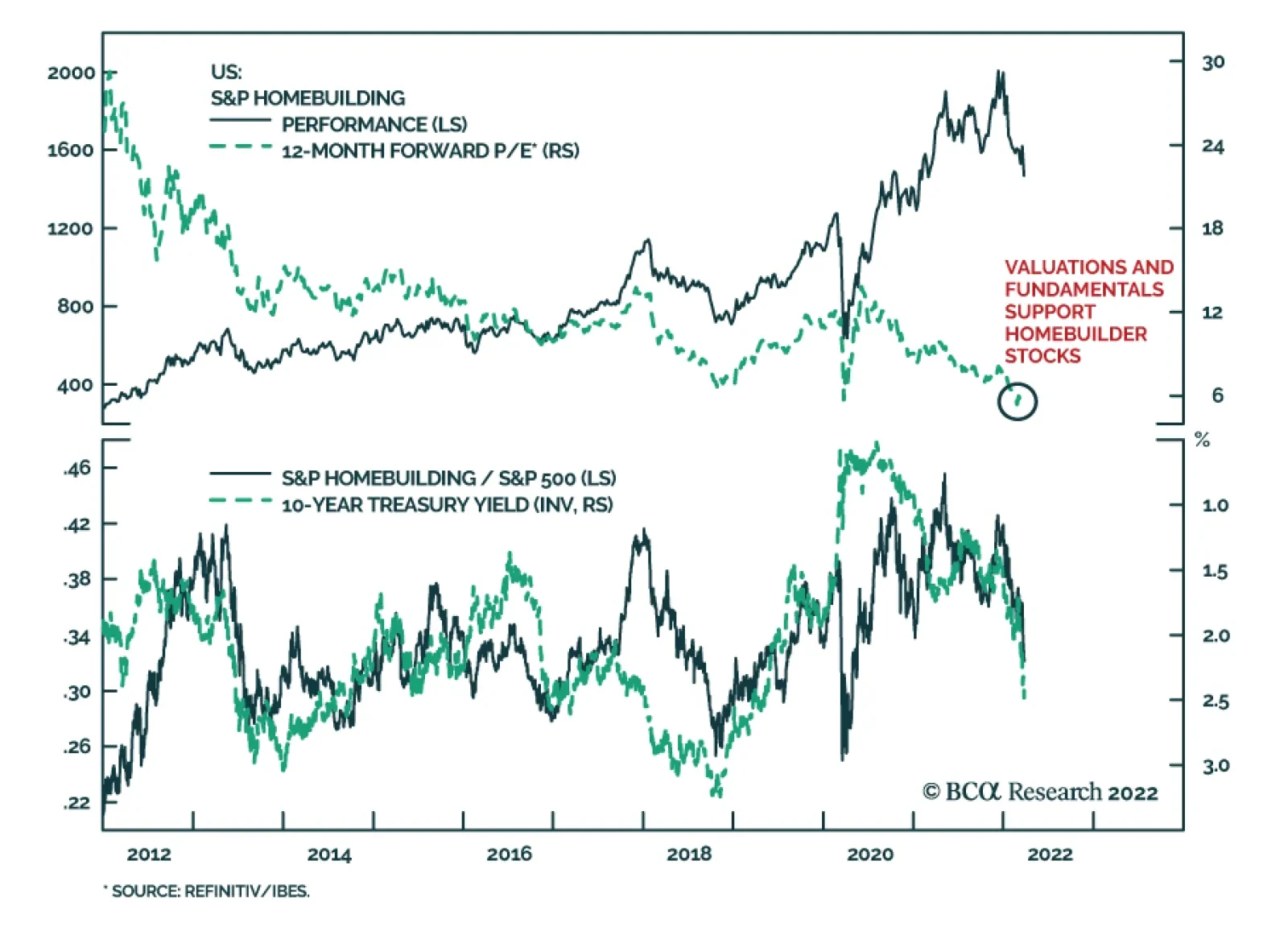
US Homebuilder stocks have had a poor start to the year. They are down 26% since the beginning of 2022 and are underperforming the S&P 500 by 22%. The sharp increase in interest rates over this period explains why homebuilders have performed so badly.…
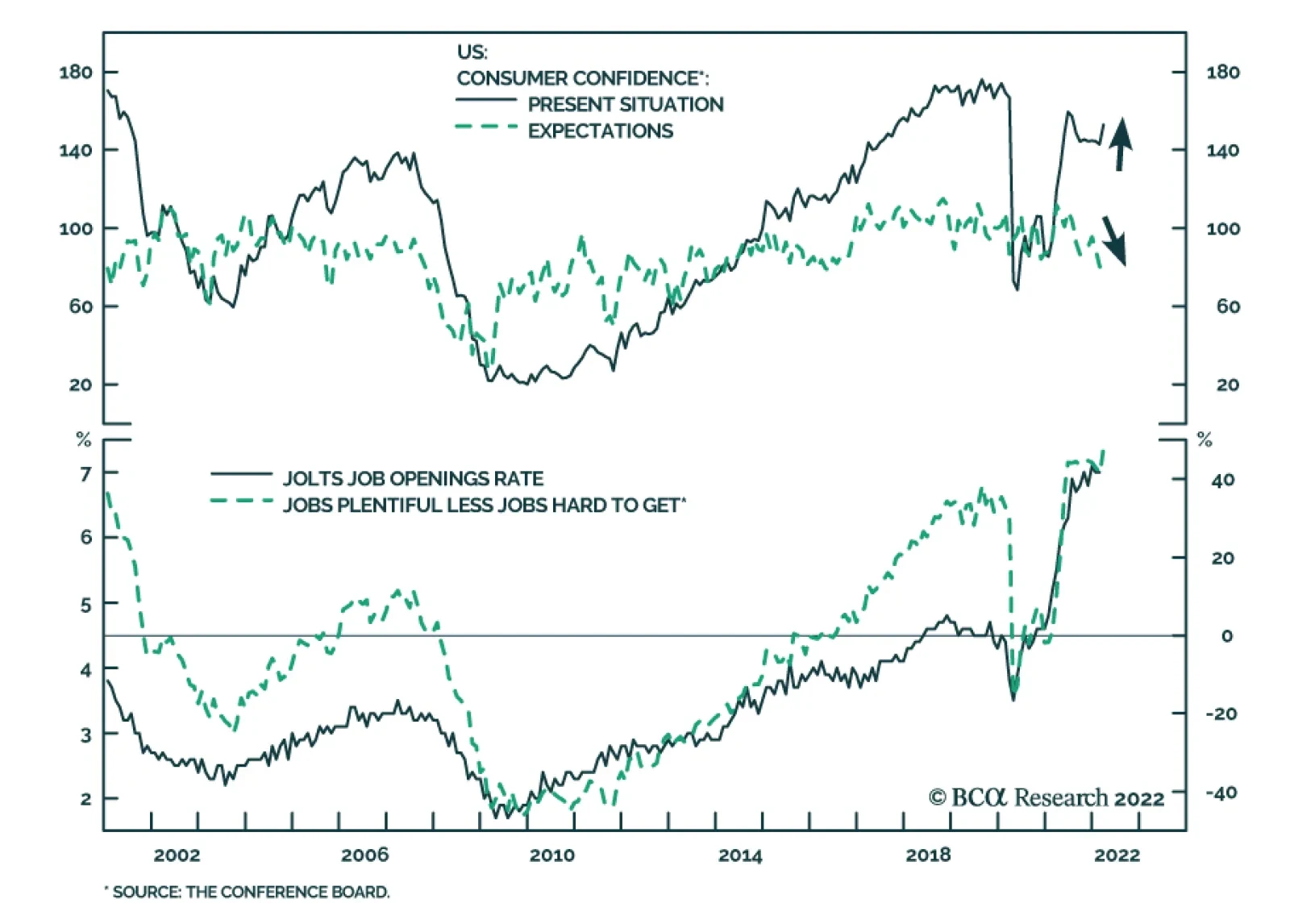
The US Conference Board’s Consumer Confidence Index inched up to 107.2 in March from a downwardly revised 105.7 in February. This month’s improvement comes on the back of a 10-point jump in the Present Situation index. However, the Expectations Index, which…
The Yield Curve & Equity Returns
…
Executive Summary Refreshing Our Tactical Trade List
A Post-Invasion Reassessment Of Our Tactical Trade Recommendations
A Post-Invasion Reassessment Of Our Tactical Trade Recommendations
Our current list of tactical trade recommendations centers around two broad themes that predate the Ukraine conflict – rising global inflation expectations and relatively stronger upward pressure on US interest rates. Both themes have been strengthened by the spillovers from the war in Eastern Europe, most notably the link between soaring commodity prices and rising inflation. We still see value in holding our recommended cross-country spread trades that will benefit from continued US bond underperformance (short US Treasuries versus government bonds in Germany, Canada and New Zealand, all at the 10-year maturity). We also maintain our bias to lean against the yield curve flattening trend in the US, but we now prefer to do it solely via our existing SOFR futures calendar spread position. Finding attractively valued inflation breakeven spread trades is more difficult after the latest oil-fueled run-up in developed market inflation expectations. Canadian breakevens, however, stand out as having the greatest upside potential according to our Comprehensive Breakeven Indicators. Bottom Line: Remain in US-Germany, US-Canada an US-New Zealand 10-year government bond yield spread widening trades. Maintain our recommended position in the US SOFR futures curve (long Dec/22 futures, short Dec/24 futures). Add a new inflation-linked bond trade, going long 10-year Canadian breakevens. Feature One month has passed since Russia invaded Ukraine, and investors are still struggling to sort out the financial market implications. Equity markets in the US and Europe have recovered the losses incurred immediately after the conflict began. Equity market volatility has also fallen back to pre-invasion levels according to the VIX index (and its European counterpart, the VStoxx index). That decline in equity volatility has also coincided with a narrowing of corporate credit spreads in both the US and Europe, with the former now fully back to pre-invasion levels. Yet while credit spread volatility has calmed down, government bond yield volatility remains elevated thanks to rising commodity prices putting upward pressure on expectations for inflation and monetary policy (Chart 1). Chart 1Global Bond Yields Are Above Pre-Invasion Levels
Global Bond Yields Are Above Pre-Invasion Levels
Global Bond Yields Are Above Pre-Invasion Levels
Table 1Refreshing Our Tactical Trade List
A Post-Invasion Reassessment Of Our Tactical Trade Recommendations
A Post-Invasion Reassessment Of Our Tactical Trade Recommendations
We have already made some “wartime” adjustments to our global bond market cyclical recommendations, with those changes reflected in our model bond portfolio. This week, we review our shorter-term tactical trade recommendations. Our current list of tactical trades revolves around two broad themes that predate the Ukraine conflict – rising global inflation expectations and relatively stronger cyclical upward pressure on US interest rates. Both themes have been strengthened by the spillovers from the war in Eastern Europe, most notably the link between soaring commodity prices and rising inflation. We continue to see the value in holding on to most of our existing tactical trades, with only a couple of adjustments to be made to our US yield curve and global inflation-linked bond positions (Table 1). US Yield Curve Tactical Trades: Shift Focus To SOFR Steepeners We have recommended trades that lean against the aggressive flattening of the US Treasury curve discounted in forward rates since late 2021. Our view has been that markets were discounting too rapid a pace of Fed rate increases in 2022. With the Fed likely delivering fewer hikes than expected, Treasury curve steepening trades would benefit as the spot Treasury curve would flatten by less than implied by the forwards. Related Report Global Fixed Income StrategyFive Reasons To Tactically Increase US Duration Exposure Now Needless to say, that view has not panned out as we anticipated. The spread between 10-year and 2-year US Treasury yields now sits at a mere +13bps, down from +104bps when we initiated our 2-year/10-year steepener trade last November. The forwards now discount an inversion of that curve starting in June of this year, which would be an extraordinary outcome by historical standards. Typically, the US Treasury curve inverts only after the Fed has delivered an extended monetary tightening cycle that delivers multiple rate hikes over at least a 1-2 year period (Chart 2). Today, the curve has nearly inverted with the Fed having only delivered only a single 25bp rate increase earlier this month. Chart 2The UST Curve Is Unusually Flat Right Now
The UST Curve Is Unusually Flat Right Now
The UST Curve Is Unusually Flat Right Now
Of course, the Fed’s reaction function in the current cycle is different compared to the past. The Fed now follows an average inflation targeting framework that tolerates temporary inflation overshoots after periods when US inflation ran below the Fed’s 2% target. Now, however, the Fed has no choice but to respond to surging US inflation, which has been accelerating since September and is now at levels last seen in 1982. Chart 3Our SOFR Trade Is Similar To Our UST Curve Trade
Our SOFR Trade Is Similar To Our UST Curve Trade
Our SOFR Trade Is Similar To Our UST Curve Trade
We still see the market pricing in too much Fed tightening this year and too few rate hikes in 2023/24. The US overnight index swap (OIS) curve now discounts 218bps of rate hikes in 2022, but 44bps of rate cuts between June 2023 and December 2024. We think a more likely scenario is the Fed doing less than discounted this year, as US inflation should show some deceleration in the latter half of 2022, but then continuing to raise rates in 2023 into 2024. We have expressed this view more specifically through an additional tactical trade that was initiated last month, going long the December 2022 3-month SOFR futures contract versus shorting the December 2024 3-month SOFR futures contract. This new trade is essentially a calendar spread trade between two futures contracts, but with a return profile that has looked quite similar to our 2-year/10-year US Treasury curve flattening trade (Chart 3). Having two tactical trades that are highly correlated, and which both are driven by the same theme of the Fed doing less this year and more over the next two years, is inefficient. We see the SOFR calendar spread trade as a more precise expression of our Fed policy view compared to the 2-year/10-year Treasury curve steepener. In addition, the SOFR trade now offers slightly better value after it has lagged the performance of the Treasury curve trade over the past couple of weeks. Thus, we are keeping this trade in our Tactical Overlay portfolio (see the table on page 15), while closing out our 2-year/10-year steepener at a loss of -92bps.1 Cross-Country Spread Trades: Keeping Betting On Relatively Higher US Yields In our Tactical Overlay portfolio, we currently have three recommended cross-country government bond spread trades that all have one thing in common – a sale of 10-year US Treasuries. The long side of the three trades are different (Germany, New Zealand and Canada), but the logic underlying all three trades is the same. The Fed will deliver more rate hikes than the central banks in the other countries. 10-year US Treasury-German Bund spread Chart 4UST-Bund Spread Is Too Low
UST-Bund Spread Is Too Low
UST-Bund Spread Is Too Low
Expecting a wider US Treasury-German Bund spread remains our highest conviction view in G-10 government bond markets. This is a trade we have described as a more efficient way to position for rising US bond yields than a pure below-benchmark US duration stance. We have maintained that recommendation in both our model bond portfolio and our Tactical Overlay portfolio. For the latter, that trade was implemented using 10-year bond futures in both markets and is up 3.9% since initiation back in October 2021. The case for expecting even more Treasury-Bund spread widening remains strong, for several reasons: Underlying inflation remains higher in the US, particularly when looking at domestic sources of inflation like wages and service sector prices. Europe, which relies more heavily on Russia for its energy supplies than the US, is more at risk of a negative growth shock from the Ukraine conflict. Our fundamental model of the 10-year Treasury-Bund spread shows that the current level of the spread (+197bps) is about one full standard deviation below fair value, which itself is rising due to stronger US economic growth, faster US inflation and a more aggressive path for monetary tightening from the Fed relative to the ECB (Chart 4). The spread between our 24-month discounters in the US and Europe, which measure the amount of rate hikes priced into OIS curves for the two regions over the next two years, has proven to be good leading indicator of the 10-year Treasury-Bund spread. That discounter spread is currently at 99bps, levels last seen when the 10-year Treasury-Bund spread climbed to the 250-300bps range in 2017/18 (Chart 5). With the relative forward curves now discounting a slight narrowing of the US-German 10-year spread over the next year, betting on a wider spread does not suffer from negative carry. We are maintaining this trade in our Tactical Overlay portfolio with great conviction. 10-year US Treasury-Canada government bond spread We entered another cross-country spread trade involving a US Treasury short position earlier this month, in this case versus 10-year Canadian government bonds. This trade is a bet on relative monetary policy moves between the Fed and the Bank of Canada (BoC). Like the Fed, the BoC is facing a problem of high inflation and tight labor markets. Canadian core CPI inflation hit a 19-year high of 3.9% in January, while the Canadian unemployment rate is at a 3-year low of 5.5%. The US is facing even higher inflation and even lower unemployment, but one major difference between the two nations is the degree of household sector debt loads. Canada’s household debt/income ratio now stands at 180%, 55 percentage points higher than the equivalent US ratio, thanks to greater residential mortgage borrowing in Canada (Chart 6). Chart 5Stay Positioned For More UST-Bund Spread Widening
Stay Positioned For More UST-Bund Spread Widening
Stay Positioned For More UST-Bund Spread Widening
The Canadian OIS curve is now discounting a peak policy rate of 3.1% in 2023, which is at the high end of the BoC’s estimated 1.75-2.75% range for the neutral policy rate. Chart 6The BoC Will Have Trouble Matching Fed Hawkishness
The BoC Will Have Trouble Matching Fed Hawkishness
The BoC Will Have Trouble Matching Fed Hawkishness
Elevated household debt will limit the BoC’s ability to lift rates that high, as this would trigger a major retrenchment of housing demand and a significant cooling of house prices. While the US is also facing issues with robust housing demand and high house prices, this is less of a factor that would limit Fed tightening relative to the BoC because US household balance sheets are not as levered as their Canadian counterparts. We are keeping our short US/long Canada spread trade (implemented using bond futures) in our Tactical Overlay portfolio, with the BoC unlikely to keep pace with the expected Fed rate increases over the next year (Chart 7). Chart 7Stay Positioned For A Narrower Canada-US Spread
Stay Positioned For A Narrower Canada-US Spread
Stay Positioned For A Narrower Canada-US Spread
10-year US Treasury-New Zealand government bond spread The third cross-country trade in our Tactical Overlay is 10-year New Zealand-US spread widening trade. Chart 8A Big Gap In NZ-US Relative Interest Rate Expectations
A Big Gap In NZ-US Relative Interest Rate Expectations
A Big Gap In NZ-US Relative Interest Rate Expectations
Like the Germany and Canada spread trades, we expect the Fed to deliver more rate hikes than the Reserve Bank of New Zealand (RBNZ) which should push up US Treasury yields versus New Zealand equivalents. In the case of this trade, however, interest rate expectations in New Zealand are far more aggressive. Chart 9Stay Positioned For NZ-US Spread Tightening
Stay Positioned For NZ-US Spread Tightening
Stay Positioned For NZ-US Spread Tightening
The RBNZ has already lifted its Official Cash Rate (OCR) by 75bps since starting the tightening cycle in mid-2021. The New Zealand OIS curve is now discounting an additional 253bps of rate hikes in this cycle, eventually reaching a peak OCR of 3.5% in June 2023. This would put the OCR into slightly restrictive territory based on the range of neutral rate estimates from the RBNZ’s various quantitative models (Chart 8). This contrasts to the pricing in the US OIS curve that places the peak in the fed funds rate at 2.8% next year before falling back to the low end of the FOMC’s 2.0-3.0% range of neutral estimates in 2024. Both the US and New Zealand are suffering from similarly high rates of inflation, with New Zealand headline inflation reaching 5.9% in the last available data from Q4/2021. However, while markets are already pricing in restrictive monetary settings in New Zealand, markets are yet to price in a similarly restrictive move in the fed funds rate. We continue to see scope for a narrowing of the New Zealand-US 10-year bond yield spread over at least the next six months. There has already been meaningful compression of the 2-year yield spread as US rate expectations have converged towards New Zealand levels (Chart 9) – we expect the 10-year spread to follow suit. Inflation Breakeven Trades: Swap Canada For Australia We currently have one inflation-linked bond (ILB) trade in our Tactical Overlay portfolio, betting on higher inflation breakevens in Australia. We initiated this trade last October, largely based on the signal from our suite of Comprehensive Breakeven Indicators (CBI) for the major developed economy ILB markets. The CBIs contain three components: the deviation from fair value from our 10-year breakeven spread models, the distance between realized headline inflation and the central bank target, and the gap between the 10-year breakeven and survey-based measures of longer-term inflation expectations. Those three measures are standardized and aggregated to form the CBI. Countries with lower CBIs have more upside potential for breakevens, and their ILBs should be favored over those from nations with higher CBIs. Chart 10Breaking Down Our Comprehensive Breakeven Inflation Indicators
A Post-Invasion Reassessment Of Our Tactical Trade Recommendations
A Post-Invasion Reassessment Of Our Tactical Trade Recommendations
Chart 11Favor Canadian Inflation-Linked Bonds Vs. Australia
Favor Canadian Inflation-Linked Bonds Vs. Australia
Favor Canadian Inflation-Linked Bonds Vs. Australia
Given the latest run-up in global inflation breakevens on the back of soaring oil prices, there are now no countries in our CBI universe that have a negative CBI (Chart 10). Canada has the lowest CBI, and thus the highest upside potential for breakeven spread widening. We are taking a modest profit of +40bps in our Australian breakeven trade, as we are approaching the self-imposed six-month holding period limit on our tactical trades and our Australian CBI is not indicating major upside for Australian breakevens.2 Based on the message from our indicators, we see a better case for entering a new tactical spread widening position in 10-year Canadian ILBs. A comparison of the CBIs between Canada and Australia shows that the Canadian 10-year inflation breakeven is well below our model-implied fair value, which incorporates both oil prices and currency levels (Chart 11). This contrasts to the Australian breakeven which is now well above fair value. A similar divergence appears when comparing breakeven spreads to survey-based measures of inflation expectations, with Canadian breakevens looking too “undervalued” compared to Australia. While realized headline inflation is above the respective central bank targets, especially in Canada, the valuation cushion makes the ILBs of the latter the better bargain of the two. The details of our new Canadian 10-year breakeven trade, where we go long the cash ILB and sell 10-year Canadian bond futures against it, are shown in our Tactical Overlay table on page 15. Robert Robis, CFA Chief Fixed Income Strategist rrobis@bcaresearch.com Footnotes 1 The Treasury curve trade is actually a “butterfly” trade, where we have included an allocation to US 3-month Treasury bills (cash) to make the curve steepener duration-neutral. Thus, the trade is more specifically a position where we are long a 2-year US Treasury bullet and short a cash/10-year US Treasury barbell with a duration equal to that of the 2-year. 2 We have recently discovered an error in our how we have calculated the returns on the 10-year Australian futures leg of our Australian 10-year inflation breakeven widening trade. The final total return for our trade shown in the Tactical Overlay table on page 15 corrects for our error, and fortunately shows a significantly higher return than we have published in past reports. GFIS Model Bond Portfolio Recommended Positioning Active Duration Contribution: GFIS Recommended Portfolio Vs. Custom Performance Benchmark
A Post-Invasion Reassessment Of Our Tactical Trade Recommendations
A Post-Invasion Reassessment Of Our Tactical Trade Recommendations
The GFIS Recommended Portfolio Vs. The Custom Benchmark Index Global Fixed Income - Strategic Recommendations* Cyclical Recommendations (6-18 Months)
A Post-Invasion Reassessment Of Our Tactical Trade Recommendations
A Post-Invasion Reassessment Of Our Tactical Trade Recommendations
Tactical Overlay Trades
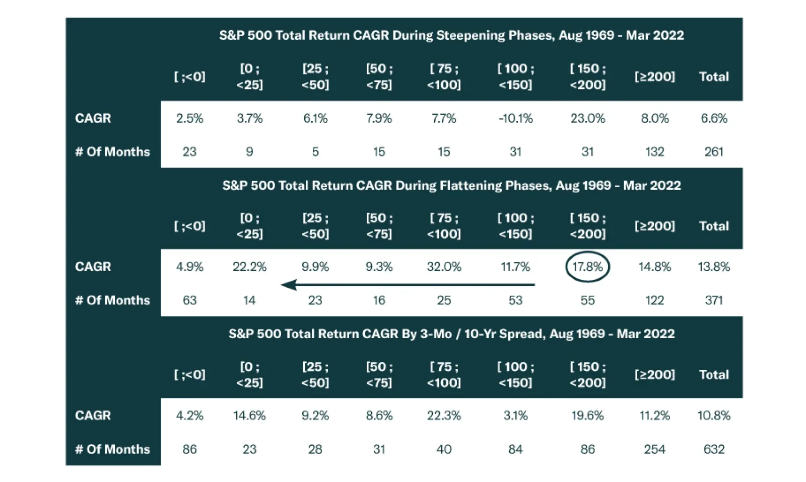
Executive Summary An inverted yield curve is a reliable recession indicator. Inversions of the 3-month/10-year Treasury slope and the 3-month/3-month, 18-months forward slope both provide more timely recession signals than inversion of the 2-year/10-year Treasury slope. An inverted yield curve is a reliable equity bear market indicator. Even when it’s not signaling a recession, the yield curve’s movements offer some insight into equity returns as stocks have consistently performed better while it is flattening than they have when it is steepening. The 2-year/10-year Treasury slope embeds useful information for corporate bond excess returns. Corporates perform best when the slope is very steep and worst when it is very flat and/or inverted. Treasury securities generally outperform cash when the yield curve is either very steep or inverted. The one exception is the early-1980s when the Fed continued to tighten aggressively even after an inversion of the yield curve. Different Slopes Are Sending Different Signals
Different Slopes Are Sending Different Signals
Different Slopes Are Sending Different Signals
Bottom Line: The overall message from the yield curve is that, while the economic recovery is no longer in its early stages, it is premature to talk about a recession. On a 6-to-12 month investment horizon, investors should overweight equities in multi-asset portfolios. Within US bond portfolios, investors should maintain a neutral allocation to investment grade corporate bonds and keep portfolio duration close to benchmark. Feature It’s a well-known maxim in macro-finance that an inverted yield curve signals a recession. While that adage embeds a lot of truth, it is also sufficiently vague that it raises more questions than it answers. How far in advance does an inverted yield curve signal a recession? What specific yield curve segment sends the most helpful signal? And most importantly, does the yield curve tell us anything useful about the future performance of financial assets? These sorts of questions are particularly relevant today as we observe some sections of the yield curve approaching inversion while others make new highs (Chart 1). Chart 1Different Slopes Are Sending Different Signals
Different Slopes Are Sending Different Signals
Different Slopes Are Sending Different Signals
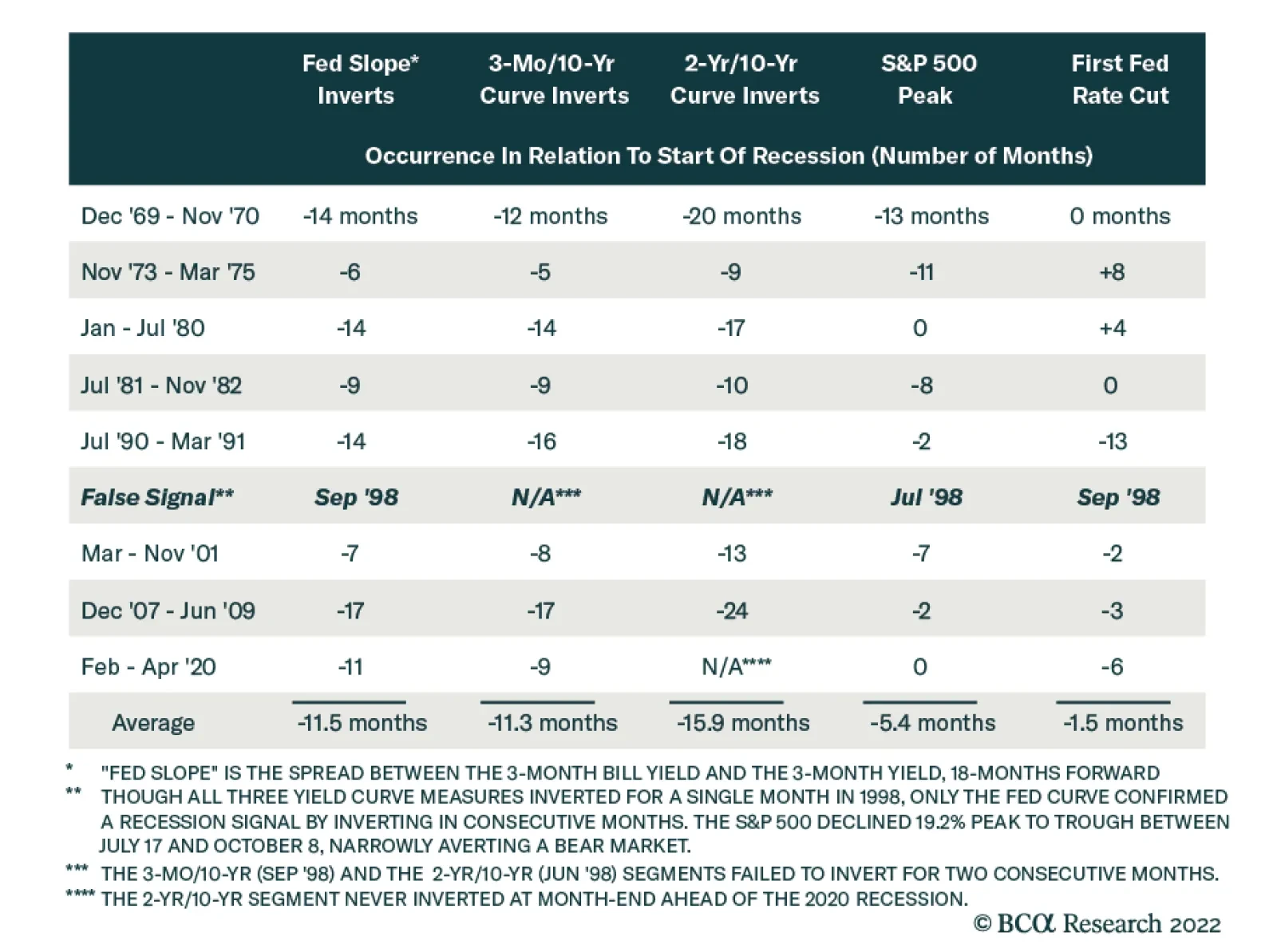
This Special Report explains how to think about the slope of the US Treasury curve as an indicator for the economy and financial markets. We first examine the yield curve’s empirical track record as a recession indicator. We then consider what the slope of the yield curve tells us about future equity, corporate bond and Treasury returns. The analysis presented in this report focuses on three different measures of the yield curve slope: The 2-year/10-year Treasury slope, the 3-month/10-year Treasury slope and the spread between the 3-month T-bill rate and the 3-month T-bill rate, 18 months forward. That last spread measure is less commonly cited, but Fed research has shown it to be a reliable predictor of recession.1 It was also recently highlighted by Fed Chair Jerome Powell.2 In the remainder of this report we will refer to the 3-month/3-month, 18-month forward spread as the “Fed Slope”. The Yield Curve & Recession Recession forecasting is a tricky business. It is often not so much a question of identifying “good” and “bad” recession indicators, but a question of balancing lead time and reliability. Recession indicators derived from financial market prices tend to offer greater advance warning of recession but also provide more false signals. On the flipside, indicators derived from macroeconomic data tend to give less lead time but with fewer false signals. Typically, the most useful recession indicators involve some combination of financial market and economic data. For example, a 2018 report from our US Investment Strategy service showed that a useful recession indicator can be created by combining the 3-month/10-year Treasury slope and the Conference Board’s Leading Economic Indicator.3 The Treasury slope’s reputation as an excellent recession indicator is justified because, despite it being derived from volatile financial market data, an inversion of the yield curve provides a very reliable recession signal. The 2-year/10-year Treasury slope has inverted in advance of 7 of the past 8 recessions and has not sent a false signal.4 The 3-month/10-year Treasury slope has done even better, calling 8 out of the past 8 recessions without a false signal. The Fed Slope, meanwhile, has also called 8 out of the past 8 recessions, but it sent one false signal in September 1998. There is room to quibble about the usefulness of the yield curve as a recession indicator in terms of lead time. The 2-year/10-year Treasury slope has, on average, inverted 15.9 months before the start of the next recession (Table 1). This inversion has always occurred before the first Fed rate cut of the cycle, and in all but one instance (1973-75), before the peak in the S&P 500. Table 1Lead Times For Yield Curve Segments, Equity Bear Markets And Fed Rate Cuts
The Yield Curve As An Indicator
The Yield Curve As An Indicator
But while some advance warning is good, the 2-year/10-year slope probably gives too much lead time. For example, the 2-year/10-year slope inverted a full 24 months before the 2007-09 recession, but it would have been unwise to act on that information since the S&P 500 didn’t peak for another 22 months! The historical record shows that the 3-month/10-year Treasury curve and the Fed Slope offer more useful signals than the 2-year/10-year curve. On average, these curves provide less lead time than the 2-year/10-year slope but still generally provide advance warning of recession and stock market peaks. The recession signal from the 3-month/10-year slope has only missed the peak in the S&P 500 twice. The signal from the Fed Slope has only missed the stock market’s peak once, but it also sent one false signal. Synthesizing all this information, we conclude that the 3-month/10-year Treasury curve and the Fed Slope are both highly reliable recession indicators that typically provide more than enough advance warning for equity investors to adjust their positions. The main value of the 2-year/10-year Treasury curve is that its inversion warns that we may soon get a timelier signal from the 3-month/10-year Treasury slope and the Fed Slope. Looking at the present situation, the 2-year/10-year Treasury slope has flattened dramatically during the past few months, but at 18 bps it remains un-inverted. Meanwhile, the 3-month/10-year Treasury slope and the Fed Slope are both elevated at 195 bps and 255 bps, respectively. We can conclude from this that recession warnings are premature. We will become more concerned about an upcoming recession when the 3-month/10-year slope and the Fed Slope approach inversion. The Yield Curve & Equity Returns Identifying a recession and demarcating its beginning and ending dates may seem like a trivial exercise that has little practical import. Celebrated mutual fund manager Peter Lynch has repeatedly offered the opinion that any time an equity investor spends thinking about the economy is wasted time. We beg to differ. Equity bear markets reliably coincide with recessions (Chart 2) – since the late 1960s, only one recession has occurred without a bear market (the first leg of the Volcker double dip from January to July 1980) and only one bear market has occurred without a recession (October 1987’s Black Monday bear market) – and an asset allocator who reduced equity exposure upon receiving advance notice of recessions would have been in a position to generate significant alpha. Chart 2Recessions And Bear Markets Tend To Coincide
Recessions And Bear Markets Tend To Coincide
Recessions And Bear Markets Tend To Coincide
The relationship between equity returns and the business cycle is not happenstance – variation in stock prices correlates closely with variation in corporate earnings and corporate earnings growth is a function of the business cycle. Equity prices, P, are simply the product of earnings per share, E, and the multiple investors are willing to pay for them, P/E: P = E x (P/E). If we hold somewhat fickle P/E multiples constant, stock prices will rise and fall with earnings. Given that earnings rarely decline outside of recessions (Chart 3), investors can expect equities to rise during expansions and decline during recessions. Chart 3Earnings Grow In Expansions And Fall In Recessions Earnings Declines Outside Of Recessions Are Rare
Earnings Grow In Expansions And Fall In Recessions Earnings Declines Outside Of Recessions Are Rare
Earnings Grow In Expansions And Fall In Recessions Earnings Declines Outside Of Recessions Are Rare
Digging a little more deeply into the empirical record since consensus S&P 500 earnings estimates began to be compiled reinforces the earnings/returns link. With the exception of the first leg of the Volcker double dip recession in 1980, forward four-quarter earnings estimates have fallen in every recession and have contracted in the aggregate at an annualized 16% rate (Table 2). Multiples have expanded at a hearty 9% clip from the beginning to the end of recessions but have always declined, sometimes sharply, during them. Conversely, earnings estimates always grow heartily during expansions, while multiples tend to observe a fairly tight range. Multiples and stocks move ahead of the business cycle, consistently troughing before the end of a recession, but the 20-percentage-point expansion/recession disparity in annualized returns testifies to the yield curve’s utility as an investment leading indicator. Table 2When Earnings Fall, So Do Stocks
The Yield Curve As An Indicator
The Yield Curve As An Indicator
The yield curve’s usefulness as a predictor of equity returns goes beyond recession signaling. Over the last half-century, the yield curve has tended to steepen and flatten in distinct phases. Defining a phase as a move of at least 200 basis points (bps) between the 3-month/10-year curve slope’s peak and trough, we count ten steepenings and nine flattenings since August 1969 (Chart 4). Chart 450 Years Of Steepening And Flattening
50 Years Of Steepening And Flattening
50 Years Of Steepening And Flattening
After segmenting performance by slope increments in steepening (Table 3, top panel) and flattening (Table 3, middle panel) phases, we find a clear distinction. S&P 500 total returns tend to be much stronger when the yield curve is in a flattening phase than when it is steepening. In general, a steeper curve is better than a flatter (or inverted) one for equity returns but flattening dominates steepening in every segment but the current one (150-200 bps). The cheery news for investors concerned about an inverted yield curve’s effect on stocks is that the upcoming flattening increments between now and inversion have historically been favorable. Though we are tactically neutral equities, we recommend overweighting them in multi-asset portfolios over a cyclical 6-to-12 month timeframe. Table 3Stocks Like A Flattening Yield Curve
The Yield Curve As An Indicator
The Yield Curve As An Indicator
The Yield Curve & Corporate Bond Returns This section of the report considers investment grade corporate bond returns in excess of a duration-matched position in US Treasuries and whether the slope of the Treasury curve can help us predict their magnitude. First, it’s important to point out that there is a lot of overlap between excess corporate bond returns and equity returns, but it is not complete (Chart 5). Corporates certainly tend to underperform duration-matched Treasuries during recessions and equity bear markets, but there have also been significant bouts of underperformance that fall outside of those periods. For example, corporate bond returns peaked well before equity returns in the late-1990s and corporates also underwent a severe selloff in 2014-15. Chart 5Investment Grade (IG) Corporate Bond Returns By Starting Slope Level And Trend
Investment Grade (IG) Corporate Bond Returns By Starting Slope Level And Trend
Investment Grade (IG) Corporate Bond Returns By Starting Slope Level And Trend
That said, Table 4 shows that, as is the case with stocks, a strategy of reducing corporate bond exposure during recessions will profit over time. Corporate bonds have underperformed Treasuries by a cumulative 3.1% (annualized) during recessions since 1979 and have outperformed by 1.2% (annualized) in non-recessionary periods. Table 4Corporate Bond Performance In And Out Of Recessions
The Yield Curve As An Indicator
The Yield Curve As An Indicator
The results in Table 4 suggest that investors should remain overweight corporate bonds versus Treasuries at least until the 3-month/10-year Treasury slope inverts. However, we think investors can perform even better if they pay attention to early warning signs from the 2-year/10-year Treasury slope. Table 5 shows historic 12-month corporate bond excess returns given different starting points for the 2-year/10-year slope. The starting points are also split depending on whether the 2-year/10-year slope was in a steepening or flattening trend at the time. Table 512-Month Investment Grade (IG) Corporate Bond Returns By Starting Slope Level And Trend
The Yield Curve As An Indicator
The Yield Curve As An Indicator
The results presented in Table 5 show that the level of the slope matters much more than whether the curve is in a steepening or flattening trend. They also show that, in general, excess returns tend to be much higher when the slope is steep than when it is flat. We also see that the odds of corporate bonds outperforming duration-matched Treasuries on a 12-month horizon decline markedly for periods when the 2-year/10-year slope starts below 25 bps. At present, the 2-year/10-year Treasury slope is 18 bps, just below the 25-bps cutoff. Though we take this negative signal from the yield curve seriously, we also anticipate that peaking inflation will prevent the Fed from raising rates by 245 bps during the next 12 months, the pace that is currently discounted in the yield curve. If this view pans out it will likely lead to some modest 2/10 curve steepening and a relief rally in corporate spreads. To square the difference between the current negative message from the yield curve and our more optimistic macro view, we recommend a neutral allocation to investment grade corporate bonds within US fixed income portfolios. Though we will likely downgrade our recommended allocation if the 2-year/10-year slope continues to flatten and approaches inversion. The Yield Curve & Treasury Returns This section of the report considers US Treasury index returns in excess of a position in cash, a metric designed to proxy for the returns earned by varying a US bond portfolio’s average duration. Treasury outperformance of cash indicates that long duration positions are profiting while Treasury underperformance of cash indicates that short duration positions are in the green. The historical relationship between Treasury returns and the slope of the yield curve is heavily influenced by the early-1980s period when the Fed plunged the economy into a double-dip recession to contain spiraling inflation. Chart 6 shows that this early-1980s episode is the only one where Treasuries sold off steeply even after all three of our yield curves had inverted. Chart 6A Repeat Of The Early 1980s Episode Remains Unlikely
A Repeat Of The Early 1980s Episode Remains Unlikely
A Repeat Of The Early 1980s Episode Remains Unlikely
In fact, if we look at the history of 12-month Treasury returns going back to 1973 split by the starting point for the slope (Tables 6A, 6B & 6C), we see that returns are worst after the curve is inverted and best when the curve is very steep. Table 6A12-Month Treasury Excess Returns* Given Different Starting Points For 2-Year / 10-Year Slope Since 1973
The Yield Curve As An Indicator
The Yield Curve As An Indicator
Table 6B12-Month Treasury Excess Returns* Given Different Starting Points For 3-Month / 10-Year Slope Since 1973
The Yield Curve As An Indicator
The Yield Curve As An Indicator
Table 6C12-Month Treasury Excess Returns* Given Different Starting Points For the Fed Slope** Since 1973
The Yield Curve As An Indicator
The Yield Curve As An Indicator
However, that picture changes if we start our historical sample in 1985 to exclude the early-1980s episode. Now, we see that Treasury returns tend to be high when the yield curve is very steep and when it is inverted (Tables 7A, 7B & 7C). The worst 12-month periods for Treasury returns are when the 2-year/10-year slope is between 75 bps and 100 bps, when the 3-month/10-year slope is between 50 bps and 75 bps and when the Fed Curve is between 0 bps and 25 bps. If we apply today’s situation to the post-1985 results shown in Tables 7A, 7B & 7C, we would conclude that the outlook for Treasury returns is very positive. The 3-month/10-year slope and Fed Curve are very steep, and the 2-year/10-year slope is in the 0 bps to 25 bps range. Of course, that message from the 2-year/10-year slope flips if viewed in the context of the post-1973 data shown in Table 6A. Table 7A12-Month Treasury Excess Returns* Given Different Starting Points For 2-Year / 10-Year Slope Since 1985
The Yield Curve As An Indicator
The Yield Curve As An Indicator
Table 7B12-Month Treasury Excess Returns* Given Different Starting Points For 3-Month / 10-Year Slope Since 1985
The Yield Curve As An Indicator
The Yield Curve As An Indicator
Table 7C12-Month Treasury Excess Returns* Given Different Starting Points For the Fed Slope** Since 1985
The Yield Curve As An Indicator
The Yield Curve As An Indicator
Our assessment is that the risk of a repeat of the early-1980s episode is still relatively small. Yes, inflation is extremely high, but it is likely to moderate naturally as we gain more distance from the pandemic. In that environment, the Fed will not feel the need to continue tightening aggressively even after all three segments of the yield curve have inverted. As such, we are inclined to view the message from the yield curve as positive for Treasury returns on a 12-month horizon, and we continue to advocate keeping average bond portfolio duration “at benchmark”. Ryan Swift US Bond Strategist rswift@bcaresearch.com Doug Peta, CFA Chief US Investment Strategist dougp@bcaresearch.com Footnotes 1 https://www.federalreserve.gov/econres/notes/feds-notes/dont-fear-the-yield-curve-20180628.htm 2 https://www.bloomberg.com/news/articles/2022-03-21/powell-says-look-at-short-term-yield-curve-for-recession-risk?sref=Ij5V3tFi 3 Please see US Investment Strategy Special Report, “How Much Longer Can The Bull Market Last?”, dated August 13, 2018. 4 We define an instance of “inversion” as a yield curve slope below zero for two consecutive months. Treasury Index Returns Spread Product Returns
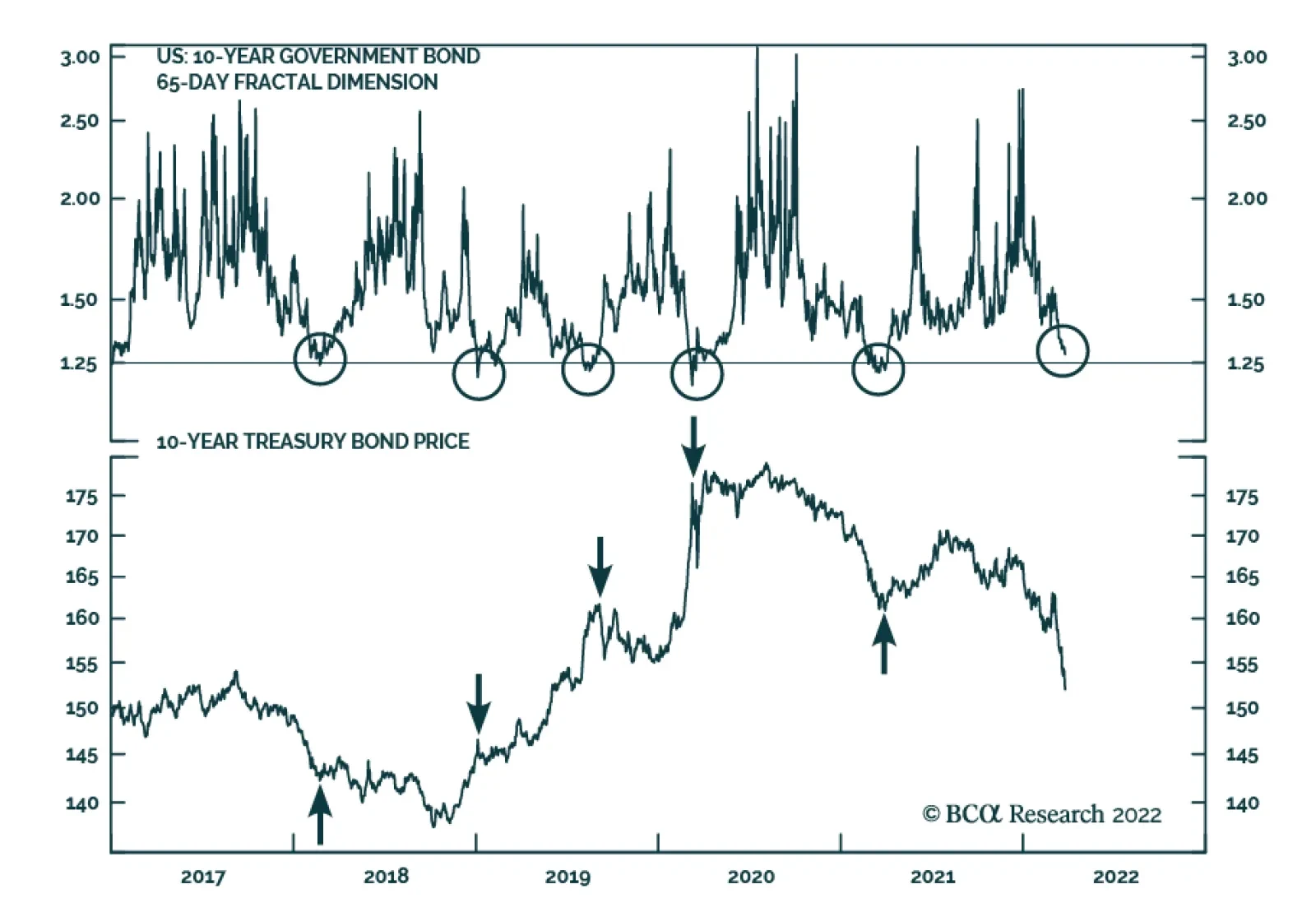
Following the sharp increase in 10-year Treasury yields – up 113 bps since early December – the signal from several of our bond market indicators is that the selloff in US Treasurys is losing steam. In our European Investment strategists’ most recent…
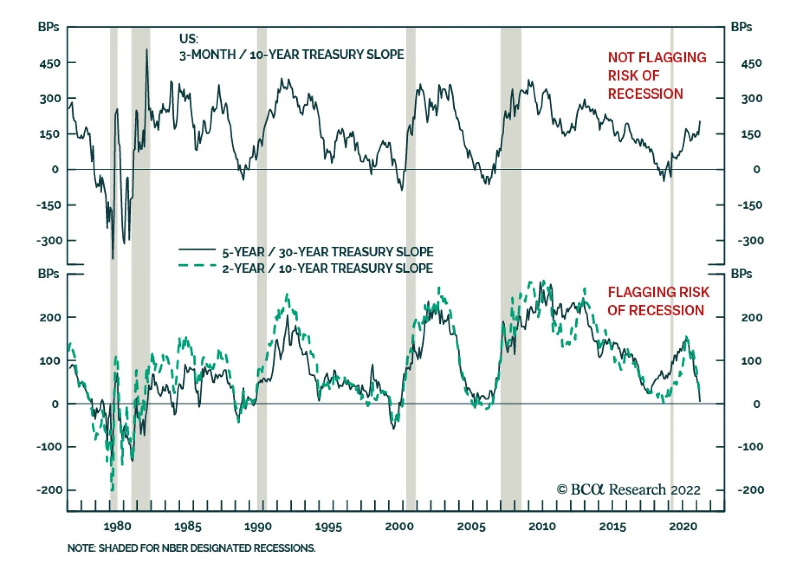
On Monday, the gap between the five- and 30-year yield on US government bond dipped into negative territory for the first time since 2006, adding to fears that the US economy is heading towards a recession. Some other parts of the Treasury curve are already…