United States
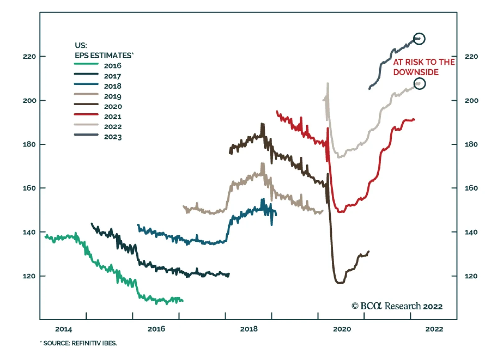
In a recent Insight, we highlighted that US equities remain vulnerable over a tactical horizon. Among the reasons for our US Equity strategists’ cautious near-term stance is that analysts have not yet revised down their earnings expectations. Instead, US…
The Richmond Fed Manufacturing Survey for March surprised positively yesterday, jumping to 13 from February’s 1 and beating expectations of a marginal increase to 2. Notably, all three survey components – shipments, new orders and employment – improved. …

Executive Summary Tracking Inflation In 2022
Tracking Inflation In 2022
Tracking Inflation In 2022
Our base case view is that inflation will moderate in the coming months, allowing the Fed to deliver a steady pace of tightening (25 bps per meeting). A 50 bps rate hike is possible at some point this year, but only if long-maturity inflation expectations become un-anchored or core PCE inflation prints consistently above 0.30%-0.35% per month. Historical evidence suggests that Treasury securities perform best when the yield curve is very steep or very flat. All else equal, an inversion of the 2-year/10-year Treasury slope would make us more bullish on bonds. High-yield corporates have performed better than investment grade corporates during the recent sell-off. Investors should continue to favor high-yield corporates over investment grade. Bottom Line: Investors should maintain “at benchmark” portfolio duration and buy Treasury curve steepeners. We also maintain an overweight allocation to high-yield corporate bonds and a neutral allocation to investment grade corporates. We Have Liftoff The Fed followed through on its earlier promise and lifted the funds rate by 25 basis points last week. FOMC participants also sharply revised up their expectations for the future pace of tightening, though this revision mostly just made the Fed’s forecast more consistent with what was already priced in the yield curve. Market rate hike expectations, as inferred from the overnight index swap curve, shifted up only slightly after the Fed’s announcement (Chart 1). Chart 1Rate Expectations
Rate Expectations
Rate Expectations
As of Monday morning, the bond market is priced for 208 bps of tightening during the next 12 months and 174 bps between now and the end of the year. This is close to the median FOMC forecast which calls for 150 bps of further tightening this year followed by an additional 92 bps in 2023. Last week’s report highlighted the tricky situation faced by the Fed.1 On the one hand, the Fed must tighten quickly enough to keep long-dated inflation expectations anchored. On the other hand, the Fed wants to avoid tightening so quickly that it causes a recession. For investors, we think it makes sense to assume that the Fed will try to split the difference by lifting rates at a pace of 25 bps per meeting for at least the next 12 months. However, there are significant risks to both the upside and downside of this projection. The Odds Of A 50 bps Hike The upside risk is that inflation is sufficiently sticky that the Fed will feel the need to deliver a 50 bps rate hike at some point this year. Last week’s Fed interest rate projections show that 7 out of 16 FOMC participants think that at least one 50 bps rate hike will be necessary. Meanwhile, market prices are consistent with one 50 basis point rate hike and five 25 basis point rate hikes at this year’s six remaining FOMC meetings. We think the Fed will only deliver a 50 bps rate hike if inflation looks to be tracking above the committee’s 2022 forecast or if long-maturity inflation expectations become un-anchored to the upside. Related Report Global Investment StrategyIs A Higher Neutral Rate Good Or Bad For Stocks? On the inflation front, the FOMC’s central tendency forecast calls for core PCE inflation of between 3.9% and 4.4% in 2022, with a median of 4.1%. To match this forecast, core PCE will have to average a monthly growth rate of between 0.30% and 0.35% in each of this year’s eleven remaining months (Chart 2).2 Every monthly inflation print above that range increases the odds of a 50 bps Fed move, every print below that range brings the odds down. As for long-maturity inflation expectations, the Fed likely views them as “well anchored” for the time being. The 10-year TIPS breakeven inflation rate has broken meaningfully above the Fed’s target range but the 5-year/5-year forward TIPS breakeven inflation rate remains consistent with the Fed’s goals (Chart 3). The University of Michigan’s survey measure of 5-10 year household inflation expectations has risen sharply, but it has not yet broken meaningfully above recent historical levels (Chart 3, bottom panel). Chart 2Tracking Inflation In 2022
Tracking Inflation In 2022
Tracking Inflation In 2022
Chart 3Inflation Expectations
Inflation Expectations
Inflation Expectations
Our sense is that inflation is very close to peaking and that lower inflation in the back half of the year will apply downward pressure to inflation expectations and prevent the Fed from delivering a 50 bps hike at any single FOMC meeting. However, we will be closely tracking the evolution of Charts 2 and 3 to see if this situation changes. The Odds Of Skipping A Meeting Chart 4Financial Conditions
Financial Conditions
Financial Conditions
The downside risk to the Fed’s expected rate hike path results from the fact that financial conditions have already responded aggressively to the Fed’s actions and communications. While it’s certainly true that financial conditions remain extremely accommodative in level terms (Chart 4), we must also acknowledge that, historically, the sort of rapid tightening of financial conditions that we have already seen is almost always followed by a significant slowdown in economic activity (Chart 4, panel 2). On top of all that, the yield curve is now completely flat beyond the 5-year maturity point and the 2-year/10-year Treasury slope is a mere 22 bps away from inversion (Chart 4, bottom panel). The Fed’s new interest rate projections show the median expected interest rate moving above estimates of the long-run neutral rate in 2023 and 2024. This sort of rate hike path is consistent with a mild inversion of the yield curve, and the Fed will likely downplay the yield curve’s recession signal during the next few months. That said, a deepening inversion of the yield curve will only increase market worries about an over-tightening of monetary policy. This could lead to a sell-off in risk assets that would accelerate the tightening of financial conditions and lead to expectations of even slower economic growth. The next section of this report explores what an inverted 2-year/10-year yield curve has historically meant for Treasury returns. Investment Implications Our base case view is that inflation will moderate in the coming months, allowing the Fed to deliver a steady pace of tightening (25 bps per meeting). We also see economic growth slowing but remaining solid enough to prevent a significant sell-off in risk assets and a deep inversion of the yield curve. We also acknowledge, however, that the risks to this view (in both directions) are unusually high. Given all that, our recommended investment strategy is to keep portfolio duration close to benchmark. The market is already well priced for a steady 25 bps per meeting pace of tightening and bond yields will merely keep pace with forwards if that pace is delivered. We also see yield curve steepeners profiting during the next 6-12 months as the yield curve’s flattening trend takes a pause now that market expectations have fully adjusted to the likely path of Fed rate increases. We remain neutral TIPS versus nominal Treasuries at the long-end of the curve, but underweight TIPS versus nominal Treasuries at the front-end. Short-maturity TIPS will underperform as inflation moderates in H2 2022. The Yield Curve And Treasury Returns The historical relationship between the slope of the yield curve and Treasury returns is very interesting. To examine it, we first looked at historical data on excess Treasury index returns versus cash since 1989 (Table 1). Table 112-Month Treasury Excess Returns* Given Different Starting Points For 2-Year / 10-Year Treasury Slope
The Implications Of Yield Curve Inversion
The Implications Of Yield Curve Inversion
Specifically, we show 12-month excess Treasury returns given different starting points for the 2-year/10-year Treasury slope. For example, when the 2-year/10-year Treasury slope has been between 0 bps and 25 bps, the Bloomberg Barclays Treasury Index has historically outperformed a position in cash by an average of 2.75% during the next 12 months. A 90% confidence interval places expected returns between 1.75% and 3.73%, and excess Treasury returns were positive in 73% of historical observations. The first big conclusion that jumps out from Table 1 is that Treasuries perform best when the yield curve is either very steep or very flat. The worst periods for Treasury returns have tended to occur when the slope is between 25 bps and 100 bps. It’s easy to understand why a very steep yield curve would lead to strong Treasury returns. A steep curve means that Treasuries offer a large yield advantage versus cash, or put differently, an extremely rapid pace of rate hikes would be necessary for cash returns to overcome the carry advantage in bonds. It’s more difficult to understand why Treasury returns have been strong after instances of curve inversion. The most likely reason is that market participants have tended to overestimate the odds of the Fed achieving a “soft landing” and have underestimated the odds of an upcoming recession and rate cuts. The data used in Table 1 are limited in that observations only begin in 1989. As such, the table misses the Paul Volcker period of the early 1980s when Treasuries continued to sell off well after the curve inverted. Chart 5 extends the historical period back to the mid-1970s and uses shading to indicate periods of 2-year/10-year yield curve inversion. Chart 5Yields Tend To Peak Shortly After Curve Inversion
Yields Tend To Peak Shortly After Curve Inversion
Yields Tend To Peak Shortly After Curve Inversion
Chart 5 reveals a pretty clear pattern. With the exception of the late-1970s/early-1980s episode, the 10-year Treasury yield tends to peak right around the time of 2-year/10-year yield curve inversion, or shortly after in the case of 1989. What can we take away from this analysis? First, the evidence suggests that we should have a bias toward taking more duration risk in our portfolio if and when the yield curve inverts. A more deeply inverted yield curve should also be viewed as a stronger bond-bullish signal than a modestly inverted yield curve. Second, we must acknowledge the major risk to this strategy. Specifically, the risk that inflation will be so high that the Fed will continue to tighten aggressively even after the yield curve inverts, as Paul Volcker did in the early-1980s. Our sense is that the odds of a repeat “Volcker moment” are low. Inflation will naturally fall as the pandemic’s impact wanes and the Fed won’t be forced to deliver another hawkish shock to market expectations. Therefore, we maintain our “at benchmark” recommendation for portfolio duration for now, but we may turn more bullish on bonds if the yield curve inverts. The Poor Performance Of Investment Grade Bonds Chart 6IG Has Lagged HY
IG Has Lagged HY
IG Has Lagged HY
One notable aspect of recent bond market moves has been that the performance of investment grade corporate bonds has significantly lagged the performance of high-yield corporate bonds during the recent period of spread widening (Chart 6). This is highly unusual. Typically, we expect bonds with more credit risk to behave like “higher beta” securities. That is, we expect lower-rated bonds to perform better in bull markets and worse in bear markets.3 The typical relationships held earlier in the cycle. Chart 7A shows that high-yield corporate bonds delivered stronger excess returns than investment grade corporate bonds from the March 2020 peak in spreads through the end of that year. Chart 7B shows that high-yield continued to outperform investment grade throughout the bull market for spreads in 2021. Chart 7ACorporate Bond Excess Returns* Versus DTS: March 2020 To December 2020
The Implications Of Yield Curve Inversion
The Implications Of Yield Curve Inversion
Chart 7BCorporate Bond Excess Returns* Versus DTS: January 2021 To September 2021
The Implications Of Yield Curve Inversion
The Implications Of Yield Curve Inversion
Chart 7CCorporate Bond Excess Returns* Versus DTS: September 2021 To Present
The Implications Of Yield Curve Inversion
The Implications Of Yield Curve Inversion
Based on that relationship, we would expect high-yield to perform worse than investment grade since spreads troughed in September 2021, but that has not been the case (Chart 7C). How do we explain the relatively weak performance of investment grade corporates relative to high-yield? One possible explanation is that the industry composition of the investment grade and high-yield bond universes is different. High-yield has a large concentration in the Energy sector while investment grade is more geared toward Financials. Given the recent surge in oil prices, it’s possible that the strong performance of Energy credits is driving the return divergence between investment grade and high-yield. Chart 8 shows the performance of each individual industry group within both investment grade and high-yield since the September 2021 trough in spreads. It shows that Energy bond returns have indeed been stronger than for other sectors. In fact, high-yield Energy excess returns have been positive! Chart 8Corporate Bond Excess Returns* Versus DTS: September 2021 To Present
The Implications Of Yield Curve Inversion
The Implications Of Yield Curve Inversion
However, Chart 8 mainly reveals that industry composition only explains part of the divergence between investment grade and high-yield returns. Notice that every single high-yield industry group has outperformed its investment grade counterpart since September 2021. This suggests that there is a more fundamental reason for the divergence between investment grade and high-yield performance. Chart 9Following The 2018 Roadmap
Following The 2018 Roadmap
Following The 2018 Roadmap
Our own sense is that the corporate bond market is following the roadmap from early 2018 (Chart 9). At that time, Fed tightening pushed the Treasury slope below 50 bps and investment grade corporates started to perform poorly, presumably because the removal of monetary accommodation justified somewhat wider corporate bond spreads. However, high-yield performed well in early 2018 as there was no material increase in corporate default risk, even though the Fed was tightening. A similar market narrative could easily be applied to today. Back in 2018, the market narrative shifted late in the year when investors suddenly decided that Fed tightening had gone too far. High-Yield sold off sharply and caught up with investment grade. The Fed was then forced to end its tightening cycle and corporate bonds rallied in early 2019. We see this 2018 roadmap as a significant risk, but not destiny. While there’s a chance that the market will soon decide that the Fed has over-tightened, leading to a sharp sell-off in high-yield. There’s also a chance that gradual Fed rate hikes will continue for much longer than the market anticipates without meaningfully slowing the economy. In that case, high-yield returns would remain solid for some time and the recent spread widening in investment grade would probably abate. For the time being, we find ourselves more inclined toward the latter scenario. Bottom Line: Investors should maintain an overweight allocation to high-yield and a neutral allocation to investment grade corporate bonds within a US bond portfolio. We may soon get a chance to upgrade our corporate bond allocation if inflationary pressures abate and the war in Ukraine shows signs of de-escalation. Ryan Swift US Bond Strategist rswift@bcaresearch.com Footnotes 1 Please see US Bond Strategy Weekly Report, “A Soft Landing Is Still Possible”, dated March 15, 2022. 2 PCE data is so far only updated to January 2022. 3 In this report we use Duration-Times-Spread (DTS) as a simple measure of a bond index’s credit risk. A higher DTS means that a bond has greater credit risk and vice-versa. Treasury Index Returns Spread Product Returns Recommended Portfolio Specification
The Implications Of Yield Curve Inversion
The Implications Of Yield Curve Inversion
Other Recommendations
The Implications Of Yield Curve Inversion
The Implications Of Yield Curve Inversion
The S&P 500 is up 7% from its March 8 trough, reducing year-to-date losses to 6.4% and bringing gains since the start of the Russian invasion of Ukraine to 5.6%. The trajectory of the Nasdaq is similar: it has recouped all of its losses since the…
The Chicago Fed National Activity Index fell from a downwardly revised 0.59 in January to 0.51 in February, below expectations of 0.54. The index is a good summary statistic of all the important US economic data releases during the month. A zero value for the…
Executive Summary Table 1Equity Capitulation Scorecard
Have US Equities Hit Rock Bottom?
Have US Equities Hit Rock Bottom?
We have put together a framework to capture the extent to which recent economic and political developments have been priced in by the equity market. It has seven criteria: Rate stabilization has not materialized yet, monetary conditions will continue to tighten Economic growth expectations do not yet reflect the deteriorating economic backdrop. US GDP forecasts will be downgraded which will be a drag on equity performance Earnings growth expectations need to come down to reflect supply disruptions, raging input prices, and the stronger dollar Oil prices have stabilized which provides support for US equities Valuations have retraced, signaling that the market is reasonably priced Technicals signal that the market is oversold “Black swans”: The effects of the war in Ukraine will be a drag on US equities and are not yet fully priced in. However, China’s pledge to be more investor-friendly is a positive. On balance, risks for US equities slightly outweigh the upside opportunity. Bottom Line: Although many ingredients for a sustainable rally are already in place, our analysis concludes that US equities have not hit rock bottom yet, and time is needed to resolve remaining headwinds. Feature The S&P 500 and NASDAQ are in correction territory, having pulled back 13% and 22%, respectively from their peak. Over the past few months, investors had to process a witches’ brew of staggering inflation, impending monetary tightening, and a war in the heart of Europe. Too much! Related Report US Equity StrategyAre We There Yet? However, over the past couple of days, US equities have staged an aggressive rally: The S&P rebounded 5.5% and the NASDAQ 8%. While we are long-term investors and don’t focus on short-term market moves, we find a recent market turn a good excuse to take a close look at US equities and gauge whether this recent rally is a “dead-cat bounce” or the market has truly bottomed and is in the early stages of a recovery rally. To do so, we have put together a framework to capture the extent to which recent economic and political developments have been priced in by the equity market. “Equity Capitulation” Framework Historically, equities bottomed when bad news had been reflected in expectations, valuations had come down to reflect the new economic reality, and investors had capitulated. Here are our criteria for an equity rebound this economic cycle: Monetary tightening has been priced in and rates have stabilized Economic growth expectations have been downgraded Energy prices have normalized Earnings growth expectations have come down and earnings are unlikely to surprise on the downside Investors have capitulated and sentiment is rock-bottom Valuations have lost their “good times” froth and are attractive There are resolutions of the geopolitical factors that have contributed to market turmoil In this report, we will go through each of the criteria and do our best to gauge whether “we are there yet.” Pricing In Tighter Monetary Policy – Rate Stabilization Is Still Elusive The recent correction of US equities reflects a repricing due to tighter monetary policy. The million-dollar question is how much monetary tightening is priced in and when will rates stabilize? To our minds, this is one of the key conditions for a sustainable bull market. Last week, the Fed raised rates for the first time since 2018. This first rate hike is 0.25 - 0.50, which did not come as a surprise and was broadcast well in advance. The latest dot plot also signals that the Fed expects the target rate to reach 1.75% by the end of 2022, i.e., six more hikes are expected this year. However, a day after the announcement, the market is pricing eight to nine rate hikes (Chart 1), with the Fed rate ending the year at 2.25-2.5%. Thus, the market expects aggressive Fed action and is likely to be positively surprised when the Fed takes a more measured approach than anticipated. This is certainly positive for equities. Chart 1The Market Is Pricing More Hikes In 2022 Then The Fed
The Market Is Pricing More Hikes In 2022 Then The Fed
The Market Is Pricing More Hikes In 2022 Then The Fed
Chart 2Monetary Conditions Will Continue To Tighten
Monetary Conditions Will Continue To Tighten
Monetary Conditions Will Continue To Tighten
However, despite the market coming to terms with an aggressive hiking schedule, monetary conditions are still easy (Chart 2), and real rates are negative. With the Fed’s emphasis on combating inflation, it is reasonable to expect that monetary conditions will continue to tighten, and real rates will rise. Also, nominal rates don’t yet show any signs of stabilization either (Chart 3). What does this mean for equities? Empirical analysis demonstrates that it takes around three months after the first hike for equities to adjust to a new monetary regime and deliver positive returns (Chart 4). Chart 3Rates Have Not Stabilized Yet
Rates Have Not Stabilized Yet
Rates Have Not Stabilized Yet
Chart 4Adjusting to A Tighter Monetary Regime Takes Time
Have US Equities Hit Rock Bottom?
Have US Equities Hit Rock Bottom?
Monetary conditions are likely to tighten further. Rate stabilization, which we are looking for, has not materialized just yet. On a positive note, we don’t expect any negative surprises from the Fed. Forecasts Need To Reflect Slowing Economic Growth According to the Bloomberg consensus, economic growth expectations for 2022 are still robust and have not been substantially downgraded (Chart 5). The market still expects the US economy to grow at 3.55%, compared to 3.8% in January, despite monetary tightening, falling ISM PMI readings (Chart 6), and soaring energy costs. The Fed is more realistic about the effects of its policy on economic growth, changing expectations from 4% to 2.8%. The logical conclusion is that more GDP growth downgrades are on the way. The latest reading of the Atlanta Fed stands at only 1.3%. Chart 5Economic Forecasts Do Not Yet Reflect Deteriorating Macro Backdrop
Economic Forecasts Do Not Yet Reflect Deteriorating Macro Backdrop
Economic Forecasts Do Not Yet Reflect Deteriorating Macro Backdrop
Chart 6Surveys Signal Growth A Slow Down
Surveys Signal Growth A Slow Down
Surveys Signal Growth A Slow Down
It is also important to note that both the direct and indirect effects of the war in Ukraine are yet to be reflected in US growth forecasts: Since the beginning of the war, the GSCI Commodities index has increased by 11%. One might argue that soaring commodity prices are a temporary phenomenon and forward curves signal eventual reversion to long-term averages. However, this may take months and even years, and by then, most of the stockpiles and hedges are likely to run out. Growth expectations are likely to fall, or worse yet, economic growth may surprise on the downside. Earnings Expectations Need To Come Down Similar to economic growth forecasts, bottom-up earnings growth expectations have barely budged (Chart 7): The market is still expecting about 9% earnings growth over the next 12 months. However, global supply disruptions and raging input prices are bound to cut into corporate profitability and slow earnings growth. Chart 7Earnings Expectations Have Not Budged
Earnings Expectations Have Not Budged
Earnings Expectations Have Not Budged
To make things worse, the US dollar has appreciated by nearly 10% since the beginning of 2021 (Chart 8). Since companies in the S&P 500 derive 40% from abroad, the strong greenback is bound to translate into softer overseas profits, cutting into the profitability of US multinationals. The effect of a stronger currency will be further exacerbated by the withdrawal of US companies from Russia to protest the war in Ukraine. While most US companies have limited exposure to Russia, there are some that will take a hit: For example, Philip Morris derives 8% of sales from that market. McDonald’s announced that closing its restaurants in Russia will cost $50 million a month or 9% of annual sales. While it is hard to accurately gauge the effect of the war and self-sanctions on US corporate profits, on the margin it is definitely a negative. Chart 8Dollar Has Strengthened Significantly
Dollar Has Strengthened Significantly
Dollar Has Strengthened Significantly
Earnings growth expectations have barely budged, and do not reflect a surge in commodity prices, a war, and slowing economic growth. We posit that downgrades are highly likely, and will be a drag on US equity performance. Oil Prices Have Stabilized The key channel for the war in Ukraine to affect the rest of the world is through the supply of energy. High energy prices present an economic danger because they touch every facet of the economy. Goldman Sachs estimates that spiraling electricity prices have already taken down 900,000 tonnes of aluminum capacity and 700,000 tonnes of zinc capacity in Europe. Certainly, in the past, a jump in the oil price has often been associated with recessions and negative equity returns (Chart 9). Therefore, we consider it a major shot in the arm that the WTI has come down from $130 to $105 on the back of lockdowns in China. This hiatus gives policymakers and oil producers time to negotiate deals and restart production – the onus is on US shale producers and Gulf nations. However, the long-term resolution is yet to be seen. Chart 9Oil Price Increases Have Been Associated With Negative Equity Returns
Oil Price Increases Have Been Associated With Negative Equity Returns
Oil Price Increases Have Been Associated With Negative Equity Returns
Oil price stabilization provides solid support for US equity performance. Valuations – No Longer An Excuse Not To Buy The correction in US equity markets has taken the froth off valuations: The S&P 500 forward multiple has come down from roughly 23x to 19x earnings (Chart 10), with all of the change attributable to multiple contraction. The BCA S&P 500 Valuation Indicator shows that the index is no longer “overvalued” (Chart 11). Outright cheap? No. But valuations can no longer be an excuse not to buy. Also, there are multiple corners of the market that are outright cheap – lots of bottom fishing is already taking place. Chart 10Valuations Have Moderated
Valuations Have Moderated
Valuations Have Moderated
Chart 11The S&P 500 Is No Longer Overvalued...
The S&P 500 Is No Longer Overvalued...
The S&P 500 Is No Longer Overvalued...
Valuations have moderated and the market is reasonably priced. Technicals – The Market Is Oversold While valuation multiples may contract further, most technical and sentiment indicators are flashing capitulation. The AAII Investor Bull/Bear Sentiment Indicator is below its March 2020 reading while the BCA Technical Indicator has shifted towards the oversold zone (Chart 12). It is important to note that this indicator is driven primarily by momentum components – its reading is oblivious to the top-heavy index composition and reflects prospects for large caps. A useful way to look under the index’s hood is to consider the number of stocks that retraced from their highs, currently over 95% of NASDAQ stocks have retraced (Chart 13). This high a reading flashes that the market is oversold, and there are lots of bargains to be had. Chart 12...Or Overbought
...Or Overbought
...Or Overbought
Chart 13Majority Of Stocks Are Oversold
Majority Of Stocks Are Oversold
Majority Of Stocks Are Oversold
Technicals indicate an oversold market. Black Swans Have Landed The war in Ukraine: Optimism about a potential peace deal between Russia and Ukraine seems premature – the conflict is just getting started and neither side will be backing off until it has to surrender unconditionally. However, while the war is contained in Ukraine, and Russian gas is flowing to Europe, any crisis in the equity market would be averted. The war in Ukraine will remain a headwind to global equities for a while. And while the US equity market is insulated from the direct consequences of the crisis, indirect effects will continue to reverberate through its economy for now. The direct and indirect effects of the war in Ukraine will be a drag on US equities and are not yet fully priced in. China pledged to keep capital markets stable and vowed to support overseas stock listings, indicating that regulation of Big Tech will end soon. In addition, it promised to offer support for property developers to minimize their risks. And China’s pledge to be more investor-friendly is believable as in its current stage of economy and with the onset of COVID, the government is in dire need of propping up both the economy and the stock market. Of course, China still presents great uncertainty associated with lockdowns. This is a positive for the US market as there are a number of Chinese companies listed on the US stock exchanges. Putting It All Together Our Equity Capitulation scorecard has seven different criteria, as discussed above. According to our assessment of the economic and market environments, there are two factors that signal near-term equity rebound: Investor capitulation or Technicals, and Energy prices. However, there are still headwinds: Monetary conditions will continue to tighten, economic and earnings growth expectations will be downgraded, and the war in Ukraine is unlikely to end soon. On balance, risks for US equities slightly outweigh the opportunity. The final score is -1, which indicates a mildly negative stance on US equities (Table 1). However, most of the outstanding negatives are likely to be resolved soon (i.e., downward revisions of expectations). Table 1Equity Capitulation Scorecard
Have US Equities Hit Rock Bottom?
Have US Equities Hit Rock Bottom?
Investment Implications Our equity capitulation indicator signals that cautious investors should continue to be underweight equities on the back of monetary tightening, slowing growth, and upcoming downward revision cycles. While Technicals and valuations make equities tempting, volatility in equities is likely to continue, and rallies will probably be short-lived. As always, long-term investors have more latitude in investment decision-making, and we believe that the long-term outlook for equities is positive. Bottom Line Our analysis concludes that US equities have not hit rock bottom yet, although many ingredients are already in place: Valuations are attractive, and equities are outright oversold. While buying equities at these levels is tempting, we recommend patience: Economic growth expectations are still elevated, and bottom-up earnings growth forecasts need to come down to reflect slowing growth and the direct and indirect effects of the war in Ukraine. Irene Tunkel Chief Strategist, US Equity Strategy irene.tunkel@bcaresearch.com Recommended Allocation
Executive Summary Fed Chair Powell is attempting to steer the US economy between the Scylla of a recession and the Charybdis of entrenched high inflation. In the benign soft-landing outcome, the economy will continue to grow well above trend while inflation abates as spending transitions from goods to services, supply chains are untangled and base effects offer arithmetic relief. Entrenched high inflation would yield the most bearish outcome as it would leave the Fed with no choice but to squash the economy to stuff the inflation genie back into the bottle. We expect that rate hikes will eventually short-circuit the expansion and the equity bull market, but not for at least another year. Disruptions from the Ukraine conflict and China’s COVID surge place the most bullish case out of reach but the bearish end of the continuum is overly defeatist. The biggest threats to our constructive view are worsening Russia-Ukraine shortages, a conflict with Russia beyond Ukraine, new COVID obstacles and a consumer retreat. The Rates Market Thinks The Fed's Overly Ambitious
The Rates Market Thinks The Fed's Overly Ambitious
The Rates Market Thinks The Fed's Overly Ambitious
Bottom Line: We continue to recommend overweighting equities and credit over our cyclical 6-12-month timeframe, but risks are heightened and we will change course if conditions dictate. Feature As telegraphed, the Fed began its rate hiking campaign at last week’s FOMC meeting. It lifted its target range for the fed funds rate 25 basis points (bps) from 0 – 0.25% to 0.25 – 0.5%. In addition to making the nearly unanimously expected 25-bps hike, it indicated that the median FOMC participant expects the funds rate to rise by 25 bps at each of the year’s six remaining meetings and by 87.5 bps in 2023, though Chair Powell stressed the projections are merely a baseline expectation subject to change as economic conditions evolve. Both projections slightly exceeded market expectations going into the meeting. After it ended, the fed funds rate implied by the December 2022 futures contract rose 15 bps to align with the median FOMC voter and the rate implied by the December 2023 fed funds contract rose 18 bps, though it remains about a quarter-point hike shy of the median FOMC projection (Chart 1). Chart 1It Looks Like The Fed Can Only Surprise Hawkishly
It Looks Like The Fed Can Only Surprise Hawkishly
It Looks Like The Fed Can Only Surprise Hawkishly
Chart 2The Dots Turn More Hawkish
Between A Rock And A Hard Place
Between A Rock And A Hard Place
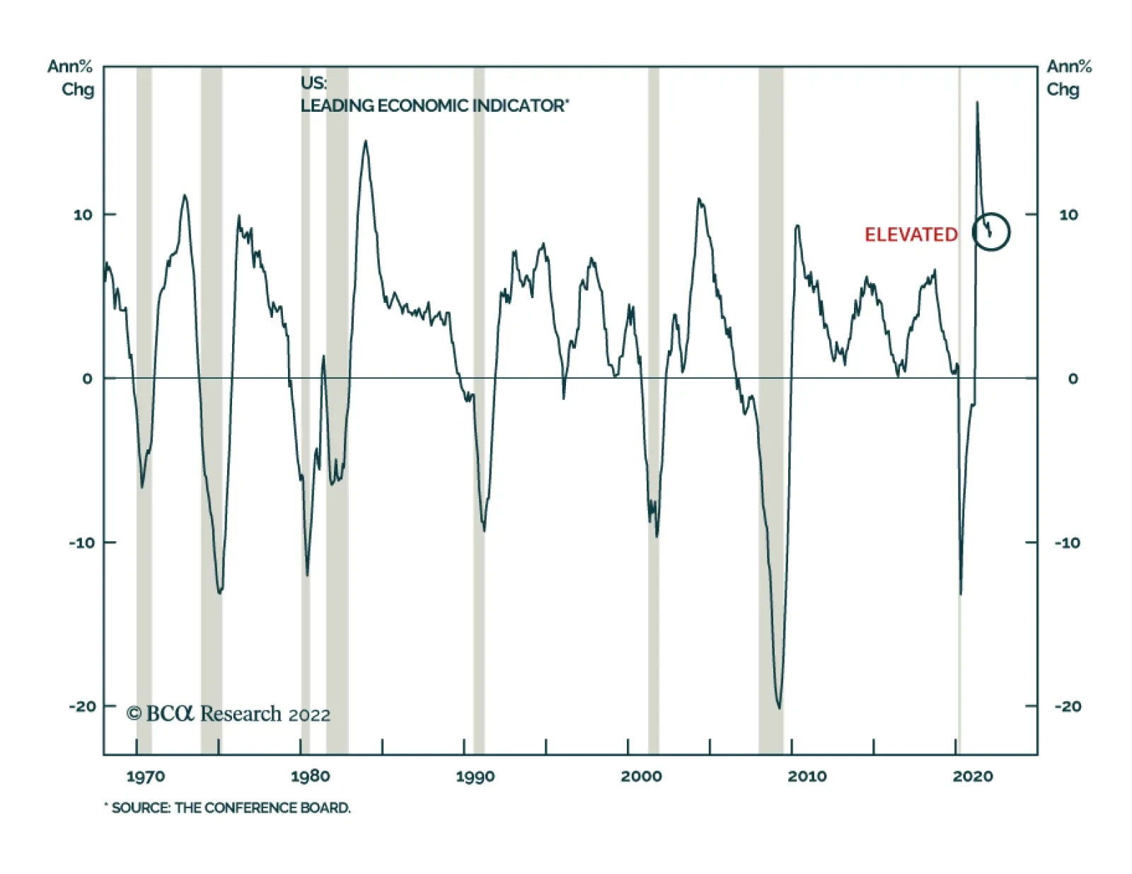
Widening the lens to consider the entire distribution of projected rate hikes (the Fed’s dots), and considering the mean value instead of the median, the dots get slightly more ambitious, revealing that disappointingly high inflation readings would prod the committee to ramp up the pace of its 2022 hikes. Seven of the sixteen FOMC participants expect at least 200 bps of hikes in 2022, with the mean funds rate projection nudging up to 2.05% (Chart 2, top panel). The rates market has the funds rate topping out between 2½ and 2⅝%, about one 25-bps hike below the average participant’s 2.81% and 2.75% year-end 2023 (Chart 2, middle panel) and 2024 (Chart 2, bottom panel) projections. With five FOMC voters expecting a terminal rate of 3% or above, there is scope for an upside surprise if inflation comes in hotter or lasts longer than anticipated. The other changes in the Summary of Economic Projections related to the committee’s GDP and inflation outlook. Participants marked down their median real 2022 GDP growth projection to 2.8% from 4% while increasing their headline and core PCE price index projections about one-and-a-half percentage points to 4.3% and 4.1%, respectively. 2023 and 2024 real GDP growth forecasts were unchanged while inflation expectations were bumped a little higher. The FOMC’s outlook has dimmed slightly, though it is still calling for a soft landing with the economy growing at an above-trend rate and supporting full employment while inflation eases to near its target level. You Can’t Get There From Here Any central bank’s long-run projections will show the economy moving toward its desired target conditions. One probably wouldn’t toil as a central banker if s/he didn’t think the bank’s tools would work and couldn’t say it out loud (even when voting anonymously) if s/he doubted that they might. An investor should therefore never place too much stock in the FOMC’s projections for key economic indicators two and three years out. “[A]ppropriate[ly] firming … monetary policy” is easier said than done, even in the best of times. Related Report US Investment StrategyThe Last Line Of Inflation Defense (Is Holding Fast) The combination of monetary and fiscal largesse almost certainly staved off a COVID recession, at the cost of fostering some asset-market excesses while quite possibly overstimulating aggregate demand over the intermediate term. The Fed is now left to confront the aftermath with blunt policy tools that work with long and variable lags. It is always a tall order to steer an economy smoothly through the ups and downs of the business cycle; sticking the landing after the pandemic’s emergency monetary and fiscal routines involves a much higher degree of difficulty. Chair Powell put on a brave face in his post-meeting press conference, but he and his colleagues are embarking on this rate hiking cycle under less-than-ideal conditions. “In hindsight, yes, it would have been appropriate to move [to hike rates] earlier. … No one wants to have to put really restrictive monetary policy on in order to get inflation back down. So, frankly, [we] need … [to] … get rates back up to more neutral levels as quickly as we practicably can and then mov[e] beyond [neutral], if [it] turns out to be appropriate.” Bottom Line: Having to move as quickly as is practicable implies that the committee and financial markets might be in for some white-knuckle moments in the months ahead. Soft landings are more common in theory than in practice and it will be especially hard to pull one off now. A Recession Is Not Likely … A narrow margin for error does not mean the Fed is walking a tightrope over two negative extremes, however, and we believe the risks of a growth shortfall are modest. We share Powell’s view that “the probability of a recession within the next year is not particularly elevated.” Aggregate demand is strong and will be supported by households’ and businesses’ fortified balance sheets while the labor market has strength to burn. We think the chair had it just right when he said, “all signs are that this is a strong economy and, indeed, one that will be able to flourish … in the face of less accommodative monetary policy.” Our simple recession indicator, built from components that have reliably provided advance warning, reinforces Powell’s conclusion. The 3-month/10-year segment of the yield curve is not yet close to inverting1 (Chart 3). The year-over-year change in the Conference Board’s Leading Economic Index is way above the zero line that has signaled past recessions (Chart 4). The fed funds rate is nowhere near its equilibrium/neutral level, which we judge to be north of 3%, and it is highly unlikely to get there by the end of the year (Chart 5). Ex-the pandemic, recessions over the last 50-plus years have only occurred when all three components sound the alarm; not one is flashing red now and not one is likely to do so during 2022. Chart 3Recessions Occur When The Yield Curve Inverts, ...
Recessions Occur When The Yield Curve Inverts, ...
Recessions Occur When The Yield Curve Inverts, ...
Chart 4... The Year-Over-Year Change In The LEI Turns Negative ...
... The Year-Over-Year Change In The LEI Turns Negative ...
... The Year-Over-Year Change In The LEI Turns Negative ...
Chart 5... And The Target Fed Funds Rate Is Above Its Equilibrium Level
... And The Target Fed Funds Rate Is Above Its Equilibrium Level
... And The Target Fed Funds Rate Is Above Its Equilibrium Level
… But Inflation Is A Pressing Concern The Fed is right to take action to try to stem inflation, which has found especially fertile soil. Extraordinary monetary and fiscal stimulus have given demand a persistent tailwind; social distancing funneled spending to goods while rolling global COVID surges slowed production and hampered transport, crimping supply; and domestic COVID infections limited labor force participation, tightening the labor market and exerting upward pressure on wages. Just when COVID was finally relaxing its grip, Russia invaded Ukraine, taking major sources of crude oil, natural gas, wheat, corn and several base metals offline while creating new cargo and shipping bottlenecks. The Omicron variant’s emergence in China could bring new supply disruptions. The upshot is that the Ukraine invasion and COVID’s Asian revival could keep inflation elevated, obscuring mitigating factors like a consumption shift from goods to services (Chart 6), diminishing shipping backlogs (Chart 7), increasing labor force participation and more forgiving year-over-year comparisons (base effects). Upside inflation surprises could open the door to a faster pace of rate hikes than markets have already discounted, especially if stubbornly high inflation begins to push up longer-run inflation expectations. Despite their recent rise, long-run expectations remain well anchored for now (Chart 8), while households’ sizable savings cushion better positions them to withstand higher prices. Chart 6A Transitory Inflation Catalyst
A Transitory Inflation Catalyst
A Transitory Inflation Catalyst
Chart 7Shipping Bottlenecks Had Been Easing
Shipping Bottlenecks Had Been Easing
Shipping Bottlenecks Had Been Easing
Chart 8Long-Run Inflation Expectations Are Still Manageable
Long-Run Inflation Expectations Are Still Manageable
Long-Run Inflation Expectations Are Still Manageable
Financial Market Impacts Equities took heart from Powell’s talk of the Fed’s commitment to prevent high inflation from becoming entrenched, but his comments were not uniformly reassuring. He specifically called out the red-hot labor market, a key pillar of the favorable growth outlook, as a source of concern. “[I]f you take a look … at today’s labor market, what you have is 1.7-plus job openings for every unemployed person (Chart 9). So that’s a very, very tight labor market, tight to an unhealthy level, I would say.” The Phillips Curve trade-off between growth and inflation still applies after all, but after a dozen years when policymakers and investors were able to ignore it, equity multiples, credit spreads and Treasury yields may no longer account for it. They seem to still be discounting a have-your-cake-and-eat-it-too environment in which growth, even when it’s above trend, is continuously goosed by accommodative policy. Chart 9Too Tight For The Fed Chair
Too Tight For The Fed Chair
Too Tight For The Fed Chair
There’s also the issue that the Fed’s tools are not suited to fine-tuning economic outcomes. One does not have to be a card-carrying Austrian to harbor some skepticism about central bankers' ability to make targeted tweaks. “[I]n principle, … the idea is we’re trying to better align demand and supply[.] [I]n the labor market, … if you were just moving down the number of job openings so that they were more like one to one, you would have less upward pressure on wages. You would have a lot less of a labor shortage. … And basically across the economy, we’d like to slow demand so that it’s better aligned with supply. … Of course, the plan is to restore price stability while also sustaining a strong labor market. That is our intention, and we believe we can do that. But we have to restore price stability.” It’s a happy circumstance when attaining a goal doesn’t involve a sacrifice, but no pain, no gain is adulthood’s default condition. To paraphrase Powell’s press conference guidance, price stability with full employment would be really nice, but if push comes to shove, price stability has to take precedence. The tight monetary policy needed to restore lost price stability would constitute a major headwind for risk assets and the economy. It would spell the end of the equity and credit bull markets while ushering in the next recession. It is our view that the perception that price stability sacrifices are inevitable is still far away enough that risk assets have roughly nine to twelve good months ahead of them, although we hold it with less conviction than we did before Russia attacked Ukraine and Omicron reached China. Both events have the potential to hasten the end of monetary accommodation and drive investors to reconsider their terminal (peak) fed funds rate expectations. We do not expect that investors will revisit their terminal rate expectations until they can glean some empirical evidence of how the economy behaves when the funds rate exceeds 2.25%. If it takes the FOMC at least a year to get to that level, we expect that any major repricing of longer-term Treasury yields is over a year away. The bottom line is that we remain constructive on financial markets and the US economy over our six-to-twelve-month cyclical timeframe, but the clock is ticking and European fighting and Asian COVID infections are threats to our view. We believe that the decline in equity prices and the widening of high-yield credit spreads adequately compensate investors for the increased potential pitfalls, but we remain vigilant and are maintaining our tactically cautious ETF portfolio positioning until some of the clouds lift. Doug Peta, CFA Chief US Investment Strategist dougp@bcaresearch.com Footnotes 1 We use the 3-month/10-year segment instead of the more common 2-year/10-year because the 3-month bill is a cleaner proxy for short rates than the 2-year note, which embeds estimates of the Fed’s future actions. 2s/10s also fail to measure up empirically, inverting even earlier than the habitually premature 3-month/10-year.
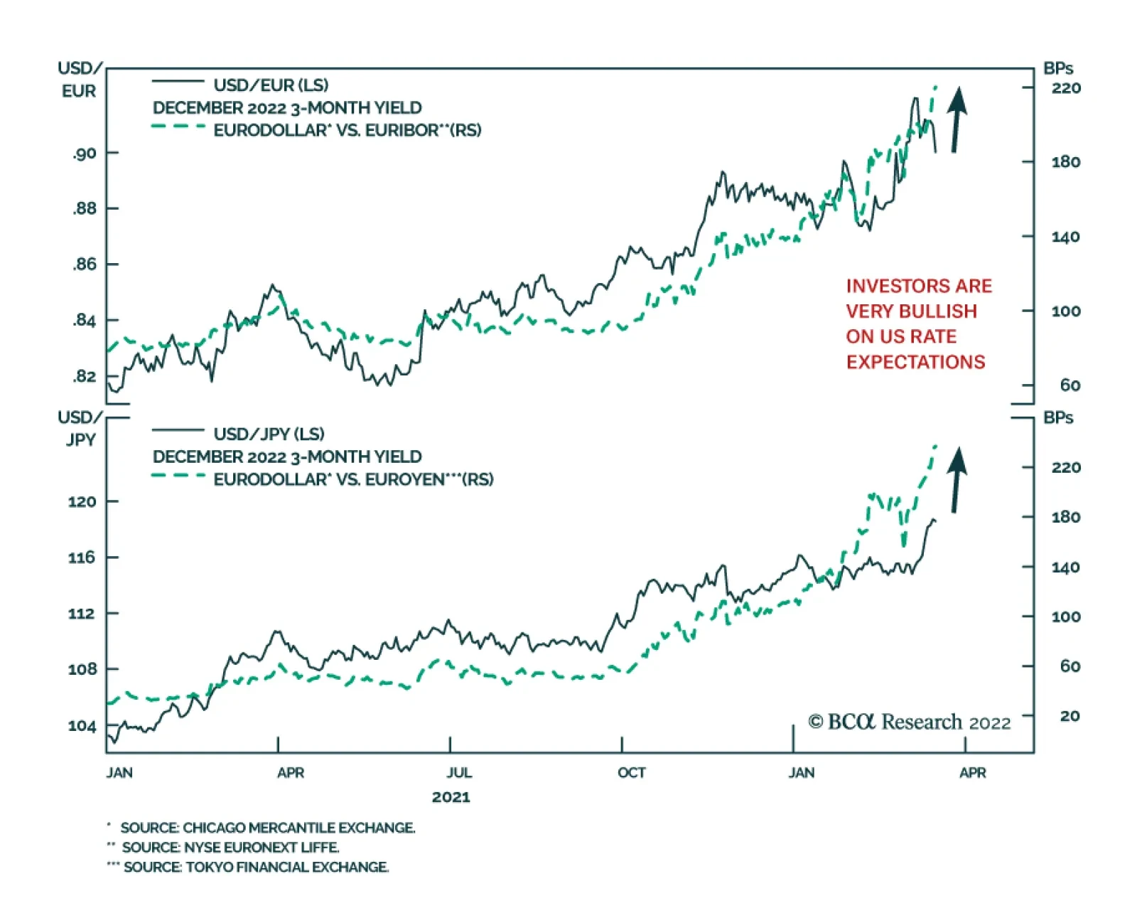
According to BCA Research’s Foreign Exchange Strategy service, the key call for currencies is whether the Fed delivers more or less hikes than is currently priced by markets. Over the long term, bond flows tend to be the key driver of the US dollar. Most…
The Conference Board Leading Economic Index (LEI) for the US ticked up by 0.3% m/m in February after decreasing by 0.5% m/m in January. The LEI is a leading indicator of recessions. Historically, it contracted on a year-on-year basis in the lead-up to a…
Executive Summary Investors Think The Fed Will Not Be Able To Raise Rates Much Above 2%
Is A Higher Neutral Rate Good Or Bad For Stocks?
Is A Higher Neutral Rate Good Or Bad For Stocks?
The neutral rate of interest is 3%-to-4% in the United States. This is substantially higher than the market estimate of around 2%. It is also higher than the central tendency range for the Fed’s terminal interest rate dot, which remained at 2.3%-to-2.5% following this week’s FOMC meeting. If the neutral rate turns out to be higher than expected, this is arguably good news for stocks over the short-to-medium term because it lowers the risk that the Fed will accidentally induce a recession this year by bringing rates into restrictive territory. Over a longer-term horizon of 2-to-5 years, however, a higher neutral rate is bad news for stocks because it means that investors will eventually need to value equities using a higher discount rate. It also means that the Fed could find itself woefully behind the curve in normalizing monetary policy. Bottom Line: Global equities will rise over the next 12 months as the situation in Ukraine stabilizes, commodity prices recede, and inflation temporarily declines. Stocks will peak in the second half of 2023 in advance of a second, and currently unexpected, round of Fed tightening beginning in late-2023 or 2024. Dear Client, Instead of our regular report next week, we will be sending you a Special Report written by Matt Gertken, BCA Research’s Chief Geopolitical Strategist, discussing the geopolitical implications of the war in Ukraine. We will be back the following week with the GIS Quarterly Strategy Outlook, where we will explore the major trends that are set to drive financial markets in the rest of 2022 and beyond. As always, I will hold a webcast discussing the outlook the week after, on Thursday, April 7th. Best regards, Peter Berezin Chief Global Strategist https://www.linkedin.com/in/peter-berezin-1289b87/ https://twitter.com/BerezinPeter A Two-Stage Fed Tightening Cycle The FOMC raised rates by 25 basis points this week, the first of seven rate hikes that the Federal Reserve has telegraphed in its Summary of Economic Projections for the remainder of 2022. We expect the Fed to follow through on its planned rate hikes this year, but then go on pause in early-2023, as inflation temporarily comes down. However, the Fed will resume raising rates in late-2023 or 2024 once inflation begins to reaccelerate and it becomes clear that monetary policy is still too easy. This second round of monetary tightening is currently not anticipated by market participants. If anything, investors think the Fed is more likely to cut rates than raise rates towards the end of next year (Chart 1). The Fed’s own views are not that different from the markets’: The central tendency range for the Fed’s terminal interest rate dot remained at 2.3%-to-2.5% following this week’s FOMC meeting, with the median dot actually ticking lower to 2.4% from 2.5% (Chart 2).
Image
Chart 2The Fed Is Still In The Secular Stagnation Camp
The Fed Is Still In The Secular Stagnation Camp
The Fed Is Still In The Secular Stagnation Camp
A Higher Neutral Rate
Image
Our higher-than-consensus view of where US rates will eventually end up reflects our conviction that the neutral rate of interest is somewhere between 3% and 4%. One can think of the neutral rate as the interest rate that equates the amount of investment a country wants to undertake at full employment with the amount of savings that it has at its disposal.1 Anything that reduces savings or increases investment would raise the neutral rate (Chart 3). As we discussed last month, a number of factors are likely to lower desired savings in the US over the next few years: Households will spend down their accumulated pandemic savings. US households are sitting on $2.3 trillion (10% of GDP) in excess savings, the result of both decreased spending on services during the pandemic and the receipt of generous government transfer payments (Chart 4). Household wealth has soared since the start of the pandemic (Chart 5). Conservatively assuming that households spend three cents of every additional dollar in wealth, the resulting wealth effect could boost consumption by nearly 4% of GDP.
Image
Chart 5Net Worth Has Soared Since The Pandemic
Net Worth Has Soared Since The Pandemic
Net Worth Has Soared Since The Pandemic
The household deleveraging cycle has ended (Chart 6). Household balance sheets are in good shape. After falling during the initial stages of the pandemic, consumer credit has begun to rebound. Banks are easing lending standards on consumer loans across the board. Baby boomers are retiring. They hold over half of US household wealth, considerably more than younger generations (Chart 7). As baby boomers transition from savers to dissavers, national savings will decline. Chart 6US Household Deleveraging Pressures Have Abated
US Household Deleveraging Pressures Have Abated
US Household Deleveraging Pressures Have Abated
Chart 7Baby Boomers Have Amassed A Lot Of Wealth
Is A Higher Neutral Rate Good Or Bad For Stocks?
Is A Higher Neutral Rate Good Or Bad For Stocks?
Government budget deficits will stay elevated. Fiscal deficits subtract from national savings. While the US budget deficit will come down over the next few years, the IMF estimates that the structural budget deficit will still average 4.9% of GDP between 2022 and 2026 compared to 2.0% of GDP between 2014 and 2019 (Chart 8). On the investment front: The deceleration in trend GDP growth, which depressed investment spending, has largely run its course.2 According to the Congressional Budget Office, real potential GDP growth fell from over 3% in the early 1980s to about 1.9% today. The CBO expects potential growth to edge down only slightly to 1.7% over the next few decades (Chart 9). Chart 8Fiscal Policy: Tighter But Not Tight
Is A Higher Neutral Rate Good Or Bad For Stocks?
Is A Higher Neutral Rate Good Or Bad For Stocks?
Chart 9Much Of The Deceleration In Potential Growth Has Already Happened
Much Of The Deceleration In Potential Growth Has Already Happened
Much Of The Deceleration In Potential Growth Has Already Happened
After moving broadly sideways for two decades, core capital goods orders – a leading indicator for capital spending – have broken out to the upside (Chart 10). Capex intention surveys remain upbeat (Chart 11). The average age of the nonresidential capital stock currently stands at 16.3 years, the highest since 1965 (Chart 12). Chart 10Positive Signs For Capex (I)
Positive Signs For Capex (I)
Positive Signs For Capex (I)
Similar to nonresidential investment, the US has been underinvesting in residential real estate (Chart 13). The average age of the housing stock has risen to a 71-year high of 31 years. The homeowner vacancy rate has plunged to the lowest level on record. The number of newly finished homes for sale is half of what it was prior to the pandemic. Chart 11Positive Signs For Capex (II)
Positive Signs For Capex (II)
Positive Signs For Capex (II)
Chart 12An Aging Capital Stock
An Aging Capital Stock
An Aging Capital Stock
Chart 13Housing Is In Short Supply
Housing Is In Short Supply
Housing Is In Short Supply
The New ESG: Energy Security and Guns The war in Ukraine will put further pressure on the neutral rate, especially outside of the United States. Chart 14European Capex Should Recover
European Capex Should Recover
European Capex Should Recover
After staging a plodding recovery following the euro debt crisis, European capital spending received a sizable boost from the launch of the NextGenerationEU Recovery Fund (Chart 14). Capital spending will rise further in the years ahead as European governments accelerate efforts to make their economies less reliant on Russian energy. Meanwhile, European governments are trying to ease the burden from rising energy costs. France has introduced a rebate on fuel starting on April 1st. It is part of a EUR 20 billion package aimed at cutting heating and electricity bills. Other countries are considering similar measures. European military spending will also rise. Germany has already announced that it will spend EUR 100 billion more on defense. European governments will also need to boost spending to accommodate potentially several million Ukrainian refugees. A Smaller Chinese Current Account Surplus? Chart 15Will China Be A Source Of Excess Savings?
Will China Be A Source Of Excess Savings?
Will China Be A Source Of Excess Savings?
The difference between what a country saves and invests equals its current account balance. Historically, China has been a major exporter of savings, which has helped depress interest rates abroad. While China’s current account surplus has declined as a share of its own GDP, it has remained very large as a share of global ex-China GDP, reflecting China’s growing weight in the global economy (Chart 15). Many analysts assume that China will double down on efforts to boost exports in order to offset the drag from falling property investment. However, there is a major geopolitical snag with that thesis: A country that runs a current account surplus must, by definition, accumulate assets from the rest of the world. As the freezing of Russia’s foreign exchange reserves demonstrates, that is a risky proposition for a country such as China. Rather than increasing its current account surplus, China may seek to bolster its economy by raising domestic demand. This could be achieved by either boosting domestic investment on infrastructure and/or consumption. Notably, the IMF’s latest projections foresee China’s current account surplus falling by more than half between 2021 and 2026 as a share of global ex-China GDP. If this were to happen, the neutral rate in China and elsewhere would rise. The Path to Neutral: The Role of Inflation If one accepts the premise that the neutral rate in the US is higher than widely believed, what will the path to this higher rate look like?
Image
The answer hinges critically on the trajectory of inflation. If inflation remains stubbornly high, the Fed will be forced to hike rates by more than expected over the next 12 months. In contrast, if inflation comes down rapidly, then the Fed will be able to raise rates at a more leisurely pace. As late as early February, one could have made a strong case that US inflation was set to fall. The demand for goods was beginning to moderate as spending shifted back towards services. On the supply side, the bottlenecks that had impaired goods production were starting to ease. Chart 16 shows that the number of ships anchored off the coast of Los Angeles and Long Beach has been trending lower while the supplier delivery components of both the ISM manufacturing and nonmanufacturing indices had come off their highs. Since then, the outlook for inflation has become a lot murkier. As we discussed last week, the war in Ukraine is putting upward pressure on commodity prices, ranging from energy, to metals, to agriculture. BCA’s geopolitical team, led by Matt Gertken, expects the war to worsen before a truce of sorts is reached in a month or two. Meanwhile, a new Covid wave is gaining momentum. New daily cases are rising across Europe and have exploded higher in parts of Asia (Chart 17). In China, the number of new cases has reached a two-year high. The government has already locked down parts of the country encompassing 37 million people, including Shenzhen, a major high-tech hub adjoining Hong Kong. Chart 17Covid Cases Are On The Rise Again In Some Countries
Is A Higher Neutral Rate Good Or Bad For Stocks?
Is A Higher Neutral Rate Good Or Bad For Stocks?
Most new cases in China and elsewhere stem from the BA.2 subvariant of Omicron, which appears to be at least 50% more contagious than Omicron Classic. Given its extreme contagiousness, China may be forced to rely on massive nationwide lockdowns in order to maintain its zero-Covid strategy. While such lockdowns may provide some relief in the form of lower oil prices, the overall effect will be to worsen supply-chain disruptions. Watch For Signs of a Wage-Price Spiral As the experience of the 1960s demonstrates, the relationship between inflation and unemployment is inherently non-linear: The labor market can tighten for a long time with little impact on prices and wages, only for a wage-price spiral to suddenly develop once unemployment falls below a certain threshold (Chart 18). Chart 18A Wage-Price Spiral Was Ignited By Very Low Unemployment Levels In The 1960s
Is A Higher Neutral Rate Good Or Bad For Stocks?
Is A Higher Neutral Rate Good Or Bad For Stocks?
Chart 19Wage Growth Has Picked Up, But Mostly At The Bottom End Of The Income Distribution
Wage Growth Has Picked Up, But Mostly At The Bottom End Of The Income Distribution
Wage Growth Has Picked Up, But Mostly At The Bottom End Of The Income Distribution
For the time being, a wage-price spiral does not appear imminent. While wage growth has picked up, most of the increase in wages has occurred at the bottom end of the income distribution (Chart 19). Chart 20More Low-Wage Employees Should Return To Work
More Low-Wage Employees Should Return To Work
More Low-Wage Employees Should Return To Work
Low-wage workers have not returned to the labor force to the same extent as higher-wage workers (Chart 20). However, now that extended unemployment benefits have lapsed and savings deposits are being drawn down, the incentive to resume work will strengthen. An influx of workers back into the labor market will cap wage growth, at least for this year. Long-Term Inflation Expectations Still Contained A sudden increase in long-term inflation expectations can be a precursor to a wage-price spiral because the expectation of higher prices can induce consumers to shop now before prices rise further, while also incentivizing workers to demand higher wages. Reassuringly, long-term inflation expectations have not risen that much. Expected inflation 5-to-10 years out in the University of Michigan survey registered 3.0% in March, down a notch from 3.1% in February (Chart 21). While the widely followed 5-year, 5-year forward TIPS inflation breakeven rate has climbed to 2.32%, it is still at the bottom of the Fed’s comfort zone of 2.3%-to-2.5% (Chart 22).3 Chart 21Long-Term Inflation Expectations Remain Contained (I)
Long-Term Inflation Expectations Remain Contained (I)
Long-Term Inflation Expectations Remain Contained (I)
Chart 22Long-Term Inflation Expectations Remain Contained (II)
Long-Term Inflation Expectations Remain Contained (II)
Long-Term Inflation Expectations Remain Contained (II)
Chart 23The Magnitude Of Damage Depends On How Long The Commodity Price Shock Lasts
Is A Higher Neutral Rate Good Or Bad For Stocks?
Is A Higher Neutral Rate Good Or Bad For Stocks?
Moreover, the jump in market-based inflation expectations since the start of the war in Ukraine has been fueled by rising oil prices. The forwards are pointing to a fairly pronounced decline in the price of crude and most other commodity prices over the next 12 months (Chart 23). If that happens, inflation expectations will dip anew. Investment Implications The neutral rate of interest is higher in the United States than widely believed. A higher neutral rate is arguably good for stocks over the short-to-medium term because it lowers the risk that the Fed will accidentally induce a recession this year by bringing rates into restrictive territory. Over a longer-term horizon of 2-to-5 years, however, a higher neutral rate is bad news for stocks because it means that investors will eventually need to value stocks using a higher discount rate. It also means that the Fed could find itself woefully behind the curve in normalizing monetary policy. While the war in Ukraine and yet another Covid wave could continue to unsettle markets for the next month or two, global equities will be higher in 12 months than they are now. With inflation in the US likely to temporarily come down in the second half of the year, bond yields probably will not rise much more this year. However, yields will start moving higher in the second half of next year as it becomes clear that policy rates still have further to rise. The bull market in stocks will end at that point. Peter Berezin Chief Global Strategist peterb@bcaresearch.com Footnotes 1 These savings can either by generated domestically or imported from abroad via a current account deficit. 2 Theoretically, there is a close relationship between trend growth and the equilibrium investment-to-GDP ratio. For example, if real trend growth is 3% and the capital stock-to-GDP ratio is 200%, a country would need to invest 6% of GDP net of depreciation to maintain the existing capital stock-to-GDP ratio. In contrast, if trend growth were to fall to 2%, the country would only need to invest 4% of GDP. 3 The Federal Reserve targets an average inflation rate of 2% for the personal consumption expenditures (PCE) index. The TIPS breakeven is based on the CPI index. Due to compositional differences between the two indices, CPI inflation has historically averaged 30-to-50 basis points higher than PCE inflation. This is why the Fed effectively targets a CPI inflation rate of about 2.3%-to-2.5%. View Matrix
Is A Higher Neutral Rate Good Or Bad For Stocks?
Is A Higher Neutral Rate Good Or Bad For Stocks?
Special Trade Recommendations Current MacroQuant Model Scores
Is A Higher Neutral Rate Good Or Bad For Stocks?
Is A Higher Neutral Rate Good Or Bad For Stocks?