United States
A dominant market theme this year is rising global government bond yields as central banks exit ultra-accommodative monetary policy and attempt to stymie inflationary pressures. The equity market implication of rising bond yields is to favor sectors and…

Executive Summary Macroeconomic Backdrop Favors Defensive Consumer Staples
Macroeconomic Backdrop Favors Defensive Consumer Staples
Macroeconomic Backdrop Favors Defensive Consumer Staples
Markets now expect five-to-six rate hikes in 2022 The rate of change in rates as opposed to their level has triggered the fast and furious repricing of long-duration assets. However, rising rates are a temporary headwind to equities The repricing of the equity market came through the P/E as opposed to the “E” Demand is clearly shifting from goods to services. Supply disruptions are clearing Earnings were strong, but investors expected more We are upgrading Consumer Staples, which is a “deep” defensive sector that offers downside protection in an environment of heightened volatility and slowing economic growth Bottom Line: While it is impossible to time the market, we believe that the worst is behind us. US equities are outright oversold, and valuations are much more reasonable. However, we recommend investors be cautious in sector selection: For now, stay away from Tech, and add to Consumer Staples to reduce portfolio volatility. Feature Performance Hit Undo 2021 January had a nasty shock in store for equity investors: At the lowest point, the S&P 500 was down 12% from its peak, and NASDAQ was down 20%, officially entering correction territory. January market moves were a partial reversal of the 2021 gains (Chart 1A), with some of the hottest investment themes, such as clean energy, fintech, and Cathie Wood's innovation ETFs hit the hardest (Chart 1B). Investors were rushing to monetize their super-charged gains before the Fed starts draining liquidity off the market. Chart 1APerformance: Sectors And Styles
Chartbook: Sector Chart Pack
Chartbook: Sector Chart Pack
Chart 1BPerformance: Investment Themes
Chartbook: Sector Chart Pack
Chartbook: Sector Chart Pack
Post-Mortem A post-mortem of the sell-off shows that the stocks that have pulled back most, were trading at extended valuations and had long duration, i.e., companies that are not very profitable now but expect to grow earnings at a robust pace far into the future. These companies are akin to lottery tickets – a small payment now may result in a low-probability event of a high gain in the future. Small-cap growth stocks are down 30% from their peak. Over time, the sell-off of small-cap growth has spread to other areas of the market and has hit all sectors but Energy, almost indiscriminately. Overall, the S&P 500's multiple has contracted by over 10% (Chart 1C). Chart 1CJanuary Correction Was Down To Multiple Contraction
Chartbook: Sector Chart Pack
Chartbook: Sector Chart Pack
Valuations And Technicals Pullbacks are responsible for equity market hygiene, cleansing the market of overextended valuations, taking the froth off the names that got ahead of themselves, and offering a reset for a new leg of upward moves, fueled by inflows into oversold names and cash deployed by new market entrants. Forward multiples of the S&P 500 have come down from 21.7x to a more reasonable 19.5x (Chart 2A). Now, 8 out of the 11 sectors have a forward PE below 20x (Chart 2B). Chart 2AMultiples Have Come Down A lot From The Peak
Multiples Have Come Down A lot From The Peak
Multiples Have Come Down A lot From The Peak
Chart 2BValuations Moderated Across All Sectors But Energy
Chartbook: Sector Chart Pack
Chartbook: Sector Chart Pack
By many technical metrics, such as the bull/bear ratio (Chart 2C), market breadth, and RSI, the market appears oversold. Many investors may consider this a good entry point. Chart 2CRetail Investors Have Capitulated
Retail Investors Have Capitulated
Retail Investors Have Capitulated
Macroeconomic Backdrop Six Is The New Four This correction was triggered by a market surprised by the grave tone of Fed officials, acknowledging their concern about the intransigent, as opposed to transient, inflation. While monetary tightening has been on the cards for a while now, what a difference a month makes! In December, the market was pricing in three rate hikes in 2022, while currently, the probability of five rate hikes stands at over 90%, and of six rate hikes at over 80% (Chart 3A). The 10-year Treasury yield moved from 1.5% at the end of December to 1.87% at its January peak. It is important to note that monetary policy is still easy and it was the rate of change in rates as opposed to their level that triggered the fast and furious repricing of long-duration assets. Chart 3AInvestors Expect Five-To-Six Hikes In 2022
Investors Expect Five-To-Six Hikes In 2022
Investors Expect Five-To-Six Hikes In 2022
Is Monetary Tightening A Death Knell For US Equities? Historically, equities wobbled two-to-three months prior to the first rate hike, and then took a breather for another couple of months for the dust to settle (Chart 3B). January and now February volatility and pullbacks are textbook behavior of equities at the cusp of a new monetary regime. However, in three of the four tightening cycles since 1990, the stock market was higher a year later. The same is true for long-term rates: In all but one of the episodes of a sharp rise in the 10-year Treasury yield since 1990, the stock market rose (Table 1). Chart 3BEquities Wobble Around The First Rate Hike
Chartbook: Sector Chart Pack
Chartbook: Sector Chart Pack
Table 1Equity Performance Around Periods Of Rising Treasury Yields
Chartbook: Sector Chart Pack
Chartbook: Sector Chart Pack
Economic Growth: Supply (Finally) Meets Demand Of course, the best antidote to higher rates is strong economic growth. So far, everything is in order on that front, with economists projecting solid 2022 nominal GDP growth of around 7.6%. Economic growth is slowing but off high levels. At last, global supply chains are gradually unclogging, and shipping bottlenecks are starting to clear. Even automakers are now saying that auto chips are becoming more readily available. However, part of the reason that supply and demand are getting closer to each other is that demand for goods is waning, dampened by both saturation and higher costs. The latest ISM PMI reading shows that both new orders and the backlog of orders are falling (Chart 4, top panel). Prices paid have also turned, heralding that the worst of price increases may be behind us (Chart 4, bottom panel). Will this contain inflation enough to appease the Fed? Possible, but not highly likely. Chart 4Demand Is Weakening
Demand Is Weakening
Demand Is Weakening
Earnings: Good But Not Good Enough With economic growth slowing, earnings and sales growth are also rolling over (Chart 5A). As investors are trying to decipher the state of the American economy, they are increasingly focused on corporate guidance. So far 12 companies offered positive guidance vs 28 with negative guidance. The Negative/Positive ratio for Q4-2021 currently stands at 2.3, compared to 0.8 in the prior four quarters. Price action in response to projected lower growth has been brutal. And while 78% of companies have beaten earnings expectations, this is a smaller share than during the other pandemic recovery quarters. The magnitude of the earnings surprise has also fallen (Chart 5B). Chart 5AEarnings And Sales Growth Are Slowing
Chartbook: Sector Chart Pack
Chartbook: Sector Chart Pack
Chart 5BThe Magnitude Of Earnings Surprises Has Fallen
Chartbook: Sector Chart Pack
Chartbook: Sector Chart Pack
This earnings season has also seen some of the largest moves on the back of companies’ reports. Positive surprises by Google, Microsoft, and Amazon have soothed investors' fears and led to broad-based next-day rallies, while skimpy results from PayPal and Meta, not only have sent these companies down more than 20%, erasing billions in market capitalization, but also have dragged down their nearest competitors (Square, Snap, etc.). Also, many companies are complaining about rising input and labor costs cutting into their profitability. This is hardly a surprise. According to our analysis of the NIPA accounts, in the US labor costs constitute 55% of sales. With wages rising at the fastest pace in years, their effect on corporate profitability can be meaningful (Chart 6A). To make things worse, input costs are also soaring – the latest PPI reading is 9.7%. Chart 6AMargins Are Contracting As...
Chartbook: Sector Chart Pack
Chartbook: Sector Chart Pack
However, companies are more and more constrained in their ability to pass on their cost increases to customers, although the elasticity of demand varies across industries. Many companies can no longer afford to raise prices without suppressing demand for their products. Corporate pricing power has turned decisively lower (Chart 6B). As a result, profit margins have contracted across all sectors, except Energy. Bottom-line – earnings are good so far, but they have failed to allay investor fears of waning profitability. Chart 6B...Corporate Pricing Power Is Declining
...Corporate Pricing Power Is Declining
...Corporate Pricing Power Is Declining
Sector Positioning Revenge Of The Nerds – Be Granular While we believe that equities are poised for another leg up, as economic growth remains strong and corporate earnings are decent, we recommend that investors be granular in their sector selection: Avoid areas most adversely affected by a tighter monetary regime and slowing growth. Per our previous analysis, we recommend underweighting the Technology sector on a tactical basis, but within Tech, stay overweight more defensive Software and IT Services. We also like Banks and Insurers that benefit from rising rates and prefer Value and Small over Growth. We are also constructive on Industrials, which are the primary beneficiaries of the new Capex cycle and the US industrial renaissance. Consumer Services Are Finally Rebounding In the meantime, with Omicron finally receding, consumer spending is shifting from consumer goods to services (Chart 7A). Consumers are flush with cash, and still have $2.2 trillion in their coffers. We have been overweight the Travel complex (Hotels, Restaurants, Cruises) since October. However, performance was derailed in the late fall as many consumers chose to stay at home and wait for the variant to pass. Also, many of the industries in the Travel complex have been challenged by the sheer number of staff quarantining or on sick leave. We upgraded Airlines at the beginning of January and remain optimistic about the outperformance of the Consumer Services sector. Upgrading Consumer Staples We are also upgrading Consumer Staples, which is a “deep” defensive that offers downside protection in an environment of heightened volatility and slowing economic growth (Chart 7B). Moreover, consumer confidence is down as Americans are disheartened by prices in the supermarket and at the gas station. However, demand for consumer staples is inelastic and should be inflation-proof. The sector is trading at 21x forward multiples and is expected to grow earnings at 6% over the next 12 months, bettering the S&P 500. Chart 7AWaning Demand For Goods Is Replaced By Demand For Services
Waning Demand For Goods Is Replaced By Demand For Services
Waning Demand For Goods Is Replaced By Demand For Services
Chart 7BMacroeconomic Backdrop Favors Defensive Consumer Staples
Macroeconomic Backdrop Favors Defensive Consumer Staples
Macroeconomic Backdrop Favors Defensive Consumer Staples
Investment Implications The market correction is still running its course, and while it is impossible to time the market, we believe that the worst is behind us. US equities are outright oversold, and valuations are much more reasonable. Rising rates are a temporary headwind. However, we recommend investors be cautious in sector selection: For now, stay away from Tech, and add to Consumer Staples to reduce portfolio volatility. Irene Tunkel Chief Strategist, US Equity Strategy irene.tunkel@bcaresearch.com S&P 500 Chart 8Macroeconomic Backdrop
Macroeconomic Backdrop
Macroeconomic Backdrop
Chart 9Profitability
Profitability
Profitability
Chart 10Valuations And Technicals
Valuations And Technicals
Valuations And Technicals
Chart 11Uses Of Cash
Uses Of Cash
Uses Of Cash
Communication Services Chart 12Macroeconomic Backdrop
Macroeconomic Backdrop
Macroeconomic Backdrop
Chart 13Profitability
Profitability
Profitability
Chart 14Valuations And Technicals
Valuations And Technicals
Valuations And Technicals
Chart 15Uses Of Cash
Uses Of Cash
Uses Of Cash
Consumer Discretionary Chart 16Macroeconomic Backdrop
Macroeconomic Backdrop
Macroeconomic Backdrop
Chart 17Profitability
Profitability
Profitability
Chart 18Valuations And Technicals
Valuations And Technicals
Valuations And Technicals
Chart 19Uses Of Cash
Uses Of Cash
Uses Of Cash
Consumer Staples Chart 20Macroeconomic Backdrop
Macroeconomic Backdrop
Macroeconomic Backdrop
Chart 21Profitability
Profitability
Profitability
Chart 22Valuations And Technicals
Valuations And Technicals
Valuations And Technicals
Chart 23Uses Of Cash
Uses Of Cash
Uses Of Cash
Energy Chart 24Macroeconomic Backdrop
Macroeconomic Backdrop
Macroeconomic Backdrop
Chart 25Profitability
Profitability
Profitability
Chart 26Valuations And Technicals
Valuations And Technicals
Valuations And Technicals
Chart 27Uses Of Cash
Uses Of Cash
Uses Of Cash
Financials Chart 28Macroeconomic Backdrop
Macroeconomic Backdrop
Macroeconomic Backdrop
Chart 29Profitability
Profitability
Profitability
Chart 30Valuations And Technicals
Valuations And Technicals
Valuations And Technicals
Chart 31Uses Of Cash
Uses Of Cash
Uses Of Cash
Health Care Chart 32Sector vs Industry Groups
Sector vs Industry Groups
Sector vs Industry Groups
Chart 33Profitability
Profitability
Profitability
Chart 34Valuations And Technicals
Valuations And Technicals
Valuations And Technicals
Chart 35Uses Of Cash
Uses Of Cash
Uses Of Cash
Industrials Chart 36Macroeconomic Backdrop
Macroeconomic Backdrop
Macroeconomic Backdrop
Chart 37Profitability
Profitability
Profitability
Chart 38Valuations And Technicals
Valuations And Technicals
Valuations And Technicals
Chart 39Uses Of Cash
Uses Of Cash
Uses Of Cash
Information Technology Chart 40Macroeconomic Backdrop
Macroeconomic Backdrop
Macroeconomic Backdrop
Chart 41Profitability
Profitability
Profitability
Chart 42Valuations And Technicals
Valuations And Technicals
Valuations And Technicals
Chart 43Uses Of Cash
Uses Of Cash
Uses Of Cash
Materials Chart 44Macroeconomic Backdrop
Macroeconomic Backdrop
Macroeconomic Backdrop
Chart 45Profitability
Profitability
Profitability
Chart 46Valuations And Technicals
Valuations And Technicals
Valuations And Technicals
Chart 47Uses Of Cash
Uses Of Cash
Uses Of Cash
Real Estate Chart 48Macroeconomic Backdrop
Macroeconomic Backdrop
Macroeconomic Backdrop
Chart 49Profitability
Profitability
Profitability
Chart 50Valuations And Technicals
Valuations And Technicals
Valuations And Technicals
Chart 51Uses Of Cash
Uses Of Cash
Uses Of Cash
Utilities Chart 52Macroeconomic Backdrop
Macroeconomic Backdrop
Macroeconomic Backdrop
Chart 53Profitability
Profitability
Profitability
Chart 54Valuations And Technicals
Valuations And Technicals
Valuations And Technicals
Chart 55Uses Of Cash
Uses Of Cash
Uses Of Cash
Recommended Allocation Footnotes
Executive Summary The European Central Bank (ECB) has engaged in a decisive pivot toward higher policy rates. Markets are pricing in a first interest-rate hike in July and three more increases thereafter in 2022. This is too much for one year. Limited domestic inflationary pressures, weakness in long-term inflation expectations, economic slack, and vulnerability in the periphery will limit the ECB to one hike in December. Nonetheless, the ECB will increase interest rates more than the market anticipates beyond 2022. The UK is setting up for a dangerous latter half of 2022. Too Much Now, Not Enough Later
Too Much Now, Not Enough Later
Too Much Now, Not Enough Later
Bottom Line: Bet on a steepening of the euro short-term rate (€STR) curve. Current pricing for 2022 is too aggressive; however, it is too timid beyond the yearend. European financials will be the prime beneficiary of this tilt. Feature On Thursday, February 3, ECB President Christine Lagarde announced a decidedly hawkish pivot at the ECB press conference. The Frankfurt-based institution, worried by higher-than-anticipated inflation, no longer excludes rate hikes for 2022. In a context in which the BoE is resolutely hiking rates and the Fed is ready to initiate a sustained tightening campaign, investors are pricing in a 10bp ECB rate hike as early as July 2022. They also foresee three additional increases by the end of the year. We agree that the ECB will start lifting the deposit rate this year; however, we expect the tightening to begin in December. Nonetheless, we expect the ECB to lift policy rates more aggressively than the €STR prices in subsequent years. European Inflation Is Different Chart 1Surprise!
Surprise!
Surprise!
The knee-jerk reaction of investors to price in a sudden, sustained campaign of ECB rate hikes this year similar to that of the Fed is natural in light of elevated Eurozone inflation and inflation surprises (Chart 1). However, we continue to view European inflation as distinct from US inflation. European inflation remains dominated by dynamics in the energy market. While headline inflation increased from 5% to 5.1% in January, the core Consumer Price Index (CPI) declined modestly to 2.3% from 2.6%. Crucially, the variance of headline CPI is still almost fully explained by the variance of its energy component (Chart 2, top panel). However, it is concerning that there is also evident pass-through from energy prices to core CPI taking place today (Chart 2, bottom panel). Naturally, natural gas prices play a particularly important role in this energy-driven inflation spike (Chart 3). Chart 2Energy Still Drives Inflation
Energy Still Drives Inflation
Energy Still Drives Inflation
Chart 3Natural Gas Remains Key
Natural Gas Remains Key
Natural Gas Remains Key
Imported inflation is another key driver of European inflation. Chart 4 highlights that there is a robust relationship between the level of headline Harmonized Index of Consumer Prices (HICP) across EU nations and their import prices. This confirms that a large proportion of the European inflationary outburst has taken root outside of the continent’s borders. Chart 4Imported Inflation?
The ECB Is Not the Fed—Not Yet
The ECB Is Not the Fed—Not Yet
Despite this energy-driven, imported inflation, domestic pressures are still much more muted than those in the US. VAT increases played an important role in pushing core CPI higher. Without this contribution, CPI excluding food and energy would be 50 bps lower (Chart 5). Meanwhile, rent inflation remains a modest 1.1%, which is significantly lower than that in the US (Chart 6, top panel), whereas used car CPI is not nearly as extreme as across the Atlantic (Chart 6, bottom panel). Chart 5Elevated Contribution From Taxes
Elevated Contribution From Taxes
Elevated Contribution From Taxes
Chart 6Comparatively Muted Domestic Inflation Drivers
Comparatively Muted Domestic Inflation Drivers
Comparatively Muted Domestic Inflation Drivers
Wage dynamics too are not yet as concerning in the Eurozone as they are in the US. Negotiated wages remain near a record low of 1.4%, and unit labor costs at 0.9% are still inconsistent with strong underlying inflationary pressures (Chart 7, top and second panel). The labor market is tightening and the Euro Area unemployment rate fell to a new low at 7%. However, the total hours worked have not yet reached their pre-pandemic levels (Chart 7, third panel), which suggests that it could take a few more months before the dislocation caused by the pandemic has been fully absorbed and wages become a risk. That being said, it is only a matter of time, as job vacancies are skyrocketing (Chart 7, bottom panel). Chart 8Plentiful Slack
Plentiful Slack
Plentiful Slack
Chart 7The Labor Market Will Heat Up... Later
The Labor Market Will Heat Up... Later
The Labor Market Will Heat Up... Later
The European output gap also limits a repetition of the wage-price spiral taking hold in the US. The OECD’s Weekly Tracker of GDP, a proxy for the overall Eurozone comprised of Germany, France, Italy, and Spain, reveals that, as of mid-January, aggregate output was still 4.9% below its pre-pandemic trend (Chart 8, top panel). Looking at the actual GDP of European countries individually, only France stands above its pre-pandemic trend, whereas Germany, Italy, and Spain still linger well below the average economic path that prevailed from 2012 to 2019 (Chart 8, bottom panels). Chart 9The Inflationary Role Of Bottlenecks
The Inflationary Role Of Bottlenecks
The Inflationary Role Of Bottlenecks
Bottlenecks have also played an important role in relation to higher inflation. Goods inflation is much more elevated than services inflation (Chart 9, top panel), and industrial companies rank the ability to procure equipment and materials as their most important production constraint (Chart 9, second panel). However, production bottlenecks are dissipating. A recent Ifo survey highlights that the proportion of retailers with procurement issues declined from 82% in December 2021 to 57% in January 2022. Moreover, the supplier deliveries indexes of the PMIs are improving across the world. In fact, our simple Supply Disruption Index has begun to rollover, which points toward an imminent end to the wave of inflation surprises (Chart 9, bottom panel). European inflation expectations bear the imprint of those more modest domestic inflationary pressures, which explains the comparatively more limited wage-price spiral on the continent. The inflation expectations of Eurozone households are rising, but they are still within the norm of the past 20 years. In the US, they are breaking out. Moreover, our Index of Common Inflation Expectations, designed to mimic the New York Fed’s measure, remains well contained and is tentatively rolling over (Chart 10). Collectively, these forces explain the radically different inflation profiles of the Euro Area and the US. On the western shore of the Atlantic, the two-year annualized rate of change of the core CPI has completely shattered its highs of the past 20 years, indicating that more than simple base-effects are contributing to inflation (Chart 11, top panel). Meanwhile, the two-year annualized rate of change of the European core CPI is higher than the past deflationary eight years, but it is still low compared to the rates that prevailed prior to the European sovereign debt crisis (Chart 11, bottom panel). Chart 10Inflation Expectations: Unlike The US
Inflation Expectations: Unlike The US
Inflation Expectations: Unlike The US
Chart 11Realized Inflation: Unlike The US
Realized Inflation: Unlike The US
Realized Inflation: Unlike The US
Chart 12The Coming CPI Peak?
The Coming CPI Peak?
The Coming CPI Peak?
Going forward, there remains a high likelihood that Eurozone inflation will soon peak. The impact of the German VAT increases will soon dissipate from the data, energy inflation will diminish as the annual rate of change of oil and natural gas prices peaks, and the growth in monetary aggregates has normalized sharply. Most importantly, in the absence of significant domestic inflationary pressures, the sharp decline in the ZEW Inflation Expectations components point toward a deceleration in headline HICP (Chart 12). Nonetheless, we cannot be too sanguine. The European output gap is likely to close this year and wages pressures will emerge before the end of 2022. As a result, inflation will not fall below 2% anytime soon. Moreover, as we wrote last week, any long-lasting crisis in Ukraine will prevent energy inflation from declining, and thus, there remains significant upside risk to our inflation view in the coming months. Bottom Line: European inflation remains dominated by energy prices and imported price pressures. For now, domestic inflation dynamics are still mild, which explains why Europe’s inflation profile is much shallower than that of the US. Moreover, the near-term picture suggests that the imported inflation will peak, giving a respite to the HICP. Nonetheless, toward the yearend, domestic inflationary forces will pick up as wages gain traction. ECB Pricing: Too Much And Too Little ECB President Christine Lagarde delivered a message that was loud and clear: The ECB is abandoning its ultra-dovish stance. Despite this policy pivot, investors are pricing in too many hikes this year, whereas we only expect one rate increase toward yearend. True, if energy prices spike anew, risks to this forecast will be skewed to the upside. Nonetheless, we are inclined to fade the number of rate hikes priced in for 2022 and bet for more hikes in 2023 and 2024 (Chart 13). Chart 13Too Much Now, Not Enough Later
Too Much Now, Not Enough Later
Too Much Now, Not Enough Later
Why does our base case only include one rate hike in December? First, we are considering the entirety of the inflation picture. As we argued above, inflationary dynamics in Europe are much tamer than those in the US, especially in terms of domestic inflation, which the ECB can influence. Moreover, the ECB is still reeling from its infamous 2011 policy mistake, which accentuated underlying deflationary pressures and caused the ECB to undershoot its mandate for eight years in a row (Chart 14). Inflation expectations also offer some leeway to the ECB. Predictions by professional forecasters continue to track below two percent for the medium term. Importantly, market-based inflation expectations remain consistent with a temporary inflation shock, and do not meet yet the ECB’s criteria of being above the 2% target durably. 10-year CPI swaps hover around 2%, driven by the jump in 2-year CPI swaps to 2.7%. Long-dated expectations approximated by the 5-year/5-year forward CPI swap remain below 2% and the inflation curve is its most inverted on record (Chart 15). Chart 15Inflation Swaps Don't Fit The ECB's Criteria
Inflation Swaps Don't Fit The ECB's Criteria
Inflation Swaps Don't Fit The ECB's Criteria
Chart 14The Legacy Of The 2011 Mistake
The Legacy Of The 2011 Mistake
The Legacy Of The 2011 Mistake
In the end, President Lagarde did mention in the press conference that inflation is finally moving toward its target after years of undershoot. In the context described above, it is likely that the ECB will continue to tolerate some higher inflation in the near term if it represses the deflationary mentality that had engulfed the Eurozone last decade and caused a progressive Japanification of the region. This is a small price to pay to exit at last the lower bound of interest rates on a durable basis. Second comes the sequencing of policy. President Lagarde reiterated the importance of the order of events. First, the ECB will have to bring asset purchases to a net zero before lifting rates. It has yet to curtail purchases. The March meeting will be of paramount importance, since it will feature the tapering schedule of the central bank. We continue to see a progressive pace of declining assets purchases that will likely end in September 2022. Moreover, the ECB will want to see how the European economy and markets will absorb the TLTRO cliff this June, when EUR1.3 trillion of facility expire. Chart 16The Italian Constraint
The Italian Constraint
The Italian Constraint
Third, the ECB remains hamstrung by financial dynamics in the periphery. On Thursday, as Bund yields rose 10 basis points, BTP yields rose 21 basis points, bringing the Italian-German spread to 150bps, its highest level since September 2020 (Chart 16). Simply put, the periphery remains fragile because Italy and Spain sport some of the most negative output gaps in the region. Waiting for a stronger position out of those countries would let the ECB increase rates further down the road, allowing for a cleaner exit from negative policy rates in Europe. While these factors continue to favor a cautious posture by the ECB in 2022 and, therefore, support our base view of only one 10bps hike in December to be flagged when net purchases end in September, they will evolve and allow for many more hikes in 2023 and 2024. We expect the following developments to unfold: The output gaps across the region will close this year, which will put the economy in a position of strength and generate stronger domestic inflationary pressures down the road. Salaries will begin to accelerate meaningfully by the summer. This force will accentuate domestic inflationary pressures in late 2022 and 2023, and will contribute to higher household inflation expectations. The periphery will grow increasingly stronger as the Next Generation EU (NGEU) disbursements accelerate in 2022 and 2023. These disbursements are primarily geared toward infrastructure/capex spending (Chart 17) and will therefore sport elevated fiscal multipliers. The resulting strength will provide more resilience to the periphery and limit the tightening of financial conditions caused by higher interest rates. Chart 17The NGEU Will Matter… A Lot
The ECB Is Not the Fed—Not Yet
The ECB Is Not the Fed—Not Yet
Chart 18Terminal Rates Are Too Low
Terminal Rates Are Too Low
Terminal Rates Are Too Low
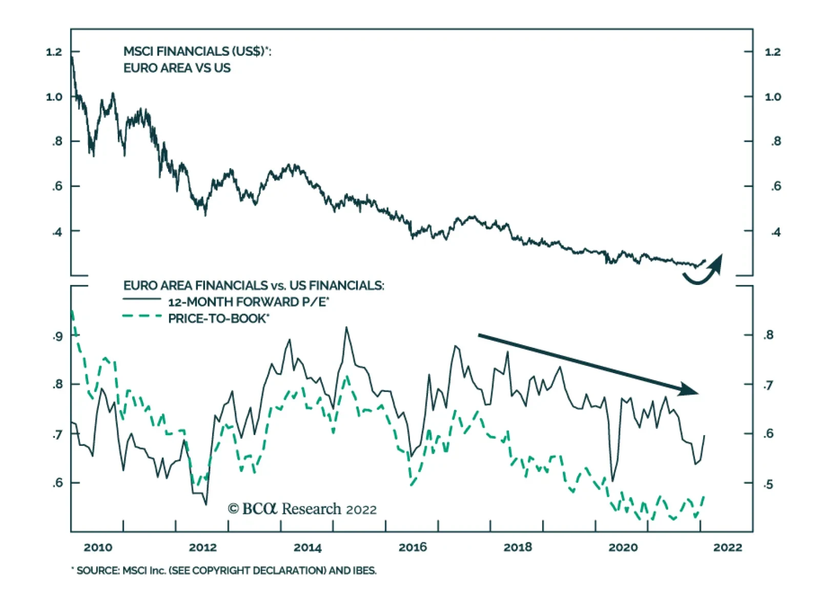
In the longer term, we also believe that markets still understate the ability of the ECB to lift rates. The market-derived terminal rate proxy for Europe is in the vicinity of the levels recorded in the wake of the European sovereign debt crisis last decade (Chart 18). Fiscal policy is more generous, however, and thus domestic demand is stronger. As a corollary, the accelerator model implies that capex will be more robust than it was last decade. Finally, the European Union is not as politically divided as it once was, which creates a stronger block. Together, these developments suggest that the r-star or the neutral rate of interest in the Euro Area is higher than last decade. Bottom Line: The €STR curve is pricing in the potential path of the ECB this year too aggressively. The ECB is likely to start raising rates in December, not in July. Domestic inflation and inflation expectations remain too modest, while the periphery remains fragile. Moreover, the ECB will stick to the previously decided sequence that calls for an end to net asset purchases ahead of hikes. Beyond 2022, we expect the ECB to increase rates more than what is priced into the €STR curve. Investment Implications The first implication of our view is that the European yield curve is likely to steepen further in the coming year. This is true in absolute terms but also relative to the US. We remain long European steepeners relative to US ones. Second, we continue to favor European financials. European banks are a direct equity play on higher yields and on a steeper yield curve (Chart 19). Moreover, European financials have upside relative to their US competitors. They are cheap, and they will benefit from the relative steepening in the European yield curve (Chart 20). Additionally, European monetary conditions will remain easier this year than US ones, whereas European growth will continue to catch up to the US. Chart 20Roll Over XLF
Roll Over XLF
Roll Over XLF
Chart 19Banks Will Shine More
Banks Will Shine More
Banks Will Shine More
Chart 21A Bit More Stress
A Bit More Stress
A Bit More Stress
Third, the equity market correction might have a little more to run. In the near term, equities had become very oversold. This week’s bounce makes sense after the S&P 500’s RSI plunged below 30. However, hedge funds are not shorting the market as violently as they did in 2018, yet all the major global central banks (apart from the BoJ) are abandoning their pandemic-driven policy. As a result of the prospect of a global decline in liquidity, a retest of the 2018-lows in net exposure is likely as we approach the March Fed meeting, especially as credit spreads are still too low to cause a meaningful change in tone by the Fed (Chart 21). Thus, European stocks could experience another wave of selling in the coming weeks, especially when the risks surrounding Ukraine have yet to clear. Keep some protections in place. Finally, the euro has surged this week. With looming Ukrainian risk, the potential for a repricing downward of the near-term European policy rates and the risk of a last sell-off in equities, the euro could give up some of its recent gains and remain in a churning pattern, in place since December 2021. The uncertainty is therefore elevated for near-term traders. However, considering last week’s ECB pivot and the likelihood of an upward revision of the €STR curve for 2024 rates, long-term investors should use a pull back in the euro in the coming weeks to gain exposure to long EUR/USD. What About The BoE? Last week, the Bank of England increased rates by 25bps to 0.5%, which was a widely expected move. The BoE is naturally ahead of the ECB because inflation swaps stand at 4.3% and are even higher than those in the US. The BoE is forced to be more aggressive because inflation expectations are becoming unmoored, which raises the risk of a wage-price spiral north of the Channel. This is a legacy of years of higher inflation and of the labor-supply problems created by Brexit. Additionally, the UK is exiting Omicron lockdowns faster than the Euro Area, which accentuates its near-term economic strength. The UK is not, however, out of the woods. A perfect storm is brewing for the remainder of the year. Interest rates are set to rise sharply, energy price caps will disappear in two months, and the budget is anticipating a significant tightening in the coming quarters after taxes rise in April. This will hurt economic activity in the latter half of the year and will cause tensions in the domestic market. The tax hikes are not guaranteed and a reversal is still possible. PM Boris Johnson is currently embroiled in the so-called “Partygate” scandal and Rishi Sunak, Chancellor of the Exchequer, is seen as the most likely candidate within the Conservative Party to replace Johnson if he were to be pushed out of power by the 1922 Committee. As a colleague observed, it remains to be seen whether Sunak’s political ambitions will scuttle his fiscal rectitude. Nonetheless, the threats to UK small-cap stocks are increasing, warranting a cautious stance if the tax increases are not revoked in the coming weeks. Mathieu Savary, Chief European Strategist Mathieu@bcaresearch.com Tactical Recommendations Cyclical Recommendations Structural Recommendations Closed Trades
Executive Summary Inflation has broken out to 40-plus-year highs in the US and is rapidly becoming a pressing issue for major central banks around the world. Financial markets are vulnerable to upside inflation surprises, which could induce the Fed and its peers to pursue markedly less friendly monetary policy. Despite the ongoing surge in consumer and producer prices, longer-term inflation expectations remain firmly anchored at low levels. Surveys and market prices betray no concern about a lasting inflection. We have ticked a majority of the boxes on our inflation checklist, but we will remain constructive on risk assets as long as inflation expectations remain well-behaved. Long-Run Inflation Expectations Are Well Anchored
The Last Line Of Inflation Defense (Is Holding Fast)
The Last Line Of Inflation Defense (Is Holding Fast)
Bottom Line: The Fed will only slam on the brakes if long-run inflation expectations break out, opening the door to a vicious circle in which inflation begets inflation. Risk assets will outperform this year unless expectations become unmoored. Feature We will be holding our quarterly webcasts next Monday, February 14, for clients in EMEA and the Americas and Tuesday, February 15, for Asia-Pacific clients in lieu of publishing a Weekly Report. Please join us with your questions to make it a fully interactive event. We will resume our regular publication schedule on the 21. Chart 1Inflation And The Fed Have Markets On Edge
Inflation And The Fed Have Markets On Edge
Inflation And The Fed Have Markets On Edge
When we assembled our inflation checklist last May, the future path of consumer prices was still quite uncertain. At the time, the drivers of elevated inflation readings were concentrated in categories that had suffered the worst pandemic disruptions, like air fares, hotels, new cars, used cars, rental cars and auto insurance, and it was unclear how much upward price pressures would spread more broadly across the economy. Delta and Omicron had yet to worsen existing supply chain tangles. While inflation was sure to exceed its post-crisis levels for an extended period, it was not at all clear that it would do so by a significant margin. Now that inflation has broken out to Volcker-era highs, investors’ focus is squarely on the Fed’s response. Fears that inflation would prompt the Fed to tighten policy more and faster than previously expected underpinned the selling spasm that stretched across the last two full weeks of January (Chart 1). The equity market had moved on from the Fed outlook before Friday’s employment report pushed the 10-year yield to a new pandemic high, but it promises to be a recurring theme until the impending rate hike cycle is complete. Turning to our checklist, we contend that inflation expectations hold the key to the Fed’s reaction and that they continue to hold fast as a bulwark against the Fed adopting a war footing that would torpedo financial markets and the economy. Making A List (And Checking It Seven Times) It doesn’t take a certified market technician to confirm that inflation has broken out (Chart 2). It doesn’t take our checklist, either, though we’ve now checked seven of its twelve boxes (Table 1). Its purpose wasn’t to replace what investors could see with their own eyes but rather to augment it with a framework for assessing future inflation moves and their impact on monetary policy settings. We do not expect that the FOMC will bring the party to an abrupt end while investors, businesses and consumers remain untroubled about long-run inflation. Chart 2Breakout
Breakout
Breakout
Table 1Inflation Checklist
The Last Line Of Inflation Defense (Is Holding Fast)
The Last Line Of Inflation Defense (Is Holding Fast)
Though we think the Inflation Expectations boxes are the key, we make a full tour through the checklist to spotlight the data behind each line. We have ticked the Labor Supply/Utilization box, despite the still-low labor force participation rate (Chart 3, top panel) because the evidence suggests it is not going to return to its pre-pandemic level any time soon. The prime age employment-to-population ratio has made much more steady progress and is back within the range of the last three expansions, suggesting that the economy has returned to full employment with the exception of industries hit hardest by the pandemic1 (Chart 3, bottom panel). Chart 3The Economy Is Closing In On Full Employment ...
The Economy Is Closing In On Full Employment ...
The Economy Is Closing In On Full Employment ...
Labor demand continues to soar, with nearly half of all respondents to the NFIB survey indicating that they have unfilled job openings and the Department of Labor’s job openings rate routinely setting new records (Chart 4). The combination of roaring demand and limited supply would seem to be a recipe for salary and wage growth, but it still hasn't come to pass. Though the main wage series have all picked up in nominal terms (Chart 5), the supply/demand imbalance has yet to produce compensation increases that can outpace inflation (Chart 6). Rampant concerns that wage gains will drag on corporate profit margins have yet to materialize and we leave the wage box unchecked. Chart 4... And Demand For Workers Is Still Exploding
... And Demand For Workers Is Still Exploding
... And Demand For Workers Is Still Exploding
Chart 5Nominal Wage Gains Look Large, ...
Nominal Wage Gains Look Large, ...
Nominal Wage Gains Look Large, ...
Chart 6... But They're Lagging Inflation
... But They're Lagging Inflation
... But They're Lagging Inflation
The breakouts in the marquee core CPI (Chart 7, top panel) and PCE (Chart 7, bottom panel) indexes have captured a lot of attention, but their trimmed-mean measures have quietly overtopped their longstanding ranges as well. The trimmed-mean series, which throw out the outliers at both ends of the distribution, supported the transitory view last summer but are now confirming that the underlying pace of consumer price increases has materially quickened. Chart 7It's Not Just About The Outliers Anymore
It's Not Just About The Outliers Anymore
It's Not Just About The Outliers Anymore
As for future inflation, our pipeline inflation indicator has eased over the last few months (Chart 8, top panel), but remains elevated and the preponderance of other cost pressure evidence keeps us from unchecking its box. Dollar strength has helped to guard against imported inflation pressures (Chart 8, bottom panel). They have been tame so far, but with inflation breaking out in Europe (Chart 9, top panel) and just about every major economy except China (Chart 9, bottom panel), rising import costs are likely to add some inflation momentum at the margin. Chart 8The Dollar's Tailwind Has Been An Inflation Headwind, ...
The Dollar's Tailwind Has Been An Inflation Headwind, ...
The Dollar's Tailwind Has Been An Inflation Headwind, ...
Chart 9... But Inflation's Become A Problem Everywhere But China
... But Inflation's Become A Problem Everywhere But China
... But Inflation's Become A Problem Everywhere But China
The Levees Are Holding Firm Although we checked six of the first eight boxes, we maintain a sanguine view about inflation’s impact on monetary policy and financial markets. Some of the boxes are more equal than others, and if we had to pick just one indicator to determine whether inflation will compel the Fed to take stern action, it would be the shape of the inflation expectations curve. Inflation begins to beget inflation when economic actors – workers, businesses, consumers and lenders – begin to expect it will linger into the future and change their behavior to align with their expectations. When inflation is expected to remain persistently high over the long term, individual workers or their unions insist on higher wages to maintain purchasing power, businesses at all points of the supply chain demand higher prices to protect their margins, consumers accelerate their big-ticket purchase decisions to get the most bang for their buck and lenders require higher nominal pro forma returns. The resulting feedback loops help inflation become entrenched in the same way that expectations of falling prices have paved the way for a deflationary mindset to grip Japan. Despite all the attention that rising prices have drawn, investors (Table 2) and households (Chart 10) continue to expect inflation to decelerate from the short term to the intermediate term, and again from the intermediate term to the long term. As long as economic actors are unconcerned about the longer-term picture, the Fed will be able to remove accommodation at a deliberate pace that will not pull the rug out from under financial markets. Table 2These Inverted Curves ...
The Last Line Of Inflation Defense (Is Holding Fast)
The Last Line Of Inflation Defense (Is Holding Fast)
Chart 10... Are Good Omens
... Are Good Omens
... Are Good Omens
To that end, the FOMC has heretofore limited itself to open mouth operations. Chair Powell may have talked tough at last month’s post-meeting press conference, but the committee passed on the chance to terminate the asset purchase program early. A rate hike is all but assured at the next meeting in mid-March and Powell indicated that investors should expect the Fed to move faster than the 25-basis-points(bps)-every-other-meeting pace of the last tightening cycle, but our US Bond Strategy team is inclined to bet the under on the money market’s 125-bps full-year expectation. We have checked the commentary box but are not going to check the dots box ahead of the March meeting’s update. It is further possible that the Fed’s expressed concerns about inflation will reduce the need for it to take action to combat it. We have previously cited our Global Fixed Income Strategy colleagues’ view that investors need only worry about inflation when central banks don't. One-year inflation expectations have come down considerably and intermediate- and long-term expectations have eased since late November (Chart 11), when Omicron’s emergence and the Fed’s hawkish pivot stirred concern. Omicron caused less supply-side disruption than initially feared and markets have relaxed a little now that the inflation cop is once again walking the beat. Chart 11Long-Term Expectations Stay Put, No Matter What Happens At The Short End
The Last Line Of Inflation Defense (Is Holding Fast)
The Last Line Of Inflation Defense (Is Holding Fast)
Investment Implications Ever since the year began, we have stressed the point that tighter policy is not necessarily tight policy. Economic and market inflection points are conditioned upon the level of the fed funds rate, not its direction. Restrictive monetary policy settings are not yet in sight and we doubt that they will emerge in time to shadow risk assets’ 2022 prospects. We like the tighter-does-not-equal-tight formulation, but it obscures an important nuance. Strictly speaking, the Fed is not tightening monetary policy when it tapers its monthly asset purchases – it’s merely dialing down the level of monetary accommodation. Similarly, raising the target fed funds rate from an emergency range of 0 to ¼% two years after COVID reached the US and several months after it ceased to be an acute threat merely reduces the level of monetary stimulus. Even if the FOMC does deliver 125 bps of hikes by year end, lifting the funds rate to 1⅜%, it will still be egging on the economy because no one believes the neutral rate is 1⅜% or lower. Removing accommodation is more like easing up on the gas than squeezing the brakes. As long as inflation doesn’t scare economic participants, causing their longer-run inflation expectations to become unmoored, the Fed will be able to reduce monetary stimulus in an incremental fashion akin to applying less pressure to the gas pedal. That does not mean investors can forget about the Fed; we expect policy scares will roil financial markets off and on throughout the rest of the year. Ultimately, though, we think the elevated volatility will prove unfounded as our base case is that the Fed will not have to slam on the brakes. The steeply downward sloping inflation expectations curve suggests that it will take a lot for expectations to reset but we will be keeping an eye on it nonetheless, because uncomfortably high inflation, and the Fed’s eagerness to counter it, remains the biggest risk to our view. Doug Peta, CFA Chief US Investment Strategist dougp@bcaresearch.com Footnotes 1 Per the January Employment Situation Report, Leisure and Hospitality now accounts for nearly 60% of nonfarm payroll and 97% of private sector service employment losses since February 2020.
According to BCA Research’s Foreign Exchange Strategy service the US dollar will continue to fight a tug of war between a hawkish Federal Reserve, which will boost interest rate differentials in favor of the US, and tightening financial conditions that will…
The January US employment report produced a massive positive surprise. Nonfarm payroll employment increased by 467 thousand – significantly above consensus estimates of 125 thousand. Average hourly earnings accelerated from 4.7% y/y to 5.7% y/y – more than…
BCA Research is proud to announce a new feature to help clients get the most out of our research: an Executive Summary cover page on each of the BCA Research Reports. We created these summaries to help you quickly capture the main points of each report through an at-a-glance read of key insights, chart of the day, investment recommendations and a bottom line. For a deeper analysis, you may refer to the full BCA Research Report. Executive Summary The golden rule for investing in the stock market simply states: “Stay bullish on stocks unless you have good reason to think that a recession is imminent.” The catch, of course, is that it is difficult to know whether a recession is lurking around the corner. Still, we can learn a lot from past recessions. As we document in this week’s report, every major downturn was caused by the buildup of imbalances within the economy, which were then laid bare by some sort of catalyst, usually monetary tightening. Today, the US is neither suffering from an overhang of capital spending, as it did in the lead-up to the 2001 recession, nor an overhang of housing, as it did in the lead-up to the Great Recession. US inflation has risen, but unlike in the early 1980s, long-term inflation expectations remain well anchored. This gives the Fed scope to tighten monetary policy in a gradual manner. Outside the US, vulnerabilities are more pronounced, especially in China where the property market is weakening, and debt levels stand at exceptionally high levels. Fortunately, the Chinese government has enough tools to keep the economy afloat, at least for the time being. Equity Bear Markets And Recessions Go Hand In Hand
Equity Bear Markets And Recessions Go Hand In Hand
Equity Bear Markets And Recessions Go Hand In Hand
Bottom Line: Equity bear markets rarely occur outside of recessions. With global growth set to remain above trend at least for the next 12 months, investors should continue to overweight equities. However, they should underweight the tech sector since tech stocks remain disproportionately vulnerable to rising rates, increased regulation, and a retrenchment in pandemic-induced spending on electronics and online services. Macro Matters Investors tend to underestimate the importance of macroeconomics for stock market outcomes. That is a pity. Charts 1, 2, and 3 show that the business cycle drives the evolution of corporate earnings; corporate earnings, in turn, drive the stock market; and as a result, the business cycle determines the path for stock prices. Chart 1The Business Cycle Drives Earnings…
The Business Cycle Drives Earnings...
The Business Cycle Drives Earnings...
Chart 2…Earnings In Turn Drive Stock Prices…
...Earnings In Turn Drive Stock Prices...
...Earnings In Turn Drive Stock Prices...
An appreciation of macro forces leads to our golden rule for investing in the stock market. It simply states: Stay bullish on stocks unless you have good reason to think that a recession is imminent. Chart 3…Hence, The Business Cycle Is The Main Driver Of Equity Returns
...Hence, The Business Cycle Is The Main Driver Of Equity Returns
...Hence, The Business Cycle Is The Main Driver Of Equity Returns
Historically, stocks have peaked about six months before the onset of a recession. Thus, it usually does not pay to turn bearish on stocks if you expect the economy to grow for at least another 12 months. In fact, aside from the brief but violent 1987 stock market crash, during the past 50 years, the S&P 500 has never fallen by more than 20% outside of a recessionary environment (Chart 4). Peering Around The Corner The catch, of course, is that it is difficult to know whether a recession is lurking around the corner. Leo Tolstoy began his novel Anna Karenina with the words “Happy families are all alike; every unhappy family is unhappy in its own way.” By the same token, every economic boom seems the same, whereas every recession has its own unique features. This makes forecasting recessions difficult. Difficult, but not impossible. Even though recessions differ substantially in their magnitude and causes, they all share the following three characteristics: 1) The buildup of imbalances that make the economy vulnerable to a downturn; 2) A catalyst that exposes these imbalances; and 3) Amplifiers or dampeners that either exacerbate or mitigate the slump. Let us review six past recessions to better understand what these three characteristics reveal about the current state of the global economy. Chart 4Equity Bear Markets And Recessions Go Hand In Hand
Equity Bear Markets And Recessions Go Hand In Hand
Equity Bear Markets And Recessions Go Hand In Hand
The 1980 And 1982 Recessions The double-dip recessions of 1980 and 1982 were the last in which inflation played a starring role. Throughout the 1970s, the Fed consistently overstated the degree of slack in the economy (Chart 5). This led to a prolonged period in which interest rates stayed below their equilibrium level. The resulting upward pressure on inflation from an overheated economy was compounded by a series of oil shocks, the last of which occurred in 1979 following the Iranian revolution. Chart 6The Volcker Era: It Took Massive Monetary Tightening To Bring Down Inflation
The Volcker Era: It Took Massive Monetary Tightening To Bring Down Inflation
The Volcker Era: It Took Massive Monetary Tightening To Bring Down Inflation
Chart 5The Fed Continuously Overstated The Magnitude Of Economic Slack In The 1970s
The Fed Continuously Overstated The Magnitude Of Economic Slack In The 1970s
The Fed Continuously Overstated The Magnitude Of Economic Slack In The 1970s
In an effort to break the back of inflation, newly appointed Fed chair Paul Volcker raised rates, first to 17% in April 1980, and then following a brief interlude in which the effective fed funds rate dropped back to 9%, to a peak of 19% in July 1981 (Chart 6). The 1990-91 Recession Overheating also contributed to the early 1990s recession. After reaching a high of 10.8% in 1982, the unemployment rate fell to 5% in 1989, about one percentage point below its equilibrium level at that time. Core inflation began to accelerate, reaching 5.5% by August 1990. The Fed initially responded to the overheating economy by hiking interest rates. The fed funds rate rose from 6.6% in March 1988 to a high of 9.8% by May 1989. By the summer of 1990, the economy had already slowed significantly. Commercial real estate, still reeling from the effects of the Savings and Loan crisis, weakened sharply. Defense outlays continued to contract following the collapse of the Soviet Union. The final straw was Saddam Hussein’s invasion of Kuwait, which caused oil prices to surge and consumer confidence to plunge (Chart 7). The 2001 Recession An overhang of IT equipment sowed the seeds of the 2001 recession. Spending on telecommunications equipment rose almost three-fold over the course of the 1990s, which helped lift overall nonresidential capital spending from 11.2% of GDP in 1992 to 14.7% in 2000 (Chart 8). Chart 7Overheating In The Leadup To The 1990-91 Recession
Overheating In The Leadup To The 1990-91 Recession
Overheating In The Leadup To The 1990-91 Recession
The recession itself was fairly mild. After subsequent revisions to the data, growth turned negative for just one quarter, in Q3 of 2001. However, due to the lopsided influence of the tech sector in aggregate profits – and even more so, in market capitalization – the dotcom bust had a major impact on equity prices (Chart 9). Chart 9The Dotcom Bust Dragged Down Tech Earnings
The Dotcom Bust Dragged Down Tech Earnings
The Dotcom Bust Dragged Down Tech Earnings
Chart 8A Glut Of I.T. Equipment Sowed The Seeds Of The 2001 Recession
A Glut Of I.T. Equipment Sowed The Seeds Of The 2001 Recession
A Glut Of I.T. Equipment Sowed The Seeds Of The 2001 Recession
Having raised rates to 6.5% in May 2000, the Fed responded to the downturn by easing monetary policy. Falling rates were effective in reviving the economy – indeed, perhaps too effective. The resulting housing boom paved the way for the Great Recession. The Great Recession (2007-2009) The housing sector was the source of imbalances in the lead-up to the Great Recession. In the US, and in other countries such as Spain and Ireland, house prices soared as lenders doled out credit on increasingly lenient terms. Chart 10A Long House Party
A Long House Party
A Long House Party
Rising house prices stoked a consumption boom and incentivized developers to build more homes. In the US, the personal savings rate fell to historic lows. Residential investment reached a high of 6.7% of GDP, up from an average of 4.3% of GDP in the 1990s (Chart 10). While the housing bubble would have burst at some point anyway, tighter monetary policy helped expedite the downturn. Starting in June 2004, the Fed raised rates 17 times, pushing the fed funds rate to 5.25% by June 2006. The ECB also hiked rates; it raised the refi rate from 2% in December 2005 to 4.25% in July 2008, continuing to tighten policy even after the Fed had begun to cut rates. Once global growth started to weaken, a number of accelerants kicked in. As is the case in every recession, rising unemployment led to less spending, which in turn led to even higher unemployment. To make matters worse, a vicious circle engulfed the housing market. Falling home prices eroded the collateral underlying mortgage loans, producing more defaults, tighter lending standards, and even lower home prices. The Fed responded to the crisis by cutting rates and introducing an alphabet soup of programs to support the financial system. However, the zero lower-bound constraint limited the degree to which the Fed could cut rates, forcing it to resort to unorthodox measures such as quantitative easing. While these measures arguably helped, they fell short of what was needed to resuscitate the economy. Fiscal policy could have picked up the slack, but political considerations limited the scale and scope of the 2009 Recovery Act. The result was a needlessly long and drawn-out recovery. The Euro Crisis (2012) Chart 11The State Is Here To Mop Up The Mess
The State Is Here To Mop Up The Mess
The State Is Here To Mop Up The Mess
A reoccurring theme in economic history is that financial crises often force governments to assume private-sector liabilities in order to avoid a full-scale economic collapse. Unlike Greece, where government debt stood at very high levels even before the GFC, debt levels in Spain and Ireland were quite modest before the crisis. However, all that changed when Spain and Ireland were forced to bail out their banks (Chart 11). Unlike the US, UK, and Japan, euro area member governments did not have access to central banks that could serve as buyers of last resort for their debts. This limitation created a feedback loop where rising bond yields made it more onerous for governments to service their debts, which led to a higher perceived likelihood of default and even higher yields (Chart 12). Chart 12Multiple Equilibria In The Debt Market Are Possible Without A Lender Of Last Resort
The Golden Rule For Investing In The Stock Market
The Golden Rule For Investing In The Stock Market
The ECB could have short-circuited this vicious cycle. Unfortunately, under the hapless leadership of Jean-Claude Trichet, instead of providing assistance, the central bank raised rates twice in 2011. This helped spread the crisis to Italy and other parts of core Europe. It ultimately took Mario Draghi’s “whatever it takes pledge” to restore some semblance of normality to European sovereign debt markets. Lessons For Today The current environment bears some resemblance to the one preceding the recessions of the early 1980s. As was the case back then, inflation today has surged well above the Federal Reserve’s target, forcing the Fed to turn more hawkish. Oil prices have also risen, despite slowing global growth. Even Russia has returned to its status as the world’s leading geopolitical boogeyman. Yet, digging below the surface, there is a big difference between today and the early ‘80s. For one thing, long-term inflation expectations remain well anchored. While expected inflation 5-to-10 years out has risen to 3.1% in the latest University of Michigan survey, this just takes the reading back to where it was not long after the Great Recession. It is still nowhere near the double-digit levels reached in the early ‘80s (Chart 13). Market-based inflation expectations are even more subdued. In fact, the widely watched 5-year/5-year forward TIPS breakeven inflation rate is currently well below the Fed’s comfort zone (Chart 14). Chart 13Long-Term Inflation Expectations Are Inching Up But Are Still Low
Long-Term Inflation Expectations Are Inching Up But Are Still Low
Long-Term Inflation Expectations Are Inching Up But Are Still Low
Chart 14Market-Based Long-Term Inflation Expectations Are Below The Fed's Comfort Zone
Market-Based Long-Term Inflation Expectations Are Below The Fed's Comfort Zone
Market-Based Long-Term Inflation Expectations Are Below The Fed's Comfort Zone
Higher oil prices are unlikely to have the sting that they once did. The energy intensity of the global economy has fallen steadily over time, especially in advanced economies (Chart 15). Today, the US generates three-times as much output for every joule of energy consumed than it did in 1970. Household spending on energy has declined from a peak of 8.3% of disposable income in 1980 to 3.8% in December 2021. The US also produces over 11 million barrels of oil per day, more than Saudi Arabia (Chart 16). Chart 15The Global Economy Has Become Less Energy Intensive Over Time
The Global Economy Has Become Less Energy Intensive Over Time
The Global Economy Has Become Less Energy Intensive Over Time
Chart 16When It Comes To Energy Production, The USA Is Now #1
When It Comes To Energy Production, The USA Is Now #1
When It Comes To Energy Production, The USA Is Now #1
Unlike in the late 1990s, advanced economies do not face a significant capex overhang. Quite the contrary. Capital spending has been fairly weak across much of the OECD. In the US, the average age of the nonresidential capital stock has risen to the highest level since the 1960s (Chart 17). Looking out, far from cratering, capital spending is set to rise, as foreshadowed by the jump in core capital goods orders (Chart 18). Chart 17The Aging Capital Stock
The Aging Capital Stock
The Aging Capital Stock
Chart 18The Outlook For US Capex Is Bright
The Outlook For US Capex Is Bright
The Outlook For US Capex Is Bright
Chart 19Need More Houses
Need More Houses
Need More Houses
In contrast to the glut of housing that helped precipitate the Global Financial Crisis, housing remains in short supply in many developed economies. In the US, the homeowner vacancy rate has fallen to a record low. There are currently half as many new homes available for sale as there were in early 2020 (Chart 19). Even in Canada, where homebuilding has held up well, government officials have been hitting the panic button over a brewing home shortage. The Biggest Risk Is Debt The biggest macroeconomic risk the global economy faces stems from high debt levels. While household debt has fallen by 20% of GDP in the US, it has risen in a number of other economies. Corporate debt has generally increased everywhere, in many cases to finance share buybacks and M&A activity (Chart 20). Public debt has also soared to the highest levels since during World War II. Chart 20Mo' Debt
Mo' Debt
Mo' Debt
Among emerging markets, China’s debt burden is especially pronounced. Total private and public debt reached 285% of GDP in 2021, nearly double what it was in early 2008. The property market is also slowing, which will weigh on growth. Like many countries, China finds itself in a paradoxical situation: Any effort to pare back debt is likely to crush nominal GDP by so much that the debt-to-GDP ratio rises rather than falls. Ironically, the only solution is to adopt reflationary policies that allow the economy to run hot. In the near term, this could prove to be a favorable outcome for investors since it will mean that monetary policy stays highly accommodative. Over the long haul, however, it may lead to a stagflationary environment, which would be detrimental to equities and other risk assets. In summary, investors should remain overweight stocks for now. However, they should underweight the tech sector since tech stocks remain disproportionately vulnerable to rising rates, increased regulation, and a retrenchment in pandemic-induced spending on electronics and online services. Peter Berezin Chief Global Strategist peterb@bcaresearch.com Global Investment Strategy View Matrix
The Golden Rule For Investing In The Stock Market
The Golden Rule For Investing In The Stock Market
Special Trade Recommendations Current MacroQuant Model Scores
The Golden Rule For Investing In The Stock Market
The Golden Rule For Investing In The Stock Market
BCA Research is proud to announce a new feature to help clients get the most out of our research: an Executive Summary cover page on each of the BCA Research Reports. We created these summaries to help you quickly capture the main points of each report through an at-a-glance read of key insights, chart of the day, investment recommendations and a bottom line. For a deeper analysis, you may refer to the full BCA Research Report. Executive Summary The first month of this year continues to see economic growth moderating around the world. However, it remains well above trend. There is a tentative growth rotation from the US to other G10 economies. The market expects five interest rate hikes from the Fed this year, but our bias is that they will underwhelm market expectations. A surge in eurozone inflation suggests that many central banks (including the ECB) will gently catch up to the Fed. We were stopped out of our long AUD/USD trade for a small profit and are reinstating this trade via a limit-buy at 0.70. The Dollar Is Flat In 2022, Despite A Hawkish Fed
Month In Review: Another Hawkish Pivot By The Fed
Month In Review: Another Hawkish Pivot By The Fed
Recommendation Inception Level Inception Date Return Long AUD/NZD 1.05 Aug 4/21 1.72% Long AUD/USD 0.7 Feb 3/22 - Bottom Line: The US dollar will continue to fight a tug of war between a hawkish Federal Reserve, which will boost interest rate differentials in favor of the US and tightening financial conditions that will sap US growth, and trigger a rotation from US stocks. Feature Chart 1The Dollar Has Been Flat In 2022
Month In Review: Another Hawkish Pivot By The Fed
Month In Review: Another Hawkish Pivot By The Fed
The dollar was volatile in January. The DXY started the year on a weakening path, surged last week on the back of a hawkish Federal Reserve, and is now relapsing anew. Year to date, the dollar index is flat. Remarkably, emerging market currencies such as the CLP, BRL, and ZAR, which are very sensitive to the greenback and financial conditions in the US, have been outperforming (Chart 1). Incoming economic data continues to be robust, but there has been a slight rotation in favor of non-US growth. The economic surprise index in the US has fallen below zero, while it is surging in other G10 countries (Chart 2). Manufacturing PMIs continue to roll over around the world, but remain robust, even in places like the euro area, which is more afflicted by the energy crisis, and the potential for military conflict in its backyard (Chart 3). Chart 2A Growth Rotation Away From The US
A Growth Rotation Away From The US
A Growth Rotation Away From The US
Chart 3APMIs Are Rolling Over Globally
PMIs Are Rolling Over Globally
PMIs Are Rolling Over Globally
Chart 3BPMIs Are Rolling Over Globally
PMIs Are Rolling Over Globally
PMIs Are Rolling Over Globally
In this week’s report, we go over a few key data releases in the last month and implications for currency markets. Our take is that a growth rotation from the US to other economies is underway, and that will ultimately support a lower greenback (Chart 4). That said, near term risks abound, including geopolitical tensions, the potential for more hawkish surprises from the Federal Reserve, and the potential for a policy mistake in China. Chart 4The IMF Expects A Growth Rotation From The US This Year
Month In Review: Another Hawkish Pivot By The Fed
Month In Review: Another Hawkish Pivot By The Fed
US Dollar: In A Tug Of War The dollar DXY index is flat year to date. Economic growth continues to moderate in the US, from very elevated levels. According to the IMF, the US should see robust growth of 4% this year, from 5.6% last year. This is quite strong by historical standards, and in fact argues for less accommodative monetary policy. The caveat is that financial conditions in the US are tightening quite quickly, which could accentuate the slowdown the IMF expects. There have been a few key data releases over the last month. The payrolls report was underwhelming, with only 199K jobs added in December, versus a consensus of 450K. Friday’s number will likely also be on the weaker side. That said, with the unemployment rate now at 3.9%, average hourly earnings growing at 4.7%, and headline CPI inflation at 7%, the case for curtailing monetary accommodation in the minds of the FOMC remains compelling. Last week, the FOMC opened the window for a faster pace of a rate hikes than the market was anticipating. Fed fund futures now suggest around five interest rate increases this year. In our view, the Fed could underwhelm market expectations for a few reasons. Sentiment has begun to deteriorate. The University of Michigan survey saw its sentiment index fall from 70.6 to 67.2. The expectations component fell from 68.3 to 64.1. These also came in below expectations. Both the Markit and ISM purchasing managers’ indices are rolling over. The services PMI in the US is sitting at 50.9, a nudge above the boom/bust level. The goods trade balance continues to hit a record deficit, at -$101bn in December, suggesting the dollar is too strong for the US external balance. In a nutshell, the economic surprise index in the US has turned firmly negative, at a time when market participants are pricing in a very hawkish pace of interest rate increases. A tighter Fed is what the US needs, but the perfect calibration of monetary policy could prove difficult to achieve. As such, we believe the Fed will slightly underwhelm market expectations of five rate hikes. With speculative positioning in the dollar close to record highs, this will surely deal a blow to the greenback. Chart 5AUS Dollar
US Dollar
US Dollar
Chart 5BUS Dollar
US Dollar
US Dollar
The Euro: War And Inflation The euro is up 0.6% year to date. Economic data in the eurozone has been resilient, despite a surge in the number of new COVID-19 cases, rising energy costs and the potential for military conflict between Ukraine and Russia. On the data front, inflation continues to surge. HICP inflation came in at 5.1% on the headline print and 2.3% on the core measure in January. This followed quite strong prints in both Germany and Spain earlier this week, where the latter is seeing inflation at 6.1%. Meanwhile, the unemployment rate continues to drift lower, falling to 7% in December for the entire eurozone, and as low as 5.1% for Germany. House prices are also surging across the monetary union. This begs the question of how long the ECB can remain on a dovish path and maintain credibility on its inflation mandate. Our favorite forward-looking measures for eurozone activity continue to point towards improvement. The Sentix investor confidence index rose from 13.5 to 14.9 in January, well above expectations. The ZEW expectations survey surged from 26.8 to 49.4 in January. The manufacturing PMI remained at a healthy 58.7 in January. The ECB continues to maintain a dovish stance, keeping rates on hold and reiterating that inflation should subside in the coming quarters. According to their analysis, inflation is stickier than anticipated, but will ultimately head lower. This could prove wrong in a world where inflation is sticky globally and driven by supply-side factors. Ultimately, if inflation does prove transitory, then the hawkish pivot by other central banks will have to be reversed, in a classic catch-22 for the euro. Most of the above analysis suggests that investors should be buying the euro on weaknesses. However, the potential conflict in Ukraine raises the prospect that energy prices could stay elevated, which will hurt European growth. This will weaken the euro. Also, speculators are only neutral the currency according to CFTC data. As such, we are standing on the sidelines on EUR/USD and playing euro strength via a short cable position. Chart 6AEuro
Euro
Euro
Chart 6BEuro
Euro
Euro
The Japanese Yen: The Most Undervalued G10 Currency The Japanese yen is flat year to date. The number of new COVID-19 infections continues to surge in Japan, which has led to various restrictions across the region and constrained economic activity. This has split the recovery on the island, where domestic activity remains constrained, but the external environment continues to boom. Inflation remains well below the Bank of Japan’s long-run target, coming in at 0.5% for the core measure, and -0.7% for the core core measure (excluding fresh food and energy) in January. The Jibun Bank composite PMI was at 48.8 in January, below the 50 boom/bust level, even though the manufacturing print is a healthy 55.4. The labor market continues to heal, with the unemployment rate at 2.7% in December, but the jobs-to-applicants ratio at 1.16 remains well below the pre-pandemic high of 1.64. This is 30% lower. As a result, wage growth in Japan has been rather anemic. The external environment continues to perform well. Machine tool orders rose 40.6% year on year in December, following strong machinery orders of 11.6% year on year in November. Exports also rose 17.5% year on year in December. That said, the surge in energy prices and a weak yen continues to be a tax on Japanese consumers. We have been constructive on the yen, on the back of a wave of pent-up demand that will be unleashed as Omicron peaks. The Bank of Japan seems to share this sentiment. While monetary policy was kept on hold at the January 17-18 meeting, the BoJ significantly upgraded its GDP growth forecasts. 2022 forecasts were upgraded from 2.9% to 3.8%. This dovetailed with the latest IMF release of the World Economic Outlook, where Japan was the only country to see improving growth from 2021 in the G10. In short, bad news out of Japan is well discounted, while any specter of good news is underappreciated. The bull case for the yen remains intact over a longer horizon in our view. From a valuation standpoint, it is the cheapest G10 currency. It is also one of the most shorted. And as we have witnessed recently, it will perform well in a market reset, given year-to-date appreciation. Should the equity market rotation from expensive markets like the US towards cheaper and cyclical markets like Japan continue, the yen will also benefit via the portfolio channel. Chart 7AJapanese Yen
Japanese Yen
Japanese Yen
Chart 7BJapanese Yen
Japanese Yen
Japanese Yen
The British Pound: A Hawkish BoE The pound is up 0.5% year to date. The Bank of England raised interest rates to 0.5% today. According to its projections, inflation will rise to 7.25% in April before peaking. The BoE also announced it will start shrinking its balance sheet, via selling £20bn of corporate bonds and allowing a run-off from maturing government bonds. The Bank of England is the one central bank caught between a rock and a hard place. Inflation in the UK is soaring, prompting the governor to send a letter to the Chancellor of the Exchequer, explaining why monetary policy has allowed inflation to deviate from the BoE’s mandate of 2%. Headline CPI for December was at 5.4% and core CPI at 4.2%. The retail price index rose 7.5% year on year in April. At the same time, the UK is facing an energy crisis that is hitting consumer spending, ahead of a well-telegraphed tax hike in April. The labor market continues to heal. The ILO unemployment rate fell to 4.1% in November. This was better than expectations and below most estimates of NAIRU. As such, the UK runs the risk of a wage-price spiral, that will corner the BoE in the face of tighter fiscal policy. Average weekly earnings rose 4.2% year on year in November, pinning real wages in negative territory. Nationwide house prices also continue to inflect higher, accelerating much faster than incomes. This will lead to demand for much higher wages in the UK, in the coming months. The Sonia curve is currently pricing four or more interest rate hikes this year. This is despite Omicron cases in the UK surging to new highs and tighter fiscal policy. Should the BoE tighten aggressively ahead of a pending economic slowdown, this will hurt the pound. PMIs remain relatively well behaved – the manufacturing PMI was 57.3 in January, above expectations, while the services PMI was a healthy 53.3, but this could turn quickly should financial conditions tighten significantly. The political situation in the UK remains volatile, especially with Prime Minister Boris Johnson facing a scandal domestically, while lingering Brexit tensions continue to hurt the trade balance. As such, portfolio flows are likely to keep the pound volatile in the near term. An equity market correction, especially on the back of heightened tensions in Ukraine, will also pressure cable. That said, more political stability domestically and internationally will allow the pound to continue its mean reversion rally. Given the above dynamics, we are long EUR/GBP in the short term but are buyers of sterling over the longer term. Chart 8ABritish Pound
British Pound
British Pound
Chart 8BBritish Pound
British Pound
British Pound
Australian Dollar: RBA Watching Inflation And Wages The Australian dollar is down 1.7% year to date. The Reserve Bank of Australia kept rates on hold at its February 1 meeting, even though it ended quantitative easing. The two critical measures that the RBA is focusing on are the outlook for inflation, especially backed by an increase in wages. In our view, a more hawkish outcome is likely to materialize over the course of 2022. On the inflation front, key measures are above the midpoint of the central bank’s target. In Q4, headline inflation was 3.5%, the trimmed mean measure was 2.6%, and the median print was 2.7% year on year. In fact, the increase in Q4 prices took the RBA by surprise and was attributed to rising fuel prices. The RBA expects inflationary pressures to remain persistent in 2022, but to ultimately fall to 2.75% in 2023. This will still be at the upper bound of their 1-3% target range. The employment picture in Australia is robust, barring lackluster wage growth. The unemployment rate fell to 4.2% in December from 4.6%, which, according to most measures, is below NAIRU. The RBA expects this rate to dip towards 3.75% next year. Admittedly, wage growth is still low by historical standards, but it is also true that the behavior of the Phillip’s curve at these low levels of unemployment is uncertain. Ergo, we could see an unexpected surge in wage growth. House prices are rising at a record 32% year-on-year in Sydney. This is a clear indication that monetary policy remains too easy, relative to underlying conditions. In the very near term, COVID-19 continues to ravage Australia, which will keep the next set of economic releases rather underwhelming. Combined with the zero-COVID policy in China (Australia’s biggest export partner), the outlook could remain somber in the very near term. This will keep the RBA dovish. On the flip side, a dovish RBA has softened the currency and allowed the trade balance to recover smartly. Meanwhile, it has also led to a record short positioning on the AUD. Our expectation going forward remains the same – as China eases policy, Australian exports will remain strong. A simultaneous peak in the spread of Omicron will also allow a domestic recovery, nudging the RBA to roll back its dovish rhetoric, relative to other central banks. Ergo, investors will get both a terms-of-trade and interest rate support for the AUD. We are reintroducing our limit but on AUD/USD at 70 cents, after being stopped out for a modest profit. Chart 9AAustralian Dollar
Australian Dollar
Australian Dollar
Chart 9BAustralian Dollar
Australian Dollar
Australian Dollar
New Zealand Dollar: Up Versus USD, But Lower On The Crosses The New Zealand dollar is down 2.3% year to date, the worst performing G10 currency. The Reserve Bank of New Zealand has been among the most hawkish in the G10. This has come on the back of strengthening economic data. In Q4, inflation in New Zealand shot up to a 32-year high of 5.9%. The labor market continues to heal, with the unemployment rate at a post-GFC low of 3.2% in Q4, well below NAIRU. Meanwhile, house prices continue to inflect higher, with dwelling costs in Wellington up over 30%. The trade balance continues to print a deficit but has been improving in recent quarters on the back of rising terms of trade. Meanwhile, given New Zealand currently has the highest G10 10-year government bond yield in the developed world, and bond inflows have been able to finance this deficit. In a nutshell, we expect the RBNZ to stay hawkish, but also acknowledge that is being well priced by bond markets. Overall, the kiwi will appreciate versus the US dollar, but will lag AUD, which is much more shorted and has a better terms-of-trade picture. As such, we are long AUD/NZD. Chart 10ANew Zealand Dollar
New Zealand Dollar
New Zealand Dollar
Chart 10BNew Zealand Dollar
New Zealand Dollar
New Zealand Dollar
Canadian Dollar: A Terms-Of-Trade Boom The CAD is down 0.3% year-to date. The Bank of Canada kept rates on hold at its January 26 meeting. This was a surprising outcome for us, as we expected the BoC to raise interest rates, but was in line with market expectations. Taking a step back, all the conditions for the BoC to raise interest rates are in place. The widely viewed Business Outlook Survey showed improvement in Q4, especially vis-à-vis wage and income growth. This is on the back of very strong inflation numbers out of Canada. The headline, trim and median inflation prints were either at or above the upper bound of the central bank’s target at 4.8%, 3.7% and 3%. On the labor front, employment levels in Canada are back above pre-pandemic levels, with the unemployment rate at 5.3%, close to estimates of NAIRU, while the participation rate has also recovered towards pre-pandemic levels. House price inflation is also prominent across many cities in Canada, which argues that monetary policy is too loose for underlying demand conditions. Longer term, the key driver of the CAD remains the outlook for monetary policy, and the path of energy prices. We remain optimistic on both fronts. On monetary policy, we expect the BoC will continue to monitor underlying conditions but will ultimately have to tighten policy as Omicron peaks. Among the G10 countries, Canada is one of the only countries where infection rates have peaked and are falling dramatically. Oil prices also remain well bid, as the Ukraine/Russia conflict continues to unfold. Should we reach a diplomatic solution in Ukraine, while Omicron also falls to the wayside, travel resumption will bring back a meaningful source of oil demand. From a positioning standpoint, speculators are only neutral the CAD. That said, we are buyers of CAD over a 12–18-month horizon given our analysis of the confluence of macro factors. Chart 11ACanadian Dollar
Canadian Dollar
Canadian Dollar
Chart 11BCanadian Dollar
Canadian Dollar
Canadian Dollar
Swiss Franc: Sticking To NIRP The Swiss franc is down 0.8% year to date. The Swiss economy continues to hold up amidst surging COVID-19 infections. Economic wise, inflation is inflecting higher, the unemployment rate has dropped to 2.4%, and wages are rising briskly. This is lessening the need for the central bank to maintain ultra-accommodative settings. House price inflation also suggests that monetary conditions remain too easy relative to underlying demand. The Swiss National Bank remains committed to its inflation mandate, and inflation in Switzerland is among the lowest in the G10. As such, it will likely lag the rest of other developed market central banks in raising rates, with currently the lowest benchmark interest rate in the world. On the flip side, Switzerland runs a trade surplus that has been in structural appreciation, underpinning the franc as a core holding in any FX portfolio. In the near term, rising interest rates are negative for the franc. We are long EUR/CHF on this basis, as we believe the ECB will begin to react to rising inflation pressures. That said, we were long CHF/NZD on the prospect of rising volatility in the FX market and took 4.6% profits on January 14. In the near term, this trade could continue to perform well. Chart 12ASwiss Franc
Swiss Franc
Swiss Franc
Chart 12BSwiss Franc
Swiss Franc
Swiss Franc
Norwegian Krone: Higher Rates Ahead The NOK is up 1.1% year-to-date. The Norges Bank kept the policy rate unchanged at 0.5% at its January meeting and reiterated that rate increases in March are likely. In their view, rising prices, low unemployment, and an easing of Covid-19 restrictions will give way to policy normalization, barring a persistence in Omicron infections. With as many as four rate hikes expected in 2022, the central bank is among the most aggressive in the G10. Headline CPI rose to 5.3% in December, spurred by record high electricity prices, while the core inflation came in at 1.8%. The unemployment rate dropped to 3.4% in Q4, the lowest since 2019. The manufacturing PMI rolled over slightly in January but at 56.5 remains well above the long-term average. Daily Covid-19 cases continue to hit record highs, but hospitalizations remain low, and the government has already scaled back most restrictions after a partial lockdown in December. This will contribute to an economic upswing and aid a recovery in retail sales that were down 3.1% month on month in December. Norway’s trade balance shot up to record highs in December, driven by surging oil and natural gas export prices. A surging trade surplus supports the krone. Meanwhile, in a rising rate environment, portfolio flows into the cyclical-heavy Norwegian stock market could provide further support for the NOK. In a nutshell, the krone is undervalued according to our PPP models and appears attractive on a tactical and cyclical basis. Chart 13ANorwegian Krone
Norwegian Krone
Norwegian Krone
Chart 13BNorwegian Krone
Norwegian Krone
Norwegian Krone
Swedish Krona: Lower Now, Strong Later The SEK is down 0.5% year-to-date. The Swedish economy continued to strengthen in Q4 with GDP growth rising 1.4% quarter-on-quarter, exceeding expectations. In December, the unemployment rate fell to 7.3%, the lowest since the onset of the pandemic, and household lending edged higher to 6.8% year on year. In other data, the manufacturing PMI increased to 62.4 in January. Headline inflation adjusted for interest rates rose to 4.1%, highest since 1993, well above the Riksbank’s 2% target. This has raised doubts on whether the central bank will be able to hold off raising rates until 2024 as it had previously announced. However, excluding energy prices the CPI declined slightly to 1.7%. In short, the Riksbank faces the same conundrum as the ECB, on the persistence of higher inflation, driven by high energy costs. The Omicron variant continues to spread at record pace in Sweden, but recent numbers suggest some moderation. This was probably due to stricter measures in Sweden, in contrast to its Scandinavian neighbors. The cost of this stringency has been softer business and consumer confidence, which are down to multi-month lows. Retail sales also fell by 4.4% in December from the previous month. Taking a step back, Sweden is a small open economy very sensitive to global growth conditions. As such, a rebound in global and Chinese economic activity will hold the key to a rebound in SEK. In our models, the SEK is also undervalued. Chart 14ASwedish Krona
Swedish Krona
Swedish Krona
Chart 14BSwedish Krona
Swedish Krona
Swedish Krona
Chester Ntonifor Foreign Exchange Strategist chestern@bcaresearch.com Trades & Forecasts Strategic View Tactical Holdings (0-6 months) Limit Orders Forecast Summary
Shares of Facebook’s parent company, Meta Platforms Inc, plummeted 26% on Thursday. The collapse follows Meta’s quarterly report which revealed that daily active users declined by 10 million in Q4. Meta’s woes can partially be blamed on company-specific…
There Is Still Dry Powder!
There Is Still Dry Powder!
2022 has surprised investors with the out-of-the-gate market correction, accompanied by a sharp underperformance of Growth vs. Value as part of repricing of the long-duration assets in the context of the tighter monetary policy. As such, $60 billion more has been allocated towards value than growth mutual funds over the past month – the highest amount since 2002 (top panel). Mean reversion is certainly a risk. A big question is whether there is a significant amount of cash sitting on the sidelines or parked in fixed income mutual funds, waiting to be redeployed into equities? To answer this question, we looked at the net flows into all money markets, retail money fund deposits, and net flows into equities vs. bonds (middle and bottom panels). While YTD’s sharp market correction produced only a small uptick in flows into the money market funds or retail deposits, reallocation from equities into fixed income mutual funds has been running its course throughout 2021. Recently, this trend has started to reverse, with net outflows from equities decelerating. This supports the thesis that market correction was a Growth into Value rotation, without much cash leaving equities. Once a new tighter monetary regime gets priced in, money may flow back into equities from the fixed income mutual funds as There Is (still) No Alternative (TINA) in the environment of rising rates. In addition, it appears that there is plenty of cash sitting in retail money funds that could potentially be redeployed. Bottom Line: It appears that retail investors stayed in equities throughout the correction. However, there is plenty of dry powder sitting on the sidelines in the money market, and bond and income mutual funds, ready to be redeployed into equities, supporting their continued outperformance even in the face of tighter monetary policy.