United States

BCA Research is proud to announce a new feature to help clients get the most out of our research: an Executive Summary cover page on each of the BCA Research Reports. We created these summaries to help you quickly capture the main points of each report through an at-a-glance read of key insights, chart of the day, investment recommendations and a bottom line. For a deeper analysis, you may refer to the full BCA Research Report. In lieu of next week’s report, I will be presenting the quarterly Counterpoint webcast series ‘Where Is The Groupthink Wrong?' I do hope you can join. Executive Summary Spending on goods is in freefall while spending on services is struggling to regain its pre-pandemic trend. If spending on goods crashes to below its previous trend, then there will be a substantial shortfall in demand. The good news is that the freefall in goods spending is leading inflation. With spending on goods now crashing back to earth, inflation will also crash back to earth later this year. Underweight the goods-dominated consumer discretionary sector, and underweight semiconductors versus the broader technology sector. Sell Treasury Inflation Protected Securities (TIPS) and other overbought inflation hedges such as commodities that have not yet corrected. Overbought base metals are particularly vulnerable. Fractal trading watchlist: We focus on nickel versus silver, add tobacco versus cannabis, and update bitcoin, biotech, CAD/SEK, and EUR/CZK. As Spending On Goods Crashes Back To Earth, So Will Inflation
As Spending On Goods Crashes Back To Earth, So Will Inflation
As Spending On Goods Crashes Back To Earth, So Will Inflation
Bottom Line: As spending on goods crashes back to earth, so will inflation, consumer discretionary stocks, semiconductors, and overbought commodities. Feature The pandemic has unleashed a great experiment in our spending behaviour. After a binge on consumer goods, will there be a massive hangover? We are about to find out. The pandemic binge on consumer goods, peaking in the US at a 26 percent overspend, is unprecedented in modern economic history. Hence, we cannot be certain what happens next, but there are three possibilities: We sustain the binge on goods, at least partly. Spending on goods falls back to its pre-pandemic trend. There is a hangover, in which spending on goods crashes to below its previous trend. The answer to this question will have a huge bearing on growth and inflation in 2022-23. After The Binge Comes The Hangover… The pandemic’s constraints on socialising, movement, and in-person contact caused a slump in spending on many services: recreation, hospitality, travel, in-person shopping, and in-person healthcare. Nevertheless, with incomes propped up by massive stimulus, we displaced our spending to items that could be enjoyed within the pandemic’s confines; namely, goods – on which, we binged (Chart I-1). Chart I-1Spending On Goods Is In Freefall
Spending On Goods Is In Freefall
Spending On Goods Is In Freefall
Gradually, we learned to live with SARS-CoV-2, and spending on services bounced back. At the same time, we made some permanent changes to our lifestyles – for example, hybrid office/home working and more online shopping. Additionally, a significant minority of people changed their behaviour, shunning activities that require close contact with strangers – going to the cinema or to amusement parks, using public transport, or going to the dentist or in-person doctors’ appointments. The result is that spending on services is levelling off well short of its pre-pandemic trend (Charts I-2-Chart I-5). Chart I-2Spending On Recreation Services Is Far Below Its Pre-Pandemic Trend
Spending On Recreation Services Is Far Below Its Pre-Pandemic Trend
Spending On Recreation Services Is Far Below Its Pre-Pandemic Trend
Chart I-3Spending On Public Transport Is Far Below Its Pre-Pandemic Trend
Spending On Public Transport Is Far Below Its Pre-Pandemic Trend
Spending On Public Transport Is Far Below Its Pre-Pandemic Trend
Chart I-4Spending On Dental Services Is Far Below Its Pre-Pandemic Trend
Spending On Dental Services Is Far Below Its Pre-Pandemic Trend
Spending On Dental Services Is Far Below Its Pre-Pandemic Trend
Chart I-5Spending On Physician Services Is Far Below Its Pre-Pandemic Trend
Spending On Physician Services Is Far Below Its Pre-Pandemic Trend
Spending On Physician Services Is Far Below Its Pre-Pandemic Trend
Arithmetically therefore, to keep overall demand on trend, spending on goods must stay above its pre-pandemic trend. Yet spending on goods is crashing back to earth. The simple reason is that durables, by their very definition, are durable. Even nondurables such as clothes and shoes are in fact quite durable. Meaning that are only so many cars, iPhone 13s, gadgets, clothes and shoes that any person can binge on before reaching saturation. Indeed, to the extent that our bingeing has brought forward future purchases, the big risk is a period of underspending on goods. Countering The Counterarguments Let’s address some counterarguments to the hangover thesis. One counterargument is that some goods are a substitute for services: for example, eating-in (food at home) substitutes for eating-out; and recreational goods substitute for recreational services. So, if there is a shortfall in services spending, there will be an automatic substitution into goods spending. The problem is that the substitutes are not mirror-image substitutes. Spending on eating-in tends to be much less than on eating-out. And once you have bought your recreational goods, you don’t keep buying them! A second counterargument is that provided the savings rate does not rise, there will be no shortfall in spending. Yet this is a tautology. The savings rate is simply the residual of income less spending. So, to the extent that there is a structural shortfall in services spending combined with a hangover in goods spending, the savings rate must rise – as it has in the past two months. A third counterargument is that the war chest of savings accumulated during the pandemic will unleash a tsunami of spending. Well, it hasn’t. And, it won’t. Previous episodes of excess savings in 2004, 2008, and 2012 had no impact on the trend in spending (Chart I-6). Chart I-6Previous Episodes Of Excess Savings Had No Impact On Spending
Previous Episodes Of Excess Savings Had No Impact On Spending
Previous Episodes Of Excess Savings Had No Impact On Spending
The explanation comes from a theory known as Mental Accounting Bias. This points out that we segment our money into different ‘mental accounts’. And that the main factor that establishes whether we spend our money is which mental account it resides in. The moment we move money from our ‘income’ account into our ‘wealth’ account, our propensity to spend it collapses. Specifically, we will spend most of the money in our ‘income’ mental account, but we will spend little of the money in our ‘wealth’ mental account. Hence, the moment we move money from our income account into our wealth account, our propensity to spend it collapses. Still, this brings us to a fourth counterargument, which claims that even though the ‘wealth effect’ is small, it isn’t zero. Therefore, the recent boom in household wealth will bolster growth. Yet as we explained in The Wealth Impulse Has Peaked, the impact of your wealth on your spending growth does not come from your wealth change. It comes from your wealth impulse, which is fading fast (Chart I-7). Chart I-7The 'Wealth Impulse' Has Peaked
The 'Wealth Impulse' Has Peaked
The 'Wealth Impulse' Has Peaked
Analogous to the more widely-used credit impulse, the wealth impulse compares your capital gain in any year with your capital gain in the preceding year. It is this change in your capital gain – and not the capital gain per se – that establishes the growth in your ‘wealth effect’ spending. Unfortunately, the wealth impulse has peaked, meaning its impact on spending growth will not be a tailwind. It will be a headwind. As Spending On Goods Crashes Back To Earth, So Will Inflation, Consumer Discretionary Stocks, And Overbought Commodities In the fourth quarter of 2021, US consumer spending dipped to below its pre-pandemic trend and the savings rate increased. Begging the question, how did the US economy manage to grow at a stellar 6.7 percent (annualised) rate? The simple answer is that inventory restocking contributed almost 5 percent to the 6.7 percent growth rate. In fact, removing inventory restocking, US final demand came to a virtual standstill in the second half of 2021, growing at just a 1 percent (annualised) rate. Growth that is dependent on inventory restocking is a concern because inventory restocking averages to zero in the long run, and after a massive positive contribution there tends to come a symmetrical negative contribution. If, as we expect, spending on services fails to catch up to its pre-pandemic trend while spending on goods falls back to its pre-pandemic trend, then there will be a demand shortfall. And if there is a hangover, in which spending on goods crashes to below its previous trend, then the demand shortfall could be substantial. As inflation crashes back to earth, so will overbought commodities. The good news is that the freefall in durable goods spending is leading inflation. In this regard, you might be surprised to learn that the US core (6-month) inflation rate has already been declining for five consecutive months. With spending on goods now crashing back to earth, inflation will also crash back to earth later this year (Chart I-8). Chart I-8As Spending On Goods Crashes Back To Earth, So Will Inflation
As Spending On Goods Crashes Back To Earth, So Will Inflation
As Spending On Goods Crashes Back To Earth, So Will Inflation
Sell Treasury Inflation Protected Securities (TIPS) and other overbought inflation hedges such as commodities that have not yet corrected. Given that the level (rather than the inflation) of commodity prices is irrationally tracking the inflation rate, the likely explanation is that investors have piled into commodities as a hedge against inflation. Hence, as inflation crashes back to earth, so will overbought commodities (Chart I-9). Overbought base metals are particularly vulnerable. Chart I-9Overbought Commodities Are Particularly Vulnerable
Overbought Commodities Are Particularly Vulnerable
Overbought Commodities Are Particularly Vulnerable
Fractal Trading Watchlist This week we focus on nickel versus silver, add tobacco versus cannabis, and update bitcoin, biotech, CAD/SEK, and EUR/CZK. To reiterate, overbought base metals are vulnerable, and the 70 percent outperformance of nickel versus silver through the past year has reached the point of fractal fragility that signalled previous major turning-points in 2014, 2016, 2018, and 2020 (Chart I-10). Accordingly, this week’s recommended trade is to go short nickel versus silver, setting the profit target and symmetrical stop-loss at 20 percent. Chart I-10Short Nickel Versus Silver
Short Nickel Versus Silver
Short Nickel Versus Silver
A Potential Switching Point From Tobacco Into Cannabis
A Potential Switching Point From Tobacco Into Cannabis
A Potential Switching Point From Tobacco Into Cannabis
Bitcoin's 65-Day Fractal Support Is Holding For Now
Bitcoin's 65-Day Fractal Support Is Holding For Now
Bitcoin's 65-Day Fractal Support Is Holding For Now
Biotech Approaching A Major Buy
Biotech Approaching A Major Buy
Biotech Approaching A Major Buy
CAD/SEK Approaching A Sell
CAD/SEK Approaching A Sell
CAD/SEK Approaching A Sell
EUR/CZK At A Bottom
EUR/CZK At A Bottom
EUR/CZK At A Bottom
Dhaval Joshi Chief Strategist dhaval@bcaresearch.com Fractal Trading System
After The Pandemic Binge Comes The Pandemic Hangover...
After The Pandemic Binge Comes The Pandemic Hangover...
After The Pandemic Binge Comes The Pandemic Hangover...
After The Pandemic Binge Comes The Pandemic Hangover...
6-Month Recommendations Structural Recommendations Closed Fractal Trades Indicators To Watch - Bond Yields Chart II-1Indicators To Watch - Bond Yields ##br##- Euro Area
Indicators To Watch - Bond Yields - Euro Area
Indicators To Watch - Bond Yields - Euro Area
Chart II-2Indicators To Watch - Bond Yields ##br##- Europe Ex Euro Area
Indicators To Watch - Bond Yields - Europe Ex Euro Area
Indicators To Watch - Bond Yields - Europe Ex Euro Area
Chart II-3Indicators To Watch - Bond Yields ##br##- Asia
Indicators To Watch - Bond Yields - Asia
Indicators To Watch - Bond Yields - Asia
Chart II-4Indicators To Watch - Bond Yields ##br##- Other Developed
Indicators To Watch - Bond Yields - Other Developed
Indicators To Watch - Bond Yields - Other Developed
Indicators To Watch - Interest Rate Expectations Chart II-5Indicators To Watch - Interest Rate Expectations
Indicators To Watch - Interest Rate Expectations
Indicators To Watch - Interest Rate Expectations
Chart II-6Indicators To Watch - Interest Rate Expectations
Indicators To Watch - Interest Rate Expectations
Indicators To Watch - Interest Rate Expectations
Chart II-7Indicators To Watch - Interest Rate Expectations
Indicators To Watch - Interest Rate Expectations
Indicators To Watch - Interest Rate Expectations
Chart II-8Indicators To Watch - Interest Rate Expectations
Indicators To Watch - Interest Rate Expectations
Indicators To Watch - Interest Rate Expectations
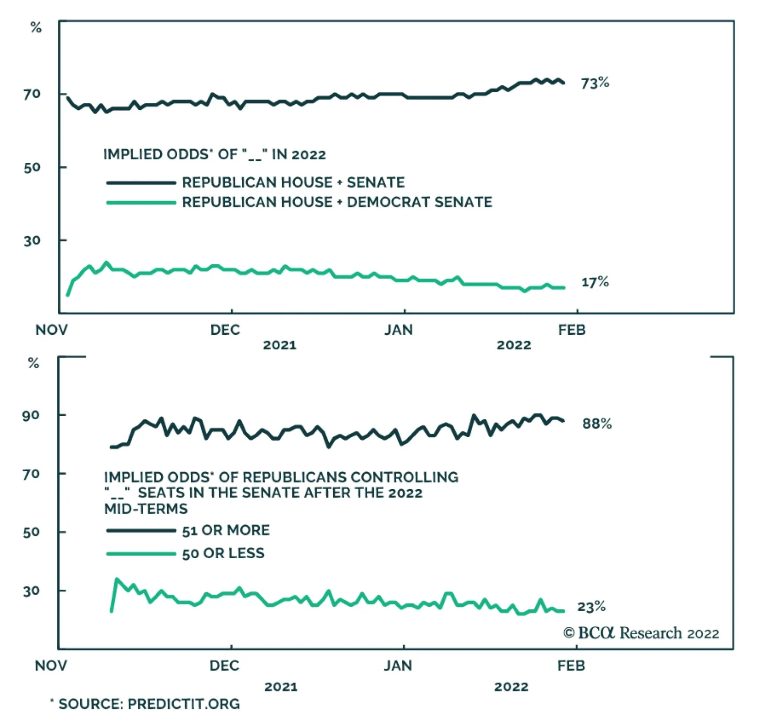
According to BCA Research’s US Political Strategy service, the most likely outcome of the US midterm elections is a GOP victory in the House and Senate. This outlook is consensus in online betting odds. However, the consensus may be underestimating…
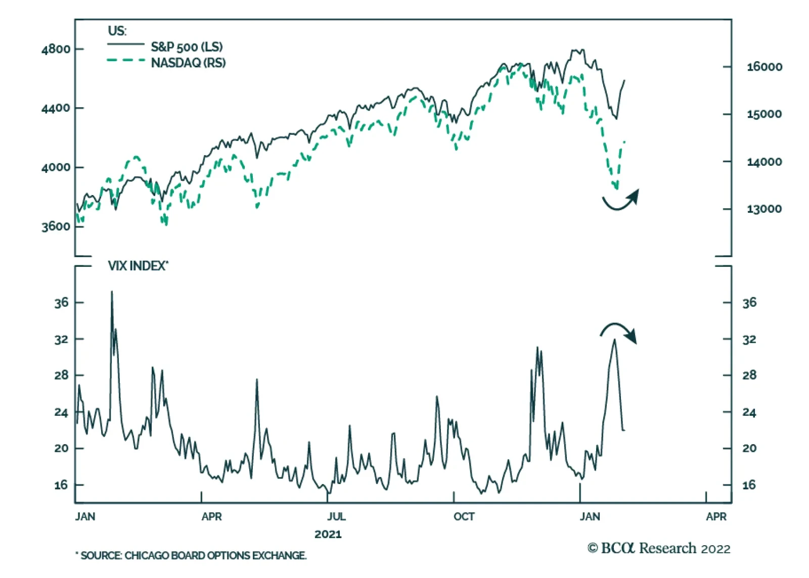
The past few days have seen an improvement in risk assets which has reversed some of January’s sharp declines. The VIX melted to 21 on Wednesday after having spiked to a 1-year high of 32 only a week ago. The equity rebound is not surprising. We recently…
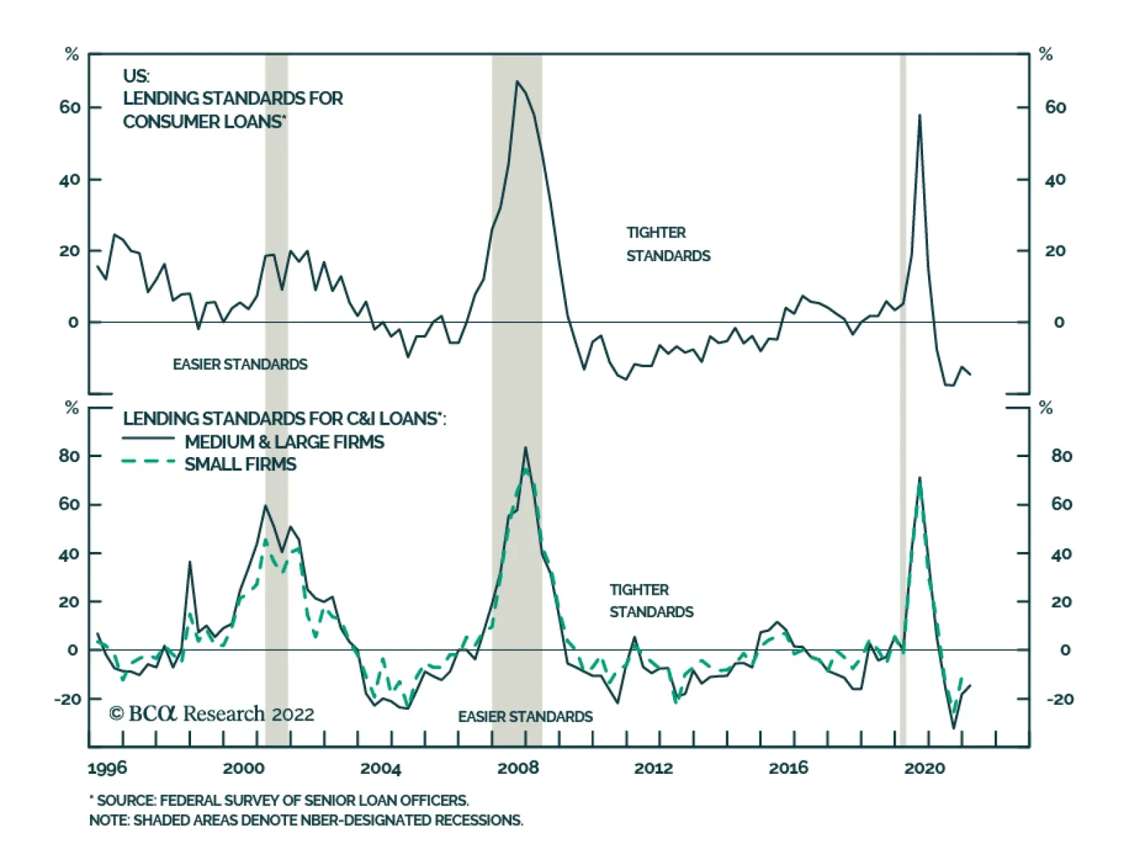
The Fed’s 4Q 2021 Senior Loan Officer Survey (SLOS) which reports on both the demand and supply of loans among banks sent a positive signal about the US economy. Banks reported easier standards for commercial and industrial loans to firms of all sizes.…
BCA Research is proud to announce a new feature to help clients get the most out of our research: an Executive Summary cover page on each of the BCA Research Reports. We created these summaries to help you quickly capture the main points of each report through an at-a-glance read of key insights, chart of the day, investment recommendations and a bottom line. For a deeper analysis, you may refer to the full BCA Research Report. Executive Summary The US midterm elections will bring another round of intense polarization and policy uncertainty this year, though the overall stock market today appears well prepared for the most likely result: a GOP victory in House and Senate. Yet our quantitative Senate election model is “too close to call.” It expects Democrats to retain 50 seats in the Senate and hence the thinnest possible majority. We doubt it, subjectively, but the important point is that the Senate will be stymied either way. Indeed, the only way investors could truly be surprised would be if Democrats made a comeback and retained control of both chambers, but this outcome is very unlikely. Voters make up their minds early in the year during midterm elections, so Democrats may not benefit from any softening of inflation later this year. Still, gridlock ensures that domestic policy uncertainty will rise as well as foreign policy uncertainty. The dollar will be resilient, favoring a tactically defensive positioning. Quant Model For US Senate Election
US Midterm 2022: Different Shades Of Gridlock
US Midterm 2022: Different Shades Of Gridlock
Bottom Line: While we expect Republicans to win both the House and the Senate in 2022, our quant model says the Senate is too close to call. Value has bottomed on a structural time frame but the coming months will be challenging and we recommend growth stocks tactically. Feature This report updates our quantitative models for the 2022 Senate and 2024 presidential elections (Chart of the Week). As always, we use the quantitative modeling as a complement to our qualitative analysis. Formal modeling helps to question our assumptions and views. It is not a substitute for empirical analysis and good judgment, whether in economics or politics. Our qualitative analysis utilizes the geopolitical method, a method based on realist political theory, in which we analyze the concrete checks and balances (constraints) that prevent policymakers from achieving their objectives. We then assign scenario probabilities and compare with BCA Research macro and market views to identify investment risks and opportunities. Advantage Republicans In Midterm Elections Our base case for the midterm election is a Republican victory in both the House of Representatives and the Senate. This outlook is consensus in online betting odds (Chart 1). However, the consensus may be underestimating the Democrats in the Senate election. The Senate is still in play and that is where investors should focus this year. However, the only true risk to expectations would be Democrats keeping the House and Senate. Every other scenario involves different shades of gridlock. Democrats can only hold onto both chambers if a shock event occurs that massively upsets expectations. Such a shock would have to be devastating for the Republicans, as it would go against long-established political cycles and current trends. The implication would be a rare chance to pass major legislation on partisan lines: corporate tax hikes and social programs cut out of the current “Build Back Better” planning. Online betters currently give this Democratic scenario a 10% probability: it is essentially a “black swan” and would be inflationary on the margin. Chart 1Midterm Election Odds Favor Republicans
US Midterm 2022: Different Shades Of Gridlock
US Midterm 2022: Different Shades Of Gridlock
Other scenarios are more or less disinflationary as Republicans in the opposition will attempt to rein in government spending: If Republicans win both chambers, then they will have an impetus to pass legislation and it is more likely that they will do so, as President Biden could find common ground (a la Bill Clinton after 1994). But if Republicans win only the House, then they will only be capable of obstruction and brinksmanship, a la the “Tea Party” Republicans of 2010-16. This scenario would be disinflationary and would heighten political risks such as the risk of a national debt default over a refusal to raise the debt ceiling in 2023. Bottom Line: The only midterm election outcome that could surprise US markets in a major way in 2022 would be a Democratic victory in both houses of Congress. But the consensus is right to put the odds of that at 10%. Otherwise the midterm scenarios are just different shades of gridlock, albeit with higher policy uncertainty under a split Congress. Republicans Highly Likely To Take The House We have not yet unveiled our House Election model but here we can make some preliminary predictions. The opposition party has gained seats in the House in 90% of the midterm elections since 1862 (incumbent party gained seats four out of 40 times). Exceptions are rare (e.g. 1902, 1934, 1998, and 2002) and not applicable to the 2022 context so far.1 About 47 seats in the House are thought to be competitive this year, compared to around 75 in 2018, 81 in 2010, and 38 in 2002. Of the 47 competitive seats, 30 are especially competitive, with 18 Democratic and 12 Republican. Four Democratic seats are wide open to competition, i.e. lacking an incumbent, the same as four Republican seats. However, more Democrats (29) are stepping down than Republicans (13), a sign that Democratic incumbents recognize cyclical patterns turning against them.2 President Biden has a net negative approval rating (53% disapprove while 42% approve), similar to President Trump in 2018, when Republicans lost 42 seats in the House. Presidential approval has a significant correlation with House losses for the president’s party since the end of World War II. This is especially true when taking the average of presidential approval and his party’s support in the generic congressional ballot. By this measure Democrats are lined up to lose 40 House seats, whereas they only need to lose a net of five to lose control. The nation’s woes are unlikely to improve significantly in time for the election: Inflation is surging and real wages are collapsing (Chart 2). Even if economists observe inflation rolling over before the election, voter inflation expectations will lag, and will be brought into the ballot box. Americans are the unhappiest they have been since the 1970s, as a consequence of the pandemic, the economy, toxic society and politics, and other factors (Chart 3). Chart 2Consumers Facing Rising Prices Amid Declining Incomes
Consumers Facing Rising Prices Amid Declining Incomes
Consumers Facing Rising Prices Amid Declining Incomes
Chart 3Unhappiness Reaches New High
US Midterm 2022: Different Shades Of Gridlock
US Midterm 2022: Different Shades Of Gridlock
A rebound in consumer confidence is not enough to save Biden’s party from losses at the ballot box, as President Obama learned in 2010 and 2014 (Chart 4). Similarly a big drop in confidence can hurt the president in the midterms even if confidence recovers in time for the vote, as happened to Republicans in 2018. Biden has another foreign policy crisis on his hands (Russia), after losing trust on his handling of Afghanistan, and may have more crises to deal with by November (Iran, Latin America). If a crisis hits the oil price, as with Russia or Iran, then prices at the pump will go higher, as we discussed in “Biden’s External Risks.” As for the immigration surge, while it will not concern the business community during a time of labor shortage and inflation, it will concern voters, especially in border states like Arizona (Chart 5). The current surge is historic and may come back to haunt the Democrats. Chart 4Lackluster Consumer Confidence Won't Help Democrats
Lackluster Consumer Confidence Won't Help Democrats
Lackluster Consumer Confidence Won't Help Democrats
Chart 5Immigration Crisis Looms On Southern Border
Immigration Crisis Looms On Southern Border
Immigration Crisis Looms On Southern Border
Republicans will benefit slightly from the post-2020 congressional redistricting. Democrats will probably not make substantial gains as a result of Republican infighting in the primaries, though it could make a big difference in the Senate. We will revisit the latter two issues in future reports (redistricting and Republican primaries) but they only matter if Democrats make a significant comeback in opinion. Otherwise the general swing of public opinion will swamp these marginal effects in the House elections. Worst of all for Democrats, evidence shows that voters tend to make up their minds early in the year. That is when the correlation is strongest between the generic congressional opinion poll and the vote share of elections, though for Democrats in particular late-year polling is equally significant (Chart 6). Chart 6AMidterm Voters Mostly Decided At The Start Of The Year
US Midterm 2022: Different Shades Of Gridlock
US Midterm 2022: Different Shades Of Gridlock
Chart 6BMidterm Voters Mostly Decided At The Start Of The Year
US Midterm 2022: Different Shades Of Gridlock
US Midterm 2022: Different Shades Of Gridlock
What could lift the Democrats’ odds? The following factors: The relevance of the Covid-19 pandemic will wane. The economy, while slowing, will continue expanding and unemployment will be very low (Chart 7). Democrats are still somewhat likely to pass a reconciliation bill with the most popular parts of their “Build Back Better” agenda. Democrats will use social “wedge issues” to mobilize their political base. A racialized battle over the Supreme Court nomination and any conservative Supreme Court ruling on abortion may mobilize African Americans and women. It is possible, not likely, that a foreign policy crisis could generate a lasting patriotic backlash against foreign insults, as we discussed last week. This dynamic is relevant given our Geopolitical Strategy’s 75% odds of new Russian military action in Ukraine. A lot can change in nine months during rapidly changing and highly polarized contests in which every marginal vote matters. Bottom Line: While Republicans are highly likely to retake control of the House, the Senate is still in competition. Chart 7Economy Will Slow, Unemployment To Remain Low
Economy Will Slow, Unemployment To Remain Low
Economy Will Slow, Unemployment To Remain Low
The Senate Leans GOP But Still In Play The Senate is more competitive than the House in this year’s election, as 20 Republican seats are up for grabs versus only 14 Democratic seats. About nine of these seats are truly competitive, compared to 13 in 2018, 11 in 2010, and 15 in 2002.3 Only one Democrat is stepping down, in the very blue state of Vermont, whereas five Republicans are stepping down, three of which from competitive states. Hence Democrats have a better chance of picking up Republican seats in North Carolina and Pennsylvania than otherwise. However, even here, Democrats only have a one-seat margin of safety. A net loss of a single seat will yield control of the chamber. Our quantitative model relies on the following six variables: State-level economic health Incumbent party margin of victory in state’s previous Senate race (i.e. 2020) The incumbent president’s net average approval rating Average net support rate of incumbent party in generic congressional ballot A dummy variable for the generic ballot, for statistical purposes A “time for change” penalty for any party that has controlled the Senate for six or more years The model’s results are shown in Chart 8. Currently the model says the status quo will hold, with a 50/50 split in the Senate. Democrats lose Georgia but gain Pennsylvania and hence the balance of power stays the same, as Vice President Kamala Harris casts any tie-breaking vote. Chart 8Senate Quant Election Model Points To Even Split
US Midterm 2022: Different Shades Of Gridlock
US Midterm 2022: Different Shades Of Gridlock
Specifically the model says: Arizona is a toss-up but leans Democratic, with 55% odds. Pennsylvania is a toss-up but switches to the Democrats with 54% odds. North Carolina is a toss-up but leans Republican with 47% odds. Georgia switches to the Republican side and is no longer viewed as a toss-up at 43% odds. Looking at the change in these election probabilities since November 2020, North Carolina has seen the biggest drop for the Democrats, followed by Arizona (Chart 9). Democratic odds are worsening in four states, while Republican odds are worsening in three states. Since North Carolina and Pennsylvania are losing their Republican incumbents, this change in odds is a problem for the GOP. By contrast, Democrats are running incumbents in the four states where they are vulnerable. The problem for Democrats, again, is that voters make up their minds early. The closest correlation between the generic party polling and the incumbent party’s performance in the Senate in a midterm election occurs in February at 94% (Chart 10). Chart 9Senate Model: Change In Predicted Probability
US Midterm 2022: Different Shades Of Gridlock
US Midterm 2022: Different Shades Of Gridlock
Senate elections, like all American elections, are increasingly nationalized.4 This is evident in the 75% correlation we find between the generic polls and the performance of the incumbent party in the Senate (Chart 10 again). So, for example, while one might view Senator Mark Kelly of Arizona as likely to win given the incumbent advantage and the fact that he is a former astronaut and US Navy captain, and he may indeed win, nevertheless a national wave of anti-incumbent feeling could overwhelm his re-election bid. Still, state effects could matter. To examine these from a macro perspective we look at each state’s Misery Index (inflation plus unemployment) compared to the national average in Chart 11. Here are the notable takeaways: Chart 10Midterm Voters Mostly Decided At The Start Of The Year
US Midterm 2022: Different Shades Of Gridlock
US Midterm 2022: Different Shades Of Gridlock
Chart 11AState Level Miseries Point To Risks For Democrats In GA And AZ…
US Midterm 2022: Different Shades Of Gridlock
US Midterm 2022: Different Shades Of Gridlock
Chart 11B… And To Republicans In PA And WI
US Midterm 2022: Different Shades Of Gridlock
US Midterm 2022: Different Shades Of Gridlock
Misery in Arizona, Georgia, and Pennsylvania is higher than average and rising – negative news for Democrat Kelly, Democrat Raphael Warnock, and the yet-to-be-decided Republican candidate in Pennsylvania. Misery in Florida is also slightly above the national average and rising, though Senator Marco Rubio is likely secure. Wisconsin misery is lower than national average and rising (possibly hurting Republican incumbent Senator Ron Johnson). North Carolina misery is lower than national average and falling (helping the yet-to-be-decided Republican candidate). In other words, Misery Indexes support our model’s findings, yet suggest that Democrats face a headwind in Arizona – where our model is also flagging an important risk for Democrats. In sum, our model’s direction of change suggests Democrats will lose another seat and thus the Senate. Going forward, the key moving parts are the economy and the president’s and his party’s approval ratings. There is a chance that these variables will bottom early in the year and improve later, which underscores that the Senate will remain competitive. What investors can be certain about is that Democrats are extremely unlikely to make significant seat gains in the Senate. So even if they retain control, it will be with the thinnest of possible majorities, and hence the Senate will only be capable of passing bipartisan Republican-authored House bills – or vetoing Republican House bills to save the president from having to veto them. It is also certain that Republicans will fall far short of the 67 votes they would need to remove Biden from office, if House Republicans find or invent a reason to impeach him. Bottom Line: The Senate outcome is too close to call but subjectively we doubt Democrats will pull it off given the negative macro trends cited above. Our Senate election model gives 51% odds that Democrats will retain a de facto majority with 50 seats. 2024 Presidential Vote: Odds Favor Democrats For Now The US presidential election is 34 months away. Investors need to be prepared for any outcome, including another contested election. But it is important to have a base case – especially because a Republican (or Democratic) victory in both House and Senate in 2022 would open up the prospect of single-party control in 2025, which has much bigger policy implications than various shades of gridlock. As a rule of thumb, investors should think of presidential elections as a referendum on the incumbent party, not the president’s person, for the prior four years of material performance. Thus Democrats are currently favored to keep the White House. Voters will feel better than they did in 2020, which suffered a triple crisis of pandemic, recession, and unrest. Significant changes must occur to alter this trajectory – such as a recession, Biden’s stepping down, or a humiliating foreign policy defeat.5 Our quantitative model supports this view: it currently gives a 55.2% chance of Democratic victory in the Electoral College (Chart 12). Chart 12US Election 2024: Quant Model Tips Dems
US Midterm 2022: Different Shades Of Gridlock
US Midterm 2022: Different Shades Of Gridlock
Our model relies on the following four variables: State economic health Incumbent party margin of victory in the previous election A penalty for parties that have held the White House for two terms (not applicable in 2024) The president’s approval rating (level) Interestingly our model produces 308 electoral votes for Biden, compared to his actual 306 in 2020, except that some states trade places: Democrats win Florida while Republicans take back Arizona and Georgia. Specifically the model says: North Carolina is a toss-up state but leans Republican. Wisconsin is a toss-up state but just slightly leans Democratic. Florida and Pennsylvania have moved above toss-up range into the Democratic camp. Arizona and Georgia have slipped beneath the toss-up range into the Republican camp. Looking at the change in each state’s odds of voting for the incumbent, Democrats’ chances are falling in eight states while Republicans chances are falling in three states (Chart 13). Wisconsin and Arizona are seeing the most substantial drops, followed by Pennsylvania. Thus the current direction of change is negative for Democrats as one would expect. Biden’s thin margin of victory in 2020 and weak approval ratings make him vulnerable, so the economic performance will largely determine the model’s results going forward. If Biden avoids a recession, that may be enough to retain the White House according to the model. Florida is an interesting case. The model gives a 59% chance it will go to the Democrats. We are suspicious of this outcome but it suggests investors should not take a Republican victory there for granted. Consider: Chart 13Presidential Model: Change In Predicted Probability
US Midterm 2022: Different Shades Of Gridlock
US Midterm 2022: Different Shades Of Gridlock
While we gave President Trump 45% odds of winning in 2020, we predicted he would win Florida due to the state’s partisan leaning.6 That leaning has probably not changed much, although Governor Ron DeSantis’s latest approval rating is only at 45%. However, the six-month change in Florida’s coincident economic indicator has fallen 0.6% since November 2020 and the Misery Index is rising above the national average, as noted above. If Biden loses Florida but the rest of our model is correct, Democrats will retain the White House with 279 electoral college votes. That would leave Wisconsin as the decisive battleground. Yet Wisconsin is very tenuously in their camp today, so any change in the model that gives Florida back to the Republicans would likely give them Wisconsin as well … The result of Biden losing Arizona, Georgia, and Wisconsin (among other combinations) would be a 269-269 tie in the electoral college, in which each state’s delegation to the House of Representatives would have a single vote. A Republican win in the House in 2022 would thus result in a Republican White House in another explosive contested election. But let’s not get ahead of ourselves, 2024 is more than two years away. Bottom Line: Our presidential model gives a 55% chance that Democrats will retain the White House in 2024. Subjectively we agree. A Democratic defeat in 2022 will not rule out a Democratic victory in 2024, especially if Biden is alive and kicking, given the incumbent advantage. But economic factors will largely determine how the model evolves over the next 34 months. Our model also suggests the Electoral College math will be close and that another contested election is possible. Investment Takeaways Based on the current stock market correction, financial markets have priced a fair amount of policy uncertainty already. And this report suggests the midterms merely offer different shades of gridlock. However, Biden’s external risks – namely conflict with Russia – could cause further risk-off moves. And uncertainty will increase as midterms get closer. US policy uncertainty is falling relative to the rest of the world (Chart 14). This is positive for King Dollar, at least over a tactical time frame. The Fed’s interest rate liftoff is also positive for the dollar. Chart 14Lower US Uncertainty In The Near Future Supports The DXY
Lower US Uncertainty In The Near Future Supports The DXY
Lower US Uncertainty In The Near Future Supports The DXY
Hence on a short-term basis, the stock-to-bond ratio can fall further and cyclicals can fall further relative to defensives. Tactically we recommend going long growth versus value stocks (Chart 15). Value has surged in the New Year and the dollar and rate hikes will counteract that, as well as any global energy shock that kills demand. Chart 15Tactically Go Long Growth Versus Value
Tactically Go Long Growth Versus Value
Tactically Go Long Growth Versus Value
However, this is a tactical call. Otherwise, we remain in line with the BCA House View, which favors stocks over bonds and a weaker dollar over the next 12 months. Matt Gertken Senior Vice President Chief US Political Strategist mattg@bcaresearch.com Guy Russell Research Analyst guyr@bcaresearch.com Footnotes 1 Brookings Institution, “Losses by the President’s Party in Midterm Elections, 1862-2014,” Vital Statistics on Congress, February 8, 2021, www.brookings.edu. 2 For the number of competitive seats, see Cook Political Report, cookpolitical.com, and Fair Vote, fairvote.org. 3 See footnotes 1 and 2 above. In addition see the Green Papers, “General Election 2002 – Contests to Watch,” October 25, 2002, thegreenpapers.com, and Ken Rudin, “2010 Senate Ratings: 11 Seats Seen As Tossups; GOP With At Least 3 Pickups,” NPR, July 9, 2010, npr.org. 4 See Joel Sievert and Seth C. McKee, “Nationalization in U.S. Senate and Gubernatorial Elections,” American Politics Research 47:5 (2019), pp. 1036-1054. 5 Our qualitative presidential election framework relies heavily on the work of Professor Allan Lichtman, American University. See our updated Lichtman-style checklist in BCA US Political Strategy, “Biden Is Underwater But His Legislation Will Float,” September 8, 2021, bcaresearch.com. 6 See BCA Research Geopolitical Strategy, “Upgrading Trump’s Odds of Re-Election,” October 26, 2020, bcaresearch.com. See also my interview on Bloomberg’s The Tape Podcast, “Full Blue Sweep Will Push Biden To Left,” July 13, 2020, Bloomberg.com. Strategic View Open Tactical Positions (0-6 Months) Open Cyclical Recommendations (6-18 Months) Table A2Political Risk Matrix
US Midterm 2022: Different Shades Of Gridlock
US Midterm 2022: Different Shades Of Gridlock
Table A3US Political Capital Index
US Midterm 2022: Different Shades Of Gridlock
US Midterm 2022: Different Shades Of Gridlock
Chart A1Presidential Election Model
US Midterm 2022: Different Shades Of Gridlock
US Midterm 2022: Different Shades Of Gridlock
Chart A2Senate Election Model
US Midterm 2022: Different Shades Of Gridlock
US Midterm 2022: Different Shades Of Gridlock
Table A4APolitical Capital: White House And Congress
US Midterm 2022: Different Shades Of Gridlock
US Midterm 2022: Different Shades Of Gridlock
Table A4BPolitical Capital: Household And Business Sentiment
US Midterm 2022: Different Shades Of Gridlock
US Midterm 2022: Different Shades Of Gridlock
Table A4CPolitical Capital: The Economy And Markets
US Midterm 2022: Different Shades Of Gridlock
US Midterm 2022: Different Shades Of Gridlock
Kicking Off Q4 Earnings Season
Kicking Off Q4 Earnings Season
With 184 S&P 500 companies having reported Q4-2021 earnings, it’s time to take a tab of the interim results. So far, the blended earnings growth rate is 26%, while the actual reported growth rate is 33%. The blended sales growth rate is 13%, while the actual reported rate is 19%. Blended earnings and sales, excluding energy, currently stand at 17% and 9% respectively. Analysts expect Q4-2021 earnings to be 2.4% below the Q3-2021 level. The majority of the companies reporting have easily exceeded analysts’ forecasts: 79% of companies delivered a positive earnings surprise (the long-term average is 66% and the prior four-quarter average is 84%), with Comm Services, Industrials, and Technology leading the pack. In terms of the magnitude of the EPS beats, the overall number currently stands at 4% with Tech in the avant-garde. While this number is strong by historical standards, it appears low compared to recent history: From Q3-2020, earnings surprises were in double digits, ranging from 10% to 22%. The big theme for the current earnings season remains inflation and rising costs. Last week, despite delivering a 19% earnings surprise, CAT shares gapped lower as the company warned about a hit to its margins even as sales climbed. The other S&P 500 members have also guided lower with 59 negative and 34 positive pre-announcements, resulting in an N/P ratio of 59/34=1.7 (Q3-2021 N/P ratio was 0.8). Negative guidance is a key reason for the ubiquitous negative returns following the earnings reports. Clearly, the growth slowdown and margin compression, which we flagged back in October, are only now being priced in by the market. In terms of Q1-2022 earnings expectations, growth is expected to slow to 7%. On a sector level, earnings of Consumer Discretionary, Financials, and Communication Services sectors are expected to contract.
Kicking Off Q4 Earnings Season
Kicking Off Q4 Earnings Season
Bottom Line: This earnings season results are consistent with our theme of earnings growth and profitability coming off the high levels and normalizing. The market is currently pricing in this new normal under a new “tighter” monetary regime.
BCA Research is proud to announce a new feature to help clients get the most out of our research: an Executive Summary cover page on each of the BCA Research Reports. We created these summaries to help you quickly capture the main points of each report through an at-a-glance read of key insights, chart of the day, investment recommendations and a bottom line. For a deeper analysis, you may refer to the full BCA Research Report. Executive Summary Cyclical UST Curve Flattening, But With Unusually Low Rate Expectations
Deciphering The Messages From The US Treasury Curve
Deciphering The Messages From The US Treasury Curve
The US Treasury curve is unusually flat given high US inflation and with the Fed not having begun to raise interest rates. The dichotomy between deeply negative real interest rates and a flattening yield curve is not only evident in the US, but in other major developed countries like Germany and the UK. A low term premium on longer-term US Treasury yields is one factor keeping the curve so flat, but the term premium will likely rise as the Fed begins to hike rates. An overly flat US Treasury curve more likely reflects a belief that the neutral real fed funds rate (r-star) is actually negative. This is consistent with markets pricing in a very low peak in the funds rate for the upcoming tightening cycle, despite the current high inflation and tight labor market. Bottom Line: The Fed will hike by less than the market expects in 2022 and longer-term Treasury yields remain too low versus even a moderate 2-2.5% peak in the fed funds rate. Stay in US curve steepeners, as the Treasury curve is already too flat and will not flatten as much as discounted in forward rates this year. Feature Last week’s FOMC meeting essentially confirmed that the Fed will begin lifting rates in March and deliver multiple rate hikes this year. This was considered a hawkish surprise as the Fed signaled imminently tighter monetary policy even with the elevated financial market volatility seen so far in 2022. Fed Chair Jerome Powell noted that the US economy was in a stronger position compared to the 2016-18 tightening cycle, justifying a faster pace of hikes – and an accelerated pace of QE tapering – this time around. Markets have responded to the increasingly hawkish guidance of the Fed by pushing up rate expectations for 2022, continuing a path dating back to last September’s FOMC meeting when the Fed first signaled that QE tapering was imminent (Chart 1). There are now 163bps of Fed rate hikes by year-end discounted in the US overnight index swap (OIS) curve. Some Wall Street investment banks are calling for the Fed to hike as much as 6 or 7 times in 2022. We see this as much too aggressive. Chart 1Fed Hawkishness Pushing Up Rate Expectations For 2022/23 - But Not Beyond That
Fed Hawkishness Pushing Up Rate Expectations For 2022/23 - But Not Beyond That
Fed Hawkishness Pushing Up Rate Expectations For 2022/23 - But Not Beyond That
Our base case scenario calls for the Fed to lift rates “only” 3-4 times this year. The persistently high inflation that is troubling the Fed is likely to peak in the first half of 2022, taking some heat off the FOMC to move as aggressively as discounted in markets this year. Although inflation will remain high enough, and the labor market tight enough, to keep the Fed on a tightening path into 2023. The US Treasury Curve Looks Too Flat What is unique about the upcoming Fed tightening cycle is that it is starting with such a flat US Treasury curve. The spread between the 2-year and 10-year yield now sits at 61bps, the lowest level since October 2020. This dynamic is not unique to the US, as yield curves are quite flat in other major countries where policy rates are near 0% and inflation remains relatively high, like the UK and Germany (Chart 2). In the US, the modest slope of the Treasury curve is notably unusual given a growth and inflation backdrop that would be more consistent with much higher bond yields: The US unemployment rate fell to 3.9% in December, well within the range of full employment estimates from FOMC members (Chart 3, top panel) Chart 2Bond Bearish Yield Curve Flattening In The US & UK
Bond Bearish Yield Curve Flattening In The US & UK
Bond Bearish Yield Curve Flattening In The US & UK
US labor costs are accelerating; the wages and salaries component of the Employment Cost Index for Private Industry Workers rose to a 38-year high of 5.0% on a year-over-year basis in Q4/2021 (middle panel) Chart 3Challenges To The Fed's Inflation Fighting Credibility
Challenges To The Fed's Inflation Fighting Credibility
Challenges To The Fed's Inflation Fighting Credibility
Higher inflation is becoming more embedded in medium term consumer inflation expectations measures like the University of Michigan 5-10 year ahead series that climbed to 3.1% last month (bottom panel). Importantly, market-based measures of inflation expectations have pulled back, even with little sign of inflation pressures easing. The 5-year TIPS breakeven, 5-years forward has fallen 35bps from the October 2021 peak of 2.41%. The bulk of that decline occurred in January of this year, alongside a rising trend in real TIPS yields as markets began pricing in a faster pace of Fed rate hikes. TIPS breakevens can often be something of a “vote of confidence” by the markets in the appropriateness of the Fed’s policy stance; rising when policy appears overly stimulative and vice versa. Thus, the decline in the TIPS 5-year/5-year forward breakeven, which climbed steadily higher since the Fed introduced massive monetary easing in March 2020 in response to the pandemic, can be interpreted as a sign that markets agree with the Fed’s recent hawkish turn. However, while the move in TIPS breakevens is sensible, the flatness of the Treasury curve appears unusual. In Chart 4, where we look at the previous times since 1975 that the 2-year/10-year US Treasury spread flattened to 70bps (just above the current level). In past cycles, the Treasury curve would be flattening into such a level after the Fed had already hiked rates a few times, which is obviously not the case today. Also, US unemployment was typically approaching, or falling through, the full employment NAIRU when the 2/10 Treasury curve fell to 70bps, suggesting diminished spare economic capacity and rising inflation pressures – similar to the current backdrop. Chart 4The UST Curve Is Unusually Flat Right Now
The UST Curve Is Unusually Flat Right Now
The UST Curve Is Unusually Flat Right Now
Chart 5UST Curve Too Flat Relative To Inflation Pressures
UST Curve Too Flat Relative To Inflation Pressures
UST Curve Too Flat Relative To Inflation Pressures
In those past cycles, the funds rate was rising at a faster pace than that of core inflation, suggesting that the Fed was pushing up real interest rates. The backdrop looks very different today, with US realized inflation soaring and the real funds rate now deeply negative. In the top panel of Chart 5, we show a “cycle-on-cycle” chart of the 2/10 Treasury curve versus an average of the previous five instances where the curve flattened to 70bps. The green line is the median outcome of all the cycles, while the shaded region represents the range of all the outcomes. In the other panels of the chart, we show US economic variables (the Conference Board leading economic index and the ISM Manufacturing index) and US inflation variables (the wages and salaries component of the Employment Cost Index and the US Congressional Budget Office estimate of the US output gap). The panels are all lined up so that the vertical line in the middle of the chart represents the date that the 2/10 curve falls to 70bps. The conclusion from Chart 5 is that the US economic variables shown are currently at the high end of the range of past curve flattening episodes, but the inflation variables are well above the high end of the historical range. In other words, the current modest slope of the 2/10 Treasury curve is in line with US growth momentum but is too flat relative to US inflation trends. So Why Isn’t The US Treasury Curve Steeper? There are a few possible reasons why the US curve is as flat as it is before the Fed has even begun tightening amid above-trend US growth and very high US inflation: Fears of a deeper financial market selloff The Fed believes strongly in the role of financial conditions in transmitting its monetary policy into the US economy. That often means that, during tightening cycles, the Fed hikes rates “until something breaks” in the financial markets, like a major equity market downturn or a big widening in corporate credit spreads. Such moves act as a brake on US growth through negative wealth effects for investors and by raising the cost of capital for businesses – reducing the need for additional Fed tightening. If bond investors thought that a major market selloff was likely before the Fed could successfully lift rates back to neutral (or even restrictive) levels during a tightening cycle, then they would discount a lower peak level of the funds rate. This would also lower the expected peak level of longer-term Treasury yields, resulting in a flatter Treasury yield curve. Given the current elevated valuations on so many asset classes – like equities, corporate credit and housing – it is likely that the relatively flat Treasury curve incorporates some believe that the Fed will have difficulty delivering a lot of rate hikes in this cycle. However, it should be noted that the US financial conditions remain quite accommodative, even after the recent equity market turbulence (Chart 6), and represent no impediment to US growth that reduces how much tightening the Fed will need to do. Longer-term bond term premia are too low A relatively flat yield curve could reflect a lack of a term premium on longer-maturity bonds. That is certainly the case when looking at the slope of the 2/10 government yield curve in the US, as well as in the UK and Germany (Chart 7).1 Chart 6US Financial Conditions Are No Impediment To US Growth
US Financial Conditions Are No Impediment To US Growth
US Financial Conditions Are No Impediment To US Growth
Chart 7Flatter Yield Curves? Or Just Lower Bond Term Premia?
Flatter Yield Curves? Or Just Lower Bond Term Premia?
Flatter Yield Curves? Or Just Lower Bond Term Premia?
The term premium is the defined as the extra yield that investors require to commit to own a longer-maturity bond instead of the compounded yield from a series of shorter-maturity bonds. The latter can also be expressed as the “expected path of short-term interest rates”, which is often proxied by an average expected path of the monetary policy rate over the life of the longer-maturity bond. So the term premium on a 10-year US Treasury yield is the difference between the actual 10-year Treasury yield and the expected (or average) path of the fed funds rate over the next ten years. The term premium can also be thought of as a risk premium to holding longer-term bonds. On that basis, the term premium should correlate to measures of bond risk, like bond price volatility or inflation volatility. That is definitely true in the US, where the 10-year Treasury term premium shows a strong correlation to the MOVE index of Treasury market option-implied volatility or a longer-term standard deviation of headline CPI inflation (Chart 8). Estimated term premia can also rise during periods of slowing economic growth momentum, but that is typically due to a rapid decline in the expected path of interest rates rather than a rise in bond risk premia (in this case, this is probably more accurately described as a rise in bond uncertainty). Currently, a low term premium on US Treasury yields is justified by the relatively low level of bond volatility and solid US growth momentum. However, the term premium looks far too low compared to the more volatile US inflation seen since the start of the COVID-19 pandemic. With the Fed set to respond to that higher inflation with rate hikes, rising real interest rate expectations could also give a lift to the Treasury term premium. Our favorite proxy for the market expectation of the peak/terminal real short-term interest rate for the major developed market economies is the 5-year/5-year forward OIS rate minus the 5-year/5-year forward CPI swap rate. That “real” 5-year/5-year forward rate measure is typically well correlated to our estimates of the 10-year term premium in the US, Germany and the UK (Chart 9). This correlation likely reflects the level of certainty bond investors have over the likely future path of real interest rates. When there is more uncertainty about how high rates will eventually go to in a tightening cycle, a higher term premium is required. The opposite is true during periods of very low and stable interest rates. Chart 8Drivers Of US Term Premia Pointing Upward
Drivers Of US Term Premia Pointing Upward
Drivers Of US Term Premia Pointing Upward
Chart 9Bond Term Premia Positively Correlated To Real Rate Expectations
Bond Term Premia Positively Correlated To Real Rate Expectations
Bond Term Premia Positively Correlated To Real Rate Expectations
Chart 10Global Yield Curves Are Too Flat Versus Real Policy Rates
Global Yield Curves Are Too Flat Versus Real Policy Rates
Global Yield Curves Are Too Flat Versus Real Policy Rates
Currently, the estimated 10-year US term premium is increasing alongside a rising market-implied path for the real fed funds rate. We anticipate these trends will continue as the Fed lift rates over the next couple of years, boosting longer-term Treasury yields and potentially putting some steepening pressure on the US Treasury curve (or at least limiting the degree of flattening as the Fed tightens). Markets believe that the neutral real rate (r*) is negative Historically, yield curve slopes for government bonds were well correlated to the level of real interest rates, measured as the central bank policy rate minus headline inflation. That relationship has broken down in the US, with the Treasury curve flattening in the face of soaring US inflation and an unchanged fed funds rate (Chart 10). Similar dynamics can also be seen in the German and UK yield curves. The most plausible reason for such a dramatic shift in the relationship between curve slopes and real policy rates is that bond investors now believe that the neutral real interest rate, a.k.a. “r-star”, is negative … and perhaps deeply so. The New York Fed has produced estimates of the US r-star dating back to the 1960s. The gap between the real fed funds rate and that r-star estimate has typically been fairly well correlated to the slope of the Treasury curve (Chart 11). When the real fed funds rate is below r-star, indicating that the policy is accommodative, the Treasury curve is usually steepening, and vice versa. Under this framework, the recent flattening trend of the Treasury curve would indicate that policy is actually getting tighter, despite the falling, and deeply negative, real fed funds rate of -5.4% (deflated by core inflation). Chart 11UST Curve Slope Is Positively Correlated To The 'Real Policy Gap'
UST Curve Slope Is Positively Correlated To The 'Real Policy Gap'
UST Curve Slope Is Positively Correlated To The 'Real Policy Gap'
The last known estimate of r-star from the New York Fed was 0%, but no update has been provided for almost two years. Blame the pandemic for that. The sharp lockdown-fueled collapse in US GDP growth in 2020, and the rapid recovery in growth as the economy reopened, made it impossible to estimate the the “neutral” level of real interest rates given such massive swings in demand that were not related to monetary policy. One way to try and “back out” the implicit pricing of r-star currently embedded in US Treasury yields is to estimate a model linking the gap between the real fed funds rate and r-star to the slope of the Treasury curve. We did just that, with the results presented in Chart 12. This model estimates the “Real Policy Gap”, or r-star minus the real fed funds rate, as a function of the 2/10 Treasury curve slope. In other words, the model shows the Real Policy Gap that is consistent with the current slope of the curve. Chart 12Current UST Yield Curve Makes Slope Sense ... If The Fed Followed The Taylor Rule With 7% Inflation
Current UST Yield Curve Makes Slope Sense ... If The Fed Followed The Taylor Rule With 7% Inflation
Current UST Yield Curve Makes Slope Sense ... If The Fed Followed The Taylor Rule With 7% Inflation
The model estimates that the current 2/10 curve slope is consistent with a Real Policy Gap of 96bps. With US core CPI inflation currently at 5%, and assuming r-star is still 0% as per the last New York Fed estimate, the fed funds rate would have to rise to 4% to justify the current slope of the 2/10 curve. While that may sound like an implausibly large increase in the funds rate, similar results are produced using straightforward Taylor Rules.2 We can also use our Real Policy Gap model to infer the level of inflation that is consistent with a Gap of 96bps, for various combinations of the funds rate and r-star. Those are shown in Table 1. Assuming the funds rate rises in line with current market expectations to 1.7% and r-star remains close to 0%, the current slope of the 2/10 Treasury curve suggests a fall in US inflation to just around 3% - still above the Fed’s inflation target - from the current 5%. Table 1The UST Curve Slope Has Already Discounted A Big Drop In US Inflation
Deciphering The Messages From The US Treasury Curve
Deciphering The Messages From The US Treasury Curve
We see this as the most plausible reason for the relatively flat level of the 2/10 US Treasury curve. Markets expect somewhat lower US inflation and a moderate rise in the funds rate over the next couple of years, making the real funds rate less negative but not pushing it above a negative r-star expectation. This would suggest upside risk for US Treasury yields, and potential bearish steepening pressure, as markets come to realize that the neutral real fed funds rate is actually positive, not negative. Fight The Forwards, Stay In US Treasury Curve Steepeners While it may sound counter-intuitive with the Fed set to begin a rate hiking cycle, we continue to see better value in tactically positioning in US Treasury curve steepening trades. Specifically, we are keeping our recommended trade in our Tactical Overlay on page 19, where we are long a 2-year Treasury bullet versus a duration-neutral barbell of cash (a 3-month US Treasury bill) and a 10-year Treasury bond. The trade is currently underwater, but we see good reasons to expect the performance to rebound over the next few months. The front end of the curve now discounts more hikes than we expect will unfold in 2022, which should limit further increases in the 2-year Treasury yield. At the same time, the 10-year yield looks too low relative to the expected cyclical peak for the fed funds rate (Chart 13). One way we can assess this is by comparing 5-year/5-year forward Treasury rates to survey estimates of the longer run, or terminal, fed funds rate. The median FOMC forecast (or “dot”) for the terminal funds rate is 2.5%, the median terminal rate forecast from the New York Fed’s Survey of Primary Dealers is 2.25% and the median terminal rate forecast from the New York Fed’s Survey of Market Participants is 2%. This sets a range of estimates of the longer-run terminal rate of 2-2.5%, in line with the current expectations of the BCA Research bond services. The current 5-year/5-year forward Treasury rate is 2.0%, at the low end of that range. We see those forwards rising to the upper part of that 2-2.5% range by the end of 2022, which will push the 10-year Treasury yield toward our year-end target of 2.25%. Chart 13The 5-Year/5-Year UST Forward Rate Is Too Low
The 5-Year/5-Year UST Forward Rate Is Too Low
The 5-Year/5-Year UST Forward Rate Is Too Low
Chart 14Stay In UST Curve Steepeners, Even With Fed Liftoff Imminent
Stay In UST Curve Steepeners, Even With Fed Liftoff Imminent
Stay In UST Curve Steepeners, Even With Fed Liftoff Imminent
Some of our colleagues within the BCA family see the longer-term neutral funds rate as considerably higher than survey estimates, perhaps as high as 3-4%. We are sympathetic to that view, but it will take signs of US economic resiliency in the face of rate hikes before bond investors – and more importantly, the Fed – arrive at that conclusion. This would make steepening trades more attractive on a strategic, or medium-term, basis as the market realizes that the Fed is further behind the policy curve (i.e. the funds rate even further below a higher terminal rate) than previously envisioned. For now, we do not see the US Treasury curve flattening at the pace discounted in the Treasury forward curve over the next 3-6 months (Chart 14, top panel). However, this will be more of a carry trade by betting against the forwards over time. A bearish steepening of the Treasury curve with a swift upward move in the 10-year Treasury yield is less likely with bond investor/trader positioning already quite short (bottom two panels). Robert Robis, CFA Chief Fixed Income Strategist rrobis@bcaresearch.com Footnotes 1 The term premium estimates shown here are derived from our own in-house framework. For those familiar with the various term premium estimates on the 10-year US Treasury yield produced by the Fed, our estimates are currently in line with those produced by the ACM model and the Kim & Wright model. 2 A fun US Taylor Rule calculator, which can be used to generate Taylor Rules under a variety of assumptions, is available on the Atlanta Fed’s website here. GFIS Model Bond Portfolio Recommended Positioning Active Duration Contribution: GFIS Recommended Portfolio Vs. Custom Performance Benchmark
Deciphering The Messages From The US Treasury Curve
Deciphering The Messages From The US Treasury Curve
The GFIS Recommended Portfolio Vs. The Custom Benchmark Index Global Fixed Income - Strategic Recommendations* Duration Regional Allocation Spread Product Tactical Overlay Trades
BCA Research’s US Bond Strategy service expects the Fed to deliver only three or four rate hikes this year. The near-term pace of tightening will be constrained by two vital monetary policy inputs: Financial Conditions: The team’s Fed Policy Loop…
The ISM report suggests that while manufacturing activity decelerated in the US in January, it ultimately remains relatively elevated. The headline index declined from 58.8 to 57.6– broadly in line with expectations of 57.5. The slowdown reflects a moderation…
BCA Research is proud to announce a new feature to help clients get the most out of our research: an Executive Summary cover page on each of the BCA Research Reports. We created these summaries to help you quickly capture the main points of each report through an at-a-glance read of key insights, chart of the day, investment recommendations and a bottom line. For a deeper analysis, you may refer to the full BCA Research Report. Executive Summary At last week’s press conference, Fed Chair Jay Powell signaled that rate hikes will begin next month. He also implied that the pace of hiking will be faster than the 25 bps per quarter seen during the 2015-18 tightening cycle. The market re-priced on the back of Powell’s comments and the overnight index swap curve is now discounting close to five rate hikes for 2022 (see Chart). Risk assets also sold off on the news and market-derived inflation expectations fell. Our sense is that tightening financial conditions and falling inflation expectations will limit the near-term pace of Fed tightening. We expect the Fed to deliver only three or four rate hikes this year. We also see a higher endpoint for tightening than the market, as we expect the fed funds rate to break above 2% before the end of the cycle. The Market Is Looking For Five Hikes This Year
The Market Is Looking For Five Hikes This Year
The Market Is Looking For Five Hikes This Year
Bottom Line: We expect a slower initial pace of rate hikes than the market, culminating in a higher endpoint for the fed funds rate. This suggests that investors should keep portfolio duration below benchmark and hold Treasury curve steepeners. Yet Another Hawkish Surprise Chart 1A Hawkish Market Reaction
A Hawkish Market Reaction
A Hawkish Market Reaction
Fed Chair Jay Powell managed to surprise markets yet again last week by signaling that rate hikes are imminent and by suggesting that they will occur at a quicker pace than was previously thought. The financial market response was the textbook reaction to a hawkish Fed surprise: Risky assets sold off, short-maturity Treasury yields surged, and the yield curve flattened (Chart 1). What exactly did the Fed say to cause such a market move? Here is a summary of our most important takeaways from last week’s meeting. First, the Fed signaled that the first rate hike will occur at the next FOMC meeting in March. The post-meeting statement added a sentence saying that “it will soon be appropriate to raise the target range for the federal funds rate.” Then, Powell said in his press conference that he believes “the Committee is of a mind to raise the federal funds rate at the March meeting.”1 Powell also repeatedly noted that the economy is in a very different place than it was during the last Fed tightening cycle, which spanned from 2015 to 2018. Specifically, he said that the labor market is far stronger and inflation is much higher. He added that “these differences are likely to have important implications for the appropriate pace of policy adjustments.” Given that the Fed tightened at a pace of 25 bps per quarter during the 2015-18 cycle, Powell’s comments seem to suggest that the Fed will lift rates at a faster-than-quarterly pace this time around.2 That would mean at least five rate hikes this year, significantly more than the median FOMC projection of three rate hikes that was published in December (Chart 2). The front-end of the overnight index swap (OIS) curve shifted up following the meeting, and it is now consistent with 122 bps of tightening in 2022, a little less than five rate hikes. Notably, Chart 2 shows that the OIS curve still expects the funds rate to level-off at 1.75% starting in 2024. Chart 2The Market Is Looking For Five Hikes This Year
The Market Is Looking For Five Hikes This Year
The Market Is Looking For Five Hikes This Year
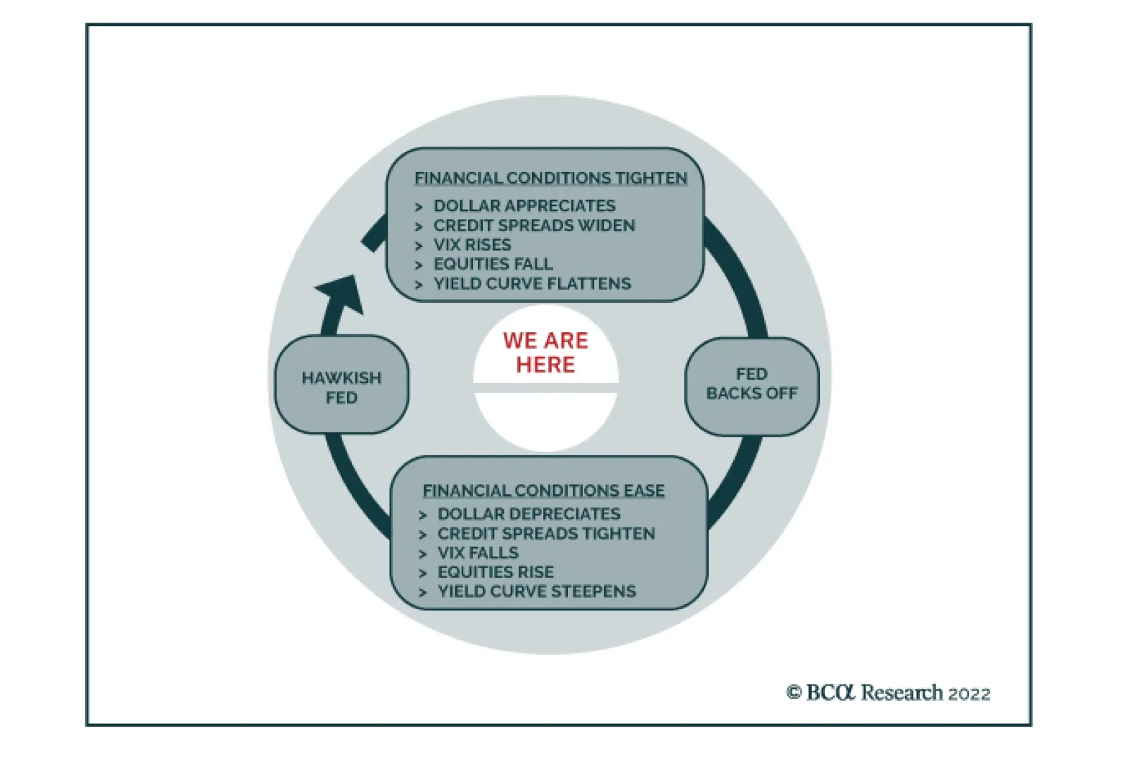
Finally, the Fed provided some details on its plans for reducing the size of its balance sheet.3 The plan follows the same roadmap as the last round of balance sheet runoff. The Fed will start running down its balance sheet sometime after rate hikes begin and it will shrink its balance sheet at a “predictable” pace via the passive runoff of securities. In other words, outright asset sales are highly unlikely. Importantly, Powell repeatedly stressed that he wants balance sheet runoff to occur “in the background”. That is, the Fed will respond to swings in the economic outlook with its interest rate policy and will simply let the balance sheet shrink at a steady pre-announced pace. In line with what we published two weeks ago, we expect balance sheet runoff to commence in May or June and to proceed at a faster pace than last time.4 Constraints On The Pace Of Hiking While Jay Powell’s comments undoubtedly suggest that the Fed intends to deliver between five and seven 25 basis point rate hikes this year, we think it’s more likely that we’ll see three or four. The reason is that the near-term pace of tightening will be constrained by two vital monetary policy inputs: financial conditions and inflation expectations. Financial Conditions This publication has often illustrated the relationship between monetary policy and financial conditions with our Fed Policy Loop (Chart 3). The Loop shows that hawkish monetary policy pivots tend to be followed by periods of tightening financial conditions, i.e. a stronger dollar, flatter yield curve, wider credit spreads and falling equity prices. Indeed, this is exactly the market reaction we’ve witnessed during the past week. The Loop also illustrates that tighter financial conditions then feed back into the market’s pricing of the near-term pace of tightening. It is as if financial markets are a regulator on the near-term pace of hikes. Financial conditions tighten when the expected near-term pace of hiking is too fast. This causes the expected pace to fall, which in turn leads to a renewed easing of financial conditions and then to another hawkish response from the Fed. The top panel of Chart 4 shows that the S&P 500 was performing well even when the market was priced for 75 bps of hiking during the next 12 months. But equities sold off as the bond market moved to price-in 100 bps and then 125 bps of near-term hiking. A similar pattern is observed in excess corporate bond returns (Chart 4, bottom panel). The pattern in Chart 4 suggests that the market is not comfortable with the pace of hiking that is currently priced into the yield curve. This could change, but if the risky asset selloff continues it will eventually lead to a decline in near-term rate hike expectations. Chart 3The Fed Policy Loop
The Best Laid Plans
The Best Laid Plans
Chart 4Five Hikes Too Many
Five Hikes Too Many
Five Hikes Too Many
Inflation Expectations Some may dispute the idea that the near-term pace of rate hikes will slow in response to a selloff in equity and credit markets. Why would the Fed care about the stock market when inflation is the highest it’s been in decades? It’s of course true that higher inflation means that the Fed will be less responsive to swings in financial conditions, though a large enough tightening would certainly get the committee’s attention. We also contend, however, that the inflation picture will look a lot different by the middle of this year. Against a backdrop of lower inflation and inflation expectations, the Fed will have more incentive to slow the pace of hiking in response to tighter financial conditions. On this point, let’s first look at inflation expectations (Chart 5). Short-maturity TIPS breakeven inflation rates remain elevated, but they stopped rising once the Fed started its hawkish pivot. Further out the curve, we see that the 10-year TIPS breakeven inflation rate has dipped in recent weeks and that the 5-year/5-year forward TIPS breakeven inflation rate – the most important indicator of long-term inflation expectations – is now below the Fed’s 2.3% to 2.5% target. Household inflation expectations are high and rising (Chart 5, bottom panel) but, much like short-maturity TIPS breakevens, they are highly sensitive to the realized inflation data. They will come down as inflation moderates in the second half of the year. We remain confident that inflation will come down in 2022, though it will probably stay above the Fed’s 2% target. First, core inflation tends to move toward trimmed mean inflation over time. With 12-month core PCE inflation at 4.85% and 12-month trimmed mean PCE inflation at 3.05%, there is significant room for the core rate to fall (Chart 6). The divergence between core and trimmed mean inflation is attributable to the extremely high inflation rates we’re seeing in the core goods sector (Chart 6, panel 2). The pandemic forced consumers to shift consumption from services to goods, and the quick transition from the delta wave to the omicron wave has meant that a re-balancing back to services has not yet occurred. With the omicron wave peaking, it is likely that the re-balancing will take place this year. In fact, we already see some preliminary signs of peaking goods inflation from the ISM Manufacturing Survey’s Prices Paid component (Chart 6, bottom panel). Chart 6Is Inflation Finally Close To Peaking?
Is Inflation Finally Close To Peaking?
Is Inflation Finally Close To Peaking?
Chart 5Inflation Expectations
Inflation Expectations
Inflation Expectations
In our view, the case for persistently high inflation depends on services inflation accelerating to offset falling goods prices. To that point, we note that service sector inflation is tightly linked to wage growth. While wage growth remains strong, the Employment Cost Index did moderate its pace in 2021 Q4 compared to Q3 (Chart 7).5 Further wage deceleration is also possible this year if fading pandemic concerns spur more people to re-join the labor force. According to the Census Bureau’s Household Pulse Survey, a record 8.75 million workers – many of them in relatively low-paid service jobs – were not working in the second week of January due to pandemic-related reasons (Chart 8). This is a huge potential supply of labor that could come online this year, taking some of the sting out of wage growth. Chart 8Omicron Weighs On Labor Supply
Omicron Weighs On Labor Supply
Omicron Weighs On Labor Supply
Chart 7Is Wage Growth Close To Peaking?
Is Wage Growth Close To Peaking?
Is Wage Growth Close To Peaking?
All in all, the recent shift in market expectations from three-to-four 2022 rate hikes to five 2022 rate hikes has only served to tighten financial conditions and push down inflation expectations. In our view, this makes it less likely that the Fed will actually be able to deliver five or more rate hikes this year. Falling inflation in the back half of the year will give the Fed even less urgency. We expect to see only three or four Fed rate hikes this year. Investment Implications Chart 9Keep Duration Low And Own Steepeners
Keep Duration Low And Own Steepeners
Keep Duration Low And Own Steepeners
As explained above, our view is that the Fed will lift rates three or four times this year, less than the five rate hikes that are currently discounted in the market. It’s also worth noting that we think the endpoint of the tightening cycle will occur at a higher funds rate than is currently discounted in the market. Chart 2 shows that the market is priced for the funds rate to level-off at 1.75% starting in 2024. Our sense is that interest rates will be above 2% when the cycle ends. Survey estimates of the long-run neutral fed funds rate agree with our assessment. The median respondent from the New York Fed’s Survey of Market Participants thinks that interest rates will average 2% in the long run. The median respondent from the Survey of Primary Dealers thinks the long-run neutral rate is 2.25% and the median FOMC participant estimates a rate of 2.5% (Chart 9). A slower initial pace of rate hikes that lasts longer than markets expect and has a higher endpoint leads to two actionable investment ideas. First, we advocate keeping portfolio duration below benchmark. The 5-year/5-year forward Treasury yield is currently 1.96%, below the range of survey estimates of the long-run neutral rate (Chart 9). History suggests that the 5-year/5-year yield will settle into the middle of the range of survey estimates as Fed tightening gets underway. The second investment conclusion is that investors should favor Treasury curve steepeners. Specifically, we advocate buying the 2-year Treasury note versus a duration-matched barbell consisting of cash and the 10-year note. While the 2/10 Treasury slope has flattened dramatically in recent weeks, we see this flattening taking a pause during the next few months (Chart 9, bottom panel). The pause will be driven by the market pricing-in a slower near-term pace of tightening at the front-end of the curve and a higher terminal fed funds rate at the long end. Ryan Swift US Bond Strategist rswift@bcaresearch.com Footnotes 1 Link for both the post-meeting statement and press conference transcript: https://www.federalreserve.gov/monetarypolicy/fomccalendars.htm 2 The Fed generally tightened at a pace of 25 bps per quarter during the 2015-18 cycle. However, it skipped one meeting in 2017 to announce balance sheet reduction plans and it kept rates unchanged between December 2015 and December 2016 in response to a weaker-than-expected economy. 3 https://www.federalreserve.gov/newsevents/pressreleases/monetary20220126c.htm 4 Please see US Bond Strategy Weekly Report, “Positioning For Rate Hikes In The Treasury Market”, dated January 18, 2022. 5 Please see Daily Insights, “US ECI Elevated, Softens On A Sequential Basis”, dated January 31, 2022. Recommended Portfolio Specification Other Recommendations Treasury Index Returns Spread Product Returns