United States
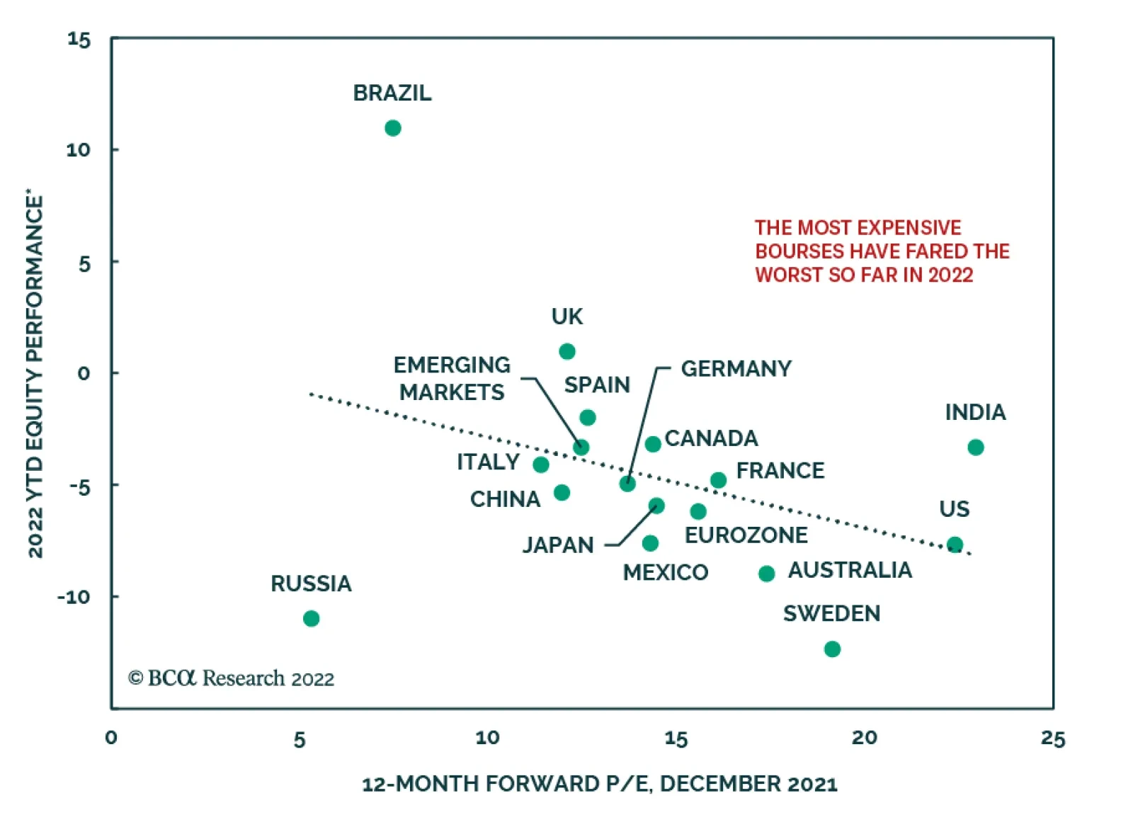
The climb up in government bond yields following the Fed’s late-2021 hawkish pivot is the trigger for the selloff in equity markets globally this month. However, the hit to equities has not been uniform across all global markets. In an insight last week, we…
Global equity markets whose valuations were most expensive going into this year have been hit hardest by the recent equity tumult (see Market Focus). Such has been the fate of US stocks: by the end of last week, the S&P 500 was down 7% so far this year,…

BCA Research is proud to announce a new feature to help clients get the most out of our research: an Executive Summary cover page on each of the BCA Research Reports. We created these summaries to help you quickly capture the main points of each report through an at-a-glance read of key insights, chart of the day, investment recommendations and a bottom line. For a deeper analysis, you may refer to the full BCA Research Report. Executive Summary The Software and Services Industry is undergoing a fundamental transformation in its business model catalyzed by a momentous migration of software applications to the cloud and broad-based digitization of the economy. This shift is accompanied by displacement of the traditional on-prem license and support model with a more lucrative cloud-based subscription model. While on-prem software sales are contracting, cloud revenue is growing in double digits. As a result, the industry enjoys spectacular margins and earnings growth. Its earnings have also proven to be resilient across the business cycle because software and IT services increase companies’ productivity in good times and bad. Rising rates are a headwind, but a temporary one. Margins Will Continue To Expand
Margins Are To Continue Expanding
Margins Are To Continue Expanding
Bottom Line: The Software and Services industry group is an all-weather industry with resilient earnings and strong growth throughout the business cycle. It is also in the epicenter of technological innovation: Migration to the cloud and digital transformation enhance the industry’s growth and profitability. We continue recommending both a tactical and a structural overweight. Feature Performance Technology stocks found themselves in the eye of this month’s market rout. After falling 19% from its peak, the NASDAQ is now firmly in correction territory. The Technology sector is down 11%, while the Software and Services industry group is down 10% (Chart 1). In the “Are We There Yet?” report published last week, we posited that it is not yet the right time to bottom fish: While the Technology sector appears oversold, macroeconomic headwinds from the imminent monetary tightening and a slowdown in demand for technology goods and services may prolong the pain. The interplay of valuations and fundamentals for the sector is not yet favorable. While we are underweight the Technology sector, thanks to our underweight positions in Semiconductors and Hardware and Equipment, we remain overweight Software and Services (S&S). In this report, we will conduct a “deep dive” into S&S and reevaluate our positioning (Table 1). Although S&S is down more than 10% from the peak, it has outperformed the S&P 500 by 88% since 2011 (Chart 2). The million-dollar question we will try to answer is whether this outperformance continues over the tactical and structural time horizons. Chart 1Software And Services Outperformed Other Tech Industries
Software And Services: On The Seventh Cloud
Software And Services: On The Seventh Cloud
Chart 2S&S Outperformed The S&P 500 By 88% Over The Past 10 Years
S&S Outperformed The S&P 500 By 88% Over The Past 10 Years
S&S Outperformed The S&P 500 By 88% Over The Past 10 Years
Table 1Performance
Software And Services: On The Seventh Cloud
Software And Services: On The Seventh Cloud
Sneak Preview: We maintain our overweight of the Software and Services sector thanks to positive market trends, the all-weather nature of the industry, and resilient earnings. Industry Group Composition The Software And Services Industry Group Is Top Heavy The S&P 500 Software and Services industry group is the largest in the Technology sector and is 48% of the sector market cap. The industry group is split between Software, which is about two-thirds of its market cap, and IT Services, which is one-third (Chart 3). Just like other technology industries, it is dominated by one of the FAANGs+M, Microsoft in this case, which makes up 42% of the industry group index weight. The top 10 constituents out of 36 comprise 80% of the industry’s weight (Table 2). During the current pullback, the S&S industry group has fallen by more than 10%, cushioned by the performance of its larger players. But this masks the pain of the smaller and less profitable constituents, which have fallen by more than 30% (Chart 4). Chart 3Software Dwarfs IT Services
Software And Services: On The Seventh Cloud
Software And Services: On The Seventh Cloud
Chart 4Some Smaller Constituents Have Fallen More Than 15% YTD
Software And Services: On The Seventh Cloud
Software And Services: On The Seventh Cloud
Table 2S&S Industry Is Dominated By A Handful Of Successful Companies
Software And Services: On The Seventh Cloud
Software And Services: On The Seventh Cloud
However, market dominance runs much deeper than just market capitalization: Microsoft, Adobe, Salesforce, and Oracle account for 87% of the Software Industry revenue, while Visa, Mastercard, Accenture, and PayPal generate 42% of the IT Services industry revenue. Larger industry players are also more profitable thanks to the high operating leverage the industry enjoys. Clearly, just a few companies drive sales and earnings growth, valuations, and performance. On the bright side, these are some of the most successful US technology companies, and their size is their competitive moat. We believe that the industry group is in “good hands.” Key Trends Cloud Migration Following the success of offshoring the US manufacturing base to China that allowed corporations to reduce labor costs, companies are now experimenting with outsourcing other key infrastructure elements. This time, however, the migration is happening to digital cloud platforms. Instead of investing in pricey servers and other hardware assets, corporations have the choice of going with Software-as-a-Service (SaaS), Platform-as-a-Service (PaaS), or Infrastructure-as-a-Service (IaaS) solutions offered by the tech titans. Not only are cloud solutions more cost-effective, but they also offer the convenience and flexibility to scale corporate hardware infrastructure by simply purchasing more or less computational power. COVID-19 lockdowns and the migration of the white-collar workforce towards remote work have motivated companies to transition their technology and operations to the cloud, and have acted as a catalyst for “digital offshoring.” Digital Transformation Digital transformation is in many ways similar to cloud migration. Essentially, it represents broader software penetration into the US economy. Whether it is a manufacturing production or customer relationship management process, wider adoption of software allows for a more efficient business solution via automation and process optimization. Airbnb and Uber are the poster children of digital transformation. While some industries have already undergone digital transformation, there are notable areas which lag behind. For instance, banks’ failure to modernize their digital infrastructure to speed up transactions and to increase overall user convenience has arguably led to the development of the crypto space as an alternative to the slow-evolving traditional financial institutions. The broader implication is that there are still major sectors in the economy that are yet to ramp up automation and increase efficiencies via digital transformation, meaning that there is a healthy demand pipeline for the tech companies. Types Of Software And Services Companies Software: Migration To The Cloud Is A Key Driver Of Growth In the past, classifying software companies was a relatively straightforward exercise: They were divided into system software vs. application software. System software included such categories as operating systems for PCs, and other hardware and database software. Application software covered Enterprise Resource Planning (ERP), Customer Relationship Management (CRM), Communications and Collaborations, etc. However, over time, the industry landscape has changed, first by the mergers that blurred the distinction across these lines, and lately, thanks to ubiquitous migration to the cloud model and digitization of the economy. Therefore, it is most practical to classify software companies by their type of business model, i.e., legacy license and support model, or cloud-based, or hybrid. Pure cloud-first: These companies derive 100% of their sales from the cloud model – Salesforce.com (CRM), ServiceNow (Now), and Twilio (TWLO) are among the biggest winners. Cloud/license hybrid: These are companies that derive 50%+ of their sales from the cloud, such as Microsoft (MSFT), Atlassian (TEAM), Autodesk (ADSK), and Adobe (ADBE). Legacy license and support model (aka On-Premises): Constellation Software (CSU), Citrix Systems (CTSX) – these companies are likely to struggle to grow organically. Types Of Cloud Application Services The cloud-based business model in turn can be classified under three different types of service: Software-as-a-Service (SaaS), Infrastructure-as-a-Service (IaaS), or Platform-as-a-Service (PaaS). Software-as-a-Service: Customers configure and access a web-based application operated by a SaaS provider over the internet. Salesforce.com, Workday (DAY), ServiceNow, and Oracle are some of the most established players. Infrastructure-as-a-Service: This service gives customers access to virtual storage and servers over the internet, enabling them to develop and run any application just as if it were running in their own data center. Amazon’s AWS, Microsoft’s Azure, and IBM are the key competitors in this space. Platform-as-a-Service: This service occupies a middle ground between SaaS and IaaS, i.e. between a full-fledged app that can be used “out-of-the-box” and a “raw server and storage” instance, making the customer responsible for installing and configuring its own “full stack.” PaaS offerings tend to be less standardized. Salesforce.com, Microsoft, and Oracle are the leaders. IDC projects the continued strength of this segment and expects it to grow at an annualized rate of 29.7% over the next five years. The following table from Microsoft presents a perfect explanation of the different software service models (Table 3). Table 3Differences In Cloud Computing Service Models
Software And Services: On The Seventh Cloud
Software And Services: On The Seventh Cloud
License And Support Vs. Cloud Subscription Model Growth Rates Broad-based migration to the cloud is shifting the industry’s revenue composition, with accelerating bifurcation between cloud and on-prem models: Cloud subscription revenue is replacing the traditional license and support model. As a result, legacy on-prem revenue has recently been contracting, and once the last of the legacy enterprise applications are retired, it will be fully replaced by cloud revenue. According to estimates by CFRA,1 the software industry grew by 4% in 2021, with a 22% year-on-year increase in cloud subscription revenue, which now constitutes 37% of total industry revenue, and a 3% decline in traditional software revenue. The surge in cloud growth is likely to continue, thanks to the accelerating pace of digital transformation. This trend is also promulgated by some of the largest players, such as Microsoft, whose cloud subscription revenue now constitutes more than half of the overall revenue and is an engine of growth in the software space. Strong cloud revenue growth is not just a function of recruiting new users but is also supported by the proliferation of new cloud apps and upgrades to the existing ones. Importantly, the cloud subscription model is also more profitable than the license model, whose EBITDA margins rarely exceed 40%. Cloud-based services take longer to become profitable but have much higher operating leverage: Once profitable, cloud and hybrid companies often have operating margins around 50-60%. Software is one of the most resilient technology industries, performing equally well in a growing economy and during downturns: Subscription pricing is sticky, and switching costs are high. As a result, companies, which derive a large share of their revenue from the cloud, have stable and predictable sales. Once clients are onboarded, cloud providers may also be able to exercise their pricing power. IT Services IT services is a smaller segment of the Software and Services industry group and is a hodge-podge of different companies that provide a wide range of services from IT consulting to FinTech. The following is a brief description of the key categories: IT Consulting: The S&P 500 IT Consulting companies are Accenture, Gartner, and Cognizant. Companies offer Professional advice in IT, management, HR, logistics, and many others. Since the pandemic, these companies’ key focus is on assisting their clients with digital transformation and improving companies’ operations. This industry is one of the key beneficiaries of accelerated migration to the cloud and has enjoyed exponential growth over the past decade. Its revenue stream is highly resilient, as even during economic downturns, clients are seeking advice on the best ways to navigate an uncertain market environment. Outsourcing: Companies such as ADP and Paychex provide HR and business services solutions for mid-sized and small companies. Their services cover payroll, benefits, retirement, and insurance services. This industry has been growing its sales and profits at a healthy clip over the past few years. Now it is focused on modernizing itself by moving its own operations to the cloud and deploying Artificial Intelligence to improve operations. These companies are also undergoing digital transformation and are moving towards the SaaS model. Financial Transaction Services: This is a FinTech industry that includes card and payment processors, such as Visa, Mastercard, and PayPal, and each of these players operates their own proprietary payment networks. Digital payments and the wide acceptance of e-commerce drive this space. Lately, these companies have been at the forefront of the adoption of digital currencies as viable payment options. Payment companies are among the earliest adopters of the cloud, and their business model is best described as Transaction-processing-as-a-service. These are highly profitable companies that consistently generate an operating margin above 60%. Key Industry Drivers Software Enhances Productivity And Improves Profitability Broadly speaking, the Software and Services industry group is considered a defensive holding owing to the resiliency of its earnings (Chart 5). Software enhances productivity: During economic downturns, it helps reduce costs, and during expansions, it helps overcome capacity constraints and labor shortages. While pandemic labor shortages and lockdowns produced a spike in productivity, more recently it has been falling, which has warranted a year-over-year increase in software investment (Chart 6). Chart 5S&S Earnings Are Resilient Across The Business Cycle
S&S Earnings Are Resilient Across The Business Cycle
S&S Earnings Are Resilient Across The Business Cycle
Chart 6Investing In Software Improves Productivity
Investing In Software Improves Productivity
Investing In Software Improves Productivity
Further, both labor shortages and rising wages are prompting companies to redesign their operations to contain costs and preserve margins. To do so, many are accelerating investments in Capex and automation, much of which is achieved through investment in software and IT services, replacing both labor and capital. According to CFRA, “software is no longer used to manage a means of production, but rather IS means of production .” Software-related Capex is not only garnering a larger slice of tech spending budgets but also of the overall Capex pie (Chart 7). Chart 7Share Of Software In Overall Capex Has Been Rising Steadily
Share Of Software In Overall Capex Has Been Rising Steadily
Share Of Software In Overall Capex Has Been Rising Steadily
Macroeconomic Backdrop Imminent Rate Hikes Tighter monetary policy and runaway inflation are at the fore of investors’ minds and, arguably, a cause of the current market rout. Software stocks have outperformed the other long-duration technology stocks. To gauge the reaction of S&S to the upcoming rate hike, we have repeated an exercise we conducted for the Technology sector last week – historical performance of the industry six months before and after the first rate hike (Chart 8). Clearly, industry returns fall two to three months before the first rate hike, but eventually recover once a new monetary regime is priced in. The year-to-date correction of the software stocks is textbook behavior. Chart 8S&S Underperforms Before The First Rate Hike
Software And Services: On The Seventh Cloud
Software And Services: On The Seventh Cloud
Software And Services Is A Global Industry – Beware Of A Strong Dollar The Technology sector is one of the most global sectors in the S&P 500 and derives 40% of sales from abroad; similarly, Software and Services has a broad international footprint. As US rates trend higher, and the interest rate differential favors the US vs. other countries, the USD is likely to appreciate further. With a stronger dollar, products of US software firms are more expensive to foreigners, which may have a dampening effect on demand. The US firms’ profitability has also been hit by an unfavorable translation from foreign currency back to the USD. Historically, the path of the dollar and the returns of S&S were inversely correlated (Chart 9). Chart 9Historically, Stronger Dollar Has Been A Headwind For The Industry
Historically, Stronger Dollar Has Been A Headwind For The Industry
Historically, Stronger Dollar Has Been A Headwind For The Industry
The redeeming grace is that, as we mentioned before, software subscription revenue is sticky, and switching costs for customers are high. As such, we expect the adverse effect on demand to be minor. Fundamentals Sales Growth According to Grandview Research , the business software and services market is expected to grow at a compound annualized rate of 11.3% from 2021 to 2028. This strong growth is underpinned by the robust pace of enterprise application cloud migration and digital transformation, which see no end in sight. The street expects the Software and Services industry to grow on par with the Technology sector at just under 20% over the next 12 months, and growth is slowing off high levels. The pandemic has shifted forward some of the spending on software, as companies rushed to adjust to remote work. However, the industry continues to grow at a healthy clip (Chart 10). Chart 10Sales Growth Is Slowing
Sales Growth Is Slowing
Sales Growth Is Slowing
Labor Costs Are Contained For Now The S&S companies first and foremost rely on the talent and ingenuity of their workforce to deliver cutting-edge technological solutions. Wages are one of the largest expenses in the industry. Recent increases in salaries accompanied by labor shortages and “the great resignation” are bound to cut into the margins of these companies. So far, software and services companies have been able to counter the trend (Chart 11) by deploying creative solutions, offering their employees a wide range of perks, and throwing their net wide in search of talent by offering remote work. Chart 11Industry Labor Costs Have Been Contained
Industry Labor Costs Have Been Contained
Industry Labor Costs Have Been Contained
Resilient Earnings Growth For the reasons discussed above, S&S earnings growth is remarkably resilient and stable throughout the business cycle (Chart 12). Currently, earnings expectations of S&S over the next 12 months exceed growth expectations for both the Technology sector and the S&P 500. Over the next 12 months, S&S earnings are expected to grow at 14% compared to 8.6% for the S&P 500 (Table 4). Chart 12S&S EPS Growth Bests The Tech Sector And The S&P 500
S&S EPS Growth Bests The Tech Sector And The S&P 500
S&S EPS Growth Bests The Tech Sector And The S&P 500
Table 4Earnings Growth Vs. Valuations
Software And Services: On The Seventh Cloud
Software And Services: On The Seventh Cloud
Despite the slowdown in sales growth and the pick-up in labor costs, EBITDA margins have exceeded the previous peak, and are projected to trend higher towards 40% over the course of the year (Chart 13). Expecting a growth slowdown, analysts have been revising earnings expectations down for S&S companies, but by now the downgrading process has run its course, and the bar is set low (Chart 14). Chart 13Margins Will Continue To Expand
Margins Will Continue To Expand
Margins Will Continue To Expand
Chart 14Downgrades Are Bottoming
Downgrades Are Bottoming
Downgrades Are Bottoming
Valuations Since the S&S industry group’s earnings are expected to grow faster than the earnings of the Tech sector and the S&P 500, it is not surprising that it trades with a 44% premium to the S&P 500 on a forward earnings basis – a steep mark-up. The current correction has taken some froth off the industry’s valuations , with multiples contracting by 3.9 points. Even after the correction, the sector appears overvalued (Chart 15). Adjusting for expected 12-month EPS growth, S&S appears more attractively valued and trades with a discount both to tech and the broad market (Table 4). It is also important to note that the industry group is home to a plethora of quite a few smaller companies, which tend to be more expensive and more volatile: Chart 16 plots companies’ forward earnings multiples against their weight in the industry group. Chart 15Valuations Are Still Dear...
Valuations Are Still Dear...
Valuations Are Still Dear...
Chart 16Significant Valuation Dispersion Among The Constituents
Software And Services: On The Seventh Cloud
Software And Services: On The Seventh Cloud
Technicals Recently, the BCA Technical Indicator has moved into the oversold territory, indicating investor capitulation. This means that this bar is cleared, and from a technical standpoint alone, Software and Services is a buy (Chart 17). Chart 17... But Technicals Indicate That S&S Is Oversold
... But Technicals Indicate That S&S Is Oversold
... But Technicals Indicate That S&S Is Oversold
Investment Implications We are both tactically and structurally bullish on the Software and Services industry group. Tactically Bullish The Software and Services industry group is an all-weather industry with an unprecedented combination of both earnings resiliency and strong growth throughout the business cycle. It is also undergoing a fundamental transformation in its business model catalyzed by a ubiquitous shift in software applications to the cloud, accompanied by displacement of the traditional on-prem license and support model with a more lucrative subscription model. The industry is expected to grow earnings in double digits and expand margins, unhindered by rising labor costs. Rising rates are certainly a headwind, but hopefully a temporary one. Froth has come off valuations, and a new monetary regime is gradually getting priced in. According to the technical indicator, the sector is oversold. On balance, we have a positive outlook on the industry group (Table 5) and maintain our overweight position. Table 5Software And Services Scorecard
Software And Services: On The Seventh Cloud
Software And Services: On The Seventh Cloud
Structurally Bullish Our long-held belief is that the broader push to the cloud, augmented reality, AI, cybersecurity, and autonomous driving, which are all software dependent, are not fads but are here to stay. Software and Services are at the epicenter of technological innovation and are home to some of the best American companies. Irene Tunkel Chief Strategist, US Equity Strategy irene.tunkel@bcaresearch.com Footnotes 1 CFRA, Industry Surveys, Software, July 2021 Recommended Allocation
BCA Research is proud to announce a new feature to help clients get the most out of our research: an Executive Summary cover page on each of the BCA Research Reports. We created these summaries to help you quickly capture the main points of each report through an at-a-glance read of key insights, chart of the day, investment recommendations and a bottom line. For a deeper analysis, you may refer to the full BCA Research Report. Executive Summary The tensions between Russia and the West over Ukraine are boiling over, as the risk of a conflict escalates. Following Washington’s written response to Moscow’s demands, BCA’s Geopolitical Strategy team now assigns a 75% probability to a Russian invasion of its neighbor. Matt Gertken, the team’s Chief Strategist, sees only a 10% chance that Russia will aim to conquer the whole of Ukraine. European markets are vulnerable to a Russian retaliation, and so we recommend hedging exposure to Europe and cyclical assets until the situation clears up. The euro remains at risk as long as tensions fester. Who Is Most Vulnerable To A Russian Energy Embargo?
Protection Needed
Protection Needed
Bottom Line: Buy hedges such as short EUR/JPY and short EUR/CHF to protect portfolios against the risk of a conflict in Ukraine. The euro has more downside from here. Feature Handicapping The Risk Of War On Wednesday, after weeks of tense discussions, the US sent back its formal written response to Russia’s demands. Upon analysis of the situation, our geopolitical team concluded that the Biden administration offered no significant concessions. The US will not stop providing weapons to Ukraine, which, from Russia’s perspective, implies that its largest occidental neighbor could become “Russia’s Taiwan, i.e. a foreign-backed military enemy on its door step.” Matt Gertken, BCA’s Geopolitical Strategy team’s Chief Strategist, believes that the probability of a diplomatic solution has fallen to 25%, despite the joint statement made by Russia, Ukraine, France, and Germany on January 26, which reaffirms the ceasefire in the Donbass region of Ukraine. Any minor violation of the ceasefire’s terms by Ukraine will create an excuse for a Russian invasion. The nature of the eventual conflict will be crucial to the economic and market outlook for Europe. Matt argues that Europeans are hamstrung by their large dependence on Russian energy. Even switching to US LNG in case of a crisis this winter will not fill the full gap and cause major economic distress in Europe. As a result, European governments will try to avoid a war in order to limit sanctions so that Russia does not cut energy supply further. However, Europeans are also allied with the US, which will push for sanctions and which is not as afraid of the consequences of a conflict. Faced with this dichotomy, Matt argues that the most likely outcome is that Russia will ultimately concentrate on the Eastern Ukraine. He observes that “Russia, if waging war, will prefer to receive revenues from Europe, as long as Europe is still buying. Thus, Russia will keep its military aims limited so that Germany and other countries have a basis for watering down sanctions to keep the energy flowing and avoid a recession.” In terms of the breakdown of probabilities, he sees a 65% probability of a short conflict whereby the battle is to control Eastern Ukraine, a 10% probability of a Russian effort to conquer the entire country, and a 25% probability of a diplomatic solution. According to Matt, it is too soon to buy the dip. Even if the situation on the ground matches our base case scenario of a limited conflict, Russia will employ a shock-and-awe strategy, creating the first major conflict on European soil since World War II. This will surprise investors and cause a knee-jerk spike in European energy prices. It will produce downside in the euro and in the relative performance of European equities, especially as it could take a few weeks before it becomes clear whether Russian troops will permanently cross the Dnieper. Bottom Line: European markets should brace for some volatility caused by Ukrainian events in the coming weeks. BCA’s geopolitical strategy team assigns only a 25% probability to a diplomatic resolution to the current tensions, a 65% probability to a limited Russian incursion in Ukraine, and a 10% chance of a war for the entire Ukrainian nation. Economic Risks Chart 1A Large Energy Shock For A Recession
Protection Needed
Protection Needed
The economic implications of our base case scenario – a limited conflict – are restricted. As we showed three months ago, energy consumption only represents roughly 2% of European GDP. It would require a durable shock associated with a drawn-out conflict – the 10% probability scenario – to push up this ratio to the levels reached before the GFC, when energy prices were squeezing Europe (Chart 1). Nonetheless, markets will price in this probability as the conflict starts. Thus, understanding which economy is more vulnerable will help assess the risks to the market. The first metric to gauge vulnerability is the role of fossil fuels in the energy mix of European countries. In the event that a conflict causes an increase in energy prices, countries that rely more heavily on fossil fuel will experience a greater shock. On this front, pre-pandemic data from Eurostat shows that the Netherlands, Ireland, Poland, Greece, and Germany are the most exposed nations (Chart 2). By contrast, Sweden, Finland, France, and Denmark are the least exposed as a result of the role of nuclear or wind power generation in these countries. Chart 2Who depends Most On Fossil Fuel?
Protection Needed
Protection Needed
Another metric is the share of a nation’s energy needs fulfilled by imports (Chart 3). On this score, Belgium, Italy, Spain, Greece, and Portugal are the most vulnerable nations, whereas Sweden, the UK, Denmark, and Czechia are the least at risk. Chart 3Who Depends Most On Imported Energy?
Protection Needed
Protection Needed
We can also concentrate on the impact of the risk of a Russian embargo on energy shipments to Western Europe. Chart 4 shows that, when it comes to crude oil, Finland, Poland, Hungary, and, to a lesser extent, Czechia are most vulnerable, whereas Austria, Spain, and Ireland are the least at risk. With respect to natural gas, which is crucial to electricity generation, Czechia, Finland, and Hungary are the three most vulnerable countries, whereas Sweden, Austria, Ireland, and Denmark are not (Chart 5). Chart 4Who Depends Most On Russian Oil?
Protection Needed
Protection Needed
Chart 5Who Depends Most On Russian Natural Gas?
Protection Needed
Protection Needed
We may also combine all these measures and approximate the share of the total energy needs of European countries fulfilled by Russia. Our Vulnerability Index shows that the most exposed nation is by far Hungary, followed by Poland, Germany, Czechia, and Italy (Chart 6). This ranking helps explain why the German government’s support for Ukraine remains somewhat tepid, and why Italian businessmen still held a video call with Russian president Vladimir Putin as recently as last Wednesday. Chart 6Who Is Most Vulnerable To A Russian Energy Embargo?
Protection Needed
Protection Needed
Bottom Line: Hungary, Poland, Germany, Czechia, and Italy are the European nations most exposed to an energy crisis in the event of a drawn-out, all-out war in Ukraine, whereas Austria, Sweden, Denmark, Ireland, and the UK are the least exposed. This scenario carries only a 10% probability, but understanding its impact is important, since investors will have to adjust their expectations once a conflict begins in the Ukraine. The ECB Response The ECB response to a Ukrainian conflict will depend on the nature of the war. In our base case scenario involving a limited assault focused on Eastern Ukraine, the ECB will look at any energy shock and its impact on inflation as temporary. European wage gains remain limited (Chart 7), and the Governing Council will assume that any spike in energy prices will not last long enough to dislodge European inflation expectations. This picture will be very different if Russia tries to conquer Western Ukraine as well. While the potential energy embargo will most likely cause a European recession, it will also risk pushing up inflation expectations permanently. Because expectations are already close to the ECB’s objective (Chart 8), the ECB will respond by tightening policy, which many members of the GC will want. This action is likely to accentuate any recessionary pressures in Europe. Again, we cannot stress enough that this constitutes a tail risk and is not our base case scenario. Chart 7European Wage Growth Remains Tame
European Wage Growth Remains Tame
European Wage Growth Remains Tame
Chart 8Inflation Expectations Could Become Unmoored
Inflation Expectations Could Become Unmoored
Inflation Expectations Could Become Unmoored
Market Implications The Euro Three weeks ago, we wrote that the euro was not ready to bottom because the risks associated with a slowing Chinese economy, the continued economic impact of Omicron, and the volatility of the natural gas market were still too considerable. Chart 9Another Wave Of Euro Selling
Another Wave Of Euro Selling
Another Wave Of Euro Selling
This is even more true after last week’s Fed press conference, when FOMC Chair Jerome Powell did not contest the aggressive market pricing in the OIS curve. As a result, the window remains open in the near-term for interest rate differentials to move in a euro-bearish fashion (Chart 9). Ukraine adds another near-term threat to the euro. First, the run-up to an invasion, whether total or partial, will create a risk-off wave in global markets. Geopolitically driven sell-offs are most often associated with a rise in the counter-cyclical dollar, which is euro-bearish. The Swiss franc too would benefit against the euro. Moreover, Europe is much more exposed than the US to the economic consequences of a Ukrainian crisis. Obviously, our base case scenario implies a shorter and shallower sell-off than what would happen if Russia tried to conquer the whole of Ukraine. Nonetheless, a move below EUR/USD 1.10 now carries a greater than 40% probability. Bunds In our base case scenario of a limited Russian incursion in Ukraine, we should see a temporary dip in German yields driven by risk aversion. However, larger economic forces continue to point toward higher yields around the world, including in Germany. In our tail risk scenario, the German yield curve is likely to invert. ECB rate hikes will not be enough to push up 10-year yields, as markets will reflect that these increases will be temporary because of the associated recession. Instead, German 10-year yields will regress toward their 2021 lows of -0.55%. Equities Chart 10European Stocks Are Now Cheap
European Stocks Are Now Cheap
European Stocks Are Now Cheap
Since mid-December, European equities have been outperforming US equities on the back of rising yields. We expect European shares to continue to outperform US stocks over the remainder of the year. As we wrote two weeks ago, European stocks possess a more generous valuation cushion against higher yields than their US counterparts, especially now that forward multiples have fallen back to 15.4, their lowest levels since May 2020 (Chart 10). Moreover, the greater cyclicality of European stocks means that they will benefit from an eventual stabilization of the Chinese economy by the latter half of 2022. They also stand to gain from a gradual normalization of the terminal rate proxy over the coming years, which often coincides with an outperformance of value stocks over growth names. Despite this positive outlook, the Ukrainian crisis poses a considerable near-term risk, even in the base case scenario of a limited Russian military aim. The wave of risk aversion will hurt the euro, which arithmetically will weigh on the relative performance of European stocks in common currency terms. Moreover, the more pro-cyclical profile of European stocks will accentuate their vulnerability in a geopolitical crisis. However, the temporary nature of the risk-off wave means that the woes suffered by Europe will also be transitory. Under the tail risk scenario, European equities will not be capable of outperforming those of the US for many months because of the high recession risk that will engulf the region. High energy prices will destroy the profit margins of European companies, which will already suffer from a hit to their top line-growth. US equities will suffer too, but significantly less so. Chart 11European Cyclicals Are Exposed To A Crisis In Ukraine
European Cyclicals Are Exposed To A Crisis In Ukraine
European Cyclicals Are Exposed To A Crisis In Ukraine
Sector wise, a Ukrainian crisis will also short circuit the outperformance of European cyclicals over defensive equities. For now, European cyclicals have managed to generate alpha, despite the market correction (Chart 11), but the risk of a recession will affect this trend. Under our base case scenario, the underperformance will be short-lived, even if it proves severe; however, under the tail risk scenario, the cyclicals-to-defensives ratio will plunge toward the bottom of its historical range. Within defensive sectors, utilities will likely underperform, especially if the tail risk scenario comes to fruition. European governments will not allow utilities to pass on the full increase in natural gas prices to consumers, which will create a major compression in utilities’ profit margins. For cyclical names, consumer discretionary will bear the brunt of any sell-off. They are relatively pricey and the combination of the potential shock to household disposable income and rising risk aversion will prove to be lethal. The sales and profit margins of industrials will be under stress. However, this shock will be transitory if the Ukrainian crisis remains contained in our base-case scenario. Chart 12The Russian Exposure Of European Banks
Protection Needed
Protection Needed
Financials carry their own risk in the context of a drawn-out Ukrainian crisis. European banks have exposure to Russia equal to $106 billion, concentrated in France and Switzerland (Chart 12). In and of itself, this is small. However, if European nations impose large enough sanctions on Russia, not only will that country cut its energy shipments to Western Europe, but Russian firms will also likely default on their foreign obligations, emboldened by Russia’s robust FX reserves and balance of payments. In the context of a recession wherein the ECB also hikes rates, these defaults will add considerable stress to the European banking sector. Thus, under our tail risk scenario, financials could perform particularly poorly. In terms of the implications for countries, Germany is the most exposed of all the major European markets to a Ukrainian crisis because of its high energy dependence on Russia and fossil fuels. The recent underperformance of German equities when we correct for sectoral bias probably already reflects the recent rise in electricity costs in the country, which hurt German firms versus their European competitors (Chart 13). While we like the fundamentals of European small-cap stocks, we have remained on the sidelines because of the strong correlation between their relative performance and the trade-weighted euro (Chart 14). The risks surrounding Ukraine and their implications for both the euro and the European economy suggest it is still too dangerous to pull the trigger and overweight small-cap in Europe. However, if our base case scenario of a limited conflict comes true, then this will create the perfect opportunity to move into the European small-cap space. Chart 13German Suffers A Nat Gas Discount
German Suffers A Nat Gas Discount
German Suffers A Nat Gas Discount
Chart 14Small-Caps Need A Euro Bottom
Small-Caps Need A Euro Bottom
Small-Caps Need A Euro Bottom
Investment Implications Considering the probability distribution laid out by BCA’s Geopolitical Strategy team, whose base case scenario is a limited Russian incursion into Ukraine, we do not expect NATO countries to impose sanctions severe enough to force Russia to cut Western Europe’s energy supply. Nonetheless, the prospect of the most significant military conflict on European soil since World War II will have a significant impact on European asset prices, even if this effect is transitory. As a result, we still maintain our preference for cyclical equities in Europe and still expect European equities to outperform US stocks over the course of 2022. We also continue to anticipate that European stocks will outperform Bunds in 2022. Nonetheless, ahead of the conflict, we recommend investors buy some hedges, such as short EUR/CHF and EUR/JPY to protect against downside risk. Rapidly after the conflict begins, an opportunity to close those hedges will emerge. With respect to the euro, the combined stress from a hawkish Fed and Ukrainian risks means we will stay on the sidelines after having been stopped out of our long EUR/USD trade. If our base case of a limited conflict does come to fruition and Russia instead initiates a full invasion of Ukraine, we will shift our portfolio to a fully defensive stance. The euro could re-test parity or even drop below it. Mathieu Savary, Chief European Strategist Mathieu@bcaresearch.com Tactical Recommendations Cyclical Recommendations Structural Recommendations Closed Trades Currency Performance Fixed Income Performance Equity Performance
The Q4 US Employment Cost Index was somewhat mixed. It decelerated from 1.3% to 1.0% on a quarter-on-quarter basis – falling below the anticipated 1.2%. However, the annual rate accelerated to a two-decade high of 4% y/y from 3.7% in Q3. Elevated wage…
The signal from the US Q4 GDP release is that consumption remains a healthy component of the US economic expansion. The 3.3% q/q increase in personal consumption is above the average 2.5% q/q recorded over the 2015-2019 period. True, the positive consumption…
HighlightsThe current surge in US measured productivity looks very unlike what occurred in the mid-to-late 1990s. A detailed breakdown of labor productivity growth points to atypical labor market compositional effects – namely a significant decline in services employment – as being responsible for the apparent rise in productivity. In addition, technological disinflation, a major ingredient of the late 1990s “disinflationary boom”, is absent today.A cross-country comparison of the growth in output per worker during the pandemic can be mostly explained by differences in the fiscal response to the crisis. US output per worker surged compared to other countries, but the US fiscal response also generated a significant amount of excess income to support economic activity – unlike in the euro area, UK, and Japan.Micro-level arguments and some academic studies argue against the idea that work from home arrangements will ultimately be productivity-enhancing. Remote work makes it more difficult for firms to train the next generation of senior employees, which will raise the staffing risks for many businesses.While the long-term outlook for technologically-driven productivity growth is positive, projected commercialization timelines for several well-known technologies under development do not point to an imminent, inflation-offsetting boom in potential output.If inflation remains significantly above target after the pandemic is over, the Fed’s long-term interest rate projections may rise. US stocks would suffer potentially large losses in a scenario where 10-year US Treasury yields rise towards the potential growth rate of the economy. Investors should consider reducing their equity exposure if 5-year, 5-year forward US Treasury yields break above 2.5%. We do not expect that to occur this year, which for now justifies an overweight stance towards risky assets.Feature Chart II-1A Pandemic-Driven Productivity Surge?
A Pandemic-Driven Productivity Surge?
A Pandemic-Driven Productivity Surge?
The behavior of US labor productivity during the COVID-19 pandemic has raised several questions among investors. As defined by output per hour worked, US productivity accelerated significantly over the first six quarters of the COVID-19 pandemic, but then fell sharply in Q3 2021 (Chart II-1). While some market participants have questioned the cause of the recent decline, investors have generally been more interested in the question of whether the US is in the middle of a long-lasting productivity surge that will help alleviate inflationary pressure – akin to what occurred in the second half of the 1990s.In this report, we review the recent surge in US labor productivity in contrast to what occurred in the late-1990s, and then compare it with what has occurred globally. While we are not pessimistic about the pace of technological advancement and its potential to drive long-run productivity, we conclude that the US is not likely experiencing a sustained productivity boom driven by technological adoption during the pandemic. This underscores why investors should not expect a significant increase in potential output owing to the pandemic or its effects. It also highlights that, if elevated inflation in response to strongly positive output gaps were to occur over the coming few years, it would likely be met by significantly tighter fiscal or monetary policy.Today Versus The 1990s: Total Factor Productivity Versus Capital Intensity Chart II-2The Technologically-Driven US Productivity Surge In The 1990s Was A Major Macro Event
The Technologically-Driven US Productivity Surge In The 1990s Was A Major Macro Event
The Technologically-Driven US Productivity Surge In The 1990s Was A Major Macro Event
A technologically-driven surge in productivity growth in the second half of the 1990s was a highly significant macroeconomic event. Chart II-2 highlights that US labor productivity surged to over 3% from 1995 to 2000, alongside a significant deceleration in core PCE inflation and a sizeable acceleration in potential GDP growth.Given the acceleration in measured productivity during the pandemic, and the accompanying rapid adoption (or broader use) of technology, it is easy to see why some investors have questioned whether a 1990s-style productivity boom is underway. However, a detailed breakdown of the 2020 rise in labor productivity growth highlights substantial differences between the current environment and that of the late 1990s, which points instead to compositional effects as the main driver.Improvements in labor productivity can come from smarter workers, an increase in the amount of capital employed per worker, or from technological innovations and better working practices. The US Bureau of Labor Statistics provides a breakdown of the annual change in labor productivity that attempts to capture these three components:The contribution from shifts in labor composition: This measures the productivity impact of changes in the age, education, and gender structure of the labor force.The contribution from capital intensity: This measures the productivity impact of shifts in the amount of capital equipment available per worker.Total factor (or “multifactor”) productivity: This measures the changes in output per hour that cannot be accounted for by the above two factors. Thus, it includes the effects of technological changes, returns to scale, shifts in the allocation of resources, and other changes in operating procedures.Examining the 2020 rise in labor productivity growth along these three factors underscores key differences between the current environment and that of the late 1990s.The first point for investors to note is that the acceleration in labor productivity in 2020 occurred alongside a contraction in total factor productivity (TFP) growth, in contrast to the 1990s when TFP drove labor productivity (Chart II-3). The fact that TFP growth fell in 2020 means that the increase in labor productivity must have occurred either because of labor composition or capital intensity effects.In 2020, labor composition contributed somewhat to accelerating labor productivity, but that most of the increase was caused by a sharp increase in capital intensity. Some of the increase in overall capital intensity occurred because of an increase in the intensity of information processing equipment and intellectual property products (supporting the idea of an increase in pandemic-driven capital deployment), but this was outstripped by the contribution of “other” capital services (Chart II-4). Chart II-3Total Factor Productivity Collapsed In 2020, Unlike In The 1990s
Total Factor Productivity Collapsed In 2020, Unlike In The 1990s
Total Factor Productivity Collapsed In 2020, Unlike In The 1990s
Chart II-4The Surge In US Capital Intensity Reflects A Rapid Compositional Shift In The Labor Market
February 2022
February 2022
The concept of capital intensity refers to the amount of capital available per worker, but in practice it is measured as the ratio of the amount of capital used relative to the amount of labor hours used to produce output. Thus, a surge in capital intensity that is not accounted for by an increase in the amount of tech-related capital available to workers points to a rapid compositional shift in the economy from relatively low capital-intensive industries to relatively high-intensive industries.Under less extreme economic circumstances we would be more inclined to search for other potential causes of a rapid increase in measured capital intensity, but a shift in employment from less to more capital-intensive industries is exactly what has occurred during the pandemic. Services jobs tend to be much more labor-intensive than goods-producing jobs; Chart II-5 highlights that the former fell far more than the latter during the pandemic, in sharp contrast to what normally occurs during a recession (Chart II-6). This phenomenon is also reflected in a highly unusual decline in services spending compared with very strong goods spending relative to their pre-pandemic trend. Chart II-5Employment In Low Capital Intensity Services-Producing Industries Fell Far More Than Goods-Producing
Employment In Low Capital Intensity Services-Producing Industries Fell Far More Than Goods-Producing
Employment In Low Capital Intensity Services-Producing Industries Fell Far More Than Goods-Producing
Chart II-6The Sharp Decline In Services Jobs During The Pandemic Was Unprecedented
The Sharp Decline In Services Jobs During The Pandemic Was Unprecedented
The Sharp Decline In Services Jobs During The Pandemic Was Unprecedented
The takeaway for investors is that the nature of the pandemic and its unique impact on the economy has created the appearance of an acceleration in productivity, when in reality true productivity has fallen and the standard measure of productivity is being flattered by enormous changes in the composition of the labor market.Today Versus The 1990s: IT Investment, And Technological DisinflationThe trends in IT investment and prices highlight another major difference between the current environment and that of the late 1990s. Charts II-7 and II-8 highlight recent trends in comparison to those of the 1990s, with the following notable points: Chart II-7There Are Major Differences Between IT Investment And Prices Today Versus The 1990s
There Are Major Differences Between IT Investment And Prices Today Versus The 1990s
There Are Major Differences Between IT Investment And Prices Today Versus The 1990s
Chart II-8A One-Off Move
A One-Off Move
A One-Off Move
The recent pace of real investment in total IT does not point to the pandemic as a sustained source of productivity growth. Real investment in IT has already slowed significantly, in contrast to the 1990s when it accelerated on a sustained basis for years.IT investment as a % of GDP and of total plant and equipment spending has already stopped rising (or is now falling), exhibiting clear signs of a one-off shift and thus undermining the view that IT investment has significantly raised potential output.In pronounced contrast to the mid-1990s when IT equipment prices were collapsing, computing equipment inflation has recently risen into positive territory – to the highest levels recorded since the data became available in 1959.Higher prices for IT equipment clearly reflect, at least in part, pandemic-driven pressure on global supply chains and the production of semiconductors. So we do not expect sustained increases in the price of computing equipment. But the key point for investors is that a major ingredient of the late 1990s “disinflationary boom” is missing today.The US Versus The WorldWe have presented Chart II-9 in previous reports to highlight that there is certainly no evidence of a global productivity surge, using output per worker as a proxy for the standard measure of labor productivity (output per hour worked). Some investors have countered that the US is a more dynamic economy, and that a sustained productivity boom would be more apparent in the US prior to its emergence in other countries. Or simply that the US alone is experiencing a productivity boom that will help reduce very elevated US inflation, with strong implications for Fed policy. Chart II-9During The Pandemic, Cross-Country Changes In Real Output Per Worker…
February 2022
February 2022
Chart II-10…Are Mostly Explained By Different Fiscal Responses
February 2022
February 2022
Chart II-11High US Real Output Per Worker Also Reflects A Lagging Jobs Recovery Relative To Pre-Pandemic Levels
High US Real Output Per Worker Also Reflects A Lagging Jobs Recovery Relative To Pre-Pandemic Levels
High US Real Output Per Worker Also Reflects A Lagging Jobs Recovery Relative To Pre-Pandemic Levels
Charts II-10 and II-11 present a different cross-country comparison that reinforces the view that the US is not likely experiencing a long-lasting productivity surge that will help reduce inflation. Chart II-10 highlights that in the face of a significant decline in employment, US output was supported by a substantial amount of “excess income” – the cumulative amount of household disposable income earned over the course of the pandemic in excess of what would have been predicted based on the pre-pandemic trend.Other major DM economies (such as the UK and euro area) either saw negative excess income or a modestly positive amount (Japan), underscoring that the fiscal response to the pandemic in most advanced economies was aimed at stabilizing income rather than raising it. In combination with Chart II-11 – which highlights that the US labor market recovery has significantly lagged behind the European and Canadian economies in terms of returning to the pre-pandemic employment trend – this would appear to explain why the US has experienced stronger real output per worker than other countries. Chart II-12Given A Similar Fiscal Response, Would The US Have Canada's Job Recovery If It Had Less COVID Cases?
Given A Similar Fiscal Response, Would The US Have Canada's Job Recovery If It Had Less COVID Cases?
Given A Similar Fiscal Response, Would The US Have Canada's Job Recovery If It Had Less COVID Cases?
Canada stands out as the outlier compared with the US, in the sense that it’s growth in real output per worker has been much lower but Canadian fiscal policy created a similar amount of excess income. However, it may be the case that the Canadian experience highlights that the US labor market recovery is the outlier, which could imply that the surge in US labor productivity may in fact have inflationary rather than disinflationary consequences at the margin.We discussed the factors that we believe are driving the slow recovery in the US working-age population in our 2022 annual outlook report, and how they are strongly linked to the pandemic. However, Canada has also clearly been affected by COVID-19, and yet it has experienced a more significant recovery in jobs.Chart II-12 highlights that there has been one major difference between the US and Canada during the pandemic: a substantial gap in the burden of disease from COVID-19. This raises the question of whether Canada has outperformed the US in terms of its labor market recovery, despite a similarly impactful fiscal response, because of a smaller labor shortage stemming from long-term COVID symptoms.Over the past two years, there have been many reports about people who have recovered from COVID but who continue to experience some symptoms of the disease. The medical community has labeled this condition as post-acute sequelae of SARS-CoV-2 infection (PASC), colloquially referred to as “long COVID.” Chart II-13Long-COVID Might Help Explain The US’ Lagged Return To Pre-Pandemic Employment
February 2022
February 2022
The medical community’s understanding of long COVID is currently poor, and doctors do not know why some people get the condition or what treatment options are likely to be the most effective. Given this, it is possible that some reports of long COVID are, in fact, related to other conditions.But a recent research report from Brookings estimated that the US labor market may be missing 1.6 million workers because of long COVID’s effects (Chart II-13), which alone would account for 1 percentage point (or roughly 1/4th) of the growth in US real output per worker since the pandemic began. This circumstance would be inflationary rather than disinflationary on the margin, as it would imply that accelerating first and second quartile US wage growth may be sticky even as the pandemic recedes.Is Working From Home Positive For Productivity?We have noted above that the macro data argues against the idea of a sustained rise in US productivity stemming from the pandemic. A more micro-level perspective, one that examines the working-from-home (WFH) experience, also appears to support our case.It is true that surveys of employees highlight that their experience of WFH has been significantly better on average than workers expected and report their being more productive while working from home during the pandemic. Chart II-14 emphasizes that, based on the running surveys from Barrero, Bloom, and Davis (“BBD”), 60% of workers have conveyed better WFH outcomes relative to expectations, versus just 14% reporting worse outcomes. In addition, Chart II-15 clearly highlights that workers prefer at least some form of hybrid WFH arrangement, with just 22% of survey respondents reporting the desire to work from home either rarely or never. Chart II-14Remote Workers Have Reported Better Work-From-Home Outcomes Than What Was Expected
February 2022
February 2022
Chart II-15Remote Workers Clearly Prefer A Hybrid Work Model
February 2022
February 2022
However, worker preferences do not necessarily correlate with productivity gains, at least not to the same degree. Chart II-16 from the BBD surveys highlights that the share of workers reporting more efficiency while working from home is not as large as those reporting better outcomes relative to expectations, suggesting that employees are considering whether WFH arrangements are benefiting them personally when responding to their desired post-pandemic level of remote work. Chart II-17 also shows that employees working from home only spend a third of the time ordinarily allocated to commuting to working on their primary job; the rest is spent on childcare, leisure, home improvement, or working on a second job (which may or may not be a sustainable source of income). Chart II-16Less Than Half Of Workers Report Being More Efficient While Working Remotely
February 2022
February 2022
Chart II-17Only 1/3rd Of Time Saved Commuting Is Spent On Primary Employment
February 2022
February 2022
There is also some evidence from academic studies that indicates productivity fell during the pandemic for some remote workers. Michael Gibbs, Friederike Mengel, and Christoph Siemroth (2021) surveyed 10,000 professionals at a large Asian IT services company, and found that productivity declined because of a slight decline in average output and a rise in hours worked.1 Admittedly, elements of the study did point to some factors potentially impacting this decline in productivity that were more prominent in the earlier phase of the pandemic, specifically the issue of childcare (which would not likely be a drag on remote worker productivity in a post-pandemic environment).But it also noted that employees with a longer company tenure fared better, which in our view is an often overlooked element of remote work that points to less future productivity gains from WFH arrangements than may be recognized by investors. The outperformance of senior staff in a WFH environment is not particularly surprising: once employees have accrued significant experience, they spend less of their working time learning and more (or all) of their working time “doing.” It makes sense that employees who predominantly “platform” their existing experience may fare the same or better in a WFH arrangement, but it is highly questionable whether it is sustainable, because it makes it much more difficult for businesses to train the next generation of senior employees.The Gibbs, Mengel, and Siemroth study noted that higher communication and coordination costs featured prominently in their findings of reduced remote worker productivity. Importantly, they found that employees communicated with fewer individuals and business units, both inside and outside the firm, and received less coaching and one-to-one meetings with supervisors. While some firms may be able to mitigate these risks to the advancement and development of more junior staff while maintaining a hybrid on-site / WFH model, we suspect that many firms will fail to do so fully.Future Productivity: Pessimism Unwarranted, But No Inflation SalvationThe fact that the US is not likely in the middle of a pandemic-driven productivity boom does not mean that the outlook for productivity is poor. In fact, we would point to two factors that lead us to believe that productivity growth will be better in the future than it has been over the past decade:The pronounced consumer deleveraging phase that existed for several years following the global financial crisis is over, andThere are several identifiable technologies currently under development that are likely to have legitimate commercial applications and productivity-enhancing benefits in the futureOn the first point, we have contended in previous reports that the weak productivity growth observed during the first half of the last economic expansion was because of demand rather than supply-side factors. This notion is jarring for many investors, who are accustomed to think of productivity trends as being exclusively driven by supply-side phenomena. This is typically correct, in that the cyclical impact of fluctuating aggregate demand on measured productivity – particularly during and immediately after recessions – is usually temporary in nature.However, the 2008/2009 recession was highly atypical, in the sense that it was a household “balance sheet” recession rather than a normal “income” recession. This led to a prolonged period of US household deleveraging, below-average corporate sales growth, and poor growth in output per hour worked. In effect, the post-2008 deleveraging phase created a long-lasting, multi-year cyclical effect on measured productivity growth.In early-2009, pessimistic investors held to an understandable reason for why they doubted the sustainability of the economic recovery: there could be no meaningful labor market recovery if businesses expected several years of weak demand because of the likelihood of consumer deleveraging. In this respect, the post-2008 period served as an important natural experiment for macroeconomists and investors: we have learned that the response of firms to a durable but shallow economic recovery is, on the one hand, to hire additional workers, but, on the other hand, also to control wage and salary costs aggressively. Chart II-18Slow Productivity Growth Last Cycle Was A Demand Story, Not A Supply Story
February 2022
February 2022
Chart II-18 encapsulates the point that weak productivity during the last economic cycle was closely tied to US household deleveraging. The chart highlights that the decline in total factor productivity due to goods-producing industries – heavily concentrated in manufacturing – was much larger than for private services from 2007 to 2019. Since there was no technological slowdown that disproportionally impacted the manufacturing industry during the period, this clearly points to demand-side rather than supply-side factors as the main driver of the post-GFC productivity slowdown.On the second point about future productivity growth, Table II-1 outlines five well-known technologies that are in various stages of development and are likely to lead to significant applications at some point in the future: artificial intelligence, automated driving (a specific application of AI), quantum computing, augmented/virtual reality and human-machine interface, and CRISPR/gene editing. The table outlines the nature of potential future applications, as well as projections from McKinsey Global Institute about the most likely commercialization timeline. Table II-1Technological Advancement Is Ongoing. It Won’t Likely Help Fight Inflation Over The Next Few Years
February 2022
February 2022
A detailed analysis of each of these technologies is beyond the scope of this report, but Table II-1 underscores two key points for investors. The first is that further, technologically-driven productivity growth is not just possible, it is likely. It is clear what advancements will probably drive these productivity gains, and Table II-1 highlights only the most well-known technologies to which experts in the field would point to.The second point is that most major changes from these technologies are projected to occur beyond 2025, and, in many cases, beyond this decade. In the case of quantum computing, while it could potentially lead to an explosion of algorithmic power that would almost certainly have major commercial implications, it is even possible that this technology will initially subtract from total factor productivity growth before contributing positively. This is because of its potential to render much of the existing global internet security and privacy infrastructure useless, as highlighted by a NIST Cybersecurity White Paper last April:“Continued progress in the development of quantum computing foreshadows a particularly disruptive cryptographic transition. All widely used public-key cryptographic algorithms are theoretically vulnerable to attacks based on Shor’s algorithm, but the algorithm depends upon operations that can only be achieved by a large-scale quantum computer. Practical quantum computing, when available to cyber adversaries, will break the security of nearly all modern public-key cryptographic systems.”2Some experts believe that the preparation required to avoid this outcome may dwarf that of the millennium bug (“Y2K”) problem of the late-1990s,3 which cost roughly 1% of GDP to fix – and thus was clearly not productivity-enhancing.The bottom line for investors is that while the long-term outlook for technologically-driven productivity growth is bright, it is unlikely to save the US and/or global economies from elevated inflation over the next several years if output gaps in advanced economies rise to strongly positive levels in the wake of the pandemic.Investment ConclusionsOur analysis above has highlighted that the current surge in measured productivity looks very unlike what occurred in the mid-to-late 1990s, and that very atypical labor market compositional effects are likely responsible for the apparent rise in labor productivity. We have also highlighted that a cross-country comparison of the growth in output per worker during the pandemic can be mostly explained by differences in the fiscal response to the pandemic, and that there are micro-level arguments against the idea that work from home arrangements are productivity-enhancing. Finally, while the long-term outlook for technologically-driven productivity growth is positive, projected commercialization timelines for several well-known technologies under development do not point to an imminent, inflation-offsetting boom in potential output.While we believe that the COVID-19 pandemic will recede in importance this year, it is not yet over. As such, investors do not yet know how strong the output gap in the US and other advanced economies will be on average over the coming two to three years, or what the pace of consumer price inflation will look like in the face of strong aggregate demand but substantially lower (or no) pressure from the supply-side of the economy (as we expect). Chart II-19There Is A Lot Of Downside For Stocks If Bond Yields Rise To Potential Growth Rates
There Is A Lot Of Downside For Stocks If Bond Yields Rise To Potential Growth Rates
There Is A Lot Of Downside For Stocks If Bond Yields Rise To Potential Growth Rates
In a scenario in which aggregate demand remains strong next year and inflation remains above-target, even in the face of Fed tightening and a normalization in services/goods spending, we would expect to see significantly tighter fiscal or monetary policy. This is a scenario in which the secular stagnation narrative, which underpins the Fed’s low long-term interest rate projection, would likely be aggressively challenged by investors. Chart II-19 highlights that US equities would potentially suffer a 24% contraction in the forward P/E in a scenario in which the equity risk premium is in line with its historical average and 10-year US Treasury yields rise to the potential growth rate of the economy.We do not yet believe that a significant rise in long-term interest rate expectations will occur this year, meaning that investors should still be overweight stocks versus government bonds over the coming 6-12 months. But as we noted in last month’s report, we may recommend that investors reduce their equity exposure if 5-year, 5-year forward Treasury yields break above 2.5% (the FOMC’s long-run Fed funds rate projection), which we noted in Section 1 of our report is 50 basis points above current levels.Jonathan LaBerge, CFAVice PresidentThe Bank Credit AnalystFootnotes1 Michael Gibbs, Friederike Mengel, and Christoph Siemroth. “Work from Home & Productivity: Evidence from Personnel & Analytics Data.” Working Paper No. 2021-56. July 13, 2021. Pp. 1-30.2 William Barker, William Polk, and Murugiah Souppaya. “Getting Ready for Post-Quantum Cryptography: Exploring Challenges Associated with Adopting and Using Post-Quantum Cryptographic Algorithms.” National Institute of Standards and Technology, US Department of Commerce. April 28, 2021. Pp. 1-7.3 Jonathan Ruane, Andrew McAfee, and William Oliver. “Quantum Computing for Business Leaders.” Harvard Business Review, January-February 2022.
Highlights The combination of a temporarily negative domestic demand effect and a lingering domestic labor and global supply chain effect from the Omicron variant has increased the urgency for the Fed to raise interest rates. The central bank’s credibility has been significantly challenged over the past year by the extent of the rise in consumer prices, and it will move forward with a rate hike at its March meeting. We expect that the Fed funds rate will rise to 1% by the end of this year. The Fed’s asset purchase reductions will not have a direct impact on economic activity, but they could have an indirect effect by prompting a faster rise in US Treasury yields towards their fair value levels. The US 10-year yield could potentially rise to 2.3-2.4% at some point in the first half of the year, rather than by the end of 2022 as we previously expected. Part of the generalized rise in risk premia this month relates to the potential Russian invasion of Ukraine, but the sell-off in equity prices also appears to reflect an overall level of investor discomfort with rising interest rates. Rising long-maturity bond yields are being driven by the short end of the curve, which we see as a sign that the generalized selloff in the US equity market is uncalled for. Investors should buy the US stock market at current levels on a 6-12 month time horizon. It is too early to position aggressively towards China-sensitive commodities and global ex-US stocks, despite the recent pickup in our market-based growth indicator for China. We are more comfortable with a bullish view toward industrial metals in the latter half of 2022, and recommend that investors buy metals on any dips in prices. A Russian invasion of Ukraine has become a likely event, suggesting that investors need to decide now whether to reduce risky asset exposure. The invasion has not yet occurred as we go to press, but could happen at any moment. All told, we doubt that a minor invasion will have a lasting, full-year impact on financial markets, but investors should gird for a risk-off reaction over shorter-term time horizons. Omicron, The Supply-Side, And The Fed January was a poor month for the global equity market, which sold off 10% from its high at the beginning of the year. Chart I-1 highlights that in the US, the S&P 500 has now fallen below its 200-day moving average, in contrast to global ex-US stocks which have fared somewhat better in US$ terms. Equities have declined this month because of a combination of imminent Fed tightening and a geopolitical crisis, both of which we will discuss in detail below. On the pandemic front, the number of confirmed cases of COVID-19 has surged globally (Chart I-2), which is likely an underestimation of the total number of infections given capacity limits on testing in many countries. Panel 2 highlights that services PMIs fell sharply in January in several economies because of the Omicron wave, reflecting both renewed pandemic control measures in some countries as well as precautionary changes in behavior amongst consumers in countries where widespread “non-pharmaceutical interventions” (“NPIs”) were not reintroduced. Manufacturing PMIs, on the other hand, held up quite well, even in Europe where natural gas prices remain high. Chart I-1A Significant Correction In US Stock Prices
A Significant Correction In US Stock Prices
A Significant Correction In US Stock Prices
Chart I-2Omicron Is Impacting Services, Not Manufacturing
Omicron Is Impacting Services, Not Manufacturing
Omicron Is Impacting Services, Not Manufacturing
Some positive signs have emerged from the hospitalization data in advanced economies, as they appear to be pointing to a cresting wave of patients with COVID-19 both in hospitals overall and specifically in intensive care units (Chart I-3). The evolution of the pandemic remains highly uncertain, and the development of new variants continues to remain a risk. But incoming data on hospitalizations, the rapid increase in the number of vaccine booster doses administered in many advanced economies, and the sheer speed at which the disease has recently been spreading all point to a possible imminent peak in the impact of the Omicron variant on the demand side of the economy – at least in the developed world. However, Chart I-4 highlights that there is no sign yet of a waning impact of the pandemic on the supply side of the economy. The chart shows that rising European natural gas prices are having less of an impact on our supply-side pressure indicator, but that the indicator remains flat excluding this effect. We noted in last month’s report that the Omicron variant posed a significant risk of more frequent or longer lockdowns in China, because of the country’s zero-tolerance COVID policy and the inability of the Sinovac vaccine to provide any protection against contracting Omicron. Panel 2 of Chart I-4 highlights that shipping costs between China/East Asia and the west coast of the US have started to tick higher again, suggesting that the impact of ongoing lockdowns as well as mandatory quarantines and testing in key areas such as Shenzhen, Tianjin, Ningbo, and Xi’an may already be having an effect. Chart I-3Hospitalizations From Omicron Appear To Be Peaking
Hospitalizations From Omicron Appear To Be Peaking
Hospitalizations From Omicron Appear To Be Peaking
Chart I-4Pandemic-Related Supply-Side Pressures Remain Severe
Pandemic-Related Supply-Side Pressures Remain Severe
Pandemic-Related Supply-Side Pressures Remain Severe
From the Fed’s perspective, a combination of a temporarily negative domestic demand effect and a lingering domestic labor and global supply chain effect from the Omicron variant has increased the urgency to raise interest rates. The Fed’s credibility has been significantly challenged over the past year by the extent of the rise in consumer prices, which is being partially driven by demand (even if supply-chain factors are also materially boosting global goods prices). Chart I-5The Odds Of Extreme US Inflation Are Falling, But Inflation Will Still Be High This Year
The Odds Of Extreme US Inflation Are Falling, But Inflation Will Still Be High This Year
The Odds Of Extreme US Inflation Are Falling, But Inflation Will Still Be High This Year
Chart I-5 shows that our inflation momentum model is signaling falling odds of 4% or higher core PCE inflation, but the model’s probability remains above the 50% mark. Thus, while it is possible that US inflation will soon peak in year-over-year terms, the Fed will move forward with a rate hike at its March meeting. For now, we believe that the Fed will move at a pace of four quarter-point rate hikes per year (regardless of how they are sequenced), suggesting that the effective Fed funds rate will rise to 1% by the end of this year. Quantitative Tightening And Financial Markets Investors continue to wrestle with the Fed’s recent hawkish shift and the implications that it may have for economic activity and financial markets. Investors are not just concerned about the pace and magnitude of Fed rate hikes, but also the potential impact of quantitative tightening as the Fed moves to slow the pace of its asset purchases over the coming few months. Chart I-6The Correlation Between The Fed's Balance Sheet And The Equity Market Is Mostly A Spurious one
The Correlation Between The Fed's Balance Sheet And The Equity Market Is Mostly A Spurious one
The Correlation Between The Fed's Balance Sheet And The Equity Market Is Mostly A Spurious one
In our view, investors should be more concerned with the former rather than the latter. Chart I-6 highlights the reason that investors were so focused on the magnitude of the Fed’s balance sheet during the first half of the last economic expansion. Panel 1 of the chart shows that the level of the S&P 500 correlated almost perfectly with the Fed’s total holdings of securities from 2008 to 2015. However, panel 2 highlights that this relationship broke down from 2016 to early 2020, only to correlate positively again as the Fed’s holdings of securities surged higher during the pandemic. To us, the experience of the past decade highlights that the correlation between the Fed’s balance sheet and the equity market is mostly a spurious one. The two are indirectly related; periods when the Fed’s security holdings increase reflect periods of monetary easing, which is typically positive for risky asset prices. But we do not agree that the impact of asset purchases on long-maturity bond yields can be effectively separated from the direct impact of changes in short-term interest rates, which are typically falling as the Fed’s balance sheet rises. In addition, asset purchases signal important information by the Fed about the future path of short-term interest rates when it changes the pace of its purchases. And finally, the 2016-2019 period strongly underscores that there is no direct link between Fed asset purchases and the stock market. It is possible that periods of rising Fed asset purchases are associated with a low government bond term premium or more dovish investor sentiment about the future path of interest rates than is projected by the Fed. If so, that could imply that the Fed’s asset purchase reductions will have some impact on financial markets over the coming months. Chart I-7 suggests that the term premium on 10-year Treasurys is no longer low, but these series are based on surveys of primary dealers and fixed-income market participants, and thus may not reflect the aggregate views of investors. Chart I-8 highlights that 10-year government bond yields are 40 basis points below the fair value implied by the Fed’s interest rate projections, and panel 2 highlights a similar conclusion based on a regression of the 10-year yield on the 2-year yield and 5-year/5-year forward CPI swap rates. Thus, it is possible that the Fed’s rapid reduction in the pace of its asset purchases will cause bond yields to converge quickly with these estimates of fair value, implying that the US 10-year yield could potentially rise to 2.3-2.4% at some point in the first half of the year rather than by the end of 2022, as we previously expected. Chart I-7Surveys Suggest The Term Premium Is No Longer Deeply Negative...
Surveys Suggest The Term Premium Is No Longer Deeply Negative...
Surveys Suggest The Term Premium Is No Longer Deeply Negative...
Chart I-8...But 10-Year Treasury Yields Are Lower Than They Should Be
...But 10-Year Treasury Yields Are Lower Than They Should Be
...But 10-Year Treasury Yields Are Lower Than They Should Be
The Stock Market, Interest Rates, And Value Versus Growth Chart I-9The US Equity Market Selloff Has Been Driven By Tech Stocks
The US Equity Market Selloff Has Been Driven By Tech Stocks
The US Equity Market Selloff Has Been Driven By Tech Stocks
The fact that the global equity selloff had been concentrated in the US prior to the escalation in tensions over Ukraine reveals the root cause of the decline. Chart I-9 highlights that the Nasdaq has fallen more than the S&P 500, as have US growth stocks compared with value stocks. As such, the recent selloff in the stock market reflects some of the major themes that we presented in our 2022 annual outlook. We highlighted in our outlook, as well as several previous reports, that the relative performance of global growth versus value since the pandemic has been driven primarily by changes in valuation that could reverse if bond yields rose. Chart I-10 highlights that this is exactly what has occurred over the past month, which also explains the underperformance of US equities given how heavily-weighted the US market is toward broadly-defined technology stocks. However, the underperformance of US growth stocks has occurred within the context of a nontrivial decline in the overall US market, which was somewhat beyond our expectation. We anticipated a period of elevated financial market volatility in advance of the Fed’s first rate hike, and we warned investors that 2022 was likely to be a year of meaningfully lower total returns (mid-to-high single digits) compared with the past two years. The fact that equity multiples for growth stocks are falling in response to higher long-maturity bond yields is not surprising to us. But investors have punished both growth and value stocks as bond yields have risen, behavior that we do not think is justified given the large difference in valuation between the two. Chart I-11 highlights that our (standardized) proxy for the equity risk premium (ERP) is above its 2003-2021 average for value stocks, whereas it is quite low for growth stocks. Had the ERP for value stocks fallen to its historical average this month value stocks would have risen between 1-4% in January despite rising real 10-year government bond yields. And the historically average levels shown in Chart I-11 might themselves be too high, given that other ERP estimates like the ones we showed in our annual outlook highlight that the 2003-2021 period was one in which the US ERP was historically elevated. Chart I-10Value Is Outperforming Growth As Bond Yields Rise, As We Predicted In Our Annual Outlook
Value Is Outperforming Growth As Bond Yields Rise, As We Predicted In Our Annual Outlook
Value Is Outperforming Growth As Bond Yields Rise, As We Predicted In Our Annual Outlook
Chart I-11The ERP For Value Stocks Does Not Need To Rise
The ERP For Value Stocks Does Not Need To Rise
The ERP For Value Stocks Does Not Need To Rise
Chart I-12The Market Is Not Yet Pricing An End To Secular Stagnation, Which Is Good For Stocks
The Market Is Not Yet Pricing An End To Secular Stagnation, Which Is Good For Stocks
The Market Is Not Yet Pricing An End To Secular Stagnation, Which Is Good For Stocks
As noted, part of a generalized rise in the ERP this month relates to the potential Russian invasion of Ukraine, an event that we now see as likely (discussed below). But the sell-off in equity prices also appears to reflect an overall level of investor discomfort with rising interest rates, particularly given the (mistaken) perception amongst investors that Fed hawkishness is entirely driven by elevated inflation. We acknowledge that the Fed’s hawkish shift has been a rapid one, and that this has led US government bond yields to rise quickly. Both the level and change in interest rates matter for economic activity and financial market sentiment, but our view is that the former is more important. Changes in interest rates are mainly significant because they create uncertainty about where rates will ultimately settle, and whether that level would be sustainable for economic activity and the valuation of financial assets. In this respect, Chart I-12 should be encouraging for investors. The chart shows that the 10-year Treasury yield recently reached a new pandemic high, but that this rise was driven by yields on shorter-maturity bonds. 5-year/5-year forward Treasury yields remain 50 basis points below the Fed’s long-term Fed funds rate projection (2.5%), suggesting that the rapid move in US Treasury yields simply reflects a revised pace of rate hikes – not ultimately a higher level. This underscores that the generalized selloff in the US equity market is uncalled for, and that investors should buy the US stock market at current levels. Chart I-13Recession Fears May Rise Early Next Year
Recession Fears May Rise Early Next Year
Recession Fears May Rise Early Next Year
Chart I-13 highlights that an accelerated pace of rate hikes will likely cause the yield curve to be flatter at the end of the year than would have otherwise been the case, which may eventually be interpreted by investors as a sign that a recession is drawing nearer (potentially implicating both value and growth stocks). We discussed this risk in last month’s report, but for now we maintain the view that this is more likely to occur in 2023 rather than this year. The chart highlights that the S&P 500 did not sell off in response to growth/recession concerns in 2018 before the 2/10 yield curve had flattened to 20-30 basis points, which isn’t likely to occur until 1H 2023 according to fair value calculations derived from the FOMC’s rate projections. The Dollar, Chinese Policy, Commodities, And Global Ex-US Stocks Chart I-14Until This Week, The Dollar Had Been Trending Lower Despite Ostensibly Bullish Dollar Factors
Until This Week, The Dollar Had Been Trending Lower Despite Ostensibly Bullish Dollar Factors
Until This Week, The Dollar Had Been Trending Lower Despite Ostensibly Bullish Dollar Factors
Despite the recent surge in US interest rate expectations, and up until last week, the US dollar had behaved in a somewhat strange fashion since late November– even as the Omicron variant spread rapidly around the globe. Chart I-14 highlights that the dollar had traded counter to both relative interest rate differentials and the intensity of the pandemic, both of which appear to have strongly explained the dollar’s trend in the first three quarters of 2021. As we go to press, the US dollar is rallying again, although at least some of the rise is being driven by the prospect of imminent war in Ukraine. We argued in our annual outlook that the dollar was likely to fall this year, and that it was both technically stretched and expensive according to our PPP models. Chart I-15 highlights that the prior weakness in the dollar may also be explained by slowing net foreign purchases of US equities, as the impact of global equity investors flocking to the tech-heavy US market during the pandemic begins to wane. However, we suspect that two additional factors may have been impacting the broad dollar trend before this week’s surge in geopolitical risk. The first is a possible reversal in the correlation between the number of COVID-19 cases and the dollar (from positive to negative). For most of the pandemic, investors have treated new waves of the pandemic as an indication that global growth will slow, which certainly occurred in the services sector this month. But the sheer speed at which the Omicron variant is spreading, in combination with the fact that it causes less severe disease than previous variants, has likely prompted some investors to expect that Omicron has shortened the amount of time to COVID-19 endemicity. An endemic disease, while still a public health issue, would imply less transmission and much less COVID-19-related hospitalization and death. Correspondingly, it would also likely be associated with a significant increase in services spending alongside stronger international travel, which would be positive for global growth (and thus negative for the dollar). Second, it is apparent that China-related assets have caught a bid, as illustrated by our market-based China growth indicator and its accompanying diffusion index (Chart I-16). While the indicators shown in Chart I-16 remain below the boom/bust line, they are rising quickly, and in a manner that suggests investors are reacting to new information. Chart I-15Portfolio Flows Have Likely Put Pressure On The Dollar Over The Past Few Months
Portfolio Flows Have Likely Put Pressure On The Dollar Over The Past Few Months
Portfolio Flows Have Likely Put Pressure On The Dollar Over The Past Few Months
Chart I-16Since November, Optimism Towards China Has Also Likely Weakened The Dollar
Since November, Optimism Towards China Has Also Likely Weakened The Dollar
Since November, Optimism Towards China Has Also Likely Weakened The Dollar
Chart I-17China Bulls Are Probably A Bit Too Early
China Bulls Are Probably A Bit Too Early
China Bulls Are Probably A Bit Too Early
We doubt that investors would be upgrading their outlook for Chinese economic growth based on expectations of COVID-19 endemicity, given the country’s zero-tolerance COVID policy and the inability of the Sinovac vaccine to prevent transmission of Omicron. Therefore, we conclude that investors have become more optimistic about the pace of easing from Chinese policymakers, potentially sparked by a recent pickup in the pace of special purpose local government bond issuance (Chart I-17). We agree with investors that Chinese monetary policy is becoming easier at the margin. For example, the PBoC recently reduced its one-year loan prime rate (LPR) by 10 bps and five-year rate by 5 bps, following last week’s 10bps cut in the 7-day reverse repo and the 1-year Medium-term Lending Facility (MLF) rate. This is on top of December’s 50 bps drop in the reserve requirement ratio (RRR). But we do not think that China’s credit data is yet heralding a meaningfully stronger growth impulse. Panel 2 of Chart I-17 presents the 12-month flow of China’s ex-equity total social financing as a share of nominal GDP, both including and excluding local government bond issuance. The chart highlights that the significant pickup in local government bond issuance has led to only a slight uptick in China’s overall credit impulse. Excluding local government bonds, China’s credit impulse continues to decline, reflecting an impaired monetary policy transmission mechanism and slowing bank loan growth. The implication is that it is too early to position aggressively towards China-sensitive commodities and global ex-US stocks, despite the recent pickup in our market-based growth indicator for China. At least some of the pickup in our market-based indicator reflects passive outperformance of some China-sensitive assets; Chart I-18 highlights that global ex-stocks and industrial metals prices have risen relative to US stock prices over the past month, but mostly because US stocks sold off in reaction to Fed hawkishness. Chart I-19 highlights that industrial metals prices continue to advance in a fashion that is not explained by the pace of China’s credit growth (as has generally been the case over the past decade), suggesting that metals are being somewhat supported by investment demand that is likely being driven by inflation hedging. We noted in our November Special Report that industrial commodities performed well during the stagflationary period of the 1970s,1 and over the past 40 years during months in which stock and bond returns are both negative. This makes metals an ideal portfolio hedge in the current environment, and we suspect that this factor – in addition to global inventory drawdowns last year – have kept prices elevated. Chart I-18Some Of The Rise In Our Market-Based China Growth Indicator Reflects Passive Outperformance
Some Of The Rise In Our Market-Based China Growth Indicator Reflects Passive Outperformance
Some Of The Rise In Our Market-Based China Growth Indicator Reflects Passive Outperformance
Chart I-19Metals Prices Are Higher Than What Chinese Economic Growth Would Imply
Metals Prices Are Higher Than What Chinese Economic Growth Would Imply
Metals Prices Are Higher Than What Chinese Economic Growth Would Imply
However, this also implies that metals prices could sell off at some point over the coming few months if US inflation fears begin to peak and Chinese monetary policy has not yet turned decisively reflationary. We are more comfortable with a bullish view toward industrial metals in the latter half of 2022, and recommend that investors buy metals on any dips in prices. Similarly, while we believe that investors should maintain global ex-US stocks on upgrade watch, we would prefer to see more evidence of a likely acceleration in Chinese economic activity before upgrading. In addition, we would also recommend that investors wait for the Ukrainian situation to play out, given the recent selloff in European stocks in response to the deepening crisis. A Likely War In Ukraine Last week, US President Joe Biden publicly predicted that Russia would likely invade parts of Ukraine, and implied that the sanction response from Western countries might be muted if the invasion were “minor”. Biden’s remarks have since been described as a gaffe, but in our view they were likely accurate. When combined with reports that the White House is warning domestic chipmakers of potential export restrictions to Russia in the event of an invasion, Biden’s remarks suggest that the US government does not believe that a diplomatic solution is likely and that Russia will probably send troops into Ukrainian territory. A full-scale invasion of Ukraine is very unlikely, as it would unite the Western world in delivering crippling economic sanctions towards Russia. The question for investors is whether the economic consequences of a minor incursion have significant enough implications to change one’s 12-month asset allocation stance. The extent of the rise in energy prices following a minor Russian incursion into Ukraine would be the key determinant of the impact that Russian military action would have on financial markets. Russia could withhold natural gas or oil exports to punish Europe if the Nord Stream II pipeline were cancelled. Oil prices would likely rise, even if retaliatory action was limited to the natural gas market, because oil consumption would rise as a substitute. This would further exacerbate the European energy crisis, although as we noted above, the PMI data continues to point to COVID as a more serious near-term threat to European economic activity than energy prices. Our geopolitical strategy team recently upgraded the odds of Russia invading Ukraine from 50% to 75%, suggesting that investors need to decide now whether to reduce risky asset exposure. The invasion has not yet occurred as we go to press, but could happen at any moment. All told, we doubt that a minor invasion will have a lasting, full-year impact on financial markets, but it is likely to have a near-term impact on the performance of some assets. While some of the risk of this event has already been priced in, on a 0-3 month time horizon, the US dollar would likely rally even further in response to an invasion and we suspect that the recent outperformance of global ex-US stocks would reverse (with the US outperforming). Our sense is that global equities may underperform government bonds for a short period following a minor incursion, but that a more aggressive Russian invasion would likely be needed to cause a persistent rise in the US dollar, US equity outperformance, and stocks to underperform bonds on a 12-month time horizon. Investment Conclusions Chart I-20We Expect Further Outperformance Of Value, Within The Context Of A Rising Stock-To-Bond Ratio
We Expect Further Outperformance Of Value, Within The Context Of A Rising Stock-To-Bond Ratio
We Expect Further Outperformance Of Value, Within The Context Of A Rising Stock-To-Bond Ratio
Relative to the investment positions that we presented in our annual outlook report, we see no compelling reason to alter any of our recommendations on a 6-12 month time horizon. Over the nearer-term, a minor Russian incursion of Ukraine is now likely, and may further roil financial markets for a period of time. But the bar for the Ukrainian situation to durably impact returns on a 12-month time horizon is high, and implies a degree of conflict that we do not currently expect. US equities have sold off because of a rise in the discount rate and in the equity risk premium. We do not believe the latter is justified for the market as a whole. Our view that US equities have overreacted to the Fed’s hawkish shift and that long-maturity US bond yields have roughly another 50 basis points of upside this year strongly point to an overweight stance towards stocks versus bonds and a short-duration stance as still justified. We continue to expect that growth stocks will underperform value stocks over the coming year, but in the context of a rising rather than falling overall market (Chart I-20). It is too early to position aggressively toward China-sensitive commodities and global ex-US stocks, but investors should maintain these assets on upgrade watch. The US dollar may continue to reverse some of its recent decline over the coming 3 months in response to military conflict in Ukraine or if investors dial back their expectations for Chinese economic growth, but we expect a lower dollar in a year’s time. Jonathan LaBerge, CFA Vice President The Bank Credit Analyst January 28, 2022 Next Report: February 24, 2022 II. The US Productivity Surge: Less Than Meets The Eye The current surge in US measured productivity looks very unlike what occurred in the mid-to-late 1990s. A detailed breakdown of labor productivity growth points to atypical labor market compositional effects – namely a significant decline in services employment – as being responsible for the apparent rise in productivity. In addition, technological disinflation, a major ingredient of the late 1990s “disinflationary boom”, is absent today. A cross-country comparison of the growth in output per worker during the pandemic can be mostly explained by differences in the fiscal response to the crisis. US output per worker surged compared to other countries, but the US fiscal response also generated a significant amount of excess income to support economic activity – unlike in the euro area, UK, and Japan. Micro-level arguments and some academic studies argue against the idea that work from home arrangements will ultimately be productivity-enhancing. Remote work makes it more difficult for firms to train the next generation of senior employees, which will raise the staffing risks for many businesses. While the long-term outlook for technologically-driven productivity growth is positive, projected commercialization timelines for several well-known technologies under development do not point to an imminent, inflation-offsetting boom in potential output. If inflation remains significantly above target after the pandemic is over, the Fed’s long-term interest rate projections may rise. US stocks would suffer potentially large losses in a scenario where 10-year US Treasury yields rise towards the potential growth rate of the economy. Investors should consider reducing their equity exposure if 5-year, 5-year forward US Treasury yields break above 2.5%. We do not expect that to occur this year, which for now justifies an overweight stance towards risky assets. Chart II-1A Pandemic-Driven Productivity Surge?
A Pandemic-Driven Productivity Surge?
A Pandemic-Driven Productivity Surge?
The behavior of US labor productivity during the COVID-19 pandemic has raised several questions among investors. As defined by output per hour worked, US productivity accelerated significantly over the first six quarters of the COVID-19 pandemic, but then fell sharply in Q3 2021 (Chart II-1). While some market participants have questioned the cause of the recent decline, investors have generally been more interested in the question of whether the US is in the middle of a long-lasting productivity surge that will help alleviate inflationary pressure – akin to what occurred in the second half of the 1990s. In this report, we review the recent surge in US labor productivity in contrast to what occurred in the late-1990s, and then compare it with what has occurred globally. While we are not pessimistic about the pace of technological advancement and its potential to drive long-run productivity, we conclude that the US is not likely experiencing a sustained productivity boom driven by technological adoption during the pandemic. This underscores why investors should not expect a significant increase in potential output owing to the pandemic or its effects. It also highlights that, if elevated inflation in response to strongly positive output gaps were to occur over the coming few years, it would likely be met by significantly tighter fiscal or monetary policy. Today Versus The 1990s: Total Factor Productivity Versus Capital Intensity Chart II-2The Technologically-Driven US Productivity Surge In The 1990s Was A Major Macro Event
The Technologically-Driven US Productivity Surge In The 1990s Was A Major Macro Event
The Technologically-Driven US Productivity Surge In The 1990s Was A Major Macro Event
A technologically-driven surge in productivity growth in the second half of the 1990s was a highly significant macroeconomic event. Chart II-2 highlights that US labor productivity surged to over 3% from 1995 to 2000, alongside a significant deceleration in core PCE inflation and a sizeable acceleration in potential GDP growth. Given the acceleration in measured productivity during the pandemic, and the accompanying rapid adoption (or broader use) of technology, it is easy to see why some investors have questioned whether a 1990s-style productivity boom is underway. However, a detailed breakdown of the 2020 rise in labor productivity growth highlights substantial differences between the current environment and that of the late 1990s, which points instead to compositional effects as the main driver. Improvements in labor productivity can come from smarter workers, an increase in the amount of capital employed per worker, or from technological innovations and better working practices. The US Bureau of Labor Statistics provides a breakdown of the annual change in labor productivity that attempts to capture these three components: The contribution from shifts in labor composition: This measures the productivity impact of changes in the age, education, and gender structure of the labor force. The contribution from capital intensity: This measures the productivity impact of shifts in the amount of capital equipment available per worker. Total factor (or “multifactor”) productivity: This measures the changes in output per hour that cannot be accounted for by the above two factors. Thus, it includes the effects of technological changes, returns to scale, shifts in the allocation of resources, and other changes in operating procedures. Examining the 2020 rise in labor productivity growth along these three factors underscores key differences between the current environment and that of the late 1990s. The first point for investors to note is that the acceleration in labor productivity in 2020 occurred alongside a contraction in total factor productivity (TFP) growth, in contrast to the 1990s when TFP drove labor productivity (Chart II-3). The fact that TFP growth fell in 2020 means that the increase in labor productivity must have occurred either because of labor composition or capital intensity effects. In 2020, labor composition contributed somewhat to accelerating labor productivity, but that most of the increase was caused by a sharp increase in capital intensity. Some of the increase in overall capital intensity occurred because of an increase in the intensity of information processing equipment and intellectual property products (supporting the idea of an increase in pandemic-driven capital deployment), but this was outstripped by the contribution of “other” capital services (Chart II-4). Chart II-3Total Factor Productivity Collapsed In 2020, Unlike In The 1990s
Total Factor Productivity Collapsed In 2020, Unlike In The 1990s
Total Factor Productivity Collapsed In 2020, Unlike In The 1990s
Chart II-4The Surge In US Capital Intensity Reflects A Rapid Compositional Shift In The Labor Market
February 2022
February 2022
The concept of capital intensity refers to the amount of capital available per worker, but in practice it is measured as the ratio of the amount of capital used relative to the amount of labor hours used to produce output. Thus, a surge in capital intensity that is not accounted for by an increase in the amount of tech-related capital available to workers points to a rapid compositional shift in the economy from relatively low capital-intensive industries to relatively high-intensive industries. Under less extreme economic circumstances we would be more inclined to search for other potential causes of a rapid increase in measured capital intensity, but a shift in employment from less to more capital-intensive industries is exactly what has occurred during the pandemic. Services jobs tend to be much more labor-intensive than goods-producing jobs; Chart II-5 highlights that the former fell far more than the latter during the pandemic, in sharp contrast to what normally occurs during a recession (Chart II-6). This phenomenon is also reflected in a highly unusual decline in services spending compared with very strong goods spending relative to their pre-pandemic trend. Chart II-5Employment In Low Capital Intensity Services-Producing Industries Fell Far More Than Goods-Producing
Employment In Low Capital Intensity Services-Producing Industries Fell Far More Than Goods-Producing
Employment In Low Capital Intensity Services-Producing Industries Fell Far More Than Goods-Producing
Chart II-6The Sharp Decline In Services Jobs During The Pandemic Was Unprecedented
The Sharp Decline In Services Jobs During The Pandemic Was Unprecedented
The Sharp Decline In Services Jobs During The Pandemic Was Unprecedented
The takeaway for investors is that the nature of the pandemic and its unique impact on the economy has created the appearance of an acceleration in productivity, when in reality true productivity has fallen and the standard measure of productivity is being flattered by enormous changes in the composition of the labor market. Today Versus The 1990s: IT Investment, And Technological Disinflation The trends in IT investment and prices highlight another major difference between the current environment and that of the late 1990s. Charts II-7 and II-8 highlight recent trends in comparison to those of the 1990s, with the following notable points: Chart II-7There Are Major Differences Between IT Investment And Prices Today Versus The 1990s
There Are Major Differences Between IT Investment And Prices Today Versus The 1990s
There Are Major Differences Between IT Investment And Prices Today Versus The 1990s
Chart II-8A One-Off Move
A One-Off Move
A One-Off Move
The recent pace of real investment in total IT does not point to the pandemic as a sustained source of productivity growth. Real investment in IT has already slowed significantly, in contrast to the 1990s when it accelerated on a sustained basis for years. IT investment as a % of GDP and of total plant and equipment spending has already stopped rising (or is now falling), exhibiting clear signs of a one-off shift and thus undermining the view that IT investment has significantly raised potential output. In pronounced contrast to the mid-1990s when IT equipment prices were collapsing, computing equipment inflation has recently risen into positive territory – to the highest levels recorded since the data became available in 1959. Higher prices for IT equipment clearly reflect, at least in part, pandemic-driven pressure on global supply chains and the production of semiconductors. So we do not expect sustained increases in the price of computing equipment. But the key point for investors is that a major ingredient of the late 1990s “disinflationary boom” is missing today. The US Versus The World We have presented Chart II-9 in previous reports to highlight that there is certainly no evidence of a global productivity surge, using output per worker as a proxy for the standard measure of labor productivity (output per hour worked). Some investors have countered that the US is a more dynamic economy, and that a sustained productivity boom would be more apparent in the US prior to its emergence in other countries. Or simply that the US alone is experiencing a productivity boom that will help reduce very elevated US inflation, with strong implications for Fed policy. Chart II-9During The Pandemic, Cross-Country Changes In Real Output Per Worker…
February 2022
February 2022
Chart II-10…Are Mostly Explained By Different Fiscal Responses
February 2022
February 2022
Chart II-11High US Real Output Per Worker Also Reflects A Lagging Jobs Recovery Relative To Pre-Pandemic Levels
High US Real Output Per Worker Also Reflects A Lagging Jobs Recovery Relative To Pre-Pandemic Levels
High US Real Output Per Worker Also Reflects A Lagging Jobs Recovery Relative To Pre-Pandemic Levels
Charts II-10 and II-11 present a different cross-country comparison that reinforces the view that the US is not likely experiencing a long-lasting productivity surge that will help reduce inflation. Chart II-10 highlights that in the face of a significant decline in employment, US output was supported by a substantial amount of “excess income” – the cumulative amount of household disposable income earned over the course of the pandemic in excess of what would have been predicted based on the pre-pandemic trend. Other major DM economies (such as the UK and euro area) either saw negative excess income or a modestly positive amount (Japan), underscoring that the fiscal response to the pandemic in most advanced economies was aimed at stabilizing income rather than raising it. In combination with Chart II-11 – which highlights that the US labor market recovery has significantly lagged behind the European and Canadian economies in terms of returning to the pre-pandemic employment trend – this would appear to explain why the US has experienced stronger real output per worker than other countries. Chart II-12Given A Similar Fiscal Response, Would The US Have Canada's Job Recovery If It Had Less COVID Cases?
Given A Similar Fiscal Response, Would The US Have Canada's Job Recovery If It Had Less COVID Cases?
Given A Similar Fiscal Response, Would The US Have Canada's Job Recovery If It Had Less COVID Cases?
Canada stands out as the outlier compared with the US, in the sense that it’s growth in real output per worker has been much lower but Canadian fiscal policy created a similar amount of excess income. However, it may be the case that the Canadian experience highlights that the US labor market recovery is the outlier, which could imply that the surge in US labor productivity may in fact have inflationary rather than disinflationary consequences at the margin. We discussed the factors that we believe are driving the slow recovery in the US working-age population in our 2022 annual outlook report, and how they are strongly linked to the pandemic. However, Canada has also clearly been affected by COVID-19, and yet it has experienced a more significant recovery in jobs. Chart II-12 highlights that there has been one major difference between the US and Canada during the pandemic: a substantial gap in the burden of disease from COVID-19. This raises the question of whether Canada has outperformed the US in terms of its labor market recovery, despite a similarly impactful fiscal response, because of a smaller labor shortage stemming from long-term COVID symptoms. Over the past two years, there have been many reports about people who have recovered from COVID but who continue to experience some symptoms of the disease. The medical community has labeled this condition as post-acute sequelae of SARS-CoV-2 infection (PASC), colloquially referred to as “long COVID.” Chart II-13Long-COVID Might Help Explain The US’ Lagged Return To Pre-Pandemic Employment
February 2022
February 2022
The medical community’s understanding of long COVID is currently poor, and doctors do not know why some people get the condition or what treatment options are likely to be the most effective. Given this, it is possible that some reports of long COVID are, in fact, related to other conditions. But a recent research report from Brookings estimated that the US labor market may be missing 1.6 million workers because of long COVID’s effects (Chart II-13), which alone would account for 1 percentage point (or roughly 1/4th) of the growth in US real output per worker since the pandemic began. This circumstance would be inflationary rather than disinflationary on the margin, as it would imply that accelerating first and second quartile US wage growth may be sticky even as the pandemic recedes. Is Working From Home Positive For Productivity? We have noted above that the macro data argues against the idea of a sustained rise in US productivity stemming from the pandemic. A more micro-level perspective, one that examines the working-from-home (WFH) experience, also appears to support our case. It is true that surveys of employees highlight that their experience of WFH has been significantly better on average than workers expected and report their being more productive while working from home during the pandemic. Chart II-14 emphasizes that, based on the running surveys from Barrero, Bloom, and Davis (“BBD”), 60% of workers have conveyed better WFH outcomes relative to expectations, versus just 14% reporting worse outcomes. In addition, Chart II-15 clearly highlights that workers prefer at least some form of hybrid WFH arrangement, with just 22% of survey respondents reporting the desire to work from home either rarely or never. Chart II-14Remote Workers Have Reported Better Work-From-Home Outcomes Than What Was Expected
February 2022
February 2022
Chart II-15Remote Workers Clearly Prefer A Hybrid Work Model
February 2022
February 2022
However, worker preferences do not necessarily correlate with productivity gains, at least not to the same degree. Chart II-16 from the BBD surveys highlights that the share of workers reporting more efficiency while working from home is not as large as those reporting better outcomes relative to expectations, suggesting that employees are considering whether WFH arrangements are benefiting them personally when responding to their desired post-pandemic level of remote work. Chart II-17 also shows that employees working from home only spend a third of the time ordinarily allocated to commuting to working on their primary job; the rest is spent on childcare, leisure, home improvement, or working on a second job (which may or may not be a sustainable source of income). Chart II-16Less Than Half Of Workers Report Being More Efficient While Working Remotely
February 2022
February 2022
Chart II-17Only 1/3rd Of Time Saved Commuting Is Spent On Primary Employment
February 2022
February 2022
There is also some evidence from academic studies that indicates productivity fell during the pandemic for some remote workers. Michael Gibbs, Friederike Mengel, and Christoph Siemroth (2021) surveyed 10,000 professionals at a large Asian IT services company, and found that productivity declined because of a slight decline in average output and a rise in hours worked.2 Admittedly, elements of the study did point to some factors potentially impacting this decline in productivity that were more prominent in the earlier phase of the pandemic, specifically the issue of childcare (which would not likely be a drag on remote worker productivity in a post-pandemic environment). But it also noted that employees with a longer company tenure fared better, which in our view is an often overlooked element of remote work that points to less future productivity gains from WFH arrangements than may be recognized by investors. The outperformance of senior staff in a WFH environment is not particularly surprising: once employees have accrued significant experience, they spend less of their working time learning and more (or all) of their working time “doing.” It makes sense that employees who predominantly “platform” their existing experience may fare the same or better in a WFH arrangement, but it is highly questionable whether it is sustainable, because it makes it much more difficult for businesses to train the next generation of senior employees. The Gibbs, Mengel, and Siemroth study noted that higher communication and coordination costs featured prominently in their findings of reduced remote worker productivity. Importantly, they found that employees communicated with fewer individuals and business units, both inside and outside the firm, and received less coaching and one-to-one meetings with supervisors. While some firms may be able to mitigate these risks to the advancement and development of more junior staff while maintaining a hybrid on-site / WFH model, we suspect that many firms will fail to do so fully. Future Productivity: Pessimism Unwarranted, But No Inflation Salvation The fact that the US is not likely in the middle of a pandemic-driven productivity boom does not mean that the outlook for productivity is poor. In fact, we would point to two factors that lead us to believe that productivity growth will be better in the future than it has been over the past decade: The pronounced consumer deleveraging phase that existed for several years following the global financial crisis is over, and There are several identifiable technologies currently under development that are likely to have legitimate commercial applications and productivity-enhancing benefits in the future On the first point, we have contended in previous reports that the weak productivity growth observed during the first half of the last economic expansion was because of demand rather than supply-side factors. This notion is jarring for many investors, who are accustomed to think of productivity trends as being exclusively driven by supply-side phenomena. This is typically correct, in that the cyclical impact of fluctuating aggregate demand on measured productivity – particularly during and immediately after recessions – is usually temporary in nature. However, the 2008/2009 recession was highly atypical, in the sense that it was a household “balance sheet” recession rather than a normal “income” recession. This led to a prolonged period of US household deleveraging, below-average corporate sales growth, and poor growth in output per hour worked. In effect, the post-2008 deleveraging phase created a long-lasting, multi-year cyclical effect on measured productivity growth. In early-2009, pessimistic investors held to an understandable reason for why they doubted the sustainability of the economic recovery: there could be no meaningful labor market recovery if businesses expected several years of weak demand because of the likelihood of consumer deleveraging. In this respect, the post-2008 period served as an important natural experiment for macroeconomists and investors: we have learned that the response of firms to a durable but shallow economic recovery is, on the one hand, to hire additional workers, but, on the other hand, also to control wage and salary costs aggressively. Chart II-18Slow Productivity Growth Last Cycle Was A Demand Story, Not A Supply Story
February 2022
February 2022
Chart II-18 encapsulates the point that weak productivity during the last economic cycle was closely tied to US household deleveraging. The chart highlights that the decline in total factor productivity due to goods-producing industries – heavily concentrated in manufacturing – was much larger than for private services from 2007 to 2019. Since there was no technological slowdown that disproportionally impacted the manufacturing industry during the period, this clearly points to demand-side rather than supply-side factors as the main driver of the post-GFC productivity slowdown. On the second point about future productivity growth, Table II-1 outlines five well-known technologies that are in various stages of development and are likely to lead to significant applications at some point in the future: artificial intelligence, automated driving (a specific application of AI), quantum computing, augmented/virtual reality and human-machine interface, and CRISPR/gene editing. The table outlines the nature of potential future applications, as well as projections from McKinsey Global Institute about the most likely commercialization timeline. Table II-1Technological Advancement Is Ongoing. It Won’t Likely Help Fight Inflation Over The Next Few Years
February 2022
February 2022
A detailed analysis of each of these technologies is beyond the scope of this report, but Table II-1 underscores two key points for investors. The first is that further, technologically-driven productivity growth is not just possible, it is likely. It is clear what advancements will probably drive these productivity gains, and Table II-1 highlights only the most well-known technologies to which experts in the field would point to. The second point is that most major changes from these technologies are projected to occur beyond 2025, and, in many cases, beyond this decade. In the case of quantum computing, while it could potentially lead to an explosion of algorithmic power that would almost certainly have major commercial implications, it is even possible that this technology will initially subtract from total factor productivity growth before contributing positively. This is because of its potential to render much of the existing global internet security and privacy infrastructure useless, as highlighted by a NIST Cybersecurity White Paper last April: “Continued progress in the development of quantum computing foreshadows a particularly disruptive cryptographic transition. All widely used public-key cryptographic algorithms are theoretically vulnerable to attacks based on Shor’s algorithm, but the algorithm depends upon operations that can only be achieved by a large-scale quantum computer. Practical quantum computing, when available to cyber adversaries, will break the security of nearly all modern public-key cryptographic systems.”3 Some experts believe that the preparation required to avoid this outcome may dwarf that of the millennium bug (“Y2K”) problem of the late-1990s,4 which cost roughly 1% of GDP to fix – and thus was clearly not productivity-enhancing. The bottom line for investors is that while the long-term outlook for technologically-driven productivity growth is bright, it is unlikely to save the US and/or global economies from elevated inflation over the next several years if output gaps in advanced economies rise to strongly positive levels in the wake of the pandemic. Investment Conclusions Our analysis above has highlighted that the current surge in measured productivity looks very unlike what occurred in the mid-to-late 1990s, and that very atypical labor market compositional effects are likely responsible for the apparent rise in labor productivity. We have also highlighted that a cross-country comparison of the growth in output per worker during the pandemic can be mostly explained by differences in the fiscal response to the pandemic, and that there are micro-level arguments against the idea that work from home arrangements are productivity-enhancing. Finally, while the long-term outlook for technologically-driven productivity growth is positive, projected commercialization timelines for several well-known technologies under development do not point to an imminent, inflation-offsetting boom in potential output. While we believe that the COVID-19 pandemic will recede in importance this year, it is not yet over. As such, investors do not yet know how strong the output gap in the US and other advanced economies will be on average over the coming two to three years, or what the pace of consumer price inflation will look like in the face of strong aggregate demand but substantially lower (or no) pressure from the supply-side of the economy (as we expect). Chart II-19There Is A Lot Of Downside For Stocks If Bond Yields Rise To Potential Growth Rates
There Is A Lot Of Downside For Stocks If Bond Yields Rise To Potential Growth Rates
There Is A Lot Of Downside For Stocks If Bond Yields Rise To Potential Growth Rates
In a scenario in which aggregate demand remains strong next year and inflation remains above-target, even in the face of Fed tightening and a normalization in services/goods spending, we would expect to see significantly tighter fiscal or monetary policy. This is a scenario in which the secular stagnation narrative, which underpins the Fed’s low long-term interest rate projection, would likely be aggressively challenged by investors. Chart II-19 highlights that US equities would potentially suffer a 24% contraction in the forward P/E in a scenario in which the equity risk premium is in line with its historical average and 10-year US Treasury yields rise to the potential growth rate of the economy. We do not yet believe that a significant rise in long-term interest rate expectations will occur this year, meaning that investors should still be overweight stocks versus government bonds over the coming 6-12 months. But as we noted in last month’s report, we may recommend that investors reduce their equity exposure if 5-year, 5-year forward Treasury yields break above 2.5% (the FOMC’s long-run Fed funds rate projection), which we noted in Section 1 of our report is 50 basis points above current levels. Jonathan LaBerge, CFA Vice President The Bank Credit Analyst III. Indicators And Reference Charts BCA’s equity indicators highlight that the “easy” money from expectations of an eventual end to the pandemic have already been made. Our valuation, and sentiment indicators remain very extended, highlighting that investors should expect positive but relatively modest returns from stocks over the coming 6-12 months. Our technical indicator has declined from extremely overbought levels in response to January’s US equity sell-off, but it has not yet reached oversold territory. Still, we believe that the equity market’s reaction to rising bond yields is overdone, especially for value stocks. Forward equity earnings are pricing in a substantial further rise in earnings per share. Net earnings revisions and net positive earnings surprises have rolled over, but from extremely elevated levels and there is no meaningful sign yet of a decline in the level of forward earnings. Bottom-up analyst earning expectations remain too high, but stocks are still likely to be supported by robust revenue growth over the coming year. Within a global equity portfolio, we continue to recommend that investors position for the underperformance of financial assets that are negatively correlated with long-maturity government bond yields (such as growth stocks). The 10-Year Treasury Yield has broken convincingly above its 200-day moving average following the Fed’s hawkish shift, but remains below the fair value implied by our bond valuation index and the FOMC-implied fair value in a March 2022 rate hike scenario. We continue to expect that long-maturity bond yields will move higher over the coming year. Commodity prices remain elevated, and our composite technical indicator highlights that they remain overbought. An eventual slowdown in US goods spending, coupled with eventual supply-chain normalization, could weigh on commodity prices at some point over the coming 6-12 months. We are more comfortable with a bullish view towards industrial metals in the latter half of 2022. US and global LEIs have rolled over from very elevated levels. Our global LEI diffusion index has declined very significantly, but this likely reflects the outsized impact of a few emerging market countries (whose vaccination progress is still lagging). Still-strong leading and coincident indicators underscore that the global demand for goods is robust, and that output gaps are negative in many advanced economies because of very weak services spending. The latter will recover significantly at some point over the coming year, as the severity of the pandemic wanes. EQUITIES: Chart III-1US Equity Indicators
US Equity Indicators
US Equity Indicators
Chart III-2Willingness To Pay For Risk
Willingness To Pay For Risk
Willingness To Pay For Risk
Chart III-3US Equity Sentiment Indicators
US Equity Sentiment Indicators
US Equity Sentiment Indicators
Chart III-4US Stock Market Breadth
US Stock Market Breadth
US Stock Market Breadth
Chart III-5US Stock Market Valuation
US Stock Market Valuation
US Stock Market Valuation
Chart III-6US Earnings
US Earnings
US Earnings
Chart III-7Global Stock Market And Earnings: Relative Performance
Global Stock Market And Earnings: Relative Performance
Global Stock Market And Earnings: Relative Performance
Chart III-8Global Stock Market And Earnings: Relative Performance
Global Stock Market And Earnings: Relative Performance
Global Stock Market And Earnings: Relative Performance
FIXED INCOME: Chart III-9US Treasurys And Valuations
US Treasurys And Valuations
US Treasurys And Valuations
Chart III-10Yield Curve Slopes
Yield Curve Slopes
Yield Curve Slopes
Chart III-11Selected US Bond Yields
Selected US Bond Yields
Selected US Bond Yields
Chart III-1210-Year Treasury Yield Components
10-Year Treasury Yield Components
10-Year Treasury Yield Components
Chart III-13US Corporate Bonds And Health Monitor
US Corporate Bonds And Health Monitor
US Corporate Bonds And Health Monitor
Chart III-14Global Bonds: Developed Markets
Global Bonds: Developed Markets
Global Bonds: Developed Markets
Chart III-15Global Bonds: Emerging Markets
Global Bonds: Emerging Markets
Global Bonds: Emerging Markets
CURRENCIES: Chart III-16US Dollar And PPP
US Dollar And PPP
US Dollar And PPP
Chart III-17US Dollar And Indicator
US Dollar And Indicator
US Dollar And Indicator
Chart III-18US Dollar Fundamentals
US Dollar Fundamentals
US Dollar Fundamentals
Chart III-19Japanese Yen Technicals
Japanese Yen Technicals
Japanese Yen Technicals
Chart III-20Euro Technicals
Euro Technicals
Euro Technicals
Chart III-21Euro/Yen Technicals
Euro/Yen Technicals
Euro/Yen Technicals
Chart III-22Euro/Pound Technicals
Euro/Pound Technicals
Euro/Pound Technicals
COMMODITIES: Chart III-23Broad Commodity Indicators
Broad Commodity Indicators
Broad Commodity Indicators
Chart III-24Commodity Prices
Commodity Prices
Commodity Prices
Chart III-25Commodity Prices
Commodity Prices
Commodity Prices
Chart III-26Commodity Sentiment
Commodity Sentiment
Commodity Sentiment
Chart III-27Speculative Positioning
Speculative Positioning
Speculative Positioning
ECONOMY: Chart III-28US And Global Macro Backdrop
US And Global Macro Backdrop
US And Global Macro Backdrop
Chart III-29US Macro Snapshot
US Macro Snapshot
US Macro Snapshot
Chart III-30US Growth Outlook
US Growth Outlook
US Growth Outlook
Chart III-31US Cyclical Spending
US Cyclical Spending
US Cyclical Spending
Chart III-32US Labor Market
US Labor Market
US Labor Market
Chart III-33US Consumption
US Consumption
US Consumption
Content Chart III-34US Housing
US Housing
US Housing
Chart III-35US Debt And Deleveraging
US Debt And Deleveraging
US Debt And Deleveraging
Chart III-36US Financial Conditions
US Financial Conditions
US Financial Conditions
Chart III-37Global Economic Snapshot: Europe
Global Economic Snapshot: Europe
Global Economic Snapshot: Europe
Chart III-38Global Economic Snapshot: China
Global Economic Snapshot: China
Global Economic Snapshot: China
Jonathan LaBerge, CFA Vice President The Bank Credit Analyst Footnotes 1 Please see The Bank Credit Analyst "Gauging The Risk Of Stagflation," dated October 29, 2021, available at bca.bcaresearch.com 2 Michael Gibbs, Friederike Mengel, and Christoph Siemroth. “Work from Home & Productivity: Evidence from Personnel & Analytics Data.” Working Paper No. 2021-56. July 13, 2021. Pp. 1-30. 3 William Barker, William Polk, and Murugiah Souppaya. “Getting Ready for Post-Quantum Cryptography: Exploring Challenges Associated with Adopting and Using Post-Quantum Cryptographic Algorithms.” National Institute of Standards and Technology, US Department of Commerce. April 28, 2021. Pp. 1-7. 4 Jonathan Ruane, Andrew McAfee, and William Oliver. “Quantum Computing for Business Leaders.” Harvard Business Review, January-February 2022.
Highlights The selloff in equities since the start of the year marks a long overdue correction rather than the start of a bear market. Stocks often suffer a period of indigestion when bond yields rise suddenly, but usually bounce back as long as yields do not move into economically restrictive territory. BCA’s bond strategists expect the 10-year yield to rise to 2%-to-2.25% by the end of the year, which is well below the level that could trigger a recession. While valuations in the US remain stretched, they are much more favorable abroad. Investors should overweight non-US markets, value stocks, and small caps in 2022. Go long homebuilders versus the S&P 500. US homebuilders are trading at only 6.5-times forward earnings and will benefit from tight housing supply conditions and a moderation in input costs. FAQ On Recent Market Action The selloff in stocks since the start of the year has garnered a lot of attention. In this week’s report, we address some of the key questions clients are asking. Q: What do you see as the main reasons for the equity selloff? A: At the start of the year, the S&P 500 had gone 61 straight weeks without experiencing a 6% drawdown, the third longest stretch over the past two decades. Stocks were ripe for a pullback. The backup in bond yields provided a catalyst for the sellers to come out. Not surprisingly, growth stocks fell hardest, as they are most vulnerable to changes in the long-term discount rate. At last count, the S&P 500 Growth index was down 13.7% YTD, compared to 4.1% for the Value index. Our research has found that stocks often suffer a period of indigestion when bond yields rise suddenly, but usually bounce back as long as yields do not move into economically restrictive territory (Table 1). BCA’s bond strategists expect the 10-year yield to rise to 2%-to-2.25% by the end of the year, which is well below the level that could trigger a recession. Table 1As Long As Bond Yields Don’t Rise Into Restrictive Territory, Stocks Should Recover
A Correction Not A Bear Market
A Correction Not A Bear Market
Historically, equity bear markets have coincided with recessions (Chart 1). Corrections can occur outside of recessionary periods, but for stocks to go down and stay down, corporate earnings need to fall. That almost never happens unless there is a major economic downturn (Chart 2). In fact, the only time in the last 50 years the US stock market fell by more than 20% outside of a recessionary environment was in October 1987. Chart 1Recessions And Bear Markets Tend To Go Hand In Hand
Recessions And Bear Markets Tend To Go Hand In Hand
Recessions And Bear Markets Tend To Go Hand In Hand
Chart 2Business Cycles Drive Earnings
Business Cycles Drive Earnings
Business Cycles Drive Earnings
Chart 3The Bull-Bear Ratio Is Below Its Pandemic Lows
The Bull-Bear Ratio Is Below Its Pandemic Lows
The Bull-Bear Ratio Is Below Its Pandemic Lows
It is impossible to know when this correction will end. However, considering that the bull-bear spread in this week’s AAII survey fell below the trough reached both in March 2020 and December 2018, our guess is that it will be sooner rather than later (Chart 3). With global growth likely to remain solid, equity prices should rise. Q: What gives you confidence that growth will hold up? A: Households are sitting on a lot of excess savings – $2.3 trillion in the US and a similar amount abroad. That is a lot of dry powder. Banks are also actively looking to expand credit, as the recent easing in lending standards demonstrates (Chart 4). Leading indicators of capital spending are at buoyant levels (Chart 5). Chart 4US Banks Are Easing Lending Standards
US Banks Are Easing Lending Standards
US Banks Are Easing Lending Standards
Chart 5The Outlook For US Capex Is Bright
The Outlook For US Capex Is Bright
The Outlook For US Capex Is Bright
It is striking how well the global economy has handled the Omicron wave. While service PMIs have come down, manufacturing PMIs have remained firm. In fact, the euro area manufacturing PMI reached 59 in January versus expectations of 57.5. It was the strongest manufacturing print for the region since August. The manufacturing PMI also ticked up slightly in Japan. The China Caixin/Markit PMI and the official PMI published by the National Bureau of Statistics also ticked higher. After dipping below zero last August, the Citi global economic surprise index has swung back into positive territory (Chart 6). Chart 6The Omicron Wave Did Not Drag Down The Global Economy
The Omicron Wave Did Not Drag Down The Global Economy
The Omicron Wave Did Not Drag Down The Global Economy
Markets are also not pricing in much of a growth slowdown (Chart 7). Growth-sensitive industrial stocks have outperformed the overall index by 1.1% in the US so far this year. EM equities have outperformed the global benchmark by 5.9%. The Bloomberg Commodity Spot index has risen 7.2%. Credit spreads have barely increased. Chart 7Markets Are Not Discounting Much Of A Growth Slowdown
Markets Are Not Discounting Much Of A Growth Slowdown
Markets Are Not Discounting Much Of A Growth Slowdown
Q: What is your early read on the earnings season? A: Nothing spectacular, but certainly not bad enough to justify the steep drop in equity prices. According to Refinitiv, of the 145 S&P 500 companies that have reported Q4 earnings, 79% have beat analyst expectations while 19% reported earnings below expectations. Usually, 66% of companies report earnings above analyst estimates, while 20% miss expectations. In aggregate, the reported earnings are coming in 3.2% above estimates, slightly lower than the historic average of 4.1%. Guidance has been lackluster. However, outside of a few tech names like Netflix, earnings disappointments have generally been driven by higher-than-expected expenses, rather than weaker sales. Overall EPS estimates for 2022 have climbed 0.4% in the US and by 1.1% in foreign markets since the start of the year (Chart 8). Q: To the extent that the Fed is trying to engineer tighter financial conditions, doesn’t this imply that stocks must continue falling? A: That would be true if the Fed really did want to tighten financial conditions, either via lower stock prices, a stronger dollar, higher bond yields, or wider credit spreads. However, we do not think that this is what the Fed wants. Despite all the chatter about inflation, the 5-year/5-year forward TIPS breakeven inflation rate has fallen to 2.05%, which is 25 basis points below the bottom end of the Fed’s comfort zone (Chart 9).1 Chart 8Earnings Expectations Have Not Been Revised Lower
Earnings Expectations Have Not Been Revised Lower
Earnings Expectations Have Not Been Revised Lower
Chart 9Market-Based Long-Term Inflation Expectations Are Below The Fed's Comfort Zone
Market-Based Long-Term Inflation Expectations Are Below The Fed's Comfort Zone
Market-Based Long-Term Inflation Expectations Are Below The Fed's Comfort Zone
Chart 10The Terminal Fed Funds Rate Seen At 2%-2.5%
The Terminal Fed Funds Rate Seen At 2%-2.5%
The Terminal Fed Funds Rate Seen At 2%-2.5%
Chart 11The Market Thinks The Fed Will Not Be Able To Lift Rates Above 2%
The Market Thinks The Fed Will Not Be Able To Lift Rates Above 2%
The Market Thinks The Fed Will Not Be Able To Lift Rates Above 2%
Remember that the Fed’s estimate of the neutral rate, R*, is very low. The Fed thinks it will only be able to raise rates to 2.5% during this tightening cycle, which would barely bring real rates into positive territory (Chart 10). The market does not think the Fed will be able to raise rates to even 2% (Chart 11). The last thing the Fed wants to do is inadvertently invert the yield curve. In the past, an inverted yield curve has reliably predicted a recession (Chart 12). Chart 12A Yield Curve Inversion Usually Signals The End Of A Business Cycle (And Can Even Predict A Pandemic)
A Yield Curve Inversion Usually Signals The End Of A Business Cycle (And Can Even Predict A Pandemic)
A Yield Curve Inversion Usually Signals The End Of A Business Cycle (And Can Even Predict A Pandemic)
The Fed is about to start raising rates and shrinking its balance sheet not because it wants to slow growth, but because it wants to maintain its credibility. While the Fed will never admit it, it is very much attuned to the direction in which the political winds are blowing. The rise in inflation, and the Fed’s failure to predict it, has been embarrassing for the FOMC. Doing nothing is no longer an option. However, doing “something” does not necessarily imply having to raise rates more than the market is already discounting. Contrary to the consensus view that the Fed has turned hawkish, we think that the main takeaway from this week’s FOMC meeting is that Jay Powell, aka Nimble Jay, wants more flexibility in how the Fed conducts monetary policy. This makes perfect sense, as layer upon layer of forward guidance merely served to confuse market participants while unnecessarily tying the Fed’s hands. Q: How confident are you that inflation will fall without a meaningful tightening in financial conditions? A: If we are talking about a horizon of 2-to-3 years, not very confident. As we discussed two weeks ago in a report entitled The New Neutral, the interest rate consistent with stable inflation and full employment is substantially higher than either the Fed believes or the market is pricing in. This means that the Fed is likely to keep rates too low for too long. However, if we are talking about a 12-month horizon, there is a high probability that inflation will fall dramatically, even if monetary policy stays very accommodative. Today’s inflation is largely driven by rising durable goods prices. Durables are the one category of the CPI basket where prices usually fall over time, so this is not a sustainable source of inflation (Chart 13). As demand shifts back from goods to services and supply bottlenecks abate, durable goods inflation will wane. Chart 14 shows that the price indices for a number of prominent categories of goods – including new and used vehicles, furniture and furnishings, building supplies, and IT equipment – are well above their trendlines. Not only is inflation in these categories likely to fall, but it is apt to turn negative, as the absolute level of prices reverts back to trend. This will put significant downward pressure on inflation. Chart 13Durable Goods Prices Are The Main Driver Of Inflation
Durable Goods Prices Are The Main Driver Of Inflation
Durable Goods Prices Are The Main Driver Of Inflation
Chart 14Some Of These Prices Will Fall Outright
Some Of These Prices Will Fall Outright
Some Of These Prices Will Fall Outright
Chart 15Wage Growth Has Picked Up, Especially At The Bottom Of The Income Distribution
Wage Growth Has Picked Up, Especially At The Bottom Of The Income Distribution
Wage Growth Has Picked Up, Especially At The Bottom Of The Income Distribution
Granted, service inflation will accelerate this year as the labor market continues to tighten. However, rising service inflation is unlikely to offset falling goods inflation. While wage growth has accelerated, wage pressures have been concentrated at the bottom end of the wage distribution (Chart 15). According to the Census Household Pulse Survey, a record 8.75 million workers – many of them in relatively low-paid service jobs – were not working in the second week of January due to pandemic-related reasons (Chart 16). As the Omicron wave fades, most of these workers will re-enter the labor force. This should help boost labor participation among low-wage workers, which has recovered much less than for higher paid workers (Chart 17). Chart 16The Pandemic Is Still Affecting Labor Supply
The Pandemic Is Still Affecting Labor Supply
The Pandemic Is Still Affecting Labor Supply
Chart 17Employment In Low-Wage Industries Has Not Fully Recovered
Employment In Low-Wage Industries Has Not Fully Recovered
Employment In Low-Wage Industries Has Not Fully Recovered
Q: Tensions between Ukraine and Russia have risen to a fever pitch. Could this destabilize global markets? Chart 18Valuations Matter For Long-Term Returns
Valuations Matter For Long-Term Returns
Valuations Matter For Long-Term Returns
A: In a note published earlier today, Matt Gertken, BCA’s Chief Geopolitical Strategist, increased his odds that Russia will invade Ukraine from 50% to 75%. However, of that 75% war risk, he gives only 10% odds to Russia invading and conquering all of Ukraine. A much more likely scenario is one where Russia invades Donbas and perhaps a few other regions in Eastern or Southern Ukraine where there are large Russian-speaking populations and/or valuable coastal territory. While such a limited incursion would still invite sanctions from the West, Matt does not think that Russia will retaliate by cutting off oil and natural gas exports to Europe. Not only would such a retaliation deprive Russia of its main source of export earnings, but it could lead to a hostile response from countries such as Germany which so far have pushed for a more measured approach than the US has championed. Q: Valuations are still very stretched. Even if the conflict in Ukraine does not spiral out of control and the goldilocks macroeconomic scenario of above-trend global growth and falling inflation comes to pass, hasn’t much of the good news already been discounted? A: US stocks are quite pricey. Both the Shiller PE ratio and households’ allocations to equities point to near-zero total returns for stocks over a 10-year horizon (Chart 18). That said, valuations are not a useful timing tool. The business cycle, rather than valuations, tends to dictate the path of stocks over medium-term horizons of 6-to-12 months (Chart 19). Chart 19AThe Business Cycle Drives The Stock Market Over Medium-Term Horizons (I)
The Business Cycle Drives The Stock Market Over Medium-Term Horizons (I)
The Business Cycle Drives The Stock Market Over Medium-Term Horizons (I)
Chart 19BThe Business Cycle Drives The Stock Market Over Medium-Term Horizons (II)
The Business Cycle Drives The Stock Market Over Medium-Term Horizons (II)
The Business Cycle Drives The Stock Market Over Medium-Term Horizons (II)
Moreover, stocks are not expensive everywhere. While US equities trade at 20.8-times forward earnings, non-US stocks trade at a more respectable 14.1-times. The valuation gap is even more extreme based on other measures such as normalized earnings, price-to-book, and price-to-sales (Chart 20). Chart 20AUS Stocks Are Trading At A Significant Premium To Their Non-US Peers (I)
US Stocks Are Trading At A Significant Premium To Their Non-US Peers (I)
US Stocks Are Trading At A Significant Premium To Their Non-US Peers (I)
Chart 20BUS Stocks Are Trading At A Significant Premium To Their Non-US Peers (II)
US Stocks Are Trading At A Significant Premium To Their Non-US Peers (II)
US Stocks Are Trading At A Significant Premium To Their Non-US Peers (II)
In terms of equity styles, both small caps and value stocks trade at a substantial discount to large caps and growth stocks (Chart 21). We recommend that investors overweight these cheaper areas of the market in 2022. Trade Recommendation: Go Long US Homebuilders Versus The S&P 500 US homebuilder stocks have fallen by 19.4% since December 10th. Beyond the general market malaise, worries about rising mortgage rates and soaring input costs have weighed on the sector. Yet, current valuations more than adequately discount these risks. The sector trades at 6.5-times forward earnings, a steep discount to the S&P 500. Whereas demand for new homes is near record high levels according to the National Association of Home Builders (NAHB) survey, the homeowner vacancy rate is at a multi-decade low. The supply of recently completed new homes is half of what it was on the eve of the pandemic (Chart 22). With demand continuing to outstrip supply, home prices will maintain their upward trend. As building material prices stabilize and worries about an overly aggressive Fed recede, homebuilder stocks will rally. Chart 21Value Stocks And Small Caps Are Cheap
Value Stocks And Small Caps Are Cheap
Value Stocks And Small Caps Are Cheap
Chart 22US Homebuilders Looking Attractive
US Homebuilders Looking Attractive
US Homebuilders Looking Attractive
Peter Berezin Chief Global Strategist peterb@bcaresearch.com Footnotes 1 The Federal Reserve targets an average inflation rate of 2% for the personal consumption expenditures (PCE) index. The TIPS breakeven is based on the CPI index. Due to compositional differences between the two indices, CPI inflation has historically averaged 30-to-50 basis points higher than PCE inflation. This is why the Fed effectively targets a CPI inflation rate of about 2.3%-to-2.5%. Global Investment Strategy View Matrix
A Correction Not A Bear Market
A Correction Not A Bear Market
Special Trade Recommendations Current MacroQuant Model Scores
A Correction Not A Bear Market
A Correction Not A Bear Market
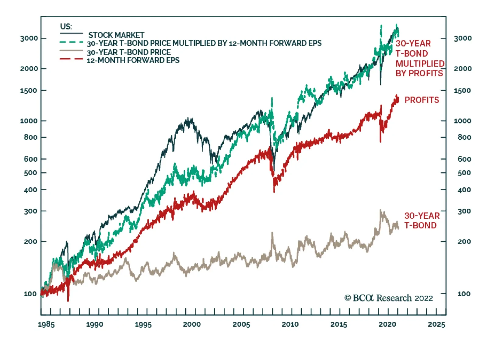
BCA Research’s Counterpoint service concludes that we are quite close to an entry-point for both stocks and long-duration bonds. The duration of the US stock market is the same as that of the 30-year T-bond, at around 25 years. Therefore, if all else were…