United States
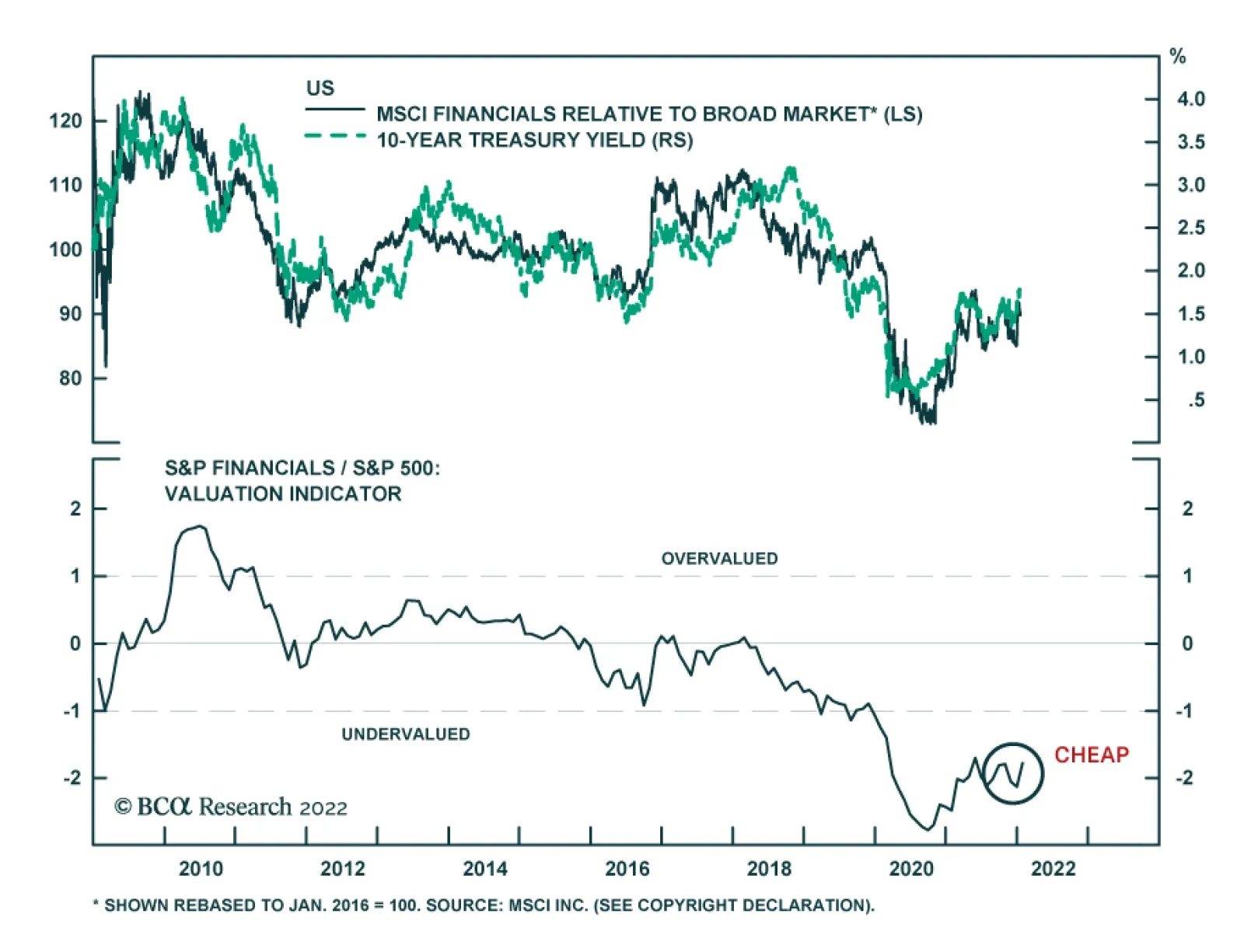
Banks kicked off the Q4 earnings season in the US with generally positive results. Most major banks – BAC, JPM, C, MS, and WFC – topped analysts’ estimates for profit. USB and GS were the exceptions. In the case of Goldman Sachs, although the $12.64 billion…

Dear Client, The subject of cryptocurrencies elicits more emotion that any topic I can think of. As is true for the broader investment community, there is no unanimity of opinion among BCA strategists on the matter. This week, our Global Asset Allocation team is publishing a report taking a favorable view on NFTs. My report is far less sanguine on NFTs and the broader crypto landscape. I hope you enjoy the spirited debate. Best regards, Peter Berezin, Chief Global Strategist Highlights The price of Bitcoin and other cryptocurrencies has become increasingly correlated with the direction of equities. Stocks should recover over the coming months as bond markets stabilize and corporate earnings continue to expand thanks to a resurgent global economy. This could give cryptos a temporary lift. The long-term outlook for cryptocurrencies remains daunting, however. In most cases, anything that cryptocurrencies can do, the existing financial system can do better. Many of the most hyped blockchain applications, from DeFi to NFTs, will turn out to be duds. Concerns that cryptocurrencies are harming the environment, contributing to crime, and enriching a small group of early investors at the expense of everyone else will lead to increased regulatory scrutiny. Our long-term target for Bitcoin is $5,000. Investors looking to hedge their risks should consider going long Cardano, Solana, and Polkadot (three up-and-coming “proof of stake” coins) versus Bitcoin, Litecoin, and Doge (three doomed “proof of work” coins). The Cost Of Crypto Who pays for cryptocurrencies? That may seem like a simple question with a simple answer: The people who buy them!
Chart 1
Yet, as economists have long known, purchases can produce externalities – costs or benefits that are borne by someone other than the person making the purchase. Some purchases can produce positive externalities, such as when you buy nice flowers to plant in front of your house. Other purchases produce negative externalities, such as when you buy a product that harms the environment. The negative externalities arising from Bitcoin mining are well known. A single Bitcoin transaction consumes 14 times as much energy as 100,000 Visa transactions (Chart 1). Bitcoin’s annual electricity consumption exceeds that of Pakistan and its 217 million inhabitants (Chart 2). The growth in crypto mining is one reason why electricity prices are so high in many countries.
Chart 2
Chart 3
Crime is another negative externality that cryptocurrencies facilitate. Bitcoin first entered the popular lexicon in 2013 when its price briefly eclipsed $1,000 due to rising demand for the currency as a medium of exchange on Silk Road and other parts of the so-called dark web. Fast forward to today and crime continues to be a major problem for the crypto industry. According to Chainalysis, illicit addresses received $14 billion in 2021, almost double 2020 levels (Chart 3). Scamming revenue grew 82% while cryptocurrency theft rose 516%. Don’t Feed The Whales There is another cost arising from cryptocurrencies that is rarely mentioned – a cost borne by people who have never bought cryptocurrencies and probably assume they are immune from the vagaries of crypto markets: The holders of regular fiat money. Early investors in today’s most popular cryptocurrencies are sitting on huge profits. A recent study found that 1% of Bitcoin holders control 27% of supply. Ownership is even more concentrated for most other cryptocurrencies (Chart 4).
Chart 4
If these whales were to sell their coins, they could purchase billions of dollars of goods and services. But since there is no indication yet that the proliferation of cryptocurrencies has expanded the aggregate supply of goods and services, their purchasing power must come at someone else’s expense.1 Still Waiting Cryptocurrency proponents would counter that blockchain technologies will usher in a golden age of innovation. Based on this perspective, Bitcoin is a lot like Amazon, a company that created immense wealth for Jeff Bezos and other early shareholders, but has reshaped the global economy in a way that arguably left most people, including those who never bought Amazon stock, better off. The problem with this argument is that Bitcoin is nothing like Amazon. Chainalysis estimates that online merchants processed less than $3 billion in cryptocurrency transactions in 2020, a number that has barely grown over time (Chart 5). While updated numbers for 2021 will be released in February, our analysis of data from Coinmap suggests that the number of merchants accepting cryptocurrency increased less last year than in either 2017 or 2018 (Chart 6). This is consistent with anecdotal evidence which suggests that the vast majority of cryptocurrency transactions continue to be motivated by investment flows rather than e-commerce.
Chart 5
Chart 6
A Feature Not A Bug “Just wait and see,” crypto evangelists say. “Sure, Bitcoin has been around since 2008, but new applications are just around the corner.” There are good reasons to be skeptical of such pronouncements. The Bitcoin network can barely process five transactions per second, compared to over 20,000 for the Visa network (Chart 7). The fee for a Bitcoin transaction can fluctuate significantly, and is typically much greater than for a debit card (Chart 8). Chart 7We Apologize For The Wait
We Apologize For The Wait
We Apologize For The Wait
Chart 8It Costs A Lot To Fill Up The Crypto Tank
It Costs A Lot To Fill Up The Crypto Tank
It Costs A Lot To Fill Up The Crypto Tank
Bitcoin’s sluggishness is inherent to how it was designed. Due to their decentralized nature, blockchains must rely on elaborate procedures to prevent bad actors from taking control. Bitcoin and other popular cryptocurrencies such as Doge use the so-called “proof of work” algorithm. To see how this algorithm works in simple terms, think of spam email. One way of eliminating spam is to require everyone to waste $10 in electricity to send a single email. That is effectively how Bitcoin functions. It is secure, but it is also very clunky. An alternative to “proof of work” is “proof of stake.” Smaller cryptocurrencies such as Cardano and Solana use this algorithm, and Ethereum is in the process of migrating to it. Continuing with the spam analogy, imagine requiring everyone to put $10 down before they send an email. If the email is opened, the $10 is returned. If the email is deleted, the $10 is forfeited. A Solution In Search Of A Problem Proof of stake systems are arguably superior to proof of work systems since the former do not require wasteful energy consumption. But are they superior to the current financial system? That is far from clear. Listening to crypto enthusiasts, one would think that everyone is still using paper money, or perhaps shells or cattle, to make transactions. In fact, the global financial system is already nearly 100% digital. Digital transfer systems such as Zelle in the US and Interac in Canada permit instantaneous transfers at very little cost. Granted, cross-border payments are far from seamless. However, this largely reflects anti-money laundering rules and other regulations that banks must follow rather than some inherent technological limitations with, say, the SWIFT system. The DeFi Delusion Decentralized Finance, or DeFi, has become a hot topic of late. Like most things involving cryptocurrencies, there is more hype than substance. The idea that there will ever be large-scale crypto-denominated lending is wishful thinking. To see why, put yourself in the position of someone contemplating lending 25 bitcoins to a borrower who is interested in buying a house for, say, $1,000,000. On the one hand, if the price of bitcoin drops, you will likely be repaid, but in depreciated coins. On the other hand, if the price of bitcoin rises, you might not be repaid at all since the value of the loan will exceed the value of the house. Any way you cut it, there is no incentive to make the loan. There are other potential DeFi applications, such as those involving smart contracts, that could potentially prove useful. The Ethereum blockchain, where many of these contracts reside, is secured by ether (ETH). The market cap of ETH is currently $370 billion. How much ether is held for investment purposes and how much is held by people looking to make transactions on the Ethereum blockchain? It is impossible to be sure, but it would not surprise us if investment demand accounts for well over 90% of ETH holdings. It would be as if the price of oil rose to $1,000 per barrel, with 90% of that value driven by investment demand. Most people would agree that this would not be a sustainable situation. NFTs: Why So Ugly? Chart 9NFTs Have Taken Off
NFTs Have Taken Off
NFTs Have Taken Off
The popularity of non-fungible tokens (NFTs) has soared over the past year. During the past four weeks, more than $250 million of NFTs were traded on average every day, up from almost nothing at the beginning of 2021 (Chart 9). NFTs allow artists to transform their work into verifiable assets that can be listed and sold on the blockchain. Or at least that is the claim. When they were first introduced, the expectation was that the most desirable NFTs would turn out to be unique and beautiful. Instead, as the CryptoPunks collection aptly demonstrates, many turned out to be repetitive and ugly. Why? One plausible answer is that many NFT buyers are not really looking to acquire digital art. Instead, they are looking to buy supercharged proxies for the cryptocurrency in which the NFT is denominated. As evidence, consider that 99% of the discussions in NFT forums are about how much money NFT buyers hope to make rather than about the “art” itself. Shadow Crypto Supply If this interpretation is correct, it undermines one of the main selling points of cryptocurrencies: That they are limited in supply. Just like banks can create money out of thin air whenever they make loans, the blockchain can spawn synthetic assets such as NFTs that increase the effective supply of the underlying cryptocurrency.2 And that is just for a single cryptocurrency. There is nothing that obliges someone to list a smart contract on the Ethereum blockchain as opposed to any other blockchain. Indeed, there is no limit to the number of blockchains, and by extension, the number of cryptocurrencies that can be created. Chart 10 shows that there are currently more than 9,000 cryptocurrencies in circulation, up from 1,000 in 2017 and less than 100 in 2013. At least with gold, they are not adding any new elements to the periodic table.
Chart 10
The Paradox Of Low Gas Fees Competition among blockchains will favor those that offer the lowest “gas fees,” that is, those that require only a small amount of cryptocurrency to update their ledgers. As users abandon blockchains with high gas fees, the prices of their cryptocurrencies will fall. The cryptocurrencies of the more efficient blockchains will benefit, but probably not as much as one might assume. Just as the demand for petrol would decline if automobiles became much more fuel efficient but miles driven did not rise much, falling gas fees could reduce demand for cryptocurrencies unless activity on their blockchains increased proportionately more than the decline in prices. Crypto prices may fall dramatically if governments offer blockchain networks as a public good. The rollout of Central Bank Digital Currencies (CBDCs) could pave the way for this development. Concluding Thoughts On The Current Market Environment And Long-Term Outlook For Cryptos The price of Bitcoin and other cryptocurrencies has become increasingly correlated with the direction of equities (Chart 11). As we noted in our first report of the new year, average returns for the S&P 500 in January have been negative since 2000. This year has been especially trying given the rapid ascent in bond yields. Our end-2022 target for the US 10-year Treasury yield is 2.25%. Hence, while we expect yields to rise over the remainder of the year, the process should be a lot more gradual than over the past few weeks. Equities often experience a period of indigestion when yields rise sharply. However, as we stressed last week, stocks typically rebound as long as yields do not end up rising to prohibitive levels. The bull-bear spread in this week’s AAII poll fell back to its pandemic lows, a positive contrarian indicator for stocks (Chart 12). With global growth still firmly above trend, corporate earnings should rise by enough to propel stocks into positive territory for the year. A rebound in stock prices, in turn, could give cryptocurrencies a temporary lift. Chart 11Cryptocurrency Prices Have Become Increasingly Correlated With Stocks
Cryptocurrency Prices Have Become Increasingly Correlated With Stocks
Cryptocurrency Prices Have Become Increasingly Correlated With Stocks
Chart 12The Bull-Bear Ratio Is Back To Its Pandemic Lows
The Bull-Bear Ratio Is Back To Its Pandemic Lows
The Bull-Bear Ratio Is Back To Its Pandemic Lows
Nevertheless, the long-term outlook for cryptocurrencies remains daunting. In most cases, anything that cryptocurrencies can do, the existing financial system can do better. Many of the most hyped blockchain applications, from DeFi to NFTs, will turn out to be duds. Meanwhile, concerns that cryptocurrencies are harming the environment, contributing to crime, and enriching a small group of early investors at the expense of everyone else will lead to increased regulatory scrutiny. Chart 13New Money Versus Old Money
New Money Versus Old Money
New Money Versus Old Money
The prices of the most popular cryptocurrencies do not reflect this eventuality. Even after falling 32% from its highs, the aggregate market capitalization of cryptocurrencies is still only slightly less than the value of the entire stock of US dollars in circulation (Chart 13). Our long-term target for Bitcoin is $5,000. Investors looking to hedge their risks should consider going long Cardano, Solana, and Polkadot (three up-and-coming “proof of stake” coins) versus Bitcoin, Litecoin, and Doge (three doomed “proof of work” coins). Peter Berezin Chief Global Strategist peterb@bcaresearch.com Footnotes 1 One way that holders of fiat money could suffer is if the presence of cryptocurrencies reduced the demand for dollars, euros, and other central bank issued currencies. If that were to happen, inflation would rise as people sought to dispose of unwanted fiat currency by buying goods and services. Alternatively, if central banks wanted to constrain inflation, they would have to shrink the money supply by selling income-generating assets. Either way, the public would be worse off. 2 For instance, consider Alice and Bob. Both wish to have a certain amount of exposure to ETH in their investment portfolios. Suppose Bob uses some of his ETH to buy an item from the “Dopey Duck” collection that Alice has just minted. If Bob regards his NFT as a substitute for the ETH he previously held, he will not want to buy more ETH to replace the ETH he lost. In contrast, Alice will end up with more ETH than she previously owned, and hence, will need to sell some of it. All things equal, this will lead to a lower price for ETH. Global Investment Strategy View Matrix
Image
Special Trade Recommendations Current MacroQuant Model Scores
Image
Dear client, In lieu of our weekly bulletin next week, I will be hosting a webcast on Friday, January 28 at 11:00 am EST, to discuss recent dollar trends. I hope you all tune in. Kind regards, Chester Ntonifor Highlights While not often discussed, it is well known that the dollar is expensive. It is true that valuations tend to matter less until they trigger a tipping point. Such inflections usually coincide with huge external imbalances, especially generated by an overvalued exchange rate. The US dollar could be stepping into such a paradigm - the DXY is 1.5 standard deviations above fair value, at the same time as the goods trade deficit is hitting record lows, and real interest rates are deeply negative. More importantly, there has been limited precedence to such a dollar configuration. Historically, it has required much higher real interest rates, or an improving balance of payments backdrop, to justify such lofty valuations. Our trading model shows that selling a currency when it is expensive and buying it when it is cheap generates excess returns over time. Within our valuation ranking, the cheapest currencies are JPY, SEK and NOK. On a terms-of-trade basis, the AUD stands out as a winner. Feature Chart 1High Dollar Valuation And Ultra-Low Real Rates Is Unprecedented
High Dollar Valuation And Ultra-Low Real Rates Is Unprecedented
High Dollar Valuation And Ultra-Low Real Rates Is Unprecedented
Valuations usually get little respect when it comes to medium-term currency movements. This has been especially the case over the last few years, where the macroeconomic environment has been by far the biggest driver of the US dollar. The bull market in the dollar from 2011 to 2020 coincided with higher real interest rates in the US, relative to the rest of the developed world. In fact, since 2008, no developed market central bank has been able to hike rates by more than 200bps, except for the US Federal Reserve. Our report last week focused on why aggressive interest rate increases by the Federal Reserve could be bullish for the US dollar in the short term, but eventually set the stage for depreciation. In this report, we argue that valuations will also become a more important factor for currency strategy over the next 1-2 years (Chart 1). The Dollar And The External Balance The framework to understand currencies and the external balance is straightforward - a rising trade deficit (imports > exports) requires a lower exchange rate to boost competitiveness in the manufacturing sector, or less spending to reduce the trade deficit. Reduced domestic spending is unlikely in most developed economies, given ample pent-up demand and loose fiscal policy. Therefore, the natural adjustment mechanism for countries running wide trade deficits will have to be the exchange rate. Within a broad spectrum of developed and emerging market currencies, the US dollar stands out as overvalued on a real effective exchange rate basis (Chart 2A and 2B). It is true that valuations tend to matter less until they trigger a tipping point. Such inflections usually occur with a shift in animal spirits, coinciding with huge external imbalances.
Chart 2
Chart 2
In the US, these imbalances are already starting to trigger a shift. The US trade deficit is deteriorating, with the goods deficit hitting a record low of -$98bn in November. Over the last few years, it has become increasingly difficult to fund this widening trade deficit via foreign purchases of US Treasuries (Chart 3). Meanwhile, as we highlighted last week, substantial equity inflows over the last few years have started to roll over. In a nutshell, the basic balance in the US (the sum of the current account and foreign direct investment) is deteriorating at an accelerated pace (Chart 4). The US current account deficit for Q3 came in at -$214.8 billion, the widest in over a decade. This has reversed a lot of the improvement in the basic balance since the Global Financial Crisis. The dollar tends to decline on a multi-year basis when the basic balance peaks and starts deteriorating. Chart 4Deteriorating Balance Of Payments Dynamics US Balance Of Payments
Deteriorating Balance Of Payments Dynamics US Balance Of Payments
Deteriorating Balance Of Payments Dynamics US Balance Of Payments
Chart 3It Is Becoming Increasingly Difficult To Fund The Widening Deficit
It Is Becoming Increasingly Difficult To Fund The Widening Deficit
It Is Becoming Increasingly Difficult To Fund The Widening Deficit
Fiscal policy is likely to become tighter in the next couple of years, easing the domestic spending constraint for the exchange rate. That said, fiscal policy will remain loose compared to pre-pandemic levels and relative to underlying employment conditions. This has historically led to a deterioration in the external balance and pulled the real effective exchange rate of the dollar down (Chart 5). Chart 5The Dollar And The Budget Deficit
The Dollar And The Budget Deficit
The Dollar And The Budget Deficit
Real Interest Rates And The Dollar It is remarkable that at a time when real rates are the most negative in the US, the dollar is as overvalued as it has been in decades on a simple PPP model. This is a perfect mirror image of the dollar configuration at the start of the bull market in 2010, where the dollar was cheap and real rates were more supportive (Chart 1). According to economic theory, a currency should adjust to equalize returns across countries. This is a no-arbitrage condition. In the early 80s, an overvalued dollar was supported by very positive real rates. The subsequent dollar declines thereafter also coincided with falling real interest rates. In fact, over the last decade, it has been an anomaly that the dollar is so strong despite relative real interest rates being so negative (Chart 6). Our view remains that the terminal interest rate for the US should be higher than what is currently discounted in the 10-year Treasury yield. According to the overnight index swap curve, the Fed will not hike interest rates past 1.75%. This is much lower than past cycles and will keep real interest rates low. This does not justify an expensive greenback. Our shorter-term interest rate model also shows the DXY as slightly expensive, even though short-term interest rates have moved in favor of the dollar over the past year (Chart 7). Chart 6The Level Of Relative Real Yields Also Matters
The Level Of Relative Real Yields Also Matters
The Level Of Relative Real Yields Also Matters
Chart 7Our Timing Model Suggests ##br##A Pullback
Our Timing Model Suggests A Pullback
Our Timing Model Suggests A Pullback
Other Considerations While real effective exchange rates and purchasing power parity models are among our favorite valuation gauges, they are not foolproof. Countries with structurally higher inflation (and so a higher real effective exchange rate), could also have higher productivity. According to the Balassa-Samuelson Hypothesis, competitiveness in the tradeable goods sector will boost wages across all sectors of the economy, leading to higher prices. This argument particularly resonates with proponents that suggest the US is a fast-growing economy, and so will tend to run a current account deficit, like Australia during the commodity boom of the early 2000s. Meanwhile, the US earns more on its overseas assets than it spends on its liabilities, suggesting that the funding gap will eventually close. Unfortunately, the overvaluation of the dollar has not been due to higher relative productivity in the US, especially when compared to other economies. Across a broad spectrum of developed and emerging market economies, the dollar is expensive according to our productivity models. The Chinese RMB (which is much overvalued on a PPP basis) is closer to fair value when productivity is taken into consideration (Chart 8).
Chart 8
Meanwhile, the sizeable US deficit is not completely offset by its positive investment balance (Chart 9). This is occurring at a time when many faster growing countries (such as China for example) are generating current account surpluses (Chart 10A and 10B). In a nutshell, whether one looks at relative price levels, relative productivity trends, or relative real returns on government assets, the dollar is expensive. Chart 9The Positive Income Balance Has Not Helped The Us Investment Position
The Positive Income Balance Has Not Helped The Us Investment Position
The Positive Income Balance Has Not Helped The Us Investment Position
Chart 10
Chart 10
Conclusion Last summer, we introduced a trading model for FX valuation enthusiasts. We used both our in-house purchasing power parity models (PPP) and our intermediate-term timing models as valuation tools. Since the 2000s, both valuation models have outperformed a buy-and-hold currency strategy with much lower volatility (Chart 11). Currency valuation tends to matter over the longer term, while the macro environment tends to dominate short-term currency trading. Given that the dollar has been overvalued for the last three to five years, the above analysis suggests we might be entering this “longer-term” tipping point where valuations will start to matter more going forward. Within our valuation ranking, the cheapest currencies are JPY, SEK and NOK. On a terms-of-trade and productivity basis, the AUD stands out as a winner. This is being reflected in a record-high basic balance surplus (Chart 12). In our trade tables, we went long AUD at 70 cents, and will upgrade this to a high conviction bet on signs that currency volatility is ebbing. Chart 11A Trading Rule Solely Based On Valuation
A Trading Rule Solely Based On Valuation
A Trading Rule Solely Based On Valuation
Chart 12AUD And Balance Of Payments
AUD And Balance Of Payments
AUD And Balance Of Payments
Chester Ntonifor Foreign Exchange Strategist chestern@bcaresearch.com Trades & Forecasts Strategic View Tactical Holdings (0-6 months) Forecast Summary
Highlights The Kingdom of Saudi Arabia (KSA), Iraq, the UAE and Kuwait – the OPEC 2.0 states capable of increasing production this year – will have to step up for coalition members unable to lift output, including Russia. US shale-oil output also will have to increase to cover demand. The COVID-19 omicron variant has proven to be less severe than anticipated, which likely will translate into a faster recovery in oil demand than was expected in December. One risk looms large: China's zero-COVID policy greatly reduced virus transmission in the country; however, this also reduced natural antibody protection in its population. This is exacerbated by a lack of mRNA vaccine availability. Faltering supply and strong demand will keep inventories tight, reducing buffers to supply shocks – e.g., the Kirkuk–Ceyhan Oil Pipeline explosion this week. We are returning our Brent forecast for 2022 to $80/bbl; for 2023, we continue to expect $81/bbl (Chart of the week). Our forecast assumes OPEC 2.0 will increase supply so as to keep Brent prices below $90/bbl. US shale-oil output also is expected to rise. We continue to see oil-price risk skewed to the upside. Still, demand-destruction from high prices or widespread omicron-induced lockdowns remain clear risks to our outlook. Feature Given the relatively mild symptoms associated with the COVID-19 omicron variant, global oil demand likely will continue to recover lost ground and return to trend sooner than expected. Faltering supply from OPEC 2.0 member states means prices will remain elevated, and perhaps push higher. On the back of these fundamentals, we are restoring our Brent price forecast to $80/bbl for this year, and $81/bbl for 2023. This is the consensus view, and we find ourselves in the uncomfortable position of sharing it.
Chart 1
Presently, the oil market is bulled up, expecting high prices this year and next, with Brent forecasts clustering in the $80-$85/bbl range out to 2025.1 Some headline-grabbing forecasts call for $100-plus prices, as top OPEC 2.0 producers – e.g. Russia, Angola and Nigeria– continue to strain in their efforts to restore production, and demand remains buoyant (Chart 2).
Chart 2
A consensus usually emerges after most market participants have adjusted their positioning to reflect a commonly held view. This usually is a temporary equilibrium. The market typically finds the highest-pain price trajectory required to shatter the consensus view – e.g., selling off because widely held demand expectations are too high or supply expectations are too low, and vice versa. Ultimately, a fundamental shock destabilizes the consensus, and prices move higher or lower to reflect the new reality. The biggest risks to our price forecast are demand destruction from high prices or widespread omicron-induced lockdowns.2 To keep prices from finding a new equilibrium above $90/bbl, a policy response from OPEC 2.0 to increase production will be required. In addition, US shale-oil output will have to increase. This is not to say we are dismissing above-consensus price realizations: Inventories will continue to draw hard as long as the level of supply remains below demand. This will leave little in the way of buffer stocks to even out price spikes, as the Ceyhan pipeline explosion demonstrated earlier this week.3 Geopolitical tensions are high in eastern Europe as Russia and the West square off, and in the Persian Gulf as Iran squares off against GCC states and the US.4 These structural and geopolitical risks leave markets exposed to volatile price spikes. OPEC 2.0 Falters
Chart 3
Chart 4
Our forecast is contingent on the core OPEC 2.0 member states ex-Russia – KSA, Iraq, the UAE and Kuwait – increasing production by an average of ~ 3.34mmb/d in 2022 and 2.76 mmb/d in 2023 relative to 2021. Most of the increases comes from KSA, Iraq and UAE (Chart 3). In addition, we expect US shale-oil producers to increase their average output by 0.6mm b/d this year, and 1.07mm b/d in 2023 relative to 2021 (Chart 4). In 2022, US crude oil supply reaches 11.7mm b/d, and in 2023 it goes to 12.13mm b/d in our estimates. The slower increase in US output this year largely is a function of the delay we expect in assembling rigs and crews to significantly lift production from current levels. These production increases are needed to make up for ongoing downgrades of OPEC 2.0 member states' ability to increase output, including Russia, where we expect crude oil production to remain flat at a little over 10mm b/d this year on average (Table 1). Table 1BCA Global Oil Supply - Demand Balances (MMb/d, Base Case Balances) To Dec23
Higher Output Needed To Constrain Oil Prices
Higher Output Needed To Constrain Oil Prices
Back in July 2021, the coalition agreed to restore 400k b/d of production taken off the market in the wake of COVID-19 demand destruction. Thus far, the coalition has only managed to restore ~ 1.86mm b/d of the 2mm b/d pledged for August to December 2021, according to the Oxford Institute for Energy Studies (OIES). For this year, the OIES notes OPEC 2.0 "will struggle to return more than 2 mb/d of withheld supplies in 2022, compared to the headline target of 3.76 mb/d."5 Our view rests on a policy call at the end of the day: We believe OPEC 2.0 – KSA in particular – is well aware of the demand-destruction potential high nominal prices and a strong USD pose, particularly as the US Fed is embarking on a rate-hike program to accompany the quantitative-tightening measures recently adopted. Absent a concerted effort to raise production by the core OPEC 2.0 states ex-Russia and the US shale producers, prices could move above $86/bbl as supply tightens and demand continues to rise. This can be seen in The Chart of the Week (the dashed brown curve depicting our estimate for prices without higher production). Importantly, even if such a concerted effort emerges, a failure to resolve the Iran nuclear talks with the US and its allies this year would keep more than 1mm b/d of production from returning to the market. This would push average Brent prices this year and next to or above $90/bbl. Oil Demand Recovery To Continue Provided we do not see widespread lockdowns resulting from the rapid transmission of the omicron variant, we expect global demand to grow close to 4.8mm b/d this year and 1.6mm b/d in 2023 (Chart 5). This reflects our view that – baring too-high prices or another full-scale COVID-induced lockdown in a key market like China – demand resumes its return to trend. It is important to point out that the increase in oil demand we expect is being driven by economic growth, which means consumers likely can withstand high prices, just as long as they do not become excessive – i.e., entrenched above $90/bbl in our view. Chart 5Global Oil Demand Forecast Remains Steady
Global Oil Demand Forecast Remains Steady
Global Oil Demand Forecast Remains Steady
Chart 6OPEC 2.0 Production Policy Kept Supply Below Demand
OPEC 2.0 Production Policy Kept Supply Below Demand
OPEC 2.0 Production Policy Kept Supply Below Demand
In our base case model, we continue to see markets remaining balanced (Chart 6) – assuming we get the policy calls right – and OECD oil inventories falling (Chart 7). Even with an uptick in inventories, which presently are 31.5mm barrels above the 2010-14 average, days-forward-cover for the OECD will remain low (Chart 8). Chart 7Crude Inventories Continue To Draw
Crude Inventories Continue To Draw
Crude Inventories Continue To Draw
Chart 8
Investment Implications The consensus view calls for oil prices to remain at current elevated levels, and to perhaps push higher. We share that view – and have maintained it for some time – which gives us pause. A consensus not only reflects a shared view. It likely reflects broad similarities in the way market participants are positioned in their capex, investment and trading outlooks. This is inherently unstable. We expect oil prices to remain elevated, and have returned our 2022 Brent forecast to $80/bbl on average. Our 2023 forecast for Brent remains $81/bbl. We continue to recommend positions that benefit from tightening markets in which forward curves are backwardated and likely to remain so. Even if we see production increasing – from the OPEC 2.0 core producers ex-Russia and the US shales – we still expect forward Brent and WTI curves to remain backwardated (prompt-delivery prices exceed deferred-delivery prices). We remain long the S&P GSCI and the COMT ETF to express this view. If we fail to see production increase to keep prices from breaching and sustaining levels above $90/bbl, long index exposure will post higher gains. The risk to our view is two-fold: 1) High prices leading to demand-destruction, which is made more acute when the USD is strong; and 2) widespread omicron-induced lockdowns, which could once again reduce consumption and lead to global supply-chain gridlock. High prices leading to demand destruction, or another round of lockdowns would force us to reconsider our positioning. Robert P. Ryan Chief Commodity & Energy Strategist rryan@bcaresearch.com Ashwin Shyam Research Associate Commodity & Energy Strategy ashwin.shyam@bcaresearch.com Paula Struk Research Associate Commodity & Energy Strategy paula.struk@bcaresearch.com Commodities Round-Up Energy: Bullish It's very early days, but EU experts are reviewing a draft plan leaked to the media earlier this month, which could result in gas- and nuclear-powered generation being included among sustainable energy sources, and suitable to bridge the global energy transition to renewable power. The draft of the common classification system for EU funding of sustainable economic activities, or taxonomy, apparently states gas plants can earn a “transitional” label if they meet several criteria, including an emissions limit of 270g of CO2e/kWh, or if their annual emissions average 550kg CO2e/kW or less over 20 years. This criterion would be applied to judging environmental performance of a gas plant over 20 years, but offers no guarantee that its emissions would drop over time. The chair of the expert panel said draft rules for nukes raised questions over "whether a plant can guarantee its green credentials today, if its obligation to manage nuclear waste – one of the main environmental concerns about the fuel – does not kick in until as late as 2050," according to euractiv.com, which broke the story earlier this month. Base Metals: Bullish Indonesia has become more restrictive with exports of raw commodities in order to attract more downstream investments and to play a bigger role in producing finished goods. Of these commodities, Indonesia’s supply of nickel, relative to the world is the highest, constituting ~ 38% of total global nickel supply. In 2020, the nation banned nickel ore exports, and is now considering a progressive export tax on low nickel content products such as ferronickel and nickel pig iron. This tax could reduce foreign investment in Indonesia’s nickel mines and global supply, which would, all else equal, support prices. These developments arrive on the back of low nickel inventories, which helped prices of the key battery metal reach a 10-year high last week (Chart 9). Precious Metals: Bullish In 2021, gold ETFs were hit by outflows of ~ $9 billion, the main reason the yellow metal was unable to reach its 2020 high above the $2,000/oz mark (Chart 10). For this year, we expect a supportive gold market, as real interest rates will remain weak despite the Fed’s hawkish tilt to lift nominal interest rates higher. In line with BCA’s Foreign Exchange Strategy service, we expect the USD to fall over the 12-18 month horizon, which will also bolster gold. Chart 9
Tighter Nickel Balances Going Forward Will Push Prices Higher
Tighter Nickel Balances Going Forward Will Push Prices Higher
Chart 10
Footnotes 1 Please see Column: Oil prices expected to rise with big variation in projections: Kemp, published by reuters.com on January 19, 2022. 2 High nominal oil prices and a strong USD compound the former demand-destruction risk. The latter risk of wide-spread omicron-induced lockdowns is elevated in China at present. Its success in shutting down the transmission of earlier COVID-19 mutations has reduced the amount of antibodies to the virus in the population. This is compounded by a lack of mRNA vaccine production and distribution, which leaves the country at risk to wide-spread omicron transmission. In states with large shares of the population carrying COVID-19 antibodies – e.g., the UK – omicron is less of a risk and is on course to becoming endemic. Please see 2022 Key Views: Past As Prelude For Commodities and Endemic COVID-19 Will Spur Commodities' Next Leg Higher which we published on December 16, 2021 and January 13, 2022 for discussions. 3 Oil flows are expected to return to normal in short order. Please see Halted Iraq-Turkey flows to resume within hour: Botas, published by argusmedia.com on January 19, 2022. 4 Please see Russia/Ukraine: Implications From Kazakhstan and Geopolitical Charts For The New Year published by BCA Research's Geopolitical Strategy service on January 7 and 14, 2022, respectively, for discussions. 5 Please see Key Themes for the Global Energy Economy in 2022 published by the Oxford Institute for Energy Studies on January 18, 2022. Investment Views and Themes Strategic Recommendations Trades Closed in 2021
Image
Image
US defense stocks have been on a tear of late (outperforming SPX by 10% since late November), benefiting from both macro and geopolitical trends. From a macro standpoint, the Defense industry has been neglected by investors for a while, and now trades at 15.4x forward earnings, with a 27% discount to S&P 500. As a “value” industry, it is likely to outperform in the environment of rising rates. On a geopolitical front, there is a secular rise in geopolitical risks due to a great power rivalry, hypo-globalization, and rising nationalism across the globe. The recent rise in commodity prices also means that countries will get back to active competition over resources and territory, in the Middle East, the South China Sea, the Mediterranean, Central Asia. As such, the US refocusing on great power competition means Democrats and Republicans both support larger defense budgets, and Biden’s Congress already confirmed this with a large 2021 defense spending bill ($780bn, an increase of 5% from the peak during Trump’s presidency). China is increasing defense spending for the same reason, attempting to carve out a sphere of influence in East Asia, secure supply chains, and deter America in the event of a conflict in China’s neighborhood such as over Taiwan. There is also a rise in defense spending among other emerging powers, such as India, which is coming into its own as a geopolitical force and expanding its military to meet the China challenge as well as the ongoing Pakistan threat. The US allied states, that were formerly dovish, such as Germany and Japan, are also ramping up their defense spending. Bottom Line: Changing world order will inevitably bring a military buildup between major powers benefiting US defense stocks on a secular basis. The US defense industry is represented by the following companies: LMT, NOC, GD, LHX, AXON, HII.
Highlights On US inflation and the Fed: If the Fed adheres to its mandate, it has no choice but to hike rates until core inflation drops toward 2% (from its current level above 4%). Yet, share prices will sell off before inflation converges toward the Fed’s target. On US TIPS yields: Rising TIPS yields will depress share prices in the richly valued equity markets like the US, support the greenback, and curtail portfolio flows into EM for a period of time. On China: Despite stimulus, China’s business cycle will continue disappointing over the near-term. Besides, a bottom in money/credit indicators does not always herald an imminent and sustainable equity rally. On financial market divergences: Major selloffs evolve in phases resembling domino effect-like patterns. In contrast, corrections are abrupt, and the majority of markets drop concurrently. Hence, the nature of current market dynamics is more consistent with a major selloff than a short-term correction. On regional allocation within a global equity portfolio: Overweight the euro area and Japan, underweight the US and EM. Feature Ms. Mea is a long-time BCA client and an avid follower of the Emerging Markets Strategy (EMS) service. Since 2017, I have been meeting with her twice a year to exchange thoughts on the global macro environment, to discuss the nuances of our views and to elaborate on investment strategy. We always publish our conversations for the benefit of all EMS clients. This virtual meeting took place earlier this week. Chart 1A Technical Breakout Is In US Bond Yields
A Technical Breakout Is In US Bond Yields
A Technical Breakout Is In US Bond Yields
Ms. Mea: It has been two years since we last met in person. I did not imagine that world travel would stay so depressed for so long when the pandemic began two years ago. I have also been surprised by the recent behavior of financial markets. There have been divergences that I cannot reconcile, such as the woes in China’s real estate sector and resilient commodity prices, the diverging performance of the S&P 500, US small caps and a significant portion of NASDAQ-listed stocks. I will ask you about these later. But let’s start with your main macro themes. Since early last year, you have been advocating two macro themes: (1) China’s slowdown; and (2) rising and non-transitory US inflation. They were controversial a year ago but have now become widely accepted in the investment community. Financial markets have moved a great deal to reflect these macro themes. Don’t you think financial markets have already fully priced in these macro trends? Answer: You are right that these narratives have become well known and financial markets have been moving to price in these developments. However, our bias is that these themes are not yet fully priced in and these macro forces will continue to impact financial markets over the near term. Let’s first discuss US inflation and interest rate moves. Chart 1 illustrates that US government bond yields have broken above major resistance levels. Such a breakout technically entails higher yields. Odds are that US long-term bond yields will move up by another 50 basis points in the months ahead before they pause or reverse. The fundamental justification for higher US bond yields is as follows: The inflation genie is out of the bottle in the US. If the Fed adheres to its inflation mandate, it has no choice but to hike rates until core inflation drops toward 2%. In December, trimmed-mean CPI and median CPI printed 4.8% and 3.8% respectively, well above the Fed’s preferred range of 2-2.25% for core inflation (Chart 2). Critically, these inflation measures are not impacted by volatile components. These measures strip out outliers like used and new car prices, auto parts, as well as energy and food. The core CPI and PCE inflation measures will drop this year but super core inflation will remain north of 3%, well above the Fed’s preferred range. Importantly, a wage inflation spiral is already underway in the US. Employees have experienced substantial negative wage growth in real terms in the past 12 months. Labor shortages are prevalent, and the employee quit rate is very high. Employees are demanding very high wage growth and employers will have little choice but to meet these demands (Chart 3). Chart 2US Super Core Inflation Suggests Broad-Based Inflationary Pressures
US Super Core Inflation Suggests Broad=Based Inflationary Pressures
US Super Core Inflation Suggests Broad=Based Inflationary Pressures
Chart 3US Wages Will Be Accelerating
US Wages Will Be Accelerating
US Wages Will Be Accelerating
Chart 4Rising TIPS Yields = Equity Multiples Comparison
Rising TIPS Yields = Equity Multiples Comparison
Rising TIPS Yields = Equity Multiples Comparison
As a result, the only way to bring down core inflation toward its preferred target range is for the Fed to slow the economy down and curb employment and wage gains. Yet before core inflation converges to the Fed’s target, risk assets will sell off first. Practically, the Fed will talk hawkish and hike until something breaks. The breaking point will be a major selloff in US share prices. US equities have been priced to perfection on the assumption that US interest rates will remain low for many years. As interest rate expectations rise further, US equity multiples are under pressure (Chart 4). Ms. Mea: The recent rise in US bond yields has been largely driven by the real component (TIPS yields), not inflation breakevens. That would usually imply improving US growth prospects. Yet US stocks have corrected as TIPS yields rose. How do you explain this and what should investors expect going forward? Answer: Indeed, the latest rise in US bonds yields is primarily driven by increasing TIPS yields, not inflation breakevens (Chart 5) TIPS yields have not been driven by economic growth expectations in the past couple of years. TIPS yields are breaking out and more upside is likely for reasons unrelated to US economic growth: The Fed’s rhetoric and guidance. TIPS yields typically move with 5-year/5-year forward yields, i.e., expectations for US interest rates in the long run (Chart 6). One of reasons why forward interest rates and TIPS yields have been low is the Fed’s commitment to keep interest rates extremely depressed for so long. As the Fed’s rhetoric has recently changed, so are interest rate expectations and TIPS yields. Given that core inflation will not drop to the Fed’s target range any time soon, the Fed will likely escalate its hawkish rhetoric. Hence, TIPS yields will keep rising, until something breaks. Chart 5US Tips Yields Have Broken Out After A Base Formation
US Tips Yields Have Broken Out After A Base Formation
US Tips Yields Have Broken Out After A Base Formation
Chart 6US TIPS Yields More With Long-Term Interest Rate Expectations
US TIPS Yields More With Long-Term Interest Rate Expectations
US TIPS Yields More With Long-Term Interest Rate Expectations
TIPS demand/supply and momentum. The TIPS market is relatively small, and it has been rigged by the Fed in the past two years or so. As a part of its QE program, the Fed has been buying a large share of TIPS, and it now owns 22% of this market. As a result, TIPS yields have fallen irrespective of economic growth dynamics. As the QE program ends, the Fed will stop purchasing TIPS. There has also been a rush into TIPS by institutional investors. In a quest for inflation protection when the Fed was complacent about inflation, investors have been opting for TIPS. This has also depressed TIPS yields. As the US central bank sounds more hawkish, investors’ demand for inflation protection will likely diminish. In addition, TIPS prices have recently plunged dramatically. Large losses could prompt further liquidation by investors pushing TIPS yields much higher. All of the above and the fact that TIPS yields remain negative suggest that they will continue rising in the coming months. Chart 7Rising TIPS Yields Warrant A Stronger US Dollar
Rising TIPS Yields Warrant A Stronger US Dollar
Rising TIPS Yields Warrant A Stronger US Dollar
Ms. Mea: Your point that TIPS yields will continue rising in the months ahead irrespective of US inflation and growth dynamics is interesting. So, what are the implications of rising US bond yields, especially TIPS yields, on various financial markets? Answer: Falling/low TIPS yields have benefited long duration plays like US stocks, and especially US growth stocks. Declining TIPS yields were a drag on the US dollar (Chart 7). Finally, they also prompted portfolio capital flows to EM. Consistently, rising TIPS yields will depress share prices in the richly valued equity markets like the US (Chart 4, above) support the greenback, and curtail portfolio flows into EM for a period of time. Ms. Mea: But aren’t US share prices positively correlated with US interest rates? Answer: Not always. Chart 8 illustrates that the correlation between the S&P 500 and US Treasury yields varied over time. Prior to the mid-1960s, it was positive. From 1966 until 1997, US equity prices were negatively correlated with US Treasury yields. Since 1997, US share prices have been positively correlated with US government bond yields (Chart 8, top panel). Chart 8US Stock-Bond Correlation: A Paradigm Shift In 2022?
US Stock-Bond Correlation: A Paradigm Shift In 2022?
US Stock-Bond Correlation: A Paradigm Shift In 2022?
Chart 9Early 2020s = Late 1960s?
Early 2020s = Late 1960s?
Early 2020s = Late 1960s?
We believe US markets are now undergoing a major paradigm shift in the stock prices-bond yields correlation. The latter is about to turn negative like it did in the second half of the 1960s. In the mid-1960s, the reason why the stock-to-bond yields correlation turned negative was because US core inflation surged well above 2% in 1966 (Chart 8, bottom panel). This marked a paradigm shift in the relationship between equity prices and US Treasury yields. The same is happening now. As we wrote a year ago in our Special Report titled A Paradigm Shift In The Stock-Bond Relationship, the proper roadmap for the US stock-to-bond correlation is not the last 10 or 20 years, but the second half of the 1960s. After US core CPI surged substantially above 2%, the S&P 500 became negatively correlated with US Treasury yields (Chart 9). Ms. Mea: Let’s now turn to emerging markets. How will EM financial markets perform amid rising US bonds yields? Also, which US yields matter most for EM financial markets, US Treasury yields or TIPS? Answer: Neither US Treasury yields nor TIPS yields have a stable correlation with EM stock prices. Correlations between US nominal bond yields, EM currencies and EM domestic bond yields vary over time. However, US TIPS yields exhibit a reasonably strong positive correlation with mainstream EM local bond yields and the US dollar's exchange rate versus EM currencies (Chart 10). Mainstream EM includes 16 markets but excludes China, Korea and Taiwan. Hence, as US TIPS yields move up, it is reasonable to expect the US dollar to strengthen against mainstream EM currencies and their local bond yields to rise (Chart 10). Currency depreciation and rising domestic bond yields will prove to be toxic for the share prices of these mainstream emerging markets. To sum up, rising US TIPS yields will jeopardize the performance of EM equities, currencies, local rates and credit markets. Ms. Mea: Aren’t many EMs better prepared for rising US nominal/real yields than they were in 2013? Answer: Yes, they are: many EM countries that were running large current account deficits in 2013 now have current account surpluses or small deficits (Chart 11, top panel). Besides, mainstream EMs ramped up their foreign currency debt in the years preceding 2013 while their foreign debt has changed little in the past 6-7 years (Chart 11, bottom panel). Chart 10Rising TIPS Yields Are A Risk To EM Domestic Bonds
Rising TIPS Yields Are A Risk To EM Domestic Bonds
Rising TIPS Yields Are A Risk To EM Domestic Bonds
Chart 11Mainstream EM: Less Vulnerable To The Fed Now Than in 2013
Mainstream EM: Less Vulnerable To The Fed Now Than in 2013
Mainstream EM: Less Vulnerable To The Fed Now Than in 2013
Table 1Current Account Balances In Individual EM Countries
Conversation With Ms. Mea: US Inflation Redux, TIPS And Implications For EM
Conversation With Ms. Mea: US Inflation Redux, TIPS And Implications For EM
Table 1 illustrates the current account balance in individual developing countries. Further, the share of foreign investor holdings in EM local currency bonds has declined a great deal in the past 2 years (Table 2). Finally, many mainstream EM central banks have hiked rates aggressively and their local bond yields have already risen considerably in the past 12 months. These also provide some protection against fixed-income portfolio capital outflows. All in all, vulnerability from foreign portfolio capital outflows in EM is much lower than it was in 2013. Nevertheless, EM financial markets will not remain unscathed if US rates march higher, the US dollar rallies and US stocks wobble. Based on the parameters displayed in Tables 1 and 2, the most vulnerable countries among mainstream EMs are Peru, Colombia, Chile and Egypt. Table 2Foreign Ownership Of Domestic Bonds: January 2022 Versus October 2019
Conversation With Ms. Mea: US Inflation Redux, TIPS And Implications For EM
Conversation With Ms. Mea: US Inflation Redux, TIPS And Implications For EM
Chart 12China"s Construction Cycle In Perspective
China"s Construction Cycle In Perspective
China"s Construction Cycle In Perspective
Ms. Mea: Let’s now move to your second theme - China’s slowdown. This is well known and arguably priced in financial markets. Importantly, policymakers have been ratcheting up stimulus. Don’t you think now is the time to upgrade the stance on Chinese stocks and China-related plays? Answer: Despite the new round of stimulus, China’s business cycle will continue disappointing over the near-term. As we wrote in last week’s report titled Chinese Equities: Valuations and Profits, Chinese corporate earnings are set to contract in the next 6 months. This means that the risk-reward profile of Chinese stocks in absolute terms is not yet attractive. Importantly, even though property market woes are well known and housing sales and starts have collapsed, housing construction activity has remained resilient (Chart 12). The bottom panel of Chart 12 demonstrates rising completions, which is one of reasons why raw materials prices have been resilient. However, new funding for property developers has dried up and they will be forced to scale back completions/construction activity. Historically, EM non-TMT share prices lagged the turning points in China’s money/credit impulses by several months (Chart 13). Even though the money/credit cycle is now bottoming, a buying opportunity in stocks will likely transpire in a few months. In brief, a tentative bottom in money/credit indicators does not always herald an imminent and sustainable equity rally. Chart 13China"s Credit Cycle And EM Non-TMT Stocks
China"s Credit Cycle And EM Non-TMT Stocks
China"s Credit Cycle And EM Non-TMT Stocks
Ms. Mea: Another topic I wanted to discuss today is divergences in global financial markets. Some equity markets have already fallen significantly, while the S&P 500 index as well as a couple of individual EM equity bourses (India, Taiwan and Mexico) have been firm. There have been massive divergences within the US equity market in general and the NASDAQ index in particular. Besides, EM high-yield corporate spreads have widened but EM investment grade corporate spreads remain tight. Finally, commodity prices have remained firm despite both China’s slowdown and US dollar strength. How should investors interpret these divergences? Answer: Such divergences in financial markets often occur during major selloffs. Notable financial market downturns evolve in phases resembling domino effect-like patterns, where some markets lead while others lag. In contrast, corrections are abrupt, and the majority of markets drop concurrently. For example, the EM crises in 1997-98 did not occur simultaneously across all EM countries. It began in July 1997 with Thailand, then spread to Korea, Malaysia and Indonesia, and finally to the rest of Asia. By August 1998, Russian financial markets had collapsed, triggering the Long-Term Capital Management (LTCM) debacle. The last leg of the crisis appeared in Brazil and culminated in the real's devaluation in January 1999. Chart 14Domino Effect In 2007-08
Domino Effect In 2007-08
Domino Effect In 2007-08
Similarly, the US financial/credit crisis in 2007-08 commenced with the selloff in sub-prime securities in March 2007. Corporate spreads began widening, and bank share prices rolled over in June 2007. Next, the S&P 500 and EM stocks peaked in October 2007 (Chart 14). Despite these developments, commodity prices and EM currencies continued to rally until the summer of 2008 when they finally collapsed in the second half of that year (Chart 14, bottom panel). There was a domino effect in financial markets in both the 2015 and 2018 turbulences. Initially, the selloffs started in the weakest links while other parts were holding up. Then, the selloff spread to all without exception. For example, in 2018, US share prices and high-yield credit spreads were doing quite well until October 2018. Then, a broad-based selloff transpired in the fourth quarter of 2018. Just as chains break at their weakest links, financial market selloffs begin in the most susceptible sectors. Overpriced US stocks with little or no profits and currencies with zero or negative interest rates have been most vulnerable to rising US interest rates. That is why these segments have sold off first in response to rising US nominal and real rates. Our hunch is that the selloff in global markets due to rising US interest rates will broaden in the coming months. This does not mean that global stocks on the verge of a major bear market, but a double-digit drop in global share prices is likely. The last asset class standing will be commodity prices. These will likely be the last affected by rising US interest rates because many investors buy commodities as an inflation hedge. Besides, oil prices have also been supported by the geopolitical tensions around Ukraine and Iran. It might take investor concerns about the US economy and a slowdown in global manufacturing to trigger a relapse in commodity prices. Chart 15Rising TIPS Yields = European Equities Outperforming US Ones
Rising TIPS Yields = European Equities Outperforming US Ones
Rising TIPS Yields = European Equities Outperforming US Ones
Ms. Mea: What investment strategy do you recommend in the coming months? Answer: As US interest rates continue rising and China’s recovery fails to transpire immediately, EM financial markets remain at risk. Therefore, we recommend a defensive stance for absolute return investors in EM equity and fixed income. We are also continuing to short a basket of EM currencies versus the US dollar. As for global equity regional allocation, the outlook for EM performance is less certain than it was in the past 12 months. Clearly, rising US/DM interest rates herald US equity underperformance versus other DM markets, like the euro area and Japan (Chart 15). The basis is that non-US equities are not as expensive as US ones and, hence, are less vulnerable to rising interest rates. Chart 16EM Relative Equity Performance Is Correlated With The USD, Not US Bond Yields
EM Relative Equity Performance Is Correlated With The USD, Not US Bond Yields
EM Relative Equity Performance Is Correlated With The USD, Not US Bond Yields
Whether EM outperforms or not is mainly contingent on the US dollar, rather than US bond yields. The top panel of Chart 16 demonstrates that EM relative equity performance against DM has a low correlation with US bond yields. Yet, EM equities will underperform their DM peers if the USD strengthens (the greenback is shown inverted on the bottom panel of Chart 16). However, if the greenback depreciates, EM will certainly outperform the US in both equity and the fixed income space. Putting it all together, asset allocators should overweight the euro area and Japan, and underweight the US and EM in a global equity portfolio. Ms. Mea: What about EM local bonds and EM credit markets? Answer: EM credit spreads will widen, and EM local yields will not drop as US bond yields head higher and EM exchange rates depreciate. We continue to recommend investors underweight EM credit versus US corporate credit, quality adjusted. As for local rates, we largely remain on the sidelines of this asset class. Our current recommendations are as follows: receiving 10-year rates in China and Malaysia, paying Czech 10-year rates and betting on 10/1-year yield curve inversions in Mexico and Russia. For a detailed list of our country recommendations for equities, credit, domestic bonds and currencies, please refer to Open Position Tables below. Arthur Budaghyan Chief Emerging Markets Strategist arthurb@bcaresearch.com
Image
Image
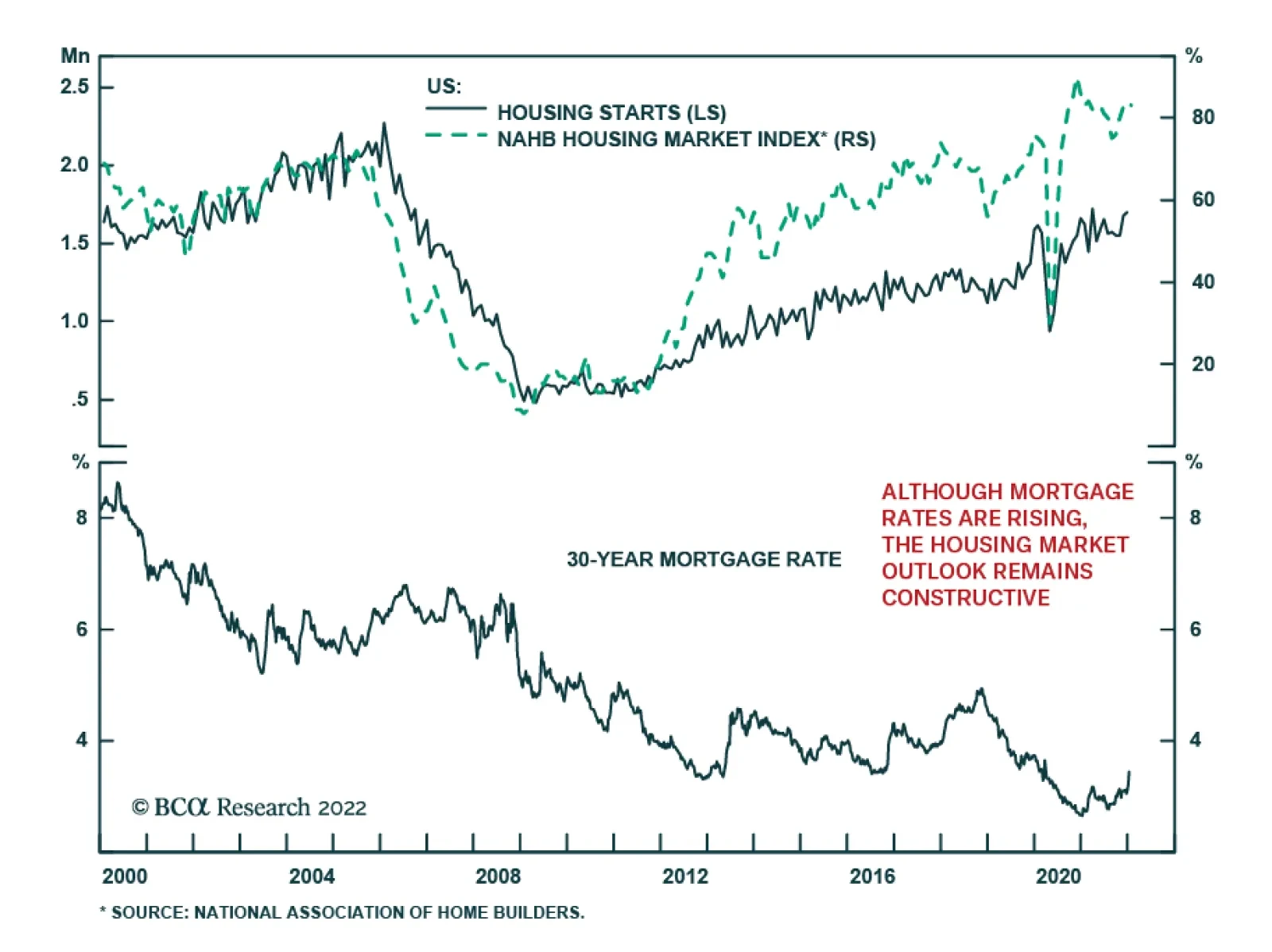
Recent data suggest that the US housing market is robust. Housing starts increased by 1.4% m/m in December, surprising estimates of a 1.7% m/m decline. Similarly, building permits rose by 9.1% m/m which is significantly above the 0.8% m/m decline expected.…
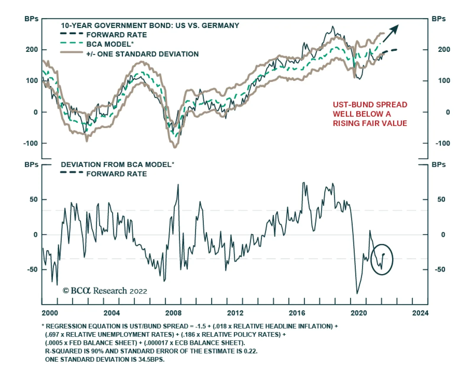
BCA Research’s Global Fixed Income Strategy service’s highest conviction investment recommendation for 2022 is to position for a wider 10-year US Treasury/Germany Bund spread. With markets already priced for multiple Fed rate hikes in 2022, it is now…
Highlights US Vs. Europe: Growth and inflation momentum remains stronger in the US versus Europe. The latter is taking the bigger economic hit from more severe Omicron economic restrictions and a greater exposure to slowing Chinese demand. European inflation has accelerated, but remains slower and less broad-based than elevated US inflation. The backdrop remains more negative for US fixed income compared to Europe. UST-Bund Spread: With markets already priced for multiple Fed rate hikes in 2022, it is now harder to earn significant returns shorting US Treasuries outright compared to 2021. We prefer positioning for higher US bond yields through less-volatile US Treasury-German Bund spread widening positions, with the ECB unlikely to deliver even the single discounted 2022 rate hike. We recommend the position both as a structural allocation in bond portfolios (underweight the US versus Germany) and as a tactical trade (selling US Treasury futures versus Bund futures). Feature Chart of the WeekUS Bond Yields & Bond Volatility Are Both Rising
US Bond Yields & Bond Volatility Are Both Rising
US Bond Yields & Bond Volatility Are Both Rising
Global fixed income markets are off to a volatile start in 2022, on the back of significant repricing of US interest rate expectations. The 10-year US Treasury yield now sits at 1.85%, up +34bps so far in January and is up +72bps from the August 4/2021 intraday low of 1.13%. The 2-year US yield, which is even more sensitive to changes in Fed expectations, is 1.04%, up +31bps so far this month and up +87bps since early August 2021. Yields are rising in other countries as well, with the 10-year benchmark government bond yield up year-to-date in the UK (+24bps), Canada (+45bps) and even Germany (+18bps) where the Bund yield is threatening to return to positive territory. US Treasuries are selling off as markets have heeded the hawkish shift in the Fed’s interest rate guidance. The US overnight index swap (OIS) curve now discounting 89bps of Fed rate hikes in 2022. Bond volatility further out the Treasury curve has increased as yields have moved higher, with the realized volatility of the Bloomberg 7-10 US Treasury index now at an 19-month high (Chart of the Week). We continue to recommend a defensive strategic posture towards direct US Treasuries with below-benchmark exposure on both duration and country allocations in global bond portfolios. However, we prefer a more efficient way to position for the same theme of rising US yields – betting on a wider 10-year US Treasury-German Bund spread. US Growth & Inflation Fundamentals Support A More Hawkish Fed The rise in global bond yields seen in recent weeks has inflicted damage on risk assets, but not in a consistent fashion. Equity markets have taken the brunt of the hit, with the S&P 500 down around -3% so far in January with the tech-heavy NASDAQ down -6%. Yet the MSCI emerging market equity index is up around +1%, European equities are flat and global high-yield corporate bond spreads are essentially unchanged so far this month. While higher bond yields are reflecting expectations of more global monetary tightening over the next year, medium-term interest rate expectations remain subdued. Our proxy for the market pricing of terminal interest rate expectations – 5-year OIS rates, 5-years forward – remains at or below pre-pandemic levels in the US, the UK, Canada and the euro area (Chart 2). Risk assets are performing relatively well in the face of higher bond yields because markets still do not believe that a major increase in interest rates will be needed in the current global tightening cycle. We see this – the likelihood that interest rates will have to rise much more than markets expect - as the biggest vulnerability for global bond markets over the next couple of years. The US remains the “poster child” for this view. In the US, core CPI inflation accelerated to an 31-year high of 5.5% in December. The pickup in US inflation continues to be broad-based, with the Cleveland Fed median CPI and trimmed mean CPI inflation measures reaching 3.8% and 4.8%, respectively (Chart 3). This massive run-up in US inflation has filtered through to medium-term household inflation expectations; the preliminary University of Michigan consumer survey for January showed that inflation 5-10 years out is expected to be 3.1% - the highest level in 13 years. Chart 2Rising Yields Are Not A Threat To Risk Assets ... Yet
Rising Yields Are Not A Threat To Risk Assets ... Yet
Rising Yields Are Not A Threat To Risk Assets ... Yet
Chart 3The Fed Cannot Ignore Elevated Inflation Expectations
The Fed Cannot Ignore Elevated Inflation Expectations
The Fed Cannot Ignore Elevated Inflation Expectations
Chart 4US Demand Steadily Normalizing From The Pandemic Shock
US Demand Steadily Normalizing From The Pandemic Shock
US Demand Steadily Normalizing From The Pandemic Shock
While much of the run-up in US inflation over the past year has been fueled by supply chain disruption and high energy prices, there is still a robust demand component to the high inflation. Consumer spending on goods remains elevated versus its pre-pandemic trend, while services spending is steadily returning back to the pre-pandemic pace (Chart 4). The overall US unemployment rate is now down to 3.9%, the lowest level since February 2020, with broad-based strength in the US labor market across most industries (bottom panel). The rise in consumer inflation expectations has to be most worrisome to Fed officials. Yes, market-based inflation expectations have already seen a significant run-up since the mid-2020 lows, and have even drifted down a bit of late on the back of the more hawkish rhetoric from the Fed. However, survey-based measures of inflation expectations tend to be less volatile than market-based measures, and typically follow trends in realized inflation, which is not slowing down in the US. In other words, rising household inflation expectations are a more reliable indication that an inflationary mindset is becoming entrenched in consumer behavior. US inflation dynamics are transitioning away from supply-driven goods inflation toward more lasting domestically driven forces like tight labor markets, faster wage growth and rising housing costs (Chart 5). Measures of supply chain disruption like global shipping costs are showing signs of peaking (top panel), while commodity price momentum has clearly rolled over – both should eventually feed into slower goods inflation this year. At the same time, tight labor markets will continue to boost US employment costs, which historically have been strongly correlated to US services inflation (middle panel). Chart 5US Inflation Pressures Remain Intense
US Inflation Pressures Remain Intense
US Inflation Pressures Remain Intense
Meanwhile, shelter costs, which represents 32% of the US CPI index, were up 4.2% on a year-over-year basis in December and are likely to continue accelerating given a dearth of housing supply versus demand that is pushing up both house prices and rents (bottom panel). Tying it all together, there are good reasons why the Fed has ramped up the hawkish rhetoric over the past couple of months. However, with the US OIS curve now discounting between 3-4 rate hikes in 2022, it will be harder to generate a second consecutive year of negative returns in the US Treasury market this year. Dating back to the early 1970s, there have only been five calendar years where the Bloomberg US Treasury index delivered an outright negative total return: 1994, 1999, 2009, 2013 and 2021 (Chart 6). None of the four cases prior to last year saw negative returns in the following year, as Treasury yields fell in 1995, 2000, 2010, 2014. Yet even the episodes that saw consecutive years of US yield increases – 1974-75, 1977-81, 1987-88, 2005-06 and 2015-16 – did not see outright negative returns from the Bloomberg US Treasury index. Chart 6Negative Return Years For US Treasuries Are Rare
Negative Return Years For US Treasuries Are Rare
Negative Return Years For US Treasuries Are Rare
Given the starting point of deeply negative real US bond yields, and interest rate expectations that remain too low beyond 2022, we still see value in staying below-benchmark on US duration exposure on a medium-term basis. However, we see a more efficient way to play for higher Treasury yields this year by positioning US Treasury underweights/shorts versus overweights/longs in government bonds in a region where discounted rate hikes will not happen – Europe. The ECB Is In No Hurry To Hike Rates The same supply driven factors that have pushed up US inflation over the past year have also lifted inflation in the euro area. Headline HICP inflation reached an 30-year high of 5.0% in December, while core HICP inflation hit an all-time high of 2.6%. The European Central Bank (ECB), however, is unlikely to deliver any rate hikes in 2022 even with the high inflation, for several reasons (Chart 7): Growth momentum entering 2022 was soft, thanks to Omicron related economic restrictions at the end of 2021 and also weak demand for European exports from China. It will take time for both of those factors to reverse, thus reducing any growth related pressure to tighten monetary policy. Inflation expectations are not exceeding the ECB 2% inflation target, with the 5-year/5-year forward EUR CPI swap now at 1.9% even with headline inflation of 5.0%. The surge in European energy prices will eventually subside in the first half of 2022, which will reduce inflationary pressure on the ECB to tighten. The ECB is ending its pandemic emergency bond buying program (PEPP) in March, and is only partially replacing that buying activity by upsizing its existing pre-pandemic asset purchase program (APP). The ECB will not want to compound the effect of this “tapering” of bond buying by also hiking interest rates, which would surely tighten financial conditions further through higher Italian government bond yields, rising corporate bond yields and a firmer euro. There is little evidence to date showing any pass-through of higher energy-fueled inflation into more domestically-driven inflation. Euro area wage growth was only 1.3% as of the latest available data in Q3/2021 (which is still well after realized inflation had started to accelerate), highlighting the lack of visible “second round” effects on euro area inflation from high energy prices that would prompt the ECB to consider rate hikes (Chart 8). Chart 7An ECB Rate Hike In 2022 Is Unlikely
An ECB Rate Hike In 2022 Is Unlikely
An ECB Rate Hike In 2022 Is Unlikely
Chart 8Limited 'Second Round' Effects From Energy-Driven European Inflation
Limited 'Second Round' Effects From Energy-Driven European Inflation
Limited 'Second Round' Effects From Energy-Driven European Inflation
The EUR OIS curve is discounting 7bps of rate hikes by year-end. Even that modest amount will not be delivered, which will limit how much further European government bond yields will rise this year. A Better Mousetrap: Playing UST Bearishness Through UST-Bund Spread Widening Trades Combining our view of an increasingly hawkish Fed and a still-dovish ECB produces our highest conviction investment recommendation for 2022: positioning for a wider 10-year US Treasury/Germany Bund spread. This can be done by underweighting the US versus core Europe in global bond portfolios, or shorting US Treasury futures versus German Bund futures as we are already recommending in our Tactical Trade Overlay (see page 15). A Treasury-Bund spread widening view is a more efficient way to play for a more hawkish Fed and higher US Treasury yields, for several reasons: There are many examples over past 30 years where the Treasury-Bund spread widened in consecutive years (Chart 9). This is in contrast to the fewer occurrences of consecutive years of rising Treasury yields shown earlier in this report. Thus, there are better odds that last year’s Treasury-Bund spread widening can be repeated in 2022. Chart 9Consecutive Years Of A Rising UST-Bund Spread Happen Often
Consecutive Years Of A Rising UST-Bund Spread Happen Often
Consecutive Years Of A Rising UST-Bund Spread Happen Often
The realized volatility of Treasury-Bund spread trades is almost always lower than that of an outright short position in US Treasuries, but the direction of returns of the two trades is similar (Chart 10). This shows that there is directionality in the Treasury-Bund spread (i.e. it is driven far more by the movements of US yields), but that is a welcome feature given our more bearish view on US Treasuries. The Treasury-Bund spread remains well below fair value on our fundamental valuation model, with fair value increasing due to widening US-European inflation differentials (Chart 11). Tighter relative monetary policies this year (more tapering and rate hikes from the Fed compared to the ECB) also favor a wider fair value spread on our model. Chart 10UST-Bund Wideners Have Lower Volatility Than Outright UST Shorts
UST-Bund Wideners Have Lower Volatility Than Outright UST Shorts
UST-Bund Wideners Have Lower Volatility Than Outright UST Shorts
Chart 11The UST-Bund Spread Looks Very Cheap On Our Model
The UST-Bund Spread Looks Very Cheap On Our Model
The UST-Bund Spread Looks Very Cheap On Our Model
The gap between our 24-month discounters, which measure the change in policy interest rates over the next two years discounted in OIS curves, for the US and euro area is a reliable leading indicator of the 10-year Treasury-Bund spread (Chart 12, bottom panel). The “discounter spread” is currently calling for the Treasury-Bund spread to widen by more than the current path discounted in US Treasury and German Bund forward rates. Chart 12Position For More UST-Bund Spread Widening In 2022
Position For More UST-Bund Spread Widening In 2022
Position For More UST-Bund Spread Widening In 2022
Chart 13UST-Bund Spread Is Not Technically Stretched
UST-Bund Spread Is Not Technically Stretched
UST-Bund Spread Is Not Technically Stretched
The Treasury-Bund spread is not stretched from a technical perspective (Chart 13). The spread is sitting right at its 200-day moving average and the 26-week change in the spread (a measure of price momentum) is rising but remains well below previous peak levels that have capped past spread increases. Summing it all up, the case is strong for including US-Germany spread widening positions as core holdings in investor portfolios in 2022. The current spread is 185bps and we have a year-end target of 225bps. Bottom Line: With markets already priced for multiple Fed rate hikes in 2022, it is now harder to earn significant returns shorting US Treasuries outright compared to 2021. We prefer positioning for higher US bond yields through less-volatile US Treasury-German Bund spread widening positions, with the ECB unlikely to deliver even the single discounted 2022 rate hike. We recommend the position both as a structural allocation in bond portfolios (underweight the US versus Germany) and as a tactical trade (selling US Treasury futures versus Bund futures). Robert Robis, CFA Chief Fixed Income Strategist rrobis@bcaresearch.com Recommendations Duration Regional Allocation Spread Product Tactical Trades GFIS Model Bond Portfolio Recommended Positioning Active Duration Contribution: GFIS Recommended Portfolio Vs. Custom Performance Benchmark
Image
The GFIS Recommended Portfolio Vs. The Custom Benchmark Index
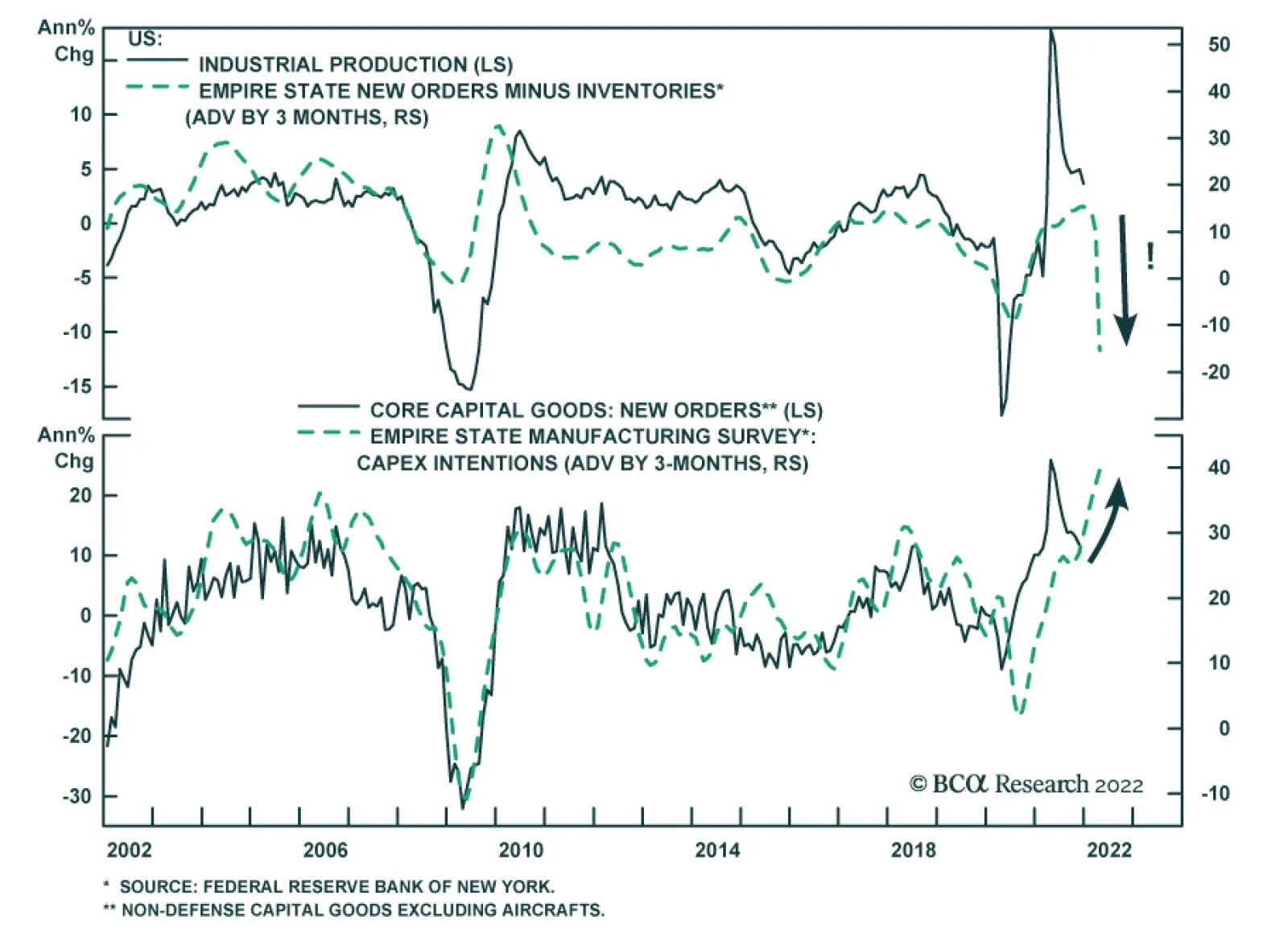
On the surface, the Empire State Manufacturing Survey was a big disappointment. The general business conditions index tumbled 33 points to -0.7, significantly below expectations of a smaller decline to 25.0. The index implies that manufacturing activity in…