United States
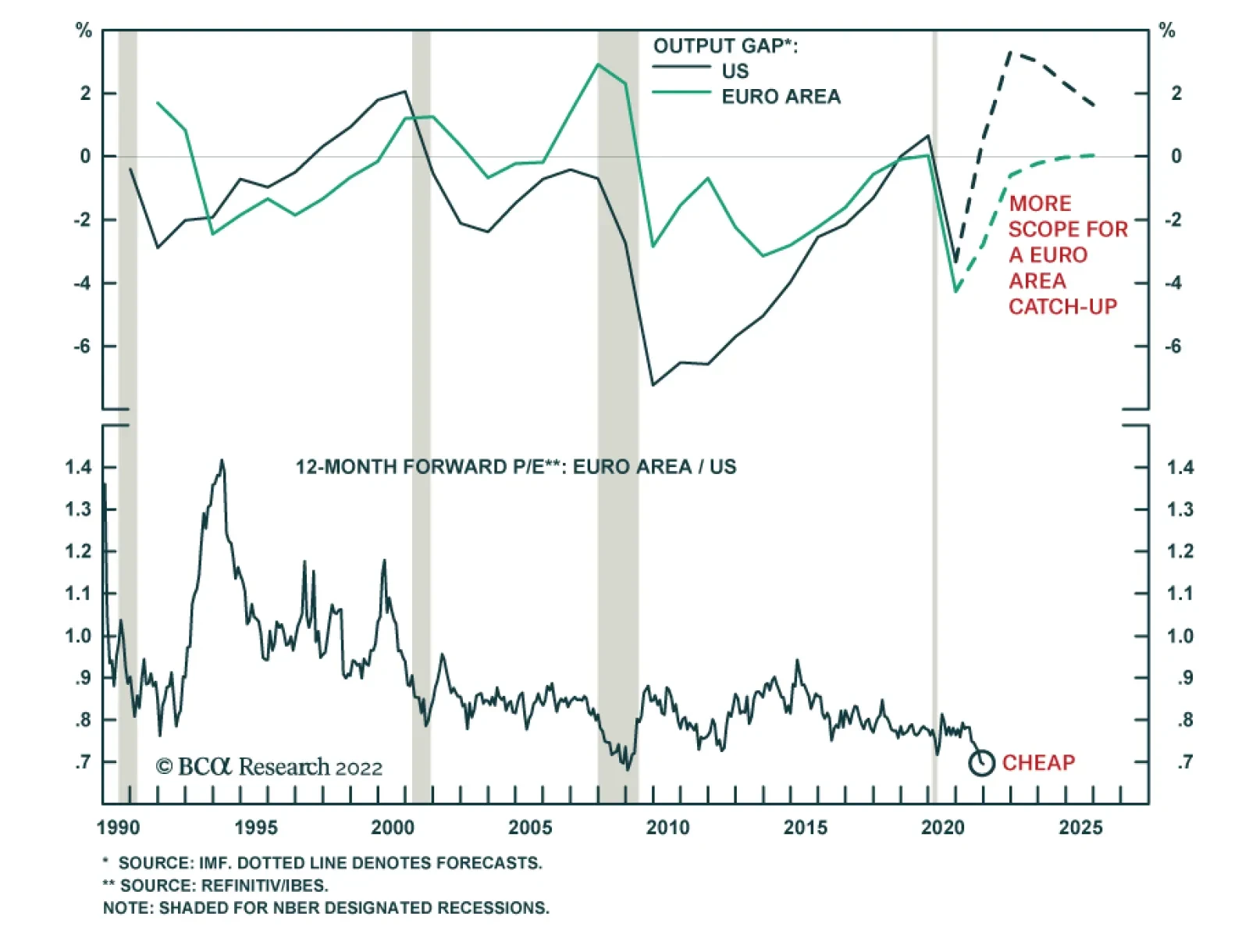
Euro Area equities underperformed US stocks by 14% in 2021. However, this underperformance has reversed so far this year with Eurozone stocks up relative to US ones. Nevertheless, risks to European equities remain elevated over the near-term. First, Europe’s…
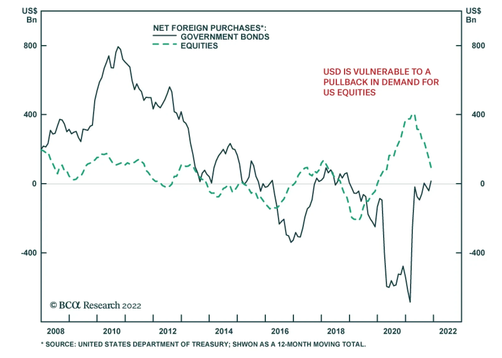
The US has been relying heavily on equity inflows to finance its massive trade deficit. These foreign equity inflows will be strong as long as there is robust demand for US stocks. However, if non-US equity markets begin to outperform, then demand and foreign…
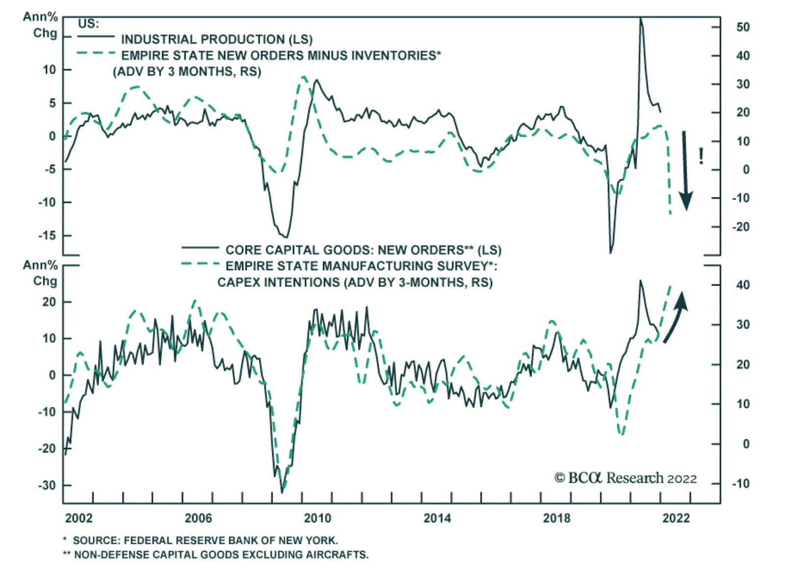
On the surface, the Empire State Manufacturing Survey was a big disappointment. The general business conditions index tumbled 33 points to -0.7, significantly below expectations of a smaller decline to 25.0. The index implies that manufacturing activity in…

Highlights Duration: A look at past rate hike cycles shows that Treasury returns are generally low, though not always negative. For the current cycle, we continue to recommend a below-benchmark portfolio duration stance as we don’t think the full extent of Fed rate hikes is adequately priced in the yield curve. Interest Rate Policy: The Fed will deliver its first rate hike in March and will lift rates 2 or 3 more times this year. We see the fed funds rate moving above 2% this cycle, higher than what is currently priced in the market. Fed Balance Sheet: The Fed will start the passive runoff of its securities holdings in the first half of this year, after one or two rate hikes have been delivered. Balance sheet reduction will proceed more quickly than it did last cycle, but the Fed will refrain from outright sales. Feature Chart 1Market Expectations Are Too Low
Market Expectations Are Too Low
Market Expectations Are Too Low
Rate hikes are just around the corner. In fact, there is a growing consensus among FOMC participants that it will be appropriate to deliver the first rate hike in March, as soon as net asset purchases reach zero. Just last week, San Francisco Fed President Mary Daly called a March rate hike “quite reasonable” and Fed Vice-Chair Lael Brainard testified that the Fed will be “in a position” to lift rates as soon as purchases end. Brainard also mentioned that the Fed has discussed shrinking its balance sheet.1 We expect the Fed to follow through with a 25 basis point rate hike in March, and with 2 or 3 more hikes over the course of 2022. We also see the Fed shrinking its balance sheet this year, via the passive runoff of maturing securities. With all that in mind, this week’s report draws on the experience of past rate hike cycles to give us a sense of what Treasury returns to expect as the Fed lifts rates. We also discuss how the Fed’s balance sheet will evolve over the next few years. Treasury Returns During Rate Hike Cycles Table 1 provides a useful summary of Treasury returns during the prior four rate hike cycles. The table shows excess Treasury returns versus cash for the Bloomberg Barclays Treasury Index as well as its Intermediate Maturity and Long Maturity sub-indexes. Table 1Treasury Returns During Fed Rate Hike Cycles
Positioning For Rate Hikes In The Treasury Market
Positioning For Rate Hikes In The Treasury Market
The first conclusion we draw is that Treasury returns are generally poor during Fed tightening cycles. Intermediate maturity Treasuries underperformed cash in all four cycles. Long maturity Treasuries provided only modestly positive returns in two of the four cycles and deeply negative returns in one of them. One important caveat is that our analysis only considers cycles where the Fed lifted rates multiple times in a row. For example, we exclude the 1997-98 period when one rate hike in 1997 was quickly reversed in 1998. We also define the most recent tightening cycle as spanning from 2015 to 2018 even though the Fed kept the policy rate steady from December 2015 to December 2016. Obviously, if the Fed is forced to abandon its tightening cycle after one or two hikes, then Treasury returns will be much stronger than our historical analysis suggests. Next, let’s dig a bit deeper by looking at each rate hike cycle individually. The 2015-2018 Cycle Chart 22015-2018 Cycle
2015-2018 Cycle
2015-2018 Cycle
The most recent Fed tightening cycle started with a 25 basis point rate hike in December 2015. The Fed then went on hold for 12 months before delivering a string of 8 hikes between December 2016 and December 2018. All in all, the tightening cycle lasted 36 months and the Fed raised the target fed funds rate by 225 bps, from a range of 0% - 0.25% to a range of 2.25% - 2.5% (Chart 2). If we look at the 36-month discounter on the day before the first hike (Chart 2, panel 3), it shows that the market was priced for 159 bps of tightening over the next three years. The fact that the Fed delivered more tightening (225 bps) explains why excess Treasury returns were negative for short and intermediate maturities. The 5-year/5-year forward Treasury yield is another useful metric because it is a good approximation of the market’s expected terminal fed funds rate, i.e. the fed funds rate at the end of the tightening cycle. The 5-year/5-year forward Treasury yield stood at 2.92% in December 2015, slightly above where the fed funds rate peaked in 2018 (Chart 2, bottom panel). This explains why long-maturity excess Treasury returns were slightly positive during the cycle. The 2004-2006 Cycle Chart 32004-2006 Cycle
2004-2006 Cycle
2004-2006 Cycle
During this cycle, which spanned from June 2004 to June 2006, the Fed lifted rates by 400 bps (sixteen 25 basis point rate hikes). The fed funds rate rose from 1% to 5.25% during the two-year span (Chart 3). The 24-month fed funds discounter stood at 369 bps the day before the first hike (Chart 3, panel 3), indicating that the market discounted 31 bps less tightening than was ultimately delivered. Once again, this explains why excess Treasury returns were negative for short and intermediate maturities. The 5-year/5-year forward Treasury yield was 5.72% just prior to the first hike in June 2004 (Chart 3, bottom panel). But, as was the case in the 2015-2018 cycle, the fed funds rate never reached this level. It peaked at 5.25% in 2006 and long-maturity excess Treasury yields were somewhat positive as a result. The 1999-2000 Cycle Chart 41999-2000 Cycle
1999-2000 Cycle
1999-2000 Cycle
In this cycle, the Fed lifted rates by 175 bps between June 1999 and May 2000, driving the fed funds rate from 4.75% to 6.5% (Chart 4). The 12-month fed funds discounter stood at 108 bps on the day before the first hike (Chart 4, panel 3). Once again, this was slightly less than the 175 bps of tightening that transpired. Excess returns for short and intermediate maturity Treasuries were negative as a result. The 5-year/5-year forward Treasury yield was 5.99% on the day before the first hike (Chart 4, bottom panel). This time, the market’s assessment proved to be too low compared to the funds rate’s 6.5% peak. This divergence explains why long-maturity Treasury excess returns were worse during this period than they were in the 2015-18 and 2004-06 cycles. The 1994-1995 Cycle Chart 51994-1995 Cycle
1994-1995 Cycle
1994-1995 Cycle
The Fed surprised markets by lifting rates extremely quickly during this cycle. The Fed moved rates from 3% to 6% in the span of only 12 months between February 1994 and February 1995 (Chart 5). The 12-month discounter was only 130 bps at the beginning of the tightening cycle, well short of the 300 bps rate increase that was delivered (Chart 5, panel 3). This large divergence explains why excess Treasury returns were so poor during this period. Interestingly, the 5-year/5-year forward Treasury yield stood at 6.69% just prior to the first hike (Chart 5, bottom panel), not that far from the ultimate peak in the fed funds rate. In other words, while market expectations for the near-term path of interest rates were too low, expectations for the ultimate peak in interest rates were fairly accurate. However, terminal rate expectations became unmoored when the Fed started to tighten, and the 5-year/5-year forward Treasury yield rose all the way to 8.5%, far above the fed funds rate’s ultimate peak. This dramatic shift in terminal rate expectations explains the deeply negative long-maturity Treasury returns observed during the period. Of course, those losses were quickly reversed in H1 1995 once it became clear that the Fed would not lift rates further. The 5-year/5-year forward Treasury yield plummeted back to 6.5%. Investment Implications Let’s apply the above analysis to today’s situation. At present, the 12-month fed funds discounter stands at 93 bps. The 24-month discounter is 151 bps and the 36-month discounter is 159 bps (Chart 1). In other words, the market is discounting that the Fed will deliver between 3 and 4 rate hikes this year, but only 2 more in 2023 before the funds rate stabilizes at roughly 1.5%. Our expectation is that the fed funds rate will rise to at least 2% during the next three years, and we therefore continue to recommend running below-benchmark portfolio duration. For its part, the 5-year/5-year forward Treasury yield is currently 2.03%. This is at the low-end of survey estimates for the long-run neutral fed funds rate (Chart 1, bottom panel). We expect the 5-year/5-year forward Treasury yield to rise closer to the middle of the range of survey estimates (~2.25%) as it becomes clear that the fed funds rate will rise to at least 2%. It’s also possible that, like in the 1994-95 episode, terminal rate expectations will rise dramatically as the Fed lifts rates more quickly than anticipated. This, however, is not our base case outlook given that expectations for a low terminal fed funds rate are very well entrenched. Bottom Line: A look at past rate hike cycles shows that Treasury returns are generally low, though not always negative. For the current cycle, we continue to recommend a below-benchmark portfolio duration stance as we don’t think the full extent of Fed rate hikes is adequately priced in the yield curve. The Balance Sheet Outlook Chart 6Hike First, Then QT
Hike First, Then QT
Hike First, Then QT
We expect the Fed to start shrinking its securities holdings this year. The process will probably begin in the first half of the year after one or two rate hikes have been delivered. To arrive at this conclusion, we first look at how the Fed proceeded during the last tightening cycle. Back then, the Fed waited until the funds rate was around 1% before it started to shrink its balance sheet in September 2017 (Chart 6). Notably, the Fed didn’t immediately move toward the full passive runoff of its portfolio. Rather, it started slowly by permitting only $6 billion of Treasuries and $4 billion of MBS to mature in October 2017. These amounts were gradually increased in the subsequent months. The Fed will move more quickly toward balance sheet reduction this cycle and the pace of said reduction will be faster. Here are the relevant passages from the minutes of the December FOMC meeting: Almost all participants agreed that it would likely be appropriate to initiate balance sheet runoff at some point after the first increase in the target range for the federal funds rate. However, participants judged that the appropriate timing of balance sheet runoff would likely be closer to that of policy rate liftoff than in the Committee’s previous experience. […] Many participants judged that the appropriate pace of balance sheet runoff would likely be faster than it was during the previous normalization episode. Many participants also judged that monthly caps on the runoff of securities could help ensure that the pace of runoff would be measured and predictable…2 From these quotes, we surmise that balance sheet runoff will start earlier than last time – after one or two rate hikes instead of four. Also, while the runoff will proceed more quickly than last time, there is still support for maintaining monthly caps on the pace. The Fed will probably not move immediately to the complete passive runoff of its portfolio, and outright bond sales do not appear to be part of the discussion. One concern that investors might have about the Fed’s balance sheet runoff is the extra supply of Treasuries that will hit the market. As an upper-bound, if we assume complete passive runoff starting in April 2022, the Fed’s Treasury holdings will shrink from $5.7 trillion today to $3.5 trillion by the end of 2024, adding an average of $715 billion extra Treasury supply to the market each year (Chart 7). If we exclude T-bills and TIPS to focus only on coupon-paying nominal Treasury securities, then we calculate that Fed holdings will fall from $4.9 trillion to $3 trillion, adding an extra $639 billion of supply to the market on average for the next three years. However, it’s important to note that Fed policy alone doesn’t dictate the supply of Treasury securities. The Treasury department’s issuance plans also need to be considered. When the Fed allows a maturing bond to passively roll off its portfolio it doesn’t dump that bond directly into the market. Rather, the Treasury Department issues new debt to replace the maturing bond. The Treasury could decide, for example, to increase T-bill issuance instead of coupon issuance. In fact, this sort of decision becomes more likely if Treasury officials are concerned about dumping too much coupon supply on the market. Currently, the Treasury Department targets a range of 15% - 20% for the amount of outstanding T-bills as a proportion of the overall funding mix, a target that it is hitting (Chart 8). However, the minutes from the most recent Quarterly Refunding meeting stressed that the Treasury feels the need to maintain “flexibility” when it comes to this target range and noted that “there is likely more leeway at the top of the recommended range than at the bottom.”3 Chart 7The Pace Of ##br##Runoff
The Pace Of Runoff
The Pace Of Runoff
Chart 8T-bill Issuance Could Rise As The Fed's Portfolio Shrinks
T-bill Issuance Could Rise As The Fed's Portfolio Shrinks
T-bill Issuance Could Rise As The Fed's Portfolio Shrinks
Finally, it is important to consider the extent to which the Fed will be able to shrink its balance sheet. The Fed’s goal will be to achieve a reserve supply that allows it to maintain the funds rate within its target band without putting undue pressure on either its Overnight Reverse Repo Facility (ON RRP) or its new Standing Repo Facility (SRF). Chart 9The Fed's Balance Sheet Was Too Small In September 2019
The Fed's Balance Sheet Was Too Small In September 2019
The Fed's Balance Sheet Was Too Small In September 2019
The ON RRP acts as a floor on interest rates and its usage therefore increases when the Fed’s balance sheet is too large. The third panel of Chart 9 shows that this is currently the case. Conversely, the SRF acts as a ceiling on interest rates and its usage will ramp up if the Fed’s balance sheet becomes too small. This last occurred in September 2019 when the Fed briefly lost control of interest rates and was forced to increase repo holdings and reserve supply (Chart 9). Going forward, the Fed will continue to run down its balance sheet until ON RRP usage drops close to zero. However, it will want to stop reducing its holdings before SRF usage picks up. It is highly uncertain when this will occur, but we suspect that the Fed won’t be able to get the balance sheet back to September 2019 levels before seeing SRF usage increase. Bottom Line: The Fed will start the passive runoff of its securities holdings in the first half of this year, after one or two rate hikes have been delivered. Balance sheet reduction will proceed more quickly than it did last cycle, but the Fed will refrain from outright sales. While the size of the Fed’s balance sheet will shrink during the next few years, it will remain larger than it was in September 2019. Ryan Swift US Bond Strategist rswift@bcaresearch.com Footnotes 1 Please see https://www.reuters.com/business/exclusive-feds-daly-march-liftoff-is-quite-reasonable-2022-01-13/ and https://www.nbcnews.com/business/economy/interest-rate-hike-come-soon-march-feds-brainard-signals-rcna12112 2 https://www.federalreserve.gov/monetarypolicy/files/fomcminutes20211215.pdf 3 https://home.treasury.gov/news/press-releases/jy0464 Recommended Portfolio Specification Other Recommendations Treasury Index Returns Spread Product Returns
BCA Research’s US Investment Strategy service argues that investors should not read the first rate hike, or even the run-up to it, as a sign to begin reducing exposure. Signal measures of economic activity – hiring, lending, spending and GDP – grow well…
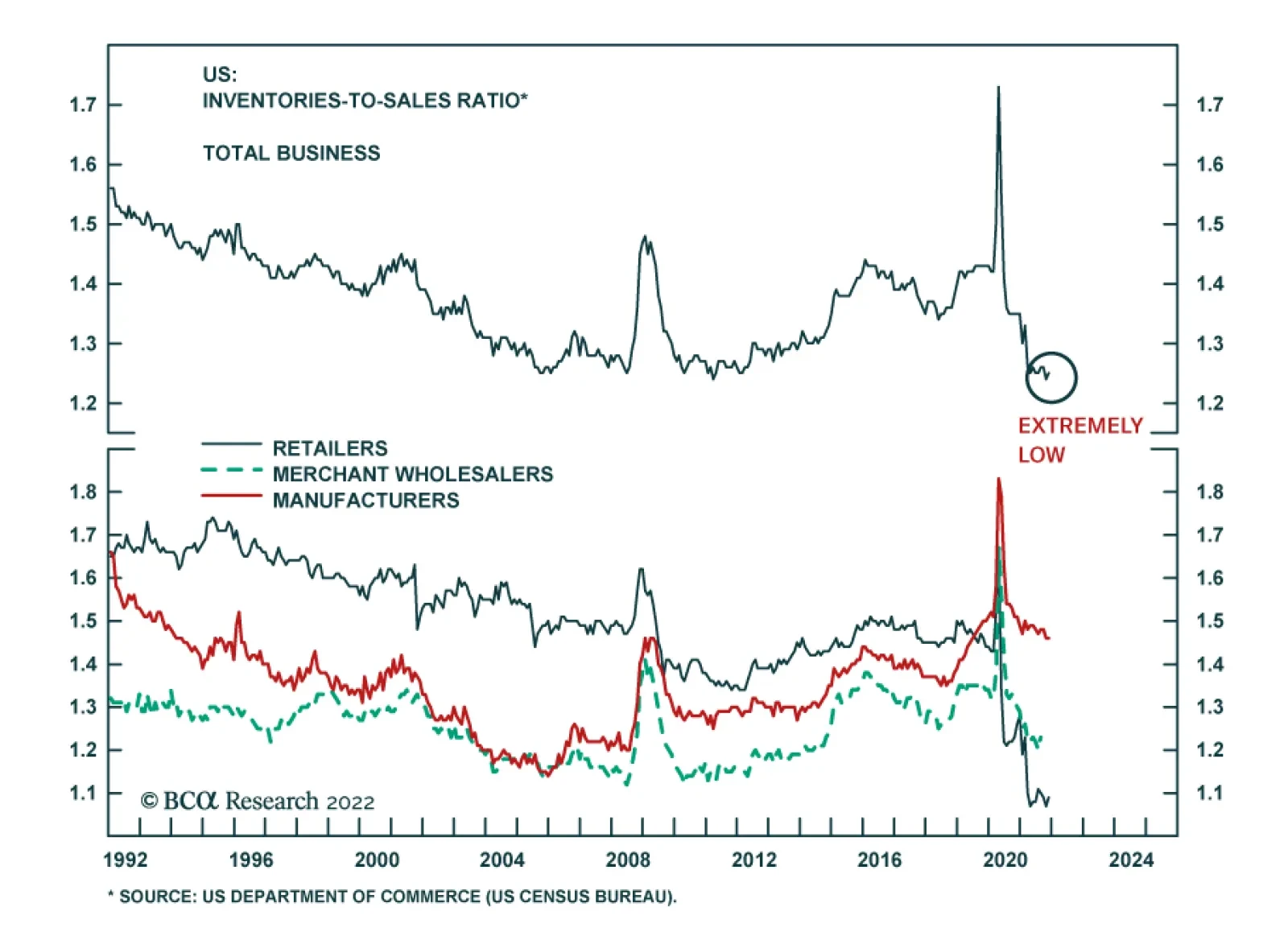
A need to restore depleted inventories will be among the forces supporting the US economic expansion this year. The total business inventories-to-sales ratio collapsed during the pandemic due to global supply chains disruptions and labor supply shortages. At…
Dear Client, Next week there will be no regular strategy report. Instead, we will hold our quarterly webcast which will discuss the outlook for the European economy and assets in 2022. I look forward to this interaction. Best regards, Mathieu Savary Highlights European and global yields have considerable upside over the coming year, even if inflation peaks in 2022. The post-World War II experience is instructive: massive war-time fiscal and monetary stimulus allowed for an upward re-estimation of the neutral rate as trend nominal growth improved. A similar development is likely to result in an improvement in nominal growth and the neutral rate compared to the post-GFC decade. China and a financial accident outside the US constitute the greatest risks this year to higher yields. European stocks and value stocks will benefit from this rise in yields. Cyclicals in general and industrials in particular are the European sectors most levered to higher yields. Overweight these assets. Defensives will underperform meaningfully if yields rise further. Long Sweden and the Netherlands / Short Switzerland is an appealing trade to bet on higher yields, especially if inflation peaks in 2022. Feature Last week, US Treasury yields finally reached levels that prevailed before the pandemic started. In Europe, German 10-year yields flirted with the symbolic 0% level, rising to their highest reading since May 2019. With the Fed preparing to increase interest rates in March, and global inflation remaining perky, do yields already reflect all the bearish bond news or will they continue to climb higher on a cyclical basis? Moreover, what would be the implications for equity prices of higher yields? BCA expects yields to rise further, for which German Bunds will not be an exception. This process will continue to generate volatility in stock prices, but ultimately, higher equities will prevail. Increasing yields will help European stocks and are strongly associated with an outperformance of cyclical equities. What’s Moving Yields Up? Not all yield increases are created equal. A breakdown of yields helps us understand what investors are pricing in for the future. In the US, the upside in 10-year yields mostly reflects the increase in 5-year yields. This maturity has moved back to levels that prevailed prior to the pandemic, while the 5-year/5-year forward yield remains below its spring 2021 peak (Chart 1, top panel). Moreover, these shifts mirror higher real interest rates, which are rising across maturities, while inflation expectations have been declining in recent weeks or have been flat since mid-2021 on a 5-year/5-year forward basis (Chart 1, middle and bottom panels). This breakdown confirms investors are driving yields higher because they expect more Fed tightening. However, this upgraded view of the Fed’s policy path is limited to the next few years, and long-term policy expectations approximated by the forward rates are not rising as much. In other words, markets do not expect that the Fed will be able to push up interest rates on a long-term basis. In Germany, the breakdown of the most recent shift in yield paints a different picture (Chart 2). As in the US, real yields, not inflation expectations, drove the latest bond selloff. This points toward pricing in an eventual policy tightening in Europe. However, unlike what is happening in the US, 5-year/5-year forward rates are the main force driving yields higher; investors are therefore expecting the ECB to have to follow the Fed later on. Chart 1Near-Term Tightening Is Driving Treasurys
Near-Term Tightening Is Driving Treasurys
Near-Term Tightening Is Driving Treasurys
Chart 2longer-Term Tightening Is Driving Bunds
longer-Term Tightening Is Driving Bunds
longer-Term Tightening Is Driving Bunds
Can the Yield Upside Continue? While BCA’s target for the 10-year Treasury yield in 2022 stands at 2.25% and the Bund yield at 0.25%, the coming two to three years should witness significantly higher yields. The period after World War II offers an interesting historical equivalent. During the War, government spending as a share of GDP exploded, lifting US gross federal debt from 52% of GDP at the dawn of the conflict to 114% at the end of 1945. However, the Fed kept a lid on interest rates during this period to help finance the war effort. T-Bill rates were pegged at 3/8th of a percent and the Fed also capped T-Bond yields at 2.5%. Chart 3The Post WWII Experience
The Post WWII Experience
The Post WWII Experience
As a consequence of this policy effort, the Fed balance sheet increased significantly and continued to do so after the war (Chart 3). The stimulative fiscal and monetary policy, as well as the capacity constraints associated with shifting production from military goods to consumer and capital goods, contributed to an inflation spike to 20% in March 1947. Moreover, the Korean War boosted government spending between 1950 and 1953, resulting in another inflation spike to 9.5% in 1951. The Fed’s cap on yields ended after the March 1951 Treasury-Fed Accord. It was followed by the beginning of a multi-decade uptrend in bond yields, which culminated in 1981 with T-Bond yields above 15% following the inflationary surge of the 1970s. Nonetheless, the yield increase from 2.5% in 1951 to 4% at the end of the 1950s happened after the inflation peak of the Korean War. This original inflection reflected economic vigor and a normalization of the neutral rate after the trauma of the Great Depression. The current situation is not dissimilar. The neutral rate and the market-based estimates of the terminal rate of interest are still very low in the US and in Europe (Chart 4). However, the vast amount of monetary and fiscal stimulus injected in the economy has jolted a recovery. It has also caused a massive wealth transfer to households and the private sector in general that is likely to increase consumption permanently. As a result, growth in the coming decade will be stronger than it was in the past decade, in both the US and Europe. This process will allow the neutral rate to rise over time, which in turn will lift the terminal rate of interest and yields. In this context, even if inflation were to cool in 2022 because some of the supply constraints that marked 2021 dissipate, yields may continue to rise and do so for the remainder of the decade. This is also true in Europe where the household savings rate still towers near 19% of disposable income and may fall by 6% to reach its pre-pandemic levels, as the US experience presages (Chart 5). Chart 4Terminal Rates Proxies Are Too Low
Terminal Rates Proxies Are Too Low
Terminal Rates Proxies Are Too Low
Chart 5European Savings Rate Has Downside
European Savings Rate Has Downside
European Savings Rate Has Downside
A simple modeling exercise confirms that yields will have greater upside over the coming year. Conceptually, yields are anchored by policy rates and the terminal rate, which is somewhere above the neutral rate of interest. One of the key determinants of the nominal neutral rate is the trend growth rate of nominal GDP. While the market cannot know precisely where that growth rate stands, recent experience influences the perception of market participants. Thus, a long-term moving average of nominal GDP growth constitutes a rough proxy of this measure and will relate to investors’ assessment of the neutral rate and the terminal interest rates. Chart 6Bond Yields Are Too Low, Especially If Trend Nominal Growth Picks Up
Bond Yields Are Too Low, Especially If Trend Nominal Growth Picks Up
Bond Yields Are Too Low, Especially If Trend Nominal Growth Picks Up
Using this approach reveals two important bearish forces for bonds. Even after accounting for the slow growth rate of both the US and Eurozone economies over the past ten years, as well as extraordinarily low policy rates, T-Notes and Bunds yields are too low (Chart 6). More importantly, if nominal GDP growth is higher this decade than next, this alone will push up the equilibrium level of yields in Advanced Economies. The upside in yields is not without risks. China is still going through a deflationary shock whereby growth is slowing. As China eases policy, Chinese yields will continue to fall, bucking the global trend (Chart 7). In recent years, Chinese yields have rarely diverged from global yields. If Chinese growth plummets from here, the divergence will not be resolved via higher Chinese yields. However, Chinese authorities do not want growth to collapse. Reports from the State Council suggest an acceleration of the implementation of major spending projects under the 14th Five-year plan and that the credit impulse is trying to bottom. Nonetheless, China remains a risk to monitor closely. The second major risk stems from the intertwined nature of the global financial system. The US economy is able to withstand higher Treasury yields, but is the rest of the world? As Chart 8 highlights, US private debt-servicing costs are low today, as a result of minimal interest rates and the decline in debt loads after the GFC. The same is not true for the G-10 outside the US, let alone EM economies. These differences suggest that the US will be much more resilient to rising yields than the rest of the world. A major financial accident outside the US would prompt a wave of risk aversion that would decrease yields around the world. Chart 7An Unusual Divergence
An Unusual Divergence
An Unusual Divergence
Chart 8Will The Rest Of The World Withstand Higher US Yields?
Will The Rest Of The World Withstand Higher US Yields?
Will The Rest Of The World Withstand Higher US Yields?
Bottom Line: Global yields have much greater upside for the years ahead, even if inflation slows in 2022. While BCA targets 2.25% and 0.25% for, respectively, Treasurys and Bund yields this year, the multi-year upside is much greater as neutral rates are re-adjusted upward. The change will not move in a straight line, but the trend will not be friendly for bondholders. In the near-term, the main culprits preventing higher yields are a further slowdown in China as well as a financial accident outside the US. Investment Implications The most obvious investment implication is that investors should use any pullback in yields to sell duration. As a corollary, investors should maintain an overweight stance on equities relative to bonds. The equity risk premium, especially in Europe, remains elevated, and European dividend yields stand near record highs compared to Bund yields (Chart 9). Moreover, when yields rise because of a higher neutral rate, this also means that the expected long-term growth rate of earnings is firming, which negates some of the adverse impacts on valuations of higher discount rates. Nonetheless, if inflation does not stabilize, the increase in yields could become much more painful for stocks, as the negative correlation between stock prices and bond yields would reassert itself—a possibility we described five weeks ago. A rising neutral rate and terminal rate are also associated with an outperformance of European stocks compared to the US and an outperformance of value stocks over growth stocks in Europe (Chart 10). These relationships reflect the greater procyclicality of European equities and value stocks. Chart 9A Valuation Cushion For Stocks
A Valuation Cushion For Stocks
A Valuation Cushion For Stocks
Chart 10Higher Terminal Rates Favor Europe And Value
Higher Terminal Rates Favor Europe And Value
Higher Terminal Rates Favor Europe And Value
Finally, we looked at the performance of European sectors based on the trend in yields. Table 1 highlights that industrials are the great winner when yields rise, which is a testament to their pro-cyclicality. They beat the market on 3-month, 6-month and 12-month horizons by 1.6%, 2.9% and 5.8%, respectively. The regularity of their benchmark-beating performance is extremely high. When yields rise, financials also see a marked improvement of their relative returns compared to their historical average returns. Surprisingly, so do European tech firms, which reflect the more hardware focus of European tech compared to the US. Table 1Rising Yields & Sector Relative Performance
Implications Of Rising Yields
Implications Of Rising Yields
Table 2 repeats the same exercise, but, this time, we control for the slope of the yield curve, focusing on periods when the yield curve is positively sloped. Again, industrials are the star sector, but other cyclicals such as materials and consumer discretionary also stand out. European tech remains dominated by its cyclical properties, while the outperformance of financials becomes more marked. Table 2Rising Yields & Sector Relative Performance With Postive Yield Curve Slope As A Control Variable
Implications Of Rising Yields
Implications Of Rising Yields
Table 3 looks at the behavior of sectors when yields rise and when the Euro Area PMI Manufacturing improves, which is a scenario we expect for most of 2022 once the winter passes. Industrials win more clearly than materials or consumer discretionary. The European tech sector continues to generate a very strong outperformance, while the excess return of financials firms up as well. This scenario also shows a particularly steep underperformance for all the defensive sectors. Table 3Rising Yields & Sector Relative Performance With Improving Manufacturing PMI As A Control Variable
Implications Of Rising Yields
Implications Of Rising Yields
Table 4 completes the picture, focusing on rising yields when core CPI decelerates, another development we foresee in 2022. Once again, industrials stand out as a result of the extent and regularity of their outperformance. However, under this controlling variable, the performance of materials and consumer discretionary stocks deteriorates significantly. Financials also see a large downgrade to their relative performance. Tech performs best under these circumstances. Here, staples suffer the worst fate, closely followed by utilities and healthcare. Table 4Rising Yields & Sector Relative Performance With Falling Core CPI As A Control Variable
Implications Of Rising Yields
Implications Of Rising Yields
Based on these observations, the highest likelihood scenario is that European cyclicals will outperform defensive equities significantly this year after a period of consolidation since last spring. A more targeted approach would be to overweight industrials and tech at the expense of staples and utilities. Geographically, investors should buy a basket of Swedish (overweight industrials) and Dutch stocks (overweight tech), while selling Swiss stocks (overweight healthcare). Mathieu Savary, Chief European Strategist Mathieu@bcaresearch.com Tactical Recommendations Cyclical Recommendations Structural Recommendations Closed Trades Currency Performance Fixed Income Performance Equity Performance
Highlights It’s true that rising rates often precipitate bear markets, but it takes a while, … : We subscribe to the view that expansions are more likely to be murdered by the Fed than die of old age. It’s hard to envision a plausible scenario in which the Fed could hike rates enough in 2022 to kill this one, though, and even the first half of 2023 would be a reach. … because the Fed only seeks to slow the economy when it’s firing on all cylinders: Earnings are typically growing at a rapid clip and risk aversion is a distant memory when the Fed begins the process of draining the punch bowl. The fed funds rate tipping point can only be definitively identified after the fact, but our estimate has an impressive track record: No one knows for sure where the line of demarcation between easy and tight monetary policy lies, but equities have shined when the fed funds rate is below our equilibrium estimate. We do not share the view that Tech stocks are especially vulnerable to higher interest rates: Although it lacks empirical support outside of a small subset of observations, the Tech vulnerability view has spread more widely than the Omicron variant. Feature Last week’s report discussing the equity impact of impending rate hikes elicited a lot of reaction. A discussion with one investor usually has relevance for other investors, so we are sharing a composite of the questions we received, along with our responses. It gives us the chance to elaborate on some points that we did not previously address in full, but our conclusion remains unchanged. History argues that equities have little to fear from an incremental rate hike campaign, and we expect that they will generate sizable positive excess returns above Treasuries and cash over the next twelve months. The Fed, With Rate Hikes, In The Board Room Why shouldn’t investors be concerned about rate hikes when you yourself have said that the Fed precipitates recessions? As the last expansion stretched on for a record length of time, we regularly repeated the line that expansions don’t die of old age, they die because the Fed murders them. It fits well with our tipping point view of rate hikes and we wholly subscribe to it. It is important to bear in mind, however, that the Fed’s tools act much more slowly than the lethal array of objects in the game of Clue. As we highlighted last week, monetary policy acts with long and variable lags and the Fed accordingly tightens it in increments allowing for real-time feedback that might help it tailor its actions to evolving economic conditions. Ex-the pandemic, tight monetary policy has been a necessary, albeit not sufficient, recession condition for the 60 years covered by our equilibrium fed funds rate estimate. Although not every instance when the fed funds rate exceeded its equilibrium level preceded a recession, no recession occurred when the funds rate was below equilibrium (Chart 1). Owing to monetary policy’s lagged effects, however, the recessions didn’t begin until well after the Fed began to tighten policy. On average, each recession arrived 26 months after Phase I kicked off and 12 months after the policy cycle entered Phase II (Table 1). Peak growth occurs in the early stages of rate hikes, while the Fed is merely easing up on the gas; deceleration only ensues in the latter stages, when the Fed pushes down on the brake pedal. Chart 1Rate Hikes Are A Necessary, But Not Sufficient, Recession Condition ...
Rate Hikes Are A Necessary, But Not Sufficient, Recession Condition ...
Rate Hikes Are A Necessary, But Not Sufficient, Recession Condition ...
Table 1... And It Takes A While For The Economy To Feel Their Full Effect
Q&A About Rate Hikes And Stocks
Q&A About Rate Hikes And Stocks
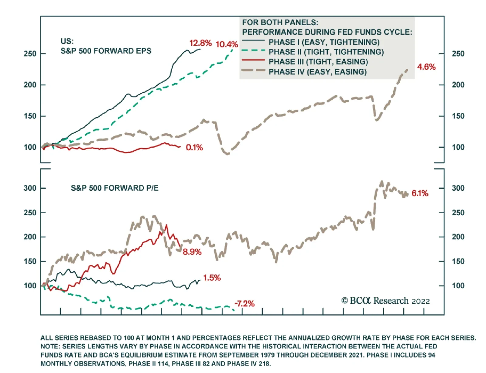
Index P/E Multiples Don’t Collapse Overnight It’s often said that the Fed hikes rates until something breaks. If equities are ultimately going to break in the process, why wouldn’t a prudent investor read the first rate hike, or even the run-up to it, as a sign to begin reducing exposure? We showed last week that signal measures of economic activity – hiring, lending, spending and GDP – grow well above their through-the-cycle pace while the Fed is tightening policy. Corporate earnings do, too, and S&P 500 earnings expectations have risen most rapidly when the Fed is hiking rates, with Phase I growth nearly doubling aggregate growth (Chart 2, middle panel). Earnings gains are vulnerable to dilution from multiple de-rating, but Phase I multiples have been roughly flat in the aggregate (Chart 2, bottom panel). Perhaps investors recognize that equities don’t break until well after the Fed starts hiking rates, or double-digit earnings growth makes them lose sight of the likelihood that they eventually will. Chart 2Our Definitions Of The Phases Must Be Close To The Mark
Our Definitions Of The Phases Must Be Close To The Mark
Our Definitions Of The Phases Must Be Close To The Mark
Based on the empirical record, investors judged by their relative performance should not reduce equity exposure until the rate hiking campaign is well advanced. Phase I has produced the best returns of any phase in the 42 years that earnings expectations have been compiled and missing out on them could be harmful to a professional investor’s career (Chart 2, top panel). Today’s Starting Point Is Unusually Demanding Have equities ever been this expensive at the start of a tightening cycle? History suggests that equities can rally in a “normal” Phase I even after some initial turbulence, but how much scope do they have to rise from current valuation levels? There is unfortunately scarcely any empirical data to address this question. The nine Phase I episodes account for just eight years of the 42-year earnings expectations era and several of them are very short (Table 2). The one instance when forward multiples were at or above today’s levels, from June through October of 1999, they were able to hold their ground, falling less than a half of a multiple point, or 1.5%. Earnings expectations grew by 6.3% over that period, allowing the S&P 500 to advance at the rate of about 1% per month, in line with its overall Phase I performance since 1979. Table 2Multiples Have Held Their Ground In Phase I
Q&A About Rate Hikes And Stocks
Q&A About Rate Hikes And Stocks
Empirically, however, robust growth in earnings expectations is the basis for overweighting stocks in Phase I, not multiple expansion. We do not expect re-rating as the Fed pushes the funds rate toward its equilibrium level, and we are alert to the certainty that stocks will de-rate sometime in the future if forward multiples are still subject to mean reversion. History shows it won’t necessarily happen in Phase I, though, and TINA may stave it off while there is a dearth of non-equity options offering positive prospective real returns. Disclaimer (BCA Is Human, Too) How can you be certain that your estimate of the equilibrium rate is accurate? We are not certain at all about the level of the equilibrium rate, and nothing we’ve ever written or said should be construed as implying that we are. As we’ve said many times before, the equilibrium rate is a concept. It cannot be directly observed and our attempts to estimate it are no more than our best effort to gain a sense of where the tipping point for financial markets and the economy might be. Our current 3.25% estimate likely sounds quite high, but we take the estimates at any given point in time with a grain of salt. We are not so full of ourselves that we believe we can pin down an amorphous concept to two decimal places in real time, and we have found that thinking of the point estimate as falling within a plausible range is the best way to proceed. Right now, the US Investment Strategy team views the equilibrium rate as somewhere around 2.5% or higher. That’s all the precision we need to assert with high conviction that monetary policy is accommodative and will remain so for all of 2022 and much, if not all, of 2023. For all the inherent uncertainty of attempts to quantify the equilibrium rate, however, the sharp disparity in equity performance across easy and tight monetary policy settings suggests that we’re on the right track. We’re further encouraged by the clear distinctions in earnings and multiples growth across phases (Figure 1), which suggest that monetary policy settings exert a persistent influence on fundamentals and investor appetites. Given that equities have flourished when policy is easy, overweighting stocks in multi-asset portfolios should contribute to outperformance over the next twelve months. Monetary policy settings are not the be-all and the end-all, but we have found that they offer a very useful default guide to asset allocation.
Chart
Fooled By Randomness? The results have been robust over a lengthy period, but how do you know they’re not random? Why does the relationship you’ve cited work? We are convinced that the observed strong-growth/tighter-policy, tepid-growth/easier-policy relationship has a durable structural foundation. The through line is the fact that monetary policy is a blunt instrument that works with indeterminate lags. Its limitations influence the way the Fed deploys it and impose a predictable pattern on its economic and market impacts. The Fed is not quite the meddler that its Libertarian-minded critics make it out to be, hovering over the economy in a continuous effort to fine-tune it. Instead, it acts on a limited basis to ensure that the harms embedded in cyclical extremes do not prevent the economy from reaching its long-run potential. It deploys accommodative measures during recessions to keep hysteresis from turning a cyclical soft patch into a structural albatross and restrictive measures during high-revving expansions to keep the inflation genie from getting out of the bottle. The Fed does not want to root out green shoots before they can take hold, so it does not begin Phase I, or assiduously pursue it, until it is certain that the economy can withstand higher rates, especially while (lagging) inflation readings are tame (Chart 3). It therefore launches tightening cycles with a predictable bias to err on the side of being too easy. Chart 3Inflation Is A Lagging Indicator, ...
Inflation Is A Lagging Indicator, ...
Inflation Is A Lagging Indicator, ...
That bias allows the economy to gather momentum in Phase I, in line with cyclical peaks in activity and earnings growth, and outsized equity and credit returns. Left unchecked, the momentum could produce higher inflation, and the Fed is typically compelled to dial up intervention to counter it. Wielding a blunt instrument that works with a lag, however, the Fed is at risk of going too far, and Phase II hikes often induce a recession. Investors sniff out the looming downturn and de-rate equities. By the time the Fed reverses field and initiates a new easing campaign (Phase III), earnings growth has stalled out and measured inflation is peaking (Table 3). Equities mark time and credit spreads widen until, with a slowdown plainly evident and measured inflation sliding, the Fed shifts to full-on accommodation (Phase IV). It maintains market-friendly settings until the economy begins to look too strong, upon which it intervenes to hold it back, kicking off a new policy cycle. Table 3... Managed With Policy That Works With A Lag
Q&A About Rate Hikes And Stocks
Q&A About Rate Hikes And Stocks
As we showed last week, the direct relationship between activity and rates is immediately apparent in the real economy. Robust activity translates to robust earnings growth, but it is possible that equity multiples will behave differently in the approaching fed funds rate cycle than they have in the past. Although we expect that TINA will protect equities from meaningful de-rating pressure this year, investors should not lose sight of the fact that the earnings estimate era began with the S&P 500’s forward P/E multiple at 7. That rock-bottom starting point paved the way for an annualized 2.6% valuation increase over the last 42 years, but it cannot continue indefinitely, if at all. We are confident that multiples will continue to fare better when the Fed is cutting rates than when it is hiking them, but the cutting tailwinds will likely weaken going forward, while the hiking headwinds will stiffen. Don’t Believe The Hype Tech stocks are especially vulnerable to higher interest rates and the fate of US indexes is intimately bound up with them. Aren’t you dismissing the threat from higher rates a little too easily? The Tech sector’s outsized presence in the S&P 500 has surely contributed to market anxieties over looming rate hikes. We are firmly of the view, however, that popular concerns over Tech stocks’ interest rate vulnerability are way overdone. The idea that their back-loaded earnings profile makes them acutely vulnerable to a higher discount rate in the manner of long duration bonds ignores the fact that their future cash flows are not fixed. Unlike bonds, their owners' claims on earnings ebb and flow as rates rise and fall in line with economic conditions. Chart 4Relative Tech Multiples Have Mostly Moved With Rates, Not Against Them
Relative Tech Multiples Have Mostly Moved With Rates, Not Against Them
Relative Tech Multiples Have Mostly Moved With Rates, Not Against Them
Chart 5
We recently devoted a Special Report to pushing back against the idea that Tech stocks are hostage to interest rates. In it, we argued that a stock’s price can be viewed as the product of its earnings per share and its P/E ratio. The biggest Tech companies’ earnings have a low interest rate sensitivity because they have little debt and do not sell big-ticket items that their customers have to finance, so the purported inverse relationship between Tech stocks’ relative performance and interest rates must be a function of relative P/E multiple changes. Relative Tech multiples and interest rates consistently moved together in the ten years through 2018, however, and were only sporadically negatively correlated over the last three years (Chart 4). Duration is essential for describing the sensitivity of risk-free bond returns to changes in interest rates, but it is an uncomfortable fit with equities. Treasuries exhibit a nearly perfect inverse correlation with changes in interest rates (Chart 5, top panel), but the cash flow uncertainty introduced by even the modest credit risk associated with investment grade corporate bonds reduces the correlation considerably (Chart 5, second panel). Interest rates’ impact on equities is even more attenuated. The S&P 500 is only weakly – and positively – correlated with rates (Chart 5, third panel), just like its Tech sector constituents (Chart 5, bottom panel). Doug Peta, CFA Chief US Investment Strategist dougp@bcaresearch.com
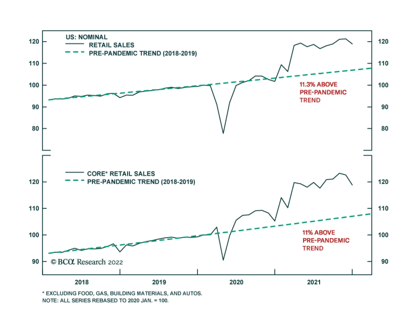
The December US retail sales report delivered a negative surprise. Overall retail sales fell 1.9% m/m and disappointed expectations of a much smaller 0.1% m/m decline. Moreover, the November 0.3% m/m increase was revised down to 0.2% m/m. More notably, the…
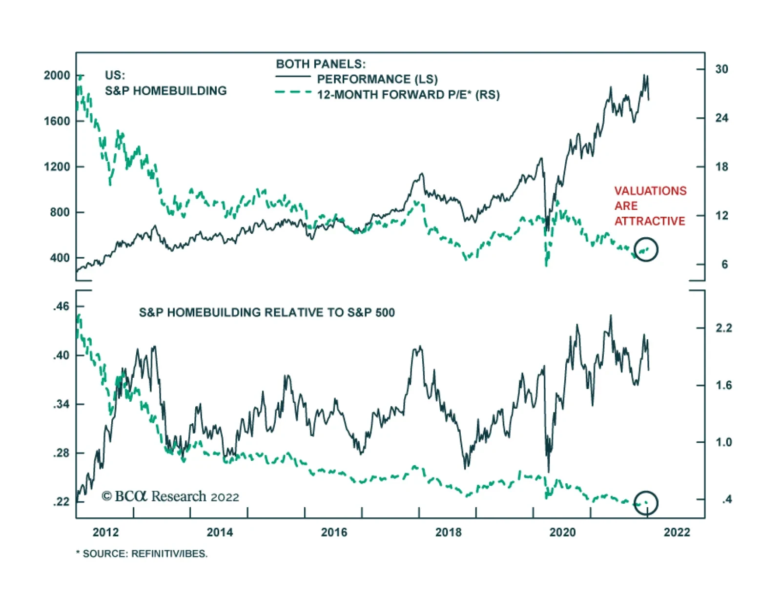
US mortgage rates have been soaring since the beginning of the year alongside Treasury yields. They are now at a pandemic high. In general, rising mortgage rates are a negative development for the US housing market as higher home loan borrowing costs weigh…