United States

Highlights For the time being, US core inflation will not drop anywhere close to the Fed’s target range. The Fed will continue tightening until something breaks. US bond yields and the US dollar are heading higher. The S&P500 will need to drop meaningfully for the Fed to stop tightening. The Fed’s tightening and the US dollar’s persistent strength amid the lack of recovery in the Chinese business cycle will eventually produce a drawdown in commodity prices in the coming months. Absolute-return investors should stay defensive on EM risk assets and asset allocators should continue to underweight EM versus DM in global equity and credit portfolios. Feature We are starting the year with a review of a few macro pillars of our view that will shape global financial markets in the coming months. US Core Inflation Will Prove Sticky… Chart 1Average Of All Core US Inflation Measures
Average Of All Core US Inflation Measures
Average Of All Core US Inflation Measures
The average of seven various US core inflation measures – core CPI, core PCE, trimmed-mean CPI, median CPI, sticky core CPI, trimmed-mean PCE and market-based core PCE – has surged to 4% (Chart 1). Although the core inflation rate could decline in 2022 as supply bottlenecks ease and base effects become more favorable, it is unlikely to drop below 3%. Instead, it will remain well above the Fed’s inflation target. If the Fed adheres to its mandate, it will have to hike rates until inflation heads toward 2%. US core inflation will not drop toward 2% unless the economy slows materially. Consumer and business inflation expectations have risen substantially. US consumer inflation expectations for one and three years ahead have risen to 4-6%, and US non-farm businesses have been able to raise prices by 4.5% y/y in Q3 (Chart 2). We can say the genie – inflation and inflation expectations – is out of bottle and it will be hard to put it back in. Importantly, labor market shortages will persist, and employee wage demand will be strong. Employees’ current wage growth expectations are based on their inflation expectations in the next one to three years, not the next decade. Even though longer term inflation expectations remain somewhat muted, they will not prevent high wage growth. Critically, inflation has “eaten” into employee income: real wage growth – adjusted for headline consumer price inflation – has been negative in 2021 (Chart 3). Consistently, employees know their compensation has lagged inflation and will be demanding significant wage hikes in 2022. Chart 3Inflation Is "Eating" Into Wages In The US
Inflation Is "Eating" Into Wages In The US
Inflation Is "Eating" Into Wages In The US
Chart 2US Inflation Expectations Have Risen Sharply
US Inflation Expectations Have Risen Sharply
US Inflation Expectations Have Risen Sharply
In short, a wage-price spiral of moderate proportions is unfolding. Given tight labor market conditions, businesses will have no choice but raise wages considerably and then try to pass the higher costs on to their consumers. … Prompting Higher US Bond Yields … Despite the surge in core inflation to a 30-plus year high, US bond yields have remained low. The long end of the US yield curve has continued to be suppressed even as the market participants raised their rate hike expectations. Not only has the expected terminal Fed funds target rate not risen much, but also the bond term premium has remained negative. The bond term premium is akin to the equity risk premium. Pronounced uncertainty about the US inflation outlook as well as elevated bond volatility warrant a higher bond term premium (Chart 4). … Which Will Push The US Dollar Higher… Rising US interest rate expectations will lead to a stronger greenback. Our US Dollar Liquidity Indicator points to continued firmness in the broad trade-weighted US dollar ( the latter is shown inverted in this chart) (Chart 5). Chart 5US Dollar Liquidity And The US Dollar
US Dollar Liquidity And The US Dollar
US Dollar Liquidity And The US Dollar
Chart 4Inflation Uncertainty And High Bond Volitility Herald A Higher Term Premium
Inflation Uncertainty And High Bond Volitility Herald A Higher Term Premium
Inflation Uncertainty And High Bond Volitility Herald A Higher Term Premium
Our framework for the relationship between currencies and their interest rates is as follows: Scenario 1: When inflation is high or rising fast, the central bank is willing to hike rates and the economy can withstand higher borrowing costs, the currency will appreciate. Scenario 2: When inflation is high or rising fast and the central bank is unwilling to hike rates, the currency will depreciate. This is the case when the central bank falls behind the curve. Scenario 3: When the central bank is tightening but the economy cannot handle higher borrowing costs, the currency will depreciate. The US economy is presently able to handle higher interest rates. Hence, the US dollar is currently driven by the dynamics described in Scenario 1, i.e., rising interest rates will support the greenback. Chart 6US Household Finances Are Healthy
US Household Finances Are Healthy
US Household Finances Are Healthy
Our rationale is that US interest rate sensitive sectors like housing and car sales have been restrained by supply shortages – not weak demand. In fact, there is large pent-up demand for both housing and autos and a reasonable rise in borrowing costs will not thwart this demand. Besides, US household debt and debt servicing costs have declined substantially in the past 10 years (Chart 6). US households are no longer highly indebted. This development – along with robust wage gains – will allow households to borrow more and service their debt. Finally, unlike in many other Anglo-Saxon countries, in the US it is long-term rates – rather than short ones – that matter for household debt servicing. Mortgages make up 70% of household debt in the US and the mortgage rate is tied to the 30-year bond yield. In many other advanced and emerging economies, mortgage rates are more influenced by the central bank policy rate than long-term bond yields. As a result, the US economy will be able to endure monetary tightening by the Fed better than other developed and emerging economies can handle rate hikes from their central banks. Specifically, mainstream EM economies (EM ex-China, Korea and Taiwan) will slow markedly as and if their central banks hike rates further (Chart 7). There is, however, a caveat: Even though Main Street America will be able to withstand a reasonable amount of rate hikes, Wall Street might not be able ride out these rate hikes. The difference is the starting point – US equity valuations are very high. … And Will Herald A US Equity Correction And Sector Rotation The spike in US core inflation is likely to engender a negative correlation between US share prices and bond yields, as was the case in 1966. We first made this argument in last year’s Special Report titled A Paradigm Shift In The Stock-Bond Relationship (Chart 8). Chart 7Mainstream EM: Monetary Tightening Will Dampen Growth
Mainstream EM: Monetary Tightening Will Dampen Growth
Mainstream EM: Monetary Tightening Will Dampen Growth
Chart 8S&P500 And Bond Yields Correlation Will Turn Negative
S&P500 And Bond Yields Correlation Will Turn Negative
S&P500 And Bond Yields Correlation Will Turn Negative
The current episode in the US is akin to the second half of the 1960s when US core inflation and bond yields rose after decades of lingering at very low levels. Starting in 1966, US share prices became negatively correlated with US Treasury yields (Chart 9 – bond yields are shown inverted). Going forward, the S&P 500 will often take its cue from US bond yields: stocks will rally when bond yields decline, and tumble when bond yields rise. Given that we expect US Treasury yields to rise in the coming months (10-year yields will move well above 2%), the S&P 500 is likely to correct. The key risk to this view is the massive amount of cash on the sidelines, and widespread investor willingness to buy any dip in US equities. The absolute level of US retail money market funds currently stands at a formidable $1 trillion (Chart 10, top panel). However, this just represents a mere 2% of the US equity market cap (Chart 10, bottom panel). Hence, if institutional investors begin selling stocks, retail investors might not be able to support the market. Chart 9Early 2020s = Late 1960s?
Early 2020s = Late 1960s?
Early 2020s = Late 1960s?
Chart 10Cash on Sidelines: A Lot Or Not So Much?
Cash on Sidelines: A Lot Or Not So Much?
Cash on Sidelines: A Lot Or Not So Much?
Chart 11EM Relative Equity Performance Is Correlated With The USD, Not Bond Yields
EM Relative Equity Performance Is Correlated With The USD, Not Bond Yields
EM Relative Equity Performance Is Correlated With The USD, Not Bond Yields
Furthermore, rising US bond yields will cause US value stocks to outperform US growth stocks. Will EM stocks outperform US or DM ones as US bond yields rise? The top panel of Chart 11 illustrates that there has been no stable correlation between US bond yields and EM versus DM relative equity performance. Yet, there is a strong relationship between EM relative equity performance and the US dollar (Chart 11, bottom panel). If the broad trade-weighted US dollar rallies, EM stocks will underperform their DM counterparts (the greenback is shown inverted in the bottom panel of Chart 11). A sell-off in US stocks and bonds and the greenback’s rally will tighten US financial conditions considerably. The Fed is putting a lot of weight on financial conditions, especially when they are becoming restrictive. As US financial conditions tighten, the Fed will likely pivot, i.e., soften its hawkish stance. The Fed would likely argue that tight financial conditions will slow growth, which will in turn bring down inflation. Such a Fed pivot will potentially mark the end of a US dollar rally, enable American share prices to rise again, and EM stocks to start outperforming. However, we are not there yet. Bottom Line: For the time being, US core inflation will not drop anywhere close to the Fed’s target range. Hence, the Fed will continue tightening until something breaks. It will take a meaningful drop in the S&P500 (~20%) to make the Fed stop tightening. Commodity Prices Commodity prices have been caught between two opposing forces: US inflation and China’s slowdown. Worries about US inflation have made investors buy inflation hedges, and commodities are traditionally viewed as an inflation hedge. Yet, there is a caveat: Inflation is proliferating in the US but not in China. On the contrary, Chinese imports of key commodities contracted dramatically in H2 2021 (Chart 12). We are surprised that commodity prices have been so resilient despite shrinking Chinese commodity imports. Our sense is that commodity prices have been held up by two forces: strong global manufacturing activity and financial demand from investors. As for the green revolution, we believe it will be a major bullish force for select commodities in a couple of years. At the moment, however, it is not large enough to offset the slowdown in the Chinese economy. It might take investor concerns about US demand and/or a slowdown in global manufacturing to trigger a relapse in commodity prices. Rising US interest rates and a continued dollar rally will eventually result in a meaningful drawdown in commodity prices. Chart 13 demonstrates that the declines in the Swedish manufacturing PMI new orders-to-inventory ratio and the Swedish krona/Swiss franc cross rate point to downside risks in raw materials prices. Chart 12Chinese Imports Of Key Commodities Have Shrunk
Chinese Imports Of Key Commodities Have Shrunk
Chinese Imports Of Key Commodities Have Shrunk
Chart 13A Red Flag For Commodities From Industrial Sweden
A Red Flag For Commodities From Industrial Sweden
A Red Flag For Commodities From Industrial Sweden
Bottom Line: Commodity prices have so far ignored China’s slowdown. However, the Fed’s tightening and the US dollar’s persistent strength amid the lack of recovery in the Chinese business cycle will eventually produce a drawdown in resource prices in the coming months. Investment Strategy For EM Chart 14EM Equities: No Profit Growth, No Bull Market
EM Equities: No Profit Growth, No Bull Market
EM Equities: No Profit Growth, No Bull Market
EM share prices have been falling in absolute terms despite the strength in the S&P 500. The EM equity index will drop further due to the dismal EM profit outlook and the continued de-rating of Chinese TMT stocks. In absolute terms, the EM equity index is at the same level as it was in 2011 because EM EPS in USD has not expanded at all since 2011 (Chart 14). Investors are reluctant to pay high multiples for EM companies because they have produced zero earnings growth over the past 10 years. Besides, higher US bond yields and continued strength in the US dollar will lead to higher EM sovereign and corporate bond yields. EM non-TMT share prices typically wobble when EM US dollar borrowing costs rise (Chart 15). Chart 15Rising EM USD Borrowing Costs Are Bearish For EM Non-TMT Stocks
Rising EM USD Borrowing Costs Are Bearish For EM Non-TMT Stocks
Rising EM USD Borrowing Costs Are Bearish For EM Non-TMT Stocks
We continue to recommend underweighting EM in a global equity portfolio. EM always underperforms DM when the greenback rallies. We maintain our short positions in a basket of EM currencies versus the US dollar. Rising US bond yields and a firm greenback will continue weighing on EM fixed income markets – both local currency and US dollar ones. Fixed-income investors should favor US corporate credit over EM corporate and sovereign credit, quality adjusted. In local rates, we are betting on yield curve inversion in Russia and Mexico, receiving rates in China and Malaysia and paying rates in the Czech Republic. For the full list of our fixed-income, currency and equity recommendations, please refer to the tables below. These are also available on our website. Arthur Budaghyan Chief Emerging Markets Strategist arthurb@bcaresearch.com Equities Recommendations Currencies, Credit And Fixed-Income Recommendations
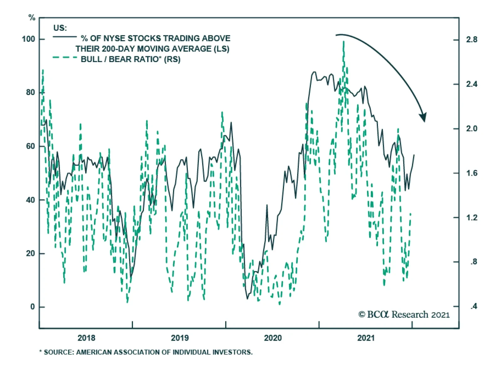
The share of US stocks trading above their 200-day moving average fell significantly over the course of 2021. They started the year at 84.68% and ended it at 52.47%. This decline indicates that equity market breadth has narrowed. Narrow breadth means that…
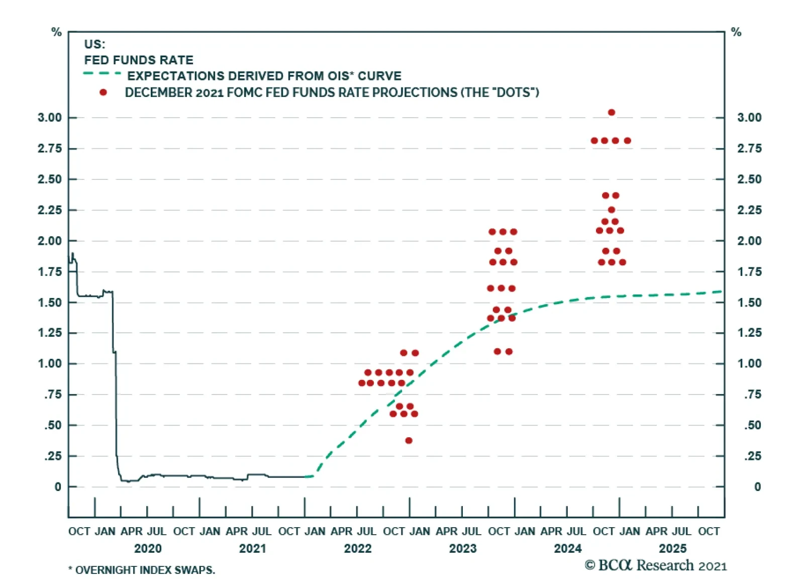
The message from the December FOMC meeting minutes released on Wednesday is that the US Federal Reserve is preparing to accelerate the withdrawal of monetary policy accommodation. Specifically, the minutes reveal that most committee members expect the US…
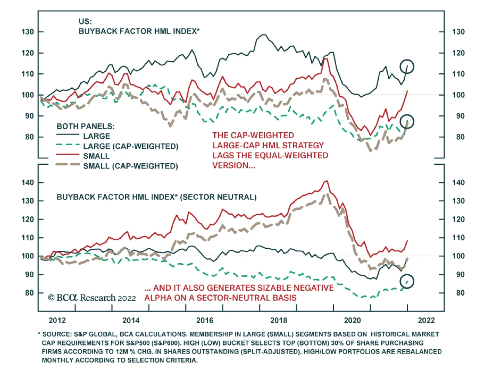
BCA Research’s US Investment Strategy service concludes that the experience of the last ten years fails to support the widely held view that stock buybacks boost share prices. The team backtested a zero-net-exposure strategy of buying stocks in a High…
Financial markets are largely unperturbed by the massive surge in global COVID-19 infections, with risk assets continuing to rally. The omicron wave will inevitably affect consumer behavior. Although this is especially true in regions where restrictions are…
Highlights Elected officials’ antipathy for buybacks is unfounded, … : For the companies that are the primary drivers of buyback activity, returning cash to shareholders is more likely to have a positive impact on employment and investment than retaining it. … and the idea that they boost stock returns may be, as well, … : Over the last ten years, a cap-weighted bucket of large-cap stocks that most reduced their share counts underperformed the bucket that most increased their share counts by 2% annually. … especially within the Tech sector, which has most enthusiastically executed them: Despite the success of Apple, which has seen its market cap soar since embarking on a deliberate strategy to shrink its shares outstanding, a strategy buying Tech’s biggest net reducers and selling its biggest net issuers would have generated sizable negative alpha over the last ten years. The problem is the relative profile of net buyers and net issuers: In general, companies that consistently buy back their own stock are mature companies that cannot earn an accretive return by redeploying the capital their incumbent business generates. Net issuers, on the other hand, are often young companies seeking fresh capital to realize their abundant growth opportunities. The next year is likely to see a pickup of share buybacks nonetheless, … : Our US Equity Strategy service’s Cash Yield Prediction Model points to increased buyback activity in 2022. … as management teams are wedded to them and buying back stock is the best use of capital for the mature companies executing them: Better to return cash to shareholders than to enter new business lines beyond the company’s area of expertise or embark on dubious acquisitions, even in the face of a potential 1% surtax. Feature Dear Client, This Special Report is the final US Investment Strategy publication for 2021. We will return with our first 2022 publication on Monday, January 10th. We wish everyone safe travels and a happy and healthy holiday season. Doug Peta Chief US Investment Strategist In Capitol Hill’s current polarized state, stock buybacks are in select company with the tech giants and China as issues that unite solons on both sides of the aisle. They are also a hot-button issue for some investors, who see them as telltale signs of a market kept aloft by sleight of hand. Although we do not think they’re worth getting worked up over – they do not promote the misallocation of capital and they may not actually boost stock prices – they come up repeatedly in client discussions and are likely to remain a feature of the landscape even if they are eventually subjected to a modest federal surtax. We have therefore joined with the BCA Equity Analyzer team to pore over its bottom-up database for insights into the buyback phenomenon. After ranking nearly 600 stocks in our large-cap universe in order of their rolling 12-month percentage change in shares outstanding across the last ten years, we were surprised to discover that the companies that most reduced their share count underperformed the companies that most grew it. We were also surprised to find that Tech was by far the worst performer among the six sectors with negative net issuance. Ultimately, the performance story seemed to boil down to Growth stocks’ extended recent edge over Value stocks. We present the data, our interpretation of it, and some future investment implications in this Special Report. Buybacks’ Bad Rap From Capitol Hill to the White House, prominent Washington voices bemoan buybacks. In a February 2019 New York Times opinion piece,1 Senators Sanders (I-VT) and Schumer (D-NY) argued that equity buybacks divert resources from productive investment in the narrow interest of boosting share prices for the benefit of shareholders and corporate executives. To counter the increasing popularity of buybacks, they proposed legislation that would permit buybacks only after several preconditions for investing in workers and communities had been met. Echoing their concerns, the White House's framework for the Build Back Better bill included a 1% surcharge on stock buybacks, “which corporate executives too often use to enrich themselves rather than investing in workers and growing the economy.” Buybacks’ opponents may mean well, but they seem to be missing an essential point: by and large, the companies that buy back their own stock lack enough attractive investment opportunities to absorb the cash their operations generate. Companies with more opportunities than cash don’t buy back stock; they issue it (and/or borrow) to get the capital to pursue them. The simple generalization that large, mature companies buy back shares while small, growing companies issue new ones is borne out by rolling 12-month percentage changes in shares outstanding by large-cap and small-cap companies (Chart 1). Chart 1The Smallest Companies Sell Stock; The Largest Buy It Back
The Smallest Companies Sell Stock; The Largest Buy It Back
The Smallest Companies Sell Stock; The Largest Buy It Back
On an equal-weighted basis, large-cap companies’ rolling share count was flat to modestly down for ten years before the pandemic drove net issuance. Adjusting for market cap, rolling net issuance has been uninterruptedly negative, shrinking by more than 2% per year, on average. The equally weighted small-cap population has been a net issuer to the tune of about 4% annually, with the biggest small-caps issuing even more, pushing the cap-weighted annual average to north of 6%. The bottom line is that large-cap companies in the aggregate have been modestly trimming their share counts, with the biggest companies retiring more than 2% of their shares each year, while small-cap companies are serial issuers, led by their largest (and presumably most bankable) constituents. We are investors serving investors, not policymakers, academics or editorial columnists charged with developing and evaluating public policy. Our mandate is bullish or bearish, not good or bad. We point out the flaws in the prevailing criticism of buybacks simply to make the point that buybacks are not an impediment to productive investment and that no one should therefore expect that productivity and income will rise if legislators or regulators restrict them. On the contrary, since we believe that buybacks represent an efficient allocation of capital, we would expect that successful attempts to limit them will hold back growth at the margin. The Buyback Calculus A company that buys back more of its shares than it issues reduces its share count. All else equal, a company with fewer shares outstanding will report greater earnings per share and a higher return on equity. Increased earnings per share (EPS) does not necessarily ensure a higher share price; if a company’s P/E multiple declines by more than EPS rises, its price will fall. Distributing retained earnings to shareholders reduces a company’s capital buffer against shocks and limits its ability to fund investment internally, but companies that embark on the most ambitious buyback campaigns likely face limited investment opportunities and have much more of a buffer than they could conceivably require. Revealed preferences suggest that management teams like buybacks. They have every interest in getting share prices higher to maximize the value of their own compensation, which typically contains an equity component that accounts for an increasing share of total compensation the more they rise in the company’s hierarchy. It is unclear, however, just how much their attachment to buybacks is founded on an expectation that buying back stock will boost its price. The opportunity to extend their tenure by pursuing a shareholder-friendly policy may well offer a stronger incentive. Do Buybacks Boost Share Prices? Returning cash to shareholders is widely perceived as good corporate governance. It increases the effective near-term yield on an equity investment and denies management the cash to pursue dubious expansion schemes or squander capital on lavish perquisites. It facilitates the reallocation of capital away from cash cows to more productive uses. Buybacks are squarely beneficial in theory, but are they good for investors in practice? (Please see the Box for a description of the methodology we followed to answer the empirical question.) Box: Performance Calculation Methodology After separating stocks into large- and small-cap categories based on Standard & Poor’s market cap parameters for inclusion in the S&P 500 and the SmallCap 600 indexes, we ranked the constituents in each category in reverse order of their rolling 12-month percentage change in shares outstanding at the end of each month from 2011 through 2021. We then placed the top three deciles (the biggest reducers of their share counts) into the High Buybacks bucket and the bottom three deciles (the biggest net issuers) into the Low Buybacks bucket. We used the buckets to backtest a zero-net-exposure strategy of buying the stocks in the High bucket with the proceeds from shorting the stocks in the Low bucket, calling it the High-Minus-Low (“HML”) strategy. We computed two sets of HML results for the large-cap and small-cap universes. The first populated the buckets without regard for sector representation (“sector-agnostic”) and the second populated the buckets in line with the sector composition of the S&P 500 and SmallCap 600 Indexes (“sector-neutral”). We also track equal-weighted and cap-weighted versions of each HML bucket to gain a sense of performance differences between constituents by size. The experience of the last ten years fails to support the widely held view that stock buybacks boost share prices. Following a zero-net-exposure strategy of owning the top three deciles of large-cap companies ranked by the rolling 12-month percentage reduction of shares outstanding and shorting the bottom three deciles generated a modest positive annual return above 1% (Chart 2). Small caps merely broke even, largely because their biggest share reducers sharply underperformed in the first year of the pandemic. On a cap-weighted basis, however, the large-cap strategy generated a negative annual return a little over 1% during the period, indicating that the largest companies pursuing buyback programs lagged their net issuer counterparts. For small caps, the cap-weighted strategy also lagged the equal-weighted strategy, albeit by a smaller margin. Chart 2Buybacks May Help A Company's Stock Price At The Margin ...
Buybacks May Help A Company's Stock Price At The Margin ...
Buybacks May Help A Company's Stock Price At The Margin ...
On a sector-neutral basis, the large-cap HML strategy roundly disappointed. The equal-weighted version was never able to do much more than break even, slipping into the red when COVID arrived, while the cap-weighted version continuously lagged it, shedding about 1.5% annually (Chart 3). Though it was hit hard by the pandemic, the equal-weighted small-cap HML strategy managed to generate about 1% annually, and boasted a 3.5% annualized return for the eight years through 2019. Chart 3... But They Are Not An Exploitable Factor
... But They Are Not An Exploitable Factor
... But They Are Not An Exploitable Factor
Drilling down to the sector level offers some additional insights. While changes in shares outstanding vary across large-cap sectors, with six sectors reducing their shares outstanding and five expanding them, every small-cap sector has been a net issuer in every single year, ex-Discretionaries and Industrials in 2019 (Chart 4). Relative sector capital needs are largely consistent regardless of market cap, however, with REITs, which distribute all their income to preserve their tax-free status, unable to expand without raising cash in the capital markets, and Utilities, Energy and traditional Telecom Services being capital-intensive industries (Table 1). Many Tech niches are capital-light, and established Industrials and Consumer businesses often throw off cash.
Chart 4
Table 1Sector Appetite For Capital Is Consistent Across The S&P 500 And The SmallCap 600
Stock Buybacks – Much Ado About Nothing
Stock Buybacks – Much Ado About Nothing
There is less large- and small-cap commonality in HML relative sector performance than in relative sector issuance. Away from Real Estate, Tech and Discretionaries, small-cap HML sector strategies generated aggregate positive returns, led by Communication Services and Energy (Chart 5). For the large caps, most HML sector strategies produced negative alpha, though the four winners and the one modest loser (Financials) are among the six sectors that have net retired shares outstanding since 2012. Tech is the conspicuous exception, with its HML strategy yielding annualized losses exceeding 3%, contrasting with the sector’s enthusiastic buyback embrace.
Chart 5
The Corporate Life Cycle Surprising as they may be on their face, negative cap-weighted ten-year HML returns do not mean that buybacks are counterproductive. We simply think they illustrate that net issuance activity follows from a company’s position in the corporate life cycle (Figure 1). Investors have prized growth in the aftermath of the global financial crisis, and the companies with the best growth prospects are often younger companies just beginning to tap their addressable markets. They have a long pathway of market share capture ahead of them and need to raise capital to begin traveling it. Many of these strong growers populate the Low basket, especially in the Tech sector.
Chart
Companies that return cash to their owners via share repurchases are often more mature. Their operations are comfortably profitable and generate more than enough cash to sustain them. They have already captured all the market share they’re likely to gain in their primary business and may not have an outlet for its proceeds in a space in which they have a plausible competitive advantage. Lacking a clear path to bettering the returns from their main operations, they have been steadily accumulating cash for a long time.
Chart
Through the lens of the Boston Consulting Group’s (BCG) growth share matrix,2 a successful business in the Maturity stage of the business life cycle is known as a Cash Cow. Cash Cows have gained considerable market share in their industry, affording them a competitive advantage based on scale, brand and experience, but little scope for growth because they have saturated a market that is itself mature (Figure 2). BCG advises management teams with a portfolio of business lines to milk Cash Cows for capital to reinvest in high-share, high-growth-potential Stars or low-share, high-growth-potential Question Marks that could be developed into Stars. In the public markets, a mature large-cap company that retains its excess capital impedes its owners’ ability to redeploy that capital to faster growing investments, subverting the overall economy’s ability to redirect capital to its best uses. Walmart, Twentieth-Century Growth Darling Walmart fits the business life cycle framework to a T and has evolved into a textbook Cash Cow. It is a dominant player that executed its initial strategy so well that it has maxed out its share in the declining/stagnating brick-and-mortar retail industry. Its international attempts to replicate its domestic success have uniformly failed to gain traction, and it currently operates in fewer major foreign countries than it's exited. Given Walmart’s star-crossed international experience and the dismal history of large corporate combinations, returning cash may be the optimal use of shareholder capital. Walmart began life as a public company in fiscal 1971 squarely in the Growth phase. It was profitable from the start and grew annual revenues by at least 25% for every one of its first 23 years of public ownership (Chart 6, top panel). It was a modest issuer of shares during its Growth phase, conducting just one secondary common stock offering 12 years after its IPO and otherwise limiting growth in shares outstanding to acquisitions, management incentive awards and conversions of debt and preferred stock. Chart 6From Young Turk To Respected Elder
From Young Turk To Respected Elder
From Young Turk To Respected Elder
Table 2From Growth To Maturity At Walmart
Stock Buybacks – Much Ado About Nothing
Stock Buybacks – Much Ado About Nothing
Once its revenue growth slipped into the low double-digits in the late nineties, it began retiring its shares at a deliberate pace (Table 2). That retirement inaugurated a ramping up of Walmart’s annual payout ratio (Chart 6, bottom panel) and cash yield (dividend yield plus buyback yield), underlining its transition from Growth to Maturity. Walmart’s 2010 admission into the S&P 500 Pure Value Index marked its ripening into full maturity, and it has been a Pure Value fixture since 2013. Today’s stolid icon is a far cry from the ambitious disruptor on display in its 1980 Annual Report: Subsequent to year end, your Company’s directors authorized [a one-third] increase in the annual dividend[.] This continues your Company’s approach of distributing a portion of profits to our shareholders and utilizing the balance to fund our aggressive expansion program. [T]he decade of the ’70’s … has been a tremendous growth period for your Company. In January 1970, we … had 32 stores …, comprising less than a million square feet of retail space. In the next ten years, we added 258 … stores, … constructed and opened three new distribution facilities, and increased our retail space to 12.6 million square feet. During that same period of time, we increased our sales and earnings at an annual compounded rate well in excess of 40 percent. Reflecting upon the progress we have made in the ‘70’s makes it apparent that there is even more opportunity in the ‘80’s for your Company, and we are better positioned to maximize our opportunities … than ever before. The Exception That Proves The Rule Apple has shined so far in the twenty-first century much like Walmart did in the latter stages of the twentieth, growing its revenues and net income at compound annual rates exceeding 20% and 25%, respectively. Unlike Walmart, however, Apple hasn’t required a steady stream of capital to grow. While Walmart had to plow its earnings right back into the business to fund the acquisition and buildout of property to create stores, warehouses and distribution centers, Apple has simply had to make incremental improvements to its music players, phones and tablets while shoring up the moats around its virtual app and music marketplaces. As a result, cash and retained earnings began silting up on Apple’s balance sheet, lying fallow in short-term marketable securities and crimping a range of return metrics. Table 3Apple's Long Road To "Net Cash Neutral"
Stock Buybacks – Much Ado About Nothing
Stock Buybacks – Much Ado About Nothing
Beginning in its 2013 fiscal year, Apple embarked on a lengthy strategy of returning that cash to shareholders, buying back stock at a rate that has allowed it to reduce its shares outstanding by 37.5% in the space of nine years (Table 3). It has reduced its retained earnings by more than $90 billion over that span and is on course to wipe them out completely in the fiscal year ending next September. Equity issuance in the form of incentive compensation augments Apple’s capital by about $5 billion per year, but if it continues to distribute more than 100% of its annual earnings in the form of dividends and repurchases, it could wipe out the rest of its recorded equity capital as well. Does this mean Apple is in danger of sliding into insolvency? Not in the least. The value of its assets dramatically exceeds the value of its liabilities, as evidenced by its nearly $3 trillion market cap and the top AAA credit rating Moody’s awarded it this week. Its reported book value is artificially suppressed by generally accepted accounting principles’ inability to value organically developed intellectual property (IP). Apple’s book value and that of other companies that generate similar IP, or benefit from internally generated moats, are dramatically undervalued. Takeaways For now, Apple is an anomaly when it comes to aggressively returning cash to shareholders while it is still in the Growth stage of its life cycle. Returning cash is typically the province of mature companies with steady operations that are unlikely to grow. It is generally good for the economy when those companies return excess cash to shareholders, freeing it up for more productive uses. If lawmakers or regulators manage to restrict the flow of capital from cash-cow companies to potential stars, we should expect activity to slow at the margin, not quicken. The experience of the last ten years suggests that companies that shrink their share counts do not outperform their counterparts that expand them. The trading strategy of shorting the biggest net share issuers to purchase the biggest net share reducers has produced negative returns. It is unclear if shareholders of companies who cannot redeploy their internally generated capital to augment the returns from their primary operations would be better served if their manager-agents retained the capital, though we suspect they would not. It seems inevitable that manager-agents with access to too much capital will eventually get into mischief. Table 4It Makes Sense That Insurers Would Buy Their Own Cheap Stock ...
Stock Buybacks – Much Ado About Nothing
Stock Buybacks – Much Ado About Nothing
Chart 7... But No One Else Seems To Want To
... But No One Else Seems To Want To
... But No One Else Seems To Want To
If buying back stock represents good corporate stewardship at mature companies, their shareholders should someday be rewarded for it. Given that the companies most suited to buying back stock tend to fit in the Value style box, the zero-net-exposure HML strategy may continue to accrue losses. Apple remains an outlier among Growth companies as an avid buyer of its stock; much more common are the S&P 500 Life and Multi-Line Insurer sub-industry groups, without which the S&P 500 Pure Value Index would have a hard time reaching a quorum (Table 4). Their constituents have assiduously bought back their stock over the last ten years, albeit to no relative avail (Chart 7). However, they should be better positioned once Value returns to favor and rising interest rates make investing their cash flow a more attractive proposition. Doug Peta, CFA Chief US Investment Strategist dougp@bcaresearch.com Footnotes 1 Opinion | Schumer and Sanders: Limit Corporate Stock Buybacks - The New York Times (nytimes.com) Accessed December 17, 2021. 2 https://www.bcg.com/about/overview/our-history/growth-share-matrix Accessed December 19, 2021.
Dear Client, This month’s Special Report is a guest piece by Doug Peta, BCA Research’s Chief US Investment Strategist. Doug’s report examines the impact of US stock buybacks using a median bottom-up approach, and presents a different perspective of the value vs. growth distribution of buybacks than we did in our October Section 2. I trust you will find his report interesting and insightful. Jonathan LaBerge, CFA The Bank Credit Analyst Elected officials’ antipathy for buybacks is unfounded, … : For the companies that are the primary drivers of buyback activity, returning cash to shareholders is more likely to have a positive impact on employment and investment than retaining it. and the idea that they boost stock returns may be, as well, … : Over the last ten years, a cap-weighted bucket of large-cap stocks that most reduced their share counts underperformed the bucket that most increased their share counts by 2% annually. especially within the Tech sector, which has most enthusiastically executed them: Despite the success of Apple, which has seen its market cap soar since embarking on a deliberate strategy to shrink its shares outstanding, a strategy buying Tech’s biggest net reducers and selling its biggest net issuers would have generated sizable negative alpha over the last ten years. The problem is the relative profile of net buyers and net issuers: In general, companies that consistently buy back their own stock are mature companies that cannot earn an accretive return by redeploying the capital their incumbent business generates. Net issuers, on the other hand, are often young companies seeking fresh capital to realize their abundant growth opportunities. The next year is likely to see a pickup of share buybacks nonetheless, … : Our US Equity Strategy service’s Cash Yield Prediction Model points to increased buyback activity in 2022. … as management teams are wedded to them and buying back stock is the best use of capital for the mature companies executing them: Better to return cash to shareholders than to enter new business lines beyond the company’s area of expertise or embark on dubious acquisitions, even in the face of a potential 1% surtax. In Capitol Hill’s current polarized state, stock buybacks are in select company with the tech giants and China as issues that unite solons on both sides of the aisle. They are also a hot-button issue for some investors, who see them as telltale signs of a market kept aloft by sleight of hand. Although we do not think they’re worth getting worked up over – they do not promote the misallocation of capital and they may not actually boost stock prices – they come up repeatedly in client discussions and are likely to remain a feature of the landscape even if they are eventually subjected to a modest federal surtax. We have therefore joined with the BCA Equity Analyzer team to pore over its bottom-up database for insights into the buyback phenomenon. After ranking nearly 600 stocks in our large-cap universe in order of their rolling 12-month percentage change in shares outstanding across the last ten years, we were surprised to discover that the companies that most reduced their share count underperformed the companies that most grew it. We were also surprised to find that Tech was by far the worst performer among the six sectors with negative net issuance. Ultimately, the performance story seemed to boil down to Growth stocks’ extended recent edge over Value stocks. We present the data, our interpretation of it, and some future investment implications in this Special Report. Buybacks’ Bad Rap From Capitol Hill to the White House, prominent Washington voices bemoan buybacks. In a February 2019 New York Times opinion piece,1 Senators Sanders (I-VT) and Schumer (D-NY) argued that equity buybacks divert resources from productive investment in the narrow interest of boosting share prices for the benefit of shareholders and corporate executives. To counter the increasing popularity of buybacks, they proposed legislation that would permit buybacks only after several preconditions for investing in workers and communities had been met. Echoing their concerns, the White House's framework for the Build Back Better bill included a 1% surcharge on stock buybacks, “which corporate executives too often use to enrich themselves rather than investing in workers and growing the economy.” Chart II-1The Smallest Companies Sell Stock; The Largest Buy It Back
The Smallest Companies Sell Stock; The Largest Buy It Back
The Smallest Companies Sell Stock; The Largest Buy It Back
Buybacks’ opponents may mean well, but they seem to be missing an essential point: by and large, the companies that buy back their own stock lack enough attractive investment opportunities to absorb the cash their operations generate. Companies with more opportunities than cash don’t buy back stock; they issue it (and/or borrow) to get the capital to pursue them. The simple generalization that large, mature companies buy back shares while small, growing companies issue new ones is borne out by rolling 12-month percentage changes in shares outstanding by large-cap and small-cap companies (Chart II-1). On an equal-weighted basis, large-cap companies’ rolling share count was flat to modestly down for ten years before the pandemic drove net issuance. Adjusting for market cap, rolling net issuance has been uninterruptedly negative, shrinking by more than 2% per year, on average. The equally weighted small-cap population has been a net issuer to the tune of about 4% annually, with the biggest small-caps issuing even more, pushing the cap-weighted annual average to north of 6%. The bottom line is that large-cap companies in the aggregate have been modestly trimming their share counts, with the biggest companies retiring more than 2% of their shares each year, while small-cap companies are serial issuers, led by their largest (and presumably most bankable) constituents. We are investors serving investors, not policymakers, academics or editorial columnists charged with developing and evaluating public policy. Our mandate is bullish or bearish, not good or bad. We point out the flaws in the prevailing criticism of buybacks simply to make the point that buybacks are not an impediment to productive investment and that no one should therefore expect that productivity and income will rise if legislators or regulators restrict them. On the contrary, since we believe that buybacks represent an efficient allocation of capital, we would expect that successful attempts to limit them will hold back growth at the margin. The Buyback Calculus A company that buys back more of its shares than it issues reduces its share count. All else equal, a company with fewer shares outstanding will report greater earnings per share and a higher return on equity. Increased earnings per share (EPS) does not necessarily ensure a higher share price; if a company’s P/E multiple declines by more than EPS rises, its price will fall. Distributing retained earnings to shareholders reduces a company’s capital buffer against shocks and limits its ability to fund investment internally, but companies that embark on the most ambitious buyback campaigns likely face limited investment opportunities and have much more of a buffer than they could conceivably require. Revealed preferences suggest that management teams like buybacks. They have every interest in getting share prices higher to maximize the value of their own compensation, which typically contains an equity component that accounts for an increasing share of total compensation the more they rise in the company’s hierarchy. It is unclear, however, just how much their attachment to buybacks is founded on an expectation that buying back stock will boost its price. The opportunity to extend their tenure by pursuing a shareholder-friendly policy may well offer a stronger incentive. Do Buybacks Boost Share Prices? Returning cash to shareholders is widely perceived as good corporate governance. It increases the effective near-term yield on an equity investment and denies management the cash to pursue dubious expansion schemes or squander capital on lavish perquisites. It facilitates the reallocation of capital away from cash cows to more productive uses. Buybacks are squarely beneficial in theory, but are they good for investors in practice? (Please see the Box II-1 for a description of the methodology we followed to answer the empirical question.) Box II-1 Performance Calculation Methodology After separating stocks into large- and small-cap categories based on Standard & Poor’s market cap parameters for inclusion in the S&P 500 and the SmallCap 600 indexes, we ranked the constituents in each category in reverse order of their rolling 12-month percentage change in shares outstanding at the end of each month from 2011 through 2021. We then placed the top three deciles (the biggest reducers of their share counts) into the High Buybacks bucket and the bottom three deciles (the biggest net issuers) into the Low Buybacks bucket. We used the buckets to backtest a zero-net-exposure strategy of buying the stocks in the High bucket with the proceeds from shorting the stocks in the Low bucket, calling it the High-Minus-Low (“HML”) strategy. We computed two sets of HML results for the large-cap and small-cap universes. The first populated the buckets without regard for sector representation (“sector-agnostic”) and the second populated the buckets in line with the sector composition of the S&P 500 and SmallCap 600 Indexes (“sector-neutral”). We also track equal-weighted and cap-weighted versions of each HML bucket to gain a sense of performance differences between constituents by size. The experience of the last ten years fails to support the widely held view that stock buybacks boost share prices. Following a zero-net-exposure strategy of owning the top three deciles of large-cap companies ranked by the rolling 12-month percentage reduction of shares outstanding and shorting the bottom three deciles generated a modest positive annual return above 1% (Chart II-2). Small caps merely broke even, largely because their biggest share reducers sharply underperformed in Year 1 of the pandemic. On a cap-weighted basis, however, the large-cap strategy generated a negative annual return a little over 1% during the period, indicating that the largest companies pursuing buyback programs lagged their net issuer counterparts. For small caps, the cap-weighted strategy also lagged the equal-weighted strategy, albeit by a smaller margin. On a sector-neutral basis, the large-cap HML strategy roundly disappointed. The equal-weighted version was never able to do much more than break even, slipping into the red when COVID arrived, while the cap-weighted version continuously lagged it, shedding about 1.5% annually (Chart II-3). Though it was hit hard by the pandemic, the equal-weighted small-cap HML strategy managed to generate about 1% annually, and boasted a 3.5% annualized return for the eight years through 2019. Chart II-2Buybacks May Help A Company's Stock Price At The Margin ...
Buybacks May Help A Company's Stock Price At The Margin ...
Buybacks May Help A Company's Stock Price At The Margin ...
Chart II-3... But They Are Not An Exploitable Factor
... But They Are Not An Exploitable Factor
... But They Are Not An Exploitable Factor
Drilling down to the sector level offers some additional insights. While changes in shares outstanding vary across large-cap sectors, with six sectors reducing their shares outstanding and five expanding them, every small-cap sector has been a net issuer in every single year, ex-Discretionaries and Industrials in 2019 (Chart II-4). Relative sector capital needs are largely consistent regardless of market cap, however, with REITs, which distribute all their income to preserve their tax-free status, unable to expand without raising cash in the capital markets, and Utilities, Energy and traditional Telecom Services being capital-intensive industries (Table II-1). Many Tech niches are capital-light, and established Industrials and Consumer businesses often throw off cash.
Chart II-4
Chart II-
There is less large- and small-cap commonality in HML relative sector performance than in relative sector issuance. Away from Real Estate, Tech and Discretionaries, small-cap HML sector strategies generated aggregate positive returns, led by Communication Services and Energy (Chart II-5). For the large caps, most HML sector strategies produced negative alpha, though the four winners and the one modest loser (Financials) are among the six sectors that have net retired shares outstanding since 2012. Tech is the conspicuous exception, with its HML strategy yielding annualized losses exceeding 3%, contrasting with the sector’s enthusiastic buyback embrace.
Chart II-5
The Corporate Life Cycle Surprising as they may be on their face, negative cap-weighted ten-year HML returns do not mean that buybacks are counterproductive. We simply think they illustrate that net issuance activity follows from a company’s position in the corporate life cycle (Figure II-1). Investors have prized growth in the aftermath of the global financial crisis, and the companies with the best growth prospects are often younger companies just beginning to tap their addressable markets. They have a long pathway of market share capture ahead of them and need to raise capital to begin traveling it. Many of these strong growers populate the Low basket, especially in the Tech sector.
Chart II-
Chart II-
Companies that return cash to their owners via share repurchases are often more mature. Their operations are comfortably profitable and generate more than enough cash to sustain them. They have already captured all the market share they’re likely to gain in their primary business and may not have an outlet for its proceeds in a space in which they have a plausible competitive advantage. Lacking a clear path to bettering the returns from their main operations, they have been steadily accumulating cash for a long time. Through the lens of the Boston Consulting Group’s (BCG) growth share matrix,2 a successful business in the Maturity stage of the business life cycle is known as a Cash Cow. Cash Cows have gained considerable market share in their industry, affording them a competitive advantage based on scale, brand and experience, but little scope for growth because they have saturated a market that is itself mature (Figure II-2). BCG advises management teams with a portfolio of business lines to milk Cash Cows for capital to reinvest in high-share, high-growth-potential Stars or low-share, high-growth-potential Question Marks that could be developed into Stars. In the public markets, a mature large-cap company that retains its excess capital impedes its owners’ ability to redeploy that capital to faster growing investments, subverting the overall economy’s ability to redirect capital to its best uses. Walmart, Twentieth-Century Growth Darling Chart II-6From Young Turk To Respected Elder
From Young Turk To Respected Elder
From Young Turk To Respected Elder
Walmart fits the business life cycle framework to a T and has evolved into a textbook Cash Cow. It is a dominant player that executed its initial strategy so well that it has maxed out its share in the declining/stagnating brick-and-mortar retail industry. Its international attempts to replicate its domestic success have uniformly failed to gain traction, and it currently operates in fewer major countries than it's exited. Given Walmart’s star-crossed international experience and the dismal history of large corporate combinations, returning cash may be the optimal use of shareholder capital. Walmart began life as a public company in fiscal 1971 squarely in the Growth phase. It was profitable from the start and grew annual revenues by at least 25% for every one of its first 23 years of public ownership (Chart II-6, top panel). It was a modest issuer of shares during its Growth phase, conducting just one secondary common stock offering 12 years after its IPO and otherwise limiting growth in shares outstanding to acquisitions, management incentive awards and debt and preferred stock conversions. Once its revenue growth slipped into the low double-digits in the late nineties, it began retiring its shares at a deliberate pace (Table II-2). That retirement inaugurated a ramping up of Walmart’s annual payout ratio (Chart II-6, bottom panel) and cash yield (dividend yield plus buyback yield), underlining its transition from Growth to Maturity. Walmart’s 2010 admission into the S&P 500 Pure Value Index marked its ripening into full maturity, and it has been a Pure Value fixture since 2013. Today’s stolid icon is a far cry from the ambitious disruptor on display in its 1980 Annual Report:
Chart II-
Subsequent to year end, your Company’s directors authorized [a one-third] increase in the annual dividend[.] This continues your Company’s approach of distributing a portion of profits to our shareholders and utilizing the balance to fund our aggressive expansion program. [T]he decade of the ’70’s … has been a tremendous growth period for your Company. In January 1970, we … had 32 stores …, comprising less than a million square feet of retail space. In the next ten years, we added 258 … stores, … constructed and opened three new distribution facilities, and increased our retail space to 12.6 million square feet. During that same period of time, we increased our sales and earnings at an annual compounded rate well in excess of 40 percent. Reflecting upon the progress we have made in the ‘70’s makes it apparent that there is even more opportunity in the ‘80’s for your Company, and we are better positioned to maximize our opportunities … than ever before. The Exception That Proves The Rule Apple has shined so far in the twenty-first century much like Walmart did in the latter stages of the twentieth, growing its revenues and net income at compound annual rates exceeding 20% and 25%, respectively. Unlike Walmart, however, Apple hasn’t required a steady stream of capital to grow. While Walmart had to plow its earnings right back into the business to fund the acquisition and buildout of property to create stores, warehouses and distribution centers, Apple has simply had to make incremental improvements to its music players, phones and tablets while shoring up the moats around its virtual app and music marketplaces. As a result, cash and retained earnings began silting up on Apple’s balance sheet, lying fallow in short-term marketable securities and crimping a range of return metrics.
Chart II-
Beginning in its 2013 fiscal year, Apple embarked on a lengthy strategy of returning that cash to shareholders, buying back stock at a rate that has allowed it to reduce its shares outstanding by 37.5% in the space of nine years (Table II-3). It has reduced its retained earnings by more than $90 billion over that span and is on course to wipe them out completely in the fiscal year ending next September. Equity issuance in the form of incentive compensation augments Apple’s capital by about $5 billion per year, but if it continues to distribute more than 100% of its annual earnings in the form of dividends and repurchases, it could wipe out the rest of its recorded equity capital as well. Does this mean Apple is in danger of sliding into insolvency? Not in the least. The value of its assets dramatically exceeds the value of its liabilities, as evidenced by its nearly $3 trillion market cap and the top AAA credit rating Moody’s awarded it this week. Its reported book value is artificially suppressed by generally accepted accounting principles’ inability to value organically developed intellectual property (IP). Apple’s book value and that of other companies that generate similar IP, or benefit from internally generated moats, are dramatically undervalued. Takeaways For now, Apple is an anomaly when it comes to aggressively returning cash to shareholders while it is still in the Growth stage of its life cycle. Returning cash is typically the province of mature companies with steady operations that are unlikely to grow. It is generally good for the economy when those companies return excess cash to shareholders, freeing it up for more productive uses. If lawmakers or regulators manage to restrict the flow of capital from cash-cow companies to potential stars, we should expect activity to slow at the margin, not quicken. The experience of the last ten years suggests that companies that shrink their share counts do not outperform their counterparts that expand them. The trading strategy of shorting the biggest net share issuers to purchase the biggest net share reducers has produced negative returns. It is unclear if shareholders of companies who cannot redeploy their internally generated capital to augment the returns from their primary operations would be better served if their manager-agents retained the capital, though we suspect they would not. It seems inevitable that manager-agents with access to too much capital will eventually get into mischief. If buying back stock represents good corporate stewardship at mature companies, their shareholders should someday be rewarded for it. Given that the companies most suited to buying back stock tend to fit in the Value style box, the zero-net-exposure HML strategy may continue to accrue losses. Apple remains an outlier among Growth companies as an avid buyer of its stock; much more common are the S&P 500 Life and Multi-Line Insurer sub-industry groups, without which the S&P 500 Pure Value Index would have a hard time reaching a quorum (Table II-4). Their constituents have assiduously bought back their stock over the last ten years, albeit to no relative avail (Chart II-7). However, they should be better positioned once Value returns to favor and rising interest rates make investing their cash flow a more attractive proposition.
Chart II-
Chart II-7... But No One Else Seems To Want To
... But No One Else Seems To Want To
... But No One Else Seems To Want To
Doug Peta, CFA Chief US Investment Strategist Footnotes 1 Opinion | Schumer and Sanders: Limit Corporate Stock Buybacks - The New York Times (nytimes.com) Accessed December 17, 2021. 2 https://www.bcg.com/about/overview/our-history/growth-share-matrix Accessed December 19, 2021.
As 2021 draws to a close, we thank you for your ongoing readership and support. We wish you and your loved ones a happy holiday season and all the best for a healthy and prosperous 2022. Highlights Over the coming three months, the odds are high that the Omicron variant of COVID-19 will disrupt economic activity in advanced economies, but the magnitude of the disruption will be heavily determined by the variant’s capacity to produce severe illness. For now, we remain of the view that the pandemic will recede in importance over the course of the next year. Relative to the assessment that we published in our 2022 Outlook report, the Omicron variant of COVID-19 has modestly raised the odds of a stagflationary outcome next year. Our base case view of above-trend growth and above-target inflation remains the most likely scenario for 2022. We do not think that the actual risk of a recession has risen significantly since we published our annual outlook, but we can envision a scenario in which Fed tightening causes investors to become fearful of a recession. The true risk of a monetary policy-induced recession over the coming 12-18 months will only rise if long-dated inflation expectations break above the range that prevailed prior to the Global Financial Crisis. Beyond 2022, the main risk to financial markets is that investors raise their longer-term interest rate expectations closer to the trend rate of economic growth. This would not be bad news for real economic activity, but it would imply meaningfully lower prices for financial assets that have benefited from low interest rates. We continue to advise that investors position themselves in line with the investment recommendations that we presented in our Outlook report. Over the coming year, investors should watch for the following when deciding whether to reduce exposure to risky assets: a breakout in long-dated inflation expectations, a significant flattening in the yield curve, or a rise in 5-year, 5-year forward US Treasury yields above 2.5%. Feature Our recently published 2022 Outlook report laid out the main macroeconomic themes that we see driving markets next year, as well as our cyclical investment recommendations.1 In this month’s report, we discuss the most relevant risks to our base case view in more depth, and update our fixed-income view in the wake of the December FOMC meeting. The Near-Term Risks Chart I-1DM Policymakers Are Afraid That Omicron Will Overwhelm The Medical System
DM Policymakers Are Afraid That Omicron Will Overwhelm The Medical System
DM Policymakers Are Afraid That Omicron Will Overwhelm The Medical System
Over the coming 0-3 months, the greatest risks to economic growth stem from the likely impact of the Omicron variant of COVID-19 on the medical system and the evolution of Europe’s energy crisis. News about the Omicron variant emerged just a few days prior to the publication of our annual outlook, and considerable uncertainty remains about its impact. Some early evidence suggests that the variant causes less severe disease, with a recent press release from South Africa’s largest private health insurance administrator suggesting that the risk of hospital admission was 29 percent lower for adults with the Omicron variant after adjusting for age, sex, underlying health conditions, and vaccine status. More recent studies from South Africa have suggested a much larger reduction in the severity of disease,2 but it is not yet clear whether these findings are applicable to advanced economies,given South Africa’s more recent vaccination campaign and higher proportion of a previously infected population. If Omicron turns out to result in 30 percent less hospitalizations, that only reduces the net impact on the medical system if the Omicron variant is no more than 1.5x as transmissible as the Delta variant. The sheer speed at which Omicron is spreading suggests it is far more contagious than this, the result in part to its ability to evade two-dose immunity. The potential for Omicron to quickly overwhelm available health system resources has alarmed authorities in several advanced economies, especially given that cases and hospitalizations have already trended higher in several countries even while Delta remained the dominant variant (Chart I-1). Additional restrictions on economic activity in the DM world appear to be likely over the coming weeks, and may be in effect until booster doses have been fully administered and/or Pfizer’s drug Paxlovid becomes widely available. For Europe, a worsening of the COVID situation has the potential to exacerbate the economic impact of the region’s ongoing energy crisis. Chart I-2 highlights that European natural gas prices have again exploded, reaching a new high that is fourteen times its pre-pandemic level. We noted in our Outlook report that European natural gas in storage is well below that of previous years, and Chart I-3 highlights that the gap in stored gas relative to previous years persists. This is occurring despite roughly average temperatures in central Europe over the past month (Chart I-4), underscoring that, barring atypically warmer temperatures, European natural gas prices are likely to remain elevated throughout the winter. Chart I-2Another Explosion In European Natural Gas Prices
Another Explosion In European Natural Gas Prices
Another Explosion In European Natural Gas Prices
Chart I-3
Chart I-5For Europe, COVID Is More Of A Problem Than Natural Gas Prices
For Europe, COVID Is More Of A Problem Than Natural Gas Prices
For Europe, COVID Is More Of A Problem Than Natural Gas Prices
Chart I-4
For now, it appears that the rise in COVID cases is having a more pronounced effect on the European economy than the energy price situation. Chart I-5 highlights that the flash December euro area manufacturing PMI fell only modestly, and that Germany’s manufacturing PMI actually rose in December. By contrast, the euro area services PMI fell over two points, reflecting the toll that recent pandemic control measures have taken on non-goods producing activity. Over the coming three months, the odds are high that the Omicron variant will disrupt economic activity in advanced economies to some degree, but the magnitude of the disruption will be heavily determined by the variant’s capacity to produce severe illness. Investors will have more information on hand in a few weeks by which to judge the extent of this risk. We will provide an update to our own assessment in our February report. Risks Over The Next Year In our Outlook report, we assigned a 60% chance to an above-trend growth and above-target inflation scenario next year, a 30% chance to a “stagflation-lite” scenario of growth at or below potential and inflation well above target, and a 10% chance of a recession. We present below our assessment of the risk that one of the latter two scenarios occurs in 2022. The Risk Of “Stagflation-Lite” Chart I-6Aside From Europe's Energy Crisis, Supply-Side Constraints Are Slowly Easing
Aside From Europe's Energy Crisis, Supply-Side Constraints Are Slowly Easing
Aside From Europe's Energy Crisis, Supply-Side Constraints Are Slowly Easing
The Omicron variant of COVID-19 has modestly raised the odds of a stagflationary outcome next year. Over the past few months, supply-side pressures have been modestly improving outside of Europe. Chart I-6 presents our new BCA Supply-Side Pressure Indicator, which measures the impact of supply-side restrictions across four categories: energy prices, shipping costs, the semiconductor shortage impact on automobile production, and labor availability. When we include all eleven components, the index has been trending higher of late, but trending flat-to-down after excluding European natural gas prices. While Omicron has the potential to reduce energy price pressure outside of Europe, it has the strong potential to cause a further increase in global shipping costs and postpone US labor market normalization. On the shipping cost front, we noted in our Outlook report that supply-side effects have been a significant driver of higher costs this year. The large rise in China/US shipping costs since late-June has been seemingly caused by the one-month closure of the Port of Yantian that began in late-May. While China has made enormous progress in vaccinating its population over the course of the year, and has prioritized the vaccination of workers in key industries, recent reports suggest that the Sinovac vaccine provides essentially no protection against contracting the Omicron variant of COVID-19. It is possible that Sinovac will offer protection against severe illness, but in terms of preventing transmission of the disease, Omicron has essentially returned China’s vaccination campaign back to square one. Chart I-7Further Price Increases May Seriously Slow Goods Spending
Further Price Increases May Seriously Slow Goods Spending
Further Price Increases May Seriously Slow Goods Spending
That fact alone makes it almost certain that China will maintain its zero-tolerance COVID policy for most of 2022, which significantly raises the risk of additional factory and port shutdowns – and thus even higher shipping costs and imported goods prices. One optimistic point is that these shutdowns are more likely to occur in mainland China than in Taiwan Province or Malaysia, two key semiconductor exporters. This is because these two regions have distributed doses of Pfizer’s vaccine, and thus presumably have the ability to provide three-dose mRNA protection to workers in crucial exporting industries (should policymakers choose to do so). Still, US consumer goods prices would clearly be impacted by even higher shipping costs, which would likely have the combined effect of slowing growth and raising prices. Chart I-7 highlights that the recent sharp deterioration in US households’ willingness to buy durable goods has been closely linked to higher goods prices, arguing that goods spending may slow meaningfully if prices rise further alongside renewed weakness in services spending. Omicron’s contagiousness may also exacerbate the ongoing US labor shortage. The shortage has occurred because of a surge in the number of retirees, difficult working conditions in several industries, and increased childcare requirements during the pandemic. The increase in the number of retirees has not happened for structural reasons; it has been driven by a sharp slowdown in the number of older Americans shifting from “retired” to “in the labor force”, which has occurred because of health concerns. None of these factors are likely to improve meaningfully while Omicron is raging, suggesting that services prices are likely to remain elevated or accelerate further even if services spending falls anew.
Chart I-8
To conclude on this point, we estimate that the odds of a stagflation-lite scenario have risen to 35% (from 30%), and the odds of our base-case scenario of above-trend growth and above-target inflation have fallen to 55% (Chart I-8). Still, our base-case view remains the most probable outcome, given that we do not believe the odds of a recession next year have risen. The Risk Of Recession We do not think that the actual risk of a recession has risen significantly since we published our annual outlook, but we can envision a scenario in which Fed tightening causes investors to become fearful of a recession. Such a scenario would have a material impact on cyclical investment strategy, and thus warrants a discussion. Following the December FOMC meeting, BCA’s baseline expectation is that a first Fed hike will occur in June 2022 and that rate increases will proceed at a pace of 25 basis points per quarter through the end of the year. BCA’s house view on this question is now in line with the view of The Bank Credit Analyst service, which published in a September Special Report that the Fed could hit its maximum employment objective as early as next summer.3 The Fed’s shift implies that the 2-year yield should rise to 1.85%, and the 10-year yield to 2.35%, by the end of next year (Chart I-9). Chart I-9A More Hawkish Fed Means A 2.35% 10-Year Yield Next Year
A More Hawkish Fed Means A 2.35% 10-Year Yield Next Year
A More Hawkish Fed Means A 2.35% 10-Year Yield Next Year
We doubt that US monetary policy will become economically restrictive next year. If the Omicron variant of COVID-19 causes a serious slowdown in economic activity, the Fed will ramp down its expectations for rate hikes. And if the Fed meets our baseline expectations for hikes next year in the context of above-trend economic growth, we do not believe that a 2.35% 10-year Treasury yield will be, in any way, limiting for economic activity. However, investors do not agree with our view about the boundary between easy and tight monetary policy, and may begin to fear a recession in response to Fed tightening next year. We noted in our Outlook report that we believe the neutral rate of interest (“R-star”) is likely higher that investors believe, but the fact remains that the Fed and market participants have judged, with deep conviction, that the neutral rate remains very low relative to the potential growth rate of the economy. Chart I-10 presents the fair value path of the 2-year Treasury yield based on our expectations for the Fed funds rate, alongside the actual 10-year Treasury yield. The chart highlights that the 2/10 yield curve could flatten significantly or even invert in the second half of 2022 if long-maturity yields rise only modestly in response to Fed tightening, which could occur if investors focus on the view that the neutral rate of interest is low and that Fed rate hikes will not prove to be sustainable. Based on two different measures of the yield curve, fixed-income investors believe that the current economic expansion is already 50-60% complete (Chart I-11), implying a recession at some point in the first half of 2023. Chart I-10The US Yield Curve Could Invert Next Year If Long-Maturity Yields Rise Only Marginally
The US Yield Curve Could Invert Next Year If Long-Maturity Yields Rise Only Marginally
The US Yield Curve Could Invert Next Year If Long-Maturity Yields Rise Only Marginally
Chart I-11More Than Half Of The Economic Expansion Has Already Occurred, According To The Yield Curve
More Than Half Of The Economic Expansion Has Already Occurred, According To The Yield Curve
More Than Half Of The Economic Expansion Has Already Occurred, According To The Yield Curve
Chart I-12A Serious Flattening In The Yield Curve Could Unnerve Stocks
A Serious Flattening In The Yield Curve Could Unnerve Stocks
A Serious Flattening In The Yield Curve Could Unnerve Stocks
If the yield curve were to flirt with inversion and investors began to price in the potential for a recession, it would cause significant financial market turmoil regardless of whether the risk of recession is real or not. Chart I-12 highlights that the S&P 500 fell 20% in late 2018 as the 2/10 yield curve flattened towards 20 basis points, in response to the economic impact of the China-US Trade War and the global impact of US tariffs on the auto industry. So it is possible that a “recessionary narrative” negatively impacts risky asset prices in the second half of 2022, even if an actual recession is ultimately avoided. Based on this, we would be much more inclined to reduce our recommended exposure to equities if the US 2/10 yield curve were to flatten below 30 basis points next year. In our view, the risk of a monetary policy-induced recession over the coming 12-18 months will only legitimately rise if long-dated inflation expectations break above the range that prevailed prior to the Global Financial Crisis. We noted in our Outlook report that this has not yet occurred for either household or market-based expectations, although it is a risk that cannot be ruled out. The odds of a breakout in long-dated inflation expectations will rise the longer that actual inflation remains elevated, and our inflation probability model suggests that core PCE inflation will remain well above 3% next year and potentially above 4% – although Chart I-13 highlights that the odds of the latter are falling. Chart I-13US Core Inflation Will Remain Well Above Target Next Year
US Core Inflation Will Remain Well Above Target Next Year
US Core Inflation Will Remain Well Above Target Next Year
A dangerous breakout in inflation expectations would raise the risk of a recession because of the Fed’s awareness of the “sacrifice ratio”, a very important economic concept that has been mostly irrelevant for the past 25 years. The sacrifice ratio is an estimate of the amount of output or employment that must be given up in order to reduce inflation by one percentage point. Table I-1 highlights some academic estimates of the sacrifice ratio, which have typically varied between 2-4% in output terms. For comparison purposes, real GDP has typically fallen no more than 2% on a year-over-year basis during most post-war US recessions. Real GDP growth fell 4% year-over-year in 2009, highlighting that the cost of reducing the rate of inflation by 1 percentage point is effectively a severe recession.
Chart I-
In his Senate testimony in late-November, Fed Chair Jay Powell noted that persistently high inflation threatens the economic recovery. He also implied that to reach its maximum employment goal, the Fed may need to act pre-emptively to tame inflation. This was implicit recognition of the sacrifice ratio, and should be seen as an expression of the Fed’s desire to avoid a scenario in which persistently high inflation causes inflation expectations to become unanchored (to the upside), as it would force the Fed to sacrifice economic activity in order to ensure price stability. By acting earlier to normalize monetary policy, the Fed hopes to keep inflation expectations well contained. Chart I-14Long-Dated Market-Based Inflation Expectations Are Not Out Of Control
Long-Dated Market-Based Inflation Expectations Are Not Out Of Control
Long-Dated Market-Based Inflation Expectations Are Not Out Of Control
For now, we see no signs that the Fed will fail to keep inflation expectations from rising dangerously. Chart I-14 highlights that long-dated market expectations for inflation have been falling over the past two months, and are essentially at the same level that they were on average in 2018. Given this, we maintain the 10% odds of recession that we presented in our Outlook report, although investors will need to monitor inflation expectations closely over the coming year to judge whether the risks of a monetary policy-induced recession are indeed rising. Risks Beyond The Next Year Beyond 2022, the main risk to risky asset prices is probably not overly tight monetary policy. Instead, the risk is that investors will come to the conclusion that the Fed funds rate will ultimately end up rising above what the Fed is currently projecting, and that the economy will be capable of tolerating interest rates that are closer to the prevailing rate of economic growth. This would not be bad news for real economic activity, but it would imply meaningfully lower prices for financial assets that have benefited from low interest rates. Chart I-15US Stocks Would Suffer Significant Losses If Interest Rates Rise Towards Potential Growth
US Stocks Would Suffer Significant Losses If Interest Rates Rise Towards Potential Growth
US Stocks Would Suffer Significant Losses If Interest Rates Rise Towards Potential Growth
Chart I-15 drives the point home by comparing the current S&P 500 forward P/E ratio to a “justified” P/E. Here, we calculate the justified P/E using the average ex-ante equity risk premium (ERP) since 1980, and real potential GDP growth as a stand-in for the real risk-free rate of interest. The chart highlights that US stocks would experience a 30% contraction in equity multiples should real long-maturity bond yields approach 2%. A decline in the ERP could potentially reduce losses for equity holders in a higher interest rate scenario, but it is very likely that the net effect would still be negative for stocks. We detailed in our Outlook report why we believe that the neutral rate of interest is higher than most acknowledge. We agree that R-star fell in the US for a time following the Global Financial Crisis (GFC), but we strongly question that it is as low as the Fed and investors believe. The neutral rate of interest fell during the first half of the last economic cycle because of a persistent period of household deleveraging and balance-sheet repair, which was a multi-year consequence of the financial crisis and the insufficient fiscal response to the 2008-09 recession. We highlighted in our Outlook report that US household balance sheets have been repaired, and that the household debt service ratio has fallen to mid-1960s levels. However, Chart I-16 highlights that even the corporate sector, which has leveraged itself significantly over the past decade, has seen its debt service ratio plummet. In a scenario in which long-maturity Treasury yields were to rise to 4%, we estimate that the debt service burden of the nonfinancial corporate sector would rise to its 70th-80th percentile historically. Chart I-16The US Corporate Sector Debt Service Burden Has Room To Rise
The US Corporate Sector Debt Service Burden Has Room To Rise
The US Corporate Sector Debt Service Burden Has Room To Rise
That would be a meaningful increase from current levels, but it would not be unprecedented, and thus would not render a 4% 10-year Treasury yield to be economically unsustainable. In addition, we strongly suspect that corporations would reduce their interest burden in such a scenario by issuing equity to retire debt. That would lower firms’ debt burden and reduce the economic impact of higher interest rates, although it would be additionally negative for equity investors given that this would dilute earnings per share. We argued in our Outlook report that a shift in investor expectations about the neutral rate of interest is unlikely to occur before the Fed begins to normalize monetary policy. Ryan Swift, BCA’s US Bond Strategist, presented further evidence of this perspective in a Special Report earlier this week.4 Ryan highlighted results from a recent academic paper, which showed that the entire decline in the 10-year Treasury yield since 1990 has occurred during three-day windows centered around FOMC meetings (Chart I-17). Ryan argued that this suggests investors change their neutral rate expectations in response to Fed interest rate decisions, rather than in response to independent macroeconomic factors that are distinct from monetary policy action. This argues that a shift in neutral rate expectations is unlikely before the Fed begins to lift interest rates in the middle of the year, and probably not until the Fed has raised rates a few times. We are thus unlikely to recommend that investors reduce their equity exposure in response to this risk until 5-year, 5-year forward Treasury yields break above 2.5% (the Fed’s long-run Fed funds rate projection), which is 80 basis points above current levels (Chart I-18). Chart I-17Fed Rate Decisions Drive Long-Maturity Bond Yields
Fed Rate Decisions Drive Long-Maturity Bond Yields
Fed Rate Decisions Drive Long-Maturity Bond Yields
Chart I-18We Will Consider Selling Stocks If Market-Based Neutral Rate Estimates Exceed 2.5%
We Will Consider Selling Stocks If Market-Based Neutral Rate Estimates Exceed 2.5%
We Will Consider Selling Stocks If Market-Based Neutral Rate Estimates Exceed 2.5%
Investment Conclusions We continue to advise that investors position themselves in line with the investment recommendations that we presented in our Outlook report. Over the following 12-months, we expect the following: Global stocks to outperform bonds Short-duration fixed-income positions to outperform long High-yield corporate bonds to outperform within fixed-income portfolios Value stocks to outperform growth Non-resource cyclicals to outperform defensives Small caps to outperform large A modest rise in commodity prices led by oil A decline in the US dollar However, our discussion of the risks to our views has highlighted three things for investors to monitor next year when deciding whether to reduce exposure to stocks (and risky assets more generally): A breakout in long-dated inflation expectations, as that would likely cause the Fed to raise interest rates more aggressively than it currently projects. A significant flattening in the yield curve, as that would indicate that investors ultimately expect existing Fed rate hike projections to prove recessionary. A rise in 5-year, 5-year forward US Treasury yields above 2.5%, as that would indicate that investors may be upwardly shifting their expectations for the neutral rate of interest. Over the shorter-term, our discussion also underscored that the Omicron variant will likely disrupt economic activity to some degree over the coming three months, and that the risks of a stagflation-lite scenario next year have modestly increased because of the likely maintenance of China’s zero-tolerance COVID policy. We continue to expect that the widespread rollout of booster doses, as well as the progressive availability of effective and safe antiviral drugs, will limit Omicron’s impact on economic activity to the first half of 2022, and that the pandemic will recede in importance next year on average in comparison to 2021. As noted above, this assessment will be monitored continually in response to the release of new information, and we will provide an update in our February report. Jonathan LaBerge, CFA Vice President The Bank Credit Analyst December 23, 2021 Next Report: January 27, 2022 II. Stock Buybacks – Much Ado About Nothing Dear Client, This month’s Special Report is a guest piece by Doug Peta, BCA Research’s Chief US Investment Strategist. Doug’s report examines the impact of US stock buybacks using a median bottom-up approach, and presents a different perspective of the value vs. growth distribution of buybacks than we did in our October Section 2. I trust you will find his report interesting and insightful. Jonathan LaBerge, CFA The Bank Credit Analyst Elected officials’ antipathy for buybacks is unfounded, … : For the companies that are the primary drivers of buyback activity, returning cash to shareholders is more likely to have a positive impact on employment and investment than retaining it. and the idea that they boost stock returns may be, as well, … : Over the last ten years, a cap-weighted bucket of large-cap stocks that most reduced their share counts underperformed the bucket that most increased their share counts by 2% annually. especially within the Tech sector, which has most enthusiastically executed them: Despite the success of Apple, which has seen its market cap soar since embarking on a deliberate strategy to shrink its shares outstanding, a strategy buying Tech’s biggest net reducers and selling its biggest net issuers would have generated sizable negative alpha over the last ten years. The problem is the relative profile of net buyers and net issuers: In general, companies that consistently buy back their own stock are mature companies that cannot earn an accretive return by redeploying the capital their incumbent business generates. Net issuers, on the other hand, are often young companies seeking fresh capital to realize their abundant growth opportunities. The next year is likely to see a pickup of share buybacks nonetheless, … : Our US Equity Strategy service’s Cash Yield Prediction Model points to increased buyback activity in 2022. … as management teams are wedded to them and buying back stock is the best use of capital for the mature companies executing them: Better to return cash to shareholders than to enter new business lines beyond the company’s area of expertise or embark on dubious acquisitions, even in the face of a potential 1% surtax. In Capitol Hill’s current polarized state, stock buybacks are in select company with the tech giants and China as issues that unite solons on both sides of the aisle. They are also a hot-button issue for some investors, who see them as telltale signs of a market kept aloft by sleight of hand. Although we do not think they’re worth getting worked up over – they do not promote the misallocation of capital and they may not actually boost stock prices – they come up repeatedly in client discussions and are likely to remain a feature of the landscape even if they are eventually subjected to a modest federal surtax. We have therefore joined with the BCA Equity Analyzer team to pore over its bottom-up database for insights into the buyback phenomenon. After ranking nearly 600 stocks in our large-cap universe in order of their rolling 12-month percentage change in shares outstanding across the last ten years, we were surprised to discover that the companies that most reduced their share count underperformed the companies that most grew it. We were also surprised to find that Tech was by far the worst performer among the six sectors with negative net issuance. Ultimately, the performance story seemed to boil down to Growth stocks’ extended recent edge over Value stocks. We present the data, our interpretation of it, and some future investment implications in this Special Report. Buybacks’ Bad Rap From Capitol Hill to the White House, prominent Washington voices bemoan buybacks. In a February 2019 New York Times opinion piece,5 Senators Sanders (I-VT) and Schumer (D-NY) argued that equity buybacks divert resources from productive investment in the narrow interest of boosting share prices for the benefit of shareholders and corporate executives. To counter the increasing popularity of buybacks, they proposed legislation that would permit buybacks only after several preconditions for investing in workers and communities had been met. Echoing their concerns, the White House's framework for the Build Back Better bill included a 1% surcharge on stock buybacks, “which corporate executives too often use to enrich themselves rather than investing in workers and growing the economy.” Chart II-1The Smallest Companies Sell Stock; The Largest Buy It Back
The Smallest Companies Sell Stock; The Largest Buy It Back
The Smallest Companies Sell Stock; The Largest Buy It Back
Buybacks’ opponents may mean well, but they seem to be missing an essential point: by and large, the companies that buy back their own stock lack enough attractive investment opportunities to absorb the cash their operations generate. Companies with more opportunities than cash don’t buy back stock; they issue it (and/or borrow) to get the capital to pursue them. The simple generalization that large, mature companies buy back shares while small, growing companies issue new ones is borne out by rolling 12-month percentage changes in shares outstanding by large-cap and small-cap companies (Chart II-1). On an equal-weighted basis, large-cap companies’ rolling share count was flat to modestly down for ten years before the pandemic drove net issuance. Adjusting for market cap, rolling net issuance has been uninterruptedly negative, shrinking by more than 2% per year, on average. The equally weighted small-cap population has been a net issuer to the tune of about 4% annually, with the biggest small-caps issuing even more, pushing the cap-weighted annual average to north of 6%. The bottom line is that large-cap companies in the aggregate have been modestly trimming their share counts, with the biggest companies retiring more than 2% of their shares each year, while small-cap companies are serial issuers, led by their largest (and presumably most bankable) constituents. We are investors serving investors, not policymakers, academics or editorial columnists charged with developing and evaluating public policy. Our mandate is bullish or bearish, not good or bad. We point out the flaws in the prevailing criticism of buybacks simply to make the point that buybacks are not an impediment to productive investment and that no one should therefore expect that productivity and income will rise if legislators or regulators restrict them. On the contrary, since we believe that buybacks represent an efficient allocation of capital, we would expect that successful attempts to limit them will hold back growth at the margin. The Buyback Calculus A company that buys back more of its shares than it issues reduces its share count. All else equal, a company with fewer shares outstanding will report greater earnings per share and a higher return on equity. Increased earnings per share (EPS) does not necessarily ensure a higher share price; if a company’s P/E multiple declines by more than EPS rises, its price will fall. Distributing retained earnings to shareholders reduces a company’s capital buffer against shocks and limits its ability to fund investment internally, but companies that embark on the most ambitious buyback campaigns likely face limited investment opportunities and have much more of a buffer than they could conceivably require. Revealed preferences suggest that management teams like buybacks. They have every interest in getting share prices higher to maximize the value of their own compensation, which typically contains an equity component that accounts for an increasing share of total compensation the more they rise in the company’s hierarchy. It is unclear, however, just how much their attachment to buybacks is founded on an expectation that buying back stock will boost its price. The opportunity to extend their tenure by pursuing a shareholder-friendly policy may well offer a stronger incentive. Do Buybacks Boost Share Prices? Returning cash to shareholders is widely perceived as good corporate governance. It increases the effective near-term yield on an equity investment and denies management the cash to pursue dubious expansion schemes or squander capital on lavish perquisites. It facilitates the reallocation of capital away from cash cows to more productive uses. Buybacks are squarely beneficial in theory, but are they good for investors in practice? (Please see the Box II-1 for a description of the methodology we followed to answer the empirical question.) Box II-1 Performance Calculation Methodology After separating stocks into large- and small-cap categories based on Standard & Poor’s market cap parameters for inclusion in the S&P 500 and the SmallCap 600 indexes, we ranked the constituents in each category in reverse order of their rolling 12-month percentage change in shares outstanding at the end of each month from 2011 through 2021. We then placed the top three deciles (the biggest reducers of their share counts) into the High Buybacks bucket and the bottom three deciles (the biggest net issuers) into the Low Buybacks bucket. We used the buckets to backtest a zero-net-exposure strategy of buying the stocks in the High bucket with the proceeds from shorting the stocks in the Low bucket, calling it the High-Minus-Low (“HML”) strategy. We computed two sets of HML results for the large-cap and small-cap universes. The first populated the buckets without regard for sector representation (“sector-agnostic”) and the second populated the buckets in line with the sector composition of the S&P 500 and SmallCap 600 Indexes (“sector-neutral”). We also track equal-weighted and cap-weighted versions of each HML bucket to gain a sense of performance differences between constituents by size. The experience of the last ten years fails to support the widely held view that stock buybacks boost share prices. Following a zero-net-exposure strategy of owning the top three deciles of large-cap companies ranked by the rolling 12-month percentage reduction of shares outstanding and shorting the bottom three deciles generated a modest positive annual return above 1% (Chart II-2). Small caps merely broke even, largely because their biggest share reducers sharply underperformed in Year 1 of the pandemic. On a cap-weighted basis, however, the large-cap strategy generated a negative annual return a little over 1% during the period, indicating that the largest companies pursuing buyback programs lagged their net issuer counterparts. For small caps, the cap-weighted strategy also lagged the equal-weighted strategy, albeit by a smaller margin. On a sector-neutral basis, the large-cap HML strategy roundly disappointed. The equal-weighted version was never able to do much more than break even, slipping into the red when COVID arrived, while the cap-weighted version continuously lagged it, shedding about 1.5% annually (Chart II-3). Though it was hit hard by the pandemic, the equal-weighted small-cap HML strategy managed to generate about 1% annually, and boasted a 3.5% annualized return for the eight years through 2019. Chart II-2Buybacks May Help A Company's Stock Price At The Margin ...
Buybacks May Help A Company's Stock Price At The Margin ...
Buybacks May Help A Company's Stock Price At The Margin ...
Chart II-3... But They Are Not An Exploitable Factor
... But They Are Not An Exploitable Factor
... But They Are Not An Exploitable Factor
Drilling down to the sector level offers some additional insights. While changes in shares outstanding vary across large-cap sectors, with six sectors reducing their shares outstanding and five expanding them, every small-cap sector has been a net issuer in every single year, ex-Discretionaries and Industrials in 2019 (Chart II-4). Relative sector capital needs are largely consistent regardless of market cap, however, with REITs, which distribute all their income to preserve their tax-free status, unable to expand without raising cash in the capital markets, and Utilities, Energy and traditional Telecom Services being capital-intensive industries (Table II-1). Many Tech niches are capital-light, and established Industrials and Consumer businesses often throw off cash.
Chart II-4
Chart II-
There is less large- and small-cap commonality in HML relative sector performance than in relative sector issuance. Away from Real Estate, Tech and Discretionaries, small-cap HML sector strategies generated aggregate positive returns, led by Communication Services and Energy (Chart II-5). For the large caps, most HML sector strategies produced negative alpha, though the four winners and the one modest loser (Financials) are among the six sectors that have net retired shares outstanding since 2012. Tech is the conspicuous exception, with its HML strategy yielding annualized losses exceeding 3%, contrasting with the sector’s enthusiastic buyback embrace.
Chart II-5
The Corporate Life Cycle Surprising as they may be on their face, negative cap-weighted ten-year HML returns do not mean that buybacks are counterproductive. We simply think they illustrate that net issuance activity follows from a company’s position in the corporate life cycle (Figure II-1). Investors have prized growth in the aftermath of the global financial crisis, and the companies with the best growth prospects are often younger companies just beginning to tap their addressable markets. They have a long pathway of market share capture ahead of them and need to raise capital to begin traveling it. Many of these strong growers populate the Low basket, especially in the Tech sector.
Chart II-
Chart II-
Companies that return cash to their owners via share repurchases are often more mature. Their operations are comfortably profitable and generate more than enough cash to sustain them. They have already captured all the market share they’re likely to gain in their primary business and may not have an outlet for its proceeds in a space in which they have a plausible competitive advantage. Lacking a clear path to bettering the returns from their main operations, they have been steadily accumulating cash for a long time. Through the lens of the Boston Consulting Group’s (BCG) growth share matrix,6 a successful business in the Maturity stage of the business life cycle is known as a Cash Cow. Cash Cows have gained considerable market share in their industry, affording them a competitive advantage based on scale, brand and experience, but little scope for growth because they have saturated a market that is itself mature (Figure II-2). BCG advises management teams with a portfolio of business lines to milk Cash Cows for capital to reinvest in high-share, high-growth-potential Stars or low-share, high-growth-potential Question Marks that could be developed into Stars. In the public markets, a mature large-cap company that retains its excess capital impedes its owners’ ability to redeploy that capital to faster growing investments, subverting the overall economy’s ability to redirect capital to its best uses. Walmart, Twentieth-Century Growth Darling Chart II-6From Young Turk To Respected Elder
From Young Turk To Respected Elder
From Young Turk To Respected Elder
Walmart fits the business life cycle framework to a T and has evolved into a textbook Cash Cow. It is a dominant player that executed its initial strategy so well that it has maxed out its share in the declining/stagnating brick-and-mortar retail industry. Its international attempts to replicate its domestic success have uniformly failed to gain traction, and it currently operates in fewer major countries than it's exited. Given Walmart’s star-crossed international experience and the dismal history of large corporate combinations, returning cash may be the optimal use of shareholder capital. Walmart began life as a public company in fiscal 1971 squarely in the Growth phase. It was profitable from the start and grew annual revenues by at least 25% for every one of its first 23 years of public ownership (Chart II-6, top panel). It was a modest issuer of shares during its Growth phase, conducting just one secondary common stock offering 12 years after its IPO and otherwise limiting growth in shares outstanding to acquisitions, management incentive awards and debt and preferred stock conversions. Once its revenue growth slipped into the low double-digits in the late nineties, it began retiring its shares at a deliberate pace (Table II-2). That retirement inaugurated a ramping up of Walmart’s annual payout ratio (Chart II-6, bottom panel) and cash yield (dividend yield plus buyback yield), underlining its transition from Growth to Maturity. Walmart’s 2010 admission into the S&P 500 Pure Value Index marked its ripening into full maturity, and it has been a Pure Value fixture since 2013. Today’s stolid icon is a far cry from the ambitious disruptor on display in its 1980 Annual Report:
Chart II-
Subsequent to year end, your Company’s directors authorized [a one-third] increase in the annual dividend[.] This continues your Company’s approach of distributing a portion of profits to our shareholders and utilizing the balance to fund our aggressive expansion program. [T]he decade of the ’70’s … has been a tremendous growth period for your Company. In January 1970, we … had 32 stores …, comprising less than a million square feet of retail space. In the next ten years, we added 258 … stores, … constructed and opened three new distribution facilities, and increased our retail space to 12.6 million square feet. During that same period of time, we increased our sales and earnings at an annual compounded rate well in excess of 40 percent. Reflecting upon the progress we have made in the ‘70’s makes it apparent that there is even more opportunity in the ‘80’s for your Company, and we are better positioned to maximize our opportunities … than ever before. The Exception That Proves The Rule Apple has shined so far in the twenty-first century much like Walmart did in the latter stages of the twentieth, growing its revenues and net income at compound annual rates exceeding 20% and 25%, respectively. Unlike Walmart, however, Apple hasn’t required a steady stream of capital to grow. While Walmart had to plow its earnings right back into the business to fund the acquisition and buildout of property to create stores, warehouses and distribution centers, Apple has simply had to make incremental improvements to its music players, phones and tablets while shoring up the moats around its virtual app and music marketplaces. As a result, cash and retained earnings began silting up on Apple’s balance sheet, lying fallow in short-term marketable securities and crimping a range of return metrics.
Chart II-
Beginning in its 2013 fiscal year, Apple embarked on a lengthy strategy of returning that cash to shareholders, buying back stock at a rate that has allowed it to reduce its shares outstanding by 37.5% in the space of nine years (Table II-3). It has reduced its retained earnings by more than $90 billion over that span and is on course to wipe them out completely in the fiscal year ending next September. Equity issuance in the form of incentive compensation augments Apple’s capital by about $5 billion per year, but if it continues to distribute more than 100% of its annual earnings in the form of dividends and repurchases, it could wipe out the rest of its recorded equity capital as well. Does this mean Apple is in danger of sliding into insolvency? Not in the least. The value of its assets dramatically exceeds the value of its liabilities, as evidenced by its nearly $3 trillion market cap and the top AAA credit rating Moody’s awarded it this week. Its reported book value is artificially suppressed by generally accepted accounting principles’ inability to value organically developed intellectual property (IP). Apple’s book value and that of other companies that generate similar IP, or benefit from internally generated moats, are dramatically undervalued. Takeaways For now, Apple is an anomaly when it comes to aggressively returning cash to shareholders while it is still in the Growth stage of its life cycle. Returning cash is typically the province of mature companies with steady operations that are unlikely to grow. It is generally good for the economy when those companies return excess cash to shareholders, freeing it up for more productive uses. If lawmakers or regulators manage to restrict the flow of capital from cash-cow companies to potential stars, we should expect activity to slow at the margin, not quicken. The experience of the last ten years suggests that companies that shrink their share counts do not outperform their counterparts that expand them. The trading strategy of shorting the biggest net share issuers to purchase the biggest net share reducers has produced negative returns. It is unclear if shareholders of companies who cannot redeploy their internally generated capital to augment the returns from their primary operations would be better served if their manager-agents retained the capital, though we suspect they would not. It seems inevitable that manager-agents with access to too much capital will eventually get into mischief. If buying back stock represents good corporate stewardship at mature companies, their shareholders should someday be rewarded for it. Given that the companies most suited to buying back stock tend to fit in the Value style box, the zero-net-exposure HML strategy may continue to accrue losses. Apple remains an outlier among Growth companies as an avid buyer of its stock; much more common are the S&P 500 Life and Multi-Line Insurer sub-industry groups, without which the S&P 500 Pure Value Index would have a hard time reaching a quorum (Table II-4). Their constituents have assiduously bought back their stock over the last ten years, albeit to no relative avail (Chart II-7). However, they should be better positioned once Value returns to favor and rising interest rates make investing their cash flow a more attractive proposition.
Chart II-
Chart II-7... But No One Else Seems To Want To
... But No One Else Seems To Want To
... But No One Else Seems To Want To
Doug Peta, CFA Chief US Investment Strategist III. Indicators And Reference Charts BCA’s equity indicators highlight that the “easy” money from expectations of an eventual end to the pandemic have already been made. Our technical, valuation, and sentiment indicators remain very extended, highlighting that investors should expect positive but modest returns from stocks over the coming 6-12 months. Our monetary indicator has retreated below the boom/bust line, although this mostly reflects the use of producer prices to deflate money growth. In nominal terms, the supply of money continues to grow. Still, the retreat in the indicator over the past year highlights that the monetary policy stance is likely to move in a tighter direction over the coming year, which is in line with the Fed’s recent hawkish shift. Forward equity earnings are pricing in a substantial further rise in earnings per share. Net earnings revisions and net positive earnings surprises are rolling over, but there is no meaningful sign of waning forward earnings momentum. Bottom-up analyst earning expectations remain too high, but stocks are likely to be supported by robust revenue growth over the coming year. Within a global equity portfolio, we continue to recommend that investors position for the underperformance of financial assets that are negatively correlated with long-maturity government bond yields. The US 10-Year Treasury Yield remains well below the fair value implied by a mid-2022 rate hike scenario, underscoring that a move higher over the coming year is quite likely. Commodity prices remain elevated, and our composite technical indicator highlights that they remain overbought. An eventual slowdown in US goods spending, coupled with eventual supply-chain normalization and the absence of a significant reflationary impulse from Chinese policy, could weigh on commodity prices at some point over the coming 6 months. We expect stronger metals prices in the back half of 2022. US and global LEIs remain very elevated but have started to roll over. Our global LEI diffusion index has declined very significantly, but this likely reflects the outsized impact of a few emerging market countries (whose vaccination progress is still lagging). Still-strong leading and coincident indicators underscore that the global demand for goods is robust, and that output is below pre-pandemic levels in most economies because of very weak services spending. The latter will recover significantly at some point over the coming year, as the severity of the pandemic wanes. EQUITIES: Chart III-1US Equity Indicators
US Equity Indicators
US Equity Indicators
Chart III-2Willingness To Pay For Risk
Willingness To Pay For Risk
Willingness To Pay For Risk
Chart III-3US Equity Sentiment Indicators
US Equity Sentiment Indicators
US Equity Sentiment Indicators
Chart III-4US Stock Market Breadth
US Stock Market Breadth
US Stock Market Breadth
Chart III-5US Stock Market Valuation
US Stock Market Valuation
US Stock Market Valuation
Chart III-6US Earnings
US Earnings
US Earnings
Chart III-7Global Stock Market And Earnings: Relative Performance
Global Stock Market And Earnings: Relative Performance
Global Stock Market And Earnings: Relative Performance
Chart III-8Global Stock Market And Earnings: Relative Performance
Global Stock Market And Earnings: Relative Performance
Global Stock Market And Earnings: Relative Performance
FIXED INCOME: Chart III-9US Treasurys And Valuations
US Treasurys And Valuations
US Treasurys And Valuations
Chart III-10Yield Curve Slopes
Yield Curve Slopes
Yield Curve Slopes
Chart III-11Selected US Bond Yields
Selected US Bond Yields
Selected US Bond Yields
Chart III-1210-Year Treasury Yield Components
10-Year Treasury Yield Components
10-Year Treasury Yield Components
Chart III-13US Corporate Bonds And Health Monitor
US Corporate Bonds And Health Monitor
US Corporate Bonds And Health Monitor
Chart III-14Global Bonds: Developed Markets
Global Bonds: Developed Markets
Global Bonds: Developed Markets
Chart III-15Global Bonds: Emerging Markets
Global Bonds: Emerging Markets
Global Bonds: Emerging Markets
CURRENCIES: Chart III-16US Dollar And PPP
US Dollar And PPP
US Dollar And PPP
Chart III-17US Dollar And Indicator
US Dollar And Indicator
US Dollar And Indicator
Chart III-18US Dollar Fundamentals
US Dollar Fundamentals
US Dollar Fundamentals
Chart III-19Japanese Yen Technicals
Japanese Yen Technicals
Japanese Yen Technicals
Chart III-20Euro Technicals
Euro Technicals
Euro Technicals
Chart III-21Euro/Yen Technicals
Euro/Yen Technicals
Euro/Yen Technicals
Chart III-22Euro/Pound Technicals
Euro/Pound Technicals
Euro/Pound Technicals
COMMODITIES: Chart III-23Broad Commodity Indicators
Broad Commodity Indicators
Broad Commodity Indicators
Chart III-24Commodity Prices
Commodity Prices
Commodity Prices
Chart III-25Commodity Prices
Commodity Prices
Commodity Prices
Chart III-26Commodity Sentiment
Commodity Sentiment
Commodity Sentiment
Chart III-27Speculative Positioning
Speculative Positioning
Speculative Positioning
ECONOMY: Chart III-28US And Global Macro Backdrop
US And Global Macro Backdrop
US And Global Macro Backdrop
Chart III-29US Macro Snapshot
US Macro Snapshot
US Macro Snapshot
Chart III-30US Growth Outlook
US Growth Outlook
US Growth Outlook
Chart III-31US Cyclical Spending
US Cyclical Spending
US Cyclical Spending
Chart III-32US Labor Market
US Labor Market
US Labor Market
Chart III-33US Consumption
US Consumption
US Consumption
Chart III-34US Housing
US Housing
US Housing
Chart III-35US Debt And Deleveraging
US Debt And Deleveraging
US Debt And Deleveraging
Chart III-36US Financial Conditions
US Financial Conditions
US Financial Conditions
Chart III-37Global Economic Snapshot: Europe
Global Economic Snapshot: Europe
Global Economic Snapshot: Europe
Chart III-38Global Economic Snapshot: China
Global Economic Snapshot: China
Global Economic Snapshot: China
Jonathan LaBerge, CFA Vice President The Bank Credit Analyst Footnotes 1 Please see The Bank Credit Analyst "OUTLOOK 2022: Peak Inflation – Or Just Getting Started?", dated December 1, 2021, available at bca.bcaresearch.com 2 Early assessment of the clinical severity of the SARS-CoV-2 Omicron variant in South Africa by Wolter et al., medRxiv preprint, December 21, 2021. 3 Please see The Bank Credit Analyst “The Return To Maximum Employment: It May Be Faster Than You Think”, dated August 26, 2021, available at bca.bcaresearch.com 4 Please see US Bond Strategy “The Fed In 2022”, dated December 21, 2021, available at bca.bcaresearch.com 5 Opinion | Schumer and Sanders: Limit Corporate Stock Buybacks - The New York Times (nytimes.com) Accessed December 17, 2021. 6 https://www.bcg.com/about/overview/our-history/growth-share-matrix Accessed December 19, 2021. EQUITIES:FIXED INCOME:CURRENCIES:COMMODITIES:ECONOMY:
Highlights Global growth will remain above-trend in 2022, although with more divergence between regions than at any time during the pandemic (US strong, Europe steady, China slowing). Global inflation will transition from being driven by supply squeezes towards more sustainable inflation fueled by tightening labor markets - a shift leading to tighter monetary policies that are not adequately discounted in the current low level of bond yields, most notably in the US. Maintain below-benchmark overall global duration exposure. Diverging growth and inflation trends will lead to a varying pace of monetary policy tightening between countries, resulting in greater opportunities to benefit from relative bond market performance and cross-country yield spread moves. Underweight government bonds in countries where central banks are more likely to hike rates in 2022 (the US, the UK, Canada) versus overweights where monetary policy is more likely to remain unchanged (Germany, France, Italy, Australia, Japan). Deeply negative real bond yields reflect an implied path of nominal interest rates that is too low relative to inflation expectations in the majority of developed countries. Real bond yields will adjust higher in countries where rate hikes are more likely, resulting in more stable inflation breakevens compared to 2021. Stay neutral global inflation-linked bonds versus nominal government debt. A tightening global monetary policy backdrop and rising real interest rates will weigh on returns in global credit markets, even as strong nominal economic growth minimizes downgrade and default risks. Like government bonds, global growth and policy divergences will create relative investment opportunities between countries, especially later in 2022 when the Fed begins to hike rates and China begins to ease macro policies. Overweight euro area high-yield and investment grade corporates versus US equivalents. Limit exposure to EM hard-currency debt until there are clear signals of China policy stimulus and upside momentum on the US dollar fades. Feature Dear Client, This report, detailing our global fixed income investment outlook for next year, will be our last for 2021. We wish you a very safe, happy and prosperous 2022. We look forward to continuing our conversation in the new year. Rob Robis, Chief Global Fixed Income Strategist BCA Research’s Outlook 2022 report, “Peak Inflation – Or Just Getting Started?”, outlining the main investment themes for the upcoming year based on the collective wisdom of our strategists, was sent to all clients in late November. In this report, we discuss the broad implications of those themes for the direction of global fixed income markets, along with our main investment recommendations for 2022. A Brief Summary Of The 2022 BCA Outlook The tone of the 2022 Outlook report was quite positive on the prospects for global growth, even with the recent development of the rapid spread of the Omicron COVID-19 variant. It remains to be seen how severe this new variant will be in terms of hospitalizations and deaths compared to previous COVID waves. We assume that any negative economic impacts from Omicron in the developed economies will be contained to the first half of 2022, however, given more widespread vaccination rates (including booster shots) and greater access to anti-viral treatments. The baseline economic scenario in 2022 is one of persistent above-trend growth in the developed world (Chart 1) with a closing of output gaps in the US and euro area. The mix of spending in those economies will shift away from goods towards services, although Omicron may delay that transition until later in 2022. Chart 1Another Year Of Above Trend Growth Expected In 2022
Another Year Of Above Trend Growth Expected In 2022
Another Year Of Above Trend Growth Expected In 2022
Chart 2Strong Fundamental Support For US Growth
Strong Fundamental Support For US Growth
Strong Fundamental Support For US Growth
Chart 3China In 2022: Deceleration Leading To Policy Easing
China In 2022: Deceleration Leading To Policy Easing
China In 2022: Deceleration Leading To Policy Easing
The US looks particularly well supported to maintain a solid pace of economic activity. The US labor market is very strong. Monetary policy remains accommodative (although that is slowly changing). Financial conditions are still easy, with the lagged impact of elevated equity and housing values providing a robust tailwind to consumer spending that is already well supported by excess savings resulting from the pandemic (Chart 2). China starts the year as a “one-legged” economy supported only by external demand, and policy stimulus later in the year will eventually be needed for the Chinese government to reach its growth targets (Chart 3).That policy shift will have significant implications for the outlook of many financial assets as 2022 evolves, including emerging market (EM) fixed income, industrial commodity prices and the US dollar (as we discuss later in this report). Global inflation will recede from the overheated pace of 2021 as supply chain bottlenecks become less acute. Inflationary pressures in 2022 will come from more “normal” sources like tightening labor markets, rising wage growth and higher housing costs (rents). This constellation of lower unemployment with still-elevated underlying inflation will look most acute in the US, leading the Fed to begin a tightening cycle that is not fully discounted in US Treasury yields. The broad investment conclusions of the BCA 2022 Outlook are more positive for global equity markets relative to bond markets, although with elevated uncertainty stemming from Omicron and future China stimulus. The views are more nuanced for other assets, like the US dollar (stronger to start the year, weaker later) and oil prices (essentially flat from pre-Omicron levels). Our Four Key Views For Global Fixed Income Markets In 2022 The following are the main implications for global fixed income investment strategy based off the conclusions from the 2022 BCA Outlook. Key View #1: Maintain below-benchmark overall global duration exposure. As we have noted in the title of our report, the investment outlook for 2022 is more complicated for investors to navigate than the relatively straightforward story from this time a year ago. Then, the development of COVID-19 vaccines led to optimism on reopening from 2020 lockdowns, but with no threat of the early removal of pandemic monetary and fiscal policy stimulus. The fixed income investment implications at the time were obvious, in the majority of developed countries - expect higher government bond yields, steeper yield curves, wider inflation breakevens and tighter corporate credit spreads. Today, the story is more complicated, but is still one that points to higher global bond yields. Take, for example, global fiscal policy. According to the IMF, the US is expected to see no fiscal drag in 2022 thanks to the Biden Administration’s spending initiatives, while Europe and EM will see significant fiscal drag (Chart 4). However, in the case of Europe, this should not be viewed negatively as it is the result of expiring pandemic era employment and income support programs that are no longer needed after economies emerged from wholesale lockdowns. So less fiscal stimulus is a sign of a healthier European economy that is more likely to put upward pressure on global bond yields, on the margin. The outlook for global consumer spending is also a bit more complicated, but still one that points to higher bond yields. Consumer confidence was declining over the final months of 2021 in the US, Europe, the UK, Canada and most other developed countries. This occurred despite falling unemployment rates and very strong labor demand, which would typically be associated with consumer optimism (Chart 5). High global inflation, which has outstripped wage gains and reduced real purchasing power, is why consumers have become gloomier in the face of healthy job markets. Chart 4Global Fiscal Policy Divergence In 2022
Global Fiscal Policy Divergence In 2022
Global Fiscal Policy Divergence In 2022
Chart 5Lower Inflation Will Help Boost Consumer Confidence
Lower Inflation Will Help Boost Consumer Confidence
Lower Inflation Will Help Boost Consumer Confidence
The implication is that the expectation of lower inflation outlined in the 2022 BCA Outlook, which sounds bond-bullish on the surface, could actually prove to be bond-bearish if it makes consumers more confident and willing to spend. On that note, there are already signs that the some of the sources of the global inflation surge of 2021 are fading in potency. Commodity price inflation has rolled over, in line with slowing momentum in manufacturing activity and a firmer US dollar (Chart 6). Measures of global shipping costs, while still elevated, have stopped accelerating. The spread of the Omicron variant may delay a further easing of supply chain disruptions in the short-term, but on a rate of change basis, the upward pressure on global inflation from supply squeezes will diminish in 2022. The inflation story will also be more complicated next year. While there will be less inflation from the prices of commodities and durable goods, there will be more inflation from the elimination of output gaps, tightening labor markets and an overall dearth of global spare capacity. Put another way, expect the gap between global headline and core inflation rates to narrow in most countries, but with domestically generated core inflation rates remaining elevated (Chart 7). Chart 6Some Relief On Supply-Driven Inflation On The Way
Some Relief On Supply-Driven Inflation On The Way
Some Relief On Supply-Driven Inflation On The Way
Chart 7Global Inflation Will Be Lower, But More Sustainable, In 2022
Global Inflation Will Be Lower, But More Sustainable, In 2022
Global Inflation Will Be Lower, But More Sustainable, In 2022
The more complicated investment story for 2022 extends to global bond yields themselves. Longer-maturity government bond yields remain far too low given the mix of very high inflation and very low unemployment in many countries. Chart 8Bond Markets Vulnerable To More Hawkish Repricing
Bond Markets Vulnerable To More Hawkish Repricing
Bond Markets Vulnerable To More Hawkish Repricing
Even as major central banks like the Fed are tapering bond purchases and signaling more rate hikes in 2022, and others like the Bank of England (BoE) have actually raised rates, bond yields remain low. The reason for this is that markets are discounting very low terminal rates – the peak level of policy rates to be reached in the next monetary tightening cycle. We proxy this by looking at 5-year overnight index swap (OIS) rates, 5-years forward. A GDP-weighted aggregate of those forward OIS rates for the major developed economies (the US, Germany, the UK, Japan, Canada and Australia) is currently 0.9%. This compares to GDP-weighted 10-year government bond yield of 0.8% (Chart 8). Forward OIS rates and 10-year bond yields are typically closely linked, which suggests upward scope for longer-maturity bond yields as markets begin to discount a higher trajectory for policy rates. We see this as the primary driver of higher bond yields in 2022 – an upward adjustment of interest rate expectations as central banks like the Fed, BoE and Bank of Canada (BoC) promise, and eventually deliver, more rate hikes than markets currently expect. We therefore recommend maintaining a below-benchmark stance on overall interest rate (duration) exposure in global bond portfolios in 2022. Government bond yield curves will eventually see more flattening pressure as central banks tighten, most notably in the US, but not before longer-term yields rise to levels more consistent with the most likely peak levels of central bank policy rates. Key View #2: Underweight government bonds in countries where central banks are more likely to hike rates in 2022 (the US, the UK, Canada) versus overweights where monetary policy is more likely to remain unchanged (Germany, France, Italy, Australia, Japan). The more complicated fixed income investing story for 2022 also extends to country allocation decisions, with more opportunities to take advantage of diverging bond market performance and cross-country spread moves. Current pricing in OIS curves shows a very modest expected path for interest rates in the major developed economies (Chart 9). Some central banks, like the BoE, BoC and the Reserve Bank of New Zealand (RBNZ) are expected to be more aggressive with rate hikes in 2022 compared to the Fed. Yet there are not many rate hikes discounted beyond 2022, even in the US (Table 1). Chart 9Markets Are Pricing Short, Shallow Hiking Cycles
Markets Are Pricing Short, Shallow Hiking Cycles
Markets Are Pricing Short, Shallow Hiking Cycles
Table 1Only Modest Tightening Expected Over The Next Three Years
2022 Key Views: The Story Gets More Complicated
2022 Key Views: The Story Gets More Complicated
The US OIS curve is currently priced for an expectation that the Fed will struggle to hike the fed funds rate beyond 1.25% by the end of 2024, even with the latest set of FOMC rate forecasts calling for 75bps of rate hikes in 2022 alone. In the case of the UK, markets are pricing in lower rates in 2024 after multiple rate hikes in 2022/23, indicative of an expectation of a policy error of BoE “overtightening” even with the BoE Bank Rate expected to peak just above 1% The relative performance of government bond markets is typically correlated to changes in relative interest rate expectations. That was once again evident in 2021, where the UK, Canada and Australia significantly underperformed the Bloomberg Global Treasury aggregate in the third quarter as markets moved to rapidly price in multiple rate hikes (Chart 10). That volatility of bond market performance was particularly unusual Down Under, as the Reserve Bank of Australia (RBA) did not signal any desire to begin hiking rates in 2022, unlike the BoE and BoC. As rate expectations in those three countries stabilized in the fourth quarter, their government bonds began to outperform. On the other hand, relative government bond performance was more stable in the euro area, Japan and the US for most of 2021 (Chart 11). In the case of the US, rate hike expectations only began to move higher in September after the Fed signaled that tapering of bond purchases was imminent. Even then, markets have moved slowly to discount 2022 rate hikes. Now, the pricing in the US OIS curve is more in line with the median interest rate “dot” from the latest FOMC projections, calling for three rate hikes next year starting in June. Chart 10Rate Hike Expectations Driving Relative Bond Returns
Rate Hike Expectations Driving Relative Bond Returns
Rate Hike Expectations Driving Relative Bond Returns
Chart 11Stay Underweight US Interest Rate Exposure
Stay Underweight US Interest Rate Exposure
Stay Underweight US Interest Rate Exposure
Looking ahead to next year, we see the widening divergences on growth, inflation and monetary policies between countries leading to the following investible opportunities on country allocation in global bond portfolios. Underweight US Treasuries Chart 12Cyclical Upside Risk To Longer-Dated UST Yields
Cyclical Upside Risk To Longer-Dated UST Yields
Cyclical Upside Risk To Longer-Dated UST Yields
The Fed has already begun to taper its bond buying, which is set to end by March 2022. As shown in Table 1, 79bps of rate hikes are discounted in the US by the end 2022, but only another 41bps are priced over the subsequent two years. Survey-based measures of interest rate expectations are similarly dovish, even with the US unemployment rate now at 4.2% - within the FOMC’s range of full employment (NAIRU) estimates between 3.5-4.5% - and wage inflation accelerating (Chart 12). Markets are underestimating how much the funds rate will have to rise over the next 2-3 years as the Fed belated catches up to a very tight US labor market and inflation persistently above the Fed’s 2% target. Stay below-benchmark on US interest rate risk, through both reduced duration exposure and lower portfolio allocations to Treasuries. Overweight Core Europe While interest rate markets are underestimating how much monetary tightening the Fed will deliver, the opposite is true in Europe. The EUR OIS curve is discounting 39bps of rate hikes to the end of 2024, even with cyclical growth indicators like the manufacturing PMI and ZEW expectations survey well off the 2021 highs (Chart 13). At the same time, there is little evidence to date indicating that the surge in European inflation this year, which has been narrowly concentrated in energy prices and durable goods prices, is feeding through into broader inflation pressures or faster wage growth. We recommend maintaining an overweight allocation to core European government bond markets (Germany, France), particularly versus underweights in US Treasuries. Our expectation of a wider 10-year US Treasury-German bund spread is one of our highest conviction views for 2022, playing on our theme of widening growth, inflation and monetary policy divergences (Chart 14). Chart 13Stay Overweight European Interest Rate Exposure
Stay Overweight European Interest Rate Exposure
Stay Overweight European Interest Rate Exposure
Chart 14Expect More US-Europe Spread Widening In 2022
Expect More US-Europe Spread Widening In 2022
Expect More US-Europe Spread Widening In 2022
Overweight European Peripherals Chart 15Stay O/W European Peripheral Exposure To Begin 2022
Stay O/W European Peripheral Exposure To Begin 2022
Stay O/W European Peripheral Exposure To Begin 2022
The ECB will be allowing its Pandemic Emergency Purchase Program, or PEPP, to expire at the end of March 2022. Beyond that, the ECB has announced that the pace of buying in the existing pre-pandemic Asset Purchase Program (APP) will be upsized from €20bn per month to between €30-40bn until at least the third quarter of 2022. This represents a meaningful slowing of the pace of ECB bond purchases, which were nearly €90bn per month under PEPP. Nonetheless, unlike most other developed economy central banks that are ending pandemic-era quantitative easing (QE) programs, the ECB will still be buying bonds on a net basis and expanding its balance sheet in 2022 (Chart 15). The central bank has taken great care in signaling that no rate hikes should be expected in 2022, likely to avoid any unwanted surges in Peripheral European bond yields or the euro. A continuation of asset purchases reinforces that message, leaving us comfortable in maintaining an overweight recommendation on Italian and Spanish government bonds for 2022. Underweight the UK and Canada Chart 16Stay U/W UK & Canadian Interest Rate Exposure
Stay U/W UK & Canadian Interest Rate Exposure
Stay U/W UK & Canadian Interest Rate Exposure
A combination of rapidly tightening labor markets and soaring inflation is almost impossible for any inflation-targeting central bank to ignore. That is certainly the case in the UK, where the unemployment rate is 4.2% with two job vacancies available for every unemployed person – a series high for that ratio (Chart 16, top panel). UK headline CPI inflation is at a 10-year high of 5.2% and the BoE expects inflation to peak around 6% in April 2022. Medium-term inflation expectations, both market based and survey based, are also elevated and well above the BoE’s 2% inflation target. The BoE surprised markets a couple of times at the end of 2021, not delivering on an expected hike in November and actually lifting rates in December in the midst of the intense UK Omicron wave. We see the latter decision as indicative of the central bank’s growing concern over high UK inflation becoming embedded in inflation expectation. The BoE will likely have to eventually raise rates to a level higher than the 2023 peak of 1.1% currently discounted in the GBP OIS curve. That justifies an underweight stance on UK interest rate exposure (both duration and country allocation) in 2022. A similar argument applies to Canada. The Canadian unemployment rate now sits at 6.0%, closing in on the February 2020 pre-COVID low of 5.7%. The BoC’s Q3/2021 Business Outlook Survey showed a net 64% of respondents reporting intensifying labor shortages (the highest level in the 20-year history of the survey). Wage growth is accelerating, headline CPI inflation is running at 4.7% and underlying inflation (trimmed mean CPI) is now at 3.4% - the latter two are well above the BoC inflation target range of 1-3%. The CAD OIS curve currently discounts 147bps of rate hikes in 2022, which is aggressively hawkish, but very little is priced beyond that in 2023 (another 19bp hike) and 2024 (a rate cut of 24bps). The BoC estimates that the neutral interest rate in Canada is between 1.75% and 2.75%. Thus, markets do not expect the BoC to lift rates to even the low end of that range over the next three years, despite a very tight labor market and an inflation overshoot. We see this as justifying a continued underweight stance on Canadian interest rate exposure (both duration and country allocation) in 2022, even with markets already discounting significant monetary tightening next year. Overweight Australia and Japan Outside of Europe, we recommend overweights on Australian and Japanese government bonds entering 2022 (Chart 17). The RBA has been quite clear in what needs to happen before it will begin to lift rates. Australian wage growth must climb into the 3-4% range that has coincided with underlying Australian inflation sustainably staying in the RBA’s 2-3% target range. Wage growth and trimmed mean CPI inflation only reached 2.2% and 2.1%, respectively, for the latest available data from Q3/2021. As Australian wage and inflation data is only released on a quarterly basis, the RBA will not be able to assess whether wage dynamics are consistent with reaching its inflation target until the latter half of 2022. The AUD OIS curve is currently discounting 119bps of rate hikes in 2022 and an additional 86bps of hikes in 2023. Those are both far too aggressive for a central bank that is unlikely to begin lifting rates until the end of 2022, at the very earliest. Thus, we recommend an overweight stance on Australian bond exposure in global bond portfolios in 2022. The case for overweighting Japanese government bonds is a simple one. There are none of the inflation or labor market pressures seen in other countries to justify a hawkish turn by the Bank of Japan (bottom panel). Japanese core CPI is shockingly in deflation (-0.7%), bucking the trend seen in other countries and showing no pass-through from rising energy prices of global supply chain disruptions. This makes Japan a good defensive “safe haven” bond market against the backdrop of rising global bond yields that we expect in 2022. Chart 17Stay O/W Australian & Japanese Interest Rate Exposure
Stay O/W Australian & Japanese Interest Rate Exposure
Stay O/W Australian & Japanese Interest Rate Exposure
Chart 18Our Recommended DM Government Bond Country Allocations
Our Recommended DM Government Bond Country Allocations
Our Recommended DM Government Bond Country Allocations
In summary, our government allocations reflect the growing gap between expected monetary policy changes in 2022. This gives us a bias to favor lower-yielding markets, with Australia being the notable exception (Chart 18). However, in an environment where global bond volatility is expected to increase as multiple central banks exit QE and begin rate hiking cycles, carry/yield considerations play a secondary role in determining optimal country allocations. Key View #3: Stay neutral global inflation-linked bonds versus nominal government debt Another part of the global fixed income universe where the investment story has become more complicated is inflation-linked bonds. Overweighting inflation-linked bonds versus nominal government debt was the right strategy for bond investors as economies reopened from 2020 COVID lockdowns and global growth recovered. Booming commodity prices and supply chain squeezes added to the positive backdrop for linkers in 2021, as realized inflation soared to levels not seen in over a generation in many countries. Yet now, there is much less upside potential for inflation breakevens from current levels. Our Comprehensive Breakeven Indicators (CBI) are one of our preferred tools to assess the attractiveness of inflation-linked bonds versus nominals within the developed markets. For each country, the CBI reflects the distance of 10-year inflation breakevens from three different measures – the fair value from our breakeven spread model, medium-term survey-based inflation expectations and the central bank inflation target. The further breakevens are from these three measures, the less scope there is for additional increases in breakevens. As can be seen in Chart 19, there is limited upside potential for breakevens in almost all countries. Only Canada has a CBI below zero, with the CBIs for the UK, US, Germany and Italy well above zero.
Chart 19
With central banks belated starting to respond to high realized inflation with tapering and rate hikes, it is still too soon to move to a full-blown underweight stance on global inflation-linked bond exposure versus nominal government debt. Instead, we recommend no more than a neutral exposure in countries where our CBIs are relatively lower – Canada, Australia, Japan – and underweight allocations where the CBIs are relatively higher – the UK, Germany, Italy and France (Chart 20). One country where we are deviating from our CBI signal is the US. We are keeping the recommended US TIPS exposure at neutral to begin 2022, but we anticipate downgrading TIPS later in 2022 if the Fed begins to lift rates sooner and more aggressively than expected. We do recommend positioning within that neutral overall TIPS allocation by underweighting shorter maturities versus longer-dated TIPS, A more hawkish Fed and some likely deceleration of realized US inflation should result in a steeper TIPS breakeven curve and a flatter TIPS real yield curve. Beyond looking at inflation breakevens, the outlook for real bond yields may be THE most complicated part of the 2022 investment story. Perhaps no single topic generates a greater debate among BCA’s strategists than real bond yields, which remain negative across the developed world (Chart 21). Determining why real yields are negative is critical for making calls across other asset classes beyond just government bonds. Valuations for equities and corporate credit have become more closely correlated with real yields in recent years. Real yield differentials are also an important factor driving currency levels. Chart 20Our Recommended Inflation-Linked Bond Allocations
Our Recommended Inflation-Linked Bond Allocations
Our Recommended Inflation-Linked Bond Allocations
We see negative real yields as a reflection of persistent central bank policy dovishness that looks increasingly unrealistic. Chart 22 should look familiar to regular readers of Global Fixed Income Strategy. We show real central bank policy rates (adjusted for realized inflation) and the market-implied expectations for those real rates derived from the forward curves for OIS rates and CPI swap rates. Chart 21Negative Real Yields: Global Bonds' Biggest Vulnerability
Negative Real Yields: Global Bonds' Biggest Vulnerability
Negative Real Yields: Global Bonds' Biggest Vulnerability
Chart 22
In the US, UK and Europe, markets are pricing a future path for nominal short-term interest rates that is consistently lower than the expected path of inflation. If markets believe that central banks will be unwilling (or unable) to ever lift policy rates above inflation, or that neutral medium-term real interest rates are in fact negative in most developed countries, then it should come as no surprise that longer-maturity real bond yields should also be negative. We do not subscribe to the view that neutral real rates are negative across the developed world, especially in the US. Even if we did, however, such a view is already reflected in the future pricing of bond yields and interest rates. As outlined earlier, OIS curves in many countries are underestimating how high nominal policy rates will go in the next 2-3 years. The potential for a “real rate shock”, where central banks tighten policy at a faster pace than markets expect, is a significant risk for global financial markets in the coming years. We see this as more of a risk for markets in 2023, with the Fed likely to become more aggressive on rate hikes and even the ECB likely to begin considering an interest rate adjustment. For 2022, however, we do expect global real yields to stabilize and likely begin to turn less negative as central banks continue to tighten policy. Key View #4: Overweight euro area high-yield and investment grade corporates versus US equivalents. Limit exposure to EM hard-currency debt until there are clear signals of China policy stimulus and upside momentum on the US dollar fades. The outlook for global credit markets in 2022 has also become more complicated, particularly for corporate bonds and EM hard currency debt. On the one hand, the levels of index yields (Chart 23) and spreads (Chart 24) for investment grade and high-yield corporate debt in the US, euro area and UK have clearly bottomed. The Omicron threat to global growth may be playing a role in the recent increases, but the more likely culprit is growing central bank hawkishness and fears of tighter monetary policy. Chart 23Global Corporate Bond Yields Have Reached A Cyclical Bottom
Global Corporate Bond Yields Have Reached A Cyclical Bottom
Global Corporate Bond Yields Have Reached A Cyclical Bottom
Chart 24Global Corporate Bond Spreads Have Reached A Cyclical Bottom
Global Corporate Bond Spreads Have Reached A Cyclical Bottom
Global Corporate Bond Spreads Have Reached A Cyclical Bottom
On the other hand, the fundamental backdrop for corporate debt is not conducive to major spread widening. As outlined at the start of this report, nominal economic growth in the major developed economies remains solid, which supports the expansion corporate revenues. Combined with still-low borrowing rates, this creates a relatively positive backdrop that limits risks from downgrades and defaults. Chart 25Monetary Policy Backdrop Turning More Negative For Credit Markets
Monetary Policy Backdrop Turning More Negative For Credit Markets
Monetary Policy Backdrop Turning More Negative For Credit Markets
Corporate bond performance, both absolute returns and excess returns versus government debt, has worsened on a year-over-year basis for the latter half of 2021 (Chart 25). That has coincided with slowing growth in the balance sheets of the Fed and other major central banks and, more recently, the flattening trend of government bond yield curves as markets have discounted 2022 rate hikes. This suggests that monetary policy tightening expectations are dominating the still relatively positive fundamental backdrop for corporate credit. Looking ahead to 2022, we see a greater need to focus on relative value and cross-country valuation considerations when allocating to developed market corporate debt – particularly when looking the biggest markets in the US and euro area. We see a strong case for favoring euro area corporates over US equivalents, both for investment grade and particularly for high-yield. Our preferred method of corporate bond valuation is looking at 12-month breakevens. Breakevens measure the amount of spread widening that would need to occur over a one year horizon to eliminate the yield advantage of owning corporate bonds over government bonds of similar duration. We calculate this as the ratio of the index spread to the index duration for a particular credit market, like US investment grade. We then take a percentile ranking of those 12-month breakevens to determine the attractiveness of spreads versus its own history. On that basis, the 12-month breakeven for US investment grade corporates looks very unattractive, sitting near the bottom of the historical distribution (Chart 26). This reflects not only tight spreads but also the high durations of investment grade credit. US high-yield corporate spreads are not as stretched, but are also not particularly cheap, with the 12-month breakeven sitting at the 34th percentile of its distribution. In the euro area, the 12-month breakeven for investment grade is not as stretched as in the US, sitting in the 36th percentile (Chart 27). The euro area high-yield 12-month breakeven looks similar to the US, at the 24th percentile of its historical distribution. Chart 26US Corporate Spread Valuations Are Not Compelling
US Corporate Spread Valuations Are Not Compelling
US Corporate Spread Valuations Are Not Compelling
Chart 27Euro Area Corporate Spread Valuations Are Also Stretched
Euro Area Corporate Spread Valuations Are Also Stretched
Euro Area Corporate Spread Valuations Are Also Stretched
Our current recommended strategy on US corporate exposure is to be neutral investment grade and overweight high-yield. We see no reason to change that view to begin 2022. However, we do anticipate downgrading US corporate exposure later in the year when the Fed begins to lift interest rates and the US Treasury curve flattens more aggressively. Earlier, we recommended positioning for a wider US Treasury-German bund spread as a way to play for the growing policy divergence between a more hawkish Fed and a still dovish ECB. Another way to do that is to overweight euro area corporate debt versus US equivalents, for both investment grade and especially for high-yield. In terms of potential default losses, the outlook is positive on both sides of the Atlantic. Moody’s is projecting a 2022 default rate of 2.3% in the US and 2.2% in the euro area (Chart 28). The last two times that the default rates were so similar, in 2014/15 and 2017/18, also coincided with a period of euro area high-yield outperforming US high-yield (on a duration-matched and currency-matched performance). We see that pattern repeating in 2022. Chart 28Favor Euro Area High-Yield Over US Equivalents In 2022
Favor Euro Area High-Yield Over US Equivalents In 2022
Favor Euro Area High-Yield Over US Equivalents In 2022
Chart 29
When looking within credit tiers, we see the best value in favoring Ba-rated euro area high-yield versus US equivalents when looking at 12-month breakeven percentile rankings (Chart 29). Yet even looking at just yields rather than spread, lower-rated euro area high-yield corporates offer more attractive yields than US equivalents, on a currency-hedged basis (Chart 30).
Chart 30
Chart 31Stay Cautious On EM Hard Currency Debt
Stay Cautious On EM Hard Currency Debt
Stay Cautious On EM Hard Currency Debt
Turning to EM hard currency debt, we recommend a cautious stance entering 2022. EM fundamentals that typically need to in place to produce tighter EM credit spreads are currently not in place. Chinese economic growth is slowing, commodity price momentum is fading and the US dollar is appreciating versus EM currencies (Chart 31). An improvement in non-US economic growth will help turn around all three trends, especially the strengthening US dollar which typically trades off US/non-US growth differentials. The key to any non-US growth acceleration in 2022 will come from China. When Chinese policymakers announce more aggressive stimulus measures in 2022, as we expect, that would represent an opportunity to turn more positive on EM USD-denominated debt. Until that happens, we recommend staying underweight EM hard currency debt, with a slight bias to favor sovereigns over corporates. Robert Robis, CFA Chief Fixed Income Strategist rrobis@bcaresearch.com Recommendations Duration Regional Allocation Spread Product Tactical Trades GFIS Model Bond Portfolio Recommended Positioning Active Duration Contribution: GFIS Recommended Portfolio Vs. Custom Performance Benchmark
Image
The GFIS Recommended Portfolio Vs. The Custom Benchmark Index
This is US Bond Strategy’s final report of the year. Our regular publication schedule will resume on January 11th with our Portfolio Allocation Summary for January 2022. Highlights Interest Rate Policy: The Fed will tighten policy in 2022. Our baseline expectation is that the first hike will occur in June 2022 and that rate increases will proceed at a pace of 25 basis points per quarter through the end of the year. An increase in real wage growth to above the rate of productivity growth and/or a break-out in long-dated inflation expectations would cause the Fed to tighten more quickly. An abrupt tightening of financial conditions would cause the Fed to move more slowly. The Flexible Average Inflation Target: The re-anchoring of long-term inflation expectations suggests that the Fed’s new FAIT framework is viewed as credible and is working as intended. It is likely here to stay. The Long-Run Neutral Rate: We think it’s likely that consensus estimates of a 2.0% to 2.5% long-run neutral fed funds rate will turn out to be too low, but we don’t recommend trading on that view in 2022. The low neutral rate narrative is very well-entrenched, and it will only be questioned after several rate hikes have been delivered and their economic impact is assessed. A Year Of Tightening The Fed started 2021 with three conditions for lifting rates (Table 1). Now, as we head into 2022, the Fed has officially acknowledged that the two conditions related to inflation have been met, and Fed Chair Jay Powell said that the economy is making “rapid progress” toward the final condition of “maximum employment”. Table 1The Fed's Liftoff Criteria
The Fed In 2022
The Fed In 2022
Based on this, it looks like rate hikes are imminent. The Fed recently doubled its pace of asset purchase tapering so that net purchases will reach zero by mid-March. This opens up the March 2022 FOMC meeting as the first “live meeting” where a rate hike could occur. Our base case expectation is that the Fed will wait a tad longer, but that liftoff will occur at the June FOMC meeting. Rate hikes will then proceed through the end of the year at a pace of 25 basis points per quarter. Next, we discuss why the Fed has adopted this hawkish posture. We also consider the factors that would cause tightening to proceed more quickly or more slowly in 2022. Reasons For The Fed’s Hawkish Pivot Chart 1Labor Market Indicators
Labor Market Indicators
Labor Market Indicators
It might sound odd to say that the US economy is rapidly approaching maximum employment. After all, the labor market is still 3.9 million jobs short of where it was in February 2020 (Chart 1). What’s more, only 59.2% of the population is employed today compared to 61.1% prior to the pandemic (Chart 1, panel 2). But Fed Chair Powell wasn’t referring to either of those figures when he said that the economy is making “rapid progress” toward maximum employment. Rather, he was referring to the unemployment rate, which currently sits at 4.2% (Chart 1, panel 3). This is only 0.2% above the Fed’s estimate of the natural rate of unemployment and only 0.7% above the pre-pandemic level of 3.5%. The fact that the unemployment rate has declined sharply means that the bulk of the shortfall in the economy-wide number of jobs is the result of people dropping out of the labor force (Chart 1, bottom panel), not the result of an increase in the percentage of the labor force that is unemployed. As recently as the November FOMC meeting, the Fed wasn’t drawing a sharp distinction between these two trends. In fact, Chair Powell said in his post-meeting press conference that “there is still ground to cover to reach maximum employment, both in terms of employment and in terms of participation.” But just one month later, at the December FOMC press conference, Chair Powell struck a much different tone. He said: Chart 2Participation Trends The Demographic Downtrend In Participation
Participation Trends The Demographic Downtrend In Participation
Participation Trends The Demographic Downtrend In Participation
But the reality is, we don’t have a strong labor force participation recovery yet and we may not have it for some time. At the same time, we have to make policy now. And inflation is well above target. So this is something we need to take into account. It appears that the Fed is no longer confident that labor force participation is about to rise. There are a few good reasons for this. First, the aging of the US population imparts a structural demographic downtrend to the labor force participation rate as an increasing number of people reach retirement age (Chart 2). In addition, there was a sharp drop in 55+ participation at the onset of the pandemic that has so far not recovered at all (Chart 2, panel 2). It is debatable whether people in this older age cohort will ever return to work. Finally, there is a shortfall in participation for people in their prime working years (ages 25-54) (Chart 2, bottom panel). These people are likely not working because of factors related to the pandemic (e.g. fear of getting sick, caregiving requirements). It is likely that prime-age participation will rise as pandemic concerns fade, but the Fed is no longer confident that these pandemic concerns will fade quickly. Faced with elevated inflation right now, the Fed has decided that it must act against inflation earlier than it had intended, before prime-age labor force participation makes a full recovery. For bond investors, the important takeaway from the recent shift in Fed policy is that a recovery in labor force participation is no longer a pre-condition for liftoff. That being the case, we are very close to the Fed pulling the trigger on rate hikes. Table 2 shows the average monthly nonfarm payroll growth required to reach different target unemployment rates by different future dates, assuming the labor force participation rate remains at its current level. With the participation rate held flat, it only takes average monthly nonfarm payroll growth of 224 thousand to reach the pre-COVID unemployment rate of 3.5% by June. That same rate of growth would cause the unemployment rate to fall below the Fed’s 4% natural rate estimate by January. Table 2Average Monthly Nonfarm Payroll Growth (Thousands) Required To Reach Unemployment Rate Target By Given Date
The Fed In 2022
The Fed In 2022
The message is clear. With rising participation no longer a pre-condition for hikes, the Fed’s “maximum employment” liftoff condition will be met within the next few months. We expect this will lead to the first Fed rate hike at the June 2022 FOMC meeting. What Happened To “Transitory” Inflation? Chart 3Core CPI Components
Core CPI Components
Core CPI Components
The Fed’s view of the labor force participation rate is very similar to its view of inflation. Both are being influenced by the pandemic, but the Fed is no longer confident that pandemic concerns will fade in a timely manner. Looking at the inflation picture, it’s easy to see the impact of the pandemic. Core goods inflation is running at a year-over-year rate of 9.4%. It was close to 0% prior to COVID (Chart 3). This is obviously the result of pandemic-related supply chain disruptions and the shift in consumer spending away from services and toward goods. Just like with labor force participation, these trends should reverse as pandemic concerns fade. However, given the pandemic’s uncertain duration, the Fed is no longer willing to wait for that to happen. The Fed’s Interest Rate Projections In line with its hawkish shift on the definition of “maximum employment”, FOMC participants revised up their interest rate projections at the December meeting. The median FOMC participant is now looking for three 25 basis point rate hikes in 2022. This is consistent with liftoff in June followed by a pace of one rate hike per quarter (Chart 4). Interestingly, the market is reasonably well priced for this near-term path for rates. The deviation between market pricing and Fed expectations occurs further out the curve. As such, we recommend that US bond investors keep portfolio duration low and favor the 2-year Treasury note over the 10-year.1 Chart 4Rate Expectations
Rate Expectations
Rate Expectations
What Would Make The Fed Go Faster? Chart 5No Wage/Price Spiral Yet
No Wage/Price Spiral Yet
No Wage/Price Spiral Yet
As noted above, our base case forecast is that the Fed will start lifting rates in June 2022 and continue to hike at a pace of 25 bps per quarter. This is roughly consistent with the Fed’s own median projections. However, we acknowledge that the Fed will tighten policy more quickly if it sees evidence of an emerging wage-price spiral. Specifically, the Fed has pointed to the risk that real wage growth might exceed the rate of productivity growth. If that were to occur, the Fed would be worried about a wage-price spiral where firms lift prices to meet wage demands, but that only causes employee inflation expectations to rise further, leading to even greater wage demands. So far, this is not occurring. Real wage growth is negative and long-dated inflation expectations remain well-anchored near the Fed’s target levels (Chart 5). An increase in real wage growth to above the rate of productivity growth and/or a break-out in long-dated inflation expectations during the next few months would cause the Fed to bring forward the liftoff date and increase the pace of rate hikes in 2022. What Would Make The Fed Go Slower? The main thing that would cause the Fed to tighten more slowly in 2022 would be if its hawkish shift prompted a severe tightening in overall financial conditions. Chart 6 shows that the ends of Fed tightening cycles typically coincide with the Goldman Sachs Financial Conditions Index moving above 100. This tightening in financial conditions also typically precedes a slowdown in economic growth (Chart 6, panel 2). Chart 6Watch Financial Conditions And Treasury Slope As The Fed Tightens
Watch Financial Conditions And Treasury Slope As The Fed Tightens
Watch Financial Conditions And Treasury Slope As The Fed Tightens
Financial conditions are incredibly easy at present. But it is conceivable that risky assets will sell-off on fears of Fed rate hikes, and a large enough sell-off would cause the Fed to pause. The slope of the Treasury curve could also be a useful indicator in this regard. The 2/10 slope is usually close to inversion when the Fed ends its rate hike cycles (Chart 6, panel 3). Bottom Line: The Fed will tighten policy in 2022. Our baseline expectation is that the first hike will occur in June 2022 and that rate increases will proceed at a pace of 25 basis points per quarter through the end of the year. An increase in real wage growth to above the rate of productivity growth and/or a break-out in long-dated inflation expectations would cause the Fed to tighten more quickly. An abrupt tightening of financial conditions would cause the Fed to move more slowly. US bond investors should position for this outcome by keeping portfolio duration low and by favoring the 2-year Treasury note over the 10-year. FAIT Accompli It’s been roughly one year since the Fed concluded its Strategic Review and released a revised Statement on Longer-Run Goals and Monetary Policy Strategy.2 One year on, it seems appropriate to consider how much Fed policy actually changed as a result. We focus on what, in our view, are the two most significant changes to the Fed’s Statement. 1. No More Pre-Mature Tightening First, the Fed changed its strategy to focus on “shortfalls of employment from its maximum level” rather than “deviations from its maximum level”. In the Fed’s words, “this change signals that high employment, in the absence of unwanted increases in inflation […], will not by itself be a cause for policy concern.” In the past, the Fed would tighten policy in response to a low unemployment rate on the expectation that inflation was about to increase. The new strategy is to wait for inflation to emerge before tightening, even if the unemployment rate is very low. Inflation has obviously emerged, so policy tightening is justified even under the new framework. Nonetheless, the evidence shows that the Fed has waited longer than usual to tighten. Chart 7A shows the change in the unemployment rate since the previous trough for the current cycle alongside the previous three cycles. For prior cycles, the lines end when the Fed delivers its first rate hike. While it’s notable that the unemployment rate has improved much more quickly this time around, it’s just as notable that the Fed still hasn’t lifted rates. This is despite the fact that the unemployment rate is only 0.7% above its pre-recession trough. This is more progress than was made before tightening in the 1990 and 2000 cycles, and about the same amount of progress as was made in the 107 months since the unemployment rate troughed before the Great Financial Crisis.
Chart 7
A broader measure of labor market utilization, the prime-age (25-54) employment-to-population ratio, tells a similar story (Chart 7B). By this metric, the labor market has already made more progress than it did during the prior two cycles and the Fed still hasn’t increased the funds rate.
Chart 7
All in all, even though inflation has emerged earlier this cycle than most expected, it’s pretty clear that the Fed’s new focus on employment “shortfalls” instead of “deviations” has made it act more dovishly. 2. Flexible Average Inflation Targeting (FAIT) The second big change that the Fed made to its Statement on Longer-Run Goals and Monetary Policy Strategy was the introduction of a Flexible Average Inflation Target (FAIT). Under the FAIT framework, the Fed will no longer view its 2% inflation target as purely forward looking. Rather, the Fed will seek to achieve average 2% inflation over time. This means that, “following periods when inflation has been running persistently below 2 percent, appropriate monetary policy will likely aim to achieve inflation moderately above 2 percent for some time.” While the Fed doesn’t specify a period over which it seeks 2% average inflation, it seems clear that the new inflation target has been achieved. PCE inflation is well above where it would have been if it averaged 2% since the new framework was adopted in August 2020 (Chart 8). This is also true if we pick February 2020, the peak of the last cycle, as our starting point. In fact, PCE inflation has almost made up for the entire inflation shortfall since January 2010. Chart 8The FAIT Framework
The FAIT Framework
The FAIT Framework
While it’s interesting to look at average inflation over different lookback periods, it’s more important to note that the actual goal of the FAIT framework is to keep long-dated inflation expectations anchored near target levels. In the Fed’s own words: By seeking inflation that averages 2 percent over time this will help ensure that longer-run inflation expectations do not drift down and remain well anchored at 2 percent.3 If we judge the effectiveness of FAIT based on trends in long-term inflation expectations, then the only reasonable conclusion is that it has been a massive success. By any measure, long-term inflation expectations were well below levels consistent with the Fed’s 2% target in fall 2020. Now, they are very close to target levels. This is true whether we look at market-based measures (Chart 9A), survey measures (Chart 9B), trend measures (Chart 9C) or a composite indicator of many different measures (Chart 9D). Chart 9AMarket-Based Inflation Expectations
Market-Based Inflation Expectations
Market-Based Inflation Expectations
Chart 9BSurvey-Based Inflation Expectations
Survey-Based Inflation Expectations
Survey-Based Inflation Expectations
Chart 9CTrend Measures Of Inflation ##br##Expectations
Trend Measures Of Inflation Expectations
Trend Measures Of Inflation Expectations
Chart 9DThe CIE Index The Fed's New Index Of Common Inflation Expectations (CIE)
The CIE Index The Fed's New Index Of Common Inflation Expectations (CIE)
The CIE Index The Fed's New Index Of Common Inflation Expectations (CIE)
The Verdict All told, it looks like the Fed has made good on its promises. It refrained from lifting rates as the unemployment rate fell and has only now moved toward tightening in response to extremely high inflation. Also, the re-anchoring of long-term inflation expectations suggests that the Fed’s new FAIT framework is viewed as credible and is working as intended. Neutral Rate Expectations In 2022 Chart 10Neutral Rate Estimates
Neutral Rate Estimates
Neutral Rate Estimates
There is one key issue for both Fed policy and bond markets that we have not yet discussed, and that’s the long-run neutral fed funds rate. This is the interest rate that, on average, will be consistent with the Fed’s price stability and maximum employment goals in the long run. As of today, the consensus among central bankers and investors is that the neutral rate is very low compared to history. There is also a widespread belief that it will remain low for the foreseeable future. For example, here is a sentence from the Fed’s Statement on Longer-Run Goals and Monetary Policy Strategy: The Committee judges that the level of the federal funds rate consistent with maximum employment and price stability over the longer run has declined relative to its historical average. Therefore, the federal funds rate is likely to be constrained by its effective lower bound more frequently than in the past. The top panel of Chart 10 shows that the Fed has revised its median estimate of the long-run neutral rate substantially lower since 2012, down from 4.3% to 2.5%. And it’s not just the Fed that has done so. The same downward revisions are seen in the Surveys of Market Participants and Primary Dealers (Chart 10, bottom 2 panels). Incidentally, the 5-year/5-year forward Treasury yield – a market-derived proxy for the long-run neutral rate – is below even the survey estimates. This is a key reason for our below-benchmark portfolio duration stance. Why Does The Fed Believe That The Neutral Rate Is Low And Will Stay Low? Chart 11The Demographic Effect
The Demographic Effect
The Demographic Effect
New York Fed President John Williams has cited three key reasons for the low neutral fed funds rate: demographics, lower productivity growth and a heightened demand for safe and liquid assets.4 Of those factors, Fed research has determined that demographics are particularly important. The trend of increasing life expectancy, specifically, has been shown to be an important factor pushing interest rates down as people increase their savings in anticipation of a longer retirement (Chart 11).5 Could The Fed Be Wrong? We aren’t as confident that the neutral rate will stay low. In fact, we think it’s possible that both Fed and investor estimates understate the current long-run neutral rate. Our own Bank Credit Analyst has observed that the 5-year/5-year forward Treasury yield was very close to trend nominal GDP growth up until the 2008 financial crisis (Chart 12). Then, it dipped below as a protracted period of household deleveraging caused private sector credit demand to dry up. With household balance sheets no longer in disrepair, we are starting to see an increase in household debt, one that could eventually push bond yields back toward trend growth.6 It’s not just our own research that is starting to question the popular narrative of a low neutral fed funds rate. At the most recent Jackson Hole summit, Atif Mian, Ludwig Straub and Amir Sufi presented a paper that shows that rising income inequality is predominantly responsible for today’s low neutral rate (Chart 13), not the demographic effect previously identified by the Fed.7 Chart 13Rising Income Inequality ##br##Since 1980
Rising Income Inequality Since 1980
Rising Income Inequality Since 1980
Chart 12Household Deleveraging Kept Rates Low Post-2008
Household Deleveraging Kept Rates Low Post-2008
Household Deleveraging Kept Rates Low Post-2008
This research has important implications for the future evolution of the neutral rate. Unlike demographics, income inequality can be altered by changes in tax policy and by shifts in the power struggle between capital owners and workers. In this regard, our US Investment Strategy service has written several reports demonstrating the ongoing structural shift toward greater labor power.8 If this structural trend continues, it suggests that the long-run neutral rate may also rise. Trading The Neutral Rate While we suspect that the long-run neutral fed funds rate will turn out to be higher than both the market and Fed anticipate, we don’t think it’s wise to trade on that view in 2022. The reason is that expectations of a low neutral fed funds rate are extremely well-entrenched. It will take a lot of contrary evidence to shift those expectations, evidence we probably won’t get next year. As noted above, survey estimates of the long-run neutral rate range roughly from 2.0% to 2.5%. Our sense is that those estimates will only be revised higher if the fed funds rate gets much closer to those levels, say at least above 1%, and the economic data suggest that further rate increases will be required. This is a story for 2023, not 2022. A recent paper documented some interesting facts about the relationship between monetary policy and market expectations.9 It observed that the entire decline in the 10-year Treasury yield since 1990 has occurred during 3-day windows around FOMC meetings (Chart 14). This is not what we would expect to see if the long-run neutral rate was determined by independent macroeconomic factors that are distinct from Fed interest rate decisions. Chart 14Fed Rate Decisions Drive Long-Maturity Bond Yields
Fed Rate Decisions Drive Long-Maturity Bond Yields
Fed Rate Decisions Drive Long-Maturity Bond Yields
We find this research very compelling. It suggests that the market changes its neutral rate expectations in response to Fed interest rate moves. In our view, this strengthens our conviction that a series of rate hikes will eventually cause the market to push its neutral rate expectations higher, leading to a sell-off in long-maturity bonds. Bottom Line: We think it’s likely that consensus estimates of a 2.0% to 2.5% long-run neutral fed funds rate will turn out to be too low, but we don’t recommend trading on that view in 2022. The low neutral rate narrative is very well-entrenched, and it will only be questioned after several rate hikes have been delivered and their economic impact is assessed. Ryan Swift US Bond Strategist rswift@bcaresearch.com Footnotes 1 For our full set of recommendations please see US Bond Strategy Special Report, “Key Views 2022: US Fixed Income”, dated December 14, 2021. 2 https://www.federalreserve.gov/monetarypolicy/guide-to-changes-in-statement-on-longer-run-goals-monetary-policy-strategy.htm 3 https://www.federalreserve.gov/monetarypolicy/review-of-monetary-policy-strategy-tools-and-communications-qas.htm#7 4 https://www.newyorkfed.org/newsevents/speeches/2018/wil181130#footnote3 5 https://www.frbsf.org/economic-research/files/el2017-27.pdf 6 For more details on this argument please see Bank Credit Analyst Special Report, “R-star, And The Structural Risk To Stocks”, dated March 31, 2021. 7 https://www.kansascityfed.org/documents/8337/JH_paper_Sufi_3.pdf 8 Please see January 13, January 20 and February 3, 2020 US Investment Strategy Special Reports, “An Investor’s Guide To US Labor History”, “Where Strikes Come From And Who Wins Them” and “The Public-Approval Contest”. 9 https://papers.ssrn.com/sol3/papers.cfm?abstract_id=3550593 Recommended Portfolio Specification Other Recommendations Treasury Index Returns Spread Product Returns