United States

The S&P 500 return is becoming concentrated once again. Over the past three months, the combined return from the 257 S&P stocks that rallied was 316 index points, 62 (20%) of which came from only two tickers: MSFT and AAPL. As a group, FAANG-like stocks represent high-quality defensive Growth due to their sheer size, liquidity, predictable and growing cash flows, and sound balance sheets.
Chart
High-quality growth stocks outperform in an environment of slowing growth and falling 10-year US Treasury yield as it justifies the valuations premium FAANGs command (see Charts 1 & 2). Further, FAANGs also provide downside protection during times of heightened risk aversion (please see here). However, the BCA house view remains that US Treasury rates will rise over the course of 2022, and that economic growth will remain above trend. In this scenario, Growth will underperform Value, and Small caps will outperform Large caps. Bottom Line: We recommend staying away from FAANG-like stocks in 2022, and funneling funds into the other 495 S&P 500 stocks.
Revisiting S&P 5 Vs S&P 495
Revisiting S&P 5 Vs S&P 495
Revisiting S&P 5 Vs S&P 495
Revisiting S&P 5 Vs S&P 495
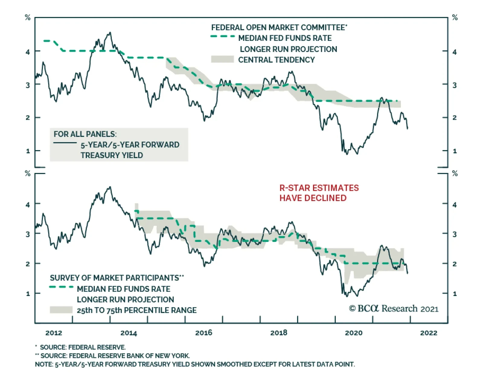
Market participants and FOMC members have brought down their estimates of the neutral rate of interest significantly over the years. While this decline was justified in the aftermath of the Global Financial Crisis, it is no longer the case. US household…
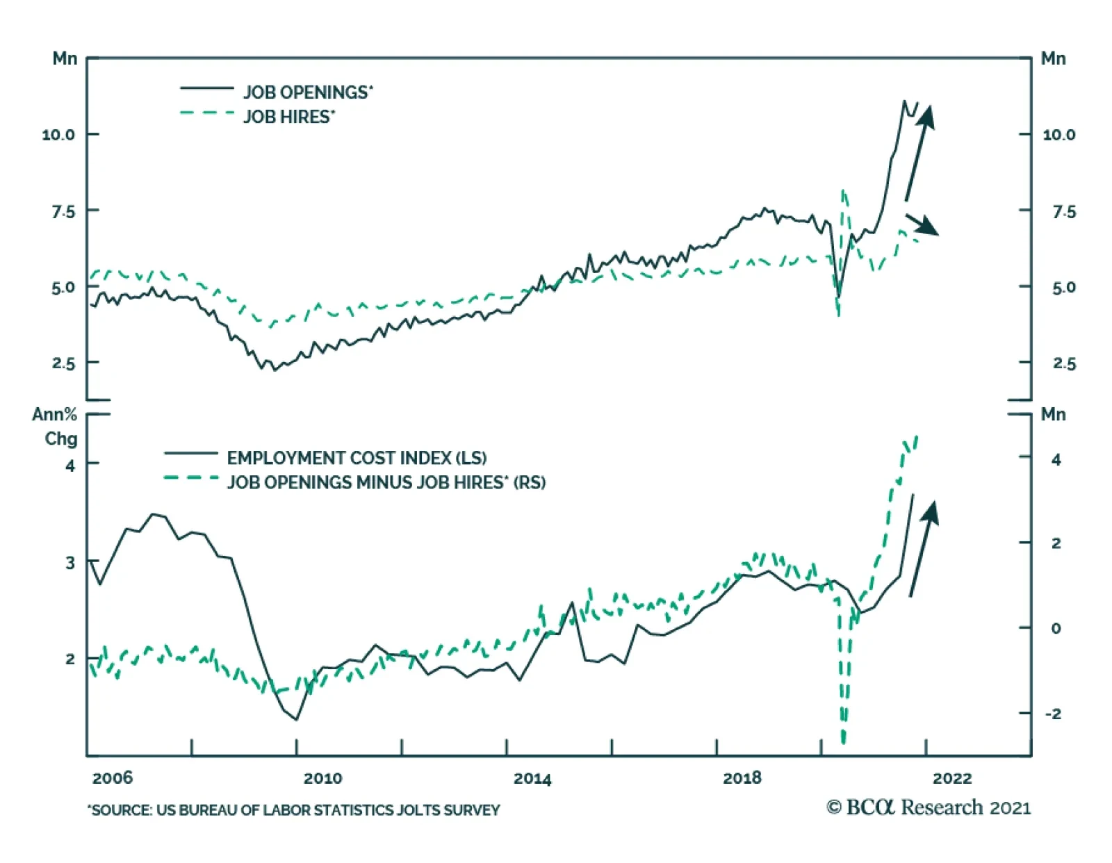
US job openings from the October JOLTS survey were stronger than expected: they increased to 11 million versus an anticipated 10.5 million. Moreover, the September figure was revised upwards from 10.4 million to 10.6 million. Meanwhile, the number of hires…
Highlights As investors’ hunt for yield continues, REITs emerge as an attractive asset class. Characterized by an attractive risk-adjusted return (comparable to public equities), and high dividend yields, REITs can add value to investors’ portfolios. The macro backdrop is supportive: Moderate levels of inflation and rising rates have historically been positive for REITs’ performance. Valuations, albeit currently looking frothy, are reflective of a recovery that was broad-based and swift. REITs’ risk premium is attractive, currently 540 basis points. Fundamentals remain supportive of a positive outlook on REITs. Even though cap rates (which historically have moved in lockstep with interest rates) could rise given our macro outlook, the cap-rate spread remains close to its historical average. The pandemic has accelerated some existing trends in the real-estate sector and established new ones. Those will create opportunities for investors. For example, the decline of retail and rise of e-commerce, working from home, and migration away from city centers are observable patterns with investable opportunities. Accordingly, the Global Asset Allocation (GAA) service upgraded the Real Estate sector to Overweight in its July 2021 Quarterly Outlook. In the near-term – given current elevated levels of inflation – we prefer REITs with short-term leases (such as self-storage and residential REITs) over those with long-term leases (such as retail and office) since the former can adjust rents more quickly. Structurally, we favor sectors supported by the growth of the digital economy. The post-pandemic environment should be positive for sectors such as data centers and industrial REITs. Feature In today’s environment of accommodative monetary policy, low interest rates, unattractive valuations and poor return prospects for income-generating assets, investors have been forced to dial up their risk appetite. Real estate stands out as a particularly attractive alternative. The Global Asset Allocation (GAA) service turned positive on real estate in July given the favorable macro backdrop in which: Inflation – while likely to come down from current elevated levels – will be higher in future than in recent decades; There is tight supply in some segments of commercial real estate (CRE); Rental growth is accelerating. This Special Report focuses on REITs, which are the simplest way for most investors to get liquid exposure to the real estate market. The report is structured as follows. We first look at the broad US REITs market (mainly equity REITs) and analyze its historical risk-return characteristics, fundamentals, and valuations. We then assess how REITs fared in previous environments of rising rates and inflation. In the second section, we analyze various sectors of the REITs market, identifying likely losers and winners from our base-case expectations for inflation and growth, and based on our views of how long-term demand for real estate will shift following the pandemic. While we have concerns about potential weaknesses in some segments of commercial real estate (e.g., retail), we highlight opportunities in more technology-driven segments of CRE. Introduction The REITs market in the US as of Q3 2021 has a market value of close to $1.5 trillion. The bulk of this is equity REITs – trusts that own and operate income-producing assets and earn income mostly through rents. The remaining are mortgage REITs which lend money directly to real-estate owners or indirectly by purchasing mortgages or securitized securities such as mortgage-backed securities (MBS) and earn income on those investments. While technically considered equities, the business model of mortgage REITs makes them more like bonds than equities. The composition of the REITs market has changed over the years. While the traditional retail and residential segments dominated the market in the first years of the millennium, structural changes have shifted the balance towards segments such as infrastructure, data centers and industrial (Chart 1). The pandemic accelerated trends that were already in play: For example, the rise of e-commerce, digitalization of services, increased teleworking, and reshoring of manufacturing and supply chains. These have had adverse effects on traditional real estate segments such as retail.
Chart 1
Historical Risk And Return, Valuations, Fundamentals & Correlations Since 1973, US all-equity1 REITs have outperformed both public equities and fixed-income assets (both government bonds and investment-grade corporate bonds) on an absolute basis, providing investors with an 11.9% annualized return versus 10.8%, 6.8%, and 7.6% respectively. On a risk-adjusted basis however, REITs’ performance was equal to that of their public equity counterparts, but lower than fixed-income assets because of REITs’ higher volatility. The negative skewness and excess kurtosis also indicate a high probability of large negative returns. Mortgage REITs (split between Home Financing and Commercial Financing), on the other hand, have returned only 5.2% on an annualized basis, while racking up annualized volatility 3.5 percentage points higher than their all-equity counterparts (Table 1). Table 1Historical Risk-Return Characteristics
Are REITs Still Attractive?
Are REITs Still Attractive?
In order to generate the sort of yields investors expect, mortgage REITs resort to leverage (about 6-8 times) which increases volatility (Chart 2). For example, REITs focusing on residential/home financing buy low credit-risk securities (with almost zero default risk), add leverage, and hedge changes in interest rates via derivatives. Mortgage REITs focusing on commercial financing use less leverage, but take on additional credit and default risk embedded in their underlying assets. Both types of REITs remain highly exposed to the economic cycle and financial conditions. Despite disappointing returns (mainly stemming from narrowing net interest spreads), mortgage REIT investors have been entranced by the high dividend yields. These have averaged 11.3% over the past four decades and are still close to 8% today, much higher than the yields of their all-equity counterparts and other assets (Chart 3). Chart 2Mortgage REITs Are Volatile...
Mortgage REITs Are Volatile...
Mortgage REITs Are Volatile...
Chart 3...And Have High Dividend Yields
...And Have High Dividend Yields
...And Have High Dividend Yields
Table 2Attractive Dividend Yields Across Sectors
Are REITs Still Attractive?
Are REITs Still Attractive?
Dividend yields for all-equity REITs are also attractive in today’s low-yielding investment environment, even though they are at all-time lows – currently they average 2.9%, 150 basis points higher than for public equities. In fact, all REIT sectors and subsectors (with the exception of the lodging/resorts sector) currently have dividend yields higher than those of public equities (Table 2). Even though REITs are considered equities, analyzing them requires different indicators. Whereas equity investors rely on multiples such as price-to-earnings (P/E) or price-to-book (P/B), for REITs price-to-funds from operations (P/FFO) is a more important valuation tool. FFO is favored over earnings since it adds back depreciation and amortization expenses, and adds to net income any gains (or subtracts any losses) from sales of underlying assets. REITs traded at a steady 17x FFO between the end of the Global Financial Crisis (GFC) and the start of the pandemic. FFO fell by 30% in the first two quarters of 2020 compared to Q4 2019, pushing the P/FFO multiple to 24.7 – an all-time high. But FFO as of Q3 2021 has inched back above its pre-pandemic level (Chart 4). The risk premium for REITs (calculated as the FFO yield minus the real 10-year treasury yield) – currently at 5.4% – remains higher than the pre-GFC bottom of 3.5%. (Chart 5). Chart 4Valuations Reflect A Swift Recovery
Valuations Reflect A Swift Recovery
Valuations Reflect A Swift Recovery
Chart 5REITs Risk Premium Is Still Elevated
REITs Risk Premium Is Still Elevated
REITs Risk Premium Is Still Elevated
With the exception of the lodging/resorts sector, REITs’ FFO as of Q3 2021 is higher than one year ago. The occupancy rate for major sectors of the REITs market is starting to rise. Overall net operating income (NOI) for Q3 2021 was 4.5% higher than its pre-pandemic (Q4 2019) level (Chart 6). Chart 6Occupancy Rates Are Rising Again
Occupancy Rates Are Rising Again
Occupancy Rates Are Rising Again
This however is the result of a large year-on-year increase in inorganic or non-same-store net operating income (NOI) – income from assets owned for less than 12 months (either recently acquired or developed) (Chart 7). M&A activity has been increasing, and amounted to almost $47 billion over the past four quarters – driven by activity in the infrastructure, self-storage, and free-standing2 segments (Chart 8).
Chart 7
Chart 8...As M&A Activity Rose
...As M&A Activity Rose
...As M&A Activity Rose
Chart 9REITs Have Low Leverage...
REITs Have Low Leverage...
REITs Have Low Leverage...
The real-estate sector has historically been seen as risky due to its high leverage, but leverage has been on the decline. Over the past decade, REITs’ reliance on equity capital has increased, with the equity/assets ratio rising from 32% in 2008 to 43% in 2021. The ratio of debt to book assets stands at around 49%, much lower than the 58% during the GFC (Chart 9). REITs have also extended the average maturity of their debt from 5 years in 2008 to over 7.5 years today. The fall in interest rates over the past two decades has benefited equity REITs: As rates fell, so did the interest they paid on their debt. Liquidity ratios also improved, with REITs’ coverage ratio (earnings relative to interest expense) at 6x, cash levels and undrawn lines of credit relative to interest expense close to 2x and 7x, respectively (Chart 10). In summary, REITs are an attractive asset class, since leverage is lower, earnings continue to rise, and cap rates – while declining – remain high compared to the risk-free rate. REITs, however, remain highly correlated to public equities: The current 3-year rolling correlation between REITs and public equities is above its historical average of 0.57 (Chart 11). This high correlation undermines the diversification benefit of REITs to investors’ portfolios. Moreover, investors should note that the correlation between REITs and direct real estate (DRE) has averaged only 0.1 over the past four decades. Even when DRE is lagged to account for its appraisal-based methodology, correlation does not rise. Chart 10...And Ample Liquidity Buffers
...And Ample Liquidity Buffers
...And Ample Liquidity Buffers
Chart 11REITs Remain Highly Correlated To Equities
REITs Remain Highly Correlated To Equities
REITs Remain Highly Correlated To Equities
In a previous Special Report we showed however that, while both direct and indirect real estate exposure can add value to investors’ portfolios on a risk-adjusted basis, direct real estate should be favored given its low correlation to other financial assets (such as equities and bonds) as well as the illiquidity premium that investors with no need for immediate liquidity can harvest. The Macro Outlook Our base case is that interest rates will inch higher over the next 12 months and that inflation will moderate but remain higher than during the past decade. How would such an environment affect the outlook for real estate – and REITs in particular? Interest rates and cap rates tend move in lockstep (with the exception of a divergence from mid-2003 until the GFC). This implies that rising rates could lead to higher cap rates, and thus lower property values (Chart 12, panel 1). The current cap-rate spread (the difference between the cap rate and the 10-year Treasury yield) is close to its long-term average of 365 basis points. This should help mitigate downward pressure on property values and act as a buffer when rates rise (Chart 12, panel 2). As long as rising rates are reflective of strengthening economic growth – and we expect US growth to remain above trend for the next two years at least (Chart 13) – and do not hurt the health of corporate tenants or increase defaults, demand for real estate should rise. Chart 12Interest Rates And Cap Rates Tend To Move In Lockstep
Interest Rates And Cap Rates Tend To Move In Lockstep
Interest Rates And Cap Rates Tend To Move In Lockstep
Chart 13Above-Trend Growth Should Bolster Demand For Real Estate
Above-Trend Growth Should Bolster Demand For Real Estate
Above-Trend Growth Should Bolster Demand For Real Estate
Historically, rising rates coincided with strong performance from REITs. On average, REITs returned 25.4% during episodes of rising interest rates, even higher than the return from equities of 24.5%. However, that figure is distorted by some outliers: REITs returned over 100% between 1976 and 1980, and in 2003-2007 (Table 3). The median return of REITS was only 7.1% versus 22.5% for equities. Excluding those two periods lowers REITs’ mean return to 9.4%. Valuation data begins only in 2000, but we can see that REITs were attractively valued in 2003, trading at about 9x P/FFO. By the peak of the market in Q1 2007, they were trading at more than 17x P/FFO. Table 3REITs Fared Well In Previous Periods Of Rising Interest Rates
Are REITs Still Attractive?
Are REITs Still Attractive?
Chart 14
REITs however fared poorly in periods of rising inflation. In a Special Report published in mid-2019, we showed that REITs were a poor hedge against very high inflation and that, much like equities, once the economy overheats and inflation rises sharply (which we define as CPI above 3.3%), REITs produced negative excess returns over cash (Chart 14 and Table 4). For investors able to be more granular in REIT allocations, drilling down to sub-categories of the market might be beneficial, particularly given the low correlation between REIT sectors (Chart 15). Table 4REITs Are Not A Good Inflation Hedge (II)
Are REITs Still Attractive?
Are REITs Still Attractive?
Chart 15Low Correlation Between REIT Sectors
Low Correlation Between REIT Sectors
Low Correlation Between REIT Sectors
The real estate market is diverse. Each sector is driven by different dynamics, reacts differently to the business cycle and changes in consumer behavior, and therefore has different return characteristics. Annual returns by sector have ranged from 4% to 19% since 1994 (Table 5). Moreover, sectors do not react in the same way to rising interest rates or inflation. Properties with short-term leases, such as hotels, storage, and apartments, can reprice and adjust rents as prices rise. On the other hand, those on the other end of the lease spectrum, e.g., retail and healthcare, have less flexibility to do so (Diagram 1). REITs with shorter-term leases (an equally-weighted basket of lodging, self-storage, and residential) outperfomed those with longer-term leases (an equally-weighted basket of healthcare, industrial, retail, and office) during periods of rising interest rates (Chart 16). Table 5REIT Sector Historical Returns
Are REITs Still Attractive?
Are REITs Still Attractive?
Diagram 1Short-Term Leases Outperform...
Are REITs Still Attractive?
Are REITs Still Attractive?
Chart 16...During Periods Of Rising Interest Rates
...During Periods Of Rising Interest Rates
...During Periods Of Rising Interest Rates
Bottom Line: The REITs market has recovered after the slump early in the pandemic. Current multiples appear expensive. However, they may just reflect a recovery that has been broad-based and swift. Cap rates historically have moved in lockstep with rising rates. If rates rise, as we expect, cap rates are likely to rise in tandem, putting downward pressure on property prices. The cap rate spread however remains close to its historical average and this should act as a buffer when rates rise. Moderate levels of inflation and rising rates are usually a positive for REITs’ performance. However, just like equities, once inflation rises too high (historically above 3.3%), REITs’ returns fall. We prefer REITs with short-term leases compared to those with long-term leases, as the former can reprice and adjust rental pricing more quickly. The Post-Covid Environment The pandemic has accelerated some existing trends in the real-estate sector and established new ones. Some sectors will struggle in this new environment, while others will flourish. In this section, we describe the likely post-pandemic world and how it will impact various segments of the real-estate market. We also assess where there are opportunities that investors can capitalize on. Retail The “death of retail” is not a new phenomenon. As technological advances led to the rise of e-commerce, consumer spending shifted from in-store to online. Over the past two decades, non-store retail sales in the US have grown at an annualized 9.5%, compared to 3.1% for in-store sales. E-commerce has risen to almost 14% of total retail sales (Chart 17). This shift is reflected in the halving of the weight of retail REITs in the REITs index over the past decade. The composition of the sector has also changed and is no longer dominated by regional malls and shopping centers but by free-standing properties: These include restaurants, theaters, fitness centers, pharmacies, etc. (Chart 18). Chart 17The Rise Of E-Commerce...
The Rise Of E-Commerce...
The Rise Of E-Commerce...
Chart 18...Had An Adverse Impact On The Retail Sector
...Had An Adverse Impact On The Retail Sector
...Had An Adverse Impact On The Retail Sector
The headwinds facing the sector – particularly shopping centers – have not abated. The size of vacant shopping center space has increased to 220 million square feet, approximately 11% of total retail space available: This is close to its post-GFC high. Private multi-retail capex continues to decline and is below its post-GFC low (Chart 19). Retail REITs’ occupancy rate is among the lowest among CRE: 94% as of Q3 2021, although it is higher than during the past two recessions. Funds from operations (FFO) and net operating income (NOI) have been declining over the past few years, with the exception of free-standing properties which saw low but positive growth (Chart 20). Chart 19Plenty Of Vacant Inventory In Shopping Centers...
Plenty Of Vacant Inventory In Shopping Centers...
Plenty Of Vacant Inventory In Shopping Centers...
Chart 20...But There Could Be Opportunities In Free-Standing Properties
...But There Could Be Opportunities In Free-Standing Properties
...But There Could Be Opportunities In Free-Standing Properties
The pandemic exacerbated some other underlying trends and threats. Smaller in-store retailers have shifted to an online presence, aided by companies like Shopify, which saw the numbers of merchants on its platform grow from 1.07 to 1.75 million in 2020. Consumers are also likely to favor shopping in smaller-scale, local shops as they find convenience in stores close to home. Additionally, given the positive correlation between household density and retail space, as households migrate from city centers to the suburbs there will be less need for retail space within city centers. Bottom Line: We recommend investors underweight the retail sector within their broad real estate exposure. The structural headwinds are not likely to disappear. Within retail, we would favor free-standing properties over shopping centers and regional malls. Office There has long been a close link between office demand and employment. As the labor market tightens, demand for offices increases and rents tend to rise (Chart 21). Investors in office REITs have earned 9.6% annualized returns, 90 basis points annualized below the overall return of the all-equity REITs index, over the past two decades. The sector is currently flush with supply. Estimates show that almost 18% (close to 800 million square feet) of total office space is vacant, yet capex has continued to increase over the past decade (Chart 22). Chart 21The Pandemic Has Changed Office Demand Dynamics
The Pandemic Has Changed Office Demand Dynamics
The Pandemic Has Changed Office Demand Dynamics
Chart 22...Leaving The Sector With Empty Space
...Leaving The Sector With Empty Space
...Leaving The Sector With Empty Space
The pandemic, however, might be the catalyst for change. After social restrictions were imposed and offices shut down, the BLS estimates that in May 2020 as many as 35-40% of US employees were telecommuting, strictly because of the pandemic (Chart 23). Since then, as restrictions were lifted and vaccination rates rose, this number has come down to 12%,3 as more employees returned to some sort of pre-pandemic normalcy. The US Household Pulse survey (published by the US Census Bureau), however, shows close to 40% of employees working at home as of the end of September (Chart 24).
Chart 23
Chart 24
Chart 25Mobility Data Showing No Full Return To Offices
Mobility Data Showing No Full Return To Offices
Mobility Data Showing No Full Return To Offices
The true number of employees who telework likely lies in between the BLS’s 15% and the Census Bureau’s 40%. A study by Jonathan Dingel and Brent Neiman estimated, based on job characteristics,4 that 37% of jobs in the US can be done entirely from home (46% if weighted by wages). Whether employees will favor a work-from-home versus a return-to-office environment is still unclear. Most surveys show a 50-50 split. High-frequency data such as the Google Mobility Trends show that the number of people going to their workplace has not yet returned to normal (Chart 25). It is likely however that office utilization rates will not return to pre-pandemic levels. This might incentivize firms to search either for offices with flexible leases or co-shared space. Chart 26Are Employers Leaving City Centers With Their Employees?
Are Employers Leaving City Centers With Their Employees?
Are Employers Leaving City Centers With Their Employees?
Companies face the choice of downsizing and so reducing business costs, or keeping the same premises which would allow for lower office density and enable social distancing between employees who return to the office. Estimates by CBRE suggest that office demand will not fall by as much as the reduction in the time employees will be in the office. CBRE argues that, while the average US employee is likely to spend 24% less time in an office, demand for office space will fall by only 9%. This calculation factors in more space per employee to allow for social distancing and collaborative working. Additionally, as more employees move away from inner cities, employers could move with them. This trend is reflected in suburban office prices which have risen by 15.1% since the beginning of 2020, compared to those in central business districts (CBD) which have risen by a mere 0.2% (Chart 26). Bottom Line: Investors in office space should be wary of corporates which are unwilling to return to offices operating at full capacity, and instead focus on single-tenant assets with long-term leases. Healthcare Chart 27Like Equities, Healthcare REITs Are A Defensive Play
Like Equities, Healthcare REITs Are A Defensive Play
Like Equities, Healthcare REITs Are A Defensive Play
REITs within this sector are focused on hospitals, senior and nursing homes, and laboratories. Since 1994, healthcare REITs have returned 10.7% annualized, with 21.1% annual volatility. These numbers, however, mask the underlying reality. Healthcare, being a defensive sector, outperformed the broad REITs market only during the dot-com recession and the GFC. In the short-lived pandemic-driven recession in 2020, healthcare REITs underperformed the broad index by 15%. On the other hand, during bull markets, particularly post the GFC, healthcare REITs significantly underperformed the broad market (Chart 27). The sector also has a high dividend yield, which has averaged 6.7% over the past 25 years, 160 basis points higher than the broad index’s historic average (Chart 28). In a Special Report published last year, we explained the structural reasons for our longstanding overweight position on Healthcare equities. We expect demand for healthcare services to continue to rise as life expectancy increases, populations age, and retiring baby boomers spend their accumulated wealth (mainly on healthcare) (Chart 29). Chart 28Healthcare REITs Have High Dividend Yields
Healthcare REITs Have High Dividend Yields
Healthcare REITs Have High Dividend Yields
Chart 29An Aging Population Will Support Demand For Healthcare
An Aging Population Will Support Demand For Healthcare
An Aging Population Will Support Demand For Healthcare
Elder care facilities will play a major role in supporting the increasingly aging population over the coming years. The pandemic has emphasized the need for high-quality senior housing: In our previous report, we highlighted that lack of funding and mismanagement – particularly in for-profit nursing homes – were reasons why they had almost four times as many Covid infections as those run by the government or non-profits. Chart 30...Increasing Investment In Healthcare Facilities
...Increasing Investment In Healthcare Facilities
...Increasing Investment In Healthcare Facilities
Chart 31Healthcare REITs' Fundamentals Are Recovering
Healthcare REITs' Fundamentals Are Recovering
Healthcare REITs' Fundamentals Are Recovering
The private sectors has already began to step in to meet this demand: Healthcare private construction expenditure has risen over the past few years and is likely to rise further (Chart 30). Cap rates continue to inch lower, but still have a decent spread over 10-year Treasurys (Chart 31, panel 1). Fundamentals have also began to improve: FFO and NOI growth seem to have bottomed, after dipping into negative territory as a result of the pandemic (panels 2 & 3). The sector has been going through a phase of consolidation: There have been significant acquisitions over the past few quarters, particularly of distressed operators (panel 4). Bottom Line: There is a structural long-term case to favor REITs in this sector, particularly an aging population with ample savings to spend on healthcare. Federal support and oversight have helped bolster confidence (for both occupants of care homes and investors) during the pandemic, and are likely to continue. Lodging/Resorts Chart 32Income Has Been The Only Source Of Return For Lodging REITs
Income Has Been The Only Source Of Return For Lodging REITs
Income Has Been The Only Source Of Return For Lodging REITs
Chart 33The Travel Industry Has Not Yet Recovered
The Travel Industry Has Not Yet Recovered
The Travel Industry Has Not Yet Recovered
Lodging REITs have been the worst performing sector over the past 27 years. Since 1994, they have returned only an annualized 4.1%, 640 basis points lower than the all-equity REITs index, with annual volatility 14 percentage points higher. They have steadily underperformed the market since 1997. Property prices within the sector have consistently declined, and income has been the only source of return (Chart 32). Lodging demand is closely linked to travel, which has been deeply impacted by the pandemic. The number of US domestic airline passengers is still only half that of the pre-pandemic period (Chart 33). With vaccines rolled out and most pandemic restrictions likely to be lifted eventually, the travel sector is set to rebound, albeit not equally across segments. Chart 34Personal Travel Likely To Recover Before Business Travel
Personal Travel Likely To Recover Before Business Travel
Personal Travel Likely To Recover Before Business Travel
Chart 35The Hotel Industry's Recovery
The Hotel Industry's Recovery
The Hotel Industry's Recovery
Personal and leisure travel is likely to return first: More people are now comfortable about going on vacation and want to make up for the “lost travel” of the past two years (Chart 34). Hotel occupancy rates, while still below 2019 levels, continue to rise, and revenue per available room (RevPAR) is close to 2019 levels (Chart 35). Business travel, on the other hand, might not recover as fast. The shift to remote working and videoconferencing is likely to push companies to review travel budgets. Business travel, which halved between 2019 and 2020, is forecast to return to its pre-pandemic level only in 2024/2025. This is likely to have a larger adverse impact on higher-end, major-city hotels. Chart 36The Pandemic's Effect On The Lodging Sector
The Pandemic's Effect On The Lodging Sector
The Pandemic's Effect On The Lodging Sector
The industry has been facing other headwinds for the past few years. The threat from online lodging platforms, such as Airbnb, has put downward pressure on occupancy rates, which have been declining recently after having hovered around the mid-60% level over the past 30 years. Bottom Line: Real spending on hotels and motels remains 26% below trend (Chart 36). A revival in leisure travel, the easing of restrictions, and pent-up demand will support the sector in the short-term. However, domestic business travel and international tourism might be slow to recover. Investors in lodging and resorts should reduce exposure to major-city assets and focus instead on rural or resort-based getaways. Residential Residential REITs are primarily focused on apartments, rather than single-family homes or manufactured (mobile) homes – although the share of apartments has been declining over the past few years (Chart 37). Since 1994, residential REITs have outperformed the broad market by an annualized 1.8 percentage points. More recently, since the single-family homes segment was added to the sector (in December 2015), residential REITs have continued to outperform the broad market, driven by a 21.4% annualized return from the manufactured homes segment, 19.4% from single-family homes, and 12.3% from apartments. The sector’s outperformance should not come as a surprise. The housing sector has been undersupplied for decades: The ratio of annual housing starts to the total number of households is 1.2% – 0.7 percentage points below its pre-GFC average (Chart 38). This has pushed up prices, increasing unaffordability, particularly for first-time buyers (Chart 39). This increased the percentage of US housing inventory occupied by renters rather than owners (Chart 40). Chart 37Apartments Make Up The Majority Of Residential REITs
Apartments Make Up The Majority Of Residential REITs
Apartments Make Up The Majority Of Residential REITs
Chart 38Housing Undersupply Is No New Issue...
Housing Undersupply Is No New Issue...
Housing Undersupply Is No New Issue...
Chart 39...Making Home Prices Unaffordable...
...Making Home Prices Unaffordable...
...Making Home Prices Unaffordable...
Chart 40...Particularly For Young Adults
...Particularly For Young Adults
...Particularly For Young Adults
Chart 41The Pandemic Pushed Renters Outside Of Major Cities
The Pandemic Pushed Renters Outside Of Major Cities
The Pandemic Pushed Renters Outside Of Major Cities
The pandemic, and its impact on shopping and work, has pushed city residents to the suburbs. This is reflected in the gap between the rental vacancy rate in large cities versus that in the suburbs (Chart 41). It is also noticeable in REITs’ performance: Ones dominated by suburban housing have outperformed those focused on city centers over the past year. Home prices, appreciating faster than rental growth, will remain a tailwind for residential REITs (Chart 42). Supply shortages will keep prices high. Fundamentals also remain supportive of a positive outlook on the sector: The cap rate on residential REITs is about 260 basis points over the 10-year Treasury yield, and both FFO and NOI growth seem to have troughed (Chart 43). Chart 42Rising Home Price Will Be A Tailwind For Residential REITs
Rising Home Price Will Be A Tailwind For Residential REITs
Rising Home Price Will Be A Tailwind For Residential REITs
Bottom Line: Investors should favor the residential sector within the REITs market, favoring single-family homes and manufactured homes over apartments, and out-of-city over downtown properties. Chart 43Improving Fundamentals For The Residential Sector
Improving Fundamentals For The Residential Sector
Improving Fundamentals For The Residential Sector
Data Centers Data centers are facilities that provide space for customers’ servers and other network and computing equipment. Due to the high and complex technical set-up specifications, leases are usually longer (upwards of five years). Properties that support the digital economy have attracted a lot of demand over the past few years. New technologies such as artificial intelligence, virtual reality, and autonomous vehicles will prove a tailwind over the coming years. Since data first became available (January 2016), data centers have outperformed the REITs benchmark by almost 60 percentage points (Chart 44). The pandemic has accelerated those trends, as social restrictions led offices, schools, and stores to close. This led to an increase in internet traffic and data creation. Estimates by OpenValut show that broadband usage increased by 51% in 2020 compared to 2019, partly due to remote learning and teleworking. Demand for data centers is expected to continue to grow. Fundamentals for the sector remain supportive: The cap rate – albeit now lower than post the GFC– is still near that of the broad benchmark (Chart 45, panel 1) and both NOI and FFO continue to grow (panels 2 & 3). Chart 44Sectors Supporting A Digitalized Economy Will Be Long-Term Outperfomers
Sectors Supporting A Digitalized Economy Will Be Long-Term Outperfomers
Sectors Supporting A Digitalized Economy Will Be Long-Term Outperfomers
Chart 45...Supporting Fundamentals' Growth
...Supporting Fundamentals' Growth
...Supporting Fundamentals' Growth
Bottom Line: Internet traffic remains the primary driver of the performance of data-center REITs. The move towards a more digitalized economy is likely to prove a tailwind for the sector. This should also immunize the sector over the economic cycle as dependence on data increases structurally. A new normal in remote working and learning, as well as continued investment in new technologies, support an allocation to the sector. Industrial Technological advances, particularly the rise of e-commerce, have also helped the industrial sector, increasing the need for logistics and fulfillment centers. Research by Prologis shows that e-commerce requires more than 3x the logistics space of brick-and-mortar sales. That is why investment in the sector has been rising over the past decade (Chart 46). Demand shows no signs of cooling: The occupancy rate of industrial REITs is at an all-time high, 4 percentage points higher than its 20-year average (Chart 47). Rental growth for industrial properties – particularly down the value chain closer to the end-consumer – has been robust due to the scarcity of permittable land. Chart 46Increased Demand For Warehouses Has Translated Into More CAPEX...
Increased Demand For Warehouses Has Translated Into More CAPEX...
Increased Demand For Warehouses Has Translated Into More CAPEX...
Chart 47...And Pushed Up Occupancy Rates
...And Pushed Up Occupancy Rates
...And Pushed Up Occupancy Rates
The pandemic has also revealed how vulnerable current supply chains are and has accelerated a trend BCA Research has highlighted for years: The decline of globalization. Going forward, companies will move to reshore some of their production to gain greater control over supply chains (Chart 48). This will amplify the need for industrial space. Bottom Line: We expect the industrial sector to continue to outperform the broad REITs market, supported by continued investment in fulfillment and logistics centers. Fundamentals remain strong: Same-store NOI is growing at over 6% a year, and acquisitions have increased, with more than $5.5 billion over the past four quarters (Chart 49). The industrial sector has been one of the quickest to revive projects put on hold during the pandemic, with the development pipeline as of Q3 2021 34% higher than in Q4 2019. Chart 48The End Of Globalization, And Supply Chain Reshoring Will Increase The Need For Industrial Space
The End Of Globalization, And Supply Chain Reshoring Will Increase The Need For Industrial Space
The End Of Globalization, And Supply Chain Reshoring Will Increase The Need For Industrial Space
Chart 49Increased M&A Activity In The Industrial Sector
Increased M&A Activity In The Industrial Sector
Increased M&A Activity In The Industrial Sector
Amr Hanafy Senior Analyst Amrh@bcaresearch.com Footnotes 1 All-equity REITs refer to equity REITs plus infrastructure and timberland REITs. 2 Free-standing REITs own stand-alone properties away from malls and are a subsector of the retail sector. 3 This does not include those whose telework was unrelated to the pandemic, such as those who worked entirely from home prior to the pandemic. 4 Jonathan I. Dingel and Brent Neiman, "How Many Jobs Can Be Done At Home?" NBER Working Paper No. 26948, April 2020.
Highlights Omicron vs. The Fed: The new COVID variant has thrown a growth scare into markets, but the bigger concern is the Fed belated playing catch up to high inflation and low unemployment. Fade the Omicron bond rally, and position for higher US Treasury yields over the next year with the Fed threatening to taper faster, and potentially hike sooner, than markets expect. New Zealand: Underlying growth and inflation fundamentals, soaring house prices, and the central bank’s historical reaction function indicate that the Reserve Bank of New Zealand will lift the cash rate to 2% by the end of 2022. However, markets are already priced for this, leaving little room for New Zealand debt to continue underperforming on a relative basis. We are upgrading New Zealand sovereigns to neutral and initiating a long NZ/short US 10-year spread trade. A Year-End Bout Of Uncertainty Chart of the WeekMarkets Have Been Worried About The Fed Since September
Markets Have Been Worried About The Fed Since September
Markets Have Been Worried About The Fed Since September
Over the past two weeks, we have published Special Reports and thus have not had an opportunity to comment on market moves and news. Needless to say, it has been an eventful period! The emergence of the new Omicron variant, and the hawkish shift in the Fed’s guidance on future policy moves, have injected fresh uncertainty and volatility into global financial markets. Since the existence of Omicron was revealed to the world on Nov 26, 30-year US Treasury yields have fallen by as much as -23bps and the S&P 500 index has been down by as much as -4.4%. Yet the evolving Fed stance, with Fed Chair Jerome Powell hinting last week that the end of tapering and start of rate hikes could begin sooner than expected next year, is having a more lasting influence on risk asset performance. Dating back to the September 23 FOMC meeting, when the Fed first signaled an imminent tapering of bond purchases and pulled forward the timing of liftoff into 2022, the 2-year US Treasury yield has gone up from 0.22% to 0.63%. Importantly, there has been little pullback on the pricing at the front-end of the US Treasury curve due to the Omicron shock. That pre-September-FOMC low in the 2-year Treasury yield also marked the peak in riskier fixed income market performance for 2021, with the Bloomberg Global High-Yield and Emerging Market USD-Denominated Sovereign total return indices down -2.0% and -1.8%, respectively, since Sept 23 (Chart of the Week). Other risk assets also appear to be responding more to news about the Fed than Omicron. Equity markets stopped climbing since the Fed announced the first taper of bond purchases at the November 3 FOMC meeting – three weeks before the world knew of Omicron - which also coincided with troughs in the VIX index and corporate credit spreads, not only in the US but in Europe and emerging markets as well (Chart 2). Of course, it is difficult to disentangle which is having a greater impact, the variant or the Fed, when details on both are evolving at the same time. Omicron Investors are understandably right to be nervous about a new COVID variant that can reportedly evade existing vaccines and even infect those who have had COVID previously. The whole idea of “putting COVID in the rearview mirror’ that has helped fuel booming equity and credit markets was predicated on vaccines being both effective and widely available. However, when investors see COVID case numbers start to pick up in the US and Europe, with vaccination rates twice that of South Africa where Omicron was first detected (Chart 3), this raises concern about a return to pre-vaccine economic restrictions and uncertainty. Chart 2A Typical Risk-Off Response To The Emergence Of Omicron
A Typical Risk-Off Response To The Emergence Of Omicron
A Typical Risk-Off Response To The Emergence Of Omicron
Chart 3Omicron Putting A Dent In Vaccine Optimism
Omicron Putting A Dent In Vaccine Optimism
Omicron Putting A Dent In Vaccine Optimism
The “Omicron effect” on fixed income markets has been most evident in the repricing of interest rate expectations. Since the presence of Omicron was revealed on November 26, there has been a reduction in the cumulative amount of tightening discounted to the end of 2024 in the overnight index swap (OIS) curves of the major developed economies (Table 1). The moves were most evident in the US (32bps of hikes priced out), Canada (37bps) and Australia (37bps). Table 1Pricing Out Some Rate Hikes Because Of Omicron
Blame The Fed, Not Omicron, For More Volatile Markets
Blame The Fed, Not Omicron, For More Volatile Markets
Much is still unknown about the dangers of the Omicron variant. The admittedly very early data out of South Africa, however, indicates that there has not been a major surge in hospitalizations related to Omicron cases. A new COVID strain that proves to be more virulent, but that does not strain health care systems, should help allay investor concerns over a major economic hit from Omicron. This presents an opportunity to put on positions that will profit from a rebound in global bond yields led by higher US Treasury yields. The Fed The Omicron threat to date has not been enough to move the Fed off its plans to rein in the monetary accommodation put in place in 2020 to fight the pandemic. If Omicron is to have any impact on the US economy, it will do so at a time when the economy continues to grow well above trend. The November reading on the ISM Manufacturing survey showed strength in the overall index, with a stabilization of the New Orders/Inventory ratio that leads overall growth, and only a very modest reduction in the still-elevated Prices Paid and Supplier Deliveries indices (Chart 4). The Atlanta Fed’s GDPNow model is suggesting that US real GDP growth could come in at a whopping 9.7% in Q4. As further evidence that the US economy is growing at a pace well above trend, just look to labor market data. New US jobless claims are at the lowest level since 1969. The November US Payrolls report showed that the headline unemployment rate fell 0.4 percentage points on the month to 4.2% - within the range of full employment estimates of the FOMC - even with actual job growth falling short of consensus forecasts (Chart 5, top panel). Chart 4Nothing Bond-Bullish In US Manufacturing
Nothing Bond-Bullish In US Manufacturing
Nothing Bond-Bullish In US Manufacturing
The improving health of the labor market is being felt more broadly, with big declines seen in unemployment rates for minorities and less-educated Americans (second panel). That point is of critical importance to the Powell Fed that has emphasized reducing racial and educational gaps in US unemployment as part of reaching its goal of “maximum employment”. Chart 5Nothing Bond-Bullish In US Labor Markets
Nothing Bond-Bullish In US Labor Markets
Nothing Bond-Bullish In US Labor Markets
Tightening labor markets are also evident in accelerating wage momentum. Excluding the 2020 spike driven by labor force compositional effects related to COVID lockdowns, the year-over-year growth in average hourly earnings reached a 39-year high of 5.9% in November (third panel). The Fed now seems willing to finally confront high US inflation and strong economic growth with some tightening of monetary policy. Chart 6A Near-Term Break From Supply-Fueled Inflation?
A Near-Term Break From Supply-Fueled Inflation?
A Near-Term Break From Supply-Fueled Inflation?
Powell caused some investor agita last week when he indicated that the taper could end before mid-2022, the previous FOMC guidance, which would open the door for rate hikes. We see Powell’s comments as less about signaling an intensifying hawkishness and more about giving the Fed optionality on when to start lifting rates next year in the event the US economy continues to overheat. The Fed strongly believes that tapering must end before rate hikes can begin, so a more accelerated taper allows for an earlier liftoff date, if necessary. To that end, the supply fueled surge in inflation this year, which has lingered for far longer than the Fed anticipated, may be showing some signs of easing. Several indices of global shipping container prices are off the highs, while there is a reduced backlog of container ships off key US ports like Los Angeles. Overall commodity price momentum has peaked, in line with slower, but still strong, global industrial activity (Chart 6). An easing of supply-driven price pressures would be welcome by the FOMC. It would allow time to evaluate both the Omicron threat and evolving US labor market dynamics, instead of being forced to fight a rearguard action against accelerating inflation. However, a shift away from goods/commodity inflation to more domestically driven inflation would not lessen the need for the Fed to begin lifting rates next year – in fact, it could even strengthen the case for the Fed to hike rates faster, and by more, than currently discounted in markets. Importantly, forward looking indicators are still pointing to solid US growth next year (Chart 7): The Conference Board’s leading economic indicator continues to grow at a pace signaling above-trend growth US financial conditions remain highly accommodative even with the recent market turbulence The New York Fed’s yield curve based recession probability model is indicating that the spread between the 10-year US Treasury yield and the 3-month US Treasury bill rate, currently 138bps, is consistent with only a 9% chance of a US recession over the next year (bottom panel) We continue to recommend a below-benchmark duration stance within US fixed income portfolios, with a yield target on the 10-year benchmark US Treasury yield of 2-2.25% to be reached by the end of 2022. We also continue to recommend positioning in Treasury curve steepening trades. This is admittedly a counter-intuitive suggestion given that the Fed is moving towards a rate hiking cycle, but we see too much flattening priced into the Treasury forward curve over the next year (Chart 8). Chart 7A Positive Message From US Leading Growth Indicators
A Positive Message From US Leading Growth Indicators
A Positive Message From US Leading Growth Indicators
Chart 8Our Favorite Bearish US Rates Trades
Our Favorite Bearish US Rates Trades
Our Favorite Bearish US Rates Trades
For global bond investors, our favorite trade that will benefit from higher US bond yields next year is to position for a wider 10-year US Treasury-German Bund spread (bottom panel). We expect the ECB to avoid any rate increases until at least mid-2023, well after the Fed has begun to tighten. Forward curves in the US and Germany currently discount a relatively stable Treasury-Bund spread in 2022, thus there is no negative carry incurred by positioning for a wider spread. Bottom Line: Omicron has thrown a growth scare into markets, but the bigger concern is that the Fed is belated starting to play catch up to high inflation and low unemployment. Fade the Omicron bond rally, and position for higher US Treasury yields over the next year. New Zealand: How Much Further Can The Bond Selloff Go? Chart 9NZ Sovereign Underperformance Has Been Driven By RBNZ Hawkishness
NZ Sovereign Underperformance Has Been Driven By RBNZ Hawkishness
NZ Sovereign Underperformance Has Been Driven By RBNZ Hawkishness
Over the past year, New Zealand bonds have sold off much faster than developed market peers (Chart 9). Markets correctly recognized the Reserve Bank Of New Zealand (RBNZ) as a central bank that would move more aggressively to tamp down on inflation and manage the financial stability and political risks arising from soaring house prices. The RBNZ has already delivered back-to-back hikes at its October and November meetings, after its plans to hike at the August meeting were thrown off by the Delta variant. Markets are now pricing in a further 172bps of tightening over the coming year, having largely faded any downside growth risk from the Omicron variant. Expectations of continued tightening have been buoyed by the response of New Zealand policymakers, who are largely looking past the Omicron variant. Restrictions have already begun to ease, with the country having entered its “Traffic Light” COVID-19 Protection Framework. The new variant is also unlikely to affect the RBNZ’s tightening path, with Chief Economist Yuong Ha stating that, given the lifting of restrictions, the RBNZ would have raised rates even if Omicron had become known before its November 24 meeting. Given the bond-bearish backdrop, New Zealand government bonds have underperformed substantially this year. On a relative hedged and duration-matched basis, New Zealand sovereigns have underperformed by -6.6% year-to-date with -4.0 percentage points of that underperformance coming after July 21 when we formally moved to an underweight stance on New Zealand debt within global government bond portfolios (Chart 9, bottom panel). However, with monetary policy entering a new phase, led by an increasingly hawkish Fed, we believe it is appropriate to re-assess our New Zealand call and judge whether this underperformance can continue into 2022. The growth picture is broadly supportive of the RBNZ’s stated policy path. Real GDP as of Q2 was above its pre-Covid trend and 2.6% over the RBNZ’s own estimate of potential GDP, supported by an easing of travel restrictions and strong consumer spending (Chart 10). On a forward-looking basis, however, the risk is now that the economy is running too hot, jeopardizing future growth. Consumer and business sentiment has been worsening as inflation expectations soar, with consumers fearing a hit to purchasing power and businesses concerned about the impact of rising input costs on profit margins. Household and business inflation fears also have a strong basis in the realized inflation data, which has soared to a 10-year high of 4.9% (Chart 11). More troublingly, underlying inflation measures such as the trimmed mean and core (excluding food and energy) are now at series highs of 4.8% and 4%, respectively, indicating that higher inflation could prove to be sticky. The RBNZ now sees headline inflation peaking at 5.7% in Q1/2022 before settling to 2% by the end of its forecast horizon in 2024. Chart 10The NZ Economy Is Overheating
The NZ Economy Is Overheating
The NZ Economy Is Overheating
Chart 11The RBNZ Will Welcome A Slight Growth Slowdown
The RBNZ Will Welcome A Slight Growth Slowdown
The RBNZ Will Welcome A Slight Growth Slowdown
The RBNZ clearly attributes higher inflation to an economy running above longer-term capacity rather than short-term supply factors. The Bank’s measure of the output gap is now at the most positive level since 2007, and survey measures of capacity utilization remain elevated. In contrast to the Fed, which is still nominally focused on maximum employment, the RBNZ actually believes that employment is above its maximum sustainable level, and sees a rising unemployment rate as necessary to ease capacity constraints. Given that the RBNZ is clearly comfortable with, and will likely welcome, a gradual rise in unemployment, it will take much more than a slight growth shock to deter the RBNZ from its tightening path. Chart 12Higher Rates Necessary To Stabilize The NZ Housing Market
Higher Rates Necessary To Stabilize The NZ Housing Market
Higher Rates Necessary To Stabilize The NZ Housing Market
The newest, and most politically potent, part of the RBNZ’s remit—house prices – has further supported a bias to tighten monetary policy. However, while still dramatically elevated, house price growth looks to have peaked (Chart 12). The central bank’s hawkish shift earlier in the year has made a clear impact, with house price growth peaking shortly after mortgage rates started picking up in April of this year. Overall household mortgage credit has also begun to decelerate, indicating that the passthrough from monetary policy to credit demand and housing via the mortgage rate is working as intended. However, there is likely further to go. The last time house price growth was somewhat stable around 6.6% in the 2012-2019 period, benchmark 5-year mortgage rates averaged 6.1%. Assuming the spread between the 5-year mortgage and policy rates remains around 4%, history indicates that we would need to see the policy rate rise to at least 2% to cool down the housing market. That 2% level is also the RBNZ’s mean estimate of a “neutral” cash rate—a level at which policy would be neither accommodative nor restrictive (Chart 13). Current market pricing is quite consistent with the RBNZ’s own projected path of rates as of the November meeting—both of which are set to exceed the neutral rate by the end of 2022. Historical experience from the pre-crisis period indicates that this is not uncommon, and that a bout of restrictive policy might be needed to cool down an overheating economy.
Chart 13
Indeed, if the RBNZ’s historical reaction to inflation is any guide, it seems likely that policymakers will want to push rates above inflation. The top two panels of Chart 14 show how anomalous deeply negative real policy rates are in New Zealand. Even if we make the case that developed market real rates are in a structural downtrend, as realized real rates have peaked out at successively lower levels with each tightening cycle, the current gap between the cash rate and core inflation seems obviously unsustainable and requires a tightening of policy. Chart 14NZ Real Rates Are Too Low
NZ Real Rates Are Too Low
NZ Real Rates Are Too Low
Chart 15Go Long The 10-Year NZ Government Bond/US Treasury Spread
Go Long The 10-Year NZ Government Bond/US Treasury Spread
Go Long The 10-Year NZ Government Bond/US Treasury Spread
Another way to think about where policy rates are in relation to a “neutral” level is to look at the yield curve (Chart 14, bottom panel). Typically, the yield curve inverts when markets judge that monetary policy is too restrictive and that short rates are too high relative to a long-run average. However, the New Zealand government bond curve has historically remained inverted for extended periods of time, troughing at around -100bps. This again indicates that the RBNZ is comfortable raising rates above neutral and keeping policy restrictive when needed. Putting together the four factors we have looked at—growth, inflation, asset prices, and the RBNZ’s reaction function—it looks likely that the RBNZ will continue along the tightening path it has set out and chances of any dovish surprise seem slim. At the same time, markets are priced to perfection in terms of the pace and amount of tightening discounted. For New Zealand sovereigns to continue underperforming, however, we will need to see markets price in, on the margin, even more tightening from the RBNZ relative to its peers. With the Fed and other central banks having become more focused on responding to US inflation dynamics, bond-bearish upside shocks to market rate expectations will increasingly come from outside New Zealand. At the same time, in the event of a negative global growth shock, perhaps relating to COVID-19, there is relatively more room for hikes to be priced out in New Zealand. Given our view that bond and rates markets have appropriately priced in the extent of the RBNZ’s likely tightening cycle, we are upgrading New Zealand sovereign debt to neutral, taking profits on our current underweight stance. While we do not include New Zealand debt in our model bond portfolio, we are expressing our view via a new tactical cross-country spread trade: long New Zealand 10-Year government bonds vs. US 10-Year Treasuries (Chart 15). Forwards are currently pricing in a flat spread between the two countries, meaning that any future spread tightening will put our trade in the black. Given that there is more space for markets to price in increased hawkishness from the Fed, we believe that spread compression is likely. We are implementing this trade by going long New Zealand cash bonds and shorting 10-year US Treasury futures. Details can be found on Page 18. Bottom Line: Underlying growth and inflation fundamentals, soaring house prices, and the central bank’s historical reaction function indicate that the Reserve Bank of New Zealand will lift the cash rate to 2% by the end of 2022. However, markets are already priced for this, leaving little room for New Zealand debt to continue underperforming on a relative basis. We are upgrading New Zealand sovereigns to neutral and initiating a long NZ/short US 10-year spread trade. Robert Robis, CFA Chief Fixed Income Strategist rrobis@bcaresearch.com Shakti Sharma Senior Analyst ShaktiS@bcaresearch.com GFIS Model Bond Portfolio Recommended Positioning Active Duration Contribution: GFIS Recommended Portfolio Vs. Custom Performance Benchmark
Image
The GFIS Recommended Portfolio Vs. The Custom Benchmark Index Global Fixed Income - Strategic Recommendations* Duration Regional Allocation Spread Product Tactical Overlay Trades
The US Bureau of Labor Statistics revised down its estimate for Q3 nonfarm labor productivity which fell by 5.2% on an annualized basis in Q3 from its earlier estimate of -5.0%. This translated into an upwards revision in unit labor costs to 9.6% from 8.3%. …
Highlights Chart 1Curve Flattening Is Overdone
Curve Flattening Is Overdone
Curve Flattening Is Overdone
Fed Chair Jay Powell made big news last month. During Senate testimony, Powell not only signaled that the Fed is likely to accelerate the pace of asset purchase tapering when it meets in December, he also suggested that the Fed won’t necessarily wait until “maximum employment” is achieved before lifting rates. Powell’s comments suggest that the first Fed rate hike could come as early as June 2022 and as late as December 2022, and the exact timing will depend on how inflation and inflation expectations move during the next few months. The front-end of the Treasury curve is fairly priced for either scenario. The 2-year Treasury yield is currently 0.60%. If we assume that the Fed eventually lifts rates at a pace of 100 bps per year until reaching a 2.08% terminal rate, we calculate a fair value range for the 2-year yield of 0.39% to 0.74%, depending on whether Fed liftoff occurs in June or December. In contrast, the same assumptions give us a fair value range of 1.69% to 1.79% for the 10-year Treasury yield, well above its current level of 1.40% (Chart 1). The investment implications are clear. Investors should maintain below-benchmark portfolio duration and put on Treasury curve steepeners, overweight the 2-year note and underweight the 10-year. Feature Table 1Recommended Portfolio Specification
Powell’s Pivot
Powell’s Pivot
Table 2Fixed Income Sector Performance
Powell’s Pivot
Powell’s Pivot
Investment Grade: Neutral Chart 2Investment Grade Market Overview
Investment Grade Market Overview
Investment Grade Market Overview
Investment grade corporate bonds underperformed the duration-equivalent Treasury index by 89 basis points in November, dragging year-to-date excess returns down to +102 bps. The index option-adjusted spread widened 12 bps on the month and our quality-adjusted 12-month breakeven spread is now at its 7th percentile since 1995. This indicates that valuations remain stretched even after the recent widening (Chart 2). The back-up in spreads was driven by the combination of the Fed’s shift toward a more hawkish policy stance and concerns about the new omicron COVID variant. This led to a large flattening of the yield curve in addition to wider corporate bond spreads. The slope of the yield curve is a critical indicator for our corporate bond call. We are very comfortable owning corporate bonds when the 3-year/10-year Treasury slope is above 50 bps, but our work suggests that returns to credit risk take a significant step down once the slope flattens into a range of 0 – 50 bps.1 The 3-year/10-year Treasury slope currently sits at 49 bps, just below our 50 bps threshold. However, our range of fair value estimates suggests that the 3/10 slope should be between 63 bps and 86 bps today, and that it should only break below 50 bps between March and September of next year (bottom panel). All in all, we expect the pace of Treasury curve flattening to abate during the next couple of months and this will allow spreads to tighten back to their recent lows. We will turn more cyclically defensive on corporate bonds next year when the break below 50 bps in the 3/10 slope is confirmed by our fair value readings. Table 3ACorporate Sector Relative Valuation And Recommended Allocation*
Powell’s Pivot
Powell’s Pivot
Chart
High-Yield: Overweight Chart 3High-Yield Market Overview
High-Yield Market Overview
High-Yield Market Overview
High-Yield underperformed the duration-equivalent Treasury index by 121 basis points in November, dragging year-to-date excess returns down to +444 bps. The index option-adjusted spread widened 50 bps on the month, leading to a significant rise in the spread-implied default rate. The spread-implied default rate is the 12-month default rate that is priced into the junk index, assuming a 40% recovery rate on defaulted debt and an excess spread of 100 bps. At present, the spread-implied default rate sits at 3.8% (Chart 3). For context, defaults have come in at an annualized rate of 1.6% so far this year and we showed in a recent report that corporate balance sheets are in excellent shape.2 Specifically, the ratio of total debt to net worth for the nonfinancial corporate sector has fallen to 41%, the lowest ratio since 2010 (bottom panel). We conclude that the default rate will be comfortably below 3.8% during the next 12 months, allowing high-yield bonds to outperform duration-matched Treasuries. We recommend that investors favor high-yield over investment grade corporate bonds, and we expect that last month’s spread widening will reverse in relatively short order. However, as noted on page 3, we will turn more defensive on credit risk (including high-yield bonds) next year once we are confident that the 3/10 Treasury curve has sustainably moved into a flatter regime (0 – 50 bps). MBS: Underweight Chart 4MBS Market Overview
MBS Market Overview
MBS Market Overview
Mortgage-Backed Securities underperformed the duration-equivalent Treasury index by 46 basis points in November, dragging year-to-date excess returns down to -90 bps. The zero-volatility spread for conventional 30-year agency MBS widened 13 bps on the month, driven by an 11 bps widening of the option-adjusted spread and a 2 bps increase in the compensation for prepayment risk (option cost) (Chart 4). We wrote in last week’s report that MBS’ recent poor performance is attributable to an option cost that is too low relative to the pace of mortgage refinancings, noting that the MBA Refinance Index has been slow to fall this year despite the back-up in yields.3 The robust pace of home price appreciation has been an important factor boosting refis, as homeowners have been increasingly incentivized to tap the equity in their homes. With no indication that cash-out refi activity is about to slow, we expect refi activity will remain sticky going forward. This will put upward pressure on MBS spreads. We recommend adopting an up-in-coupon bias within an overall underweight allocation to MBS. Higher coupon MBS exhibit more attractive option-adjusted spreads and higher convexity than lower coupon MBS. This makes high-coupon MBS (4%, 4.5%) more likely to outperform low-coupon MBS (2%, 2.5%, 3%) in an environment where bond yields are flat or rising (bottom panel). Government-Related: Neutral Chart 5Government-Related Market Overview
Government-Related Market Overview
Government-Related Market Overview
The Government-Related index underperformed the duration-neutral Treasury index by 35 basis points in November, dragging year-to-date excess returns down to +33 bps. Sovereign debt underperformed duration-equivalent Treasuries by 157 basis points in November, dragging year-to-date excess returns down to -220 bps. Foreign Agencies underperformed the Treasury benchmark by 9 bps on the month, dragging year-to-date excess returns down to +36 bps. Local Authority bonds underperformed by 16 bps in November, dragging year-to-date excess returns down to +406 bps. Supranationals outperformed by 2 bps, bringing year-to-date excess returns up to +18 bps. The investment grade Emerging Market Sovereign bond index outperformed the equivalent-duration US corporate bond index by 42 bps in November. The Emerging Market Corporate & Quasi-Sovereign index underperformed duration-matched US corporates by 16 bps (Chart 5). Both EM indexes continue to offer significant yield advantages versus US corporate bonds with the same credit rating and duration. We continue to recommend overweighting USD-denominated EM sovereigns and corporates versus investment grade US corporates with the same credit rating and duration.4 Within EM sovereigns, attractive countries include: Russia, Mexico, Indonesia, Saudi Arabia, UAE and Qatar. Municipal Bonds: Maximum Overweight Chart 6Municipal Market Overview
Municipal Market Overview
Municipal Market Overview
Municipal bonds outperformed the duration-equivalent Treasury index by 29 basis points in November, bringing year-to-date excess returns up to +371 bps (before adjusting for the tax advantage). The economic and policy back-drop remains favorable for municipal bond performance. Trailing 4-quarter net state & local government savings are incredibly high (Chart 6) and 2021’s federal spending splurge will support state & local government coffers for some time. A recent report showed that the average duration of municipal bond indexes has fallen significantly during the past few decades, a trend that has implications for how we should perceive municipal bond valuation.5 Specifically, the trend makes municipal bonds more attractive relative to both Treasury securities and investment grade corporates. Long-maturity bonds are especially compelling. We calculate that 12-17 year maturity Revenue Munis offer a breakeven tax rate of 14% relative to credit rating and duration matched US corporate bonds. 12-17 year General Obligation Munis offer a breakeven tax rate of 22% versus corporates (panel 2). High-yield muni spreads are reasonably attractive compared to high-yield corporates (panel 4), but we recommend only a neutral allocation to high-yield munis versus high-yield corporates. The deep negative convexity of high-yield munis makes them susceptible to extension risk if bond yields rise. Treasury Curve: Buy 2-Year Bullet Versus Cash/10 Barbell Chart 7Treasury Yield Curve Overview
Treasury Yield Curve Overview
Treasury Yield Curve Overview
The Treasury curve flattened dramatically in November. Increasingly hawkish rhetoric from the Fed pushed front-end yields higher as news about the omicron COVID strain pressured long-dated yields lower. The 2-year/10-year Treasury slope flattened 16 bps on the month, it currently sits at 75 bps. The 5-year/30-year Treasury slope flattened 11 bps on the month, it currently sits at 56 bps. As noted on the front page, long-dated Treasury yields have fallen to well below levels consistent with a reasonable Fed rate hike cycle. This drop in long-maturity yields has pushed the 2/5/10 butterfly spread to extremely high levels, both in absolute terms and relative to our model’s fair value (Chart 7). This signals that 2/10 yield curve steepeners are incredibly cheap. Indeed, we observe that the 2/10 slope has already flattened to below the levels that were witnessed on the last two Fed liftoff dates in 2015 and 2004 (panel 4). A trade long the 5-year bullet and short a duration-matched 2/10 barbell does indeed look attractive in this environment. However, we note that the 2/5 Treasury slope has also flattened to below levels seen on the prior two Fed liftoff dates (bottom panel). In other words, the 2/5 slope also has room to steepen during the next 6-12 months, and we prefer to focus our long positions on the 2-year Treasury note rather than the 5-year. This leads us to recommend a position long the 2-year note and short a duration-matched barbell consisting of cash and the 10-year note. We also advise investors to own a position long the 20-year bond versus a duration-matched barbell consisting of the 10-year note and 30-year bond. This latter position offers a very attractive duration-neutral yield advantage of 24 bps. TIPS: Neutral Chart 8TIPS Market Overview
TIPS Market Overview
TIPS Market Overview
TIPS performed in line with the duration-equivalent nominal Treasury index in November, leaving year-to-date excess returns unchanged at +739 bps. The 10-year TIPS breakeven inflation rate fell 8 bps on the month while the 2-year TIPS breakeven inflation rate rose 17 bps. The 10-year and 2-year rates currently sit at 2.44% and 3.24%, respectively. The Fed’s preferred 5-year/5-year forward TIPS breakeven inflation rate rose 8 bps on the month. It currently sits at 2.16%, below the Fed’s 2.3% - 2.5% target range. Our valuation indicator shows that 10-year TIPS are slightly expensive compared to 10-year nominal Treasuries (Chart 8), and we retain a neutral allocation to TIPS versus nominals at the long-end of the curve. We acknowledge the risk that a prolonged period of high inflation could lead to a break-out in long-dated TIPS breakevens, but this now looks less likely given the Fed’s increasing hawkishness. We see better trading opportunities at the front-end of the TIPS curve, where the 2-year TIPS breakeven inflation rate remains well above the Fed’s target range (panel 4). Short-maturity breakevens are more sensitive to swings in CPI than those at the long-end. Therefore, the 2-year TIPS breakeven inflation rate has considerable downside during the next 6-12 months, assuming inflation moderates as we expect it will. We recommend an underweight allocation to TIPS versus nominals at the front-end of the curve. Given our view that CPI inflation will be lower in 6-12 months, we recommend shorting 2-year TIPS outright, positioning in 2/10 TIPS breakeven inflation curve steepeners (bottom panel) and 2/10 TIPS (real) yield curve flatteners. All three trades will profit from falling short-maturity inflation expectations. ABS: Overweight Chart 9ABS Market Overview
ABS Market Overview
ABS Market Overview
Asset-Backed Securities underperformed the duration-equivalent Treasury index by 9 basis points in November, dragging year-to-date excess returns down to +26 bps. Aaa-rated ABS underperformed by 11 bps on the month, dragging year-to-date excess returns down to +13 bps. Non-Aaa ABS performed in line with Treasuries in November, keeping year-to-date excess returns steady at +93 bps. During the past two years, substantial federal government support for household incomes has caused US households to build up an extremely large buffer of excess savings. During this period, many households have used their windfalls to pay down consumer debt and credit card debt levels have fallen to well below pre-COVID levels (Chart 9). The result is that the collateral quality backing consumer ABS is exceptionally high. Investors should remain overweight consumer ABS and should take advantage of the high quality of household balance sheets by moving down the quality spectrum, favoring non-Aaa rated securities over Aaa-rated ones. Non-Agency CMBS: Neutral Chart 10CMBS Market Overview
CMBS Market Overview
CMBS Market Overview
Non-Agency Commercial Mortgage-Backed Securities underperformed the duration-equivalent Treasury index by 40 basis points in November, dragging year-to-date excess returns down to +155 bps. Aaa Non-Agency CMBS underperformed Treasuries by 30 bps in November, dragging year-to-date excess returns down to +63 bps. Non-Aaa Non-Agency CMBS underperformed Treasuries by 70 bps, dragging year-to-date excess returns down to +469 bps (Chart 10). Though returns have been strong this year and spreads remain attractive, particularly for lower-rated CMBS, we continue to recommend only a neutral allocation to the sector because of the structurally challenging environment for commercial real estate. Agency CMBS: Overweight Agency CMBS underperformed the duration-equivalent Treasury index by 47 basis points in November, dragging year-to-date excess returns down to +58 bps. The average index option-adjusted spread widened 9 bps on the month. It currently sits at 40 bps (bottom panel). Though Agency CMBS spreads have recovered to well below their pre-COVID levels, they still look attractive compared to other similarly risky spread products. Stay overweight. Ryan Swift US Bond Strategist rswift@bcaresearch.com Appendix A: Butterfly Strategy Valuations The following tables present the current read-outs from our butterfly spread models. We use these models to identify opportunities to take duration-neutral positions across the Treasury curve. The following two Special Reports explain the models in more detail: US Bond Strategy Special Report, “Bullets, Barbells And Butterflies”, dated July 25, 2017, available at usbs.bcaresearch.com US Bond Strategy Special Report, “More Bullets, Barbells And Butterflies”, dated May 15, 2018, available at usbs.bcaresearch.com Table 4 shows the raw residuals from each model. A positive value indicates that the bullet is cheap relative to the duration-matched barbell. A negative value indicates that the barbell is cheap relative to the bullet. Table 5 scales the raw residuals in Table 4 by their historical means and standard deviations. This facilitates comparison between the different butterfly spreads. Table 6 flips the models on their heads. It shows the change in the slope between the two barbell maturities that must be realized during the next six months to make returns between the bullet and barbell equal. For example, a reading of -62 bps in the 5 over 2/10 cell means that we would expect the 5-year to outperform the 2/10 if the 2/10 slope flattens by less than 62 bps during the next six months. Otherwise, we would expect the 2/10 barbell to outperform the 5-year bullet. Table 4Butterfly Strategy Valuation: Raw Residuals In Basis Points (As Of November 30th, 2021)
Powell’s Pivot
Powell’s Pivot
Table 5Butterfly Strategy Valuation: Standardized Residuals (As Of November 30th, 2021)
Powell’s Pivot
Powell’s Pivot
Table 6Discounted Slope Change During Next 6 Months (BPs)
Powell’s Pivot
Powell’s Pivot
Appendix B: Excess Return Bond Map The Excess Return Bond Map is used to assess the relative risk/reward trade-off between different sectors of the US bond market. It is a purely computational exercise and does not impose any macroeconomic view. The Map’s vertical axis shows 12-month expected excess returns. These are proxied by each sector’s option-adjusted spread. Sectors plotting further toward the top of the Map have higher expected returns and vice-versa. Our novel risk measure called the “Risk Of Losing 100 bps” is shown on the Map’s horizontal axis. To calculate it, we first compute the spread widening required on a 12-month horizon for each sector to lose 100 bps or more relative to a duration-matched position in Treasury securities. Then, we divide that amount of spread widening by each sector’s historical spread volatility. The end result is the number of standard deviations of 12-month spread widening required for each sector to lose 100 bps or more versus a position in Treasuries. Lower risk sectors plot further to the right of the Map, and higher risk sectors plot further to the left.
Chart 11
Footnotes 1 Please see US Bond Strategy Weekly Report, “Expected Returns In Corporate Bonds”, dated September 21, 2021. 2 Please see US Bond Strategy Weekly Report, “The Fed’s Inflation Problem”, dated November 23, 2021. 3 Please see US Bond Strategy Weekly Report, “The Omicron Impact”, dated November 30, 2021. 4 Please see US Bond Strategy Weekly Report, “Damage Assessment”, dated September 28, 2021. 5 Please see US Bond Strategy Weekly Report, “The Best & Worst Spots On The Yield Curve”, dated October 26, 2021.
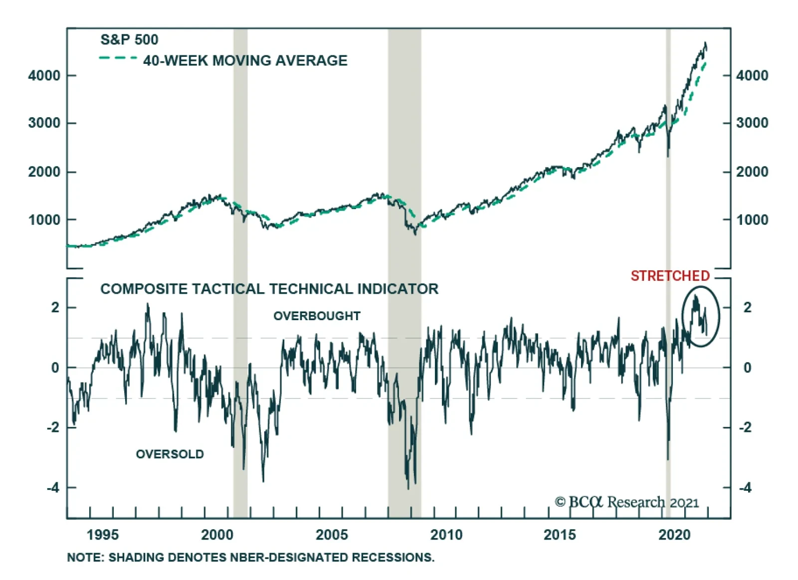
Retail flows into US equities have been extremely strong this year, contributing to the healthy performance of US stocks. However, this raises the question whether the market is now vulnerable to a pullback in retail demand. For the most part, the TINA…
Highlights Economy: Chair Powell retired the term “transitory” last week, signaling that the Fed may take a harder line on inflation in the coming year: The Fed coined the transitory term to describe the current inflation backdrop, and publicly throwing in the towel on the idea allows the FOMC to open the door to a more hawkish approach in 2022. Markets: Financial markets continued their post-Thanksgiving gyrations, but the Omicron variant was a more meaningful driver than Fedspeak: Powell’s hints simply brought the Fed’s liftoff date closer to the markets' estimate. Omicron was the main force behind the fall in interest rates, as evidenced by the swoon in oil and pandemic-exposed equities. Strategy: Don’t fight the crowd in the near term, but position for a higher-than-expected terminal rate down the road: We expect rates will remain well behaved in 2022, but we do not share the seeming market conviction that rates will be permanently lower. Feature A US investor who called it a week the day before Thanksgiving may think twice about leaving his/her desk for even a day going forward. Stocks and other risk assets were hammered in the abbreviated Black Friday session on concerns about Omicron, COVID’s latest variant. The S&P 500 recovered much of its losses last Monday, only to be jolted again on Tuesday, as Fed Chair Powell testified before a Senate committee. Stocks duly surged on Wednesday, leaving the S&P off just over 1% from its pre-Thanksgiving close, until news that the Omicron variant had been discovered in California sparked a sharp intra-day reversal. They then came back very strong on Thursday – lather, rinse, repeat. The action was a reminder that volatility often picks up as a perceived inflection point nears. The VIX, which measures implied volatility on S&P 500 index options, spent the week ensconced above the 20 level that has mostly contained it since the financial crisis faded and effective COVID vaccines became widely available (Chart 1). Despite the recent gyrations, our base-case cyclical outlook, as described in last week’s report, remains in place. We expect US growth will come in well above trend for this quarter and all of 2022, monetary policy settings will likely remain easy for another two years, and the accumulated monetary and fiscal stimulus that’s already been injected into the economy will keep the expansion going at least through 2023. Chart 1An Eventful Stretch
An Eventful Stretch
An Eventful Stretch
What The Chair Said Fed Chair Powell testified before the Senate and the House Tuesday and Wednesday last week, respectively. His comments on the pace of tapering, the economy’s progress in meeting the Fed’s inflation criteria for hiking rates, the way inflation might thwart employment gains and the word "transitory" captured the attention of investors and the financial media. On tapering: “At this point, the economy is very strong, and inflationary pressures are high. It is therefore appropriate in my view to consider wrapping up the taper of our asset purchases, which we … announced at our November meeting, perhaps a few months sooner.” On the inflation criteria for hiking rates: “The test that we’ve articulated clearly has been met [.] … Inflation has run well above 2% for long enough now [given recent data releases].” On inflation as a threat to full employment: “What I am taking on board is it is going to take longer to get labor force participation back. … That means to get back to the kind of great labor market we had before the pandemic, we’re going to need a long expansion. To get that we’re going to need price stability, and in a sense, the risk of persistent high inflation is also a major risk to getting back to such a labor market.” On “transitory” inflation: Though some people interpreted it as short-lived, we used “transitory” to “mean that it won’t leave a permanent mark in the form of higher inflation. I think it’s probably a good time to retire that word and try to explain more clearly what we mean.” How Powell’s Comments Might Shift Monetary Policy Table 1The Liftoff Checklist
Wiggle Room
Wiggle Room
The taper timetable will be sped up. It seems clear that the FOMC will vote to accelerate the taper at its meeting ending December 15th. Given how carefully the Fed has telegraphed its asset purchase actions, Powell would not have raised the issue unless it were a done deal. Instead of ending in June upon the purchase of an additional $420 billion of Treasury and agency securities, as per the November FOMC meeting's guidance, this round of QE will end sometime sooner after buying somewhat less. While we do not think that the parameters of the taper matter all that much in themselves, Powell has stated that the FOMC will not begin hiking rates until it has stopped purchasing securities and accelerating the tapering pace will afford it the flexibility to bring the liftoff date forward if it so chooses. Chart 2Hikes May Not Wait For Full Employment
Hikes May Not Wait For Full Employment
Hikes May Not Wait For Full Employment
The economic prerequisites for hiking rates are closer to being met. Our US Bond Strategy service has maintained a checklist of the three criteria the FOMC laid out as preconditions for hiking rates (Table 1). With consumer prices rising by more than the 2% target for several months, our bond colleagues checked the inflation boxes a while ago and noted that the full employment1 criterion would become the swing factor for rate hikes. Per the FOMC’s Summary of Economic Projections, it has been reasonable to assume that full employment would entail an unemployment rate at or below 4% (Chart 2, top panel), with the prime-age participation rate near its pre-pandemic level (Chart 2, middle panel), even if overall participation continues to lag (Chart 2, bottom panel). Powell’s Senate testimony indicated that the criterion has been relaxed, as his comments calling out too-high inflation as a threat to the labor market countered the Fed’s previously firm resolve to let the economy run hot until the economy achieved maximum employment. The bottom line is that Powell’s testimony has given the Fed some flexibility to raise rates sooner than the second half of next year if it sees fit. As Cleveland Fed president Loretta Mester, a 2022 FOMC voter, said after Powell wrapped up his appearances on Capitol Hill, “Making the taper faster is definitely buying insurance and optionality so that if inflation doesn’t move back down significantly next year we’re in a position to be able to hike if we have to. Right now, with the inflation data the way it is and with the job market as strong as it is, I do think we have to be in a position that if we need to raise rates a couple times next year, we’re able to do that.” The Fixed Income Market Reaction Chart 3What A Difference A Week Makes
What A Difference A Week Makes
What A Difference A Week Makes
Ahead of Powell’s testimony, the overnight index swap curve took out almost an entire hike for the next twelve months, falling from 66 basis points ("bps") (two hikes and a 64% chance of a third) on Thanksgiving to 43 bps on Monday (one hike and a 72% chance of a second). The same went for the next twenty-four months, which fell from 140 bps to 117 bps, or five hikes and a 60% chance of a sixth to four hikes and a 68% chance of a fifth by Thanksgiving 2023. Rate hike odds regained some ground on Powell’s remarks, though the ultimate rebound was half-hearted – at press time, the probability of a third hike in the next twelve months stood at just 8% (Chart 3, top panel); only two hikes were priced in for the following twelve months, with an 80% chance of a third hike (Chart 3, middle panel); and the chances of getting the fed funds rate above 1.5% by November 2024 were judged to be slim (Chart 3, bottom panel). How can it be that a hawkish shift in Fed rhetoric would coincide with a decline in fed funds rate expectations? The bulk of the decline resulted from the emergence of the Omicron variant and the toll it might take on economic activity. If Omicron fears prove to be overstated, fed funds rate expectations likely will as well, but as we showed last week, market terminal rate expectations were in line with the FOMC’s guidance – they just foresaw a sooner liftoff date. Powell’s comments and the increased tapering pace suggest that the Fed’s expectations are moving closer to market expectations. The other aspect is the fact that markets were on board with the transitory inflation narrative. Sharply downward sloping inflation expectations curves indicated that fixed income markets agreed that high near-term inflation would not leave a lasting mark on longer-run inflation. Since Thanksgiving, the curves derived from TIPS (Chart 4) and CPI swap prices (Chart 5) have put a new spin on Operation Twist, with the front end shifting in while the back end has stood pat. Omicron aside, if retiring the transitory term means the Fed will be more vigilant about upward inflation pressures, it increases the probability they will turn out to be transitory, as the Fed will give them less of a chance to take root.
Chart 4
Chart 5
Investment Implications In our view, adaptive expectations will keep long-end interest rates on a fairly tight leash over the next year. It seems that investors are unable to shake what they perceive to be the central lesson of the post-crisis era: rates will be permanently lower. That view rests on a conviction that inflation is kaput and the widely shared sense that the Fed can’t hike rates beyond 2% because it would be: a) too disruptive for a fundamentally fragile economy, b) too disruptive for financial markets weaned on ZIRP, and/or c) too disruptive for a prodigally indebted federal government. We don’t think those views will hold up over the next few years – encouraging inflation would seem to be the easiest way to wriggle out from c) – but we do not advise challenging them head-on in the near term. We also push back – rhetorically for now – on the view that long maturity Treasury yields are low, and the yield curve has flattened, because the Fed is on track to make a policy mistake by unnecessarily tightening into a recession. Monetary policy affects the economy with long and variable lags – our rule of thumb is somewhere from six to twelve months – and if the neutral fed funds rate is north of 2% (an admittedly out-of-fashion view), it appears as if it will take at least two years to get there. Under our rule-of-thumb lag, then, the economy will be subject to a tailwind from monetary accommodation at least until the middle or end of 2024. Given the additional consumption support from households' remaining $2.2 trillion of pandemic excess savings, we are confident that a recession is not on the horizon. We are therefore staying the course, overweighting equities and high yield while underweighting Treasuries, and remaining vigilant for threats to our base-case macro backdrop of strong growth and easy monetary policy. Doug Peta, CFA Chief US Investment Strategist dougp@bcaresearch.com Footnotes 1 “Full employment” is a somewhat ambiguous concept that turns on estimates of the natural slack that results from structural frictions in the labor market, like geographic and skills mismatches.
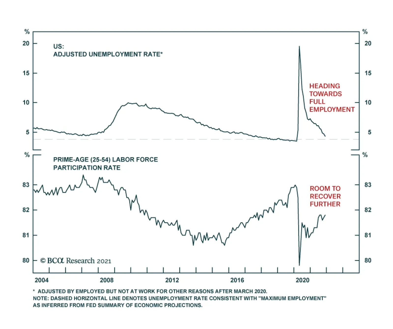
Results of the establishment survey in the US employment report suggest that the labor market recovery experienced a setback in November. Nonfarm payroll gains slowed to 210 thousand following the prior month’s upwardly revised 546 thousand, and below…