United States

In this report we examine the risk of stagflation by comparing the current environment to that of the late-1960s and 1970s. Today, investors cannot rule out the possibility of a stagflationary outcome, for four reasons: long-term household inflation expectations have risen significantly over the past year; fiscal policy has been expansionary; monetary policy will remain expansionary at the Fed’s projected terminal Fed funds rate; and component shortages and price increases linked to energy market and supply chain disruptions may persist or worsen over the coming year. However, the strong demand-pull inflationary dynamics that existed in the late-1960s were mostly absent in the lead-up to the pandemic, supply-chain issues are in part due to strong goods demand and supply disruptions that will eventually dissipate, and economic agents do not expect severe price pressures to persist beyond the pandemic. On balance, this points to a stagflationary outcome over the coming 6-24 months as a risk, but not a likely event. Investors should use the Misery Index, which is the sum of the unemployment rate and headline PCE inflation, as a real-time stagflation indicator. The Misery Index underscores that the US economy is unlikely to experience true stagflation unless the unemployment rate rises. A portfolio of the US dollar, the Swiss Franc, and industrial commodities may serve as a useful hedge for investors who are concerned about absolute return prospects in a world in which long-maturity bond yields are rising and risks of stagflationary dynamics are present. Chart II-1The Misery Index Reflects The Risk Of Stagflation
The Misery Index Reflects The Risk Of Stagflation
The Misery Index Reflects The Risk Of Stagflation
Over the past several weeks, concerns about a possible return to 1970s-style stagflation have re-emerged significantly in the minds of many investors. These investors have pointed toward similarities between the current environment and that of the 1970s, including shortages limiting output, a snarled global trade and logistical system, and rising energy prices. Chart II-1 highlights that the US “Misery Index” – the sum of the unemployment rate and headline PCE inflation – rose again over the past several months to high single-digit territory, after having fallen dramatically from April 2020 to February of this year. Panel 2 of Chart II-1 highlights that last year's rise in the Misery Index was driven almost entirely by the unemployment rate, whereas the current level is due to a combination of a modestly elevated unemployment rate and a pronounced acceleration in inflation. The headline PCE deflator has risen above 4%, a level that has not been reached since 1991 during the First Gulf War. In this report, we examine the risk of stagflation by comparing the current environment to that of the late 1960s and 1970s. We conclude that while investors cannot rule out the possibility of a stagflationary outcome, there are important differences that point toward a stagflation outcome over the coming 6-24 months as a risk, not a likely event. We conclude by highlighting assets that may produce absolute returns in a world in which long-maturity bond yields are rising and risks of stagflationary dynamics are present. Revisiting The 1960s And 70s Chart II-2The 1960s Laid The Groundwork For Elevated Inflation
The 1960s Laid The Groundwork For Elevated Inflation
The 1960s Laid The Groundwork For Elevated Inflation
The first step in judging the risk of a return to 1970s-style stagflation is to review, in a detailed way, what caused those conditions. Investors are well aware of the role that two separate energy price shocks played in raising prices and damaging output during this period, but they are less cognizant of the impact that a persistent period of above-trend output and significant labor market tightness had in setting up the conditions for sharply higher inflation. This focus of investors on energy prices partially reflects the fact that the Misery Index increased most visibly in the 1970s and that policymakers in the 1960s may not have realized how extensively economic output was running above its potential. With the benefit of hindsight, Chart II-2 illustrates the extent to which inflationary pressures built up in the 1960s, well before the first oil price shock in 1973. The chart shows that the unemployment rate was below NAIRU – the non-accelerating inflation rate of unemployment – for 70% of the time during the 1960s, and that inflation had already responded to this in the latter half of the decade. Annual headline PCE inflation was running just shy of 5% at the onset of the 1970 recession; it fell to 3% in the aftermath of the recession, but had already begun to reaccelerate in the first half of 1973. Following the 1973/1974 recession, inflation did decelerate significantly, falling from 11-12% to 5% in headline terms, and from 10% to 6% in core terms. But the pace of price appreciation did not fall below 5-6% in the second half of the 1970s, despite a significant and sustained rise in the unemployment rate above its natural rate. The 1975 to 1978 period is especially important for investors to understand, because it is arguably the clearest period of true stagflation in the 1970s. The fact that the Misery Index rose sharply during two major oil price shocks is not particularly surprising in and of itself, given the direct impact of energy prices on headline consumer prices; it is the fact that the index remained so elevated between these shocks, the result of persistently high inflation in the face of significant labor market slack, that is most relevant to investors. There are two reasons that both inflation and unemployment remained high during this period. First, labor market slack was sizeable during these years because the US economy was more energy-intensive in the 1970s than it is today. Chart II-3 highlights that goods-producing employment lagged overall employment growth from late 1973 to late 1977, underscoring that the rise in oil prices significantly impacted jobs growth in energy-intensive industries.
Chart II-3
Second, it is clear that the combination of demand-pull inflation in the late 1960s and the predominantly cost-push inflation of the 1970s led to expectations of persistent inflation among households and firms. The original Phillips Curve, as formulated by New Zealand economist William Phillips in the late 1950s, described a negative relationship between the unemployment rate and the pace of wage growth. Given the close correlation between wage and overall price growth at the time, the Phillips Curve was soon extended and generalized to describe an inverse relationship between labor market slack and overall price inflation. But the experience of the 1970s highlighted that inflation expectations are also an important determinant of inflation, a realization that gave birth to the expectations-augmented (i.e. “modern-day”) Phillips Curve (more on this below). The Stagflation Era Versus Today
Chart II-
Table II-1 presents a stagflation “threat matrix,” representing the Bank Credit Analyst service’s assessment of the various factors that could potentially contribute to a stagflationary environment today, relative to what occurred in the 1960s and 1970s. While we acknowledge that there are some similarities today to what occurred five decades ago, the most threatening factors have been present for a shorter period of time and appear to have a smaller magnitude than what occurred during the stagflationary era. In addition, key factors, such as the visibility available to policymakers and investors about household inflation expectations and the potential output of the economy, would appear to reduce significantly the risk of a stagflationary outcome today. We discuss each of the factors presented in Table II-1 below: Fiscal & Monetary Policy Chart II-4Government Spending Last Cycle Looked Nothing Like The 1960s
Government Spending Last Cycle Looked Nothing Like The 1960s
Government Spending Last Cycle Looked Nothing Like The 1960s
The persistently tight labor market that contributed to the inflationary buildup in the 1960s occurred as a result of easy fiscal and monetary policy. Chart II-4 highlights that the contribution to real GDP growth from government expenditure and investment was very elevated in the 1960s. Chart II-5 shows that a positive output gap in the late 1960s and the first half of the 1970s is well explained by the fact that 10-year US government bond yields were persistently below nominal GDP growth. The relationship between the stance of monetary policy and the output gap only meaningfully diverged in the latter half of the 1970s, during the true stagflationary era that we noted above. Chart II-5Easy Monetary Policy Juiced Aggregate Demand In The 60s And Early 70s
Easy Monetary Policy Juiced Aggregate Demand In The 60s And Early 70s
Easy Monetary Policy Juiced Aggregate Demand In The 60s And Early 70s
Chart II-6Monetary Policy Today Is Extremely Easy
Monetary Policy Today Is Extremely Easy
Monetary Policy Today Is Extremely Easy
Today, it is clear that the stance of fiscal policy has recently been extraordinarily easy, and 10-year US government bond yields have remained well below nominal GDP growth for the better part of the last decade. Relative to estimates of potential nominal GDP growth, 10-year Treasury yields are the lowest they have been since the 1970s (Chart II-6). Ostensibly, this supports concerns that policy might contribute to a stagflationary outcome. These concerns were raised by Larry Summers in March, when he described the Biden administration’s fiscal policy as the “least responsible” that the US has experienced in four decades and warned of the potential inflationary consequences of overheating the economy.1 But there are two important counterpoints to these concerns. First, easy fiscal policy this cycle has followed a period during the last economic cycle in which government spending contributed to the most sustained drag on economic activity since the 1950s. Unlike the 1960s, the unemployment rate has been below NAIRU for only a third of the time over the past decade. In addition, Chart II-7 highlights that fiscal thrust will turn to fiscal drag next year, underscoring the temporary nature of the massive burst in fiscal spending that has occurred in response to the pandemic. Under normal circumstances, the fiscal drag implied by Chart II-7 would substantially raise the risks of a recession next year, but we have noted in previous reports that a significant amount of excess savings remain to support spending and employment. The net impact of these two factors results in a reasonable expectation that the US economy will return to maximum employment next year, but this is a far cry from the 1960s when the unemployment rate was below its natural rate for 70% of the decade.
Chart II-7
Based on conventional measures, US monetary policy has been easy for a decade, but easy monetary policy did not begin to contribute positively to a rise in household sector credit growth last cycle until 2014/2015. This underscores that the natural rate of interest (“R-star”) did fall during the early phase of the last economic expansion. However, we argued in an April report that R-star was likely rising in the latter half of the last expansion,2 and we believe that the terminal Fed funds rate is likely higher than what the Fed is currently projecting, barring any additional negative policy shocks. Thus, while we do not believe that the duration of easy monetary policy over the past decade has laid the groundwork for a major rise in prices, it is now clearly positively contributing to aggregate demand and does risk a future overshoot in prices if long maturity bond yields remain well below the pace of economic growth for a sustained period of time. The Impact Of Shortages Chart II-8Gasoline Shortages Plagued The US Economy In The 1970s
Gasoline Shortages Plagued The US Economy In The 1970s
Gasoline Shortages Plagued The US Economy In The 1970s
Gasoline shortages occurred during the oil shocks of the 1970s and are a key similarity that some investors point toward when comparing the situation today with the stagflationary era. Chart II-8 highlights that the annual growth in real personal consumption expenditures on energy goods and services fell into negative territory on six occasions in the 1970s, although it was most pronounced during the two oil price shocks and their resulting recessions. Today, the impact of shortages appears to be broader than what occurred in the 1970s, but less impactful and not likely to be as long-lasting. Chart II-9 highlights that the OPEC oil embargo of 1973 raised the global oil bill by 2.4% of global GDP and permanently raised the price of oil. The global oil bill will only be fractionally above its pre-pandemic level in 2022, with oil prices at $80/bbl, and, while it is true that US gasoline prices have risen significantly, they are not higher than they were from 2011-2014 (Chart II-10). Chart II-9$80/bbl Oil Is Not Onerous
$80/bbl Oil Is Not Onerous
$80/bbl Oil Is Not Onerous
Chart II-10US Gasoline Prices Are High, But They Have Been Higher
US Gasoline Prices Are High, But They Have Been Higher
US Gasoline Prices Are High, But They Have Been Higher
It is certainly true that global shipping costs have skyrocketed and that this is contributing to the increase in US consumer prices. We estimate, however, that this increase in shipping costs as a share of GDP is no more than a quarter of the impact of the 1973 increase in oil prices, without the attendant negative effects on US goods-producing employment that occurred in the 1970s. If anything, surging shipping costs create an incentive to re-shore manufacturing production, which would contribute positively to US goods-producing employment. We also do not expect the rise in shipping costs to be meaningfully permanent, i.e., shipping costs may ultimately settle at a higher level than they were in late-2019, but at a much lower level than what prevails today. Chart II-11A Tight Labor Market Is Causing Wage Growth To Pick Up
A Tight Labor Market Is Causing Wage Growth To Pick Up
A Tight Labor Market Is Causing Wage Growth To Pick Up
Semiconductor and labor shortages would appear to represent a more salient threat of stagflation in the US, as the domestic production of motor vehicles cannot occur without key inputs and a tight labor market is already contributing to an acceleration in wage growth (Chart II-11). As we noted in Section 1 of our report, auto production significantly impacted growth in the third quarter. However, Chart II-12 highlights that, for now, the breadth of impact of these shortages appears to be limited: the production component of the ISM manufacturing index remains in expansionary territory, industrial production of durable manufacturing excluding motor vehicles and parts has not broken down, and both housing starts and building permits remain above pre-pandemic levels despite this year’s downtrend in permits. Chart II-12Shortages Do Not Yet Seem To Be Broad-Based
Shortages Do Not Yet Seem To Be Broad-Based
Shortages Do Not Yet Seem To Be Broad-Based
A physical shortage of components is a less relevant factor for the services side of the economy, which appears to have re-accelerated meaningfully in October. The services sector is more considerably impacted by shortages in the labor market, which seem to be linked to a still-low labor force participation rate. We noted in our September report that the decline in the participation rate has significantly overshot what would be implied by the ongoing pace of retirements. Chart II-13 highlights that this has occurred not just because of a significant retirement effect, but also because of the shadow labor force (people who want a job but are not currently looking for work) and family responsibilities. We expect that the recent expiry of expanded unemployment insurance benefits, a steady rise in the immunity of the US population, an abating Delta wave of COVID-19, and a likely upcoming reduction in school/classroom closures once the Pfizer/BioNTech vaccine is approved for school-age children will likely ease the labor shortage issue over the coming several months.
Chart II-13
Output Gap Uncertainty It remains a debate among economists why policymakers maintained such easy monetary policy in the 1960s and 1970s, but Chart II-14 highlights that uncertainty about the size of the output gap may have contributed to too-low interest rates. The chart shows the unemployment rate compared with today's estimate of NAIRU, alongside a simple proxy for policymakers’ real time estimate of the natural rate of employment: the cumulative average unemployment rate in the post-war environment. To the extent that policymakers used past averages of the unemployment rate as their guide for NAIRU, Chart II-14 highlights how they may have underestimated the degree to which output was running above its potential level in the 1960s, and would not have even concluded that output was above potential in the early 1970s. Chart II-14Policymakers Overestimated Labor Market Slack In The 60s And 70s
Policymakers Overestimated Labor Market Slack In The 60s And 70s
Policymakers Overestimated Labor Market Slack In The 60s And 70s
Chart II-15Policymakers Know That NAIRU Is Likely At Or Below 4%
Policymakers Know That NAIRU Is Likely At Or Below 4%
Policymakers Know That NAIRU Is Likely At Or Below 4%
Today, the environment is quite different, because the acceleration in wage growth at the tail end of the last expansion gives policymakers and investors a good estimate of where NAIRU is. Chart II-15 highlights that wage growth accelerated in 2018/2019 in response to a sub-4% unemployment rate, which is consistent with both the Fed’s NAIRU estimate of 3.5-4.5% and Fed Vice Chair Richard Clarida’s expressed view that a 3.8% unemployment rate likely constitutes maximum employment (barring any issues with the breadth and inclusivity of the labor market recovery). It is possible that the pandemic has structurally lowered potential output, which could mean that policymakers may no longer rely on the wage growth / unemployment relationship that existed in the latter phase of the last expansion. However, we do not find any credible arguments that would support the notion of a structurally lower level of potential output: the pandemic is likely to end at some point in the not-too-distant future, the negative impact of working-from-home policies on office properties and employment in central business districts is not sizeable,3 and productivity may have permanently increased in some industries because of the likely stickiness of a hybrid work culture. The Behavior Of Inflation Expectations Chart II-16Rising Long-Term Expectations Have Merely Normalized (For Now)
Rising Long-Term Expectations Have Merely Normalized (For Now)
Rising Long-Term Expectations Have Merely Normalized (For Now)
One parallel to the argument that policymakers may have underestimated the degree of labor market tightness in the 1960s and early 1970s is the fact that they did not yet understand that inflation expectations are an important determinant of actual inflation, nor were they able to monitor them even if they did. Most credible surveys of inflation expectations began in the 1980s, and policymakers in the 1960s and 1970s were guided by the original Phillips Curve that solely related inflation to unemployment. Today, policymakers have the experience of the stagflationary episode to serve as a warning not to allow inflation expectations to get out of control, and both policymakers and investors have reliable measures of inflation expectations for households and market-participants. Chart II-16 highlights that households expect significant inflation over the coming year, but also expect prices over the longer term to rise at a pace that is almost exactly in line with their average from 2000-2014. The Rudd Controversy: (Adaptive) Inflation Expectations Do Matter One potential criticism of the idea that inflation expectations are signaling a low risk of higher future inflation has emerged through arguments made by Jeremy Rudd, a Federal Reserve economist. In a recent paper, Rudd questioned the view that households’ and firms’ expectations of future inflation are a key determinant of actual inflation; he suggested instead that relatively stable inflation since the mid-1990s might reflect a situation in which inflation simply does not enter workers’ employment decisions and expectations are irrelevant. Rudd’s paper was primarily addressed to policymakers who view inflation dynamics in a highly quantitative light. A full response to the paper would be mostly academic and thus not especially relevant to investors; however, we would like to highlight three points related to the Rudd piece that we feel are important.4 First, we disagree with Rudd’s argument that the trend in inflation has not responded to changes in economic conditions since the mid-1990s. Chart II-17 highlights that while the magnitude of the relationship has shifted, the trend in inflation relative to a measure of long-term expectations based on prior actual inflation has mimicked that of the output gap. The fact that inflation was (ironically) too high during the early phase of the last economic cycle provides some support for Rudd’s inflation responsiveness view, although we would still point toward the Fed’s strong record of maintaining low and stable inflation, its active communication with the public in the years following the global financial crisis, and the fact that a recovery began and the output gap began to (slowly) close as the best explanation for the avoidance of deflation during that period. Second, we agree with Rudd’s point that regime shifts in inflation’s responsiveness to economic conditions can occur, and that adaptive measures of inflation expectations, and even surveys of inflation, may not capture such a shift in real time. Chart II-18 shows that the 2014-2016 period was a good example of this, when adaptive expectations as well as household survey measures of long-term inflation expectations both lagged the actual decline in inflation that was caused by a collapse in the price of oil. Chart II-17The Trend In Inflation Continues To Respond To Economic Conditions
The Trend In Inflation Continues To Respond To Economic Conditions
The Trend In Inflation Continues To Respond To Economic Conditions
Chart II-18Surveyed Inflation Expectations Can Lag, But This Time They Led
Surveyed Inflation Expectations Can Lag, But This Time They Led
Surveyed Inflation Expectations Can Lag, But This Time They Led
But Chart II-18 also shows that long-term household survey measures of inflation led the rise in actual inflation (and thus our adaptive expectations measure) last year, underscoring that these measures are likely more reliable indicators today of whether a major regime shift is occurring. As noted above, long-term expectations have risen significantly relative to what prevailed prior to the pandemic, but this has merely raised expectations from extraordinarily depressed levels back to the average that prevailed prior to (and immediately after) the global financial crisis. Therefore, household expectations are not yet at dangerous levels. Chart II-19Unit Labor Costs Modestly Lead Inflation, But Are Far From Extreme
Unit Labor Costs Modestly Lead Inflation, But Are Far From Extreme
Unit Labor Costs Modestly Lead Inflation, But Are Far From Extreme
Third, one of the core observations in Rudd’s paper is that unit labor cost (ULC) growth leads the trend in inflation, which he argued was evidence against the idea that expectations of future inflation are a key determinant of actual inflation. Chart II-19 highlights that Rudd is correct that ULC growth modestly leads inflation (especially core inflation), but we disagree with his conclusion that it argues against the importance of expectations. As we noted in Section 2 of our January 2021 Bank Credit Analyst,5 one crucial aspect of the expectations-augmented, or “modern-day” Phillips Curve is that, if inflation expectations are largely formed based on the experience of past inflation, then inflation is ultimately determined by three dimensions of the output gap: whether it is rising or falling, whether it is above or below zero, and how long it has been above or below zero. Our view is that ULC growth is fundamentally linked to slack in the labor market, which is directly incorporated in output gap measures. As we noted above, investors currently have a good estimate of the magnitude of the output/employment gap, meaning that it is possible to track the inflationary consequences of prevailing aggregate demand. As a final point about ULC growth, Chart II-19 highlights that while the five-year CAGR of unit labor costs is currently running at its strongest pace since the global financial crisis, investors should note that it remains well below the levels that prevailed in the late-1960s when persistently above-potential output laid the groundwork for a massive inflationary overshoot. Conclusions And Investment Strategy Our review of the 1960s and 1970s highlights that stagflation is a phenomenon in which supply-side shocks raise prices of key inputs to production, which lowers output and raises unemployment. Energy price shocks in the 1970s occurred after a long period of policy-driven above-trend growth in the 1960s, meaning that both demand-pull and cost-push inflation contributed to stagflation in the 1970s. Today, investors cannot rule out the possibility of a stagflationary outcome, for four reasons: long-term household inflation expectations have risen significantly over the past year; fiscal policy has been very expansionary; monetary policy will remain expansionary at the Fed’s projected terminal Fed funds rate; and component shortages and price increases linked to energy market and supply chain disruptions may persist or worsen over the coming year. Chart II-20It Is Not Stagflation If The Unemployment Rate Continues To Fall
It Is Not Stagflation If The Unemployment Rate Continues To Fall
It Is Not Stagflation If The Unemployment Rate Continues To Fall
However, the strong demand-pull inflationary dynamics that existed in the late-1960s were mostly absent in the lead-up to the pandemic, supply-chain issues are in part the result of strong goods demand and disruptions that are clearly linked to the pandemic (and thus will eventually dissipate), and long-term inflation expectations are behaving differently than short-term expectations, signaling that economic agents do not expect severe price pressures to persist beyond the pandemic. Policymakers also have more visibility about the magnitude of economic / labor market slack than they did during the stagflationary era and better tools to track inflation expectations. On balance, this points to a stagflationary outcome over the coming 6-24 months as a risk, but not as a likely event. Using the Misery Index as real-time stagflation indicator, investors should note that the US economy is not likely experiencing true stagflation unless the unemployment rate rises. Chart II-20 highlights that there is no evidence yet of a contraction in goods-producing or service-producing jobs. Even if goods-producing employment slows meaningfully over the coming few months as a result of component shortages, the unemployment rate is still likely to fall if services spending normalizes, as it would imply that the gap in services-producing employment, which is currently 20% of the level of pre-pandemic goods-producing employment, will continue to close. Investors have been focused on the issue of stagflation because its occurrence would imply a sharply negative correlation between stock prices and bond yields. This is not our base case view, but we have highlighted that months with negative returns from both stocks and long-maturity bonds tend to be associated with periods of monetary policy tightening (or in anticipation of such periods). As we discussed in Section 1 of our report, we do expect the Fed to raise interest rates next year. We do not see a rise in bond yields to levels implied by the Fed’s interest rates projections as being seriously threatening to economic activity, corporate earnings growth, or equity multiples. But the adjustment to higher long-maturity bond yields may unnerve equity investors for a time, implying temporary periods of a negative stock price / bond yield correlation. Table II-2 highlights that, since 1980, commodities, the US dollar, and the Swiss franc have typically earned positive returns during non-recessionary months in which stock and long-maturity bond returns are negative. While the dollar is not likely to perform well in a stagflationary scenario, Chart II-21 highlights that CHF-USD and industrial commodities performed quite well in the late-1970s. As such, a portfolio of these three assets might serve as a useful hedge for investors who are concerned about absolute return prospects in a world in which long-maturity bond yields are rising and risks of stagflationary dynamics are present.
Chart II-
Chart II-21The Swiss Franc and Raw Industrials Did Well During The Stagflationary Era
The Swiss Franc and Raw Industrials Did Well During The Stagflationary Era
The Swiss Franc and Raw Industrials Did Well During The Stagflationary Era
Jonathan LaBerge, CFA Vice President The Bank Credit Analyst Footnotes 1 “Summers Sees ‘Least Responsible’ Fiscal Policy in 40 Years,” Bloomberg News, March 20, 2021. 2 Please see The Bank Credit Analyst “R-star, And The Structural Risk To Stocks,” dated March 31, 2021, available at bca.bcaresearch.com 3 Please see The Bank Credit Analyst “Work From Home “Stickiness” And The Outlook For Monetary Policy,” dated June 24, 2021, available at bca.bcaresearch.com 4 Rudd, Jeremy B. (2021). “Why Do We Think That Inflation Expectations Matter for Inflation? (And Should We?),” Finance and Economics Discussion Series 2021-062. Washington: Board of Governors of the Federal Reserve System. 5 Please see The Bank Credit Analyst “The Modern-Day Phillips Curve, Future Inflation, And What To Do About It,” dated December 18, 2021, available at bca.bcaresearch.com
Highlights The circumstances of the pandemic improved in October, but data highlighting the economic consequences of the Delta wave grew more severe. US economic activity slowed meaningfully in the third quarter, driven by lower car sales and a slowdown in services spending. The imminent vaccination of school-aged children, and signs that services activity and spending are increasing, will likely raise labor force participation, boost education employment, and hasten the return of real services spending back to pre-pandemic levels. Investors have the right bond view, but the wrong reason. Investors believe that the Fed will be forced to raise interest rates earlier than it currently expects to prevent an out-of-control rise in prices, whereas it will likely do so because of a quicker return to maximum employment. Bond yields are likely to move higher over the coming year, but this will be driven by real yields, not inflation expectations. Once the Fed begins to raise interest rates, investors should be on the lookout for signs that market expectations for the real natural rate of interest, or “R-star,” are rising. The Fed’s terminal rate projection is well below nominal potential GDP growth, and a gap between these two measures no longer makes sense. Stocks are likely to generate mid-single digit returns next year, which will beat the returns offered by bonds and cash. But stocks will generate much lower returns compared with those enjoyed by investors over the past year. A benign rise in long-maturity bond yields argues for the outperformance of value versus growth stocks over the coming year. Cyclical stocks are now becoming stretched versus defensives on an equally-weighted basis; stay overweight for now, but a downgrade to neutral may be in the cards at some point next year. Feature Chart I-1The Waning Impact Of Delta
The Waning Impact Of Delta
The Waning Impact Of Delta
Over the past month, the focus of investors has shifted from day-to-day developments to the consequences of the Delta wave of the pandemic. Chart I-1 highlights that, while an estimate of the COVID-19 reproduction rates in advanced economies has recently inched higher, it remains below one and hospitalizations continue to trend lower in most major economies. UK hospitalizations have increased over the course of the month, but remain at a level that is a quarter of their January peak – despite an elevated pace of confirmed cases. In the US, both these cases and hospitalizations continue to fall, trends that are likely to be reinforced by the vaccination of children over the coming weeks. A 50-60% vaccination rate for school-aged children would increase the US vaccination rate by 4-5 percentage points. Vaccinating all children at this rate would increase the total vaccination rate by 7-8 percentage points. In combination with a meaningful level of natural immunity, the vaccination of children is likely to bring the US very close to, if not above, the non-accelerating hospitalization rate of immunity (or “NAHRI”).1 The Delta Hangover While the circumstances of the pandemic improved in October, the economic consequences grew more severe. US economic activity slowed meaningfully in the third quarter, as highlighted by yesterday’s advance release. Chart I-2 highlights that durable goods spending subtracted almost three percentage points from Q3 growth, and that most other components of GDP contributed less to growth in Q3 than in Q2.
Chart I-2
The significant slowdown in Q3 growth is disappointing, but several factors point toward the conclusion that it is not likely to be sustained: Chart I-3Services PMIs Are Pointing To A Stronger Q4
Services PMIs Are Pointing To A Stronger Q4
Services PMIs Are Pointing To A Stronger Q4
The Delta wave very likely impacted services spending, which we have highlighted is likely to drive overall consumption over the coming year. Given the ongoing impact of semiconductor shortages on the availability of new cars, it is not surprising that a slowdown in services spending resulted in a significant slowdown in overall growth. After having declined significantly in Q3, Chart I-3 highlights that the US, UK, French, and Japanese October flash services PMI rose anew, underscoring that recent services weakness have been closely linked to the Delta variant of COVID-19 (whose impact is now waning). Chart I-3 also highlights that the US services PMI is currently at a level that has been historically consistent with solid real PCE growth. Finally, while it is true that manufacturing PMIs are being supported by supplier deliveries components, the October output component of the US Markit manufacturing index remained in expansionary territory, as was the case in Germany, Japan, and the UK (despite month-over-month declines in these components). Chart I-4 highlights that Q3’s real GDP reading was highly anomalous relative to the pace of jobs growth in the quarter, based on the relationship between the two since the global financial crisis. In quarters in which real GDP growth was 1% or less than implied by the trendline shown in Chart I-4, real GDP accelerated in the subsequent quarter 80% of the time. In conjunction with a pickup in services activity in October, this suggests that growth will be meaningfully stronger in Q4.
Chart I-4
Chart I-5Global Growth Is Peaking, But A Major Downturn Is Unlikely
Global Growth Is Peaking, But A Major Downturn Is Unlikely
Global Growth Is Peaking, But A Major Downturn Is Unlikely
Chart I-5 shows our global Nowcast indicator, alongside our global LEI. Our Nowcast indicator is a high-frequency measure of economic activity that is designed to predict global industrial production. The chart shows that both the Nowcast and global LEI are declining, but that this decline is occurring from an extremely elevated level. The global economy is at an inflection point in terms of the pace of growth, but Chart I-5 still points to above-trend growth – and certainly not a major cyclical downturn. The expectation of a slowdown in growth in Q3 has significantly raised concerns about a possible return to 1970s-style stagflation in the minds of many investors. We address this topic in depth in this month’s Special Report, and conclude that, while investors cannot rule out the possibility of stagflation, there are important differences that point toward a stagflationary outcome over the coming 6-24 months as a risk, not a likely event. We note in our report that the risk of stagflation can be monitored in real time by tracking the Misery Index, which is the sum of headline PCE inflation and the unemployment rate. Currently, the Misery Index is elevated relative to the average of the past 30 years, but it is meaningfully lower than it was during the latter half of the 1970s. This also underscores that true stagflation is only likely to occur if the unemployment rate rises, which means that the economic and financial market outlook over the coming year is strongly tied to the pace of jobs growth (even more so than usual). Table I-1 presents an industry breakdown of the jobs gap relative to pre-pandemic levels, sorted by industries with the largest gap. The table highlights that leisure and hospitality, government, and education and health services jobs continue to account for two-thirds of the five million jobs gap, with the latter two largely reflecting the same effect: 60% of the government jobs gap is accounted for by state and local government education-related employment.
Chart I-
Chart I-6Leisure And Hospitality Employment Tracks The Hotel Occupancy Rate
Leisure And Hospitality Employment Tracks The Hotel Occupancy Rate
Leisure And Hospitality Employment Tracks The Hotel Occupancy Rate
US education employment has been impacted by school and classroom closures, which we noted above are likely to end once school-aged children are vaccinated against the disease. Chart I-6 highlights that leisure and hospitality employment is clearly predicted by the US hotel occupancy rate, which wobbled over the past few months as a result of the Delta wave of the pandemic. Correspondingly, monthly growth in leisure and hospitality employment slowed in August and September. Taken together, the imminent vaccination of school-aged children and signs that services activity and spending are increasing will likely raise labor force participation, boost education employment, and hasten the return of real services spending back to pre-pandemic levels. The Bond Market Outlook Chart I-7The Market Now Agrees With Us About The Timing Of Fed Rate Hikes...
The Market Now Agrees With Us About The Timing Of Fed Rate Hikes...
The Market Now Agrees With Us About The Timing Of Fed Rate Hikes...
A continued normalization of the labor market over the coming 6-12 months argues in favor of Fed rate hikes next year, which is a view that we have maintained for several months. Recently, investors have come to agree with us, by moving forward their expectations for the Fed funds rate (Chart I-7). However, Chart I-8 highlights that investors have the right view for the wrong reason. The chart highlights that US government bond yields have risen entirely due to inflation expectations and that real yields have fallen. This means that investors believe that the Fed will be forced to raise interest rates earlier than it currently expects to prevent an out-of-control rise in prices, whereas we believe that they will do so because of a return to maximum employment. The implication for investors is that bond yields are still likely to rise over the coming year, but that higher yields are likely to occur alongside falling inflation expectations. This trend underscores that common hedges against inflation, such as precious metals and the relative performance of TIPS, are likely to underperform over the coming year. We have noted in previous reports that the fair value for long-maturity government bond yields implied by the Fed’s interest rate projections is not likely threatening for equity multiples, and certainly not for economic activity. A September 2022 rate hike, coupled with a pace of three hikes per year and a 2.5% terminal Fed funds rate, implies that 10-year Treasury yields will rise to 2.15% over the coming year, which would be only modestly higher than the level that prevailed prior to the pandemic (Chart I-9). Chart I-8...But For The Wrong Reason
...But For The Wrong Reason
...But For The Wrong Reason
Chart I-9Higher Bond Yields Are Unlikely To Be Restrictive Next Year
Higher Bond Yields Are Unlikely To Be Restrictive Next Year
Higher Bond Yields Are Unlikely To Be Restrictive Next Year
However, once the Fed begins to raise interest rates, investors should be on the lookout for signs that market expectations for the real natural rate of interest, or “R-star,” are rising. The Fed’s terminal rate projection is well below nominal potential GDP growth, and, while a gap between these two measures made sense in the years following the global financial crisis, this no longer appears to be the case. Chart I-10 highlights that real household mortgage liabilities began to contract sharply in 2006, and did not turn positive on a year-over-year basis until the end of 2016. It is likely that R-star was falling or weak during this period, but the correlation between the two series clearly shifted in the latter phase of the last economic cycle. Chart I-11 emphasizes this point by highlighting that the household debt service ratio is now the lowest it has been since the 1970s, underscoring the capacity that US consumers have to withstand higher interest rates. Chart I-10R-star Fell Post-GFC, For A Time
R-star Fell Post-GFC, For A Time
R-star Fell Post-GFC, For A Time
Chart I-11Today, US Households Have A Lot Of Capacity To Tolerate Higher Rates
Today, US Households Have A Lot Of Capacity To Tolerate Higher Rates
Today, US Households Have A Lot Of Capacity To Tolerate Higher Rates
We doubt that investor expectations for the terminal rate will rise significantly before the Fed begins to normalize monetary policy, but it may happen. In addition, the Fed may begin raising interest rates next year as soon as late in the summer or early in the fall, which would locate the liftoff date within our 6-12 month investment time horizon. As such, our base case view is that a rise in interest rates over the coming year will not be threatening to the equity market, but this view may change at some point next year. Equities: Expect Modest Returns In 2022 A benign increase in long-maturity bond yields in 2022 suggests that equity multiples will neither contribute to, nor subtract from, equity returns. As such, return expectations for equities should be centered around expected earnings growth.
Chart I-
Table I-2 presents consensus estimates for nominal GDP growth, S&P 500 revenue growth, and earnings growth for 2022. The table highlights that expectations for revenue growth estimates appear to be reasonable, given that bottom-up analysts continue to expect an expansion in profit margins next year. Chart I-12 highlights that margins have already risen back above their pre-pandemic high, and that this is true for both tech and ex-tech sectors. Chart I-12US Profit Margins Have Already Risen To Record Levels
US Profit Margins Have Already Risen To Record Levels
US Profit Margins Have Already Risen To Record Levels
We doubt that further increases in profit margins will be sustained next year. It is possible that margins will actually decline – a view that was recently espoused by our US Equity Strategy service.2 Risks to profit margins underscore that stocks are likely to generate mid-single digit returns next year, which will beat the returns offered by bonds and cash. But stocks will generate much lower returns compared with those enjoyed by investors over the past year. Within the equity market, we remain of the view that even a benign rise in long-maturity bond yields argues for the outperformance of value versus growth stocks over the coming year. Chart I-13 highlights that the rolling one-year correlation between relative global growth versus value stock prices and the US 10-year Treasury yield has become increasingly negative over time, which bodes well for value. We also continue to recommend that investors favor small over large caps and cyclicals over defensives, although cyclical stocks are now becoming stretched versus defensives on an equally-weighted basis as they are closing in on their 2018 highs (Chart I-14). We think it is too early to position against cyclicals, but a downgrade to neutral may be in the cards at some point next year. Chart I-13Growth Will Underperform Value If Long-Maturity Bond Yields Rise
Growth Will Underperform Value If Long-Maturity Bond Yields Rise
Growth Will Underperform Value If Long-Maturity Bond Yields Rise
Chart I-14Cyclicals Are Starting To Look Stretched Versus Defensives
Cyclicals Are Starting To Look Stretched Versus Defensives
Cyclicals Are Starting To Look Stretched Versus Defensives
Investment Conclusions Next month’s report will feature BCA’s 2022 outlook, as well as a transcript of our recently held annual discussion with Mr. X and his daughter Ms. X (who joined his family office a couple of years ago). Our annual outlook will provide a detailed walkthrough of our views for the upcoming year, as well as answers to sobering questions raised by Mr. X and Ms. X about the longer-term outlook. For now, we recommend that investors stick with a pro-cyclical view, favoring the following assets: Global stocks over bonds A short-duration position within a government bond portfolio Speculative-grade corporate bonds within a credit portfolio Global ex-US stocks vs US, focused on DM ex-US Global value versus growth stocks Cyclicals versus defensives, and small versus large caps Major currencies versus the US dollar Jonathan LaBerge, CFA Vice President The Bank Credit Analyst October 29, 2021 Next Report: November 30, 2021 II. Gauging The Risk Of Stagflation In this report we examine the risk of stagflation by comparing the current environment to that of the late-1960s and 1970s. Today, investors cannot rule out the possibility of a stagflationary outcome, for four reasons: long-term household inflation expectations have risen significantly over the past year; fiscal policy has been expansionary; monetary policy will remain expansionary at the Fed’s projected terminal Fed funds rate; and component shortages and price increases linked to energy market and supply chain disruptions may persist or worsen over the coming year. However, the strong demand-pull inflationary dynamics that existed in the late-1960s were mostly absent in the lead-up to the pandemic, supply-chain issues are in part due to strong goods demand and supply disruptions that will eventually dissipate, and economic agents do not expect severe price pressures to persist beyond the pandemic. On balance, this points to a stagflationary outcome over the coming 6-24 months as a risk, but not a likely event. Investors should use the Misery Index, which is the sum of the unemployment rate and headline PCE inflation, as a real-time stagflation indicator. The Misery Index underscores that the US economy is unlikely to experience true stagflation unless the unemployment rate rises. A portfolio of the US dollar, the Swiss Franc, and industrial commodities may serve as a useful hedge for investors who are concerned about absolute return prospects in a world in which long-maturity bond yields are rising and risks of stagflationary dynamics are present. Chart II-1The Misery Index Reflects The Risk Of Stagflation
The Misery Index Reflects The Risk Of Stagflation
The Misery Index Reflects The Risk Of Stagflation
Over the past several weeks, concerns about a possible return to 1970s-style stagflation have re-emerged significantly in the minds of many investors. These investors have pointed toward similarities between the current environment and that of the 1970s, including shortages limiting output, a snarled global trade and logistical system, and rising energy prices. Chart II-1 highlights that the US “Misery Index” – the sum of the unemployment rate and headline PCE inflation – rose again over the past several months to high single-digit territory, after having fallen dramatically from April 2020 to February of this year. Panel 2 of Chart II-1 highlights that last year's rise in the Misery Index was driven almost entirely by the unemployment rate, whereas the current level is due to a combination of a modestly elevated unemployment rate and a pronounced acceleration in inflation. The headline PCE deflator has risen above 4%, a level that has not been reached since 1991 during the First Gulf War. In this report, we examine the risk of stagflation by comparing the current environment to that of the late 1960s and 1970s. We conclude that while investors cannot rule out the possibility of a stagflationary outcome, there are important differences that point toward a stagflation outcome over the coming 6-24 months as a risk, not a likely event. We conclude by highlighting assets that may produce absolute returns in a world in which long-maturity bond yields are rising and risks of stagflationary dynamics are present. Revisiting The 1960s And 70s Chart II-2The 1960s Laid The Groundwork For Elevated Inflation
The 1960s Laid The Groundwork For Elevated Inflation
The 1960s Laid The Groundwork For Elevated Inflation
The first step in judging the risk of a return to 1970s-style stagflation is to review, in a detailed way, what caused those conditions. Investors are well aware of the role that two separate energy price shocks played in raising prices and damaging output during this period, but they are less cognizant of the impact that a persistent period of above-trend output and significant labor market tightness had in setting up the conditions for sharply higher inflation. This focus of investors on energy prices partially reflects the fact that the Misery Index increased most visibly in the 1970s and that policymakers in the 1960s may not have realized how extensively economic output was running above its potential. With the benefit of hindsight, Chart II-2 illustrates the extent to which inflationary pressures built up in the 1960s, well before the first oil price shock in 1973. The chart shows that the unemployment rate was below NAIRU – the non-accelerating inflation rate of unemployment – for 70% of the time during the 1960s, and that inflation had already responded to this in the latter half of the decade. Annual headline PCE inflation was running just shy of 5% at the onset of the 1970 recession; it fell to 3% in the aftermath of the recession, but had already begun to reaccelerate in the first half of 1973. Following the 1973/1974 recession, inflation did decelerate significantly, falling from 11-12% to 5% in headline terms, and from 10% to 6% in core terms. But the pace of price appreciation did not fall below 5-6% in the second half of the 1970s, despite a significant and sustained rise in the unemployment rate above its natural rate. The 1975 to 1978 period is especially important for investors to understand, because it is arguably the clearest period of true stagflation in the 1970s. The fact that the Misery Index rose sharply during two major oil price shocks is not particularly surprising in and of itself, given the direct impact of energy prices on headline consumer prices; it is the fact that the index remained so elevated between these shocks, the result of persistently high inflation in the face of significant labor market slack, that is most relevant to investors. There are two reasons that both inflation and unemployment remained high during this period. First, labor market slack was sizeable during these years because the US economy was more energy-intensive in the 1970s than it is today. Chart II-3 highlights that goods-producing employment lagged overall employment growth from late 1973 to late 1977, underscoring that the rise in oil prices significantly impacted jobs growth in energy-intensive industries.
Chart II-3
Second, it is clear that the combination of demand-pull inflation in the late 1960s and the predominantly cost-push inflation of the 1970s led to expectations of persistent inflation among households and firms. The original Phillips Curve, as formulated by New Zealand economist William Phillips in the late 1950s, described a negative relationship between the unemployment rate and the pace of wage growth. Given the close correlation between wage and overall price growth at the time, the Phillips Curve was soon extended and generalized to describe an inverse relationship between labor market slack and overall price inflation. But the experience of the 1970s highlighted that inflation expectations are also an important determinant of inflation, a realization that gave birth to the expectations-augmented (i.e. “modern-day”) Phillips Curve (more on this below). The Stagflation Era Versus Today
Chart II-
Table II-1 presents a stagflation “threat matrix,” representing the Bank Credit Analyst service’s assessment of the various factors that could potentially contribute to a stagflationary environment today, relative to what occurred in the 1960s and 1970s. While we acknowledge that there are some similarities today to what occurred five decades ago, the most threatening factors have been present for a shorter period of time and appear to have a smaller magnitude than what occurred during the stagflationary era. In addition, key factors, such as the visibility available to policymakers and investors about household inflation expectations and the potential output of the economy, would appear to reduce significantly the risk of a stagflationary outcome today. We discuss each of the factors presented in Table II-1 below: Fiscal & Monetary Policy Chart II-4Government Spending Last Cycle Looked Nothing Like The 1960s
Government Spending Last Cycle Looked Nothing Like The 1960s
Government Spending Last Cycle Looked Nothing Like The 1960s
The persistently tight labor market that contributed to the inflationary buildup in the 1960s occurred as a result of easy fiscal and monetary policy. Chart II-4 highlights that the contribution to real GDP growth from government expenditure and investment was very elevated in the 1960s. Chart II-5 shows that a positive output gap in the late 1960s and the first half of the 1970s is well explained by the fact that 10-year US government bond yields were persistently below nominal GDP growth. The relationship between the stance of monetary policy and the output gap only meaningfully diverged in the latter half of the 1970s, during the true stagflationary era that we noted above. Chart II-5Easy Monetary Policy Juiced Aggregate Demand In The 60s And Early 70s
Easy Monetary Policy Juiced Aggregate Demand In The 60s And Early 70s
Easy Monetary Policy Juiced Aggregate Demand In The 60s And Early 70s
Chart II-6Monetary Policy Today Is Extremely Easy
Monetary Policy Today Is Extremely Easy
Monetary Policy Today Is Extremely Easy
Today, it is clear that the stance of fiscal policy has recently been extraordinarily easy, and 10-year US government bond yields have remained well below nominal GDP growth for the better part of the last decade. Relative to estimates of potential nominal GDP growth, 10-year Treasury yields are the lowest they have been since the 1970s (Chart II-6). Ostensibly, this supports concerns that policy might contribute to a stagflationary outcome. These concerns were raised by Larry Summers in March, when he described the Biden administration’s fiscal policy as the “least responsible” that the US has experienced in four decades and warned of the potential inflationary consequences of overheating the economy.3 But there are two important counterpoints to these concerns. First, easy fiscal policy this cycle has followed a period during the last economic cycle in which government spending contributed to the most sustained drag on economic activity since the 1950s. Unlike the 1960s, the unemployment rate has been below NAIRU for only a third of the time over the past decade. In addition, Chart II-7 highlights that fiscal thrust will turn to fiscal drag next year, underscoring the temporary nature of the massive burst in fiscal spending that has occurred in response to the pandemic. Under normal circumstances, the fiscal drag implied by Chart II-7 would substantially raise the risks of a recession next year, but we have noted in previous reports that a significant amount of excess savings remain to support spending and employment. The net impact of these two factors results in a reasonable expectation that the US economy will return to maximum employment next year, but this is a far cry from the 1960s when the unemployment rate was below its natural rate for 70% of the decade.
Chart II-7
Based on conventional measures, US monetary policy has been easy for a decade, but easy monetary policy did not begin to contribute positively to a rise in household sector credit growth last cycle until 2014/2015. This underscores that the natural rate of interest (“R-star”) did fall during the early phase of the last economic expansion. However, we argued in an April report that R-star was likely rising in the latter half of the last expansion,4 and we believe that the terminal Fed funds rate is likely higher than what the Fed is currently projecting, barring any additional negative policy shocks. Thus, while we do not believe that the duration of easy monetary policy over the past decade has laid the groundwork for a major rise in prices, it is now clearly positively contributing to aggregate demand and does risk a future overshoot in prices if long maturity bond yields remain well below the pace of economic growth for a sustained period of time. The Impact Of Shortages Chart II-8Gasoline Shortages Plagued The US Economy In The 1970s
Gasoline Shortages Plagued The US Economy In The 1970s
Gasoline Shortages Plagued The US Economy In The 1970s
Gasoline shortages occurred during the oil shocks of the 1970s and are a key similarity that some investors point toward when comparing the situation today with the stagflationary era. Chart II-8 highlights that the annual growth in real personal consumption expenditures on energy goods and services fell into negative territory on six occasions in the 1970s, although it was most pronounced during the two oil price shocks and their resulting recessions. Today, the impact of shortages appears to be broader than what occurred in the 1970s, but less impactful and not likely to be as long-lasting. Chart II-9 highlights that the OPEC oil embargo of 1973 raised the global oil bill by 2.4% of global GDP and permanently raised the price of oil. The global oil bill will only be fractionally above its pre-pandemic level in 2022, with oil prices at $80/bbl, and, while it is true that US gasoline prices have risen significantly, they are not higher than they were from 2011-2014 (Chart II-10). Chart II-9$80/bbl Oil Is Not Onerous
$80/bbl Oil Is Not Onerous
$80/bbl Oil Is Not Onerous
Chart II-10US Gasoline Prices Are High, But They Have Been Higher
US Gasoline Prices Are High, But They Have Been Higher
US Gasoline Prices Are High, But They Have Been Higher
It is certainly true that global shipping costs have skyrocketed and that this is contributing to the increase in US consumer prices. We estimate, however, that this increase in shipping costs as a share of GDP is no more than a quarter of the impact of the 1973 increase in oil prices, without the attendant negative effects on US goods-producing employment that occurred in the 1970s. If anything, surging shipping costs create an incentive to re-shore manufacturing production, which would contribute positively to US goods-producing employment. We also do not expect the rise in shipping costs to be meaningfully permanent, i.e., shipping costs may ultimately settle at a higher level than they were in late-2019, but at a much lower level than what prevails today. Chart II-11A Tight Labor Market Is Causing Wage Growth To Pick Up
A Tight Labor Market Is Causing Wage Growth To Pick Up
A Tight Labor Market Is Causing Wage Growth To Pick Up
Semiconductor and labor shortages would appear to represent a more salient threat of stagflation in the US, as the domestic production of motor vehicles cannot occur without key inputs and a tight labor market is already contributing to an acceleration in wage growth (Chart II-11). As we noted in Section 1 of our report, auto production significantly impacted growth in the third quarter. However, Chart II-12 highlights that, for now, the breadth of impact of these shortages appears to be limited: the production component of the ISM manufacturing index remains in expansionary territory, industrial production of durable manufacturing excluding motor vehicles and parts has not broken down, and both housing starts and building permits remain above pre-pandemic levels despite this year’s downtrend in permits. Chart II-12Shortages Do Not Yet Seem To Be Broad-Based
Shortages Do Not Yet Seem To Be Broad-Based
Shortages Do Not Yet Seem To Be Broad-Based
A physical shortage of components is a less relevant factor for the services side of the economy, which appears to have re-accelerated meaningfully in October. The services sector is more considerably impacted by shortages in the labor market, which seem to be linked to a still-low labor force participation rate. We noted in our September report that the decline in the participation rate has significantly overshot what would be implied by the ongoing pace of retirements. Chart II-13 highlights that this has occurred not just because of a significant retirement effect, but also because of the shadow labor force (people who want a job but are not currently looking for work) and family responsibilities. We expect that the recent expiry of expanded unemployment insurance benefits, a steady rise in the immunity of the US population, an abating Delta wave of COVID-19, and a likely upcoming reduction in school/classroom closures once the Pfizer/BioNTech vaccine is approved for school-age children will likely ease the labor shortage issue over the coming several months.
Chart II-13
Output Gap Uncertainty It remains a debate among economists why policymakers maintained such easy monetary policy in the 1960s and 1970s, but Chart II-14 highlights that uncertainty about the size of the output gap may have contributed to too-low interest rates. The chart shows the unemployment rate compared with today's estimate of NAIRU, alongside a simple proxy for policymakers’ real time estimate of the natural rate of employment: the cumulative average unemployment rate in the post-war environment. To the extent that policymakers used past averages of the unemployment rate as their guide for NAIRU, Chart II-14 highlights how they may have underestimated the degree to which output was running above its potential level in the 1960s, and would not have even concluded that output was above potential in the early 1970s. Chart II-14Policymakers Overestimated Labor Market Slack In The 60s And 70s
Policymakers Overestimated Labor Market Slack In The 60s And 70s
Policymakers Overestimated Labor Market Slack In The 60s And 70s
Chart II-15Policymakers Know That NAIRU Is Likely At Or Below 4%
Policymakers Know That NAIRU Is Likely At Or Below 4%
Policymakers Know That NAIRU Is Likely At Or Below 4%
Today, the environment is quite different, because the acceleration in wage growth at the tail end of the last expansion gives policymakers and investors a good estimate of where NAIRU is. Chart II-15 highlights that wage growth accelerated in 2018/2019 in response to a sub-4% unemployment rate, which is consistent with both the Fed’s NAIRU estimate of 3.5-4.5% and Fed Vice Chair Richard Clarida’s expressed view that a 3.8% unemployment rate likely constitutes maximum employment (barring any issues with the breadth and inclusivity of the labor market recovery). It is possible that the pandemic has structurally lowered potential output, which could mean that policymakers may no longer rely on the wage growth / unemployment relationship that existed in the latter phase of the last expansion. However, we do not find any credible arguments that would support the notion of a structurally lower level of potential output: the pandemic is likely to end at some point in the not-too-distant future, the negative impact of working-from-home policies on office properties and employment in central business districts is not sizeable,5 and productivity may have permanently increased in some industries because of the likely stickiness of a hybrid work culture. The Behavior Of Inflation Expectations Chart II-16Rising Long-Term Expectations Have Merely Normalized (For Now)
Rising Long-Term Expectations Have Merely Normalized (For Now)
Rising Long-Term Expectations Have Merely Normalized (For Now)
One parallel to the argument that policymakers may have underestimated the degree of labor market tightness in the 1960s and early 1970s is the fact that they did not yet understand that inflation expectations are an important determinant of actual inflation, nor were they able to monitor them even if they did. Most credible surveys of inflation expectations began in the 1980s, and policymakers in the 1960s and 1970s were guided by the original Phillips Curve that solely related inflation to unemployment. Today, policymakers have the experience of the stagflationary episode to serve as a warning not to allow inflation expectations to get out of control, and both policymakers and investors have reliable measures of inflation expectations for households and market-participants. Chart II-16 highlights that households expect significant inflation over the coming year, but also expect prices over the longer term to rise at a pace that is almost exactly in line with their average from 2000-2014. The Rudd Controversy: (Adaptive) Inflation Expectations Do Matter One potential criticism of the idea that inflation expectations are signaling a low risk of higher future inflation has emerged through arguments made by Jeremy Rudd, a Federal Reserve economist. In a recent paper, Rudd questioned the view that households’ and firms’ expectations of future inflation are a key determinant of actual inflation; he suggested instead that relatively stable inflation since the mid-1990s might reflect a situation in which inflation simply does not enter workers’ employment decisions and expectations are irrelevant. Rudd’s paper was primarily addressed to policymakers who view inflation dynamics in a highly quantitative light. A full response to the paper would be mostly academic and thus not especially relevant to investors; however, we would like to highlight three points related to the Rudd piece that we feel are important.6 First, we disagree with Rudd’s argument that the trend in inflation has not responded to changes in economic conditions since the mid-1990s. Chart II-17 highlights that while the magnitude of the relationship has shifted, the trend in inflation relative to a measure of long-term expectations based on prior actual inflation has mimicked that of the output gap. The fact that inflation was (ironically) too high during the early phase of the last economic cycle provides some support for Rudd’s inflation responsiveness view, although we would still point toward the Fed’s strong record of maintaining low and stable inflation, its active communication with the public in the years following the global financial crisis, and the fact that a recovery began and the output gap began to (slowly) close as the best explanation for the avoidance of deflation during that period. Second, we agree with Rudd’s point that regime shifts in inflation’s responsiveness to economic conditions can occur, and that adaptive measures of inflation expectations, and even surveys of inflation, may not capture such a shift in real time. Chart II-18 shows that the 2014-2016 period was a good example of this, when adaptive expectations as well as household survey measures of long-term inflation expectations both lagged the actual decline in inflation that was caused by a collapse in the price of oil. Chart II-17The Trend In Inflation Continues To Respond To Economic Conditions
The Trend In Inflation Continues To Respond To Economic Conditions
The Trend In Inflation Continues To Respond To Economic Conditions
Chart II-18Surveyed Inflation Expectations Can Lag, But This Time They Led
Surveyed Inflation Expectations Can Lag, But This Time They Led
Surveyed Inflation Expectations Can Lag, But This Time They Led
But Chart II-18 also shows that long-term household survey measures of inflation led the rise in actual inflation (and thus our adaptive expectations measure) last year, underscoring that these measures are likely more reliable indicators today of whether a major regime shift is occurring. As noted above, long-term expectations have risen significantly relative to what prevailed prior to the pandemic, but this has merely raised expectations from extraordinarily depressed levels back to the average that prevailed prior to (and immediately after) the global financial crisis. Therefore, household expectations are not yet at dangerous levels. Chart II-19Unit Labor Costs Modestly Lead Inflation, But Are Far From Extreme
Unit Labor Costs Modestly Lead Inflation, But Are Far From Extreme
Unit Labor Costs Modestly Lead Inflation, But Are Far From Extreme
Third, one of the core observations in Rudd’s paper is that unit labor cost (ULC) growth leads the trend in inflation, which he argued was evidence against the idea that expectations of future inflation are a key determinant of actual inflation. Chart II-19 highlights that Rudd is correct that ULC growth modestly leads inflation (especially core inflation), but we disagree with his conclusion that it argues against the importance of expectations. As we noted in Section 2 of our January 2021 Bank Credit Analyst,7 one crucial aspect of the expectations-augmented, or “modern-day” Phillips Curve is that, if inflation expectations are largely formed based on the experience of past inflation, then inflation is ultimately determined by three dimensions of the output gap: whether it is rising or falling, whether it is above or below zero, and how long it has been above or below zero. Our view is that ULC growth is fundamentally linked to slack in the labor market, which is directly incorporated in output gap measures. As we noted above, investors currently have a good estimate of the magnitude of the output/employment gap, meaning that it is possible to track the inflationary consequences of prevailing aggregate demand. As a final point about ULC growth, Chart II-19 highlights that while the five-year CAGR of unit labor costs is currently running at its strongest pace since the global financial crisis, investors should note that it remains well below the levels that prevailed in the late-1960s when persistently above-potential output laid the groundwork for a massive inflationary overshoot. Conclusions And Investment Strategy Our review of the 1960s and 1970s highlights that stagflation is a phenomenon in which supply-side shocks raise prices of key inputs to production, which lowers output and raises unemployment. Energy price shocks in the 1970s occurred after a long period of policy-driven above-trend growth in the 1960s, meaning that both demand-pull and cost-push inflation contributed to stagflation in the 1970s. Today, investors cannot rule out the possibility of a stagflationary outcome, for four reasons: long-term household inflation expectations have risen significantly over the past year; fiscal policy has been very expansionary; monetary policy will remain expansionary at the Fed’s projected terminal Fed funds rate; and component shortages and price increases linked to energy market and supply chain disruptions may persist or worsen over the coming year. Chart II-20It Is Not Stagflation If The Unemployment Rate Continues To Fall
It Is Not Stagflation If The Unemployment Rate Continues To Fall
It Is Not Stagflation If The Unemployment Rate Continues To Fall
However, the strong demand-pull inflationary dynamics that existed in the late-1960s were mostly absent in the lead-up to the pandemic, supply-chain issues are in part the result of strong goods demand and disruptions that are clearly linked to the pandemic (and thus will eventually dissipate), and long-term inflation expectations are behaving differently than short-term expectations, signaling that economic agents do not expect severe price pressures to persist beyond the pandemic. Policymakers also have more visibility about the magnitude of economic / labor market slack than they did during the stagflationary era and better tools to track inflation expectations. On balance, this points to a stagflationary outcome over the coming 6-24 months as a risk, but not as a likely event. Using the Misery Index as real-time stagflation indicator, investors should note that the US economy is not likely experiencing true stagflation unless the unemployment rate rises. Chart II-20 highlights that there is no evidence yet of a contraction in goods-producing or service-producing jobs. Even if goods-producing employment slows meaningfully over the coming few months as a result of component shortages, the unemployment rate is still likely to fall if services spending normalizes, as it would imply that the gap in services-producing employment, which is currently 20% of the level of pre-pandemic goods-producing employment, will continue to close. Investors have been focused on the issue of stagflation because its occurrence would imply a sharply negative correlation between stock prices and bond yields. This is not our base case view, but we have highlighted that months with negative returns from both stocks and long-maturity bonds tend to be associated with periods of monetary policy tightening (or in anticipation of such periods). As we discussed in Section 1 of our report, we do expect the Fed to raise interest rates next year. We do not see a rise in bond yields to levels implied by the Fed’s interest rates projections as being seriously threatening to economic activity, corporate earnings growth, or equity multiples. But the adjustment to higher long-maturity bond yields may unnerve equity investors for a time, implying temporary periods of a negative stock price / bond yield correlation. Table II-2 highlights that, since 1980, commodities, the US dollar, and the Swiss franc have typically earned positive returns during non-recessionary months in which stock and long-maturity bond returns are negative. While the dollar is not likely to perform well in a stagflationary scenario, Chart II-21 highlights that CHF-USD and industrial commodities performed quite well in the late-1970s. As such, a portfolio of these three assets might serve as a useful hedge for investors who are concerned about absolute return prospects in a world in which long-maturity bond yields are rising and risks of stagflationary dynamics are present.
Chart II-
Chart II-21The Swiss Franc and Raw Industrials Did Well During The Stagflationary Era
The Swiss Franc and Raw Industrials Did Well During The Stagflationary Era
The Swiss Franc and Raw Industrials Did Well During The Stagflationary Era
Jonathan LaBerge, CFA Vice President The Bank Credit Analyst III. Indicators And Reference Charts BCA’s equity indicators highlight that the “easy” money from expectations of an eventual end to the pandemic have already been made. Our technical, valuation, and sentiment indicators remain very extended, highlighting that investors should expect positive but modest returns from stocks over the coming 6-12 months. Our monetary indicator has retreated below the boom/bust line, although this mostly reflects the use of producer prices to deflate money growth. In nominal terms, the supply of money continues to grow. Still, the retreat in the indicator over the past year highlights that the monetary policy stance is likely to shift in a tighter direction over the coming year. Forward equity earnings are pricing in a substantial further rise in earnings per share. Net earnings revisions and net positive earnings surprises appear to have peaked, but there is not yet any meaningful sign of waning forward earnings. Bottom-up analyst earning expectations remain too high, but stocks are likely to be supported by robust revenue growth over the coming year. Within a global equity portfolio, we would continue to recommend that investors position for the underperformance of financial assets that are negatively correlated with long-maturity government bond yield. The US 10-Year Treasury yield remains above its 200-day moving average after failing to break meaningfully below it. 10-Year Treasury Yields remain below the fair value implied by a late-2022 rate hike scenario, underscoring that a move higher over the coming year is likely. However, most of the recent move higher in government bond yields has occurred due to rising inflation expectations, whereas the increase in yields over the coming year will likely occur in real terms. Commodity prices remain elevated, and our composite technical indicator highlights that they are still overbought. An eventual slowdown in US goods spending, coupled with eventual supply-chain normalization and the absence of a significant reflationary impulse from Chinese policy, may weigh on commodity prices at some point over the coming 6-12 months. US and global LEIs remain very elevated but have started to roll over. Our global LEI diffusion index has declined very significantly, but this likely reflects the outsized impact of a few emerging market countries (whose vaccination progress is still lagging). Still-strong leading and coincident indicators underscore that the global demand for goods is robust, and that output is below pre-pandemic levels in most economies because of very weak services spending. The latter will recover significantly at some point over the coming year, as social distancing and other pandemic control measures disappear. EQUITIES: Chart III-1US Equity Indicators
US Equity Indicators
US Equity Indicators
Chart III-2Willingness To Pay For Risk
Willingness To Pay For Risk
Willingness To Pay For Risk
Chart III-3US Equity Sentiment Indicators
US Equity Sentiment Indicators
US Equity Sentiment Indicators
Chart III-4US Stock Market Breadth
US Stock Market Breadth
US Stock Market Breadth
Chart III-5US Stock Market Valuation
US Stock Market Valuation
US Stock Market Valuation
Chart III-6US Earnings
US Earnings
US Earnings
Chart III-7Global Stock Market And Earnings: Relative Performance
Global Stock Market And Earnings: Relative Performance
Global Stock Market And Earnings: Relative Performance
Chart III-8Global Stock Market And Earnings: Relative Performance
Global Stock Market And Earnings: Relative Performance
Global Stock Market And Earnings: Relative Performance
FIXED INCOME: Chart III-9US Treasurys And Valuations
US Treasurys And Valuations
US Treasurys And Valuations
Chart III-10Yield Curve Slopes
Yield Curve Slopes
Yield Curve Slopes
Chart III-11Selected US Bond Yields
Selected US Bond Yields
Selected US Bond Yields
Chart III-1210-Year Treasury Yield Components
10-Year Treasury Yield Components
10-Year Treasury Yield Components
Chart III-13US Corporate Bonds And Health Monitor
US Corporate Bonds And Health Monitor
US Corporate Bonds And Health Monitor
Chart III-14Global Bonds: Developed Markets
Global Bonds: Developed Markets
Global Bonds: Developed Markets
Chart III-15Global Bonds: Emerging Markets
Global Bonds: Emerging Markets
Global Bonds: Emerging Markets
CURRENCIES: Chart III-16US Dollar And PPP
US Dollar And PPP
US Dollar And PPP
Chart III-17US Dollar And Indicator
US Dollar And Indicator
US Dollar And Indicator
Chart III-18US Dollar Fundamentals
US Dollar Fundamentals
US Dollar Fundamentals
Chart III-19Japanese Yen Technicals
Japanese Yen Technicals
Japanese Yen Technicals
Chart III-20Euro Technicals
Euro Technicals
Euro Technicals
Chart III-21Euro/Yen Technicals
Euro/Yen Technicals
Euro/Yen Technicals
Chart III-22Euro/Pound Technicals
Euro/Pound Technicals
Euro/Pound Technicals
COMMODITIES: Chart III-23Broad Commodity Indicators
Broad Commodity Indicators
Broad Commodity Indicators
Chart III-24Commodity Prices
Commodity Prices
Commodity Prices
Chart III-25Commodity Prices
Commodity Prices
Commodity Prices
Chart III-26Commodity Sentiment
Commodity Sentiment
Commodity Sentiment
Chart III-27Speculative Positioning
Speculative Positioning
Speculative Positioning
ECONOMY: Chart III-28US And Global Macro Backdrop
US And Global Macro Backdrop
US And Global Macro Backdrop
Chart III-29US Macro Snapshot
US Macro Snapshot
US Macro Snapshot
Chart III-30US Growth Outlook
US Growth Outlook
US Growth Outlook
Chart III-31US Cyclical Spending
US Cyclical Spending
US Cyclical Spending
Chart III-32US Labor Market
US Labor Market
US Labor Market
Chart III-33US Consumption
US Consumption
US Consumption
Chart III-34US Housing
US Housing
US Housing
Chart III-35US Debt And Deleveraging
US Debt And Deleveraging
US Debt And Deleveraging
Chart III-36US Financial Conditions
US Financial Conditions
US Financial Conditions
Chart III-37Global Economic Snapshot: Europe
Global Economic Snapshot: Europe
Global Economic Snapshot: Europe
Chart III-38Global Economic Snapshot: China
Global Economic Snapshot: China
Global Economic Snapshot: China
Jonathan LaBerge, CFA Vice President The Bank Credit Analyst Footnotes 1 Please see Section 1 of the September 2021 Bank Credit Analyst for a detailed discussion of the US immunity level. 2 Please see US Equity Strategy "Marginally Worse," dated October 11, 2021, available at uses.bcaresearch.com 3 “Summers Sees ‘Least Responsible’ Fiscal Policy in 40 Years,” Bloomberg News, March 20, 2021. 4 Please see The Bank Credit Analyst “R-star, And The Structural Risk To Stocks,” dated March 31, 2021, available at bca.bcaresearch.com 5 Please see The Bank Credit Analyst “Work From Home “Stickiness” And The Outlook For Monetary Policy,” dated June 24, 2021, available at bca.bcaresearch.com 6 Rudd, Jeremy B. (2021). “Why Do We Think That Inflation Expectations Matter for Inflation? (And Should We?),” Finance and Economics Discussion Series 2021-062. Washington: Board of Governors of the Federal Reserve System. 7 Please see The Bank Credit Analyst “The Modern-Day Phillips Curve, Future Inflation, And What To Do About It,” dated December 18, 2021, available at bca.bcaresearch.com EQUITIES:FIXED INCOME:CURRENCIES:COMMODITIES:ECONOMY:
Highlights Short-term inflation risk will escalate further if politics causes new supply disruptions. Long-term inflation risk is significant as well. There is a distinct risk of a geopolitical crisis in the Middle East that would push up energy prices: the US’s unfinished business with Iran. The primary disinflationary risk is China’s property sector distress. However, Beijing will strive to maintain stability prior to the twentieth national party congress in fall 2022. South Asian geopolitical risks are rising. The Indo-Pakistani ceasefire is likely to break down, while Afghani terrorism will rebound. Book gains on our emerging market currency short targeting “strongman” regimes. Feature
Chart 1
Investors are underrating the risk of a global oil shock. This was our geopolitical takeaway from the BCA Conference this year. Investors are focused on the risk of inflation and stagflation, always with reference to the 1970s. The sharp increase in energy prices due to the Arab Oil Embargo of 1973 and the Iranian Revolution of 1979 are universally cited as aggravating factors of stagflation at that time. But these events are also given as critical differences between the situation in the 1970s and today. Unfortunately, there could be similarities. From a strictly geopolitical perspective, the risk of a conflict in the Middle East is significant both in the near term and over the coming year or so. The risk stems from the US’s unfinished business with Iran. More broadly, any supply disruption would have an outsized impact as global energy inventories decline. OPEC’s spare capacity at present can cover a 5 million barrel shock (Chart 1). In this week’s report we also provide tactical updates on China, Russia, and India. Geopolitics And The 1970s Inflation Chart 2Wage-Price Spiral, Stagflation In 1970s
Wage-Price Spiral, Stagflation In 1970s
Wage-Price Spiral, Stagflation In 1970s
Fundamentally the stagflation of the 1970s occurred because global policymakers engendered a spiral of higher wages and higher prices. The wage-price spiral was exacerbated by a falling dollar, after President Nixon abandoned the gold standard, and a commodity price surge (Chart 2). Monetary policy clearly played a role. It was too easy for too long, with broad money supply consistently rising relative to nominal GDP (Chart 3). Central banks including the Federal Reserve were focused exclusively on employment. Policymakers saw the primary risk to the institution’s credibility as recession and unemployment, not inflation. Fear of the Great Depression lurked under the surface. Fiscal policy also played a role. The size of the US budget deficit at this time is often exaggerated but there is no question that they were growing and contributed to the bout of inflation and spike in bond yields (Chart 4). The reason was not only President Johnson’s large social spending program, known as the “Great Society.” It was also Johnson’s war – the Vietnam war. Chart 3Central Banks Focused On Employment, Not Prices, In 1970s
Central Banks Focused On Employment, Not Prices, In 1970s
Central Banks Focused On Employment, Not Prices, In 1970s
On top of this heady mix of inflationary variables came geopolitics. The Yom Kippur war in 1973 prompted Arab states to impose an embargo on Israel’s supporters in the West. The Arab embargo cut off 8% of global oil demand at the time. Oil prices skyrocketed, precipitating a deep recession (Chart 5). Chart 4Johnson's 'Great Society' And Vietnam War Spending
Johnson's 'Great Society' And Vietnam War Spending
Johnson's 'Great Society' And Vietnam War Spending
The embargo came to a halt in spring of 1974 after Israeli forces withdrew to the east of the Suez Canal. The oil shock exacerbated the underlying inflationary wave that continued throughout the decade. The Iranian revolution triggered another oil shock in 1979, bringing the rise in general prices to their peak in the early 1980s, at which point policymakers intervened decisively. Chart 5Arab Oil Embargo And Iranian Revolution
Arab Oil Embargo And Iranian Revolution
Arab Oil Embargo And Iranian Revolution
There is an analogy with today’s global policy mix. Fear of the Great Recession and deflation rules within policymaking circles, albeit less so among the general public. The Fed and the European Central Bank have adjusted their strategies to pursue an average inflation target and “maximum employment.” Chart 6Wage-Price Spiral Today?
Wage-Price Spiral Today?
Wage-Price Spiral Today?
The Biden administration is reviving big government with a framework agreement of around $1.2 trillion in new deficit spending on infrastructure, green energy, and social programs likely to pass Congress before year’s end. In short, the macro and policy backdrop are changing in a way that is reminiscent of the 1970s despite various structural differences between the two periods. It is too early to declare that a wage-price spiral has developed but core inflation is rising and investors are right to be concerned about the direction and potential for inflation surprises down the road (Chart 6). These trends would not be nearly as concerning if they were not occurring in the context of a shift in public opinion in favor of government versus markets, labor versus capital, onshoring versus offshoring, and protectionism versus free trade. Investors should note that the last policy sea change (in the opposite direction) lasted roughly 30-40 years. The global savings glut – shown here as the combined current account balances of the world’s major economies – has begun to decline, implying that a major deflationary force might be subsiding. Asian exporters apparently have substantial pricing power, as witnessed by rising export prices, although they have yet to break above the secular downtrend of the post-2008 period (Chart 7). Chart 7Hypo-Globalization Is Inflationary
Hypo-Globalization Is Inflationary
Hypo-Globalization Is Inflationary
A commodity price surge is also underway, of course, though it is so far manageable. The US and EU economies are less energy-intensive than in the 1970s and there is considerable buffer between today’s high prices and an economic recession (Chart 8). Chart 8Wage-Price Spiral Today?
Wage-Price Spiral Today?
Wage-Price Spiral Today?
The problem is that there is a diminishing margin of safety. Furthermore, a crisis in the Middle East is not far-fetched, as there is a concrete and distinct reason for worrying about one: the US’s unresolved collision course with Iran. A crisis in the Persian Gulf would greatly exacerbate today’s energy shortages. Iran: The Risk Of An Oil Shock Iran now says it will rejoin diplomatic talks over its nuclear program in late November. This development was expected, and is important, but it masks the urgent and dangerous trajectory of events that could blow up any day now. It is emphatically not an “all clear” sign for geopolitical risk in the Persian Gulf. The US is hinting, merely hinting, that it is willing to use military force to prevent Iran from going nuclear. The Iranians doubt US appetite for war and have every reason to think that nuclear status will guarantee them regime survival. Thus the Iranians are incentivized to use diplomacy as a screen while pursuing nuclear weaponization – unless the US and Israel make a convincing display of military strength to force Iran back to genuine diplomacy. A convincing display is hard to do. A secret war is taking place, of sabotage and cyber-attacks. On October 26 a cyber-attack disrupted Iranian gas stations. But even attacks on nuclear scientists and facilities have not dissuaded the Iranians from making progress on their nuclear program yet. Iran does not want to be attacked but it knows that a ground invasion is virtually impossible and air strikes alone have a poor record of winning wars. The Iranians have achieved 60% highly enriched uranium and are expected to achieve nuclear breakout capacity – the ability to make a nuclear device – sometime between now and December (Table 1). The IAEA no longer has any visibility in Iran. The regime’s verified production of uranium metal can only be used for the construction of a warhead. Recent technical progress may be irreversible, according to the Institute for Science and International Security.1 If that is true then the upcoming round of diplomatic negotiations is already doomed. Table 1Iran’s Compliance With Nuclear Deal And Time Until Breakout (Oct 2021)
Bad Time For An Oil Shock! (GeoRisk Update)
Bad Time For An Oil Shock! (GeoRisk Update)
American policymakers seem overconfident in the face of this clear nuclear proliferation risk. This is strange given that North Korea successfully manipulated them over the past three decades and now has an arsenal of 40-50 nuclear weapons. The consensus goes as follows: Regime instability: Americans emphasize that the Iranian regime is unstable, lacks genuine support, and faces a large and restive youth population. This is all true. Indeed Iran is one of the most likely candidates for major regime instability in the wake of the COVID-19 shock. Chart 9AIran's Economy Sees Inflation Spike ...
Iran's Economy Sees Inflation Spike ...
Iran's Economy Sees Inflation Spike ...
Chart 9B... Yet Some Green Shoots Are Rising
... Yet Some Green Shoots Are Rising
... Yet Some Green Shoots Are Rising
However, popular protest has not had any effect on the regime over the past 12 years. Today the economy is improving and illicit oil revenues are rising (Chart 9). A new nationalist government is in charge that has far greater support than the discredited reformist faction that failed on both the economic and foreign policy fronts (Chart 10). The sophisticated idea that achieving nuclear breakout will somehow weaken the regime is wishful thinking. If it provokes US and/or Israeli air strikes, it will most likely see the people rally around the flag and convince the next generation to adopt the revolutionary cause.2 If it does not provoke a war, then the regime’s strategic wisdom will be confirmed. American military and economic superiority: Americans tend to think that Iran will back down in the face of the US’s and Israel’s overwhelming military and economic superiority. It is true that a massive show of force – combined with the sale of specialized weaponry to Israel to enable a successful strike against extremely hardened nuclear facilities – could force Iran to pause its nuclear quest and go back to negotiations. Yet the US’s awesome display of military power in both Iraq and Afghanistan ended in ignominy and have not deterred Iran, just next door, after 20 years. Nor have American economic sanctions, including “maximum pressure” sanctions since 2019. The US is starkly divided, very few people view Iran as a major threat, and there is an aversion to wars in the Middle East (Chart 11). The Iranians could be forgiven for doubting that the US has the appetite to enforce its demands.
Chart 10
Chart 11
In short the US is attempting to turn its strategic focus to China and Asia Pacific, which creates a power vacuum in the Middle East that Iran may attempt to fill. Meanwhile global supply and demand balances for energy are tight, with shortages popping up around the world, giving Iran greater leverage. From an investment point of view, a crisis is likely in the near term regardless of what happens afterwards. A crisis is necessary to force the US and Iran to return to a durable nuclear deal like in 2015. Otherwise Iran will reach nuclear breakout and an even bigger crisis will erupt, potentially forcing the US and Israel (or Israel alone) to take military action. Diplomatic efforts will need to have some quick and substantial victories in the coming months to convince us that the countries have moved off their collision course. A conflict with Iran will not necessarily go to the extreme of Iran shutting down the Strait of Hormuz and cutting off 21% of the world’s oil and 26% of liquefied natural gas (Chart 12). If that happens a global recession is unavoidable. It would more likely involve lesser conflicts, at least initially, such as “Tanker War 2.0” in the Persian Gulf.3 Or it could involve a flare-up of the ongoing proxy war by missile and drone strikes, such as with the Abqaiq attack in 2019 that knocked 5.7 million barrels per day offline overnight. The impact on oil markets will depend on the nature and magnitude of the event.
Chart 12
What are the odds of a military conflict? In past reports we have demonstrated that there is a 40% chance of conflict with Iran. The country’s nuclear program is at a critical juncture. The longer the world goes without a diplomatic track to defuse tensions, the more investors should brace for negative surprises. Bottom Line: There is a clear and present danger of a geopolitical oil shock. The implication is that oil and LNG prices could spike in the coming zero-to-12 months. The implication would be a dramatic “up then down” movement in global energy prices. Inflation expectations should benefit from simmering tensions but a full-blown war would cause an extreme price spike and global recession. China: The Return Of The Authoritative Person Another reason that today’s inflation risk could last longer than expected is that China’s government is likely to backpedal from overtightening monetary, fiscal, and regulatory policy. If this is true then China will secure its economic recovery, the global recovery will continue, commodity prices will stay elevated, and the inflation expectations and bond yields will recover. If it is not true then investors will start talking about disinflation and deflation again soon. We are not bullish on Chinese assets – far from it. We see China entering a property-induced debt-deflation crisis over the long run. But over the 2021-22 period we have argued that China would pull back from the brink of overtightening. Our GeoRisk Indicator for China highlights how policy risk remains elevated (see Appendix). So far our assessment appears largely accurate. The government has quietly intervened to prevent the troubled developer Evergrande from suffering a Lehman-style collapse. The long-delayed imposition of a nationwide property tax is once again being diluted into a few regional trial balloons. Alibaba founder Jack Ma, whom the government disappeared last year, has reappeared in public view, which implies that Beijing recognizes that its crackdown on Big Tech could cause long-term damage to innovation. At this critical juncture, a mysterious “authoritative” commentator has returned to the scene after five years of silence. Widely believed to be Vice Premier Liu He, a Politburo member and Xi Jinping confidante on economic affairs, the authoritative person argues in a recent editorial that China will stick with its current economic policies.4 However, the message was not entirely hawkish. Table 2 highlights the key arguments – China is not oblivious to the risk of a policy mistake. Table 2Messages From China’s ‘Authoritative Person’ On Economic Policy (2021)
Bad Time For An Oil Shock! (GeoRisk Update)
Bad Time For An Oil Shock! (GeoRisk Update)
Readers will recall that a similar “authoritative Person” first appeared in the People’s Daily in May 2016. At that time, the Chinese government had just relented in the face of economic instability and stimulated the economy. It saw a 3.5% of GDP increase in fiscal spending and a 10.0% of GDP increase in the credit impulse from the trough in 2015 to the peak in 2016. The authoritative person was explaining that the intention to reform would persist despite the relapse into debt-fueled growth. So one must wonder today whether the authoritative person is emerging because Beijing is sticking to its guns (consensus view) or rather because it is gradually being forced to relax policy by the manifest risk of financial instability. To be fair, a recent announcement on government special purpose bonds does not indicate major fiscal easing. If local governments accelerate their issuance of new special purpose bonds to meet their quota for the year then they are still not dramatically increasing the fiscal support for the economy. But this announcement could protect against downside growth risks. The first quarter of 2022 will be the true test of whether China will remain hawkish. Going forward there are two significant dangers as we see it. The first is that policymakers prove ideological rather than pragmatic. An autocratic government could get so wrapped up in its populist campaign to restrain high housing costs that it refuses to slacken policies enough and causes a crash. The second danger is that inflation stays higher for longer, preventing authorities from easing policy even when they know they need to do so to stabilize growth. The second danger is the bigger of the two risks. As for the first risk, ideology will take a backseat to necessity. Xi Jinping needs to secure key promotions for his faction in the top positions of the Communist Party at the twentieth national party congress in 2022. He cannot be sure to succeed if the economy is in free fall. A self-induced crash would be a very peculiar way of trying to solidify one’s stature as leader for life at the critical hour. Similarly China cannot maintain a long-term great power competition with the United States if it deliberately triggers property deflation and financial turmoil. It can and will continue modernizing and upgrading its military, e.g. developing hypersonic missiles, even if it faces financial turmoil. But it will have a much greater chance of neutralizing US regional allies and creating a regional buffer space if its economic growth is stable. Ultimately China cannot prevent financial instability, economic distress, and political risk from rising in the coming years. There will be a reckoning for its vast imbalances, as with all countries. It could be that this reckoning will upset the Xi administration’s best-laid plans for 2022. But before that happens we expect policy to ease. A policy mistake today would mean that very negative economic outcomes will arrive precisely in time to affect sociopolitical stability ahead of the party congress next fall. We will keep betting against that. Bottom Line: China’s “authoritative” media commentator shows that policymakers are not as hawkish as the consensus holds. The main takeaway is that policymakers will adjust the intensity of their reform efforts to maintain stability. This is standard Chinese policymaking and it is more important than usual ahead of the political rotation in 2022. Otherwise global inflation risk will quickly give way to deflation risk as defaults among China’s property developers spread and morph into broader financial and economic instability. Indo-Pakistani Ceasefire: A Breakdown Is Nigh India and Pakistan agreed to a ceasefire along the line of control in February 2021. While the agreement has held up so far, a breakdown is probably around the corner. It was never likely to last for long. Over the short run, the ceasefire made sense for both countries: COVID-19 Risks: The first wave of the pandemic had abated but COVID-19-related risks loomed large. India had administered less than 15 million vaccine doses back then and Pakistan only 100,000. Dangerous Transitions Were Underway: With America’s withdrawal from Afghanistan in the works, Pakistan was fully focused on its western border. India was pre-occupied with its eastern front, where skirmishes with Chinese troops forced it to redirect some of its military focus. As we now head towards the end of 2021, these constraints are no longer binding. COVID-19 Risks Under Control: The vaccination campaign in India and Pakistan has gathered pace. More than 50% of India’s population and 30% of Pakistan’s have been given at least one dose. Pakistan’s Ducks Are Lined-up In Afghanistan: America’s withdrawal from Afghanistan has been completed. Afghanistan is under Taliban’s control and Pakistan has a better hold over the affairs of its western neighbor. One constraint remains: India and China remain embroiled in border disputes. Conciliatory talks between their military commanders broke down a fortnight ago. Winter makes it nearly impossible to undertake significant operations in the Himalayas but a failure of coordination today could set up a conflict either immediately or in the spring. While India may see greater value in maintaining the ceasefire than Pakistan, India has elections due in key northern states in 2022. India’s northern states harbor even less favorable views of Pakistan than the rest of India. Hence any small event could trigger a disproportionate response from India. Bottom Line: While it is impossible to predict the timing, a breakdown in the Indo-Pakistani ceasefire may materialize in 2022 or sooner. Depending on the exact nature of any conflict, a geopolitically induced selloff in Indian equities could create a much-needed consolidation of this year’s rally and ultimately a buying opportunity. Russia, Global Terrorism, And Great Power Relations Part of Putin’s strategy of rebuilding the Russian empire involves ensuring that Russia has a seat at the table for every major negotiation in Eurasia. Now that the US has withdrawn forces from Afghanistan, Russia is pursuing a greater role there. Most recently Russia hosted delegations from China, Pakistan, India, and the Taliban. India too is planning to host a national security advisor-level conference next month to discuss the Afghanistan situation. Do these conferences matter for global investors? Not directly. But regional developments can give insight into the strategies of the great powers in a world that is witnessing a secular rise in geopolitical risk.
Chart 13
China, Russia, and India have skin in the game when it comes to Afghanistan’s future. This is because all three powers have much to lose if Afghanistan becomes a large-scale incubator for terrorists who can infiltrate Russia through Central Asia, China through Xinjiang, or India through Pakistan. Hence all three regional powers will be constrained to stay involved in the affairs of Afghanistan. Terrorism-related risks in South Asia have been capped over the last decade due to the American war (Chart 13). The US withdrawal will lead to the activation of latent terrorist activity. This poses risks specifically for India, which has a history of being targeted by Afghani terrorist groups. And yet, while China and Russia saw the Afghan vacuum coming and have been engaging with Taliban from the get-go, India only recently began engaging with Taliban. The evolution of Afghanistan under the Taliban will also influence the risk of terrorism for the rest of the world. In the wake of the global pandemic and recession, social misery and regime failures in areas with large youth populations will continue to combine with modern communications technology to create a revival of terrorist threats (Chart 14).
Chart 14
American officials recently warned of the potential for transnational attacks based in Afghanistan to strike the homeland within six months. That risk may be exaggerated today but it is real over the long run, especially as US intelligence turns its strategic focus toward states and away from non-state actors. India, Europe, and other targets are probably even more vulnerable than the United States. If Russia and China succeed in shaping the new Afghanistan’s leadership then the focus of militant proxies will be directed elsewhere. Beyond terrorism, if Russia and China coordinate closely over Afghanistan then India may be left in the cold. This would reinforce recent trends in which a tightening Russo-Chinese partnership hastens India’s shift away from neutrality and toward favoring the US and the West in strategic matters. If these trends continue to the point of alliance formation, then they increase the risk that any conflicts between two powers will implicate others. Bottom Line: Afghanistan is now a regional barometer of multilateral cooperation on counterterrorism, the exclusivity of Russo-Chinese cooperation, and India’s strategic isolation or alignment with the West. Investment Takeaways It is too soon to play down inflation risks. We share the BCA House View that they will subside next year as pandemic effects wane. But we also see clear near-term risks to this view. In the short run (zero to 12 months), a distinct risk of a Middle Eastern geopolitical crisis looms. A gradual escalation of tensions is inflationary whereas a sharp spike in conflict would push energy prices into punitive territory and kill global demand. Over the next 12 months, China’s economic and financial instability will also elicit policy easing or fiscal stimulus as necessary to preserve stability, as highlighted by the regime’s mouthpiece. Obviously stimulus will not be utilized if the economic recovery is stable, given elevated producer prices. In a future report we will show that Russia is willing and able to manipulate natural gas prices to increase its bargaining leverage over Europe. This dynamic, combined with the risk of cold winter weather exacerbating shortages, suggests that the worst is not yet over. Geopolitical conflict with Russia will resume over the long run. Stay long gold as a hedge against both inflation and geopolitical crises involving Iran, Taiwan/China, and Russia. Maintain “value” plays as a cheap hedge against inflation. Book a profit of 2.5% on our short trade for currencies of emerging market “strongmen,” Turkey, Brazil, and the Philippines. Our view is still negative on these economies. Stay long cyber-security stocks. Over the long run, inflation risk must be monitored. We expect significant inflation risk to persist as a result of a generational change in global policy in favor of government and labor over business and capital. But the US is maintaining easy immigration policy and boosting productivity-enhancing investments. Meanwhile China’s secular slowdown is disinflationary. The dollar may remain resilient in the face of persistently high geopolitical risk. The jury is still out. Matt Gertken Vice President Geopolitical Strategy mattg@bcaresearch.com Ritika Mankar, CFA Editor/Strategist ritika.mankar@bcaresearch.com Footnotes 1 David Albright and Sarah Burkhard, "Iran’s Recent, Irreversible Nuclear Advances," Institute for Science and International Security, September 22, 2021, isis-online.org. 2 Ray Takeyh, "The Bomb Will Backfire On Iran," Foreign Affairs, October 18, 2021, foreignaffairs.com. 3 See Aaron Stein and Afshon Ostovar, "Tanker War 2.0: Iranian Strategy In The Gulf," Foreign Policy Research Institute, August 10, 2021, fpri.org. 4 "Ten Questions About China’s Economy," Xinhua, October 24, 2021, news.cn. Section II: Appendix: GeoRisk Indicator China
China: GeoRisk Indicator
China: GeoRisk Indicator
Russia
Russia: GeoRisk Indicator
Russia: GeoRisk Indicator
United Kingdom
UK: GeoRisk Indicator
UK: GeoRisk Indicator
Germany
Germany: GeoRisk Indicator
Germany: GeoRisk Indicator
France
France: GeoRisk Indicator
France: GeoRisk Indicator
Italy
Italy: GeoRisk Indicator
Italy: GeoRisk Indicator
Canada
Canada: GeoRisk Indicator
Canada: GeoRisk Indicator
Spain
Spain: GeoRisk Indicator
Spain: GeoRisk Indicator
Taiwan
Taiwan-Province of China: GeoRisk Indicator
Taiwan-Province of China: GeoRisk Indicator
Korea
Korea: GeoRisk Indicator
Korea: GeoRisk Indicator
Turkey
Turkey: GeoRisk Indicator
Turkey: GeoRisk Indicator
Brazil
Brazil: GeoRisk Indicator
Brazil: GeoRisk Indicator
Australia
Australia: GeoRisk Indicator
Australia: GeoRisk Indicator
South Africa
South Africa: GeoRisk Indicator
South Africa: GeoRisk Indicator
Section III: Geopolitical Calendar
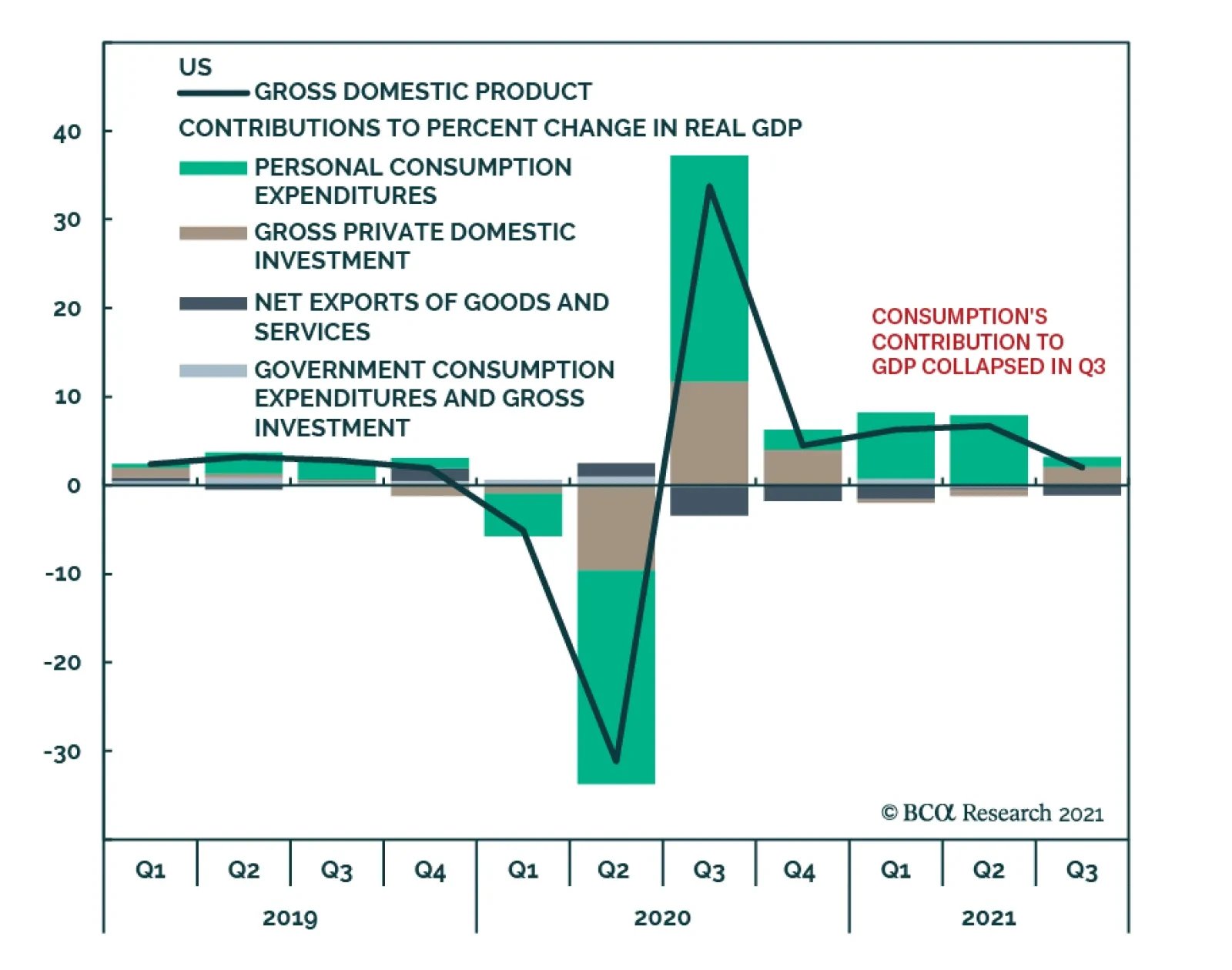
The advance estimate of Q3 US GDP surprised to the downside. After rising by an annualized 6.7% in Q2, real GDP growth decelerated to 2.0% q/q in Q3 – below the anticipated 2.6%. The slowdown mainly reflects the impact of two dynamics: (1) the delta wave…
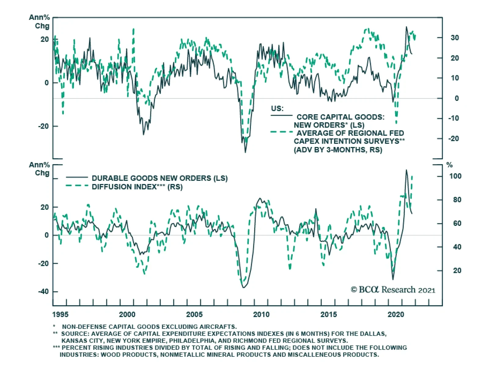
US durable goods orders fell by 0.4% in September. However, this was less than the anticipated 1.1% decrease. Moreover, the 2.3% drop in transportation equipment is responsible for the month-on-month decline. Excluding transportation, durable goods orders…
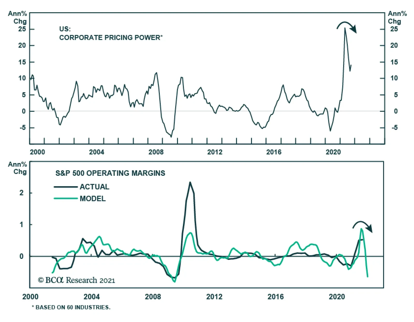
The Q3 earnings season is in full swing and the main takeaway thus far is that companies are clearing the low bar that analysts set for their earnings expectations. One common feature across most companies’ reports is that they are struggling with supply…
BCA Research’s US Political Strategy service concludes that Democratic bills will feed into short-run inflation risks. A major plot twist in Congress occurred over the past two weeks: corporate and individual tax cuts are on the chopping block as the…
Highlights Democrats are backing off from corporate tax hikes, a positive surprise for the earnings outlook. However, the reconciliation bill will be even more stimulating than expected at a time when the output gap is closed. Short-run inflation risks are high and Democratic bills will feed into that. Long-run inflation risks will need to be monitored. Compromises on legislation will help Democrats on the margin in the 2022 midterm elections but gridlock would freeze fiscal policy. Maintaining low corporate taxes while boosting government spending on infrastructure, R&D, renewables, and social safety should be good for productivity, potential growth, and the US dollar over the long run. We still give 65% odds for the reconciliation bill to pass. Reconciliation is the critical means of avoiding a national debt default after the December 3 deadline. This assumes that bipartisan infrastructure passes (80% odds). With the market already pricing the impending Democratic agreement, we are closing our long renewable energy trade for a gain of 30% and our long infrastructure basket for a gain of 8%. Feature A major plot twist in Congress occurred over the past two weeks: corporate and individual tax cuts are on the chopping block as the December 3 deadline approaches for the Biden administration’s signature piece of legislation. This development is uncertain but not unlikely. It would fit with our annual theme of bipartisan structural reform in the sense that it would mark a further Democratic cooptation of the previous Republican administration’s policies for the sake of popular opinion. Investors should not bet on zero tax hikes but they should prepare for positive surprises relative to the 5.5%-7% corporate tax hike that was previously envisioned. Rotation from low-tax to high-tax sectors was already underway prior to this news, which favors that trend (Chart 1). Chart 1Democrats Scrap Corporate Tax Hike?
Democrats Scrap Corporate Tax Hike?
Democrats Scrap Corporate Tax Hike?
In this report we update investors with the status of negotiations: what is in the bill, what is not, what remains undecided, what will be the net effect, and how will Wall Street respond? Details are subject to change up to the very moment before Congress votes. Here is what we know right now. What’s Essential To The Bill? Before the reconciliation bill, the $550 billion bipartisan infrastructure bill still has a subjective 80% chance of passage. The Senate already approved it on August 10, with 19 Republicans in favor. It stalled in the House of Representatives because the left wing refused to vote for it until party leaders reached a framework agreement on the larger social spending bill. The latter can only pass via the partisan reconciliation process. That framework could be agreed any day now but even if it suffers a surprise delay the House can push through the infrastructure bill fairly quickly. Infrastructure stocks still have some room to rise in the lead-up to President Biden’s signature but their ability to outperform the market going forward will depend on a range of factors outside politics and policy (Chart 2). Chart 2Infrastructure Bill Already Priced
Infrastructure Bill Already Priced
Infrastructure Bill Already Priced
As for the main reconciliation bill, House Speaker Nancy Pelosi claims that “more than 90 percent of everything is agreed to” in the framework agreement – but critical provisions are still in flux. The headline price tag has fallen from $3.5 trillion to $1.5-$2 trillion, leaving $1.75 trillion as the happy medium. The root of the disagreement is that the Democrats are a “big tent” party with two major factions of relatively equal strength. Moderates and conservatives have the upper hand on economics, whereas liberals have the upper hand on social issues (Chart 3). On the spending side, progressives have insisted on five policy priorities: the “care” economy (child care, elderly care), affordable housing, climate change, immigration, and health care. They say they can negotiate on the size and duration of the relevant programs but not on whether they are included.1 The Senate parliamentarian has already ruled out immigration so the other four priorities will be included, albeit watered down.
Chart 3
West Virginia Senator Joe Manchin’s initial demands to Senate Majority Leader Chuck Schumer are highlighted in Table 1. Manchin’s demands for a lower price tag are being met by the progressives’ willingness to pass smaller or short-lived programs with “sunset clauses.” The idea is that Republicans will suffer for allowing them to expire. History shows that it is very difficult to remove an entitlement once it is established. Table 1West Virginia Senator Joe Manchin’s Initial Demands For Biden’s Reconciliation Bill
Chopping Block
Chopping Block
The following items look to be included but pared back in size: The Child Tax Credit (from $450 billion to ~$100 billion). This benefit was enhanced by COVID-19 stimulus and is likely to be kept in place, albeit for one year instead of five years. This sets up a “cliff” in December 2022. Paid family and medical leave (from $225 billion to ~$100 billion). This benefit looks likely to be lowered from 12 weeks to four weeks and targeted toward low-income groups for a duration of three-to-four years. Medicare benefits expansion to include dental, vision, and hearing aid (from $358 billion to ~$200 billion or less). This provision is under pressure due to costs but Senator Bernie Sanders of Vermont insists that it will be included to some extent. Dental is likely to be slashed. This part of the bill was supposed to be paid for by allowing Medicare to negotiate drug prices, which is still being discussed. The Hill reports that the government may be given the power to negotiate prices for Medicare Part B but not Part D.2 On the revenue side, Pelosi says the deal will include a harmonization of overseas taxes. This would include a minimum 15% corporate tax rate on book earnings in keeping with the international agreement the Biden administration has negotiated. An estimated ~$400 billion in new revenue would be raised. Senators Manchin and Kyrsten Sinema of Arizona agree. Pelosi also claims agreement on tougher tax enforcement and a bulked-up Internal Revenue Service – a measure that is said to bring in $135 billion in revenue but which can be exaggerated to help cover the cost of new spending, at least on paper. What’s Already Been Chopped? Pelosi claims that the climate change disagreements are resolved. Manchin hails from a coal state where every single county favored President Trump for reelection. He has nixed the Clean Energy Performance Program (CEPP) as well as any tax on carbon emissions.3 However, the $150 billion from CEPP will not be saved but redirected toward various other green energy projects. This solution confirms our view this year that Democrats would provide green subsidies but not punitive green measures. The US and global policy setting is favorable for renewable stocks, though the energy crunch in China and Europe is a sign that this trade is not a one-way trade since popular backlash against green policies is possible in future (Chart 4). Manchin is opposing the expansion of Medicaid to 12 states that have refused to expand it. The other 38 states had to pay 10% of the cost; a federal expansion would give it to the 12 laggards for free. Eliminating the provision entirely would put the onus back on the 12 states (useful for local Democrats) while cutting $141 billion from the overall cost of the reconciliation bill.4 Democrats have also agreed to cut the $88 billion proposal to make two years of community college tuition-free. Chart 4Renewable Stocks Brush Off Energy Realism (For Now)
Renewable Stocks Brush Off Energy Realism (For Now)
Renewable Stocks Brush Off Energy Realism (For Now)
Universal preschool (pre-kindergarten), which would cost $450 billion, is popular but now under fire. It is not in the list of progressive priorities and could be slashed. Housing aid at $300 billion is expected to be cut by half or more. Elderly care could fall from $400 billion to half or one-third of that. Immigration provisions are unlikely to appear in the final reconciliation bill, as noted above. The Senate Parliamentarian Elizabeth MacDonough has ruled that immigration is not germane to direct fiscal matters, which are the focus of the reconciliation process.5 The Democrats have a vested interest in immigration and are not acting with any urgency on the border in the meantime, setting up an immigration crisis in 2022 and beyond (Chart 5). Table 2 shows the original Democratic spending plan with annotations for the latest developments, which are all subject to change in the very near term. Chart 5Looming Crisis On Southern Border
Looming Crisis On Southern Border
Looming Crisis On Southern Border
Table 2Senate Democratic Spending Plan Up For Negotiation
Chopping Block
Chopping Block
What’s Next On The Chopping Block? On the revenue side, the following provisions are being debated: Corporate and Individual Tax Hikes: Senator Kyrsten Sinema of Arizona – who won her seat by a 2.4% margin in a state that President Biden carried by only 0.3% of the vote – has ostensibly succeeded in scrapping the corporate tax hike and individual income tax hike from the reconciliation package. Our guess is that these tax hikes will still somehow make it into the bill in a weaker form but if Sinema prevails then $710 billion in new revenue will be forgone. Billionaire Tax: Democrats are also looking at a “billionaire tax,” although it would more accurately be called a hundred-millionaire tax based on what is known. It would be a yearly tax levied on the unrealized capital gains of those who own $1 billion in assets or who make $100 million in income over three consecutive years. Non-publicly traded assets would be taxed upon sale. This mark-to-market proposal is said to raise $250 billion in revenue, although nobody knows since tax evasion would be rife.6 It would be a popular tax but it is complex to administer, its constitutionality is uncertain, and it is being introduced in the eleventh hour. House negotiators would prefer straightforward corporate and high-income tax hikes. Tax On Stock Buybacks: There is also a proposal to levy a 2% tax on stock buybacks, which would be popular and not so hard to implement as a wealth tax. But it is also being introduced late in the game. SALT Deduction Cap: Democrats from high tax states have relentlessly pushed to remove the cap on their deductions passed by Republicans. A temporary repeal for 2022-23 is being discussed but would be a handout to the upper and upper-middle class. Total repeal could deprive the overall package of $85 billion per year in revenue. Tobacco and E-Cigarettes: This tax is estimated to raise $97 billion but is regressive. Table 3 highlights the tax provisions according to the original Democratic plan along with annotations for recent developments. Table 3Democratic Tax Plan Up For Negotiation
Chopping Block
Chopping Block
The Hyde amendment is lurking under the radar and could torpedo the entire bill – but we bet it will not. This provision has been included in legislation for half a century to prevent taxpayer money from directly funding abortion. President Biden, a Catholic, supported it until his 2020 presidential campaign when he caved to pressure from the progressives to remove it. However, Manchin insists on it.7 Since abortion is a moral dilemma, Manchin cannot compromise on it. Yet his “nay” would sink the entire reconciliation bill. So this is a mini-crisis waiting to happen and Hyde will most likely be included to save the bill. What’s The Time Frame? There are three soft deadlines and one hard deadline for these bills to pass. The soft deadlines are the following: October 31 – Transportation Funding Expires: House members want to pass the bipartisan infrastructure bill by October 31, along with a renewal of transport funds. This is a good plan because it separates bipartisan infrastructure from partisan reconciliation. But a short-term extension is also an option for transportation funding. It may be necessary if reconciliation is further delayed and House progressives refuse to support an infrastructure vote. November 1-2 – World Leaders Summit and UN Climate Change Conference: Democrats want a climate deal before Biden arrives in Glasgow, Scotland for the COP26 climate talks. It looks as if this will be achieved as we go to press. If not, Biden can offer vague promises instead. There will be no shortage of promises at Glasgow. November 9 – US Special Elections: If Democrats passed something before the various off-year elections are held then they would give their candidates a badly needed boost. Biden’s collapsing approval rating has been an albatross for Democratic candidates, including in the Virginia gubernatorial race (Chart 6). A signing ceremony at the White House would help take it off their necks. But lawmakers cannot speed up complex and controversial legislation just to save Terry McAuliffe’s bacon. The hard deadline is December 3, the new deadline for funding the federal government and raising the national debt limit.
Chart 6
Republicans are unlikely to vote to raise the debt ceiling a second time this year so Democrats will most likely be forced to include it in the reconciliation bill. Importantly, the debt ceiling will help to ensure the reconciliation bill’s passage. Any Democratic senator or lawmaker who votes against the bill will bear unique responsibility for a default on the national debt and financial turmoil, not to mention the doom of his or her party in the midterm elections. If anything this extreme cost suggests that our 65% subjectively probability for the bill’s passage is too low. What Are The Investment Implications? Democrats are likely to produce a $1.75-$2 trillion spending bill that raises around $1 trillion in new tax revenue. Our previous estimates of a net deficit impact of $1.2-$1.6 trillion for both the infrastructure and reconciliation bills will be updated when the framework reconciliation bill is put into writing but so far does not look far off the mark. Estimates for fiscal multipliers range widely (Table 4). The bipartisan infrastructure bill, with traditional or “hard” public investments, could have a multiplier of 0.4 to 2.2, based on the CBO’s retrospective 2015 estimates for the American Recovery and Reinvestment Act (the stimulus passed during the Great Recession). The partisan reconciliation bill, with “human infrastructure” and social welfare spending, could have a fiscal multiplier ranging from 0.6x (the average of the COVID-19 relief in 2020) to 1.2 or 1.4 (Moody’s estimates of the impact of expanding the Child Tax Credit in 2010). Table 4Range Of Fiscal Multipliers For Government Spending
Chopping Block
Chopping Block
However, the US output gap is virtually closed and stands at a positive 1.5% of GDP, according to Bloomberg consensus estimates (Chart 7). Thus additional deficit spending is inflationary on the margin. Core inflation is elevated and there is no immediate prospect for commodity prices to fall drastically in the next few months given tight global supplies, the approach of winter weather, and the looming conflict over Iran’s nuclear program in the Persian Gulf. A future political liability is thus taking shape. American consumers and small businesses are becoming increasingly concerned about inflation, much more so than taxes and regulation (Chart 8). By the time of the midterm election in fall 2022, inflation may have subsided. But if it has not then the Democrats will take the blame. Chart 7The Vanishing Output Gap
The Vanishing Output Gap
The Vanishing Output Gap
Chart 8The Inflation Threat
The Inflation Threat
The Inflation Threat
The equity sectors that stood to suffer the most from any repeal of President Trump’s Tax Cuts And Jobs Act of 2017 were real estate, technology, health care, and utilities. The sectors that stood to suffer least were energy, industrials, consumer staples, and materials. If Democrats maintain Trump’s corporate rate then the former sectors will see a relief rally. However, Big Tech will suffer marginally from the imposition of a minimum global corporate tax. The global macro context favors cyclical sectors and value stocks over defensive sectors and growth stocks as long as bond yields and inflation expectations continue to rise. Chart 9 shows that companies that were formerly high tax companies rallied tremendously in the wake of Trump’s tax cuts, while those with high foreign tax risk underperformed. That process will likely be reaffirmed if Trump’s headline corporate rate is preserved while the minimum rate is imposed on companies with high foreign tax risk. Over the long run, inflation may or may not prove to be as big of a problem. The Biden bills should boost productivity, on top of the productivity improvement that has already occurred as a result of COVID-19 digitization efforts. US corporates would maintain a high degree of competitiveness if the corporate rate were to stay put. The original Biden plan would have put the US back at the highest level of integrated corporate income taxes out of all the OECD countries. Keeping corporate rates low, combined with public investments in infrastructure, the digital economy, renewable energy, and the social safety net should boost productivity, potential growth, and the US dollar. Chart 9High-Tax Basket Stands To Benefit - Along With Value Stocks
High-Tax Basket Stands To Benefit - Along With Value Stocks
High-Tax Basket Stands To Benefit - Along With Value Stocks
If Congress returns to gridlock after the 2022 midterm elections as expected, then the fiscal splurge may be on pause at least until 2025. In that case the inflation risk in coming years will depend more on global rather than domestic developments. We have long argued that inflation risks are rising due to populism and fiscal extravagance in the United States. The Biden administration’s legislation marks a return of Big Government and a net increase in the budget deficit over the coming decade. However, the latest developments suggest it will not be the extravagant democratic-socialist blowout originally envisioned. If that proves true, then its long-run impact will be beneficial for the US economy and politics. On a deeper level, the most important takeaway from the above analysis is that the Democrats remain limited by checks and balances. Beneath all the partisan acrimony, a new consensus is emerging in the US in favor of proactive fiscal policy (infrastructure, social safety net) and more hawkish trade policy (supply chain resilience, onshoring). The drivers of this new consensus are powerful: the elites do not want rebellion, the masses want a more favorable domestic economy, and both want greater strategic security relative to foreign competitors. The likely passage of the Strategic Competition Act by the end of the year, or at least the semiconductor portion of it, and the passage of a bulked up annual defense bill despite Democrats’ allegedly dovish bias, will further emphasize this point. By compromising the plan to come closer to moderate senators’ demands, the Democrats are courting the median US voter and likely to minimize their losses in the midterm elections. Even assuming they still lose the House of Representatives at least, the new policy consensus will continue to develop because it shares core elements with the Republican agenda. Matt Gertken Vice President Geopolitical Strategy mattg@bcaresearch.com Appendix
Image
Image
Image
Image
Image
Image
Image
Image
Footnotes 1 See Congressional Progressive Caucus, “CPC Calls For 5 Key Priorities To Be Included In The American Jobs Plan,” April 9, 2021, progressives.house.gov. See also Tyler Stone, “Rep. Ilhan Omar: If Our Progressive Priorities Aren’t Met, No Legislation Will Pass,” July 30, 2021, realclearpolitics.com. 2 See Jennifer Scholtes, Marianne Levine, and Alice Miranda, “What’s Still In The Dem Megabill? Cheat Sheet On 12 Big Topics,” Politico, October 25, 2021, politico.com; Jordain Carney, “Sanders draws red lines on Medicare expansion, drug pricing plan in spending bill,” The Hill, October 26, 2021, thehill.com. 3 Benjamin J. Hulac, “Manchin Tries To Slow Clean Energy Shift As West Virginia Clings To Coal,” Roll Call, October 26, 2021, rollcall.com. 4 Jordain Carney, “Manchin Says Framework ‘Should’ Be Possible This Week,” The Hill, October 25, 2021, thehill.com. 5 Lisa Desjardins, “Read the Senate rules decision that blocks Democrats from putting immigration reform in the budget,” PBS, September 20, 2021, pbs.org. 6 See Naomi Jagoda, “Billonaire Tax Gains Momentum,” The Hill, October 26, 2021, thehill.com; Steven M. Rosenthal, “Wyden’s Billionaire Income Tax Is Ambitious But Problematic,” Tax Policy Center, October 25, 2021, taxpolicycenter.org; Scott A. Hodge, “The Rich Are Not Monolithic and Taxing Their Wealth Invites Tax Collection Volatility,” Tax Foundation, October 26, 2021, taxfoundation.org. 7 Sam Dorman, “Biden says he’d sign reconciliation package including Hyde Amendment,” Fox News, October 6, 2021, foxnews.com.
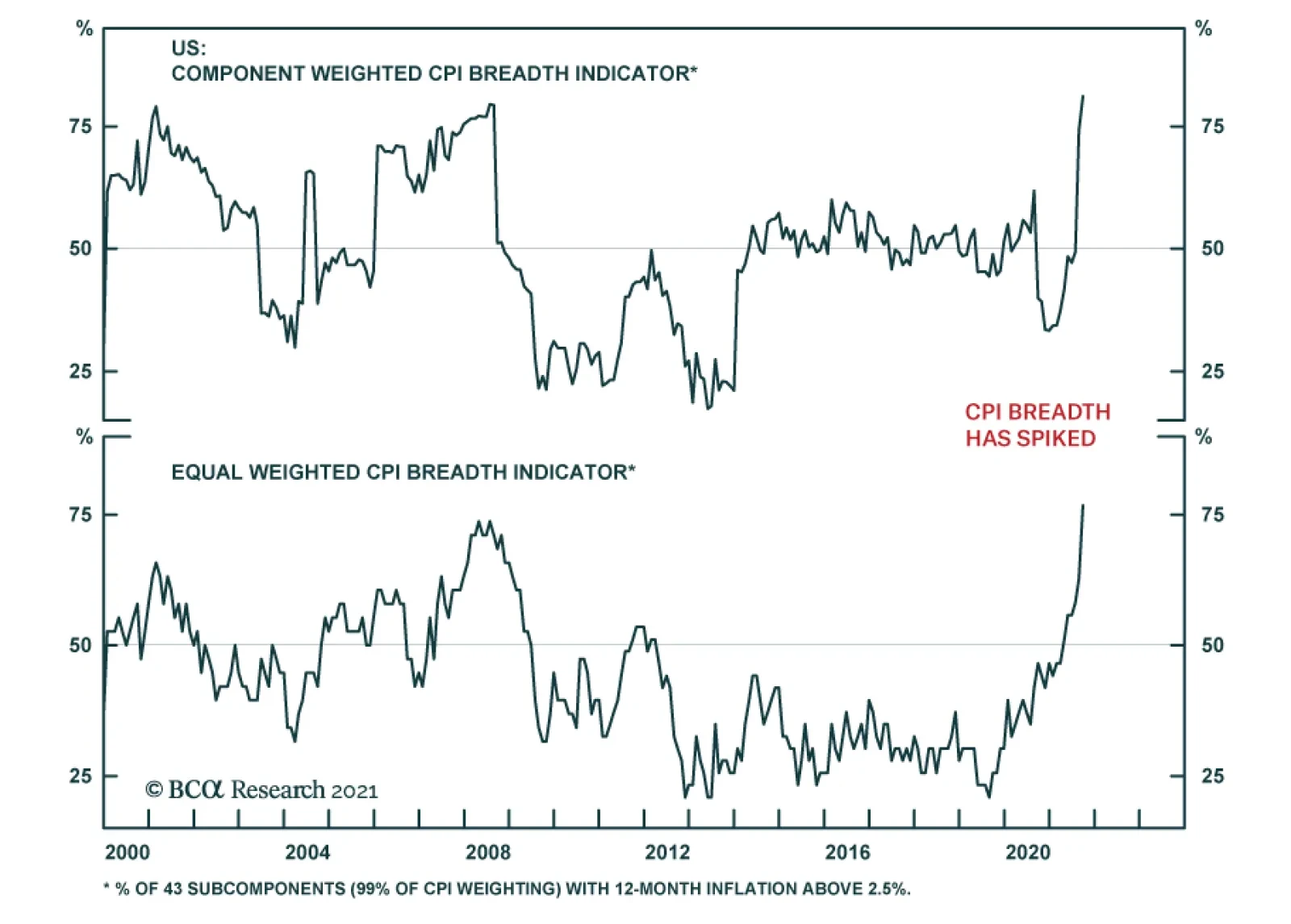
BCA Research’s US Bond Strategy service still views December 2022 as the most likely liftoff date. The team is monitoring five factors to see if their forecast needs to be revised. 1. The Unemployment Rate: The Fed has officially pledged through its…
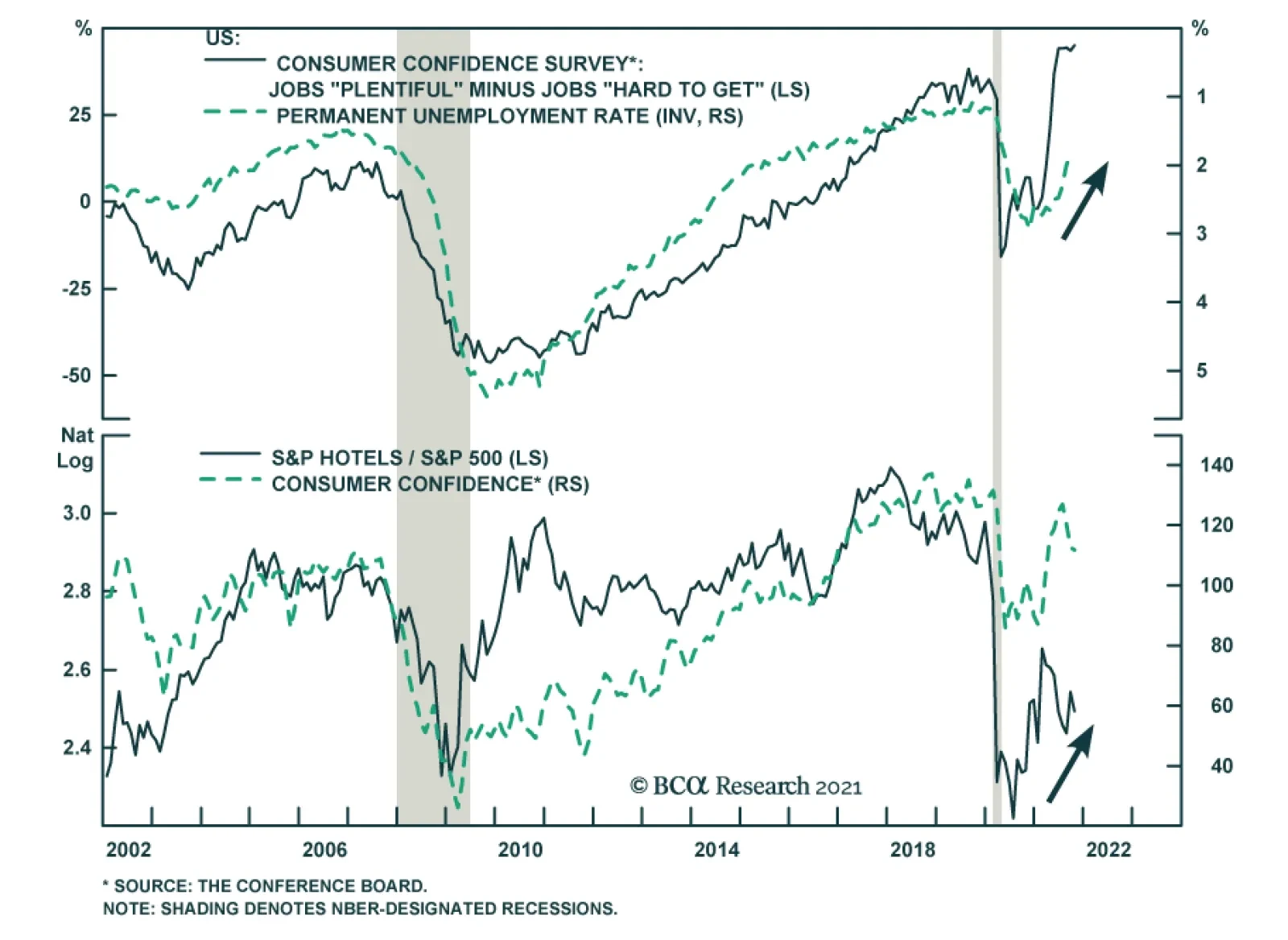
Consumer sentiment appears to be firming in the US. The Conference Board Consumer Confidence Index ticked up from 109.8 to 113.8 in October, surprising expectations of a minor decline to 108. The increase follows three consecutive months of decline. Notably,…