United States
The past two weeks have been characterized by a rotation in US equities. Sectors and styles that are sensitive to rising interest rates such as real estate, tech, and growth stocks have been underperforming. Meanwhile, less rate-sensitive equities –…

With inflation readings elevated for longer than expected and global growth data rolling over, fears of stagflation are tightening their grip over the markets. Together, inflation and a not fully recovered labor market, have pushed the US misery index above the one standard deviation mark (Chart 1). We conducted an empirical analysis to examine how different sectors and styles fared during periods of stagflation. To do so, we defined stagflation as periods with inflation is above 3% and industrial production is contracting on a YoY basis. We have only 24 months in this regime since 1989, which constitutes 6.3% of all observations. Admittedly, our sample is small. We then calculate the median relative returns of each S&P 500 sector across the regime. Chart 1
CHART 1
CHART 1
Here is what we found: Out of the three S&P “long duration” growth sectors (Technology, Communication Services, and Consumer Discretionary), two are in the red as inflationary headwinds are overpowering scarcity of growth in the economy. Meanwhile, the traditional inflationary beneficiaries, such as Financials, Materials, and Energy outperformed the S&P 500. Historically, the Health Care sector was also a good deflation hedge due to its inelastic demand profile. However, more recently pricing power of the sector has been declining due to a perfect storm of regulatory changes and patent cliffs. The Consumer Staples index is another defensive sector that outperformed during stagflation as consumers prioritize everyday necessities over other spending (Chart 2). Chart 2
Stagflation Vs Sector Performance
Stagflation Vs Sector Performance
Bottom Line: If stagflation fears materialize, Financials, Consumer Staples, Energy, and Materials are the key sectors that have the best chance to withstand the headwinds.
Highlights Q3/2021 Performance Breakdown: Our recommended model bond portfolio outperformed the custom benchmark index by +8bps during the third quarter of the year. Winners & Losers: The government bond side of the portfolio outperformed by +4bps, led by the timely downgrade of UK Gilts to underweight in early August. Spread product allocations outperformed by +4bps, coming entirely from the overweights to high-yield in the US and Europe. Portfolio Positioning For The Next Six Months: We are maintaining an overall below-benchmark portfolio duration exposure, concentrated in the US and UK. We expect global growth will rebound from the Delta variant and supply chain disruptions will keep inflation elevated for longer, both of which will push global bond yields higher as central banks – led by Fed – turn less dovish. We are maintaining a moderate overweight to global spread product versus government debt, concentrated on an overweight to US high-yield where valuations still look the least stretched compared to corporate debt in other countries. Feature Global bond markets have had a lot of sources of uncertainty to digest over the past few months. Renewed COVID fears due to the spread of the Delta variant, slowing global growth momentum, supply chain disruptions leading to surging realized inflation, the ongoing US fiscal policy debate in D.C., concerns over Chinese corporate debt and the increasingly hawkish monetary policy signals sent by global central banks, most notably the Fed. The net result of these narratives has been some major swings in government bond market performance during the third quarter of 2021. The benchmark 10-year government bond yield in the US started the quarter at 1.48%, fell to an intraday low of 1.12% on August 4, then soared higher to end the quarter back at 1.50%. Even bigger moves were seen in other countries, with the 10-year UK Gilt yield doubling from its Q3 low of 0.48% on August 4 while the 10-year German bund yield is now 30bps above its low for the quarter. Despite this yield volatility, however, spreads for riskier credit market assets like US high-yield have remained generally well behaved. With that in mind, we present our quarterly review of the BCA Research Global Fixed Income Strategy (GFIS) model bond portfolio during Q3/2021. We also present our recommended positioning for the portfolio for the next six months (Table 1), as well as portfolio return expectations for our base case and alternative investment scenarios. We anticipate that bond investor uncertainty will switch from concerns about global growth to worries that stubbornly elevated inflation will elicit bond-bearish monetary policy responses from central banks. Table 1GFIS Model Bond Portfolio Recommended Positioning For The Next Six Months
GFIS Model Bond Portfolio Q3/2021 Performance Review & Current Allocations: Fading A Growth Scare
GFIS Model Bond Portfolio Q3/2021 Performance Review & Current Allocations: Fading A Growth Scare
As a reminder to existing readers (and to new clients), the model portfolio is a part of our service that complements the usual macro analysis of global fixed income markets. The portfolio is how we communicate our opinion on the relative attractiveness between government bond and spread product sectors. We do this by applying actual percentage weightings to each of our recommendations within a fully invested hypothetical bond portfolio. Q3/2021 Model Bond Portfolio Performance: Positive Returns In An Uncertain Environment Chart 1Q3/2021 Performance: Riding The Duration Roller Coaster
Q3/2021 Performance: Riding The Duration Roller Coaster
Q3/2021 Performance: Riding The Duration Roller Coaster
The total return for the GFIS model portfolio (hedged into US dollars) in the third quarter was +0.21%, slightly outperforming the custom benchmark index by +8bps (Chart 1).1 In terms of the specific breakdown between the government bond and spread product allocations in our model portfolio, the former generated +4bps of outperformance versus our custom benchmark index while the latter also outperformed by +4bps. Those small positive excess returns should be considered a victory, given the huge yield swings within the quarter, particularly for government bonds. We maintained a significant underweight position to US Treasuries in the portfolio during Q3, given our view that markets were underestimating the risks that the US economy would weather the summer Delta storm. As Treasury yields declined steadily during July and August, so did the relative performance of our model bond portfolio. The government bond portion of the portfolio was underperforming the benchmark by as much as -30bps before global bond yields bottomed out in early August. In the end, there was only a slight underperformance (-2bps) from the US Treasury portion of the portfolio during the quarter (Table 2). Table 2GFIS Model Bond Portfolio Q3/2021 Overall Return Attribution
GFIS Model Bond Portfolio Q3/2021 Performance Review & Current Allocations: Fading A Growth Scare
GFIS Model Bond Portfolio Q3/2021 Performance Review & Current Allocations: Fading A Growth Scare
Our biggest government bond overweights have been concentrated in the euro area. There, the sum of active returns during Q3 from our government bond allocations was +3bps, although that came entirely from above-benchmark allocations to inflation-linked bonds in Germany, France and Italy. We did make one major shift in our government bond allocations during the quarter, and it was both timely and successful. We downgraded our recommended UK Gilt exposure to underweight on August 11.2 We observed that the Bank of England (BoE) was starting to prepare the markets for less accommodative monetary policy, with the UK economy holding up well as its Delta variant surge was losing momentum. The BoE rhetoric has proven to be even more hawkish than we anticipated, hinting at a possible rate hike before the end of 2021, leading Gilts to be the worst performing government bond market in our model portfolio universe during the quarter. The result: our UK underweight contributed +4bps to the portfolio performance during the quarter. Turning to the credit side of the portfolio, the most successful positions were our overweight tilts on high-yield in the US (+3bps) and euro area (+1bps). All other exposures contributed little to returns, an unsurprising development given our neutral allocations to investment grade corporates in the US, UK and euro area, as well as for USD-denominated EM corporates. The bar charts showing the total and relative returns for each individual government bond market and spread product sector are presented in Charts 2 & 3. Chart 2GFIS Model Bond Portfolio Q3/2021 Government Bond Performance Attribution
GFIS Model Bond Portfolio Q3/2021 Performance Review & Current Allocations: Fading A Growth Scare
GFIS Model Bond Portfolio Q3/2021 Performance Review & Current Allocations: Fading A Growth Scare
Chart 3GFIS Model Bond Portfolio Q3/2021 Spread Product Performance Attribution By Sector
GFIS Model Bond Portfolio Q3/2021 Performance Review & Current Allocations: Fading A Growth Scare
GFIS Model Bond Portfolio Q3/2021 Performance Review & Current Allocations: Fading A Growth Scare
Biggest Outperformers: Overweight UK Gilts with a maturity greater than 10-years (+4bps) Overweight Italian inflation-linked bonds (+2bps) Overweight US high-yield: Ba-rated (+2bps) and B-rated (+1bps) Biggest Underperformers: Underweight US Treasuries with a maturity greater than 10-years (-2bps) Overweight Japanese Government Bonds in longer maturity buckets: 7-10 years (-1bps) and greater than 10-years (-1bps) Overweight UK inflation-linked bonds (-1bps) Chart 4 presents the ranked benchmark index returns of the individual countries and spread product sectors in the GFIS model bond portfolio for Q3/2021. Returns are hedged into US dollars (we do not take active currency risk in this portfolio) and adjusted to reflect duration differences between each country/sector and the overall custom benchmark index for the model portfolio. We have also color coded the bars in each chart to reflect our recommended investment stance for each market during Q3 (red for underweight, dark green for overweight, gray for neutral). Chart 4Ranking The Winners & Losers From The GFIS Model Bond Portfolio Universe In Q3/2021
GFIS Model Bond Portfolio Q3/2021 Performance Review & Current Allocations: Fading A Growth Scare
GFIS Model Bond Portfolio Q3/2021 Performance Review & Current Allocations: Fading A Growth Scare
Ideally, we would look to see more green bars on the left side of the chart where market returns are highest, and more red bars on the right side of the chart were returns are lowest. As can be seen in the chart, the bars look very close to that ideal for Q3/2021. Among the markets that represent our overweights, the most notably positive returns came from all euro area government bonds (a combined +136bps) and euro area corporates (a combined +20bps from investment grade and high-yield). Returns within our recommended underweight positions were even more notable: UK Gilts (-302bps), New Zealand government bonds (-103bps), EM USD-denominated sovereigns (-85bps), and Canadian government bonds (-45bps). Bottom Line: Our model bond portfolio slightly outperformed its benchmark index in the third quarter of the year by +8bps – a moderately positive result coming equally from underweight positions in government bonds and overweight allocations to spread product. Future Drivers Of Portfolio Returns Chart 5Negative Real Yields: The Biggest Mispricing In Global Bond Markets
Negative Real Yields: The Biggest Mispricing In Global Bond Markets
Negative Real Yields: The Biggest Mispricing In Global Bond Markets
Looking ahead, the performance of the model bond portfolio will continue to be driven primarily by our below-benchmark overall duration tilt – focused on our underweight stance on US Treasuries – and our overweight stance on high-yield corporates. Our most favored cyclical indicators for global bond yields are still, in aggregate, signaling more upside potential over at least the next six months, although the nature of the signal is changing (Chart 5). While our Global Duration Indicator, comprised of leading economic indicators and measures of future economic sentiment, has peaked, the overall level of 10-year bond yields within the major developed markets remains well below levels implied by the Indicator (top panel). That is most clearly evident when looking at the large gap between deeply negative real bond yields and the still-elevated level of the global manufacturing PMI, which typically leads real yields by around six months (second panel). We continue to view this gap between real yields and growth as the biggest mispricing in global bond markets – one that will eventually be rectified by the incremental reduction in monetary accommodation that is signaled by our Global Central Bank Monitor (bottom panel). The combined message from our Central Bank Monitor, Duration Indicator and the manufacturing PMI is that global bond yields are still too low, suggesting a below-benchmark overall portfolio duration stance remains appropriate. With regards to country allocation within the government bond side of our model portfolio, we continue to overweight countries where central banks are less likely to begin normalizing pandemic-era monetary policy quickly (Germany, France, Italy, Spain, Japan, Australia), while underweighting countries where normalization is expected to begin within the next 6-12 months (the US, UK and Canada). We have the highest conviction on the US and UK underweights, with a curve-flattening bias for both markets relative to the rest of the major developed markets (Chart 6). The bond-friendly (and risk asset-friendly) impact of global quantitative easing programs is fading, on the margin, with the annual growth rate of central bank balance sheets having already slowed sharply (Chart 7). The pace of tapering, and any subsequent rate hikes, will differ by country and support our government bond country allocations in the model portfolio. Chart 6Expect More Relative Curve Flattening In The US & UK
Expect More Relative Curve Flattening In The US & UK
Expect More Relative Curve Flattening In The US & UK
Chart 7The 'Great Global Taper' Has Begun
The 'Great Global Taper' Has Begun
The 'Great Global Taper' Has Begun
Chart 8Less Scope For Wider Global Inflation Breakevens
Less Scope For Wider Global Inflation Breakevens
Less Scope For Wider Global Inflation Breakevens
We expect the Fed to taper its pace of bond purchases over the first half of 2022, setting up a first Fed rate hike late next year. The Bank of Canada and the BoE will be the other developed market central banks that will both end QE and lift rates before the Fed does the same. On the other hand, the ECB, Bank of Japan and the Reserve Bank of Australia will maintain a more relatively dovish stance in 2022, with very modest tapering (at worst) and no rate hikes. Turning to inflation-linked bonds, we are maintaining an overall neutral allocation given the competing forces of rising global inflation and rich valuations. Our Comprehensive Breakeven Indicators combine three measures to determine the upside potential for 10-year inflation breakevens: the distance from fair value based on our models, the spread between headline inflation and central bank target inflation, and the gap between market-based and survey-based measures of inflation expectations. Those indicators suggest that the most attractive markets to position for further upside potential for breakevens are Italy, France, Canada and Japan (Chart 8). On the back of this, we are maintaining our overweight allocations to inflation-linked bonds in the euro area and Japan in our model portfolio, while staying neutral on US TIPS. Chart 9Fading Support For Credit Markets From Global QE In 2022
Fading Support For Credit Markets From Global QE In 2022
Fading Support For Credit Markets From Global QE In 2022
Moving our attention to the credit side of our model portfolio, a moderate overweight stance on overall global corporates (focused on high-yield) versus governments remains appropriate. However, the slowing trend in developed market central bank balance sheets is flashing a warning sign for the future performance of global spread product. The annual growth rate of the combined balance sheets of the Fed, ECB, Bank of Japan and Bank of England has been an excellent leading indicator (by about twelve months) of the annual excess returns of both global investment grade and high-yield corporates during the “QE Era” since the 2008 financial crisis (Chart 9). That growth rate peaked back in February of this year, suggesting a peak of global corporate bond outperformance around February 2022, particularly for high-yield versus government bonds and investment grade (top two panels). At the same time, our preferred measure of the attractiveness of credit spreads - the historical percentile ranking of 12-month breakeven spreads – shows that lower-rated high-yield credit tiers in the US and euro area offer spreads that are relatively high versus their own history compared to other credit sectors in our model bond portfolio universe (Chart 10). Using this metric, investment grade corporate spreads look much more fully valued, particularly in the US. Chart 10Lower-Rated High-Yield & EM Sovereigns Offer Relatively Attractive Spreads
GFIS Model Bond Portfolio Q3/2021 Performance Review & Current Allocations: Fading A Growth Scare
GFIS Model Bond Portfolio Q3/2021 Performance Review & Current Allocations: Fading A Growth Scare
Given sharply reduced default risks in the US and Europe, with strong nominal growth supporting corporate revenues alongside low borrowing rates, the fundamental backdrop for riskier high-yield corporates is still positive. Thus, we are maintaining our overweights to high-yield bonds in both the US and euro area, while sticking with only a neutral stance on investment grade corporates in the US, euro area and the UK. We do anticipate starting to reduce that exposure in the model portfolio sometime in early months of 2022, however, based on the ominous leading signal from the growth of central bank balance sheets – and what that means about the future path for global monetary policy and risk asset performance. Within the euro area, we are maintaining overweights to Italian and Spanish government bonds given the likelihood that the monetary policy backdrop will remain supportive (Chart 11). We expect the ECB to be one of the most accommodative central banks within our model portfolio universe in 2022. At worst, the ECB could deliver a modest reduction of total asset purchases, but with no rate hikes. Chart 11A Relatively Dovish ECB Will Be Positive For European Credit
A Relatively Dovish ECB Will Be Positive For European Credit
A Relatively Dovish ECB Will Be Positive For European Credit
Chart 12EM Headwinds: A Firmer USD, China Tightening & Global QE Tapering
EM Headwinds: A Firmer USD, China Tightening & Global QE Tapering
EM Headwinds: A Firmer USD, China Tightening & Global QE Tapering
Finally, we are sticking with a cautious stance on emerging market (EM) spread product in our model bond portfolio. Slowing Chinese economic growth, a firming US dollar, rate hikes across EM in response to high inflation, and the coming turn in the Fed policy cycle are all headwinds to the relative performance of EM USD-denominated corporates and sovereigns (Chart 12). We are sticking with our overall modestly underweight stance on EM USD-denominated credit. However, rebounding global growth and some potential policy stimulus in China could prompt us to consider an upgrade in the coming months. Summing it all up, our overall allocations and risks in our model portfolio leading into Q4/2021 look like this: An overall below-benchmark stance on global duration, equal to -0.75 years versus the custom index (Chart 13). A moderate overweight stance on global spread product versus government debt, equal to five percentage points of the portfolio (Chart 14). This overweight comes almost entirely from allocations to US and euro area high-yield corporates. The tracking error of the portfolio, or its expected volatility versus that of the benchmark index, is relatively low at 55bps (Chart 15). This fits with our desire to maintain only a moderate level of absolute portfolio risk, while focusing exposures more on relative tilts between countries and credit sectors. Chart 13Overall Portfolio Duration: Stay Below Benchmark
GFIS Model Bond Portfolio Q3/2021 Performance Review & Current Allocations: Fading A Growth Scare
GFIS Model Bond Portfolio Q3/2021 Performance Review & Current Allocations: Fading A Growth Scare
Chart 14Overall Portfolio Allocation: Small Spread Product Overweight
GFIS Model Bond Portfolio Q3/2021 Performance Review & Current Allocations: Fading A Growth Scare
GFIS Model Bond Portfolio Q3/2021 Performance Review & Current Allocations: Fading A Growth Scare
The yield of the portfolio is now slightly higher than that of the benchmark, with a small “positive carry” of 16bps (Chart 16). Chart 15Overall Portfolio Risk: Moderate
Overall Portfolio Risk: Moderate
Overall Portfolio Risk: Moderate
Chart 16Overall Portfolio Yield: Small Positive Carry Vs. Benchmark
Overall Portfolio Yield: Small Positive Carry Vs. Benchmark
Overall Portfolio Yield: Small Positive Carry Vs. Benchmark
Scenario Analysis & Return Forecasts We now turn to scenario analysis to determine the return expectations for the portfolio for the next six months. On the credit side of the portfolio, we use risk-factor-based regression models to forecast future yield changes for global spread product sectors as a function of four major factors - the VIX, oil prices, the US dollar and the fed funds rate (Table 2A). For the government bond side of the portfolio, we avoid using regression models and instead use a yield-beta driven framework, taking forecasts for changes in US Treasury yields and translating those in changes in non-US bond yields by applying a historical yield beta (Table 2B). For our scenario analysis over the next six months, we use a base case scenario plus two alternate “tail risk” scenarios. Table 2AFactor Regressions Used To Estimate Spread Product Yield Changes
GFIS Model Bond Portfolio Q3/2021 Performance Review & Current Allocations: Fading A Growth Scare
GFIS Model Bond Portfolio Q3/2021 Performance Review & Current Allocations: Fading A Growth Scare
Table 2BEstimated Government Bond Yield Betas To US Treasuries
GFIS Model Bond Portfolio Q3/2021 Performance Review & Current Allocations: Fading A Growth Scare
GFIS Model Bond Portfolio Q3/2021 Performance Review & Current Allocations: Fading A Growth Scare
We see global growth momentum, the stickiness of supply-driven inflation pressures and the Fed monetary policy outlook as the three most important factors for fixed income markets over the next six months, thus our scenarios are defined along those lines. Base case Global growth rebounds from the dip seen during July and August as fears over the spread of the Delta variant subside. Unemployment rates across the developed economies continue to decline on the back of ongoing demand/supply imbalances in labor markets. China is a relative growth laggard, but this will trigger fresh macro stimulus measures (credit, monetary, perhaps fiscal) from policymakers concerned about missing growth targets. Global supply chain disruptions will remain stubbornly persistent, keeping upward pressure on realized inflation rates in most countries even as commodity price momentum cools a bit on a rate of change basis. Most developed market central banks will move to dial back pandemic monetary policy stimulus to varying degrees, most notably the Fed and the Bank of England. The Fed will begin tapering its asset purchases around the turn of the year, to be completed during Q4/2021 thus setting the stage for a Fed rate hike in December. In this scenario, we expect the US Treasury curve to see some initial mild bear-steepening alongside moderately wider longer-term TIPS breakevens, before entering a more typical cyclical bear-flattening as the Fed begins tapering and rate hike expectations get pulled forward. The net result over the next six months: the entire US Treasury curve shifts higher in roughly parallel fashion, with the 10-year reaching 1.70% by next March. The VIX drifts a bit lower from the current 21 to 18, the US dollar is flattish (faster global growth offsets more USD-favorable real yield differentials versus other developed markets), the Brent oil price goes up +5% on the back of stronger global demand, and the fed funds target rate is unchanged at 0-0.25%. Upside growth & inflation surprise Global growth accelerates amid sharply diminished COVID risks and rallying stock and credit markets that loosen financial conditions. Consumer & business confidence recover smartly, as do hiring and capex. Global inflation rates accelerate from current elevated levels, but less from supply squeezes and more from fundamental pressures and faster wage growth. China loosens macro policies, but developed market central banks shift in an even more hawkish direction. The Fed signals a rapid 2022 taper and a funds rate liftoff well before year-end. In this scenario, real bond yields drift higher globally, but inflation breakevens stay elevated with the earlier surge in realized inflation proving not to be “transitory”. The US Treasury curve shifts much higher than in our base case, led by the 5-year maturity with bear-flattening beyond that point. The 10-year US Treasury yield climbs to 1.90% by the end of Q1/2022. The VIX moves higher to 25, the US dollar falls -3% (faster global growth offsetting a relatively modest increase in US/non-US real yield differentials), the Brent oil price goes up +10% and the fed funds target range is unchanged at 0-0.25%. Downside growth & inflation surprise Global growth loses additional momentum as consumer and business confidence stay muted. Supply/demand mismatches in labor markets remain unresolved, leading to a slower pace of employment growth. China does not signal adequate stimulus to offset its slowdown, while a weakened Biden administration implements a much smaller-than-expected US fiscal stimulus. Supply chain disruptions persist, keeping inflation elevated even as growth slows (stagflation). Developed market central banks, stuck between slowing growth and elevated inflation, are unable to ease in response to slower growth. The Fed chooses a slower drawn-out taper with liftoff delayed to 2023. Diminished economic optimism leads to a pullback in global equity values, lower government bond yields and wider global credit spreads. The US Treasury curve bull flattens as longer-maturity yields fall, with the 10-year yield moving back down to 1.25% alongside lower inflation breakevens. The VIX rises to 30, the safe-haven US dollar rises +5%, the Brent oil price falls -10% and the fed funds target range stays at 0-0.25%. The inputs into the scenario analysis are shown in Chart 17 (for the USD, VIX, oil and the fed funds rate), while the US Treasury yield scenarios are in Chart 18. The excess return scenarios for the model bond portfolio, using the above inputs in our simple quantitative return forecast framework, are shown in Table 3A (the scenarios for the changes in US Treasury yields are shown in Table 3B). Chart 17Risk Factor Assumptions For The Scenario Analysis
Risk Factor Assumptions For The Scenario Analysis
Risk Factor Assumptions For The Scenario Analysis
Chart 18US Treasury Yield Assumptions For The Scenario Analysis
US Treasury Yield Assumptions For The Scenario Analysis
US Treasury Yield Assumptions For The Scenario Analysis
Table 3AGFIS Model Bond Portfolio Scenario Analysis For The Next Six Months
GFIS Model Bond Portfolio Q3/2021 Performance Review & Current Allocations: Fading A Growth Scare
GFIS Model Bond Portfolio Q3/2021 Performance Review & Current Allocations: Fading A Growth Scare
Table 3BUS Treasury Yield Assumptions For The 6-Month Forward Scenario Analysis
GFIS Model Bond Portfolio Q3/2021 Performance Review & Current Allocations: Fading A Growth Scare
GFIS Model Bond Portfolio Q3/2021 Performance Review & Current Allocations: Fading A Growth Scare
The model bond portfolio is expected to deliver a positive excess return over the next six months of +60bps in the base case scenario and +57bps in the optimistic growth scenario, but is projected to underperform by -26bps in the pessimistic growth scenario. Bottom Line: We are maintaining an overall below-benchmark portfolio duration exposure, concentrated in the US and UK. We expect global growth will rebound from the Delta variant and supply chain disruptions will keep inflation elevated for longer, both of which will push global bond yields higher as central banks – led by Fed – turn less dovish. We are maintaining a moderate overweight to global spread product versus government debt, concentrated on an overweight to US high-yield where valuations still look the least stretched compared to corporate debt in other countries. Robert Robis, CFA Chief Fixed Income Strategist rrobis@bcaresearch.com Ray Park, CFA Research Analyst ray@bcaresearch.com Footnotes 1 The GFIS model bond portfolio custom benchmark index is the Bloomberg Barclays Global Aggregate Index, but with allocations to global high-yield corporate debt replacing very high-quality spread product (i.e. AA-rated). We believe this to be more indicative of the typical internal benchmark used by global multi-sector fixed income managers. 2 Please see BCA Research Global Fixed Income Strategy/ European Investment Strategy Weekly Report, "The UK Leads The Way", dated August 11, 2021, available at gfis.bcaresearch.com. The GFIS Recommended Portfolio Vs. The Custom Benchmark Index
GFIS Model Bond Portfolio Q3/2021 Performance Review & Current Allocations: Fading A Growth Scare
GFIS Model Bond Portfolio Q3/2021 Performance Review & Current Allocations: Fading A Growth Scare
Global Fixed Income - Strategic Recommendations* Duration Regional Allocation Spread Product Tactical Trades Yields & Returns Global Bond Yields Historical Returns
According to BCA Research’s US Bond Strategy service, the Treasury curve will bear-flatten as markets price in the expectation that the Fed will launch a new rate hike cycle in December 2022. Bond yields rose notably in September, with the bulk of the move…
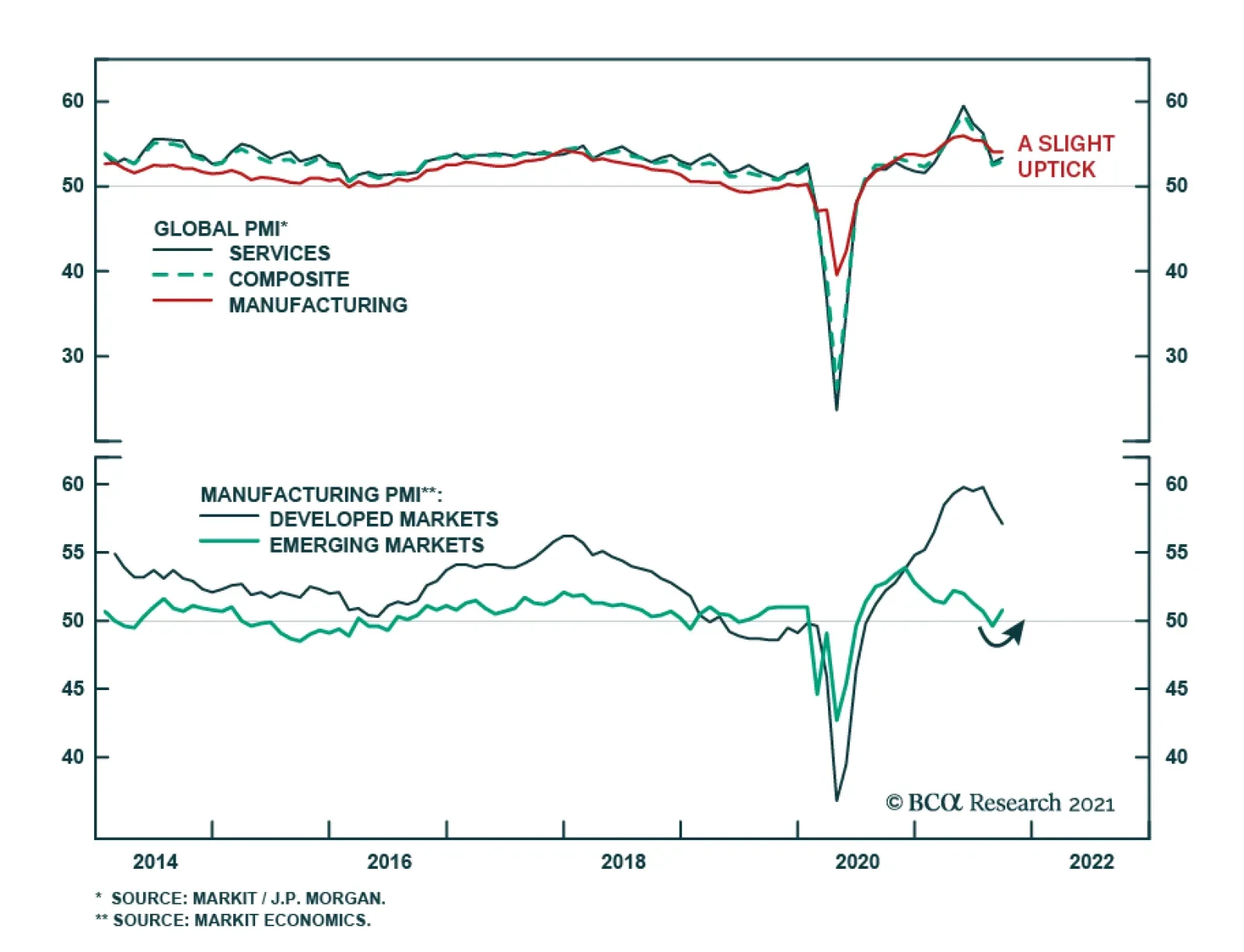
The Global PMI sent a slightly positive signal about the state of the global economy in September. The headline composite index ticked up to 53.0 from 52.5 – the first improvement in four months. The acceleration in the pace of global expansion reflects a…
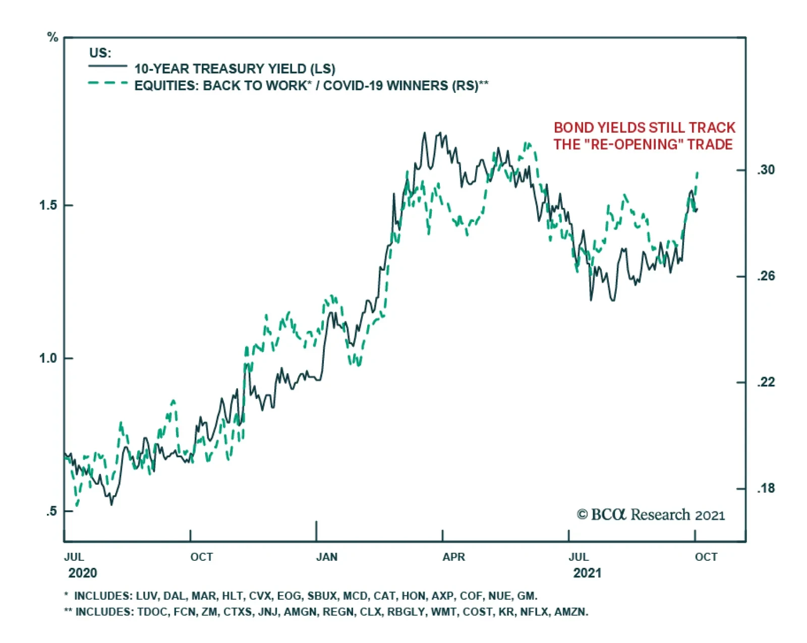
Highlights Chart 1Bond Yields Still Track The "Re-Opening" Trade
Bond Yields Still Track The "Re-Opening" Trade
Bond Yields Still Track The "Re-Opening" Trade
Bond yields rose notably in September, with the bulk of the move coming in the days after the Fed teased an upcoming tapering of its asset purchases and revealed slightly hawkish revisions to its interest rate projections. Interestingly, some of the details of the bond market move don’t mesh nicely with the mildly hawkish policy surprise that the Fed delivered. For example, the Treasury curve steepened on the month and long-maturity TIPS breakeven inflation rates rose. Our sense is that September’s market moves were less driven by the Fed and more by a revival of the reflation (or re-opening) trade from earlier this year. The daily new US COVID case count ticked down and, while overall S&P 500 returns were negative on the month, a basket of equities designed to profit from the end of the pandemic soundly beat a basket of “COVID winners” (Chart 1). With the delta COVID wave receding, we remain confident that economic growth will be sufficiently strong for the Fed to launch a new rate hike cycle in December 2022. The Treasury curve will bear-flatten as that outcome gets priced in. Feature Table 1Recommended Portfolio Specification
A Bout Of Reflation
A Bout Of Reflation
Table 2Fixed Income Sector Performance
A Bout Of Reflation
A Bout Of Reflation
Investment Grade: Neutral Chart 2Investment Grade Market Overview
Investment Grade Market Overview
Investment Grade Market Overview
Investment grade corporate bonds outperformed the duration-equivalent Treasury index by 26 basis points in September, bringing year-to-date excess returns up to +193 bps. The combination of above-trend economic growth and accommodative monetary policy supports continued positive excess returns for spread product versus Treasuries. At 99 bps, the 3-year/10-year Treasury slope remains steep. This is a strong signal that monetary conditions are accommodative. But despite the positive macro back-drop, investment grade valuations are extremely tight (Chart 2). A recent report presented the results of a scenario analysis for investment grade corporate bond returns during the next 12 months.1 We concluded that investment grade corporate bond total returns will be close to zero or negative during the next 12 months and that excess returns versus duration-matched Treasuries are capped at 85 bps. With that in mind, we advise investors to seek out higher returns in junk bonds, municipal bonds and USD-denominated Emerging Market sovereign and corporate bonds. We also recommend favoring long-maturity corporate bonds and those corporate sectors with elevated Duration-Times-Spread.2 Table 3ACorporate Sector Relative Valuation And Recommended Allocation*
A Bout Of Reflation
A Bout Of Reflation
Table 3BCorporate Sector Risk Vs. Reward*
A Bout Of Reflation
A Bout Of Reflation
High-Yield: Overweight Chart 3High-Yield Market Overview
High-Yield Market Overview
High-Yield Market Overview
High-Yield outperformed the duration-equivalent Treasury index by 53 basis points in September, bringing year-to-date excess returns up to 558 bps. A recent report looked at the default expectations that are currently priced into the junk index and considered whether they are likely to be met.3 If we demand an excess spread of 100 bps and assume a 40% recovery rate on defaulted debt, then the High-Yield index embeds an expected default rate of 3.2% (Chart 3). Using a model of the 12-month trailing speculative grade default rate that is based on gross corporate leverage (pre-tax profits over total debt) and C&I lending standards, we estimate that the 12-month default rate will fall to between 2.3% and 2.8%, below what the market currently discounts. Notably, the corporate default rate is tracking at an annualized rate of roughly 1.7% through the first eight months of the year, well below the estimate generated by our macro model. Another recent report considered different plausible scenarios for junk bond returns during the next 12 months.4 We concluded that junk bond total returns will fall into a range of -0.29% to +1.80% during the next 12 months and that excess returns versus duration-matched Treasuries will be between +0.94% and +1.84%. MBS: Underweight Chart 4MBS Market Overview
MBS Market Overview
MBS Market Overview
Mortgage-Backed Securities outperformed the duration-equivalent Treasury index by 24 basis points in September, bringing year-to-date excess returns up to -43 bps. The nominal spread between conventional 30-year MBS and equivalent-duration Treasuries tightened 19 bps in September. The spread is wide compared to recent history, but it remains tight compared to the recent pace of mortgage refinancings (Chart 4). The conventional 30-year MBS option-adjusted spread (OAS) tightened 6 bps in September to reach 31 bps (panel 3). This is above the 22 bps offered by Aaa-rated consumer ABS but below the 52 bps offered by Aa-rated corporate bonds and the 33 bps offered by Agency CMBS. In a recent report we looked at MBS performance and valuation across the coupon stack.5 We noted that the higher convexity of high-coupon MBS makes them likely to outperform lower-coupon MBS in a rising yield environment. Higher coupon MBS also have greater OAS than lower coupons. This makes the high-coupon MBS more likely to outperform in a flat bond yield environment as well. Given our view that bond yields will be higher in 6-12 months, we recommend favoring high coupons (4%, 4.5%) over low coupons (2%, 2.5%, 3%) within an overall underweight allocation to Agency MBS. Government-Related: Neutral Chart 5Government-Related Market Overview
Government-Related Market Overview
Government-Related Market Overview
The Government-Related index underperformed the duration-equivalent Treasury index by 15 basis points in September, dragging year-to-date excess returns down to +69 bps (Chart 5). Sovereign debt underperformed duration-equivalent Treasuries by 95 bps in September, dragging year-to-date excess returns down to -87 bps. Foreign Agencies outperformed the Treasury benchmark by 5 bps on the month, bringing year-to-date excess returns up to +49 bps. Local Authority bonds outperformed by 24 bps in September, bringing year-to-date excess returns up to +406 bps. Domestic Agency bonds underperformed by 7 bps, dragging year-to-date excess returns down to +24 bps. Supranationals underperformed by 4 bps, dragging year-to-date excess returns down to +27 bps. Last week’s report looked at performance and valuation trends for Emerging Market sovereign and corporate bonds relative to US corporates.6 The recent underperformance of EM bonds versus US corporates has led to attractive relative valuations in the sector. We see investment grade EM sovereign and corporate bonds both outperforming investment grade US corporates during the next 12 months. The outperformance will be the result of better starting valuations and an acceleration of EM growth in 2022. The bonds of Colombia, Russia, Mexico, Indonesia, Saudi Arabia, UAE and Qatar look particularly attractive within the USD-denominated EM sovereign space. Municipal Bonds: Overweight Chart 6Municipal Market Overview
Municipal Market Overview
Municipal Market Overview
Municipal bonds outperformed the duration-equivalent Treasury index by 29 basis points in September, bringing year-to-date excess returns up to +292 bps (before adjusting for the tax advantage). The economic and policy back-drop remains favorable for municipal bond performance. Trailing 4-quarter net state & local government savings were already positive through the end of Q1 2021 and they received another significant boost in Q2 as funds from the American Rescue Plan were doled out (Chart 6). With state & local government balance sheets in such good shape, we are comfortable moving down in quality within municipal bonds. A move down in quality is especially compelling because of tight Aaa muni valuations relative to Treasuries (top panel). Valuation is more compelling in the lower investment grade credit tiers, especially at the long-end of the curve.7 Both General Obligation (GO) and Revenue munis in the 12-17 year maturity bucket offer a before-tax yield pick-up versus corporate bonds with the same credit rating and duration (panel 2). Finally, high-yield muni spreads are reasonably attractive relative to high-yield corporates, offering a breakeven tax rate of 25% (panel 4). But despite the attractive spread, we recommend only a neutral allocation to high-yield munis versus high-yield corporates as the deep negative convexity of high-yield munis makes them susceptible to extension risk if bond yields rise. Treasury Curve: Buy 2/10 Barbell Versus 5-Year Bullet Chart 7Treasury Yield Curve Overview
Treasury Yield Curve Overview
Treasury Yield Curve Overview
The Treasury curve bear-steepened in September, with yields moving sharply higher – especially in the 5-10 year maturity space. The 2-year/10-year Treasury slope steepened 14 bps to end the month at 124 bps. The 5-year/30-year slope flattened 5 bps to end the month at 110 bps. We expect bond yields to be higher in 6-12 months, but we also anticipate that the next significant move higher in bond yields will coincide with curve flattening, not steepening. At 2.08%, the 5-year/5-year forward Treasury yield is already within our target fair value range of 2% - 2.25%. In a recent report, we demonstrated that yield curve steepening only occurs when either the Fed is cutting rates or the 5-year/5-year forward yield rises.8 This means that the 2/10 Treasury curve is more likely to flatten than steepen during the next 6-12 months, even as bond yields move higher. Similarly, we observe that the overnight index swap (OIS) curve is priced for the fed funds rate to be 0.30% in one year’s time and 1.62% in five years (Chart 7). The latter rate has 131 bps of upside if it converges all the way back to its 2018 high, but this pales in comparison to the 256 bps of upside in the 12-month forward rate. The yield curve will flatten as the 12-month forward OIS rate converges with the 5-year forward rate (panel 3). Investors should position in yield curve flatteners on a 6-12 month horizon. Specifically, we recommend shorting the 5-year bullet versus a duration-matched 2/10 barbell. TIPS: Neutral Chart 8TIPS Market Overview
TIPS Market Overview
TIPS Market Overview
TIPS outperformed the duration-equivalent nominal Treasury index by 47 basis points in September, bringing year-to-date excess returns up to +627 bps. The 10-year TIPS breakeven inflation rate rose 3 bps on the month, while the 5-year/5-year forward TIPS breakeven inflation rate rose 5 bps. At 2.41%, the 10-year TIPS breakeven inflation rate is near the middle of the 2.3% to 2.5% range that is consistent with inflation expectations being well anchored around the Fed’s target (Chart 8). Meanwhile, at 2.26%, the 5-year/5-year forward TIPS breakeven inflation rate is only just below target (panel 3). With long-dated inflation expectations close to the Fed’s target levels, we see limited upside on a 6-12 month horizon. We also see the cost of short-maturity inflation protection falling during the next few months as realized inflation moderates from its extremely high level. This will lead to a steepening of the inflation curve (bottom panel). We recommend that investors position for a steeper 2/10 inflation curve, or alternatively for a flatter 2/10 real Treasury curve. We noted in last week’s report that the combination of nominal curve flattening and inflation curve steepening will lead to a large flattening of the 2/10 real curve during the next 6-12 months.9The 2-year TIPS yield, in particular, has a lot of upside. ABS: Overweight Chart 9ABS Market Overview
ABS Market Overview
ABS Market Overview
Asset-Backed Securities outperformed the duration-equivalent nominal Treasury index by 3 basis points in September, bringing year-to-date excess returns up to +43 bps. Aaa-rated ABS outperformed by 2 bps on the month, bringing year-to-date excess returns up to +32 bps. Non-Aaa ABS outperformed by 7 bps, bringing year-to-date excess returns up to +99 bps. The stimulus from last year’s CARES Act led to a significant increase in household savings when individual checks were mailed in April 2020. That excess savings has still not been spent and the most recent round of stimulus checks has only added to the stockpile (Chart 9). The extraordinarily large stock of household savings means that the collateral quality of consumer ABS is also extraordinarily high. Indeed, many households have been using their windfalls to pay down consumer debt (bottom panel). Investors should remain overweight consumer ABS and should also take advantage of the high quality of household balance sheets by moving down the quality spectrum. Non-Agency CMBS: Neutral Chart 10CMBS Market Overview
CMBS Market Overview
CMBS Market Overview
Non-Agency Commercial Mortgage-Backed Securities outperformed the duration-equivalent Treasury index by 2 basis points in September, bringing year-to-date excess returns up to +195 bps. Aaa Non-Agency CMBS outperformed Treasuries by 4 bps in September, bringing year-to-date excess returns up to +96 bps. Non-Aaa Non-Agency CMBS underperformed Treasuries by 4 bps on the month, dragging year-to-date excess returns down to +525 bps (Chart 10). Though returns have been strong and spreads remain attractive, particularly for lower-rated CMBS, we continue to recommend only a neutral allocation to the sector because of the structurally challenging environment for commercial real estate. Agency CMBS: Overweight Agency CMBS outperformed the duration-equivalent Treasury index by 3 basis points in September, bringing year-to-date excess returns up to +94 bps. The average index option-adjusted spread tightened 1 bp on the month. It currently sits at 33 bps (bottom panel). Though Agency CMBS spreads have recovered to well below pre-COVID levels, they still look attractive compared to other similarly risky spread products. Stay overweight. Ryan Swift US Bond Strategist rswift@bcaresearch.com Appendix A: Butterfly Strategy Valuations The following tables present the current read-outs from our butterfly spread models. We use these models to identify opportunities to take duration-neutral positions across the Treasury curve. The following two Special Reports explain the models in more detail: US Bond Strategy Special Report, “Bullets, Barbells And Butterflies”, dated July 25, 2017, available at usbs.bcaresearch.com US Bond Strategy Special Report, “More Bullets, Barbells And Butterflies”, dated May 15, 2018, available at usbs.bcaresearch.com Table 4 shows the raw residuals from each model. A positive value indicates that the bullet is cheap relative to the duration-matched barbell. A negative value indicates that the barbell is cheap relative to the bullet. Table 4Butterfly Strategy Valuation: Raw Residuals In Basis Points (As Of September 30th, 2021)
A Bout Of Reflation
A Bout Of Reflation
Table 5 scales the raw residuals in Table 4 by their historical means and standard deviations. This facilitates comparison between the different butterfly spreads. Table 5Butterfly Strategy Valuation: Standardized Residuals (As Of September 30th, 2021)
A Bout Of Reflation
A Bout Of Reflation
Table 6 flips the models on their heads. It shows the change in the slope between the two barbell maturities that must be realized during the next six months to make returns between the bullet and barbell equal. For example, a reading of -17 bps in the 5 over 2/10 cell means that we would expect the 5-year to outperform the 2/10 if the 2/10 flattens by less than 17 bps during the next six months. Otherwise, we would expect the 2/10 barbell to outperform the 5-year bullet. Table 6Discounted Slope Change During Next 6 Months (BPs)
A Bout Of Reflation
A Bout Of Reflation
Appendix B: Excess Return Bond Map The Excess Return Bond Map is used to assess the relative risk/reward trade-off between different sectors of the US bond market. It is a purely computational exercise and does not impose any macroeconomic view. The Map’s vertical axis shows 12-month expected excess returns. These are proxied by each sector’s option-adjusted spread. Sectors plotting further toward the top of the Map have higher expected returns and vice-versa. Our novel risk measure called the “Risk Of Losing 100 bps” is shown on the Map’s horizontal axis. To calculate it, we first compute the spread widening required on a 12-month horizon for each sector to lose 100 bps or more relative to a duration-matched position in Treasury securities. Then, we divide that amount of spread widening by each sector’s historical spread volatility. The end result is the number of standard deviations of 12-month spread widening required for each sector to lose 100 bps or more versus a position in Treasuries. Lower risk sectors plot further to the right of the Map, and higher risk sectors plot further to the left. Chart 11Excess Return Bond Map (As Of September 30th, 2021)
A Bout Of Reflation
A Bout Of Reflation
Footnotes 1 Please see US Bond Strategy Weekly Report, “Expected Returns In Corporate Bonds”, dated September 21, 2021. 2 Please see US Bond Strategy Weekly Report, “The Collapsing Credit Risk Premium”, dated July 20, 2021. 3 Please see US Bond Strategy Weekly Report, “The Post-FOMC Credit Environment”, dated June 29, 2021. 4 Please see US Bond Strategy Weekly Report, “Expected Returns In Corporate Bonds”, dated September 21, 2021. 5 Please see US Bond Strategy Weekly Report, “A New Conundrum”, dated April 20, 2021. 6 Please see US Bond Strategy Weekly Report, “Damage Assessment”, dated September 28, 2021. 7 Please see US Bond Strategy Weekly Report, “The Collapsing Credit Risk Premium”, dated July 20, 2021. 8 Please see US Bond Strategy / Global Fixed Income Strategy Weekly Report, “A Bump On The Road To Recovery”, dated July 27, 2021. 9 Please see US Bond Strategy Weekly Report, “Damage Assessment”, dated September 28, 2021.
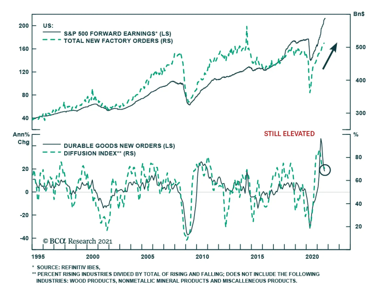
US factory orders surprised to the upside in August. The headline number accelerated from July’s upwardly revised 0.7% m/m to 1.2% m/m – above expectations of 1.0%. One of the key risks BCA Research’s Global Investment strategists are monitoring is the…
Foreword Today we are publishing a charts-only report focused on the S&P 500, and GICS 1 sectors. Many of the charts are self-explanatory; to some, we have added a short commentary. The charts cover macro, valuations, fundamentals, technicals, and the uses of cash. Our goal is to equip you with all the data you need to make investment decisions along these sector dimensions. We also include performance, valuations and earnings growth expectation tables for all styles, sectors, industry groups, and industries (GICS 1, 2 and 3). We hope you will find this publication useful. We alternate between Styles and Sector chart pack updates on a bi-monthly basis. Changes In Positioning Downgrade Growth to an equal weight and upgrade Value to an equal weight. Upgrade Small to an overweight and downgrade Large to an underweight. Downgrade Technology to equal weight by reducing overweight in Software and Services. We remain overweight Semiconductors and Equipment. We are on board with the ongoing market rotation: We were waiting for a decisive shift in rates and a dissipation of the Covid-19 scare as a signal to initiate this repositioning (Chart 1). Chart 1Performance Of S&P 500 Sectors And Styles
US Equity Chart Pack
US Equity Chart Pack
Overarching Investment Themes: Rotation Has Begun! Taper Tantrum 2.0: With tapering imminent and monetary tightening around the corner, both real yields and nominal yields are up sharply over the past couple of weeks (Chart 2A). Chart 2ARates Are Up Sharply
Rates Are Up Sharply
Rates Are Up Sharply
Chart 2BProbability Of Two Rate Hikes In 2022 Has Been Climbing
Probability Of Two Rate Hikes In 2022 Has Been Climbing
Probability Of Two Rate Hikes In 2022 Has Been Climbing
Market expects two rate hikes by the end of 2022: Although Chairman Powell has explicitly separated the decision to taper from the timing of the first rate hike, which he conditioned on full employment and which is “a long way off,” the market is still spooked by the timing and the speed of rate hikes. Currently, the probability of two rate hikes in 2022 stands at around 40%, rising sharply over the past two weeks (Chart 2B). The BCA house view is that the Fed will start hiking in December of 2022. Market rotation is on: Rising yields and a recent decline in Delta variant infections have triggered a fast and furious style and sector rotation. Higher rates put pressure on rate-sensitive sectors and styles, such as Growth, Technology, Communication Services, and Real Estate. While the “taper tantrum” pullback affects the entire US equity market, areas most geared to rising rates, such as Cyclicals, Financials, and Small Caps fare the best (Chart 3). An easing of the Delta scare has led to the “reopening” trade outperforming the ”work-from-home” trade. Chart 3Rotation Away From Rate-sensitive Sectors And Styles
US Equity Chart Pack
US Equity Chart Pack
Macro Economic slowdown is finally priced in: At long last, deteriorating economic data is fully digested by investors. The Citigroup Economic Surprise index is still in negative territory (Chart 4A) but has turned decisively. The markets move on the second derivative and a “less bad” economic surprise is a major positive for the markets. Chart 4ADeterioration Of Economic Data Is Finally Priced In
Deterioration Of Economic Data Is Finally Priced In
Deterioration Of Economic Data Is Finally Priced In
Chart 4BSupply Bottleneck Are Not Easing
Supply Bottleneck Are Not Easing
Supply Bottleneck Are Not Easing
Supply-chain disruptions are not abating: Shipping costs continue their ascent. The average delay of cargo ships traveling between the Far East and North America is 12 days – compare that to 1 day in January 2020.1 The ISM PMI Supplier Performance index increased from 69.5 in August to 73.4 indicating that supply bottlenecks are not easing (Chart 4B). There are also significant backlogs of goods (Chart 5A), and plenty of new orders. It will take time for supply chains to normalize, with most industry participants expecting the situation to improve only in 2022. Chart 5AManufacturers Are Overwhelmed
Manufacturers Are Overwhelmed
Manufacturers Are Overwhelmed
Chart 5BA Whiff Of Stagflation?
A Whiff Of Stagflation?
A Whiff Of Stagflation?
Labor shortages: Companies are still struggling to fill job openings. According to the US Census Survey, “pandemic layoff” or “caring for children” were the top reasons for not working. The number of people not working because of Covid-19 infections or fear of Covid spiked at the end of August.2 This explains the August jobs report. The ugly “S” word: With the ubiquitous shortage of input materials and labor, along with transportation delays, suppliers are simply unable to meet demand for goods, pushing prices higher. Stagflation may be rearing its ugly head: The Dallas Fed manufacturing index is showing a divergence, with prices moving higher while business activity is shifting lower. This is not the case with the ISM PMI index components, but investors need to be vigilant (Chart 5B). Americans are in a worse mood: Consumer confidence survey readings continue on a downward path. The combination of higher prices for everyday goods, the loss of purchasing power, the discontinuation of supplementary unemployment benefits, and paychecks not adjusted for inflation weigh on consumer sentiment. On the positive side, jobs are still plentiful. Valuation And Profitability Despite recent turbulence and rotations across sectors and styles, consensus is still expecting 15% YoY earnings growth over the next 12 months. However, QoQ growth rates look very different as we remove the base effect: Growth is expected to dip this coming quarter (Q3, 2021), and stay modest for most of 2022. This is a low bar that should be easy for companies to clear, although supply disruptions may dent corporate earnings. In the meantime, valuations remain elevated at 20.7 forward earnings (Chart 6). Chart 6Earnings Growth Expectations Are Modest
US Equity Chart Pack
US Equity Chart Pack
Sentiment There are still inflows into US equities, but they are easing. This can be explained by FOMO (fear of missing out), and lots of cash sitting on the sidelines that many retail investors aim to park in US equities. (Chart 7A). However, this is changing as rising rates render the TINA (“there is no alternative”) trade much less attractive. Chart 7AInflows Into US Equities Are Easing
Inflows Into US Equities Are Easing
Inflows Into US Equities Are Easing
Chart 7BCapex Is On The Rise
Capex Is On The Rise
Capex Is On The Rise
Uses Of Cash Capex: Capital goods orders are soaring, pointing to robust capex. The latest S&P estimates suggest that capex will rise 13% this year.3 This points to economic normalization, and attests to corporate confidence in economic growth. It is also a likely byproduct of shortages that plague the US supply chain – companies are expanding their capacity. (Chart 7B). Investment Implications Low for longer is over: The Fed has committed to tapering within the next 2-3 months. Unless this intention is derailed by another Covid scare or a significant deterioration in economic growth, we are now convinced that rates will move up to hit the BCA house view of 1.7%-1.9% by year-end. S&P 500: There is plenty of rotation under the hood; yet we expect US equities to hold their own into the balance of the year as, for now, monetary and fiscal policy remain easy, and earnings growth is likely to surprise on the upside. Severe and prolonged supply disruptions are a key risk to this view, as they chip away from economic growth, and cut into companies sales growth and profitability. Growth vs. Value: With rates rising into year-end, interest-rate sensitive stocks, such as Growth and the Technology sector, are under pressure. Since we opened overweight Growth and underweight Value position on June 14, Growth has outperformed S&P 500 by 4.1%, and Value underperformed by 4.5%. We do not want to overstay our welcome, and are neutralizing both sides of the trade, bringing positioning to an equal weight. Technology has beaten the S&P 500 by 2.2%, and we are shifting to an equal weight positioning by reducing overweight of the Software Industry Group. We remain overweight Semiconductors and Equipment. We are closing our overweight to Growth and underweight to Value allocation. We reduce overweight to Technology. Chart 7C
US Equity Chart Pack
US Equity Chart Pack
Cyclicals vs. Defensives: The onset of the Delta variant is dissipating, and we expect consumer cyclicals to rebound as more people are willing to travel and eat out. We also believe that the parts of the Industrials sector most exposed to restocking of inventories, infrastructure, and construction will perform strongly. Small vs. Large: We are upgrading Small from neutral to an overweight, and downgrade Large to an underweight. Small is highly geared to rising rates. It is also cheaper than Large, and most of the earnings downgrades are already in the price. We are now constructive on this asset class. Irene Tunkel Chief Strategist, US Equity Strategy irene.tunkel@bcaresearch.com S&P 500 Chart 8Macroeconomic Backdrop
Macroeconomic Backdrop
Macroeconomic Backdrop
Chart 9Profitability
Profitability
Profitability
Chart 10Valuations And Technicals
Valuations And Technicals
Valuations And Technicals
Chart 11Uses Of Cash
Uses Of Cash
Uses Of Cash
Communication Services Chart 12Macroeconomic Backdrop
Macroeconomic Backdrop
Macroeconomic Backdrop
Chart 13Profitability
Profitability
Profitability
Chart 14Valuations And Technicals
Valuations And Technicals
Valuations And Technicals
Chart 15Uses Of Cash
Uses Of Cash
Uses Of Cash
Consumer Discretionary Chart 16Macroeconomic Backdrop
Macroeconomic Backdrop
Macroeconomic Backdrop
Chart 17Profitability
Profitability
Profitability
Chart 18Valuations And Technicals
Valuations And Technicals
Valuations And Technicals
Chart 19Uses Of Cash
Uses Of Cash
Uses Of Cash
Consumer Staples Chart 20Macroeconomic Backdrop
Macroeconomic Backdrop
Macroeconomic Backdrop
Chart 21Profitability
Profitability
Profitability
Chart 22Valuations And Technicals
Valuations And Technicals
Valuations And Technicals
Chart 23Uses Of Cash
Uses Of Cash
Uses Of Cash
Energy Chart 24Macroeconomic Backdrop
Macroeconomic Backdrop
Macroeconomic Backdrop
Chart 25Profitability
Profitability
Profitability
Chart 26Valuations And Technicals
Valuations And Technicals
Valuations And Technicals
Chart 27Uses Of Cash
Uses Of Cash
Uses Of Cash
Financials Chart 28Macroeconomic Backdrop
Macroeconomic Backdrop
Macroeconomic Backdrop
Chart 29Profitability
Profitability
Profitability
Chart 30Valuations And Technicals
Valuations And Technicals
Valuations And Technicals
Chart 31Uses Of Cash
Uses Of Cash
Uses Of Cash
Health Care Chart 32Macroeconomic Backdrop
Macroeconomic Backdrop
Macroeconomic Backdrop
Chart 33Profitability
Profitability
Profitability
Chart 34Valuations And Technicals
Valuations And Technicals
Valuations And Technicals
Chart 35Uses Of Cash
Uses Of Cash
Uses Of Cash
Industrials Chart 36Macroeconomic Backdrop
Macroeconomic Backdrop
Macroeconomic Backdrop
Chart 37Profitability
Profitability
Profitability
Chart 38Valuations And Technicals
Valuations And Technicals
Valuations And Technicals
Chart 39Uses Of Cash
Uses Of Cash
Uses Of Cash
Information Technology Chart 40Macroeconomic Backdrop
Macroeconomic Backdrop
Macroeconomic Backdrop
Chart 41Profitability
Profitability
Profitability
Chart 42Valuations And Technicals
Valuations And Technicals
Valuations And Technicals
Chart 43Uses Of Cash
Uses Of Cash
Uses Of Cash
Materials Chart 44Macroeconomic Backdrop
Macroeconomic Backdrop
Macroeconomic Backdrop
Chart 45Profitability
Profitability
Profitability
Chart 46Valuations And Technicals
Valuations And Technicals
Valuations And Technicals
Chart 47Uses Of Cash
Uses Of Cash
Uses Of Cash
Real Estate Chart 48Macroeconomic Backdrop
Macroeconomic Backdrop
Macroeconomic Backdrop
Chart 49Profitability
Profitability
Profitability
Chart 50Valuations And Technicals
Valuations And Technicals
Valuations And Technicals
Chart 51Uses Of Cash
Uses Of Cash
Uses Of Cash
Utilities Chart 52Macroeconomic Backdrop
Macroeconomic Backdrop
Macroeconomic Backdrop
Chart 53Profitability
Profitability
Profitability
Chart 54Valuations And Technicals
Valuations And Technicals
Valuations And Technicals
Chart 55Uses Of Cash
Uses Of Cash
Uses Of Cash
Footnotes 1 Source: eeSea 2 US Census Household Pulse Survey, Employment Table 3. 3 S&P Global Market Intelligence, S&P Global Ratings; Universe is Global Capex 2000 Recommended Allocation
Highlights European small-cap equities have structurally outperformed large-cap stocks. This outperformance echoes the desirable sectoral biases of small-cap stocks. It also reflects the inability of European large-cap stocks to expand their markups, unlike US large caps. The pro-cyclicality of European small-cap stocks and the limited correlation of their relative performance to the Chinese credit cycle make them an attractive play in European portfolios. The current risk-off phase in global markets suggests it is still too early to buy European small-cap stocks, but an opportunity to overweight them will emerge in the coming weeks. Feature Markets last week were volatile and corrected sharply. This fit with the view expressed in our previous strategy report, which argued that the near-term outlook for European equities was still clouded by the confluence of the coming Fed tightening and a Chinese economic slowdown. Chart 1Ebbing COVID Allows For Central Bank Repricing
Ebbing COVID Allows For Central Bank Repricing
Ebbing COVID Allows For Central Bank Repricing
The market seems especially concerned by the deterioration in liquidity conditions. The Delta wave is ebbing around the world (Chart 1) and inflation is proving to be stickier than policymakers had originally anticipated. As a result, investors appear to be pricing in the potential implications of central banks moving from being behind the curve to ahead of the curve. Moreover, surging natural gas prices in Europe, empty gas stations in the UK, labor shortages around the world, and steep automobile production cuts by major players like Toyota and GM raise the specter of stagflation. In this context, bond yields are rising and stocks are agitated. The dollar’s rally further tightens global financial conditions and adds to the systemic stress, which intensifies the very unsettling environment for investors. Consequently, seasonal October weakness remains on the table. Chart 2Tactical Vulnerabilities Remain
Tactical Vulnerabilities Remain
Tactical Vulnerabilities Remain
We continue to see this selling phase as temporary. Sentiment will be consistent with a trough in risk assets soon (Chart 2). Additionally, Chinese authorities will reflate the economy much more aggressively than they have so far, even if it probably takes more market pain first. In this context, we focus on what to buy to take advantage of the eventual rebound in cyclical plays. This week, we look at European small-cap stocks that have handsomely outperformed their larger counterparts over the past ten years. In Europe, Small Is Beautiful Chart 3Small Caps Lead In Europe
Small Caps Lead In Europe
Small Caps Lead In Europe
The underperformance of European stocks relative to the US over the past 13 years is well known by investors. Less known is that, since 2012, European small-cap stocks have performed roughly in line with their US counterparts. In other words, European small-cap stocks have massively outperformed Euro Area equity benchmarks (Chart 3). Two forces explain the ability of European small caps to beat their larger competitors by 85% since the Great Financial Crisis. The sectoral composition of European small-cap indexes helped them outperform their larger competitors. Using MSCI benchmarks, the small-cap index largest overweight are industrials and real estate, compared to financials, healthcare, and consumer staples for large caps (Table 1). Industrials have been one of the best performing sectors in the cyclicals and value categories, while financials have greatly suffered. Meanwhile, real estate equities enjoy falling yields, while financials hate them. This dichotomy explains why European small caps outperformed as European yields collapse (Chart 4). It is also why, unlike in the US, the relative performance of European small-cap equities exhibits little correlation with the slope of the yield curve. Table 1Small Caps Overweighs The Right Sectors
Small Caps Win Big?
Small Caps Win Big?
Chart 4European Small Caps Like Lower Bund Yields
European Small Caps Like Lower Bund Yields
European Small Caps Like Lower Bund Yields
The poor performance of the European large-cap stocks is the second element explaining the outperformance of European small caps. The European large-cap stocks lie at the heart of Europe’s underperformance relative to the US, not the smaller firms. According to researchers De Loecker, Eeckhout, and Unger, US firms have grown their markups massively since the 1980s (Chart 5).1 These expanding markups reflect a growing market power, which is the result of rising market concentration among the dominant players in nearly all the industries.2 In fact, Grullon, Larkin & Michaely show that industries with a greater level of concentration also display higher levels of RoA (Chart 6).3 The problem for European large firms is that they have not experienced the same increase in industry concentration as US businesses. Research by the OECD demonstrates that industry concentration rose significantly more in the US than in Europe over the past 20 years (Chart 7). This is particularly true in the service sector (Chart 7, middle panel) and the less digital-intensive industries (Chart 7, bottom panel).4 Chart 5Higher US Markups
Small Caps Win Big?
Small Caps Win Big?
Chart 6As Concentration Increases, So Do RoAs
Small Caps Win Big?
Small Caps Win Big?
Chart 7Europe Did Not Witness The Same Increase In Concentration
Small Caps Win Big?
Small Caps Win Big?
Without this increase in market power, European large caps could not experience a meaningful pick up in their RoEs relative to those of small-cap stocks. They have therefore been fully victim to their sector composition and massively underperform smaller firms as well as US large businesses. Bottom Line: The structural outperformance of European small caps relative to large-cap stocks reflects the former’s large overweight in industrials and real estate stocks compared to the latter’s overrepresentation of financials, healthcare, and consumer staples names. Additionally, the inability of large-cap European names to increase industrial concentration has prevented them from mimicking the extraordinary growth in markups and RoE witnessed in the US. As a result, European small-cap names could massively beat their larger counterparts. Can The Outperformance Continue? The structural outperformance of small caps will become challenged if Europe experiences a structural increase in yields, which will hurt real estate stocks while helping financials. This sectoral effect will result in a structural outperformance of European stocks. On a cyclical horizon, however, the outlook continues to favor small-cap over large-cap equities in Europe and the Eurozone. Chart 8The Relative Performance Of European Small Caps is Procyclical
Small Caps Win Big?
Small Caps Win Big?
As in the US, the relative performance of European small-cap stocks is pro-cyclical. As Chart 8 shows, small-cap stocks generate the largest excess returns at the beginning of business cycle upswings. They continue to outperform, as long as the business cycle points up. Only once a slowdown begins do small- cap names underperform. Similarly, the relative performance of small-cap equities correlates closely with the Euro Area Manufacturing PMI (Chart 9). It also displays a negative correlation with high-yield spreads (Chart 9, middle panel). Additionally, small-cap stocks track the evolution of inflation swaps (Chart 9, bottom panel). This behavior of small caps means that they remain an attractive bet over the next 18 to 24 months. The European economy is likely to continue to grow robustly over the coming two years and thus stay in the quadrant where small caps outperform. Moreover, the ECB’s policy will generate very accommodative monetary conditions for an extended period. Hence, European high-yield bonds will continue to outperform safe havens and the labor market will tighten further, which will help CPI swap climb up. Despite this procyclicality, the relative performance of small-cap stocks displays only a loose correlation with the European cyclical/defensive split (Chart 10). Moreover, small caps do not correlate closely with commodity prices (Chart 10 middle panel). These two observations reflect the limited relationship between the relative performance of small-cap equities and the Chinese credit impulse (Chart 10, bottom panel). The small caps’ lack of sensitivity to the Chinese economy is the consequence of their lower international bent compared to that of large-cap firms. Chart 9More Signs Of Procyclicality
More Signs Of Procyclicality
More Signs Of Procyclicality
Chart 10Low Correlation To China Plays
Low Correlation To China Plays
Low Correlation To China Plays
This low correlation with Chinese economic variables is likely to prove another asset for small-cap equities. As we have witnessed with the Evergrande saga or the rotating crackdowns from one industry to the next, China will remain a source of uncertainty for the global economy and global capital markets for the foreseeable future. Thus, a low-correlation relative performance is an attractive attribute. Chart 11Not Particularly Cheap
Not Particularly Cheap
Not Particularly Cheap
European small-cap stocks are not without blemish. Unlike in the US, they trade at a premium to large-cap stocks on many valuation metrics. For example, their price-to-forward earnings, price-to-trailing earnings, price-to-cash flow ratios and dividend yields stands at 21 vs 16, 35 vs 35, 18 vs 10 and 1.2% vs 2%, respectively. True, small-cap indexes carry a large proportion of companies with negative earnings. Adjusting for this characteristic, the forward P/E ratio falls to 15.12, which is just under the similarly adjusted forward P/E ratio of the Eurozone benchmark. Our Composite Small Cap Relative Valuation Indicator, which amalgamates this information, is directly in the neutral zone (Chart 11). The neutral relative valuation of small-cap stocks is a handicap because they sport operating metrics that are worse than their larger cousins. Their RoE are a meagre 6.3% vs 7.7%. Moreover, forward earnings have rebounded sharply already and long-term growth expectations are lofty (Chart 12). This leaves the euro as the ultimate arbiter of the path of European small caps. As Chart 13 illustrates, the trade-weighted euro closely tracks the relative performance of the Euro Area small-cap benchmark. This reflects the more domestic nature of small caps, but also, their procyclicality, which mimics that of the euro. Chart 12Some Good News In The Price
Some Good News In The Price
Some Good News In The Price
Chart 13A Play On The Euro
A Play On The Euro
A Play On The Euro
Chart 14A Weaker Yuan Could Lift The Dollar
A Weaker Yuan Could Lift The Dollar
A Weaker Yuan Could Lift The Dollar
The euro continues to face near-term hurdles, which creates a problem for small-cap stocks. The dollar is catching a bid as the Fed moves closer to its tapering and eventual rate hike. Moreover, interest rate differentials between China and the US are narrowing, which will weigh on the yuan (Chart 14). A weaker CNY often causes EM currencies to depreciate and puts downward pressure on the euro. Furthermore, if the global equity correction perdures a few more weeks, the dollar will benefit from additional risk-off flows, which will also hurt the euro. Beyond these near-term risks, BCA’s foreign exchange strategists continue to hold a positive cyclical outlook on the dollar. The greenback’s defining characteristic is its counter-cyclicality. Thus, BCA’s expectation that the period of risks to global growth is temporary also means that the dollar’s rally has a finite life. As we argued last week, Chinese policymakers are unlikely to let the economic deterioration fester for too long, as it would risk uncontrolled deleveraging pressures. Moreover, global capex and inventory trends also point toward a growth re-acceleration in the first half of 2022. In this environment, the euro—which still behaves as the anti-dollar—will be able to regain its footing. Therefore, we will not chase EUR/USD below the 1.15 - 1.12 zone. Chart 15History Rhymes
History Rhymes
History Rhymes
The near-term risks to the euro and small-cap stocks create a buying opportunity for investors with a 12- to 18-month investment horizon. A short period of small-cap underperformance will allow small-cap equities to digest completely the period of outperformance that took place between March 2020 and June 2021 (Chart 15). It will also follow the pattern of the past ten years, wherein periods of outperformance last 18 to 24 months and are followed by a short decline before resuming anew. Bottom line: Small-cap stocks are an attractive vehicle to bet on pro-cyclical assets in Europe. They have benefited from a structural outperformance as a result of their attractive sectoral profile. Moreover, their relative performance strengthens when the global business cycle is in expansion, yet it is a rare cyclical asset with a limited correlation to Chinese credit trends. European small-cap stocks are tightly correlated with the trade-weighted euro. In the near term, this could cause a period of underperformance to develop; however, this is a buying opportunity for investors with a 12- to 18-month investment horizon. Mathieu Savary, Chief European Strategist Mathieu@bcaresearch.com Footnotes 1J. De Loecker, J. Eeckhout, G. Unger, “The Rise Of Market Power And The Macroeconomic Implications,” Mimeo 2018. 2Please see The Bank Credit Analyst Section II "The Productivity Puzzle: Competition Is The Missing Ingredient," dated June 27, 2019, available at bcaresearch.com 3G. Grullon, Y. Larkin and R. Michaely, “Are Us Industries Becoming More Concentrated?,” April 2017. 4Bajgar, M., et al. (2019), “Industry Concentration in Europe and North America,” OECD Productivity Working Papers, No. 18, OECD Publishing, Paris, https://doi.org/10.1787/2ff98246-en. Tactical Recommendations
Small Caps Win Big?
Small Caps Win Big?
Cyclical Recommendations
Small Caps Win Big?
Small Caps Win Big?
Structural Recommendations
Small Caps Win Big?
Small Caps Win Big?
Closed Trades
Small Caps Win Big?
Small Caps Win Big?
Currency Performance Fixed Income Performance Equity Performance
Highlights Economy – The US growth outlook turns on what households will do with their excess savings: Some of our BCA colleagues are concerned that consumption will weaken now that the flow of fiscal transfers has dried up, but we are confident that the stock of pandemic savings will provide ample fuel for consumption and power the economy to grow well above trend through the end of 2022. Markets – The apparent drivers of last week’s stock market stumble will not bring about the end of the bull market: No matter how uncertainty about Fed policy waxes and wanes, a modest backup in yields poses no threat to corporate earnings or the economy. The antics on Capitol Hill are a sideshow that will not have any lasting impact on equities. Strategy – Stay the course: Unless a vaccine-resistant COVID variant emerges or the Fed becomes convinced that it must swiftly impose tight monetary policy settings to stop inflation, the combination of above-trend growth and accommodative monetary policy will allow equities and spread product to generate positive excess returns over Treasuries and cash. Feature Chart 1The COVID Bull Has Been Fast And Smooth
The COVID Bull Has Been Fast And Smooth
The COVID Bull Has Been Fast And Smooth
US investors got a jolt last week when the S&P 500 slid by 2% on Tuesday and failed to spring off of the canvas in subsequent sessions. After the index stumbled Wednesday and Thursday en route to its first 5% peak-to-trough decline since the Phase 3 vaccine trial results were released last November, traders had to be wondering if the buy-the-dip reflex that has kept downdrafts on a tight leash (Chart 1) was no longer in effect. Beneath the remarkably placid surface of a powerful advance that has refused to correct, individual investor sentiment has been slipping (Chart 2, top panel), despite a still solid composite reading (Chart 2, bottom panel). Professional investors are conditioned to view retrenchments in individual investor sentiment with relief, but a reported cooling of the retail temperature was not the principal cause of last week’s action. The potential for a taper tantrum and a renewed standoff over the debt ceiling were the primary catalysts in the accepted explanatory narrative, with stagflation lurking in the background. As we briefly discuss below, the first two ideas do not concern us. Stagflation, on the other hand, is a frightening prospect, no matter how unlikely it is to emerge in the next couple of years. Prompted by discussions in last week’s internal meetings, we revisit the rationale behind our view that a too-cold outcome is very unlikely with a new analytical approach highlighting the unprecedented improvement in households’ financial position. Chart 2Individual Sentiment Has Faded
Individual Sentiment Has Faded
Individual Sentiment Has Faded
Tantrum, Schmantrum The US Investment Strategy team has a total of six children, ranging from below one to eighteen, and it has seen enough fits, fussing and tantrums to know that they all eventually fizzle out. We think any equity distemper over the phasing out of asset purchases will pass without event. The FOMC meeting that purportedly sparked the agita matched the nearly unanimous expectation that the committee would prepare the ground for a November or December start to the taper and a mid-year end to the purchases shouldn’t have come as a surprise, either. The bottom line is that the need for emergency policy measures has passed along with the emergency. It is important to remember that slowing the pace of purchases merely dials down the level of Fed support. Tapering is a far cry from imposing tight monetary policy by setting the fed funds rate above its equilibrium level. Liftoff looks to be just over a year away and the rate-hike dots suggest FOMC participants don’t foresee restraining the economy before 2024. Real rates are currently negative along the entire yield curve (Chart 3), and mild backups that leave the nominal 10-year yield around the 1.75% top end of its range or our bond strategists’ 2-2.25% year-end 2022 projection will not cause a problem for corporate earnings or the economy. Tech stocks may be subject to intermittent pressure as yields reset and bump up the denominator used to discount their projected future earnings, but they do not face acute risk when the economy is in the early stages of a lengthy stretch of above-trend growth. Chart 3Race To The Bottom
Race To The Bottom
Race To The Bottom
Tuning Out The Political Theater Chart 4Fool Me Twice, Shame On Me
Fool Me Twice, Shame On Me
Fool Me Twice, Shame On Me
Another factor contributing to the sense of unease as the week began was Senate Republicans’ obstruction of a bill that would have suspended the debt ceiling until December 2022 while providing the funds to keep the federal government’s lights on for two-plus months. Treasury Secretary Yellen warned of “catastrophic” consequences if Congress failed to lift or suspend the debt ceiling and announced that the Treasury only has enough cash to meet its obligations through October 18th. The parties eventually agreed Thursday morning on a temporary spending package to keep the federal government operating into early December, but the debt ceiling issue remains unresolved. Investors (and citizens) should remember that we have seen this movie many times before. It drove a credit downgrade the first time around, and contributed to a nasty slide in equities, but markets have taken little note of it ever since (Chart 4). Our geopolitical strategists point out that Democrats control both houses of Congress and therefore have the means to avert a default. The Groundhog Day loop is tedious, and may induce some near-term volatility in financial markets, but it is unlikely to lead to any lasting disruption. Producer Price Inflation And Corporate Earnings The surge in consumer prices has captured most of the financial community’s attention but the rise in producer prices has been just as unsettling. The year-over-year change in the producer price index (PPI) has been running well ahead of the year-over-year change in the consumer price index (CPI) and shows no sign of slowing down, stretching to 8.3% in August following 7.7% and 7.1% prints in July and June, respectively. If PPI changes lead CPI changes as late-stage producers and retailers pass on their cost increases, businesses could be forced to raise prices or endure shrinking profit margins. Corporate earnings could begin to stagnate even as inflation runs amok. Along those lines, the difference between PPI and CPI may serve as a proxy for profit margin pressures that could herald declining profits for companies with little to no pricing power. In a low-inflation environment like the one that’s prevailed since the global financial crisis, one might expect the PPI-CPI spread to be inversely correlated with profit margins. The reverse has been true; margins have tended to rise when the spread widens and fall when it contracts (Chart 5). And as margins have gone, so too have earnings (Chart 6). Chart 5Even When Producers' And Wholesalers' Domestic Costs Rise Faster Than Consumer Prices ...
Even When Producers' And Wholesalers' Domestic Costs Rise Faster Than Consumer Prices ...
Even When Producers' And Wholesalers' Domestic Costs Rise Faster Than Consumer Prices ...
Chart 6... Large-Cap Corporate Profits Have Held Up
... Large-Cap Corporate Profits Have Held Up
... Large-Cap Corporate Profits Have Held Up
Our US Equity Strategy colleagues have pointed out that pricing power is a function of the elasticity of demand for a given product and demand elasticity differs across and even within industries. It is therefore very difficult to generalize about PPI’s impacts on margins and earnings. Over the last two decades, however, aggregate corporate profit margins and S&P 500 earnings have defied intuition by moving with the PPI-CPI spread instead of mirroring it. It is possible that multinational companies have employed offshoring and other strategies to escape the drag from relative PPI strength (the PPI only reflects domestic production costs). We will continue to watch the evolution of PPI and CPI, but the recent empirical record suggests that a hotter PPI does not necessarily threaten S&P 500 earnings. Stock, Flow And Consumption Our constructive take on the economy and markets is largely premised on the idea that the massive buildup of household savings will provide fuel for avid consumption in 2021 and 2022. We therefore pay particular attention to arguments that counter our view and we heard two new ones in last week’s daily research meetings. One held that mental accounting limits spending of found money and the other that the end of fiscal flows will trump the stock of accumulated savings and restrain spending. We set the mental accounting objection aside with little ado. Though we are devotees of behavioral economics and especially of past BCA Conference participant Daniel Kahneman, applying the idea that people treat money differently based on its source to the disposition of pandemic-inspired fiscal transfers simply warms over the permanent income hypothesis Milton Friedman advanced in the 1950s. Like Ricardian equivalence, the permanent income hypothesis has theoretical appeal but stubbornly resists empirical proof, not least because money is fungible, and it is difficult to isolate found money from the earned variety, particularly in aggregate data sets. Empirical analysis is further complicated by varying marginal propensities to consume: one household’s superfluous windfall is another’s lifeline. Although the stock-versus-flow debate cannot be definitively answered, the magnitude of the pandemic flows and the resulting stock of accumulated savings was so large that it has provided households with a formidable amount of fuel for consumption. A flow variable is measured over a set period, like the items on a quarterly income statement. A stock variable is measured at a particular point in time, like the items on a balance sheet, which offers a snapshot of those items' status at quarter end. The economic impact payments sent to over 70% of households arrived in three flows (April/May 2020, January 2021 and April 2021) and the households eligible for unemployment insurance benefits received them in weekly flows until they went back to work or the term ran out. While the payments were flowing, household disposable income soared way above its trend growth during the 2009 to 2020 expansion (Chart 7). If flows are all that matter, the impact of the fiscal stimulus is finished now that they have returned to trend. Similarly, now that consumption has returned to the vicinity of its trendline (Chart 8), the consumption gap has been closed. But closing the book now on the fiscal transfers neglects the impact of the massive stock of savings that silted up as households were unable to spend their extra income as they pleased while much of the economy was shut down. Chart 7Income Growth Flattens Out During Recessions, ...
Income Growth Flattens Out During Recessions, ...
Income Growth Flattens Out During Recessions, ...
Chart 8... As Does Consumption
... As Does Consumption
... As Does Consumption
The accumulation of savings was significant (Chart 9), and we and our Global Investment Strategy colleagues have separately estimated that households saved $2.2 or $2.3 trillion more than they would have if the pandemic hadn’t occurred. That aggregate hoard, equivalent to 11% of the nation’s annual output, opens the door to the possibility that post-recession consumption patterns will be different this time. In the 1990-91 and 2001 recessions, the drop-offs from the expansion trends in income and consumption netted out, leaving households with no aggregate excess savings to deploy in the ensuing expansion (Table 1). Consumption declined much more from its baseline pace than income during the Great Recession, and households emerged from it with excess savings equal to 2.8% of a year’s GDP. Chastened by the GFC and confronted with a stingier credit environment, however, they turned to the task of shoring up their financial position after four decades of watering down the savings rate while merrily ramping up debt. Chart 9It Took A Crisis To Scare Americans Into Saving
It Took A Crisis To Scare Americans Into Saving
It Took A Crisis To Scare Americans Into Saving
Table 1This Cycle Is Unique
Stock Versus Flow
Stock Versus Flow
The picture is very different now – households have amassed excess savings four times as large as they did after the Great Recession, banks are champing at the bit to lend and fixed income investors are desperate for a fresh supply of securities offering any spread over Treasuries – and we expect the consumption response will be as well. Ultimately, our expectation is merely an assertion, just like our colleagues’ contrary assertion that the savings have largely been spent. Our baseline scenario that somewhere around half of the excess savings will ultimately be consumed requires less of a stretch than the notion that postwar Americans will embrace parsimony like those with first-hand experience of the Depression. We submit that the burden of proof remains squarely on those who assert the latter, so much so that we offered our interlocutor three-to-one odds on a beer wager to settle the debate. Doug Peta, CFA Chief US Investment Strategist dougp@bcaresearch.com