United States

Earnings season is upon us again. Time just flies! This quarter, according to Refinitiv, Net Income is expected to increase by 64.9% YoY on Revenue growth of 18.5%. EPS growth is expected to be 68.1% - it is higher than income growth by 3.2% thanks to the projected share repurchases. BCA Model expects a 3.6% buyback yield. These numbers are truly spectacular, and yet a little suspicious. So what do we make of them? Similar to the inflation story, Q2-21 earnings season growth numbers look so high because they are dominated by the base effect: growth is computed against the worst quarter of the pandemic, Q2-20. To strip out the base effect, we calculated quarterly earnings growth with respect to Q2 of 2019 for the S&P 500 as well as its GICS1 sectors. Looking at the cleaner numbers reveals that SPX quarterly EPS growth sits at a respectable 12.2%. This number appears manageable, in sharp contrast to eyewatering growth calculated based on Q2-20 comparables. Bottom Line: The implication is that once we take out the once in a lifetime pandemic effect, we observe that earnings growth is normalizing, and expectations are rather reasonable.
Earnings Season Is On
Earnings Season Is On
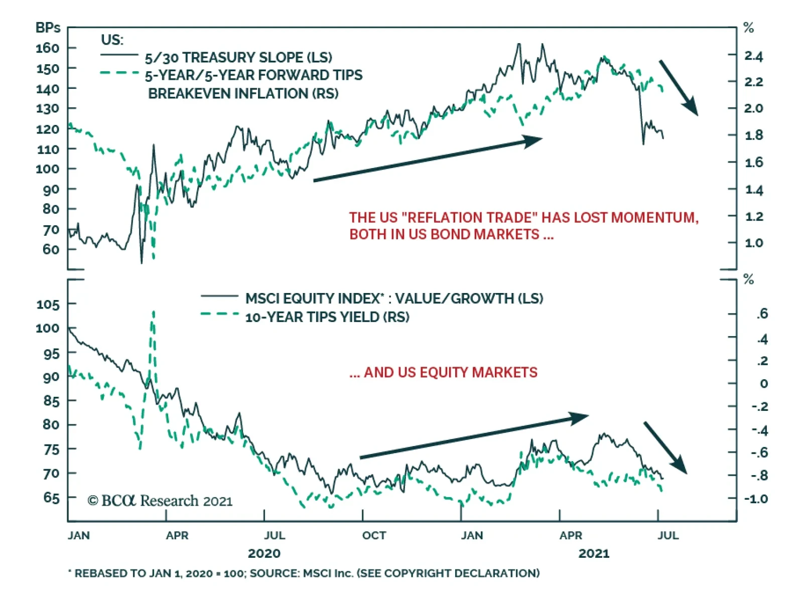
Highlights Duration: The recent decline in Treasury yields is overdone. Economic growth is no longer accelerating, but it hasn’t slowed enough to justify the strength in bonds. Stronger employment data will pressure bond yields higher this fall, once labor supply constraints ebb. Ultimately, we expect the 10-year Treasury yield to reach a range of 2% to 2.25% by the end of 2022 when the Fed is ready to lift rates. Maintain below-benchmark portfolio duration. Employment: The static unemployment rate and sub-50 readings from ISM employment indexes will prove to be short-lived phenomena driven by labor supply constraints. These constraints will vanish in the fall when schools re-open and expanded unemployment benefits lapse. Yield Curve: Remain positioned in yield curve flatteners. We specifically like shorting the 5-year bullet versus a duration-matched 2/10 barbell. We expect that the next significant move in Treasury yields will be a bear-flattening of the curve prompted by strong employment data this fall. Feature Last week was another dramatic one in the bond market. Bond yields fell sharply as doubts emerged about the pace of economic recovery and the economy’s progress back to full employment. The 10-year Treasury yield started the week at 1.44% before hitting an intra-day low of 1.25% on Thursday. It then rebounded somewhat to end the week at 1.36%. One catalyst for the move was Tuesday morning’s ISM Non-Manufacturing report that printed at 60.1, below consensus expectations of 63.5. But in truth, economic momentum had already been slowing for several months before that release. The 10-year Treasury yield peaked at 1.74% on March 31st, right around the same time that the New York Fed’s Weekly Economic Index and both the ISM Manufacturing and Non-Manufacturing indexes leveled-off (Chart 1). Last week simply saw the “slowing growth” narrative pick up steam. One noteworthy feature of last week’s market action is that the Treasury curve flattened as yields fell. While the 10-year yield is now at its lowest since February, the 2-year yield remains higher than it was just prior to the June FOMC meeting (Chart 2). This suggests that part of the drop in long-maturity bond yields is due to a fear that the Fed will over-tighten in the face of slowing growth. This fear likely stems from the Fed’s apparent hawkish pivot at the June FOMC meeting.1 Chart 1"Peak Growth" Hits The Bond Market
"Peak Growth" Hits The Bond Market
"Peak Growth" Hits The Bond Market
Chart 2A Flatter Curve Since March
A Flatter Curve Since March
A Flatter Curve Since March
It’s also worth mentioning that the bulk of last week’s drop in yields was concentrated in long-maturity real yields (Chart 2, bottom 2 panels). TIPS breakeven inflation rates have fallen somewhat since the end of March. But, at 2.3% and 2.23% respectively, the 10-year and 30-year TIPS breakeven inflation rates are not that far below the Fed’s 2.3% - 2.5% target range. Chart 3Bond Rally Not Confirmed By Commodities
Bond Rally Not Confirmed By Commodities
Bond Rally Not Confirmed By Commodities
Finally, many have suggested that “technical factors” are responsible for last week’s bond market strength. That is, factors related to the supply and demand for bonds but unrelated to economic fundamentals conspired to push yields lower. This is a difficult thesis to prove or disprove, but we will point out that the 10-year Treasury yield has diverged significantly from the CRB Raw Industrials / Gold ratio (Chart 3). The 10-year yield and the CRB/Gold ratio tend to track each other very closely but, in contrast to yields, the CRB/Gold ratio has actually increased since March 31st. This lends some credence to the argument that last week’s drop in yields is not purely a reflection of economic weakness, and it could be an overreaction to weaker-than-expected data that was exacerbated by extreme short positioning in the market (Chart 3, bottom panel). Three Reasons Why The Decline In Treasury Yields Is Overdone We do in fact think that the recent decline in Treasury yields is overdone, and we continue to see the 10-year Treasury yield reaching a range of 2% - 2.25% by the end of next year when the Fed is ready to lift rates. We present three reasons why the recent drop in Treasury yields is overdone. First, the bond market is making too much of the “slowing growth” narrative. Yes, it’s certainly true that the economic indicators shown in Chart 1 are no longer accelerating, but in level terms they remain consistent with a robust economic recovery where GDP growth is well above trend. This sort of growth environment is consistent with a falling unemployment rate that will eventually bring Fed rate hikes into play. Bond yields will move higher as this tightening cycle approaches. Second, it is not just the pace of economic growth that matters for bond yields. The output gap matters as well.2 That is, the same rate of economic growth will coincide with higher bond yields when the unemployment rate is 5% than it will when the unemployment rate is 10%. With that in mind, we observe that the output gap has closed significantly during the past year. The prime-age employment-to-population ratio is 77%, up from a 2020 low of 70%. Similarly, capacity utilization is 75%, up from a 2020 low of 64% (Chart 4). Unless we expect economic growth to slow enough for progress on these two fronts to reverse, then we should see significantly higher bond yields this year compared to last year. This makes it difficult to see how Treasury yields can fall much further from current levels. Another way to conceptualize the relationship between the output gap and long-maturity bond yields is to look at how long-dated yields move relative to short-dated yields. Since the Fed moves the funds rate in response to changes in the output gap, we can model the 10-year Treasury yield relative to the fed funds rate and expectations for near-term changes in the fed funds rate to get a sense of how well the output gap explains changes in long-maturity bond yields. Chart 5 presents a simple model of the 10-year Treasury yield relative to the fed funds rate and the 24-month fed funds discounter. It shows that last week’s decline in the 10-year yield caused it to diverge significantly from the model’s fair value. Chart 4The Output Gap Matters
The Output Gap Matters
The Output Gap Matters
Chart 5Long-Maturity Yields Are Too Low
Long-Maturity Yields Are Too Low
Long-Maturity Yields Are Too Low
Third, the Fed’s pledge to keep rates at the zero-lower-bound at least until the labor market reaches “maximum employment” means that the labor market outlook is critical for bond yields. Our view is that the labor market is on the cusp of a rapid recovery that will cause the Fed to lift rates before the end of 2022. However, recent labor market data have been mixed and there is considerable uncertainty in the market about the future pace of employment gains. The next section delves deeper into the outlook for the labor market. Making Sense Of The Employment Data Chart 6ISM Employment Below 50 ...
ISM Employment Below 50 ...
ISM Employment Below 50 ...
Overall, it seems safe to say that the labor market data have been disappointing in recent months. Yes, nonfarm payroll growth has averaged a robust +543k this year, but the minutes of the June FOMC meeting revealed that “some participants” viewed employment gains as “weaker than they had expected”. The recent dips in the employment components of both the ISM Manufacturing and Non-Manufacturing indexes to below the 50 boom/bust line only add to the sense of pessimism about the labor market. Historically, sub-50 readings from the ISM employment indices (particularly from the non-manufacturing ISM) have coincided with slowing employment growth (Chart 6). This time, however, we don’t see the ISM employment indexes staying below 50 for very long. The more demand-focused components of the ISM indexes – production, new orders and backlog of orders – remain elevated (Chart 7). This tells us that demand is strong and that hiring is only weak because of labor supply constraints, a topic we have covered repeatedly in this publication.3 Our view is that by September, once schools re-open and expanded unemployment benefits lapse, we will see a surge in hiring and a jump in the ISM employment components as people are enticed back into the workforce. A clearer picture of the labor market will then emerge, and it will catalyze a jump in bond yields. It’s not just weak ISM employment readings that are giving investors doubts about the labor market. The unemployment rate’s decline has also slowed markedly in recent months (Chart 8). Our adjusted measure of the U3 unemployment rate currently sits at 6.1%, above the headline U3 measure of 5.9% and significantly above the range of 3.5% to 4.5% that the Fed estimates is consistent with full employment. Chart 7... But Demand Indicators Are Elevated
... But Demand Indicators Are Elevated
... But Demand Indicators Are Elevated
Chart 8Slow Progress On Unemployment
Slow Progress On Unemployment
Slow Progress On Unemployment
Chart 9Labor Supply Is The Problem
Labor Supply Is The Problem
Labor Supply Is The Problem
We adjust the U3 unemployment rate to include a number of people that are currently being classified as “employed but absent from work” when they should be classified as “temporarily unemployed”. The number of people describing themselves as “employed but absent from work” jumped sharply in March 2020 and has remained elevated. This is the result of workers that were placed on temporary furlough during the pandemic and who should be counted as unemployed. We make our adjustment by taking the difference between the number of people that are “employed but absent from work for other reasons” each month and a baseline calculated as that month’s average between 2015 and 2019. We then add this excess amount to the number of temporarily unemployed. This gives us adjusted readings for both the U3 unemployment rate and the temporary unemployment rate (Chart 8, top 2 panels). The Appendix of this report updates our scenarios for the average monthly nonfarm payroll growth required to reach “maximum employment” to consider both this new adjustment and June’s employment figures. Technical adjustments aside, the main takeaway for investors is that progress toward “maximum employment” has been relatively slow during the past few months. This is particularly true if we look at the unemployment rate excluding those on temporary furlough (Chart 8, panel 3) and the labor force participation rate (Chart 8, bottom panel). This slow progress toward “maximum employment” is undoubtedly a reason why bond yields remain low. But, once again, we think it’s only a matter of time before labor supply constraints ease and the unemployment rate falls rapidly, catching up to indicators of labor demand that have already surpassed pre-COVID levels (Chart 9). Bottom Line: The recent decline in Treasury yields is overdone. Economic growth is no longer accelerating, but it hasn’t slowed enough to justify the strength in bonds. The labor market also continues to make progress toward maximum employment (and Fed rate hikes) though that progress has slowed during the past few months. We anticipate that stronger employment data will pressure bond yields higher this fall, once labor supply constraints ebb. Ultimately, the economy will reach full employment in time for the Fed to lift rates in 2022. We expect that the 10-year Treasury yield will be in a range of 2% to 2.25% by then. Maintain below-benchmark portfolio duration. A Quick Note On The Yield Curve Chart 105y5y Still Close To Fair Value
5y5y Still Close To Fair Value
5y5y Still Close To Fair Value
While we view the recent drop in the level of bond yields as an overreaction, we are less inclined to view recent curve flattening as temporary. To see why, let’s look at the 5-year/5-year forward Treasury yield relative to survey estimates of the long-run neutral fed funds rate. We like to think of the 5-year/5-year forward Treasury yield as a market proxy for the long-run neutral fed funds rate, so a range of estimates of that rate is a logical fair value target. The 5-year/5-year forward Treasury yield has fallen a lot during the past few weeks. But, at 2%, it is still within the range of neutral rate estimates from the New York Fed’s Survey of Market Participants and only just outside of the same range from the Survey of Primary Dealers (Chart 10). The fact that the 5-year/5-year yield remains relatively close to its fair value range tells us that there is very limited scope for curve steepening. Recent periods of significant curve steepening have tended to coincide with one of the following two developments: The Fed is cutting rates (coincides with a bull-steepening) The 5-year/5-year forward Treasury yield moves into its fair value range after starting out well below it (coincides with a bear-steepening) This second sort of curve steepening occurred during the 2013 taper tantrum, after the 2016 presidential election and again after the 2020 presidential election. It’s conceivable that the yield curve could re-steepen somewhat during the next few months, if the 5-year/5-year forward yield moves back to its prior highs. But we expect the next major move in the Treasury market to be a bear-flattening as the rest of the yield curve catches up to the 5-year/5-year. This is the sort of curve flattening that occurred in 2017 and 2018 when the Fed was lifting rates (Chart 10, bottom 2 panels). A bear-flattening of the yield curve is also the most likely outcome if we start to see significant positive employment surprises later this year, as we anticipate. These employment surprises would bring forward the timing and pace of rate hikes but wouldn’t necessarily cause investors to question their views about the long-run neutral fed funds rate. Bottom Line: Remain positioned in yield curve flatteners. We specifically like shorting the 5-year bullet versus a duration-matched 2/10 barbell. We expect that the next significant move in Treasury yields will be a bear-flattening of the curve prompted by strong employment data this fall. Appendix: How Far From “Maximum Employment” And Fed Liftoff? Chart A1Defining “Maximum Employment”
Defining "Maximum Employment"
Defining "Maximum Employment"
The Federal Reserve has promised that the funds rate will stay pinned at zero until the labor market returns to “maximum employment”. The Fed has not provided explicit guidance on the definition of “maximum employment”, but we deduce that “maximum employment” means that the Fed wants to see the U3 unemployment rate within a range consistent with its estimates of the natural rate of unemployment, currently 3.5% to 4.5%, and that it wants to see a more or less complete recovery of the labor force participation rate back to February 2020 levels (Chart A1). Alternatively, we can infer definitions of “maximum employment” from the New York Fed’s Surveys of Primary Dealers and Market Participants. These surveys ask respondents what they think the unemployment and labor force participation rates will be at the time of Fed liftoff. Currently, the median respondent from the Survey of Market Participants expects an unemployment rate of 3.5% and a participation rate of 63%. The median respondent from the Survey of Primary Dealers expects an unemployment rate of 3.7% and a participation rate of 63%. Tables A1-A4 present the average monthly nonfarm payroll growth required to reach different combinations of unemployment rate and participation rate by specific future dates. For example, if we use the definition of “maximum employment” from the Survey of Market Participants, then we need to see average monthly nonfarm payroll growth of +484k in order to hit “maximum employment” by the end of 2022. Table A1Average Monthly Nonfarm Payroll Growth Required For The Unemployment To Reach 4.5% By The Given Date
Overreaction
Overreaction
Table A2Average Monthly Nonfarm Payroll Growth Required For The Unemployment To Reach 4% By The Given Date
Overreaction
Overreaction
Table A3Average Monthly Nonfarm Payroll Growth Required For The Unemployment To Reach 3.5% By The Given Date
Overreaction
Overreaction
Table A4Average Monthly Nonfarm Payroll Growth Required To Reach “Maximum Employment” As Defined By Survey Respondents
Overreaction
Overreaction
Chart A2 presents recent monthly nonfarm payroll growth along with target levels based on the Survey of Market Participants’ definition of “maximum employment”. This chart helps us track progress toward specific liftoff dates. For example, if monthly nonfarm payroll growth continues to print at the same level as last month, then we could anticipate a Fed rate hike by June 2022. We will continue to track these charts and tables in the coming months, and will publish updates after the release of each monthly employment report. Chart A2Tracking Toward Fed Liftoff
Tracking Toward Fed Liftoff
Tracking Toward Fed Liftoff
Ryan Swift US Bond Strategist rswift@bcaresearch.com Footnotes 1 Please see US Bond Strategy / Global Fixed Income Strategy Weekly Report, “How To Re-Shape The Yield Curve Without Really Trying”, dated June 22, 2021. 2 For a description of the five macro factors that determine bond yields please see US Bond Strategy Weekly Report, “Bond Kitchen”, dated April 9, 2019. 3 Please see US Bond Strategy Weekly Report, “Making Money In Municipal Bonds”, dated April 27, 2021. Fixed Income Sector Performance Recommended Portfolio Specification
US President Joe Biden tapped a new “channel” of direct communications with Russian President Vladimir Putin on July 9 to protest another cyber-attack thought to have originated by criminals operating on Russian soil. A Russian group of hackers known as REvil…

Over a 12-month horizon, investors should maintain a modest overweight allocation to equities. Although pandemic-related uncertainties linger – particularly regarding the emergence and impact of variants – global growth will remain strong. And even though…
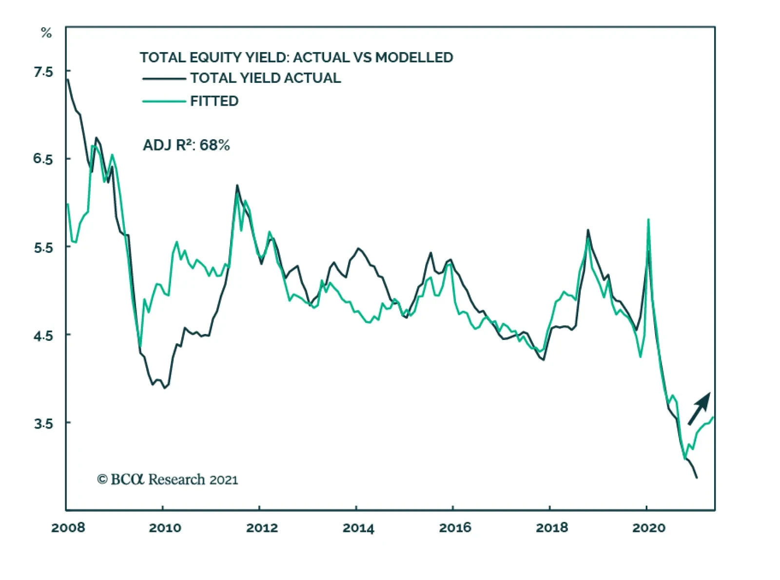
According to BCA Research’s US Equity Strategy service, we are at the outset of the new dividend and buyback cycle. Both market and company-related factors underpin dividend and buyback trends. The quality of a company’s profitability, cash flow, and…
Highlights Home prices have risen at a rapid rate over the last year, stirring some fears that a new bust could be in store: The housing market is strong, but price appreciation has not been that significant relative to history and popular concerns appear to be misplaced. Banks and households are on much sounder financial footing than they were before the housing bust: Banks’ exposure to residential mortgages has shrunk and stiffer regulatory requirements have made them more resilient to shocks. Households have been de-levering since the crisis and have accumulated massive excess savings since the pandemic began. The housing market is not oversupplied in the aggregate and does not appear as if it will become oversupplied soon: High prices are a reliable cure for high prices, but the housing supply response has been muted and looks as if it will remain so for the immediate future. The Global Financial Crisis had its roots in debauched underwriting standards that bear no resemblance to today’s mortgage lending environment: Before it spread around the world, the GFC was known as the subprime crisis, but subprime borrowers are almost entirely shut out of today’s residential mortgage market. Feature The state of the housing market was a central concern for investors in the wake of the global financial crisis. That incident was initially known as the subprime crisis, as a new class of loans – subprime mortgages – set a self-reinforcing debt-deflation dynamic into motion. When the music stopped, dedicated mortgage originators and securitizers were out of business, a sizable share of borrowers faced foreclosure and a lot of homes, from freshly built subdivisions to tattered urban blocks, stood empty. Many of the people who were a part of the pipeline – making loans, appraising properties, wholesaling loans, packaging loans into securities, trading securities, and building and selling houses – were thrown out of work. As if the consequences in the real economy weren’t bad enough, the convulsions in the financial markets imperiled the banking system. Record mortgage default rates and plunging collateral values left commercial banks gasping, and highly leveraged investment banks holding unsold securities, as-yet-unpackaged whole loans or other property investments found their capital levels whittled nearly to zero. A high-profile insurer was undone by guaranteeing against the securities’ defaults, but several life insurers were squeezed by the losses they sustained on highly rated securities that turned out to harbor a lot of poorly underwritten loans. The net result of the financial distress was a paucity of investment capital to help the real economy get back on its feet. Elected officials, central bankers, regulators and investors are all understandably wary of a repeat of the crisis and its wide-ranging effects. In his press conference after the FOMC’s April meeting, Chair Powell acknowledged the risks before going on to say that they don’t appear particularly strong right now. “So many of the financial crack-ups … that have happened in the last 30 years have been around housing. We … really don’t see that [financial stability concerns] here. We don’t see bad loans and unsustainable prices and that kind of thing.” This Special Report examines why we concur with the Fed’s view. Investors May Be Jittery, But The Banks Are Steady Chart 1Once Bitten, Twice Shy
Once Bitten, Twice Shy
Once Bitten, Twice Shy
This evening in the States we will get on the phone with an Asia-Pacific client who wants to discuss the following topic: “One of the issues that we are currently exploring is the US housing market. It is exceptionally strong and may create an important medium-term risk for the US and global markets.” Internet users closer to home have also taken note of the housing market’s strength and have their own concerns about it. Google searches for “housing crash” by US users are making new highs, dwarfing the interest the phrase drew ahead of the GFC (Chart 1). While potential homebuyers are understandably wary of getting in at the top, and households who already have mortgages are averse to price declines that would erode the value of their equity, it is the overall financial system’s exposure to US home prices that draws global investors’ attention. Such an overwhelming majority of households borrow to buy their home that single-family homes have traditionally comprised the largest component of banking system collateral (Chart 2). Although US banks have less exposure to residential mortgages than their peers in other major developed economies (Table 1), the housing market poses an outsize risk to financial stability by virtue of the amount of debt financing it. Chart 2Moving Beyond Mortgages
Moving Beyond Mortgages
Moving Beyond Mortgages
Table 1Don't Look At Us
The US Housing Market: Déjà Vu All Over Again?
The US Housing Market: Déjà Vu All Over Again?
Since the GFC, however, the largest banks have sharply reduced their exposure to lending (Chart 3, top panel). They have a disproportionate influence on the state of the overall banking system and their offloading of qualifying loans to Fannie Mae and Freddie Mac have helped the system pare residential real estate loans’ share of total assets to 10%, or half of their pre-GFC weight (Chart 3, bottom panel). The wave of post-GFC regulation has forced systemically important banks to hold more capital against their assets, making them more resilient to shocks and the ordinary vagaries of asset markets and the business cycle. Loans account for less than half of all bank assets, with nearly all the rest going to Treasury and agency securities, cash, property and goodwill and fully collateralized short-term loans (Chart 4). Chart 3Big Banks Have Become Much More Judicious Lenders
Big Banks Have Become Much More Judicious Lenders
Big Banks Have Become Much More Judicious Lenders
Chart 4Risk Off
Risk Off
Risk Off
Bottom Line: The banking system is better capitalized than it was in 2007 and has considerably less exposure to residential real estate loans. The financial system is much less vulnerable to a rupture in the housing market than it was 15 years ago. Better Borrowers, Better Loans Household balance sheets are not a source of vulnerability, either, as they are in far better shape than they were before the GFC. Employment gains, increased savings, lender write-offs and lower debt-service costs helped shore up household finances after the crisis, and the pandemic yielded explosive wealth gains via whopping fiscal transfers, reduced spending options and surging stock and home prices. No previous four-quarter stretch has been better for household net worth gains, nominal (Chart 5, top panel) or real (Chart 5, bottom panel), than the one ended March 31st, and even the five-quarter stretch including last year’s disastrous first quarter was quite strong relative to history, especially in real terms. Households have paid down their outstanding credit card balances, and with interest rates at rock-bottom levels, servicing the debt they have has never been easier (Chart 6). Chart 5The Pandemic Has Been Great For Household Net Worth
The Pandemic Has Been Great For Household Net Worth
The Pandemic Has Been Great For Household Net Worth
Chart 6A Light Yoke
A Light Yoke
A Light Yoke
Chart 7Only Qualified Borrowers Need Apply
The US Housing Market: Déjà Vu All Over Again?
The US Housing Market: Déjà Vu All Over Again?
The improvement in aggregate household financial positions would be of little import if lenders repeated their pre-GFC practices of lending to the weakest candidates in the pool of potential borrowers. Fortunately for financial stability and the health of the housing market, the highest-quality borrowers have been capturing an increasing share of new mortgage loans. In a reversal of the underwriting follies of a decade-and-a-half ago, lenders are shunning subprime and near-prime borrowers in favor of the best credits (Chart 7). The current housing boom has been built on a solid credit foundation. Supplies Are Tight As measured by the Case-Shiller 20-City Index, home prices are appreciating at a double-digit clip on a year-over-year basis. The rapid appreciation has helped fuel fears of a housing bubble, but it pales beside the 46-month stretch of double-digit percentage gains from August 2002 through May 2006 (Chart 8). Our Bank Credit Analyst and Global Fixed Income Strategy colleagues have made the case that the current burst of home price appreciation across the developed world has largely derived from generous fiscal transfers and extremely accommodative monetary policy.1 That implies that home prices will not be able to maintain their current pace once the policy support fades, but it does not necessarily foreshadow a looming crash. In our view, policy has contributed to a sugar rush that has briefly quickened price gains, a much less destabilizing condition than the multi-year course of steroid injections provided by the willful abandonment of prudent lending standards that triggered the GFC. Chart 8Nothing Like The Last Boom Yet
Nothing Like The Last Boom Yet
Nothing Like The Last Boom Yet
Despite the run-up in prices, homes remain much more affordable today than they were at the peak of the pre-GFC boom (Chart 9, top panel), thanks to mortgage rates that are about half their 2004-7 level (Chart 9, middle panel). Homebuilders have maintained their discipline this time around, holding new home construction at or below the rate of household formation (Chart 10, top panel) and there is none of the overtrading associated with bubbles, like the flipping at the top of the last cycle. As a share of the total housing stock, inventories of new and existing homes for sale are more than two standard deviations below their four-decade mean (Chart 10, middle panel) and the share of vacant homes, at 0.9%, is sitting at its 65-year series low (Chart 10, bottom panel). Unusually high prices will eventually inspire new sources of supply and push price gains down to levels consistent with their long-run mean; in the meantime, low mortgage rates will likely summon enough demand to prevent the disruption that Google searchers and cranky Austrians fear. Chart 9Affordability Is Still Quite High ...
Affordability Is Still Quite High ...
Affordability Is Still Quite High ...
Chart 10... Even Though Supply Is Tight
... Even Though Supply Is Tight
... Even Though Supply Is Tight
Haven’t We Left Something Out? Now wait a minute; you’re trying to have it both ways. You’ve been citing rising wealth for a while, suggesting that it will help foster a virtuous growth cycle that will last through next year, six or seven quarters after the final stimulus checks were cut. Home prices have been a part of that wealth surge but you’re ignoring what will happen once they stop defying gravity. We have been tracking aggregate household income, spending and savings for over a year and the growing pile of savings has been a key pillar of our argument that the economy will grow way above trend. Our running estimate of excess pandemic savings is now up to $2.4 trillion through May. That’s quite a lot even in a $21 trillion economy, and if it were all spent over a two-year period, GDP would grow by 10% more than it otherwise would. There is no close precedent for the income windfall that up to three-fourths of households have received since the pandemic began, so we cannot turn to regression models for an estimate of the savings’ near-term impact. However, it's important to recognize the money was directed at households below the top rungs of the income scale with a higher marginal propensity to consume, especially the federal unemployment insurance benefit supplements, which wound up going largely to the lowest-paid workers who bore the brunt of pandemic layoffs. Our working assumption is that around half of the savings will be spent across 2021 and 2022, which would push output over the period higher by more than 5%. We don’t care about GDP growth per se, but it does impact the outlook for corporate earnings, household income and credit performance. We have viewed the savings developments as making an important contribution to the positive macro backdrop for investments in equities and credit and expect they will continue to do so well into next year. Although we expect the returns on risk assets to slow, we anticipate that they will continue to exceed returns from Treasuries and cash and therefore maintain our overweight recommendations on equities and spread product. The household net worth gains from financial asset and home price appreciation haven’t factored much into our view. Though their advances have far outpaced the increase in savings, mainstream economic models consider their effects on consumption to be modest. Most of the gains are captured by wealthier households, who are more apt to save wealth increases than spend them, and our rule of thumb is that five cents and three cents of every dollar of stock and home price gains are spent, respectively. By that measure, the $7.4 and $3.2 trillion advances in the value of directly held stocks and home equity are less impactful than the savings gains and do not figure meaningfully into our view. We disagree with the widespread assumption that the increase in home prices is particularly notable. Per the Fed’s quarterly report on US financial accounts, the first quarter’s year-over-year increase in the value of real estate owned by households was 10.3%, a little more than half a standard deviation above the 275-quarter mean (Chart 11). It’s a nice gain, especially against a backdrop of low inflation, but it’s hardly a game changer. We agree that what goes up must come down, but in this case, reverting to the mean would only involve a three-percentage-point decline. Chart 11Housing Wealth Is Rising, But Not At An Outsized Rate
Housing Wealth Is Rising, But Not At An Outsized Rate
Housing Wealth Is Rising, But Not At An Outsized Rate
It should also be noted that outright national declines in nominal home values are rare – the only incidence in the postwar era occurred amidst the subprime crisis/GFC. It appears that the trauma of that event has global investors and Google-searching US citizens overestimating the probability that it might occur again. We have exhumed the term “subprime crisis” because that housing bust was caused by a near-total abandonment of established lending standards by virtually everyone involved in mortgage origination and securitization, including the agencies that rated the securities, the middlemen who warehoused them, the end-investors who bought them and the insurer who blithely wrote credit protection on them. Nothing even remotely similar from a credit perspective is going on today. Chart 12 shows the aggregate loan-to-value (LTV) on residential mortgages since 1971, when the first baby boomers began to turn 25, derived from the Fed’s financial accounts data. Aggregate household LTV is back to the 33% level it hugged throughout the seventies and eighties. It exploded higher from 2006 to 2009 as new mortgage debt galloped ahead of stagnating home values during the lending crescendo of 2006 and 2007 and then continued on in 2008 and 2009 as mortgage balances fell more slowly than home values (Chart 13). Chart 12High LTVs Amplify Shocks, Low LTVs Absorb Them
High LTVs Amplify Shocks, Low LTVs Absorb Them
High LTVs Amplify Shocks, Low LTVs Absorb Them
Chart 13Six Years That Crippled The Housing Market
The US Housing Market: Déjà Vu All Over Again?
The US Housing Market: Déjà Vu All Over Again?
Appalling underwriting provided the kindling for the crisis and the unprecedented plunge in US home prices that was a feature of it. A similar plunge will not recur this cycle when there are almost no borrowers with little to no skin in the game who would walk away from their nonrecourse loans at the first sign of trouble. Psychology also matters; given our deep-seated aversion to recognizing losses, homeowners who do not have to sell often hold on until prices climb back above their basis. Home values will surely encounter some headwinds once mortgage rates rise from rock-bottom levels, but an outright decline remains unlikely when increases in longer-dated Treasury yields will almost certainly be accompanied by an increase in inflation and/or real growth expectations, both of which would be associated with higher home prices. We hold our conclusion with high conviction: the US housing market does not look vulnerable and it is not likely to be a source of distress for the financial system here or abroad. Doug Peta, CFA Chief US Investment Strategist dougp@bcaresearch.com Footnotes 1 Please see the May 28, 2021 Global Fixed Income Strategy/Bank Credit Analyst Special Report, “Global House Prices: A New Threat For Policymakers.”
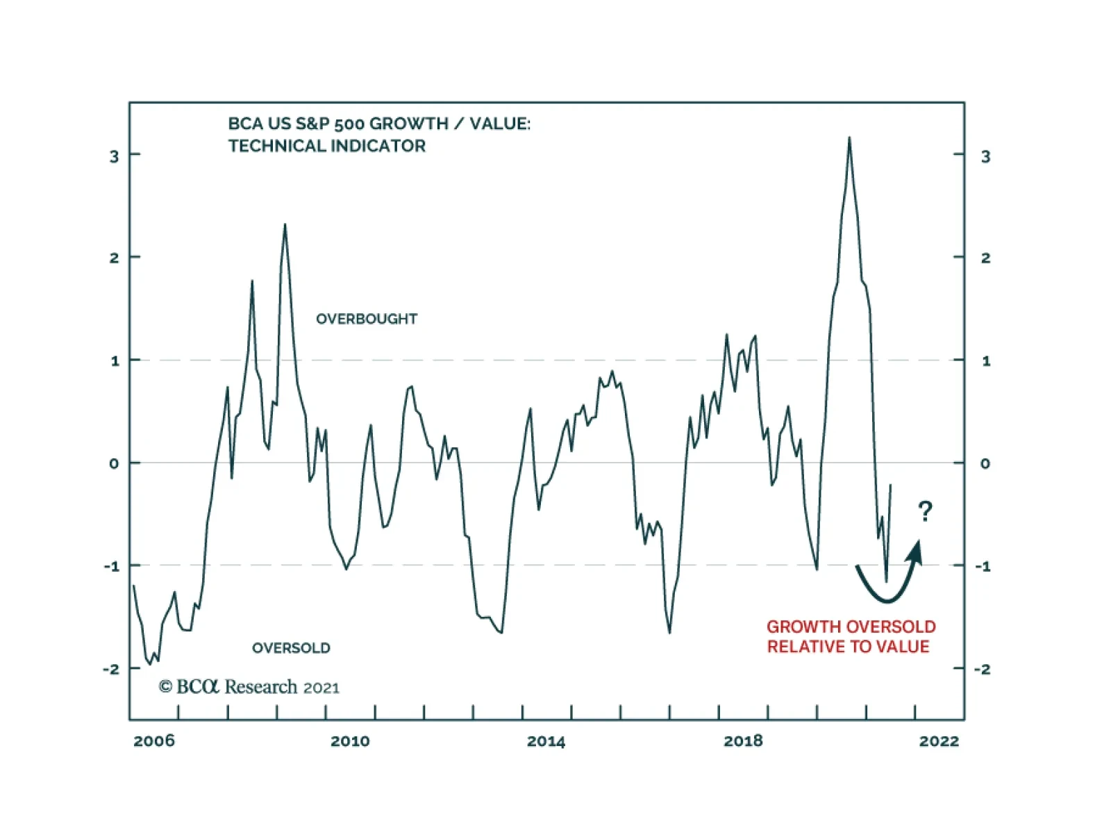
As economies started to reopen, and long-term bond yields began to rise, global Value stocks outperformed global Growth stocks by almost 20% from November to May. However, over the past couple of months this trend has reversed. Our US Equity Strategists…
The growth acceleration narrative that drove much of the performance of global financial markets in 2021 is showing signs of fraying, led by US bond yields. The 10-year US Treasury yield continues to drift lower, hitting an intraday low of 1.25% yesterday.…
Highlights Over the short term – 1-2 years – the pick-up in re-infection rates in Asia and LatAm states with large-scale deployments of Sinopharm and Sinovac COVID-19 vaccines will re-focus attention on demand-side risks to the global recovery (Chart of the Week). The UAE-Saudi impasse re extending the return of additional volumes of OPEC 2.0 spare capacity to the oil market over 2H21 will be short-lived. The UAE's official baseline production will be increased to 3.8mm b/d from 3.2mm b/d presently, and its output in 2H21 will be adjusted accordingly. Over the medium term – 3-5 years out – the risk to the expansion of metal supplies needed for renewables and electric vehicles (EVs) will rise, as left-of-center governments increase taxes and royalties, and carbon prices move higher. Rising metals costs will redound to the benefit of oil and gas producers, and accelerate R+D in carbon- and GHG-reduction technologies. Longer-term – 5-10 years out – the active discouragement of investment in hydrocarbons will contribute to energy shortages. In anticipation of continued upside volatility in commodity prices and share values of oil, gas and metals producers, we remain long the S&P GSCI and COMT ETF, and long equities of producers and traders via the PICK ETF. Feature Our conversations with clients almost invariably leads us to considering the risks to our long-standing bullish views for energy and metals. This week, we reprise some of the highlights of these conversations. In the short term, our bullish call on oil is underpinned by the assumption of continued expansion in vaccinations, which we believe will lead to global economic re-opening and increased mobility, as the world emerges from the devastation of COVID-19. This expectation is once again under scrutiny. On the supply side, the very public negotiations undertaken by the UAE and the leaders of OPEC 2.0 – the Kingdom of Saudi Arabia (KSA) and Russia – over re-basing the UAE's production reminds investors there is substantial spare capacity from the coalition available for the market over the short term. The slow news cycle going into the US Independence Day holiday certainly was a fortuitous time to make such a point. Chart of the WeekWorrisome Uptick Of COVID-19 Cases
Assessing Risks To Our Commodity Views
Assessing Risks To Our Commodity Views
KSA-UAE Supply-Side Worries The abrupt end to this week's OPEC 2.0 meeting was unsettling to markets. Shortly after the meeting ended – without being concluded – officials from the Biden administration in the US spoke with officials from KSA and the UAE, presumably to encourage resolution of outstanding issues and to get more oil into the market to keep crude oil prices below $80/bbl (Chart 2). We're confident the KSA-UAE impasse re extending the return of additional volumes of spare capacity to the oil market over 2H21 will be short-lived. The UAE's official baseline production number (i.e., its October 2018 output level) will be increased to 3.8mm b/d from 3.2mm b/d presently, and its output in 2H21 will be adjusted accordingly. Coupled with a likely return of Iranian export volumes in 4Q21, this will bring prices down into the mid- to high-$60/bbl range we are forecasting. Chart 2US Pushing For Resolution of KSA-UAE Spat
US Pushing For Resolution of KSA-UAE Spat
US Pushing For Resolution of KSA-UAE Spat
Longer term, markets are worried this incident is a harbinger of a breakdown in OPEC 2.0's so-far-successful production-management strategy, which has lifted oil prices 200% since their March 2020 nadir. At present, the producer coalition has ~ 6-7mm b/d of spare capacity, which resulted from its strategy to keep the level of supply below demand. A breakdown in this discipline – in extremis, another price war of the sort seen in March 2020 or from 2014-2016 – could plunge oil markets into a price collapse that re-visits sub-$40/bbl levels. In our view, economics – specifically the cold economic reality of the price elasticity of supply – continues to work for the OPEC 2.0 coalition: Higher revenues are realized by members of the group as long as relatively small production cuts produce larger revenue gains – e.g., a 5% (or less) cut in production that produces a 20% (or more) increase in price trumps a 20% increase in production that reduces prices by 50%. Besides, none of the members of the coalition possess the wherewithal to endure another shock-and-awe display from KSA similar to the one following the breakdown of the March 2020 OPEC 2.0 meeting. We also continue to expect US shale-oil producers to be disciplined by capital markets, and to retain a focus on providing competitive returns to their shareholders, which will limit supply growth to that which maintains profitability. Until we see actual evidence of a breakdown in the coalition's willingness to maintain its production-management strategy, we will continue to assume it remains operative. Worrisome COVID-19 Re-Infection Trends Reports of increased re-infection rates in Latin American and Asia-Pacific states providing Chinese Sinopharm and Sinovac COVID-19 vaccines will re-focus attention on demand-side risks to the global recovery. Conclusive data on the efficacy of these vaccines is not available at present, based on reporting from Health Policy Watch (HPW).1 The vast majority of these vaccines were purchased in Latin America and the Asia-Pacific region, where ~ 80% of the 759mm doses of the two Chinese vaccines were sold, according to HPW's reporting. This will draw the attention of markets to this risk (Chart 3). Of particular concern are the increases in re-infection rates in the Seychelles and Chile, where the majority of populations in both countries were inoculated with one of the Chinese vaccines. Re-infections in Indonesia also are drawing attention, where more than 350 healthcare workers were re-infected after receiving the Sinovac vaccination.2 The risk of renewed global lockdowns remains small, but if these experiences are repeated globally with adverse health consequences, this assessment could be challenged. Chart 3COVID-19 Returning In High-Vaccination States
Assessing Risks To Our Commodity Views
Assessing Risks To Our Commodity Views
Transition Risks To A Low-Carbon Economy Over the medium- to long-terms, our metals views are premised on the expectation the build-out of the global EV fleet and renewable electricity generation – including its supporting grids – will require massive increases in the supply of copper, aluminum, nickel, and tin, not to mention iron ore and steel. This surge in demand will be occurring as governments rush headlong into unplanned and unsynchronized wind-downs of investment in the hydrocarbon fuels that power modern economies.3 The big risk here is new metal supplies will not be delivered fast enough to build all of the renewable generation, EVs and their supporting grids and infrastructures to cover the loss of hydrocarbons phased out by policy, legal and boardroom challenges. Such a turn of events would re-invigorate oil and gas production. Renewable energy and electric vehicles are the sine qua non of the drive to achieve net-zero carbon emissions by 2050. However, the rising price of base metals will add to already high costs of rebuilding power grids to make them suitable for green energy. Given miners’ reluctance to invest in new mines, we do not expect metals prices to drop anytime soon. According to Wood Mackenzie, in 2019 the cost of shifting just the US power grid to renewable energy over the next 10 years will amount to $4.5 trillion.4 Given these cost and supply barriers, fossil fuels will need to be used for longer than the IEA outlined in its recent and controversial report on transitioning to a net-zero economy.5 To ensure that fossil fuels can be used while countries work to achieve their net zero goals, carbon capture utilization and storage (CCUS) technology will need to be developed and made cheaper. The main barrier to entry for CCUS technology is its high cost (Chart 4). However, like renewable energy, the more it is deployed and invested in, the cheaper it will become, following the trend seen in the development of renewable energy and EVs, which were aided by large-scale subsidies from governments to encourage the development of the technology. These cost reductions are already visible: In its 2019 report, the Global CCS Institute noted the cost of implementing CCS technology initially used in 2014 had fallen by 35% three years later. Chart 4CCUS Can Be Expensive
Assessing Risks To Our Commodity Views
Assessing Risks To Our Commodity Views
Metals Mines' Long Lead Times In 2020 the total amount of discovered copper reserves in the world stood at ~ 870mm MT (Chart 5), according to the US Geological Service (USGS). As of 2017, the total identified and undiscovered amount of reserves was ~ 5.6 billion MT.6 The World Bank recently estimated additional demand for copper would amount to ~ 20mm MT p.a. by 2050 (Chart 6).7 Glencore’s recently retired CEO Ivan Glasenberg last month said that by 2050, miners will need to produce around 60mm MT p.a. of copper to keep up with demand for countries’ net zero initiatives.8 Even with this higher estimate, if miners focus on exploration and can tap into undiscovered reserves, supply will cover demand for the renewable energy buildout. Chart 5Copper Reserves Are Abundant
Assessing Risks To Our Commodity Views
Assessing Risks To Our Commodity Views
Chart 6Call On Base Metals Supply Will Be Massive Out To 2050
Assessing Risks To Our Commodity Views
Assessing Risks To Our Commodity Views
While recent legislative developments in Chile and Peru, which together constitute ~ 34% of total discovered copper reserves, could lead to significantly higher costs as left-of-center governments re-write these states' constitutions, geological factors would not be the main constraint to copper supply for the renewables energy buildout: Even if copper mining companies were to move out of these two countries, there still is about 570 million MT in discovered copper reserves, and nearly ten times that amount in undiscovered reserves. As we have written in the past, capital expenditure restraint is the principal reason the supply side of copper markets – and base metals generally – is challenged (Chart 7). Unlike in the previous commodity boom, this time mining companies are focusing on providing returns to shareholders, instead of funding the development of new mines (Chart 8). Chart 7Copper Prices Remains Parsimonious
Copper Prices Remains Parsimonious
Copper Prices Remains Parsimonious
Chart 8Shareholder Interests Predominate Metals Agendas
Assessing Risks To Our Commodity Views
Assessing Risks To Our Commodity Views
Of course, it is likely metals miners, like oil producers, are waiting to see actual demand for copper and other base metals pick up before ramping capex. Sharp increases in forecasted demand is not compelling for miners, at this point. This means metals prices could stay elevated for an extended period, given the 10-15-year lead times for copper mines (Chart 9). For example, the Kamoa-Kakula mine in the Democratic Republic of Congo (DRC) now being brought on line took roughly 24 years of exploration and development work, before it started producing copper. Technological breakthroughs that increase brownfield projects’ productivity, or significant increases in the amount of recycled copper as a percent of total copper supply would address some of the price pressures arising from the long lead times associated with the development of new copper supply. Another scenario with a non-trivial probability that threatens the viability of metals investing is a breakthrough – or breakthroughs – in CCUS technology, which allows oil and gas producers to remove enough carbon from their fuels to allow firms using these fuels to achieve their net-zero carbon goals. Chart 9Long Lead Times For Mine Development
Assessing Risks To Our Commodity Views
Assessing Risks To Our Commodity Views
Investment Implications Short-term supply-demand issues affecting the oil market at present are transitory, and do not signal a shift in the fundamentals supporting our bullish call on oil. Our thesis based on continued production discipline remains intact. That said, we will continue to subject it to rigorous scrutiny on a continual basis. Our average Brent forecast for 2021 remains $66.50/bbl, with 2H21 prices averaging $70/bbl. For 2022 and 2023 we continue to expect prices to average $74 and $81/bbl, respectively (Chart 10). WTI will trade $2-$3/bbl lower. Our metals view has become slightly more nuanced, thanks to our client conversations. One of the unintended consequences of the unplanned and uncoordinated rush to a net-zero carbon future will be an improvement in the competitive position of oil and gas as transportation fuels and electric-generation fuels going forward. This will be driven by rising costs of developing and delivering the metals supplies needed to effect the net-zero transition. We expect markets will provide incentives to CCUS technologies and efforts to decarbonize oil and gas fuels, which will contribute to the global effort to arrest rising temperatures. This suggests the rush to sell these assets – which is underway at present – could be premature.9 In the extreme, this could be a true counterbalance to the metals story, if it plays out. Chart 10Our Oil Price View Remains Intact
Our Oil Price View Remains Intact
Our Oil Price View Remains Intact
Robert P. Ryan Chief Commodity & Energy Strategist rryan@bcaresearch.com Ashwin Shyam Research Associate Commodity & Energy Strategy ashwin.shyam@bcaresearch.com Commodities Round-Up Energy: Bullish The monthly OPEC 2.0 meeting ended without any action to increase monthly supplies, following the UAE's bid to increase its baseline reference production – determined based on October 2018 production levels – to 3.8mm b/d, up from 3.2mm b/d. S&P Global Platts reported the UAE's Energy Minister, Suhail al-Mazrouei, advanced a proposal to raise its monthly production level under the coalition's overall output deal, while KSA's energy minister, Prince Abdulaziz bin Salman, insisted the UAE follow OPEC 2.0 procedures in seeking an output increase. We do not expect this issue to become a protracted standoff between these states. The disagreement between the ministers is procedural to substantive. Remarks by bin Salman last month – to wit, KSA has a role in containing inflation globally – and his earlier assertions that production policy of OPEC 2.0 would be driven by actual oil demand, as opposed to forecasted oil demand, suggest the Kingdom is not aiming for higher oil prices per se. Base Metals: Bullish Spot benchmark iron ore (62 Fe) prices traded above $222/MT this week in China on the back of stronger steel demand, according to mining.com (Chart 11). Market participants are anticipating further steel-production restrictions and appear to be trying to get out in front of them. Precious Metals: Bullish The USD rally eased this week, allowing gold prices to stabilize following the June Federal Open Market Committee (FOMC) meeting. In the two weeks since the FOMC, our gold composite indicator shows that gold started entering oversold territory (Chart 12). We believe gold prices will start correcting upwards, expecting investor bargain-hunting to pick up after the price drop. The mixed US jobs report, which showed the unemployment rate ticked up more than expected, implies that interest rates are not going to be raised soon. Our colleagues at BCA Research's US Bond Strategy (USBS) expect rates to increase only by end-2022.10 This, along with slightly higher odds of a potential COVID-19 resurgence, will support gold prices in the near-term. Ags/Softs: Neutral The USDA's Crop Progress report for the week ended 4 July 2021 showed 64% of the US corn crop was in good to excellent condition, down from the 71% reported for the comparable 2020 date. The Department reported 59% of the bean crop was in good to excellent shape vs 71% the year earlier. Chart 11
BENCHMARK IRON ORE 62% FE, CFR CHINA (TSI) GOING DOWN
BENCHMARK IRON ORE 62% FE, CFR CHINA (TSI) GOING DOWN
Chart 12
Sentiment Supports Oil Prices
Sentiment Supports Oil Prices
Footnotes 1 Please see Are Chinese COVID Vaccines Underperforming? A Dearth of Real-Life Studies Leaves Unanswered Questions, published by Health Policy Watch, June 18, 2021. 2 According to HPW, the World Health Organization's Emergency Use Listing for these two vaccines "were unique in that unlike the Pfizer, AstraZeneca, Moderna, and Jonhson & Johonson vaccines that it had also approved, neither had undergone review and approval by a strict national or regional regulatory authority such as the US Food and Drug Administration or the European Medicines Agency. Nor have Phase 3 results of the Sinopharm and Sinovac trials been published in a peer-reviewed medical journal. More to the point, post-approval, any large-scale tracking of the efficacy of the Sinovac and Sinopharm vaccine rollouts by WHO or national authorities seems to be missing." 3 Please see A Perfect Energy Storm On The Way, which we published on June 3, 2021 for additional discussion. It is available at ces.bcaresearch.com. 4 Please refer to The Price of a Fully Renewable US Grid: $4.5 Trillion, published by greentechmedia 28 June 2019. 5 Please refer to the IEA's Net Zero By 2050, published in May 2021. 6 Please refer to USGS Mineral Commodity Summaries, 2021. 7 Please refer to Minerals for Climate Action: The Mineral Intensity of the Clean Energy Transition, published by the World Bank. 8 Please refer to Copper supply needs to double by 2050, Glencore CEO says, published by reuters.com on June 22, 2021. 9 Please see the FT's excellent coverage of this trend in A $140bn asset sale: the investors cashing in on Big Oil’s push to net zero published on July 6, 2021. 10 Please refer to Watch Employment, Not Inflation, published by the USBS on June 15, 2021. Investment Views and Themes Strategic Recommendations Tactical Trades Commodity Prices and Plays Reference Table Trades Closed in 2021 Summary of Closed Trades
Image
Underweight (Upgrade Alert) We are currently underweight US banks, but the macro environment is changing and today we put this sub-sector on an upgrade alert looking to push it to a neutral allocation. The news on the buyback and dividend fronts is encouraging as banks will be allowed to resume their shareholder friendly activities that were halted last year due to the Fed’s Stress Test. Already, financials stocks are at the front of the pack with a roughly 3% total yield that is likely to increase further. Tack on the current search for yield environment, and the allure of financials equities becomes even more tempting. Bottom Line: We are putting banks on our upgrade alert watchlist. Please see an upcoming Strategy Report where we delve deeper into the buyback and dividend topics.
Buyback Revival?
Buyback Revival?