United States

Foreword Today we are publishing a charts-only report focused on the S&P 500, Cyclicals/Defensives, Growth/Value, and Small/Large. Many of the charts are self-explanatory; to some we have added a short commentary. The charts cover macro, valuations, fundamentals, technicals, and the uses of cash. Our goal is to equip you with all the data you need to make investment decisions along these style dimensions. We also include performance, valuations and earnings growth expectations tables for all styles, sectors, industry groups, and industries (GICS 1, 2 and 3). We hope you will find this publication, which we plan to update on a monthly basis, useful. Overarching Investment Themes Macro Economic growth remains robust, albeit slowing from a high peak. The business cycle has moved to an unusual slowdown stage, characterized by high growth. Investors’ inflation fears are dissipating, and the reflation trade is on the way out. However, concerns remain: According to the Consumer Confidence Survey, higher inflation is getting embedded into consumer expectations, potentially propagating a vicious cycle of stronger demand and higher prices (Chart 1). Fed rhetoric is becoming more hawkish. Yet, investors are shrugging it off, concluding a more active Fed is worth it to tame inflation. Companies are struggling to fill job openings and are hit with rising materials prices. However, corporate America's pricing power remains at an all-time high, helping offset the margin squeeze (Chart 2). Chart 1Consumer Confidence Survey: Inflation Expectations
Consumer Confidence Survey: Inflation Expectations
Consumer Confidence Survey: Inflation Expectations
Chart 2Corporate Pricing Power
Corporate Pricing Power
Corporate Pricing Power
Post-pandemic economic recovery was plagued by shortages and supply-chain disruptions. While it will take a long time for the supply issues to be resolved, bottlenecks are showing early signs of easing as delivery times are starting to fall (Chart 3). Last, but not least, consumers have money to spend, but prefer to splurge on services and experiences rather than goods. Chart 3Philadelphia Fed Business Survey: Delivery Times
Philadelphia Fed Business Survey: Delivery Times
Philadelphia Fed Business Survey: Delivery Times
Valuations And Profitability The US stock market remains expensive, trading more than two standard deviations above the long-term average (Chart 4). Cyclicals look even worse, trading three standard deviations above Defensives. The six-month forward earnings outlook for the S&P 500 remains healthy with the BCA earnings model pointing towards higher growth. Hopefully, the index will grow into its elevated valuation. Small, Value, and Cyclicals also have impressive earnings growth expectations relative to their safer counterparts, but growth has peaked across the board, which does not bode well for performance. Chart 4Valuations Indicator (S&P 500)
Valuations Indicator (S&P 500)
Valuations Indicator (S&P 500)
Uses Of Cash Share buybacks and other shareholder-friendly activities are on the rise again and are expected to gain steam this year and next. A falling denominator in the EPS ratio is another factor that will propel the S&P 500 higher (Chart 5). Capex is still lagging. A pickup in Capex will signal that the post-pandemic recovery is firmly on track, and life is fully back to normal as companies are comfortable investing in future growth. This will give the US equity rally, especially Cyclicals, a new lease of life (Chart 6). Chart 5Buybacks
Buybacks
Buybacks
Chart 6Capex/Sales
Capex/Sales
Capex/Sales
Investment Implications Normalization has been sending ripples through the US equity markets, as investors rotate back into Growth, and away from the reflation trade, and give a cold shoulder to small caps. We recommend a rotation from Value into Growth. While we are agnostic between Small and Large, we prefer both small- and large-cap Growth to large caps in general. While we think that the value trade has (mostly) run its course, we still like the Cyclicals most exposed to Consumer and Business Services, Infrastructure, and Oil. Irene Tunkel Chief Strategist, US Equity Strategy irene.tunkel@bcaresearch.com S&P 500 Chart 7Macroeconomic Backdrop
Macroeconomic Backdrop
Macroeconomic Backdrop
Chart 8Profitability
Profitability
Profitability
Chart 9Valuations And Technicals
Valuations And Technicals
Valuations And Technicals
Chart 10Uses Of Cash
Uses Of Cash
Uses Of Cash
Cyclicals Vs Defensives Chart 11Macroeconomic Backdrop
Macroeconomic Backdrop
Macroeconomic Backdrop
Chart 12Profitability
Profitability
Profitability
Chart 13Valuation And Technicals
Valuation And Technicals
Valuation And Technicals
Chart 14Uses Of Cash
Uses Of Cash
Uses Of Cash
Growth Vs Value Chart 15Macroeconomic Backdrop
Macroeconomic Backdrop
Macroeconomic Backdrop
Chart 16Valuations, Profitability And Technicals
Valuations, Profitability And Technicals
Valuations, Profitability And Technicals
Small Vs Large Chart 17Macroeconomic Backdrop
Macroeconomic Backdrop
Macroeconomic Backdrop
Chart 18Profitability
Profitability
Profitability
Chart 19Valuations And Technicals
Valuations And Technicals
Valuations And Technicals
Chart 20Uses Of Cash
Uses Of Cash
Uses Of Cash
Table 1Performance
US Equity Chart Pack
US Equity Chart Pack
Table 2Valuations And Forward Earnings Growth
US Equity Chart Pack
US Equity Chart Pack
Recommended Allocation
Is It A Small World After All?
Is It A Small World After All?
Footnotes .
Highlights Chart 1Employment Growth
Employment Growth
Employment Growth
June’s employment report revealed that 850 thousand jobs were added to nonfarm payrolls during the month. This is well above the 416k to 505k threshold that is required to hit the Fed’s “maximum employment” target in time for a rate hike in 2022 (Chart 1). The bond market, however, didn’t see things this way. Treasury yields fell across the entire curve following the report’s release on Friday. This is likely because, in contrast to the establishment survey’s strong +850k print, the household employment survey showed a decline of 18k jobs and an uptick in the unemployment rate from 5.8% to 5.9%. Importantly, the household survey tends to be more volatile than the establishment survey, and we expect it will catch up in the coming months. We see the bond market as overly complacent in the face of what is shaping up to be a rapid labor market recovery that will only accelerate once schools re-open and expanded unemployment benefits lapse in September. US bond investors should maintain below-benchmark portfolio duration. Feature Table 1Recommended Portfolio Specification
On Track For 2022 Liftoff
On Track For 2022 Liftoff
Table 2Fixed Income Sector Performance
On Track For 2022 Liftoff
On Track For 2022 Liftoff
Investment Grade: Neutral Chart 2Investment Grade Market Overview
Investment Grade Market Overview
Investment Grade Market Overview
Investment grade corporate bonds outperformed the duration-equivalent Treasury index by 50 basis points in June, bringing year-to-date excess returns up to +209 bps. The combination of above-trend economic growth and accommodative monetary policy supports continued positive excess returns for spread product versus Treasuries. At 99 bps, the 3/10 Treasury slope remains very steep and the 5-year/5-year forward TIPS breakeven inflation rate is below the Fed’s 2.3% to 2.5% target range. The message from these two indicators is that the Fed is not yet ready for monetary conditions to turn restrictive. Despite the positive macro back-drop, investment grade valuations are extremely tight. The investment grade corporate index’s 12-month breakeven spread is at its lowest since 1995 (Chart 2). Last week’s report looked at what different combinations of Treasury slope and corporate spreads have historically signaled about corporate bond excess returns.1 We found that tight corporate spreads only correlate with negative excess returns once the 3/10 Treasury slope is below 50 bps. Though we retain a positive view of spread product as a whole, better value can be found outside of the investment grade corporate sector. Specifically, we recommend favoring high-yield over investment grade. We also prefer municipal bonds, USD-denominated EM sovereigns and USD-denominated EM corporates over investment grade US corporates with the same credit rating and duration. Table 3ACorporate Sector Relative Valuation And Recommended Allocation*
On Track For 2022 Liftoff
On Track For 2022 Liftoff
Table 3BCorporate Sector Risk Vs. Reward*
On Track For 2022 Liftoff
On Track For 2022 Liftoff
High-Yield: Overweight Chart 3High-Yield Market Overview
High-Yield Market Overview
High-Yield Market Overview
High-Yield outperformed the duration-equivalent Treasury index by 122 basis points in June, bringing year-to-date excess returns up to +468 bps. Last week’s report looked at the default expectations that are currently priced into the junk index and considered whether they are likely to be met.2 If we demand an excess spread of 100 bps and assume a 40% recovery rate on defaulted debt, then the High-Yield index embeds an expected default rate of 2.8% (Chart 3). Using a model of the 12-month trailing speculative grade default rate that is based on gross corporate leverage (pre-tax profits over total debt) and C&I lending standards, we estimate that the 12-month default rate will fall to between 2.3% and 2.8%, slightly below what the market currently discounts. This estimate assumes 7% real GDP growth (an input we use to forecast corporate profit growth) and corporate debt growth of between 0% and 8%. Notably, the corporate default rate is tracking at an annualized rate of roughly 1.8% through the first five months of the year, below the estimate generated by our macro model. At 267 bps, the average option-adjusted spread on the High-Yield index is at its lowest since 2007. However, our above analysis suggests that these spread levels are still consistent with earning positive excess returns versus duration-matched Treasuries because default losses will also be low. High-yield spreads also look relatively attractive compared to investment grade spreads. Investors still receive an additional 97 bps of spread as compensation for moving out of the Baa credit tier and into the Ba tier (panel 2). Given the accommodative macro environment, we advise investors to grab this extra spread. MBS: Underweight Chart 4MBS Market Overview
MBS Market Overview
MBS Market Overview
Mortgage-Backed Securities underperformed the duration-equivalent Treasury index by 36 basis points in June, dragging year-to-date excess returns down to -45 bps. The nominal spread between conventional 30-year MBS and equivalent-duration Treasuries tightened 8 bps in June. The spread remains wide compared to recent history, but it is still tight compared to the pace of mortgage refinancings (Chart 4). The conventional 30-year MBS option-adjusted spread (OAS) widened 13 bps in June (panel 3), and it is now starting to look more competitive compared to other similarly risky spread sectors. The conventional 30-year MBS OAS sits at 34 bps, below the 49 bps offered by Aa-rated corporate bonds but above the 17 bps offered by Aaa-rated consumer ABS and the 30 bps offered by Agency CMBS. In a recent report we looked at MBS performance and valuation across the coupon stack.3 We noted that the higher convexity of high-coupon MBS makes them likely to outperform lower-coupon MBS in a rising yield environment. Higher coupon MBS also have greater OAS than lower coupons. This makes the high-coupon MBS more likely to outperform in a flat bond yield environment as well. Given our view that bond yields will rise during the next 6-12 months, we recommend favoring high coupons (4%, 4.5%) over low coupons (2%, 2.5%, 3%) within an overall underweight allocation to Agency MBS. Government-Related: Neutral Chart 5Government-Related Market Overview
Government-Related Market Overview
Government-Related Market Overview
The Government-Related index outperformed the duration-equivalent Treasury index by 4 basis points in June, bringing year-to-date excess returns up to +91 bps (Chart 5). Sovereign debt underperformed duration-equivalent Treasuries by 16 bps in June, dragging year-to-date excess returns down to +36 bps. Foreign Agencies outperformed the Treasury benchmark by 10 bps on the month, bringing year-to-date excess returns up to +46 bps. Local Authority bonds outperformed by 31 bps in June, bringing year-to-date excess returns up to +392 bps. Domestic Agency bonds underperformed by 1 bp, dragging year-to-date excess returns down to +26 bps. Supranationals outperformed by 3 bps, bringing year-to-date excess returns up to +26 bps. USD-denominated Emerging Market (EM) Sovereign bonds continue to offer an attractive spread pick-up versus investment grade US corporate bonds with the same credit rating and duration. Attractive countries include: Qatar, UAE, Saudi Arabia, Mexico and Russia. Last week’s report looked at valuation within the investment grade USD-denominated EM corporate space.4 We found that EM corporates are attractively priced relative to US corporate bonds across the entire investment grade credit spectrum. We also found that EM corporates are attractive relative to EM sovereigns within the A and Baa credit tiers. EM sovereigns have the edge in the Aa credit tier. Municipal Bonds: Overweight Chart 6Municipal Market Overview
Municipal Market Overview
Municipal Market Overview
Municipal bonds outperformed the duration-equivalent Treasury index by 22 basis points in June, bringing year-to-date excess returns up to +309 bps (before adjusting for the tax advantage). We took a detailed look at municipal bond performance and valuation in a recent report and come to the following conclusions.5 First, the economic and policy back-drop is favorable for municipal bond performance. The recently enacted American Rescue Plan includes $350 billion of funding for state & local governments, a bailout that came after state & local government revenues already exceeded expenditures in 2020 (Chart 6). Second, Aaa-rated municipal bonds look expensive relative to Treasuries (top panel). Muni investors should move down in quality to pick up additional yield. Third, General Obligation (GO) and Revenue munis offer better value than investment grade corporates with the same credit rating and duration, particularly at the long-end of the curve. Revenue munis in the 12-17 year maturity bucket offer a before-tax yield pick-up versus corporates. GO munis offer a breakeven tax of just 6% (panel 2). Fourth, taxable munis offer a yield advantage over credit rating and duration-matched investment grade corporates that investors should grab (panel 3). Finally, high-yield muni spreads are reasonably attractive relative to high-yield corporates, offering a breakeven tax rate of 20% (panel 4). But despite the attractive spread, we recommend only a neutral allocation to high-yield munis versus high-yield corporates as the deep negative convexity of high-yield munis makes them susceptible to extension risk if bond yields rise. Treasury Curve: Buy 2/10 Barbell Versus 5-Year Bullet Chart 7Treasury Yield Curve Overview
Treasury Yield Curve Overview
Treasury Yield Curve Overview
The Treasury curve underwent a massive re-shaping in June. Yields at the front-end of the curve rose significantly after the June FOMC meeting while longer-maturity yields declined. All told, the yield curve flattened dramatically on the month. The 2/10 slope flattened 24 bps to end the month at 120 bps. The 5/30 slope flattened 28 bps to end the month at 119 bps. As we wrote in a recent report, we believe that the June FOMC meeting marks an inflection point for the yield curve.6 Prior to the meeting, the yield curve up to the 10-year maturity point had generally been in a bear-steepening/bull-flattening regime, where the slope of the yield curve was positively correlated with the average level of yields (Chart 7). But bond investors appear to have left the June FOMC meeting with a sense that we are now marching toward a Fed rate hike cycle. In that new world, it makes more sense for the yield curve to be negatively correlated with the average level of yields: a bear-flattening/bull-steepening regime. Given that we expect the Fed to lift rates before the end of 2022, we are now sufficiently close to a tightening cycle that the yield curve should bear-flatten between now and then. We therefore recommend that investors short the 5-year bullet and go long a duration-matched barbell consisting of the 2-year and 10-year notes. This position offers a negative yield pick-up, but it looks modestly cheap on our fair value model (see Appendix A) and it will earn capital gains as the 2/10 slope flattens. TIPS: Neutral Chart 8TIPS Market Overview
TIPS Market Overview
TIPS Market Overview
TIPS underperformed the duration-equivalent nominal Treasury index by 22 basis points in June, dragging year-to-date excess returns down to +461 bps. The 10-year and 5-year/5-year forward TIPS breakeven inflation rates both fell 10 bps on the month. At 2.35%, the 10-year TIPS breakeven inflation rate is just within the 2.3% to 2.5% range that is consistent with inflation expectations being well anchored around the Fed’s target (Chart 8). Meanwhile, at 2.18%, the 5-year/5-year forward TIPS breakeven inflation rate is below where the Fed would like it to be (panel 3). We see some upside in long-maturity TIPS breakeven inflation rates during the next 6-12 months, as we expect that the 5-year/5-year forward breakeven will find its way back into the Fed’s target range before the first rate hike. However, once the Fed starts tightening it will have a strong incentive to keep long-maturity breakevens below 2.5%. This means that a long position in TIPS versus nominal Treasuries has limited upside. We also see the cost of short-maturity inflation protection falling somewhat during the next few months, as realized inflation is likely at its peak. This will lead to some modest steepening of the inflation curve (panel 4). We do expect, however, that the inflation curve will remain inverted. An inverted inflation curve is simply more consistent with the Fed’s Average Inflation Target than a positively sloped one, as the Fed will be attacking its inflation target from above rather than from below. ABS: Overweight Chart 9ABS Market Overview
ABS Market Overview
ABS Market Overview
Asset-Backed Securities outperformed the duration-equivalent Treasury index by 6 basis points in June, bringing year-to-date excess returns up to +39 bps. Aaa-rated ABS outperformed by 5 bps on the month, bringing year-to-date excess returns up to +31 bps. Non-Aaa ABS outperformed by 14 bps on the month, bringing year-to-date excess returns up to +84 bps. The stimulus from last year’s CARES act led to a significant increase in household savings when individual checks were mailed in April 2020. That excess savings has still not been spent and the most recent round of stimulus checks has only added to the stockpile by pushing the savings rate higher yet again (Chart 9). The extraordinarily large stock of household savings means that the collateral quality of consumer ABS is also extraordinarily high. Indeed, many households have been using their windfalls to pay down consumer debt (bottom panel). Investors should remain overweight consumer ABS and should also take advantage of the high quality of household balance sheets by moving down the quality spectrum. Non-Agency CMBS: Neutral Chart 10CMBS Market Overview
CMBS Market Overview
CMBS Market Overview
Non-Agency Commercial Mortgage-Backed Securities outperformed the duration-equivalent Treasury index by 20 basis points in June, bringing year-to-date excess returns up to +183 bps. Aaa Non-Agency CMBS outperformed Treasuries by 4 basis points in June, bringing year-to-date excess returns up to +82 bps. Non-Aaa Non-Agency CMBS outperformed Treasuries by 66 bps in June, bringing year-to-date excess returns up to a whopping +522 bps (Chart 10). Though returns have been strong and spreads remain attractive, particularly for lower-rated CMBS, we continue to recommend only a neutral allocation to the sector because of the structurally challenging environment for commercial real estate. Even with the economic recovery well underway, commercial real estate loan demand continues to contract and banks are not making lending standards more accommodative (panels 3 & 4). Agency CMBS: Overweight Agency CMBS underperformed the duration-equivalent Treasury index by 9 basis points in June, dragging year-to-date excess returns down to +116 bps. The average index option-adjusted spread widened 3 bps on the month and it currently sits at 30 bps (bottom panel). Though Agency CMBS spreads have recovered to well below pre-COVID levels, they still look attractive compared to other similarly risky spread products. Stay overweight. Appendix A: Butterfly Strategy Valuations The following tables present the current read-outs from our butterfly spread models. We use these models to identify opportunities to take duration-neutral positions across the Treasury curve. The following two Special Reports explain the models in more detail: US Bond Strategy Special Report, “Bullets, Barbells And Butterflies”, dated July 25, 2017, available at usbs.bcaresearch.com US Bond Strategy Special Report, “More Bullets, Barbells And Butterflies”, dated May 15, 2018, available at usbs.bcaresearch.com Table 4 shows the raw residuals from each model. A positive value indicates that the bullet is cheap relative to the duration-matched barbell. A negative value indicates that the barbell is cheap relative to the bullet. Table 4Butterfly Strategy Valuation: Raw Residuals In Basis Points (As Of June 30TH, 2021)
On Track For 2022 Liftoff
On Track For 2022 Liftoff
Table 5 scales the raw residuals in Table 4 by their historical means and standard deviations. This facilitates comparison between the different butterfly spreads. Table 5Butterfly Strategy Valuation: Standardized Residuals (As Of June 30TH, 2021)
On Track For 2022 Liftoff
On Track For 2022 Liftoff
Table 6 flips the models on their heads. It shows the change in the slope between the two barbell maturities that must be realized during the next six months to make returns between the bullet and barbell equal. For example, a reading of 9 bps in the 5 over 2/10 cell means that we would only expect the 5-year to outperform the 2/10 if the 2/10 slope steepens by more than 9 bps during the next six months. Otherwise, we would expect the 2/10 barbell to outperform the 5-year bullet. Table 6Discounted Slope Change During Next 6 Months (BPs)
On Track For 2022 Liftoff
On Track For 2022 Liftoff
Appendix B: Excess Return Bond Map The Excess Return Bond Map is used to assess the relative risk/reward trade-off between different sectors of the US bond market. It is a purely computational exercise and does not impose any macroeconomic view. The Map’s vertical axis shows 12-month expected excess returns. These are proxied by each sector’s option-adjusted spread. Sectors plotting further toward the top of the Map have higher expected returns and vice-versa. Our novel risk measure called the “Risk Of Losing 100 bps” is shown on the Map’s horizontal axis. To calculate it, we first compute the spread widening required on a 12-month horizon for each sector to lose 100 bps or more relative to a duration-matched position in Treasury securities. Then, we divide that amount of spread widening by each sector’s historical spread volatility. The end result is the number of standard deviations of 12-month spread widening required for each sector to lose 100 bps or more versus a position in Treasuries. Lower risk sectors plot further to the right of the Map, and higher risk sectors plot further to the left. Chart 11Excess Return Bond Map (As Of June 30TH, 2021)
On Track For 2022 Liftoff
On Track For 2022 Liftoff
Ryan Swift US Bond Strategist rswift@bcaresearch.com Footnotes 1 Please see US Bond Strategy Weekly Report, “The Post-FOMC Credit Environment”, dated June 29, 2021. 2 Please see US Bond Strategy Weekly Report, “The Post-FOMC Credit Environment”, dated June 29, 2021. 3 Please see US Bond Strategy Weekly Report, “A New Conundrum”, dated April 20, 2021. 4 Please see US Bond Strategy Weekly Report, “The Post-FOMC Credit Environment”, dated June 29, 2021. 5 Please see US Bond Strategy Weekly Report, “Making Money In Municipal Bonds”, dated April 27, 2021. 6 Please see US Bond Strategy / Global Fixed Income Strategy Weekly Report, “How To Re-Shape The Yield Curve Without Really Trying”, dated June 22, 2021.
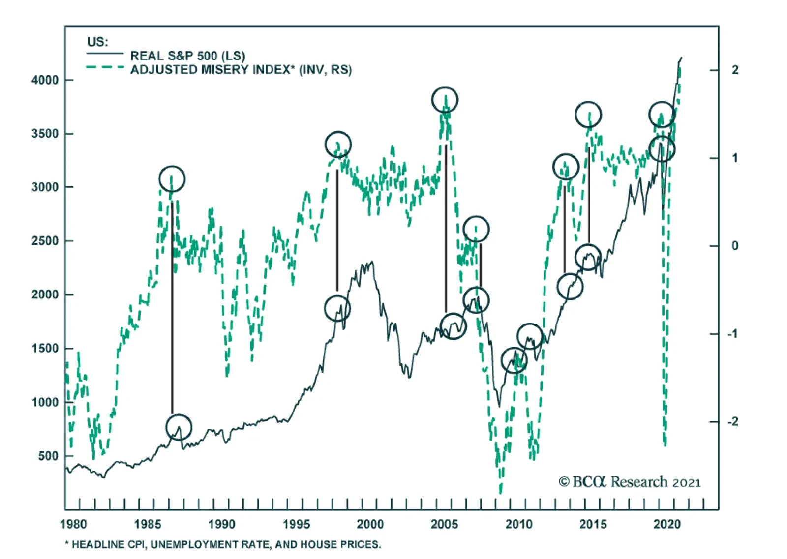
Our misery index is surging to fresh highs. Whenever a combination of rising inflation, high unemployment and rising house prices was in play, this was a warning salvo that the policy mix might become a toxic cocktail for longer-term asset prices. BCA…
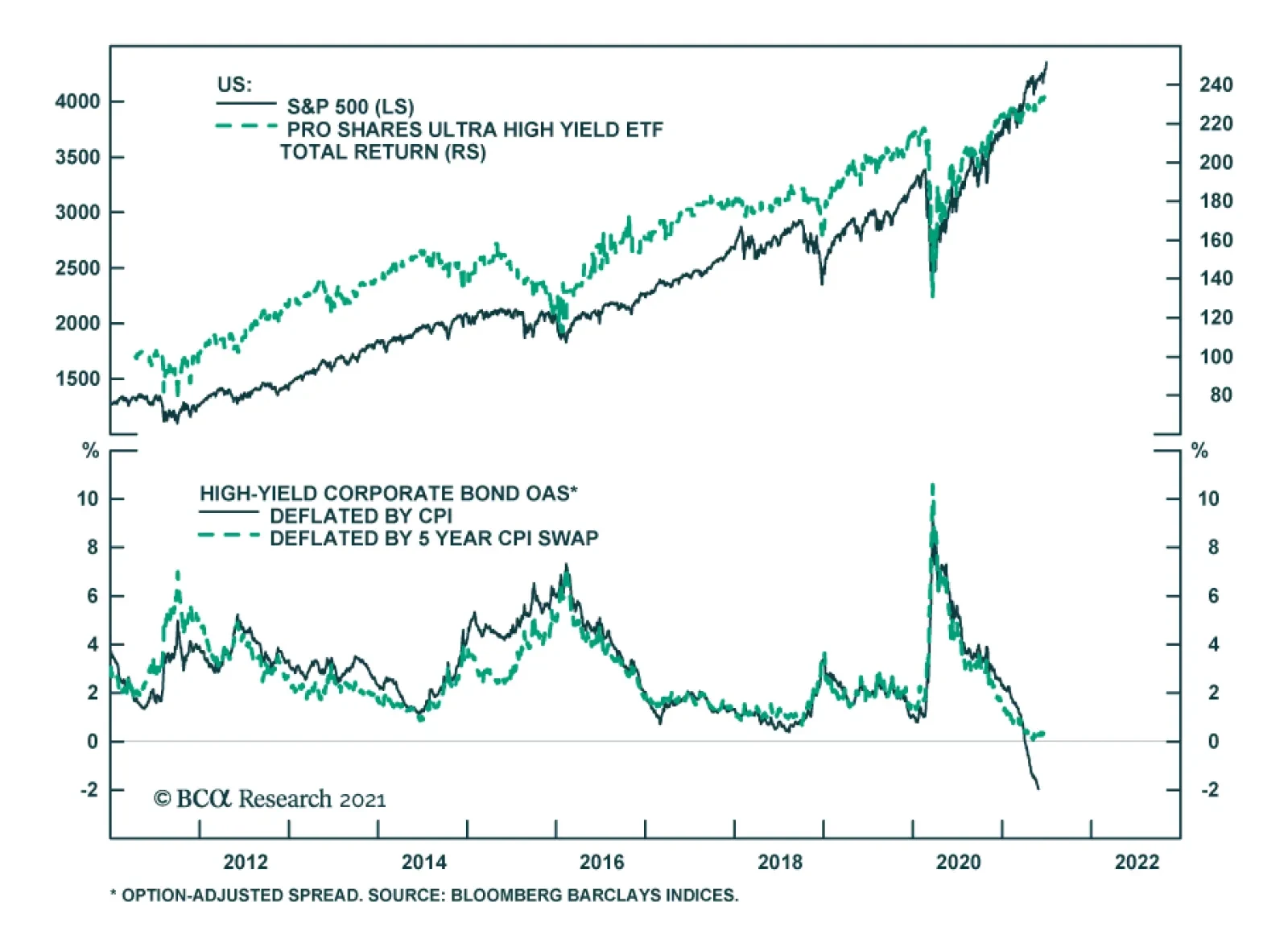
Real yields on the junk coupon in the US have turned negative. The junk bond market has always provided a corridor of comfort for investors that want a higher return (relatively equitable to equities), but less risk (since junk bonds are higher in the payout…
Highlights Economy – The endpoint of easier-for-longer monetary policy may be coming into view: Elevated inflation readings and discomfort among more hawkish FOMC members may signal that a monetary policy inflection is on the way. Markets – Volatility should pick up as investors reprice financial assets to reflect the end of emergency accommodation: The rumblings in bond, currency and precious metals markets that followed the June FOMC meeting are likely to spread as investors pull their liftoff date expectations forward. Strategy – Maintain below-benchmark duration positioning and ensure that portfolios can withstand increased volatility: Don’t be lulled to sleep by the 10-year Treasury yield’s backing and filling or by the VIX’s foray into the low teens. It is a more auspicious time to be buying insurance than selling it. Feature After fourteen years, investors may be weary of focusing so much attention on the Fed, but there’s been no avoiding its impact since the global financial crisis (GFC) emerged. Zero interest rate policy (ZIRP), large-scale asset purchases and other emergency measures have exerted a strong pull on financial markets as they have been switched on and off. The extended turn of rushing to the rescue appears to be weighing on the Fed as well. Last August’s revisions to its Statement on Longer-Run Goals and Monetary Policy Strategy explicitly acknowledged the challenges of operating in a ZIRP world in which its ability to deploy its primary tool for countering economic weakness – cutting the fed funds rate – is constrained by the zero lower bound. The Fed responded by adjusting its approach to each element of its dual mandate. It adopted an average-inflation-targeting framework that seeks to remediate past inflation shortfalls and indicated that it would only intervene to mitigate shortfalls from its maximum employment estimate. The latter move marked a break with the previous four decades, when the Fed, unwilling to give inflation pressures a chance to take root, proactively tightened policy when it judged that the labor market might be getting too strong. Taken together, the changes amounted to a significant break from doing whatever it took to keep inflation from gaining a foothold to making sure it didn’t completely vanish from households’, businesses’ and investors’ consciousness. If the changes were implemented as outlined, the effects could be wide-ranging. Inflation would be able to gain more traction, all else equal, leading to higher bond yields as markets anticipated that a higher terminal fed funds rate would be required to bring it to heel. A higher terminal fed funds rate might lead to a deeper economic slowdown, ushering in lower bond yields than otherwise would have prevailed. By inducing higher highs and lower lows in Treasury yields, the revisions to the Fed’s framework could promote increased financial market volatility, depending on FOMC members’ ongoing commitment to them and the way that commitment interacted with investors’ expectations. Although the revised framework is eleven months old, it is freshly relevant as the interaction between its implementation and investors’ expectations may be approaching an inflection point. When the FOMC announced the framework revisions last August, it didn’t have any immediate monetary policy implications and investors and committee members could reasonably have figured they would cross the new-framework bridge when they came to it. Elevated inflation readings and some differences in views within the FOMC suggest the bridge might now have to be crossed soon enough to fit within most institutional investors’ time horizons. Volatility may well rise as markets attempt to reprice assets against the backdrop of a novel monetary policy approach. End Of An Era The aforementioned changes that the FOMC made to its monetary policy strategy represented a watershed moment for US monetary policy. Beginning with Paul Volcker’s tenure as Fed chair near the end of the high-inflation ‘70s, the Fed has kept a sharp lookout for inflation pressures (Chart 1). Though it only introduced an annual inflation target in the aftermath of the GFC, its one-way view of inflation was well established. Signs that it might be emerging could be grounds for tighter monetary conditions while dormant readings were nothing to worry about. Chart 1Upholding Volcker's Mantle
Upholding Volcker's Mantle
Upholding Volcker's Mantle
The average inflation target indicates that inflation shortfalls will henceforth be as much of a concern as inflation overshoots and the Fed will attempt to remediate them with an eye towards keeping inflation expectations from slipping below 2%. On the other hand, the new framework shifts from a two-way to a one-way perspective on employment. Where the committee had previously attempted to conduct policy in a way that mitigated any deviations from its maximum-employment assessment, the new framework seeks only to mitigate shortfalls. Citing the post-crisis experience, when inflation remained in check despite a half-century low in the unemployment rate, and a desire to see expansion gains spread more widely across households, Chair Powell has repeatedly emphasized that too much employment is not a concern. Easier Said Than Done When the Fed announced the changes to its approach, we noted that they would be significant for investors provided it were to follow through on them. It is one thing to promise wide-reaching changes in the indefinite future but quite another to execute them in real time under duress. Financial markets seemed to be aware that turning on a dime would be easier said than done and did not bother to adjust their fed funds rate expectations (Chart 2) or reprice assets that might be most affected by the new policy framework. Among investors with a time frame of a year or less, the talk was all theoretical, anyway – of course policy was going to remain extremely easy when the US and the rest of the world were still knee-deep in a once-in-a-century pandemic and the development of an effective vaccine was a ways off. Chart 2Until Recently, Markets Saw Little Chance Of Rate Hikes On A Two-Year Horizon
Until Recently, Markets Saw Little Chance Of Rate Hikes On A Two-Year Horizon
Until Recently, Markets Saw Little Chance Of Rate Hikes On A Two-Year Horizon
In other words, talk was cheap when the FOMC unveiled its new framework. Its plans would only matter once the pandemic’s grip eased and central banks regained some discretion. The committee’s resolve to adhere to the new framework would only be tested in the face of uncomfortably high inflation prints and/or inflation expectations that threatened to anchor at levels above its target range. Investors wouldn’t bother to reprice financial assets in line with the new framework until they were certain it would apply. Inoculating Against Deflation As it turned out, effective vaccines appeared on the horizon sooner than anticipated. Pfizer and BioNTech announced the enormously encouraging results from their vaccine’s Phase III trials before the New York open on November 9th, and the Moderna vaccine’s similar clinical successes followed shortly thereafter. Vaccine distribution would begin in January, and the long end of the Treasury curve would begin to reprice, nudged along by rising inflation expectations. Agita sparked by March CPI data caused expectations to peak ahead of the April release, and 10-year breakevens briefly edged above the levels consistent with the Fed’s goals (Chart 3, top panel). Chart 3Coloring Within The Lines
Coloring Within The Lines
Coloring Within The Lines
Chart 4Unsustainable Outliers
Unsustainable Outliers
Unsustainable Outliers
We share the view of most mainstream economists that the upside surprises in the March and April inflation prints resulted from transitory reopening factors and do not mark an inflection point. Increases in used car prices will slow once rental car companies rebuild their fleets to match burgeoning demand and new car production can resume at its intended pace, lumber prices will continue to ease as sawmills ramp up operations to capture outsized profits, and the pace of increases in airfares will settle down once staffing bottlenecks can be resolved and more flights can be added to meet resurgent demand (Chart 4). Easier For How Much Longer? Markets’ collective shrug upon the release of the revisions to the Fed’s monetary policy framework reflected the view that they did not amount to a meaningful change over most investors’ time horizons. The second wave of COVID-19 infections had peaked a month before, but at least one other was likely in store as students returned to college campuses, and a vaccine was not yet on the horizon. According to Good Judgment’s professional superforecasters, there was roughly an equal 40% probability that 25 million vaccine doses would be available for distribution in the US between October 1st, 2020 and March 31st, 2021 or between April 1st and September 30th, 2021 (Chart 5). The more optimistic estimate turned out to be right, albeit not quite optimistic enough: nearly 25 million doses were administered by the end of February and nearly 50 million by the March 31/April 1 midpoint of the two periods (Chart 6). Chart 5Vaccine Development And Distribution Wound Up Beating August's Expectations ...
Transitioning Away From Auto-Pilot
Transitioning Away From Auto-Pilot
Chart 6... By A Considerable Margin
... By A Considerable Margin
... By A Considerable Margin
The vaccine outlook was relevant because it was hard to envision any incremental tightening of monetary policy while the country was still in the throes of the pandemic. Treasury yields at the longer end of the curve weren’t likely to go anywhere in the absence of increases in the fed funds rate (Chart 7) or increases in inflation or real growth expectations. Just as a still-raging virus was likely to keep the FOMC from hiking rates, it would also put a lid on inflation pressures and economic growth. With economic activity sharply limited by social distancing mandates and individuals’ innate reluctance to risk exposure, it was certain that capacity would continue to surpass aggregate demand. Chart 7Treasury Yields Move With Fed Funds Expectations
Treasury Yields Move With Fed Funds Expectations
Treasury Yields Move With Fed Funds Expectations
To the extent investors thought about the FOMC’s new framework when it was unveiled, they seem to have taken it as confirmation that monetary policy would remain easier for longer, consistent with the theme that has prevailed since the Bernanke Fed led the charge to counter the GFC. Treasury yields were subdued even after the vaccine news broke in November (Chart 8, top panel), and with the interest rate structure remaining quiet, there was no major repricing in other rate-sensitive markets. Gold, which might have been expected to benefit from more accommodative policy, slipped nearly 15%, from the mid-$1,900s to the high $1,600s, between the release of the new framework and its March trough. After retracing half of its post-August decline, it shed a fresh 5% following the FOMC’s June meeting (Chart 8, second panel). Chart 8Growth Prospects, Not Fed Prospects
Growth Prospects, Not Fed Prospects
Growth Prospects, Not Fed Prospects
Commodity currencies had added 10% versus the US dollar before ceding half of those gains in the wake of the June FOMC meeting, but their rally appears to have been driven by the increased global growth expectations that followed the positive vaccine news as they went nowhere in September and October (Chart 8, third panel). Similarly, the DXY Index had taken its post-revision cue from global growth prospects, moving inversely with pandemic news (rising when bad, falling when good), before rallying after the June meeting (Chart 8, bottom panel). The rise in measured inflation has encouraged some committee members to bring forward their anticipated liftoff dates and accelerate their individual dot plots, as disclosed last month. Now that the Fed no longer seems to be of one mind on the easier-for-longer path, investors have begun to reassess the scene. Prices are moving as capital reportedly exits pro-inflation positions and the money markets now call for two-and-a-half rate hikes by mid-2023 (Chart 2). More volatility could be in store amidst a shift in the Fed consensus as markets pull forward or push back their expected liftoff date and the expected pace of hikes speeds up or slows down. Investment Implications With the moves in measured inflation and inflation expectations seeming to have met the FOMC’s first two criteria for hiking rates (Table 1), a return to full employment looms as the final hurdle to liftoff. We reiterate our view that hiring progress is the swing factor that investors should be watching to anticipate the coming shift in monetary policy settings. Net payrolls expanded by 850,000 in June, topping estimates and putting the three-month moving average, 567,000, ahead of the 375-485,000 pace required to return the economy to full employment by the second half of 2022.1 That may sound like an overly ambitious target on its face, but we contend that annualized monthly payroll expansion of 4% for fourteen months or 3.1% for eighteen months is attainable given the magnitude of the pandemic job losses (Chart 9). Table 1A Checklist For Liftoff
Transitioning Away From Auto-Pilot
Transitioning Away From Auto-Pilot
Chart 9A 2H22 Return To Full Employment Is Entirely Possible
A 2H22 Return To Full Employment Is Entirely Possible
A 2H22 Return To Full Employment Is Entirely Possible
Our outlook for sustained net payroll expansion remains near the optimistic end of the expectations continuum, though the money market consensus has lately caught up with our sometime-before-the-end-of-2022 liftoff date view (Chart 10). Given that we expect that the yield curve will steepen as the hiring strength shows itself, we advise maintaining below-benchmark duration in Treasury portfolios. The optimism embedded in our hiring view implies robust growth over the next twelve months and we therefore recommend overweighting spread product within fixed income portfolios via a high-yield overweight, and overweighting equities within multi-asset portfolios. Hot growth will eventually induce the Fed to start pumping the monetary brakes, slowing the economy and investment returns, but the twelve-month outlook remains favorable for risk assets. Chart 10Looking For At Least One Hike By The End Of 2022
Looking For At Least One Hike By The End Of 2022
Looking For At Least One Hike By The End Of 2022
Doug Peta, CFA Chief US Investment Strategist dougp@bcaresearch.com Footnotes 1 Making the simplifying (and overly conservative) assumption that returning to full employment will require recovering February 2020’s level of nonfarm payrolls, the US is currently short 6.8 million jobs. Regaining those jobs by August 2022 (14 months from now) will require a monthly average of 485,000 net job gains; regaining them by December 2022 (18 months hence) will require a 375,000 monthly average.
US payroll employment gain in June was very robust at 850,000, much better than in May and April. In contrast, the household survey posted a negative number, an 18,000 decline in June. Other employment data - such as participation rate, unemployment rate and…
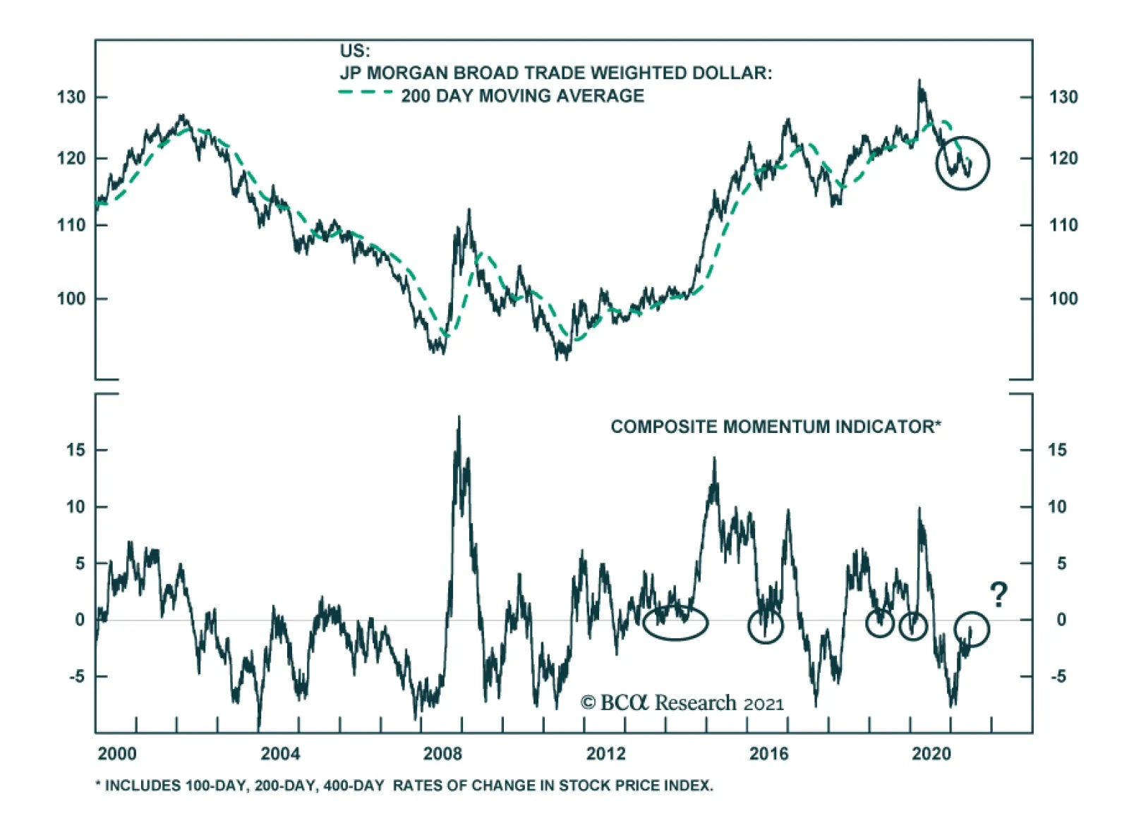
The broad trade-weighted US dollar has been consolidating since early this year. If the greenback fails to break decisively above its 200-day moving average, a major down leg will develop. On the contrary, if this broad trade-weighted US dollar stages a…
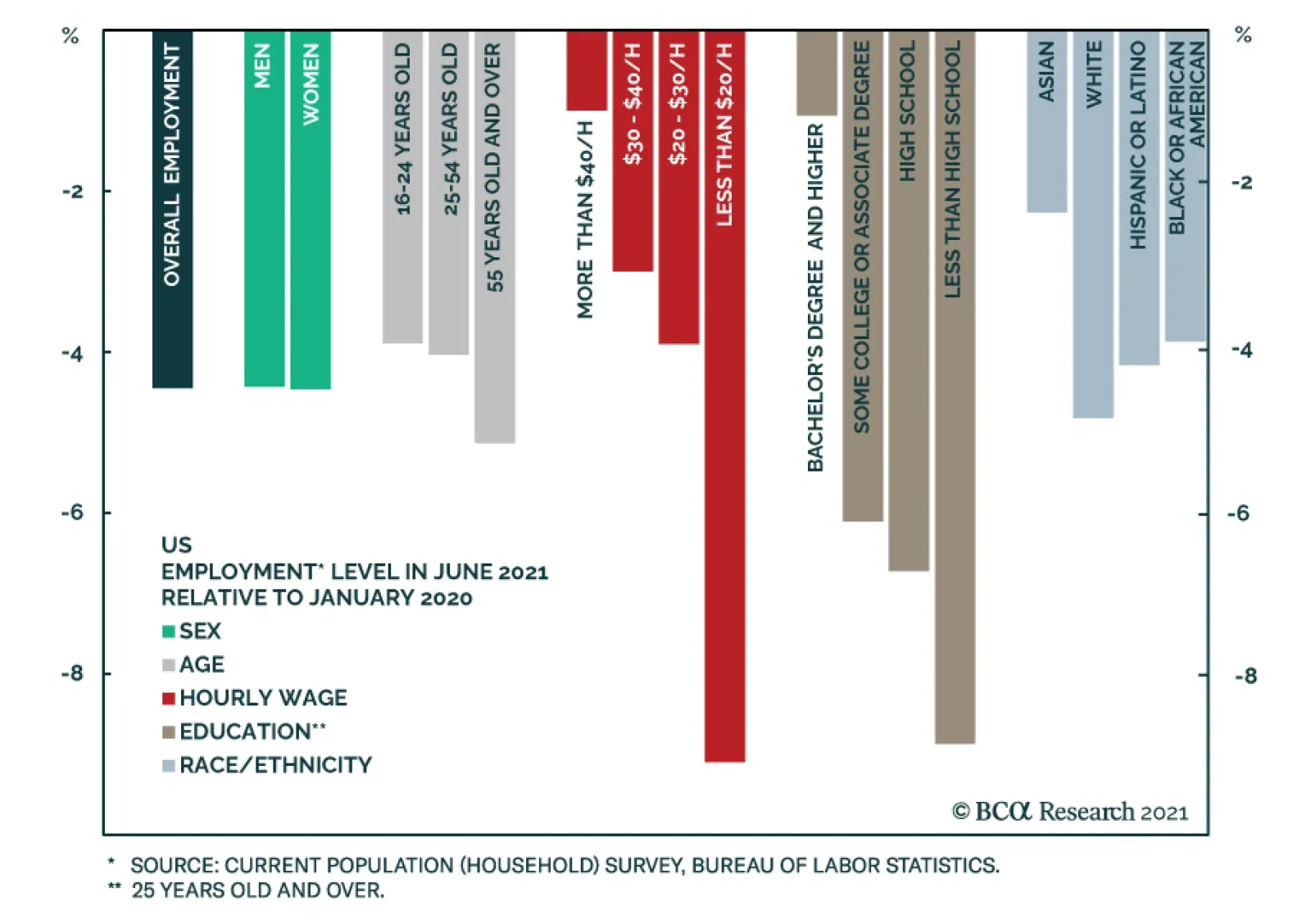
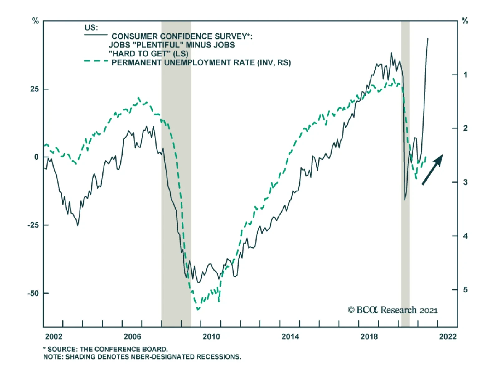
There were over 4% fewer people employed in the US in June than in January 2020. On the face of it, this would suggest the presence of a significant amount of labor market slack. Yet, the NFIB small business survey tells a different story. It revealed that…
Highlights Gold is – and always will be – exquisitely sensitive to Fed policy and forward guidance, as last month's "Dot Shock" showed (Chart of the Week). Its price will continue to twitch – sometimes violently – as the widening dispersion of views evident in the Fed dots keeps markets on edge and pushes forward rate expectations in different directions. Fed policy is important but will remain secondary to fundamentals in oil markets. Increasingly inelastic supply will force refiners to draw down inventories, which will keep forward curves backwardated. OPEC 2.0's production-management policy is the key driver here, followed closely by shale-oil's capital discipline. Between these market bookends are base metals, which will remain sensitive to Fed policy, but increasingly will be more responsive to tightening supply-demand fundamentals, as the pace of the global renewables and EV buildout challenges supply. The one thing these markets will share going forward is increasing volatility. Gold volatility will remain elevated as markets are forced to parse sometimes-cacophonous Fed forward guidance; oil volatility will increase with steeper backwardation; and base metals volatility will rise as fundamentals continue to tighten. We remain long commodity-index exposure (S&P GSCI and COMT ETF) and equity exposure (PICK ETF). Feature Gold markets still are processing last month's "Dot Shock" – occasioned by the mid-June move of three more Fed bankers' dots into the raise-rates-in-2022 camp at the Fed – and the sometimes-cacophonous forward guidance of post-FOMC meetings accompanying these projections. Following last month's meeting, seven of the 18 central bankers at the June meeting now favor an earlier rate hike. This dot dispersion fuels policy uncertainty. When policy uncertainty is stoked, demand for the USD typically rises, which generally – but not always – contributes to liquidation of dollar-sensitive positions in assets like commodities. This typically leads to higher price volatility.1 This is most apparent in gold, which is and always will be exquisitely sensitive to Fed guidance and the slightest hint of a change in course (or momentum building internally for such a change). This is what markets got immediately after the June meeting. When this guidance reflects a wide dispersion of views inside the Fed, it should come as no surprise that price volatility increases among assets that are most responsive to monetary policy. This dispersion of market expectations – as a matter of course – is intensified by discordant central-bank forward guidance.2 Fundamentals Reduce Oil's Sensitivity To Fed Policy Fed policy will always be important for the evolution of the USD through time, which makes it extremely important for commodities, since the most widely traded commodities are priced in USD. All else equal, an increase in the value of the USD raises the cost of commodities ex-US, and vice versa. Chart of the WeekGold Still Processing Dot Shock
Gold Still Processing Dot Shock
Gold Still Processing Dot Shock
Chart 2Oil Market Remains Tight...
Oil Market Remains Tight...
Oil Market Remains Tight...
The USD's impact is dampened when markets are fundamentally tight – e.g., when the level of demand exceeds supply, as is the case presently for oil (Chart 2).3 When this occurs, refiner inventories have to be drawn down to make up for supply deficits (Chart 3). This leads to a backwardation in the oil forward curves – i.e., prices of prompt-delivery oil are higher than deferred-delivery oil – reflecting the fact that the supply curve is becoming increasingly inelastic (Chart 4). This backwardation benefits OPEC 2.0 member states, as most of them have long-term supply contracts with customers indexed to spot prices, and investors who are long commodity-index exposure, as it is the source of the roll yield for these products.4 Chart 3Forcing Inventories To Draw...
Forcing Inventories To Draw...
Forcing Inventories To Draw...
Chart 4...And Backwardating Forward Curves
...And Backwardating Forward Curves
...And Backwardating Forward Curves
Copper's Sensitivity To Fed Policy Declining Supply-demand fundamentals in base metals – particularly in the bellwether copper market – are tightening, which, as the oil market illustrates, will make prices in these markets less sensitive to USD pressures going forward (Chart 5). We expect the copper forward curve to remain backwardated for an extended period (Chart 6), which will distance the evolution of copper prices from Fed policy variables (e.g., interest rates and the USD). Chart 5Copper USD Sensitivity Will Diminish As Balances Tighten
Copper USD Sensitivity Will Diminish As Balances Tighten
Copper USD Sensitivity Will Diminish As Balances Tighten
Chart 6Expect Persistent Backwardation In Copper
Expect Persistent Backwardation In Copper
Expect Persistent Backwardation In Copper
Indeed, our modeling suggests this already is occurring in the metals markets, as can be seen from the resilience of copper prices during 1H21, when China's fiscal and monetary stimulus was waning and, recently, during the USD's recent rally, which was an unexpected headwind generated by the Fed's June meeting. If, as appears likely, China re-engages in fiscal and monetary stimulus in 2H21, the global demand resurgence for metals, copper in particular, will receive an additional fillip. Like oil, copper inventories will have to be drawn down over the next two years to make up for physical deficits, which have been a persistent problem for years (Chart 7). Capex in copper markets has yet to be incentivized by higher prices, which means these physical deficits likely will widen as the world gears up for expanded renewables generation and the grids required to support them, not to mention higher electric vehicle (EV) demand. If, as we expect, copper miners do not invest in new greenfield mine projects – choosing instead to stay with their brownfield expansion strategies – the market will tighten significantly as the world ramps up its demand for renewable energy. This means copper's supply curve will, like oil's, become increasingly inelastic. At the limit – i.e., if new mining capex is not incentivized – price will be forced to allocate limited supply, and may even have to get to the point of destroying demand to accommodate the renewables buildout. Chart 7Supply-Demand Balance Tightening In Copper
Supply-Demand Balance Tightening In Copper
Supply-Demand Balance Tightening In Copper
A Word On Spec Positioning We revisited our modeling of speculative influence on these markets over the past couple of weeks, in anticipation of the volatility we expect and the almost-certain outcry from public officials that will ensue. Our modeling continues to support our earlier work, which found fundamentals are determinant to the evolution of industrial commodity prices. Using Granger-Causality and econometric analysis, we find prices mostly explain spec positioning in oil and copper, and not the other way around.5 We do find spec positioning – via Working's T Index – to be important to the evolution of volatility in WTI crude oil options, along with other key variables (Chart 8).6 That said, other variables are equally important to this evolution, including the St. Louis Fed's Financial Stress Index, EM equity volatility, VIX volatility and USD volatility. These variables are not useful in modeling copper volatility, where it appears fundamental and financial variables are driving the evolution of prices and, by extension, price volatility. We will continue to research this issue, and will continue to subject our results to repeated trials in an attempt to disprove them, as any researcher would do. Chart 8Oil Volatility Drivers
Oil Volatility Drivers
Oil Volatility Drivers
Investment Implications Gold will remain hostage to Fed policy, but oil and base metals increasingly will be charting a path that is independent of policy-related variables, chiefly the USD. There is no escaping the fact that gold volatility will increasingly be in the thrall of US monetary policy – particularly during the next two years as the Fed attempts to guide markets toward something resembling normalization of that policy.7 However, as the events of the most recent FOMC meeting illustrate, gold price volatility will remain elevated as markets are forced to parse oftentimes-cacophonous Fed forward guidance. This would argue in favor of using low-volatility episodes as buying opportunities in gold options – particularly calls, as we continue to expect gold prices to end the year at $2,000/oz. We also favor silver exposure via calls, expecting price to go to $30/oz this year. In oil and base metals, we continue to expect supply-demand fundamentals in these markets to tighten, which predisposes us to favor commodity index products. For this reason, we remain long commodity-index exposure – specifically the S&P GSCI index, which is up 6.8% since inception, and the COMT ETF, which is up 8.7% since inception. We expect the base metals markets to remain very well bid going forward, and remain long equity exposure in these markets via the PICK ETF, which we re-entered after a trailing stop was elected that left us with a 24% gain since inception at the end of last year. Robert P. Ryan Chief Commodity & Energy Strategist rryan@bcaresearch.com Ashwin Shyam Research Associate Commodity & Energy Strategy ashwin.shyam@bcaresearch.com Commodities Round-Up Energy: Bullish US crude oil stocks (ex SPR) fell 6.7mm barrels in the week ended 25 June 2021, according to the US EIA. Total crude and product stocks were down 4.6mm barrels. Domestic crude oil production was unchanged at 11.1mm b/d over the reporting week. Total refined-product demand surpassed the comparable 2019 reporting period, led by higher distillate consumption (4.2mm b/d vs 3.8mm b/d). Gasoline consumption remains a laggard (9.2mm b/d vs 9.5mm b/d), as does jet fuel (1.4mm b/d vs 1.9mm b/d). Propane and propylene demand surged over the period, likely on the back of petchem demand (993k b/d vs 863k b/d). Base Metals: Bullish Base metals prices are moving higher in anticipation of tariffs being imposed by Russia to discourage exports beyond the Eurasian Economic Union, according to argusmedia.com. In addition to export tariffs on copper, aluminum and nickel, steel exports also will face levies to discourage material from leaving the EAEU (Chart 9). The tariffs are expected to remain in place from August through December 2021. Separately, premiums paid for high-quality iron ore in China (65% Fe) reached record highs earlier this week, as steelmakers scramble for supply, according to reuters.com. The premium iron ore traded close to $36/MT over benchmark material (62% Fe) this week. Precious Metals: Bullish Gold prices continue to move lower following the FOMC meeting on June 16. The yellow metal was down 0.6% y-o-y at $1762.80/oz as of Tuesday’s close after being up a little more than 13% y-o-y before the FOMC meeting earlier this month (Chart 10). We believe the USD rally, which, based on earlier research we have done, could be benefitting from safe-haven demand arising from global concern over the so-called Delta variant of COVID-19, which has spread to at least 85 countries. Public-health officials are fearful this could cause a resurgence in COVID-19 cases and additional mutations in the virus if vaccine distribution in EM states is not increased. Ags/Softs: Neutral Widely disparate weather conditions in the US west and east crop regions – drought vs cooler and wetter weather – appear to be on track to produce average crop yields for corn and beans this year, according to agriculture.com's Successful Farming. In regions where hard red spring wheat is grown, states experiencing low rainfall likely will have poor crops this year. Chart 9
"Dot Shock" Continues To Roil Gold; Oil … Not So Much
"Dot Shock" Continues To Roil Gold; Oil … Not So Much
Chart 10
US Dollar To Keep Gold Prices Well Bid
US Dollar To Keep Gold Prices Well Bid
Footnotes 1 We model gold prices as a function of financial variables sensitive to Fed policy – e.g., real rates and the broad trade-weighted USD – and uncertainty, which is conveyed via the Global Economic Policy Uncertainty (GEPU) index published by Baker, Bloom & Davis. 2 Please see Lustenberger, Thomas and Enzo Rossib (2017), "Does Central Bank Transparency and Communication Affect Financial and Macroeconomic Forecasts?" SNB Working Papers, 12/2017. The Swiss central bank researchers find "… the verdict about the frequency of central bank communication is unambiguous. More communication produces forecast errors and increases their dispersion. … Stated differently, a central bank that speaks with a cacophony of voices may, in effect, have no voice at all. Thus, speaking less may be beneficial for central banks that want to raise predictability and homogeneity among financial and macroeconomic forecasts. We provide some evidence that this may be particularly true for central banks whose transparency level is already high." (p. 26) 3 Please see OPEC 2.0 Vs. The Fed, published on February 8, 2018, for additional discussion. 4 Please see The Case For A Strategic Allocation To Commodities As An Asset Class, a Special Report we published on March 11, 2021 on commodity-index investing. It is available at ces.bcaresearch.com. 5 The one outlier we found was Brent prices, for which non-commercial short positioning does Granger-Cause price. Otherwise, price was found to Granger-Cause spec positioning on the long and short sides of the market. 6 Please see BCA Research's Commodity & Energy Strategy Weekly Report, "Specs Back Up The Truck For Oil," published on April 26, 2018, in which we introduce Holbrook Working's "T Index," a measure of speculative concentration in futures and options markets. It is available at ces.bcaresearch.com. Briefly, Working's T Index shows how much speculative positioning exceeds the net demand for hedging from commercial participants in the market. 7 Please see How To Re-Shape The Yield Curve Without Really Trying published by our US Bond Strategy group on June 22 for a deeper discussion of the outlook for Fed policy. Investment Views and Themes Strategic Recommendations Tactical Trades Commodity Prices and Plays Reference Table Trades Closed in 2021 Summary of Closed Trades
Image
Underweight Housing stocks have been resilient to rising interest rates for the most part of the year, but now macro headwinds are taking over this consumer discretionary sub-sector and we recommend a below benchmark allocation. Rising mortgage rates (up 35 bps YTD), and skyrocketing housing prices (up 15% YoY), are starting to hurt housing affordability, suppressing demand, and putting downward pressure on homebuilders’ revenue. To make things worse, oriented strand board prices remain on the ascent despite the outright bear market in lumber futures. The cost of labor is on the rise, too, increasing homebuilders’ expenses. Falling revenue and rising costs are a poisonous cocktail bound to hurt homebuilders’ profitability, putting a halt to what has been a strong run and making them an excellent candidate for an underweight allocation. Looking beyond this macro soft patch, once headwinds dissipate, we will be adding to homebuilders as the industry has compelling long-term prospects: US consumers are facing a housing shortage to the tune of five million units as construction was running under the trend over the past decade. Bottom Line: We are underweight the S&P homebuilding index. The ticker symbols for the stocks in this index are: BLBG: S5HOME – LEN, PHM, DHI, NVR.
Cracked Foundation
Cracked Foundation