United States
No significant policy announcements were made at the June FOMC meeting, and yet, subsequent yield moves clearly point to it being an important inflection point for the US bond market. This isn’t obvious if you just look at the 10-year nominal Treasury…

Strong Connnection
Strong Connnection
Overweight The juggernaut trend in the US software & services industry is as strong as ever, and today we are reiterating our overweight call for this large sector. First, within the context of our recent recommendation to rotate into growth, software & services stocks are quintessential growth companies that outperform during periods of a growth slowdown and benefit from rate stabilization. Second, the US private fixed investment in software is going to the moon with the latest print making a 20-year high (top panel). There is no doubt that all this capex will boost both top-line and bottom-line growth. Finally, software & services earnings growth expectation data is also revealing. Sell-side analysts have completely thrown in the towel on software companies with relative forward earnings probing dotcom and GFC era Mariana Trenches (bottom panel). Bottom Line: Secular software & services growth story remains intact and we reiterate our overweight recommendation for this key sector.
Highlights Now that the dust has settled on the hotly contested 2020 election, we introduce our revised and updated quantitative presidential election model. We will periodically update the model as a gauge of President Biden’s political capital as well as the Democratic Party’s evolving odds of keeping the White House in 2024. The model measures the probability of the ruling party’s winning the Electoral College vote for each of the 50 states. As of now, the Democrats only have a 53% chance. Granting that Republicans have a good chance of retaking at least one chamber of Congress in the 2022 midterm election, investors likely face a return to gridlock. Gridlock would mean neither too much nor too little spending and zero tax hikes. The Democratic Party’s success on its current legislative agenda in 2021-22 is highly significant as it will set US fiscal policy for the foreseeable future. Democrats are still highly likely to pass an infrastructure bill by year’s end that will hike corporate taxes and mark peak stimulus for this cycle. Stay long the BCA Infrastructure Basket. Feature The 2020 US Presidential Election has come and gone. Joe Biden defeated Donald Trump with a margin of 74 Electoral College votes to become the 46th president of the United States of America. 57 of these votes came from states where Biden’s margin of victory over Trump hovered around one percentage point or less, highlighting how close the race for the White House was. In this report – for your Independence Day reading pleasure – we introduce the US Political Strategy quantitative presidential election model. Sadly it is never too soon to gear up for the next US presidential election. Our election model is a state-by-state model that uses both economic and political variables to predict the probability of the incumbent party winning the Electoral College votes in each of the 50 states.1 We favor predicting the Electoral College vote over the popular vote since the winner of the presidential election is determined by the Electoral College. There have been five cases in history where the nationwide popular vote did not determine the outcome and two in recent history (George W. Bush in 2000 and Donald Trump in 2016). The college imposes a significant (and deliberate) constraint on majority opinion if it is not shared across America’s geographic regions. The model’s sample size includes ten presidential elections, from 1984-2020, across 50 states, netting 500 observations. The model incorporates the lessons of the narrow 2020 election which took place amid extreme political polarization and an economic recession. The Four Variables Our election model is based off a Probit regression that produces the probability that each state will remain under the control of the incumbent party. The dependent variable (classified as “elected”) is stated as follows: 1 = Incumbent party wins Electoral College votes in state; or, 0 = Incumbent party loses the Electoral College votes in state. This method allows us to measure the probability that a state with certain characteristics will fall into one of these two categories. We can then predict the probability of the incumbent party winning all the Electoral College votes in each of the 50 states. The model has four independent variables, or predictors: State economic health. Specifically, we use the Federal Reserve Bank of Philadelphia State Coincident Index for each of the 50 states. The coincident index combines four of a given state’s economic indicators to summarize current economic conditions in a single statistic. The four indicators are nonfarm payroll employment; average hours worked in manufacturing by production workers; the unemployment rate; and wage and salary disbursements plus proprietors' income deflated by the consumer price index (US city average). In other words, it captures job growth, manufacturing wages, joblessness, and real household income. Margin of victory in previous election. Specifically, we use the incumbent party’s margin of victory in the previous presidential election in each state. A “time for change” variable. This is a categorical variable indicating whether the incumbent party has occupied the White House for one or more terms. Since Biden is serving his first term as president this variable will have no impact on our model’s predictions for the 2024 election. If the Democratic Party were to win the 2024 election and hold the White House for a second term, this variable would then have a negative impact on the party’s odds of winning a third straight term in 2028. Presidential approval rating. Namely, we use the average approval level of the incumbent president in July of an election year. Biden Would Still Win The Election Today Our election model gives us an early look into the 2024 presidential race. We can also look back to see if Biden would win the 2020 presidential election if it were held again today. As it stands, Biden would still win with 308 Electoral College votes (Chart 1), two more than the official account of last year’s election. The two additional votes are a result of the model suggesting Florida (29 votes) would turn Democratic, while Arizona (11 votes) and Georgia (16 votes) would turn Republican, opposite to the 2020 election outcome. Chart 1Quant Model Gives Democrats Only 53% Chance Of Retaining The White House
Introducing The US Political Strategy Quantitative Presidential Election Model
Introducing The US Political Strategy Quantitative Presidential Election Model
Biden’s overall probability of an election win lies at 53%, in line with early market predictions (Chart 2). These odds reinforce the fact that the 2020 election was closely fought, that the US public remains nearly evenly divided, and that national economic conditions contribute to this division. While it is still early days in the 2024 election cycle, there are some interesting takeaways from our model’s latest prediction. For starters, Florida remains a toss-up state but leans toward the Democrats. Philadelphia and Wisconsin, which were hotly contested in 2020, are only just favored to remain Democratic. Another interesting prediction concerns Arizona and Georgia. Both states were highly contested battlegrounds. For Arizona, it was the first time since the 1996 presidential election that the state turned Democratic; for Georgia it was the first time since 1992. Both states saw larger turnouts for Democrats than in recent elections. However, both states would flip back to Republican control if the election were held today, according to our model, by a more than 10 percentage point change in probability. This is an interesting prediction given that only seven months have passed since the 2020 election. Chart 2Market Has Democrats Ahead Of Republicans
Introducing The US Political Strategy Quantitative Presidential Election Model
Introducing The US Political Strategy Quantitative Presidential Election Model
The stage was largely set for a Trump loss in 2020. Recessions are catastrophic for presidents running for reelection, especially if they take place during the election year. Coupled with a nationwide health pandemic, Trump was highly likely to lose. In fact his race with Biden proved a lot closer than many commentators expected – in large part due to his unwavering base of support, as reflected in the unprecedentedly small range of his approval rating. This is what prompted us to upgrade his odds from 35% to 45% in a BCA Geopolitical Strategy report on October 26, 2020 (for further discussion see Statistical Appendix). By contrast, Democrats are heavily favored to keep the White House in the 2024 cycle as they will ride the coattails of a recovering US economy, an increasingly vaccinated population, and a (likely) divided Republican opposition. US Still At Peak Polarization Our model produces a novel measure of US political polarization: it shows how many states will be won or lost with extreme certainty (less than 5% or greater than 95%). These are states that are not really competitive because of overwhelming partisan favoritism among their voting populations. Results of in-sample predictions from our model show a slight uptick in the degree of polarization in 2024, which is now above both 2012 and 2020 levels (Chart 3, Top Panel). This change is intuitive coming off the back of one of the most highly contested US elections in history. However, polarization should not rise much higher in the 2024 presidential election cycle. In better economic times, polarization tends to fall, as wider prosperity tends to blanket nationwide social grievances. If Trump wins the Republican nomination in 2024 then one would assume that polarization will remain near peak levels. But if the economy has improved substantially, as we expect, then Trump’s populist platform will have less appeal for voters and the Republican Party will remain divided. This would lead to a higher level of Republican approval of the Democratic candidate, i.e. falling polarization (Chart 3, bottom panel). Chart 3Still At Peak Polarization
Introducing The US Political Strategy Quantitative Presidential Election Model
Introducing The US Political Strategy Quantitative Presidential Election Model
Over the next five-to-ten years, we hold the contrarian view that polarization will fall. Generational change in the US will produce more domestic policy consensus, specifically on government spending and taxes, while geopolitical struggle with China will unify the nation against a common enemy for the first time since the Cold War. But our quantitative model pushes against this view at present. Accuracy In Back Tests Our model performs well during in-sample back-testing when comparing it to actual Electoral College vote outcomes for each election since 1984. The model correctly predicts all presidential election outcomes over our sample period (Chart 4), including last year’s narrow result. Chart 4Our Model Predicts All Election Outcomes In Our Sample …
Introducing The US Political Strategy Quantitative Presidential Election Model
Introducing The US Political Strategy Quantitative Presidential Election Model
The model performs well in out-of-sample back testing too, with prediction accuracy of states at 92%. All election outcomes from 2000-2020 are correctly predicted (Chart 5). Chart 5… And During Out-Of-Sample Back Testing
Introducing The US Political Strategy Quantitative Presidential Election Model
Introducing The US Political Strategy Quantitative Presidential Election Model
What Now? We are still a long way from the next presidential election, but the cycle has begun. This means we can begin to form an early view of what is to come over the next three and a half years. The model also gives us a look into what the election backdrop looks like just seven months after the 2020 election. Right now, the Democratic Party holds a decent margin over whoever the Republican competitor may be in 2024. Our model suggests the Democrats would win 308 Electoral College votes if a presidential election were run today, as mentioned. Overall, they have a 53% chance of victory. From a qualitative point of view, our model may be understating the Democrats’ odds in 2024, as things stand today. First, the surest rule of thumb in US politics is that voters will ask themselves whether they are better off than they were four years ago. It is unlikely that voters will be worse off in November 2024 than they were amid the pandemic, recession, and nationwide racial and social unrest of November 2020. Second, the split within the Republican Party over President Trump’s populism, symbolized by marginal Republican votes to convict him of incitement of insurrection over the January 6 riot on Capitol Hill, is likely to produce a closely fought Republican primary election or even a third party candidate, dividing the Republican vote. That’s not to say Republicans have zero chance. Republicans are likely to retake the House of Representatives in 2022, which will give them a base to mount a challenge over the succeeding two years. President Biden will be about to turn 82 years old when the 2024 vote is held – he may choose or be forced to hand the reins to Vice President Kamala Harris, who did not perform well in the 2020 Democratic primary election. Exogenous shocks could take the world by surprise and undermine the “return to normalcy” that the Democrats are trying to project. There are also some interesting toss-up states in 2024, but these will change as we continue to update our model with the latest data. If Biden has to step down, and the Republicans reunify, then the US could see another closely fought election. But Republican reunification is a stretch as things stand today. For now, Biden’s reelection bid will benefit from the recovery and Republican divisions. Investment Takeaways Our quantitative election model gauges the probability that the incumbent political party will retain the White House in the Electoral College vote. The model is based on state-level economic health, the president’s job approval rating, and the strength of his margin of victory in each state, plus an “incumbent advantage” for parties that have only held the White House for one term. The model currently shows that the Democratic Party would win if the 2024 election were held today, albeit with only a 53% probability – an indication of how nearly evenly divided the states remain after the hotly contested election of 2020. However, the model is likely underrating the Democrats as the economy will improve substantially between now and 2024. This will increase the odds of Democrats retaining critical swing states. It will also prolong Republican divisions by depriving them of an economic message around which to rally. But of course anything can happen over three and a half years. The Democrats are favored in 2024 notwithstanding the subjective 75% chance that Republicans retake the House of Representatives in the 2022 midterm elections. A new party in the White House almost always loses seats in Congress at its first midterm. While 2022 could be an exception, we still favor Republicans to regain the House. The takeaway from all of the above is that while 2022 will produce gridlock, nevertheless the 2024 election is unlikely to resolve it. Hence the US will see no drastic domestic legislative changes after 2021-22 period – fiscal policy will be frozen. This provides certainty for investors as it means neither excessive spending, nor austerity, nor tax hikes. Yet midterm elections that produce gridlock exhibit a “buy the rumor, sell the news” profile and are not more bullish for markets than those that produce single-party rule (Chart 6). Monetary policy will probably tighten in 2023 so everything will depend on where the market stands before the election. Incidentally, the model suggests that US political polarization, which hit extreme levels in 2020, will increase further in the 2024 cycle. But this result may not pan out. Over the long run as generational change and geopolitical conflict will force Americans to gather around a new consensus on key policies, namely government spending and foreign and trade policy. Still, we recognize that this reduction in polarization may not occur substantially by 2024 – and on a deeper level that US politics will always be very partisan, as they have been since the presidential election of 1800. Investors should stay constructive on the bull market in the second half of the year as President Biden’s infrastructure bill and/or American Jobs Plan is likely to pass Congress. However, passage in the Senate will mark the top of this cycle’s fiscal stimulus and investors should no longer underweight defensive sectors and growth stocks going forward. Chart 6Gridlock 2022 Will Give Investors Fiscal Certainty
Gridlock 2022 Will Give Investors Fiscal Certainty
Gridlock 2022 Will Give Investors Fiscal Certainty
Guy Russell Research Analyst guyr@bcaresearch.com Statistical Appendix Some clients may be curious as to how our US Political Strategy election model differs from our Geopolitical Strategy model used in the 2020 elections, and where it has made improvements in its efficiency and predictive accuracy. We discuss these improvements herein. Changes To The Geopolitical Strategy Presidential Election Model The last update to the BCA Geopolitical Strategy presidential election model was published at the end of October 2020. We correctly forecast that Biden would win the election in March 2020 and maintained this view throughout the year. By October, however, our quantitative model gave President Trump a 51% chance of winning, predicting that he would gain 279 electoral college votes. We read the model as “too close to call” and stuck with our subjective judgement in favor of Biden for the final prediction, a testament to the need for both quantitative and qualitative analysis. The model missed four states: Arizona, Georgia, Michigan, and New Hampshire. The popular margin of victory in these states was 0.3%, 0.2%, 2.8%, and 8.4% respectively. We knew our model might be over-generous to Trump because we chose to use the range rather than the level of his popular approval rating as a key variable in the model. We did this to counteract the effect of “shy Trump voters,” which distorted traditional public opinion polling.2 Methodology And Variables For the most part, we retain the methodology and suite of economic and political variables used in previous versions of the model. For long-time clients and those who are new to the US Political Strategy and Geopolitical Strategy service, the original version of our model can be found here while the updated 2020 version can be found here.3 The one and only economic variable is now transformed by a six-month change to each state’s coincident index, capturing the improvement or deterioration of the state’s economy. The six-month change results in the best statistical fit for the overall model this time round. In the 2020 model, we transformed the variable by a three-month change. A fast-changing economic environment coupled with a then-higher statistical impact in our model led us to this decision. We still weight the transformation of our economic variable in the same manner as we did in last year’s updated model. We take a weighted average of the six-month change of all the monthly state coincident indices in the presidential term preceding the election. Later months are weighted heavier than earlier months as the most recent context will have a greater impact on voter opinion in the election. In terms of our political variables, the margin of victory is simply measured as the incumbent party’s share of the popular vote minus the non-incumbent party’s vote share. This has not changed from previous versions of our model. For the 2024 model, we have switched back to including the average job approval level instead of range. We use the level as of July of the election year.4 July job approval data shows the highest correlation with the popular and Electoral College vote. October is marginally higher but not enough higher to justify losing three-months of data lead time in our estimation (Chart A1). Obviously whenever we update the model for predictive purposes ahead of November 2024, the latest month’s approval rating serves as a proxy for the final July 2024 reading. Chart A1July Job Approval Highly Correlated With Election Outcome
Introducing The US Political Strategy Quantitative Presidential Election Model
Introducing The US Political Strategy Quantitative Presidential Election Model
Model Performance Predicted Error The 2024 model has made noteworthy improvements in predictive accuracy across recent elections when compared to the 2020 model. Most noticeable is the large difference in error (Chart A2). The 2020 model failed by a small margin to predict the election outcome. The 2024 model accurately predicts last year’s outcome, although it overpredicts the outcome by 27 Electoral College votes. Chart A2New Model Reduces Predicted Error Over Old Model …
Introducing The US Political Strategy Quantitative Presidential Election Model
Introducing The US Political Strategy Quantitative Presidential Election Model
The 2024 model also performs well against a different version of the 2020 model, a “bare bones” version that relied exclusively on economic data. This version excluded Trump’s approval data, relying only on an economic explanatory variable to explain the variation in the model’s evolving prediction over time. Our last update to this bare bones model predicted a Trump loss, hence the low prediction error (Chart A3). We published this result alongside our official 2020 model (and other alternatives) for the sake of transparency and to enable clients to choose which of our models better suited their assumptions over ours. We still believe the incumbent president’s job approval data plays a significant role in the presidential election, which is why we included this variable in the GPS and USPS models. But the bare bones model was especially powerful given the economic backdrop in the US last year. Now that the US economy is showing increasing signs of making a full recovery, our 2024 model has learnt from past data and modeling, and still manages to predict 2020’s election outcome despite its inclusion of non-economic (i.e. political) variables. Chart A3… And Performs Well Against “Bare Bones” Economic Model
Introducing The US Political Strategy Quantitative Presidential Election Model
Introducing The US Political Strategy Quantitative Presidential Election Model
If we create a new bare bones 2024 model and compare it to a comparable 2020 model we arrive at essentially the same outcome (Chart A4). These are two pure economic models, but the new version has a different (smoother) transformation applied to the coincident economic index. That is, changes in economic activity are less volatile. The older version under-predicted the 2020 election outcome by two crucial Electoral College votes, while the new one over-predicted the outcome by 16 votes. Chart A4New “Bare Bones” Economic Model
Introducing The US Political Strategy Quantitative Presidential Election Model
Introducing The US Political Strategy Quantitative Presidential Election Model
However, for our official 2024 model we will not take this bare bones economic approach but rather will incorporate hard political data (presidential approval, state margin of victory, and a time for change variable). Minimizing predictive error while retaining an explanatory variable that we believe is causal provides us with the most robust model. Classification The 2024 model correctly classifies predicted outcomes at a rate of exactly 90%. That is, when the model makes a prediction of a certain state’s electoral outcome from 1984-2020, it is correct 90% of the time. This level of classification is the highest we have achieved across the several versions we have published since 2016 (Table 1). A close second is the bare bones 2020 model, at 89.11%. Table 1New Model Classifies Outcomes At The Highest Rate …
Introducing The US Political Strategy Quantitative Presidential Election Model
Introducing The US Political Strategy Quantitative Presidential Election Model
Sensitivity And Specificity – Receiver Operating Characteristic Curve A Receiver Operating Characteristic (ROC) curve is a performance measurement for classification problems of binary modelled outcomes, among others. An ROC curve tells us how much the model is capable of distinguishing between classes. In our case, we have two classes: the dependent variable (classified as “elected”) is stated as 1 = incumbent party wins the Electoral College votes in each state; or 0 = incumbent party does not win the Electoral College votes in each state. The higher the area under the curve (AUC), the better our model is at predicting 0 classes as 0 and 1 classes as 1. An excellent model has AUC near to one. A poor model has an AUC near to zero, which means it has the worst measure of classifying classes correctly, labelling zeros as ones and vice versa. In fact, at a level of zero AUC, the model is reciprocating incorrect classes by predicting zeros as ones and ones as zeros. Statistically, more AUC means that the model is identifying more true positives while minimizing the number/percent of false positives. The ROC curve for our 2024 model has an AUC of 0.9668 (Chart A5), the highest AUC of all models we have developed and tested (Table 2). This means that the true positive rate for classifying outcomes is high and the false positive rate is low, further bolstering the model’s robustness. Chart A5Receiver Operating Characteristic Curve Of New Model
Introducing The US Political Strategy Quantitative Presidential Election Model
Introducing The US Political Strategy Quantitative Presidential Election Model
Table 2… Has The Best Fit Compared To Older Models …
Introducing The US Political Strategy Quantitative Presidential Election Model
Introducing The US Political Strategy Quantitative Presidential Election Model
F1 Scores A final grading of the 2024 model is by means of the F1 score. The F1 score is a measurement that considers both precision (specificity in the above ROC curve) and recall (sensitivity in the above ROC curve) to compute the score. The F1 score can be interpreted as a weighted average of the precision and recall values, where an F1 score reaches its best value at 1 and worst value at 0. The 2024 model produces the highest F1 score across our suite of historic models (Table 3). Table 3… And Is The Most Accurate Across All Models
Introducing The US Political Strategy Quantitative Presidential Election Model
Introducing The US Political Strategy Quantitative Presidential Election Model
After discussing the above statistical metrics and elements of the 2024 model, we are happy to accept it as our new base case presidential election model, premised on its improvement in accuracy at predicting election outcomes in the past, as well as its ability to correctly classify outcomes as they were realized, relative to past published models of this nature. Appendix Tables Table A1USPS Trade Table
Introducing The US Political Strategy Quantitative Presidential Election Model
Introducing The US Political Strategy Quantitative Presidential Election Model
Table A2Political Risk Matrix
Introducing The US Political Strategy Quantitative Presidential Election Model
Introducing The US Political Strategy Quantitative Presidential Election Model
Table A3Political Capital Index
Introducing The US Political Strategy Quantitative Presidential Election Model
Introducing The US Political Strategy Quantitative Presidential Election Model
Table A4APolitical Capital: White House And Congress
Introducing The US Political Strategy Quantitative Presidential Election Model
Introducing The US Political Strategy Quantitative Presidential Election Model
Table A4BPolitical Capital: Household And Business Sentiment
Introducing The US Political Strategy Quantitative Presidential Election Model
Introducing The US Political Strategy Quantitative Presidential Election Model
Table A4CPolitical Capital: The Economy And Markets
Introducing The US Political Strategy Quantitative Presidential Election Model
Introducing The US Political Strategy Quantitative Presidential Election Model
Footnotes 1 We assume that the District of Columbia will vote for the Democratic candidate due to past voting outcomes overwhelmingly favoring Democrats. 2 Large numbers of people polled in the 2016 and 2020 elections declined to say they were voting for President Trump, who was stigmatized in the mainstream media and society at large, or refused to participate in opinion polling. While some analysts rejected this idea after the 2016 election, the large polling misses in 2020 revived it. As many as one-fifth of Trump voters in 2020 might have kept their support secret. See Gregory Korte, “‘Shy Trump Voters’ Re-Emerge As Explanation For Pollsters’ Miss,” Bloomberg, November 19, 2020, bloomberg.com. See also Ed Kilgore, “What Did We Learn About Political Polling In 2020?” New York Magazine, March 26, 2021, nymag.com. 3 From here on out, the updated 2020 Geopolitical Strategy model will be referred to as the “2020 model”. 4 We we had originally introduced four measures covering this topic back in 2019, two require a longer period of job approval data to be put into estimation, these being the “October momentum” and the “2-year change” job approval variables. We will revisit additional job approval measures and determine if they should be included in later estimations.
Our US Investment Strategy service has been tracking excess savings – aggregate household savings above what it estimates households would have saved in the absence of the pandemic – since last summer. Its tally has grown to $2.3 trillion, a sizable quantity…
BCA Research’s Global Fixed Income Strategy & US Bond Strategy services recommend that investors shift out of curve steepeners and into curve flatteners. Some of last week’s dramatic curve flattening should reverse in the near-term. It was, after all,…
US small cap equities outperformed their large cap peers between early October 2020 and mid-March 2021 – during which US 10-year Treasury yields climbed 106 bps. However, since the beginning of Q2, small cap stocks have once again mostly underperformed…
Underweight Last month, we made a final defensive tweak to our portfolio and downgraded financials from overweight to neutral by trimming banks to below benchmark allocation. One of the reasons we focused on financials specifically, was our view that the yield curve has likely peaked for this stage of the business cycle. The taper news from last week served as a catalyst bringing our view to life with the 30/5-year US Treasury yield curve flattening violently (bottom panel). The knock-on effect was felt by banks, which are down more than 10% from their peak in mid-May in relative terms (top panel). As we highlighted in previous research, any whiff of QT/taper is bearish news for yields considering the implications of an imminent liquidity withdrawal. Slightly hawkish Fed comments from last week have not been digested by the market yet, and bank stocks still have room to the downside. Once the news is fully priced in, banks will represent a good buying opportunity given our cyclical (9 to 12 months) and structural sanguine equity market views. We will be closely monitoring this call. Bottom Line: We remain underweight the S&P banks index. The position is currently up 11% since inception. The ticker symbols for the stocks in this index are: BLBG: S5BANKX – JPM, BAC, C, WFC, USB, PNC, TFC, FRC, FITB, SIVB, KEY, MTB, RF, CFG, HBAN, CMA, ZION, PBCT. Chart 1
An Uppercut For Banks
An Uppercut For Banks
Highlights Fed: The Fed’s interest rate projections moved up sharply in June but its verbal forward guidance on interest rates and asset purchases didn’t change in any meaningful way. Investors should ignore the Fed’s dot plot and assess the timing of rate hikes based on when they expect the Fed’s “maximum employment” goal to be met. We expect it will be met in time for Fed liftoff in 2022. Duration: The drop in long-dated yields following last week’s FOMC meeting is overdone. Maintain below-benchmark portfolio duration. TIPS: Long-maturity TIPS breakeven inflation rates have fallen below the Fed’s 2.3% to 2.5% target band. We expect they will quickly move back into that range but doubt they will move above 2.5%. Maintain a neutral allocation to TIPS versus nominal Treasuries. Yield Curve: We are now close enough to Fed liftoff that investors should shift out of curve steepeners and into curve flatteners. Specifically, we recommend shorting the 5-year bullet and buying a duration-matched 2/10 barbell. Feature Chart 1Markets React To The Fed's Hawkish Surprise
Markets React To The Fed's Hawkish Surprise
Markets React To The Fed's Hawkish Surprise
The Fed caused quite a stir in bond markets last week. The 10-year US Treasury yield did a roundtrip from 1.50% before Wednesday’s FOMC meeting up to a peak of 1.58% and then back down to 1.44% by Friday’s close. This, however, wasn’t the most significant bond market move. Shorter-dated Treasury yields increased sharply after the FOMC statement was released and have remained high, resulting in a huge flattening of the curve (Chart 1). Real yields, at both the long and short ends of the curve, also jumped on Wednesday and have not fallen back down. This led to a significant drop in TIPS breakeven inflation rates. In fact, both the 10-year and 5-year/5-year forward TIPS breakeven inflation rates are now below the Fed’s 2.3% - 2.5% target range (Chart 1, bottom panel). What’s really interesting is that this massive re-shaping of both the real and nominal yield curves was prompted by an FOMC meeting where the Fed didn’t make any significant policy announcements and, at least from our perspective, didn’t alter its forward guidance on interest rates or asset purchases in any meaningful way. In this report we will try to disentangle the seeming contradiction between the Fed’s actions and the market’s reaction. The first section looks at what the Fed actually announced at last week’s meeting and considers what that means for the future course of monetary policy. The second section looks at the market’s reaction in more detail to see if it presents any investment opportunities. What The Fed Said Considering the sum total of last week’s Fed communications – the FOMC Statement, the Summary of Economic Projections and Jay Powell’s press conference – we arrive at four takeaways: 1. The Dots Moved In The Fed’s interest rate forecasts shifted noticeably higher compared to where they were in March, a change that likely catalyzed the dramatic move in bond markets. Thirteen out of 18 FOMC participants now expect to lift rates before the end of 2023 (Chart 2A). At the March FOMC meeting only seven participants forecasted rate hikes in 2023 (Chart 2B). On top of that, seven FOMC participants now expect to lift rates before the end of 2022, this is up from four in March. Finally, the median participant’s interest rate forecast went from calling for no rate hikes through the end of 2023 to two. Cahrt 2AMarket And Fed Rate Expectations After The June FOMC Meeting
Market And Fed Rate Expectations After The June FOMC Meeting
Market And Fed Rate Expectations After The June FOMC Meeting
Chart 2BMarket And Fed Rate Expectations Before The June FOMC Meeting
Market And Fed Rate Expectations Before The June FOMC Meeting
Market And Fed Rate Expectations Before The June FOMC Meeting
Rate expectations embedded in the overnight index swap (OIS) market also moved up last week. The OIS curve is now priced for Fed liftoff in December 2022 and for a total of 87 bps of rate hikes by the end of 2023 (Chart 2A). Prior to the FOMC meeting, the OIS curve was priced for Fed liftoff in April 2023 and for a total of 78 bps of rate hikes by the end of 2023 (Chart 2B). It’s important to note that this change in the Fed’s interest rate forecasts occurred without the Fed changing its forward guidance about when it will be appropriate to lift rates. The Fed continues to communicate that it has a three-pronged test for liftoff: 12-month PCE inflation must be above 2% The labor market must be at “maximum employment” The committee must expect that inflation will remain above 2% for some time We asserted back in March that investors should focus on this verbal forward guidance from the Fed and not the dot plot, noting that the Fed’s interest rate forecasts were inconsistent with its own verbal forward guidance.1 The reason for the inconsistency is that Fed participants were trying to err on the side of signaling dovishness to the market. In his March press conference Chair Powell said that the Fed wants to see “actual progress” towards its economic objectives not “forecast[ed] progress”. This bias likely led FOMC participants to place their dots too low, ignoring the strong likelihood that the economy would make rapid progress toward its employment and inflation goals in the coming months. After last week, the Fed’s dots are now more consistent with a reasonable timeline for achieving its policy goals, but our advice remains the same. Investors should ignore the dot plot and focus instead on what the Fed is telling us about when it will lift rates. On that note, we have repeatedly made the case that the three items on the Fed’s liftoff checklist will be met in time for rate hikes to begin next year.2 2. Upside Risks To Inflation Chart 3Upside Risks To Inflation
Upside Risks To Inflation
Upside Risks To Inflation
The second change the Fed made last week was in how it characterized the risks surrounding inflation. The official FOMC Statement continues to describe the recent increase in inflation as “transitory”, but the Summary of Economic Projections revealed a huge increase in the number of participants who view the risks surrounding their inflation forecasts as tilted to the upside (Chart 3). This shouldn’t be too surprising. Inflation has been incredibly strong in recent months with 12-month core CPI and 12-month core PCE rising to 3.80% and 3.06%, respectively. Importantly, however, a change in risk assessment doesn’t portend a change in policy. The Fed’s median forecast sees core PCE inflation falling from 3.4% this year to 2.1% in 2022, and we also agree that inflation has peaked.3 That said, it is interesting to consider how the Fed might respond if consumer prices continue to accelerate. On that question, Chair Powell said last week that the Fed would “be prepared to adjust the stance of monetary policy” if it “saw signs that the path of inflation or longer-term inflation expectations were moving materially and persistently beyond levels consistent with [its] goal.” Our sense is that the Fed would be prepared to bring forward the tapering of its asset purchases in response to stronger-than-expected inflation, but it is extremely unlikely that it would lift rates before its three liftoff criteria are met. In fact, given the Phillips Curve lens through which the Fed views inflation, it is much more likely that any increase in inflation that isn’t matched by a tight labor market will continue to be written off as “transitory”. 3. Tapering Discussions Have Begun Third, Jay Powell revealed in his post-meeting press conference that the Fed has begun discussions about when to start tapering its asset purchases. The Fed’s test for when to start tapering is “substantial further progress” toward its policy goals. This test is much vaguer than the criteria for liftoff, and this gives the Fed more flexibility on when it could announce tapering. For what it’s worth, Powell also said that “the standard of ‘substantial further progress’ is still a ways off.” We don’t view this revelation about tapering discussions as that significant for markets. For one thing, there is already a strong consensus among market participants that tapering will begin in Q1 2022 (Tables 1A & 1B). Given that the Fed has promised to “provide advance notice before announcing any decision to make changes to our purchases”, starting discussions this summer seems consistent with market expectations, as well as our own.4 Table 1ASurvey Of Market Participants Expected Fed Timeline
How To Re-Shape The Yield Curve Without Really Trying
How To Re-Shape The Yield Curve Without Really Trying
Table 1BSurvey Of Primary Dealers Expected Fed Timeline
How To Re-Shape The Yield Curve Without Really Trying
How To Re-Shape The Yield Curve Without Really Trying
It’s also important to note that any announcement of asset purchase tapering wouldn’t tell us much about when the Fed’s three liftoff criteria are likely to be met. In other words, a tapering announcement doesn’t tell us anything about when rate hikes are likely to occur. This means that any tapering announcement will have much less of an impact on financial markets than the 2013 taper tantrum, for example. In 2013, markets interpreted the tapering announcement as a signal that rate hikes were coming sooner than expected. The Fed’s explicit interest rate guidance will prevent that outcome this time around. 4. Operational Tweaks Finally, the Fed raised the interest rate it pays on excess reserves (IOER) from 0.10% to 0.15% and the interest rate on its overnight reverse repo facility (ON RRP) from 0% to 0.05% (Chart 4). We discussed the possibility that the Fed might make these changes in last week’s report.5 In recent months, a surplus of cash in overnight markets caused benchmark interest rates to fall toward the lower-end of the Fed’s 0% - 0.25% target range. Critically for the Fed, the ON RRP facility functioned properly as a firm floor on interest rates. It saw its usage surge (Chart 4, bottom panel) but it prevented interest rates from falling below 0%. The IOER and ON RRP rate increases are probably not necessary if the Fed’s goal is to simply keep overnight interest rates within its target band, but the increases will help push rates up toward the middle of the target range. They may also lead to some decline in ON RRP usage, though that has not occurred just yet. In any event, the surplus of cash in money markets that is applying downward pressure to overnight interest rates will evaporate within the next few months. The Treasury Department expects to hit a cash balance of $450 billion by the end of July and, as long as Congress passes legislation to increase the debt limit this summer, the Treasury’s cash balance will probably not get much below $450 billion (Chart 5). A tapering of the Fed’s asset purchases starting late this year or early next year would also remove surplus cash from money markets. Chart 4IOER And ON RRP Rate Hikes
IOER And ON RRP Rate Hikes
IOER And ON RRP Rate Hikes
Chart 5The Cash Surplus In Money Markets
The Cash Surplus In Money Markets
The Cash Surplus In Money Markets
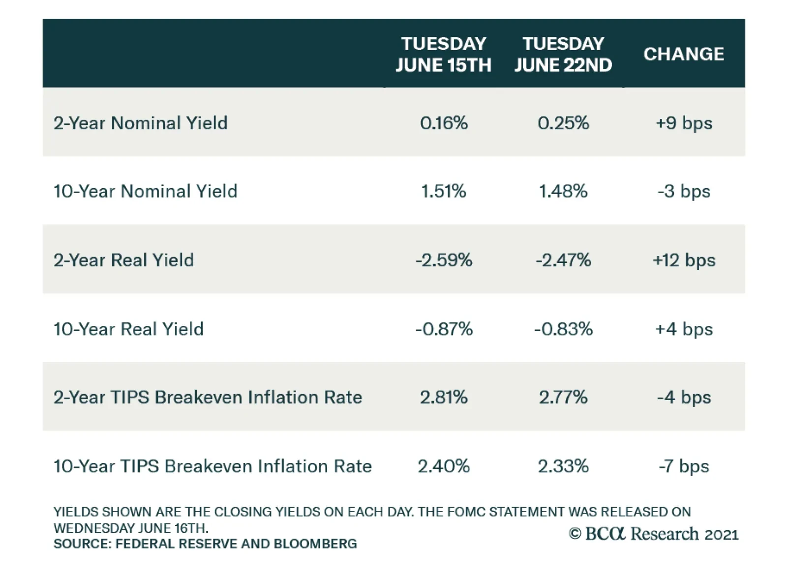
Bottom Line: The Fed’s interest rate projections moved up sharply in June but its verbal forward guidance on interest rates and asset purchases didn’t change in any meaningful way. Investors should ignore the Fed’s dot plot and assess the timing of rate hikes based on when they expect the Fed’s “maximum employment” goal to be met. We expect it will be met in time for Fed liftoff in 2022. How The Market Reacted As noted at the outset of this report, the bond market didn’t have the same sanguine reaction to the Fed’s communications as we did. It reacted as though the Fed had delivered a massive hawkish surprise. The major bond market moves were as follows: Short-maturity nominal Treasury yields jumped following the FOMC meeting on Wednesday, and those short-dated yields remained at their new higher levels through Thursday and Friday (Table 2A). Table 2AChange In Nominal Yields Following June FOMC Meeting
How To Re-Shape The Yield Curve Without Really Trying
How To Re-Shape The Yield Curve Without Really Trying
Table 2BChange In Real Yields Following June FOMC Meeting
How To Re-Shape The Yield Curve Without Really Trying
How To Re-Shape The Yield Curve Without Really Trying
Table 2CChange In TIPS Breakeven Inflation Rates Following June FOMC Meeting
How To Re-Shape The Yield Curve Without Really Trying
How To Re-Shape The Yield Curve Without Really Trying
The 10-year nominal Treasury yield also increased following the Fed meeting, but then gave back all of that increase and then some on Thursday and Friday (Table 2A). The result is a significant flattening of the nominal Treasury curve, consistent with the market discounting a more hawkish path for monetary policy. Looking at real yields, we see significant increases following Wednesday’s Fed meeting for all maturities (Table 2B). Then, with the exception of the 30-year yield, real yields did not fall back down later in the week. Finally, we see large declines in the cost of inflation compensation at both the short and long ends of the curve (Table 2C). Once again, this is consistent with the market pricing-in a more hawkish Fed that will be less tolerant of an inflation overshoot. In light of these significant yield moves, we consider the investment implications for the level of bond yields, the performance of TIPS versus nominal Treasuries and the slope of the nominal Treasury curve. The Level Of Yields Chart 65y5y Yield Has Upside
5y5y Yield Has Upside
5y5y Yield Has Upside
There were two major developments last week that influence our view on the level of Treasury yields. First, the market is now priced for a more reasonable December 2022 liftoff date and 87 bps of rate hikes by the end of 2023. Second, the 5-year/5-year forward Treasury yield fell sharply. It currently sits at 2.06%, just 6 bps above the median estimate of the long-run neutral fed funds rate from the New York Fed’s Survey of Market Participants and 25 bps below the same measure from the Survey of Primary Dealers (Chart 6). On the one hand, the market-implied path for overnight interest rates looks more in line with reality, though we still see scope for it to move higher. On the other hand, the 5-year/5-year forward Treasury yield now looks too low compared to consensus estimates of the long-run neutral interest rate. We are inclined to think that the market-implied path for rates will either stay where it is or move higher and that the drop in the 5-year/5-year forward yield is overdone. We maintain our recommended below-benchmark portfolio duration stance. TIPS Versus Nominal Treasuries As shown in Chart 1, long-maturity TIPS breakeven inflation rates have fallen back to levels below the Fed’s desired target range. We don’t think TIPS breakeven inflation rates will stay below target for long. The principal goal of the Fed’s new Average Inflation Targeting strategy is to ensure that long-term inflation expectations are well-anchored near target levels. Recent market action seems to imply that the Fed will overtighten and miss its inflation objective from below, but that is highly unlikely. We recently downgraded our recommended TIPS allocation from overweight to neutral because breakevens were threatening to break above the top-end of the Fed’s target band.6 We maintain our neutral 6-12 month allocation, but we do see long-maturity TIPS breakevens moving back into the 2.3% to 2.5% target band relatively quickly. Nimble investors may wish to buy TIPS versus nominal Treasuries as a short-term trade. Nominal Treasury Curve Slope Chart 7A Transition To Curve Flattening
A Transition To Curve Flattening
A Transition To Curve Flattening
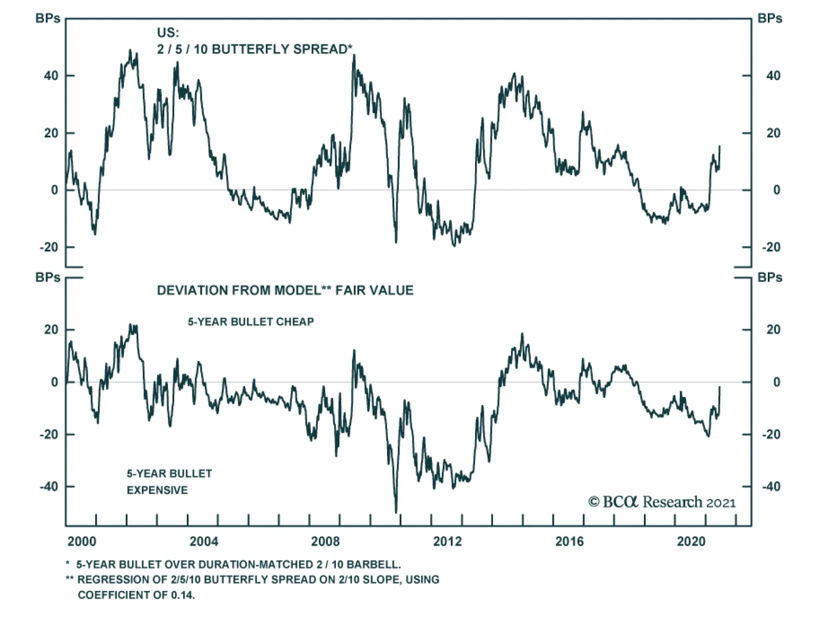
We see the potential for some of last week’s dramatic curve flattening to reverse in the near-term. It was, after all, a drop in long-maturity TIPS breakeven inflation rates that was responsible for the curve flattening on Thursday and Friday and, as was already discussed, this drop in the cost of inflation compensation will likely prove fleeting. However, if we look out on a longer 6-12 month time horizon, it is much more likely that the curve will continue to flatten rather than steepen. If we assume that the first rate hike occurs in December 2022, it means that we are roughly 18 months away from the start of a rate hike cycle. In past cycles, 18 months prior to liftoff was pretty close to the inflection point between curve steepening and flattening, whether we look at the 2/10, 5/30 or even 2/5 slope (Chart 7). For this reason, we think it makes more sense to enter curve flatteners at this stage of the cycle than steepeners, even though flatteners tend to have negative carry. We therefore exit our prior curve position – long 5-year bullet / short duration-matched 2/30 barbell – a trade that was designed to be a positive carry hedge against our below-benchmark portfolio duration allocation.7 In its place, we recommend that investors enter a 2/10 curve flattener. Specifically, we recommend shorting the 5-year note and going long a duration-matched 2/10 barbell. This trade offers a negative yield pick-up of 16 bps, but the 2/10 barbell does look somewhat cheap relative to the 5-year on our model (Chart 8). Chart 8Buy 2/10 Barbell, Sell 5-Year Bullet
Buy 2/10 Barbell, Sell 5-Year Bullet
Buy 2/10 Barbell, Sell 5-Year Bullet
We expect to hold this trade for some time, profiting from a bear-flattening of the 2/10 yield curve as we move closer and closer to eventual Fed liftoff. Ryan Swift US Bond Strategist rswift@bcaresearch.com Footnotes 1 Please see US Bond Strategy Weekly Report, “The Fed Looks Backward While Markets Look Forward”, dated March 23, 2021. 2 Please see US Bond Strategy Weekly Report, “Watch Employment, Not Inflation”, dated June 15, 2021. 3 Please see US Bond Strategy Weekly Report, “Entering A New Yield Curve Regime”, dated May 11, 2021. 4 Please see US Bond Strategy/Global Fixed Income Strategy Special Report, “A Central Bank Timeline For The Next Two Years”, dated June 1, 2021. 5 Please see US Bond Strategy Weekly Report, “Watch Employment, Not Inflation”, dated June 15, 2021. 6 Please see US Bond Strategy Portfolio Allocation Summary, “Fed Won’t Catch Inflation Fever”, dated May 4, 2021. 7 Please see US Bond Strategy Weekly Report, “Entering A New Yield Curve Regime”, dated May 11, 2021. Fixed Income Sector Performance Recommended Portfolio Specification
Highlights The Auto and Components industry group is in the middle of a momentous transition to electric and autonomous-vehicle manufacturing thanks to technological advances in battery storage, AI, and radars. The entire EV cohort will benefit from government support for decarbonization, the preferences of millennials for green tech, and cutting-edge technological innovation. Further, the price of gas has recently nearly doubled, average US vehicles are more than 12 years old, while most US consumers came out of recession unscathed. Is this the time for consumers to upgrade to EVs? Legacy Automakers are to be primary beneficiaries of the theme: Higher earnings and greater economic visibility regarding EV transition should lead to further rerating of the industry group. These carmakers are also turning into Growth stocks as an expected surge in earnings is far in the future. Tesla has already had an amazing run. Even though it is 30% down from its peak, it remains expensive, and much of the growth expectations are already baked into the price. We recommend staying neutral on Tesla as it is a “cult” stock and a surge “to the moon” is not out of question. Ecosystem: The surge in EV capex and R&D spending will give a boost to the entire supply chain, which consists of chip manufacturers, battery and lidar R&D, part manufacturers, and charging networks. Many of these companies are still small. An ETF may be the best way to capture these names. Existing EV themed ETFs may not be perfect: Many have holdings that are way too broad and over-diversified, most invest outside of the US. Yet, these are the convenient vehicles to capture the theme and provide exposure to the entire EV cohort. Some of the best-known ETFs are ARKQ, DRIV, IDRV, and KARS. We believe that the EV/AV theme will outperform the US equity market over the 3-12 months horizon. Overweighting EV is also consistent with our call to rotate into Growth as higher rates and the pick up in inflation appear to be priced in. Feature Auto And Components Industry Delivers Historical Technological Advances The auto industry is undergoing a monumental shift towards electric vehicles (EV) and autonomous driving thanks to technological advances in battery storage, AI, and radars. Transition to EV is happening at a fast pace: According to IEA, the number of EVs on the road increased from about 17,000 vehicles in 2010 to 7.9 million in 2019. Autonomous vehicles (AV) are still in a testing stage, but most automakers promise to put them on the road within the next decade. LMC Automotive forecasts that that by 2031, EVs will reach 17 million units, while AVs will approach one million in 2025. Investors are cheering on this transition: The MSCI USA Auto and Components sector has outperformed MSCI USA by over 300% (408% vs. 90%) since the pandemic trough in March 2020. The EV-themed ETF DRIV outperformed by 95%. In this Special Report we provide an overview of the EV and AV industries and their emerging ecosystem. It is structured as following: First, we discuss the tailwind for transitioning towards EV. Second, we identify the key players in the EVs and AVs space. Third, we look at ways that investors can best get exposure to the EV theme and provide an investment outlook for the space. EV Tailwinds: Biden Administration Pushes Toward “Clean Tech”, Millennials Cheer The Biden administration’s push toward decarbonization of the economy will further accelerate transition towards EVs with a host of fiscal, infrastructure, and executive actions, such as tax credits, scrappage incentives, and government purchases. The White House’s $1.7-2.3 trillion infrastructure bill – which is highly likely to pass by the end of the year with green initiatives intact – includes a $15 billion buildout of 500,000 charging stations (there are currently only 27,000 in operation). Executive action by President Biden has also tightened fuel-economy standards. Individual states like California have committed to zero-emission standards by 2030. Add this to the emerging preferences of millennials for clean tech, and fully electric vehicles are expected to account for 33% of all US auto sales by 2030. Of course, there are EV adoption challenges: EV batteries remain expensive, adding approximately $10,000 to the price of a vehicle. Charging infrastructure is sparse, while EVs have relatively limited driving ranges and long charging times. But even these obstacles will be resolved sooner rather then later. According to Cathie Wood, CEO and CIO of the ARK (thematic) ETFs, EVs will approach sticker parity with gas-powered cars as soon as 2023. And there are a number of new entrants developing charging networks. Even driving ranges are increasing with Lucid promising 500 miles per charge (Chart 1). Key Players In The US Market Tesla: Enormous Potential But Competition Is Catching Up Tesla is a pioneer of battery electric vehicles (BEV), rewarded with sky-high valuations and deep pockets. Its stock had a spectacular run, rising ten-fold in two years, getting ahead of itself: It is down 30% from its January peak. So what is the bull case for Tesla that justifies the multiples, and may be considered a catalyst for future outperformance? After all, manufacturing of EVs is likely to become a highly competitive and low-margin business. Tesla has four unique advantages that constitute its competitive “moat”: An extensive supercharger network in the US and worldwide. Its push towards increased vertical integration into capabilities such as battery manufacturing and other key enabling technologies would allow it to maintain a technological edge over competition, as well as protect the company against any potential supply-chain disruptions. A mobility ecosystem, especially of data and network, turning the car into “mobile real estate”, powered by the cloud and fueled ultimately by thousands of exabytes of data. A host of auxiliary businesses: Energy, insurance, mobility/rideshare, network services and third-party battery supply. However, despite its tremendous long-term potential, Tesla has only recently become profitable (Chart 2). Further, we can’t discount a possibility that Tesla’s dominance may come to an end. Not only are Ford and GM gearing up their EV operations, but also European and Asian vehicle manufacturers such as VW, BMW, Hyundai, and Toyota present a significant competitive threat. Further, Chinese EVs, such as NIO, Geely, BYD, and XPEV, could erode Tesla’s market share in the Chinese market. Chart 1EV Will Reach Price Parity With ICE In 2023
EV Revolution
EV Revolution
Chart 2Tesla Has Only Recently Become Profitable
Tesla Has Only Recently Become Profitable
Tesla Has Only Recently Become Profitable
Ford And GM Are Firmly Committed To EV Legacy automakers, such as Ford and GM, have no choice but to move aggressively into the EV space in order to survive the imminent regulatory push in Europe and the US to eliminate fossil-fuel cars. Also succeeding in the EV space is necessary to stave off competition from Tesla and other EV and legacy automakers (Chart 3). Recently, GM announced that it would accelerate its EV timeline and develop 30 new EV models by 2025, transitioning to 100% EV by 2035. It is targeting global EV sales of more than 1 million by 2025. On the heels of that announcement, Ford pledged to become all electric in Europe by 2030. The company anticipates that 40% of its global vehicle volume will be fully electric by 2030. Chart 3GM And Ford Need to Stave Off Competition From Tesla
GM And Ford Need to Stave Off Competition From Tesla
GM And Ford Need to Stave Off Competition From Tesla
The transition to EV is a major endeavor for all legacy automakers but, if successful, they will reap significant rewards by means of higher sales and profits as EVs become increasingly more popular. They will also emerge as prime competitors of Tesla. Waymo (Alphabet) Alphabet’s Waymo launched its first autonomous ride-hailing network in Arizona but will need time and significant resources to scale nationally. The company is also developing both local and long-haul AV networks to transport goods. So far the company has not been profitable, struggling to commercialize the product efficiently. New EV Players There is a host of newcomers into the EV/AV space in the US. Furthest down the path in the light-vehicle market are Lucid, Fisker, and Electrameccanica (Solo). Workhorse Group, and the controversial Nikola are most established in the truck space. There are also EV recreational vehicle makers such as Canoe and Green Power Motors. EV/Autonomous Vehicles Ecosystem There is a brand new ecosystem developing around EVs, with suppliers providing batteries, radars, and charging stations. The industry is highly fragmented, and most smaller suppliers on the cutting edge of technological innovation are too small to be part of any index just yet or are not even public yet. Batteries The recently IPO’d QuantumScape has developed a breakthrough technology for a battery that charges in just 15 minutes. The company has received significant investment from VW. Solid Power is its newest competitor, still privately owned. Romeo Power develops batteries for big trucks, buses, and construction equipment. And XL Fleet supports EV conversions for commercial vehicles. Lidars Companies like Luminar and Velodyne use Lidar technology to improve the 3-D “vision” of the self-driving cars. These ventures demand large investments into capex and R&D, but present significant future revenue opportunities to the winners. Waymo (Alphabet) relies on Lidar technology for its fleet of AV vehicles. Charging Networks There are also a few companies focused on developing private charging networks, overcoming the main obstacle on the path to EV adoption – the need for ubiquitous availability of charging stations: ChargePoint, EVBox and Volta. Chipmakers All these vehicles are powered by chips produced by Nvidia, Qualcomm, Micron, and other semiconductor manufacturers, and technological improvements taking place in this industry are literally exponential. It is not clear yet which of these entrants are here to stay and, in a way, the EV and AV industry should remind investors of biotech: Each of these companies requires only a small allocation as part of an EV basket in order to capture the 100-bagger future winners. Where Do You Find The EV/AV Theme In Equity Indices? EV Companies And Suppliers Are Spread Across A Multitude Of Sectors This may sound like a silly question. The answer is seemingly obvious: In the Auto and Components Industry Group. However, there is a whole host of companies that are part of the ecosystem that are neither in the S&P 500/MSCI USA nor in the Auto and Components industry group. Nvidia, Micron, and Qualcomm are chipmakers assigned to the Technology sector. Alphabet’s self-driving business unit, Waymo, sits within Communications Services. Velodyne (recently added to the Russell 2000), Luminar, Quantumscape, and XL Fleet are small caps. There are also a number of special purpose acquisition companies (SPACs) that are in the process of merging with EV companies (Lucid, Faraday, ChargePoint, etc.). Auto And Components Industry Group Is Dwarfed By Tesla Moreover, a key issue with Auto and Components GICS2 is that it is dominated by a few large companies: Ford, GM, and Tesla account for 90% of the segment by market cap. The rest is divided among several autoparts manufacturers. Moreover, despite generating sales equal to only a quarter of the sales of GM or Ford (in 2020 $31 billion vs $122 billion for GM and $116 billion for Ford), Tesla alone represents roughly 3/4 of the industry group by market cap, being five times larger than Chrysler and GM combined (Chart 4). In terms of market share, Ford and GM account for 6% and 9% of global auto sales respectively, while Tesla barely even registers on a radar at 0.8%. Tesla’s dominant position holds this industry group hostage to its price performance (Chart 5). Chart 4Tesla Dominates Auto & Components Industry Group
EV Revolution
EV Revolution
Chart 5Performance Of Auto Industry Is Held Hostage By Tesla
EV Revolution
EV Revolution
Therefore, it is more effective to pursue the EV theme via a more balanced and diversified custom stock basket or ETF. Having said that, because of the size of the three largest automakers, we rely on MSCI USA Auto and Components industry group as a proxy for the EV/AV investment theme for analytical purposes. EV ETFs Are Mushrooming Recently there appeared a number of ETFs powered by EV/AV themes, cutting across GICS, such as ARKQ, IDRV, KARS, and DRIV. The ETFs BATT and LIT narrowly focus on EV batteries. These ETFs contain a wide range of companies cutting across industries (See Appendix for details) Excluding the broader-themed ARKQ (Autonomous Technology and Robotics), the DRIV ETF is the most widely traded. This ETF contains all the same companies as the MSCI USA Auto and Parts industry group, but also covers the entire EV/AV supply chain from miners to companies manufacturing opto-electronic components like IIVI. DRIV contains 77 names, and ranges from giants like Tesla and Microsoft to the tiny Plug Power. It is a global ETF and includes names like Nio, VW, and Toyota. Not a single name exceeds 4% weight. DRIV is 67% correlated with MSCI USA Auto and Components, and is generally less volatile, as it is more diversified across a variety of sectors (Table 1). Table 1EV/AV ETFs
EV Revolution
EV Revolution
Key Revenue Drivers Reopening Trade And Global Growth Acceleration The Automobiles and Components industry group is a classic early cyclical, highly geared to economic growth, outperforming during the recovery stage of the business cycle. Global reopening has resulted in a sharp global growth acceleration and benefited US automakers’ sales at home and abroad. Indeed, total vehicle sales in the US have already exceeded pre-pandemic levels. The question is whether this surge may continue with a backdrop of a growth slowdown (albeit off high levels) and how fast supply-chain disruptions will be resolved. Consumers Are Flush With Cash Most vehicles are sold to consumers, whose sentiment and financial wellbeing are the key industry drivers. Ubiquitous vaccination and economy-wide reopening is increasing employment in the lower-paid cohorts most affected by lockdowns. Expiration of unemployment benefits and school reopening will see millions more returning to work this fall. Anticipating a surge in employment, consumer confidence has started to rebound, albeit off low levels. The most recent $1.9 trillion fiscal stimulus package with its $1,400 checks cut directly to consumers, bodes well for US auto sales. For many vehicles, this amount may be sufficient for a down-payment. Personal savings have increased by roughly $1.5 trillion from the January 2020 trough, and disposable income has increased by 6%. Coupled with low interest rates and an improvement in banks’ willingness to lend, US consumers are in an excellent shape to upgrade their vehicles (Charts 6 & 7). Chart 6Demand For Auto Loans Has Picked Up
Demand For Auto Loans Has Picked Up
Demand For Auto Loans Has Picked Up
Chart 7Lending Standards for Auto Loans Eased Up
Lending Standards for Auto Loans Eased Up
Lending Standards for Auto Loans Eased Up
However, plans to buy a new car have declined recently due to car shortages and a spike in prices. Supply Chain Disruptions Hurt Demand For Vehicles Pandemic has brought about unique challenges: Global pent-up demand and COVID-induced supply-chain disruptions led to a mismatch between supply and demand and resulted in sharp price acceleration across a wide range of goods. US automakers have been hit hard by the global chip shortage, resulting in plant shutdowns and lower output in some cases. Shortages of lithium, a key component of EV batteries, led to its price doubling. Transportation networks are also choked up, and delivery costs are up more than 30%. While these post-pandemic difficulties are transitory in nature, prices of vehicles spiked, making it the most volatile component of the latest CPI reading, with prices in May rising 16% YoY (Chart 8). Higher price tags and half-empty car lots at dealerships are dampening consumers’ intentions to upgrade their vehicles, despite their present financial wellbeing (Chart 9). Chart 8Prices Of Cars Surged
Prices Of Cars Surged
Prices Of Cars Surged
Chart 9Supply Disruption Dampened Demand For Vehicles
Supply Disruption Dampened Demand For Vehicles
Supply Disruption Dampened Demand For Vehicles
According to IHS Markit, the average age of vehicles on US roadways rose to a record 12.1 years last year, as lofty prices and improved quality prompted owners to hold on to their cars for longer. The average price for a new vehicle is $38,000, which is expensive for most Americans. However, there are early signs that supply disruptions are starting to dissipate: Production of motor vehicles rose 6.7% in May compared with a 5.7% decrease a month earlier. Once vehicle prices stabilize, or even correct, sales are likely to rebound. EV also enjoy a unique tailwind: The price of gasoline has doubled since the beginning of the year, making electric vehicles a more attractive proposition than gas-guzzling alternatives. Weaker Dollar Boosts Foreign Sales USD has weakened by 8% since the beginning of the pandemic. This bodes well for the US auto and parts manufacturers who derive about 1/3 of revenues from outside the US. A weaker USD not only stimulates demand by making vehicles cheaper for foreign buyers but will also benefit manufacturers' income statements via a currency-translation effect (Chart 10). Chart 10Weaker Dollar Boosts Foreign Sales
Weaker Dollar Boosts Foreign Sales
Weaker Dollar Boosts Foreign Sales
Profitability Of Automakers Belt-tightening Of 2020 Is Unsustainable Margin compression has been a problem for the industry group for a while as a race to enhance existing vehicles and transition to EV has been weighing on profitability (Chart 11). However, in 2020, despite a dip in sales volume, US automakers were able to successfully manage margins, by reducing R&D expenses, capex, and labor costs, and by halting increases in dividends and buybacks, and enjoying lower prices of industrial metals. Maintaining this new lean cost structure is hardly sustainable. Chart 11Margins Are Under Pressure
Margins Are Under Pressure
Margins Are Under Pressure
R&D And Capex Will Rise As Technological Innovation Demands Capital Outlays R&D and capex are likely to increase for the entire group. Legacy automakers are forced to operate on two distinct timelines by managing and investing in the immediate conventional vehicle production cycle, while concurrently preparing for the longer-term transition to a world of vehicle electrification and autonomous driving. Development of EVs requires deep pockets and substantial investments into both capex and R&D, which have been steadily rising (Charts 12 & 13). Chart 12R&D Expense Is Bound To Increase…
R&D Expense Is Bound To Increase…
R&D Expense Is Bound To Increase…
Chart 13… As Is Capex
EV Revolution
EV Revolution
Case in point, GM has recently announced a $35 billion investment into EV and AV, an increase of 75% from its initial pledge, an amount exceeding its gas and diesel investment. Not to be outdone, Ford has copied the move, pledging $30 billion on EV vehicle development, including battery development, by 2025. This is an increase of more than 35% over the $22 billion previously pledged. Clearly, commitment to EV siphons resources away from other businesses, and put pressures on automakers to keep up with competitors. Yet the market applauded these announcements by bidding up shares of both companies, implicitly saying that EV spending will lead to better future cashflows. Thus transition to EV moves auto stocks from the Value into the Growth camp, making the group more sensitive to interest rates. Runaway Cost Of Raw Materials Is Stabilizing Metals such as steel, iron, and aluminum comprise over 75% of the content of the car. The price of metals is particularly important to EV manufacturers as the body of an EV contains five times more steel than regular vehicles. In 2020 gross margin benefited from a dip in prices of industrial metals. However, the recent economic recovery has led to a rebound in the prices of commodities, with the GSCI Industrial Metals Index rising by more than 70% off the bottom and reaching 2010 levels (Chart 14). There are early signs that prices are stabilizing: The price of steel is down by 20%, copper by 13%, and aluminum by 6%, from their respective peaks (Chart 15). Chart 14Price Of Industrial Metals Have Spiked...
Price Of Industrial Metals Have Spiked...
Price Of Industrial Metals Have Spiked...
Chart 15...But There Are Early Signs Of Correction
...But There Are Early Signs Of Correction
...But There Are Early Signs Of Correction
High Operating Leverage Of Auto Manufacturers Amplified Earnings Growth Automakers and suppliers have high fixed-cost manufacturing facilities. As a result, their operating leverage is high, i.e., increases in sales are translated into even greater increases in profits. As 2021 sales are expected to rise, earnings will also continue to rebound, reaching or even exceeding pre-pandemic levels. Looking ahead, we expect earnings growth to decelerate as sales are likely to normalize while EV transitioning costs will continue to rise (Chart 16). However, eventually, EV investment will translate into higher sales volumes: Once new technology infrastructure is in place, the long-term profitability of the industry group will improve. Chart 16Earnings Are Rebounding To Pre-pandemic Levels
Earnings Are Rebounding To Pre-pandemic Levels
Earnings Are Rebounding To Pre-pandemic Levels
Valuations: Significant Dispersion Within Industry Group The auto and parts industry has been underperforming the market since February 2020, with valuations coming down significantly. Looking under the hood, we observe a pronounced bifurcation between Tesla and other stocks (Table 2). Table 2Tesla Is Still Expensive, Ford and GM Are Cheap
EV Revolution
EV Revolution
Tesla trades at an eye-watering 596x earnings (which is an improvement from 1,300x back in January) and 16.3x sales multiple. The company has enormous long-term potential, but over the short term it needs to grow into its valuations, as it has effectively “borrowed” returns from the future. Yet investors need to keep in mind that Tesla is a cult stock, and has a strong retail following: Continuation of an irrational speculative bubble is within the realm of possibility. Therefore, a neutral allocation to Tesla will be prudent. Legacy automakers and suppliers are still cheap despite a strong run off their market lows. Forward 12-month PE is in the single/low-double digit range. Low valuations indicate that there is still an overhang of uncertainty over the economic recovery and potential profitability of legacy car manufacturers and suppliers, along with lingering doubts about the success of the group in the EV space. However, there is a lot of room for long-term rerating once there is greater visibility (Chart 17). Chart 17With Tesla Down 30% From Peak, Industry Group Looks Cheaper
With Tesla Down 30% From Peak, Industry Group Looks Cheaper
With Tesla Down 30% From Peak, Industry Group Looks Cheaper
Investment Outlook We have a positive 3-12-month outlook for the investment performance of the EV theme: The entire EV cohort will benefit from government support for decarbonization, the preference of millennials for green tech, and cutting-edge technological innovation. American vehicles are getting old, and consumers have financial resources to purchase new cars. Supply disruptions are gradually dissipating. Gasoline is getting expensive, but EV/ICE parity is near. Investing in automakers and suppliers, which are turning into growth companies with longer duration of cash flows, is also aligned with our thesis of rotating into Growth as rates have stabilized and the pick up in inflation has been priced in. Legacy Automakers are to be primary beneficiaries of the theme. Both Ford and GM are relatively inexpensive. Higher earnings and improved visibility on the success of EV transition should lead to further rerating. Tesla is also a quintessential growth company. However, unlike legacy automakers, it has already had an amazing run. Even though it is down from its peak, it remains expensive, and much of the positive expectations are already baked into price. We recommend staying neutral on Tesla as it is a “cult” stock and a surge “to the moon” is not out of the question. Ecosystem Surge in EV capex and R&D spending will have positive spill-over effect on EV ecosystem suppliers. These are small cap stocks and creating a well-diversified basket of names in battery, radar, chips and software will help capture returns of the long-term winners. Existing EV-themed ETFs may not be perfect: Many have holdings that are way too broad and over diversified, most invest outside of the US. Yet, these are convenient vehicles to capture the theme and provide exposure to the entire EV value chain, including emerging industry players. Bottom Line: The auto industry is undergoing a major technological disruption. This process is expensive and perilous yet presents an enormous future earnings growth opportunity. The ingredients for success are in place: Proliferation of new technologies, government support, changing consumer preferences, and surging US economy. This tide will lift all boats: Legacy and EV-only auto manufacturers and suppliers as well as EV ecosystem players. We are bullish on the sector on a 3-12 months investment horizon. Irene Tunkel Chief Strategist, US Equity Strategy irene.tunkel@bcaresearch.com Appendix Table A1EV/AV ETF Summary
EV Revolution
EV Revolution
Recommended Allocation
EV Revolution
EV Revolution
Highlights Economy – We agree with the Fed’s judgment that sky-high inflation readings will not last: Used-car prices won’t go up forever and neither will airline fares or hotel accommodations. Supply bottlenecks affecting the prices of a wide range of goods will eventually ease. Markets – If growth is too strong for a recession but not so strong that it forces the Fed to induce a recession, equities and spread product will outperform Treasuries: Uncertainty surrounds the post-pandemic economy, but our base case is that the US will be able to grow well above trend in 2021 and 2022 without triggering uncomfortably high inflation. Strategy – Investors should remain at least equal weight risk assets in multi-asset portfolios: A strong-growth, easy-policy backdrop is good for equities and credit and investors should maintain exposure to them in balanced portfolios. Feature The unprecedented nature of the current economic backdrop, in which a global pandemic causes the US to idle large swaths of the economy, inject previously unimaginable amounts of aid to households and businesses to help them withstand its ravages, then attempt to restart the idled elements more than a year later, allows a lot of room for interpretation. One can see just about whatever one wants to see in the incoming flow of data as it is highly uncertain how long it will take the many individual engines to hum after their switches are flipped back to ON from OFF. Investors are charged with getting ahead of moves in forward-looking markets, however, and want to know now what awaits around the bend. Amidst the flow of often contradictory data points, we strive to maintain our focus on the broad overarching trend. We continue to find the Goldilocks-and-the-Two-Tails framework helpful in keeping our eye on the ball (Figure 1). Our base case remains that the just-right strong-growth/accommodative-monetary-policy backdrop will remain in place for the balance of our three-to-twelve-month cyclical investment time frame. COVID-19’s apparent retreat in the US1 leads us to believe that the too-cold left-tail outcome, characterized by disappointingly slow growth, is increasingly unlikely (Chart 1). Figure 1Goldilocks And The Two Tails
Checking In With The Inflation Checklist
Checking In With The Inflation Checklist
Chart 1The Pace Has Slowed, But A Lot Of Americans Are Already Vaccinated
The Pace Has Slowed, But A Lot Of Americans Are Already Vaccinated
The Pace Has Slowed, But A Lot Of Americans Are Already Vaccinated
Table 1Inflation Checklist
Checking In With The Inflation Checklist
Checking In With The Inflation Checklist
The right-tail outcome in which the economy overheats looks more probable and it is our primary concern. Overheating would bring uncomfortably high rates of consumer price inflation and we devote this week’s report to a review of our inflation checklist (Table 1). The checklist is not meant to identify the moment that inflation becomes a mortal threat to the expansion. We will not sound the alarm and adjust our asset allocation recommendations the instant that a pre-determined number of boxes are checked; it is simply meant to provide us with a systematic framework for assessing its movements and their implications for financial markets and the economy. Labor Market Indicators Chart 2Wages Are Not Yet A Hot Spot
Wages Are Not Yet A Hot Spot
Wages Are Not Yet A Hot Spot
The executive summary of last week’s examination of the labor market is that we expect the factors constraining supply will ease considerably by the fall as the services sector fully reopens, in-person learning resumes for all K through 12 students and federal supplements to unemployment insurance benefits expire. Demand for workers remains robust, with the JOLTS job openings rate and the NFIB survey’s unfilled job openings series making new highs. The combination of potent demand and constrained supply is not producing wage inflation, however. The Atlanta Fed’s wage tracker, which follows the same set of employees over time, has rolled over and is now nearly a full point below its post-GFC peak (Chart 2, middle panel); the employment cost index, which also adjusts for changes in labor force composition, is rising but remains near the bottom of its pre-GFC range (Chart 2, bottom panel); and the less-sophisticated average hourly earnings series has dipped below 2% (Chart 2, top panel). Price Indexes Checking the Marquee Indexes box was a no-brainer after the core CPI and core PCE price index made new multi-year highs in May. The question going forward is whether the surge in consumer prices is a one-off or a harbinger of a lasting change. We remain in the one-off camp with the Fed, figuring that the bottlenecks that have pushed month-over-month gains in the price indexes to multi-decade highs are a function of trying to ramp up production to more normal levels after a year-plus interruption. The trimmed-mean measures of core CPI and PCE send a much less worrisome message and suggest that once the bottlenecks driving outlier price increases are resolved, the marquee measures will settle down as well (Chart 3). Chart 3Trimmed-Mean Price Indexes Are Still Well Behaved
Trimmed-Mean Price Indexes Are Still Well Behaved
Trimmed-Mean Price Indexes Are Still Well Behaved
Pipeline Pressures BCA’s pipeline inflation pressure index did not let up in May (Chart 4, top panel), indicating that components like the CRB Raw Industrials Index are still pushing higher, reinforcing our Commodity and Energy Strategy team’s view that several years of tepid investment have left base metals and energy markets with supply deficits that will push prices higher into the intermediate term. The DXY index tested multi-year support at 90 but is holding above it for now (Chart 4, bottom panel), staving off the increase in import prices that could result from a technical breakdown in the dollar. There is also little direct inflation pressure coming from overseas, as consumer prices in the Eurozone and China, the two biggest economies outside of the US, remain contained (Chart 5). Chart 4Pipeline Pressures Have Not Eased, But The Dollar Staved Off An Inflationary Breakdown
Pipeline Pressures Have Not Eased, But The Dollar Staved Off An Inflationary Breakdown
Pipeline Pressures Have Not Eased, But The Dollar Staved Off An Inflationary Breakdown
Chart 5China And The Eurozone Aren't Exporting Inflation Pressures To The US Yet
China And The Eurozone Aren't Exporting Inflation Pressures To The US Yet
China And The Eurozone Aren't Exporting Inflation Pressures To The US Yet
Inflation Expectations Chart 6Markets Still Expect The Rate Of Inflation To Slow Over Time
Markets Still Expect The Rate Of Inflation To Slow Over Time
Markets Still Expect The Rate Of Inflation To Slow Over Time
The inflation expectations curve as derived from market-based measures remains inverted, indicating that investors agree with the Fed’s transitory inflation assessment. The message is the same as it was last month when we showed the TIPS break-even and CPI swap rates for the 2-to-5- and 5-to-10-year periods, though there have been some adjustments across the segments. The 2-to-5-year segment has become more inverted (Chart 6, top and third panels), which is to say that investors expect a larger drop-off in inflation in years three, four and five versus years one and two, while the 5-to-10-year segment has become less inverted (Chart 6, second and bottom panels). The curves still point to declining long-term inflation after a near-term spike, however, as inflation is projected to fall in years 3 to 5 and then hold steady (TIPS) or rise slightly (CPI swaps) in years 6 to 10 (Table 2). We find market-based measures to be more insightful than survey measures, but we were encouraged to see the University of Michigan consumer survey data follow the same pattern. The median 1-year inflation expectation, at 4% (down 60 basis points (“bps”) from May), was 120 bps above the median 5-year inflation expectation of 2.8% (down 20 bps from May’s reading). The New York Fed’s April Survey of Market Participants had 5-year-on-5-year CPI inflation rising, albeit at a modest level that demonstrated market professionals’ inflation expectations remain well anchored. The respondents’ median forecast for the annual rate of inflation from April 2026 through March 2031 was 2.2%, slightly above their 2.1% median forecast from April 2021 through March 2026. Table 2Investors Agree That Inflation Will Be Transitory
Checking In With The Inflation Checklist
Checking In With The Inflation Checklist
The Fed’s Reaction Function The June FOMC meeting accorded with our expectations. The post-meeting statement acknowledged the economy’s improvement as waning infections and an effective vaccination campaign have pushed the pandemic off of center stage. Meeting participants pulled their median liftoff date expectation into 2023 from 2024, aligning “the dots” more closely with financial markets and our own late-2022 view (Chart 7). They also significantly raised their 2021 inflation expectations from March, which had been trampled by the April and May CPI and PCE index releases. Chart 7Much Ado About A Modest Tweak
Much Ado About A Modest Tweak
Much Ado About A Modest Tweak
We were therefore surprised that the meeting produced so much excitement in financial markets. Treasuries gyrated, with yields soaring across all maturities Wednesday afternoon before long-dated issues unwound most of their backup (the 10-year note) or made new multi-month lows (the 30-year bond) in Thursday’s session. Yields at the short end of the curve stayed higher as the bond market moved its liftoff date expectations forward, with the net result that the Treasury curve flattened. The dollar popped, precious metals were hammered, and the NASDAQ rose while banks took a hit. We included the Fed reaction function items in our inflation checklist as a way of highlighting that the high-inflation end game will proceed once fed funds rate hikes are directed at containing it. When we introduced the checklist last month, we wrote that we would only check the Fed boxes in the event that Fed speakers begin to telegraph a change of direction or if the dots indicated that the bias toward accommodative policy was shifting. We do not think last week’s recognition that the March Summary of Economic Projections (SEP) had gone stale in the wake of subsequent data releases constitutes a change in the Fed’s accommodative stance. As a Wall Street Journal editorial lamenting that bias (and the administration’s ambitious spending plans) put it,2 Which of the following doesn’t fit with the others? A) 7% GDP growth in 2021. B) 5% and 3.8% year-over-year increases in CPI and core CPI, respectively. C) 4.5% unemployment by year-end, on its way to 3.8% at year-end 2022. D) A near-zero fed funds rate for two more years. As long as the Fed finds a way for D) to coexist with A), C) and whatever B) turns out to be over the ensuing months as transitory inflation pressures abate, there will be no need to check our reaction function boxes. Investors won’t have any need to get overweight benchmark duration to position for a cyclical rally in Treasuries, either. Why Bother? Our US Bond Strategy colleagues have noted that the inflation-related criteria for hiking rates have been met. Year-over-year PCE inflation is above 2% and with the SEP’s median headline and core projections for 2021 PCE inflation at 3.4% and 3%, respectively, it is on track to exceed 2% for some time. If the Fed abides by the specific guidance it has repeatedly outlined, the beginning of the next rate-hiking cycle will depend on the state of the labor market. An investor who wants to position for the cyclical inflection in Treasury yields will be best served by anticipating the path of nonfarm payrolls. We will continue to keep tabs on our inflation checklist, however, because inflation is an important tail risk. We are asked about it in every meeting and it is a hot topic in the general media as well. If households, businesses and investors were to become convinced that a new worrisome inflation regime had begun, financial markets and the economy would be roiled. Even though such a scenario lies outside of our base case, we will track it and think about how to navigate it on the general principle that we would rather be ready than have to get ready. Doug Peta, CFA Chief US Investment Strategist dougp@bcaresearch.com Footnotes 1 The 7-day averages of new cases and deaths have fallen all the way to their late March 2020 levels. 2https://www.wsj.com/articles/no-inflation-worries-at-the-fed-11623883322 Accessed June 17, 2021.