United States

The economic reopening has been an underlying theme throughout most of our research since last September that has allowed us, among other things, to harvest handsome gains from our long “Back-To-Work”/short “COVID-19 Winners” baskets pair trades to the tune of 42%. While in our research we primarily focused on exploiting how the pandemic affected different sectors of the US economy, in this Special Report we take an international approach. Specifically, we recommend a play that will benefit from the unfolding Chinese slowdown (China was the country that first emerged from the pandemic, and it has already gone through peak post-pandemic growth), and from the continuing recovery in developed markets (DMs) that are yet to reach their post-pandemic growth apex. Choosing The Trade Vehicle To express this cyclical 6 to 12-month time horizon trade, we chose an intra-commodity price ratio of long crude oil/short copper. Copper prices are intrinsically driven by China’s insatiable demand for commodities, and today the Middle Kingdom accounts for 60% of global copper consumption, up 200% from just 15 years ago (Chart 1, top panel)! At the same time, the crude oil market does not have a dominant end-demand consumer as even China accounts for only 15% of global consumption. The implication is that oil prices are a good proxy for global ex-China growth, whereas copper is a great China growth gauge. The bottom panel of Chart 1 also links China's consumption of copper relative to that of oil and the CPI differential between China and the rest of the world. Importantly, as DMs now enter a period of high CPI prints, the differential will dive deeper into negative territory supporting our thesis of preferring crude at the expense of copper. In the S&P 500 sector universe, Chart 2 shows that a long S&P oil & gas exploration & production (S&P O&G E&P)/short S&P metals & mining (S&P M&M) position approximates the oil-to-copper ratio. In this report we will stick to using this sub-sector level proxy. Chart 1China And Commodities
China And Commodities
China And Commodities
Chart 2Expressing The Trade Using Sectors
Expressing The Trade Using Sectors
Expressing The Trade Using Sectors
Review Of China’s Slowdown In December 2020, we first pointed out the risk of Chinese growth going on hiatus in the second half of 2021 serving as a catalyst to likely reset the stock market. Now that China is the center piece of our new pair trade, a brief review of Chinese macro data is in order. On the domestic front, China put a break on its fiscal stimulus programs that is not likely to change anytime soon. Since the GFC, China has a tendency to refrain from stimulating the economy – a rule that is only broken once an exogenous shock hits the system (Euro debt crisis in 2011, pop of the Chinese equity bubble in 2015, trade war in 2019, and finally the pandemic in 2020). Absent any black swan events, China’s fiscal support will continue its downward trajectory, which, at the margin, will cap future copper gains (Chart 3, bottom panel). Tack on the natural tightening from the Chinese sovereign bond market, and copper’s cyclically bullish thesis crumbles (Chart 3, middle panel). When we look at other regions that proxy mainland China, a similar message emerges. Chart 4 shows that not only is AUD/USD refusing to break above a key historical resistance level, but also Taiwanese SAR1 building permits are sniffing out some trouble. Both of these series confirm that Chinese, and by extension, copper’s growth is likely peaking. Chart 3Troubling News At Home…
Troubling News At Home…
Troubling News At Home…
Chart 4...And Abroad
...And Abroad
...And Abroad
Chart 5A Key Driver Is Turning
A Key Driver Is Turning
A Key Driver Is Turning
Finally, Chart 5 reiterates just how important China is for the S&P M&M index, which is due for a rough awakening. Review Of DM Growth The long leg of our trade relies on economic recovery in the DM region. The growth story for the US is well-known, so we will not spend much time on it besides reiterating that generous fiscal support and an accommodative Fed are here to stay for the foreseeable future, ensuring that real economic US growth will remain robust. This brings us to the next major DM player – Europe. When it came to the vaccine roll out, the old continent was slow at inoculation, which initially made for a sluggish recovery, but last month’s Eurozone PMI release showed that the common market is picking up steam. On top of that, several leading variables predict that the explosive rise in the euro area’s PMI is not a one-off print. A diffusion index comprising Swedish data remains on the ascent. Sweden is a hypersensitive economy partially focused on the early-stage production of industrials goods which makes it a good indicator of the future overall European growth. Next, the OECD’s Leading Indicator for the Eurozone that enjoys an approximately 5-6-month lead on the euro area PMI ticked up anew (Chart 6). Finally, a liquidity proxy in the form of M2 minus GDP growth reaccelerated after a brief pause emphasizing that the Eurozone’s recovery is here to stay (Chart 7). Chart 6Upbeat Soft Data Coupled…
Upbeat Soft Data Coupled…
Upbeat Soft Data Coupled…
Chart 7...With Plentiful Liquidity...
Intra-Commodity Pair Trade
Intra-Commodity Pair Trade
Chart 8 aggregates these three series into a leading model, which confirms that European PMIs will remain strong. The broader implication is that DM economic activity will remain healthy supporting higher WTI prices, at a time when China’s slowdown will be disproportionately weighing on copper prices. Chart 8...Equals Steady Eurozone PMI
...Equals Steady Eurozone PMI
...Equals Steady Eurozone PMI
Dollar Context We also think that the continuing US dollar bear market, which is BCA’s and our base case view, will be more beneficial to WTI prices given their tight historical inverse correlation. Chart 9 also shows that the rally in copper prices wasn’t driven by the greenback, instead it was China stock piling of the metal in light of the recent collapse in prices that drove copper higher. If anything, the US dollar is now a headwind for copper as the massive divergence between copper prices and the greenback will likely close through a catch down phase in the former. Chart 9US Dollar Tailwinds
US Dollar Tailwinds
US Dollar Tailwinds
Chart 10Enticing Industry-level Data
Enticing Industry-level Data
Enticing Industry-level Data
Delving Into Sector-level Data While both the S&P O&G E&P and the S&P M&M sub-industries are highly exposed to their respective commodities, their relative pricing power closely mimics the shape of the business cycle. The implication is that oil producers are more efficient at converting their raw commodity into earnings than mining companies (Chart 10, second panel) – a feature that is also evident once we dissect income statement data (Chart 11). Mixing that with more limited wage pressures in the oil & gas industry makes for a perfect cocktail that will boost relative operating margins favoring E&P producers (Chart 10, third & bottom panels). Chart 11Clean Earnings Pipes
Clean Earnings Pipes
Clean Earnings Pipes
What Is Priced In? Has the market and sell-side analysts already sniffed out this trade opportunity? The short answer is no. On a 12-month forward P/E ratio basis our long S&P O&G E&P / short S&P M&M pair trade is at the neutral zone. Similarly, on a 12-month forward P/S metric, this share price ratio is actually trading below its historical mean and in the neutral zone. The only metric that is a touch elevated is the relative net earnings revisions ratio, but again, it remains far from historical extremes (Chart 12). Switching from analysts’ forecasts to our TTM indicators, neither our Technical nor Valuation indicators are showing any signs of overbought conditions or overvaluation, respectively. Encouragingly, 6-month momentum also had a chance to reset courtesy of the recent pullback in the share price ratio, offering a compelling entry point to this trade (Chart 13). Chart 12Sell-side Is Late To The Party
Sell-side Is Late To The Party
Sell-side Is Late To The Party
Chart 13Technicals Give The Go-ahead
Technicals Give The Go-ahead
Technicals Give The Go-ahead
Bottom Line: Given the unfolding Chinese slowdown, yet still robust DM growth expectations, enticing sector-level data coupled with favorable technicals and valuations, it pays to initiate a long S&P oil & gas exploration & production / short S&P metals & mining market neutral trade as a way to capitalize on the China/DM growth differential on a 6 to 12-month time horizon. The ticker symbols for the stocks in the S&P 500 oil & gas exploration & production and S&P 500 metals & mining indexes are BLBG: S5OILP – COP, EOG, HES, COG, MRO, APA, PXD, DVN, FANG and BLBG: S5METL – FCX, NEM, NUE, respectively. Arseniy Urazov Senior Analyst ArseniyU@bcaresearch.com Footnotes 1 Taiwan (province of China).
Highlights The Fed: The Fed will formally discuss tapering plans over the course of this summer and fall and announce the slowing of asset purchases before the end of 2021. Its labor market objectives will also be achieved in time to lift rates in 2022. Non-US Developed Markets: The central banks outside the US most likely to deliver tapering and/or outright rate hikes over the next 1-2 years are those facing housing bubbles – the Bank of Canada and Reserve Bank of New Zealand. The ECB will do nothing on rates while adjusting asset purchase programs to preserve the size of its balance sheet, while the Reserve Bank of Australia will also sit on their hands for longer. Bond Strategy Recommendations: Investors should maintain below-benchmark portfolio duration in US-only and global fixed income portfolios. Global bond investors should also favor exposure in markets where central banks will be more dovish than expected (core Europe, Australia), while limiting exposure to markets where hawkish surprises are more likely (the US, Canada, New Zealand). Feature The recovery from the 2020 COVID recession is now well underway and many investors are getting antsy about when central bankers might respond by removing monetary policy accommodation. Some central banks appear more eager than others. Both the Bank of Canada and Bank of England, for instance, have already started to reduce their rates of bond buying. Meanwhile, the US Federal Reserve is only just now starting to talk about the timing of its own tapering. This Special Report lays out a timeline for what central bank actions we should expect during the next two years. The first section focuses exclusively on the US Federal Reserve and the second section incorporates likely announcements from other central banks. Based on a comparison of our expected central bank timeline with current market prices, we conclude that investors should maintain below-benchmark portfolio duration in US-only and global fixed income portfolios. Global bond investors should also favor government bonds in countries where central banks are likely to be less hawkish than markets expect (core Europe, Australia) versus bonds from countries where hawkish surprises are more likely (US, Canada, New Zealand and, potentially, the UK and Sweden). The Federal Reserve’s Timeline Chart 1 shows our anticipated timeline for when the Federal Reserve will make specific policy announcements between now and the start of 2024. Chart 1The Federal Reserve’s Timeline
A Central Bank Timeline For The Next Two Years
A Central Bank Timeline For The Next Two Years
First, over the course of this summer, the Fed will initiate discussions about when to taper its asset purchases. Then, asset purchase tapering will be announced at the December 2021 FOMC meeting with purchases set to decline as of the beginning of 2022. We expect that net Fed purchases will fall to zero by the end of Q3 2022. That is, by that time the Fed will no longer be adding to its securities holdings. Rather, it will keep the size of its balance sheet constant. Then, with its balance sheet no longer growing, the Fed will begin the process of lifting interest rates. We expect the first rate hike to occur at the December 2022 FOMC meeting. Finally, some time after the fed funds rate is well above the zero bound, the Fed will try to reduce the size of its securities portfolio. How do we arrive at this timeline? Table 1A Checklist For Liftoff
A Central Bank Timeline For The Next Two Years
A Central Bank Timeline For The Next Two Years
We start with the Fed’s forward guidance about the timing of the first rate hike (Table 1). The Fed has told us that it will lift rates off the zero bound once (i) PCE inflation is above 2%, (ii) the labor market is at “maximum employment” and (iii) inflation is expected to remain above 2% for some time. The first item on the Fed’s liftoff checklist has already been met and the third item logically follows from the other two. That is, if inflation is above 2% and the labor market is at “maximum employment” then the Fed will certainly expect inflation to remain high. This means that the second item on the Fed’s checklist is the most critical for assessing the timing of liftoff. In assessing the US labor market’s progress toward “maximum employment” we first have to define what “maximum employment” means. Based on the Fed’s communications, we infer that “maximum employment” means an unemployment rate between 3.5% and 4.5% - a range consistent with the Fed’s NAIRU estimates – and a labor force participation rate that has recovered back to pre-pandemic levels (Chart 2). Table 2 presents the average monthly growth in nonfarm payrolls that is required to reach that definition of maximum employment by specific future dates. For example, we calculate that average monthly payroll growth of 698k to 830k will cause the labor market to reach maximum employment by the end of this year. Average monthly payroll growth of 412k to 493k is required to hit the Fed’s target by the end of 2022. Chart 2Defining "Maximum Employment"
Defining "Maximum Employment"
Defining "Maximum Employment"
Table 2Average Monthly Nonfarm Payroll Growth Required To Reach Maximum Employment By The Given Date
A Central Bank Timeline For The Next Two Years
A Central Bank Timeline For The Next Two Years
The most recent issue of the Bank Credit Analyst posits several reasons why US employment growth will pick up steam in the coming months.1 We agree with this view and note that indicators of labor demand such as job openings, the NFIB “jobs hard to get” survey and the Conference Board’s “jobs plentiful” survey also point to accelerating employment gains.2 All told, we think that average monthly payroll growth of 412k to 493k is eminently achievable (Chart 3). This means that the Fed will hit its three liftoff criteria in time to hike rates before the end of 2022. Chart 3Max Employment By The End of 2022
Max Employment By The End of 2022
Max Employment By The End of 2022
Working backwards from the expected liftoff date, the Fed has said that it needs to see “substantial progress” toward the criteria listed in Table 1 before it will taper its pace of asset purchases. The definition of “substantial progress” remains somewhat unclear, but a few recent Fed communications provide some clues. First, Fed Chair Jay Powell said that he wants to see a “string of months” like the strong March employment report before it will be appropriate to reduce the pace of asset purchases. The question of how many months constitutes a “string” remains unclear, but it certainly seems plausible that we could see two or three more strong employment reports over the course of the summer. Other Fed Governors appear to agree with this timeline. Governor Randal Quarles: If my expectations about economic growth, employment, and inflation over the coming months are borne out, however, and especially if they come in stronger than I expect, then, as noted in the minutes of the last FOMC meeting, it will become important for the FOMC to begin discussing our plans to adjust the pace of asset purchases at upcoming meetings.3 Fed Vice-Chair Richard Clarida: I myself think that the pace of labor market improvement will pick up. […] It may well be the time that – there will come a time in upcoming meetings we’ll be at the point where we can begin to discuss scaling back the pace of asset purchases …4 Fed Governor Christopher Waller: The May and June jobs report[s] may reveal that April was an outlier, but we need to see that first before we start thinking about adjusting our policy stance.5 Our takeaway from these comments is that two or three more strong employment reports, say 500k or higher, would be sufficient for the Fed to more formally discuss tapering plans. Further, several Fed Governors seem to agree with our forecast that nonfarm payroll growth will accelerate in the coming months. With that in mind, it seems reasonable to expect that the Fed will discuss tapering plans over the course of the summer and fall, and that it will have seen sufficient labor market gains to announce a formal plan before the end of this year. Assuming that a tapering announcement occurs before the end of this year and that asset purchases actually start declining as of Jan 1st 2022, we estimate that the tapering process will conclude by the end of Q3 2022. That is, the Fed will hold the size of its balance sheet constant as of that date. Chart 4Balance Sheet Growth Will End Before The First Rate Hike
Balance Sheet Growth Will End Before The First Rate Hike
Balance Sheet Growth Will End Before The First Rate Hike
At the very least, the Fed will certainly bring its net purchases to zero before it lifts rates. This is because it would be incoherent for the Fed to be tightening policy through its interest rate actions while it eases policy with its balance sheet strategy. Indeed, this is the roadmap that the Fed followed leading up to the 2015 rate hike cycle (Chart 4). Finally, we note that the Fed will try to reduce the size of its balance sheet only after the process of rate hikes is well underway. This will be consistent with the last tightening cycle when the Fed waited until the funds rate was 1.5% before it pared the size of its securities portfolio (Chart 4). We also want to stress that the Fed will only try to reduce the size of its balance sheet. In fact, we doubt that this process will get very far. The main reason for our skepticism is that there is an ongoing structural issue in the Treasury market where the supply of securities keeps growing while stricter regulations make it more costly for primary dealers to intermediate trades.6 In this environment, there are strong odds that Treasury market liquidity will evaporate whenever there is a significant shock to financial markets. When that happens, the Fed will be forced to support Treasury market liquidity through large-scale purchases, as was the case during last March’s market turmoil (Chart 5). In essence, the likelihood of future shocks that will necessitate Fed intervention in the Treasury market makes it unlikely that the Fed will make much progress reducing the size of its balance sheet. Chart 5Fed Had To Support Treasury Market In March 2020
Fed Had To Support Treasury Market In March 2020
Fed Had To Support Treasury Market In March 2020
Market Expectations And Investment Implications We can get a sense of how our Fed timeline compares to consensus expectations by looking at the New York Fed’s Surveys of Market Participants and Primary Dealers (Tables 3A & 3B). Respondents to these surveys expect tapering to start in early 2022, in line with our expectations, though they generally see it taking longer for net purchases to fall to zero. Respondents also expect a later Fed liftoff date than we do and don’t see the Fed trying to reduce the size of its balance sheet until well after rate hikes have begun. Table 3ASurvey of Market Participants Expected Fed Timeline
A Central Bank Timeline For The Next Two Years
A Central Bank Timeline For The Next Two Years
Table 3BSurvey Of Primary Dealers Expected Fed Timeline
A Central Bank Timeline For The Next Two Years
A Central Bank Timeline For The Next Two Years
But more important for investors than survey results is what is currently priced into the yield curve. In that regard, the overnight index swap curve is priced for Fed liftoff in February 2023 and a total of 75 bps of rate hikes by the end of 2023 (Chart 6). We expect rate hikes to start earlier and proceed more quickly than that, and therefore recommend running below-benchmark duration in US bond portfolios. Chart 6Market Rate Expectations
Market Rate Expectations
Market Rate Expectations
The Timelines For Other Central Banks Policymakers outside the US are facing many of the same issues that the Fed is – rapidly recovering economies coming out of the pandemic, inflation overshoots, and surging asset prices. However, not every central bank will respond at the same time, or same pace, as the Fed. In Charts 7a and 7b, we show additional timelines for two of the most important non-Fed central banks: the European Central Bank (ECB) and the BoE. We see the likely dates and policy decisions playing out as follows. Chart 7AThe ECB’s Timeline
A Central Bank Timeline For The Next Two Years
A Central Bank Timeline For The Next Two Years
Chart 7BThe Bank Of England’s Timeline
A Central Bank Timeline For The Next Two Years
A Central Bank Timeline For The Next Two Years
European Central Bank For the ECB, the timing of its upcoming inflation strategy review is the most critical element. That report is due to be delivered in the latter half of this year, most likely in September or October (no firm release date has been announced by the ECB). It is highly unlikely that any meaningful policy changes will be implemented before that strategic review is completed. Some ECB officials have hinted that a move to a Fed-like interpretation of the ECB inflation target, tolerating overshoots of the target to make up for past undershoots, could result from the strategy review. The more likely option will be a move to an inflation target range, perhaps a 1-3% tolerance band, that offers more policy flexibility than the current target of just below 2%. This will potentially “move the goalposts” for the ECB in a way that will make monetary tightening even less likely compared to previous cycles. Looking at past ECB tightening episodes dating back to the central bank’s inception in 1998, it is clear that a majority of countries within the euro area must be seeing inflation that is high enough, with unemployment low enough, before any policy tightening can take place. Chart 8 illustrates this point, by showing “breadth” measures for unemployment and inflation across the euro area.7 Chart 8The ECB Usually Tightens When Growth AND Inflation Are Broad Based
The ECB Usually Tightens When Growth AND Inflation Are Broad Based
The ECB Usually Tightens When Growth AND Inflation Are Broad Based
Specifically, the chart shows the percentage of euro area countries with an unemployment rate below the OECD’s estimate of full employment (second panel), the percentage of euro area countries with headline inflation higher than one year earlier (third panel) and the percentage of euro area countries with headline inflation above the ECB’s 2% target (bottom panel). We compare those breadth measures to the actual path of policy interest rates and the size of the ECB’s balance sheet (top panel). The conclusion from the chart is that the euro area is still a long way from having the sort of broad-based rise in inflation or fall in unemployment necessary to trigger a reduction in the size of its balance sheet or actual interest rate hikes. Chart 9The ECB Is Under No Pressure To Tighten Pre-Emptively
The ECB Is Under No Pressure To Tighten Pre-Emptively
The ECB Is Under No Pressure To Tighten Pre-Emptively
Nonetheless, our expectation is that the ECB will want to begin preparing the markets for the end of the Pandemic Emergency Purchase Program (PEPP) - which has been buying government bonds since March 2020 in a less constrained fashion than previous asset purchase programs - shortly after the inflation strategy review is concluded. Much of the euro area economy is already showing signs of rapid recovery from pandemic induced lockdowns, amid an accelerating pace of vaccinations. On top of that, the Next Generation European Union (NGEU) recovery fund is set to begin distributing funds in the final quarter of 2021, providing a meaningful lift to government investment and expected growth in 2022. It will be difficult for the ECB to justify the need for an “emergency” program like the PEPP to continue against such a growth backdrop, especially with euro area inflation no longer at the depressed levels seen in 2020. We expect the ECB to begin preparing the market for the end of PEPP heading into the December 2021 ECB policy meeting, when it will be announced that the program will not be renewed when it expires in March 2022 (Chart 9). As always for such major policy announcements, the ECB will wish to do so when there is a new set of economic forecasts used to justify any changes. This is why December – the first meeting after the strategic review is completed that will also have new forecasts – is the earliest realistic date for an announcement on the PEPP. The communication around the PEPP announcement will need to be delicate, as the PEPP has significantly increased the ECB’s footprint in European bond markets. The share of government bonds owned by the ECB has increased by anywhere from five to ten percentage points since the PEPP began (Chart 10). We expect the ECB will be forced to expand its existing Public Sector Purchase Program (PSPP) to make up for the eventual disappearance of the PEPP. This means that the PEPP will be effectively “rolled into” the PSPP, to limit the damage from a likely post-PEPP surge in bond yields in the more fragile markets like Italy, Spain and even Greece – especially with the euro now trading close to pre-2008 highs on a trade-weighted basis (Chart 11). Chart 10The PEPP Can Expire, But Cannot Disappear
A Central Bank Timeline For The Next Two Years
A Central Bank Timeline For The Next Two Years
Chart 11ECB Must Avoid A 'PEPP Taper Tantrum'
ECB Must Avoid A 'PEPP Taper Tantrum'
ECB Must Avoid A 'PEPP Taper Tantrum'
There is a chance that the ECB will want to avoid any “PEPP taper tantrum” in Peripheral European yields (and spreads versus Germany) by making an announcement on PEPP expiry and PSPP expansion at the same meeting. If that happens, we suspect it would happen in December of this year rather than sometime in the first quarter of 2022. Beyond that, the ECB will likely seek to keep financial conditions as accommodative as possible by keeping policy interest rates unchanged well into 2023, with an actual rate hike not likely until mid-2024 at the earliest. The ECB could deliver a more modest form of “tightening” before then by letting some of the cheap bank funding programs (TLTROs) expire. Although we suspect that even those programs will need to be renewed, perhaps at less attractive financing terms, to prevent an unwanted tightening of credit conditions in the euro area banking system. Bank Of England Chart 12BoE Forecasts Are Conservative
BoE Forecasts Are Conservative
BoE Forecasts Are Conservative
Having already announced a tapering of the pace of its bond buying in early May, the BoE is likely to continue along that path over the next year. We expect the BoE, like the ECB, to make any future taper announcements when new sets of economic forecasts are published in Monetary Policy Reports. Thus, the next taper announcements are expected in August 2021, November 2021 and February 2022, with a full tapering down to zero net purchases (new buying only replacing maturing bonds) by May 2022 at the latest. The first rate hike will occur between 6-12 months after the end of tapering, possibly as early as November 2022 but, more likely in our view, sometime closer to mid-2023. The most recent set of BoE economic forecasts calls for headline UK CPI inflation to rise to 2.3% in 2022 before settling down to 2% in 2023 and 1.9% in 2024 (Chart 12). This would be a mild inflation outcome by recent UK standards during what will certainly be a period of strong post-pandemic growth over the next 12-18 months. Longer-term inflation expectations, both survey-based and extracted from CPI swaps and inflation-linked Gilts, are priced for a bigger inflation upturn above 3%. The BoE has been one of the least active central banks in the developed world since the 2008 financial crisis. The BoE main policy rate, the Bank Rate, has been no higher than 0.75% since then, even with the BoE threatening to lift rates to higher levels many times under the leadership of former Governor Mark Carney when inflation was overshooting the bank’s 2% target. Of course, the Brexit uncertainty since mid-2016 effectively tied the hands of the central bank and prevented any possible policy tightening. Now that Brexit has actually happened, however, the BoE has more flexibility to respond to developments with UK economic growth and inflation, as needed. A possible path for the UK Cash Rate was laid out in a recent speech by BoE Monetary Policy Committee (MPC) member Gertjan Vlieghe.8 He triggered a selloff across the Gilt market with his comment that a BoE rate hike could occur as early as Q2 2022 – with the Bank Rate rising to 1.25% from the current 0.1% by 2024 - under more optimistic scenarios for UK growth and employment. His base case, however, was that the coming uptick in UK inflation will prove to be temporary, but that a move towards full employment will make the first hike more likely toward the end of 2022 with modest rate increases in 2023 and 2024 that will take the Bank Rate to 0.75% (Chart 13). Chart 13Gilts Are Vulnerable To A Hawkish Surprise
Gilts Are Vulnerable To A Hawkish Surprise
Gilts Are Vulnerable To A Hawkish Surprise
Vlighe’s base case scenario on growth and interest rates is in line with the BoE’s current forecasts that call for spare capacity in the UK economy to be fully eliminated by mid-2022, with rate hikes to begin in mid-2023. That is broadly in line with our projected BoE timeline and with current pricing in the UK OIS curve, although we see risks tilted towards faster growth and inflation – and the BoE moving more aggressively than projected – over the next 12-18 months. Other Major Developed Market Central Banks Looking beyond the “Big Three” of the Fed, ECB and BoE, central bank timelines have become increasingly dependent on a single factor – the strength of domestic housing markets. House prices are booming in Canada, New Zealand and Sweden, with valuation measures like the ratio of median house prices to median incomes soaring to historical extremes according to the OECD (Chart 14). House prices are also climbing fast in the US and UK, but the valuation measures have not surpassed the peaks seen during the mid-2000s housing bubble. The housing boom has already motivated some central banks to respond by turning less dovish sooner than expected, even with unemployment rates still above pre-pandemic peaks (Chart 15).9 The BoC noted that soaring Canadian housing values motivated the taper announcement in April. The Reserve Bank of New Zealand (RBNZ) has come under political pressure over the growing unaffordability of New Zealand homes, with the government changing the central bank’s remit earlier this year to force the RBNZ to explicitly consider house price inflation when setting monetary policy. Chart 14Surging House Prices Can Turn Doves Into Hawks
Surging House Prices Can Turn Doves Into Hawks
Surging House Prices Can Turn Doves Into Hawks
Chart 15These CBs Could Turn More Hawkish Before Reaching Full Employment
These CBs Could Turn More Hawkish Before Reaching Full Employment
These CBs Could Turn More Hawkish Before Reaching Full Employment
We expect more tapering announcements from the BoC over the latter half of 2021, with a first rate hike likely sometime in the first quarter of 2022. We see the RBNZ moving aggressively, as well, tapering over the remainder of 2021 before lifting rates by the spring of 2022 at the latest. Sweden’s Riksbank will be the next central bank to turn more hawkish because of surging home values, although they will lag the pace of the BoC and RBNZ with Sweden only now beginning to emerge from lockdowns associated with a third wave of COVID-19 cases. Importantly, Australia – a country that has dealt with house price surges in the past – has seen house price valuations retreat over the past few years, even with the Reserve Bank of Australia (RBA) slashing policy rates to historic lows. The RBA also introduced yield curve control in 2020 to anchor the level of short-term bond yields, while also engaging in outright bond purchases to mitigate the rise in longer-term bond yields. With Australian inflation still remaining well below target in a year of rising global inflation, and with subdued labor costs likely to keep price pressures moderate over the next 12-18 months, we expect the RBA to move very slowly on both tapering and rate hikes. Finally, for completeness, we should note that we do not expect any policy changes from the Bank of Japan (BoJ) over the next two years, with inflation likely to remain far below the central bank’s 2% target. Non-US Investment Implications In Table 4, we show the timing of the first rate hike (i.e. “liftoff”), and the subsequent amount of total rate hikes to the end of 2024, as currently discounted in the OIS curves of the eight countries discussed in this report. We rank the countries in the table in order of liftoff dates, starting with the closest to today. Table 4The “Pecking Order” Of Central Bank Rate Hikes
A Central Bank Timeline For The Next Two Years
A Central Bank Timeline For The Next Two Years
The RBNZ is expected to hike first in May 2022, followed by the BoC (September 2022), the Fed (February 2023), the RBA (April 2023), the Riksbank (May 2023), the BoE (May 2023), the ECB (June 2023) and the BoJ (October 2025). The cumulative amount of rate hikes discounted to the end of 2024 rank similarly: more rate increases are expected in New Zealand (167bps), Canada (150bps), the US (137bps) and Australia (113bps); while fewer rate increases are expected in the Sweden (63bps), the UK (61bps), the euro area (31bps) and Japan (7bps). According to our various central bank timelines discussed in this report, we see the risks of a rate hike coming sooner than discounted by markets in the US, Canada and New Zealand. We see central banks moving slower than markets expect in the euro area and Australia, while we see Sweden and UK priced in line with our base case views (although we see risks tilted towards a more hawkish turn faster than expected in the latter two). The story is the same in terms of cumulative rate hikes discounted in OIS curves, with markets not pricing in enough rate hikes in New Zealand, Canada and the US – and, possibly, Sweden and the UK – while pricing too many hikes in Australia and the euro area. This leads us to recommend the following country allocations in a global government bond portfolio: Underweight the US, Canada and New Zealand Overweight Australia and core Europe (and Japan) Neutral Sweden and the UK, but with a bias to downgrade. Ryan Swift US Bond Strategist rswift@bcaresearch.com Robert Robis, CFA Chief Fixed Income Strategist rrobis@bcaresearch.com Footnotes 1 Please see The Bank Credit Analyst June 2021 Monthly Report, "Global House Prices: A New Threat For Policymakers", dated May 27, 2021. 2 Please see US Bond Strategy Weekly Report, “Lower For Longer, Then Faster Than You Think”, dated May 25, 2021. 3 https://www.federalreserve.gov/newsevents/speech/quarles20210526b.htm 4 https://ca.news.yahoo.com/federal-reserve-vice-chair-richard-clarida-yahoo-finance-transcript-may-2021-173007192.html 5 https://www.federalreserve.gov/newsevents/speech/waller20210513a.htm 6 For a longer discussion of Treasury market liquidity issues please see US Investment Strategy / US Bond Strategy Special Report, “Alphabet Soup 2: Shocked And Awed”, dated July 28, 2020. 7 For more details, please see Global Fixed Income Strategy Report, “ECB Outlook: Walking On Eggshells”, dated May 19, 2021. 8 The full speech can be found here: https://www.bankofengland.co.uk/speech/2021/may/gertjan-vlieghe-speech-hosted-by-the-department-of-economics-and-the-ipr 9 For more details on the global housing boom, see Global Fixed Income Strategy Special Report, “Global House Prices: A New Threat For Policymakers”, dated May 28, 2021. Fixed Income Sector Performance Recommended Portfolio Specification

The bull market in global equities is entering a riskier spot. This does not mean that the bull market is ending, but it means that its quality will deteriorate as the frequency and intensity of drawdowns is likely to rise relative to expected returns. …
Highlights We took a walk along a section of Fifth Avenue that is home to several mass affluent retailers, … : Sometimes strategists have to get out from behind their screens and take a look around, so we made a survey of the retail spaces on Fifth Avenue between 14th and 23rd Streets. … where the enormous glut of storefronts demonstrated that not every segment of the economy is subject to upward inflation pressure: We counted 78 spaces, only 49 of which were filled. It's a great time to rent retail space in the Flatiron/Union Square area and may well be in much of the rest of the country, too. Overall, the implications from our one-mile stroll appear to be constructive for financial markets and the economy: Stories about tight supplies and rising prices are getting all the headlines, but there are also pockets of the economy with excess capacity, and the inflation genie is not yet out of the bottle. Declining commercial rents help much more of the publicly traded universe than they hurt, and we still like equities. Feature Sometimes economists have to yank their heads out of the blizzard of data and models swirling around them and take a look at the real world beyond their screens. We did so last week, walking along a nine-block stretch of Manhattan’s lower Fifth Avenue. The segment, between 14th and 23rd Streets, runs from Greenwich Village’s prewar apartment buildings and nineteenth-century townhouses to the turn-of-the-century Flatiron Building, traversing the heart of Silicon Alley and running just west of some of the city’s best restaurants. Although the well-to-do long ago decamped uptown (Teddy Roosevelt’s and Edith Wharton’s childhood homes were within a block of our route), and the most elite retailers from the area’s Ladies’ Mile heyday followed, its heavy concentration of storefronts are generally filled by retailers seeking to appeal to a mass affluent constituency. In other words, it’s a nice area and one would expect those storefronts to be occupied, or in the process of being quickly refurbished to meet the needs of their next tenants, when the economy is booming. Instead, we find that only 49 of its 78 retail spaces are currently filled, leaving a whopping 37% vacancy rate.1 A two-part schematic of the properties shows the blocks from 14th to 19th Streets (Figure 1) and from 19th to 23rd Streets (Figure 2). The rendering treats every property as if it were the same size and makes no attempt to reflect its true relative scale. Blank spaces are inserted solely to balance blocks with unequal numbers of storefronts on the east and west side of the street. A vacancy’s most recent tenant is listed only when it can be definitively established by onsite and/or internet examinations. Figure 1Fifth Avenue Storefronts, 14th Street To 19th Street
Nine Blocks Of Fifth Avenue
Nine Blocks Of Fifth Avenue
Figure 2Fifth Avenue Storefronts, 19th Street To 23rd Street
Nine Blocks Of Fifth Avenue
Nine Blocks Of Fifth Avenue
A Tale Of (At Least) Two Economies The Many Winners The tumbleweeds blowing by the empty storefronts on Fifth Avenue illustrate the economic bifurcation that has resulted from the pandemic and the policy efforts undertaken to combat it. A handful of segments are suffering badly, which is par for the course after a recession, but an unusually high number of the rest are thriving. Many households in the bottom two-thirds of the income distribution have received more income than they would have if the pandemic had not occurred. The low-income unemployed were able to pocket more from augmented unemployment insurance (UI) benefits than they did from their jobs, while all singles earning $75,000 or less and married couples earning $150,000 or less were eligible for three rounds of economic impact payments that amounted to $3,200 per adult and $2,500 per child ($11,400 in total for a family of four). Constraints on their ability to spend their windfalls have bloated their savings and placed them on a sounder financial footing (Chart 1). Chart 1Aggregate Household Debt Is Manageable And Easy To Service
Aggregate Household Debt Is Manageable And Easy To Service
Aggregate Household Debt Is Manageable And Easy To Service
Households in the upper reaches of the income distribution have seen their wealth expand as generous monetary and fiscal policy helped financial markets recover faster than you can say “exploding budget deficit.” Suburban and exurban homeowners have seen the value of their homes surge (Chart 2, top panel) and many homeowners, no matter where they reside, have been able to refinance their mortgages at lower rates (Chart 2, bottom panel), pushing down their monthly payments. Nearly all households that were able to maintain their income have saved more since the onset of COVID-19 simply because of their reduced ability to consume amidst activity restrictions (Chart 3). Chart 2Homeowners Have Had A Good Pandemic
Homeowners Have Had A Good Pandemic
Homeowners Have Had A Good Pandemic
Chart 3Households' Pandemic Windfall
Households' Pandemic Windfall
Households' Pandemic Windfall
Large-cap business borrowers, who have participated in the cascade of corporate bond issuance that has allowed them to pre-fund their cash needs, term out their debt and reduce their debt service burden, have also been among the winners. So, too, have small-business employees who continued to be paid thanks to the forgivable Paycheck Protection Program loans extended to their employers. They may not have reaped the rewards of the median unemployed worker who received UI benefits exceeding their pay by more than a third, but they did get to share in the economic impact payment bounty. Banks have escaped the credit losses that reliably accompany a recession (Chart 4) and can look forward to capital-boosting loan-loss reserve releases as the year proceeds. Chart 4Banks Have Had A Good Pandemic, Too
Banks Have Had A Good Pandemic, Too
Banks Have Had A Good Pandemic, Too
The Losers Chart 5CRE Weakness Is Not A Systemic Threat
CRE Weakness Is Not A Systemic Threat
CRE Weakness Is Not A Systemic Threat
The reason why the forgoing list of winners is so long, and indeed, why equities and credit have had such a good recession, is because Congress and the Fed stitched together an enormous safety net. It couldn’t break everyone’s fall, however, and so there have been some losers. At the top of the list are the proprietors of PPP businesses, like restaurants, bars, concert venues and independent theaters, which have operated at partial capacity (at best) or have simply seen demand evaporate as cities cleared out and office workers remained home. On the territory covered by our walking survey, Eisenberg’s,2 which had occupied the same space opposite the Flatiron Building from 1929 to 2020, is the poster child for this unfortunate group. These independent businesses’ landlords or the lenders who hold their mortgages must be feeling the pinch, too. Despite rock-bottom interest rates that have pushed down the cost of financing property purchases, retail property cap rates (akin to the inverse of their P/E ratios) have been creeping higher, reaching a seven-year high in March, per Real Capital Analytics data on Bloomberg. It is easy to envision portfolios of properties on the nine blocks of our survey generating losses, as even one space with no revenue can be enough to make a handful of properties a loser. It is also easy to see landlords missing mortgage payments. The good news for the financial system is that overall bank exposure to commercial real estate (CRE) loans is at the low end of its 35-year range (Chart 5, top panel), with small banks holding two-thirds of them (Chart 5, bottom panel). While CRE loans account for a quarter of small banks’ aggregate loan book, they comprise just 6% of large banks’ lending portfolios (Chart 5, middle panel). A CRE credit event would sting commercial mortgage-backed security (CMBS) investors, like the life insurers and pension funds that have been avid CMBS buyers, but it would not have any meaningful adverse impact on the availability of credit. Investment Takeaways From A Mile Of New York City Sidewalk Falling rents will help S&P 500 profit margins. Supply and demand dictate that retail rents on Fifth Avenue between 14th and 23rd Streets will fall. 37% of its spaces are empty and they are owned by a patchwork of individual landlords, represented by at least five separate CRE brokers. Competition among the landlords to rent the spaces – to get any revenue in the door to offset the fixed outflows for mortgage payments and property taxes – will be fierce, just as it will among the brokers seeking to capture commissions, and it should preclude any potential for supplier collusion. This is a lessees’ market if there ever was one. Table 1Tenants Outweigh Landlords In The S&P 500
Nine Blocks Of Fifth Avenue
Nine Blocks Of Fifth Avenue
The Fall 2020 edition of the semi-annual retail rent report compiled by the Real Estate Board of New York (REBNY) echoes that conclusion. The “decreases [in average asking price-per-square foot rents] are historic, with 11 corridors [of the 17 surveyed] experiencing their lowest … averages in at least a decade. While asking rents dropped significantly, taking rents can be much lower, with some brokers citing average differences … around 20%. Increases in retail availabilities and feedback from … brokers indicate that we are in a tenant’s market.”3 The vacancy picture is not so bleak everywhere across the country, but many shopping center, strip mall and enclosed mall owners are likely to have to drop prices or ease terms to entice tenants. A shift in surplus from landlords to retail tenants should be afoot nationally, just as it should be from office owners to office tenants. Those surplus shifts will benefit S&P 500 earnings, as the aggregate market capitalization of retailers with a physical store presence far outstrips the market cap of retail REITs, and the aggregate market cap of S&P 500 constituents that rent office space dwarfs the market cap of office REITs (Table 1). Brick-and-mortar retail isn’t dead. Chart 6Absence Makes The Heart Grow Fonder
Absence Makes The Heart Grow Fonder
Absence Makes The Heart Grow Fonder
The rise of internet retailing has been perhaps the single biggest business development of the twenty-first century, and last spring’s lockdowns accelerated its already rapid market share gains. But e-commerce has lost some share in the early stages of relaxed restrictions and it will presumably lose more once a fully reopened economy allows people to re-engage in public activities (Chart 6). We do not challenge the proposition that e-commerce will take an even greater share of retail sales in the future, but the revealed preferences of retailers indicate that they believe it is important to maintain a physical presence. Retailers like The Gap, with three of its brands occupying the entire western side of Fifth from 17th to 18th Streets as well as the storefront at the southeast corner of Fifth and 18th (Figure 1), tout the strategic advantages of their omnichannel platforms, marrying a robust online presence with a well-located portfolio of physical stores. One could easily hawk Harry Potter-themed wares on the internet, but the impending opening of the massive Harry Potter store on the southeast corner of 22nd and 5th has generated buzz among the Peta children that would not have occurred virtually, given the cruel and horribly unfair restrictions that limit their online exposure. It and other brick-and-mortar retail concerns will find it easier to turn a profit in the current rental market.4 As both The Gap and lululemon noted in their earnings calls for the quarter ended January 31st, reduced rents contributed to wider gross margins. Runaway inflation is not a foregone conclusion, at least not any time soon. Central banking critics have been calling for runaway inflation ever since the Fed cut rates to zero and launched its large-scale asset purchases program in December 2008. They were further inflamed by QE2 in 2010 and QE3 in 2012, but their End-Is-Near warnings failed to come to pass. We expect that the combination of maximally easy monetary policy and fiscal largesse on an unprecedented scale may well produce annual consumer price increases that break out of the sleepy range that’s prevailed over the last two decades. As our previous two Strategy Reports have detailed, however, we don’t think the breakout is going to occur any time soon. The release of pent-up demand is sure to overwhelm restrained post-pandemic capacity in many segments of the economy. As a friend making travel arrangements from Washington, DC to Chicago for his daughter’s just-opened graduation ceremony reports, there were barely any available seats on flights and finding a hotel room in the Windy City was especially difficult. Inflation in those segments will be offset to some degree by commercial rent deflation, however, along with falling prices for used bar and restaurant equipment. Furthermore, we are confident that individuals and businesses throughout the economy will ramp up capacity as soon as it appears likely to be profitable. Employment will come back. All but the newest publicly traded retailers are actively engaged in rationalizing their physical store footprints, but Fifth Avenue’s vacant storefronts will not remain empty forever. Neither will all the spaces that held now-shuttered restaurants, bars and entertainment venues. There will be money to be made from the release of a year-plus of pent-up demand and sole proprietors, small businesses and national chains will jockey to capture their share of it. Any publicly traded company needs growth to satisfy the stock market and any concern that wishes to be acquired needs growth to obtain the highest possible sales price. Even if recovering retail activity initially takes the form of clusters of pop-up stores, conventional leases will again be signed once entrepreneurs get the sense that the demand to support business is here to stay. And once the businesses come, the employees to staff them will follow. April 2020 through May 2021 may have been a great fourteen months to be unemployed, but the United States is far from an idler’s paradise. When contractors’ and gig workers’ temporary UI benefit eligibility, along with the federal UI benefit supplement, expire everywhere by September and as early as June or July in 21 states and counting, people will return to work. Intervention creates winners and losers. If the authorities can’t bail out everyone when shocks hit the economy, there will be an observable divide between those who received support and those who didn’t. The gap between the winners and the losers may undermine social cohesion, but disparities offer professional investors an opportunity to separate themselves from the crowd. It might be a good time to acquire retail properties with sound longer-run prospects from holders whose financial positions may have become untenable. It may also be a good time to acquire businesses in the worst-hit segments, or to team up with the people who have the expertise to run them. Equities still have the wind at their back. When we came out from behind our terminal to do some first-hand research on Fifth Avenue, we also took note of the televised scenes from Madison Square Garden, less than a mile away to the north and west, and from Kiawah Island, off the coast of South Carolina. The spontaneous joy on display at the Garden and NBA playoff venues across the country as fans were once again able to come together to cheer on their favorite teams, and at the site of the PGA Championship, where the gallery engulfed popular soon-to-be champion Phil Mickelson and his playing partner as they made their way to the eighteenth green,5 leads us to believe that consumers are ready to be released from the past year’s constraints and gather, celebrate and spend. Looking around, we get the sense that a new, post-COVID chapter may have begun in the US. If the whole country is as keyed up as sports fans were two weekends ago, our view that corporate earnings growth can surpass even currently elevated expectations appears to be on track. As long as the virus truly is in retreat, equities will remain the place to be. Doug Peta, CFA Chief US Investment Strategist dougp@bcaresearch.com Footnotes 1 We conducted our in-person survey of the properties on Sunday, May 23rd and Monday, May 24th from the sidewalk, without accessing any of the vacant spaces. Our 78-space count is based on the properties’ current configuration, which is subject to change upon alterations by the properties’ owners. 2History – Eisenbergs NYC 3 REBNY Research, "Manhattan Retail Report (Fall 2020)." Accessed May 27, 2021. 4 REBNY’s Fall 2020 Retail Rent Report found that mean asking rents on Fifth Avenue from 14th to 23rd had fallen by 22% year-over-year and noted that effective rents have reportedly been much lower than asking rents. 5Golf crowd pours onto Ocean Course, mobs Mickleson on 18 | The State
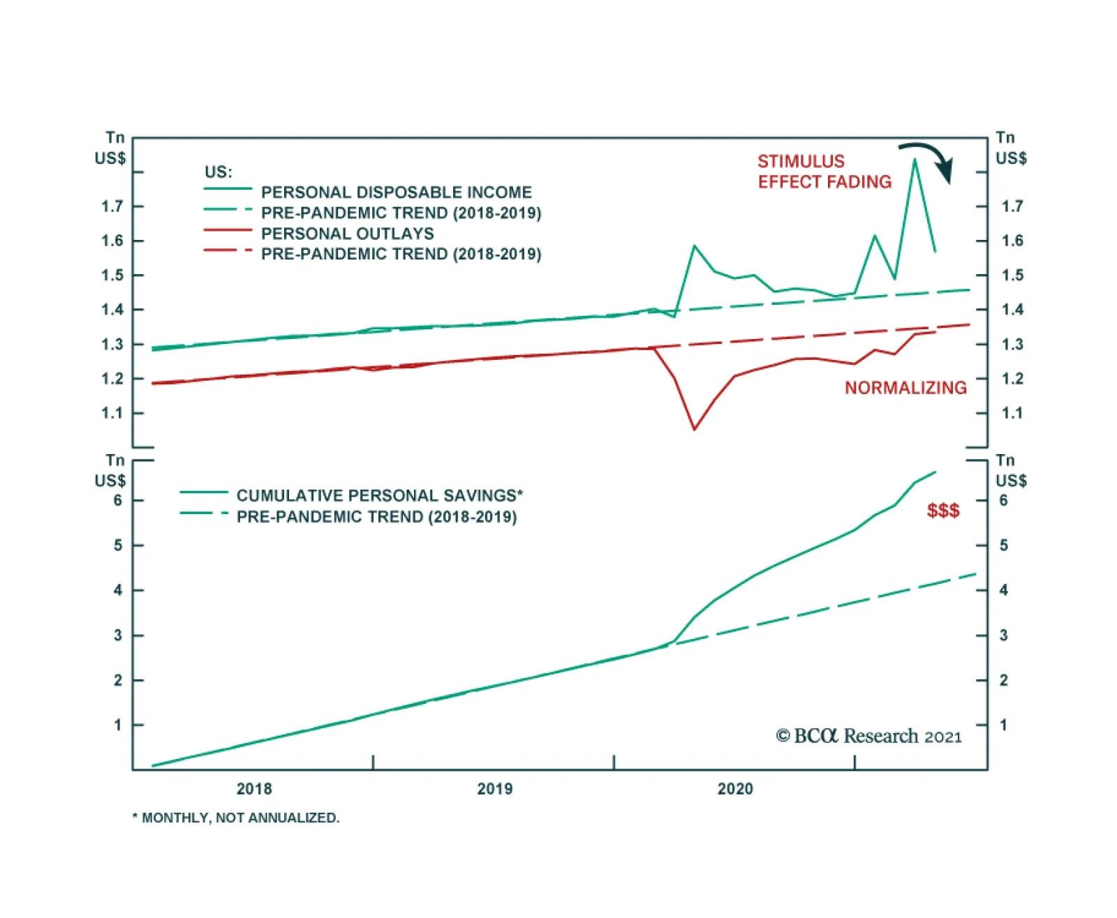
Although US income contracted sharply in April, the details of the Income and Outlays Report were relatively positive. On the income side, the 13.1% drop in income is better than the 14.2% contraction anticipated by the consensus. Moreover, the decline…
BCA Research’s Global Investment Strategy service concludes that the subdued pace of bank lending will mitigate inflationary pressures in the near term. Money growth has exploded in the US and to a lesser degree, in the other major developed economies. Not…
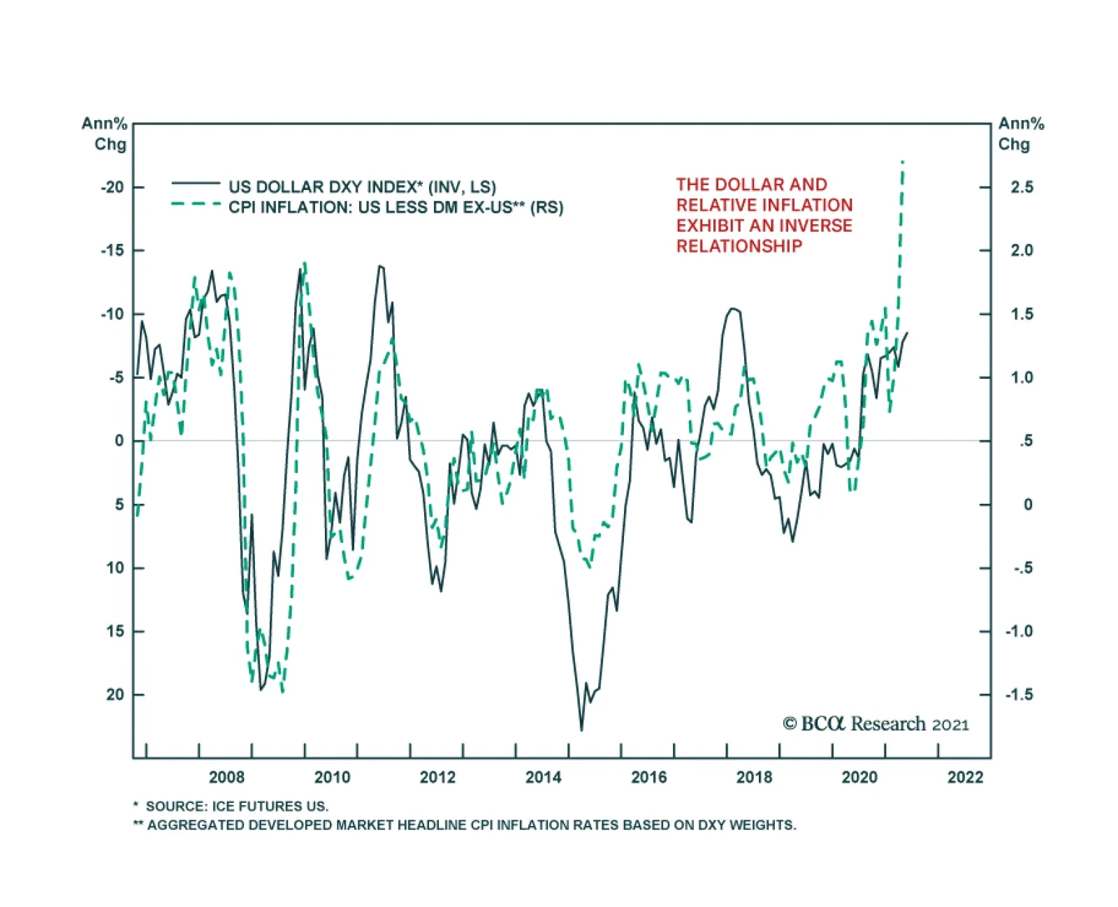
Most market participants have been paying close attention to the inflation overshoot in the US, and whether it is transitory. Currency markets, however, specifically the dollar, have been paying close attention to the inflation differential between the US and…
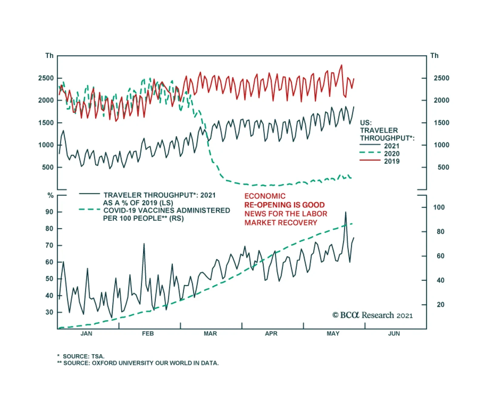
Data from the US Transportation Security Administration (TSA) suggests that US economic activity is normalizing rapidly. The number of travelers screened at TSA checkpoints in US airports continues to make fresh pandemic highs. Over the past week, that…
Underweight
Beware: Communications Equipment Value Trap
Beware: Communications Equipment Value Trap
Our underweight in the S&P communications equipment index is slightly in the green, and today we reiterate our below benchmark allocation in this niche tech sub-sector. The key reason for concern is industry pricing power. While the US economy is inflating on nearly every metric, communications equipment manufacturers are struggling to keep up, and their relative pricing power is sinking like a stone (second panel). In fact, year-over-year (y/y) growth for CSCO’s enterprise orders is at the 0% mark. Keep in mind that Q1/2020 is the earliest quarter that the pandemic started to wreak havoc, yet CSCO couldn’t even show a positive y/y number, despite soaring CEO capex intensions (bottom panel)! Thus, we view this tech sub-group as a value trap rather than an opportunity and we think there are valid reasons why the market is currently valuing this index at a 20% discount to the broad market on a forward P/E basis to the broad market (third panel). Bottom Line: We reiterate our underweight stance in the S&P communications equipment index. The ticker symbols for the stocks in this index are: BLBG: S5COMM – CSCO, JNPR, MSI, ANET, FFIV.
Highlights House prices are rising rapidly across the developed markets, in response to the extraordinary monetary and fiscal policy stimulus implemented to fight the pandemic. Evidence points to the house price surge being driven by monetary policy that has left real interest rates far below equilibrium levels. Supply factors are a secondary cause of the house price boom. Financial stability risks stemming from rising house prices are less acute than the pre-2008 experience, as overall household leverage has grown more slowly during the pandemic and global banks are better capitalized. Rapidly rising house prices are forcing some central banks to turn less accommodative earlier than expected. The recent hawkish turns by the Bank of Canada and Reserve Bank of New Zealand may be canaries in the coal mine for other central banks – perhaps even the Fed – if house prices and household leverage start rising together. Feature The COVID-19 pandemic led to the sharpest economic recession since World War II, alongside an enormous rise in unemployment. Consensus expectations call for the output gap to be closed (or mostly closed) in most advanced economies by the end of this year, but it remains an open question how quickly these economies will be able to return to full employment amid potentially permanent shifts in demand for office space and goods sold at physical, “brick and mortar” retail locations. Despite this sizeable and swift economic shock, house price appreciation accelerated last year in the developed world. Chart 1 highlights that US house prices rose at an 18% annualized pace in the second half of 2020, whereas they accelerated at a high-single digit pace in developed markets ex-US (on a GDP-weighted basis). This, in conjunction with a sharp rise in the household sector credit-to-GDP ratio (Chart 2), has unnerved some investors while raising questions about the implications for monetary policy. Chart 1House Prices Are Surging Around The World
House Prices Are Surging Around The World
House Prices Are Surging Around The World
Chart 2Rising Fears About Deteriorating Household Balance Sheets
Rising Fears About Deteriorating Household Balance Sheets
Rising Fears About Deteriorating Household Balance Sheets
Before we discuss the investment implications of the global housing boom, however, we must first accurately determine the reasons why it is happening. The Work-From-Home Effect: Less Than Meets The Eye When analyzing the surprising behavior of the housing market last year, the working-from-home effect brought upon by the pandemic emerges as an obvious factor potentially explaining house price gains. Last year, following recommended or mandatory stay-at-home orders from governments, most office-based businesses rapidly shifted to work-from-home arrangements as an emergency response. However, in the month or two following the beginning of stay-at-home orders, several national US surveys found many office workers preferred the flexibility afforded by work-from-home arrangements. Many employers, correspondingly, found that the productivity of their employees did not suffer while working from home, or that it even improved. Several prominent corporations in the US have subsequently made some work-from-home options permanent, or even allowed employees to work from offices in a different city than they did prior to the pandemic. Newfound work-from-home options have undoubtedly created new demand for housing, and thus explained the surge in house prices seen over the past year in the minds of some investors. However, in our view, evidence from the US, the UK, and France suggests that the work-from-home effect better explains differences in price gains across housing types and within large metropolitan areas, rather than aggregate or national-level changes in house prices. Chart 3 provides some quantification of the impact of work-from-home policies by plotting US resident migration patterns by city. This data has been compiled by CBRE, and the impact of COVID is shown as the change in net move-ins from 2019 to 2020 per 1000 people. This helps control for the underlying migration pattern that existed in US cities prior to the pandemic. Chart 3Work From Home Policies Have Impacted Migration Trends…
Global House Prices: A New Threat For Policymakers
Global House Prices: A New Threat For Policymakers
The chart highlights that the negative migration impact from COVID has been mostly concentrated in New York City and the three most populous cities on the West Coast (by metro area): Los Angeles, San Francisco, and Seattle. And yet, Chart 4 highlights that house price inflation in these four cities has accelerated to a double-digit pace, only modestly below the national average. Chart 4...But Cities With Outward Migration Still Have Very Strong House Price Gains
...But Cities With Outward Migration Still Have Very Strong House Price Gains
...But Cities With Outward Migration Still Have Very Strong House Price Gains
The house price indexes shown in Chart 4 represent aggregate, metro area trends, and clearly some regions within these metro areas have experienced house price deceleration or outright deflation versus gains in areas outside the urban core. But Chart 5 highlights that house prices have declined in Manhattan basically in line with the change in net move-ins as a share of the population, underscoring that double-digit metro area-wide house price gains appear to be vastly disproportionate to changes in net migration. Similarly, Chart 6 highlights that rents decelerated in the US over the past year but remained in positive territory and grew at a 3.5% annualized rate from February to April. Chart 5In Manhattan, House Prices Have Tracked Net Migration
Global House Prices: A New Threat For Policymakers
Global House Prices: A New Threat For Policymakers
Chart 6Rent Costs Have Decelerated, But Have Not Contracted
Rent Costs Have Decelerated, But Have Not Contracted
Rent Costs Have Decelerated, But Have Not Contracted
Evidence from Paris and London also suggests that a work-from-home effect is insufficient to explain broad house price gains. Panel 1 of Chart 7 highlights that house prices in France have accelerated significantly, but that apartment prices have decelerated only fractionally in lockstep. Panel 2 shows that the acceleration in house prices does reflect a work-from-home effect, as prices have risen faster in inner Parisian suburbs. Panel 3, however, highlights that Parisian apartment prices, the dominant property type in the urban core, have decelerated modestly. Chart 8 highlights that house price gains have not even decelerated in greater London; they have been merely been modestly outstripped by gains in Outer South East (outside of the Outer Metropolitan Area). Chart 7In France, Parisian Apartment Prices Are Simply Lagging, Not Falling
In France, Parisian Apartment Prices Are Simply Lagging, Not Falling
In France, Parisian Apartment Prices Are Simply Lagging, Not Falling
Chart 8In The UK, Greater London Property Prices Are Accelerating
In The UK, Greater London Property Prices Are Accelerating
In The UK, Greater London Property Prices Are Accelerating
The Policy Effect: The Fundamental Driver Of The Housing Market Despite the broader location flexibility that work-from-home policies now provide to potential homeowners, it seems inconceivable that the housing market would have responded in the manner that it has over the past year given the size of the economic shock brought on by the pandemic without significant support from policy. Above-the-line fiscal measures to the pandemic have totaled in the double-digits in advanced economies (Chart 9), and monetary policy has contributed to easier financial conditions via rate cuts, asset purchases, and sizeable programs to support financial market liquidity. Chart 9There Has Been A Massive Fiscal Policy Response To The Crisis
Global House Prices: A New Threat For Policymakers
Global House Prices: A New Threat For Policymakers
In fact, Charts 10-13 present compelling evidence that fiscal and monetary policy have been the core drivers of significant house price gains over the past year. Charts 10 and 11 plot the above-the-line fiscal response of advanced economies against the year-over-year growth rate in house prices as well as its acceleration (the change in the year-over-year growth rate). The charts show a clearly positive relationship, with a stronger link between the pandemic fiscal response and the acceleration in house prices. Chart 10Differences In Last Year’s Fiscal Response…
June 2021
June 2021
Chart 11…Help Explain Differences In House Price Gains
June 2021
June 2021
Chart 12Pre-Pandemic Differences In The Monetary Policy Stance…
June 2021
June 2021
Chart 13…Do An Even Better Job Of Explaining 2020 House Price Gains
June 2021
June 2021
Charts 12 and 13 highlight the even stronger link between house prices and the pre-pandemic monetary policy stance in advanced economies, defined as the difference between each country’s 2-year government bond yield and its Taylor Rule-implied policy interest rate as of Q4 2019. We construct each country’s Taylor Rule using the original specification, with core consumer price inflation, a 2% inflation target, and real potential GDP growth as the definition of the real equilibrium interest rate. The charts make it clear that easy monetary policy strongly explains house price gains in 2020, particularly the year-over-year percent change rather than its acceleration. This makes sense, given that monetary policy was already quite easy in many countries at the onset of the pandemic – meaning that changes were less pronounced than they would have been had interest rates been higher. The explanation that emerges from Charts 10-13 is that historic fiscal easing, combined with an easy starting point for monetary policy – that became even easier last year – enabled demand from work-from-home policies to manifest during an extremely severe recession. We agree that work-from-home policies have shifted the geographic preferences of some home buyers and likely provided a new source of net demand from renters in urban cores purchasing homes in outlying areas. But we strongly doubt that the net effect of work-from-home policies in the midst of an extreme shock to economic activity would have caused the rise in house prices that we have observed, certainly not to this level, without major support from policy. This underscores that policy, and not the work-from-home effect, has and will likely remain the core driver of the global housing market. The Supply Effect: Mostly A Red Herring Chart 14Countries Fall Into Two Groups In Terms Of The Relative Trend In Real Residential Investment
Countries Fall Into Two Groups In Terms Of The Relative Trend In Real Residential Investment
Countries Fall Into Two Groups In Terms Of The Relative Trend In Real Residential Investment
One perennial question that emerges when analyzing the housing market, particularly in markets with outsized house price gains, is the impact of constrained supply. It is frequently argued that constrained supply is squeezing prices higher in many markets, and that the appropriate policy solution to extreme house price gains is to enable widespread housing construction – not to raise interest rates. We do not rule out the potential impact of constrained supply in certain cities or regional housing markets, and we have highlighted in previous research that a positive relationship does exist between population density in urban regions and median house price-to-income ratios.1 But as a broad explanation for supercharged house price gains, the supply argument appears to fall flat. Chart 14 presents the most standardized measure of cross-country housing supply available for several advanced economies, the trend in real residential investment relative to real GDP over time. These series are all rebased to 100 as of 1997, prior to the 2002-2007 US housing market boom. The chart makes it clear that advanced economies generally fall into two groups based on this metric: those that have seen declines in real residential investment relative to GDP, especially after the global financial crisis (panel 1), and those that have experienced either an uptrend in housing construction relative to output or have seen a flat trend (panel 2). If scarce housing supply was the core driver of outsized house price gains, then we would expect to see stronger gains in the countries shown in panel 1 and smaller gains in the countries shown in panel 2. In fact, mostly the opposite is true: Charts 15 and 16 highlight that the relationship between the level of these indexes today relative to their 1997 or 2005 levels is positively related to the magnitude of house price gains last year, suggesting that housing market supply has generally been responding to demand over the past decade. The US and possibly New Zealand stand as possible exceptions to the trend, suggesting that relatively scarce supply may be boosting prices even further in these markets beyond what fiscal and monetary policy would suggest. Chart 15Countries That Have Seen A Stronger Pace Of Residential Investment…
June 2021
June 2021
Chart 16…Have Experienced Stronger House Price Gains
June 2021
June 2021
Chart 17Is This Not Enough Supply, Or Too Much Demand?
Global House Prices: A New Threat For Policymakers
Global House Prices: A New Threat For Policymakers
As a final point about the inclination of investors to gravitate towards supply-side arguments related to the housing market, Chart 17 presents a simple thought experiment. The chart shows a simple housing supply-demand curve diagram, in a scenario where the demand curve for housing has shifted out more than the supply curve has (thus raising house prices). Is this a scenario in which supply is too tight? Or is it a case in which demand is too strong? In our view, the tight supply answer is reasonable in circumstances where the increase in demand is normal or otherwise sustainable. But Charts 10-13 clearly showed that housing demand is being boosted by easy policy, which in the case of some countries has occurred for years: interest rates have remained well below levels that macroeconomic theory would traditionally consider to be in equilibrium, and this has occurred alongside significant household sector leveraging (Chart 18). As such, in our view, investors should be more inclined to view the global housing market as generally being driven by demand-side rather than supply-side factors. This Is Not 2007/08 … Yet We highlighted in Chart 2 above that the household sector debt-to-GDP ratio increased sharply last year, which has raised some questions about debt sustainability among investors. For the most part, the rise in this ratio actually reflects denominator effects (namely a sharp contraction in nominal GDP) rather than a huge surge in household debt. Chart 19 shows BIS data for the annual growth in total household debt in developed economies was roughly stable last year, at least until Q3 (the most recent datapoint available from the BIS). Chart 18Low Interest Rtaes Have Fueled Household Leveraging
Low Interest Rtaes Have Fueled Household Leveraging
Low Interest Rtaes Have Fueled Household Leveraging
Chart 19Total Credit Growth Has Been Stable, But Mortgage Credit Growth Is Accelerating
Total Credit Growth Has Been Stable, But Mortgage Credit Growth Is Accelerating
Total Credit Growth Has Been Stable, But Mortgage Credit Growth Is Accelerating
Chart 20US Mortgage Growth Is Picking Up, As Repayments Slow Consumer Credit Growth
US Mortgage Growth Is Picking Up, As Repayments Slow Consumer Credit Growth
US Mortgage Growth Is Picking Up, As Repayments Slow Consumer Credit Growth
But Chart 19 shows the recent trend in total household debt, which masks diverging mortgage and non-mortgage debt trends. In the US, euro area, Canada, and Sweden, household mortgage debt has accelerated to varying degrees, underscoring that households have likely paid down non-mortgage debt with some of the savings that they have accumulated from a significant reduction in spending on services. Chart 20 shows this effect directly in the case of the US; mortgage debt growth accelerated by roughly 1.5 percentage points in the second half of the year, whereas consumer credit growth (made up of student loans, auto loans, credit cards, and other revolving credit) decelerated significantly. This aligns with data showing that US households have used some of their savings windfall to pay down their credit card balances. This changing mix within household debt - less higher-interest-rate consumer credit, more lower-interest-rate collateralized mortgage debt – could, on the margin, help mitigate financial stability risks from the housing boom by moderating overall debt service burdens. The starting point for the latter matters, though, in accurately assessing the risks from rising house prices and increased mortgage debt, particularly in countries where household debt levels are already high. According to data from the BIS, the US already has one of the lowest household debt service ratios (7.6%) among the developed economies (Chart 21).2 This compares favorably to the double-digit debt service ratios in the “higher-risk” countries like Canada (12.6%), Sweden (12.1%) and Norway (16.2%). On top of that, US commercial banks have become far more prudent with mortgage loan underwriting standards since the 2008 financial crisis. The New York Fed’s Household Debt and Credit report shows that an increasing majority of mortgage lending made by US banks since the 2008 crisis has been to those with very high FICO credit scores (Chart 22). This is in sharp contrast to the steady lending to “subprime” borrowers with poor credit scores that preceded the 2008 financial crisis. The median FICO score for new mortgage originations as of Q1 2021 was 788, compared to 707 in Q4 2006 at the peak of the mid-2000s US housing boom. Chart 21Diverging Trends In Global Household Debt Servicing Costs
Diverging Trends In Global Household Debt Servicing Costs
Diverging Trends In Global Household Debt Servicing Costs
Chart 22US Banks Have Become More Prudent With Mortgage Lending
US Banks Have Become More Prudent With Mortgage Lending
US Banks Have Become More Prudent With Mortgage Lending
US bank balance sheets are also now less directly exposed to a fall in housing values. Residential loans now represent only 10% of the assets on US bank balance sheets, compared to 20% at the peak of the last housing bubble (Chart 23). This puts the US in the “lower-risk” group of countries in Europe, the UK and Japan where mortgages are less than 20% of bank balance sheets. This compares favorably to the “higher risk” group of countries where residential loans are a far larger share of bank assets (Chart 24), like Canada (32%), New Zealand (49%), Sweden (45%) and Australia (40%). Chart 23Banks Have Limited Direct Exposure To Housing Here
Banks Have Limited Direct Exposure To Housing Here
Banks Have Limited Direct Exposure To Housing Here
Chart 24Banks Are Far More Exposed To Housing Here
Banks Are Far More Exposed To Housing Here
Banks Are Far More Exposed To Housing Here
Like nature, however, the financial ecosystem abhors a vacuum. “Non-bank” mortgage lenders have filled the void from traditional US banks reducing their lending to lower-quality borrowers, and they now represent around two-thirds of all US mortgage origination, a big leap from the 20% origination share in 2007. Non-bank lenders have also taken on growing shares of new mortgage origination in other countries like the UK, Canada and Australia. Chart 25Global Banks Can Withstand A Housing Shock
Global House Prices: A New Threat For Policymakers
Global House Prices: A New Threat For Policymakers
Non-bank lenders do not take deposits and typically fund themselves via shorter-term borrowings, which raises the potential for future instability if credit markets seize up. These lenders also, on average, service mortgages with a higher probability of default, so they are exposed to greater credit losses when house prices decline. However, the risk of a full-blown 2008-style commercial banking crisis, with individual depositors’ funds at risk from a bank failure, are reduced with a greater share of riskier mortgage lending conducted by non-bank entities. This is especially true with global commercial banks far better capitalized today, with double-digit Tier 1 capital ratios (Chart 25), thanks to regulatory changes made after the Global Financial Crisis. Net-net, we conclude that the overall financial stability implications of the current surge in house prices in the developed economies are relatively modest on average. The acceleration in mortgage growth has occurred alongside reductions in non-mortgage growth, at a time when banks are better able to withstand a shock from any sustained future downturn in house prices. However, if house prices continue to accelerate and new homebuyers are forced to take on ever increasing amounts of mortgage debt, financial stability issues could intensify in some countries. Services spending will recover in a vaccinated post-COVID world, as economies reopen and consumer confidence improves, which will likely end the trend of falling non-residential consumer debt offsetting rising mortgage debt in countries like the US and Canada. Overall levels of household debt could begin to rise again relative to incomes, building up future financial stability risks when central banks begin to normalize pandemic-related monetary policies – a process that has already started in some countries because of the housing boom. The Monetary Policy Implications Of Surging House Prices Rapidly appreciating house prices are becoming an area of concern for policymakers in countries like Canada and New Zealand, where the affordability of housing is becoming a political, as well as an economic, issue. In the case of New Zealand, the government has actually altered the remit of the Reserve Bank of New Zealand (RBNZ) to more explicitly factor in the impact of monetary policy on housing costs. The Bank of Canada announced in April that it would taper its pace of government debt purchases and signaled that its decision was based, at least in small part, on signs of speculative behavior in Canada’s housing market. Macroprudential measures like limiting loan-to-value ratios of new mortgage loans are a policy option that governments in those countries have already implemented to try and cool off housing demand. Yet while such measures can help alleviate demand-supply mismatches in certain cities and regions, the efficacy of such measures in sustainably slowing the ascent of house prices on a national scale is unclear. In the April 2021 IMF Global Financial Stability Report, researchers estimated that, for a broad group of countries, the implementation of a new macro-prudential measure designed to cool loan demand reduced national household debt/GDP ratios by a mere one percentage point, on average, over a period encompassing four years.3 If macroprudential measures are that ineffective in sustainably reducing demand for mortgage loans, then the burden of slowing house price appreciation will have to fall on the more blunt instruments of monetary policy. Importantly, surging house price inflation is not likely to give a boost to realized inflation measures – an important issue given the current backdrop of rapidly rising realized inflation rates in many countries. Housing costs do represent a significant portion of consumer price indices in many developed countries, ranging from 19% in New Zealand to 33% in the US (Chart 26), with the euro area being the outlier with housing having a mere 2% weighting in the headline inflation index. Chart 26A Limited Impact On Actual Inflation From Housing
June 2021
June 2021
Yet those so-called “housing” categories overwhelmingly measure only housing rental costs and not actual house prices. This is an important distinction because rents – which are often imputed measures like in the US and not even actual rental costs - are rising at a far slower pace than actual house prices in most countries, so the housing contribution to realized inflation is relatively modest. So the good news is that booming house prices will not worsen the acceleration of realized global inflation that has concerned investors and policymakers in 2021. Yet that does not mean that central bankers will not be forced to tighten policy to cool off red-hot housing demand that is clearly being fueled by persistently negative real interest rates. In Chart 27 and Chart 28, we show both nominal and real policy interest rates for the “lower risk” and “higher risk” country groupings that we described earlier. The real policy rates are nominal policy rates versus realized headline CPI inflation. The dotted lines in the charts represent the future path of rates discounted by markets. Specifically, the projection for nominal rates is taken from overnight index swap (OIS) forward curves, while the projection for real rates is calculated by subtracting the discounted path of inflation expectations extracted from CPI swap forwards. Chart 27Markets Discounting Negative Real Rates For The Next Decade
Markets Discounting Negative Real Rates For The Next Decade
Markets Discounting Negative Real Rates For The Next Decade
Chart 28Negative Real Rates Are Unsustainable During A Housing Bubble
Negative Real Rates Are Unsustainable During A Housing Bubble
Negative Real Rates Are Unsustainable During A Housing Bubble
There are two key takeaways from these charts: Real policy interest rates are at or very close to the most deeply negative levels seen since the 2008 financial crisis. Markets are discounting that real rates will be at or below 0% for most of the next decade. Admittedly, there is room for debate over what the equilibrium level of real interest rates (a.k.a. “r-star”) should be in the coming years. However, we deem it a major stretch to believe that real rates need to be persistently low or negative for the next ten years to support even trend growth across the developed economies. In our view, the current boom in housing demand and mortgage borrowing provides clear evidence that negative real rates are below equilibrium and, thus, are stimulating credit demand. Thus, the only way for a central bank to cool off housing demand will be to raise both nominal and, more importantly, real interest rates. Canada and New Zealand will be the “canaries in the coal mine” among developed market central banks for such a move. According to the latest Bank of Canada Financial Stability Review, nearly 22% of Canadian mortgages are highly levered, with a loan-to-value ratio greater than 450%, a greater share of such mortgages than during the 2016/17 housing boom (Chart 29). Canadian house prices have risen to such an extent that home prices in major cities like Toronto, Vancouver and Montreal are among the most expensive in North America.4 Stunningly, a recent Bloomberg Nanos opinion poll revealed that nearly 50% of Canadians would support Bank of Canada rate hikes to cool off the red-hot housing market (Chart 30). The central bank will be unable to resist the pressure to use monetary policy to slam on the brakes of the housing market – investors should expect more tapering and, eventually, rate hikes from the Bank of Canada over at least the next couple of years. Chart 29Canadians Are Leveraging Up To Buy Expensive Homes
Canadians Are Leveraging Up To Buy Expensive Homes
Canadians Are Leveraging Up To Buy Expensive Homes
Chart 3050% Of Canadians Want A Rate Hike To Cool Housing
June 2021
June 2021
In New Zealand, worsening housing affordability has reached a point where a 20% down payment on the median national house price is equal to 223% of median disposable income (Chart 31). This is forcing more first-time home buyers to take on levels of mortgage debt that the RBNZ deems highly risky (top panel). Like the Bank of Canada, the RBNZ will prove to be one of the most hawkish central banks in the developed world over the next couple of years as the central bank follows their newly-revised remit to try and cool off housing demand in New Zealand. Who is next? Housing values, measured by the ratio of median national house prices to median national household incomes, are rising in the US and UK but are still below the peaks of the mid-2000s housing bubble (Chart 32). Meanwhile, housing is becoming more expensive across the euro area, but not in a consistent manner, with valuations in Germany and Spain having increased far more than in France or Italy. Housing valuations have actually improved in Australia over the past couple of years on a price-to-income basis. The most likely candidates for a housing-related hawkish turn are in Scandinavia, with housing valuations in Sweden and Norway closing in on Canada/New Zealand levels. Chart 31New Zealand Housing Is Wildly Unaffordable
New Zealand Housing Is Wildly Unaffordable
New Zealand Housing Is Wildly Unaffordable
Chart 32Global House Price/Income Ratios Are Trending Higher
Global House Price/Income Ratios Are Trending Higher
Global House Price/Income Ratios Are Trending Higher
Investment Conclusions The current acceleration in global house prices is an inevitable outcome of the extraordinary monetary and fiscal easing implemented during the pandemic. Higher realized inflation is pushing real rates deeper into negative territory in many countries, fueling the demand for housing. Central banks in countries with more stretched housing valuations will be forced to turn more hawkish sooner than expected, leading to tapering and, eventually, rate hikes to cool housing demand. This has negative implications for government bond markets in countries where housing is more expensive and real yields remain too low, like Canada, New Zealand and Sweden (Chart 33). Investors should limit exposure to government bonds in those markets over the next 6-12 months. Chart 33Negative Real Yields & Expensive Housing Valuations – An Unsustainable Mix
June 2021
June 2021
Bond markets in countries where house prices are not rising rapidly enough to force policymakers to turn more hawkish more quickly – like core Europe, Australia and even Japan - are likely to be relative outperformers. The US and UK are “cuspy” bond markets, as housing valuations are becoming more expensive in those two countries but the Fed and Bank of England are not facing the same domestic political pressure to use monetary policy tools to fight the growing unaffordability of housing. That could change, though, if overall household leverage begins to rise alongside house price inflation as the US and UK economies emerge from the pandemic. Current pricing in OIS curves shows that markets expect the RBNZ and Bank of Canada to begin hiking rates in May 2022 and September 2022, respectively (Table 1). This is well ahead of expectations for “liftoff” from other developed markets central banks, including the Fed in April 2023. The cumulative amount of rate hikes following liftoff to the end of 2024 is highest in Canada, New Zealand, the US and Australia. Those are also countries with currencies that are trading at or above the purchasing power parity levels derived from our currency strategists’ valuation models. This highlights the difficult choice that central bankers facing housing bubbles must confront, as the rate hikes that will help cool off housing demand will lead to currency appreciation that could impact other parts of their economies like exports and manufacturing. Table 1Hawkish Central Banks Must Live With Currency Strength
Global House Prices: A New Threat For Policymakers
Global House Prices: A New Threat For Policymakers
Tracking the second-round economic consequences of eventual monetary policy actions to control excessive house price inflation, particularly in “higher risk” countries, is likely to be the subject of future Bank Credit Analyst / Global Fixed Income Strategy reports. Robert Robis, CFA Chief Fixed Income Strategist Jonathan LaBerge, CFA Vice President The Bank Credit Analyst Footnotes 1 Please see Global Investment Strategy "Canada: A (Probably) Happy Moment In An Otherwise Sad Story," dated July 14, 2017, available at gis.bcaresearch.com 2 Importantly, the BIS debt service ratios include the payment of both principal and interest, thus making it a true measure of debt service costs that includes repayment of borrowed funds – a critical issue in countries with high loan-to-value ratios for home mortgages. 3 Please see page 46 of Chapter 2 of the April 2021 IMF Global Financial Stability Report, which can be found here: https://www.imf.org/en/Publications/GFSR/Issues/2021/04/06/global-financial-stability-report-april-2021 4 “Vancouver, Toronto and Hamilton are the least affordable cities in North America: report”, CBC News, May 20, 2021