United States

Highlights The ECB is not repressing interest rates and penalizing savers. The Eurozone shows none of the symptoms associated with financial repression. Global excess savings are keeping US rates depressed. If US rates are low, then European rates must be lower because of structural problems in the region’s economy, independent of the ECB’s preferences. Structurally, there is still no case for European yields to rise meaningfully compared to the rest of the world. Despite positive forces over the next year or two, European financials will remain long-term underperformers. European utilities will outperform US ones. The euro is transforming into a safe haven like the yen and the Swiss franc. Feature By maintaining negative short rates, the European Central Bank is conducting severe financial repression, which distorts rates of return and penalizes savers. This is a common refrain among many insurers and pension plan managers investing in Europe and among a large number of the region’s politicians. Chart 1The ECB's Financial Repression?
The ECB's Financial Repression?
The ECB's Financial Repression?
At first glance, this criticism is apt. For the past five years, negative policy rates have forced safe-haven Bund yields to trade well below the Euro Area’s nominal GDP growth (Chart 1). Moreover, the real ECB deposit rate remains well below the Holston, Laubach-Williams estimate of R-star (the real neutral rate of interest). If we go beyond these superficial observations, it is far from clear that the ECB is conducting financial repression or distorting market rates any more than other major global central banks. Is It Financial Repression? The ECB is not conducting financial repression; rather, it is responding to powerful economic forces in Europe and beyond that are depressing interest rates. The definition of financial repression is crucial to this assessment. Financial repression involves monetary authorities actively suppressing interest rates to the advantage of the borrowers and users of capital at the expense of the savers, whose risk-free investments then provide subpar rates of returns. Following this definition, financial repression shows these clear symptoms: A low savings rate. Suppressed interest rates do not adequately compensate savers to forgo consumption. Thus, they are less likely to put money aside. A significant build-up of debt. Real interest rates are below fair market value, which subsidizes borrowing. A significant expansion of the money supply. Money supply expands rapidly in response to strong credit demand in the economy. Plentiful capital expenditures. Savers must take on more financial risk to make appropriate returns on their assets, which compresses risk premia. Depressed internal rates of return boost the net present value of investment projects and thus cause investments to account for a large share of output. A current account deficit. A nation’s current account balance equals its savings minus its investments. By depressing savings and stimulating investments, financial repression results in a current account deficit or a sharply deteriorating current account balance. Above-trend GDP growth. By depressing savings and boosting investments, financial repression lifts cyclical spending and forces the GDP to rise above its potential. The problem for commentators who argue that the ECB is conducting financial repression is that the Euro Area meets none of these criteria. First, Eurozone money and credit growth has run well below that of the US ever since the euro crisis, despite ECB policy rates that are constantly lower than the Fed Funds rate. Moreover, since the ECB cut rates to zero, the pace of money and credit creation has decelerated significantly compared to their pre-crisis trends (Chart 2). Second, the Euro Area’s real GDP per capita, nominal GDP per capita, and the GDP deflator have also fallen 4.6%, 5.2% and 5%, respectively, behind those of the US, since the ECB has cut interest rates to zero (Chart 3). Moreover, the growth of these variables has also decelerated significantly over this period, which is consistent with depressed credit demand. Additionally, despite the inferior performance of European activity metrics compared to those of the US since the introduction of the common currency, European government bonds have performed exactly in line with those of the US (Chart 3, bottom panel) and have therefore outperformed in real terms. This is inconsistent with financial repression by the ECB. Chart 2Europe's Money And Credit Trends Are Too Tame...
Europe's Money And Credit Trends Are Too Tame...
Europe's Money And Credit Trends Are Too Tame...
Chart 3... So Are Output Volume And Price Trends
... So Are Output Volume And Price Trends
... So Are Output Volume And Price Trends
Finally, the Euro Area runs a current account surplus of 2.3% of GDP, which has grown by 4.1% of GDP since late 2008. This is the clearest sign that Eurozone savings have become excessive relative to investment, despite the surge in government deficits in the wake of the COVID-19 pandemic. Excess savings are not typically associated with central banks artificially distorting interest rates. Bottom Line: The economic developments in the Euro Area do not correspond to what would be anticipated if the ECB were repressing interest rates. The growth rate of money and credit has structurally slowed both in absolute terms and compared to that of the US. The same deceleration is evident in both real and nominal output per person, as well as in price levels. Finally, the Eurozone’s current account surplus has widened, which highlights that savings have grown in excess of investments. The Eurozone Needs Lower Interest Rates Than The US The ECB must set appropriately low interest rates, if US yields are low across the curve. In a way, the case that the Federal Reserve is conducting financial repression is stronger than the case against the ECB. Over the past twelve years, nominal and real output per capita have grown more robustly in the US, while money as well as credit expansion and inflation have also been stronger. The US runs a persistent current account deficit of 3.1% of GDP, which also indicates that it is not awash in excess domestic savings. Chart 4Maybe The Fed Is Repressing Interest Rates
Maybe The Fed Is Repressing Interest Rates
Maybe The Fed Is Repressing Interest Rates
We could even argue that the case for the Fed repressing interest rates is growing stronger. The federal budget deficit has expanded to 19% of GDP, even as the unemployment rate tumbles (Chart 4). Moreover, US quarterly GDP growth has averaged 8.5% since the fourth quarter of 2020 and, according to Bloomberg consensus estimates, is anticipated to average 6.3% for the remainder of the year. US inflation is also strong. Annual core CPI Inflation hit 3% in April; monthly core inflation was 0.92%, or an annualized rate of 11.6%, the strongest reading in almost 40 years. Yet, even in the US, the argument that the Fed is repressing interest rates is ultimately weak, despite the aforementioned economic strength. The Fed is accommodating global market pressures that are greater than those of the US economy. In other words, even if the Fed did not set short rates, US interest rates would be low across the curve because of global excess savings. Chart 5Too Much Savings, Everywhere
Too Much Savings, Everywhere
Too Much Savings, Everywhere
Excess savings around the world constitute an exceptionally strong gravitational force that anchor global rates at low levels. As Chart 5 shows, since the early 1990s, global private savings have outpaced investments by a cumulative 163% of GDP. Accumulated government deficit, which has accounted for 99% of global GDP, has been far too small to absorb fully this surplus of savings. The resulting imbalance places downward pressure on global inflation (a consequence of demand falling short of supply) and real interest rates, which means it depresses nominal interest rates across the curve. US interest rates also feel the yield-compressing effect of these excess global savings, even if the US economy does not generate excess savings itself (it runs a current account deficit). The major DM central banks are removing a greater proportion of the float of safe-haven from their jurisdictions than the Fed (Chart 6). The resulting scarcity of safe-haven securities means that US fixed-income products remain the natural outlet for global investors seeking safety and liquidity. Thus, despite the US lack of excess savings, Treasury yields have traded below nominal GDP growth 55% of the time over the past 30 years, no matter how strong US activity is or how wide federal deficits become. If the Fed has little choice but to accept low US interest rates, then the Eurozone must accept even lower interest rates because of its large excess savings. As Chart 7 illustrates, the 2-year and 10-year interest rate spreads (both in nominal and real terms) between the Eurozone and the US track the gap between the US current account deficit and the Europe’s current account surplus. Chart 6Treasurys Are The World Only Plentiful Safe-Haven
Treasurys Are The World Only Plentiful Safe-Haven
Treasurys Are The World Only Plentiful Safe-Haven
Chart 7Europe's Excess Savings Justify Lower Rates Across The Curve
Europe's Excess Savings Justify Lower Rates Across The Curve
Europe's Excess Savings Justify Lower Rates Across The Curve
The Eurozone lower rate of return on capital is another force depressing rates relative to the US (Chart 8). This lower return on capital reflects the following structural problems with the European economies: Excess capital stock. The Eurozone peripheral nations have abnormally large capital stocks in relation to their GDPs (Chart 9). As we previously argued, this feature means that Europe suffers from large amounts of misallocated capital, which hurt the return on capital. Chart 8Capital Is Not Rewarded In Europe
Capital Is Not Rewarded In Europe
Capital Is Not Rewarded In Europe
Chart 9Too Much Capital!
Too Much Capital!
Too Much Capital!
Ageing capital stock. Not only is the Eurozone capital stock too large relative to the size of its economy, it is also older than that of the US (Chart 10). An ageing capital stock, especially in a world where ICT spending is one of the key sources of innovation and growth, further hurts the Euro Area’s return on capital. Lower incremental output-to-capital ratio (Chart 11). The Euro Area generates significantly less output per unit of investment than the US. This confirms the notion that capital is misallocated and that it is used less productively than in the US. Chart 10Europe's Capital Is Ageing Too
Europe's Capital Is Ageing Too
Europe's Capital Is Ageing Too
Chart 11Poor Capital Utilization
Poor Capital Utilization
Poor Capital Utilization
Chart 12Europe's Inferior Productivity Problem
Europe's Inferior Productivity Problem
Europe's Inferior Productivity Problem
The final force limiting European interest rates compared to the US is the Euro Area’s inferior potential growth rate. The Eurozone’s population is ageing, and it will start to contract in 2030. Moreover, multifactor productivity growth is weaker than in the US (Chart 12). A lower potential GDP growth accentuates the discount in the Euro Area neutral rate of interest compared to the US. Bottom Line: Despite the relative economic vigor of the US, global excess savings lower US rates across the curve. The ECB has no choice but to accept even lower European rates, because the European economy suffers from greater excess savings than the US: its return on capital is inferior, and its neutral rate of interest is hampered by its lower potential GDP growth. Investment Conclusions For European rates to avoid the fate of Japan and to circumvent suffering many more decades wedged near zero, some important changes must take place. First, at the global level, excess savings must recede. This will allow global interest rates to increase, especially those of the US. Even if Eurozone rates continue to trade at a discount to the US, safe-haven yields in Europe would nonetheless climb in absolute terms. The fall in the global ratio of workers relative to dependent people, most notably in China where the 2020 population census has just highlighted the trend, is one factor pointing toward a potential gradual decline in global savings. For the moment, absorbing excess savings means that global fiscal policy must remain accommodative. Although fiscal authorities around the world continue to display greater profligacy than they did in the wake of the Great Financial Crisis, there is no guarantee that they will not revert to their old ways. In fact, BCA’s Global Investment Strategy service recently showed that the US fiscal policy is set to become more of a constraint on growth next year than it has been in 2020 and 2021 (Chart 13). One factor to monitor is the international shift in voters’ preferences toward left-wing economic policies, which often results in more generous fiscal spending. If this trend persists, then global fiscal deficits will close more slowly than the private sector savings will decline. This process will both be inflationary over the long run and impose upward pressure on real interest rates worldwide. But the fiscal excesses of the current moment may force opposition parties to restrain spending whenever they come into power. Chart 13Will Global Fiscal Policy Morph Into a Headwind?
The ECB Is Not In Charge
The ECB Is Not In Charge
Second, to narrow the spread between the Eurozone and US interest rates, the Euro Area must tackle its low rate of return on capital. Practically, this means that much of the excess capital stock weighing on European rates of returns must be written down. Doing so will require more cross border mergers and acquisitions within sectors in the Eurozone. However, the loss-recognition process on nonviable capital will be deflationary. Thus, to facilitate these asset write-downs, the region’s fiscal policy and monetary policy must first remain extremely accommodative. It is far from certain that European authorities will resist reverting to their old ways. A structural underweight on European financial equities remains appropriate. Even if the Eurozone enacts the reforms necessary to invite the peripheral asset write-downs required to boost rates of return in the long-run, in the interim, these reforms will be deflationary. Consequently, no matter what, Eurozone yields will remain well below the US for years to come. Moreover, European credit demand is unlikely to outperform the rest of the world for the coming few years. In this context, the RoE of European banks will remain low. Therefore, our current recommendation to overweight this sector is only valid as a near-term play on the global economic recovery and is not a strategic recommendation. By contrast, European utilities will structurally outperform their US counterparts. European utilities offer higher RoE than US ones and have healthier leverage (Chart 14). Moreover, European utilities trade at discounts to US firms on a price-to-book, price-to-cash flow, price-to-sales and dividend yield basis (Chart 15). Additionally, as yield plays, structurally lower European yields relative to those of the US will advantage European utilities on a long-term basis. Chart 14European Utilities Offer More Appealing Operating Metrics...
European Utilities Offer More Appealing Operating Metrics...
European Utilities Offer More Appealing Operating Metrics...
Chart 15... And Are More Attractively Priced Than US Ones
... And Are More Attractively Priced Than US Ones
... And Are More Attractively Priced Than US Ones
Finally, the euro will increasingly trade as a safe-haven currency like the yen and the Swiss franc. First, after a decade of trial by fire, EU integration and solidarity have gained rather than lost momentum and the EU break-up risk has proved to be limited to Brexit. Second, although the Eurozone economy is pro-cyclical, so are the Swiss and Japanese economies. Instead, the Euro Area’s structurally elevated savings rate and current account balance are transforming this economy into a net creditor, with a positive net international investment position equal to -0.1% of GDP. Moreover, the bloc’s low inflation will continue to put upward pressure on the euro’s long-term fair value. If we add the Euro Area’s low interest rates to the mix, then the euro is likely to behave increasingly as a funding currency. Thus, while the euro will benefit from the USD’s weakness forecasted by our Foreign Exchange Strategists, it will underperformed more pro-cyclical currencies such as the SEK, the NOK, or the GBP, which do not suffer from the same ills as the Eurozone. Mathieu Savary, Chief European Investment Strategist Mathieu@bcaresearch.com
Highlights April payrolls missed by a mile, suggesting growth expectations may need to be revised lower: 266 thousand net payroll additions is a dramatic shortfall when the consensus expects 1 million but we still expect the economy to return to full employment sometime around the middle of next year. April’s CPI report hinted that the US may already have an inflation problem: Core CPI rose 0.9% in its largest month-over-month increase since April 1982. We are not worried that ‘70s and ‘80s inflation is back, however, as a small segment of the core basket drove the increase and the categories in that segment are extremely unlikely to maintain their white-hot pace. The Fed is determined not to be fooled: We expect the Fed will remain resolute in its stated commitment not to overreact to transitory inflation pressures. Tapering is likely to begin by the end of this year or the beginning of 2022 and we agree with the money market’s assessment that the first rate hike will follow in late 2022. Neither element of that timetable is likely to pose a threat to the economy or financial markets over the next twelve months. Feature As we stated in last week’s quarterly webcast, we continue to expect the US economy will grow well above its trend level in 2021 and 2022, supported by lavish fiscal transfers and extremely accommodative monetary policy. Those factors are likely to continue to support risk assets, and we therefore remain bullish on equities and credit and recommend overweighting them in multi-asset portfolios while underweighting Treasuries and maintaining below-benchmark duration positioning in all fixed income portfolios. Holding constructive views on the economy and markets leaves us vulnerable to a weaker-than-expected expansion and higher-than-expected inflation readings. If the April employment situation report was a herald of sluggish hiring activity, or if the April CPI report revealed that inflation has already begun to get out of hand, our positioning would be at risk. We do not think either release was particularly concerning, as it looks to us like the economy will grow well above trend across this year and next. We are mindful, however, that there is no precedent for the events of the last fourteen months: a global pandemic caused vast swaths of the economy to shut down; monetary and fiscal policy turned ultra-accommodative to prevent the shutdown from leaving lingering economic scars; a new administration, in concert with a new Congressional majority, doubled the fiscal commitment after effective vaccines had already begun to turn the public health tide; and demand, bottled up for over a year in many categories, is way out ahead of capacity as the economy prepares to reopen fully. Trouble could be brewing, and it would be irresponsible not to re-examine our theses about the labor market and inflation but the April employment and CPI releases did not alter our views. The State Of The Labor Market The April employment situation report raised questions about whether the economy really was as strong as advertised. 266,000 net payroll additions typically constitute a pretty good haul, especially when the three-month moving average is 524,000. Those numbers fell well short of consensus estimates for a million new jobs in April and a 795,000 three-month moving average, however, and the resulting 700,000-plus miss may well have been the largest ever. 8.2 million fewer people are working now than in February 2020, before the pandemic struck. It is reasonable to ask, as one client did, if those jobs are really going to come back. We expect they will, as we still see employers hiring at a robust clip over the rest of the year and well into 2022, spurred on by the release of pent-up demand for services. Digging into nonfarm payrolls data by industry sector and selected subsectors, it looks like the major employment shortfalls will be cured once pandemic-stricken industries like restaurants, hotels, cinemas, live theaters and spectator sports can get back to business. Roughly 75% of the payroll losses over the last fourteen months have come from private service providers, 15% from government employers and 10% from goods-producing industries (Chart 1). Total nonfarm payrolls are down 5.4% since February 2020; among NAICS1 industries, only Information and Leisure & Hospitality, which employ 7.8% and 16.8% fewer workers, respectively, are far behind the overall economy (Chart 2). Chart 1Pandemic Job Losses
The Data That Cried Wolf
The Data That Cried Wolf
Chart 2Total Employment Is Down 5.4% And Two Industries Are Faring Much Worse
The Data That Cried Wolf
The Data That Cried Wolf
Digging down one more level shows that the employment pain has been highly concentrated, with ten services industry subsectors enduring three-quarters of the job losses despite accounting for less than a third of private service-providing jobs (Chart 3). These subsectors, which have shed anywhere from 7 to 40% of their pre-pandemic workforce (Chart 4), will have to revive if the economy is going to get back to pre-pandemic employment levels. The labor market and the overall economy would be in trouble if these subsectors faced permanent impairment, but their long-run employment trends are encouraging. Chart 3Ten Subindustries Have Lost Three-Quarters Of Private Services Jobs ...
The Data That Cried Wolf
The Data That Cried Wolf
Chart 4... And Their Workforces Are Still Decimated
The Data That Cried Wolf
The Data That Cried Wolf
Only Broadcasting (ex-Internet) was experiencing steady decline before the pandemic (Chart 5, top panel) and it employs comparatively few people. The other subsectors broadly outgrew aggregate nonfarm payrolls from 1990, when most of the individual payrolls series began (Chart 5, bottom panel), and we do not expect that demand for these service niches will disappear. With the exception of radio, TV and cable broadcasting, we expect demand for all of the hardest-hit categories (Box 1) will come surging back once the pandemic has been subdued. People are clamoring to eat and drink in restaurants and bars, to return to live entertainment venues, to fly for vacations or to visit family and friends and they are desperate for schools to reopen, caregivers to return to duty and a range of personal service providers to perform some of the functions they have had to insource or do without for fourteen months. Chart 5The Weakest Subsector Is Also The Smallest
The Weakest Subsector Is Also The Smallest
The Weakest Subsector Is Also The Smallest
Box 1: Hard-Hit NAICS Categories 481: Air Transportation Industries in this subsector provide air transportation of passengers and/or cargo using aircraft, such as airplanes and helicopters. 512: Motion Picture And Sound Recording Industries Industries in this subsector are involved in the production and distribution of motion pictures and sound recordings. 515: Broadcasting (Except Internet) Industries in this subsector create content or acquire the right to distribute content and subsequently broadcast it. It includes two industry groups: Radio and TV Broadcasting and Cable and Other Subscription Programming. 561: Administrative And Support Services Industries in this subsector engage in activities that support the day-to-day operations of other organizations. Many of the activities performed in this subsector are ongoing routine support functions that all businesses and organizations must do and that they have traditionally done for themselves. Recent trends, however, are to contract or purchase such services from businesses that specialize in such activities and can, therefore, provide the services more efficiently. 61: Educational Services This sector comprises establishments that provide instruction and training in a wide variety of subjects and is provided by specialized establishments, such as schools, colleges, universities and training centers. They may be private, for-profit institutions or publicly owned and operated. All industries in the sector share a commonality of process – labor inputs of instructors with the requisite subject matter expertise and teaching ability. 624: Social Assistance Industries in this subsector provide a wide variety of social assistance services directly to their clients. These services do not include residential or accommodation services, except on a short-stay basis. 71: Arts, Entertainment And Recreation The sector includes a wide range of establishments that operate facilities or provide services to meet varied cultural, entertainment and recreational interests of their patrons. Some establishments providing these facilities or services are classified in other sectors. Those providing accommodations and recreational facilities are classified in 721, Accommodation. Restaurants and night clubs providing live entertainment are classified in 722, Food Services and Drinking Places. Movie theaters, libraries and publishers are classified in 51, Information. 721: Accommodation Industries in the subsector provide lodging or short-term accommodations for travelers, vacationers and others. 722: Food Services And Drinking Places Industries in the subsector prepare meals, snacks and beverages to customer order for immediate on-premises and off-premises consumption. 812: Personal And Laundry Services Establishments in this classification provide personal and laundry services to individuals, households and businesses, including personal care services; death care services; laundry and dry cleaning services; and a wide range of other personal services, such as pet care (ex-veterinary) services, photofinishing services, temporary parking services and dating services. The Inflation Genie Has Not Gotten Out Of The Bottle April headline and core CPI surprised to the upside by a significant margin last week, giving new life to the inflation debate. No one should have been shocked by the year-over-year readings (4.2% headline and 3% core), even if they topped consensus expectations (3.6% and 2.3%, respectively), given how bad conditions were last spring. But the dramatic rise in month-over-month inflation – 0.8% headline and 0.9% core – pointed to a potentially threatening acceleration in the rate of consumer price increases. Fortunately, a deeper dive into the report revealed that nearly all the sequential increase in the core CPI was driven by nine subcategories that experienced statistically improbable price spikes. Those spikes may continue off and on throughout the rest of the year, but we are confident that they are unlikely to persist and are therefore not a harbinger of troublesome inflation. The first three columns of Table 1 show the major expenditure categories in the CPI and Core CPI (ex-food and energy) baskets and their index weights. The fourth through sixth columns show their month-over-month change and the contribution each major category made to the headline and core month-over-month change, reported out to two decimal places. The italicized columns on the right show the nine outlier categories’ contributions to the month-over-month change in the core index and repeat their core index weights from the third column. Table 1CPI Baskets With Selected Components
The Data That Cried Wolf
The Data That Cried Wolf
The nine outlier categories produced three-fourths of April’s month-over-month Core CPI increase despite accounting for just one-sixth of its weight. By themselves, the outliers generated a 4.2% sequential price increase (63% annualized). The rest of the core index rose by a rounded 0.3% month over month (3.3% annualized). Monthly and annualized core price increases of 0.3% and 3.3%, respectively, are elevated but they are in line with what investors should expect given base effects, the likelihood that demand will re-emerge faster than supply can be expanded to meet it and the Fed’s intent to drive inflation expectations higher. The key question going forward is the persistence of the turbo-charged inflation pressures coming from the core index’s outliers. Based on their own histories, we do not think the current price increases can be sustained. Except for New Vehicles and Motor Vehicle Insurance, the outliers’ April moves, ranging from 3.5 to 8.5 standard deviations above their means, were exceedingly improbable and no one should look for a repeat performance (Table 2). It is entirely possible that new categories will come to the fore on a rolling basis over the rest of the year but April’s outliers have failed to keep pace with the overall consumer price level over the last 10 to 20 years (Chart 6) or experienced outright price deflation (Chart 7). Table 2Unsustainable Increases
The Data That Cried Wolf
The Data That Cried Wolf
Chart 6Outlier Prices Had Grown Modestly ...
Outlier Prices Had Grown Modestly ...
Outlier Prices Had Grown Modestly ...
Chart 7... Or Been Falling Pre-Pandemic
... Or Been Falling Pre-Pandemic
... Or Been Falling Pre-Pandemic
The Fed Won’t Be Fooled So what does all this mean for markets? Individual stocks may not care about employment or pricing trends in a handful of NAICS categories, but the Fed surely is following labor market and consumer price inflation dynamics closely. Once it thinks the economy has reached full employment or that inflation expectations have risen as far as it wants them to, it may begin the process of removing monetary accommodation and that could eventually have significant consequences for financial markets. Stocks cheered the disappointing employment report because it signaled the full-employment finish line is not on the immediate horizon, but they wobbled a bit in the wake of the higher-than-expected inflation prints. The Fed has gone to considerable lengths to convince markets of its resolve not to overreact to transitory inflation pressures and to renounce pre-emptive tightening when the labor market appears to be heating up, but investors will surely test it as the economic data gain strength. We continue to take the Fed at its word because it must get inflation expectations sustainably higher for its conventional policy tools to regain their zest. Europe’s regrettable experience with negative interest rate policy has hardened the zero lower bound’s constraint. The only way to endow a zero nominal fed funds rate with more power is to raise inflation expectations, making the real policy rate more negative. The Fed’s credibility is at stake, as well; its messaging will lose effect if it goes back on its pledges to relax its inflation vigilance as per last summer’s revisions to its long-run monetary policy goals and abandons its three-pronged test for hiking rates after focusing so much attention on it. The bottom line for investors is that we think the robust growth/accommodative monetary policy backdrop will remain in place across all of 2021 and 2022. That backdrop is a sweet spot for risk asset returns and investors ought to take advantage of it while it lasts. The data may have cried wolf in April and it may continue to do so off and on over the rest of the year but one day the inflation predator really will be stalking the markets, which may become complacent after serial false alarms. We remain vigilant for that day but we want to accrue excess returns until it arrives. Doug Peta, CFA Chief US Investment Strategist dougp@bcaresearch.com Footnotes 1 North American Industrial Classification System.
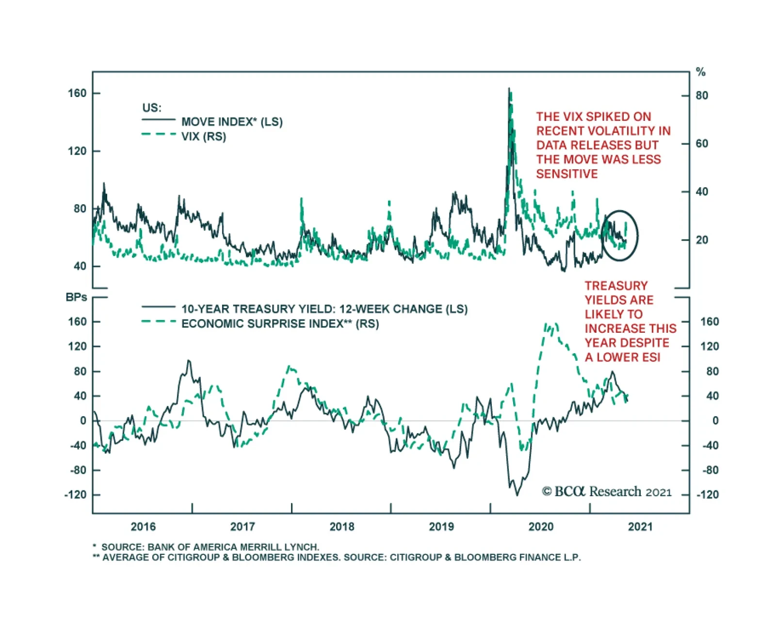
Over the past couple of weeks, US economic data releases have been tempestuous: the Employment report was a monumental miss, April CPI and PPI releases were both major upside surprises, and retail sales (see The Numbers) and industrial production (see Country…
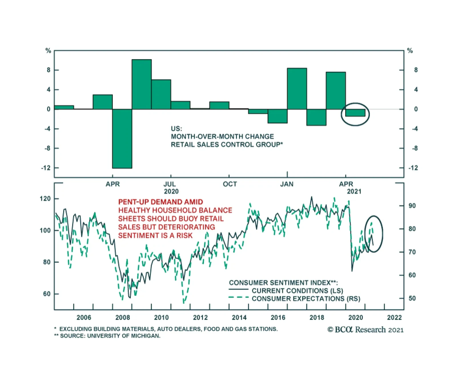
Friday brought another set of disappointing US data releases. After a stimulus driven 10.7% m/m surge in March, retail sales were flat in April, undershooting expectations of a 1.0% m/m increase. The control group, which excludes autos, gas, building…
BCA Research’s Global Investment Strategy service concludes that even though US growth has likely peaked, investors should maintain a positive 12-month view on global equities. Historically, a slowdown in US growth, as proxied by a decline in the ISM…
Highlights US growth has likely peaked. Economic momentum will slow over the coming quarters as the tailwind from stimulus fades and the vaccination campaign winds down. Historically, a slowdown in US growth, as proxied by a decline in the ISM manufacturing index, has been associated with lower overall equity returns, the outperformance of defensive stocks over cyclicals, large caps over small caps, and US equities over their overseas peers. A falling ISM has also been associated with a strengthening dollar, lower Treasury yields, wider credit spreads, a decline in the US Treasury/German bund spreads, falling oil prices, and an increase in the gold-to-copper price ratio. Compared to past episodes, there are three reasons to expect the coming US slowdown to be relatively benign: First, growth is slowing from exceptionally strong levels; second, growth in many other parts of the world is still speeding up; and third, monetary policy will remain highly accommodative in the face of what is likely to be a transitory increase in inflation. We continue to maintain a positive 12-month view on global equities. Nevertheless, with global growth momentum likely to slow later this year, investors who are maximally overweight risk should pare back cyclical exposure. Crypto update: We warned that “Bitcoin is on a collision course with ESG” two weeks ago. Elon Musk’s flip-flop on allowing customers to pay for Teslas in Bitcoin is yet another piece of evidence that ESG concerns will win out. With that in mind, we are going short Bitcoin. Beware The Second Derivative US growth has likely peaked. Economic momentum will slow over the coming quarters as the tailwind from fiscal stimulus fades and the vaccination campaign winds down. According to the Brookings Institution, fiscal easing contributed nearly seven percentage points to US growth in the first quarter (Chart 1). However, fiscal policy is set to detract from growth in the remainder of the year, reflecting the one-off nature of some of the stimulus measures. Chart 1After A Strong Boost, Fiscal Thrust Is Turning Negative
Peak Growth And A Whiff Of Stagflation
Peak Growth And A Whiff Of Stagflation
On the pandemic front, the number of new cases continues to trend lower in the US, thanks mainly to a successful vaccination campaign. A falling infection rate has allowed states to dismantle lockdown measures. Conceptually, it is the change in social distancing measures that correlates with economic growth. While some restrictions remain in place (especially in the educational sector), we are now well past the point of maximum loosening. How have financial markets performed during episodes of slowing US economic growth? To answer this question, we looked at the performance of various assets during periods when the ISM manufacturing index was falling and when it was rising. To add a bit more granularity to the analysis, we also looked at cases when the ISM was trending up and above 50, trending down and above 50, trending down and below 50, and trending up and below 50. As summarized in Table 1 and the Appendix Charts, the key results are as follows: Stocks tend to do best when the ISM is rising. Since 1950, the S&P 500 has risen on average by 1.51% during months when the ISM was trending higher, compared to 0.49% during months when the ISM was trending lower. The results were virtually the same if one restricts the sample to the post-1995 period. While the change in the ISM generally matters more for the S&P 500, absolute levels matter too. Since 1995, the best period for the S&P 500 was when the ISM was below 50 but trending higher (S&P 500 up 2.07%), while the worst period was when the ISM was below 50 and trending lower (S&P 500 up 0.03%). This suggests that swings in the ISM have a bigger effect on the stock market during periods of economic contraction. During periods where the ISM was falling but still above 50, the S&P 500 has delivered a positive – though far from stellar – monthly return of 0.69%. US defensively-geared equities outperformed cyclicals when the ISM was trending lower. During periods when the ISM was falling but still above 50, defensives beat cyclicals by 0.45%. Defensives outperformed cyclicals by 0.84% during periods when the ISM was below 50 and trending lower. US small caps underperformed large caps during periods when the ISM was falling. Non-US stocks also underperformed their US counterparts in a falling ISM environment. The relationship between the ISM and value/growth performance is more ambiguous. To the extent that there is one, value generally outperforms growth when the ISM is below 50. Treasury yields tend to increase, while the yield curve tends to steepen, when the ISM is trending higher. Reflecting the higher beta that Treasuries have to the global business cycle, Treasury yields generally rise more than Germany bund yields when the ISM is on the upswing. Corporate credit spreads tend to widen when the ISM is falling. Spreads narrow the most when the ISM is below 50 but rising. As a countercyclical currency, the US dollar tends to weaken when the ISM is rising and strengthen when the ISM is falling. The prices of cyclically-sensitive commodities such as oil and copper normally decline when the ISM is trending lower, although in general, the bulk of the decline in commodity prices usually occurs only when the ISM has dipped below 50. There is not much of a relationship between gold prices and the ISM. Table 1The Economic Cycle And Financial Assets
Peak Growth And A Whiff Of Stagflation
Peak Growth And A Whiff Of Stagflation
Implications For Today Assuming that the ISM has peaked but remains above 50, the analysis above suggests that the S&P 500 will rise modestly over the coming months; US stocks will edge out non-US stocks; defensives will outperform cyclicals; and large caps will perform slightly better than small caps. The analysis also suggests that Treasury yields will move lower; the Treasury-bund spread will narrow; corporate credit spreads will be flat-to-wider; the dollar will strengthen modestly; and commodities will move broadly sideways. Our own 12-month view is more pro-risk than implied by the ISM analysis. There are three reasons for this: First, US growth is slowing from exceptionally strong levels; second, growth in many other parts of the world is still accelerating; and third, monetary policy remains highly accommodative. Let’s examine each assumption in turn. Reason #1: US growth is slowing from exceptionally strong levels While payroll growth surprised sharply on the downside in April, we suspect this was mainly due to pandemic-induced distortions to the seasonal adjustment mechanism used by the Bureau of Labor Statistics. Seasonally unadjusted payrolls rose by 1.1 million in April, which is broadly consistent with the strong pace of GDP growth tracking estimates. The Atlanta Fed GDPNow model points to growth of 11% in Q2. Bloomberg consensus estimates have US real GDP rising by 8.1% in the second quarter. Growth will decline to 7% in Q3 and 4.7% in Q4, but still average 4% in 2022 (Table 2). Table 2Growth Is Peaking, But At A Very High Level
Peak Growth And A Whiff Of Stagflation
Peak Growth And A Whiff Of Stagflation
Chart 2Firms Will Need To Rebuild Inventories
Peak Growth And A Whiff Of Stagflation
Peak Growth And A Whiff Of Stagflation
US households were sitting on $2.2 trillion in excess savings as of the end of April. This is money they would not have had in absence of the pandemic. Slightly less than half of that stockpile can be attributed to transfer payments, mainly in the form of stimulus checks and unemployment benefits. The rest stems from decreased spending during the pandemic. Not all of this money will be spent immediately. However, given the large sums involved – $2.2 trillion is equivalent to 15% of annual personal consumption – even a partial depletion of these excess savings will be enough to power consumption for the foreseeable future. Meanwhile, firms will have to boost production in order to restore depleted inventories. The inventory-to-sales ratio stands at record low levels (Chart 2). The decline in inventories pushed up the ISM new orders-to-inventory ratio in April, even as the overall ISM index slid from 64.7 in March to 60.7. The new orders-to-inventory ratio tends to lead the ISM index, which suggests that any decline in the ISM index over the coming months will be gradual. An easing of supply-side constraints should also support growth. Even though overall employment was still 5.2% below pre-pandemic levels in April, a record share of small firms surveyed by the NFIB reported difficulty in filling vacant positions (Chart 3). Enhanced unemployment benefits have eroded the incentive to find work. In addition, many schools remain partially shuttered. Chart 4 shows that mothers with young children have seen a much larger decline in labor force participation than other groups. Chart 3Firms Are Struggling To Find Workers
Firms Are Struggling To Find Workers
Firms Are Struggling To Find Workers
Chart 4Mothers With Children Had To Leave The Labor Force
Peak Growth And A Whiff Of Stagflation
Peak Growth And A Whiff Of Stagflation
Enhanced unemployment benefits will expire in September. As schools resume normal operations, more workers will flow back into the labor market. At the same time, some of the bottlenecks currently gripping the global supply chain should abate, allowing for increased output. Reason #2: Growth in many other parts of the world is still accelerating Chart 5Over 40% Of S&P 500 Revenues Come From Abroad
Peak Growth And A Whiff Of Stagflation
Peak Growth And A Whiff Of Stagflation
Chart 6Euro Area Data Has Surprised On The Upside
Euro Area Data Has Surprised On The Upside
Euro Area Data Has Surprised On The Upside
S&P 500 constituent firms derive 43% of their revenues from abroad (Chart 5). While Bloomberg estimates suggest that US growth will peak in the second quarter, growth in the euro area is not expected to peak until the third quarter. Mathieu Savary, who heads BCA’s European Investment Strategy service, sees upside risks to European growth estimates for the second half of this year. Consistent with Mathieu’s observations, recent economic data has been surprising to the upside in the euro area (Chart 6). Just this week, economic expectations for both Germany and the wider euro area leaped to the highest level in more than 20 years, according to the ZEW economic research institute. Growth in Japan should also pick up in the remainder of the year. Japan’s vaccination campaign has gotten off to a very slow start, with less than 3% of the population being inoculated to date. The government imposed its third state of emergency on April 25 in response to rising viral case counts. It subsequently extended those restrictions on May 11. The authorities intend to vaccinate the country’s 36 million elderly people by July, when the Olympics are set to begin. This should permit some easing in lockdown measures. Investors are worried that the Chinese economy will slow this year. The Chinese PMIs peaked in November 2020, about the same time as the combined credit/fiscal impulse reached an apex (Chart 7). Jing Sima, BCA’s chief China strategist, expects the general government budget deficit to remain at a still-ample 8% of GDP this year, similar to where it was last year. She expects credit growth to slow by 2%-to-3%, converging towards the pace of nominal GDP growth. Keep in mind that China’s credit-to-GDP ratio stands at 270%. Thus, if credit grows in line with nominal GDP growth of about 10%, this would still leave the stock of credit roughly 27% of GDP higher at the end of 2021 compared to the end of 2020. This hardly constitutes “deleveraging”. A resilient Chinese economy should buoy other emerging markets. Progress on the pandemic front should also help. The UN estimates that as many as 15 billion vaccine doses could be produced by the second half of 2021, enough to inoculate most of the world’s population (Chart 8). The shortages of vaccines in emerging markets could turn into a surfeit by the end of this year, something that market participants do not seem to fully appreciate. Chart 7China: Peak Stimulus And Peak Growth
China: Peak Stimulus And Peak Growth
China: Peak Stimulus And Peak Growth
The rotation in growth momentum from the US to the rest of the world should put downward pressure on the US dollar. A weaker dollar, in turn, has usually coincided with the outperformance of non-US stock markets (Chart 9). Chart 8Vaccine Production Set To Ramp Up Further
Peak Growth And A Whiff Of Stagflation
Peak Growth And A Whiff Of Stagflation
Chart 9A Weaker Dollar Has Coincided With The Outperformance Of Non-US Stock Markets
A Weaker Dollar Has Coincided With The Outperformance Of Non-US Stock Markets
A Weaker Dollar Has Coincided With The Outperformance Of Non-US Stock Markets
Reason #3: Monetary policy remains highly accommodative The slowdown in US growth is coming at a time when inflation is rising. The core CPI increased by 0.9% month-over-month in April. This was the biggest monthly jump since August 1981. The year-over-year rate climbed to 3.0%, the highest in 25 years. The “whiff of stagflation” helped push the S&P 500 down this week. As we discussed last week, we are very much in the camp that expects inflation to rise significantly over the long haul. Over the next one or two years, however, we would fade inflationary fears. As the example of the 1960s illustrates, a long period of overheating is often necessary to push up inflation in a sustained manner. The US unemployment rate reached its full employment level in 1962. However, it was not until 1966 – when the unemployment rate was two full percentage points below equilibrium – that inflation finally took off (Chart 10). The official core CPI likely overstates underlying inflationary pressures. The pandemic threw all sorts of prices out of whack. Stripping out volatile food and energy prices from inflation is not enough. One needs more refined measures of inflation. Luckily, they exist. Chart 11 shows that median CPI, trimmed-mean CPI, and sticky price CPI all remain well contained. Similarly, relatively clean measures of wage growth, such as the Atlanta Fed Wage Tracker, do not point to an imminent wage-price spiral (Chart 12). Chart 10Inflation Started Accelerating Quickly Only When Unemployment Reached Very Low Levels In The 1960s
Inflation Started Accelerating Quickly Only When Unemployment Reached Very Low Levels In The 1960s Inflation Started Accelerating Quickly Only When Unemployment Reached Very Low Levels In The 1960s
Inflation Started Accelerating Quickly Only When Unemployment Reached Very Low Levels In The 1960s Inflation Started Accelerating Quickly Only When Unemployment Reached Very Low Levels In The 1960s
Chart 11Cleaner Measures Of Inflation Are Telling A Different Story
Cleaner Measures Of Inflation Are Telling A Different Story
Cleaner Measures Of Inflation Are Telling A Different Story
Chart 12Wage Growth Is Still Lackluster
Wage Growth Is Still Lackluster
Wage Growth Is Still Lackluster
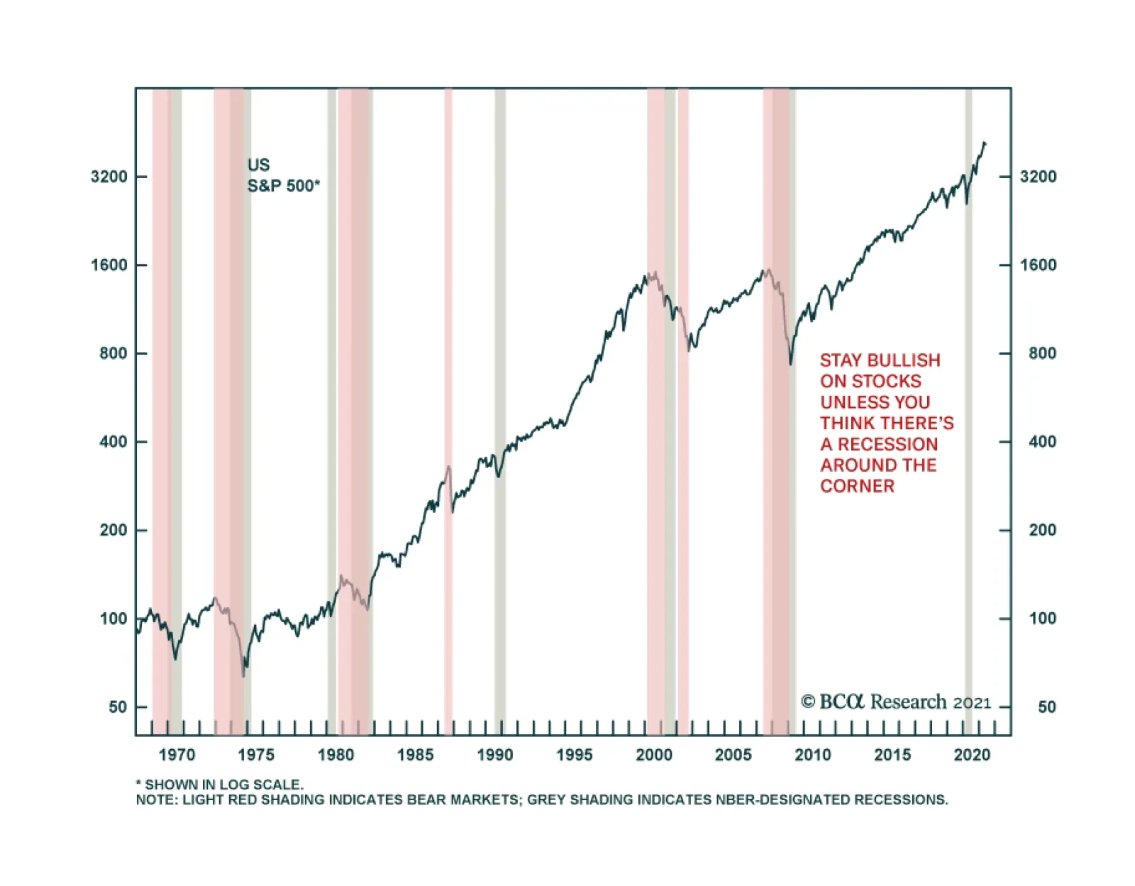
All this means that the Fed can afford to sustain exceptionally easy monetary policy. That should keep growth at an above-trend pace and continue to support to equity valuations. Investment Conclusions My “golden rule” for investing is to stay bullish on stocks unless one thinks there is a recession around the corner (Chart 13). Seeing around the corner is not easy, of course, but it is not impossible either. Chart 13Recessions And Bear Markets Tend To Overlap
Peak Growth And A Whiff Of Stagflation
Peak Growth And A Whiff Of Stagflation
Last year’s recession was caused by a true exogenous shock – the pandemic. Most recessions are endogenous in nature, however. They result from growing imbalances that are usually laid bare by tighter monetary policy. One can debate the extent to which the global economy is plagued by imbalances of one form or another. But one thing is clear, monetary policy is unlikely to turn contractionary any time soon. In this environment, one should remain positive on equities and other risk assets over a 12-month horizon. Nevertheless, with global growth momentum likely to slow later this year, investors who are maximally overweight risk should pare back cyclical exposure. Go Short Bitcoin We warned that “Bitcoin is on a collision course with ESG” two weeks ago in a report entitled “How To Short Bitcoin, Or Anything Else, Without Losing Your Shorts.” Elon Musk’s flip-flop on allowing Tesla customers to pay for Teslas in Bitcoin is yet another piece of evidence that ESG concerns will win out. News that Colonial Pipeline paid hackers 75 bitcoin (nearly $5 million) in ransom further cements Bitcoin’s status as the currency of choice for criminals around the world. With all that in mind, we are going short Bitcoin as of midnight Eastern Daylight Time (EDT) using the shorting technique described in that report. The technique flips the usual risk-reward from shorting on its head. Normally, when you short a stock, your gain is capped at 100% of the initial position whereas your potential loss is unlimited. With our shorting technique, your potential loss is capped at 100% while your potential gain is unlimited. This makes shorting as an investment strategy a lot safer. APPENDIX The Economic Cycle And Financial Assets APPENDIX CHART 1A
Peak Growth And A Whiff Of Stagflation
Peak Growth And A Whiff Of Stagflation
APPENDIX CHART 1B
Peak Growth And A Whiff Of Stagflation
Peak Growth And A Whiff Of Stagflation
Appendix Chart 1C
Peak Growth And A Whiff Of Stagflation
Peak Growth And A Whiff Of Stagflation
Appendix Chart 1D
Peak Growth And A Whiff Of Stagflation
Peak Growth And A Whiff Of Stagflation
Peter Berezin Chief Global Strategist pberezin@bcaresearch.com Global Investment Strategy View Matrix
Peak Growth And A Whiff Of Stagflation
Peak Growth And A Whiff Of Stagflation
Special Trade Recommendations
Peak Growth And A Whiff Of Stagflation
Peak Growth And A Whiff Of Stagflation
Current MacroQuant Model Scores
Peak Growth And A Whiff Of Stagflation
Peak Growth And A Whiff Of Stagflation
Highlights Global currencies are at a critical level versus the dollar. From a positioning standpoint today, a break below 89-90 on the DXY index will be extremely bearish, while a bounce from current levels should be capped in the 3-4% range. Two key factors have pushed the dollar down: lower real rates in the US and recovering economic momentum outside the US. There could be some seasonal strength in the dollar as equity markets churn in May. However, this will provide an opportunity for fresh short positions. The Federal Reserve will maintain its resolve to view the current inflation overshoot as transitory, while it will still focus on the labor market. This will keep real rates in the US depressed relative to other countries. New trade idea: Go long CHF/NZD as a play on rising currency volatility. Also sell USD/JPY if it touches 110. Feature Chart I-1The Dollar Is At A Critical Juncture
The Dollar Is At A Critical Juncture
The Dollar Is At A Critical Juncture
After a brief rally from January to March, the dollar is once again on the verge of a technical breakdown. Both the DXY index, the Federal Reserve trade-weighted dollar and EM currency benchmarks are sitting at critical levels (Chart I-1). A breakdown will confirm that the dollar bear market that began in March 2020 remains intact. It will also trigger a flurry of speculative outflows from the dollar. In our December FX outlook,1 our view was that the DXY was headed towards 80 on a cyclical (12-18- month horizon). However, we also predicted the DXY index would hit 94-95 in the first quarter, a view we have reinforced multiple times since then. With the DXY index having peaked at 93.5, it is now instructive to explore the most likely next move. To do this, we will revisit what has changed and what has remained the same since our December piece. Gauging Investor Positioning Chart I-2Dollar Bulls Are Capitulating
Dollar Bulls Are Capitulating
Dollar Bulls Are Capitulating
Going into 2021, selling the dollar was a consensus trade and the currency was very much oversold. For contrarians, it paid to be bullish (Chart I-2). Since then, investors have closed their short positions on the dollar, shifting their focus to JPY- and CHF-funded carry trades. Speculators are still long the euro, but the magnitude of this bet has declined from a net 30% of open interest to around 10% today. Positioning in GBP and CAD are still elevated, which suggests that these currencies remain vulnerable to a technical pullback. Interestingly, the Citigroup sentiment indicator for the USD is close to its January nadir. From the vantage point of this gauge, there has been an accumulation of dollar short positions in recent weeks. This helps explain recent dollar weakness. Going forward, positioning will not be particularly useful in dictating the next move in the dollar since it only works well at extremes. Even then, it is only useful for gauging countertrend moves. For much of the early 2000s, sentiment on the dollar was bearish yet rallies were capped at 4-6%. During last decade’s dollar bull market, sentiment remained mostly in bullish territory, but the dollar achieved escape velocity (Chart I-3). Chart I-3The Dollar And Regime Shifts
The Dollar And Regime Shifts
The Dollar And Regime Shifts
From today’s positioning standpoint, a break below 89-90 on the DXY index will be an extremely bearish sign, while a bounce from current levels should be capped in the 3-4% range. This puts the greenback at a critical crossroad in technical terms. The Federal Reserve, Inflation And Interest Rates At the start of 2021, interest rates were moving in favor of the dollar, which continued a trend that has been in place since the middle of last year. The gap between the US and German 10-year yields rose from a low of around 100 basis points last year to a high of over 200 basis points in March. More recently, interest rate differentials have started to move against the dollar, explaining the broad reversal in dollar indices since March. The US-German 10-year spread now sits at 180 basis points. Exchange rates tend to reflect real interest rate differentials, since inflation erodes the purchasing power of a currency. As such, it is important to gauge not only what is happening to nominal rates, but also to underlying inflation trends. This complicates matters because inflation is often a lagging variable, so getting a sense of where inflation is headed can be greatly useful for currency strategy. As a starting point, the US does not rank well when it comes to real interest rates. Chart I-4 shows the broad correlation between real interest rates and the dollar. For low interest rate countries such as Switzerland, Sweden and the euro area, the peak in US real rates also coincided with a cyclical rebound in these currencies. Even for a currency such as the Japanese yen, real rates are favorable compared to the US. Nominal 10-year rates are 10bps and inflation swaps at the 10-year tenor are 23bps. This pins Japanese real rates almost 100bps above rates in the US. Chart I-4AInterest Rates Have Moved Against The Dollar
Interest Rates Have Moved Against The Dollar
Interest Rates Have Moved Against The Dollar
Chart I-4BInterest Rates Have Moved Against The Dollar
Interest Rates Have Moved Against The Dollar
Interest Rates Have Moved Against The Dollar
Chart I-4CInterest Rates Have Moved Against The Dollar
Interest Rates Have Moved Against The Dollar
Interest Rates Have Moved Against The Dollar
Of course, with inflation surprising to the upside in the US, the Fed could taper sooner than they have communicated and/or raise interest rates faster than the market expects. This will not be surprising given other central banks such as the Bank of Canada and the Bank of England have already telegraphed reduced asset purchases. However, even if the Fed does decide to taper its asset purchases, the impact on the dollar will not be as straightforward as some market participants expect. To understand why, consider Chart I-5, which shows that relative to other central banks, the Fed’s balance sheet impulse is already shrinking by approximately 13% of GDP. In essence, the Fed has already been "stealthily" tapering asset purchases compared to other G10 central banks. This action supported the dollar this year. It has also pushed market pricing of the Fed funds rate well above the median dots of the FOMC in 2 years (Chart I-6). Thus the prospect of the Fed tapering asset purchases might already be embedded in the price of assets. Chart I-5Stealth Tapering By The Fed?
Stealth Tapering By The Fed?
Stealth Tapering By The Fed?
Chart I-6Markets Have Already Priced A Hawkish Fed
Markets Have Already Priced A Hawkish Fed
Markets Have Already Priced A Hawkish Fed
Going forward, our Global Fixed Income colleagues have noted that the Fed is already moving down the ladder in terms of who is expected to taper next.2 The Bank of Japan and the European Central Bank have barely tapered their asset purchases. They might not announce anything significant in their June 10 and June 18 meetings respectively, but markets will still be squarely focused on any change in language. Chart I-7A Profligate US Government Has Historically Been Dollar Bearish
A Profligate US Government Has Historically Been Dollar Bearish
A Profligate US Government Has Historically Been Dollar Bearish
If investors decide to take the Fed’s messaging at face value, which suggests that the FOMC will look through any upside surprises in inflation, then real rates will remain depressed in the US—which will pressure the dollar lower. We have little conviction about whether US inflation is transient or more permanent. However, we do know that the US economy is more inflationary than most other developed markets because the US is stimulating domestic demand by much more than is required to close the output gap. Historically, this is a bearish development for the US dollar (Chart I-7). Economic Momentum As A Catalyst To the extent that monetary policy is tailored to suit domestic economic conditions, growth momentum is clearly rotating from the US to other countries. This suggests that the case for other central banks, such as the ECB or the RBA, to follow the steps of the BoE or BoC is rising at the margin. Manufacturing PMIs around the world have overtaken US levels, and it is only a matter of time before the services PMIs catchup. Chart I-8 shows that euro area data continues to surprise to the upside, with the economic surprise index between the euro area and the US at a decade high. This has historically been synonymous with modestly higher Eurozone bond yields relative to the US, which has also provided some support for the currency. The expectations component of both the ZEW and the Sentix surveys came out stronger this month, which confirms that both European and German growth should remain healthy over the summer (Chart I-9). Chart I-8Small Window For European Yields To Rise
Small Window For European Yields To Rise
Small Window For European Yields To Rise
Chart I-9Euro Area Data To Stay Strong
Euro Area Data To Stay Strong
Euro Area Data To Stay Strong
As for the slowdown in Chinese stimulus, we agree it is a risk to global growth as our China Strategists highlight, but two opposing factors are also at play: Chinese stimulus leads the economy by a long lag. Last cycle, the apex of Chinese credit was in 2016, but it took until 2018 for global trade to slow down (Chart I-10). This partly explains why commodity prices have not relapsed, despite slowing credit creation from their largest buyer. An economy cannot rely on credit formation alone. At some point, the baton has to be passed to the forces of animal spirits. The velocity of money, or how many units of GDP are created for every unit of money creation, is one of these forces. Chart I-11 shows that the velocity of money has been rising faster outside the US, led by China. Chart I-10Chinese Credit Impulse Works With A Lag
Chinese Credit Impulse Works With A Lag
Chinese Credit Impulse Works With A Lag
Chart I-11Money Velocity Versus The US
Money Velocity Versus The US
Money Velocity Versus The US
The above trends give us conviction that any strength in the dollar is a countertrend move that should be faded until the Federal Reserve does a volte face and tightens monetary policy faster than they have telegraphed. A period of weak global growth would constitute another risk to our view. Interestingly, the Chinese RMB has hit new cyclical lows, despite a narrowing of interest rate differentials between the US and China. We suggested in our February Special Report that USD/CNY was headed for 6.2, even if interest rate differentials between the US and China narrowed. If Chinese economic activity is able to stay relatively robust despite slowing credit formation, then USD/CNY will decline further. Chart I-12EM Growth Remains Weak
EM Growth Remains Weak
EM Growth Remains Weak
A break lower in USD/CNY is a necessary but not a sufficient condition for EM currencies to outperform. Relative to the US, EM growth remains worse than at the depths of the COVID-19 recession last year (Chart I-12). Our Emerging Market Strategists reckon a change in economic conditions will be necessary for EM currencies to outperform on a sustained basis. A broadening of the vaccination campaign toward EM countries is likely to hold the key to this change. The Real Risk To Dollar Short Positions The risk from shorting the dollar at current levels comes from the equity market. Developed market currencies have run ahead of the relative performance of their domestic bourses. This is a departure from historical correlations (Chart I-13). A reset in equity markets that favors defensive equities will lead to inflows into the US equity and bond markets, which will hurt DM currencies and buffet the dollar. It is worrisome that this earnings season, the US enjoyed stronger positive earnings revisions. Correspondingly, the US put/call ratio remains very depressed, with complacency reigning across most equity bourses (Chart I-14). Chart I-13ACurrencies Have Ran Ahead Of Equity Outperformance
Currencies Have Ran Ahead Of Equity Outperformance
Currencies Have Ran Ahead Of Equity Outperformance
Chart I-13BCurrencies Have Ran Ahead Of Equity Outperformance
Currencies Have Ran Ahead Of Equity Outperformance
Currencies Have Ran Ahead Of Equity Outperformance
Chart I-14Lots Of Exuberance In US Stocks
Lots Of Exuberance In US Stocks
Lots Of Exuberance In US Stocks
Chart I-15Equities And The Dollar Have Diverged
Equities And The Dollar Have Diverged
Equities And The Dollar Have Diverged
The nature of a potential market reset is important to consider. For example: Global equities correct, but technology and healthcare lead the drop. In this scenario, the dollar underperforms, as is happening now (Chart I-15) because the US has a heavy weighting in these defensive sectors. The reverse will happen if value stocks or cyclicals lead the drop in global equities. Global equities correct, but bond yields drop as well. The initial reaction will be a stronger dollar as US inflows accelerate, but this will also curb the appeal of the US dollar since Treasury yields will converge towards those of Bunds or JGBs. Moreover, US real rates will collapse even further. We will be sellers of the dollar on strength in this scenario. Global equities correct as yields increase. If US yields lead this rise, the dollar will rally at first, but outflows from the US equity market will also accelerate. If this rotation is durable, the dollar will eventually depreciate, because foreign bourses are highly levered to rising yields. In a nutshell, the US bond market offers attractive yields and the US stock market could behave defensively (as has historically been the case) in a market correction. This creates a risk to shorting the dollar today. Currency Strategy Currency markets are at a critical juncture (Chart I-1) where either a breakdown in the dollar or a countertrend reversal is imminent. Our strategy remains the same it has been so far in 2021. Continue to short the USD against a basket of the most attractive currencies. On this basis, we are already long the Scandinavian currencies. Go short USD/JPY given lopsided positioning. We are placing a limit sell on USD/JPY today at 110. We are also raising our limit buy on the euro to 1.18. It is interesting that the EUR/JPY cross broke out from a multi-year downtrend. This cross has an inverse correlation with the dollar. Buy CHF/NZD today as a play on rising currency volatility. This is a good bet as markets grapple with the next central bank taper policy (Fed versus other DM economies) (Chart I-16). Wait for the equity market correction to play out, after which a green light to short the dollar outright will once again emerge. Historically, May is a good month for the dollar and a volatile one for equities (Chart I-17). That said, dollar bear markets often run in long cycles. Chart I-16Buy CHF/NZD As Insurance
Buy CHF/NZD As Insurance
Buy CHF/NZD As Insurance
Chart I-17The Dollar And Seasonality
The Dollar And Seasonality
The Dollar And Seasonality
Chester Ntonifor Foreign Exchange Strategist chestern@bcaresearch.com Footnotes 1 Please see Foreign Exchange Strategy Special Report, "2021 Key Views: Tradeable Themes," dated December 4, 2020. 2Please see Global Fixed Income Strategy Special Report, "Who Tapers Next?," dated December 04, 2020. Currencies US Dollar Chart II-1USD Technicals 1
USD Technicals 1
USD Technicals 1
Chart II-2USD Technicals 2
USD Technicals 2
USD Technicals 2
The recent data out of the US have been mixed: Average hourly earnings improved by 0.7% in April versus March, beating the expected 0.1% increase. Non-farm payrolls increased by 266K in April, far below the expected 978K and 770K in March. The unemployment rate worsened slightly from 6% in March to 6.1% in April, versus an expected improvement to 5.8%. The NFIB Small Business Optimism survey edged higher to 99.8 in April from 98.2 the prior month. CPI came in at 4.2% year on year in April, outpacing expectations of a 3.6% rise. Month on month, CPI grew by 0.8% in April, crushing the 0.2% consensus. Core CPI came in at 3% year on year in April, beating the expected 2.3%. PPI also surprised to the upside, clocking in at 6.2% year on year in April, versus an expected rise of 5.8%. The US dollar DXY index dropped by 1.3% this week. While CPI surged ahead, employment severely lagged expectations. The Fed’s “maximum employment” target, a gateway to any asset purchase tapering, is unlikely to be reached when the market expects it. This combination of persistent Fed dovishness and potential sizable inflation is bearish for the dollar. Report Links: Arbitrating Between Dollar Bulls And Bears - March 19, 2021 The Dollar Bull Case Will Soon Fade - March 5, 2021 Are Rising Bond Yields Bullish For The Dollar? - February 19, 2021 The Euro Chart II-3EUR Technicals 1
EUR Technicals 1
EUR Technicals 1
Chart II-4EUR Technicals 2
EUR Technicals 2
EUR Technicals 2
Recent data from the euro area have been strong: March German imports strengthened by 6.5% month on month, crushing the expected 0.7%. German ZEW current condition registered at -40.1 in May, far ahead of the -48.8 in April. German ZEW economic sentiment also surprised to the upside in May at 84.4 versus the anticipated 72. For the entire euro area, the ZEW economic sentiment increased to 84 in May from 66 in April. Sentix investor confidence improved to 21 in May from 13.1 in April, beating the expected 14. Sentix investor expectations climbed to an all-time high of 36.8. The current situation crossed into positive territory for the first time since February 2020. March industrial production was up by 0.1% month on month, lower than the expected 0.7%. The euro strengthened by 1.3% this week against the USD. The uplifting ZEW survey results reinforce our expectation of a global growth rotation in favor of the euro area. While the ECB may not taper asset purchases, a forceful vaccination campaign should lead to further upside data surprises, especially in services. The Euro Area Economic Surprise Index (ESI) remains elevated in contrast with the US ESI, which has declined sharply from its July 2020 peak. Report Links: Relative Growth, The Euro, And The Loonie - April 16, 2021 Portfolio And Model Review - February 5, 2021 On Japanese Inflation And The Yen - January 29, 2021 The Yen Chart II-5JPY Technicals 1
JPY Technicals 1
JPY Technicals 1
Chart II-6JPY Technicals 2
JPY Technicals 2
JPY Technicals 2
There was scant data out of Japan this week: Household spending strengthened by 7.2% in March versus February, comfortably beating the expected 2.1% increase. The Japanese current account weakened to JPY 2.65tn in March from JPY 2.9tn in February. The Eco Watchers Survey disappointed in April, with current conditions declining from 49 to 39.1 and the expectations component falling from 49.8 to 41.7. The yen was up by 0.5% against the USD this week. The recent extension of the already months-long state of emergency will put downward pressure on the yen in the near term. However, with Japanese equities and the currency in oversold conditions, we are cautiously optimistic on the yen further along in the year. Report Links: The Dollar Bull Case Will Soon Fade - March 5, 2021 On Japanese Inflation And The Yen - January 29, 2021 The Dollar Conundrum And Protection - November 6, 2020 British Pound Chart II-7GBP Technicals 1
GBP Technicals 1
GBP Technicals 1
Chart II-8GBP Technicals 2
GBP Technicals 2
GBP Technicals 2
The recent data out of the UK have been weak: Construction PMI remained mostly unchanged at 61.6 in April. GDP weakened, quarter on quarter, by 1.5% in Q1. More disappointing was business investment that dropped in Q1 by 11.9% quarter on quarter and 18.1% year on year. March GDP strengthened by 2.1% month on month, suggesting the pullback in the first quarter was mostly due to lockdowns. Manufacturing production was up by 2.1% in March versus February, beating the 1% consensus. The trade deficit narrowed to GBP11.71B in March. The pound was up by 1.7% this week against the USD. The soft Q1 output data, primarily a result of the winter lockdown, mask improvements in March. With restrictions being lifted, services output and household consumption (induced by excess savings) should quickly catch up with the recent bounce in manufacturing. However, markets may have priced in too much of the UK’s vaccination outperformance as is reflected in the overpriced small-cap equities. Report Links: Portfolio And Model Review - February 5, 2021 The Dollar Conundrum And Protection - November 6, 2020 Revisiting Our High-Conviction Trades - September 11, 2020 Australian Dollar Chart II-9AUD Technicals 1
AUD Technicals 1
AUD Technicals 1
Chart II-10AUD Technicals 2
AUD Technicals 2
AUD Technicals 2
The recent data out of Australia have been positive: The NAB Business confidence increased to 26 in April from 17 the prior month. The NAB business survey index also edged higher to 32 in April from 25 in March. Retail sales increased by 1.3% in March month on month, slightly below the expected 1.4%. Quarter on quarter, Q1 retail sales weakened by 0.5% versus the estimated drop of 0.4%. Q1 CPI came in below expectations at 0.6% quarter on quarter and 1.1% year on year. The AUD was up by 1.2% this week against the USD. While the NAB business confidence and conditions indices came in at record highs, the price pressures remain weak in Australia and vaccination progress continues to lag. That said, leading indicators such as capex intentions and forward orders are improving. We are short AUD/MXN mainly to capitalize on Mexico’s proximity to the rebounding US. Report Links: The Dollar Bull Case Will Soon Fade - March 5, 2021 Portfolio And Model Review - February 5, 2021 Australia: Regime Change For Bond Yields & The Currency? - January 20, 2021 New Zealand Dollar Chart II-11NZD Technicals 1
NZD Technicals 1
NZD Technicals 1
Chart II-12NZD Technicals 2
NZD Technicals 2
NZD Technicals 2
The recent data out of New Zealand have been scant: Electronic card retail sales increased by 4% month on month in April after a 0.8% drop in March. The food price index came in at 1.1% month on month in April, compared to 0% in March. The NZD was up by 0.8% this week against the dollar. With positive data coming out of New Zealand recently, our Global Fixed Income Strategy colleagues judge the RBNZ to be the next central bank most likely to taper sometime in the second half of 2021. However, with Q2 inflation expectations that remain soft and the tourism sector still held back by broad border shutdowns, we remain cautious on the kiwi. Report Links: Portfolio And Model Review - February 5, 2021 Currencies And The Value-Versus-Growth Debate - July 10, 2020 Updating Our Balance Of Payments Monitor - November 29, 2019 Canadian Dollar Chart II-13CAD Technicals 1
CAD Technicals 1
CAD Technicals 1
Chart II-14CAD Technicals 2
CAD Technicals 2
CAD Technicals 2
The recent data out of Canada have been mildly disappointing: The employment report was disheartening. Canada lost 207.1K jobs in April, and the participation rate dropped from 65.2% to 64.9%. The unemployment rate also weakened from 7.5% to 8.1% in April, higher than expected. The Ivey PMI dropped to 60.6 in April from 72.9 in March, in line with expectations. The CAD was up by 1.35% against the USD this week. Despite the already months-long rallying of the loonie and the housing prices, the CAD is still cheap by its real effective exchange rate. Strengthening oil prices should continue to support the currency. A potential extension to the current COVID-19 lockdown and lagging vaccination progress remain downside risks. Report Links: Relative Growth, The Euro, And The Loonie - April 16, 2021 Will The Canadian Recovery Lead Or Lag The Global Cycle? - February 12, 2021 Currencies And The Value-Versus-Growth Debate - July 10, 2020 Swiss Franc Chart II-15CHF Technicals 1
CHF Technicals 1
CHF Technicals 1
Chart II-16CHF Technicals 2
CHF Technicals 2
CHF Technicals 2
The recent Swiss data have been neutral: Unemployment rate remained relatively unchanged at 3.3% in April, in line with expectations. The Swiss franc was up by 1% this week against the USD. The franc is cheap with a real effective exchange rate that is at one standard deviation below fair value. Should the pickup in global trade continue, this will buffet the franc. However, our bias is that the SNB will continue to fight excessive franc strength, especially against the euro. So we think the franc will lag the euro over the longer term. We are also going long CHF/NZD today should currency volatility pick up. Report Links: Portfolio And Model Review - February 5, 2021 The Dollar Conundrum And Protection - November 6, 2020 On The DXY Breakout, Euro, And Swiss Franc - February 21, 2020 Norwegian Krone Chart II-17NOK Technicals 1
NOK Technicals 1
NOK Technicals 1
Chart II-18NOK Technicals 2
NOK Technicals 2
NOK Technicals 2
The recent data out of Norway have been mixed: CPI came in at 3% in April, in line with expectations. PPI growth registered at 22.5% in April, year on year. GDP dropped by 0.6% in Q1 quarter on quarter, a disappointment given an estimated 0.4% decrease. Mainland GDP also undershot expectations, decreasing by 1% in Q1 quarter on quarter. The NOK was up by 1% this week against the dollar. The soft Q1 data may hold back the NOK in the very near term, especially considering its remarkable performance since its March 2020 lows. That said, the rally in oil prices will continue to provide support to the NOK. Vaccination progress, on par with that of the euro area, should also benefit the currency. Report Links: Portfolio And Model Review - February 5, 2021 Revisiting Our High-Conviction Trades - September 11, 2020 A New Paradigm For Petrocurrencies - April 10, 2020 Swedish Krona Chart II-19SEK Technicals 1
SEK Technicals 1
SEK Technicals 1
Chart II-20SEK Technicals 2
SEK Technicals 2
SEK Technicals 2
Recent Swedish data have been mildly positive: The unemployment rate came down from 8.4% in March to 8.2% in April. CPI came in at 2.2% year on year and 0.2% month on month in April, in line with expectations. CPIF registered at 2.5% year on year and 0.3% month on month in April, both beating the consensus. The SEK was up by 2% this week against the USD. Vaccination progress in Sweden is only notches below that of the euro area. A potential shift of sentiment out of the crowded commodity-driven trades could also lend support to the export-driven SEK, on the back of a recovery in Europe in the near term. Report Links: Revisiting Our High-Conviction Trades - September 11, 2020 Updating Our Balance Of Payments Monitor - November 29, 2019 Where To Next For The US Dollar? - June 7, 2019 Footnotes 1 Please see Foreign Exchange Strategy Special Report, "2021 Key Views: Tradeable Themes," dated December 4, 2020. 2 Please see Global Fixed Income Strategy Special Report, "Who Tapers Next?," dated December 04, 2020. Trades & Forecasts Forecast Summary Core Portfolio Tactical Trades Limit Orders Closed Trades
Chart 1
Chart 1
Chart 1
In late April, we revisited our Infrastructure Basket in light of President Biden pumping out one fiscal package after another. BCA’s view also remains that the populist shift in US politics is just getting started and that likely more fiscal packages, in one form or another, are coming in the future. This brings us to the question of how much is already priced in, and is it too late to jump on the fiscal train? While the bottom panel of Chart 1 is showing that our Infrastructure Basket is getting expensive on the 12-month forward P/S ratio, we do note that there is little historical data to go by and only two business cycles. On the other hand, the middle panel of Chart 1 demonstrates that the Infrastructure Basket is fairly valued when looking at the forward P/E ratio: it is currently hovering just a few pixels away both from the zero-line and the historical mean making our basket an attractive addition to investors' equity portfolios. Bottom Line: We reiterate our cyclical and structural USES Infrastructure basket overweight recommendations. For completion purposes, Charts 2-5 below also breakdown our basket into its GICS4-level constituents. Chart 2
Chart 2
Chart 2
Chart 3
Chart 3
Chart 3
Chart 4
Chart 4
Chart 4
Chart 5
Chart 5
Chart 5
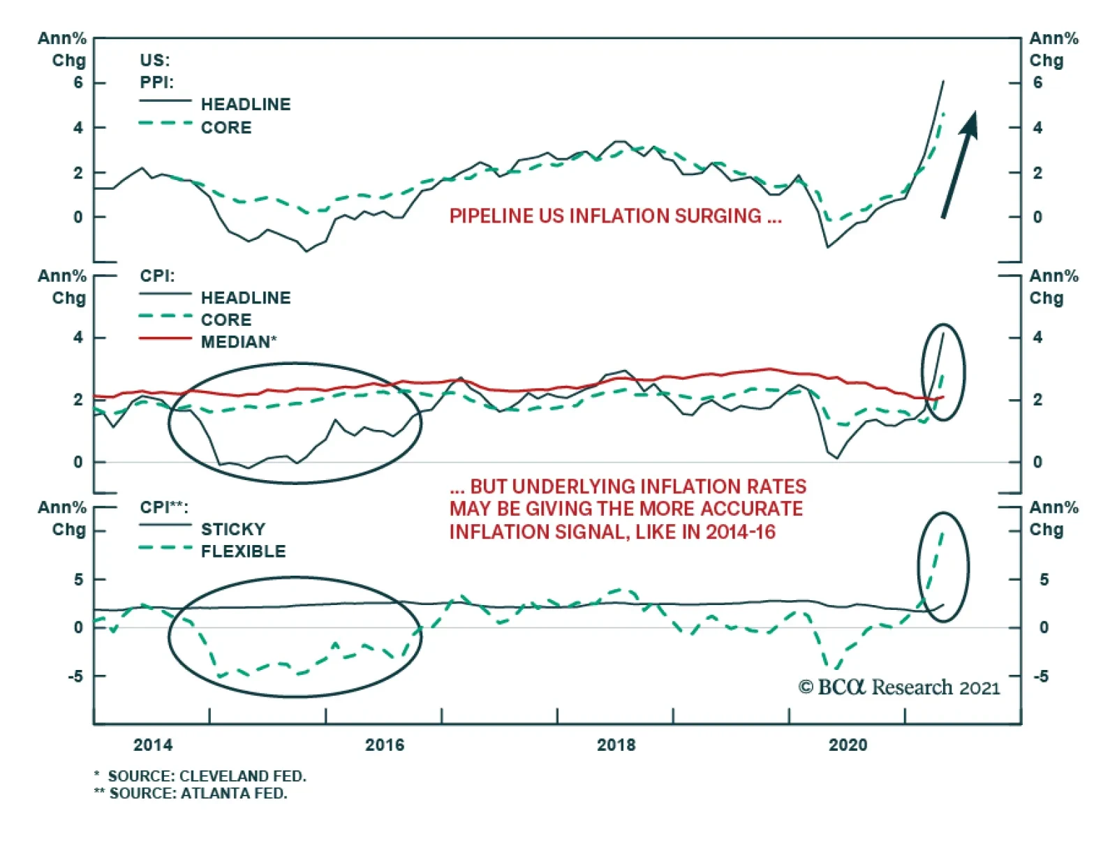
The US April producer price index (PPI) report produced another major upside surprise after the blowout CPI number. The PPI for final demand rose 0.6% on the month, doubling consensus forecasts and lifting the year-over-year inflation rate to 6.2%. The…
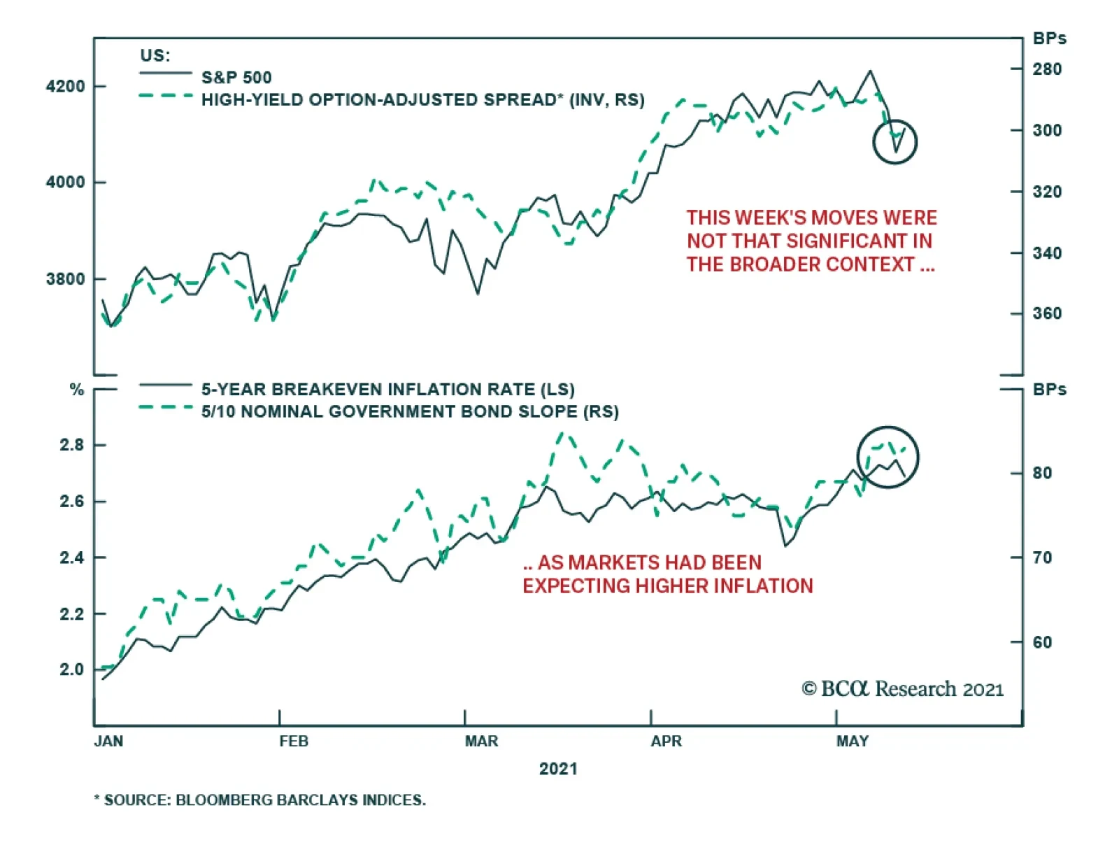
A chill went through US financial markets after the shockingly strong April US CPI report this past Wednesday. The S&P 500 plunged -2.1%, the NASDAQ fell -2.7% and the VIX index surged 6 points. Despite the risk-off tone in equities, US…