United States

Highlights Over the 2021-22 period, renewable capacity will account for 90% of global electricity-generation additions, per the IEA's latest forecast. This will follow the 45% surge (y/y) in renewable generation capacity added last year, which occurred despite the COVID-19 pandemic (Chart of the Week). Continued investment in renewables and EVs – along with a global economic rebound – are pushing forecasts at banks and trading companies to a $13k - $20k/MT range for copper, vs. ~ $10.6k/Mt (~ $4.80/lb) at present. Should these stronger metals forecasts prove out, investments that extend low-carbon use of fossil fuels via carbon-capture and circular-use technologies will become more attractive. Investment in these technologies has been limited because there is no explicit global reference price to assess investments against. A carbon market or tax would provide such a bogey and accelerate investment. It could be monitored via a Carbon Market Club, which would limit trade to states posting and collecting the tax.1 Feature At almost 280GW, renewable energy capacity additions last year increased 45% y/y, the most since 1999, according to the IEA's most recent update on renewable energy.2 For this year and next, renewables are expected to account for 90% of capacity additions, led by solar PV investment increasing ~ 50% to 162GW. Wind capacity grew 90% last year, increasing to 114GW, and is expected to increase ~ 50% to end-2022. As renewables generation – and EV investment – continues to grow, demand for bulks (steel and iron ore) and base metals, led by copper, will pull prices higher. This is occurring against a backdrop of flat supply growth and physical deficits over the four years ended 2020 (Chart 2). According to the IEA, a 40% increase in steel and copper prices over the September 2020 to March 2021 period played a role in higher solar PV module prices. Chart of the WeekRenewables Capacity Surges
Surging Metals Prices And The Case For Carbon-Capture
Surging Metals Prices And The Case For Carbon-Capture
The supply side of the copper market will remain in deficit this year and next, in our assessment, and may continue on that trajectory if, as Wood Mackenzie expects, demand grows at a 2% p.a. rate over the next 20 years and miners remain reluctant to commit to the capex required to keep up with demand.3 Chart 2Physical Deficits Will Draw Copper Stocks...
Physical Deficits Will Draw Copper Stocks...
Physical Deficits Will Draw Copper Stocks...
ESG risk for copper – and other metals required to build the generation and infrastructure required in the renewables buildout – will increase as prices rise, which also will add to cost.4 Cost increases coupled with increasing ESG risks in this buildout will increase the attractiveness of carbon-capture and circular-economy technology investment, in our view. This would extend the use of low-carbon fossil fuels if the technology can move the world closer to a net-zero carbon future. However, unless and until policy catalyzes this investment, – e.g., via a global carbon trading price or tax – investment in these technologies likely will continue to languish. Carbon-Capture Tech's Unfulfilled Promise The history of Carbon Capture, Utilization and Storage (CCUS) has been one of high hopes and unmet expectations. It is generally recognized as a route to mitigate climate change; however, its deployment has been slower than expected. Low-carbon technology requires more critical metals than its fossil-fuel counterpart (Chart 3). Apart from the issue of cost, the ESG risks of mining metals for the renewable energy transition will increase as more metals are demanded, which we discussed in previous research.5 According to Wood Mackenzie, mining companies will need to invest nearly $1.7 trillion in the next 15 years to help supply enough metals to transition to a low carbon world.6 Chart 3Low-Carbon Tech Is Metals Intensive
Surging Metals Prices And The Case For Carbon-Capture
Surging Metals Prices And The Case For Carbon-Capture
Given these looming physical requirements for metals, fossil fuels most likely will need to be used for longer than markets currently anticipate, as a bridge to the low-carbon future, or as part of that future, depending on how successfully carbon is removed from the hydrocarbons used to power modern society. If so, using fossil fuels while mitigating their environmental impact will require highly focused technology to lower CO2 and other green-house gas (GHG) emissions during the transition to a low-carbon future. Enter CCUS technology: This technology traps CO2 from sources that use fossil fuels or biomass to make the energy required to run modern societies. In the current iterations of this technology, CO2 can either be compressed and transported, or stored in geological or oceanic reservoirs. This can then be used for Enhanced Oil Recovery (EOR) to extract harder-to-reach oil by injecting CO2 into the reservoirs holding the hydrocarbons.7 The Scope For CCUS Investment CCUS investment spending is increasing, as are the number of planned facilities using or demonstrating this technology. In the 2020 edition of its Energy Technology Perspectives, the IEA noted 30 new integrated CCUS facilities have been announced since 2017, mostly in advanced economies such as US and Europe, but also in some EM nations. As of 2020, projects at advanced stages of planning represented a total of $27 billion, more than double the investment planned in 2017 (Chart 4). Among its many goals, the Paris Agreement seeks a balance between emissions by man-made sources and removal by greenhouse gas (GHGs) sinks (absorption of the gases) in the second half of the 21st century. Practically, many countries – especially EM economies – will still need to use fossil fuels to develop during this period (Chart 5).8 Chart 4Carbon-Capture Projects To Date
Surging Metals Prices And The Case For Carbon-Capture
Surging Metals Prices And The Case For Carbon-Capture
Chart 5EM Development Will Require Fossil-Fuel Energy
Surging Metals Prices And The Case For Carbon-Capture
Surging Metals Prices And The Case For Carbon-Capture
CCUS In The Energy Sector As a fuel that emits fewer GHGs than coal – i.e., half the CO2 of coal – natural gas can be used effectively as a bridge to green-power generation (Chart 6). Chart 6Natural Gas Will Remain Attractive As A Bridge Fuel
Surging Metals Prices And The Case For Carbon-Capture
Surging Metals Prices And The Case For Carbon-Capture
The CO2 in natgas needs to be removed before dry gas is sold as pipeline-quality gas or LNG. This CO2 is normally vented to the atmosphere; however, by using CCUS technology, it can be reinjected into geological formations and used for EOR. For this reason, LNG companies in the US, the world’s largest LNG exporter, have been looking into investing in CCUS technology in a bid to become greener.9 CCUS can also be used to produce low-cost hydrogen – so-called blue hydrogen – using natural gas and coal, as opposed to the more expensive electrolysis process, which uses renewables-based electricity to produce "green" hydrogen. The lower blue-hydrogen costs will make clean hydrogen more accessible to emerging nations, opening new avenues for the world to use the energy carrier in its decarbonization effort. The Value Of Ccus In Other Industries CCUS technology can be retrofitted to existing power and industrial plants, which, according to the IEA, could otherwise still emit 8 billion tons of CO2 in 2050, around one-quarter of annual energy-sector emissions in 2020. Of the fossil fuel generators, coal-fired power generation presents the biggest CO2 challenge, with most of the emissions coming from China and other EM Asia nations, where the average plant age is less than 20 years. Since the average age of a coal fired power plant is 40 years, according to the US National Association of Regulatory Commissioners, this implies that these plants have a long remaining life and could still be operating until 2050. CCUS is the only alternative to retiring or repurposing existing power and industrial plants. The IEA believes that CCUS is imperative to reach net-zero carbon emissions. In its Sustainable Development Scenario - in which global CO2 emissions from the energy sector decline to net-zero by 2070 – CCUS accounts for 15% of the cumulative reduction in emissions. If the world needs to reach net-zero by 2050 instead, it will need almost 50% more CCUS deployment.10 Properly implemented and scaled, CCUS can allow industries to continue using oil, gas and coal and to attain net-zero carbon emission targets, boosting demand for fossil fuels in the medium term. This is especially important to EM development. Why Aren’t We Further Along In CCUS? What Can Be Done? The main reason CCUS isn’t used more widely is because of its cost. Currently, the cost of capturing carbon varies, based on the amount of CO2 concentration, with Direct Air Capture being most expensive (Chart 7). Given the prohibitive costs, CCUS has not been commercially viable. However, the same argument could have been used against implementing renewable sources of energy. While at one point the Levelized Cost of Energy from renewable sources was high, as these sources have been scaled up – aided in no small part by government subsidies – costs have fallen, following something akin to a Moore’s Law cost-decay curve. A Levelized Cost of Energy for solar generation reported by Lazard Ltd., which allows for comparisons across technologies (e.g., fossil-fuel vs renewable), shows generation costs fell by 89% to $40/MWh from $359/MWh from 2009-2019 (Chart 8). This learning curve was able to take place because of government subsidies, which promoted the deployment of solar technology. Chart 7CCUS Can Be Expensive
Surging Metals Prices And The Case For Carbon-Capture
Surging Metals Prices And The Case For Carbon-Capture
Chart 8Subsides Could Support CCUS, Just As Was Done For Solar
Subsides Could Support CCUS, Just As Was Done For Solar
Subsides Could Support CCUS, Just As Was Done For Solar
The cost of CCUS technology is falling. For example, in 2019 the Global CCS Institute reported it cost $100/ton to capture carbon from the Canada-based Boundary Dam using a CCS unit built in 2014. The cost of carbon captured at the US-based Petra Nova plant – built three years later – using improved technology was $65/ton. Both are coal-powered electricity plants. The report also noted coal-fired power plants planning to commence operations in 2024-28 using the same CCS technology as those at Boundary Dam and Petra Nova expect carbon costs to be ~ $43/ton, due to steeper learning curves, research, lower capital costs due to economies of scale, and digitalization. One commonality amongst these sources of cost reductions is that companies need to invest more into CCUS and familiarize themselves with this technology. As was the case with renewables, government subsidies would reduce the prohibitive costs of operating CCUS technology, and draw more participation to refining this technology. Early, first-of-its-kind CCUS will be expensive, however subsidies in the form of capital support or tax credits will increase CCUS implementation and research. Boundary Dam and Petra Nova are examples of facilities that benefitted from government subsidies. The facilities received $170 million and $200 million respectively from Canadian and US Government agencies at the time of the CCS units’ construction. The US has also implemented a 45Q tax credit system which pays facilities $50/ton of CO2 stored and $35/ton of CO2 if it is used in applications like Enhanced Oil Recovery. According to the Global CCS Institute, in late-2019, of the eight new CCUS projects that were added in the US, four cited the presence of 45Q as the key driver. Putting Carbon Markets And Taxes To Work The EU’s Emissions Trading System (ETS) market, which was implemented in 2005, is an example of innovative policy which incentivizes companies to curb emissions, using market forces. The price of carbon measured in these markets puts a tangible value on a negative externality, which before this went unrecorded. The downside of this ETS is its reliance on the EU's environmental policy implementation, which is subject to policy changes that complicate supply-demand analysis for longer-term planning – e.g., the recent increase in its emissions target to a minimum of 55% net reduction in GHG emissions by 2030. An alternative to policy-driven trading of emissions rights is a per-ton tax on emissions, which governments would impose and collect. This would raise costs of technologies using fossil fuels – including those used in the mining industry to increase supply of critical bulks and base metals needed for the renewables transition. At the same time, such a tax would give firms supplying and using technologies that raise CO2 levels an incentive to lower CO2 output using CCUS technologies. ETS markets and governments imposing CO2 taxes could form Carbon Market Clubs – a technology developed by William Nordhaus, the 2018 Nobel Laureate in Economics – that restrict trading to states that can demonstrate their participation and support of actual carbon-reduction detailed in the Paris Agreement via trading or tax schemes.11 As the green energy transition gains traction and governments implement more net-zero emissions policies, the price of carbon will rise. As the price of carbon rises, the price tag associated with companies’ carbon emissions will increase with it. With market participants expecting the price of carbon to continue to rise after hitting record values, the incentive for companies operating in the EU to use CCUS technology will rise, as would the incentive for firms facing a carbon tax.12 Bottom Line: Given the meteoric price rise of green metals, underfunded capex, and the ESG risks associated with mining metals for the low carbon future, we expect fossil fuels to play a larger role in the transition to a low-carbon society than markets are currently expecting. For countries to be able to use fossil fuels while ensuring they achieve their climate goals, the use of CCUS technology is important. To increase CCUS uptake, governments will need to subsidize this technology until demand for it gains traction, just like in the case of renewables. Encouraging ETS and carbon-tax schemes also will be required to catalyze action. Robert P. Ryan Chief Commodity & Energy Strategist rryan@bcaresearch.com Ashwin Shyam Research Associate Commodity & Energy Strategy ashwin.shyam@bcaresearch.com Commodities Round-Up Energy: Bullish Brent prices were knocking against the $70/bbl door going to press, following the IEA's assessment of a robust demand recovery in 2H21 (Chart 9). The IEA took its 1H21 demand growth down 270k b/d, owing to COVID-19-induced demand destruction in India, OECD Americas and Europe, but left its 2H21 estimate intact, making overall demand growth for this year 5.4mm b/d. The EIA also expects 5.4mm b/d demand growth for this year, and growth of 3.7mm b/d next year. OPEC left its full-year 2021 demand growth estimate at 6mm b/d. OPEC 2.0 meets again on June 1 and will look to return more of its sidelined production to the market, in our estimation. We will be updating our supply-demand balances and price forecasts in next week's report. Base Metals: Bullish Spot copper prices traded on either side of $4.80/lb on the CME/COMEX market this week as we went to press. Threats of a tax increase in Chile, where a bill calling for such a measure is making its way through Congress; a potential strike by mine workers; and a shortage of sulfuric acid used in the extraction of ore brought about, according to Bloomberg, by reduced global sulfur supplies due to lower refinery runs during the pandemic all are keeping copper well bid. Our target for Dec21 COMEX copper remains $5/lb (~ $11k/ton on the LME). We remain long calendar 2022 COMEX copper vs short 2023 COMEX copper expecting physical supply deficits to continue to force storage draws, which will backwardate the metal's forward curve. Precious Metals: Bullish US CPI data on Wednesday showed that headline inflation rose by 4.2% for the month of April compared to the previous year. While this increase is the highest since 2008, this jump could also be fueled by a low base effect – Inflation levels were falling this time last year as the pandemic picked up. While rising prices increases demand for gold as an inflation hedge, if the Federal Reserve increases interest rates on the back of this data, the US dollar will rise, negatively affecting gold prices (Chart 10). However, we do not expect the Fed to abruptly change its guidance on this report, and therefore expect the central bank will treat this blip as transitory. As of yesterday’s close, COMEX gold was trading at $1,835.9/oz. Ags/Softs: Neutral Going to press, the Chicago soybean market was surging ahead of the scheduled World Agriculture Supply and Demand Estimates (WASDE) report due out later Wednesday. Front-month beans were trading ~ $16.70/bu, up 2% on the day. This month's WASDE will contain the USDA's first estimate for demand in ag markets for the 2021/22 crop year. Markets are expecting supplies to tighten as demand strengthens. Chart 9
Brent Prices Going Up
Brent Prices Going Up
Chart 10
Covid Uncertainty Could Push Up Gold Demand
Covid Uncertainty Could Push Up Gold Demand
Footnotes 1 Please see Carbon Market Clubs and the New Paris Regime published by the World Bank in July 2016. The intellectual and computational framework for such technology was developed by William Nordhaus, the 2018 Nobel Laureate in Economics. 2 Please see Renewable Energy Market Update, Outlook for 2021 and 2022.pdf, published by the IEA this week. 3 WoodMac notes, "without additional substantial investment, production will decline from 2024 onwards. Coupled with demand growth, this decline in output will lead to a theoretical shortfall of around 16 Mt by 2040." The consultancy estimates an additional $325 - $500+ billion will be needed to meet copper demand over this period. Please see Will a lack of supply growth come back to bite the copper industry? Published 23 March 2021 by woodmac.com. 4 Please see Renewables ESG Risks Grow With Demand, which we published 29 April 2021. It is available at ces.bcaresearch.com. 5 Refer to footnote 4. 6 Please see Low carbon world needs $1.7 trillion in mining investment, published by Reuters. 7 This method is used to increase oil production. It changes the properties of the hydrocarbons, restores formation pressure and enhances oil displacement in the reservoir. Using EOR, oil companies can recover 30% to 60% of the original oil level in the reservoir. Please see Enhanced Oil Recovery published by the US Department of Energy. 8 Please see the Reuter’s column CO2 emission limits and economic development. 9 Please see World Oil’s U.S. LNG players tout carbon capture in bid to boost green image. 10 Please see IEA’s Special Report on Carbon Capture Utilisation and Storage, published as a part of the Energy Technology Perspective 2020. 11 See footnote 1 above. 12 Please see Cost of polluting in EU soars as carbon price hits record €50 by the Financial Times. Investment Views and Themes Strategic Recommendations Tactical Trades Commodity Prices and Plays Reference Table Trades Closed in 2021 Summary of Closed Trades
Higher Inflation On The Way
Higher Inflation On The Way
Overweight
Buy Biotech Stocks Against The Grain
Buy Biotech Stocks Against The Grain
In last week’s Strategy Report, we made a couple of changes within the health care universe; namely we upgraded pharma to neutral and boosted biotech stocks to overweight both of which lifted the S&P health care sector to an above benchmark allocation. This move serves as a hedge to our overall portfolio positioning. With regard to biotech equities, we posited that this highly fragmented industry is prime for consolidation. Even in the large cap S&P 500 biotech index there is scope for further M&A activity. Not only intra-industry mergers, but also cash rich and drug pipeline extension thirsty Big Pharma is lurking in the shadows ready to deploy their cash hoard. Already, there is an ongoing mini M&A boom and given the recent biotech firms’ success stories in the race to discover the COVID-19 vaccine, they command a high profile in investment banking board rooms (see chart). The implication is that as the M&A boom gains further traction, it effectively reduces the supply of stocks available to investors, consequently driving prices higher. Bottom Line: We reiterate our recent upgrade in the S&P biotech index to overweight. The ticker symbols for the stocks in this index are: BLBG: S5BIOTX– AMGN, ABBV, GILD, VRTX, REGN, ALXN, BIIB, INCY.
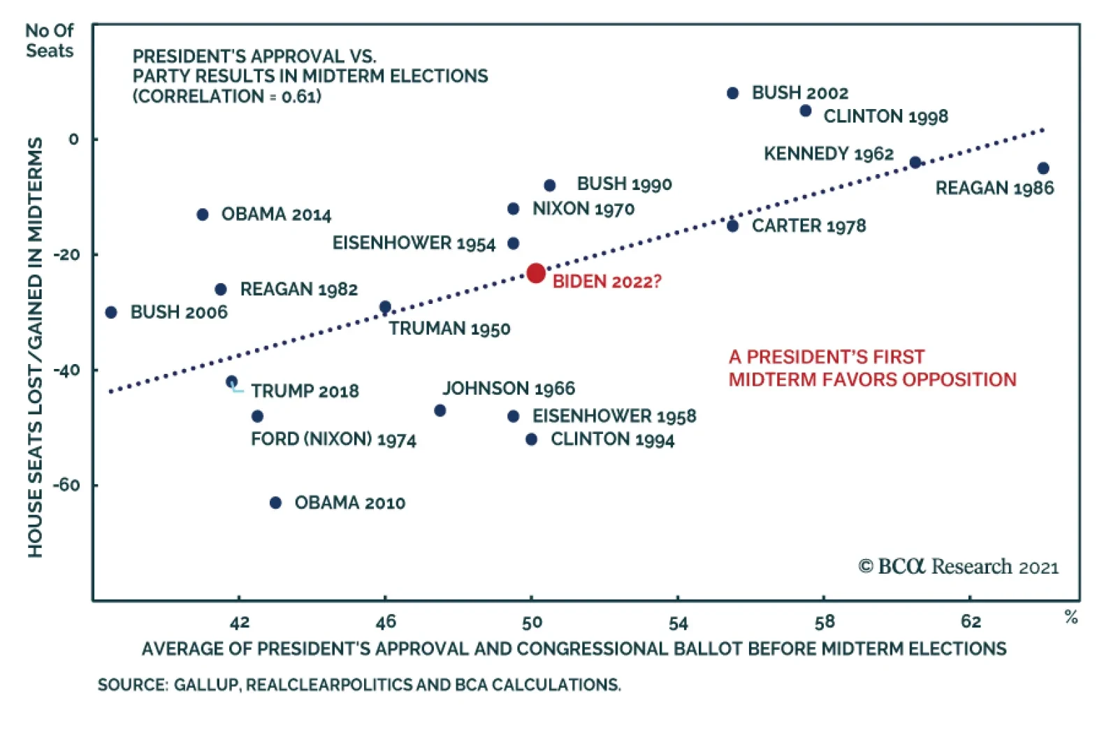
BCA Research’s US Political Strategy service argues that while Republicans are favored to win a majority in the House of Representatives, there is a non-negligible risk that Democrats will retain the House. First, the economy will be strong in 2022.…
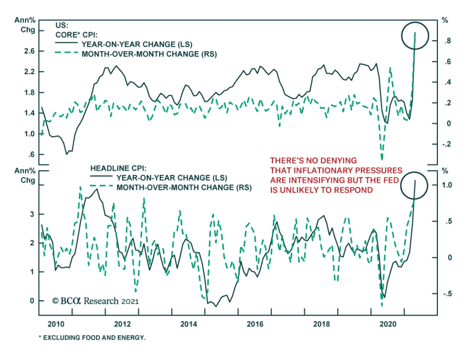
The US CPI release for April confirms that inflationary pressures are intensifying. Most importantly, month-on-month changes show that the phenomenon goes beyond the base effect. The headline index jumped 0.8% m/m from 0.6% m/m, significantly above the…
Chart 1
Chart 1
Chart 1
Fourteen months ago we penned a report titled “20 Reasons To Buy Equities” and now that the SPX is up 2,000 points since that trough, the risk/reward tradeoff is to the downside and we are compelled to book gains and raise some cash. On May 3 we upgraded health care to overweight and added some defensive exposure to our portfolio and last week we highlighted five technical reasons not to chase equities higher in the near term. What follows are 10 reasons to lighten up on stocks and therefore await a better entry point to deploy fresh capital later this summer: 1. The Fed and other developed global central banks’ easing has reached a peak. In fact, taper has started at the BoC and the BoE announced a quasi-taper, the ECB is rumored to commence decreasing asset purchases this summer and the Fed will likely taper by yearend (Chart 1). 2. US fiscal easing has also hit an apex and a large fiscal cliff looms in 2022 a mid-term election year (Chart 2). 3. The bulls have taken full control of the equity market and our Risk Appetite Indicator recently touched the four standard deviations line (Chart 2). 4. The ISM manufacturing survey peaked near 65 and the non-manufacturing hit an all-time high (Chart 2). 5. China’s is in a slowdown mode and BCA’s total social financing projections indicate a further deceleration in the back half of the year (Chart 1). Chart 2
Chart 2
Chart 2
Chart 3
Chart 3
Chart 3
6. Equity market internals have been signaling trouble since February, warning that this bifurcated market is in desperate need of a breather (Chart 3). 7. The VIX in mid-April had a 15 handle for the first time since early last year, warning that investors are complacent (Chart 3). 8. Similarly, the junk bond option adjusted spread is at cyclical lows, and financial conditions are as good as they get probing all-time lows (Chart 2). 9. SPX profit growth is slated to jump 34% in calendar 2021, according to the latest I/B/E/S estimates with EPS on track to hit an all-time high level of $188 (Chart 3). 10. Finally, valuations remain lofty with the forward P/E ratio hovering near 22 an historically high level (Chart 3). Bottom Line: The easy money has been made since the March 23, 2020 trough when the SPX was 2,000 points lower. Our sense is that the next 10% move in the SPX is lower (close to 3,800) rather than higher and a healthy and much needed reset looms. Thus, we recommend investors book some gains, raise some dry powder and be prepared to deploy fresh capital later this summer.
The five-year breakeven rate hit the highest level since 2006 on Monday as bond investors adjusted to price in higher inflation expectations. The repricing triggered a broad-based selloff in equities that spilled into Tuesday. Long-duration, interest-rate…
Dear client, Next Monday May 17, instead of sending you a Strategy Report we will be hosting our quarterly webcast “From Alpha To Omega With Anastasios” at 10am EST with two special guests, addressing the recent market moves and discussing the US equity market outlook. Kind Regards, Anastasios In this Monday’s Special Report, we attempted to quantify the border between deflation and inflation. We relied on empirical data and examined the relationship between core CPI inflation and equites. We found that the S&P 500 P/E multiple typically peaks when core CPI inflation reaches 2.3% and begins to decline once inflation climbs above 2.5% (see chart). The only adjustment we made to the 2.5% number was instead of looking at a specific inflection level, we turned it into a range of 2.3-2.7%. To confirm our 2.3-2.7% estimate, we also examined the relationship between core CPI inflation and fixed income, which can be found on page 3 of our most recent Special Report along with a discussion on select GICS1 level sector positioning during periods of “true” inflation, as opposed to reflation.
Quantifying The Border Between Inflation And Deflation
Quantifying The Border Between Inflation And Deflation
Highlights Global Tapering: The Bank of England has joined the Bank of Canada as central banks tapering the pace of bond buying. Markets are now trying to sort out who is next and concluding that it will not be the Federal Reserve, with US employment still well below the pre-pandemic peak. US Treasury yields will continue trading sideways until there is greater clarity on the pace of US labor market improvement, especially after the big downside miss in the April jobs report. US Treasury Curve: We are adding a new recommended US butterfly trade to our Tactical Overlay portfolio, going long the 5-year bullet and short the 2/30 barbell using US Treasury futures. This trade should benefit with US Treasury curve steepening overshooting the pace of past cycles, while offering attractive carry if persistent Fed dovishness slows the cyclical transition to a bear-flattening curve regime. Feature Heading into 2021, one of our key investment themes for the year was that no major central bank would shift to a less dovish monetary policy stance before the Fed. Not even five months into the year, our theme has already been proven incorrect. Last week, the Bank of England (BoE) announced a slower pace of its asset purchases, following a similar tapering decision by the Bank of Canada (BoC) last month. Chart of the WeekUS Jobs Recovery Lagging, Despite Vaccine Success
Who Tapers Next?
Who Tapers Next?
We had assumed that no central bank could tolerate the currency strength that would inevitably occur by tapering ahead of the Fed. That was clearly not the case in Canada, and the Canadian dollar has already appreciated 4.6% versus the greenback since the BoC taper announcement April 21. The British pound also rallied solidly against both the US dollar and euro immediately after the BoE taper announcement last week. Markets are beginning to speculate on future taper candidates, like the Reserve Bank of New Zealand (RBNZ), with the New Zealand dollar being one of the strongest currencies in the G10 versus the US dollar since the end of March (+4.4%). Investors had been debating the possibility that the Fed could begin tapering sometime in the second half of 2020, largely based on what has to date been a successful US vaccination campaign. Yet while that led to optimism that the US economy can quickly reopen and return to normal, the fact remains that the recovery in US employment from the COVID shock has lagged other major economies (Chart of the Week). The big downside miss on the April US payrolls report highlights how the Fed can be patient before joining the tapering club. US Treasury yields are likely to continue trading sideways, and the US dollar will trade soft, until markets can sort out the true state of US labor demand versus supply. Which Central Bank Could Follow The BoC And BoE? Back in March, we published a report that discussed what we called the “pecking order of global liftoff”.1 We looked at how interest rate markets were pricing in an increasingly diverse path out of the coordinated global monetary easing enacted last year during the COVID recession (Chart 2). We looked at both the timing of “liftoff” (the first rate hike) and the pace of hikes afterward to the end of 2024. We then ranked the countries by the market-implied timing of liftoff. Chart 2Sorting Out The Relative Hawks & Doves Among Global CBs
Sorting Out The Relative Hawks & Doves Among Global CBs
Sorting Out The Relative Hawks & Doves Among Global CBs
At the time, overnight index swap (OIS) curves were discounting the earliest liftoff from the RBNZ (June 2022) and BoC (August 2022). The Fed was expected to hike in January 2023, followed by the BoE in June 2023 and Reserve Bank of Australia (RBA) in July 2023. The European Central Bank (ECB) and Bank of Japan (BoJ) were the laggards, with no rate hiked discounted until September 2023 and February 2025, respectively. In terms of the pace of rate hikes after liftoff through 2024, our list was broken into two groups. The more aggressive central banks were expected to be the BoC (+175bps), RBA (+156bps), RBNZ (+140bps) and the Fed (+139bps). Much smaller amounts of rate hikes were anticipated from the BoE (+63bps), ECB (+25bps) and BoJ (+9bps). In the two months since our March report, the market timing of liftoff, and the pace of subsequent hikes, has shifted for all those countries (Table 1). The BoC is now expected to move in September 2022, ahead of the RBNZ (October 2022). In 2023, the Fed is now priced for liftoff in March 2023, followed by the BoE and RBA (both in July 2023). The ECB liftoff date is little changed (now August 2023), while the market has dramatically pushed out the timing of any BoJ hike (now November 2025). The cumulative rate hikes through 2024 are moderately lower for all countries except Australia (a reduction in total tightening of 56bps). Table 1The Fed Is Sliding Down The “Pecking Order Of Liftoff” List
Who Tapers Next?
Who Tapers Next?
What is interesting about these changes is that the market has pulled forward the timing of liftoff for the BoE and RBA, while pushing it out for the BoC, RBNZ, BoJ and, most importantly, the Fed. The Fed is now drifting down the “pecking order” for liftoff, expected to lift rates only a couple of months before the BoE or RBA. This is a major change from previous monetary policy cycles, when the Fed would typically be a first mover when it comes to tightening policy. Chart 3The Momentum Of Global QE Has Already Been Slowing
The Momentum Of Global QE Has Already Been Slowing
The Momentum Of Global QE Has Already Been Slowing
While the BoC and BoE decisions to taper quantitative easing (QE) have garnered the headlines, the pace of global central bank balance sheet expansion had already peaked at the start of 2021 (Chart 3). The pace has slowed most dramatically in Canada and the US, but this was a result of certain emergency programs expiring – most notably the Fed’s corporate bond buying vehicles late last year and the BoC’s short-term repo facilities more recently. Greater financial market stability was the reason cited to end those programs, while still leaving government bond QE buying in place unchanged. The year-over-year pace of global QE was set to slow, simply from less favorable comparisons to 2020 after the surge in central bank balance sheet expansion last year. Yet now we are starting to see actual tapering of government bond purchases from some central banks. Is such “early tightening” warranted? Back in that same March report where we discussed the order of global liftoff, we gave our assessment of the most important factors that could drive central banks to consider a shift to a less dovish stance (like tapering). For the BoC, we cited booming house prices and robust business confidence as reasons the BoC could turn less dovish sooner (Chart 4). For the BoE, we noted a sharper-than-expected recovery in domestic investment and consumer spending, as the locked-down UK economy reopens, as reasons why the BoE could begin to tweak its policy settings. For both central banks, all those indicators were mentioned as factors leading to their decision to taper. For the Fed, we determined that rising inflation expectations and increasing labor market tightness would both be required for the Fed to turn less dovish. Only inflation expectations have reached that goal, with the US Employment/Population ratio still well below the pre-pandemic peak (Chart 5). For the RBA, we looked solely at realized inflation measures, as the RBA has explicitly noted that Australian wage growth must rise sustainably towards 3% - nearly double current levels - before realized CPI inflation could return to the 2-3% target range. For both the Fed and RBA, the necessary conditions for a change in current policy settings have not yet been met. Chart 4What The More Hawkish CBs Are Watching
What The More Hawkish CBs Are Watching
What The More Hawkish CBs Are Watching
Chart 5What The More Dovish CBs Are Watching
What The More Dovish CBs Are Watching
What The More Dovish CBs Are Watching
For the ECB, we noted that realized inflation (and the ECB’s inflation forecasts), along with the Italy-Germany government bond spread as a measure of financial conditions, were the most important indicators to watch before the ECB could consider any move to taper its QE programs (Chart 6). Italian spreads have widened a bit in recent months, while the latest set of ECB economic forecasts still call for headline euro area inflation to remain well south of the 2% target out to 2023. For the BoJ, we simply cited a rise in realized inflation as the only possible development that could lead to a BoJ taper. The BoJ now forecasts that Japanese inflation will not reach the 2% central bank target until at least 2024. So for both the ECB and BoJ, the conditions do not warrant any imminent tapering of bond buying. Chart 6What The Most Dovish CBs Are Watching
What The Most Dovish CBs Are Watching
What The Most Dovish CBs Are Watching
As another way to determine who could taper next, we turn to our Central Bank Monitors, which are designed to measure the pressure on policymakers to ease or tighten monetary setting. All the Monitors have responded to the recovery in global growth and inflation, along with the easing of financial conditions implied by booming markets, over the past year. Yet only the RBA Monitor is calling for tightening (Chart 7), indicating that the RBA’s current focus on only wages and realized inflation is a departure from their behavior in the past. The Fed and BoE Monitors have risen to the zero line, suggesting no further pressure to ease policy but no tightening is needed either. The ECB, BoJ and RBNZ Monitors are all close, but just below, the zero line, suggesting diminishing need for more monetary stimulus (Chart 8). Chart 7Bond Yields Have Moved Ahead Of Our CB Monitors
Bond Yields Have Moved Ahead Of Our CB Monitors
Bond Yields Have Moved Ahead Of Our CB Monitors
Chart 8Yields Overshooting Tightening Pressures Here Too
Yields Overshooting Tightening Pressures Here Too
Yields Overshooting Tightening Pressures Here Too
Based on our assessment of the above indicators, we judge the RBNZ to be the next central bank most likely to taper, sometime in the 2nd half of 2021. We still see the Fed starting to signal tapering later this year, but with actual slowing of US Treasury (and Agency MBS) purchases not occurring until early 2022. The year-over-year momentum of bond yields correlates strongly with the Central Bank Monitors. The rise in global bond yields seen over the past year has exceeded the pace implied by the Monitors. This is unsurprising given how rapidly the global economy has recovered from pandemic-fueled recession in 2020. Supply chain disruptions and surging commodity prices have also given a lift to bond yields via rising inflation expectations, even as central banks have promised to keep rates on hold for at least the next couple of years. Yet purely from a monetary policy perspective, the surge in global bond yields looks to have gone a bit too far, too fast. Bottom Line: Markets are now trying to sort out who will taper next after the BoC and BoE, and have concluded that it will not be the Federal Reserve, with US employment still well below the pre-pandemic peak. US Treasury yields will continue trading sideways until there is greater clarity on the pace of US labor market improvement, especially after the big downside miss in the April jobs report. Bond yields in other developed markets appear to have overshot economic momentum, and a period of consolidation is needed before yields can begin moving higher again. US Treasury Curve: How Much Steepening Left? Chart 9A Pause In The UST Bear-Steepening Trend
A Pause In The UST Bear-Steepening Trend
A Pause In The UST Bear-Steepening Trend
For most of the past year, the primary trend in the US Treasury curve has been one of bear steepening. Longer maturity yields have borne the brunt of the upward pressure stemming from the rapid recovery in US (and global) economic growth from the depths of the 2020 COVID-19 recession. In recent weeks, however, the surge in longer-maturity Treasury yields has stalled, as have the immediate steepening pressures (Chart 9). Purely from a fundamental economic perspective, a steepening Treasury curve is an expected result of the reflationary mix of growth, inflation and monetary policy currently at work in the US. For example, since the 2020 lows, 5-year/5-year forward inflation expectations from the TIPS market have risen 143bps while the ISM manufacturing index surged from a low of 41 to a high of 65 in March of this year (Chart 10). Combine that with the Fed cutting rates to 0% last year, while promising to keep rates unchanged through 2023 and reinforcing that commitment through QE, and it is no surprise to see a steeper US Treasury curve. Chart 10UST Curve Steepening Has Been Driven By Reflation
UST Curve Steepening Has Been Driven By Reflation
UST Curve Steepening Has Been Driven By Reflation
Yet even despite these obvious steepening pressures, the pace of the Treasury curve steepening does seem to be a bit rapid compared to history. In Chart 11, we show a “cycle-on-cycle” analysis, comparing the slope of various US Treasury curve segments (2-year versus 5-year, 5-year versus 10-year, 10-year versus 30-year) to the average of the previous five US business cycles, dating back to the 1970s. The curves are lined up to the start date of the previous recession, with the vertical line in the chart representing that date. Thus, this chart allows us to see how the Treasury curve evolved heading into, and coming out of, economic downturns. Chart 11 shows that the current 2-year/5-year curve, with a steepness of 63bps, is in line with past steepening moves coming out of recession. For the curve segments at longer maturities, the pace of steepening has been much more rapid than in the past. In fact, the current 5-year/10-year slope of 82bps is already above the average past peak level, as is the 10-year/30-year curve of 72bps. If we do the same cycle-on-cycle analysis for the three previous US recessions dating back to 1990, the current curve slopes are more in line with levels seen one year into the economic expansion (Chart 12). During those previous cycles, the curve steepening trend ended around two years into the expansion. This suggests that the current curve steepening could continue into 2022, except for one major difference – the Fed cut rates to 0% very rapidly last year, far faster than in the previous easing cycles. This suggests that additional curve steepening from current levels can only occur through a surge in US inflation. Chart 11Current UST Steepening Has Moved Fast Compared To Past Cycles
Current UST Steepening Has Moved Fast Compared To Past Cycles
Current UST Steepening Has Moved Fast Compared To Past Cycles
Chart 12Can More UST Curve Steepening Occur With A 0% Funds Rate?
Can More UST Curve Steepening Occur With A 0% Funds Rate?
Can More UST Curve Steepening Occur With A 0% Funds Rate?
The slope of the Treasury curve is typically correlated to the level of the nominal fed funds rate, but is even more strongly correlated to the funds rate minus actual inflation, or the real fed funds rate. When the real funds rate is below the natural real rate of interest, a.k.a. r-star, the Treasury curve has historically exhibited its strongest steepening trend. That can be seen in Chart 13, where we show the real fed funds rate (adjusted by US core CPI inflation) compared to the New York Fed’s estimate of r-star. The gap between the two series is shown in the bottom panel, correlating very strongly to the 2-year/30-year Treasury curve slope. Chart 13Curve Steepening Results When Real Rates Are Below R*
Curve Steepening Results When Real Rates Are Below R*
Curve Steepening Results When Real Rates Are Below R*
With the nominal funds rate at zero, that gap between r-star and the real fed funds rate can only widen in a fashion that would support more curve steepening if a) realized US inflation moves higher or b) r-star moves higher. Both outcomes are possible as the US economic recovery, fueled by expanding vaccinations and fiscal stimulus. Both real rates and r-star are much lower in the current cycle than in previous economic recoveries, although the r-star/real funds rate gap appears to be following a more typical path that suggests potential additional steepening pressure (Chart 14). The wild card in this analysis is the Fed itself. If US economic growth and inflation evolve in way that makes it more likely the Fed would have to begin tapering QE and, eventually, signal future rate hikes, the Treasury curve may shift to a more typical bear-flattening trend seen during tightening cycles. We saw an example of that after the release of the March US employment report, where over a million jobs were created in a single month, causing 5-year Treasury yields to jump higher than longer-maturity Treasuries (i.e. curve flattening). Looking ahead, it appears that the US yield curve is more likely to slowly transition to a bear-flattening/bull-steepening regime than continue the bear-steepening/bull-flattening: trend of the past twelve months. One way to position for this is to enter into butterfly curve trades that offer attractive carry or valuation. For that, we turn to our Treasury curve valuation models. We have been recommending a Treasury yield curve trade in our Tactical Overlay portfolio on page 19, going long a 7-year bullet versus going short a 5-year/10-year barbell (Chart 15). This barbell is now very cheap on our models, which measure value by regressing the butterfly spread on the underlying slope of the curve. In this case, the spread between the 5/7/10 butterfly is unusually wide compared to the slope of the 5/10 Treasury curve. According to our model, this butterfly spread discounts nearly 100bps of additional 5/10 steepening, an excessive amount compared to past cycles. Chart 14R* - Real Funds Rate Gap Below Previous Cyclical Peaks
R* - Real Funds Rate Gap Below Previous Cyclical Peaks
R* - Real Funds Rate Gap Below Previous Cyclical Peaks
Chart 15Maintain Our Current 5/7/10 UST Butterfly Trade
Maintain Our Current 5/7/10 UST Butterfly Trade
Maintain Our Current 5/7/10 UST Butterfly Trade
While the valuation is attractive on the 5/7/10 butterfly (Table 2), the carry on this position is a modest 12bps. A butterfly with more attractive carry is the 2/5/30 butterfly. Table 2US Butterfly Strategy Valuation: Standardized Residuals
Who Tapers Next?
Who Tapers Next?
Table 3US Butterfly Strategies: Carry
Who Tapers Next?
Who Tapers Next?
Chart 16Enter A New 2/5/30 UST Butterfly Trade
Enter A New 2/5/30 UST Butterfly Trade
Enter A New 2/5/30 UST Butterfly Trade
This butterfly has a neutral valuation (Chart 16) on our model, but offers 35bps of carry - the most attractive among all butterflies involving a 5-year bullet (Table 3). With US Treasury yields, and the Treasury curve slope, likely to remain rangebound for the next few months, going for higher carry trades is an attractive strategy – particularly if used in conjunction with a below-benchmark duration stance, which we still advocate. The 2/5/30 butterfly represents an attractive near-term hedge to that more defensive duration posture. Bottom Line: We are adding a new recommended US Treasury butterfly trade to our Tactical Overlay portfolio, going long the 5-year bullet and short the 2/30 barbell. This trade should benefit with US Treasury curve steepening overshooting the pace of past cycles, while offering attractive carry if persistent Fed dovishness slows the cyclical transition to a bear-flattening curve regime. Robert Robis, CFA Chief Fixed Income Strategist rrobis@bcaresearch.com Footnotes 1 Please see BCA Research Global Fixed Income Strategy Report, "Harder, Better, Faster, Stronger", dated March 16, 2021, available at gfis.bcaresearch.com. Recommendations The GFIS Recommended Portfolio Vs. The Custom Benchmark Index
Who Tapers Next?
Who Tapers Next?
Duration Regional Allocation Spread Product Tactical Trades Yields & Returns Global Bond Yields Historical Returns
Highlights Duration: Despite last month’s weak employment growth, we continue to expect the economy to reach maximum employment in time for the Fed to lift rates in 2022. Maintain below-benchmark portfolio duration. TIPS: Long-maturity TIPS breakeven inflation rates have returned to levels that are consistent with the Fed’s target. Breakevens are also discounting a very rapid increase in near-term inflation at the front-end of the curve. Investors should take this opportunity to reduce TIPS exposure from overweight to neutral and to close inflation curve flattener and real yield curve steepener positions. Yield Curve: The Treasury curve has transitioned into a bear-flattening/bull-steepening regime beyond the 5-year maturity point, and as such, our recommended yield curve positioning must be re-considered. We recommend that investors position for maximum carry across the yield curve by going long the 5-year bullet and short a duration-matched 2/30 barbell. April Payrolls Shock The Bond Market In the current environment, there is probably nothing more important for US bond investors than keeping a close eye on the monthly employment data. The Federal Reserve has made the first rate hike contingent on a return to “maximum employment”, and bond yield fluctuations reflect the market’s changing assessment of the timing and pace of future Fed rate hikes. Chart 1A Big Miss On Payrolls
A Big Miss On Payrolls
A Big Miss On Payrolls
With that in mind, investors got a shock last Friday when April’s employment report disappointed expectations by one of the widest margins ever. The economy added only 266 thousand jobs to nonfarm payrolls in April while the Bloomberg consensus estimate was calling for 1 million! At present, the market is looking for Fed liftoff in February 2023 (Chart 2). We calculate that monthly employment growth must average at least 412 thousand for the Fed to reach its maximum employment goal by the end of 2022, in time to lift rates in early-2023 (Chart 1 on page 1). Average monthly employment growth of at least 698 thousand is required to hit the Fed’s maximum employment target by the end of this year.1 Chart 2Market Priced For Liftoff In February 2023
Market Priced For Liftoff In February 2023
Market Priced For Liftoff In February 2023
The last section of this report (titled “Evidence Of A Labor Shortage In The April Payrolls Report”) explores possible reasons for the weaker-than-expected employment data and concludes that payroll growth will be stronger in the second half of this year. We continue to expect that the economy will reach maximum employment in time for the Fed to lift rates in 2022, and as such, we advise bond investors to maintain below-benchmark portfolio duration. Peak Inflation Last week, we downgraded our allocation to TIPS from overweight to neutral and closed two yield curve positions – an inflation curve flattener and a real yield curve steepener – that had been in place since April 2020.2 We made these moves for two reasons: There is a good chance that realized inflation won’t match the aggressive expectations that are already discounted in the front-end of the inflation curve. Long-maturity TIPS breakeven inflation rates are now consistent with the Fed’s target. In other words, they can’t rise much further without the Fed acting to bring them back down. On the first point, we continue to expect that inflation will be relatively strong between now and the end of the year, but the market has already more than priced-in this outcome. The 1-year CPI swap rate is currently 3.18% and the 2-year CPI swap rate sits at 2.99% (Chart 3). Even if we assume that core CPI increases by a robust +0.2% per month going forward, that will only cause 12-month core CPI inflation to reach 2.29% by the end of this year (Chart 4). Chart 3An Inflation Snapback Is Priced In
An Inflation Snapback Is Priced In
An Inflation Snapback Is Priced In
Chart 4Inflation In 2021
Inflation In 2021
Inflation In 2021
Chart 5TIPS Are Very Expensive
TIPS Are Very Expensive
TIPS Are Very Expensive
To further that point, this week we unveil our new TIPS Breakeven Valuation Indicator (Chart 5). The indicator is based on the theory of adaptive expectations – the theory that inflation expectations are formed based on recent trends in the actual inflation data. In essence, the indicator compares the current 10-year TIPS breakeven inflation rate to different measures of inflation and determines whether 10-year TIPS are currently cheap or expensive relative to 10-year nominal bonds. A negative reading indicates that TIPS are expensive, while a positive reading suggests that TIPS are cheap. At present, the indicator sits at -0.88. Historically, when TIPS are this expensive on our indicator there are strong odds that the 10-year TIPS breakeven inflation rate will fall during the next 12 months (Table 1). Table 1TIPS Breakeven Valuation Indicator Track Record
Entering A New Yield Curve Regime
Entering A New Yield Curve Regime
On the second point, we have often noted that a range of 2.3% to 2.5% on long-maturity TIPS breakevens (levels seen during the mid-2000s) is consistent with the Fed’s inflation target. The 10-year and 5-year/5-year forward TIPS breakeven inflation rates haven’t spent much time near those levels during the past decade, but that is starting to change. The 10-year TIPS breakeven inflation rate recently shot up to 2.52%, above the top-end of our target band, while the 5-year/5-year forward TIPS breakeven inflation rate sits near the low-end of the range at 2.34% (Chart 6). Even Fed Chair Powell acknowledged that TIPS breakeven rates are “pretty close to mandate consistent” in the press conference that followed the April FOMC meeting.3 This is not to say that we expect the Fed to pivot quickly towards tightening. However, once the economy reaches maximum employment and the Fed starts to lift rates, the pace of rate hikes will be much quicker if long-maturity TIPS breakeven inflation rates are threatening to break above 2.5%. This puts a long-run ceiling on TIPS breakevens, one that we are quickly approaching. As for our inflation curve flattener and real yield curve steepener positions, neither makes sense unless TIPS breakeven rates continue to rise (Chart 7). Chart 6Long-Maturity Breakevens Are At Target
Long-Maturity Breakevens Are At Target
Long-Maturity Breakevens Are At Target
Chart 7Exit Inflation Curve Flattener And Real Yield Curve Steepener
Exit Inflation Curve Flattener And Real Yield Curve Steepener
Exit Inflation Curve Flattener And Real Yield Curve Steepener
The cost of inflation compensation is much more volatile at the front-end of the curve than at the long end, which means that the inflation curve tends to flatten when breakevens rise and steepen when they fall. In other words, the inflation curve will not flatten further unless breakevens move higher. While we don’t see room for further inflation curve flattening, we also think that the curve will remain inverted. With the Fed targeting a temporary overshoot of its 2% inflation target, an inverted inflation curve is much more consistent with the Fed’s stated goals than a positively sloped one. As for the real yield curve, it’s easiest to think of a real yield curve steepener as the combination of a nominal curve steepener and an inflation curve flattener. If the inflation curve holds steady, then there is no difference between a real yield curve steepener and a nominal yield curve steepener. On that note, the next section of this report discusses why the case for a nominal yield curve steepener is also starting to break down. Bottom Line: Long-maturity TIPS breakeven inflation rates have returned to levels that are consistent with the Fed’s target. Breakevens are also discounting a very rapid increase in near-term inflation at the front-end of the curve. Investors should take this opportunity to reduce TIPS exposure from overweight to neutral and to close inflation curve flattener and real yield curve steepener positions. Nominal Treasury Curve: Pick Up Carry In Bullets The average yield on the Bloomberg Barclays Treasury Master Index troughed on August 4th 2020 and rose by 92 basis points until it peaked on April 2nd. The Treasury curve steepened dramatically during that period, with increases in the 10-year and 30-year yields far outpacing the rise in the 5-year yield (Table 2). Table 2Treasury Yield Changes Since The August 2020 Trough
Entering A New Yield Curve Regime
Entering A New Yield Curve Regime
But the shape of the yield curve has behaved differently since yields peaked on April 2nd. The average index yield is down 11 bps since then, but the decline has been led by the 5-year while the 10-year and 30-year yields have been relatively sticky. We view this as evidence that, as we edge closer to an eventual rate hike cycle, the yield curve is entering a new regime. This is a natural progression. When rate hikes are only expected to occur far into the future, there will be very little volatility at the front-end of the curve and the yield curve will tend to steepen when yields rise and flatten when they fall. But over time, as we get closer to expected rate hikes, volatility will shift toward shorter and shorter maturities. This will eventually cause the yield curve to flatten when yields rise and steepen when they fall. Chart 8Buy 5-Year Versus 2/30
Buy 5-Year Versus 2/30
Buy 5-Year Versus 2/30
While there is still very little volatility in 1-3 year yields, it looks like the curve beyond the 5-year maturity point has transitioned into a bear-flattening/bull-steepening regime. That is, when yields rise we should expect the 5/30 slope to flatten and when yields fall we should expect the 5/30 slope to steepen. Indeed, we see that a gap has recently opened up between the trends in the 5/30 slope and the Treasury index yield, while the 2/5 slope remains tightly correlated with the level of yields (Chart 8). The big implication of this regime shift is that we should no longer expect our current recommended yield curve position, long the 5-year bullet and short a duration-matched 2/10 barbell, to perform well in a rising yield environment. To profit from rising yields, investors would be better off positioning for a flatter 5/30 curve by going short the 10-year bullet and long a duration-matched 5/30 barbell. However, this is not the strategy we’d recommend for investors who are already running below-benchmark portfolio duration and are thus already exposed to rising yields. The reason is that while we think the market’s current expected fed funds rate path is slightly too dovish, it is not that far from a reasonable forecast. Put differently, we see bond yields as biased higher but the near-term upside could be limited. For this reason, and since we are already exposed to higher yields through our portfolio duration call, we prefer to enter a yield curve position that will profit from an environment of stable yields. That is, a carry trade that offers a large amount of yield pick-up. The best trade in that regard is a position long the 5-year bullet and short a duration-matched 2/30 barbell (Chart 8, bottom panel). This position offers a positive yield pick-up of 31 bps, a nice cushion against the risk of capital losses from further 2/30 steepening. Bottom Line: The Treasury curve has transitioned into a bear-flattening/bull-steepening regime beyond the 5-year maturity point, and as such, our recommended yield curve positioning must be re-considered. We recommend that investors position for maximum carry across the yield curve by going long the 5-year bullet and short a duration-matched 2/30 barbell. Evidence Of A Labor Shortage In The April Payrolls Report Given the well-founded optimism about the pace of US economic recovery (real GDP grew 6.4% in the first quarter after all) it was very surprising that only 266 thousand jobs were added in April. One possible reason for the weak job growth is that a lack of labor supply is holding it back. We explored this issue in a recent report and concluded that there is a lot of evidence to support the claim.4 While it is a bad idea to read too much into any single datapoint, we think it’s likely that the labor shortage played a significant role in April’s poor employment number. At first blush, the industry breakdown of April’s employment report appears to refute the labor shortage narrative. For example, the Leisure & Hospitality sector added 331 thousand jobs on the month, by far the most of all the industry groups (Table 3). This is interesting because the Leisure & Hospitality sector – primarily restaurants and bars – is a close-contact service industry with low average wages, the exact sort of industry where we would expect to see evidence of a labor shortage. Table 3Employment By Industry
Entering A New Yield Curve Regime
Entering A New Yield Curve Regime
But we don’t think strong Leisure & Hospitality job growth refutes the labor shortage narrative. For one thing, while +331k is a lot of new jobs in a single month, it could have been a lot more. The third column of Table 3 shows that the Leisure & Hospitality industry is still 2.8 million jobs short of where it was prior to COVID. Further, other indicators within the Leisure & Hospitality sector clearly point toward a lack of labor supply. The Job Openings Rate is much higher in the Leisure & Hospitality sector than in the economy as a whole (Chart 9) and Leisure & Hospitality wages have grown much more quickly during the past few months (Chart 9, bottom panel). It seems highly likely that Leisure & Hospitality job growth would be stronger if not for supply side constraints. More generally, economy-wide measures of labor demand have recovered much more quickly than the actual employment data (Chart 10). The job openings rate and the NFIB Jobs Hard To Fill survey have both surpassed their pre-COVID peaks, and more households describe jobs as “plentiful” than as “hard to get”. The one outlier is the unemployment rate which, after controlling for furloughed workers, has barely budged off its peak (Chart 10, bottom panel). This points strongly to labor supply being the limiting factor, not demand. Chart 9Leisure & Hospitality Wages Are Accelerating
Leisure & Hospitality Wages Are Accelerating
Leisure & Hospitality Wages Are Accelerating
Chart 10Evidence Of A Labor Shortage
Evidence Of A Labor Shortage
Evidence Of A Labor Shortage
Bottom Line: There is a lot of evidence that a lack of labor supply is holding back job growth. However, we expect that supply constraints will be cleared up relatively soon as widespread vaccination makes people more comfortable re-entering the labor force, and as expanded unemployment benefits lapse. We expect that job growth will be much stronger in the second half of 2021 and into 2022. Ryan Swift US Bond Strategist rswift@bcaresearch.com Footnotes 1 We define maximum employment as an unemployment rate of 4.5% and a labor force participation rate equal to its pre-COVID level of 63.3%. 2 Please see US Bond Strategy Weekly Report, “Negative Oil, The Zero Lower Bound And The Fisher Equation”, dated April 28, 2020. 3 https://www.federalreserve.gov/mediacenter/files/FOMCpresconf20210428.p… 4 Please see US Bond Strategy Weekly Report, “Making Money In Municipal Bonds”, dated April 27, 2021. Fixed Income Sector Performance Recommended Portfolio Specification
In the previous Tinkering With Inflation Special Report, we outlined our structural view for US inflation, namely that over the next 10 years inflation will surprise to the upside largely driven by politicians re-discovering the magic of fiscal spending. In today’s Special Report, we look at structural GICS1 sector-level implications for portfolio allocation courtesy of the looming inflationary flux, but with a major caveat. Over the years we have published numerous reports answering the question of “what to buy and what to sell” when inflation comes and goes. But, the key criticism is that our previous inflationary analysis included data from the current disinflationary era. In other words, the data was capturing the effects of reflation (i.e. inflationary spikes within the broader deflationary megatrend), rather than effects of the pure-play inflation (i.e. inflationary spikes within the broader inflationary trend). Up until recently, such analysis was well-fit for the macro environment investors were in, but given our structurally inflationary view, it pays to take a closer look at the relative GICS1 sector performance during “true” inflationary periods. The shaded areas in Chart 1 display five pure-play inflationary periods that we analyse in this Special Report. Importantly, we also treat the very first iteration with a big grain of salt as it was catalyzed by a one-off event: excessive Department of Defense (DoD) Vietnam War and Star War spending, which in turn skewed relative sector performance results (similarly to how relative sector performance during the recent pandemic-induced recession is not indicative of the typical recessionary sector performance). The Line In The Sand Before we proceed with our sectorial analysis, we must first distinguish between moves in core CPI that constitute deflation and inflation. We rely on empirical data and examine in detail the relationship between core CPI inflation, interest rates, and equites. Starting with equites, we find that the S&P 500 P/E multiple typically peaks when core CPI inflation reaches 2.3% and begins to decline once inflation climbs above 2.5% (Chart 2). At this level the market no longer finds the prospect of investing in long duration assets attractive. The investment horizon shortens as well as the multiple market participants are willing to pay for future earnings. The only adjustment we make to the 2.5% number is instead of looking at a specific inflection level, we turn it into a range of 2.3-2.7%. Chart 1True Inflationary Episodes
True Inflationary Episodes
True Inflationary Episodes
Chart 2Inflation And The P/E Multiple
Tinkering With Inflation (Part II): True Inflation Vs. Reflation
Tinkering With Inflation (Part II): True Inflation Vs. Reflation
Next, we bring fixed income into the picture and look at the correlation between SPX returns and changes in the 10-year US Treasury yield. The changes in this correlation help to distinguish between deflationary and inflationary environments due to different causality routes that exist from bonds to stocks, versus from stocks to bonds. A concrete example will help to clarify the point. When bond yields rise, they push stock prices down resulting into a negative causal correlation from yields to stocks. On the other hand, if stocks fall, then the central bank has to cut rates to protect the stock market, and in doing so it lowers yields. The end result is a positive causal correlation from stocks to yields. Negative correlation: yields rise ➜ DCF discount factor rises ➜ stocks fall Positive correlation: stocks fall ➜ central bank cuts rates ➜ yields fall Every central bank has to make the choice in which one of these two structural casual loops they operate as they can only protect one asset: either the bond market from inflation or the stock market from deflation. The choice of that key asset reveals the inflationary vs. deflationary regime. The bottom panel of Chart 3 illustrates this interplay. The top panel of Chart 3 also plots our 2.3%-2.7% inflation/deflation core CPI inflection range. Every time core CPI approached this critical range, the correlation between SPX returns and changes in the 10-year yield snapped to zero in preparation for a structural paradigm shift. This empirical exercise further illustrates that the 2.3-2.7% band in core CPI is the border between inflation and deflation. Chart 3The Border Line
The Border Line
The Border Line
What follows is a select GICS1 sector return/positioning analysis during bouts of actual inflation. We also mainly focus on cyclical sectors since positioning within defensive GICS1 sectors is not driven by inflation, but instead it is dictated by global growth dynamics, which are beyond the scope of this Special Report. Arseniy Urazov Senior Analyst ArseniyU@bcaresearch.com Positioning For True Inflation: S&P Consumer Discretionary It is no secret that consumers don’t like CPI inflation as it erodes purchasing power via a multitude of channels. High interest rates that go toe to toe with inflation make big item purchases more challenging due to the higher cost of credit, hence weighing on end-demand for consumer discretionary stocks. Also, there is only so much cost pressures companies can pass onto the US consumer. The implication is that there comes a time when the entire S&P consumer discretionary sector is forced to sacrifice margins and profits. Chart 4 shows our consumer drag indicator that encapsulates both of these factors. Our thesis is that should true inflation return, the underperformance period is likely to be more severe compared with previous historical episodes (Chart 6). The reason for such a grim forecast has to do with the present-day sector composition. Following the inclusion of TSLA in this GICS1 sector, the combined exposure to AMZN and TSLA is 53% (Chart 5). Chart 4Inflationary Headwinds
Inflationary Headwinds
Inflationary Headwinds
Chart 5Overconcentration
Overconcentration
Overconcentration
Chart 6Inflation & Consumer Discretionary Equities
Inflation & Consumer Discretionary Equities
Inflation & Consumer Discretionary Equities
Both of these companies are effectively a long duration trade, which disproportionately benefited from low rates via the multiple expansion channel. Should inflation return to the system and end the era of low rates, both TSLA and AMZN will fall out of investor’s favor and heavily weigh on the overall S&P consumer discretionary sector. Finally, the bottom panel of Chart 6 shows the impressive run consumer discretionary stocks had since the beginning of the millennium rising by over 100% in relative terms. The rise is also in sharp contrast to the performance from 1975 to 2000 when the sector was range bound. The implication is that should an inflation-induced normalization period take root, the risk/reward in the S&P consumer discretionary sector will lie to the downside. Bottom Line: The S&P consumer discretionary sector will underperform in an inflationary world. Positioning For True Inflation: S&P Financials Similar to their early cycle brethren consumer discretionary stocks, investors should shy away from financials when the inflation genie is out of the bottle. Outside of the anomaly Vietnam War/Moon Landing period, Chart 7 reveals that inflation is a major headwind for financials. Chart 7Inflation & Financials Equities
Inflation & Financials Equities
Inflation & Financials Equities
There are several avenues through which it hurts the sector. The first one is the yield curve. When the Fed raises short term rates to combat inflation, it flattens the curve. The end result is that the yield curve is flatter during an inflationary era, meaning that the spread between borrowing and lending narrows for the banking sector and results in a net interest margins squeeze. As a result, profitability drops, and stock prices fall (Chart 7, bottom panel). Inflation also hurts S&P financials due to the mismatch between banks' assets and liabilities. A typical bank has longer maturity for its receipts stream than for its liabilities. Consequently, as inflation rises, it reduces the future net inflow because creditors demand higher interest rates, while the returns earned by the bank on its current loan book is mostly fixed by existing contracts. The net result is lower bank equity and subsequently lower stock prices. The example below adds more color to the argument. Table 1 shows a stylized example of a balance sheet for a commercial bank over the course of three years with the following assumptions: Table 1The Effect Of Inflation
Tinkering With Inflation (Part II): True Inflation Vs. Reflation
Tinkering With Inflation (Part II): True Inflation Vs. Reflation
Inflation from Year 1 to Year 2 is 5%, but it increases from Year 2 to Year 3 to 10% The bank's contracts with creditors mature in 1 year, while loans mature in 2 years Reserve requirements against all deposits are 10% Nominal interest rates on loans stand at 5% Interest rates on deposits stand at 4.5% Cash account is ignored as it doesn’t affect qualitative results The bank starts in Year 1 and extends $1,000 worth of loans maturing in two years with a 5% rate and receives $1,000 worth of deposits that grow at 4.5% per year and mature next year. The bank also has 10% ($100) of its liabilities in reserves. The difference between assets and liabilities is the bank’s equity or market value, which is also $100. Next year, the bank receives $50 (5% of $1000) in income from the loans it extended in Year 1, but a portion of this income has to be moved to reserves as the value of deposits increased by $45 (4.5% of $1000). Thus, the final value of loans is $1050 minus ($45 times the 10% reserve requirement), which equals $1045.5. The bank’s nominal equity value also increased to $105, but when adjusted for inflation it remains the same as in Year 1. Now, expected inflation for Year 3 changes from 5% to 10%, and since deposits have matured, creditors renegotiate them at a new rate of 10%, while the loans that were issued in Year 1 remain contractually bind to the original 5%. Crunching the numbers for Year 3 using new interest rates reveals that both the nominal and real value of a bank’s equity decreased due to the maturity mismatch between its assets and liabilities. Of course, the bank could have extended new loans in Year 2 at the higher 10% rate, but it would have only reduced the drop in equity value, but not eliminated it, so for the sake of simplicity we ignored that option. What this exercise showed is the second avenue through which inflation weighs on banks, and by extension, financials equities. Bottom Line: It pays to shy away from the S&P financials sector during bouts of inflation. Positioning For True Inflation: S&P Energy The S&P energy index is a classic inflation beneficiary as true inflationary impulses are synonymous with oil price surges. Chart 8 highlights how this commodity-driven sector was quick to react to all six inflationary spurts, besting the market during each of them. Chart 8Inflation & Energy Equities
Inflation & Energy Equities
Inflation & Energy Equities
Moreover, deglobalization is likely to provide a boost to relative energy prices over a multi-year time horizon as the number of proxy wars in South America and the Middle East will likely increase, undercutting global oil supply. Hence, the geopolitical risk premia in crude oil will also rise boosting the allure of energy stocks. Finally, for investors who are choosing between energy and materials equites to express their near-term inflationary view, we would recommend sticking to the S&P Energy index in light of our unfolding China slowing down view. Chart 9 also depicts how China's dominance in the materials market is nearly absolute compared to the one in energy space. Hence, materials equities are more sensitive to the China weakness story, and investors should at the margin prefer energy equities over materials. Stay tuned for an upcoming report that will explore this idea in greater depth and recommend a new intra-commodity complex pair trade. Bottom Line: The S&P energy sector will outperform the market should deflation recede. Chart 9China And Commodities
China And Commodities
China And Commodities
Positioning For True Inflation: S&P Industrials The S&P industrials sector is located in the middle of the economic value chain and thus it has diminishing power to pass on inflationary cost increases especially energy related ones. At the same time, capital goods producers have other corporations as their end-demand user, which means that they suffer less from inflation than sectors at the far end of the value chain like consumer discretionary. Chart 10 shows how relative performance of the S&P industrials sector is “neither here nor there” when examining inflationary spikes. Chart 10Inflation & Industrials Equities
Inflation & Industrials Equities
Inflation & Industrials Equities
However, taking a closer look, we do note a shorter-term pattern that unfolds within every inflationary period. The S&P industrials index outperforms in the early stages of an inflationary spike, but then gives up its gains as inflation re-accelerates. There is an intuitive explanation for this dynamic. As deflation recedes giving way to inflation, industrial stocks are able to pass on the initial price increases to their customers thus preserving margins and profits. But as inflation persists, the fact that industrials companies are located in the middle of the economic value chain becomes a headwind as they are no longer able to pass on costs increases, which in turn gets reflected in falling relative stock prices. Bottom Line: Keep the S&P industrials index in the overweight basket early on into an inflationary spike, but do not overstay your welcome as inflation endures. Positioning For True Inflation: S&P Materials Typically, inflationary pressures first manifest themselves in higher raw material costs as rising demand from increased economic growth outpaces supply, benefiting materials equities. At the same time, the fact that materials stocks are the first link in the economic value chain allows them to efficiently pass on price increases, whereas other sectors at the end of the value chain like S&P consumer discretionary typically have the hardest time doing so (Chart 11). Chart 11Inflation & Materials Equities
Inflation & Materials Equities
Inflation & Materials Equities
The current deflationary environment has proven rocky for the S&P materials sector as it sits at the second lowest level in history following the dotcom-formed “Mariana Trench”. Should our forecast for an inflationary revival prove accurate, materials producers will be prime beneficiaries with ample upside potential. The mean relative share price ratio during the previous inflationary cycle (1960-1996) is 0.25. Today, materials are sitting at the 0.12 mark, which makes a 100%+ rise a reasonable structural forecast. Bottom Line: Materials are a secular buy in an inflationary world. Positioning For True Inflation: S&P Technology On the surface, the S&P technology sector appears to be a textbook candidate to short during inflation, but empirical data disagrees with the theory. The top panel of Chart 12 shows that there have only been two clean periods when tech underperformed during true inflationary periods (1974-1976 and 1987-1990). On the other hand, in 1977 – the year that had a very significant inflationary spike – technology stocks managed to outpace the broad market by a wide margin. Chart 12Inflation & Technology Equities
Inflation & Technology Equities
Inflation & Technology Equities
The reason for such inconsistent performance is due to the fact that the sector is sensitive to two opposing forces: multiple contraction and real economic growth. It is well-know that currently technology stocks represent the longest duration sector within the S&P 500, but they also enjoy inelastic demand profile. In other words, corporations cannot put their guard down and fully trim CAPEX and R&D expenses even during recessions because if they do, their competition will steam roll ahead. The same holds for the consumer sector. While some tech gadgets are luxury goods, consumers cannot simply postpone their PC, phone, and software related expenses as those are necessity goods. In short, the S&P technology index is not a pure-play cyclical sector as inelastic demand profile for its goods from other economic agents gives the sector some inflation-proof properties. Given that the upcoming inflationary impulse will be fiscal-driven, we would not rush to put tech stocks in the underweight basket. Instead, we opt to stick with a neutral allocation to underscore this tug of war effect between the two forces. Bottom Line: Relative technology performance in an inflationary world will depend on whether real economic growth can compensate for multiple contraction. Stick with a benchmark allocation. So What? In this Special Report we examined how investors should be positioned for true inflation rather than reflation. Some of the key differences are the following: financials switch from being a buy during reflation to a sell during true inflation, industrials are flat when looking at the entire inflationary spike, but they outperform in the early innings and underperform in the later stages of inflation, and finally technology is not a clear underperformer as this sector is caught between two opposing forces. Now circling back to our structural inflationary view, while it will take time for the current deflationary megatrend to make a full U-turn, the incoming post-recessionary spike driven by fiscal spending and heating up of the US economy will make for the right environment to test whether last century’s inflationary correlations will still hold. Our portfolio is appropriately positioned to test this hypothesis with an overweight toward inflationary winners and a neutral weight in inflationary losers (Table 2). As a reminder we have the S&P financials sector on downgrade alert. Table 2Current Portfolio Positioning
Tinkering With Inflation (Part II): True Inflation Vs. Reflation
Tinkering With Inflation (Part II): True Inflation Vs. Reflation
For completion purposes, Chart A1 in the Appendix on the next page also provides historical performance for defensive GICS1 sectors during true inflationary periods. Bottom Line: Investors should overweight true inflationary winners as the incoming CPI flux will unlock excellent value in those sectors. Appendix Chart A1Appendix
Appendix
Appendix
Footnotes