United States

Initiating a long S&P semis/short S&P technology hardware storage & peripherals (THS&P) pair trade is the ultimate reflationary play given its tight positive correlation with the 10-year US Treasury yield (top panel). Not only does the bond market spell more upside for this relative share price ratio, but the trade also captures a significant early supply chain advantage of chip stocks over their hardware brethren. Switching from macro to industry level data, and the news on the operating front is equally enticing. Chip capital outlays trounce THS&P stocks’ investments by a wide margin, which should further boost relative revenue prospects (bottom panel). In fact, chip sales already have the upper hand compared with tech hardware storage and peripherals revenues and a relative reacceleration phase looms as the chip industry’s bottlenecks get resolved in the back half of the year (not shown). Tack on recent news of President Biden’s preliminary infrastructure plans that include a $50bn sum for semiconductors in order to bolster US based manufacturing and research and development and the demand profile for chip stocks brightens further. Bottom Line: We initiated a long S&P semis/short S&P THS&P pair trade in a recent Special Report. The ticker symbols for the stocks in the S&P semiconductors and S&P THS&P indexes are BLBG: S5SECO – INTC, TXN, ADI, AMD, MXIM, XLNX, MCHP, NVDA, AVGO, QCOM, MU, SWKS, QRVO, NXPI, MPWR, and BLBG: S5CMPE – AAPL, HPQ, HPE, WDC, NTAP, STX, respectively.
Intra-sector Reflationary Trade
Intra-sector Reflationary Trade
Highlights Duration: Treasury yields look fairly valued on several different valuation metrics and the yield curve discounts a much quicker pace of rate hikes than is currently signaled by the Fed’s “dot plot”. However, the economic data continue to beat expectations by a wide margin. This suggests that bond yields could overshoot their fair value in the near term. Maintain below-benchmark portfolio duration. Employment: The US employment boom is just getting started. Total employment is still 8.4 million below pre-pandemic levels, but 37% of missing jobs are from the Leisure & Hospitality sector where demand is about to surge. Fed: The US economy will reach the Fed’s definition of “maximum employment” in 2022. This will cause the Fed to lift rates before the end of 2022, an event that will be preceded by an announcement of asset purchase tapering either late this year or early next year. Feature Chart 1Price Pressures Building
Price Pressures Building
Price Pressures Building
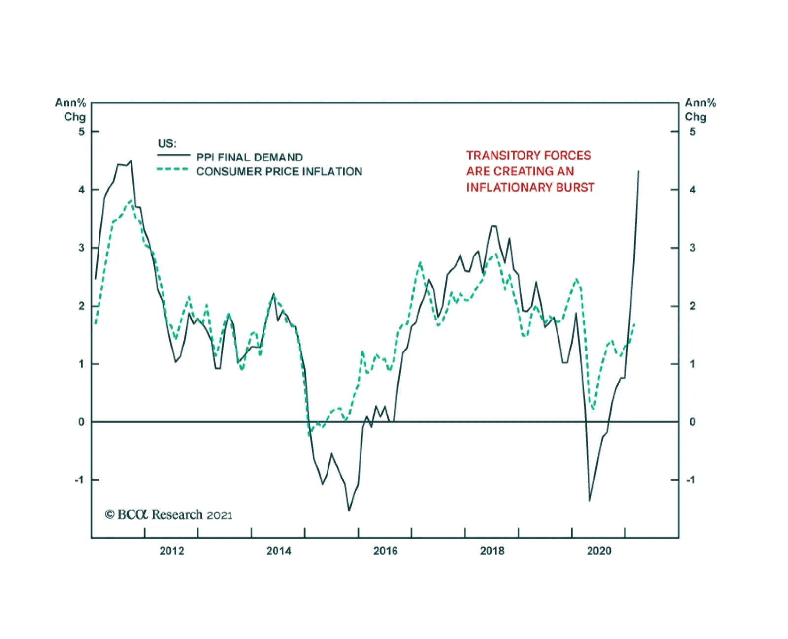
The past two weeks brought us a couple of interesting developments directly related to the Treasury market. First, long-dated Treasury yields declined somewhat, presumably because many investors concluded that the yield curve is already priced for the full extent of future Fed rate hikes. Second, we received further evidence – from March’s +916k employment report, the 12% year-over-year increase in producer prices and continued elevated readings from PMI Prices Paid indexes – that economic activity is recovering more quickly than even the most optimistic forecasters anticipated (Chart 1). These two opposing forces highlight a tension in the current outlook for US Treasury yields. Yields now look fairly valued on several different valuation metrics, a fact that justifies keeping bond portfolio duration close to benchmark. However, cyclical economic indicators are surging, a fact that suggests yields will keep rising in the near-term, causing them to overshoot fair value for a time. This week’s report looks at this tension between valuation indicators and cyclical economic indicators through the lens of our Checklist To Increase Portfolio Duration. While we think there are convincing arguments in favor of both “At Benchmark” and “Below Benchmark” portfolio duration stances on a 6-12 month investment horizon, we are deciding to stick with our recommended “Below Benchmark” stance for now, until the economic data are more in line with market expectations. Checking In With Our Checklist Back in February, following the big jump in bond yields, we unveiled a Checklist of several criteria that would cause us to increase our recommended portfolio duration stance from “Below Benchmark” to “At Benchmark”.1 As is shown in Table 1, the Checklist contains seven items that can be grouped into two categories: Valuation Indicators that compare the level of Treasury yields to some estimate of fair value Cyclical Indicators that look at whether trends in the economic data are consistent with rising or falling bond yields Table 1Checklist For Increasing Duration
Overshoot Territory
Overshoot Territory
Valuation Indicators Chart 2Valuation Indicators
Valuation Indicators
Valuation Indicators
As mentioned above, valuation indicators show that Treasury yields are roughly consistent with fair value, suggesting that a neutral duration stance is appropriate. First, consider the 5-year/5-year forward Treasury yield relative to survey estimates of the long-run neutral fed funds rate (Chart 2). Last week, survey estimates from the New York Fed’s Survey of Market Participants and Survey of Primary Dealers were updated to March, and while there was some upward movement in the estimated long-run neutral rate ranges, the median estimates in both surveys were unchanged from January. The result is that the 5-year/5-year forward Treasury yield remains near the top-end of its survey-derived fair value band (Chart 2, top 2 panels). Second, the same two surveys also ask respondents to forecast what the average fed funds rate will be over the next 10 years. We can derive an estimate of the 10-year term premium by subtracting those forecasts from the 10-year spot Treasury yield (Chart 2, bottom 2 panels). In this case, respondents did raise their average fed funds rate forecasts and our term premium estimates were revised down as a result. While both term premium estimates are now below their 2018 peaks, they remain elevated compared to recent historical averages. Third, we turn to the front-end of the yield curve to look at what sort of Fed rate hike path is priced into the market (Chart 3). We see that the market is currently priced for Fed liftoff in December 2022 and for a total of four 25 basis point rate hikes by the end of 2023. Only a handful of FOMC participants forecasted a similar path at the March Fed meeting. Chart 3Market Priced For December 2022 Liftoff
Market Priced For December 2022 Liftoff
Market Priced For December 2022 Liftoff
We discussed the wide divergence between market expectations and the Fed’s “dot plot” in a recent report.2 Essentially, the divergence boils down to the Fed focusing more on actual economic outcomes while the market takes its cues from economic forecasts. We think there’s good reason for optimism about the economy, and therefore expect that the Fed will revise its interest rate forecasts higher in the coming months as the “hard” economic data improve. However, we should point out that respondents to the New York Fed’s Survey of Primary Dealers and Survey of Market Participants also have much more benign interest rate forecasts than the market, and respondents to those surveys do not share the Fed’s bias toward actual economic outcomes. Table 2 shows that the average respondent to the Survey of Market Participants only sees a 35% chance that the Fed will lift rates before the end of 2022 and the Survey of Primary Dealers displays a similar result. Table 2Odds Of A Fed Rate Hike By End Of Year
Overshoot Territory
Overshoot Territory
The wide gap between rate hike expectations embedded in the yield curve and forecasts from both the FOMC and the New York Fed’s surveys suggests that Treasury yields are at least fairly valued, and perhaps too high. However, the most important question is whether the market’s rate hike expectations look lofty compared to our own forecast. As is explained in the below section (titled “The Employment Boom Is Just Getting Started”), we think that the jobs market will be strong enough for the Fed to lift rates before the end of 2022 and that the market’s anticipated rate hike path looks reasonable. However, even this view is only consistent with a neutral stance toward portfolio duration. Chart 4Higher Inflation Is Priced In
Higher Inflation Is Priced In
Higher Inflation Is Priced In
For our final valuation indicator we focus specifically on the outlook for inflation compared to what is already priced into the forward CPI swap curve (Chart 4). The forward CPI swap curve is priced for headline CPI inflation to rise to 2.7% by May 2022 before falling back down only slightly. In reality, year-over-year headline CPI will probably spike to even higher levels during the next two months but will then recede more quickly. We think it’s reasonable to expect headline CPI inflation to be between 2.4% and 2.5% in 2022, a range consistent with the Fed’s 2% PCE target, but the forward CPI swap curve reveals that this outcome is already priced. All in all, the message from the valuation indicators in our Checklist is that a robust economic recovery is already reflected in market prices. Thus, even with our optimistic economic outlook, Treasury yields look fairly valued, consistent with an “At Benchmark” portfolio duration stance. Cyclical Indicators While valuation indicators perform well over longer time horizons, they are notoriously bad at pinpointing market turning points. It’s for this reason that we augment our Checklist with cyclical economic indicators, specifically high-frequency cyclical economic indicators that correlate tightly with bond yields. First, we look at the ratio between the CRB Raw Industrials commodity price index and gold (Chart 5). The CRB index is a good proxy for global economic growth and gold is inversely correlated with the stance of Federal Reserve policy – gold falls when policy is perceived to be getting more restrictive and rises when policy is perceived to be easing. This ratio has shown little evidence of rolling over and further gains are likely as the economy emerges from the pandemic. We also look at other high-frequency global growth indicators like the relative performance between cyclical and defensive equities and the performance of Emerging Market currencies (Chart 5, panels 2 & 3). The trend of cyclical equity sector outperformance continues while EM currencies have shown some tentative signs of weakness. The US dollar is one particularly important indicator for bond yields. As US yields rise relative to yields in the rest of the world it makes the US bond market a more attractive destination for foreign investors. When US yields are attractive enough, these foreign inflows can stop them from rising. One good indication that US yields are sufficiently high to attract a large amount of foreign interest is when investor sentiment toward the dollar turns bullish. For now, the survey of dollar sentiment we track shows that investors are still bearish on the US dollar (Chart 5, bottom panel). Bearish dollar sentiment supports further increases in bond yields. Chart 5Cyclical Indicators
Cyclical Indicators
Cyclical Indicators
Chart 6Data Surprises Still Positive
Data Surprises Still Positive
Data Surprises Still Positive
Finally, we track the US Economic Surprise Index as an excellent summary indicator of the US data flow relative to market expectations. The index also correlates tightly with changes in bond yields (Chart 6). Though the index has fallen significantly from the absurd highs seen late last year, it is still elevated compared to typical historical levels. In general, bond yields tend to rise when the economic data are beating expectations, as indicated by a positive Surprise Index. All in all, we see that the cyclical indicators in our Checklist are sending a very different signal than the valuation indicators. This suggests a high probability that yields could overshoot fair value in the near term. Bottom Line: Treasury yields look fairly valued on several different valuation metrics and the yield curve discounts a much quicker pace of rate hikes than is currently signaled by the Fed’s “dot plot”. However, the economic data continue to beat expectations by a wide margin. This suggests that bond yields could overshoot their fair value in the near term. Maintain below-benchmark portfolio duration. The Employment Boom Is Just Getting Started Chart 7Defining "Maximum Employment"
Defining "Maximum Employment"
Defining "Maximum Employment"
The Fed has conditioned the first rate hike of the cycle on both (i) 12-month PCE inflation being at or above 2% and (ii) the labor market being at “maximum employment”. As we’ve previously written, we see strong odds that the inflation trigger will be met in time for a 2022 rate hike.3 This week, we assess the likelihood that “maximum employment” will be reached in time for the Fed to lift rates next year. Fed communications have made it clear that the FOMC’s definition of “maximum employment” is equivalent to an environment where the unemployment rate is between 3.5% and 4.5% - the range of FOMC participants’ NAIRU estimates – and the labor force participation rate has made a more-or-less complete recovery to pre-pandemic levels (Chart 7). Following March’s blockbuster employment report, we update our calculations of the average monthly nonfarm payroll growth that must occur to hit “maximum employment” by different future dates (Tables 3A-3C). Table 3AAverage Monthly Nonfarm Payroll Growth Required For The Unemployment Rate To Reach 4.5% By The Given Date
Overshoot Territory
Overshoot Territory
Table 3BAverage Monthly Nonfarm Payroll Growth Required For The Unemployment Rate To Reach 4% By The Given Date
Overshoot Territory
Overshoot Territory
Table 3CAverage Monthly Nonfarm Payroll Growth Required For The Unemployment Rate To Reach 3.5% By The Given Date
Overshoot Territory
Overshoot Territory
For example, to reach the Fed’s definition of “maximum employment” by December 2022, nonfarm payroll growth must average between +410k and +487k per month between now and then. To reach “maximum employment” by the end of this year, payroll growth must average between +701k and +833k over the remaining nine months of 2021. It’s probably unrealistic to expect a return to “maximum employment” by the end of this year, but we do expect at least a couple more monthly payroll reports that are even stronger than last month’s +916k. Our optimism stems from the industry breakdown of the current jobs shortfall. Table 4 shows the change in overall nonfarm payrolls between February 2020 and March 2021. In total, we see that the US economy is missing 8.4 million jobs compared to pre-pandemic. We also see that 3.1 million (or 37%) of those jobs come from the Leisure & Hospitality sector. That sector is predominantly made up of restaurants and bars, two services where demand is about to ramp up significantly as COVID vaccination spreads across the US. A few months in a row of 1 million or more jobs added is highly likely in the near future. Table 4Employment By Industry
Overshoot Territory
Overshoot Territory
Bottom Line: We see the boom in employment as just getting started and we expect that the US economy will reach the Fed’s definition of “maximum employment” in 2022. This will cause the Fed to lift rates before the end of 2022, an event that will be preceded by an announcement of asset purchase tapering either late this year or early next year. Ryan Swift US Bond Strategist rswift@bcaresearch.com Footnotes 1 https://www.bcaresearch.com/webcasts/detail/387 2 Please see US Bond Strategy Weekly Report, “The Fed Looks Backward While Markets Look Forward”, dated March 23, 2021, available at usbs.bcaresearch.com 3 Please see US Bond Strategy Weekly Report, “Limit Rate Risk, Load Up On Credit”, dated March 16, 2021, available at usbs.bcaresearch.com Fixed Income Sector Performance Recommended Portfolio Specification
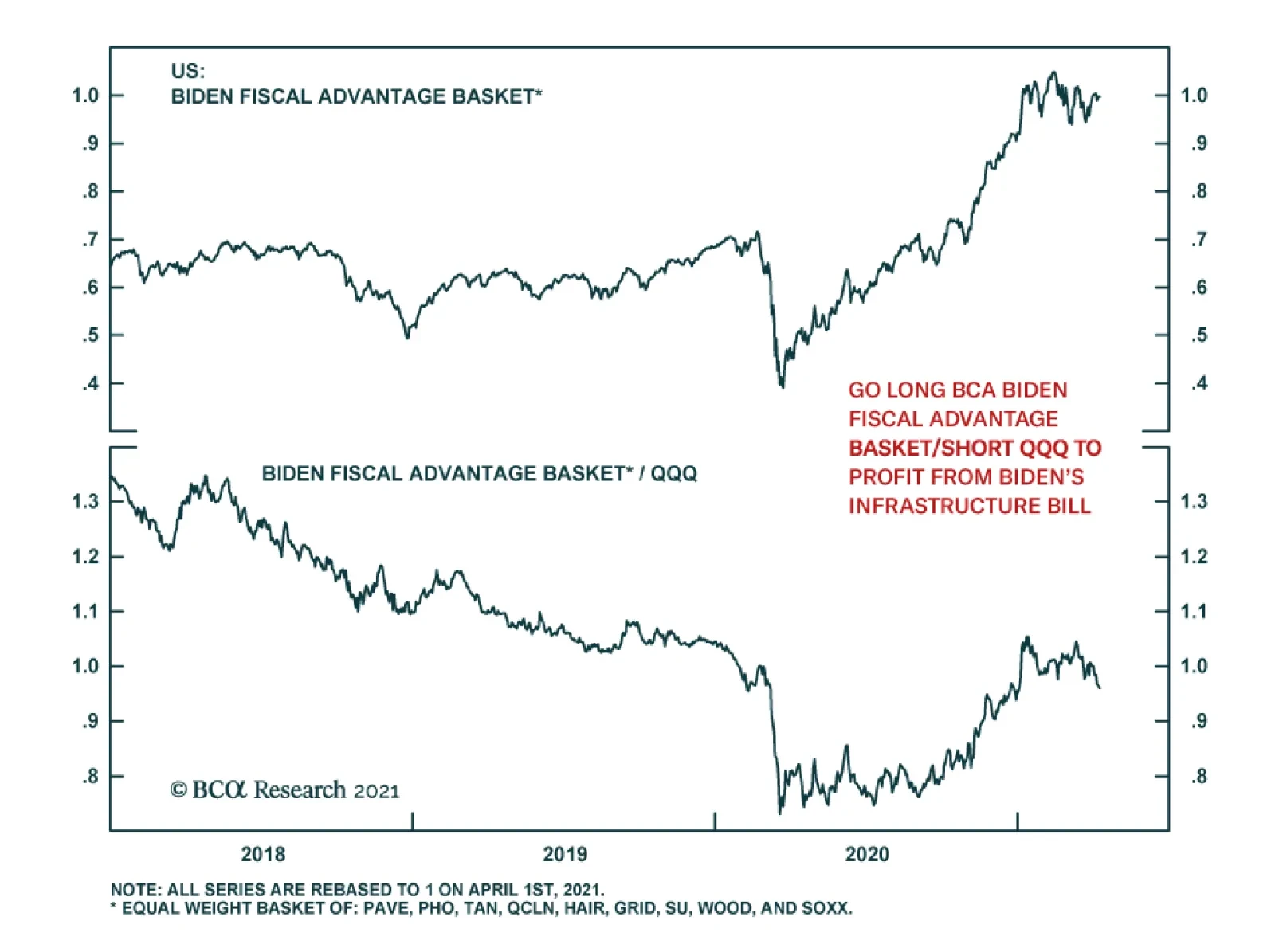
Our US Equity Strategy service has been inundated with client requests on how to best position for President Biden’s sweeping infrastructure spending package. They therefore constructed the BCA Biden Fiscal Advantage Basket, which comprises eight ETFs and one…
According to BCA Research’s European Investment Strategy service, structural headwinds are still too strong to hold a long-term bullish view on Eurozone equities relative to the US. However, the coming two years should be kind to euro area stocks. This…
How To Play Biden’s $2.4 trillion “American Jobs Plan”
How To Play Biden’s $2.4 trillion “American Jobs Plan”
We have been inundated with client requests on how to best position for President Biden’s sweeping infrastructure spending package. We therefore constructed the BCA Biden Fiscal Advantage Basket, which comprises eight ETFs and one stocks, all equal weighted (top panel). Instead of buying specific stocks we opted to go the ETF way in order to diversify away company specific risk. Our goal was to filter for ETFs that hold mostly US companies and that offered the highest possible liquidity. From a portfolio construction perspective, we tried to match the different spending segments of Biden’s preliminary bill (that our sister BCA US Political Strategy expects to pass Congress with high conviction) with an ETF. The ticker symbols of the eight ETFs and one stock we included in this Equity Basket are: PAVE, PHO, QCLN, TAN, WOOD, SOXX, HAIL, GRID and SU. We choose SU as there is no pure play Canadian oil sands ETF trading in USD. Granted there is some replication of stocks included in these ETFs, and in certain ETFs there is a sizable international stock exposure including EM and Chinese stocks. One final caveat is that these ETFs have a high concentration of technology stocks. Our sense is that this Basket should outperform the SPX on a cyclical and structural basis (middle panel). However, given the high tech exposure, our preferred way to express this trade is via a long/short pair trade versus the QQQ (bottom panel). Bottom Line: Initiate a long BCA Biden Fiscal Advantage Basket/short QQQ pair trade. On April 26, 2021 we will publish a joined SR with our sister US Political Strategy service on President Biden’s infrastructure spending bill proposal and elaborate further on this Equity Basket. The ticker symbols for the stocks in the BCA Biden Fiscal Advantage Basket are: PAVE, PHO, QCLN, TAN, WOOD, SOXX, HAIL, GRID and SU. The table in the appendix on the next page shows a number of other related ETFs that did not make our cut, but that you may find interesting to research further.
How To Play Biden’s $2.4 Trillion "American Jobs Plan"
How To Play Biden’s $2.4 Trillion "American Jobs Plan"
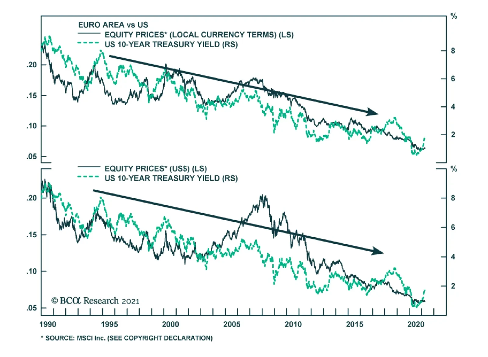
Highlights Structural headwinds are still too strong to hold a long-term bullish view on Eurozone equities relative to the US. However, the coming two years should be kind to euro area stocks. The relative performance of European stocks compared to that of the US is predominantly a function of yields. BCA foresees higher yields over a 24-month period. Moreover, European equities are exceptionally cheap, which accentuates their appeal as a yield play. Tactical considerations indicate that a modest overweight in European stocks, not an aggressive one, is most appropriate for cyclical investors. European investment grade bonds are appealing in a European fixed-income portfolio. Feature Chart 1Europe's Underperformance Explained
Europe's Underperformance Explained
Europe's Underperformance Explained
Over the past decade, Eurozone equities have massively underperformed US ones. The poor outcome generated by European bourses mimicked the fall in European profits against the US (Chart 1). Considering that the relative performance of euro area stocks stands at an all-time low, should investors begin to bet on Europe? The outlook for yields favors European stocks on a cyclical basis. However, the structural picture suggests that both Europe and the US must experience fundamental changes before European stocks can surpass their US counterparts on a long-term basis. Structural Challenges Remain The case for overweighting European equities on a structural investment horizon (5 to 10 years) remains weak. Only some major changes in the European and US economies can alter the long-term headwinds facing Eurozone stocks. Table 1US Possesses The Favored Sectors
Time And Attraction
Time And Attraction
Sectoral biases partly explain Europe’s inability to match the US’s profit potential. The US market over-represents high-margin and high return-on-equity businesses, such as technology and healthcare, while most Eurozone bourses have significant weightings in the structurally challenged financial, materials, and energy sectors (Table 1). This difference in sector representation also explains the larger buybacks witnessed in US markets compared to euro area ones, which further boosted the US’s relative EPS. Chart 2Japan Never Recovered
Japan Never Recovered
Japan Never Recovered
The performance of Japanese equities over the past three decades provides another cautionary tale for European stocks. Despite a substantial underperformance in the 1990s, Japanese equities never meaningfully recovered in the 2000s and ended up falling further behind the US over the past 12 years (Chart 2). A powerful liquidity trap and a 23% decline in the Japanese population compared to that of the US seriously hampered the ability of Japanese firms to generate stronger relative cash flows. This challenging profit picture meant that no matter how low JGB rates fell in comparison to the US, Japanese multiples never benefited from a significant re-rerating. The Eurozone suffers from similar ills to that of Japan, which warns that the latter constitutes a valid template for European assets. Europe’s population is expected to decline by 16% relative to that of the US over the coming three decades, which will hurt sales and capex in Europe. Moreover, despite low interest rates, private credit demand is weak, which limits the region’s economic vigor. Most concerning, Europe’s capital stock as a share of GDP is substantial, especially in the periphery (Chart 3). Such an observation indicates that there is a high probability that previously misallocated capital is burdening the euro area. This misallocation will continue to hurt economic activity, because it encumbers demand via weak capex and also harms productivity. A DuPont decomposition of RoE reveals how Europe’s economic malaise affects corporate profitability (Chart 4). The Eurozone’s excessively large capital stocks means that its asset turnover is inferior to that of the US, which corroborates the notion that capital is misallocated. Moreover, the euro area’s low profit margins reflect more than its sectoral composition. Greater economic rigidities as well as lower market power and concentration in Europe hurt profitability (even if it limits inequalities compared to the US). Finally, the corporate sector is deleveraging, which is a consequence of a liquidity trap and poor trend growth, causing the ratio of RoE to RoA to decline relative to the US. Chart 3Too Much Capital
Too Much Capital
Too Much Capital
Chart 4DuPont De No Good
DuPont De No Good
DuPont De No Good
To reverse the structural outperformance of US equities relative to the Eurozone, Europe’s secular profitability underperformance must end. We will look for the following factors to stop this decline, which we will explore in further detail over time: European reforms. Europe will remain disadvantaged until its excess capital stock is written off. This process is complex and it will require greater fiscal integration as well as greater reforms to promote competition and to decrease labor market as well as service sector rigidities. More Innovation. Despite a strong patent record in economies such as Germany, Europe lags behind the US in the creation of leading innovative companies. Europe’s industrial and consumer discretionary sectors could prove beneficiaries of the green revolution taking place around the world, but it is still too early to tell. Chart 5Market Power Helps The US
Market Power Helps The US
Market Power Helps The US
An ossification of the US economy. Europe could also begin to outperform, because the US might lose its edge. Economic populism is rife in the US, fueled by growing discontent with economic inequalities. As a result, government involvement in the economy as well as regulatory efforts could increase significantly. While a push to redistribute income toward the middle class would alleviate inequalities, it would hurt profitability and cause US RoE to decline toward European levels (Chart 5). Bottom Line: The secular underperformance of Eurozone equities reflects their inability to generate as much profits as US ones. Beyond sector biases, Europe’s demographic hurdles and its deeper problem with secular stagnation remain its key handicaps. For now, there is no solid case to bet on a major change in these trends, which only European reforms or problems in the US can undo. But A Cyclical Opportunity Exists Despite the challenging structural environment for European equities, the cyclical outlook (24 months) is attractive. Even in Japan, multi-year episodes of outperformance punctuated a decades-long underperformance relative to the US or the MSCI all-country world index. In the case of the Eurozone, this upbeat view rests on BCA Research expectations of higher global yields. The performance of Europe’s equities relative to the US correlates closely with the level of US yields (Chart 6). The sectoral footprint of both bourses is an important driver of this correlation. The US overweighs growth and defensive stocks, which account for 49% and 23% of its capitalization, respectively. Meanwhile, the euro area over-represents value stocks and deep cyclicals, which account for 55% and 26% of its market, respectively. Historically, global value stocks beat growth equities when yields are rising (Chart 7). Chart 6A Yield Story
A Yield Story
A Yield Story
Chart 7What Value Likes
What Value Likes
What Value Likes
The outperformance of value stocks when yields rise is multifaceted. Deep cyclicals, such as industrials, materials, financials and energy, constitute a larger share of value benchmark than growth ones. Consequently, when yields increase because the global business cycle experiences an upswing, the earnings of value stocks accelerate compared to those of growth stocks (Chart 7, bottom panel). The positive impact of yields on the value versus growth split is also more direct. Higher yields, especially if they accompany a steeper yield curve, boost the profitability of financials. Meanwhile, mounting yields increase the discount factor applied to the long-term deferred cash flows that contribute a large proportion of the intrinsic value of growth stocks. Higher yields also support the relative performance of Eurozone stocks via the evolution of the expected growth rates of their long-term earnings. As Chart 8 illustrates, upgrades to sell-side estimates of the long-term growth rate of European EPS relative to the US coincide with a steeper US yield curve slope and rising 5-year/5-year forward Treasury yields. These relationships exist because European economic activity and sectoral representation are more cyclical than that of the US. Eurozone equities look like a particularly cheap bet on higher yields over the coming 18 to 24 months. Sentiment toward European assets remains depressed compared to the US. Even on an equal-weighted basis, the discount of the expected long-term growth rate of euro area EPS relative to the US is exceptionally wide (Chart 9, top panel). True, the sustainable growth rate (SGR) of earnings is a function of the return on equity and the dividend payout ratio. Nonetheless, despite the fact that the euro area low RoE forces the European SGR down, Eurozone stocks embed a long-term growth rate that is 47% too low vis-à-vis the US. Other metrics underscore the cheapness of European equities relative to the US. Our Mechanical Valuation Indicator, which is sector neutral, stands at a 1-sigma discount in favor of the Eurozone (Chart 9, bottom panel). Chart 8EPS Growth and The Yield Structure
EPS Growth and The Yield Structure
EPS Growth and The Yield Structure
Chart 9Europe Is Cheap
Europe Is Cheap
Europe Is Cheap
Ultimately, Europe’s relative expected growth and valuations are particularly depressed, because domestic activity lags behind that of the US by a significant margin. As the vaccination campaign advances and the economy reopens later in the quarter, the Eurozone’s service sector will catch up and the earnings growth discount will dissipate (Chart 10). Moreover, regardless of its recent dynamism, even the European industrial sector has room to catch up to the US. Our Swedish Economic Diffusion Index captures the general strength in Swedish economic activity, which foretells a further increase in both the euro area Manufacturing PMI and equities relative to the US (Chart 11). Chart 10Stronger Services Will Help
Stronger Services Will Help
Stronger Services Will Help
Chart 11Listen To Sweden
Listen To Sweden
Listen To Sweden
Bottom Line: BCA’s expectations that global yields will rise over the coming 24 months are consistent with Eurozone equities outperforming US ones over this period, even if the long-term outlook remains challenging for Europe. European equities are much more pro-cyclical than US ones, which is reified by their sector and value biases. Moreover, euro area equities currently embed a particularly large discount to their US counterpart, which increases their attractiveness as a play on rising bond yields. The Right Entry Point? Strategy and forecasts are two different things. BCA strongly believes that yields will rise over the coming two years; however, a large overweight in Eurozone equities is a risky bet at the current juncture. Instead, we recommend investors opt for a modest overweight. Short-term traders should stay clear of this market for now. The reason for this cautiousness is that yields are very vulnerable to a temporary near-term pullback because: Chart 12A Countertrend Bond Rally?
A Countertrend Bond Rally?
A Countertrend Bond Rally?
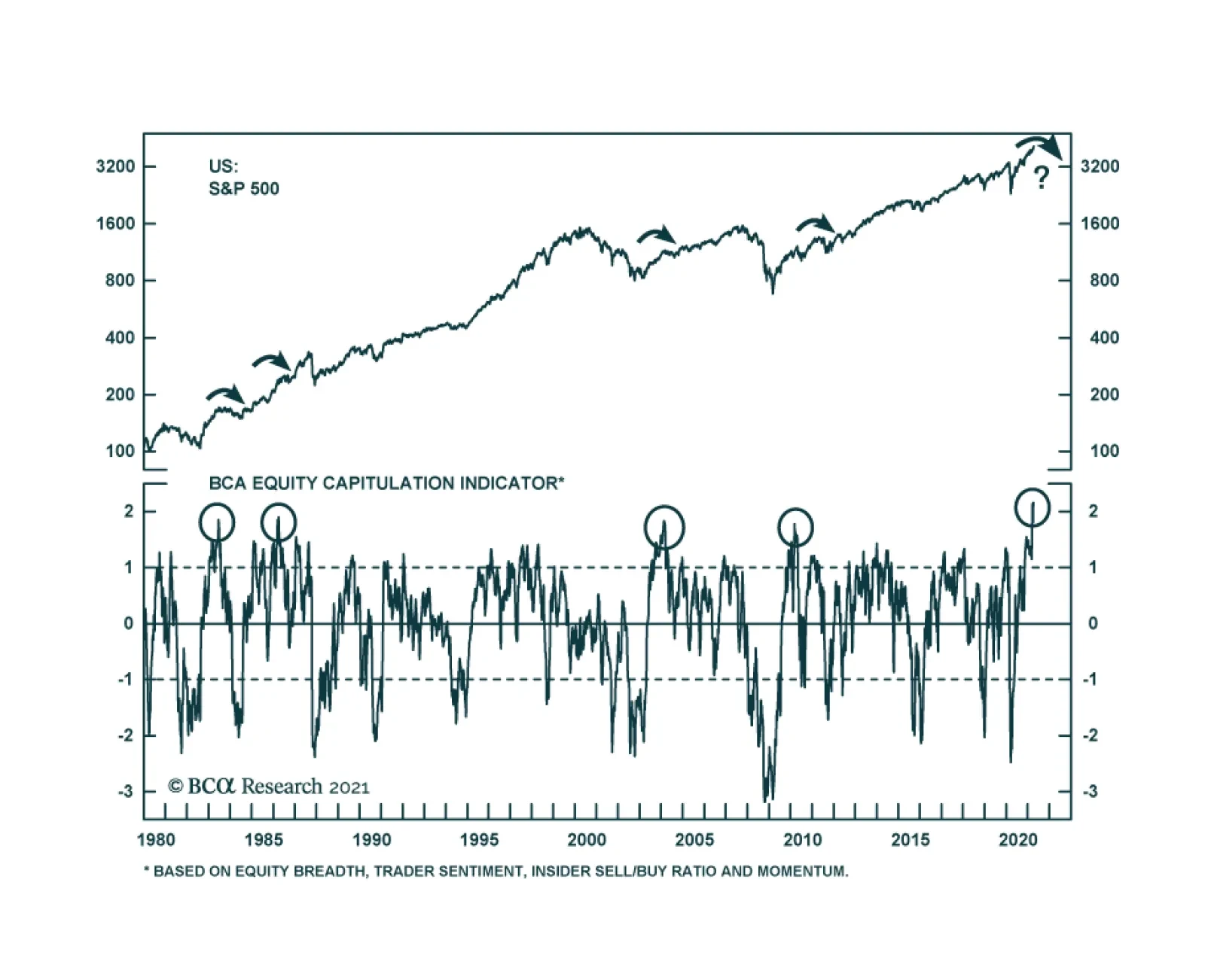
Technicals point to a counter-trend bounce in bond prices. Our BCA Composite Technical Indicator is massively oversold, our Composite Sentiment Indicator is extremely depressed, and speculators are aggressively shorting T-Bonds (Chart 12). The recent bond market behavior is puzzling. Despite March’s blockbuster non-farm payroll data and Manufacturing, as well as Services ISM surveys, yields are softening. Not even the announcement of the Biden administration’s $2.3 trillion American Jobs Plan could increase yields in recent weeks. This price action confirms that bonds are oversold and that, until the recent price decline is digested, the threshold to push yields higher has risen meaningfully. Equities are at risk of a pullback. Euphoria is prevalent, which increases the odds of corrective action in equities. Our BCA Equity Capitulation Index stands at a 45-year high (Chart 13) and our US Equity Strategy team’s Risk Appetite Index is at its highest levels since 2007, both of which suggest that complacency is rife. Moreover, the put/call ratio has collapsed to 0.45, which shows the carefree attitude of traders. Yields will decline if stock prices correct. EM equities are underperforming US stocks. EM benchmarks are more sensitive to marginal changes in the global growth outlook. For now, the risk is that growth disappoints lofty expectations. Since 2014, periods of relative weakness in EM bourses precede declines in Treasury yields (Chart 14). Authorities are trying to limit credit growth in China. As we argued two weeks ago, Beijing is aiming to slow credit growth to prevent systemic vulnerabilities from developing. This process is fraught with risks and is likely to result in a deceleration in China’s economy. While Europe and most emerging markets remained mired in a health crisis, China will be a source of temporary downside for global economic activity. The recent announcement that the PBoC asked Chinese banks to limit new loans confirms this assessment. Chart 13Euphoria!
Euphoria!
Euphoria!
Chart 14EM Stocks Are Telling Us Something
EM Stocks Are Telling Us Something
EM Stocks Are Telling Us Something
Bottom Line: For now, investors with a cyclical horizon (two years) should only keep a modest overweight position in Eurozone equities because the near-term outlook for yields points to some temporary downside. Not allocating the full allowable capital budget to Europe will allow investors to upgrade their overweight after the near-term downside in yields has passed. Investors may also consider implementing some hedges. Our foreign exchange strategist recommends a short EUR/JPY position as a form of portfolio protection. Keeping some cash in yen to deploy later in Europe mimics this advice. Short-term traders should stay clear of Europe as long as bond markets have not digested their oversold condition. Market Focus: Investment Grade Corporates and the ECB The ECB’s minutes highlight that investment grade corporate bonds are attractive within European fixed-income portfolios. The recently released ECB minutes revealed that higher real rates do not overly concern the Governing Council, because they reflect an improving global economic outlook and not an eventual policy tightening. Moreover, the GC does not want to give the impression it will engage in yield control, yet the pace of purchases under the Pandemic Emergency Purchase Programme (PEPP) will remain accelerated and flexible until June, at a minimum. The ECB will not derail the supportive environment for economic activity anytime soon. Meanwhile, as we have argued in past reports, fiscal policy in Europe will also stay relaxed for the time being. Thus, the Eurozone’s policy environment remains supportive for credit spreads, especially since the default cycle has been muted. However, do corporate bonds already fully price in this positive backdrop? According to the 12-month breakeven spread, European credit spreads can compress further. The breakeven spread is the amount of spread widening required for corporate bond returns to break even with a duration-matched position in government bond securities over a 12-month horizon. It is approximated by dividing the OAS of a bond (or an index) by its duration. The breakeven spread is then compared to its own history, by observing the percentage of time that it has been lower in the past.1 Chart 15Some Value Left
Some Value Left
Some Value Left
European credit spreads have tightened 160 bps since March last year and are already below their pre-Covid level (Chart 15). However, the 12-month breakeven spread has been tighter 18% of the time since 1999. In other words, higher quality corporate bonds in Europe have room to see further spread compression, since policy will remain relaxed for a long time. This is especially true in the Aa-rated credit tier, where the breakeven spread has been more expensive 35% of the time (not shown). Meanwhile, US breakeven spreads for IG corporate bonds are in their 2nd percentile and policy will tighten sooner than in Europe. Therefore, bond investors with a European-only mandate are not forced to step down the quality ladder as aggressively as those in the US do. Table 2Norway, France And Italy Stand Out
Time And Attraction
Time And Attraction
Table 2 provides the same analysis at the country level. Taking into consideration the average credit rating of each countries’ investment grade bonds, we find that Norwegian, French, and Italian spreads have the most value left. Interestingly, the ECB’s purchases of Italian and French paper is currently deviating widely from its capital keys, which should place downward pressure on credit spreads in these jurisdictions. Bottom Line: There is still value left in European investment grade corporate bonds, unlike in the US, where valuations are extremely expensive and a decrease in quality is warranted. For now, such a move is uncalled for in Europe, especially since the value in its high-yield index is concentrated in its riskiest credit tiers. At the country level, investors should favor Norwegian, French, and Italian investment grade corporate bonds. Mathieu Savary, Chief European Investment Strategist Mathieu@bcaresearch.com Jeremie Peloso, Senior Analyst JeremieP@bcaresearch.com Footnotes 1We find this valuation tool superior to others for two main reasons: (i) using the breakeven spread rather than the average index OAS allows us to control for the changing average duration of the benchmark bond indices; and (ii) the percentile rank is often a better representation of credit spreads than the spread itself. Cyclical Recommendations Structural Recommendations Trades Currency Performance
Time And Attraction
Time And Attraction
Fixed Income Performance Government Bonds
Time And Attraction
Time And Attraction
Corporate Bonds
Time And Attraction
Time And Attraction
Equity Performance Major Stock Indices
Time And Attraction
Time And Attraction
Geographic Performance
Time And Attraction
Time And Attraction
Sector Performance
Time And Attraction
Time And Attraction
Closed Trades
Highlights The latest major economic releases have been solidly positive, … : The manufacturing ISM hit a 37-year high and the services ISM made a new all-time high in its 24-year history, while the March employment report was quite strong. … but they have fallen within the wide distribution of Goldilocks economic and market outcomes, … : The pace of vaccinations is limiting the potential of a negative pandemic surprise and the Fed continues to stick to its easier-for-longer messaging. … though we are watching the potential to drift into the too-hot right tail: Although the labor market is awash in excess capacity, both ISM surveys are telling a pro-inflation story replete with bottlenecks, shortages and suppliers willing to exploit their advantages. Earnings season will shed some light on how long the good times can be sustained: First quarter earnings releases begin this week with the SIFI banks. We will look to management commentary for insight into how corporate earnings are likely to stack up against expectations and how long we might be able to stick with our risk-friendly positioning. Feature When the COVID-19 pandemic reached the US last spring, our view turned on the outcome of the battle between policy makers and the virus. We were optimistic that the economy could escape long-term damage and that risk assets would be able to come back from their vicious February-March declines because we expected that policy makers would do what it took to build a bridge across the pandemic crater. Once the Democrats captured the White House and a majority in both houses of Congress, the policymakers-versus-the-virus outcome was settled, as the Biden-Pelosi-Schumer triumvirate ensured that fiscal policy would join monetary policy in erring to the side of providing too much support to the economy. The investment narrative now has shifted to whether or not policy makers have overdone it. It is possible to have too much of a good thing and excessive stimulus could cause the economy to overheat, hastening the end of the just-right Goldilocks combination of strong growth and easy monetary policy. It is also possible that the pandemic could still spring a nasty surprise on the United States, bringing about a growth disappointment despite indulgent policy, but the probability of a bad public-health outcome appears to shrink every week that the rapid vaccination clip is maintained. Our new framework is Goldilocks and the two tails (Figure 1), in which the probability of a just-right outcome that keeps the strong-growth, easy-policy beat going is considerably larger than unanticipated slowing (the too-cold left tail) or overheating (the too-hot right tail). This week, we review vaccine progress, consumer loan delinquencies and key economic releases to assess where in our stylized distribution the economy is likely to fall. Figure 1Goldilocks And The Two Tails
Goldilocks Is Alive And Well
Goldilocks Is Alive And Well
The Left Tail We have viewed widespread vaccinations as the best way to inoculate the economy against a left-tail outcome. The more quickly herd immunity can be achieved via vaccinations, the less likely that growth will fall short of market expectations. We are impressed with the ground the US has made up after stumbling out of the gate; vaccine production has ramped up well beyond expectations and a mix of public and private injection sites are getting doses delivered. Assuming that new virus-resistant variants do not emerge, it looks as if the US is sure to meet the goal of inoculating a critical mass of the adult population well before September 30th (Chart 1). Chart 1Off And Running
Off And Running
Off And Running
A self-reinforcing wave of defaults and bankruptcies would have been at the center of any worst-case economic and market scenarios. The Fed was keenly aware of the threat and preventing avoidable bankruptcies was an explicit monetary policy aim. Zero interest rates, massive asset purchases and new emergency measures like the Primary and Secondary Corporate Credit Facilities paved the way for record corporate bond issuance, eradicating the threat of bankruptcy for many viable businesses that were severely strained by the pandemic. Generous fiscal policy more directly buoyed household borrowers, but Powell and company had an eye out for them as well, highlighting the goal of : “just … keeping people solvent, keeping them in their homes, keeping them paying their bills just for maybe a few more months.”1 Personal loan performance has therefore been an important indicator for tracking the course of the recovery and policy makers’ success in promoting it. We have been monitoring 60-day delinquency rates across the four main consumer loan categories (90-day rates for credit cards) ever since TransUnion began publishing them on a monthly basis last spring. They have been a good barometer (with a lag) of the flow of transfer payments from the federal government to households. The $1,200 economic impact payments for adults with annual earnings below $75,000 were distributed in March and April, while the $600 weekly federal unemployment insurance (UI) benefit supplement was available from late March until the end of July, and delinquency rates steadily declined from March through August in every category but autos (Chart 2, top panel). Chart 260-Day Delinquency Rates Had Stopped Falling …
Goldilocks Is Alive And Well
Goldilocks Is Alive And Well
Chart 3… But The Leading 30-Day Delinquencies Are Headed Lower
Goldilocks Is Alive And Well
Goldilocks Is Alive And Well
After the UI supplements stopped flowing in the second half of the year, 60-day delinquencies began creeping up in every category but mortgages (Chart 2, third panel). A new round of $600 checks that were distributed in January, along with the resumption of federal UI benefit supplement payments at a rate of $300 per week, helped the February numbers and March’s $1,400 checks will extend the positive turn. The 30-day delinquency rates show the same pattern, but with bigger declines in February (Chart 3). 30-day delinquency rates lead 60- and 90-day rates and their positive trend will surely be enhanced by the latest round of direct payments and the gathering hiring momentum on display in the March employment report. Along with the success of the vaccination rollout, consumer loan performance suggests that the probability of left-hand tail outcomes is narrowing. Robust ISM Surveys And The Specter Of Cost-Push Inflation The ISM manufacturing and services PMI surveys stand out amid the welter of economic data that researchers and investors have to navigate. They are issued monthly with virtually no lag and provide a reliable read on the economy’s direction. Given that stocks tend to perform well when the economy performs well, they also provide information about the future direction of the stock market (Chart 4) and offer a first-cut guide to asset allocation. Chart 4A Strong Economy Is Good For Equity Returns
A Strong Economy Is Good For Equity Returns
A Strong Economy Is Good For Equity Returns
The March composite releases were quite strong, with the manufacturing survey hitting a 37-year high and the services survey reaching the highest level in its 24-year history. The manufacturing survey was strong across the board, with new orders and order backlogs at or near extended highs (Chart 5, fourth panel) and the production and employment indexes (Chart 5, second and third panels) pointing to broad pickups. Unfortunately, the prices paid and supplier performance indexes (Chart 5, bottom panel) hinted that upward price pressures and supply bottlenecks have taken hold across broad swaths of the economy. Those components, and the accompanying comments from survey respondents, suggest that upward inflation pressures are building. The ISM services PMI survey closely resembled its manufacturing counterpart. New orders (Chart 6, fourth panel) and business activity (Chart 6, second panel) were very strong, though not as large a share of services employers are looking to hire (Chart 6, third panel). The share of respondents facing higher prices has broken out (Chart 6, fifth panel) and lengthening supplier delivery times are prevalent. The services sector has more slack than the manufacturing sector, but it is not immune from inflation pressure. Chart 5The Manufacturing PMI Looks A Lot Like ...
The Manufacturing PMI Looks A Lot Like ...
The Manufacturing PMI Looks A Lot Like ...
Chart 6... Its Services Counterpart
... Its Services Counterpart
... Its Services Counterpart
It is important to remember that the PMI surveys are diffusion indexes that capture share rather than magnitude. The record and near-record readings don’t mean that respondents’ businesses are growing at their most rapid rate in decades; they mean that the share of respondents who report quickening growth is at record/near-record levels. The same goes for the near-record prices paid readings; they don’t reflect that prices are rising at close-to-record rates, they reflect that an unusually large proportion of companies report increasing prices. The diffusion of upward price pressures as reported in the surveys has had a solid record of leading year-on-year core CPI increases and testifies to the economy’s potential to overheat (Chart 7). Cost-push inflation pressures could derail the strong-growth/easy-policy backdrop. Chart 7Inflation Pressures Have Begun To Stir
Inflation Pressures Have Begun To Stir
Inflation Pressures Have Begun To Stir
Bottom Line: The ISM PMI surveys reinforce the idea that the probability of a left-hand tail outcome is modest and shrinking, but they suggest that right-tail overheating is a valid concern. Labor Market Firmly In Goldilocks Territory Chart 8The Labor Market Still Has A Lot Of Slack
The Labor Market Still Has A Lot Of Slack
The Labor Market Still Has A Lot Of Slack
Net payroll gains in the March employment report comfortably surpassed expectations, while January’s and February’s estimates were also revised higher. The employment figures added to the run of positive surprises in key economic data series that suggest that growth in 2021 and 2022 will run well above its long-term potential. Despite the gains, however, employment remains far below its pre-pandemic peak (Chart 8, top panel) and the spaces that were hardest hit by the pandemic, like restaurants and hospitality, are not operating at anything close to full capacity. With labor force participation sharply reduced from its pre-pandemic level (Chart 8, bottom panel), the labor market is a long way from being tight. With all the excess capacity in the labor market, wage growth has been well behaved. Neither of the main wage series is growing at a rate that would give rise to inflation concerns. Average hourly earnings are up a lot year-over-year (Chart 9, top panel) because of a 5% month-over-month surge last April, but they have been running in place for the last three months and face much tougher comparisons beginning next month. The employment cost index has been rising at a rate well below its 2019 peak (Chart 9, bottom panel) that accompanied half-century lows in the unemployment rate. Chart 9Wage Growth Is Not Yet A Reason For Concern
Wage Growth Is Not Yet A Reason For Concern
Wage Growth Is Not Yet A Reason For Concern
With considerable ground to make up to get back to its pre-pandemic state, the labor market appears to have plenty of room to run before it pulls the overall economy into overheating territory. The combination of ample slack and a strong backlog of labor demand (Chart 10) hints at a best-of-both-worlds/Goldilocks scenario. As long as it remains in place, the labor market is likely to be a positive economic catalyst, promoting robust hiring activity without setting off a self-reinforcing wage-price dynamic that would prod the Fed to cut off monetary accommodation in an abrupt way that would disrupt financial markets. Chart 10There's Still A Lot Of Demand For Workers
There's Still A Lot Of Demand For Workers
There's Still A Lot Of Demand For Workers
Investment Implications We stand by our base case that the Goldilocks backdrop of solid growth and ample monetary accommodation will remain in place at least into early 2022. That backdrop precludes the possibility of a recession and therefore argues for risk-friendly investment strategy. Stocks rarely experience significant reversals outside of recessions and spread product reliably generates positive excess returns over Treasuries and cash. Multi-asset investors should remain at least equal weight equity and credit while holding fixed income duration below benchmark levels. We have a high degree of conviction that the economy will avoid a downside surprise in the next twelve months, thanks to the success of the vaccination effort and measures undertaken to limit defaults by households and businesses. We are less sure that the economy will be able to avoid overheating. A rapid rise in consumer prices to levels that would unsettle markets and force the Fed into tightening monetary policy sooner than expected is not our base case but it cannot be ruled out. We will be perusing the data for any advance indications that inflation could be gaining a foothold while also carefully observing what we see in our day-to-day experience. We will also be listening eagerly to what corporate management teams have to say over the next three to four weeks when they report their first-quarter earnings and offer their impressions of the second quarter and the full year. Doug Peta, CFA Chief US Investment Strategist dougp@bcaresearch.com Footnotes 1 Interview conducted May 13, 2020 and broadcast May 17. Full Transcript: Fed Chair Jerome Powell's 60 Minutes interview on economic recovery from the coronavirus pandemic - CBS New.
The VIX closed a hair below 17 on Thursday and is continuing to decline on Friday, making a new pandemic low. The drop indicates that investor sentiment is improving amid and a perception of receding market risk. This progress is in line with other market…
Producer prices continue to warn of budding inflationary pressures in the US. PPI Final Demand accelerated to 4.2% y/y while core PPI (excluding food and energy) climbed to 3.1% y/y. Although this can partly be attributed to base effects, the monthly…
Bon Voyage!
Bon Voyage!
Overweight We have been overweight the niche (0.33% of the S&P 500) airlines sector going into the pandemic, and while it has been slow to recover, there is little doubt that soon airline stocks will reclaim their pre-COVID-19 altitude. The top panel of the chart on the right highlights that travelling is making a comeback as a larger and larger proportion of the world population is becoming inoculated. Consequently, air travel is springing to life. Another services industry that COVID-19 wrecked also confirms that the path of least resistance is higher for airlines: indoor dining is en route to rebound to pre-pandemic levels (middle panel). Finally, business and consumer travelling is slated to make a huge comeback following months of “staycations”. Consumers and businesses alike have amassed significant excess savings and stand ready to draw them down when the opportunity arises, likely some time after Memorial Day. This will further underpin the recovery in airlines and other savaged services stocks. Bottom Line: Stay overweight the S&P airlines index that will be gaining altitude as fiscal checks trickle down through the economy at a time when the US at large reaches herd immunity. The ticker symbols for the stocks in this index are: BLBG: S5AIRL - DAL, LUV, AAL, UAL, ALK.