United States
On Tuesday, Intel unveiled a massive manufacturing expansion plan, including a $20 billion investment towards two new semiconductor fabrication facilities in Arizona. Does this massive outlay reflects an idiosyncratic response to the global chip shortage or…
Back in January, we highlighted that global PMIs painted a bifurcated picture of the recovery from both geographic and sectoral perspectives. At the time, the US release was significantly more upbeat versus other major economies, and manufacturing PMIs were…
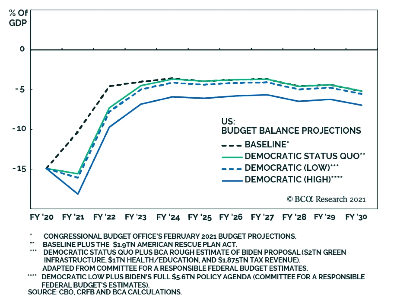
According to BCA Research’s US Political Strategy service, government spending has taken a big step up and Biden’s second major legislative initiative will ensure that this new profligacy is permanent rather than a temporary response to a crisis. The…

Reinstating Long VIX Futures Hedge
Reinstating Long VIX Futures Hedge
Last December in our “2021 High-Conviction Calls” Strategy Report we instituted a long VIX futures trade (for a second time) as a hedge to our cyclical exposure, and earlier this year we crystallized handsome gains just shy of 20% from this hedge. Subsequently, we put on a stop buy order at 25 on the June 2021 VIX futures and that was triggered intraday on Monday. We are obeying our stop buy and have reinstated our hedge. Over the past month, we highlighted how Chinese data softening (see here and here), coupled with the lack of an SPX valuation cushion could spell some short-term trouble for the broad equity market. The chart on the right further underpins the point: the VIX’s term structure indicates that stress has built up beneath the surface. Tack on the fact that the SPX sits near our end-2021 4,000 target, and short-term cautiousness is warranted anew. Bottom Line: Intraday on Monday we obeyed our stop buy order and initiated a long June 2021 VIX futures position at 25 as a near-term hedge to our high-conviction calls.
BCA Research’s US Bond Strategy service believes that the Fed is probably overly cautious and that the SEP’s forecasts will eventually move toward the market, validating current bond yields. Revisions to Fed policymakers’ interest rate forecasts at last…
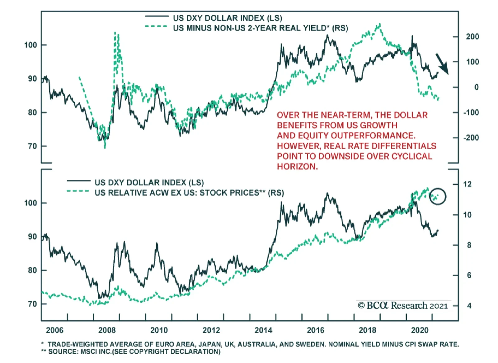
BCA Research believes the US dollar is experiencing a countertrend rally within a bear market. However, the DXY is up 2% ytd and continues to face upside pressure, raising the question of whether this move will morph into a new cyclical bull market. Over…
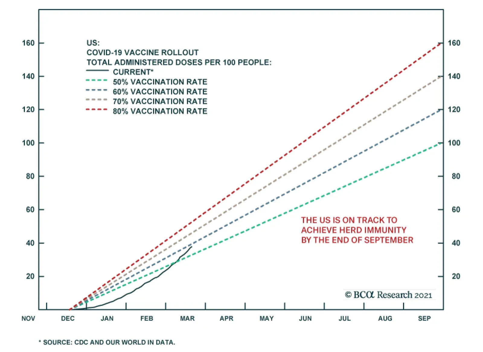
US economic data have been especially variable so far in 2021. The Atlanta Fed’s GDPNow real-time projection model of real first quarter US GDP growth surged five percentage points, from 4.5% to 9.5%, the day the blowout January retail sales number was…
Today marks the one year anniversary of last year’s SPX lows and we are compelled to reprint the “20 Reasons To Buy Equities” part of our report that Monday “as is” that was titled “The Darkest Hour Is Just Before The Dawn”. The appendix below shows the updates to the charts, and as we reflect how far the stock market expansion has come in the past year, this unique recovery remains quite astounding and with no close historical parallel. Bottom Line: While the SPX is getting close to our 4,000 yearend target and some near-term caution is warranted the equity bull market (and business cycle) is in its infancy and we reiterate our cyclical and structural sanguine views. 20 Reasons To Buy Equities Below are the 20 reasons to start buying equities. We are already in recession. Markets trough in recessions and historically offer enticing risk/reward return profiles. China’s manufacturing PMI and other hard data fell below the GFC lows. As a general rule of thumb investors should buy stocks when the global PMI is well below 50 (Chart 1). Cupboards are bare. A drawdown in inventories is usually followed by a jump in production. Consumers will benefit from the oil market carnage and the super low mortgage refinancing rates. The Fed cut rates to zero, did QE5, and brought back the alphabet soup of programs like CPFF, PDCF and MMLF from the GFC, more will likely follow (Chart 2). The DXY has gone from 95 on March 9 to 103 on Friday. King dollar will soon have to reverse course and provide some much-needed relief globally as the Fed’s US dollar swap lines aim to alleviate the shortage of US dollars (Chart 3). Keep in mind what Dr. Bernanke told Scott Pelley in a 60 Minutes interview with regard to money creation: “PELLEY: Is that tax money that the Fed is spending?
Chart 1
Chart 1
Chart 2
Chart 2
BERNANKE: It's not tax money. The banks have accounts with the Fed, much the same way that you have an account in a commercial bank. So, to lend to a bank, we simply use the computer to mark up the size of the account that they have with the Fed (emphasis ours). So it's much more akin to printing money than it is to borrowing.”1
Chart 3
Chart 3
Chart 4
Chart 4
Other global Central Banks are cutting rates and doing QE. Beyond Christine Lagarde’s recent €750bn bazooka, the ECB has the OMT ready from previous crises. Already last week the ECB intervened in Italian BTPs via Banca d’Italia. Germany has hinted that it would not be opposed to a “Covid-bond.” A mega US fiscal package looms near the $1tn mark.2 The recession-related automatic stabilizers and government spending will soar. China’s fiscal response will likely be as large as in late 2008 (as a reminder in Q4/2008 the Chinese fiscal spending announcement equated “to 12.5% of China’s GDP in 2008, to be spent over 27 months”3). Germany and a slew of other countries have already pledged fiscal spending. Spain has announced a 20% of GDP package. Countries will bid-up the size of the bailout. IMF announced a $1tn bailout package. Nibbling at stocks when the VIX is at 85 makes sense versus when the VIX is at 12 (Chart 4). The yield curve slope is steepening (Chart 5). The 10-year real Treasury yield hit a low of -50bps that indicator has also priced in recession (Chart 4). Equity market internals have fully priced recession, small caps and weak balance sheet stocks in particular (Chart 6). Sentiment is washed out as per our Capitulation, Sentiment and Complacency-Anxiety Indicators (Chart 6). Bernie Sanders has lost his bid to become the nominee of the Democratic Party. Buffett will either bailout a company or two or buyout a company he likes. Jamie Dimon and/or other prominent CEOs (insiders) will start buying their own company stock. Social-distancing measures in the West will ultimately break the Epidemic Curve first derivative and arrest the panic. Even if COVID-19 comes back in force, the fact is that most of the patients who succumb to it are elderly. In Italy, the average age of death is 80 years old. As such, the final circuit-breaker ahead of a GFC would be desensitization by the population, as selective quarantines – targeting the elderly cohorts – get implemented in order to allow other people to return to work. Furthermore, two “silver bullet” solutions remain as tail risks to the bearish narrative. First, a biotech or pharmaceutical company may make a break-through in the fight against COVID-19. Not necessarily a vaccine, but a treatment. Finally, upcoming warm weather in the northern hemisphere may also help the fight against the virus. Bottom Line: Investors with higher risk tolerance should continue to layer in slowly and put cash to work with a cyclical 9-12 month time horizon. Please refer to yesterday’s Weekly Report for more details.
Chart 5
Chart 5
Chart 6
Chart 6
Appendix Chart A1
Chart 1
Chart 1
Chart A2
Chart 2
Chart 2
Chart A3
Chart 3
Chart 3
Chart A4
Chart 4
Chart 4
Chart A5
Chart 5
Chart 5
Chart A6
Chart 6
Chart 6
Footnotes 1 https://www.cbsnews.com/news/ben-bernankes-greatest-challenge/2/ 2 Please see BCA US Equity Strategy Daily Report, "Don’t Be A Hero" dated March 11, 2020, available at uses.bcaresearch.com. 3 https://www.oecd.org/gov/budgeting/Public%20Governance%20Issues%20in%20China.pdf
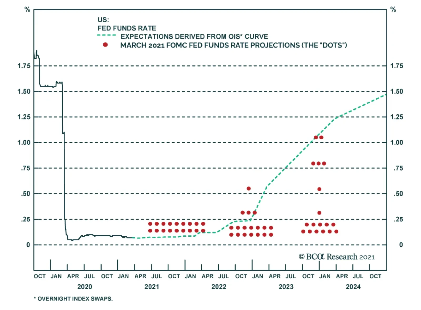
Highlights Duration & The Fed: Unlike the bond market, the Fed is being intentionally cautious about how quickly it revises its interest rate expectations higher, focusing more on hard economic data than on surveys. We expect the Fed dots to move up later this year as the hard economic data improve, validating current pricing in the bond market. Maintain below-benchmark portfolio duration. Yield Curve: The Treasury yield curve continues to trade directionally with the level of yields, except for the 10/30 slope which has now begun to bear-flatten. Investors should continue to position for curve steepening out to the 10-year maturity point. We recommend going long the 5-year note and short a duration-matched barbell consisting of the 2-year and 10-year notes. Economy: The US economy is at an inflection point where survey data indicate a great deal of optimism about the economic recovery, but where those optimistic growth prospects are not yet evident in the hard economic data. This is typical of post-recession environments where survey data move first and then the hard economic data play catch up. Feature The pain in the bond market continues. The 10-year Treasury yield rose again last week, closing at 1.74% on Friday, and the Bloomberg Barclays Treasury Index has now returned -6.1% since it peaked last August. If we use the peak-to-trough drawdown in the Treasury Index as our gauge, we are now in the midst of one of the five worst bond selloffs of the past 50 years. During that 50-year period, the current bearish bond move is only surpassed by the 2009, 2003, 1994 and 1980 episodes (Chart 1). Chart 1A Historic Bond Rout
A Historic Bond Rout
A Historic Bond Rout
That said, the current bond selloff might still have a lot of runway. In level terms, the 30-year Treasury yield has only just recaptured its 2020 peak and the 10-year yield hasn’t even done that (Chart 2). Then, there’s another 101 bps of upside in the 30-year yield and 150 bps of upside in the 10-year yield just to get back to their 2018 peaks, yield levels that aren’t exactly distant memories. Yields do look stretched if we look at long-dated forwards. The 5-year/5-year forward Treasury yield, for example, is already well above its 2020 peak. The large increase in the 5-year/5-year forward yield is the result of Fed policy keeping the short-end of the yield curve capped (Chart 2, bottom 2 panels) forcing the bulk of Treasury weakness to be felt at the long-end. The 5-year/5-year forward Treasury yield is important because it reflects the market’s expectation of where the fed funds rate will settle in the long-run. In fact, you can use survey estimates of the long-run neutral fed funds rate to get a useful fair value range for the 5-year/5-year forward. At present, the 5-year/5-year forward yield has pushed well above this survey-derived fair value range (Chart 3), though it’s important to note that it is still 75 bps below its 2018 peak. Survey estimates of the long-run neutral fed funds rate were revised down as growth disappointed in 2019, it stands to reason that they could be revised higher as growth improves this year, thus moving the fair value range up as well. Chart 2Yields Can Rise Further
Yields Can Rise Further
Yields Can Rise Further
Chart 35-Year/5-Year Is Elevated
5-Year/5-Year Is Elevated
5-Year/5-Year Is Elevated
In fact, whether that process of upward revisions to survey estimates of the long-run neutral fed funds rate begins is an important near-term question for the bond market. Upward revisions would signal further upside in long-dated yields and more curve steepening ahead. Static long-run neutral rate estimates would signal that the upside in long-maturity yields is limited. In that latter case, the cyclical bond bear market would transition to a less severe bear-flattening phase where short-maturity yields eventually catch up to the long-end as the Fed tightens policy. It’s currently unclear how those survey estimates will evolve – we will get March updates for both surveys shown in Chart 3 on April 8th – but for now it’s too soon to say that the 5-year/5-year forward yield has peaked. We continue to recommend maintaining below-benchmark portfolio duration as we keep tabs on our Checklist To Increase Portfolio Duration.1 Currently, our Checklist is not screaming out for us to make a change. Explaining The Disagreement Between The Fed And The Market We expected that Fed policymakers would revise up their interest rate forecasts at last week’s FOMC meeting, but we also expected that the forecasts wouldn’t rise far enough to match the rate hike path that is currently priced in the market.2 This is in fact what happened, though the Fed was slightly more dovish than we anticipated. Only 7 out of 18 FOMC participants expect any rate hikes at all before the end of 2023, while the overnight index swap curve is discounting more than four 25 basis point hikes by then (Chart 4). Chart 4Market More Hawkish Than Fed
Market More Hawkish Than Fed
Market More Hawkish Than Fed
What explains this divergence between the market and the Fed? Perhaps bond investors are simply ignoring the Fed’s dovish message. In that case, we should expect yields to fall as it becomes clear that the Fed intends to keep rates pinned at zero for much longer than is currently priced in the curve. Or perhaps Fed policymakers just don’t appreciate the surge in economic activity that is about to unfold. In that case, their interest rate forecasts (the “dots”) will rise sharply in the coming months as the economic data improve. Chair Powell gave a hint about how we should think about the divergence between the market and the “dots” in his post-meeting press conference. He said that the Fed wants to see “actual progress” towards its economic objectives not “forecast[ed] progress”, and he noted that this increased focus on “actual progress” is “a difference from our past approach.”3 In other words, the Fed is making a concerted effort to take a more backward-looking approach to policymaking under its new Average Inflation Targeting regime. It doesn’t want to tighten policy in response to a forecast of stronger growth in the future only to get whipsawed if that forecast doesn’t pan out. It would rather err on the side of tightening too late and then possibly have to move more quickly if it falls behind the curve. The market, by contrast, is a purely forward-looking discounting mechanism. Market prices move quickly to incorporate new information but are often caught offside. We are reminded of Paul Samuelson’s famous quip that the stock market has predicted nine of the past five recessions. This explains exactly what is happening right now. The market is looking ahead, taking its cues from survey data (or “soft data”) such as the ISM indexes that are pointing toward a sharp rise in economic activity and inflation. The Fed, by contrast, is endeavoring to focus more on the actual hard economic data such as the unemployment rate, industrial production and consumer price indexes. These hard economic data simply haven’t improved that much yet. The last section of this report (titled “Economy: Hard Vs Soft Data”) gives some examples of how the hard and soft economic data have diverged. Chart 5The Path Back To Maximum Employment
The Path Back To Maximum Employment
The Path Back To Maximum Employment
Ultimately, the disagreement between the market’s funds rate expectations and the Fed’s dots will be resolved as the hard economic data are released during the next few months. Those data will either validate the current message from economic surveys, causing the Fed to revise up its rate forecasts, or disappoint market expectations, causing market forecasts and bond yields to fall. In this regard, the hard economic data on the labor market will be particularly important. The Fed has said that it will not lift rates until “maximum employment” is achieved. In practice, “maximum employment” means that the unemployment rate will fall into a range of 3.5% - 4.5%, consistent with the Fed’s estimates of the natural rate, and the labor force participation rate will recover to pre-COVID levels (Chart 5). The top row of Table 1 shows that average monthly employment growth of 419k is required to achieve that target by the end of 2022. We have made the case in prior reports that, though that number seems high, it is achievable.4 Table 1Average Monthly Nonfarm Payroll Growth Required For The Unemployment Rate To Reach 4.5% By The Given Date
The Fed Looks Backward While Markets Look Forward
The Fed Looks Backward While Markets Look Forward
It’s also worth noting that the Fed’s median unemployment rate forecast was revised significantly lower last week. The Fed is now looking for an unemployment rate of 4.5% by the end of this year and 3.9% by the end of 2022 (Chart 5, top panel). The fact that the Fed doesn’t project any rate hikes during this timeframe can only mean that policymakers aren’t forecasting a similar recovery in the labor force participation rate. The bottom line is that, unlike the market, the Fed is being intentionally cautious about how quickly it revises its funds rate expectations higher, focusing more on hard economic data than surveys. Eventually, the disagreement between the hard and soft economic data will be resolved and either the Fed dots will move toward the market, or the market will move toward the Fed. Our sense is that the Fed is probably being overly cautious and that their forecasts will eventually move toward the market, validating current bond yields. Too Early To Expect Curve Flattening We have been recommending nominal Treasury curve steepeners for some time, on the view that the yield curve will trade directionally with yields. This means that rising yields will coincide with curve steepening.5 This correlation has held up extremely well, but we know that it won’t last forever. Eventually, we will be close enough to Fed rate hikes that the yield curve will start to flatten as yields rise. This process will begin at the long-end of the curve and gradually shift toward the short-end as Fed liftoff approaches. Chart 6 shows how the correlation between the level of Treasury yields and different yield curve slopes has held up during the recent surge in bond yields. For the most part, the tight correlation between rising yields and steeper curves remains intact, with the 10/30 slope being the exception (Chart 6, bottom panel). It looks like during the past month the 10/30 slope has transitioned from a bear-steepening/bull-flattening regime into a bear-flattening/bull-steepening regime. The investment implication is that the short position of a curve steepener trade should be applied to the 10-year note not the 30-year bond, particularly for duration-neutral steepeners. It’s difficult to know exactly when the other segments of the yield curve will transition from their bear-steepening/bull-flattening regimes into bear-flattening/bull-steepening regimes, but we suspect that the current correlations have quite a bit more running room. If we look at what occurred prior to the last time that the Fed lifted rates off the zero bound, in December 2015, we see that most curve segments didn’t start to bear-flatten until a few months before liftoff (Chart 7) Chart 6Bear-Steepening/Bull-Flattening Regime Continues
Bear-Steepening/Bull-Flattening Regime Continues
Bear-Steepening/Bull-Flattening Regime Continues
Chart 7Bear-Flattening Started Just Months Before 2015 Liftoff
Bear-Flattening Started Just Months Before 2015 Liftoff
Bear-Flattening Started Just Months Before 2015 Liftoff
In terms of how to implement a yield curve steepener, we have been recommending a position long the 5-year note and short a duration-matched barbell consisting of the 2-year and 10-year notes. We are sticking with that position for now, as it has performed well even as the 2/5/10 butterfly spread has widened in recent weeks (Chart 8). We expect it will continue to perform well as long as both the 2/5 and 5/10 yield curve slopes continue to steepen. Once we suspect that the 5/10 slope is transitioning into a bear-flattening/bull-steepening regime, we will have to either shift into a curve flattener or a curve steepener that is focused more at the short-end of the curve. Chart 85/10 Slope Still Steepening
5/10 Slope Still Steepening
5/10 Slope Still Steepening
Bottom Line: The Treasury yield curve continues to trade directionally with the level of yields, except for the 10/30 slope which has now begun to bear-flatten. Investors should continue to position for curve steepening out to the 10-year maturity point. We recommend going long the 5-year note and short a duration-matched barbell consisting of the 2-year and 10-year notes. Economy: Hard Vs. Soft Data Chart 9IP Lags The PMI
IP Lags The PMI
IP Lags The PMI
Chart 10Surveys Suggest Higher Inflation Ahead
Surveys Suggest Higher Inflation Ahead
Surveys Suggest Higher Inflation Ahead
As noted above, the US economy is at an interesting inflection point where, owing to large-scale fiscal stimulus and an effective COVID vaccination rollout, there is a lot of optimism about the future. This optimism is showing up in how people respond to surveys about their economic and business expectations, but it has not yet translated into better actual economic outcomes. The ISM Manufacturing PMI survey is a case in point. It surged to 60.8 in February, its highest level since 2018, but actual measured industrial production continues to contract in year-over-year terms (Chart 9). In all likelihood, this is simply a result of surveys (“soft data”) leading the hard data. A simple linear regression fit between industrial production and the PMI shows that wide negative divergences have a habit of showing up during recessions, only for the gaps to close very quickly in the early stages of the recovery. We see the same dynamic at play in the inflation data. Actual core CPI inflation has not moved up significantly, but surveys indicate that price pressures are rising fast (Chart 10). Bottom Line: The US economy is at an inflection point where survey data indicate a great deal of optimism about the economic recovery, but where those optimistic growth prospects are not yet evident in the hard economic data. This is typical of post-recession environments where survey data move first and then the hard economic data play catch up. Ryan Swift US Bond Strategist rswift@bcaresearch.com Footnotes 1 For more details on our Checklist please see US Bond Strategy Weekly Report, “No Panic From Powell”, dated March 9, 2021, available at usbs.bcaresearch.com 2 Please see US Bond Strategy Weekly Report, “Limit Rate Risk, Load Up On Credit”, dated March 16, 2021, available at usbs.bcaresearch.com 3 https://www.federalreserve.gov/mediacenter/files/FOMCpresconf20210317.pdf 4 Please see US Bond Strategy Weekly Report, “No Panic From Powell”, dated March 9, 2021, available at usbs.bcaresearch.com 5 Please see US Bond Strategy Weekly Report, “Life At The Zero Bound”, dated March 24, 2020, available at usbs.bcaresearch.com Fixed Income Sector Performance Recommended Portfolio Specification
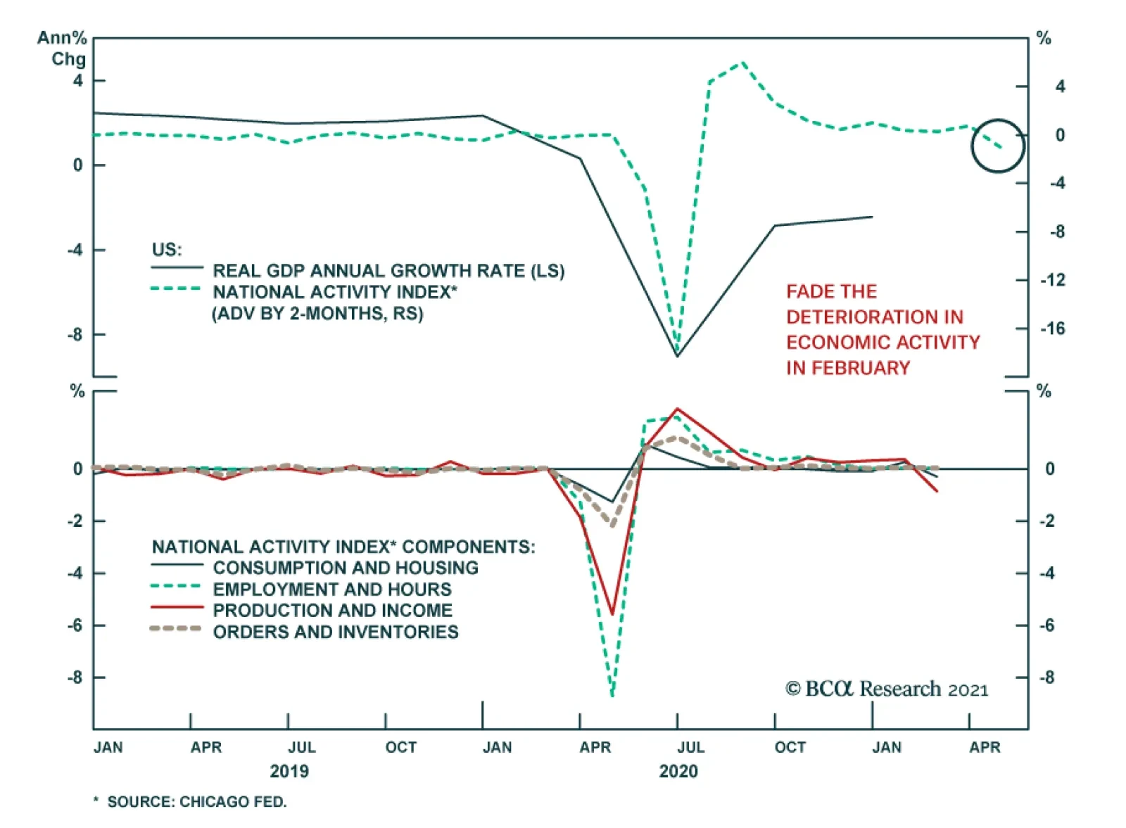
Yesterday, the Chicago Fed’s February National Activity Index fell from January’s revised print of 0.75 to -1.09, well beneath expectations of 0.72. The weakness was broad-based, with all four components of the index lower versus January. Of the four, both…