United States
BCA Research’s US Political Strategy service concludes that the Senate will pass the American Rescue Plan largely as is, supercharging economic growth as economic activity normalizes, consumer confidence recovers, and the service sector revives. The second…

Machinery And China
Machinery And China
Overweight In the coming months the market may sniff out the China driven slowdown we highlighted in recent research. This will likely present an opportunity to further augment machinery exposure as a number of macro forces are supporting this industrials sub-sector. First, the correlation between the greenback and global growth is as negative as ever. As long as the ongoing tactical USD appreciation is seen in the context of a secular bear market, machinery stocks will remain stellar cyclical outperformers (US dollar shown inverted, second panel). Second, the industry-level inventory cycle has not yet reached an apex. Given that the pandemic grounded machinery new orders to a halt, the economic reopening will pave the way for a significant rebound in machinery spending (third panel). Finally, our multi-factor macro sales (not shown) and earnings models, both argue that a sharp rebound in top and bottom line growth is in the cards (bottom panel). Bottom Line: We remain overweight the S&P machinery index, but are mindful of a potential transitory China-related headwind.
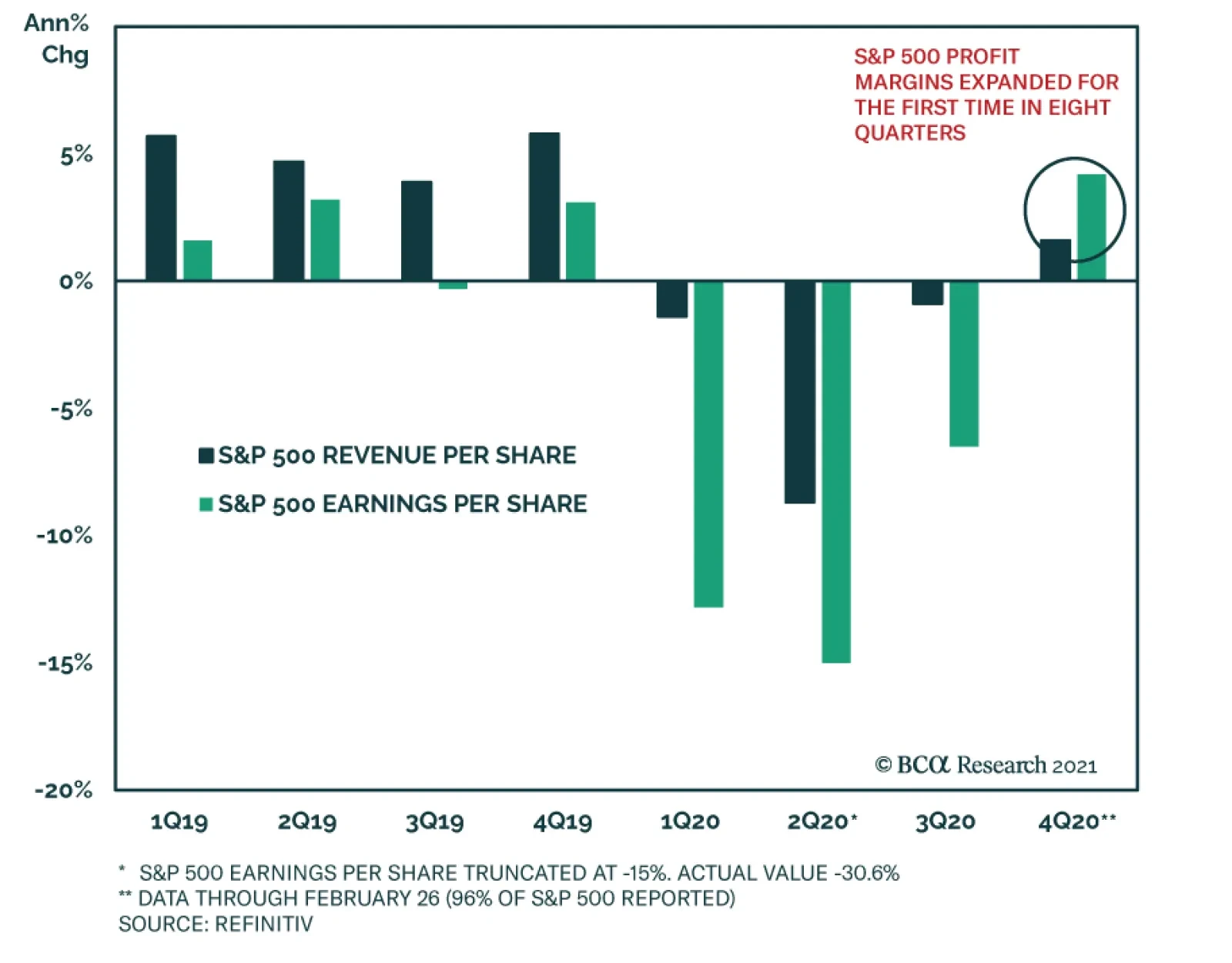
Fourth quarter 2020 earnings season is effectively in the books, with no more than a few stragglers left to report, and it was another blockbuster relative to expectations. As a whole, the constituents of the S&P 500 surpassed consensus earnings-per-share…
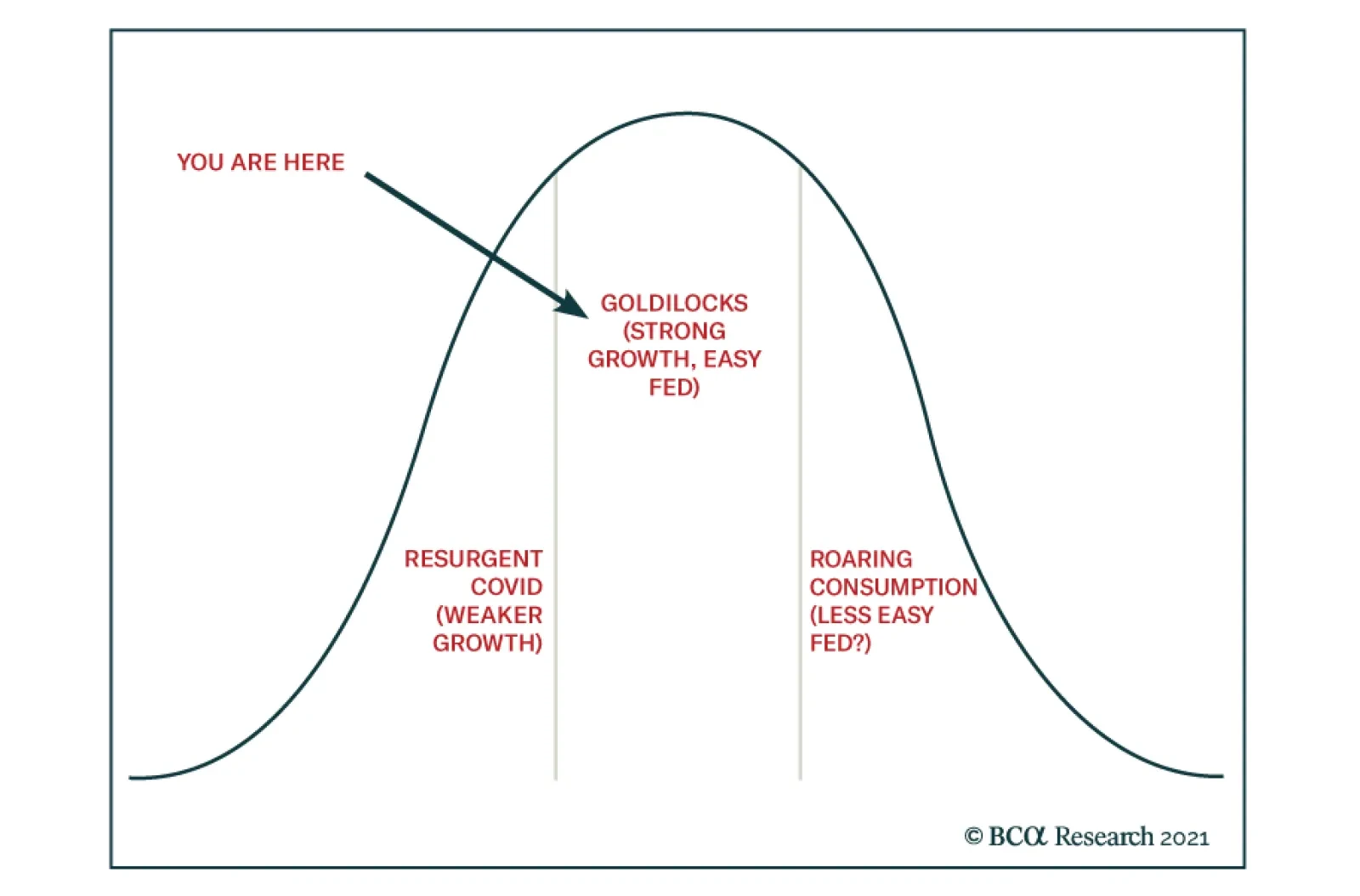
BCA Research’s US Investment Strategy service concludes that financial markets and the economy are in a good spot, supported by a combination of above-trend growth and easy monetary policy that will remain in place for at least the next year. Moreover, the…
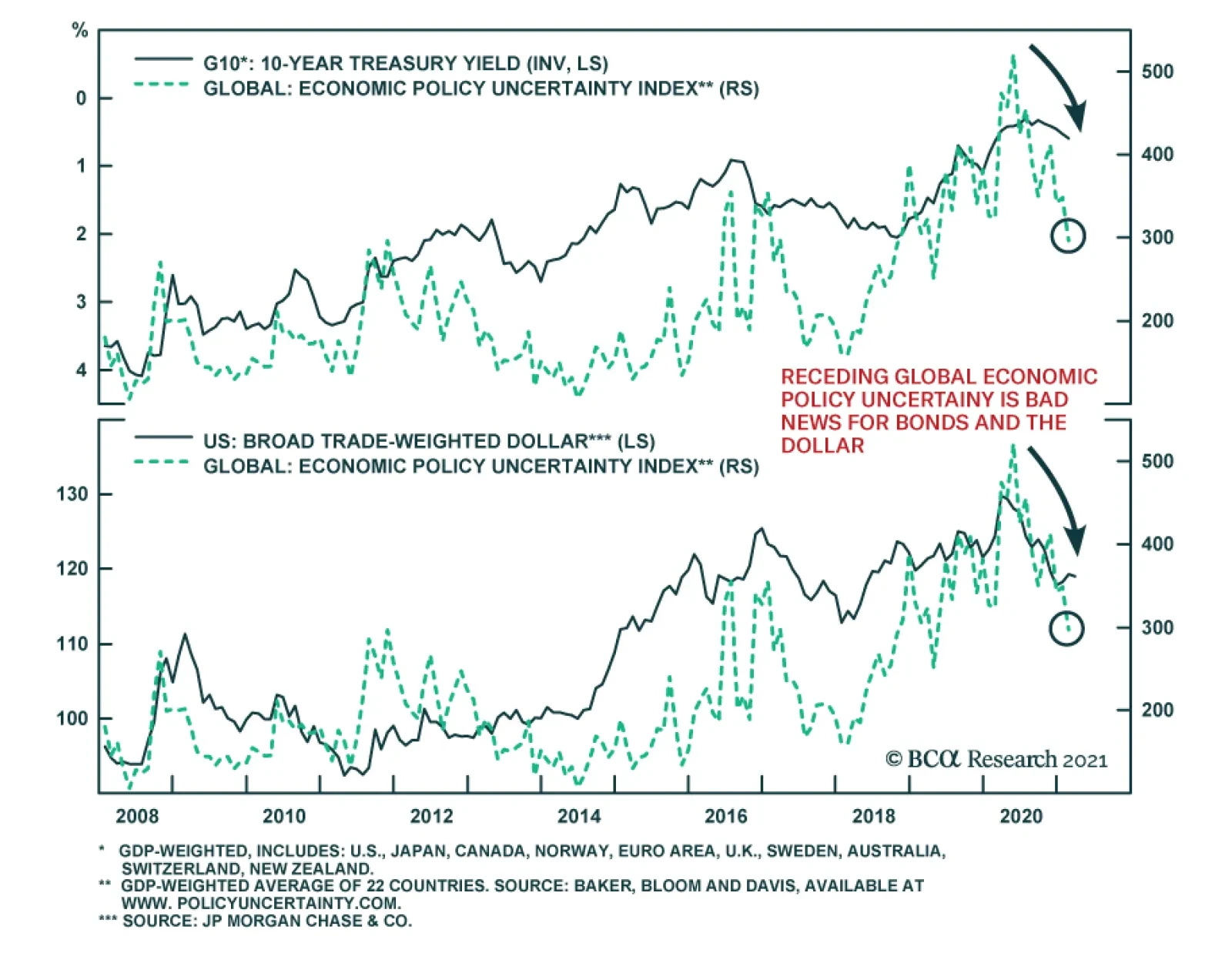
The Global Policy Uncertainty Index resumed its downtrend in February, following a January uptick on the back of the latest violent wave of COVID-19 infections. While major economies still face both pandemic and economic uncertainty, the path of least…
Highlights Rising Global Yields: The increased turbulence in global bond markets is part of the adjustment process to a more positive outlook for global economic growth. Rising real yields are now the main driver of nominal yield movements, with stable inflation expectations indicating that investors are not overly concerned about a sustained inflation overshoot. Duration: Central bankers will eventually be forced to shift to less dovish interest rate guidance to reflect the new reality of faster growth and increased inflation pressures, but this is likely to not occur until much later in 2021, starting with the Fed. Maintain a below-benchmark cyclical duration stance in global bond portfolios. UST Yields & Spreads: The selloff in US Treasuries has pushed US yields to levels that are starting to look a bit stretched relative to yields from other major developed economies like Germany and Japan. This is especially true on a volatility-adjusted basis. As a result, we are closing our tactical US-Germany spread widening trade in bond futures at a profit of 1.8%. Feature Chart of the WeekBond Yields Are Rising Because Of Growth
Bond Yields Are Rising Because Of Growth
Bond Yields Are Rising Because Of Growth
The rapid surge in global bond yields seen so far in 2021 has led some commentators to declare that the dreaded “bond vigilantes” have returned to dole out punishment for overly stimulative fiscal and monetary policies (most notably in the US). The rapid pace of the bond selloff, with the 10-year US Treasury yield reaching 1.6% on an intraday basis last week, has raised fears that spiking yields could damage a fragile global economic recovery. This logic is backwards – it is surging growth expectations that are driving bond yields sustainably higher from deeply depressed levels. Global growth is projected to accelerate at a very rapid pace over the rest of this year and 2022. The combination of the Bloomberg consensus real GDP growth and inflation forecasts for the major developed economies suggest that nominal year-over-year GDP growth is expected to climb to 7.2% in the US, 8.4% in the UK and 6.4% in the euro area by year-end (Chart of the Week). Nominal growth in 2022 is expected to grow by another 5-7% across the same regions, suggesting a return to a slightly faster pace than prevailed during the pre-pandemic years of 2017-19 - even after a boom in 2021. Nominal longer-term global government bond yields, which had been priced for a pandemic-stricken economic backdrop, are now playing catch-up to the new reality of a post-pandemic, vaccinated world. Bond investors understand that the need for extreme monetary accommodation is ebbing, especially in the US where there will be an enormous fiscal impulse to growth in 2021 (and beyond). As a result, interest rate expectations are moving higher, fueling a repricing towards higher bond yields around the world. This process has more room to run. A Global Move Higher In Yields, For The Right Reasons Chart 2Reflationary Bear-Steepening Of Global Yield Curves
Reflationary Bear-Steepening Of Global Yield Curves
Reflationary Bear-Steepening Of Global Yield Curves
The cyclical rise in developed market bond yields that began last summer was initially focused on longer-maturity yields boosted by rising inflation expectations (Chart 2). The very front-ends of bond yield curves – which are more sensitive to expectations of changes in central bank policy rates – have remained subdued. The upward pressure on global bond yields is starting to infect some shorter maturities, however. 5-year government bonds yields in the UK, Canada and Australia rose 44bps, 42bps and 35bps, respectively, during the month of February. The latter two represented a near doubling of the level of the 5-year yield. In the case of the UK, the surge in 5-year Gilt yields came from a starting point of negative yields at the end of January. Last week, the 5-year US Treasury yield jumped a massive 22bps on a single day due to a poorly received US Treasury auction. Year-to-date, longer-term global bond yields have been rising more through the real yield component than higher inflation expectations (Charts 3A & 3B). This is a change in the dynamics from the latter half of 2020 when inflation expectations were the dominant force pushing global yields higher. Chart 3AReal Yields Are Driving The Recent Bond Selloff …
Real Yields Are Driving The Recent Bond Selloff...
Real Yields Are Driving The Recent Bond Selloff...
Chart 3B… Even In The Lower-Yielding Markets
...Even In The Lower-Yielding Markets
...Even In The Lower-Yielding Markets
This shift in “leadership” of the global bond market selloff has been broad-based. 10-year real yields from inflation-linked bonds have surged higher in the US (+35bps year-to-date), UK (+40bps), Australia (+44bps) and Canada (+25bps). Real 10-year yields have even inched up in France (+9bps), despite euro area growth suffering because of COVID-19 lockdowns. This coordinated rise in real bond yields comes on the heels of a sharp improvement in overall global economic momentum and improving expectations for future growth. Manufacturing PMIs, a reliable leading indicator of real yields in the developed markets, began a cyclical improvement in the middle of last year and, right on cue, global bond yields bottomed out toward the end of 2020 (Chart 4). The link between that strong growth momentum and real bond yields comes from expected changes in central bank policies. Our Central Bank Monitors for the US, euro area, UK, Japan, Canada and Australia – designed to measure cyclical pressures on monetary policy - have all moved significantly higher since mid-2020 (Chart 5). This suggests a diminished need for additional monetary stimulus because of rebounding economic growth and intensifying inflation pressures. The Monitors have climbed to above pre-pandemic levels in the US and Australia. Chart 4Real Yields Starting To Catch Up To Solid Growth
Real Yields Starting To Catch Up To Solid Growth
Real Yields Starting To Catch Up To Solid Growth
Chart 5Markets Starting To Discount Rate Hikes In 2023
Markets Starting To Discount Rate Hikes In 2023
Markets Starting To Discount Rate Hikes In 2023
Interest rate markets are responding to this cyclical pressure to tighten monetary policies by repricing the expected timing and pace of the next rate hiking cycle. Our 24-month discounters, which derive the amount of interest rate changes priced into overnight index swap (OIS) curves up to two years in the future, are now pricing in higher policy rates in the US (+40bps), the UK (+32bps), Australia (+36bps) and Canada (a whopping +82bps) by the first quarter of 2023. This repricing of interest rate expectations does conflict with current central bank forward guidance, to varying degrees. For example, the Fed continues to signal that there will not be any rate hikes until at least the end of 2023. Policymakers will not be overly concerned about higher government bond yields and shifting interest rate expectations, however, if there is limited spillover into broader financial market performance. In the US, the latest increase in real Treasury yields to date has had minimal impact on US equity market valuations or corporate bond yields (Chart 6A), suggesting no tightening of financial conditions that could impact future US economic growth. A similar situation is playing out in Europe, where higher longer-term real yields have had little impact on equity market valuations or the borrowing rates that the ECB is most concerned about, like Italian BTP yields (Chart 6B). Chart 6ANo Tightening Of Financial Conditions In The US...
No Tightening Of Financial Conditions In The US...
No Tightening Of Financial Conditions In The US...
Chart 6B...Or Europe
...Or Europe
...Or Europe
Currency valuations are a more important indicator of financial conditions for other central banks. For example, the Reserve Bank of Australia (RBA) has been explicit that its current policies – near-zero policy rates, yield curve control to anchor the level of 3-year bond yields and quantitative easing (QE) to moderate the level of longer-term yields – are intended to not only keep borrowing costs low but also dampen the value of the Australian dollar. At the moment, the US dollar is being pulled in different directions by the typical fundamental drivers. Real rate differentials between the US and other major developed economies remain unattractive for the greenback, even with the latest rise in US real yields (Chart 7). At the same time, growth differentials between the US and the other major economies are turning more USD-positive. For now, rate differentials are the more dominant factor for the US dollar and will remain so until the Fed begins to shift to a less dovish policy stance – an outcome that we do not expect until much later this year when the Fed will begin to prepare the market for a tapering of asset purchases in 2022. A sustainable bottoming of the US dollar, fueled by a shift to a less accommodative Fed, will also likely mark the end of the rising trend for global inflation expectations, given the links between the dollar, commodity prices and inflation breakevens (bottom panel). Central banks outside the US will continue to resist any unwelcome appreciation of their own currencies versus the US dollar. That means doing more QE when bond yields rise too quickly, as the RBA did this week and the ECB has threatened to do in recent comments from senior policymakers (Chart 8). Increasing the size of asset purchases is unlikely to sustainably drive non-US bond yields lower, however, in an environment of improving global growth that is causing investors to reassess the future path of interest rates. All more QE can hope to do at this point in the global business cycle is limit how fast bond yields can increase. Chart 7The USD Remains The Critical Reflationary Variable
The USD Remains The Critical Reflationary Variable
The USD Remains The Critical Reflationary Variable
Chart 8More QE Is Less Effective At Capping Bond Yields
More QE Is Less Effective At Capping Bond Yields
More QE Is Less Effective At Capping Bond Yields
Chart 9Markets With A Lower Yield Beta To USTs Are Outperforming
Markets With A Lower Yield Beta To USTs Are Outperforming
Markets With A Lower Yield Beta To USTs Are Outperforming
From an investment strategy perspective, the current growth-fueled move higher in global real bond yields does not change any of our suggested tilts. We continue to recommend a below-benchmark overall duration stance within global bond portfolios. Within our recommended country allocation among developed market government bonds, we continue to prefer a large underweight to US Treasuries and overweights to markets that are less susceptible to changes in US Treasury yields like Germany, France, Japan and the UK (Chart 9). We also continue to recommend only neutral allocations to Canadian and Australian government bonds (with below-benchmark duration exposure within those allocations), although we are on “downgrade alert” for both given their status as higher-beta bond markets with central banks more likely follow the Fed down a less dovish path later this year. Bottom Line: Rising real yields are now the main driver of nominal yield movements, with stable inflation expectations indicating that investors are not overly concerned about a sustained inflation overshoot. Central bankers will eventually be forced to shift to less dovish interest rate guidance to reflect the new reality of faster growth and increased inflation pressures, but this is likely to not occur until much later in 2021, starting with the Fed. Maintain a below-benchmark cyclical duration stance in global bond portfolios, with a large underweight allocation to US Treasuries. The UST-Bund Spread Widening Looks Stretched Chart 10Yield Chasing Has Been A Losing Strategy In 2021
Yield Chasing Has Been A Losing Strategy In 2021
Yield Chasing Has Been A Losing Strategy In 2021
Last August, we published a report discussing how “yield chasing” – a strategy of consistently favoring the highest yielding government bond markets – had become the default strategy for bond investors during the early months of the pandemic.1 We concluded that yield chasing would be a successful strategy for only as long as central banks stuck to their promises to maintain very loose monetary policy for the next few years. Investors would be forced to chase scarce yields in that environment, while worrying less about cyclical economic and inflation factors that could push up bond yields. Yield chasing has performed quite poorly so far in 2021. A basket of higher-yielding markets like the US, Canada and Australia has underperformed a basket of low-yielders like Germany, France and Japan by -1.4 percentage points (Chart 10). Obviously, such a carry-driven strategy would be expected to perform poorly during an environment of rising bond volatility as is currently the case. Markets that have been offering relatively enticing yields, like the US or Australia (Table 1), are actually generating the largest total return losses. Those higher-yielders have suffered more aggressive repricing of interest rate expectations, as discussed in the previous section of this report, leading to losses from duration that are dwarfing the higher yields. This is especially true in the US, where there remains the greater scope for an upward repricing of interest rate and inflation expectations. Table 1Government Bond Yields: Unhedged & Hedged Into USD
Are Central Banks Losing Control Of Bond Yields? No.
Are Central Banks Losing Control Of Bond Yields? No.
This suggests that investors must be cautious on determining when to consider increasing exposure to higher yielders like the US, even after Treasury yields have increased substantially. One way to evaluate that is to look at the spreads between US Treasuries and low yielders like Germany and Japan, relative to US bond volatility. In Chart 11, we show the spread of 10-year US Treasuries to 10-year German Bunds. To facilitate a fair comparison between the two, we hedge the Treasury yield into euros while adjusting the spread for duration difference between the two bonds. The currency-hedged and duration-matched Treasury-Bund spread is shown in the middle panel of the chart. In the bottom panel, we adjust that spread for US interest rate volatility by dividing the spread by the level of the MOVE index of US Treasury option volatility. On an unadjusted basis, the 10-year yield gap now sits at 175bps, +70bps higher than the lows seen in August 2020. That spread is narrower on a currency hedged basis, with the 10-year US Treasury yield hedged into euros +73ps higher than the 10-year German bund yield. Two conclusions stand out from the chart: The currency-hedged and duration-matched spread is still well below the prior peaks dating back to 2000; The volatility-adjusted spread is already one standard deviation above the mean value since 2000. In other words, there is scope for US Treasuries yields to continue rising relative to German Bund yields based on levels reached in past cycles. Yet at the same time, the spread provides a reasonable level of compensation compared to the riskiness (volatility) of Treasuries, also based on past cycles. We show the same chart for the spread between 10-year US Treasuries and 10-year Japanese government bonds (JGBs) in Chart 12. In this case, there is also scope for additional spread widening although the volatility-adjusted spread is still not as attractive as at previous peaks since 2000. Chart 11UST-Bund Spread Looking Stretched Vs UST Vol
UST-Bund Spread Looking Stretched Vs UST Vol
UST-Bund Spread Looking Stretched Vs UST Vol
Chart 12UST-JGB Spread Getting Stretched Vs UST Vol
UST-JGB Spread Getting Stretched Vs UST Vol
UST-JGB Spread Getting Stretched Vs UST Vol
The message from the volatility-adjusted Treasury-Bund spread lines up with that of the momentum measures of the unadjusted spread. The latter is historically stretched relative to its 200-day moving average, while the change in the spread over the past six months has been as rapid as any of the moves seen since the 2008 financial crisis (Chart 13). Adding it all up, positioning for additional widening of the Treasury-Bund spread is a much poorer bet from a risk versus reward perspective than it was even a few months ago. On a fundamental medium-term basis, however, there is still room for the Treasury-Bund spread to widen further. Relative inflation and unemployment (spare capacity) trends both argue for relatively higher US bond yields (Chart 14). In addition, the Fed is almost certainly going to start tightening monetary policy well before the ECB, thus policy rate differentials will underpin a wider bond spread – although that is already largely discounted in the spread on a forward basis (top panel). Chart 13UST-Bund Spread Momentum Looks Stretched
UST-Bund Spread Momentum Looks Stretched
UST-Bund Spread Momentum Looks Stretched
Chart 14Fundamentals Still Support A Wider UST-Bund Spread
Fundamentals Still Support A Wider UST-Bund Spread
Fundamentals Still Support A Wider UST-Bund Spread
Chart 15Stay Underweight US Vs. Germany On A Strategic Basis
Stay Underweight US Vs. Germany On A Strategic Basis
Stay Underweight US Vs. Germany On A Strategic Basis
Our fundamental fair value model of the 10-year Treasury-Bund spread shows that the spread is still cheap relative to fair value, which is rising (Chart 15). This suggests more medium-term upside in the spread, perhaps even by more than currently priced into the forwards over the next year. Based on this analysis, we see a case for maintaining a core strategic (6-12 month holding period) underweight position for the US versus Germany in our recommended country allocation within our model bond portfolio. At the same time, with the spread looking a bit stretched on some of the momentum and volatility-adjusted measures, we are taking profits on our tactical (0-6 month holding period) 10-year Treasury-Bund spread widening trade using bond futures, realizing a 1.8% return (see the Tactical Overlay table on page 18). Bottom Line: The selloff in US Treasuries has pushed US yields to levels that are starting to look a bit stretched relative to yields from other major developed economies like Germany and Japan. This is especially true on a volatility-adjusted basis. As a result, we are taking profits on our tactical US-Germany spread widening trade. However, we are maintaining our strategic overweight for Germany versus the US in our model bond portfolio, as fundamentals argue for a wider Treasury-Bund spread on a cyclical and strategic basis. Robert Robis, CFA Chief Fixed Income Strategist rrobis@bcaresearch.com Footnotes 1 Please see BCA Research Global Fixed Income Strategy Report, "We’re All Yield Chasers Now", dated August 11, 2020, available at gfis.bcaresearch.com. Recommendations The GFIS Recommended Portfolio Vs. The Custom Benchmark Index
Are Central Banks Losing Control Of Bond Yields? No.
Are Central Banks Losing Control Of Bond Yields? No.
Duration Regional Allocation Spread Product Tactical Trades Yields & Returns Global Bond Yields Historical Returns
Highlights Chart 1Back To Fair Value
Back To Fair Value
Back To Fair Value
February was a terrible month for the bond market. In fact, the Bloomberg Barclays Treasury Master Index returned -1.8%, its worst month since November 2016. The 5-year/5-year forward Treasury yield rose 37 bps. At 2.19%, it is now fairly valued for the first time since 2019, at least according to survey estimates of the long-run neutral fed funds rates (Chart 1). We outlined a checklist for increasing portfolio duration in our Webcast two weeks ago. So far, only two of the five items on our list have been checked. In particular, dollar sentiment and cyclical economic indicators continue to point toward higher yields, even though the market is now priced for a rate hike cycle that is slightly more hawkish than the Fed’s median forecast from December. We anxiously await this month’s revisions to the Fed’s interest rate forecasts. If the Fed’s forecasts remain unchanged from December, then we may get an opportunity to add some duration back into our recommended portfolio. Stay tuned. Feature Investment Grade: Neutral Chart 2Investment Grade Market Overview
Investment Grade Market Overview
Investment Grade Market Overview
Investment grade corporate bonds outperformed the duration-equivalent Treasury index by 65 basis points in February, bringing year-to-date excess returns up to +68 bps. The combination of above-trend economic growth and accommodative monetary policy supports positive excess returns for spread product versus Treasuries. Though Treasury yields have risen in recent weeks, this does not yet pose a risk for credit spreads. The 5-year/ 5-year forward TIPS breakeven inflation rate remains below 2%. We won’t be concerned about restrictive monetary policy pushing credit spreads wider until it reaches a range of 2.3% to 2.5%. Despite the positive macro backdrop, investment grade corporate valuations are extremely tight. The investment grade corporate index’s 12-month breakeven spread is down to its 2nd percentile (Chart 2). This means that the breakeven spread has only been tighter 2% of the time since 1995. The same measure shows that Baa-rated bonds have only been more expensive 3% of the time (panel 3). We don’t anticipate material underperformance versus Treasuries, but we see better value outside of the investment grade corporate space.1 Specifically, we advise investors to favor tax-exempt municipal bonds over investment grade corporates with the same credit rating and duration. We also prefer USD-denominated Emerging Market Sovereign bonds over investment grade corporates with the same credit rating and duration. Finally, the supportive macro environment means we are comfortable adding credit risk to a portfolio. With that in mind, we encourage investors to pick up the additional spread offered by high-yield corporates. Table 3ACorporate Sector Relative Valuation And Recommended Allocation*
Stay Bearish On Bonds
Stay Bearish On Bonds
Table 3BCorporate Sector Risk Vs. Reward*
Stay Bearish On Bonds
Stay Bearish On Bonds
High-Yield: Overweight Chart 3High-Yield Market Overview
High-Yield Market Overview
High-Yield Market Overview
High-Yield outperformed the duration-equivalent Treasury index by 115 basis points in February, bringing year-to-date excess returns up to +178 bps. Ba-rated credits outperformed duration-matched Treasuries by 111 bps on the month, besting B-rated bonds which outperformed by only 104 bps. The Caa-rated credit tier delivered 138 bps of outperformance versus duration-matched Treasuries. We view Ba-rated junk bonds as the sweet spot within the corporate credit space. The sector is relatively insulated from default risk and yet still offers a sizeable spread pick-up over investment grade corporates (Chart 3). We noted in our 2021 Key Views Special Report that the additional spread earned from moving down in quality below Ba is merely in line with historical averages.2 Assuming a 25% recovery rate on defaulted debt and a minimum required risk premium of 150 bps, we calculate that the junk index is priced for a default rate of 2.3% for the next 12 months (panel 3). This represents a steep drop from the 8.3% default rate observed during the most recent 12-month period. However, only 2 defaults occurred in January, down from a peak of 22 in July. Job cut announcements, an excellent indicator of the default rate, have also fallen dramatically (bottom panel). Overall, we see room for spread compression across all junk credit tiers in 2021 but believe that Ba-rated bonds offer the best opportunity in risk-adjusted terms. MBS: Underweight Chart 4MBS Market Overview
MBS Market Overview
MBS Market Overview
Mortgage-Backed Securities underperformed the duration-equivalent Treasury index by 26 basis points in February, dragging year-to-date excess returns down to -2 bps. The nominal spread between conventional 30-year MBS and equivalent-duration Treasuries widened 6 bps in February, but it remains low relative to the recent pace of mortgage refinancings (Chart 4). The MBS option-adjusted spread (OAS) tightened 1 bp on the month to 24 bps. This is considerably below the 57 bps offered by Aa-rated corporate bonds and the 42 bps offered by Agency CMBS. It is only slightly above the 22 bps offered by Aaa-rated consumer ABS. The plummeting primary mortgage spread was a key reason for the elevated refi activity seen during the past year. However, the spread has now recovered back to more typical levels (bottom panel). The implication is that further increases in Treasury yields will likely be matched by higher mortgage rates. This means that mortgage refinancings are likely close to a peak. A drop in refi activity would be a positive development for MBS returns, but we aren’t yet ready to turn bullish on the sector. First, relative OAS valuation favors Aa-rated corporates and Agency CMBS over MBS. Second, the gap between the nominal MBS spread and the MBA Refinance Index remains wide (panel 2) meaning that we could still see spreads adjust higher. Last year’s spike in the mortgage delinquency rate is alarming (panel 4), but it will have little impact on MBS returns. The increase was driven by household take-up of forbearance granted by the federal government. Our US Investment Strategy service has shown that a considerable majority of households will remain current on their loans once the forbearance period ends, causing the delinquency rate to fall back down.3 Government-Related: Neutral Chart 5Government-Related Market Overview
Government-Related Market Overview
Government-Related Market Overview
The Government-Related index underperformed the duration-equivalent Treasury index by 3 basis points in February, dragging year-to-date excess returns down to +21 bps (Chart 5). Sovereign debt underperformed duration-equivalent Treasuries by 95 bps in February, dragging year-to-date excess returns down to -116 bps. Foreign Agencies outperformed the Treasury benchmark by 31 bps on the month, bringing year-to-date excess returns up to +25 bps. Local Authority bonds outperformed by 63 bps in February, bringing year-to-date excess returns up to +203 bps. Domestic Agency bonds outperformed by 1 bp, bringing year-to-date excess returns up to +16 bps. Supranationals underperformed by 2 bps, dragging year-to-date excess returns down to +5 bps. We recently took a detailed look at valuation for USD-denominated Emerging Market (EM) Sovereigns.4 We found that, on an equivalent-duration basis, EM Sovereigns offer a spread advantage versus US corporates for all credit tiers except Ba. We recommend that investors take advantage of this spread pick-up by favoring investment grade EM Sovereigns over investment grade US corporates. Attractive countries include: Qatar, UAE, Saudi Arabia, Mexico, Russia and Colombia. We prefer US corporates over EM Sovereigns in the high-yield space. Ba-rated high-yield US corporates offer a spread advantage over EM Sovereigns and the extra spread available in B-rated and lower EMs comes from distressed credits in Turkey and Argentina. Municipal Bonds: Overweight Chart 6Municipal Market Overview
Municipal Market Overview
Municipal Market Overview
Municipal bonds underperformed the duration-equivalent Treasury index by 6 basis points in February, dragging year-to-date excess returns down to +102 bps (before adjusting for the tax advantage). Municipal bond spreads have tightened dramatically during the past few months and Aaa-rated Munis now look expensive compared to Treasuries, with the exception of the short-end of the curve (Chart 6). That said, if we match the duration and credit rating between the Bloomberg Barclays Municipal bond indexes and the US Credit index, we find that both General Obligation (GO) and Revenue Munis appear attractive compared to US investment grade Credit. Both GO and Revenue Munis offer a before-tax spread pick-up relative to US Credit for maturities above 12 years (bottom panel), the same goes for Revenue bonds in the 8-12 year maturity bucket (panel 3). Revenue bonds in the 6-8 year maturity bucket offer an after-tax yield pick-up versus Credit for investors with an effective tax rate above 0.3%. GO bonds in the 8-12 year and 6-8 year maturity buckets offer breakeven effective tax rates of 1% and 10%, respectively. All in all, municipal bond value has deteriorated markedly in recent months and we downgraded our recommended allocation from “maximum overweight” to “overweight” in January. However, investors should still prefer municipal bonds over investment grade corporate bonds with the same credit rating and duration. Treasury Curve: Buy 5-Year Bullet Versus 2/10 Barbell Chart 7Treasury Yield Curve Overview
Treasury Yield Curve Overview
Treasury Yield Curve Overview
Treasury yields moved up dramatically in February, with the curve steepening out to the 7-year maturity point and flattening thereafter. The 2/10 Treasury slope steepened 30 bps on the month to reach 130 bps. The 5/30 slope, meanwhile, held steady at 142 bps. Slopes across the entire yield curve traded directionally with yields for the bulk of February. That is, until last Thursday when a surge in bond yields occurred alongside flattening beyond the 5-year maturity point. As a result, the 2/5/10 butterfly spread spiked (Chart 7), moving into positive territory for the first time in a while (panel 4). This curve behavior raises an interesting question. Was last week’s sharp underperformance in the belly a one-off move driven by convexity selling and other technical factors, as many have suggested?5 Or, are we now close enough to a potential Fed liftoff date that we should expect some segments of the yield curve to flatten on days when yields rise? We will be watching the correlations between different yield curve segments and the overall level of yields closely during the next few weeks, but as of today, we think it’s premature to declare that the 5/10 slope has transitioned into a regime where it flattens on days when yields move higher. That being the case, we expect further increases in bond yields to coincide with a falling 2/5/10 butterfly spread, and we retain our recommended position long the 5-year bullet and short a duration-matched 2/10 barbell. TIPS: Overweight Chart 8TIPS Market Overview
TIPS Market Overview
TIPS Market Overview
TIPS outperformed the duration-equivalent nominal Treasury index by 39 basis points in February, bringing year-to-date excess returns up to +183 bps. The 10-year TIPS breakeven inflation rate rose 2 bps on the month to hit 2.17%. The 5-year/5-year forward TIPS breakeven inflation rate fell 15 bps in February to reach 1.91%. February’s TIPS outperformance was concentrated at the front-end of the curve, as investors started to price-in the possibility of higher inflation during the next year or two that eventually subsides. It’s interesting to note that, despite last month’s surge in bond yields, the 5-year/5-year forward TIPS breakeven inflation rate fell, moving further away from the Fed’s 2.3% to 2.5% target range in the process (Chart 8). The Fed will continue to strive for an accommodative policy stance at least until this target is met. Last month’s price action caused our recommended positions in inflation curve flatteners and real yield curve steepeners to perform very well, but we think further gains are possible in the coming months. The 2/10 CPI swap slope has only just dipped into negative territory (panel 4). With the Fed officially targeting a temporary overshoot of its 2% inflation target, this slope should remain inverted for some time yet. With the Fed also continuing to exert more control over short-dated nominal yields than over long-term ones, short-maturity real yields will continue to come under downward pressure relative to the long end (bottom panel). ABS: Overweight Chart 9ABS Market Overview
ABS Market Overview
ABS Market Overview
Asset-Backed Securities outperformed the duration-equivalent Treasury index by 3 basis points in February, bringing year-to-date excess returns up to +20 bps. Aaa-rated ABS outperformed by 2 bps on the month, bringing year-to-date excess returns up to +13 bps. Non-Aaa ABS outperformed by 9 bps on the month, bringing year-to-date excess returns up to +58 bps. The stimulus from last year’s CARES act led to a significant increase in household savings when individual checks were mailed last April. This excess savings has still not been spent, and now another round of checks is pushing the savings rate higher again (Chart 9). The large stock of household savings means that the collateral quality of consumer ABS is very high, with many households using their windfall to pay down debt (bottom panel). Investors should remain overweight consumer ABS and take advantage of strong collateral performance by moving down in credit quality. The Treasury department’s decision to let the Term Asset-Backed Loan Facility (TALF) expire at the end of 2020 does not alter our recommendation. Spreads are already well below the borrowing cost that was offered by TALF, and these tight spread levels are justified by strong household balance sheets. Non-Agency CMBS: Neutral Chart 10CMBS Market Overview
CMBS Market Overview
CMBS Market Overview
Non-Agency Commercial Mortgage-Backed Securities outperformed the duration-equivalent Treasury index by 12 basis points in February, bringing year-to-date excess returns up to +87 bps. Aaa Non-Agency CMBS underperformed Treasuries by 5 bps in February, dragging year-to-date excess returns down to +37 bps. Meanwhile, non-Aaa CMBS outperformed by 75 bps, bringing year-to-date excess returns up to +262 bps (Chart 10). We continue to recommend an overweight allocation to Aaa-rated Non-Agency CMBS and an underweight allocation to non-Aaa CMBS. Even with the expiry of TALF, Aaa CMBS spreads are already well below the cost of borrowing through TALF and thus won’t be negatively impacted. Meanwhile, the structurally challenging environment for commercial real estate could lead to problems for lower-rated CMBS (panels 3 & 4). Agency CMBS: Overweight Agency CMBS outperformed the duration-equivalent Treasury index by 11 basis points in February, bringing year-to-date excess returns up to +39 bps. The average index option-adjusted spread tightened 3 bps on the month to reach 42 bps (bottom panel). Though Agency CMBS spreads have completely recovered back to their pre-COVID lows, they still look attractive compared to other similarly risky spread products. This is especially true when you consider the Fed’s continued pledge to purchase as much Agency CMBS as “needed to sustain smooth market functioning”. Appendix A: Butterfly Strategy Valuations The following tables present the current read-outs from our butterfly spread models. We use these models to identify opportunities to take duration-neutral positions across the Treasury curve. The following two Special Reports explain the models in more detail: US Bond Strategy Special Report, “Bullets, Barbells And Butterflies”, dated July 25, 2017, available at usbs.bcaresearch.com US Bond Strategy Special Report, “More Bullets, Barbells And Butterflies”, dated May 15, 2018, available at usbs.bcaresearch.com Table 4 shows the raw residuals from each model. A positive value indicates that the bullet is cheap relative to the duration-matched barbell. A negative value indicates that the barbell is cheap relative to the bullet. Table 4Butterfly Strategy Valuation: Raw Residuals In Basis Points (As Of February 26TH, 2021)
Stay Bearish On Bonds
Stay Bearish On Bonds
Table 5 scales the raw residuals in Table 4 by their historical means and standard deviations. This facilitates comparison between the different butterfly spreads. Table 5Butterfly Strategy Valuation: Standardized Residuals (As Of February 26TH, 2021)
Stay Bearish On Bonds
Stay Bearish On Bonds
Table 6 flips the models on their heads. It shows the change in the slope between the two barbell maturities that must be realized during the next six months to make returns between the bullet and barbell equal. For example, a reading of 39 bps in the 5 over 2/10 cell means that we would only expect the 5-year to outperform the 2/10 if the 2/10 slope steepens by more than 39 bps during the next six months. Otherwise, we would expect the 2/10 barbell to outperform the 5-year bullet. Table 6Discounted Slope Change During Next 6 Months (BPs)
Stay Bearish On Bonds
Stay Bearish On Bonds
Appendix B: Excess Return Bond Map The Excess Return Bond Map is used to assess the relative risk/reward trade-off between different sectors of the US bond market. It is a purely computational exercise and does not impose any macroeconomic view. The Map’s vertical axis shows 12-month expected excess returns. These are proxied by each sector’s option-adjusted spread. Sectors plotting further toward the top of the Map have higher expected returns and vice-versa. Our novel risk measure called the “Risk Of Losing 100 bps” is shown on the Map’s horizontal axis. To calculate it, we first compute the spread widening required on a 12-month horizon for each sector to lose 100 bps or more relative to a duration-matched position in Treasury securities. Then, we divide that amount of spread widening by each sector’s historical spread volatility. The end result is the number of standard deviations of 12-month spread widening required for each sector to lose 100 bps or more versus a position in Treasuries. Lower risk sectors plot further to the right of the Map, and higher risk sectors plot further to the left. Chart 11Excess Return Bond Map (As Of February 26th, 2021)
Stay Bearish On Bonds
Stay Bearish On Bonds
Ryan Swift US Bond Strategist rswift@bcaresearch.com Footnotes 1 For a look at alternatives to investment grade corporates please see US Bond Strategy Weekly Report, “Searching For Value In Spread Product”, dated January 26, 2021, available at usbs.bcaresearch.com 2 Please see US Bond Strategy Special Report, “2021 Key Views: US Fixed Income”, dated December 15, 2020, available at usbs.bcaresearch.com 3 Please see US Investment Strategy Weekly Report, “The Big Bank Beige Book, January 2021”, dated January 25, 2021, available at usis.bcaresearch.com 4 Please see US Bond Strategy Weekly Report, “Searching For Value In Spread Product”, dated January 26, 2021, available at usbs.bcaresearch.com 5 https://www.bloomberg.com/news/articles/2021-02-25/convexity-hedging-haunts-markets-already-reeling-from-bond-rout?sref=Ij5V3tFi Fixed Income Sector Performance Recommended Portfolio Specification Corporate Sector Relative Valuation And Recommended Allocation
Highlights Portfolio Strategy The selloff in the long end of the Treasury bond market and related yield curve steepening, rising loan growth and a turnaround in bank net interest margins, all signal that a durable re-rating phase is in the offing in the beaten down financials sector. Soaring real and nominal yields on the back of a US economic reopening, sinking policy uncertainty, and the specter of a countertrend USD rally, all undermine global gold mining stocks. Downgrade to underweight. We deem there is an exploitable opportunity within the reopening theme and we reiterate our recent pair trade recommendation: long USES “Laggards” basket/short USES “Overshooters” basket (excluding the GICS1 sectors). Recent Changes Downgrade the global gold mining index to underweight, today. This move also pushes the S&P materials sector to a neutral allocation. Last week our rolling 2.5% stop was triggered and we booked gains of 17% in the deep cyclicals/defensives portfolio bent that is now on even keel. On February 10, we closed the S&P consumer staples and the S&P homebuilding high-conviction underweights for 8% and -11% returns, respectively, since the December 7 inception. On February 11, we rolled over the synthetic long SPY options structure from March expiry (long $390/$410 call spread/short $340 put) to June expiry (long $400/$420 call spread/short $340 put) netting gains of $5.41/contract or 676% since the January 12 inception. Feature While stocks swiftly gyrated last week and the selloff in Treasury bonds dominated the news flow, the corporate bond market remained as placid as ever. This eerie calmness is slightly unnerving as junk spreads, all the way out to the CCC poor-quality spectrum, have been steadily sinking. But, resurging commodities likely confirm that there is no real reason to panic as global growth remains on an upward trajectory courtesy of pent-up demand that will get unleashed in the back half of the year as the global economy reopens (Chart 1). We recently reinitiated the long “Back-To-Work” basket as the expense of our “COVID-19 Winners” basket and this trade is already up another 21.3% since the second inception on Feb 3, 2021. With regard to monetary policy that remains a key pillar of equity euphoria, the Fed has vociferously signaled that they will not be backing down from QE and their ZIRP policy. The FOMC is not even thinking about thinking about tapering asset purchases, despite a looming inflation spike in the coming months due to base effects and bottlenecks that they vehemently deem transitory. Chart 1Eerie Calm?
Eerie Calm?
Eerie Calm?
Importantly, Charts 2 & 3 show that both the ISM’s manufacturing prices paid index and a sideways move in retail gasoline prices predict a surge in headline CPI in the April/May time frame as we first showed in a recent Special Report. Chart 2The Bond Market Is Already…
The Bond Market Is Already…
The Bond Market Is Already…
Chart 3…Testing The Fed
…Testing The Fed
…Testing The Fed
Tack on a plethora of anecdotes regarding shortages and price hikes in a slew of industries and an inflationary spurt is already here. In more detail, an inflationary impulse is not only evident in chip and car shortages and in container freight shipping rates, but also in dry bulk transport rates. Drilling beneath the surface of the Baltic Dry Index, and looking beyond Capesize carriers, reveals that Panamax and Handysize vessel freight rates are on a tear, probing 11-year highs and more than quadrupling since the March lows (Chart 4). These smaller ships are more nimble and rarely take voyage empty as recent container ships have been when returning to China to reload. Thus, the sizable increase in Handysize and Panamax shipping rates suggests that commodity demand is robust, especially industrial commodities. Returning to US shores, the most recent retail sales report also caused a jump in the Atlanta Fed’s GDPNow and the NY Fed’s Nowcast forecasts for Q1 near double digit real GDP growth. For calendar 2021, according to daily data from Bloomberg, economists expect US real GDP growth north of 4.9% (Chart 5). More blow out quarters are in the offing courtesy of the inoculation of the population, the reopening of the economy and persistent government largesse. Chart 4Look Beneath The Surface…
Look Beneath The Surface…
Look Beneath The Surface…
Chart 5…And The Economic Recovery Is Gaining Steam…
…And The Economic Recovery Is Gaining Steam…
…And The Economic Recovery Is Gaining Steam…
Crudely put, while consumers will not buy 10 coffees or eat 10 meals at a restaurant all at once when the economy fully reopens, they may choose to fly business on their next vacation and indulge on a more lavish hotel. Add on that the hospitality industry specifically has aggressively shut down capacity and an inflationary impulse is likely as consumer purse strings will loosen very quickly. Thus, trust in the Fed’s ultra-dovishness represents the biggest equity market risk in the coming months as the FOMC allows the economy to run hot and there are high odds that the bond market will continue to test the Fed’s resolve. Our sense is that the Fed will initially ignore the spike in inflation, at least until the summer, thus refraining from removing the proverbial “punch bowl”. However, if the market detects any signs of a “less dovish” Fed, especially if high inflation prints persist for whatever reason, risk premia will get repriced a lot higher (Chart 6). Chart 6…But A Lot Of Good News Is Baked In
…But A Lot Of Good News Is Baked In
…But A Lot Of Good News Is Baked In
Staying on the topic of interest rates, we have a long-held rule of thumb that stocks cannot stomach more than 100-125bps tightening via a selloff in the 10-year US Treasury bond in a less than a year time frame basis. In other words, were the 10-year US Treasury yield to surpass and stay over 1.55% by March, 2.05% by June, and 1.75% by August, then the equity market will likely suffer a pullback, especially given the absence of a valuation cushion. In fact, last Thursday the 10-year US Treasury yield cleared the 1.6% hurdle and stocks sold off violently. In more detail, we examined data from 2009 onward, therefore only covering the QE era, which would increase the applicability of our analysis. Importantly, the 2009-2011 iterations provide the closest parallels as to what will likely take root this cycle as those instances occurred in a post recessionary environment, which is similar to today. The 2009-2011 period also best aligns with the main reason for having this rule of thumb in the first place: to gauge the risk of interest rates undermining the market by weighing on forward multiples and/or via an economic slowdown because of tightening in monetary conditions. Our analysis shows that while the exact timing and size of the stock market drawdown varies from episode to episode, it is generally consistent with a roughly 10% pullback in the S&P 500 albeit with a 1-2 month lag following the trigger in our rule1 (Chart 7). Chart 7Monitoring Our 100-125bps Rule Of Thumb
Monitoring Our 100-125bps Rule Of Thumb
Monitoring Our 100-125bps Rule Of Thumb
Keep in mind that such a pullback is consistent with historical precedents when the Fed is actively engaged in QE, with the most recent example being last September’s/October’s 10% drawdown. Our sense is that the ongoing bond market selloff will serve as a catalyst for a continuation/acceleration of the reopening/rotation/reflation trade out of highly valued tech stocks and into more compellingly valued deep and early cyclicals. Such a transition typically proves tumultuous. This week, we update our sanguine view on an early-cyclical sector, and act on the downgrade alert to a deep cyclical sector via downgrading a safe haven commodity index to a below benchmark allocation. Financials Are On Fire Within the GICS1 universe, the most levered sector to interest rates is the S&P financials sector. Given that the bond selloff has staying power, we reiterate our overweight stance on this early-cyclical sector that we fist boosted to an above benchmark allocation on November 16, 2020. Following up from the 100-125bps bond market tightening rule of thumb, adding another layer of complexity via bringing in the yield curve (YC) is instructive. This analysis corroborates our rule of thumb and suggests that not only do 10-year US Treasury yields have more room to rise, but also so does the S&P financials sector, especially given that it is hovering at an extremely depressed level relative to the S&P 500 (Chart 8). Chart 8V-Shaped Recovery?
V-Shaped Recovery?
V-Shaped Recovery?
Historically the yield curve peaks at a range of 150 to 250 bps. In the past 7 cycles, this range was in place with only one exception: the first leg of the double dip recession in the early 80s. This represents a stellar track record of where the YC peters out based on empirical evidence. Even in the post GFC world, the YC steepened north of 250bp (thrice) and during the early stages of that recovery. The implication is that if history at least rhymes, then the yield curve can steepen a lot more. Were it to revisit the 250bps level, the YC could nearly double from current levels (Chart 9A). Practically, given that the Fed will pin the 2-year US Treasury yield near zero with a near-term max value of roughly 50bps, this equates to a tentative early-cycle peak 10-year Treasury yield range of 2% to 3%. Chart 9AYield Curve Can Steepen A Lot More
Yield Curve Can Steepen A Lot More
Yield Curve Can Steepen A Lot More
Putting this in perspective, at current levels, the 10-year US Treasury yield is roughly where it stood right after Brexit in mid-2016, which was last cycle’s trough, and still deeply in overvalued territory according to BCA bond valuation model (Chart 9B). Importantly, back then, as now, yields have been late comers to the equity rally. As a reminder, during the manufacturing recession the SPX troughed on Feb 15, 2016 – the day the Royal Dutch Shell / BG Group merger closed – while interest rates bottomed in the first week of July 2016. One key driver of the positive impact of rising interest rates on relative financials share prices will be the end to the banking sector’s hemorrhaging net interest margins (Chart 10). Chart 9BBonds Remain Extremely Overvalued
Bonds Remain Extremely Overvalued
Bonds Remain Extremely Overvalued
Chart 10NIM Turnaround Looms
NIM Turnaround Looms
NIM Turnaround Looms
Financial services companies represent the nervous system of every economy and a vibrant economy is synonymous with firming loan growth (bottom panel, Chart 11). Beyond the recovery in the broad non-financial corporate sector, the overheating residential housing market in particular is another vital area that is propping up the financials sector (top panel, Chart 11). All of this suggests that relative profitability will pick up steam this year, a message that our macro-driven relative EPS models also corroborate (second panel, Chart 12). This stands in marked contrast to sell-side analysts’ profit expectations and represents an exploitable trading opportunity: the earnings hurdle is so low for financials that even a modest beat of suppressed EPS growth expectations will go a long way in breathing fresh life into this neglected early-cyclical sector (third & bottom panels, Chart 12). Tack on pent up financials sector buyback demand and a 40bps dividend yield carry versus the SPX and the profit outlook brightens further for this interest rate-sensitive sector. Chart 11Financials Rising Alongside The Economy
Financials Rising Alongside The Economy
Financials Rising Alongside The Economy
Finally, relative valuations are bombed out on any metric used (middle, fourth & bottom panels, Chart 13). Granted, relative technicals are not as alluring as last November, however our Technical Indicator is still below overbought levels that have marked prior relative performance peaks (second panel, Chart 13). Chart 12Green Light On Earnings
Green Light On Earnings
Green Light On Earnings
Chart 13Financials Are Cheap No Matter How You Cut It
Financials Are Cheap No Matter How You Cut It
Financials Are Cheap No Matter How You Cut It
Adding it all up, the selloff in the long end of the Treasury bond market and the associated yield curve steepening, rising loan growth and a turnaround in bank net interest margins signal that a durable re-rating phase looms for the beaten down financials sector. Bottom Line: Continue to overweight the S&P financials sector. Are Gold Miners Losing Their Luster? Last December when we penned the 2021 high-conviction calls Strategy Report, we put global gold miners in the “also rans” section as we did not have the courage to go underweight despite our view of an economic reopening and selloff in the bond market. It is never too late. Today, we use the downgrade alert we issued on the S&P materials sector to trim the sector to neutral via downgrading the global gold mining index to a below benchmark allocation. As a reminder, in mid-January we had put the materials sector on our downgrade watch list as a way to express the move of the cyclicals/defensives portfolio bent back down to even keel. The stock-to-bond (S/B) ratio has broken out to at least a three decade high because stocks are near all-time highs and bonds are selling off violently. This represents an explosive cocktail for gold stocks and is warning that there is ample downside for relative share prices (S/B ratio shown inverted, Chart 14). Chart 14Sell Gold Miners…
Sell Gold Miners…
Sell Gold Miners…
This is largely due to the definitive reopening of the US economy in the coming quarters (bottom panel, Chart 15). It is also evident in 5-year/5-year forward real yields that have been soaring year-to-date signaling that investors should shy away from gold miners (real yields shown inverted, middle panel, Chart 15). Even nominal yields underscore that the path of least resistance for global gold mining equities points lower, especially given that the recent bond market selloff is driven by the real (i.e. growth) not inflation component. As a reminder, gold bullion and gold miners yield next to nothing thus when real rates rise, the opportunity cost to hold gold and gold miners skyrockets and investors abandon gold miners for higher yielding assets (top panel, Chart 16). The recent fall in the share of global negative yielding bonds by over $4tn also weighs on the prospects of gold miners (bottom panel, Chart 16). Importantly, while we are not calling for the Fed to raise rates any time soon, the 12-month forward fed funds rate discounter (as backed out of the OIS curve) has jumped back to the zero line, opening a wide gap with relative share prices. This is unsustainable and our sense is that this gulf will narrow via a drop in the latter in the coming months (fed funds rate discounter shown inverted and advanced, middle panel, Chart 16). Chart 15…When The Economy Is Roaring
…When The Economy Is Roaring
…When The Economy Is Roaring
Another source of worry for gold stocks is the USD. Historically, a rising greenback pushes gold bullion and gold equities lower and vice versa. If the US economy will rebound at a faster clip than the euro area as the Fed is explicitly taking inflation risk and is allowing the economy to run hot, then at some point the US dollar may start to flex its muscles. Granted, this will likely be a countertrend rally in the context of a USD bear market that commenced last spring, especially given the still lopsided US dollar positioning (Chart 17). Chart 16Rising Rates Are bearish Bullion
Rising Rates Are bearish Bullion
Rising Rates Are bearish Bullion
Chart 17Mighty USA = Countertrend Rally In The USD
Mighty USA = Countertrend Rally In The USD
Mighty USA = Countertrend Rally In The USD
In addition, US and global policy uncertainties are melting as the US/Sino trade war has been in hibernation, the US elections are behind us and a “Blue Wave” sweep is certain to deliver mega fiscal easing packages, thus exerting downward pressure on the safe haven status of gold bullion and gold mining equities (Chart 18). Finally, the global equity risk premium is in freefall as not only the Fed, but also the ECB, the BoJ, and a plethora of other CB including EM ones are doing QE effectively engineering a “risk on” asset price inflation phase (Chart 18). Nevertheless, our bearish gold mining equity thesis has to contend with oversold conditions and bombed out relative valuations. We will be closely monitoring these two risks and stand ready to act and cut losses in case value oriented buyers come out of left field (Chart 19). Chart 18Mind The Catch Down Phase
Mind The Catch Down Phase
Mind The Catch Down Phase
Chart 19Two Risks To Monitor
Two Risks To Monitor
Two Risks To Monitor
Netting it all out, soaring real and nominal yields on the back of a US economic reopening, sinking policy uncertainty, and the specter of a countertrend USD rally, all undermine global gold mining stocks. Bottom Line: Downgrade the global gold mining index to underweight today. This move also pushes the S&P materials sector back to the neutral zone. A Few Words On The “Back-To-Work” Trade Last year we created two baskets of stocks to capture the economic reopening theme by constructing a long/short pair trade. This year, we crystallized 21.5% in gains from that pair trade and subsequently reopened it and it is already up another 21.3% since the second inception on February 3, 2021. Two weeks ago, we took a fresh look at the economic reopening theme and pitted “Back-To-Work” laggards against leaders. First, we filtered for well-behaved cyclical industries among all the sectors and sub-sectors we cover. We define a well-behaved cyclical industry as one that trailed the SPX from February 19, 2020 to March 23, 2020; and then outpaced the broad market from March 23, 2020 to today (all computations are in relative to SPX terms). Such filtering excluded all of the defensive & cyclical industries that outperformed the market during the recession, and it also excluded those industries that were too damaged by the pandemic and could not recover above the March 23 trough level (for example, airlines) always in relative terms. Chart 20 is a stylized depiction of our analysis. In total 27 industries survived the filtering. We then computed what is the minimum percentage increase required in order for each group to recover to its February 19 level, and then calculated the difference between that required increase and the one that actually materialized. A positive value signifies that the sector climbed above its February 19 level, whereas a negative value means that the sector still has not recovered. Chart 20Stylized Depiction Of “Back-To-Work” Sectors To Buy And To Avoid…
Blind Trust
Blind Trust
Chart 21 displays the results. Our rationale is as follows: should the economic recovery and normalization themes continue unabated as we expect, then the risk/reward trade-off of owning the “laggards” is greater than the “overshooters”: the former have ample upside potential left, whereas the latter are already discounting a lot of good news. Chart 22 plots the ratio of the two baskets against the ISM manufacturing prices paid sub-component and the 10-year US Treasury yield and supports our rationale that the “laggards” have a long runway ahead versus the “overshooters”. Chart 21…Buy The Laggards / Sell The Overshooters
Blind Trust
Blind Trust
Chart 22Inflation Impulse Beneficiaries
Inflation Impulse Beneficiaries
Inflation Impulse Beneficiaries
Bottom Line: We deem there is an exploitable opportunity within the reopening theme and we reiterate our recent pair trade recommendation: long USES “Laggards” basket/short USES “Overshooters” basket (excluding the GICS1 sectors). As a proxy for this trade we include tickers for the largest stock in each sub-sector (excluding GICS1). Laggards: V, BLK, HCA, MCD, HON, AXP, JPM, COP, PSX, MAR, SLB. Overshooters: EMR, BLL, LIN, NUE, UNP, HD, DHI, CAT, MS, J, TSLA, AMAT. We are aware of some minor conflicts between the “Overshooters” and the “Back-To-Work” basket and also versus our current recommendations table, but we still recommend investors stick with this pair trade. Anastasios Avgeriou US Equity Strategist anastasios@bcaresearch.com Footnotes 1 A quick note on the taper tantrum and the 2016 iterations. During those periods the S&P 500 actually fell at the same time as yields rose (not after the rule was triggered), so technically we should not have counted that as a valid iteration on our chart. Current Recommendations Current Trades Strategic (10-Year) Trade Recommendations
Overdose?
Overdose?
Size And Style Views February 24, 2021 Stay neutral cyclicals over defensives January 12, 2021 Stay neutral small over large caps June 11, 2018 Long the BCA Millennial basket The ticker symbols are: (AAPL, AMZN, UBER, HD, LEN, MSFT, NFLX, SPOT, ABNB, V). January 22, 2018 Favor value over growth
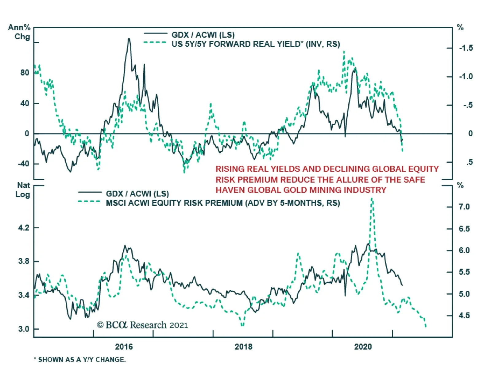
Our US equity strategists recently downgraded the global mining index to underweight. The economic reopening theme is a dominant force in the market. 5-year/5-year forward real yields have been soaring year-to-date, signaling that investors should shy away…

BCA Research’s Foreign Exchange Strategy service concludes that a big driver for the RMB in the coming years will also be widespread diversification away from USD assets. With extremely low volatility, the yuan has appreciated by approximately 10% since…