United States
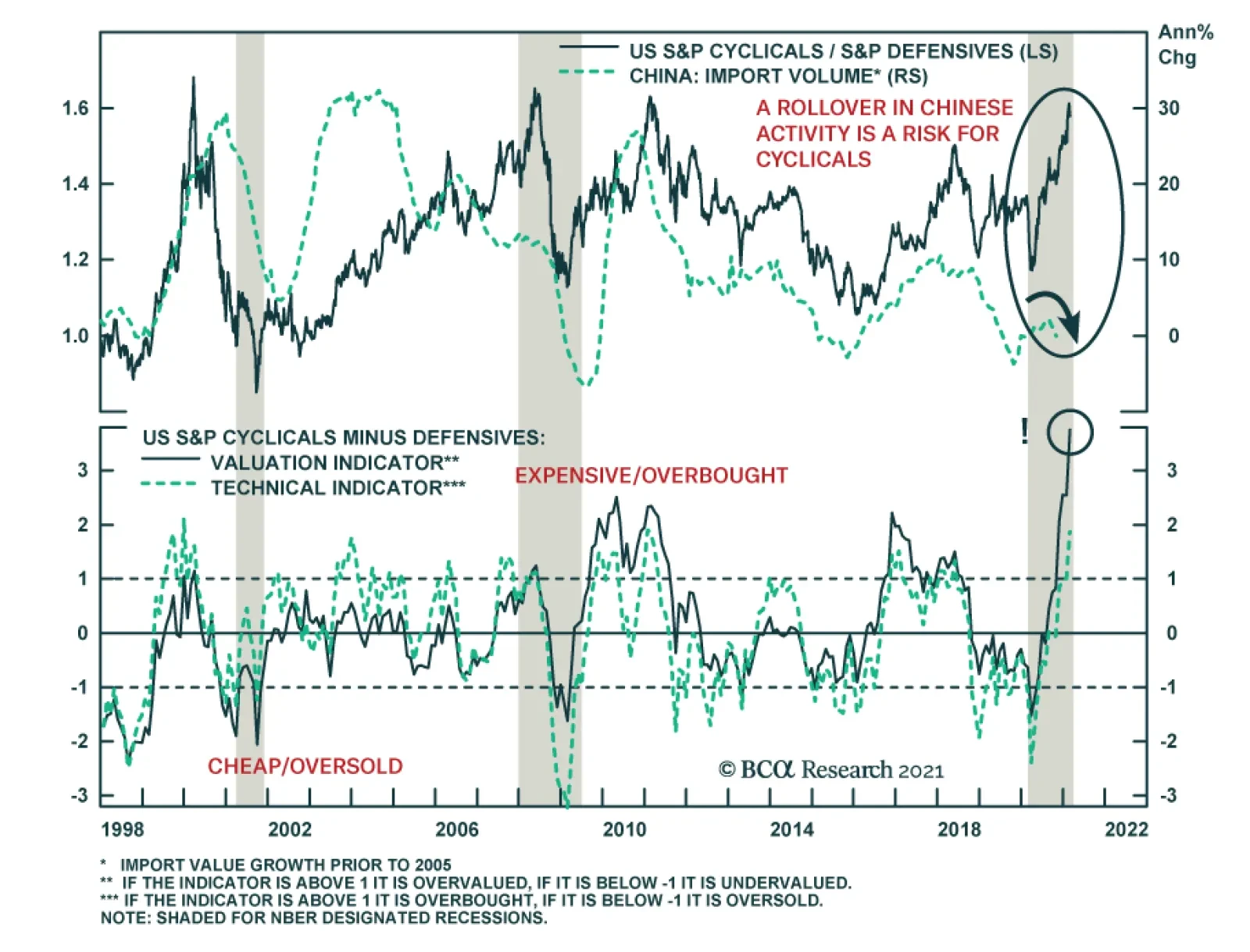
Since the onset of the recession, cyclical stocks have thwarted defensive ones. However, the performance of cyclicals relative to defensives is highly mean reverting, and now, it stands towards the top of its historical distribution, begging the question…
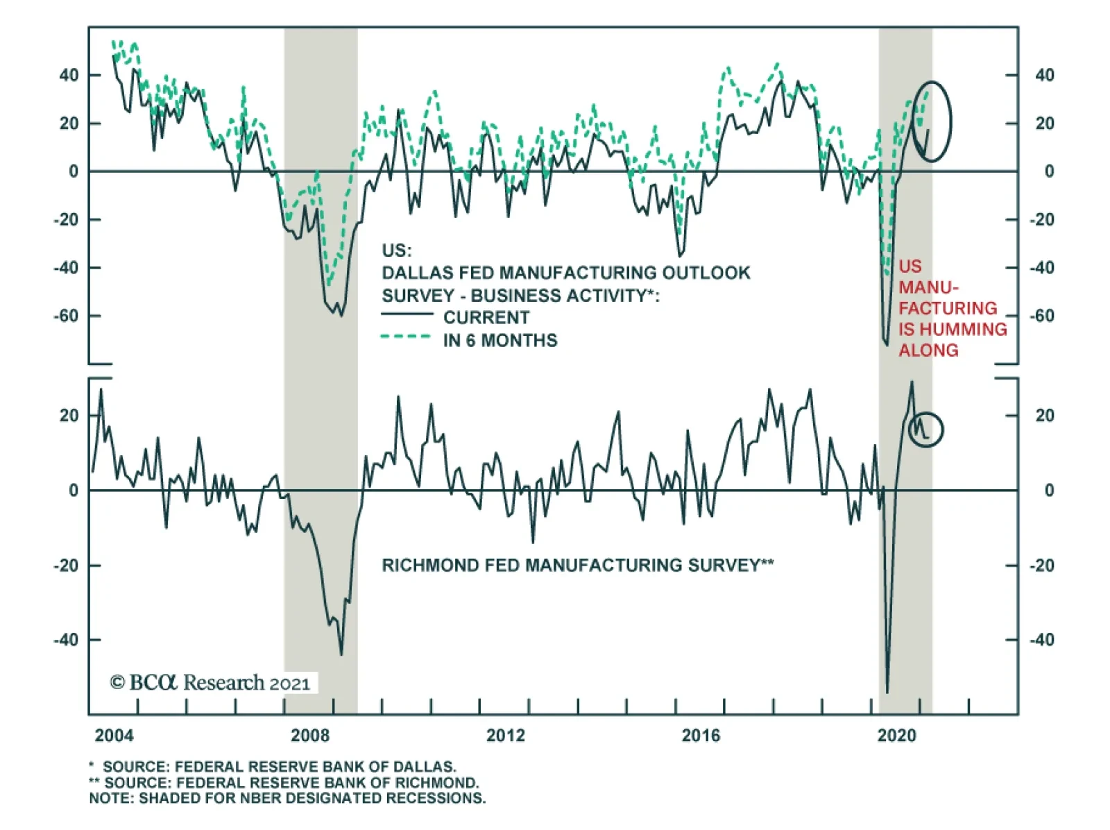
Robust regional Fed manufacturing surveys for February indicate that while US manufacturing is humming along, there is a slight divergence in the recovery across regions. On the one hand, the Dallas Fed’s business activity index surged 10.2 points to 17.2,…

In an Insight late last week, we mentioned our rule of thumb that stocks cannot stomach more than 100-125bps tightening via a selloff in the 10-year US Treasury bond within a year. Applying this rule to the present-day suggests that equities will become turbulent should the 10-year US Treasury yield surpass 1.55% by March, 2.05% by June, and 1.75% by August. Today, we provide more color on this 100-125bps rule by looking at historical SPX drawdowns once yields sprint higher (please see chart on the next page). While the exact timing and the size of the drawdown varies from episode to episode, it is generally consistent with a roughly 10% pullback in the S&P 500 albeit with a 1-2 month lag following the trigger in our rule. We chose to examine data from 2009 onward thus only covering the QE era, which would increase the applicability of our analysis. Speaking of applicability, the 2009-2011 iterations provide the closest parallels as to what will likely take root this cycle as those iterations occurred in a post recessionary environment, which is similar to today. (We have drawn a number of parallels between circa 2010 and today in previous Insights, please see here, here and here). The 2009-2011 period also best aligns with the main reason for having this rule of thumb in the first place: to gauge the risk of interest rates undermining the market by weighing on the forward multiple component of price and/or via an economic slowdown because of tightening in monetary conditions. Before we conclude, a quick note on the taper tantrum and the 2016 iterations. During those periods the S&P 500 actually fell at the same time as yields rose (not after the rule was triggered), so technically we should not have counted that as a valid iteration on our chart. Bottom Line: Were the 10-year US Treasury yield to surpass 1.55% by March, 2.05% by June, and 1.75% by August, then the equity market will likely suffer a pullback especially given the absence of a valuation cushion.
The 100bps-125bps Rule Of Thumb
The 100bps-125bps Rule Of Thumb
BCA Research’s Foreign Exchange Strategy service concludes that a rise in global bond yields is not a reliable precursor to a stronger dollar, because the USD reacts to interest-rate differentials, rather than the level of yields. Instead, the dollar is…
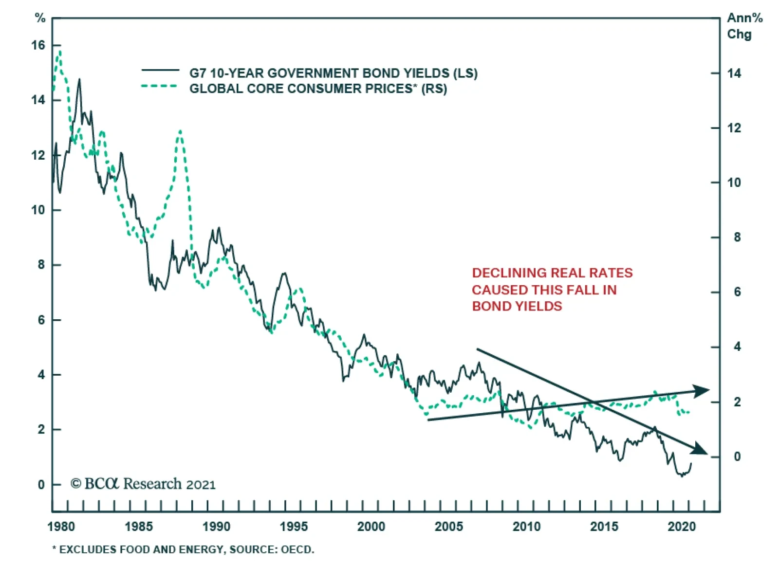
From 1982 to 2002, the largest contributor to the secular decline in global bond yields was the fall in inflation. However, from 2002 to the present, inflation among OECD nations has been stable, yet bond yields have made new lows, indicating that over this…
BCA Research’s Global Investment Strategy service argues that many of the factors that led to high inflation in the 1970s could reassert themselves. The path to higher interest rates is lined with lower interest rates. A period of ultra-easy monetary…
Since the end of September, the performance of small-cap equities has been stunning, with the Russell 2000 surging 53%, generating a more than 20% beat of the S&P 500. The over-representation of cyclical stocks within the small-cap benchmark only partly…
The Fed has telegraphed that they will not be backing down from QE and their ZIRP policy. The FOMC is not even thinking about thinking about tapering asset purchases despite a looming inflation spike in the coming months due to base effects that they vehemently deem transitory. Importantly, Charts 1 & 2 show that both the ISM’s manufacturing prices paid index and a sideways move in retail gasoline prices predict a surge in headline CPI in the April/May time frame as we first showed in a recent Special Report. Tack on a plethora of anecdotes regarding shortages and price hikes in a slew of industries and an inflationary spurt is already here. This week’s retail sales report also caused a jump in the Atlanta Fed’s GDPNow forecast for Q1 near double digit real GDP growth. More blow out output quarters are in the offing courtesy of the inoculation of the population and reopening of the economy and persistent government largesse. Thus, trust in the Fed’s ultra dovishness represents the biggest equity market risk in the coming months and there are high odds that the bond market will really test the Fed’s resolve. Chart 1
Litmus Test Looms
Litmus Test Looms
Chart 2
Litmus Test Looms
Litmus Test Looms
Our sense is that the Fed will initially ignore the spike in inflation at least until the summer, thus refraining from removing the proverbial “punch bowl”. However, if the market detects any signs of a “less dovish” Fed, especially if high inflation prints persist for whatever reason, risk premia will get repriced a lot higher. Finally, staying on the topic of interest rates, we have a long-held rule of thumb that stocks cannot stomach more than 100-125bps tightening via a selloff in the 10-year US Treasury bond on a year-over-year basis. In other words, were the 10-year US Treasury yield to surpass 1.55% by March, 2.05% by June, and 1.75% by August, then the equity market will likely suffer a pullback especially given the absence of a valuation cushion. Bottom Line: A marginally less dovish Fed represents a key risk for the broad equity market as inflation rears its ugly head in the coming months.
Highlights A rise in global bond yields has rarely been a reliable precursor of a stronger dollar. This is because the dollar reacts to interest-rate differentials, rather than the level of global yields. Changes in the dollar correlate with both the level and the rate of change in relative yields. A definitive shift to a bullish dollar stance will require a rise in relative US real rates in the order of 50-to-75 bps. Meanwhile, negative/low interest rates could have caused a swing in the currency/yield correlation, especially at the short end of the curve. In aggregate, the dollar responds to relative rates of return. This includes not only fixed income flows, but equity flows as well. As such, the US equity market also needs to outperform foreign bourses to make the case for a stronger dollar. The dollar is oversold and remains ripe for a countertrend bounce. This noise could be confused for a durable bullish signal. Feature Chart I-1No Rise In Real Yields
No Rise In Real Yields
No Rise In Real Yields
Global bond yields are on the rise, driven by the long end of the curve. This has included US yields, where the 10-year rate has bounced from a low of 36 bps last March to 130 bps today. Rising yields have important ramifications for equity prices (through the discount rate) and exchange rates. A rise in yields can be driven by prospects of either better growth, higher inflation expectations, or a combination of the two. This could bring forward expectations that the central bank will tighten monetary policy faster. In the case of the US and Eurozone, the culprit behind higher yields has been higher inflation expectations (Chart I-1). What does this mean for exchange rates? Are rising yields positive or negative for the dollar? Also, does it matter which component is driving yields higher – growth or inflation expectations? Finally, which currencies have historically benefited the most from an uptick in global yields? Correlation Between Yields And Exchange Rates Chart I-2Bond Yields And Currencies Often Diverge
Bond Yields And Currencies Often Diverge
Bond Yields And Currencies Often Diverge
The historical evidence is that there is little correlation between the dollar and the level or direction of global bond yields. Since the end of the Bretton Woods system in the 1970s, the trade-weighted dollar has appreciated while global bond yields have collapsed (Chart I-2). More important has been the path of relative interest rates. For example, the ebb and flow of EUR/USD has tracked the yield differential between Bund and Treasury yields since the 1970s (bottom panel Chart I-2). Currencies react more to the path of relative real rates than nominal rates. In theory, rising inflation is negative for a currency since its purchasing power is reduced. In a globally competitive system, the currency adjusts lower to equalize prices across borders. However, rising growth expectations allow policy rates to catch up with a higher neutral rate. This improves the relative rate of return for bond investors, allowing for capital inflows. Across the G10, there has been a longstanding relationship between real interest rate differentials and the path of the currency (Chart I-3A and Chart I-3B). Chart I-3ACurrencies Move With Relative Real Rates
Currencies Move With Relative Real Rates
Currencies Move With Relative Real Rates
Chart I-3BCurrencies Move With Relative Real Rates
Currencies Move With Relative Real Rates
Currencies Move With Relative Real Rates
Importantly, US real rates have not risen much against the rest of the world with the latest uptick in global bond yields. In fact, compared to countries such as Australia, the UK, Switzerland, and New Zealand, they have declined. This is negative for the dollar on the margin. While the direction of relative real rates is important, the absolute level of real yield spreads also matters for currency and bond investors. Chart I-4 shows that the dollar tends to respond to the level of real rates in the US, compared to the rest of the world. When US real rate differentials are positive, the dollar tends to appreciate on a year-over-year basis. Looking at a snapshot of global real yields, the US sits below the median (Chart I-5). Commodity-producing countries fare much better. So do Japan and Switzerland. Based on the historical precedent, US real rates will have to improve by about 50-to-100 bps to set the dollar up for structural upside. Chart I-4US Real Rates Are ##br##Still Low
US Real Rates Are Still Low
US Real Rates Are Still Low
Chart I-5US Real Rates Need 50-75 Bps Upside To Make Them Attractive
US Real Rates Need 50-75 Bps Upside To Make Them Attract
US Real Rates Need 50-75 Bps Upside To Make Them Attract
Bonds Versus Equities There are multiple drivers of exchange rates. Bond yields are just one of them. Equity flows also matter. One way to square the circle on whether the level of US real rates makes a difference for the dollar is through flow data. Foreign inflows into US Treasuries remain negative. This suggests that despite the rise in US nominal rates since March of last year, foreign investors are still not convinced they are sufficiently high to compensate for the rising US twin deficits. Rather, inflows into equities have been rather strong. This raises the prospect that the equity market has become an important driver of currency returns and will become the dominant driver going forward (Chart I-6). Importantly, the correlation between bond yields and exchange rates at very low rates is not straightforward. Bond investors span the duration spectrum, and 1-year, 2-year and even 5-year yield differentials are not meaningfully different across countries (Chart I-7). This is particularly the case if hedging costs are taken into consideration. It explains why currencies have not moved much in light of the violent moves at the long end of the yield curve, as shown in Chart I-3A and Chart I-3B. At times, the moves have been opposite to what economic theory would suggest. Chart I-6Foreign Investors Like US Equities, ##br##Not Bonds
Foreign Investors Like US Equities, Not Bonds
Foreign Investors Like US Equities, Not Bonds
Chart I-7A Regime Shift For Interest Rates And Currencies?
A Regime Shift For Interest Rates And Currencies?
A Regime Shift For Interest Rates And Currencies?
Chart I-8The CAD Is Not Driven By Relative Interest Rates, But Terms Of Trade
The CAD Is Not Driven By Relative Interest Rates, But Terms Of Trade
The CAD Is Not Driven By Relative Interest Rates, But Terms Of Trade
If a central bank explicitly targets a bond yield, that makes it difficult for that same yield to send a reliable signal about the economy. That is why at very low rates, markets start to gravitate to other indicators of growth. These include, but are not limited to, differences in PMI surveys or even commodity prices. For example, the performance of the Canadian dollar can be perfectly explained by the rise in Canadian terms of trade, even though real interest rate differentials between Canada and the US have not done much (Chart I-8). Rising oil prices are usually bullish for Canadian national income, on a relative basis. They are also bullish for Canadian equities that are more resource based. Inflows into these sectors tend to be positive for the currency. In the case of Europe, the euro has rolled over on the drop in relative real rates, but the gap in economic data surprises with the US has provided a far better explanation of euro underperformance in recent weeks. With domestic European economies in various lockdowns, economic data is becoming relatively weaker (Chart I-9). This is curbing growth, inflation, and interest rate expectations. Chart I-9Economic Divergences Explain EUR/USD, Rather Than Real Interest Rates
Economic Divergences Explain EUR/USD, Rather Than Real Interest Rates
Economic Divergences Explain EUR/USD, Rather Than Real Interest Rates
This brings up a bigger point. Flows tend to gravitate to capital markets with the highest expected returns, and this is certainly the case when cyclical versus defensive style tilts are concerned. This is important for currency strategy, since sector composition can drive a country’s equity returns. Higher yields tend to be beneficial for cyclical stocks, especially banks. In the case of Europe, the bourses are heavily weighted toward banks, industrials, and consumer discretionary sectors. Not only do these sectors need to do well for the equity market to outperform, they are also strongly tied to the performance of the domestic economy. That is why for the most part, both equity and currency relative performances tend to be in sync (Chart I-10). The bottom line is, to get the USD call right, investors should broaden their scope from relative bond yields to other drivers of currency returns. With most developed market interest rates near zero at the short end, relative bond yields matter less. More importantly, flows will be dictated by investors’ perceptions of where to find higher relative rates of return. This, in turn, will be based on relative growth fundamentals. Our bias is as follows: The US equity market has become very tech-heavy. Rising interest rates tend to hurt higher duration sectors such as tech and health care. At the margin, this hurts the relative performance of US equities. As such, rising rates will negatively impact the US equity market more, and will not derail our bearish dollar view (Chart I-11). Chart I-10The Dollar And Relative Stock Markets
The Dollar And Relative Stock Markets
The Dollar And Relative Stock Markets
Chart I-11Global Defensives And Interest Rates
Global Defensives And Interest Rates
Global Defensives And Interest Rates
The Signal And The Noise Chart I-12The Dollar Could Be Seasonally Strong
The Dollar Could Be Seasonally Strong
The Dollar Could Be Seasonally Strong
There are a few conclusions from the insights made above. First, US real interest rates have not meaningfully improved relative to the rest of the world. Second, a rise in US real rates of 50bps above the rest of the world would be required in order to seriously question our bearish dollar view, from a fixed income angle. Finally, sector performance matters a great deal, which means that the current rise in global bond yields is bearish for US stocks compared to non-US bourses. This places the US dollar at a very critical juncture. On the one hand, the dollar is still very oversold. Every time the dollar bounces from these oversold levels, the bulls rage forward, taking it as vindication that the uptrend has resumed. As we have highlighted, the DXY could hit 94 before working off oversold conditions. February and March tend to be excellent months for a rise in the DXY (Chart I-12). On the other hand, a rise in the dollar could be genuine confirmation that the US is leading the recovery both in terms of rates and equity performance. Weakness in the euro will not be particularly surprising, given the lopsided level of optimism. We remain bullish until the euro hits 1.35. The reality is that no one knows the trajectory of global growth in 2021, let alone how the relative growth profile between countries will play out. The euro area is heavily levered to global growth, hence we remain bullish EUR/USD. However, this view will change if the facts change. Meanwhile, in a higher inflationary environment, the outperformers tend to be the Norwegian krone and commodity currencies. This makes sense since commodity prices (and ultimately producer prices) tend to outperform in a period of rising inflation. It dovetails nicely with our high-conviction view to heavily overweight the Scandinavian currencies (Chart I-13). Chart I-13Rising Inflation Is Bullish For The NOK
Are Rising Bond Yields Bullish For The Dollar?
Are Rising Bond Yields Bullish For The Dollar?
Chester Ntonifor Foreign Exchange Strategist chestern@bcaresearch.com Currencies U.S. Dollar Chart II-1USD Technicals 1
USD Technicals 1
USD Technicals 1
Chart II-2USD Technicals 2
USD Technicals 2
USD Technicals 2
Recent data in the US have been rather robust: Inflation expectations are well anchored. The February 5-10 year survey from the University of Michigan pinned inflation expectations at 2.7% year-on-year. Core PPI came in at 2% year-on-year in January, blowing out expectations of a 1.1% rise. Retail sales galloped above expectations. The control group printed 6% month-on-month in January compared to expectations of a 1% rise. Housing starts declined month-on-month in January, but building permits rose so it’s a wash if rising rates are affecting cyclical spending in the US. The DXY index rose by around 30 bps this week. There is a clear tug-of-war in markets, with the Fed signaling that policy will remain easy as far as the eye can see, but bond markets pushing up longer-term rates. Our bias is that any pickup in inflation will prove transitory, vindicating Fed policy in 2021. Report Links: Are Rising Bond Yields Bullish For The Dollar? - February 19, 2021 Portfolio And Model Review - February 5, 2021 Sizing A Potential Dollar Bounce - January 15, 2021 The Euro Chart II-3EUR Technicals 1
EUR Technicals 1
EUR Technicals 1
Chart II-4EUR Technicals 2
EUR Technicals 2
EUR Technicals 2
Recent data from the euro area remain weak: The trade surplus widened to €27.5 billion in December. 4Q GDP slowed by 5% year-on-year, in line with expectations. The ZEW survey was a very positive surprise. The expectations component for February jumped from 58.3 to 69.6. The euro fell by 0.4% against the US dollar this week. The markets will keep oscillating between how deep the euro area slowdown will be for now, and the magnitude of any potential rebound. We are bullish on euro area growth, especially given tentative signs of a revival in animal spirits (proxied by the expectations component of the surveys). Report Links: Portfolio And Model Review - February 5, 2021 On Japanese Inflation And The Yen - January 29, 2021 The Dollar Conundrum And Protection - November 6, 2020 The Japanese Yen Chart II-5JPY Technicals 1
JPY Technicals 1
JPY Technicals 1
Chart II-6JPY Technicals 2
JPY Technicals 2
JPY Technicals 2
Recent data from Japan has been positive: 4Q GDP surprised to the upside, rising an annualized 12.7% quarter-on-quarter. Exports are booming, rising 6.4% year-on-year in December. The rise in machinery orders by 11.8% in December corroborated the positive contribution from CAPEX to GDP. The Japanese yen fell by 0.9% against the US dollar this week. As Japanese data surprised to the upside, inflation expectations also rose and depressed real rates. The drop in the yen signals the market might be pricing in that the BoJ will not fight strength in economic data with more tapering. We are long the yen as a portfolio hedge, but that view has been shaken by recent weakness. Report Links: On Japanese Inflation And The Yen - January 29, 2021 The Dollar Conundrum And Protection - November 6, 2020 The Near-Term Bull Case For The Dollar - February 28, 2020 British Pound Chart II-7GBP Technicals 1
GBP Technicals 1
GBP Technicals 1
Chart II-8GBP Technicals 2
GBP Technicals 2
GBP Technicals 2
Recent data out of the UK have been in line: 4Q GDP in the UK was slightly better than expected at 1% quarter-on-quarter. Core CPI for January came in at 1.4%, in line with expectations. House prices are soaring, rising 8.5% in December on a year-on-year basis. The pound was the best performing currency this week, rising about 1%. Our short EUR/GBP trade has benefited from faster vaccination in the UK (that could give way to a faster reopening of the economy) and a nice valuation starting point. We are tightening stops this week to protect profits. Report Links: Portfolio And Model Review - February 5, 2021 The Dollar Conundrum And Protection - November 6, 2020 Revisiting Our High-Conviction Trades - September 11, 2020 Australian Dollar Chart II-9AUD Technicals 1
AUD Technicals 1
AUD Technicals 1
Chart II-10AUD Technicals 2
AUD Technicals 2
AUD Technicals 2
The most important data this week from Australia was the employment report: There were 29.1K new jobs in January, in line with expectations. More importantly, there were 59K new full-time jobs, while part-time jobs fell by 29.8K. The unemployment rate declined from 6.6% to 6.4%. The Aussie was flat this week. When it comes to Covid-19, Australia ranks extremely well on a global scale. The number of new cases are low, the government has secured enough vaccines for the entire population and economic activity has rebounded given very close ties to China. We like the AUD, and are long versus the NZD. However, we expect that any positive surprises in the rest of the world will hurt AUD relative to the Americas. As such, we are short AUD/MXN. Report Links: Portfolio And Model Review - February 5, 2021 Australia: Regime Change For Bond Yields & The Currency? - January 20, 2021 An Update On The Australian Dollar - September 18, 2020 New Zealand Dollar Chart II-11NZD Technicals 1
NZD Technicals 1
NZD Technicals 1
Chart II-12NZD Technicals 2
NZD Technicals 2
NZD Technicals 2
There was scant data out of New Zealand this week: Net migration remained at a very low level of 415 individuals in December. The New Zealand dollar fell by 0.3% against the US dollar this week. The kiwi has catapulted itself to the most expensive currency in our PPP models. According to our attractiveness ranking, it is also the worst. We are already long AUD/NZD but are looking for more opportunities to short the kiwi at the crosses. Stay tuned. Report Links: Portfolio And Model Review - February 5, 2021 Currencies And The Value-Versus-Growth Debate - July 10, 2020 Updating Our Balance Of Payments Monitor - November 29, 2019 Canadian Dollar Chart II-13CAD Technicals 1
CAD Technicals 1
CAD Technicals 1
Chart II-14CAD Technicals 2
CAD Technicals 2
CAD Technicals 2
Recent data from Canada was positive: Housing starts rose by 282.4K, well above expectations for a January level of 228.3 K. Foreigners continued to by C$5 billion of securities in December. CPI was in line with expectations. The core median came in at 1.4% but the core trim was 1.8%, a nudge below the BoC range of 1-3%. The Canadian dollar was flat against the US dollar this week. The path of the CAD will be dictated by two factors – 1) relative economic growth between the US and the rest of the world (CAD benefits more from better US growth); and 2) the path of commodity prices, especially oil. Both remain positive for the CAD, as we alluded to last week. Report Links: Will The Canadian Recovery Lead Or Lag The Global Cycle? - February 12, 2021 Currencies And The Value-Versus-Growth Debate - July 10, 2020 More On Competitive Devaluations, The CAD And The SEK - May 1, 2020 Swiss Franc Chart II-15CHF Technicals 1
CHF Technicals 1
CHF Technicals 1
Chart II-16CHF Technicals 2
CHF Technicals 2
CHF Technicals 2
Recent data out of Switzerland have been flat: Core CPI came in at 0% in January, suggesting Switzerland has tentatively exited deflation (the print was -0.4% in December). January exports rebounded, even as watch sales remained quite weak. The Swiss franc fell by 0.7% against the US dollar this week. Safe-haven currencies were laggards, with only the Swiss franc lagging the Japanese yen. This is clearly a signal that the market remains very much in risk-on mode. We are long EUR/CHF on this basis, but short USD/JPY purely as portfolio insurance. Report Links: Portfolio And Model Review - February 5, 2021 The Dollar Conundrum And Protection - November 6, 2020 On The DXY Breakout, Euro, And Swiss Franc - February 21, 2020 Norwegian Krone Chart II-17NOK Technicals 1
NOK Technicals 1
NOK Technicals 1
Chart II-18NOK Technicals 2
NOK Technicals 2
NOK Technicals 2
The data out of Norway has been robust: 4Q mainland GDP came in at 1.9% quarter-on-quarter. Expectations were for a 1.3% rise. The trade balance exploded to NOK 23.1 billion in January. The Norwegian krone was flat against the US dollar this week, but outperformed the euro. The NOK is the perfect example of a currency on a coiled spring – cheap valuations, a liquidity discount, and primed to benefit from the global economic rebound. We are long the NOK against the euro, loonie, and USD. Report Links: Portfolio And Model Review - February 5, 2021 Revisiting Our High-Conviction Trades - September 11, 2020 A New Paradigm For Petrocurrencies - April 10, 2020 Swedish Krona Chart II-19SEK Technicals 1
SEK Technicals 1
SEK Technicals 1
Chart II-20SEK Technicals 2
SEK Technicals 2
SEK Technicals 2
The most important data from Sweden this week was the CPI: The headline measure for January came in at 1.6%, in line with expectations. The core measure at 1.8% was also in line with expectations. The Swedish krona was flat against the US dollar this week. The Swedish COVID-19 experiment is coming home to roost. On the one hand, much higher cases compared to Norway have dampened economic activity as people voluntarily try to avoid infection. Sweden chose to keep its economy largely open. On the other hand, Sweden is a highly levered play on the global cycle. We think the latter will dominate, and so are positive on the krona. Report Links: Revisiting Our High-Conviction Trades - September 11, 2020 Updating Our Balance Of Payments Monitor - November 29, 2019 Where To Next For The US Dollar? - June 7, 2019 Trades & Forecasts Forecast Summary Core Portfolio Tactical Trades Limit Orders Closed Trades
Highlights US inflation is set to increase sharply over the coming months as base effects kick in. Higher fuel prices, fiscal stimulus, and the partial relaxation of lockdown measures should also boost inflation. The Fed is unlikely to react hawkishly to higher inflation, arguing that it is largely transitory in nature. While the Fed’s relaxed attitude towards inflation risks may be justified in the near term, there is a high probability that inflation will get out of hand later this decade. Contrary to conventional wisdom, many of the factors that led to high inflation in the 1970s could reassert themselves. Investors should overweight stocks for now, but be prepared to reduce equity exposure in about two years. US Inflation Has Bottomed US inflation surprised on the downside in January. The core CPI was flat on the month, compared with the consensus estimate for an increase of 0.2%. We expect US inflation to move higher over the coming months. The weakness in January’s inflation print was concentrated in sectors of the economy that have been hard hit by the pandemic. Airline fares dropped 3.2%, hotel rates fell 1.9%, and entertainment admission prices declined 5.5%. Prices in these sectors should rise on a year-over-year basis as base effects kick in (Chart 1). The relaxation of lockdown measures should also help to partially restore demand in these areas. WTI crude prices have risen 70% since the end of October. Rising energy prices should push up headline inflation, with some bleed-through to core prices. Chart 2 shows that there is a strong correlation between gasoline prices and headline inflation. If gasoline prices evolve in line with what is predicted by the futures market, headline inflation could temporarily rise to 4% this spring. Chart 1Base Effects Will Push Inflation Higher
1970s-Style Inflation: Yes, It Could Happen Again
1970s-Style Inflation: Yes, It Could Happen Again
Chart 2Strong Link Between Gasoline Prices And Headline Inflation
Strong Link Between Gasoline Prices And Headline Inflation
Strong Link Between Gasoline Prices And Headline Inflation
In addition, the lagged effects from a weaker dollar should translate into higher goods prices in the US (Chart 3). A stronger labor market and a slower pace of rent forgiveness should also boost housing inflation (Chart 4). Chart 3A Weaker Dollar Will Be A Tailwind For Inflation
A Weaker Dollar Will Be A Tailwind For Inflation
A Weaker Dollar Will Be A Tailwind For Inflation
Chart 4Stronger Labor Market Will Boost Housing Inflation
Stronger Labor Market Will Boost Housing Inflation
Stronger Labor Market Will Boost Housing Inflation
Fiscal stimulus should further supercharge demand, adding to inflationary pressures. Ironically, Republican unwillingness to offer modest, politically palatable cuts to President Biden’s proposed aid bill has opened the door to the Democrats ramming through the entire $1.9 trillion package via the reconciliation process. As we discussed last week, the amount of stimulus in the pipeline easily dwarfs the size of the output gap. From Reflation To Inflation? Deflation is bad for stocks, just as is high and accelerating inflation. Somewhere between deflation and inflation, however, lies reflation. Reflation is good for stocks. Chart 5Inflation Expectations Have Recovered But Are Still Below Levels That Would Cause Concern For The Fed
Inflation Expectations Have Recovered But Are Still Below Levels That Would Cause Concern For The Fed
Inflation Expectations Have Recovered But Are Still Below Levels That Would Cause Concern For The Fed
We are currently in a reflationary Goldilocks zone, where inflation expectations have risen but not by enough to force the Fed’s hand. There is a high probability we will stay in this Goldilocks zone for the remainder of the year. The 5-year/5-year forward TIPS breakeven rate is still below the level that the Fed regards as consistent with its long-term inflation objective, and even farther below the level that would cause the Fed to panic (Chart 5). Jay Powell told The Economic Club of New York last week that the Fed is unlikely to “even think about withdrawing policy support” anytime soon. The Fed minutes released on Wednesday echoed this view. That ‘70s Show? The path to higher interest rates is lined with lower interest rates. A period of ultra-easy monetary policy can sow the seeds for economic overheating, rising inflation, and ultimately, much higher interest rates. Since this is precisely what happened during the 1970s, it is prudent to ask whether something like that could happen again. Investors certainly do not believe a replay of the 70s is in the cards, at least if long-term CPI swaps are any guide (Chart 6). Yet, we think that a 1970s-style inflationary episode is a greater risk than most investors realize. As we discuss below, much of what investors believe about how inflation emerged during that period is either based on myths, or at best, half-truths. Let’s examine each of these misconceptions in turn. Myth #1: High inflation in the 1970s was primarily driven by supply disruptions, with oil shocks being the most prominent. Fact: Oil shocks exacerbated the inflation problem in the 1970s, but it was an overheated economy that permitted inflation to rise in the first place. Inflation took off in 1966, seven years before the first oil shock. By 1969, core CPI inflation was running at close to 6% (Chart 7). Chart 6Investors Do Not Expect Inflation To Vault Higher
1970s-Style Inflation: Yes, It Could Happen Again
1970s-Style Inflation: Yes, It Could Happen Again
Chart 7Inflation Started Accelerating Quickly Only When Unemployment Reached Very Low Levels In The 1960s
1970s-Style Inflation: Yes, It Could Happen Again
1970s-Style Inflation: Yes, It Could Happen Again
Similar to today, fiscal policy was exceptionally accommodative in the mid-1960s. The escalation of the Vietnam War produced a surge in military expenditures. Social spending rose dramatically with the introduction of Lyndon Johnson’s “Great Society” programs. Medicare and Medicaid took effect in July 1966. Amy Finkelstein has estimated that Medicare, the larger of the two health care programs, led to a 37% increase in real hospital expenditures between 1965 and 1970. Johnson’s “guns and butter” policies caused government spending to surge in the second half of the decade. The budget deficit, which was broadly balanced during the first half of the 60s, swelled to 4% of GDP (Chart 8). As fiscal policy was loosened, the economy began to overheat. The unemployment rate fell to 3.8% in 1966, two percentage points below what economists later concluded had been its full-employment level. Chart 8US "Guns And Butter" Policies In The 1960s Caused Government Spending To Swell
US "Guns And Butter" Policies In The 1960s Caused Government Spending To Swell
US "Guns And Butter" Policies In The 1960s Caused Government Spending To Swell
Myth #2: The Phillips curve is much flatter today. Chart 9The Increase In Inflation In 1966 Was Broad-Based
The Increase In Inflation In 1966 Was Broad-Based
The Increase In Inflation In 1966 Was Broad-Based
Fact: The Phillips curve was also flat during the 1960s. Core inflation was remarkably stable during the first half of the 60s, averaging about 1.5%, even as the unemployment rate steadily declined. Then, starting in 1966, core inflation more than doubled within the span of ten months. As Chart 9 illustrates, the sudden spike in inflation in 1966 was fairly broad-based. A “kink” in the Phillips curve had been reached. That the relationship between inflation and unemployment turned out to be non-linear is not surprising. As long as there is some slack in the labor market, employers are likely to resist raising wages. Thus, a decline in unemployment from a high level to a merely moderate level is unlikely to lead to meaningful wage inflation. It takes a truly overheated labor market – one that forces firms to engage in a tit-for-tat battle to entice workers – for the relationship between unemployment and inflation to reassert itself. In the near term, there is little risk that the US economy will reach a kink in the Phillips curve. Jason Furman estimates that the unemployment rate stood at 8.3% in January if one adjusts for the drop in labor force participation and methodological problems with how the BLS defines temporarily furloughed workers. This is well above the level that could trigger a price-wage spiral. Chart 10Is The Phillips Curve Really Dead?
Is The Phillips Curve Really Dead?
Is The Phillips Curve Really Dead?
Yet, it would be naïve to think that such a spiral could not materialize in a few years. As Chart 10 shows, over the past 40 years, every time the US labor market was on the cusp of overheating, something would invariably come along to push up unemployment. Last year, it was the pandemic. In 2008, it was the Global Financial Crisis. In 2000, it was the dotcom bust. In the early 1990s, it was the collapse in commercial real estate prices following the Savings and Loan Crisis. Admittedly, only the pandemic qualifies as a truly exogenous shock. The preceding three recessions were fomented by growing economic imbalances, which were ultimately laid bare by a Fed hiking cycle. One can debate the degree to which the US economy is suffering from non-pandemic related imbalances today, but one thing is certain: The Fed is not keen on raising rates anytime soon. Thus, whatever imbalances exist today may not be exposed before the economy has had the chance to overheat. Myth #3: Inflation expectations are better anchored these days. Chart 11Long-Term Bond Yields Lagged Inflation During The 1960s
Long-Term Bond Yields Lagged Inflation During The 1960s
Long-Term Bond Yields Lagged Inflation During The 1960s
Fact: Inflation expectations certainly became unmoored in the 1970s. However, there is not much evidence that expectations were adrift prior to the sudden increase in inflation in 1966. At the time, the US had not experienced a major episode of inflation since the Civil War. While long-term bond yields did rise in the second half of the 60s, they generally lagged inflation, suggesting that investors were caught off-guard (Chart 11). It should also be noted that the US and other major economies operated under the Bretton Woods system of fixed exchange rates during the 1960s. Each US dollar was convertible into gold at the official rate of $35 per ounce. The existence of this quasi-gold standard helped anchor inflation expectations. The system began to fall apart in the late 1960s as inflation rose. When President Nixon suspended the dollar’s convertibility into gold in August 1971, the US CPI had already increased by nearly 30% from its 1965 level. While the collapse of the Bretton Woods system in the early 1970s undoubtedly caused inflation expectations to become further unhinged, the breakdown of the system would not have occurred if inflation had not risen in the first place. Myth #4: Widespread wage indexation and powerful trade unions fueled an acceleration in the 1960s. Fact: Just as was the case with the unmooring of inflation expectations, wage indexation was more a response to rising inflation than a cause of it. Chart 12 shows that the share of workers covered by cost of living adjustments only jumped after inflation had accelerated. Chart 12Higher Inflation Led To More Inflation-Indexed Wage Contracts, Not The Other Way Around
Higher Inflation Led To More Inflation-Indexed Wage Contracts, Not The Other Way Around
Higher Inflation Led To More Inflation-Indexed Wage Contracts, Not The Other Way Around
As far as unions are concerned, the US unionization rate peaked by the end of the 1950s and was already on a downward path when inflation began to rise. Revealingly, Canada experienced a similar decline in inflation as the US in the early 1980s even though unionization rates remained elevated (Chart 13). This suggests that union power was not a dominant driver of inflation. Chart 13Inflation Fell In Canada, Despite A High Unionization Rate
Inflation Fell In Canada, Despite A High Unionization Rate
Inflation Fell In Canada, Despite A High Unionization Rate
Myth #5: Today’s globalized economy will limit inflationary pressures. Fact: The empirical evidence generally suggests that the impact of globalization on US inflation has been smaller than widely supposed.1 This is not surprising. The US is a fairly closed economy. Imports account for only 15% of GDP. As a result, a fairly large change in relative prices is necessary to prompt Americans to shift a meaningful fraction of their expenditures towards foreign-made goods. Such a shift in spending would require a real appreciation of the US dollar. A real appreciation could occur either if US inflation exceeds inflation abroad or if the nominal value of the dollar strengthens against other currencies. (Admittedly, the standard terminology can be a bit confusing; just think of a real US dollar appreciation as anything that makes the US economy less competitive). Here’s the thing though: The US dollar is unlikely to strengthen unless the Federal Reserve starts to sound more hawkish. If the Fed remains in the dovish camp, real rates could fall as inflation edges higher. This will put downward pressure on the dollar, leading to a smaller trade deficit and even more aggregate demand. Myth #6: Demographics are much more deflationary now than they were in the past. Fact: Demographic trends arguably did help push down inflation over the past few decades. However, population aging is likely to boost inflation going forward. Chart 14 shows that the ratio of workers-to-consumers in the US and around the world – the so-called “support ratio” – rose steadily in the 1980s, 1990s, and 2000s as more women entered the labor force and the number of dependent children per household declined. An increase in the ratio of workers-to-consumers is equivalent to an increase in the ratio of production-to-consumption. A rising support ratio is thus deflationary. More recently, however, the support ratio has begun to decline as baby boomers retire but continue to spend. Consumption actually increases in old age once health care spending is included in the tally (Chart 15). As production falls in relation to consumption, inflation could rise. Chart 14Support Ratios Are Declining Globally After Rising Steadily For Three Decades
Support Ratios Are Declining Globally After Rising Steadily For Three Decades
Support Ratios Are Declining Globally After Rising Steadily For Three Decades
Chart 15Consumption Increases In Old Age Once Health Care Spending Is Factored In
1970s-Style Inflation: Yes, It Could Happen Again
1970s-Style Inflation: Yes, It Could Happen Again
Myth #7: Today’s fast pace of technological innovation will keep inflation down. Chart 16Total Factor Productivity Growth Is Lower Than It Was During The Great Inflation
Total Factor Productivity Growth Is Lower Than It Was During The Great Inflation
Total Factor Productivity Growth Is Lower Than It Was During The Great Inflation
Fact: Total factor productivity growth – a broad measure of innovation – is not just low by historic standards today; it is lower than during the period of the Great Inflation spanning from 1966 to 1982 (Chart 16). Some have argued that productivity growth is mismeasured. We have examined this argument in the past and found it wanting. In any case, economic theory does not necessarily say that technological innovation should be deflationary. Economic theory states that faster innovation should lead to higher real incomes. It does not say whether the increase in real income should come via rising nominal income or falling inflation. Indeed, to the extent that faster innovation leads to higher potential GDP growth, it could fuel inflation. This is because stronger trend growth will tend to raise the neutral rate of interest, implying that monetary policy will become more stimulative for any given policy rate. Myth #8: Policymakers have learned from their mistakes. It is easy to dismiss this claim, but it is worth considering it seriously. Some of the mistakes that policymakers made during the 60s and 70s were far from obvious at the time. Athanasios Orphanides, who formerly served as a member of the ECB’s Governing Council, has documented that central banks in the US and other major economies systematically overestimated the amount of slack in their economies (Chart 17). They also overestimated trend growth, with the result that they came to see the combination of sluggish growth and seemingly high unemployment as evidence of inadequate demand. Chart 17Central Banks Overestimated The Degree Of Slack In Their Economies During The Great Inflation
1970s-Style Inflation: Yes, It Could Happen Again
1970s-Style Inflation: Yes, It Could Happen Again
Is it possible that economic analysis has improved so much over the past 40 years that such mistakes would not be repeated today? Perhaps, but it is worth noting that not only did most economists fail to predict the productivity boom in the late 1990s, most were not even aware that it had happened until after it had ended. Knowing what is happening to the economy in real time is hard enough. Predicting what will happen to such things as trend growth and the natural rate of unemployment is even more difficult. Myth #9: The Fed is a lot more independent now. Fact: We will only know for sure when this independence is tested. History clearly shows that inflation tends to be higher in countries which lack independent central banks (Chart 18). The Fed’s independence was compromised in the 1970s. In his exhaustive study of the Nixon tapes, Burton Abrams documented how Richard Nixon sought, and Fed Chairman Arthur Burns obligingly delivered, an expansionary monetary policy in the lead-up to the 1972 election. Chart 18Inflation Is Higher In Countries Lacking Independent Central Banks
1970s-Style Inflation: Yes, It Could Happen Again
1970s-Style Inflation: Yes, It Could Happen Again
Starting with the appointment of Paul Volcker, the Fed sought to regain its independence. Most recently, Jay Powell publicly resisted Donald Trump’s efforts to prod the Fed to ease monetary policy. Yet, the Fed’s independence may turn out to be illusory. The Fed wasted little time in slashing rates and relaunching its QE program once the pandemic began. But will it be as quick to tighten monetary policy if inflation starts getting out of hand? Jay Powell’s four-year term as chair runs through February 2022. He will need to stay in Joe Biden’s good graces if he hopes to be reappointed to a second term. The fact that government debt levels are so high further complicates matters. Higher interest rates would force the government to shift funds from social programs towards bond holders. Will the Fed raise rates even if it faces strong political opposition? Time will tell. Investment Conclusions Chart 19Social Unrest Can Fuel Inflation
1970s-Style Inflation: Yes, It Could Happen Again
1970s-Style Inflation: Yes, It Could Happen Again
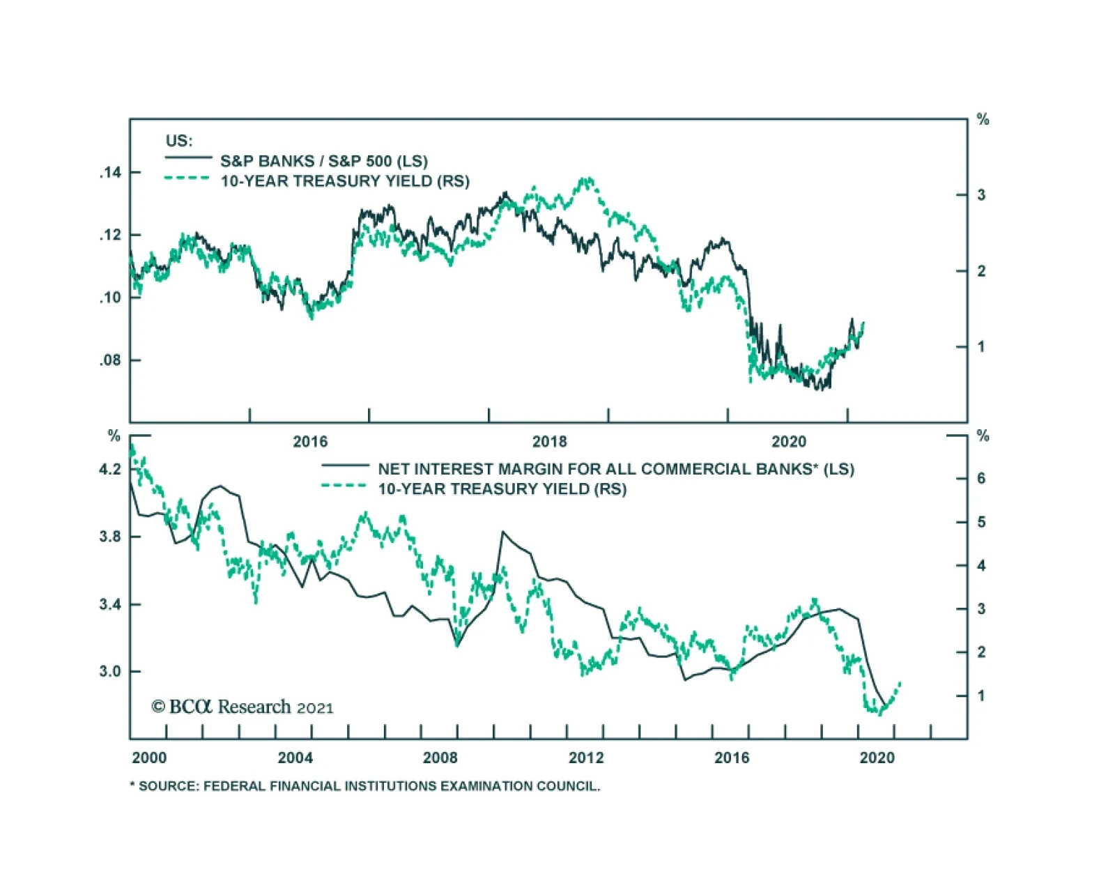
While no two periods are exactly the same, there are a number of striking similarities between the late 1960s and the present day. As is the case today, fiscal policy was highly expansionary back then. The same goes for monetary policy: Just like today, the Fed kept interest rates well below the growth rate of the economy. In the 1960s, the Federal Reserve was still focused on avoiding a repeat of the Great Depression and the deflationary wave that accompanied it. Today, the Fed is equally focused on reflating the economy. The 1960s was a decade of rising political and social unrest. Crime rates went through the roof, a trend that was eerily matched by rising inflation rates (Chart 19). Early estimates suggest that the US homicide rate jumped by 37% in 2020 – easily the largest one-year increase on record. As was the case in the 1960s, most of the news media has ignored this disturbing development. What should investors do? Our tactical MacroQuant model is flagging some near-term risks for stocks. Nevertheless, as long as the economy is growing solidly and the Fed remains on the sidelines, it is too early for investors with a 12-month horizon to bail on equities. Instead, equity investors should favor sectors that could benefit from higher inflation. Commodity producers are a natural choice. Banks could also gain from an uptick in inflation. Chart 20 shows the remarkably strong correlation between the performance of US banks relative to the S&P 500 and the 10-year Treasury yield. Higher bond yields would boost bank net interest margins, leading to higher profits. Banks are also very cheap and have started to see their earnings estimates rise faster not only relative to the broader market but even relative to tech stocks (Chart 21). Chart 20Bank Shares Are A Buy (I)
Bank Shares Are A Buy (I)
Bank Shares Are A Buy (I)
Fixed-income investors should keep duration risk low. They should also favor inflation-protected securities over nominal bonds. Chart 21Bank Shares Are A Buy (II)
1970s-Style Inflation: Yes, It Could Happen Again
1970s-Style Inflation: Yes, It Could Happen Again
Looking further out, the secular bull market in stocks will end when inflation rises to a high enough level that even the Fed cannot ignore. That day will arrive, but probably not for another two years. Peter Berezin Chief Global Strategist pberezin@bcaresearch.com Footnotes 1 Globalization is often cited as a potential reason behind low inflation in advanced economies, including the US. However, a number of empirical studies have found that globalization did not play a major role. In general, domestic economic conditions are seen as the main factor in the inflation process. Please see Jane Ihrig, Steven B. Kamin, Deborah Lindner, and Jaime Marquez, “Some Simple Tests of the Globalization and Inflation Hypothesis,” Board of Governors of the Federal Reserve System (International Finance Discussion Papers No. 891) (April 2007); Laurence M. Ball, “Has Globalization Changed Inflation?” National Bureau of Economic Research Working Paper Series 12687 (November 2006), and associated blog post “Has Globalization Changed Inflation?” National Bureau of Economic Research, (June 2007); Janet. L. Yellen, 'Panel discussion of William R. White “Globalisation and the Determinants of Domestic Inflation”,' Presentation to the Banque de France International Symposium on Globalisation, Inflation and Monetary Policy (March 2008); Fabio Milani, “Global Slack And Domestic Inflation Rates: A Structural Investigation For G-7 Countries,” Journal of Macroeconomics, (32:4) (2010); and and Lei Lv, Zhixin Liu, and Yingying Xu, “Technological progress, globalization and low-inflation: Evidence from the United States,” PLoS ONE, (14:4), (April 2019). Global Investment Strategy View Matrix
1970s-Style Inflation: Yes, It Could Happen Again
1970s-Style Inflation: Yes, It Could Happen Again
Special Trade Recommendations
1970s-Style Inflation: Yes, It Could Happen Again
1970s-Style Inflation: Yes, It Could Happen Again
Current MacroQuant Model Scores
1970s-Style Inflation: Yes, It Could Happen Again
1970s-Style Inflation: Yes, It Could Happen Again