United States
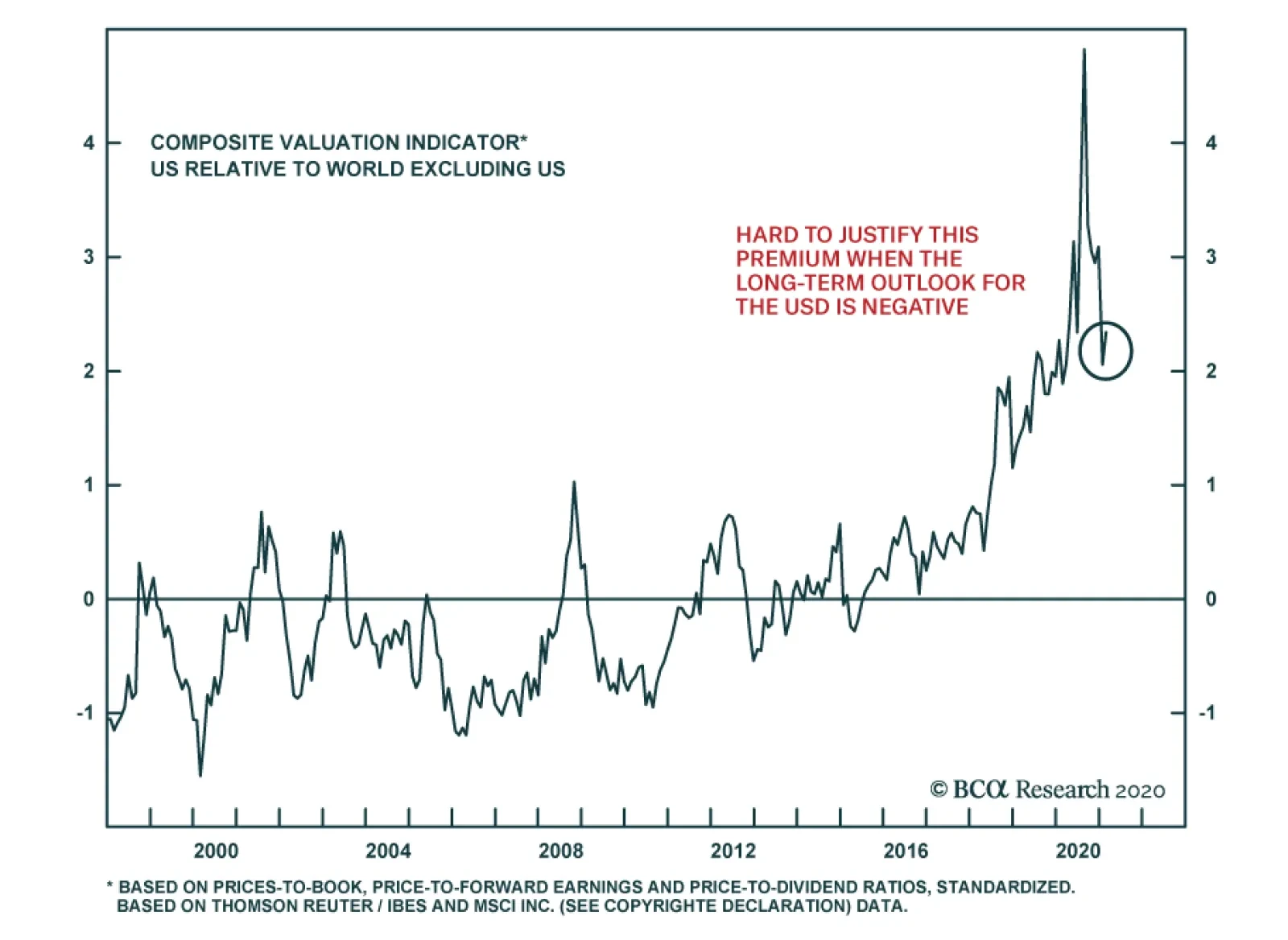
Over the coming year, the outlook for US equities relative to the rest of the world will remain dominated by relative growth dynamics and their bearing on earnings. However, long-term investors must also account for valuation differentials. US stocks…
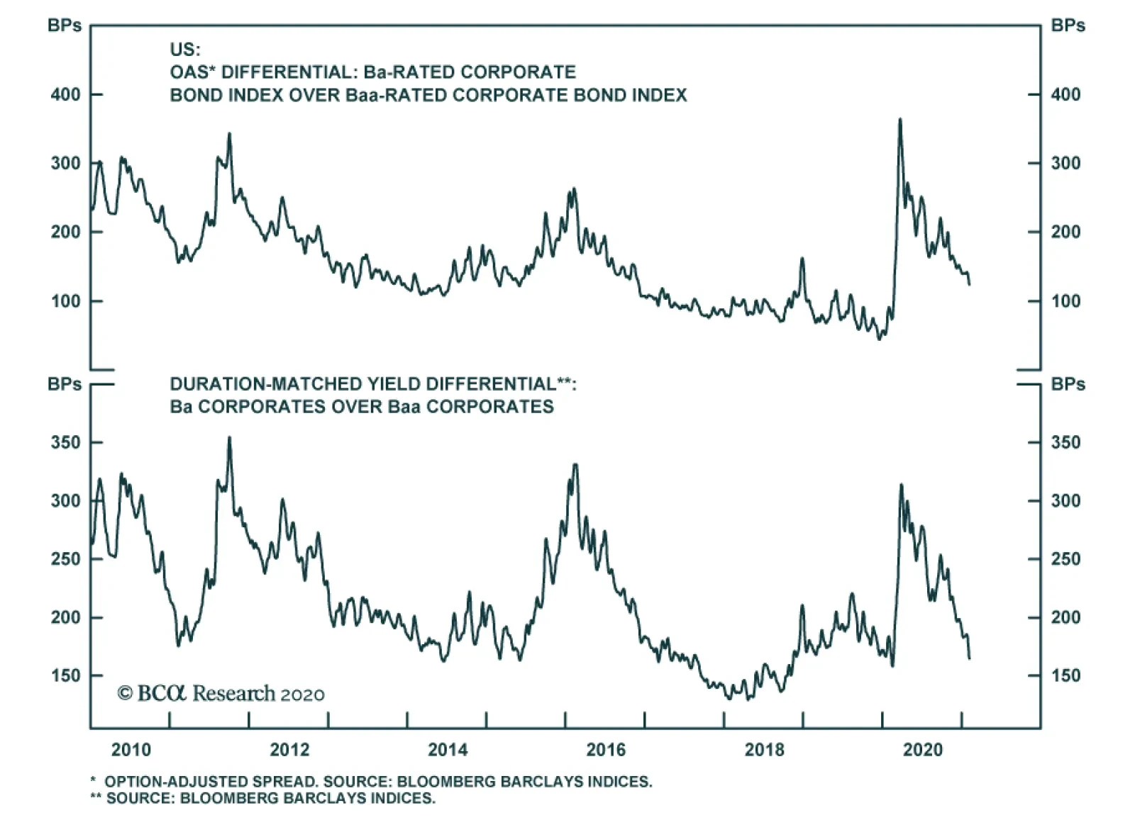
According to BCA Research’s US Bond Strategy service, the Ba credit tier still offers the most attractive risk-adjusted returns within corporate bonds. The difference between the average option-adjusted spread (OAS) of the Ba index and the average OAS of…

Overweight
The Software Juggernaut Is Intact
The Software Juggernaut Is Intact
We remain on the sidelines with regard to the broad S&P technology sector, but we continue to recommend a barbell portfolio approach preferring defensive software and services stocks to aggressive hardware and equipment equities. In that light, we reiterate our overweight stance in the key S&P software sub-industry that still commands the highest market cap weight in the tech sector, just shy of 33%. While the overall capex data is sluggish, software capital outlays have recovered smartly and according to national accounts are growing at a 10%/annum pace. Stock market-reported capex confirms that software capital expenditures are on an absolute tear and remain a key pillar of our secular preference for this defensive tech group (see chart). True, there is an element of stealing revenues from the future, but as long-time readers of our publication know we do not believe that SaaS is a fad and the adoption of cloud services remains in the early innings, which will continue to underpin the S&P software index. Bottom Line: Continue to overweight the S&P software index. The ticker symbols for the stocks in this index are: BLBG: S5SOFT – MSFT, ADBE, CRM, ORCL, INTU, NOW, ADSK, ANSS, SNPS, CDNS, FTNT, PAYC, CTXS, NLOK, TYL. For more details, please refer to this Monday’s Strategy Report.
Highlights Duration: Long-maturity Treasury yields are closing in on our intermediate-term targets. On balance, cyclical and valuation indicators continue to support an outlook for higher yields, but a few are sending warning signs that the bearish bond move is due for a correction. We maintain our recommended below-benchmark 6-12 month duration stance for now, but are keeping a close eye on the indicators shown in this report. Ba Versus Baa Corporates: From a risk-adjusted perspective, the Ba credit tier still looks like the sweet spot for positioning within corporate bonds. Fallen Angels have performed exceptionally, but no longer look cheap compared to the Baa and Ba corporate indexes. Labor Market: If the current pace of monthly employment growth is maintained, it will be a very long time before the economy reaches full employment. Vaccine effectiveness and distribution rate are the two most important factors that will determine employment growth going forward. We are optimistic that we will see a 4.5% unemployment rate sometime in 2022. Feature Chart 1Uptrend Intact
Uptrend Intact
Uptrend Intact
Bond yields moved higher last week, maintaining their post-August uptrend despite a brief lull in the second half of January (Chart 1). The 30-year yield even touched 1.97%, its highest level since last February. Given the sharp up-move, the first section of this week’s report considers whether bond yields look stretched. More broadly, we discuss several factors that will help us decide when to increase portfolio duration. How Much Higher Can Yields Rise? We have maintained a recommended below-benchmark duration stance since October and have been targeting a range of 2% to 2.25% for the 5-year/5-year forward Treasury yield.1 That target range is based on median estimates of the long-run equilibrium fed funds rate from the New York Fed’s surveys of market participants and primary dealers (Chart 2). The rationale is that in an environment of global economic recovery where the Fed is expected to eventually lift the funds rate back to equilibrium, long-dated forward yields should reflect expectations of that long-run equilibrium. At present, the 5-year/5-year forward Treasury yield is 1.97% meaning that there is between 3 bps and 28 bps of upside before our target is met. Chart 2Almost At Target
Almost At Target
Almost At Target
A 5-year/5-year forward Treasury yield between 2% and 2.25% would not automatically trigger an increase in our recommended portfolio duration, but it would mean that further increases in yields would need to be justified by upward revisions to survey estimates of the long-run equilibrium fed funds rate. In a similar vein, the 5-year/5-year forward TIPS breakeven inflation rate has risen considerably in recent months, but at 2.15%, it remains below the 2.3% to 2.5% range that the Fed would consider “well anchored” (Chart 2, bottom panel). In other words, there is still some running room for reflationary economic outcomes to be priced into bond yields. Cyclical Growth Indicators Treasury yields may be encroaching on the lower bounds of our target ranges, but cyclical economic indicators suggest further increases ahead. The CRB Raw Industrials / Gold ratio remains in a solid uptrend, and encouragingly, it is being driven by a surging CRB index and not just a falling gold price (Chart 3). Separately, the outperformance of cyclical equity sectors over defensives has moderated in recent weeks, but not yet by enough to warrant reversing our duration call (Chart 3, bottom panel). Chart 3Cyclical Bond Indicators
Cyclical Bond Indicators
Cyclical Bond Indicators
Value Indicators Chart 4Bond Valuation Indicators
Bond Valuation Indicators
Bond Valuation Indicators
While cyclical indicators point to further bond weakness ahead, a couple valuation measures show yields starting to look stretched. Two survey-derived estimates of the 10-year zero-coupon term premium have moved up sharply. The estimate derived from the New York Fed’s Survey of Market Participants has jumped into positive territory and the estimate derived from the Survey of Primary Dealers is close behind (Chart 4). These surveys ask respondents to estimate what they think the fed funds rate will average over the next ten years. By comparing the median survey response to the current spot 10-year Treasury yield we get a measure of how much term premium the median investor expects to earn. These term premium estimates have typically been negative during the past few years, though they did rise to about +50 bps before Treasury yields peaked in 2018. In other words, a positive term premium estimate, on its own, is no reason to extend duration. All it tells us is that if the median investor is correct about the future path of the fed funds rate, then there is more money to be made at the long-end of the curve than in cash. This doesn’t rule out investors revising their funds rate expectations higher, or the term premium becoming even more stretched. Another related bond valuation indicator is the difference between the market’s expected path for the fed funds rate and the path projected by the FOMC (Chart 4, bottom panel). Here we see that, for the first time since 2014, the market is priced for a faster pace of tightening over the next two years than the median FOMC participant anticipates. Again, this is not a decisive signal to buy bonds. The FOMC could revise its funds rate projections higher when it meets next month. However, the longer that market pricing remains more hawkish than the Fed, the stronger the case to increase duration becomes. The Dollar Chart 5Dollar Still Supports Higher Yields
Dollar Still Supports Higher Yields
Dollar Still Supports Higher Yields
Finally, we should note that the trade-weighted dollar appreciated last week as bond yields rose (Chart 5). A stronger dollar certainly supports the case for extending duration, the only question is whether the dollar has strengthened enough to dent US economic growth and pull US yields back down. Our sense is that we haven’t reached that breaking point yet, but we could if US real yields continue to rise relative to real yields in the rest of the world (Chart 5, panels 2 & 3). We think of the relationship between US bond yields and the dollar as a feedback loop. A weaker dollar supports economic reflation, which eventually sends yields higher. However, once higher US yields de-couple too far from yields in the rest of the world, the dollar appreciates. A stronger dollar impairs the economic outlook and sends US yields back down, the dollar then depreciates and the cycle repeats. At present, we appear to be in the stage of the feedback loop where US yields are rising relative to the rest of the world, putting upward pressure on the dollar. However, we don’t think the dollar is yet strong enough to prevent US yields from climbing. Dollar bullish sentiment, for example, remains below 50% suggesting that most investors remain dollar bears. A sub-50 reading on this index also tends to coincide with rising US Treasury yields (Chart 5, bottom panel). A move above 50 in the dollar sentiment index would be another signal that the bond bear market is becoming stretched. Bottom Line: Long-maturity Treasury yields are closing-in on our intermediate-term targets. On balance, cyclical and valuation indicators continue to support an outlook for higher yields, but a few are sending warning signs that the bearish bond move is due for a correction. We maintain our recommended below-benchmark 6-12 month duration stance for now, but are keeping a close eye on the indicators shown in this report. Comparing Baa- And Ba-Rated Corporate Bonds Chart 6The Ba Index OAS Is Unusually High
The Ba Index OAS Is Unusually High
The Ba Index OAS Is Unusually High
We have previously written that the macro environment is extremely positive for credit risk and we recommend moving down in quality within corporate bonds. We have also pointed out that the incremental spread pick-up earned from moving out of Baa-rated bonds and into Ba-rated bonds is elevated compared to typical historical levels. As such, the Ba-rated credit tier looks like the sweet spot for corporate bond allocation from a risk/reward perspective.2 In this week’s report we delve a little deeper into the relative valuation between Baa- and Ba-rated bonds. First, we note the difference between the average option-adjusted spread (OAS) of the Ba index and the average OAS of the Baa index. The Ba index OAS is 126 bps above the Baa index OAS, a level that looks high compared to recent years (Chart 6). One problem with this simple comparison of index OAS is that the average duration of the Ba index is much lower than the average duration of the Baa index (Chart 6, bottom panel). However, after doing our best to match the duration between the two indexes, we still find that Ba offers an attractive yield advantage, particularly compared to levels seen in 2017 and 2018 (Chart 6, panel 2). Going back to our simple OAS differential, we conducted a small study looking at calendar year excess returns between 1989 and 2020. Our results show that the differential between the Default-Adjusted Ba OAS and the Baa OAS does a good job predicting relative excess returns between the two sectors (Table 1).3 The Default-Adjusted Ba OAS is the Ba index OAS at the beginning of the calendar year minus realized Ba default losses that occurred during the year in question. We also use the Baa index OAS from the beginning of the year, but don’t make any adjustments for Baa default losses. Table 1Annual Excess Return Differential & Relative Spreads: Ba Corporates Over Baa Corporates
Ba-Rated Bonds Look Best
Ba-Rated Bonds Look Best
Our results show that Ba excess returns outpaced Baa excess returns in every calendar year for which the Adjusted Ba/Baa OAS differential exceeds 100 bps. The raw Ba/Baa OAS differential is currently 126 bps. This means that we should be very confident that Ba-rated bonds will outperform Baa-rated bonds in 2021, as long as Ba default losses come in below 0.26%. This seems likely. For context, Ba default losses came in at 0.09% in 2020, despite the 12-month default rate spiking to almost 9%. Fallen Angels Another interesting issue to consider when looking at the intersection between the Baa and Ba credit tiers is the presence of fallen angels – bonds that were initially rated investment grade but have been downgraded to junk. The 2020 default cycle coincided with a huge spike in ratings downgrades and the number of outstanding fallen angels jumped dramatically (Chart 7). Not only that, but fallen angels also performed exceptionally well in 2020. Fallen angels outperformed duration-matched Treasuries by 800 bps in 2020 compared to 431 bps for the Ba-rated index, -10 bps for the Baa-rated index and -13 bps for the B-rated index (Chart 7, bottom panel). All that outperformance has compressed fallen angel valuations a lot. The incremental spread pick-up in fallen angels over duration-matched Baa-rated bonds is 201 bps, about one standard deviation below its post-2010 average (Chart 8). Fallen angels look even worse compared to the Ba index, offering only a 30 bps spread advantage (Chart 8, panel 2). Chart 7Fallen Angels Dominated In 2020
Fallen Angels Dominated In 2020
Fallen Angels Dominated In 2020
Chart 8Fallen Angels No Longer Look Cheap
Fallen Angels No Longer Look Cheap
Fallen Angels No Longer Look Cheap
Bottom Line: From a risk-adjusted perspective, the Ba credit tier still looks like the sweet spot for positioning within corporate bonds. Fallen Angels have performed exceptionally, but no longer look cheap compared to the Baa and Ba corporate indexes. Labor Market Update Chart 9Employment Growth Has Slowed
Employment Growth Has Slowed
Employment Growth Has Slowed
Last week’s January employment report was a disappointment with nonfarm payrolls growing only 49k after having contracted by 227k in December (Chart 9). Two weeks ago, we calculated the average monthly nonfarm payroll growth that will be required for the unemployment rate to reach 4.5% by certain future dates.4 In our view, an unemployment rate of 4.5% would meet the Fed’s definition of maximum employment, making it an important pre-condition for monetary tightening. Revising our calculations to incorporate January’s report, a 4.5% unemployment rate by the end of 2021 still looks like a long shot. Nonfarm payroll growth would have to average between +328k and +705k per month to meet that target, depending on the path of the participation rate (Table 2). That said, we still view a 4.5% unemployment rate by the end of 2022 as achievable. Table 2Average Monthly Nonfarm Payroll Growth Required For The Unemployment Rate To Reach 4.5% ##br##By The Given Date
Ba-Rated Bonds Look Best
Ba-Rated Bonds Look Best
Yes, even that will require average monthly payroll growth of between +210k and +411k, but we are likely to see a re-opening of certain shuttered sectors – Leisure & Hospitality, for example – during that timeframe. When it occurs, this re-opening will lead to a surge in employment growth that will push average monthly payroll growth dramatically higher. Notice that almost 40% of the 9.9 million drop in overall employment since February 2020 has come from the Leisure & Hospitality sector (Chart 10). Chart 10Waiting For The Post-COVID Snapback
Waiting For The Post-COVID Snapback
Waiting For The Post-COVID Snapback
Bottom Line: If the current pace of monthly employment growth is maintained, it will be a very long time before the economy reaches full employment. Vaccine effectiveness and distribution rate are the two most important factors that will determine employment growth going forward. We are optimistic that we will see a 4.5% unemployment rate sometime in 2022. Ryan Swift US Bond Strategist rswift@bcaresearch.com Footnotes 1 Please see US Bond Strategy / Global Fixed Income Strategy Special Report, “Beware The Bond-Bearish Blue Sweep”, dated October 20, 2020, available at usbs.bcaresearch.com 2 Please see US Bond Strategy Special Report, “2021 Key Views: US Fixed Income”, dated December 15, 2020, available at usbs.bcaresearch.com 3 Excess returns are calculated relative to duration-matched Treasury securities in all cases. 4 Please see US Bond Strategy Weekly Report, “Searching For Value In Spread Product”, dated January 26, 2021, available at usbs.bcaresearch.com Fixed Income Sector Performance Recommended Portfolio Specification
According to BCA Research’s US Equity Strategy service, is getting ready to downgrade the cyclical/defensives split to neutral. Not only are the Chinese authorities trying to engineer a slowdown with the recent reverse repo operations, but also BCA’s China…
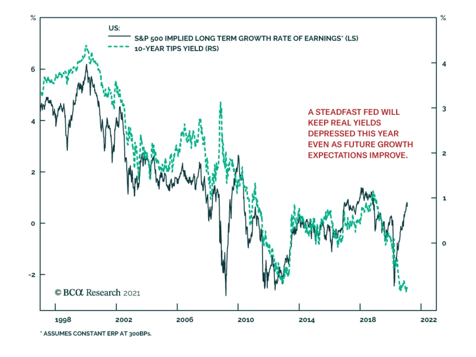
The long-term outlook for earnings growth and the 10-year TIPS yield typically move in tandem because they are both driven by expectations of future growth. However, this long-standing relationship has recently broken down. The 10-year TIPS yield has remained…
Dear client, Next week instead of our regular Strategy Report we will be sending you a Special Report from BCA’s Equity Analyzer service on Inflation and Factor investing penned by my colleague Lucas Laskey, Senior Quantitative Analyst. Finally, on February 22 we will be hosting our quarterly webcast one at 10am EST for North American and EMEA clients and one at 8pm EST for Asia Pacific, Australian and New Zealand clients “From Alpha To Omega With Anastasios”. Mathieu Savary, who heads our Daily Insights service, will be our special guest in the morning webcast. On March 1 we will resume our regular publication schedule. Kind Regards, Anastasios Highlights Portfolio Strategy China’s engineered economic deceleration, the knee jerk US dollar bounce along with signs of soft US capital expenditures entice us to protect our deep cyclicals versus defensives portfolio gains and institute a 2.5% rolling stop to this share price ratio. Rising relative capital outlays, firming software pricing power and an M&A frenzy more than offset the negative relative profit signal from our models that sell side analysts already anticipate. Continue to overweight the S&P software index. Recent Changes Last Tuesday we closed out our VIX futures hedge for a gain of 19% since the December 7, 2020 inception. Last Wednesday we re-initiated our long “Back-To-Work”/short “COVID-19 Winners” pair trade. Feature Equity volatility settled down last week following a ferocious ten-day SPX oscillation that sent the VIX soaring to roughly 38 near the peak at the end of January, courtesy of the GME/Wallstreetbets (WSB) saga before collapsing back down near 21 last week. Chart 1 shows that this was likely an equity-only event: both risk off currencies – the yen and the franc – actually fell versus the USD, junk bond spreads barely budged and the vol curve violently inverted, a move that more often than not signals that complacency has morphed into panic. Importantly, when the Fed embarks on active QE the SPX drawdown maxes out at 10% based on empirical evidence, including the recent September/October 10% drawdown. Using the ES futures low hit two Sundays ago, the S&P 500 experienced a 5.3% peak-to-trough pullback well within the range of previous Fed active QE iterations. As a reminder, the 2010 and 2011, 17% and 20% respective drawdowns took root after the Fed had concluded QE1 and QE2 operations. The implication is that for a more significant drawdown to materialize, likely the Fed has to end the current QE operation and reinject some volatility in the bond markets (bottom panel, Chart 1). Isolating the true signal from all this noise, convinced us to book handsome gains to the tune of 19% in our VIX June futures hedge (conservatively assuming that no leverage was used), reinitiate the long “Back-To-Work”/short “COVID-19 Winners” pair trade and put the small cap size bias on our upgrade watch list. As volatility has slowly died down, investors can start to refocus on profit fundamentals. Similar to the steep fall in EPS that the SPX 35% drawdown predicted in March of 2020, in recent research we showed that were we to hold the SPX at current levels, its 12-month rate-of-change would surpass the 61% mark next month and forecast that profit growth would rise by a similar amount. Indeed, sell side analysts’ bottom up earnings estimates corroborate this analysis as quarterly EPS will peter out roughly at a 48% year-over-year (YOY) growth rate next quarter and vault to all-time highs in quarterly level terms in Q3 following a three-year hiatus (Chart 2). Chart 1Equity-only Event
Equity-only Event
Equity-only Event
Chart 2Joined At The Hip
Joined At The Hip
Joined At The Hip
Importantly, the tech sector no longer commands an earnings weight similar to its market cap weight likely because it’s run ahead of itself and also because the rest of the sectors are playing catch up this year as the US economy is slated to reopen on the back of the herculean inoculation efforts (profit weight and mkt cap weight columns, Table 1). Table 1Sector EPS And Market Cap Weights
Re-grossing?
Re-grossing?
This is most evident on the sector contribution to this year's SPX earnings growth. Historically, the tech sector commanded the lion’s share of profit explanation for the SPX, but not in 2021. In fact, the S&P IT sector is ranked 4th in terms of contribution to overall SPX profits, behind industrials, financials and consumer discretionary (Chart 3). Delving deeper into 12-month forward earnings growth figures is instructive. Table 2 shows our universe of coverage ranked first by GICS1 sector growth rates and then re-ranked per sub-group. As an aside the energy sector’s EPS is slated to contract in calendar 2020 and thus any YOY growth rate figures are rendered useless for the broad sector and the energy sub-industries. Chart 3Sector Contribution To 2021 SPX EPS Growth
Re-grossing?
Re-grossing?
Table 2Identifying S&P 500 Sector EPS Growth Leaders And Laggards
Re-grossing?
Re-grossing?
Our portfolio positioning is well aligned with the sector ranking of EPS growth for the coming year. Put differently, given the havoc that COVID-19 wreaked to the US industrial and service bases it is normal that deep cyclical sectors along with financials and the decimated services-heavy parts of the consumer discretionary sector to occupy the top ranks. In contrast, defensives sectors that were largely COVID-19 beneficiaries (especially health care and consumer staples) are near the bottom of the pit. The sole misalignment is the bombed out real estate sector that we remain overweight (Table 2). Netting it all out, our sense is that the market has successfully navigated a tumultuous two-week period and we reiterate our long-held sanguine 9-12 month cyclical view on the prospects of the S&P 500. This week, we update a defensive tech sub-group and put a tight stop in the cyclicals/defensives portfolio bent in order to protect profits. Risks To The Cyclicals Over Defensives Portfolio Bent Last December we highlighted that China’s four year cycle will peter out in the back half of 2021 and could cause some equity market consternation, with stocks likely sniffing out any trouble likely by the end of Q1/2021. It appears that investors have been sleeping at the wheel and largely distracted by the GME/WSB saga. Not only did they neglect the robust SPX profit season, but they also ignored that something is amiss in China as we first showed last week (please refer to Chart 12 here). Importantly, what worries us most is the transition from China being the primary locomotive of global growth to the US taking the reins in coming quarters. Clearly such a handoff is tumultuous, especially given the recent added risk of a reflex rebound in the greenback that we first warned about on January 12 when we set the cyclicals/defensives ratio on downgrade alert. Subsequently, we upgraded the S&P utilities sector to neutral locking in gains of 15% for the portfolio, and today we decide to institute a 2.5% rolling stop in the cyclicals/defensives portfolio bent, in order to participate on further upside but also protect 16% gains for the portfolio since the July 27, 2020 inception in case of a market relapse. Practically, when the rolling stop gets triggered we will move the cyclicals/defensives bent down to neutral via executing the downgrade alert we have in the S&P materials sector. In more detail, China’s slamming on the brakes is the key risk to cyclicals/defensives. Not only are the Chinese authorities trying to engineer a slowdown with the recent reverse repo operations, but also BCA’s China Monetary Indicator, the selloff in the Chinese sovereign bond market and the cresting in the PBOC’s balance sheet are all corroborating the economic deceleration signal (Chart 4). Chinese total social financing has peaked, the 6-month credit impulse is plunging, and the nosedive in Goldman Sachs’ Chinese current activity indicator (CAI) are all firing warning shots that the economy is slated to slowdown (Chart 5). Chart 4Everywhere…
Everywhere…
Everywhere…
Chart 5…One Looks…
…One Looks…
…One Looks…
Already both the Chinese manufacturing and services PMIs have hooked down with the manufacturing new orders-to-inventories (NOI) in free fall and export orders in outright contraction. Tack on the reversal in the Citi economic surprise index (ESI) for China and the outlook dims further for US cyclicals/defensives (Chart 6). No wonder Chinese demand for loans has turned the corner, infrastructure spending has topped out and railway freight volumes have ticked down as a direct response to the tightening in Chinese monetary conditions (Chart 7). Chart 6…China…
…China…
…China…
Chart 7…Is Slowing…
…Is Slowing…
…Is Slowing…
Chinese imports flirting with the zero line best capture all this softening in Chinese data and also warns that the US cyclicals/defensives ratio is nearing a zenith (Chart 8). Beyond the dual risk of a counter trend rally in the USD and China’s undeniable deceleration, returning to US shores reveals another source of potential trouble for cyclicals/defensives. Chart 8…Down
…Down
…Down
The US Citi ESI has come back down to earth, and the ISM manufacturing PMI cooled off last month with the NOI ratio flashing red (Chart 9). Importantly, Goldman Sachs’ US CAI is sinking like a stone corroborating that, at the margin, US economic data is softening (Chart 10). Moreover, US capex is in the doldrums courtesy of the collapse in EPS last year that dealt a blow to CEO confidence. Worrisomely, the rollover in the latest capex intentions from regional Fed surveys along with the downbeat NFIB survey’s capital outlays in 6-months component underscore that CEOs remain reluctant to invest (Chart 9). Chart 9Even US Trouble…
Even US Trouble…
Even US Trouble…
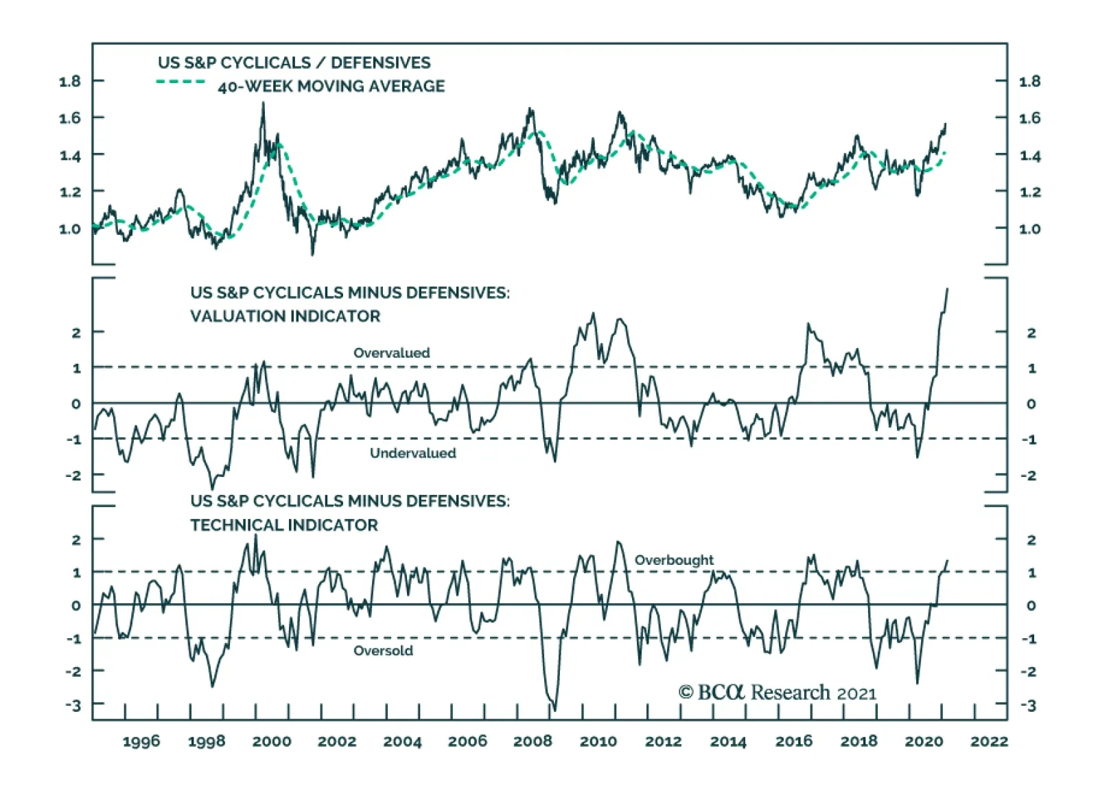
Finally, relative valuations have surged to all-time highs leaving no cushion in case of a mishap, while relative technicals are in extreme overbought territory near a level that has marked the commencement of prior relative share price drawdowns (Chart 11). Chart 10…Is Brewing
…Is Brewing
…Is Brewing
Netting it all out, China’s engineered economic deceleration, the knee jerk US dollar bounce along with signs of soft US capital expenditures entice us to protect our deep cyclicals versus defensives portfolio gains and institute a 2.5% rolling stop to this share price ratio. Bottom Line: Prepare to move the cyclicals/defensives portfolio bent back down to neutral from currently overweight. Today we recommend investors establish a 2.5% rolling stop to the cyclicals/defensives relative share price ratio as a risk management tool in order to protect profits. Chart 11Overstretched And Pricey
Overstretched And Pricey
Overstretched And Pricey
Software On The Ascend While we remain on the sidelines with regard to the broad S&P technology sector we continue to recommend a barbell portfolio approach preferring defensive software and services stocks to aggressive hardware and equipment equities. In that light, we reiterate our overweight stance in the key S&P software sub-industry that still commands the highest market cap weight in the tech sector just shy of 33%. While overall capex is sluggish as we highlighted above, software capital outlays have recovered smartly and according to national accounts are growing at a 10%/annum pace. Stock market-reported capex confirms that software capital expenditures are on an absolute tear and remain a key pillar of our secular preference for this defensive tech group (Chart 12). On the sales front, COVID-19 accelerated the push to the cloud and 2020 has been a bumper year for industry sales. True there is an element of stealing revenues from the future, but as long-time readers of our publication know we do not believe that SaaS is a fad and the adoption of cloud services remains in the early innings. Impressively, while relative forward top line growth expectations have rolled over, the attempt of the software price deflator to exit deflation suggests that software stocks will easily surpass this lowered revenue bar in coming quarters (Chart 13). Chart 12Primary Capex Beneficiary
Primary Capex Beneficiary
Primary Capex Beneficiary
Amidst the IPO frenzy that has captured investors’ imagination especially given the spectacular increases in both SNOW and PLTR (neither of which is in the SPX yet), software M&A fever remains as high as ever. This constant reduction of software stock supply, coupled with the insatiable appetite of software executives to aggressively retire equity, signals that software equity prices will remain well bid (Chart 14). Chart 13Software Tries To Exit Deflation
Software Tries To Exit Deflation
Software Tries To Exit Deflation
Chart 14Positive Share Price Dynamics
Positive Share Price Dynamics
Positive Share Price Dynamics
Nevertheless, our relative EPS growth models are waving a yellow flag. The SPX is slated to grow profits north of 25% this year, but according to our profit models software will only manage to grow in the single digits, thus trailing the broad market by a wide margin. Encouragingly, this grim relative profit growth backdrop is already reflected in depressed sell side analysts’ forecasts (Chart 15). Finally, while relative valuations are still lofty they recently have corrected back to one standard deviation above the historical mean. Similarly, relative technicals have worked off overbought conditions and have settled down near the recent historical average (Chart 16). Chart 15Risks…
Risks…
Risks…
In sum, rising relative capital outlays, firming software pricing power and an M&A frenzy more than offset the negative relative profit signal from our models that sell side analysts already anticipate. Bottom Line: Continue to overweight the S&P software index. The ticker symbols for the stocks in this index are: BLBG: S5SOFT – MSFT, ADBE, CRM, ORCL, INTU, NOW, ADSK, ANSS, SNPS, CDNS, FTNT, PAYC, CTXS, NLOK, TYL. Chart 16…To Monitor
…To Monitor
…To Monitor
Anastasios Avgeriou US Equity Strategist anastasios@bcaresearch.com Current Recommendations Current Trades Strategic (10-Year) Trade Recommendations
Overdose?
Overdose?
Size And Style Views January 12, 2021 Stay neutral small over large caps July 27, 2020 Overweight cyclicals over defensives (2.5% rolling stop) June 11, 2018 Long the BCA Millennial basket The ticker symbols are: (AAPL, AMZN, UBER, HD, LEN, MSFT, NFLX, SPOT, ABNB, V). January 22, 2018 Favor value over growth
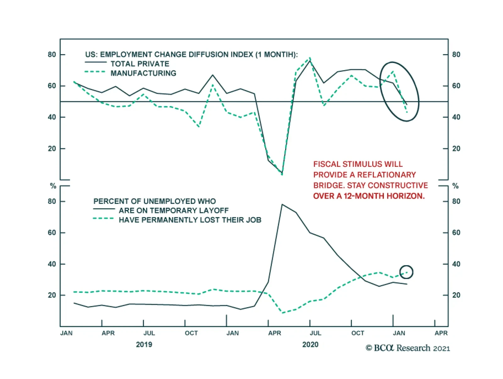
The January US employment report was a disappointment. Nonfarm payrolls increased by 49 thousand, less than half the expected 105 thousand, moreover, the past two months were revised down by 159 thousand. In addition, the bulk of the increase is concentrated…
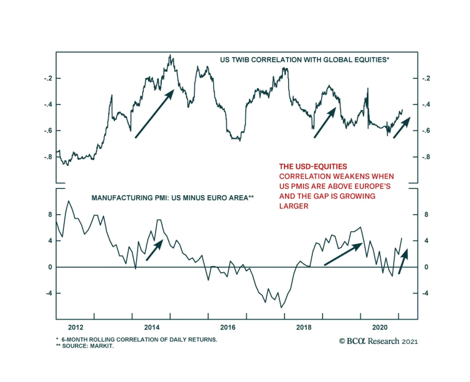
The US dollar is often characterized as a counter-cyclical currency, strengthening amid business cycle downturns, and weakening during upturns. This is clear in the dollar’s negative correlation with equity prices. However, the relationship has recently…
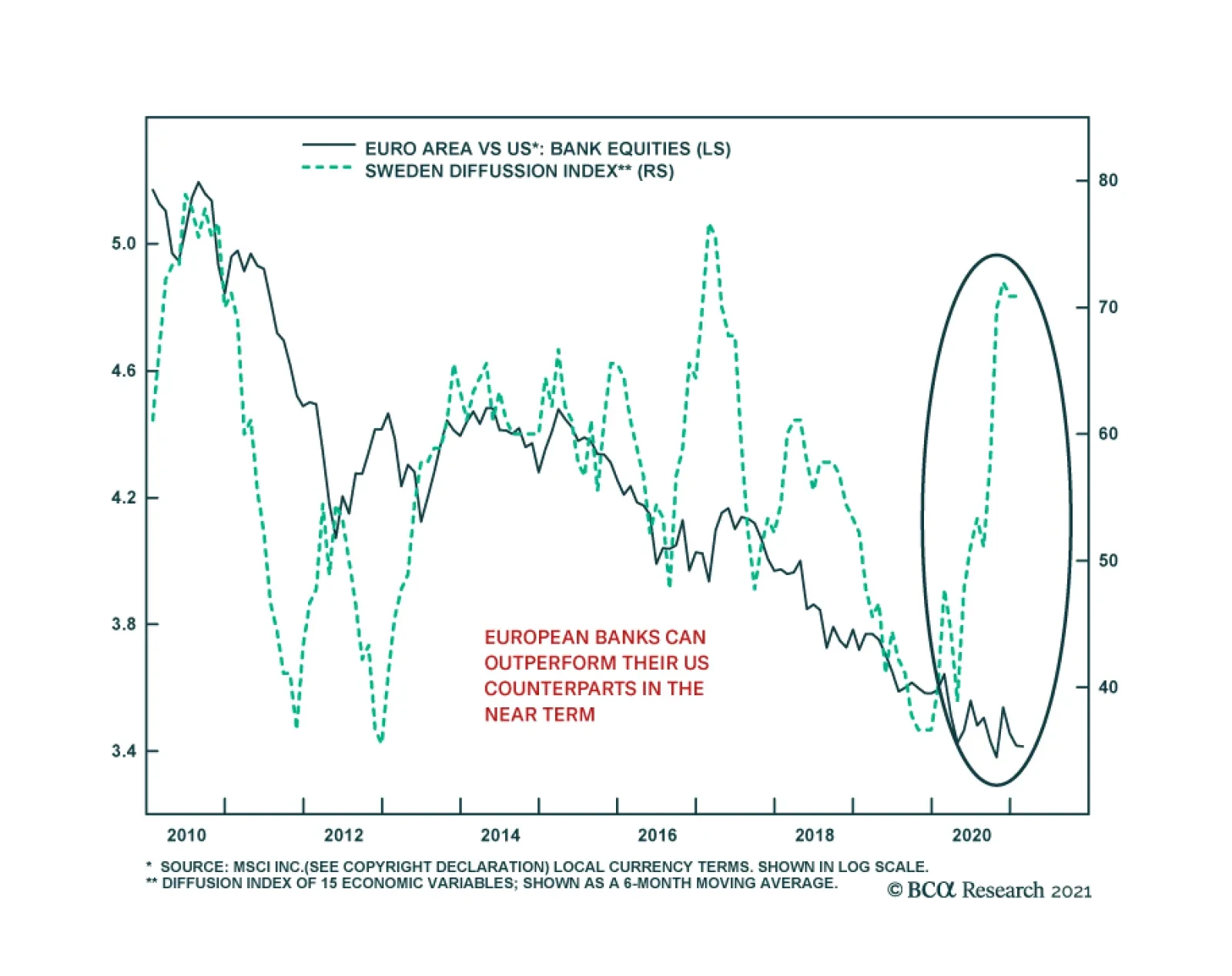
European banks face structural hurdles against their US counterparts. The return on equity of European banks stands well below that of the US, and the lower neutral rate of interest in Europe suggests that European banks will continue to face narrower net…