United States
BCA Research’s Emerging Markets Strategy service concludes that the enormous size of US stimulus and overflow of liquidity is creating a thrill akin to riding a tiger. Remarkably, this kind of jubilation is very similar to what EM experienced in 2009-10. That…
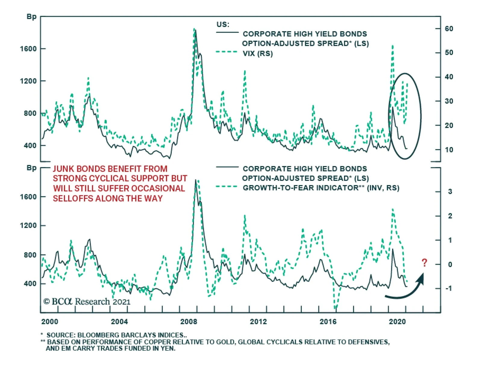
Cyclically, it still makes sense to overweight high-yield bonds within US fixed-income portfolios because the recovery will limit bankruptcies and help recovery rates while the Fed’s presence backstops this market. Nonetheless, credit spreads are still…

Upgrading Utilities
Upgrading Utilities
Neutral We have been on the right side of the underweight utilities position for the better part of the past two years, but now that the easy money has been made, we are compelled to book handsome gains of 14.8% for the portfolio since inception and move to the sidelines. Extreme euphoria has taken over in the overall equity space and while the vaccine rollout news is a big positive, we doubt the ISM manufacturing survey reading can rise significantly from the current historically stretched level (ISM survey shown inverted, top panel). Similarly, junk yields are at all-time lows confirming that investor complacency is sky-high, and the USD very oversold with positioning stretched to the short dollars side. Any hiccups would cause all three of these macro indicators to reverse course abruptly, which would boost relative utilities share prices (middle & bottom panels). Bottom Line: We booked gains of 14.8% since inception in the S&P utilities sector and upgraded it from underweight to neutral. The ticker symbols for the stocks in this index are: BLBG: S5UTIL – NEE, D, DUK, SO, AEP, EXC, XEL, ES, SRE, WEC, AWK, PEG, ED, DTE, AEE, EIX, ETR, PPL, CMS, FE, AES, LNT, ATO, EVRG, CNP, NI, NRG, PNW. For more details, please refer to this Monday’s Strategy Report.
Highlights Increased fiscal assistance in the US and other advanced economies will support economic activity until the practice of social distancing durably ends later this year. The US is not yet vaccinating at a pace that is consistent with herd immunity, but that pace is likely to quicken over the coming weeks. A September herd immunity milestone should allow for a significant increase in public “contacts” over the summer and for a substantial closure of the output gap in the second half of the year. The spending of accumulated household savings in the US would rapidly push the output gap into positive territory if those savings were fully deployed upon reopening. But expectations of eventual tax increases and some permanent reduction in services spending suggests that some of those savings will not be spent, and that major economic overheating this year is not likely. The market has largely priced in the most likely economic outcome over the coming year, suggesting that investors should not expect outsized returns in 2021. But our base case view still favors equities relative to bonds, and implies mid-to-high single-digit returns from stocks in absolute terms. An aggressively hawkish deviation in monetary policy later this year is unlikely, barring a sharp and sustained rise in inflation back to target levels. Still, a closure of the output gap this year will push long-dated bond yields higher, suggesting that fixed-income investors should be short duration. Investors should favor global over US and value over growth stocks over the coming year. The US dollar will continue to trend lower, albeit at a slower pace. Feature Chart I-1The Near-Term Outlook For Economic Growth Is Poor
The Near-Term Outlook For Economic Growth Is Poor
The Near-Term Outlook For Economic Growth Is Poor
The outlook for growth in the US and other developed economies remains poor over the very near term. The combination of another major wave of the COVID-19 pandemic, at least partially driven by more transmissable variants of the virus, as well as the lagged effects of diminished US fiscal support in the second half of last year have led to a slowdown in economic activity that is likely to linger for the coming several weeks (Chart I-1). Outside of the US, the pressure on the medical system has led to the re-imposition of heavy control measures that mechanically weigh on consumer spending. Within the US, some restrictions have been re-imposed, but spending has also slowed due to the exhaustion of the stimulative benefits of last year’s CARES act for a sizeable portion of recipients. There are early signs suggesting that the second wave is cresting in advanced economies: hospitalizations appear to have peaked in the US and a few major European economies, and the number of new cases is either trending lower or has plateaued (Chart I-2). However, even if this is the beginning of the end of the latest wave, the gains in the war against COVID-19 have clearly been won through changes in policy and human behavior, not through inoculation. Chart I-2Infections Are Slowing Because Of Policy And Behavior (Not Vaccinations)
Infections Are Slowing Because Of Policy And Behavior (Not Vaccinations)
Infections Are Slowing Because Of Policy And Behavior (Not Vaccinations)
For example, in the US, some market commentators have highlighted the fact that hotbed midwestern states such as North and South Dakota have administered more doses of the vaccine and that the Midwest is experiencing the largest decline in new cases in the country, inferring a causal relationship. This ignores the fact that new confirmed cases peaked in the Midwest almost a month before the Pfizer/BioNTech vaccine was approved by the CDC. This suggests that a decline in cases there, which led the overall US trend, much more likely occurred in response to an exponential rise in hospitalizations in October and early November. We cannot identify a specific policy change in Midwestern states that catalyzed a peak in cases, but we hypothesize that residents of these states took it upon themselves to reduce their contacts as the threat of medical system collapse and health care rationing increased sharply. A cresting second wave is certainly positive from a health perspective, and should reduce the pressure on the medical system. But the fact that additional restrictions and/or growth-negative consumer behavior were required yet again to “flatten the curve” underscores that many of these measures will likely remain in place for the coming few weeks to durably end the wave, and thus will weigh on Q1 growth. They will also likely remain the only viable response to combat future outbreaks until vaccination reaches levels that are sufficient to reduce the impact of the pandemic on economic activity. More Fiscal Support On The Way In Europe and Canada, the fiscal response to the second wave has generally been to extend wage subsidy and income support programs. In the US, after having let unemployment benefit payments lapse in the second half of 2020, the US congress passed a US$900 billion aid bill in late December that provides US$300 per week in supplemental unemployment benefit payments and US$600 in direct checks to most Americans. Chart I-3 highlights that these payments have already begun to reach US households. In addition, following the Democratic Senate wins in Georgia earlier this month, President Biden announced a $1.9 trillion emergency relief package that topped up individual direct payments to US$2,000, assistance to small businesses, aid to state & local governments, and funding for pandemic-related expenses such as testing and the rollout of vaccines. While the size and contents of Biden’s proposal may get scaled down, our geopolitical strategists expect most of the plan to gain approval in Congress early this year. That implies that the federal deficit is on track to fall somewhere between the “Democratic Status Quo” and “Democratic High” scenarios shown in Chart I-4, meaning that the deficit will peak at between 22% and 25% of GDP in fiscal year 2021. Chart I-3Unemployment Benefit Payments Are Rising Again
Unemployment Benefit Payments Are Rising Again
Unemployment Benefit Payments Are Rising Again
Chart I-4A Very Significant Amount Of Stimulus Is Still To Come
February 2021
February 2021
This is a very significant amount of stimulus, and will provide a substantial reflationary bridge to help counter the negative impact on Q1 growth from the pandemic. But in the aggregate, some portion of the fiscal stimulus is unlikely to be spent by households until there is no longer a need for social distancing and the economy fully reopens. How long it takes to arrive at that moment depends enormously on the US’ progress at vaccinating its population. Vaccines, Herd Immunity, And Reopening For now, the news on the vaccine front is mixed. Israel, which has vaccinated over 40% of its population with at least one dose (Chart I-5), has demonstrated that it is technically possible to deploy the vaccine at an extremely rapid pace. But it is not clear that Israel’s experience is applicable to other countries, given aggressive efforts by the Israeli government to obtain early access to vaccine doses (which cannot, by definition, be achieved by everyone). While Chart I-5 shows that the US currently ranks highly among other countries at administering vaccines, Chart I-6 highlights that the pace must quicken for herd immunity to be reached later this year. The chart shows the number of actual US doses administered per 100 people, alongside the range that would need to be followed for 50-80% of the US population to be fully immunized by the end of September. Note that more than 100 doses per 100 people will be required in order to vaccinate most of the US population, given that two vaccine doses will need to be administered per person. Chart I-5Israel Is Winning The Vaccine Race Because Of Preferential Access
February 2021
February 2021
Chart I-6Although It Likely Will, The Pace Of US Vaccinations Must Quicken
Although It Likely Will, The Pace Of US Vaccinations Must Quicken
Although It Likely Will, The Pace Of US Vaccinations Must Quicken
The “X” on the chart highlights the Biden administration’s previous goal of 100 million doses administered in the first 100 days following inauguration, which was too timid of an objective to be on any of the herd immunity paths shown in the chart. The administration’s new goal of 1.5 million injections administered per day starting by the middle of February is more promising and suggests that the US will be within the herd immunity range by late April. Chart I-6 is somewhat daunting, in that it highlights the risk that the US may not actually achieve herd immunity this year, and that investors are overestimating the odds of true economic reopening. However, that would be an overly pessimistic assessment, for three reasons: Due to the scaling up of vaccine production, the pace of vaccine dose deliveries will likely soon grow at an exponential rather than linear rate. This implies that the “underperformance” of actual vaccine doses administered versus the herd immunity paths shown in Chart I-6 is temporary. Private industry is likely to help the government meet its new vaccination goals. Amazon has recently offered the federal government assistance at distributing vaccine doses, and CVS, the retail pharmacy chain, has recently suggested that its stores could provide 1 million injections per day. These estimates do not include the likely establishment of large-scale, federally-funded vaccination sites. Despite what health professionals may advise, wide-ranging re-opening of economic activity and the end of social distancing policies will likely occur before herd immunity is technically reached. From the perspective of a health care professional, case minimization should be the objective of policy as it stands to minimize the number of deaths linked to the pandemic. But given the tremendous economic, emotional, and mental health toll inflicted by social distancing, from the perspective of politicians and many members of the public, the objective of policy should instead be to ensure that the medical system remains functional and that rationing of critical care is not required. The fact that vaccines are being administered to those most likely to become hospitalized suggests that the peak impact on the health care system will occur before herd immunity is achieved, which should allow for an increase in public “contacts” over the summer. What Happens When The Economy Re-Opens? In the US and in most advanced countries, the gap in spending is focused entirely on the services side of the economy. Table I-1 presents a simple estimate of the US spending gap for real personal consumption expenditures, broken down by type. The table highlights that goods spending is currently above not just pre-pandemic levels, but also above what would have been expected if the pandemic had not occurred. The only exceptions to this are nondurable goods categories that have been highly impacted by working-from-home policies, such as clothing and footwear and gasoline and other energy goods. The household services consumption gap, on the other hand, was deeply negative in Q3, concentrated within transportation, recreation, and food/accommodation services. Table I-1The Spending Gap Is Almost Entirely On The Services Side
February 2021
February 2021
My colleagues Peter Berezin and Doug Peta have recently estimated that US households are sitting on roughly $1.4-1.5 trillion in excess savings as a combined result of the CARES act and the massive services spending gap noted above (Chart I-7). That amounts to approximately 7% of GDP, which significantly exceeds an estimated output gap of roughly 3% at the end of Q4 (Chart I-8). Chart I-7A Massive Horde Of Excess Savings Has Been Accumulated
A Massive Horde Of Excess Savings Has Been Accumulated
A Massive Horde Of Excess Savings Has Been Accumulated
Chart I-8Excess Savings Of 7% Of GDP Dwarf A -3% Output Gap
Excess Savings Of 7% Of GDP Dwarf A -3% Output Gap
Excess Savings Of 7% Of GDP Dwarf A -3% Output Gap
At first blush, this suggests that the deployment of those savings, which seems likely once the pandemic is over and the need for social distancing measures are no longer required, could rapidly push the output gap into positive territory. But that calculation assumes that all excess savings will be spent, which will probably not occur given that some holders of those savings will expect future tax increases. An enormous budget deficit combined with Democratic control of government means that individual and corporate tax increases are highly likely over the coming 12-24 months, suggesting that higher-income individuals will expect some of those excess savings to ultimately be taxed away. In addition, even once social distancing is no longer required, it seems likely that some small portion of the spending on services that has been “missing” over the past year will never return. While it seems reasonable to expect that the gap in spending on hospitality and travel will close quickly and even potentially exceed pre-pandemic levels once the health situation allows, it also seems reasonable to expect that some service areas, particularly retail, will experience a permanent loss in demand owing to durable shifts in consumer behavior that occurred during the pandemic (greater familiarity and use of online shopping, a permanent reduction of some magnitude in commuting, etc). Chart I-9So Far, There Is Little Evidence Of Major Permanent Labor Market Damage
So Far, There Is Little Evidence Of Major Permanent Labor Market Damage
So Far, There Is Little Evidence Of Major Permanent Labor Market Damage
It remains unclear how much of a permanent decline will occur, and it is very difficult to forecast because of its dependency on the pace at which vaccination occurs. The faster that economic circumstances return to normal, the less permanent changes are likely to occur. For now, evidence from the labor market remains encouraging, in that permanent job loss has not surged beyond that experienced during a typical income-statement recession (Chart I-9). But the bottom line is that some of the mountain of savings that has been accumulated over the past year has occurred due to a reduction in spending on certain services that may not return once the pandemic is over, meaning that those funds may be permanently saved. This suggests that meaningful output gap closure, rather than major overheating of the economy, is the more likely scenario later this year. Is Re-Opening Priced In? Charts I-10 and I-11 highlight market expectations for growth and earnings over the next 12 months. The charts highlight that expectations are already in line with a meaningful closure of the output gap later this year: consensus growth expectations suggest that real GDP will only be about half a percentage point below potential output by the end of 2021, and bottom-up analysts expect that S&P 500 earnings per share will be approximately 3% higher in 12 months’ time than they were at the onset of the pandemic. Chart I-10Meaningful Output Gap Closure Is Likely This Year
Meaningful Output Gap Closure Is Likely This Year
Meaningful Output Gap Closure Is Likely This Year
Chart I-11Analysts Already Expect A Complete Earnings Recovery
Analysts Already Expect A Complete Earnings Recovery
Analysts Already Expect A Complete Earnings Recovery
Does the fact that market expectations already reflect what is likely to occur over the coming year mean that stock prices have nowhere to go? At a minimum it suggests that strong, double-digit returns are unlikely, especially given that equities are more technically stretched to the upside than they have been at any point over the past decade and that investor sentiment is very bullish (Chart I-12). However, even if earnings grow exactly in line with analyst expectations over the coming year, it is not correct to say that stocks offer no return potential. Chart I-13 illustrates this point by showing the historical relationship between earnings surprises and the price performance of the S&P 500. Chart I-12US Equities Are Extremely Overbought
US Equities Are Extremely Overbought
US Equities Are Extremely Overbought
Chart I-13Positive Stock Returns Almost Always Accompany In-Line Earnings Performance
Positive Stock Returns Almost Always Accompany In-Line Earnings Performance
Positive Stock Returns Almost Always Accompany In-Line Earnings Performance
The first point to note from the chart is that positive earnings surprises are quite rare, in that actual earnings tend to underperform expectations of earnings 12 months prior. As such, earnings performance over the coming 12 months that is exactly in line with expectations would be a better fundamental result than what investors can typically expect. The second point to note is that it is rare for stocks to fall when earnings meet or exceed prior expectations, unless faced with a significant growth shock. Earnings met or exceeded expectations in 1995, from 2004-2007, from 2010-2011, and in 2018, and in all four cases, stocks delivered either high single-digit or low double-digit price returns. Negative year-over-year returns occurred only briefly in two of these episodes and were tied to major changes to the economic outlook: the euro area sovereign debt crisis in 2011-2012, and the onset of the Sino-US trade war in 2018. Conclusions And Investment Recommendations Chart I-14Investors Should Favor Global Ex-US and Value Stocks This Year
Investors Should Favor Global Ex-US and Value Stocks This Year
Investors Should Favor Global Ex-US and Value Stocks This Year
For investors focused on the coming 6-12 months, the key conclusions of our analysis are as follows: The outlook for economic growth is negative over the very near term, but additional fiscal support will likely provide enough of a reflationary bridge to avoid a serious contraction in activity. The achievement of herd immunity and the end of social distancing must occur this year for consensus 2021 expectations for economic growth and earnings to be realized. The US is not yet vaccinating at a pace that is consistent with herd immunity later this year, but credible projections from the new administration suggest that the pace will meaningfully quicken by the end of February. Some US households have accumulated significant savings over the past year, which would rapidly push the output gap into positive territory were they to all be deployed following full economic reopening. The expectation of eventual tax increases and a permanent reduction in some services spending means that not all of these savings will be spent, suggesting that the output gap will close meaningfully this year – but not overshoot into positive territory. Consensus market expectations already reflect what is likely to occur over the coming year, but the realization of these expectations still implies mid-to-high single-digit returns from equities. Chart I-15The Dollar Is A Counter-Cyclical Currency, And Will Continue To Trend Lower
The Dollar Is A Counter-Cyclical Currency, And Will Continue To Trend Lower
The Dollar Is A Counter-Cyclical Currency, And Will Continue To Trend Lower
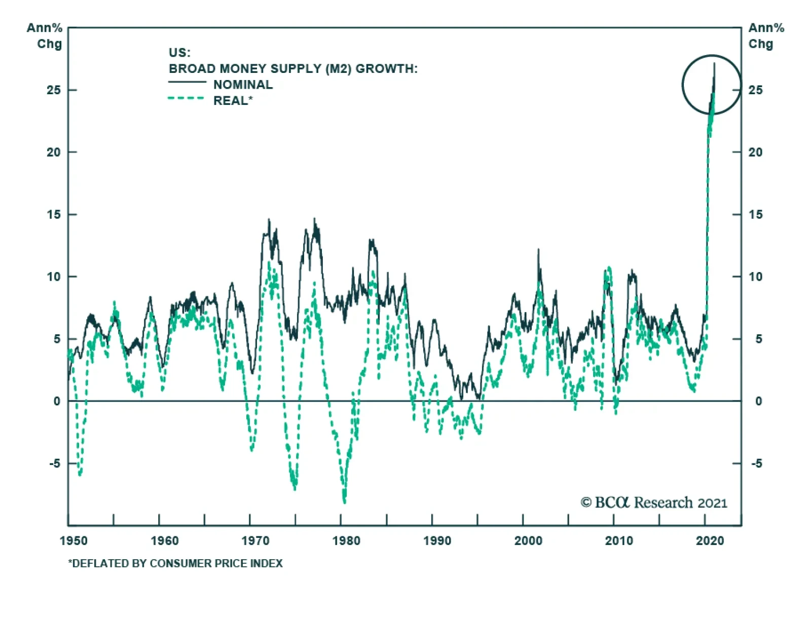
Given these conclusions, we recommend the following investment stance over the coming 6-12 months: Stock prices are likely to rise in absolute terms despite already elevated multiples, and investors should remain overweight equities relative to government bonds. A meaningful closure of the output gap is consistent with the Fed’s economic projections, suggesting that an aggressively hawkish deviation in monetary policy later this year is unlikely, barring a sharp and sustained rise in inflation back to target levels. Still, a closure of the output gap this year will push long-dated bond yields higher, suggesting that fixed-income investors should be short duration. The “reopening trade” favors global over US stocks, and value over growth stocks. Chart I-14 highlights that global ex-US stocks are now in a clear uptrend versus their US peers, whereas value stocks have yet to decisively break out. We expect the latter will occur over the coming 6-12 months. The US dollar is a reliably counter-cyclical currency, and has behaved exactly as a counter-cyclical currency should have over the past year (Chart I-15). We thus expect a further, albeit less sharp, decline in the dollar over the coming year. Jonathan LaBerge, CFA Vice President The Bank Credit Analyst January 28, 2021 Next Report: February 25, 2021 II. Surging US Money Growth: Should Investors Be Concerned? Generally-speaking, an increase in bank deposits occurs due to either Fed asset purchases, bank asset purchases, or bank loan creation. Deposits have grown massively over the past year because the Treasury has issued an enormous amount of bonds, and these bonds have been purchased both by the Fed and US banks. Relative to the 2008-2009 period, the comparatively better health of US bank balance sheets last year has been an even more important factor than Fed asset purchases in accounting for the difference in money growth between the two periods. Money growth used to be a good predictor of economic activity, but today it makes more sense to focus on interest rates rather than monetary aggregates as a leading economic indicator. Over the past 20 years, only the collapse in velocity that occurred after 2008 is meaningful for investors, and it appears to reflect already “known” information: the persistent household deleveraging that occurred following the global financial crisis, and the effect of Fed asset purchases on the stock of money at several points over the past decade. Our base case view is that a portion of the significant amount of household savings that have accumulated will not be spent, and that the US output gap will close but not move deeply into positive territory this year. But the enormous growth in money over the past year reflects unprecedented fiscal and monetary support, which could eventually change investor expectations about long-term interest rates (even absent rapid overheating). Rising long-term rate expectations could threaten the equity bull market, given the impact the secular stagnation narrative has had in keeping long-term rate expectations low and the extent to which easy money has boosted equity valuation multiples over the past year. Broad money growth has exploded higher over the past year, to a pace that has not been seen since WWII (Chart II-1). This growth in the money supply has vastly exceeded what investors witnessed during and immediately following the global financial crisis of 2008-2009, raising concerns among many investors of the potential cyclical and structural consequences. Chart II-1A Nearly Unprecedented Surge In Money Growth
A Nearly Unprecedented Surge In Money Growth
A Nearly Unprecedented Surge In Money Growth
In this report we revisit the deposit creation process, and explain the specific factors that have led to surging money growth over the past year. We also review the usefulness of money growth as an economic indicator, and provide some perspective on the 20-year decline in money velocity. We conclude by noting that the surge in money growth is potentially concerning for investors for two reasons. First, if US households ignore likely future tax increases and decide to fully spend the vast amount of savings that have accumulated over the past year, then the US economy is likely to overheat rather quickly. The second, more likely, threat to investors is if the sharp increase in the money supply ends up changing market expectations about the neutral rate of interest. It remains too early to conclude whether investors will significantly revise up their long-term rate expectations, in large part because the scale of permanent damage in the wake of the pandemic is still unknown. But investors should remain vigilant, given the impact the secular stagnation narrative has had on keeping long-term rate expectations low and the extent to which easy money has boosted equity valuation multiples over the past year. Reviewing The Money And Bank Deposit Creation Process In order to fully understand the spectacular growth of the money supply over the past year and its potential implications for the economy and financial markets, it is important to revisit how money is created in a modern economy. My colleague Ryan Swift, BCA’s US Bond Strategist, reviewed this question in detail in a June 2020 Strategy Report and we summarize the report’s key points below.1 In the US, most of the stock of broad money aggregates is composed of bank deposits. Following the global financial crisis, the textbook view of how banks act purely as intermediaries, taking in deposits from the public and lending them out, was revealed to be a mostly inaccurate description of the financial system in the aggregate. Rather, while individual banks often compete for deposits as a source of funding, bank deposits in the aggregate are typically created by making loans. Central banks can also create money, by purchasing financial assets and crediting the banking system with reserve assets (central bank money). Table II-1 highlights the link between the Fed’s balance sheet and that of US banks in the aggregate, and highlights how changes in deposits – a liability of the banking system – must be offset by increases in bank assets or decreases in other bank liabilities. Table II-1The Link Between The Fed’s Balance Sheet And The Aggregate US Banking System
February 2021
February 2021
The typical mechanics of three money-creating operations are described below, alongside the corresponding change in balance sheet items: Fed Asset Purchases: When the Federal Reserve purchases financial assets in the secondary market, it increases securities held (Fed asset) and typically increases reserves (Fed liability). In the increase in reserves (banking system asset) matches the increase in deposits (banking system liability), as the previous holders of the assets purchased by the Fed deposit the proceeds of the sale. Bank Asset Purchases: When banks purchase government securities from non-bank holders they credit the sellers with bank deposits.2 This increases bank holdings of securities or other assets (banking system asset) and increases deposits (banking system liability). Bank Loan Creation: When banks create a loan, they increase their holdings of loans & leases (banking system asset) and deposit the loan amount into the borrowers’ account (banking system liability). At the individual bank level, if Bank A creates a loan and the borrower withdraws the funds to pay someone with an account at Bank B, there will be an asset-liability mismatch relating to that loan transaction between those two banks if no other actions are taken. The result will be that Bank A experiences an increase in equity capital and Bank B experiences a decline. But for the banking system as a whole, the increase in bank assets exactly matched the increase in bank liabilities, and Bank A created the deposits that ended up as a liability of Bank B. The issuance or retirement of long-term bank debt and equity instruments can also create or destroy deposits but, for the purpose of understanding the difference in money growth during the pandemic compared with the 2008-2009 experience, it is sufficient to focus on the three money-creating operations described above. Explaining The Recent Surge In Money Growth The prevalent view among many financial market participants is that the money supply has surged in the US due to the fiscal stimulus provided by the CARES act. But an increase in the government’s budget deficit does not in and of itself create money, because the Treasury issues bonds to finance the difference between revenue and expenditures. If those bonds are purchased entirely by the nonfinancial sector, then an increase in deposits of stimulus recipients is offset by a decrease in deposits of those who purchased the bonds. A more precise answer is that deposits have grown massively over the past year because the Treasury has issued an enormous amount of bonds and these bonds have been purchased both by the Fed and US banks. Charts II-2A and II-2B highlight this by showing the change in the main items on the aggregate banking system balance sheet since the end of 2019. The charts show that the increase in deposits on the liability side of bank balance sheets have been matched by large increases in reserves and other cash (caused by the Fed’s asset purchases) and banks’ securities holdings (caused by bank asset purchases). Chart II-2AOver The Past Year, Fed And Bank Asset Purchases…
February 2021
February 2021
Chart II-2B…Account For Most Of The Surge In Deposits
February 2021
February 2021
But this does not explain why money growth has been so much larger over the past year than it was in 2008-2009, when total Federal Reserve assets increased from $920 billion to $2.2 trillion. Chart II-1 on page 15 highlighted that growth in M2 has risen to a whopping 25% year-over-year growth rate, a full 15 percentage points above the strongest rate that prevailed following the global financial crisis. Charts II-3A and II-3B explain the discrepancy, by showing the change in the main items on the aggregate banking system balance sheet as a percent of the money supply during each of the two periods, as well as the difference. The charts show that while changes in bank reserves and cash assets – caused by Fed asset purchases – were significantly larger in 2020 than they were on average from 2008 to 2009, changes in loans & leases and securities in bank credit, as well as other assets were also quite significant and account for two-thirds of the difference when added together. Chart II-3ARelative To 2008/2009, The Health Of The Banking System…
February 2021
February 2021
Chart II-3B…Helped Facilitate More Money Creation Last Year
February 2021
February 2021
Thus, while it is true that the Fed’s accommodation of extraordinary fiscal easing has helped create a sizeable amount of money over the past year, relative to the 2008-2009 period the comparatively better health of US bank balance sheets has been an even more important factor – in the sense that balance sheet restrictions did not prevent US banks from facilitating the creation of money as appears to have been the case in the aftermath of the global financial crisis. Money And Growth We noted above that fiscal easing does not create money in and of itself unless the bonds issued to finance an increase in the deficit are purchased either by banks or the Fed. Yet most investors would not disagree that significant increases in budget deficits boost short-term economic growth, particularly during recessions. This implies that the link between money and economic growth may not be particularly strong over a cyclical time horizon, which is in fact what the data shows – at least over the past 30 years. Charts II-4A and II-4B illustrate the historical relationship between real GDP and real M2 growth, pre- and post-1990. The chart makes it clear that the relationship between real money and GDP growth used to be strong, with real money growth somewhat leading economic activity. This relationship completely broke down after the 1980s, and is now mostly coincident and negative. There are three reasons behind the breakdown: 1. The money supply used to be the Federal Reserve’s monetary policy target, meaning that money growth directly reflected monetary policy shifts. Today, the Fed targets interest rates, and the portion of money created through loans simply mirrors the change in interest rates as loan demand rises (falls) and interest rates fall (rise). Specifically, Chart II-4A shows that the ability of money growth to lead economic activity seems to have ended in the late 1980s, when the Fed stopped providing targets for monetary aggregates. Chart II-4AMoney Growth Used To Predict Economic Activity…
Money Growth Used To Predict Economic Activity...
Money Growth Used To Predict Economic Activity...
Chart II-4B…But Ceased To Do So Once The Fed Stopped Targeting The Money Supply
...But Ceased To Do So Once The Fed Stopped Targeting The Money Supply
...But Ceased To Do So Once The Fed Stopped Targeting The Money Supply
Chart II-5US Banks Provide Meaningfully Less Private Sector Credit Than In The Past
US Banks Provide Meaningfully Less Private Sector Credit Than In The Past
US Banks Provide Meaningfully Less Private Sector Credit Than In The Past
2. The share of total US credit provided by US banks has fallen significantly over time – especially during the early 1990s – as corporate bond issuance, securitized loans, and mortgages backed by agency bonds issued to the private sector rose as a proportion of total credit (Chart II-5). 3. Since 2000, a Chart II-4B shows that a clearly negative correlation has emerged between money growth and economic activity during recessions. In 2008-2009 and again last year, money growth reflected emergency Fed asset purchases in the face of a sharp decline in economic activity. In 2000, the Fed did not expand its balance sheet, but the economy diverged from money growth due to the lingering impact of management excesses, governance failures, and elevated debt in the corporate sector in the 1990s. The conclusion for investors is straightforward: while money growth used to be a good predictor of economic activity, today it makes more sense to use interest rates than monetary aggregates as a leading indicator for growth. Money Velocity And Its Implications When discussing the impact of money on the economy, one point often raised by investors is the fact that money velocity has declined significantly over the past two decades. This observation is frequently followed by the question of whether the absence of this decline would have caused real growth, inflation, or both to have been higher over the past 20 years than they otherwise were. It is difficult to prove or refute the point, as monetary velocity is not a well-understood concept – investors do not have a good, reliable theory upon which to predict changes in velocity or understand their economic significance. Velocity is calculated from the equation of exchange as a ratio of nominal GDP to some measure of the money supply (typically a broad measure such as M2) and theoretically represents the turnover rate of money. But long-term changes in velocity do not seem to correlate well with measures of growth or inflation. Short-term changes in velocity correlate extremely well with inflation, but this simply reflects the fact that velocity tends to be driven by the numerator (nominal GDP) over short periods of time (see Box II-1). BOX II-1 Money Velocity Over The Short-Term Some investors have pointed to the relationship shown in Chart II-B1 to argue that M2 money velocity is a significant cyclical predictor of inflation. But Chart II-B2 illustrates that nearly two-thirds of annual changes in velocity since 1990 have been accounted for by changes in the numerator – nominal GDP – rather than the denominator. This underscores that the apparent explanatory power of short-term changes in money velocity at predicting inflation is simply capturing the normal relationship between real growth and inflation, as well as the naturally positive correlation between the implicit GDP price deflator and core consumer prices. Chart Box II-1Velocity Seemingly Predicts Inflation Over The Short-Term…
Velocity Seemingly Predicts Inflation Over The Short-Term...
Velocity Seemingly Predicts Inflation Over The Short-Term...
Chart Box II-2…Because Short-Term Changes In Velocity Are Driven By Nominal Output
February 2021
February 2021
The bigger question is why velocity has declined so significantly over the past 20 years, and what this means for investors. Chart II-6Large Declines In Velocity Are Linked To Prolonged Periods Of Deleveraging
Large Declines In Velocity Are Linked To Prolonged Periods Of Deleveraging
Large Declines In Velocity Are Linked To Prolonged Periods Of Deleveraging
Panel 1 of Chart II-6 shows a long-dated history of M2 velocity, and highlights that the average or “normal” level of M2 velocity has historically been just under 1.8. Over the past century, there have been just four major deviations from this level: A major decline that began at the start of the Great Depression and prevailed until the Second World War (WWII) Significant volatility during and in the years immediately following WWII A sharp rise in velocity during the 1990s to a record level A downtrend beginning in the late 1990s that remains intact today Abstracting from the war period in which the economy was heavily distorted by government intervention, Chart II-6 also highlights that persistent declines in velocity appear to be explainable by major deleveraging events. The second panel of the chart shows a measure of the duration of private sector deleveraging, and highlights that the two periods of low velocity have been strongly (negatively) correlated with the prevalence of deleveraging. This explanation is simple but intuitive: excessive leveraging eventually causes households and firms to redirect a larger portion of their income to servicing or paying down debt, which weighs on real growth and, by extension, prices. While it is true that the recent 20-year downtrend in velocity began in the late 1990s and thus well before household deleveraging began in 2008, this seems to mostly reflect the reversal of an anomalous rise in velocity in the late 1990s. We largely view the decline in velocity from the late 1990s to 2008 as a “reversion to the mean.” It remains an option question why velocity rose so sharply in the 1990s. Some evidence seems to point to financial innovation and technological change: Chart II-7 highlights that the number of automated bank teller and point-of-sale payment terminals rose massively in the 1990s, alongside a significant acceleration in real cash in circulation. This is theoretically consistent with an increased “turnover” rate of money. But Chart II-8 highlights that a substantial portion of the rise in velocity during this period was attributable to denominator effects (persistently weak money growth), rather than numerator effects. Chart II-7Some Evidence Of Increased Money Turnover In The 1990s
Some Evidence Of Increased Money Turnover In The 1990s
Some Evidence Of Increased Money Turnover In The 1990s
Chart II-8The Rise In Velocity In The 1990s Was Driven By Slow Money Growth
The Rise In Velocity In The 1990s Was Driven By Slow Money Growth
The Rise In Velocity In The 1990s Was Driven By Slow Money Growth
Regardless of the cause, velocity was clearly anomalous on the upside in the 1990s, suggesting that it is not the downtrend in velocity over the past 20 years that is significant to investors. Rather, it is the collapse in velocity that has occurred since 2008 that is meaningful, and from the perspective of investors it appears to reflect already “known” information: the persistent household deleveraging that occurred following the global financial crisis, and the effect of Fed asset purchases on the stock of money at several points over the past decade. In the future, any meaningful increases in velocity are only likely to occur due to a significant reduction in the size of the Fed’s balance sheet, which is two to three years away at the earliest. The Fed could decide to taper its asset purchases sometime later this year or in early 2022, but tapering would merely slow the pace at which the Fed’s assets are increasing (and would thus not cause velocity to rise via a meaningful slowdown in money growth). Money And Future Inflation The final question to address is the issue of whether the enormous rise in money growth over the past year is likely to lead to higher, potentially much higher, inflation over the coming 6-12 months. This has been the main question from investors who have been unnerved by the surge in money growth and the collapse in the US government budget balance. Any link between money and inflation has to come through spending, so the question of whether a surge in money will lead to higher inflation is akin to asking whether the massive amount of savings that have been accumulated over the past year are likely to be spent, and over what period. We discussed this question in Section 1 of this month’s report, and noted that expectations of future tax increases and a permanent decline in some services spending will likely prevent all of these savings from being deployed once the practice of social distancing durably ends later this year. This implies that a substantial closure of the output gap is likely to occur in the second half of the year, but that major economic overheating will be avoided. Moreover, even if the output gap does rise into positive territory over the coming 6-12 months, this does not necessarily suggest that inflation will rise quickly back above the Fed’s target. In last month’s Special Report, we highlighted two important points about inflation that are often overlooked by investors. First, inflation’s long-term trend is determined by inflation expectations. Second, if inflation expectations are largely formed based on the experience of past inflation, then inflation is ultimately determined by three dimensions of the output gap: whether it is rising or falling, whether it is above or below zero, and how long it has been above or below zero. While market-based expectations of long-term inflation have risen well above the Fed’s target, both our adaptive expectations model for inflation as well as a simple five-year moving average are between 30-60 basis points below the 2% mark (Chart II-9). This may suggest that a persistent period of output above potential may be required in order to raise inflation relative to expectations and to raise expectations themselves above the Fed’s target unless the Fed’s efforts at “jawboning” them higher prove to be highly successful. Measured as a year-over-year growth rate of core prices, inflation is set to spike higher in April and May in the order of 50-60 basis points simply due to base effects (Chart II-10). However, inflation will only sustainably rise to an above-target rate over the coming 6-12 months if demand is even stronger than implied by consensus expectations, which is not our base case view. Chart II-9Adaptive Inflation Expectations Measures Are Still Well Below The Fed's Target
Adaptive Inflation Expectations Measures Are Still Well Below The Fed's Target
Adaptive Inflation Expectations Measures Are Still Well Below The Fed's Target
Chart II-10The Fed Will Look Through Base Effects On Consumer Prices
The Fed Will Look Through Base Effects On Consumer Prices
The Fed Will Look Through Base Effects On Consumer Prices
Investment Conclusions Investors can draw two conclusions from our analysis above. First, there is reason to be concerned about the enormous rise in the money supply if we are wrong in our assessment that some portion of the savings accumulated over the past year will not ultimately be spent. If US households ignore likely future tax increases and decide to fully spend their savings windfall, then the US economy is likely to overheat rather quickly. The second, more likely, threat to investors is if the sharp increase in the money supply, reflecting monetized fiscal stimulus and a meaningfully healthier financial system compared with the global financial crisis, ends up changing market expectations about the neutral rate of interest. Chart II-11The Pandemic Response May Raise Long-Term Rate Expectations
The Pandemic Response May Raise Long-Term Rate Expectations
The Pandemic Response May Raise Long-Term Rate Expectations
Chart II-11 that while 5-year/5-year forward Treasury yields are not much lower than they were pre-pandemic, that is an artificially low bar. Long-dated bond yields fell over 100 basis points in 2018 and 2019, in response to a global growth slowdown precipitated by the Trump administration’s trade war. While President Biden will pursue some protectionist policies, they are likely to be meaningfully less damaging to global growth than under President Trump and are extremely unlikely to act as the primary driver of macroeconomic activity over the course of Biden’s term (as they were during the period that long-dated bond yields fell). As such, if the pandemic ends this year with seemingly minimal lasting damage to the US economy, long-dated bond yields could re-approach their late 2018 levels or higher towards the end of the year. This would cause a meaningful rise in 10-year Treasury yields, even with the Fed on hold until the middle of 2022 or later. A significant rise in bond yields would be quite unwelcome to stock investors given how stretched equity multiples have become. Table II-2 presents a set of year-end scenarios to gauge the potential impact of an eventual rise in 10-year yields. We assume that forward earnings grow at 5% this year, and we allow the spread between the 12-month forward earnings yield and the 10-year yield (a proxy for the equity risk premium) to return to its 2003-2007 average as part of an assumed “normalization” trade. Table II-2Current Multiples Are Justified Only If The 10-Year Treasury Yield Does Not Rise Above 2.5%
February 2021
February 2021
The table suggests that a 10-year Treasury yield of 2.5% will be the most that the interest rates could rise before the fair value of the S&P 500 falls below current levels. That roughly equates to a return to the late-2018 levels that prevailed for 5-year/5-year forward Treasury yields, given that the short-end of the curve will remain pinned close to the zero lower bound for some time. For now, it remains too early to conclude whether investors will significantly revise their long-term rate expectations, in large part because the scale of permanent damage in the wake of the pandemic is still unknown. But investors should remain vigilant and attentive to the fact that interest rates may pose a threat to financial markets later this year even in a scenario where the US economy is not immediately overheating, given the impact the secular stagnation narrative has had in keeping long-term rate expectations low and the extent to which easy money has boosted equity valuation multiples over the past year. Jonathan LaBerge, CFA Vice President The Bank Credit Analyst III. Indicators And Reference Charts BCA’s equity indicators highlight that the “easy” money from expectations of an eventual end to the pandemic have already been made. Our technical, valuation, and sentiment indicators are very extended, highlighting that a near-term pullback in stock prices remains a significant risk. Our monetary indicator is in a clear downtrend, reflecting a reduced intensity of monetary support, but it remains above the boom/bust line. The upshot is that while the marginal stimulus provided by monetary policy is falling, the level of stimulus from easy monetary conditions remains significant. Forward equity earnings already price in a complete earnings recovery, but for now there is no sign of waning forward earnings momentum. Net revisions and positive earnings surprises remain solidly positive. Within a global equity portfolio, the US underperformance that we noted last month continues, led by strong gains in emerging markets (including China). Euro area stocks have significantly underperformed EM over the course of the pandemic, are likely to emerge as the new regional leader within a global ex-US portfolio at some point later this year. The US 10-Year Treasury yield has broken convincingly above its 200-day moving average. Long-dated yields are technically stretched to the upside, but our valuation index highlights that bonds are still extremely expensive and that yields have room to move higher over the cyclical investment horizon. The technical and valuation profile is similar for the US dollar. The USD is technically oversold, but it remains expensive according to our models. We noted in Section 1 of this month’s report that the dollar has traded almost exactly in line with what one would expect from a counter-cyclical currency, suggesting that USD will continue to trend lower, at a more moderate pace, over the coming year. Raw industrials prices have recovered not just back to pre-pandemic levels, but also back to 2018 levels (i.e., before the Sino/US trade war). This underscores that many commodity prices are extended, and are likely due for a breather. US and global LEIs remain in a solid uptrend. A peak in our global LEI (GLEI) diffusion index suggests that the pace of advance in the GLEI will moderate, but the diffusion index has not yet fallen to a level that would herald a meaningful decline in the LEI. The waning US payroll momentum that we flagged in last month’s Section 3 culminated in a slowdown in economic activity that is likely to linger for the coming several weeks. However, the very significant amount of stimulus that is still set to arrive will provide a substantial reflationary bridge to help counter the negative impact on Q1 growth from the pandemic. EQUITIES: Chart III-1US Equity Indicators
US Equity Indicators
US Equity Indicators
Chart III-2Willingness To Pay For Risk
Willingness To Pay For Risk
Willingness To Pay For Risk
Chart III-3US Equity Sentiment Indicators
US Equity Sentiment Indicators
US Equity Sentiment Indicators
Chart III-4Revealed Preference Indicator
Revealed Preference Indicator
Revealed Preference Indicator
Chart III-5US Stock Market Valuation
US Stock Market Valuation
US Stock Market Valuation
Chart III-6US Earnings
US Earnings
US Earnings
Chart III-7Global Stock Market And Earnings: Relative Performance
Global Stock Market And Earnings: Relative Performance
Global Stock Market And Earnings: Relative Performance
Chart III-8Global Stock Market And Earnings: Relative Performance
Global Stock Market And Earnings: Relative Performance
Global Stock Market And Earnings: Relative Performance
FIXED INCOME: Chart III-9US Treasurys And Valuations
US Treasurys And Valuations
US Treasurys And Valuations
Chart III-10Yield Curve Slopes
Yield Curve Slopes
Yield Curve Slopes
Chart III-11Selected US Bond Yields
Selected US Bond Yields
Selected US Bond Yields
Chart III-1210-Year Treasury Yield Components
10-Year Treasury Yield Components
10-Year Treasury Yield Components
Chart III-13US Corporate Bonds And Health Monitor
US Corporate Bonds And Health Monitor
US Corporate Bonds And Health Monitor
Chart III-14Global Bonds: Developed Markets
Global Bonds: Developed Markets
Global Bonds: Developed Markets
Chart III-15Global Bonds: Emerging Markets
Global Bonds: Emerging Markets
Global Bonds: Emerging Markets
CURRENCIES: Chart III-16US Dollar And PPP
US Dollar And PPP
US Dollar And PPP
Chart III-17US Dollar And Indicator
US Dollar And Indicator
US Dollar And Indicator
Chart III-18US Dollar Fundamentals
US Dollar Fundamentals
US Dollar Fundamentals
Chart III-19Japanese Yen Technicals
Japanese Yen Technicals
Japanese Yen Technicals
Chart III-20Euro Technicals
Euro Technicals
Euro Technicals
Chart III-21Euro/Yen Technicals
Euro/Yen Technicals
Euro/Yen Technicals
Chart III-22Euro/Pound Technicals
Euro/Pound Technicals
Euro/Pound Technicals
COMMODITIES: Chart III-23Broad Commodity Indicators
Broad Commodity Indicators
Broad Commodity Indicators
Chart III-24Commodity Prices
Commodity Prices
Commodity Prices
Chart III-25Commodity Prices
Commodity Prices
Commodity Prices
Chart III-26Commodity Sentiment
Commodity Sentiment
Commodity Sentiment
Chart III-27Speculative Positioning
Speculative Positioning
Speculative Positioning
ECONOMY: Chart III-28US And Global Macro Backdrop
US And Global Macro Backdrop
US And Global Macro Backdrop
Chart III-29US Macro Snapshot
US Macro Snapshot
US Macro Snapshot
Chart III-30US Growth Outlook
US Growth Outlook
US Growth Outlook
Chart III-31US Cyclical Spending
US Cyclical Spending
US Cyclical Spending
Chart III-32US Labor Market
US Labor Market
US Labor Market
Chart III-33US Consumption
US Consumption
US Consumption
Chart III-34US Housing
US Housing
US Housing
Chart III-35US Debt And Deleveraging
US Debt And Deleveraging
US Debt And Deleveraging
Chart III-36US Financial Conditions
US Financial Conditions
US Financial Conditions
Chart III-37Global Economic Snapshot: Europe
Global Economic Snapshot: Europe
Global Economic Snapshot: Europe
Chart III-38Global Economic Snapshot: China
Global Economic Snapshot: China
Global Economic Snapshot: China
Jonathan LaBerge, CFA Vice President The Bank Credit Analyst Footnotes 1 Please see USBS Strategy Report "The Case Against The Money Supply," dated June 30, 2020, available at usbs.bcaresearch.com 2 Please see “Money creation in the modern economy,” Bank of England, Q1 2014 Quarterly Bulletin.
Generally-speaking, an increase in bank deposits occurs due to either Fed asset purchases, bank asset purchases, or bank loan creation. Deposits have grown massively over the past year because the Treasury has issued an enormous amount of bonds, and these bonds have been purchased both by the Fed and US banks. Relative to the 2008-2009 period, the comparatively better health of US bank balance sheets last year has been an even more important factor than Fed asset purchases in accounting for the difference in money growth between the two periods. Money growth used to be a good predictor of economic activity, but today it makes more sense to focus on interest rates rather than monetary aggregates as a leading economic indicator. Over the past 20 years, only the collapse in velocity that occurred after 2008 is meaningful for investors, and it appears to reflect already “known” information: the persistent household deleveraging that occurred following the global financial crisis, and the effect of Fed asset purchases on the stock of money at several points over the past decade. Our base case view is that a portion of the significant amount of household savings that have accumulated will not be spent, and that the US output gap will close but not move deeply into positive territory this year. But the enormous growth in money over the past year reflects unprecedented fiscal and monetary support, which could eventually change investor expectations about long-term interest rates (even absent rapid overheating). Rising long-term rate expectations could threaten the equity bull market, given the impact the secular stagnation narrative has had in keeping long-term rate expectations low and the extent to which easy money has boosted equity valuation multiples over the past year. Broad money growth has exploded higher over the past year, to a pace that has not been seen since WWII (Chart II-1). This growth in the money supply has vastly exceeded what investors witnessed during and immediately following the global financial crisis of 2008-2009, raising concerns among many investors of the potential cyclical and structural consequences. Chart II-1A Nearly Unprecedented Surge In Money Growth
A Nearly Unprecedented Surge In Money Growth
A Nearly Unprecedented Surge In Money Growth
In this report we revisit the deposit creation process, and explain the specific factors that have led to surging money growth over the past year. We also review the usefulness of money growth as an economic indicator, and provide some perspective on the 20-year decline in money velocity. We conclude by noting that the surge in money growth is potentially concerning for investors for two reasons. First, if US households ignore likely future tax increases and decide to fully spend the vast amount of savings that have accumulated over the past year, then the US economy is likely to overheat rather quickly. The second, more likely, threat to investors is if the sharp increase in the money supply ends up changing market expectations about the neutral rate of interest. It remains too early to conclude whether investors will significantly revise up their long-term rate expectations, in large part because the scale of permanent damage in the wake of the pandemic is still unknown. But investors should remain vigilant, given the impact the secular stagnation narrative has had on keeping long-term rate expectations low and the extent to which easy money has boosted equity valuation multiples over the past year. Reviewing The Money And Bank Deposit Creation Process In order to fully understand the spectacular growth of the money supply over the past year and its potential implications for the economy and financial markets, it is important to revisit how money is created in a modern economy. My colleague Ryan Swift, BCA’s US Bond Strategist, reviewed this question in detail in a June 2020 Strategy Report and we summarize the report’s key points below.1 In the US, most of the stock of broad money aggregates is composed of bank deposits. Following the global financial crisis, the textbook view of how banks act purely as intermediaries, taking in deposits from the public and lending them out, was revealed to be a mostly inaccurate description of the financial system in the aggregate. Rather, while individual banks often compete for deposits as a source of funding, bank deposits in the aggregate are typically created by making loans. Central banks can also create money, by purchasing financial assets and crediting the banking system with reserve assets (central bank money). Table II-1 highlights the link between the Fed’s balance sheet and that of US banks in the aggregate, and highlights how changes in deposits – a liability of the banking system – must be offset by increases in bank assets or decreases in other bank liabilities. Table II-1The Link Between The Fed’s Balance Sheet And The Aggregate US Banking System
February 2021
February 2021
The typical mechanics of three money-creating operations are described below, alongside the corresponding change in balance sheet items: Fed Asset Purchases: When the Federal Reserve purchases financial assets in the secondary market, it increases securities held (Fed asset) and typically increases reserves (Fed liability). In the increase in reserves (banking system asset) matches the increase in deposits (banking system liability), as the previous holders of the assets purchased by the Fed deposit the proceeds of the sale. Bank Asset Purchases: When banks purchase government securities from non-bank holders they credit the sellers with bank deposits.2 This increases bank holdings of securities or other assets (banking system asset) and increases deposits (banking system liability). Bank Loan Creation: When banks create a loan, they increase their holdings of loans & leases (banking system asset) and deposit the loan amount into the borrowers’ account (banking system liability). At the individual bank level, if Bank A creates a loan and the borrower withdraws the funds to pay someone with an account at Bank B, there will be an asset-liability mismatch relating to that loan transaction between those two banks if no other actions are taken. The result will be that Bank A experiences an increase in equity capital and Bank B experiences a decline. But for the banking system as a whole, the increase in bank assets exactly matched the increase in bank liabilities, and Bank A created the deposits that ended up as a liability of Bank B. The issuance or retirement of long-term bank debt and equity instruments can also create or destroy deposits but, for the purpose of understanding the difference in money growth during the pandemic compared with the 2008-2009 experience, it is sufficient to focus on the three money-creating operations described above. Explaining The Recent Surge In Money Growth The prevalent view among many financial market participants is that the money supply has surged in the US due to the fiscal stimulus provided by the CARES act. But an increase in the government’s budget deficit does not in and of itself create money, because the Treasury issues bonds to finance the difference between revenue and expenditures. If those bonds are purchased entirely by the nonfinancial sector, then an increase in deposits of stimulus recipients is offset by a decrease in deposits of those who purchased the bonds. A more precise answer is that deposits have grown massively over the past year because the Treasury has issued an enormous amount of bonds and these bonds have been purchased both by the Fed and US banks. Charts II-2A and II-2B highlight this by showing the change in the main items on the aggregate banking system balance sheet since the end of 2019. The charts show that the increase in deposits on the liability side of bank balance sheets have been matched by large increases in reserves and other cash (caused by the Fed’s asset purchases) and banks’ securities holdings (caused by bank asset purchases). Chart II-2AOver The Past Year, Fed And Bank Asset Purchases…
February 2021
February 2021
Chart II-2B…Account For Most Of The Surge In Deposits
February 2021
February 2021
But this does not explain why money growth has been so much larger over the past year than it was in 2008-2009, when total Federal Reserve assets increased from $920 billion to $2.2 trillion. Chart II-1 on page 15 highlighted that growth in M2 has risen to a whopping 25% year-over-year growth rate, a full 15 percentage points above the strongest rate that prevailed following the global financial crisis. Charts II-3A and II-3B explain the discrepancy, by showing the change in the main items on the aggregate banking system balance sheet as a percent of the money supply during each of the two periods, as well as the difference. The charts show that while changes in bank reserves and cash assets – caused by Fed asset purchases – were significantly larger in 2020 than they were on average from 2008 to 2009, changes in loans & leases and securities in bank credit, as well as other assets were also quite significant and account for two-thirds of the difference when added together. Chart II-3ARelative To 2008/2009, The Health Of The Banking System…
February 2021
February 2021
Chart II-3B…Helped Facilitate More Money Creation Last Year
February 2021
February 2021
Thus, while it is true that the Fed’s accommodation of extraordinary fiscal easing has helped create a sizeable amount of money over the past year, relative to the 2008-2009 period the comparatively better health of US bank balance sheets has been an even more important factor – in the sense that balance sheet restrictions did not prevent US banks from facilitating the creation of money as appears to have been the case in the aftermath of the global financial crisis. Money And Growth We noted above that fiscal easing does not create money in and of itself unless the bonds issued to finance an increase in the deficit are purchased either by banks or the Fed. Yet most investors would not disagree that significant increases in budget deficits boost short-term economic growth, particularly during recessions. This implies that the link between money and economic growth may not be particularly strong over a cyclical time horizon, which is in fact what the data shows – at least over the past 30 years. Charts II-4A and II-4B illustrate the historical relationship between real GDP and real M2 growth, pre- and post-1990. The chart makes it clear that the relationship between real money and GDP growth used to be strong, with real money growth somewhat leading economic activity. This relationship completely broke down after the 1980s, and is now mostly coincident and negative. There are three reasons behind the breakdown: 1. The money supply used to be the Federal Reserve’s monetary policy target, meaning that money growth directly reflected monetary policy shifts. Today, the Fed targets interest rates, and the portion of money created through loans simply mirrors the change in interest rates as loan demand rises (falls) and interest rates fall (rise). Specifically, Chart II-4A shows that the ability of money growth to lead economic activity seems to have ended in the late 1980s, when the Fed stopped providing targets for monetary aggregates. Chart II-4AMoney Growth Used To Predict Economic Activity…
Money Growth Used To Predict Economic Activity...
Money Growth Used To Predict Economic Activity...
Chart II-4B…But Ceased To Do So Once The Fed Stopped Targeting The Money Supply
...But Ceased To Do So Once The Fed Stopped Targeting The Money Supply
...But Ceased To Do So Once The Fed Stopped Targeting The Money Supply
Chart II-5US Banks Provide Meaningfully Less Private Sector Credit Than In The Past
US Banks Provide Meaningfully Less Private Sector Credit Than In The Past
US Banks Provide Meaningfully Less Private Sector Credit Than In The Past
2. The share of total US credit provided by US banks has fallen significantly over time – especially during the early 1990s – as corporate bond issuance, securitized loans, and mortgages backed by agency bonds issued to the private sector rose as a proportion of total credit (Chart II-5). 3. Since 2000, a Chart II-4B shows that a clearly negative correlation has emerged between money growth and economic activity during recessions. In 2008-2009 and again last year, money growth reflected emergency Fed asset purchases in the face of a sharp decline in economic activity. In 2000, the Fed did not expand its balance sheet, but the economy diverged from money growth due to the lingering impact of management excesses, governance failures, and elevated debt in the corporate sector in the 1990s. The conclusion for investors is straightforward: while money growth used to be a good predictor of economic activity, today it makes more sense to use interest rates than monetary aggregates as a leading indicator for growth. Money Velocity And Its Implications When discussing the impact of money on the economy, one point often raised by investors is the fact that money velocity has declined significantly over the past two decades. This observation is frequently followed by the question of whether the absence of this decline would have caused real growth, inflation, or both to have been higher over the past 20 years than they otherwise were. It is difficult to prove or refute the point, as monetary velocity is not a well-understood concept – investors do not have a good, reliable theory upon which to predict changes in velocity or understand their economic significance. Velocity is calculated from the equation of exchange as a ratio of nominal GDP to some measure of the money supply (typically a broad measure such as M2) and theoretically represents the turnover rate of money. But long-term changes in velocity do not seem to correlate well with measures of growth or inflation. Short-term changes in velocity correlate extremely well with inflation, but this simply reflects the fact that velocity tends to be driven by the numerator (nominal GDP) over short periods of time (see Box II-1). BOX II-1 Money Velocity Over The Short-Term Some investors have pointed to the relationship shown in Chart II-B1 to argue that M2 money velocity is a significant cyclical predictor of inflation. But Chart II-B2 illustrates that nearly two-thirds of annual changes in velocity since 1990 have been accounted for by changes in the numerator – nominal GDP – rather than the denominator. This underscores that the apparent explanatory power of short-term changes in money velocity at predicting inflation is simply capturing the normal relationship between real growth and inflation, as well as the naturally positive correlation between the implicit GDP price deflator and core consumer prices. Chart Box II-1Velocity Seemingly Predicts Inflation Over The Short-Term…
Velocity Seemingly Predicts Inflation Over The Short-Term...
Velocity Seemingly Predicts Inflation Over The Short-Term...
Chart Box II-2…Because Short-Term Changes In Velocity Are Driven By Nominal Output
February 2021
February 2021
The bigger question is why velocity has declined so significantly over the past 20 years, and what this means for investors. Chart II-6Large Declines In Velocity Are Linked To Prolonged Periods Of Deleveraging
Large Declines In Velocity Are Linked To Prolonged Periods Of Deleveraging
Large Declines In Velocity Are Linked To Prolonged Periods Of Deleveraging
Panel 1 of Chart II-6 shows a long-dated history of M2 velocity, and highlights that the average or “normal” level of M2 velocity has historically been just under 1.8. Over the past century, there have been just four major deviations from this level: A major decline that began at the start of the Great Depression and prevailed until the Second World War (WWII) Significant volatility during and in the years immediately following WWII A sharp rise in velocity during the 1990s to a record level A downtrend beginning in the late 1990s that remains intact today Abstracting from the war period in which the economy was heavily distorted by government intervention, Chart II-6 also highlights that persistent declines in velocity appear to be explainable by major deleveraging events. The second panel of the chart shows a measure of the duration of private sector deleveraging, and highlights that the two periods of low velocity have been strongly (negatively) correlated with the prevalence of deleveraging. This explanation is simple but intuitive: excessive leveraging eventually causes households and firms to redirect a larger portion of their income to servicing or paying down debt, which weighs on real growth and, by extension, prices. While it is true that the recent 20-year downtrend in velocity began in the late 1990s and thus well before household deleveraging began in 2008, this seems to mostly reflect the reversal of an anomalous rise in velocity in the late 1990s. We largely view the decline in velocity from the late 1990s to 2008 as a “reversion to the mean.” It remains an option question why velocity rose so sharply in the 1990s. Some evidence seems to point to financial innovation and technological change: Chart II-7 highlights that the number of automated bank teller and point-of-sale payment terminals rose massively in the 1990s, alongside a significant acceleration in real cash in circulation. This is theoretically consistent with an increased “turnover” rate of money. But Chart II-8 highlights that a substantial portion of the rise in velocity during this period was attributable to denominator effects (persistently weak money growth), rather than numerator effects. Chart II-7Some Evidence Of Increased Money Turnover In The 1990s
Some Evidence Of Increased Money Turnover In The 1990s
Some Evidence Of Increased Money Turnover In The 1990s
Chart II-8The Rise In Velocity In The 1990s Was Driven By Slow Money Growth
The Rise In Velocity In The 1990s Was Driven By Slow Money Growth
The Rise In Velocity In The 1990s Was Driven By Slow Money Growth
Regardless of the cause, velocity was clearly anomalous on the upside in the 1990s, suggesting that it is not the downtrend in velocity over the past 20 years that is significant to investors. Rather, it is the collapse in velocity that has occurred since 2008 that is meaningful, and from the perspective of investors it appears to reflect already “known” information: the persistent household deleveraging that occurred following the global financial crisis, and the effect of Fed asset purchases on the stock of money at several points over the past decade. In the future, any meaningful increases in velocity are only likely to occur due to a significant reduction in the size of the Fed’s balance sheet, which is two to three years away at the earliest. The Fed could decide to taper its asset purchases sometime later this year or in early 2022, but tapering would merely slow the pace at which the Fed’s assets are increasing (and would thus not cause velocity to rise via a meaningful slowdown in money growth). Money And Future Inflation The final question to address is the issue of whether the enormous rise in money growth over the past year is likely to lead to higher, potentially much higher, inflation over the coming 6-12 months. This has been the main question from investors who have been unnerved by the surge in money growth and the collapse in the US government budget balance. Any link between money and inflation has to come through spending, so the question of whether a surge in money will lead to higher inflation is akin to asking whether the massive amount of savings that have been accumulated over the past year are likely to be spent, and over what period. We discussed this question in Section 1 of this month’s report, and noted that expectations of future tax increases and a permanent decline in some services spending will likely prevent all of these savings from being deployed once the practice of social distancing durably ends later this year. This implies that a substantial closure of the output gap is likely to occur in the second half of the year, but that major economic overheating will be avoided. Moreover, even if the output gap does rise into positive territory over the coming 6-12 months, this does not necessarily suggest that inflation will rise quickly back above the Fed’s target. In last month’s Special Report, we highlighted two important points about inflation that are often overlooked by investors. First, inflation’s long-term trend is determined by inflation expectations. Second, if inflation expectations are largely formed based on the experience of past inflation, then inflation is ultimately determined by three dimensions of the output gap: whether it is rising or falling, whether it is above or below zero, and how long it has been above or below zero. While market-based expectations of long-term inflation have risen well above the Fed’s target, both our adaptive expectations model for inflation as well as a simple five-year moving average are between 30-60 basis points below the 2% mark (Chart II-9). This may suggest that a persistent period of output above potential may be required in order to raise inflation relative to expectations and to raise expectations themselves above the Fed’s target unless the Fed’s efforts at “jawboning” them higher prove to be highly successful. Measured as a year-over-year growth rate of core prices, inflation is set to spike higher in April and May in the order of 50-60 basis points simply due to base effects (Chart II-10). However, inflation will only sustainably rise to an above-target rate over the coming 6-12 months if demand is even stronger than implied by consensus expectations, which is not our base case view. Chart II-9Adaptive Inflation Expectations Measures Are Still Well Below The Fed's Target
Adaptive Inflation Expectations Measures Are Still Well Below The Fed's Target
Adaptive Inflation Expectations Measures Are Still Well Below The Fed's Target
Chart II-10The Fed Will Look Through Base Effects On Consumer Prices
The Fed Will Look Through Base Effects On Consumer Prices
The Fed Will Look Through Base Effects On Consumer Prices
Investment Conclusions Investors can draw two conclusions from our analysis above. First, there is reason to be concerned about the enormous rise in the money supply if we are wrong in our assessment that some portion of the savings accumulated over the past year will not ultimately be spent. If US households ignore likely future tax increases and decide to fully spend their savings windfall, then the US economy is likely to overheat rather quickly. The second, more likely, threat to investors is if the sharp increase in the money supply, reflecting monetized fiscal stimulus and a meaningfully healthier financial system compared with the global financial crisis, ends up changing market expectations about the neutral rate of interest. Chart II-11The Pandemic Response May Raise Long-Term Rate Expectations
The Pandemic Response May Raise Long-Term Rate Expectations
The Pandemic Response May Raise Long-Term Rate Expectations
Chart II-11 that while 5-year/5-year forward Treasury yields are not much lower than they were pre-pandemic, that is an artificially low bar. Long-dated bond yields fell over 100 basis points in 2018 and 2019, in response to a global growth slowdown precipitated by the Trump administration’s trade war. While President Biden will pursue some protectionist policies, they are likely to be meaningfully less damaging to global growth than under President Trump and are extremely unlikely to act as the primary driver of macroeconomic activity over the course of Biden’s term (as they were during the period that long-dated bond yields fell). As such, if the pandemic ends this year with seemingly minimal lasting damage to the US economy, long-dated bond yields could re-approach their late 2018 levels or higher towards the end of the year. This would cause a meaningful rise in 10-year Treasury yields, even with the Fed on hold until the middle of 2022 or later. A significant rise in bond yields would be quite unwelcome to stock investors given how stretched equity multiples have become. Table II-2 presents a set of year-end scenarios to gauge the potential impact of an eventual rise in 10-year yields. We assume that forward earnings grow at 5% this year, and we allow the spread between the 12-month forward earnings yield and the 10-year yield (a proxy for the equity risk premium) to return to its 2003-2007 average as part of an assumed “normalization” trade. Table II-2Current Multiples Are Justified Only If The 10-Year Treasury Yield Does Not Rise Above 2.5%
February 2021
February 2021
The table suggests that a 10-year Treasury yield of 2.5% will be the most that the interest rates could rise before the fair value of the S&P 500 falls below current levels. That roughly equates to a return to the late-2018 levels that prevailed for 5-year/5-year forward Treasury yields, given that the short-end of the curve will remain pinned close to the zero lower bound for some time. For now, it remains too early to conclude whether investors will significantly revise their long-term rate expectations, in large part because the scale of permanent damage in the wake of the pandemic is still unknown. But investors should remain vigilant and attentive to the fact that interest rates may pose a threat to financial markets later this year even in a scenario where the US economy is not immediately overheating, given the impact the secular stagnation narrative has had in keeping long-term rate expectations low and the extent to which easy money has boosted equity valuation multiples over the past year. Jonathan LaBerge, CFA Vice President The Bank Credit Analyst Footnotes 1 Please see USBS Strategy Report "The Case Against The Money Supply," dated June 30, 2020, available at usbs.bcaresearch.com 2 Please see “Money creation in the modern economy,” Bank of England, Q1 2014 Quarterly Bulletin.
Highlights Biden’s initial political capital is moderate-to-strong according to our Political Capital Matrix. He will pass his American Rescue Plan and one or two budget reconciliation bills over the next 18 months. Investors will need to discount the impact of tax hikes eventually. The Democrats’ second impeachment of President Trump is a distraction but the party will not let it derail their legislative agenda. The bipartisan power-sharing agreement in the Senate will keep the filibuster in place for now (though not permanently). This does not affect the most market-relevant aspects of Biden’s policies, at least not in 2021, but beyond that it is an open question. The stock rally is stretched, so prepare for volatility in the near term. But over the long run continue to prefer stocks over bonds, cyclicals over defensives, and value over growth stocks. Feature The US equity rally is getting frothy even as President Joe Biden kicks off his administration with a flurry of executive orders. Financial exuberance stems from combined monetary and fiscal stimulus that will provide a positive backdrop for risk assets for most of this year. Still, most of the good news is priced so we expect volatility to revive in the short run. The BCA Equity Capitulation Indicator is nearing the highest points of its historic range, which is typically a signal for a 10% equity correction or more (Chart 1). Not all indicators point decisively to a bubble that will pop imminently but several suggest that a bubble is being formed.1 The policy backdrop of fiscal largesse combined with an ultra-dovish Fed makes it easy to see why some parts of the market are getting manic. In this context, the Biden administration’s regulatory and tax agenda will become a negative catalyst in the short run even though its big spending will secure the economic recovery, which is positive in the long run. Chart 1Mania Unfolding
Mania Unfolding
Mania Unfolding
Biden’s First Executive Orders Biden’s initial decrees brought zero surprises so far. He rejoined the Paris climate agreement, canceled the Keystone XL pipeline, suspended new oil and gas leasing on federal land, reversed President Trump’s border emergency and immigration curbs, ordered federal workers to wear masks, and directed the federal government to “Buy American.” The energy sector suffered the brunt of Biden’s initial regulatory salvo but the relative performance of energy stocks did not drop as much as financials, where Biden’s regulatory risks are less immediate. Biden’s policies are negative for health care stocks but they suffered least from what was a general setback for value plays in the context of a small bounce in the dollar and fears about global growth weakness stemming from the pandemic which has not yet been quelled. Large caps in all three of these sectors are underperforming small caps, suggesting that Biden’s new regulations and looming tax hikes are not driving the markets – at least not yet (Chart 2). Rather these cyclical small caps stand to benefit from the administration’s large spending plans, which include the $1.9 trillion American Rescue Plan currently being negotiated (Table 1). These plans are highly likely to pass as explained below. Chart 2Biden's Executive Orders: No Surprises So Far
Biden's Executive Orders: No Surprises So Far
Biden's Executive Orders: No Surprises So Far
Table 1Biden’s American Rescue Plan (With Previous COVID Relief)
Biden's Political Capital
Biden's Political Capital
Going forward, Biden’s regulatory onslaught will bring negative surprises eventually as it expands and deepens but these will not counteract the stronger tailwinds of the vaccine and fiscal spending. Democrats have yet to invoke the Congressional Review Act, which enables them rapidly to reverse the regulations that the Trump administration ordered just before leaving office.2 The regulatory risk is greater for health care and energy than it is for financials and tech, though the latter two are not void of risk. Health care is the Democrats’ top priority outside of pandemic relief and economic recovery. (See Appendix for our updated political risk matrix by sector.) While the market can look through Biden’s regulatory threat, at least for now, it cannot look through the impact of higher taxes on corporate earnings forever. Over the next two months House Democrats will start revealing details of their budget proposals, which could serve as a negative catalyst for the overstretched equity rally. Other negative catalysts from an ambitious new administration are also possible with a market at such dizzy heights. Secretary of Treasury Janet Yellen has discouraged raising taxes initially but investors know that taxes will go up sooner or later. Moreover the specific legislative vehicle for Biden to push his agenda – “budget reconciliation” – requires tax hikes to offset spending increases. Thus if Democrats initiate a reconciliation bill in February or March then it will imply at least some revenue offsets, even if the biggest tax increases are saved for the second reconciliation bill for FY2022. Bottom Line: Value stocks have taken a breather but will continue to outperform over the cyclical 12-month time horizon. Looming Democratic tax proposals are more likely to serve as a near-term negative catalyst for the overstretched equity rally than Biden’s regulatory onslaught, which will take time to be felt. We are sticking with value over growth stocks due to the extremely accommodative fiscal and monetary policy setting. The Filibuster Preserved (For Now) A critical check on lawmaking in the Senate, the filibuster, has been preserved – at least for the moment. This is positive news for markets as it lowers the odds of major legislative surprises this year. The filibuster enables senators to block normal legislation through endless debate. Sixty senators are needed to invoke “cloture” and bring debate to a close. Otherwise the bill goes nowhere. With the Senate divided evenly at 50-50 seats between the two parties, Biden’s agenda will now depend on any bills that can garner 10 Republican senators, plus two “budget reconciliation” bills for fiscal 2021-22. Reconciliation bills only require a simple 51-seat majority in the Senate. Eliminating the filibuster will remain a risk over the long run. It was only preserved because two centrist Democratic senators, Joe Manchin of West Virginia and Kyrsten Sinema of Arizona, declared that they would not vote to abolish it. This prompted Republican Senate Minority Leader Mitch McConnell to drop his chief demand, that the filibuster be kept, in his negotiations with Democratic Majority Leader Chuck Schumer toward an agreement for the two evenly divided parties in the Senate to share power. Now a power-sharing agreement is in place so the legislative process can begin, albeit within the filibuster’s guardrails. Notice that Schumer never conceded to McConnell that the filibuster would be preserved. And two Democrats is not very many. Later these centrists may succumb to party pressure, say amid Republican obstructionism of a voting rights bill, to eliminate the filibuster. The last time the Senate was evenly divided, after the 2000 election, the power-sharing agreement only lasted six months, from January to June 2001. A single retirement or death could turn the balance. Moreover since Democrats have the option of two reconciliation bills first, the filibuster is not a substantial check on them until 2022 or beyond, at which point the centrists could fall under sustained pressure.3 Bottom Line: Preserving the filibuster provides a source of stability – it reduces policy uncertainty and polarization. It restricts Biden’s agenda largely to his major initiatives: entrenching the Affordable Care Act, expanding infrastructure spending, partially repealing Trump tax cuts, and various other tax-and-spend measures known to investors. It lowers the chance that financial markets will be blindsided in 2021 by a sweeping new legislative initiative – for example, the Green New Deal – or radical redistributive schemes. While markets will need to discount the tax hikes they will be able to recover more quickly than if they also expected a stream of unpredictable legislation from a Senate unshackled from the filibuster. Stimulus And The Tax Hike Timeline The American Rescue Plan could pass in February at the earliest or April at the latest. If at least 10 Republican senators cooperate then it will fly through Congress. The advantage of this bipartisan route is that it would achieve an early Biden objective while still leaving Democrats with two full chances to pass reconciliation bills covering fiscal 2021-22. The economic recovery would be on sure footing thereafter, giving Biden more room to maneuver (Charts 3 and 4). Chart 3Is More Stimulus Necessary?
Is More Stimulus Necessary?
Is More Stimulus Necessary?
Bipartisan talks are under way. Senator Joe Manchin of West Virginia set up talks with about 15 other senators and three White House aides, including National Economic Council director Brian Deese, toward revising and passing the rescue plan.4 Winning over ten Republicans is a tall order but GOP senators are aware that the pandemic is still going and even Republican voter opinion favors more relief. So far Democrats have not allowed any compromise in the size of the deal but that could change to get 60 votes, since they can always make up the difference through reconciliation later. The rescue plan is unlikely to be passed before Trump’s second impeachment trial begins on February 8, however. If 10 Republicans cannot be found, the Senate will be slowed down by juggling reconciliation and impeachment. Trump’s first impeachment took 49 days, leaving the average at 65 days (Table 2). It will keep the Senate busy at least through mid-March. Chart 4More Checks Coming For Households?
More Checks Coming For Households?
More Checks Coming For Households?
Table 2Impeachment Takes At Least A Month
Biden's Political Capital
Biden's Political Capital
Since Democrats are highly unlikely to win over 17 Republicans to convict Trump of inciting insurrection, the impeachment could be a policy mistake. Democrats are determined not to let slide the opportunity to position themselves as the arch defenders of democracy. Acquitting Trump would put several prominent Republicans on record endorsing him even after his alleged interference with the peaceful transition of power. However, impeachment will not be allowed to derail Biden’s agenda. The Democratic Party controls both processes. The Senate can wrap up the trial if it becomes an obstacle. Diagram 1 presents the timeline for these events to occur. The implication is that March 14, when the latest expansion of unemployment benefits starts to expire, will serve as a deadline for Biden’s rescue plan. Diagram 1Timeline Of Impeachment, Budget Reconciliation, And Regular Legislation
Biden's Political Capital
Biden's Political Capital
Budget reconciliation takes seven months on average but it only took three months in 2017, which is the proper analogy for today. Even if tax hikes are passed in Q2 there is an open question as to when they would take effect (Diagram 2). Prudent investors should be prepared for a retroactive January 1, 2021 effective date, even if it is more likely that they will kick in on January 1, 2022 to give the economy more time to recover. Again, taxes pose a risk to the rally. Diagram 2How Long Does It Take To Pass A Budget Reconciliation Bill?
Biden's Political Capital
Biden's Political Capital
If Republicans do not cooperate on Biden’s rescue plan then Democrats will cite it as obstructionism from the beginning, despite Biden’s call to unity, and it will play into any future efforts to eliminate the filibuster. But those will likely center on the period after the two reconciliation bills. Bottom Line: As the House Democrats begin to draft their first budget resolution, to initiate the reconciliation process, tax hikes will come more into focus. The near-term upside risk is that Democrats skip taxes in the first bill and save it for later. But there will have to be at least some revenue raisers in any reconciliation bill. So a near-term pullback is entirely reasonable to expect. We would be buyers on the dip given the extremely accommodative fiscal and monetary backdrop. Introducing Our Political Capital Index To assess any government’s capability – namely its ability to alter the policy setting that affects the economy and financial markets – we need to measure its political capital or grounds of support. To this end we have constructed a Political Capital Index to measure the strength and capability of US ruling parties and presidencies (Table 3). Table 3Political Capital Index
Biden's Political Capital
Biden's Political Capital
The Political Capital Index shows a series of political and economic indicators, as of the latest available data (December or January), as well as the change since Biden’s election in November.5 Below we describe the political and economic categories of political capital that we chose and the data we use to represent them: Political Strength: The most basic measure of political capital is President Biden’s margin of victory in the popular vote (4.4%) and Electoral College vote (306/538), the number of days he has been in power, his party’s Congressional majorities, and the Supreme Court’s ideological leaning. These components will last for two-to-four years and can only be changed by new elections or deaths (Table 4). Even a president elected in a landslide would see his political capital decay over time. The sooner the next election, the less political capital the ruling party has. The president and Congress will have more trouble passing legislation just before the election and will be more careful about what they do pass to avoid punishment at the ballot box. Any difficult economic policies or reforms will tend to be done at the beginning of the term, as political capital is still abundant and the next election is not a clear and present danger. President Biden has moderate political capital. His popular victory was solid, his electoral victory was the same as President Trump’s, but his congressional majorities are weak. His initial legislative efforts should be assumed to pass but aside from his rescue plan and one or two reconciliation bills he will not be able to get much else done. Table 4Political Capital: White House And Congress
Biden's Political Capital
Biden's Political Capital
Household Sentiment: Household sentiment is the origin of political capital since households are voters. We measure it through presidential net approval ratings, both in general and in handling the economy, as well as through consumer confidence (Chart 5). Household sentiment changes easily – it can drive policies and react to them. Even if the economy is objectively improving, sentiment can remain downbeat if politicians fail to communicate their policies, which could cost them the election. Measures that improve household pocketbooks or welfare are more popular than those that impose structural changes like taxes and regulation. But reforms are possible when a politician has sufficient political capital, or when a worse outcome would follow from doing nothing. Biden will start with a higher approval rating than President Trump but his average approval is not much higher at present and consumer confidence has ticked down as a result of the pandemic. His economic stimulus should create an improvement in household sentiment in the coming year. Chart 5US Households: Still Downbeat
US Households: Still Downbeat
US Households: Still Downbeat
Business Sentiment: Business sentiment is another important element of political capital. Businesses that are confident about the economy’s prospects will spend on capex, new orders, and new hires, and they will also deplete their inventories (Table 5). Animal spirits respond to spending, taxation, regulation, and trade – all areas where politicians have some control. Table 5Political Capital: Household And Business Sentiment
Biden's Political Capital
Biden's Political Capital
Policymakers can run down business sentiment by enacting painful policies for business, in favor of government or households or personal whim – or they can pass business-friendly policies to boost animal spirits. Businesses cannot vote like households but they have a powerful influence over politicians through lobbyists and political donations and a powerful influence on voters through employment. Higher animal spirits encourage new employment, which improves household welfare, thus boosting political capital. Biden is starting out fairly strong with respect to business sentiment, with the exception of the service sector, which is still beaten down by the pandemic. This is an area where his political capital could decay over time. Big business was happy to get rid of Trump’s trade war but now it faces larger government encroachment. This risk is flagged by small businesses, which are already highly distrustful of new taxes and regulation (Chart 6). Chart 6US Business Sentiment
US Business Sentiment
US Business Sentiment
Chart 7Measures Of Polarization
Measures Of Polarization
Measures Of Polarization
Political Polarization: Starkly divided populations and governments are often gridlocked or obstructionist, preventing policies from getting approved or implemented (Chart 7). Our polarization proxy measures the difference in approval of the sitting president according to party, while our economic polarization measure does the same for economic sentiment. Structural polarization is a low-frequency data series from political science literature that measures whether House members and senators tend to vote with the “party line” or “reach across the aisle.”6 The Philly Fed Partisan Index also measures the degree of political disagreement among politicians at the federal level. A highly polarized environment ensures that there will be strong opposition to any policy put forward by lawmakers and a higher likelihood of reversal by the next governing party. This leads to erratic policymaking and policy uncertainty among households and businesses. Lower polarization increases the durability of policies. Fiscal Policy: The government sector contributes to political capital through fiscal policy, especially fiscal thrust (the change in the cyclically adjusted primary budget deficit) (Table 6). An expansionary fiscal policy affords policymakers greater latitude – especially in times and places where inflation is not a public concern. It can also be an effort by the ruling party to boost its political capital when it is low, or when an election looms. The Biden administration is lucky to start off with a new business cycle, as Obama did in 2009, but the large dose of fiscal support today will become a fiscal drag by 2024 so the long-term effectiveness of today’s “pump priming” will be essential. Table 6Political Capital: The Economy And Markets
Biden's Political Capital
Biden's Political Capital
Economic Conditions: Economic conditions are arguably the most important component of political capital. We included several objective measures of household wellbeing such as unemployment, inflation, gasoline prices at the pump, and wage growth. If voters have seen their quality of life improve under the current set of leaders then they are more likely to vote to continue their windfall. To judge whether a party will be re-elected, it is critical to know whether household wellbeing has changed since the last election. High unemployment, high inflation, high economic uncertainty, and high bankruptcy levels point to struggling voters who are more likely to take their grievances to the ballot box. By the same token, leaders will struggle to get anything done if voters are beset with these ills. Asset Markets: Asset markets play at least some role in determining political capital. Most voters are not highly exposed to the stock market, though they care about their pension fund. Most voters are highly exposed to the property market. A euphoric stock market will not necessarily buoy the political capital of a president or ruling party, as demonstrated by the recent election: President Trump’s approval was closely linked to the stock market, which also restrained his actions, yet a rallying market did not get him re-elected. A market crash will always hurt policymakers, especially if it happens just before an election. We watch the stock market primarily as a downside risk to the ruling party’s political capital rather than upside. Bottom Line: Our Political Capital Index is how we will monitor President Biden’s and the Democratic Party’s capability in the coming months and years. The administration begins with moderate political capital but it is likely to improve on economic recovery, which will be secured through control of Congress and the purse strings. Our confidence that Biden’s American Rescue Plan and one or two reconciliation bills will pass stems from this assessment. This means a large spending program and tax hikes are highly probable and investors should prepare for them. Investment Takeaways Signs of mania – from Bitcoin to TESLA to GameStop – have gripped the market as the combined effect of ultra-dovish monetary and fiscal policy is priced. This process can continue beyond reasonable expectations. Nevertheless we are prepared for near-term volatility and a correction at any time. The rollout of the COVID-19 vaccine faces inevitable bumps and the pandemic is still triggering government lockdown measures and consumer caution – though these will improve over time. Biden’s regulatory agenda and especially looming tax hikes will also spur some risk aversion in the near term as the House Democrats begin preparing a reconciliation bill. Overcoming the hurdle of Trump’s impeachment will free up the Senate to move forward on reconciliation as well, which means tax hikes will fall under the market’s radar sooner or later. A regular bill could be passed in February without new taxes but otherwise a reconciliation bill will pass as early as April and include at least some new taxes, even if they take effect next year. We would still use the opportunity to buy into any further weakness in value plays relative to growth plays (Chart 8). Fundamentally the economy is set to improve this year, the pandemic is set to subside, and the policy support will be reinforced and expanded as necessary. Chart 8A Setback For Growth Versus Value
A Setback For Growth Versus Value
A Setback For Growth Versus Value
Chart 9Equity Correction Looms
Equity Correction Looms
Equity Correction Looms
The reflation trade is technically over-extended, investors are complacent, and some profit-taking is due. The extremely depressed put-to-call ratio tracks well with the US dollar index, both of which are showing signs of life (Chart 9). We would fade a rebound in the dollar, however, as the Democratic Party’s policies will ensure widening twin deficits (budget and trade deficits) even as the Fed demonstrates its commitment to its new goal of allowing an inflation overshoot to make up for past undershoots. Matt Gertken Vice President Geopolitical Strategy mattg@bcaresearch.com Jesse Anak Kuri Associate Editor jesse.Kuri@bcaresearch.com Appendix Table A1Political Risk Matrix
Biden's Political Capital
Biden's Political Capital
Table A2Biden’s Cabinet Position Appointments
Biden's Political Capital
Biden's Political Capital
Footnotes 1 See BCA Research US Equity Strategy, “Overdose?” January 25, 2021, bcaresearch.com. 2 The Congressional Review Act of 1996 enables Congress to speed up the removal of regulations that were adopted recently, in this case since August 21, 2020. The process requires both houses of Congress to repeal a regulation but the Senate cannot prevent repeal via filibuster. The Trump administration used the law aggressively to remove several of President Barack Obama’s outgoing regulations. See Jonathan H. Adler, “Will Democrats Learn To Love The Congressional Review Act?” Reason, January 23, 2021, reason.com. 3 Democrats are explicitly interested in repealing the filibuster, as Biden and Senate Majority Leader Chuck Schumer have indicated (not to mention former President Obama who characterized it as a relic of the racist Jim Crowe era). 4 See Ed O’Keefe et al, “16 senators from both parties meet with White House on COVID-19 relief plan,” CBS News, January 25, 2021, cbsnews.com; Aamer Madhani and Lisa Mascaro, “White House Begins Talks With Lawmakers On COVID-19 Relief,” Associated Press, January 25, 2021, apnews.com. 5 Biden’s term technically began on January 20 but voters in 2024 will judge the president and ruling party based on whether they are better off than they were four years ago, i.e. when they last made a major judgment. 6 See Jeffrey Lewis, Keith Poole, Howard Rosenthal, et al, at voteview.org.
As the economy is transitioning from liquidity to growth, the oil-to-gold price ratio has caught our attention again this year. As a reminder, last year we successfully traded this high-octane pair using the S&P oil & gas exploration & production (O&G E&P) index on the long side and the global gold miners index on the short side. We pocketed gains of 10% in early May of 2020, only to reinstate the trade again and to scoop a further 32% in gains. This year, the latest ISM manufacturing survey release painted a bright picture for this intra-commodity price ratio once again (see chart), and while we are not reinstituting the pair trade just yet, it is now flashing on our radar screen; we are patient and await a better entry point. Reopening of the economy and related energy demand recovery will underpin oil prices and producers going forward, at the same time as rising real yields will weigh on the shiny metal and gold mining stocks. Bottom Line: Put a stop buy on long S&P O&G E&P/short global gold miners via the XOP/GDX exchange traded funds at a ratio of 1.2.
From Liquidity To Growth
From Liquidity To Growth
According to BCA Research’s US Bond Strategy service, muni value has deteriorated, but the sector still looks attractive compared to investment-grade corporate bonds. Municipal bond spreads have tightened dramatically during the past couple of months and…
The January improvement in the Conference Board’s Consumer Confidence Index highlights that optimism from looming fiscal stimulus is outweighing pessimism from the current wave of infections. The headline index bounced back to 89.3 from 87.1, slightly above…
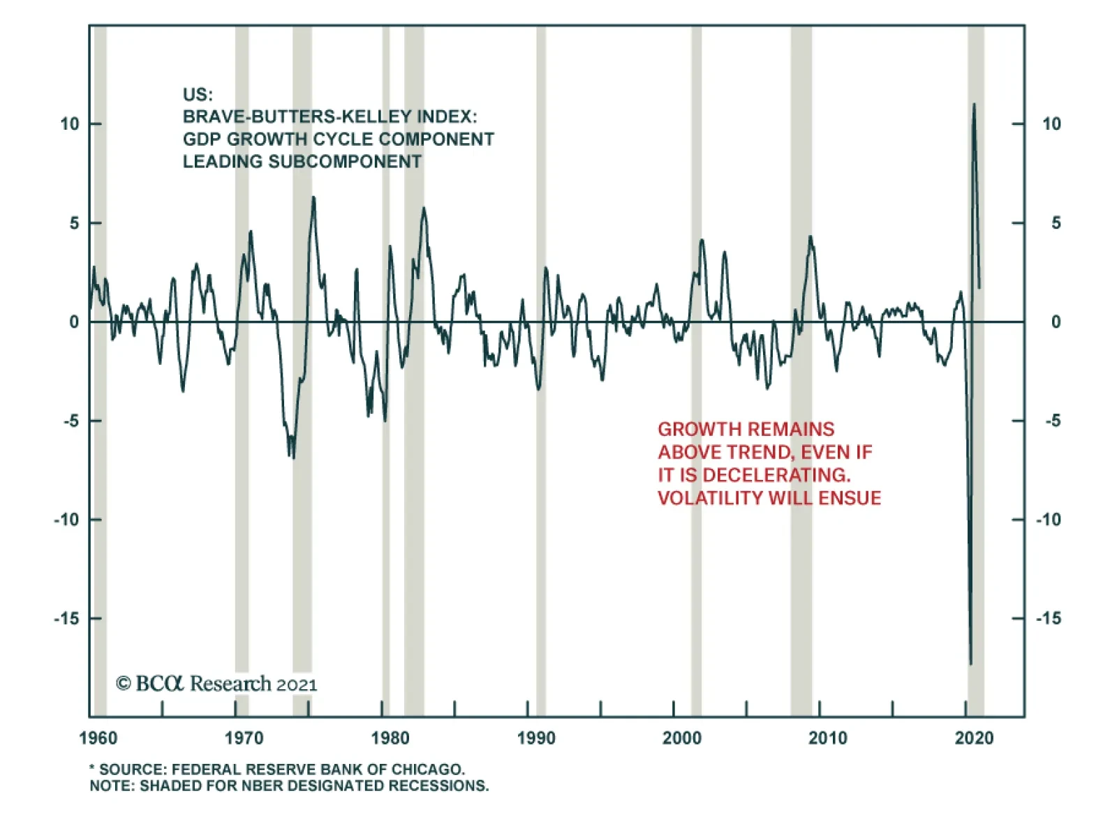
The Fed began publishing the Brave-Butters-Kelly Index (BBKI) as a monthly estimate for US GDP. The most recent reading of the leading component of the BBKI confirms that sequential economic activity in the US is decelerating markedly. This suggests that the…