United States

Highlights Fed: We will use the monthly US employment data to track progress toward the first Fed rate hike. At present, our base case outlook calls liftoff in late-2022 or the first half of 2023. Investors should maintain below-benchmark portfolio duration. Corporate Bonds: The macro environment is supportive for spread product returns, but there are better opportunities than in investment grade corporate bonds. We prefer high-yield over investment grade within the US corporate space, particularly the Ba credit tier. Munis: Muni value has deteriorated markedly, but the sector still looks attractive compared to investment grade corporate bonds. EM Sovereigns: We recommend owning investment grade USD-denominated EM Sovereign bonds instead of investment grade US corporates. Within high-yield, US corporates still offer a better opportunity than EM Sovereigns. Using Employment Data To Time Fed Liftoff The current debate raging in fixed income circles revolves around whether large-scale fiscal stimulus will cause inflation to flare this year, possibly leading to a much earlier fed funds liftoff date than is currently priced into the yield curve (Chart 1). Chart 1Fed Liftoff Priced For July 2023
Fed Liftoff Priced For July 2023
Fed Liftoff Priced For July 2023
Last week’s report discussed our outlook for inflation in 2021.1 In short, our base case calls for 12-month PCE inflation to peak above the Fed’s 2% target in April but to then fall back below 2% by the end of the year. However, there is a compelling case to be made that inflation could rise more quickly. Table 1A Checklist For Liftoff
Searching For Value In Spread Product
Searching For Value In Spread Product
Last week, our Global Investment Strategy service pointed out that the combined effect of December’s fiscal stimulus deal and President Biden’s newly proposed American Rescue Plan would inject an average of $300 billion per month into the economy through the end of September.2 The Congressional Budget Office estimates that the monthly output gap – the difference between what the economy is capable of producing and what it is actually producing – is currently $80 billion. In that environment, it’s not hard to see how excess demand could lead to price increases in certain sectors. Chart 2How Far From "Maximum Employment"?
How Far From "Maximum Employment"?
How Far From "Maximum Employment"?
Of course, for bond investors what matters is not just the path of inflation but how the Fed responds. If rising inflation prompts the Fed to lift rates before July 2023 – the liftoff date currently priced into the market – then bonds will sell off. If liftoff occurs later, then yields will fall. This makes timing the liftoff date critical, and fortunately, the Fed has given us three explicit criteria that must be met before liftoff will occur (Table 1). This week’s report focuses, not on inflation, but on the condition related to “maximum employment.” Our sense is that if the Fed does not think the economy is at “maximum employment” it will ignore modest overshoots of its 2% inflation target on the view that the large amount of labor market slack will eventually cause inflationary pressures to wane. We define “maximum employment” as an unemployment rate of 4.5%, consistent with the upper-bound of the Fed’s most recent range of NAIRU estimates (Chart 2). Using that assumption, and an assumption for the path of the labor force participation rate (Chart 2, bottom panel), we can calculate the average monthly payroll gains that must occur for the unemployment rate to hit the 4.5% target by specific future dates. Our results are shown in Table 2. We use four different scenarios for the labor force participation rate. The lowest estimate assumes that the participation rate remains at its current level. The highest estimate assumes that it re-converges to its pre-COVID level at the same time as the unemployment rate hits 4.5%. The two middle estimates assume smaller increases of 1% and 0.5%, respectively. Table 2Average Monthly Nonfarm Payroll Growth Required For The Unemployment Rate To Reach 4.5% Over The Given Horizon
Searching For Value In Spread Product
Searching For Value In Spread Product
We expect the participation rate to rise as the economy recovers and people are drawn back into the labor force, but some workers have likely been permanently displaced by the pandemic and a full convergence back to pre-COVID levels may not occur until well after the unemployment rate reaches 4.5%, if at all. With that in mind, the “Convergence To Pre-COVID” scenario probably overstates the monthly payroll gains necessary to hit full employment and the “Stays At 61.5%” scenario almost certainly understates them. If we focus on the two middle scenarios, we see that average monthly payroll gains of between 472k and 572k are required for the unemployment rate to hit 4.5% by the end of this year. This range falls to 346k - 413k if we push the liftoff date out until mid-2022 and to 283k – 334k if we move out until the end of 2022. At first blush, these numbers look unattainable. Between 2010 and 2019, average monthly payroll growth averaged a mere +97k. But, given the downturn that just occurred, employment growth will likely be much stronger going forward. Our research into past economic cycles has found that the two main determinants of average monthly employment growth during the first year following a recession are: The drawdown in employment that occurred during the recession (a larger drawdown correlates with greater payroll growth in the first 12 months of recovery) Real GDP growth during the first 12 months of recovery Chart 3 shows the correlation between the peak-to-trough decline in nonfarm payrolls during the past eight US recessions and the average monthly payroll gains seen during the first 12 months of economic recovery. The correlation is quite linear except for the 2008 recession where the peak-to-trough decline in payrolls was 8.7 million but the bounce-back was incredibly weak. Chart 4 explains why the 2008 recession looks like such an outlier in Chart 3. Real GDP growth during the first 12 months of recovery coming out of the 2008 recession was very low, only 2.6%. Chart 3Large Payroll Drawdowns Tend To Be Followed By Strong Gains…
Searching For Value In Spread Product
Searching For Value In Spread Product
Chart 4…And Occur Alongside Strong Economic Recovery
Searching For Value In Spread Product
Searching For Value In Spread Product
Thinking about the current recovery from the COVID recession. Nonfarm payrolls fell by about 22 million from peak to trough in 2020. This is literally off the charts (looking at Chart 3), about 2.5 times the job loss seen in 2008. Then, the Fed’s most recent median estimate for real GDP growth in 2021 is a robust 4.2%, and this estimate was made before Democrats took control of the Senate and proposed a massive new stimulus bill. Considering both the large drawdown in employment and the outlook for rapid GDP growth in 2021, average monthly payroll gains should be quite strong this year. A return to a 4.5% unemployment rate by the end of 2021 is probably a long shot, but we can easily envision average monthly payroll gains on the order of 300k to 400k per month, enough to prompt Fed tightening by late-2022 or the first half of 2023. Whatever transpires, we will monitor monthly payroll growth in the coming months and use this analysis to continuously reassess our liftoff expectations. For the time being, investors should keep portfolio duration low. Alternatives To Investment Grade Corporates Another conclusion that falls out of the above analysis is that the runway for spread product outperformance remains long. With Fed tightening unlikely until late-2022 or the first half of 2023, monetary conditions will remain accommodative for some time. This will drive a continued search for yield, supporting the outperformance of spread product relative to Treasuries. But despite the supportive macro environment, bond investors face a problem that the most popular US spread sector – investment grade corporate bonds – looks very expensive. The average option-adjusted spread for the Bloomberg Barclays investment grade corporate index is only 2 bps above its pre-COVID low, and the spread on Baa-rated bonds is exactly equal to its pre-COVID low. Aa- and A-rated bonds appear somewhat cheaper (Chart 5). The valuation picture is even bleaker after adjusting the index to ensure a constant average credit rating and average duration over time. The 12-month breakeven spread for the credit rating-adjusted corporate index has only been tighter 3% of the time since 1995 (Chart 6). Chart 5IG Spreads Are Tight...
IG Spreads Are Tight...
IG Spreads Are Tight...
Chart 6...Especially After Adjusting For Risk
...Especially After Adjusting For Risk
...Especially After Adjusting For Risk
The remainder of this report discusses potential alternatives to investment grade corporate bonds. Specifically, we’re looking for spread products that will benefit from the same macro environment as investment grade corporates, but where investors can pick up some additional risk-adjusted value. Candidate #1: Junk Bonds Chart 7Ba-Rated Corporates Are Cheap
Ba-Rated Corporates Are Cheap
Ba-Rated Corporates Are Cheap
One obvious thing investors might consider is a move down the quality spectrum into high-yield bonds. This move comes with greater credit risk, but we believe the incremental spread pick-up provides more than fair additional compensation. The Bloomberg Barclays High-Yield index’s average option-adjusted spread is still 33 bps above its pre-COVID low, and the spread pick-up in the Ba credit tier relative to the Baa credit tier looks particularly compelling (Chart 7). The supportive macro environment makes us less worried about taking additional credit risk in a portfolio, and we recommend that investors pick up the additional spread offered in the high-yield space. The elevated incremental spread pick-up in Ba bonds makes that credit tier look like the best risk-adjusted opportunity. Candidate #2: Tax-Exempt Municipal Bonds Municipal bond spreads have tightened dramatically during the past couple of months and Aaa-rated Munis no longer look cheap compared to Treasuries (Chart 8). That said, if we match the duration and credit rating between the Bloomberg Barclays Municipal bond indexes and the US Credit index, we find that both General Obligation (GO) and Revenue Munis appear attractive compared to US investment grade Credit. Both GO and Revenue Munis offer a before-tax spread pick-up relative to US Credit for maturities above 12 years (Chart 9), the same goes for Revenue bonds with 8-12 year maturities. Revenue bonds in the 6-8 year maturity bucket offer an after-tax yield pick-up versus Credit for investors with an effective tax rate of 10% or higher. GO bonds in the 8-12 year and 6-8 year maturity buckets offer breakeven effective tax rates of 14% and 26%, respectively. Chart 8Muni / Treasury Yield Ratios
Muni / Treasury Yield Ratios
Muni / Treasury Yield Ratios
Chart 9Munis Still Attractive Versus Corporates
Munis Still Attractive Versus Corporates
Munis Still Attractive Versus Corporates
All in all, municipal bond value has deteriorated markedly in recent months and we therefore downgrade our recommended allocation slightly from “maximum overweight” (5 out of 5) to “overweight” (4 out of 5). Investors should still prefer tax-exempt municipal bonds relative to investment grade corporate bonds with the same credit rating and duration. Candidate #3: USD-Denominated Emerging Market Sovereigns For all of last year we advised investors to favor investment grade corporate bonds over USD-denominated EM Sovereigns of equivalent credit rating and duration. This positioning worked out well. Since the March 23rd peak in credit spreads, the A3/Baa1-rated EM Sovereign index has only outperformed the duration-matched A-rated US Credit index by 159 bps while it has underperformed the Baa-rated US Credit index by 571 bps (Chart 10). In the high-yield space, the B1/B2-rated EM Sovereign index has significantly underperformed both the Ba and B-rated US junk bond indexes. Chart 10EM Sovereigns Underperformed US Corporates In 2020
EM Sovereigns Underperformed US Corporates In 2020
EM Sovereigns Underperformed US Corporates In 2020
But now, after nine months of poor relative performance, value is starting to look more compelling in the EM Sovereign space. Chart 11 shows that EM Sovereigns offer a yield pick-up versus duration-matched US corporate bonds for all credit tiers except Ba. At the country level, the yield advantage in the A and Aa credit tiers is attributable to opportunities in Qatar, UAE and Saudi Arabia (Chart 12). In the Baa credit tier, investors should look for opportunities in Mexico, Russia and Colombia, while avoiding the Philippines. Chart 11USD-Denominated EM Sovereign Spreads Versus Credit Rating And Duration-Matched US Credit: By Credit Rating
Searching For Value In Spread Product
Searching For Value In Spread Product
Chart 12USD-Denominated EM Sovereign Spreads Versus Credit Rating And Duration-Matched US Credit: By Country
Searching For Value In Spread Product
Searching For Value In Spread Product
All in all, investors should shift some allocation away from investment grade corporates and into USD-denominated EM Sovereigns with equivalent duration and credit rating, focusing on the countries that offer a yield pick-up. Turning to high-yield, we would rather own junk-rated US corporate bonds than junk-rated EM Sovereigns. US corporates offer a yield pick-up over EM Sovereigns in the Ba credit tier, and the sky-high spreads offered by B and Caa-rated EMs are due to overly risky opportunities in Turkey and Argentina. We don’t see these countries benefiting from the supportive US macro environment in the same way as US corporate credit, and therefore recommend overweighting US corporate junk bonds over EM Sovereign junk bonds. Bottom Line: Investors should continue to overweight spread product versus Treasuries in US fixed income portfolios but should look for opportunities outside of investment grade corporate bonds. We recommend owning municipal bonds and USD-denominated EM Sovereign bonds in place of investment grade US corporate bonds with the same credit rating and duration. We also recommend taking additional credit risk in US junk bonds, particularly in the Ba credit tier. Investors should prefer US junk bonds over junk-rated EM Sovereigns. Ryan Swift US Bond Strategist rswift@bcaresearch.com Footnotes 1 Please see US Bond Strategy Weekly Report, “Trust The Fed’s Forward Guidance”, dated January 19, 2021, available at usbs.bcaresearch.com 2 Please see Global Investment Strategy Weekly Report, “Stagflation In A Few Months?”, dated January 22, 2021, available at gis.bcaresearch.com Fixed Income Sector Performance Recommended Portfolio Specification
Obeying The Stop: Close The Intra-Real Estate Pair Trade
Obeying The Stop: Close The Intra-Real Estate Pair Trade
In the January 19th Special Report we instituted a long S&P REITs / short S&P homebuilders pair trade with a 10% stop loss. Yesterday, our stop was triggered and we are obeying it and closing this pair trade. Among other reasons, one of the macro drivers that compelled us to put this pair trade on was the 10-year US Treasury yield: historically the correlation between the relative share price ratio and interest rates would snap positive especially following a recession. Hence, a pullback in yields was also a key risk we highlighted for this pair trade. The 10-year US Treasury yield peaked near 1.19% and has continued to correct breaking below 1.04%, which at the margin boosts the allure of homebuilding stocks and consequently put our pair trade offside. While the original reasoning for putting this pair trade on remains intact, we refrain from fighting the trend and opt to move to the sidelines for the time being. We will be on the lookout for a better-timed entry point in the near future. Bottom Line: Obey the trailing stop and close the long S&P REITs / short S&P homebuilders pair trade for a loss of 10%.
Highlights Global Yields: The fall in global bond yields over the past two weeks represents a corrective pullback from an overly rapid rise in inflation expectations, especially in the US. The underlying reflationary themes that drove yields higher, however, remain intact, even with uncertainty over COVID-19 vaccine distribution and mixed messages on future central bank policy moves. Duration Strategy: We maintain our broad core recommendations on global government bonds: stay below-benchmark on overall duration exposure, overweighting non-US markets versus US Treasuries, while favoring inflation-linked debt over nominal bonds. Australia vs. US: Following from the conclusions of our Special Report on Australia published last week, we are initiating a new cross-country spread trade in our Tactical Overlay portfolio: long 10-year Australian government bond futures versus short 10-year US Treasury futures. Feature Chart of the WeekCentral Banks Will Stay Very Dovish
Central Banks Will Stay Very Dovish
Central Banks Will Stay Very Dovish
The benchmark 10-year US Treasury yield fell to 1.04% yesterday as this report went to press, after reaching a high of 1.18% on January 12th. 10-year government bond yields have also fallen over the same period, but by lesser amounts ranging between 5-10bps, in Germany, France, the UK and Australia. We view these moves as a consolidation before the next upleg in global yields, and not the start of a new bullish cyclical phase for government bond markets. Our Central Bank Monitors for the major developed economies are all showing diminished pressure for easier monetary policies, but are not yet signaling a need for tightening to slow overheating economies (Chart of the Week). Realized inflation and breakevens from inflation-linked bond markets remain below levels consistent with central bank policy targets, even in the US after the big run-up in TIPS breakevens. Reflationary, pro-growth monetary (and fiscal) policies are still necessary. Policymakers can talk all they want about optimism on future global growth with COVID-19 vaccines now being rolled out in more countries, but it is far too soon to expect any shift away from a maximum dovish monetary policy stance that is bearish for bonds and bullish for risk assets. We continue to recommend a below-benchmark overall stance on global cyclical duration exposure, with a country allocation focused most intensely on underweighting US Treasuries. The Global Backdrop Remains Bond Bearish Optimism over a potential boom in global economic growth in the second half of 2021 - fueled by the rollout of COVID-19 vaccines, massive pandemic income support programs and other increased government spending measures, and ongoing easy monetary policies – has become an increasingly consensus view among investors. As evidence of this, the latest edition of the widely-followed Bank of America Fund Managers’ Survey highlighted that the biggest tail risks for financial markets all relate to that bullish narrative: a disappointing vaccine rollout, a “Tantrum” in bond markets, a bursting of the US equity bubble and rising inflation expectations.1 We can understand why investors would be most worried about the success of the COVID-19 vaccine distribution which has started with mixed results. According to the Oxford University COVID-19 database, the UK has now delivered 10.38 vaccinations per 100 people, while the US has given out 6.6 shots per 100 people (Chart 2). By comparison, the pace of the vaccine rollout has been far slower in Germany, France, Italy and China. Note that this data shows total vaccine shots administered and does not represent a count of the total number of inoculated citizens, as a full dose requires two shots. Chart 2Vaccine Rollout So Far: Operation Impulse Power
A Pause, Not A Peak, In Global Bond Yields
A Pause, Not A Peak, In Global Bond Yields
Success on the vaccine front is what is needed for investors to envision an eventual end to the pandemic … or at least an end to the growth-damaging lockdowns related to the pandemic. So a slower-than-expected rollout does justify somewhat lower bond yields, all else equal. However, the news on the spread of the virus itself has turned more encouraging during this “dark winter” of COVID-19. The latest data on new cases of the virus shows that the severe surge in the US and UK appears to have peaked (Chart 3). In the euro area, the overall number of new cases is at best stabilizing with more divergence between countries: cases are continuing to explode higher in Italy and Spain but slowing in large economies like Germany and the Netherlands (and stabilizing in France). The growth in new virus-related hospitalizations, however, has clearly slowed across those major economies, including in places with surging new case numbers like Italy. Chart 3Lockdowns Will Not Last Forever
Lockdowns Will Not Last Forever
Lockdowns Will Not Last Forever
Chart 4European Lockdowns Taking A Bite Out Of Growth
European Lockdowns Taking A Bite Out Of Growth
European Lockdowns Taking A Bite Out Of Growth
A reduction in the strain on hospital bed capacity gives hope that the current severe economic restrictions seen in Europe and parts of the US can soon begin to be lifted. This can help sustain the cyclical upturn in global economic growth, especially in countries where lockdowns have been most onerous like the UK, which saw a sharp plunge in the preliminary Markit PMI data for January (Chart 4). So on the COVID-19 front, we interpret the overall backdrop as more positive for global growth expectations, and hence more supportive of higher global bond yields. Chart 5Reflationary Expectations Remain Well Entrenched
Reflationary Expectations Remain Well Entrenched
Reflationary Expectations Remain Well Entrenched
Expectations are still tilted towards rising yields, judging by the ZEW survey of global financial market professionals (Chart 5). The survey shows that the bias continues to lean towards expectations of both higher long-term interest rates and inflation, but without any expected increase in short-term interest rates. This fits with the overall yield curve steepening theme that has driven global bond markets since last summer, which has been consistent with the dovish messaging from central banks. The Fed, ECB and other major central banks continue to project a very slow recovery of labor markets from the COVID-19 shock, with no return to pre-pandemic levels until at least 2024 (Chart 6). This is forcing central banks to maintain as dovish a policy mix as possible, including projecting stable policy rates over the next several years supported by ongoing quantitative easing (QE). These policies have helped support the rise in global inflation expectations and helped fuel the “Everything Rally” that has stretched the valuations of risk assets worldwide. So it is also not surprising that worries about a bond “Tantrum”, rising inflation expectations and a bursting of equity bubbles would also top the tail risks highlighted in that Bank of America investor survey. All are connected to the next moves of the major global central banks. Chart 6Central Banks Must Stay Easy For A Long Time
Central Banks Must Stay Easy For A Long Time
Central Banks Must Stay Easy For A Long Time
On that front, we are not worried about any premature shift to a less dovish stance, given the lingering uncertainties over COVID-19 and with actual inflation – and inflation expectations - remaining below central bank targets. Several officials from the world’s most important central bank, the US Federal Reserve, have made comments in recent weeks discussing the outlook for US monetary policy. A few FOMC members raised the possibility of a potential discussion of slower bond purchases by year-end, if the US economy grows faster than expected and the vaccine rollout goes smoothly. Although the majority of FOMC members, including Fed Chair Jerome Powell and Vice-Chairman Richard Clarida, noted that any such discussion was premature and would not take place until 2022 at the earliest. In our view, the Fed will not begin to signal any shift to a less dovish policy stance before US inflation and inflation expectations have all sustainably returned to levels consistent with the Fed’s 2% target (Chart 7). That means seeing TIPS breakevens rise to the 2.3-2.5% range that has prevailed during previous periods when headline PCE inflation as at or above 2%. Chart 7US Inflation Still Justifies Maximum Fed Dovishness
US Inflation Still Justifies Maximum Fed Dovishness
US Inflation Still Justifies Maximum Fed Dovishness
Chart 8The Fed Is Not Yet Worried About Overly Easy Financial Conditions
The Fed Is Not Yet Worried About Overly Easy Financial Conditions
The Fed Is Not Yet Worried About Overly Easy Financial Conditions
Such a shift by the Fed could happen by year-end, but only if there was also concern within the FOMC that financial conditions in the US had become overly stimulative and risked future instability of overvalued asset prices (Chart 8). At the present time, however, the Fed will continue to focus on policy reflation and worry about any negative spillover effects on financial markets at a later date. Financial conditions are also a potential issue for other central banks, but from a different perspective – currencies. Financial conditions in more export-focused economies like the euro area and Australia are more heavily influenced by the impact on competitiveness from currency values (Chart 9). Chart 9Currencies Dictate Financial Conditions Outside The US
Currencies Dictate Financial Conditions Outside The US
Currencies Dictate Financial Conditions Outside The US
Chart 10Projected Relative QE Favors UST Underperformance
Projected Relative QE Favors UST Underperformance
Projected Relative QE Favors UST Underperformance
The combination of the Fed’s lingering dovish policy bias and the improving global growth backdrop should keep the US dollar under cyclical downward pressure. The weaker greenback means that non-US central banks must try to maintain an even more dovish bias than the Fed to limit the upward pressure on their own currencies. A desire to fight unwanted currency appreciation via a more rapid pace of QE relative to the Fed – at a time when US Treasury yields are likely to remain under upward pressure from rising inflation expectations – should support a narrowing of non-US vs US bond spreads over the next 6-12 months (Chart 10). Bottom Line: The underlying reflationary themes that drove global bond yields higher over the past several months remain intact, even with uncertainty over COVID-19 vaccine distribution and mixed messages on future central bank policy moves. Stay below-benchmark on overall global duration exposure, overweighting non-US government bond markets versus US Treasuries, while also favoring global inflation-linked debt over nominal bonds. A New Cross-Country Spread Trade: Long Australian Government Bonds Vs. US Treasuries In last week’s Special Report on Australia, which we co-authored jointly with BCA Research Foreign Exchange Strategy, we concluded that a neutral exposure to Australian government debt within global bond portfolios was still warranted.2 Uncertainty over the Reserve Bank of Australia (RBA) reaction function and the future path of Australia’s yield beta, which measures the sensitivity of Australian yields to global yields and remains elevated, justified a neutral stance. We do, however, have a higher conviction view that Australian government debt will outperform US Treasuries – especially given our expectation that US yields have more cyclical upside – given that the yield beta of the former to the latter has declined (Chart 11). Chart 11Australian Government Bonds Are "Defensive" When US Yields Are Rising
Australian Government Bonds Are "Defensive" When US Yields Are Rising
Australian Government Bonds Are "Defensive" When US Yields Are Rising
This week, we translate that view into a new tactical trade—going long 10-year Australian government bonds versus shorting 10-year US Treasuries. This trade will be implemented through bond futures (details of the trade can be seen in our trade table on page 15). In addition to the yield beta argument, the Australia-US 10-year spread looks attractive on a fair value basis. Chart 12 presents our new Australia-US 10-year spread valuation model, based on fundamental factors such as relative policy interest rates, inflation and unemployment. The model also accounts for the impact from the massive bond buying by the Fed and Reserve Bank of Australia (RBA); we include as an independent variable the relative central bank balance sheets as a share of respective nominal GDP. Although the Australia-US spread has converged somewhat towards fair value since the blow out in March 2020, it is still at attractive levels at 13bps or 0.8 standard deviations above fair value. The model-implied fair value of the Australia-US spread could also fall further, thereby creating a lower anchor point for spreads to gravitate towards. While the policy rate differential will likely remain unchanged until 2023, other factors will move to drag down the spread fair value (Chart 13). The gap in relative headline inflation should, much to the RBA’s chagrin, move further into negative territory given the relatively weaker domestic and foreign price pressures in Australia. On the QE front, the RBA also has much more room to expand its balance sheet relative to developed market peers, and will feel pressured to do so if the Australian dollar continues to rally. Finally, the RBA expects a much slower recovery in Australian unemployment than the Fed does for the US. This should further push down fair value if the central bank forecasts play out as expected. Chart 12The Australia-US 10-Year Spread Is Undervalued
The Australia-US 10-Year Spread Is Undervalued
The Australia-US 10-Year Spread Is Undervalued
Technical considerations also seem to be in favor of our trade (Chart 14). While the deviation of the Australia-US 10-year spread from its 200-day moving average, and its 26-week change, are both slightly negative, the 2008 period is instructive. Chart 13Relative Fundamentals Point Towards A Lower Australia-US Spread
Relative Fundamentals Point Towards A Lower Australia-US Spread
Relative Fundamentals Point Towards A Lower Australia-US Spread
Chart 14Technicals Favor Further Reduction In The Australia-US Spread
Technicals Favor Further Reduction In The Australia-US Spread
Technicals Favor Further Reduction In The Australia-US Spread
For both measures, after blowing up to around the +75-150bps zone, they likewise fell by a commensurate amount, attributable to a strong “base effect”. A similar dynamic should play out now after the dramatic 2020 spike in spread momentum. Meanwhile, duration positioning in the US, while it is short on net, is still far from levels where it has troughed. Lastly and most importantly, forward curves are pricing in an Australia-US spread close to zero, which provides us a golden opportunity to “beat the forwards” as the spread tightens without incurring negative carry. As a reference, we are initiating this trade with the cash 10-year Australia-US bond spread at 4bps, with a target range of -30bps to -80bps over the usual 0-6 month horizon that we maintain for our Tactical Overlay positions. Bottom Line: We seek to capitalize on our view that Australian yields will be slower to rise relative to US yields by introducing a new spread trade: buy Australian government bond 10-year futures and sell US 10-year Treasury futures. Robert Robis, CFA Chief Fixed Income Strategist rrobis@bcaresearch.com Shakti Sharma Research Associate ShaktiS@bcaresearch.com Footnotes 1https://www.bloombergquint.com/markets/record-number-of-fund-managers-overweight-on-emerging-markets-says-bofa-survey 2 Please see BCA Research Global Fixed Income Strategy Special Report, "Australia: Regime Change For Bond Yields & The Currency?", dated January 20, 2021, available at gfis.bcaresearch.com. Recommendations The GFIS Recommended Portfolio Vs. The Custom Benchmark Index
A Pause, Not A Peak, In Global Bond Yields
A Pause, Not A Peak, In Global Bond Yields
Duration Regional Allocation Spread Product Tactical Trades Yields & Returns Global Bond Yields Historical Returns
BCA Research’s US Equity Strategy service highlights that the equity market does not only suffer from a valuation bubble but from a growth expectation one as well. The google trends search term ‘stock market bubble’ hit all-time highs since the 2004 start…
Highlights Portfolio Strategy Speculative fervor dominates trading in the S&P auto & components group, but soaring long-term profit projections, lofty valuations, overbought technicals, and a looming German/Japanese/Chinese BEV competitive attack on TSLA’s BEV home turf, all but guarantee some cooling off in the recent exuberance in this GICS2 industry group, and compel us to downgrade exposure to underweight. This move also pushes the S&P consumer discretionary sector to a below benchmark allocation, today. A firming operating backdrop, a stealthy turn in select macro data, extreme sell-side pessimism, bombed out technicals and compelling valuations all signal that it no longer pays to be bearish the S&P utilities sector. Upgrade to neutral. Recent Changes Downgrade the S&P automobiles & components index to underweight, today. This move also pushes the S&P consumer discretionary sector to a below benchmark allocation, today. Upgrade the S&P utilities sector to neutral today, locking in gains of 14.8% since inception. Last Wednesday our rolling stop on the long “Back To Work”/short “COVID-19 Winners” pair trade got triggered and we booked gains of 21.5% since the September 8 inception. Table 1
Overdose?
Overdose?
Feature The SPX cheered Joe Biden’s inauguration and vaulted to fresh all-time highs last week. It is now at spitting distance from our 4,000 target, a mere 3.8% higher. While loose fiscal and easy monetary policies have staying power and will remain largely intact in 2021, their efficacy is dwindling. Crudely put, it would take additional extra-ordinary larger amounts of stimuli to move the needle, as all the good news and then some, is already reflected in fully valued stocks. Financial conditions are the easiest on record, as we highlighted recently, and investor complacency reigns supreme given the 0.34 print in the equity put/call ratio (Chart 1). Chart 1Complacency Reigns
Complacency Reigns
Complacency Reigns
In the near-term, something’s got to give. Importantly, a rising number of indicators we track are flashing red. Not only is there a plethora of anecdotes that the newly minted stock traders using Robinhood are chasing story stocks armed with freshly-written stimulus checks, but margin debt is also exploding (Chart 2). Granted, the latter is a coincident indicator, nevertheless the stampede into stocks via tapping margin accounts is near previous cyclical zeniths: the annualized 13-week rate of change of margin debt uptake surpassed 100%/annum, a move last seen in 2007/2008 and 1999/2000 (Chart 2). Correcting margin debt for GDP and total stock market capitalization for the size of the US economy (Buffett Indicator) is revealing. Both measures are at an extreme using data going back to the 1970s, making the equity market susceptible to disappointment (Chart 3). Buyer exhaustion will come sooner rather than later, and such a dearth of buyers will cause at least an air pocket in stocks. Chart 2Maxed Out On Debt?
Maxed Out On Debt?
Maxed Out On Debt?
Chart 3Off The Charts
Off The Charts
Off The Charts
Moreover, there is an element of pre-GFC-type excesses, but now investors are speculating with equities instead of housing. Back then, NINJA loans, ARM loans and subprime loans in general were sustaining the house of cards as long as the price of the underlying asset kept on rising. As soon as prices crested and moved sideways to lower, debt deflation hit real estate speculators hard, especially ones that owned multiple homes. Currently, anecdotes of homeowners speculating on the stock market via Mortgage Equity Withdrawals (Greenspan-Kennedy MEW)1 are also mushrooming. In other words, many retail investors are tapping into their home equity and money saved from ultra-cheap re-financings and redeploying it into stocks. As of Q3/2020 MEW is running at the highest level since the GFC at $300bn or roughly 2% of disposable income; keep in mind that the latter has also gotten a COVID-19 fiscal boost to the order of $1.2tn, which makes the galloping MEW even more remarkable (Chart 4). Chart 4Even MEW Is Spiking
Even MEW Is Spiking
Even MEW Is Spiking
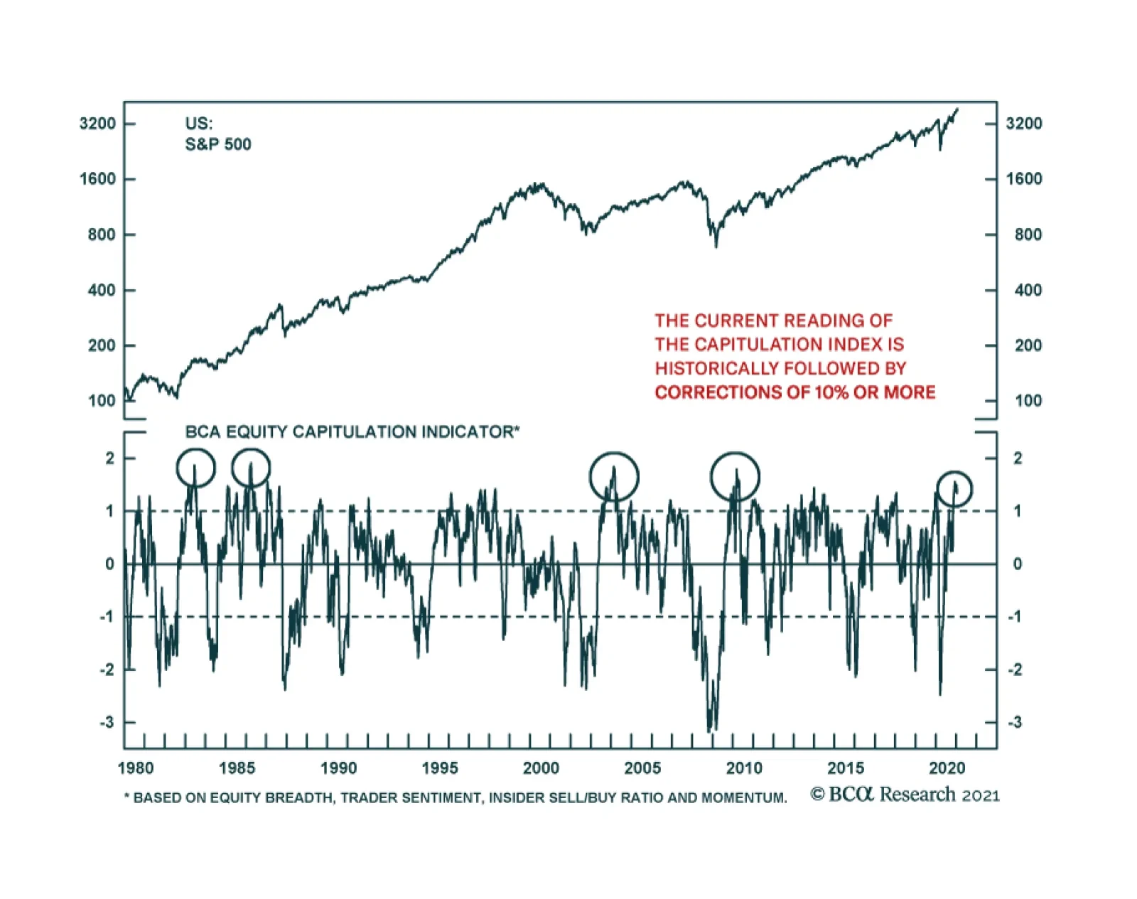
While MEW is nowhere near its 2007/2008 peak, surely some of it is leaking into equities, beyond PCE, further fueling the recent stock market exuberance. Another indicator that has sprang to life of late is our Equity Capitulation Index. Back in March we used this indicator from a contrary perspective when we recommended investors go long equities on a cyclical basis (reason #16 to start buying equities). Subsequently we have remained cyclically exposed, but we cannot neglect the negative signal this indicator is now emitting: it has clawed back all the losses since March and is now at a level that has marked previous near-term tops, and at an eerily similar level as during the 2010 SPX peak (second panel, Chart 5). Further on the sentiment front, bulls are abundant, but bears have gone extinct: according to Investors Intelligence the bull/bear ratio is closing in on 4, an historically elevated ratio (Chart 6). Chart 5Contrary Alert: Bears Capitulated?
Contrary Alert: Bears Capitulated?
Contrary Alert: Bears Capitulated?
Chart 6Extreme Sentiment Reading
Extreme Sentiment Reading
Extreme Sentiment Reading
Netting it all out, speculative fervor has taken over the equity markets and at least a healthy near-term breather is warranted in order to consolidate recent impressive gains. We remain cautious on the short-term prospects of the broad equity market and continue to recommend investors go long a $390/$410 call spread on the SPY exchange traded fund financed by a short $340 put on the SPY for either March or June option expiries. This week, we downgrade a consumer goods index to underweight that is at the epicenter of the recent equity market bubble talk. This change also pushes the S&P consumer discretionary index to a below benchmark allocation. Further, we trigger our upgrade alert on a niche defensive sector monetizing sizable gains for the portfolio. Downgrade Autos & Components To Underweight We recommend investors shy away from the S&P automobiles & components GICS2 industry group, and today we downgrade it to an underweight stance. Before analyzing this group that has an 80%+ weight in TSLA in more detail, a couple of bubble-related observations are in order. The top panel of Chart 7 shows the google trends search term ‘stock market bubble’ as a time series, and it has hit all-time highs since the 2004 start in this data search query. Importantly, linking this to the SPX is instructive. Every time these search results pick up steam, so does S&P 500 momentum until it cracks. Assuming a sideways move from here onward on the S&P until the spring, it will boost year-over-year momentum to a peak over the 50%/annum mark (bottom panel, Chart 7). Using weekly data, the SPX has only managed such a feat three other times since WWlI, in 1983, in 1998 and in 2010 (as a reminder we drew SPX parallels to 1998 and 2010 earlier this month). True, this does not prove that the SPX is in a bubble per se, however it does highlight that it is overstretched and at risk of a snapback. While everyone was preoccupied with the effect TSLA’s SPX inclusion would have on the index’s 12-month forward P/E, the real change crept up in the long-term EPS growth expectations. This story stock caused the S&P 500’s five-year profit growth expectation to skyrocket from 12% to 21% overnight (top panel, Chart 8) and pushed down the S&P 500 forward P/E/G ratio to near par (not shown). Chart 7Bubble Talk Mushrooming
Bubble Talk Mushrooming
Bubble Talk Mushrooming
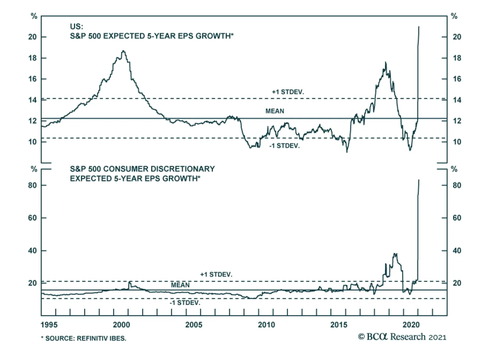
Chart 8"It's too good for true, honey, it's too good for true" (Adventures of Huckleberry Finn, 1884), Mark Twain.
"It's too good for true, honey, it's too good for true" (Adventures of Huckleberry Finn, 1884), Mark Twain.
"It's too good for true, honey, it's too good for true" (Adventures of Huckleberry Finn, 1884), Mark Twain.
Back in late-1999, YHOO’s SPX inclusion also caused a bump in this metric, but it paled in comparison to TSLA’s current dominance. In other words, nine percentage points of growth are attributed to a single stock or 43% of the SPX EPS growth is tied to the fortunes of TSLA. We highly doubt this will occur as analysts have been upgrading profit estimates and price targets for TSLA hand over fist over the past few months, with some using DCFs out to 2040 in order to back up their forecasts. Drilling deeper beneath the surface into the consumer discretionary sector is revealing. TSLA’s inclusion pushed the sector’s 5-year forward profit growth estimates to 83% (bottom panel, Chart 8). To put this in perspective it translates into consumer discretionary profits increasing 20 fold in the next 5 years; no, this is not a typo. Assuming that stock prices follow profits as it typically transpires, then prices will have to rise by a similar amount. Again, our sense is that this is highly unlikely. In comparison, AMZN’s graduation to the SPX in late-2005 barely budged this profit growth metric for the GICS1 sector as tech stocks were still licking their wounds from the dotcom bubble burst. One level lower into GICS2 territory and circling back to S&P auto & components, data series go fully parabolic, to a degree not seen even during the dotcom bubble era. The same aforementioned long-term growth rate zooms to over 300% for the S&P automobiles & components index compared with the broad market (Chart 9). Turning over to relative revenue expectations for the coming 12 months that data point surges close to 15% (middle panel, Chart 9). With regard to valuations, relative forward P/E, relative P/S and P/B are all in the stratosphere, warning that there is no valuation cushion to fall back on in case of an earnings mishap (Chart 10). Chart 9Dizzying…
Dizzying…
Dizzying…
Chart 10...Heights
...Heights
...Heights
Importantly, on the profit front, a wide gap has opened between relative share prices and relative forward EPS, which suggests that high-flying auto stocks will soon stop defying gravity (Chart 11). Technicals are also waving a red flag: the S&P autos & components relative annualized 13-week rate of change clocked in at over 250%/annum, steeply diverging from relative net EPS revisions (Chart 12). Chart 11Stocks Should Follow Profits
Stocks Should Follow Profits
Stocks Should Follow Profits
Chart 12Cult Stock…
Cult Stock…
Cult Stock…
Using the datastream index equivalent to the S&P automobiles & components (this data provider had included TSLA prior to the S&P’s inclusion in the S&P 500) reveals that this relative share price ratio is on a tear and warns investors that the S&P automobiles & components index is not as depressed as it first appears to the naked eye (Chart 13). Chart 13...Effect
...Effect
...Effect
Looking at the single stock level, TSLA exemplifies the mania of the 2020s (bottom panel, Chart 14). This story stock has been moving in lockstep with M1 money supply. Such a breakneck pace of appreciation is clearly unsustainable (Chart 15). Chart 14TSLA Is A Mania
TSLA Is A Mania
TSLA Is A Mania
Chart 15Spurious? Doubt It
Spurious? Doubt It
Spurious? Doubt It
Finally, comparing TSLA to its global peers is also mind boggling. TSLA is worth a couple hundred billion US dollars more than all of the other global auto stocks put together (top panel, Chart 14)! Auto manufacturing is a cutthroat business with razor thin margins. Thus, we doubt that the German and Japanese (and lately even Chinese BEV makers) auto makers are not going to make inroads into TSLA’s BEV home turf. In Norway, the most advanced BEV market in the world, VW Group outsold TSLA last year by a factor of over 3-to-1. In sum, speculative fervor dominates trading in the S&P auto & components group, but soaring long-term profit projections, lofty valuations, overbought technicals, and a looming German/Japanese/Chinese BEV competitive attack on TSLA’s BEV home turf all but guarantee some cooling off in the recent exuberance in this GICS2 industry group. Bottom Line: Trim the S&P automobiles & components index to underweight today. This move also pushes the S&P consumer discretionary sector to a below benchmark allocation. The ticker symbols for the stocks in this index are: BLBG: S5AUCO – TSLA, GM, F, APTV, BWA. Act On The Utilities Upgrade Alert, Lock In Gains And Lift Exposure To Neutral We have been on the right side of the underweight utilities position for the better part of the past two years, but now that the easy money has been made we are compelled to book handsome gains of 14.8% for the portfolio since inception and move to the sidelines. The bearish story is well known on utilities and avoiding them is now a consensus trade. Chart 16 shows that when the economy is in expansion mode, it pays to minimize utilities exposure. The pendulum always swings the opposite direction and when the cycle matures, investors seek the safe haven stable cash flow status of this niche defensive sector. Extreme euphoria has taken over in the overall equity space and while the vaccine rollout news is a big positive, we doubt the ISM manufacturing survey reading can rise significantly from the current historically stretched level (ISM survey shown inverted, top panel, Chart 16). Similarly, junk yields are at all-time lows confirming that investor complacency is sky-high, and the USD very oversold with positioning stretched to the short dollars side. Any hiccups would cause all three of these macro indicators to reverse course abruptly, which would boost relative utilities share prices (Chart 16). Already, the CITI economic surprise index is sinking like a stone, equity market vol refuses to fall below 20, and the gap between the 10-year US Treasury (UST) yield and relative share prices remains historically wide, leaving ample room for utilities to catch up to the year-over-year drubbing in yields (yields shown inverted, top panel, Chart 17). In fact, were the broad equity market to correct as we expect in the near-term, there are high odds that the 10-year UST yield would fall, further boosting the allure of high yielding utilities. Chart 16Bearish Story Is Well Known
Bearish Story Is Well Known
Bearish Story Is Well Known
Chart 17It No Longer Pays To Avoid Utilities
It No Longer Pays To Avoid Utilities
It No Longer Pays To Avoid Utilities
On the operating front, nat gas prices have stopped hemorrhaging and as this least dirty fossil fuel gains broader investor acceptance in the new EV/ESG and responsible investing world, there is scope for utilities to reassert some of their lost pricing power. As a reminder, natural gas prices are the marginal price setter for utilities and the recent jump in momentum in the former is encouraging for utilities selling prices (second panel, Chart 18). Chart 18Positive Operating…
Positive Operating…
Positive Operating…
Chart 19...Backdrop
...Backdrop
...Backdrop
Moreover, industry inventories are whittled down and utilities construction has been receding, throughout last year (inventories shown inverted, top panel, Chart 19). In fact, it is contracting at roughly a 10%/annum pace (construction shown inverted, bottom panel, Chart 19). Taken together, it no longer pays to be overly bearish this niche defensive sector. Unsurprisingly, sell-side analysts have thrown in the towel and relative 12-month profit forecasts have plummeted, probing all-time lows near the negative 20% mark (third panel, Chart 18). Analyst pessimism is even more pronounced on the five-year outlook, with relative profit growth collapsing again near the negative 17% mark (bottom panel, Chart 18)! Granted this is a single stock’s effect as we showed in the previous section, with late-December TSLA inclusion to the index pushing the SPX long-term profit growth estimate to nearly 21%. We would lean against such pessimism. Finally, relative technicals and valuations also warn against staying negative on the prospects of the S&P utilities sector (Chart 20). Importantly, our Technical Indicator has fallen to one standard deviation below the historical mean, a level that has marked six countertrend up-moves in the past 25 years (bottom panel, Chart 20). Adding it all up, a firming operating backdrop, a stealthy turn in select macro data, extreme sell-side pessimism, bombed out technicals and compelling valuations all signal that it no longer pays to be bearish the S&P utilities sector. Bottom Line: Execute the upgrade alert and augment the S&P utilities sector to neutral today locking in gains of 14.8% since inception. The ticker symbols for the stocks in this index are: BLBG: S5UTIL – NEE, D, DUK, SO, AEP, EXC, XEL, ES, SRE, WEC, AWK, PEG, ED, DTE, AEE, EIX, ETR, PPL, CMS, FE, AES, LNT, ATO, EVRG, CNP, NI, NRG, PNW. Chart 20Unloved And Undervalued
Unloved And Undervalued
Unloved And Undervalued
Anastasios Avgeriou US Equity Strategist anastasios@bcaresearch.com Footnotes 1 https://www.federalreserve.gov/pubs/feds/2007/200720/200720pap.pdf Current Recommendations Current Trades Strategic (10-Year) Trade Recommendations
Overdose?
Overdose?
Size And Style Views January 12, 2021 Stay neutral small over large caps October 26, 2020 Favor small over large caps July 27, 2020 Overweight cyclicals over defensives (Downgrade Alert) June 11, 2018 Long the BCA Millennial basket The ticker symbols are: (AAPL, AMZN, UBER, HD, LEN, MSFT, NFLX, SPOT, TSLA, V). January 22, 2018 Favor value over growth
The S&P 500’s tactical vulnerability is only increasing. One of our favorite technical indicators is suggesting that the risk of a correction is very elevated. The BCA Equity Capitulation Index is at its highest level since 2010 and 2004, two readings…
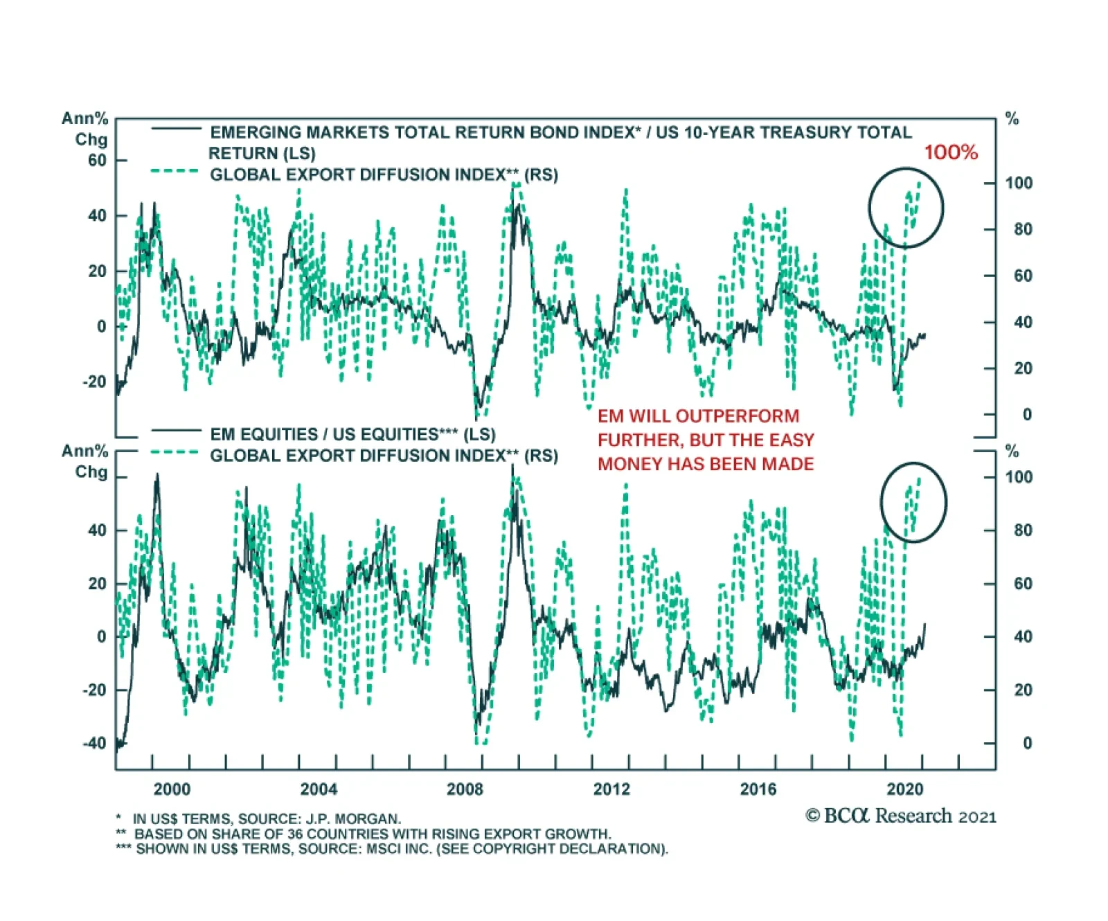
The main characteristic of EM assets remains their elevated sensitivity to global growth. The near-continuous underperformance of EM equities from late 2010 to early 2020 mostly reflected the poor performance of global economic activity over this time frame,…
BCA Research’s Global Investment Strategy service’s baseline view is that inflation will increase only modestly over the next few years before accelerating in the middle of the decade. Nevertheless, the risks are skewed towards an earlier and sharper increase…
Obey The Rolling Stop And Crystallize Gains In The “Back To Work” Trade
Obey The Rolling Stop And Crystallize Gains In The “Back To Work” Trade
In the September 8thStrategy Report we first created the “Back To Work” basket and recommended investors to gain exposure to the reopening trade by initiating a long “Back To Work”/short “COVID-19 Winners” pair trade. More recently, and in light of the handsome gains that this trade has produced, we instituted a 5% rolling stop in order to protect profits. Yesterday, our stop was triggered compelling us to crystallize 21.5% in gains since inception. Not only did this long/short trade serve its purpose by capturing the economic reopening and vaccine related rollout euphoria, but it also outperformed the market by 700bps as the SPX rose only by 14.5% since September 8th. Bottom Line: Lock in 21.5% gains in the long “Back-To Work”/short “COVID-19 Winners” pair trade since the early-September inception.
Melt Up Arithmetic
Melt Up Arithmetic
While everyone was preoccupied with the effect TSLA’s SPX inclusion would have on the index’s 12-month forward P/E, the real change crept up in the long-term EPS growth expectations. This story stock caused the S&P 500’s five-year profit growth expectation to skyrocket from 12% to 21% overnight (top panel) and push down the S&P 500 forward P/E/G to near par (not shown). Back in late-1999, YHOO’s SPX inclusion also caused a bump in this metric, but it paled in comparison to TSLA’s current dominance. In other words, nine percentage points of growth are attributed to a single stock or 43% of the SPX EPS growth is tied to the fortunes of TSLA. We highly doubt this will occur as analysts have been upgrading profit estimates and price targets for TSLA hand over fist, with some using DCFs out to 2040 in order to back up their forecasts. Drilling deeper beneath the surface into the consumer discretionary sector is revealing. TSLA’s inclusion pushed the sector’s 5-year forward profit growth estimates to 83% (bottom panel). To put this in perspective it translates into consumer discretionary profits increasing 20 fold in the next 5 years; no, this is not a typo. Assuming that stock prices follow profits as it typically transpires, then prices will have to rise by a similar amount. Again, our sense is that this is highly unlikely. In comparison, AMZN’s graduation to the SPX in late-2005 barely budged this profit growth metric for the GICS1 sector as tech stocks were still licking their wounds from the dotcom bubble burst. Bottom Line: Frothiness is prevalent in certain parts of the equity market and some near-term caution is warranted. We reiterate our recent recommendation that investors deploy fresh capital via going long the $390/$410 SPY call spread and financing it via a $340 put either for March or June expiries. For additional analysis please look forward to this coming Monday’s Strategy Report.