United States

Dear Client, The US Capitol is going on lockdown as we write to introduce BCA Research’s newest investment service, US Political Strategy, in this inaugural report. US Political Strategy will provide timely and actionable policy insights for US-dedicated, multi-asset investors. It grew naturally out of our successful Geopolitical Strategy service, which has become an industry leader in combining geopolitical and market analysis over the past decade. By client demand, we are expanding our policy team and deepening our coverage of policy-induced macro and market themes and trends. US Political Strategy will delve deep into domestic US politics: executive orders, Capitol Hill, regulatory risk, the Supreme Court, emerging socioeconomic trends, and their impacts on key US sectors and assets. Meanwhile, Geopolitical Strategy will redouble its focus on truly global and geopolitical risks and opportunities, including US foreign and trade policy but more especially China, Europe, and other major markets. Both strategies utilize our proprietary analytical framework, which relies on data-driven assessments of the “checks and balances” that shape policy outcomes. As with all our research, we are agnostic about political parties, transparent about our conviction levels and scenario probabilities, and solely focused on actionable investment advice. For more information please visit the US Political Strategy webpage. For a free trial please reach out to your BCA Research account manager or email contactbca@bcaresearch.com. We trust you will find this enhancement of coverage insightful and profitable. Happy New Year! All very best, Matt Gertken Vice President BCA Research The outgoing Trump administration is powerless to stop the presidential transition and the US military and security forces will not participate in any “coup.” Investors should buy the dip if social instability affects the markets between now and President-elect Joe Biden’s Inauguration Day. Democrats have achieved a sweep of US government with two victories in Georgia’s Senate election. The Biden administration is no longer destined for paralysis. Investors no longer need fear a premature tightening of US fiscal policy. Fiscal thrust will expand by around 6.9% of GDP more than it otherwise would have in FY2021 and contract by 12.3% of GDP in FY2022. Democrats will partly repeal the Trump tax cuts to pay for new spending programs, including an expansion and entrenchment of Obamacare. Big Tech is the most exposed to the combination of higher corporate taxes and inflation expectations. Investors should go long risk assets and reflation plays on a 12-month basis. We recommend value over growth stocks, materials over tech, TIPS over nominal treasuries, infrastructure plays, and municipal bonds. The special US Senate elections in Georgia produced a two-seat victory for Democrats on January 5 and have thus given the Democratic Party de facto control of the Senate.Financial markets have awaited this election with bated breath. The “reflation trade” – bets on economic recovery on the back of ultra-dovish monetary and fiscal policy – had taken a pause for the election. There was a slight setback in treasury yields and the outperformance of cyclical, small cap, and value stocks, which rallied sharply after the November 3 general election (Chart 1). The Democratic victory ensures that US corporate and individual taxes will go up – triggering a one-off drop in earnings per share of about 11%, according to our US Equity Strategist Anastasios Avgeriou (Table 1). But it also brings more proactive fiscal policy. Since the Democrats project larger new spending programs financed by tax hikes, the big takeaway is that the US economic recovery will gain momentum and will not be undermined by premature fiscal tightening. Chart 1Markets Will Look Through Unrest To Reflation
Buy Reflation Plays On Georgia’s Blue Sweep
Buy Reflation Plays On Georgia’s Blue Sweep
Table 1What EPS Hit To Expect?
Buy Reflation Plays On Georgia’s Blue Sweep
Buy Reflation Plays On Georgia’s Blue Sweep
Chart 2Democrats Won Georgia Seats, US Senate
Buy Reflation Plays On Georgia’s Blue Sweep
Buy Reflation Plays On Georgia’s Blue Sweep
Republicans Snatch Defeat From Jaws Of Victory The results of the Georgia runoffs, at the latest count, are shown in Chart 2. Republican Senator David Perdue has not yet officially lost the race, as votes are still being tallied, but he trails his Democratic challenger Jon Ossoff by 16,370 votes. This is a gap that is unlikely to be changed by subsequent vote disputes or recounts (though it is possible and the results are not yet declared as we go to press). President-elect Joe Biden only lost 1,274 votes to President Trump when ballots were recounted by hand in November. The Democratic victory offers some slight consolation for opinion pollsters who underestimated Republicans in the general election in certain states. Opinion polls had shown a dead heat in both of Georgia’s races, with Republican Senators Perdue and Kelly Loeffler deviating by 1.4% and 0.4% respectively from their support rate in the average of polls in December. Democratic challengers Jon Ossoff and Raphael Warnock differed by 1.3% and 2.3% from their final polling (Charts 3A & 3B). Chart 3AOpinion Pollsters Did Better …
Buy Reflation Plays On Georgia’s Blue Sweep
Buy Reflation Plays On Georgia’s Blue Sweep
Chart 3B… In Georgia Runoffs
Buy Reflation Plays On Georgia’s Blue Sweep
Buy Reflation Plays On Georgia’s Blue Sweep
By comparison, in the November 3 general election, polls underestimated Perdue by 1.3% and overestimated Warnock by 5.3% (Chart 4). On the whole, the election shows that state-level opinion polling can improve to address new challenges. Our quantitative Senate election model had given Republicans a 78% chance of winning Georgia. This they did in the first round of the election, but conditions have changed since November 3, namely due to President Trump’s refusal to concede the election after the Electoral College voted on December 14.1 Our model is based on structural factors so it did not distinguish between the two Senate candidates in the same state. For the whole election, the model predicted that Democrats would win a net of three seats, resulting in a Republican majority of 51-49. Today we see that the model only missed two states: Maine and Georgia. But Georgia has made all the difference, with the result to be 50-50, for Vice President Kamala Harris to break the tie (Chart 5). Chart 4Ossoff In Line With Polls, Warnock Slightly Beat
Buy Reflation Plays On Georgia’s Blue Sweep
Buy Reflation Plays On Georgia’s Blue Sweep
Chart 5Our Quant Model Missed Maine And Georgia – And Georgia Carries Two Seats To Turn The Senate
Buy Reflation Plays On Georgia’s Blue Sweep
Buy Reflation Plays On Georgia’s Blue Sweep
COVID-19 likely took a further toll on Republican support in the interim between the two election rounds. The third wave of the COVID-19 pandemic has not peaked in the US or the Peach State. While the number of cases has spiked in Georgia as elsewhere, the number of deaths has not yet followed (Chart 6). Chart 6COVID-19 Surged Since November
Buy Reflation Plays On Georgia’s Blue Sweep
Buy Reflation Plays On Georgia’s Blue Sweep
Lame Duck Trump Risk Before proceeding to the policy impacts of the apparent Democratic sweep of both executive and legislative branches, a word must be said about the presidential transition and President Trump’s final 14 days in office. First, the Joint Session of Congress to count the Electoral College ballots to certify the election of the new US president has been interrupted as we go to press. There is zero chance that protesters storming the proceedings will change the outcome of the election. The counting of the electoral votes can be interrupted for debate; it will be reconvened. Disputes over the vote could theoretically become meaningful if Republicans controlled both the House and the Senate, as the combined voice of the legislature could challenge the legitimacy of a state’s electoral votes. But today the Republicans only control the Senate, and while some will press isolated challenges, based on legal disputes of variable merit, these challenges will not gain traction in the Senate let alone in the Democratic-controlled House. What did the US learn from this controversial election? US political polarization is reaching extreme peaks which are putting strain on the formal political system, but Trump lacks the strength in key government bodies to overturn the election. Second, there was no willingness of state legislatures to challenge their state executives on the vote results. This has to do with the evidence upon which challenges could be lodged, but there is also a built-in constraint. Any state legislature whose ruling party opposes the popular result will by definition put its own popular support in jeopardy in the next election. Third, the Supreme Court largely washed its hands of state-level disputes settled by state-level courts. Historically, the Supreme Court never played a role in presidential elections. The year 2000 was an exception, as the high court said at the time. The 2020 election has established a high bar for any future Supreme Court involvement, though someday it will likely be called on to weigh in. Hysteria regarding the conservative leaning on the court – which is now a three-seat gap – was misplaced. The three Supreme Court justices appointed by Trump took no partisan or interventionist role. Nevertheless, the court’s conservative leaning will be one of the Trump administration’s biggest legacies. The marginal judge in controversial cases is now more conservative and will take a larger role given that Democrats now have a greater ability to pass legislation by taking the Senate. President Trump is still in office for 14 days. There is zero chance of a successful military coup or anything of the sort in a republic in which institutions are strong and the military swears allegiance to the constitution. Attempts to oppose the Electoral College and Congress will be opposed – and ultimately they will be met with an overwhelming reassertion of the rule of law. All ten of the surviving secretaries of defense of the United States have signed an open letter saying that the election results should no longer be resisted and that any defense officials who try to involve the military in settling electoral disputes could be criminally liable.2 With Trump’s options for contesting the election foreclosed, he will turn to signing a flurry of executive orders to cement his legacy. His primary legacy is the US confrontation with China, so he will continue to impose sanctions on China on the way out, posing a tactical risk to equity prices. The business community will be slow to comply, however, so the next administration will set China policy. There is a small possibility that Trump will order economic or even military action against Iran or any other state that provokes the United States. But Trump is opposed to foreign wars and the bureaucracy would obstruct any major actions that do not conform with national interests. Basically, Trump’s final 14 days may pose a downside risk to equities that have rallied sharply since the November 9 vaccine announcement but we are long equities and reflation plays. Sweeps Just As Good For Stocks As Gridlock The balance of power in Congress is shown in Chart 7. The majorities are extremely thin, which means that although Democrats now have control, there will remain high uncertainty over the passage of legislation, at least until the 2022 midterm elections. Investors can now draw three solid conclusions about the makeup of US government from the 2020 election: The White House’s political capital has substantially improved – President-elect Joe Biden no longer faces a divided Congress. He won by a 4.5% popular margin (51.4% of the total), bringing the popular and electoral vote back into alignment. He will have a higher net approval rating than Trump in general, and household sentiment, business sentiment, and economic conditions will improve from depressed, pandemic-stricken levels over the course of his term. The Senate is evenly split but Democrats will pass some major legislation – Thin margins in the Senate make it hard to pass legislation in general. However, the budget reconciliation process enables laws to pass with a simple majority if they involve fiscal matters. Hence, Democrats will be able to legislate additional COVID relief and social support that they were not able to pass in the end-of-year budget bill. They can pass a reconciliation bill for fiscal 2022 as well. They will focus on economic recovery followed by expanding and entrenching the Affordable Care Act (Obamacare). We fully expect a partial repeal of Trump’s Tax Cut and Jobs Act, if not initially then later in the year. Democrats only have a five-seat majority in the House of Representatives – Democrats will vote with their party and thus 222 seats is enough to maintain a working majority. But the most radical parts of the agenda, such as the Green New Deal, will be hard to pass. Chart 7Democrats Control Both Houses
Buy Reflation Plays On Georgia’s Blue Sweep
Buy Reflation Plays On Georgia’s Blue Sweep
With the thinnest possible margin, the Senate has a highly unreliable balance of power. Table 2 shows top three Republicans and Democrats in terms of age, centrist ideology, and independent mentality. Four senators are above the age of 85 – they can vote freely and could also retire or pass away. Centrist and maverick senators will carry enormous weight as they will provide the decisive votes. The obvious example is Senator Joe Manchin of West Virginia, who has opposed the far-left wing of his party on critical issues such as the Green New Deal, defunding the police, and the filibuster. Table 2The Senate Will Hinge On These Senators
Buy Reflation Plays On Georgia’s Blue Sweep
Buy Reflation Plays On Georgia’s Blue Sweep
The Democrats could conceivably muster the 51 votes to eliminate the filibuster, which requires a 60-vote majority to pass most legislation, but it will be very difficult. Senators Dianne Feinstein (D, CA), Angus King (I, ME), Kyrsten Sinema (D, AZ), Jon Tester (D, MT), and Manchin are all skeptical of revoking this critical hurdle to Senate legislation.3 We would not rule it out, however. The US has reached a point of “peak polarization” in which surprises should be expected. By the same token, Republican Senators Lisa Murkowski and Susan Collins often vote against their party. Collins just won yet another tough race in Maine due to her ability to bridge the partisan gap. There are also mavericks like Rand Paul – and Ted Cruz will have to rethink his populist strategy given his thin margins of victory and the Trump-induced Republican defeat in the South. Not shown are other moderates who will be eager to cross the political aisle, such as Senator Mitt Romney of Utah. None of the above means Democrats will fail to raise taxes. All Democrats voted against Trump’s Tax Cut and Jobs Act, which did not end up being popular or politically beneficial for the Republicans. The Democratic base is fired up and mobilized by Trump to pursue its core agenda of increasing the government role in US society and the economy and redressing various imbalances and disparities. This requires revenue, especially if it is to be done with only 51 votes via the budget reconciliation process. The two Democratic senators from Arizona are vulnerable, but they will toe the party line because Trump and the GOP were out of step with the median voter. Moreover, Arizonians voted for higher taxes in a state ballot measure in November. Since 1980, gridlocked government has resulted in higher average annual returns on the S&P500. But since 1949, single-party sweeps have slightly edged out gridlocked governments in stock returns, though the results are about the same (Chart 8). The point is that gridlock makes it hard for government to get big things done. Sometimes that is positive for markets, sometimes not. The macro backdrop is what matters. The Federal Reserve is unlikely to start tightening until late 2022 at earliest and fiscal thrust in 2021-22 will be more expansionary now that the Democrats have control of the Senate. This policy backdrop is negative for the dollar and positive for risk assets, especially equity sectors that will suffer least from impending corporate tax hikes, such as energy, industrials, consumer staples, materials, and financials. Chart 8Sweeps Don’t Always Underperform Gridlock
Buy Reflation Plays On Georgia’s Blue Sweep
Buy Reflation Plays On Georgia’s Blue Sweep
Meanwhile, Biden will have far less trouble getting his cabinet and judicial appointments through the Senate (Appendix). His appointees so far reflect his desire to return the US to “rule by experts,” as opposed to Trump’s disruptive style of personal rule. Investors will cheer the return to technocrats and predictable policymaking even if they later relearn that experts make gigantic mistakes too. Fiscal Policy Outlook The critical feature of the Trump administration was the COVID-19 pandemic, which sent the US budget deficit soaring to World War II levels relative to GDP. In the coming years, the change in the budget deficit (fiscal thrust) will necessarily be negative, dragging on growth rates (Chart 9). Fiscal policy determines how heavy and abrupt that drag will be. Chart 9US Budget Deficit Surged – Pace Of Normalization Matters
Buy Reflation Plays On Georgia’s Blue Sweep
Buy Reflation Plays On Georgia’s Blue Sweep
Chart 10 presents four scenarios that we adjusted based on data from the Congressional Budget Office. The baseline would see an extraordinary 6.7% of GDP contraction in the budget deficit that would kill the recovery, which the Georgia outcome has now rendered irrelevant. The “Republican Status Quo” scenario is now the minimum. Chart 10Democratic Sweep Suggests Big Fiscal Thrust In FY2021 And Less Contraction FY2022
Buy Reflation Plays On Georgia’s Blue Sweep
Buy Reflation Plays On Georgia’s Blue Sweep
The “Democratic Status Quo” scenario assumes that the $600 per household rebate will be increased to $2,000 per family and that the remaining $2.5 trillion of the Democrats’ proposed HEROES Act will be enacted. The “Democratic High” scenario adds Biden’s $5.6 trillion policy agenda on top of the Democratic status quo, supercharging the economic recovery with a fiscal bonanza. Biden will not achieve all of this, so the reality will lie somewhere between the solid blue and dotted blue lines. This Democratic status quo implies a 6.9% of GDP expansion of the deficit in FY2021. It also implies that the deficit will contract by 12.3% of GDP in FY2022, instead of 13.5% in the Republican status quo scenario. The economic recovery will be better supported. So, too, will the Fed’s timeline for rate hikes – but the Fed’s new strategy of average inflation targeting shows that it is targeting an inflation overshoot. So the threat of Fed liftoff is not immediate. The longer the extraordinary fiscal largesse is maintained, the greater the impact on inflation expectations and the more upward pressure on bond yields (Chart 11). Big Tech will be the one to suffer while Big Banks, industrials, materials, and energy will benefit. Chart 11Bond Bearish Blue Sweep
Buy Reflation Plays On Georgia’s Blue Sweep
Buy Reflation Plays On Georgia’s Blue Sweep
Our US Political Risk Matrix There is no correlation between fiscal thrust and equity returns. This is true whether we consider the broad market, cyclicals/defensives, value/growth stocks, or small/large caps (Chart 12). Normally, fiscal thrust surges when recessions and bear markets occur, leading to volatility in asset prices. However, in the new monetary policy context, the risk is to the upside for the above-mentioned sectors, styles, and segments. Looking at sector performance before and after the November 3 election and November 9 vaccine announcement, there has been a clear shift from pandemic losers to pandemic winners. Big Tech and Consumer Discretionary (Amazon) thrived during the period before the vaccine, while value stocks (industrials, energy, financials) suffered the most from the lockdowns. These trends have reversed, with energy and financials outperforming the market since November (Chart 13). The Biden administration poses regulatory risks for Big Oil and arguably Big Banks, but these will come into play after the market has priced in economic normalization and the emerging consensus in favor of monetary-fiscal policy coordination, which is very positive for these sectors. Chart 12Fiscal Thrust Not Correlated With Stocks
Buy Reflation Plays On Georgia’s Blue Sweep
Buy Reflation Plays On Georgia’s Blue Sweep
Chart 13Energy And Financials Turned Around With Vaccine
Buy Reflation Plays On Georgia’s Blue Sweep
Buy Reflation Plays On Georgia’s Blue Sweep
In the case of energy, as stated above, the Biden administration will still struggle to get anything resembling the Green New Deal approved in Congress. Nevertheless, environmental regulation will expand and piecemeal measures to promote research and development, renewables, electric vehicles, and other green initiatives may pass. Large cap energy firms are capable of adjusting to this kind of transition. Coal companies are obviously losers. In the case of financials, Biden’s record is not unfriendly to the financial industry. His nominee for Treasury Secretary, former Fed Chair Janet Yellen, approved of the relaxation of some of its more stringent financial regulations under the Trump administration. Big Banks are no longer the target of popular animus like they were after the 2008 financial crisis – in that regard they have given way to Big Tech. Our US Investment Strategist Doug Peta argues that the Democratic sweep will smother any gathering momentum in personal loan defaults, which would help banks outperform the broad market. Biden’s regulatory approach to Big Tech will be measured, as the Obama administration’s alliance with Silicon Valley persists, but tech stands to suffer the most from higher taxes, especially a minimum corporate tax rate. With a unified Congress, it is also now possible that new legislation could expand tech regulation. There is a bipartisan consensus emerging on tech regulation so Republican votes can be garnered. Tech thrives on growth-scarce, disinflationary environments whereas the latest developments are positive for inflation expectations. In the recent lead-up to the Georgia vote, industrials, financials, and consumer discretionary stocks have not benefited much, even though they should (Chart 14). These are investment opportunities. Chart 14Upside For Energy And Financials Despite Regulatory Risk
Buy Reflation Plays On Georgia’s Blue Sweep
Buy Reflation Plays On Georgia’s Blue Sweep
In our Political Risk Matrix, we establish these views as our baseline political tilts, to be applied to the BCA Research House View of our US Equity Strategy. The results are shown in Table 3. When equity sectors become technically stretched, the political impacts will become more salient. Table 3US Political Risk Matrix
Buy Reflation Plays On Georgia’s Blue Sweep
Buy Reflation Plays On Georgia’s Blue Sweep
Investment Takeaways Over the past few years our sister Geopolitical Strategy has written extensively about “Civil War Lite,” “Peak Polarization,” and contested elections in the United States. We will dive deeper into these themes and issues in forthcoming reports, but for now suffice it to say that extremist events will galvanize the majority of the nation behind the new administration while also driving politicians of both stripes to use pork-barrel spending to try to stabilize the country. Congress will err on the side of providing too much fiscal stimulus just as surely as the Fed is bent on erring on the side of providing too much monetary stimulus. That means reflation, which will ultimately boost stocks in 2021. We also expect stocks to outperform government bonds, at least on a tactical 3-6 month timeframe. As the above makes clear, we prefer value stocks over growth stocks. Specifically we favor cyclical plays like materials over the big five of Google, Apple, Amazon, Microsoft, and Facebook. An infrastructure bill was one of the few legislative options for the Biden administration under gridlock, now it is even more likely. Infrastructure is popular and both presidential candidates competed to see who could offer the bigger plan. Moreover, what Biden cannot achieve under the rubric of climate policy he can try to achieve under the rubric of infrastructure. The BCA US Infrastructure Basket correlates with the US budget deficit as well as growth in China/EM and we recommend investors pursue similar plays. In the fixed income space, Treasury inflation protected securities (TIPS) are likely to continue outperforming nominal, duration-matched government bonds. Our US Bond Strategist Ryan Swift is on alert to downgrade this recommendation, but the change in US government configuration at least motivates a tactical overweight in TIPS. The chances of US state and local governments receiving fiscal support – previously denied by the GOP Senate – has increased so we will also go long municipal bonds relative to treasuries. Matt Gertken Vice President US Political Strategy mattg@bcaresearch.com Appendix Table A1Biden’s Cabinet Position Appointments
Buy Reflation Plays On Georgia’s Blue Sweep
Buy Reflation Plays On Georgia’s Blue Sweep
Footnotes 1 Perdue defeated Ossoff on November 3 but fell short of the 50% threshold to avoid a second round; meanwhile the cumulative Republican vote in the multi-candidate special election outnumbered the cumulative Democratic vote on November 3. 2 Ashton Carter, Dick Cheney, William Cohen, et al, “All 10 living former defense secretaries: Involving the military in election disputes would cross into dangerous territory,” Washington Post, January 3, 2021, washingtonpost.com. 3 Jordain Carney, “Filibuster fight looms if Democrats retake Senate,” The Hill, August 25, 2020, thehill.com.
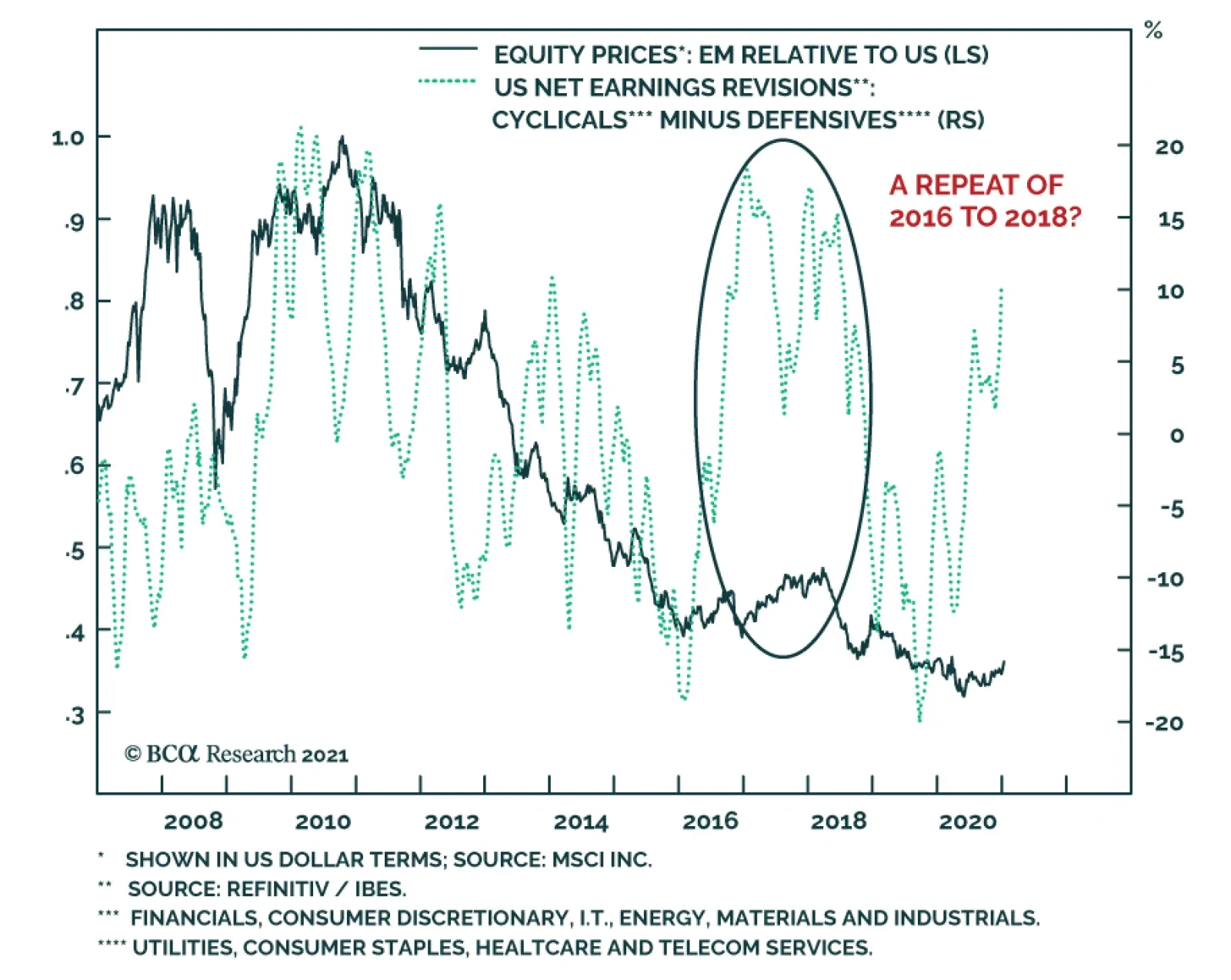
The reality that the market rally will become more volatile (see Indicator Spotlight) does not preclude a meaningful outperformance of EM equities relative to the US. In fact, BCA Research expects EM equities to perform in line with the EAFE benchmark and…
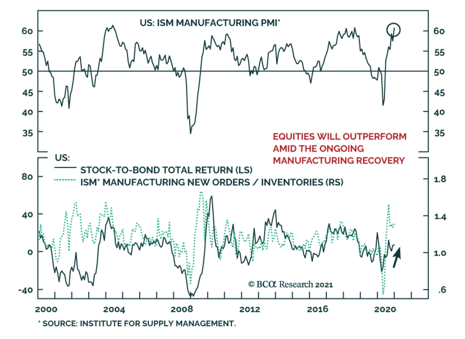
The December ISM Manufacturing PMI rose to 60.7 from 57.5 versus expectations of a decline to 56.8, corroborating evidence that the economy has grown somewhat desensitized from pandemic developments. This is consistent with the message from Monday’s strong US…
Highlights Chart 12020 Returns
2020 Returns
2020 Returns
After a tumultuous start to the year, corporate bonds rallied in 2020 H2, managing to eke out small annual gains versus Treasuries. Specifically, investment grade corporates outperformed duration-equivalent Treasuries by 4 basis points in 2020 and high-yield outperformed by 185 bps (Chart 1). Treasuries, for their part, bested cash by 7% on the year but returns have been trending down since August. As we look forward to 2021, the economic cycle is in what we call a sweet spot for spread product returns. Economic growth is above trend, but inflation is low and monetary conditions are highly accommodative. This macro back-drop will lead to positive spread product returns versus Treasuries and a moderate bear-steepening of the Treasury curve in 2021. However, stretched valuations for investment grade corporates mean that investors must be selective within spread product. We think the Ba credit tier offers the best risk-adjusted opportunity in the corporate bond space, and also recommend favoring tax-exempt municipal bonds over equivalent-quality investment grade corporates. Feature Investment Grade: Neutral Chart 2Investment Grade Market Overview
Investment Grade Market Overview
Investment Grade Market Overview
Investment grade corporate bonds outperformed the duration-matched Treasury index by 79 basis points in December and by 4 bps in 2020. The investment grade corporate index eked out a small gain relative to the duration-matched Treasury index in 2020. Corporates underperformed Treasuries by 18% from the beginning of the year until March 23, the day that the Fed stopped the bleeding in credit markets by unveiling its suite of emergency lending facilities. With the Fed’s backstops in place, the corporate index went on to outperform Treasuries by 22% between March 23 and the end of the year (Appendix A). As we noted in our 2021 Key Views Special Report, the corporate bond index option-adjusted spread is not quite back to its pre-COVID low.1 However, valuation is close to all-time expensive after adjusting for changes in the index’s average credit rating and duration. The 12-month breakeven spread for the Bloomberg Barclays Corporate Index (adjusted to keep the average credit rating constant) has only been tighter 4% of the time since 1995 (Chart 2). The same figure for the Baa-rated credit tier is 5%. As noted, the macro environment of above-trend growth and accommodative Fed policy is very positive for spread product returns. However, better value exists outside of the investment grade corporate space. In particular, we advise investors to look at Ba-rated high-yield corporates and tax-exempt municipal bonds. High-Yield: Overweight Chart 3High-Yield Market Overview
High-Yield Market Overview
High-Yield Market Overview
High-Yield outperformed the duration-equivalent Treasury index by 190 basis points in December and by 185 basis points in 2020. Ba-rated junk bonds outperformed duration-matched Treasuries by 431 bps in 2020, while B-rated and Caa-rated bonds lagged by 13 bps and 238 bps, respectively. Since the March 23 peak in spreads, Ba-rated bonds outperformed Treasuries by 33%, B-rated bonds outperformed by 30% and Caa-rated bonds outperformed by 36% (Appendix A). We view Ba-rated junk bonds as the sweet spot within the corporate credit space. The sector is relatively insulated from default risk and yet still offers a sizeable spread pick-up over investment grade corporates (Chart 3). We noted in our 2021 Key Views Special Report that the additional spread earned from moving down in quality below Ba is in line with historical averages.2 Assuming a 25% recovery rate on defaulted debt and a minimum required risk premium of 150 bps, we calculate that the junk index is priced for a default rate of 2.8% for the next 12 months (panel 3). This represents a steep drop from the 8.4% default rate observed during the most recent 12-month period. However, only seven defaults occurred in November, down from a peak of 22 in July. Job cut announcements, an excellent indicator of the default rate, are also falling rapidly (bottom panel). Overall, we see room for spread compression across all junk credit tiers in 2021 but believe that Ba-rated bonds offer the best opportunity in risk-adjusted terms. Table 3ACorporate Sector Relative Valuation And Recommended Allocation*
The Cyclical Sweet Spot
The Cyclical Sweet Spot
Table 3BCorporate Sector Risk Vs. Reward*
The Cyclical Sweet Spot
The Cyclical Sweet Spot
MBS: Underweight Chart 4MBS Market Overview
MBS Market Overview
MBS Market Overview
Mortgage-Backed Securities outperformed the duration-equivalent Treasury index by 22 basis points in December but underperformed by 17 bps in 2020. The conventional 30-year MBS index option-adjusted spread (OAS) tightened 10 bps on the month to reach 61 bps (Chart 4). This is higher than the 58 bps offered by Aa-rated corporate bonds, the 49 bps offered by Agency CMBS and the 24 bps offered by Aaa-rated consumer ABS. Despite the relatively attractive OAS, we continue to view the elevated primary mortgage spread as a material risk for MBS investors. The elevated spread suggests that mortgage rates need not rise alongside Treasury yields in the near-term, meaning that mortgage refinancings can continue at their current rapid pace (panel 3). Our view is that expected prepayment losses embedded in MBS spreads (aka the option cost) are too low relative to this pace of refinancing. Last year’s spike in the mortgage delinquency rate was driven by households that were granted forbearance by the federal government’s CARES act (panel 4). The risk for MBS holders is that these households will not be able to resume their regular mortgage payments when the forbearance period ends this spring. While the situation bears close monitoring, our sense is that excess savings built up during the past nine months will be sufficient to prevent a surge of bankruptcies when the forbearance period ends. The recent stimulus package provides households with even more assistance. Government-Related: Underweight Chart 5Government-Related Market Overview
Government-Related Market Overview
Government-Related Market Overview
The Government-Related index outperformed the duration-equivalent Treasury index by 62 basis points in December but underperformed by 161 bps in 2020. Sovereign debt outperformed duration-equivalent Treasuries by 176 bps in December but underperformed by 98 bps in 2020. Foreign Agencies outperformed the Treasury benchmark by 7 bps in December but underperformed by 640 bps in 2020. Local Authority debt outperformed Treasuries by 146 bps in December but underperformed by 86 bps in 2020. Domestic Agency bonds outperformed by 14 bps in December but underperformed by 9 bps in 2020. Supranationals outperformed by 2 bps in December and by 3 bps in 2020. US dollar weakness is usually a boon for Emerging Market (EM) Sovereign and Foreign Agency returns. However, 2020’s dollar weakness was mostly relative to other Developed Market currencies (Chart 5). Value has improved somewhat for EM Sovereigns during the past few weeks, but the index continues to offer less spread than the Baa-rated US Credit index (panel 4). At the country level, Turkey, Colombia, Mexico, Russia, South Africa and Indonesia are the only countries that offer a spread pick-up relative to duration and quality-matched US corporates. Of those, only Mexico looks attractive on a risk/reward basis. Municipal Bonds: Overweight Chart 6Municipal Market Overview
Municipal Market Overview
Municipal Market Overview
Municipal bonds outperformed the duration-equivalent Treasury index by 56 basis points in December but underperformed by 286 bps in 2020 (before adjusting for the tax advantage). We upgraded municipal bonds to “maximum overweight” in our recent 2021 Key Views Special Report.3 Attractive valuations are the main reason for this move. First, spreads between Aaa-rated municipal bonds and equivalent-maturity Treasuries are elevated compared to history across the entire yield curve (Chart 6). Second, municipal bonds look even more attractive relative to duration and quality-matched credit. The Bloomberg Barclays Revenue Bond index offers a greater yield than the quality-matched Credit index across the entire maturity spectrum (before adjusting for the tax advantage). The same is true for the Bloomberg Barclays General Obligation index beyond the 12-year maturity point (panel 3). While the failure to include state & local government aid in the recent relief bill is a big blow to municipal budgets that are already stretched, we think municipal bond spreads offer more-than-adequate compensation for default/downgrade risk. State & local governments are already engaging in austerity measures that will help protect bondholders (bottom panel) and State Rainy Day Fund balances were at all-time highs heading into the COVID downturn. Both of these things should help stave off a wave of municipal downgrades. Treasury Curve: Buy 5-Year Bullet Versus 2/10 Barbell Chart 7Treasury Yield Curve Overview
Treasury Yield Curve Overview
Treasury Yield Curve Overview
The Treasury curve bear-steepened in December. The 2/10 Treasury slope steepened 13 bps to 81 bps. The 5/30 Treasury slope steepened 7 bps to 129 bps. Our expectation is that continued economic recovery will cause investors to price-in eventual monetary tightening at the long-end of the Treasury curve. With the Fed maintaining a firm grip on the front end, this will lead to Treasury curve bear steepening. A timely vaccine roll-out and the recently passed fiscal relief bill will serve to speed this process along. We recommend positioning for a steeper curve by owning the 5-year Treasury note and shorting a duration-matched barbell consisting of the 2-year and 10-year notes. This position is designed to profit from 2/10 curve steepening. Valuation is a concern with our recommended steepener, as the 5-year yield is below the yield on the duration-matched 2/10 barbell (Chart 7). However, the 5-year looked much more expensive during the last zero-lower-bound period between 2010 and 2013 (bottom 2 panels). We anticipate a return to similar levels. TIPS: Overweight Chart 8TIPS Market Overview
TIPS Market Overview
TIPS Market Overview
TIPS outperformed the duration-equivalent nominal Treasury index by 141 basis points in December and by 117 bps in 2020. The 10-year and 5-year/5-year forward TIPS breakeven inflation rates rose 22 bps and 18 bps on the month. They currently sit at 2.01% and 2.07%, respectively. Core CPI rose 0.22% in November, pushing the year-over-year rate from 1.63% to 1.65%. Meanwhile, 12-month trimmed mean CPI fell from 2.22% to 2.09%, narrowing the gap between trimmed mean and core (Chart 8). We anticipate further narrowing in 2021 Q1 and therefore expect core CPI to print relatively hot. For this reason, we recommend maintaining an overweight allocation to TIPS versus nominal Treasuries for the time being, even though the 10-year TIPS breakeven inflation rate looks somewhat elevated on our Adaptive Expectations Model (panel 2).4 Inflation pressures may moderate once the core and trimmed mean inflation measures converge, and this could give us an opportunity to tactically reduce TIPS exposure in the first half of this year. We also recommend holding real yield curve steepeners and inflation curve flatteners. With the Fed now officially targeting an overshoot of its 2% inflation goal, we expect the cost of 2-year inflation protection to rise above the cost of 10-year inflation protection (panel 4). With the Fed also exerting more control over short-dated nominal yields than over long-term ones, we expect short-maturity real yields to come under downward pressure relative to the long end (bottom panel). ABS: Overweight Chart 9ABS Market Overview
ABS Market Overview
ABS Market Overview
Asset-Backed Securities outperformed the duration-equivalent Treasury index by 15 basis points in December and by 98 bps in 2020. Aaa-rated ABS outperformed the Treasury benchmark by 12 bps in December and by 81 bps in 2020. Non-Aaa ABS outperformed by 33 bps in December and by 207 bps in 2020 (Chart 9). On paper, the Treasury department’s decision to let the Term Asset-Backed Loan Facility (TALF) expire at the end of 2020 is quite negative for ABS. However, as we explained in a recent report, we don’t anticipate a material impact on spreads.5 For one thing, Aaa ABS spreads are already well below the borrowing cost offered by TALF. But more importantly, consumer credit quality is strong. As we first explained last June, the stimulus received from the CARES act led to a significant increase in disposable income and a jump in the savings rate (panel 4).6 Faced with an income boost and few spending opportunities, many households paid down consumer debt. Given the recently passed additional fiscal support and the substantial savings that have already accrued, we see household balance sheets as being in a good place. As such, we advise moving down-in-quality to pick up extra spread in non-Aaa ABS. Non-Agency CMBS: Neutral Chart 10CMBS Market Overview
CMBS Market Overview
CMBS Market Overview
Non-Agency Commercial Mortgage-Backed Securities outperformed the duration-equivalent Treasury index by 113 basis points in December but underperformed by 57 bps in 2020. Aaa Non-Agency CMBS outperformed Treasuries by 58 bps in December and by 56 bps in 2020. Non-Aaa Non-Agency CMBS outperformed Treasuries by 277 bps in December but underperformed by 360 bps in 2020 (Chart 10). We continue to recommend an overweight allocation to Aaa-rated Non-Agency CMBS and an underweight allocation to non-Aaa CMBS. Even with the expiry of TALF, Aaa CMBS spreads are already well below the cost of borrowing through TALF and thus will not be negatively impacted.7 Meanwhile, the structurally challenging environment for commercial real estate could lead to problems for lower-rated CMBS (panels 3 & 4). Agency CMBS: Overweight Agency CMBS outperformed the duration-equivalent Treasury index by 50 basis points in December and by 105 bps in 2020. The average index spread tightened 7 bps in December to reach 49 bps (bottom panel). At its September meeting, the Fed decided to slow its pace of Agency CMBS purchases. It is no longer looking to increase its Agency CMBS holdings, but rather, will only purchase what is “needed to sustain smooth market functioning”. This is nonetheless a backstop of the market, and it does not change our overweight recommendation. Appendix A: Buy What The Fed Is Buying The Fed rolled out a number of aggressive lending facilities on March 23. These facilities focused on different specific sectors of the US bond market. The fact that the Fed has decided to support some parts of the market and not others has caused some traditional bond market correlations to break down. It has also led us to adopt of a strategy of “Buy What The Fed Is Buying”. That is, we favor those sectors that offer attractive spreads and that benefit from Fed support. The below Table tracks the performance of different bond sectors since the March 23 announcement. We will use this to monitor bond market correlations and evaluate our strategy’s success. TablePerformance Since March 23 Announcement Of Emergency Fed Facilities
The Cyclical Sweet Spot
The Cyclical Sweet Spot
Appendix B: Butterfly Strategy Valuations The following tables present the current read-outs from our butterfly spread models. We use these models to identify opportunities to take duration-neutral positions across the Treasury curve. The following two Special Reports explain the models in more detail: US Bond Strategy Special Report, “Bullets, Barbells And Butterflies”, dated July 25, 2017, available at usbs.bcaresearch.com US Bond Strategy Special Report, “More Bullets, Barbells And Butterflies”, dated May 15, 2018, available at usbs.bcaresearch.com Table 4 shows the raw residuals from each model. A positive value indicates that the bullet is cheap relative to the duration-matched barbell. A negative value indicates that the barbell is cheap relative to the bullet. Table 4Butterfly Strategy Valuation: Raw Residuals In Basis Points (As Of December 31ST, 2020)
The Cyclical Sweet Spot
The Cyclical Sweet Spot
Table 5 scales the raw residuals in Table 4 by their historical means and standard deviations. This facilitates comparison between the different butterfly spreads. Table 5Butterfly Strategy Valuation: Standardized Residuals (As Of December 31ST, 2020)
The Cyclical Sweet Spot
The Cyclical Sweet Spot
Table 6 flips the models on their heads. It shows the change in the slope between the two barbell maturities that must be realized during the next six months to make returns between the bullet and barbell equal. For example, a reading of 85 bps in the 5 over 2/10 cell means that we would only expect the 5-year to outperform the 2/10 if the 2/10 slope steepens by more than 85 bps during the next six months. Otherwise, we would expect the 2/10 barbell to outperform the 5-year bullet. Table 6Discounted Slope Change During Next 6 Months (BPs)
The Cyclical Sweet Spot
The Cyclical Sweet Spot
Appendix C: Excess Return Bond Map The Excess Return Bond Map is used to assess the relative risk/reward trade-off between different sectors of the US bond market. It is a purely computational exercise and does not impose any macroeconomic view. The Map’s vertical axis shows 12-month expected excess returns. These are proxied by each sector’s option-adjusted spread. Sectors plotting further toward the top of the Map have higher expected returns and vice-versa. Our novel risk measure called the “Risk Of Losing 100 bps” is shown on the Map’s horizontal axis. To calculate it, we first compute the spread widening required on a 12-month horizon for each sector to lose 100 bps or more relative to a duration-matched position in Treasury securities. Then, we divide that amount of spread widening by each sector’s historical spread volatility. The end result is the number of standard deviations of 12-month spread widening required for each sector to lose 100 bps or more versus a position in Treasuries. Lower risk sectors plot further to the right of the Map, and higher risk sectors plot further to the left. Chart 11Excess Return Bond Map (As Of December 31ST, 2020)
The Cyclical Sweet Spot
The Cyclical Sweet Spot
Ryan Swift US Bond Strategist rswift@bcaresearch.com Footnotes 1 Please see US Bond Strategy Special Report, “2021 Key Views: US Fixed Income”, dated December 15, 2020, available at usbs.bcaresearch.com 2 Please see US Bond Strategy Special Report, “2021 Key Views: US Fixed Income”, dated December 15, 2020, available at usbs.bcaresearch.com 3 Please see US Bond Strategy Special Report, “2021 Key Views: US Fixed Income”, dated December 15, 2020, available at usbs.bcaresearch.com 4 For more details on our model please see US Bond Strategy Weekly Report, “How Are Inflation Expectations Adapting?”, dated February 11, 2020, available at usbs.bcaresearch.com 5 Please see US Bond Strategy Weekly Report, “Preparing For A Dark Winter … But Do Markets Care?”, dated November 24, 2020, available at usbs.bcaresearch.com 6 Please see US Bond Strategy Weekly Report, “No Holding Back”, dated June 16, 2020, available at usbs.bcaresearch.com 7 Please see US Bond Strategy Weekly Report, “Preparing For A Dark Winter … But Do Markets Care?”, dated November 24, 2020, available at usbs.bcaresearch.com Fixed Income Sector Performance Recommended Portfolio Specification Corporate Sector Relative Valuation And Recommended Allocation
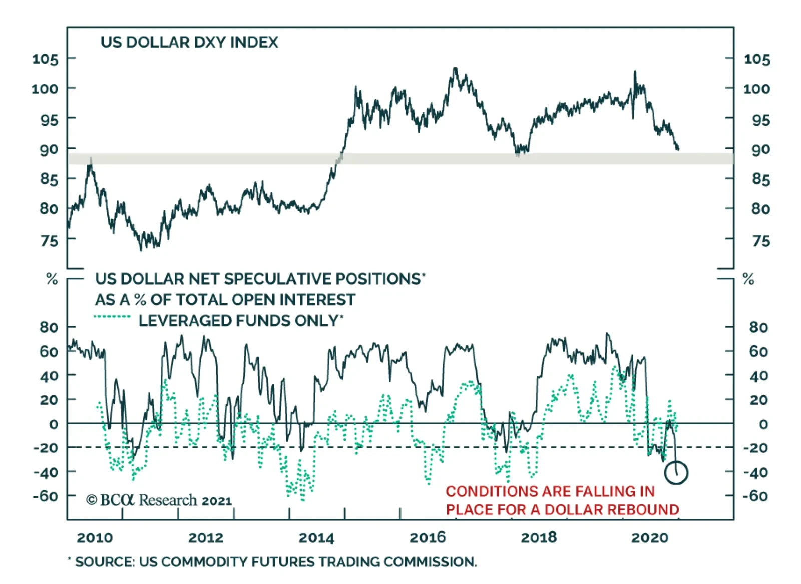
Can the dollar weakness continue in 2021? Economic forces suggest that the most likely outcome is further depreciation. The dollar is a counter-cyclical currency and the continued recovery this year will weigh on the Greenback. Moreover, the strength of US…
BCA Research’s US Bond Strategy service’s base case view is that the eventual pace of Fed tightening will be determined by inflation expectations and that no lift-off will happen until core PCE is above 2% and unemployment near 4%. However, one wildcard could…
This is US Bond Strategy’s final report of the year. Our regular publication schedule will resume on January 5th with our Portfolio Allocation Summary for January 2021. We wish you a happy, healthy and prosperous new year. Highlights Interest Rate Policy: The Fed has given us a checklist of three criteria that must be met before it will lift rates off the zero bound. After those criteria are met, the pace of the eventual rate hike cycle will be determined by how quickly inflation expectations move back to “well-anchored” levels. We don’t expect Fed liftoff in 2021. Balance Sheet Policy: The Fed will only increase the pace or lengthen the maturity of its asset purchases if the economy or risk assets undergo a significant negative shock in 2021. Absent that, Fed communications in late-2021 will increasingly focus on the eventual tapering of asset purchases. Given the current vague guidance about when tapering will start, a scaled-down repeat of the 2013 Taper Tantrum is possible in late-2021 or 2022. Emergency Lending Facilities: The Fed will not undertake efforts to subvert Congress and re-establish its emergency lending facilities in 2021. However, the absence of the facilities will not have a negative impact on financial markets. Fiscal/Monetary Coordination: Looking beyond 2021, we see the lines between fiscal and monetary policy continuing to blur. The Fed will be increasingly incentivized to dip its toes into the fiscal arena and fiscal policymakers will let it. Feature Chart 1An Eventful Year
An Eventful Year
An Eventful Year
It would be an understatement to say that 2020 was a busy year for the Federal Reserve. The Fed cut rates to the zero bound when the recession struck in March. It also exploded its balance sheet to fresh all-time highs and rolled out brand-new emergency lending facilities to support flagging credit markets (Chart 1). Then, to top it all off, the Fed concluded a Strategic Review of its monetary policy strategy in August and officially adopted an Average Inflation Target. This report touches on the market implications of 2020’s big Fed moves, but its focus is on what the Fed is likely to do in 2021. The first three sections discuss how we see the Fed’s interest rate policy, balance sheet policy and emergency lending facilities evolving next year. The final section considers a longer time horizon as it discusses what might be the next frontier for monetary policy: increased cooperation between monetary and fiscal authorities. Interest Rate Policy With the fed funds rate at its effective lower bound, bond investors will spend 2021 trying to determine the eventual start date and magnitude of the next tightening cycle. This will be especially complicated because the Fed’s adoption of an Average Inflation Target means that old models of its reaction function must be discarded. We discussed the implications of the move toward Average Inflation Targeting in a September Special Report.1 To quickly recap, the Fed made three main changes that will influence our outlook for interest rate policy in 2021. First, the Fed edited its Statement on Longer-Run Goals and Monetary Policy Strategy to include a new interpretation of its price stability mandate. The new Statement reads: In order to anchor longer-term inflation expectations at [2 percent], the Committee seeks to achieve inflation that averages 2 percent over time, and therefore judges that, following periods when inflation has been running persistently below 2 percent, appropriate monetary policy will likely aim to achieve inflation moderately above 2 percent for some time.2 Second, the Fed modified its Statement on Longer-Run Goals and Monetary Policy Strategy to signal that it will rely less on labor market indicators to forecast future inflation. In its old Statement, the Fed talked about minimizing “deviations of employment from the Committee’s assessments of its maximum level.” The revised Statement talks about mitigating “shortfalls of employment from the Committee’s assessment of its maximum level.” In other words, the Fed is saying that it will be less inclined to view an unemployment rate below its estimated natural level (NAIRU) as a signal that inflation is about to accelerate. The Fed’s adoption of an Average Inflation Target means that old models of its reaction function must be discarded. Finally, at the September FOMC meeting, the Fed translated the changes it made to its Statement on Longer-Run Goals and Monetary Policy Strategy into more explicit guidance about when it will consider lifting rates off the zero bound. That guidance is as follows: … it will be appropriate to maintain this target range until labor market conditions have reached levels consistent with the Committee’s assessments of maximum employment and inflation has risen to 2 percent and is on track to moderately exceed 2 percent for some time.3 The Timing Of Liftoff Table 1A Checklist For Liftoff
The Fed In 2021
The Fed In 2021
Digging into the new guidance, we identify three criteria for lifting rates off the zero bound (Table 1). First, the unemployment rate must reach levels consistent with the Committee’s assessments of NAIRU. Currently, those estimates range from 3.5% to 4.5% (Chart 2). Practically, we view this as the least important of the three criteria. NAIRU estimates are revised based on what happens with inflation, and the Fed has already acknowledged that it is now less inclined to view a sub-NAIRU unemployment rate as an inflationary signal. In short, if inflation were to rise sustainably above 2% with the unemployment rate still at 5%, the Fed would simply revise up its NAIRU estimates and begin the rate hike cycle. Chart 2Criteria For Lifting Rates
Criteria For Lifting Rates
Criteria For Lifting Rates
The Fed’s second criterion for lifting rates is also the most specific. Inflation must rise to 2 percent before the Fed will consider hiking rates. In a recent speech, Fed Vice-Chair Richard Clarida said he interprets this to mean that 12-month PCE inflation must be at least 2% before the Fed will consider hiking (Chart 2, bottom panel).4 This is helpful for bond investors. We can be certain that no rate hikes will occur at least until 12-month PCE inflation reaches 2%. Finally, the Fed also wants to be certain that inflation is “on track to moderately exceed 2 percent for some time.” This means that the event of 12-month PCE reaching 2% won’t automatically lead to a rate increase. The Fed must also view inflation gains as sustainable. This will likely become an issue in the first half of 2021 when we know that base effects will push 12-month PCE sharply higher, possibly even above 2%. However, we also know that those gains will be short lived.5 Of course, the Fed also knows about the impact of base effects and it will look past any temporary jump in inflation in H1 2021. More generally, while we advise investors to not pay much attention to the Fed’s NAIRU estimates, the unemployment rate will play a role in the Fed’s determination of whether above-2% inflation is sustainable. That is, the Fed is more likely to view above-2% inflation as sustainable if the unemployment rate is 4% than it is if the unemployment rate is 6%. What Does The Market Think? The bond market has been quick to price-in the big shift in the Fed’s interest rate guidance. At present, the overnight index swap curve is priced for a single 25 basis point rate hike in mid-2023 and only one more by mid-2024 (Chart 3). We see a good chance that the Fed’s three liftoff criteria are met before then, a view that forms the basis of our below-benchmark portfolio duration recommendation for 2021.6 In addition, the New York Fed’s Survey of Market Participants shows that only 43% of respondents expect liftoff before the end of 2023 and only 31% before the end of 2022 (Table 2A). This is further evidence that bond yields have room to rise if it looks like the Fed’s three liftoff criteria will be met in 2022 or the first half of 2023. Finally, the New York Fed’s survey shows that market participants understand the Fed’s three liftoff criteria and that differences in opinion about the timing of liftoff reflect differences in views about the economic outlook, not differences in understanding the Fed’s reaction function. The bulk of survey respondents think that the unemployment rate will be between 3.5% and 4.2% (consistent with the Fed’s NAIRU estimates) and that 12-month PCE inflation will be between 2.2% and 2.5% at the time of liftoff (Table 2B). Chart 3The Fed May Lift Rates Sooner Than Markets Expect
The Fed May Lift Rates Sooner Than Markets Expect
The Fed May Lift Rates Sooner Than Markets Expect
Table 2ALiftoff Expectations
The Fed In 2021
The Fed In 2021
Table 2BMarkets Understand The Fed’s Guidance
The Fed In 2021
The Fed In 2021
The Pace Of Tightening And Why We’re Watching Inflation Expectations We’ve seen the three criteria upon which the Fed will condition its decision to hike rates off the zero bound. But the timing of liftoff is not the only thing that bond investors need to consider. We also need to get a sense of how quickly rate hikes will proceed once the next tightening cycle begins. According to the Fed’s interest rate guidance, even after liftoff the Fed will seek to maintain accommodative monetary conditions until it has achieved its price stability goal under its new Average Inflation Target. Recall that this goal is defined as achieving “inflation that averages 2 percent over time”. This is somewhat vaguer than the Fed’s liftoff guidance. Over what time period should we seek to hit average 2% inflation? One option is to start calculating the average when the new regime was adopted in August. In that case, average PCE inflation is running at 0.96%, well below 2%. Alternatively, we could calculate average inflation since the Fed last cut rates to zero in March 2020 (1.50%) or average inflation since the Fed cut rates to zero in December 2008 (1.43%). The point is that the Fed has not given us a clearly defined target. Differences in opinion about the timing of liftoff reflect differences in views about the economic outlook. For this reason, it’s important for bond investors to understand why the Fed has shifted to an Average Inflation Target. The reason has to do with trying to re-anchor inflation expectations. Box 1 shows an example of an Expectations-Augmented Phillips Curve, the Fed’s go-to framework for thinking about inflation. As the accompanying quote from Janet Yellen explains, the Fed thinks about inflation’s long-run trend as being driven by expectations. Shocks to economic slack and import prices can cause inflation to deviate from its long-run trend, but expectations drive the trend itself. This makes it critical for a central bank to keep expectations well anchored near its inflation target. Box 1The Expectations-Augmented Phillips Curve (aka The Fed’s Inflation Model)
The Fed In 2021
The Fed In 2021
This is the underlying rationale for the Fed’s Average Inflation Target. The Fed has observed that inflation expectations have been too low in recent years. In the Fed’s model, this signals that inflation’s long-run trend has shifted down. In order to get expectations back up to target, the Fed understands that it will probably need to accept a period of above-target inflation. Since economic agents have just experienced a long period of sub-2% inflation, it will probably require a significant period of above-2% inflation before their expectations sustainably shift higher.7 To sum it all up, the Fed will seek to keep monetary conditions accommodative, and thus supportive for risk assets, until inflation expectations are deemed to be re-anchored. At that point, monetary policy will shift to a neutral or restrictive stance and risk asset performance will be challenged. But don’t just take our word for it. Here is what Vice-Chair Clarida said in a recent speech (referenced above): It is important to note, however, that the goal of the new framework is to keep inflation expectations well anchored at 2 percent, and, for this reason, I myself plan to focus more on indicators of inflation expectations themselves – especially survey-based measures – than I will on the calculation of an average rate of inflation over any particular window of time. It is clear that inflation expectations will dictate the eventual pace of Fed tightening. But the question of what measure of inflation expectations to track remains unresolved. Measures of inflation expectations fall into three main categories: Market-based measures Survey measures Trend measures Market-based measures are derived from inflation-linked bonds. Specifically, we derive TIPS breakeven inflation rates for different time horizons by taking the difference between a nominal yield and TIPS yield of the same maturity. In this publication, we often refer to the 10-year and 5-year/5-year forward TIPS breakeven inflation rates and have found that a range of 2.3% to 2.5% has historically been consistent with periods when inflation expectations were deemed “well anchored” (Chart 4A). One potential issue with using market-based measures of inflation expectations is that TIPS prices can sometimes move around for reasons unrelated to changing inflation expectations. That is, regulations or broader portfolio diversification concerns could change the risk premium an investor is willing to accept from TIPS, even if that investor’s underlying inflation view is unchanged. Academics have made attempts to solve this problem by using affine term structure models to decompose yields into various components. Chart 4B presents one such model from D’Amico, Kim and Wei (DKW).8 The DKW model splits the TIPS breakeven inflation rate (or inflation compensation) into an inflation expectation, a liquidity premium that compensates investors for the lower liquidity in TIPS compared to nominal Treasuries and an inflation risk premium that represents the extra compensation investors require to take inflation risk. We are skeptical of the usefulness of affine term structure models. In general, these models have too few inputs to reliably generate the components they purport to measure. However, the Fed clearly pays some attention to the DKW decomposition. If a future increase in TIPS breakeven inflation rates is driven entirely by movement in the liquidity or inflation risk premium components, it would be reasonable to question whether the Fed will react. Chart 4AInflation Expectations: Market-Based Measures
The Fed In 2021
The Fed In 2021
Chart 4BA Decomposition Of TIPS##br## Breakevens
The Fed In 2021
The Fed In 2021
Survey measures of inflation expectations are exactly that: Responses from surveys, usually of professional forecasters or households (Chart 4C). One drawback of survey measures compared to market-based measures is that they are updated less frequently. Another is that survey respondents, particularly households, may only be able to distinguish very large swings in prices. That said, the Fed tracks a wide range of survey measures and they were even singled out by Vice-Chair Clarida as being particularly important in the above quote. Trend inflation measures are statistical measures of the trend in the actual PCE or CPI inflation data. Chart 4D shows both a very simple trend measure, the 10-year annualized rate of change, and a slightly more complex trend measure based on an exponential smoothing rule. Academics have developed even more complex trend inflation measures.9 The logic behind these measures is that expectations tend to adapt only slowly to changes in the actual inflation data. Chart 4CInflation Expectations: Survey Measures
The Fed In 2021
The Fed In 2021
Chart 4DInflation Expectations: Trend Measures
The Fed In 2021
The Fed In 2021
Finally, we should point out a relatively new measure that the Fed will be using to track inflation expectations going forward. It is called the Common Inflation Expectations Index and it is a composite of 21 different survey and market-based inflation measures (Chart 4E), no trend inflation measures are included.10 Chart 4EIntroducing The Common Inflation Expectations Index
The Fed In 2021
The Fed In 2021
To summarize, the Fed has given us a checklist of three criteria that must be met before it will lift rates off the zero bound. After those criteria are met, the pace of the eventual rate hike cycle will be determined by how quickly inflation expectations move back to levels that are considered “well anchored”. Once that happens, the Fed will no longer have an incentive to keep monetary conditions accommodative and risk asset performance will be challenged. Charts 4A-4E in this report provide a wide array of different measures of inflation expectations to monitor. We will keep an eye on all of them, but in particular, we will track the Common Inflation Expectations Index’s progress back to 2.1% and the 5-year/5-year forward TIPS breakeven inflation rate’s progress back to a range of 2.3%-2.5%. While we don’t expect the Fed’s rate hike criteria to be met in 2021, a 2022 liftoff is possible if the COVID vaccine spurs a rapid economic recovery. However, we do expect that, in 2021, the market will start to price-in an earlier liftoff date and quicker pace of tightening than is currently discounted, thus pushing bond yields higher. The Financial Conditions Wildcard Chart 5Financial Conditions
Financial Conditions
Financial Conditions
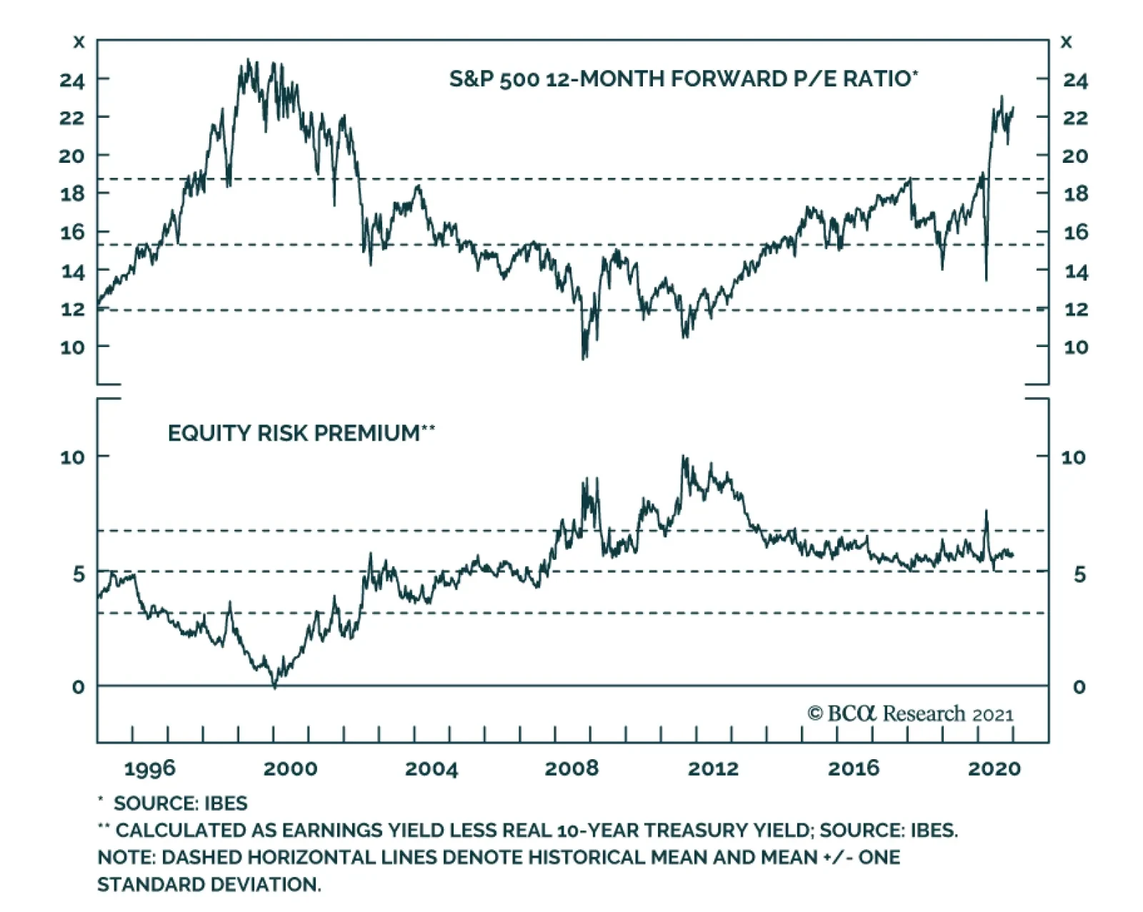
Our base case view is that the eventual pace of Fed tightening will be determined by inflation expectations. However, there is one wildcard that could cause the Fed to abandon its inflation expectations goal and tighten policy earlier. That wildcard is financial conditions. Presently, financial asset valuations are a mixed bag (Chart 5). Corporate bond spreads are tight, but not at all-time expensive levels. Equity P/E ratios are very elevated, but equities don’t look expensive compared to bonds. If these valuations stay relatively stable, the Fed will continue to rely on inflation expectations to guide the pace of tightening. However, if inflation expectations take a long time to rise, it is conceivable that such a long period of low interest rates could lead to historically stretched financial asset valuations. In short, if inflation doesn’t return within the next couple of years, the Fed may have to tighten policy to take the wind out of an asset bubble that might otherwise burst and lead to an economic recession. We stress that we are not yet close to this point and that the bar for the Fed to abandon its inflation goal will be very high, but we would place financial conditions alongside inflation expectations as the two most important variables to monitor to assess the eventual pace of Fed tightening. Balance Sheet Policy With the funds rate pinned at zero and the Fed’s interest rate guidance essentially set in stone, changes to the pace and composition of asset purchases are the principal tool that the Fed will use to provide more or less immediate monetary accommodation in 2021. The Fed is currently purchasing $80 billion of Treasuries and $40 billion of Agency MBS each month, with Treasury purchases spread out across the yield curve. If this pace and distribution of Treasury purchases is maintained in 2021, the Fed will end up purchasing less and less of the Treasury flow. The Treasury Department has a stated policy goal of increasing the average maturity of the outstanding debt and it has been pursuing that goal by raising the amount of coupon issuance at the expense of bills. The Treasury has already given us its planned coupon issuance schedule for Q4 2020 and Q1 2021. Chart 6 shows that net Fed coupon purchases will gradually decline as a percentage of gross issuance, assuming the Treasury follows through with its plan and the Fed’s balance sheet policy is unchanged. Chart 6The Path For Treasury Supply And Fed Demand
The Fed In 2021
The Fed In 2021
Can The Fed Do More? … Will The Fed Do More? It is possible that the Fed will use its balance sheet to provide more monetary easing in 2021. There are two ways it could do this. First, it could simply increase the monthly pace of asset purchases. Alternatively, it could keep the same pace of purchases but shift Treasury buying toward the long-end of the curve. The idea here would be to prevent long-dated yields from rising too quickly. One or both of these changes could happen in 2021, but only if the economy experiences a negative growth shock or risk asset prices (equities and corporate credit) fall significantly. In that case, the Fed will want to be seen as responding to a negative shock, but absent that, the Committee seems comfortable with its current balance sheet strategy. Chart 7Rate-Sensitive Sectors Have Recovered
Rate-Sensitive Sectors Have Recovered
Rate-Sensitive Sectors Have Recovered
Some have suggested that, even if the economic recovery stays on track, the Fed will try to use its balance sheet to lean against rising long-maturity bond yields. We doubt this. First, it is not obvious that the Fed would be able to stop the 10-year Treasury yield from rising to a range of, say, 1.25% to 1.5% by increasing bond purchases in that maturity range by a few billion dollars. As long as the Fed’s interest rate guidance is unchanged, the market’s interest rate expectations will continue to exert a powerful influence on bond yields across the entire curve. Unless the Fed announces a cap on long-dated bond yields, and pledges to buy enough securities to enforce that cap, we are skeptical about the effectiveness of just changing the quantity of asset purchases. Second, it is also not clear that a 10-year Treasury yield between 1.25% and 1.5%, in the context of a steepening yield curve and improving economic growth, would be a problem for either the economy or risk assets. In fact, these sorts of environments tend to be very positive for risk asset performance.11 It is only when the Fed is shifting to a more restrictive monetary policy stance and the yield curve is flattening that bond yields start to exert a negative influence on the economy and risk assets. Even if the Fed is not worried about a moderate bear-steepening of the Treasury curve, a case could be made for providing more easing right now in order to spur a quicker recovery. This question was posed to Chair Powell several times at the last FOMC press conference. In response, Powell noted that the sectors of the economy that are most sensitive to interest rates – residential investment and consumer spending on durable goods – have already recovered (Chart 7). The lagging sectors of the economy – particularly consumer spending on services – cannot recover until the COVID vaccine is widely distributed, irrespective of the level of interest rates. In our view, this is an acknowledgement that the Fed does not see much value in trying to provide further accommodation through the balance sheet channel. All in all, our base case scenario is that the Fed will maintain its current pace and maturity distribution of asset purchases throughout 2021. However, it will increase the pace and/or lengthen the maturity if there is a significant shock to the economy and/or financial markets. Later in 2021, if the recovery stays on track, Fed communications will increasingly take up the issue of when it will be appropriate to taper its pace of asset purchases. The Exit From Asset Purchases And The Possibility Of A Taper Tantrum Chart 8Remember The Taper Tantrum
Remember The Taper Tantrum
Remember The Taper Tantrum
The Fed has already given us a timeline for how it will wind down its asset purchases. According to the minutes from the November FOMC meeting, most participants support a timeline where the Fed will start tapering its pace of asset purchases sometime before the first rate hike. It will then begin lifting interest rates and will stop purchases altogether sometime after that. At the December FOMC meeting, the Fed gave us additional guidance on when it will start the tapering process. Unfortunately, this guidance is quite vague and only confirms the fact that tapering will start before the liftoff date. Specifically, the Fed said that tapering will begin when “substantial further progress has been made toward the Committee’s maximum employment and price stability goals.” Because the guidance around the timing of the tapering process is quite vague, we think it’s possible that it could sneak up on investors and lead to a sharp upward re-adjustment in rate hike expectations, and thus a bond sell-off. In essence, a tamer version of the 2013 Taper Tantrum is possible in late-2021 or 2022. On May 22, 2013, Fed Chair Ben Bernanke explained the Fed’s plan to eventually start tapering its asset purchases. Because investors took this to mean that the rate hike cycle would start much sooner than anticipated, the bond market underwent a sharp re-adjustment. The market quickly went from pricing-in only 35 bps of rate hikes over the next 24 months to 116 bps, and Treasury returns fell precipitously as a result (Chart 8). The Fed has learned a few lessons about communications since then, and it will do its best to keep market expectations aligned with its own strategy. However, unless firmer guidance is provided about when tapering will begin, the risk of a hawkish surprise around the tapering announcement remains. Bottom Line: The Fed will only increase the pace or lengthen the maturity of its asset purchases if the economy or risk assets undergo a significant negative shock in 2021. Absent that, Fed communications in late-2021 will increasingly focus on the eventual tapering of asset purchases. Given the current vague guidance about when tapering will start, a scaled-down repeat of the 2013 Taper Tantrum is possible in late-2021 or 2022. Emergency Lending Facilities In addition to cutting rates to zero and massively scaling up the size of its balance sheet, the Fed also responded to the COVID recession by launching a slew of emergency lending facilities, some re-treads from the financial crisis and some brand new. Facilities to support the corporate bond market (The Primary and Secondary Market Corporate Credit Facilities) and the Municipal Liquidity Facility were particularly successful at capping bond spreads versus Treasuries, even if their actual usage was quite low. In fact, corporate bond spreads peaked on the very day that the Fed announced its corporate credit facilities in March (Chart 1). More recently, however, Treasury Secretary Steve Mnuchin refused to authorize the continuation of most of the Fed’s emergency lending facilities beyond the end of the year. We wrote in November that, even with the Treasury taking back the funds used to set up the facilities, the Fed could re-launch them in 2021 if incoming Treasury Secretary Janet Yellen provides her approval.12 However, a late addition to the recently passed fiscal stimulus package appears to prohibit the re-authorization of the facilities without Congressional approval. At the time of publishing, we have not been able to see the details of the new provision, so there remains some uncertainty about what the Fed can and cannot do in this regard. Credit spreads are no longer trading at distressed levels, primary issuance markets are functioning properly, and the Fed’s facilities have hardly been used at all. Nonetheless, while the new bill raises interesting questions about Fed independence in the long-run, we doubt that markets will respond negatively to the absence of the Fed’s emergency facilities in 2021. Credit spreads are no longer trading at distressed levels, primary issuance markets are functioning properly, and the Fed’s facilities have hardly been used at all (Table 3). Table 3Usage Of The 2020 Federal Reserve Emergency Lending Facilities
The Fed In 2021
The Fed In 2021
In short, we don’t see the Fed going out of its way to re-establish the facilities in 2021 because it will become clear that they are no longer needed. The Next Regime Shift In Fed Policy: Fiscal/Monetary Coordination The adoption of an Average Inflation Target represents a major regime shift in Federal Reserve policy. In the final section of this report, we expand our horizon beyond 2021 and speculate about what the next major regime shift for the Fed might be. The 2020 recession made two things crystal clear. First, traditional fiscal policy becomes essentially impotent once interest have been reduced to the zero-lower-bound. Once there, Fed policy is most impactful when it focuses on lending to the private sector. Lending to the private sector through an emergency lending facility is an act that blurs the distinction between monetary and fiscal policy. This was made abundantly clear by Congress’ recent push to legislate the Fed’s activities in this arena. Second, it is difficult for fiscal policy to act quickly enough during an economic downturn. While the CARES act was delivered in a timely manner, it has taken many months to pass a follow-up bill. The Fed’s independence allows it to act immediately when it is economically necessary, while Congress’ increasing polarization makes swift action a challenge. If we take these two observations to their logical conclusion, and throw in the strong chance that the traditional channels of monetary policy will be increasingly blocked in the future as rates bump up against zero, it seems to us that the strict separation of responsibilities between fiscal and monetary policymakers will fade over time. More specifically, greater time spent at the zero-lower-bound will incentivize the Fed to get more and more creative with its quasi-fiscal private lending facilities. Further, Congress will be more than happy to allow this encroachment as it finds itself unable to respond effectively in times of crisis. Of course, this will also lead to periodic push-back as some members of Congress fret about the Fed’s over-reach, but we expect this push-back will be the exception rather than the rule. Greater time spent at the zero-lower-bound will incentivize the Fed to get more and more creative with its quasi-fiscal private lending facilities. In fact, the best idea might be for fiscal and monetary policymakers to join together proactively to craft programs that can be deployed during the next recession. One example of such an idea was recently presented by Julia Coronado and Simon Potter.13 Coronado and Potter’s idea relies on the use of instant payment processing technology (which the Fed is already working on) to create digital accounts at the Federal Reserve for every household. Once those accounts are in place, the federal government could issue Recession Insurance Bonds, zero coupon bonds with some pre-determined face value, and grant one bond to every household in the country. Then, during the next economic downturn, the Fed could decide to do a “people’s QE” where it buys all the Recession Insurance Bonds leaving every household with a direct cash payment equal to the face value of the bond. This scheme directly addresses the two main problems we named earlier. It is fiscal policy, not monetary policy, so it can still be effective at the zero-lower-bound. Also, Congress can take its time to deliberate on the bill that authorizes the creation of the Recession Insurance Bonds, as this can be done proactively during a period of economic recovery. Then, the Fed can use its ability to move quickly during the next downturn to “activate” the bonds and deliver the fiscal stimulus that Congress actually passed years earlier. While likely not a story for 2021, we see increased cooperation between monetary and fiscal policymakers as the next big regime shift for the Fed. Ryan Swift US Bond Strategist rswift@bcaresearch.com Footnotes 1 Please see US Bond Strategy / Global Fixed Income Strategy Special Report, “A New Dawn For US Monetary Policy”, dated September 1, 2020, available at usbs.bcaresearch.com 2 https://www.federalreserve.gov/monetarypolicy/guide-to-changes-in-statement-on-longer-run-goals-monetary-policy-strategy.htm 3 https://www.federalreserve.gov/monetarypolicy/files/monetary20200916a1.pdf 4 https://www.federalreserve.gov/newsevents/speech/clarida20201116a.htm 5 For a more complete discussion of our 2021 inflation outlook please see “BCA Outlook 2021: A Brave New World”, dated November 30, 2020, available at bca.bcaresearch.com 6 Please see US Bond Strategy Special Report, “2021 Key Views: US Fixed Income”, dated December 15, 2020, available at usbs.bcaresearch.com 7 This is the theory of adaptive expectations and we use it to model changes in the 10-year TIPS breakeven inflation rate. For further details please see US Bond Strategy Weekly Report, “How Are Inflation Expectations Adapting?”, dated February 11, 2020, available at usbs.bcaresearch.com 8 https://www.federalreserve.gov/econres/notes/feds-notes/tips-from-tips-update-and-discussions-20190521.htm 9 Fed Governor Lael Brainard references several of these trend measures in this recent speech: https://www.federalreserve.gov/newsevents/speech/brainard20201021a.htm&…; 10 More details on how this aggregate measure is constructed can be found here: https://www.federalreserve.gov/econres/notes/feds-notes/index-of-common-inflation-expectations-20200902.htm 11 For more details on how corporate credit performs during different yield curve environments please see US Bond Strategy Special Report, “2021 Key Views: US Fixed Income”, dated December 15, 2020, available at usbs.bcaresearch.com 12 Please see US Bond Strategy Weekly Report, “Preparing For A Dark Winter … But Do Markets Care?”, dated November 24, 2020, available at usbs.bcaresearch.com 13 https://www.piie.com/publications/policy-briefs/reviving-potency-monetary-policy-recession-insurance-bonds
Highlights The Fed will continue to have investors’ backs in 2021 (and beyond): The Fed will maintain extremely accommodative policy settings to combat low inflation expectations and growth that could still falter in the face of insufficient fiscal support or vaccination snafus. Congress appears to be nearing agreement on another round of fiscal aid: The economic outlook is much rosier than it was when the pandemic arrived but households and businesses in the hardest-hit segments need further assistance to tide them over until COVID-19 is definitively beaten. It appears as if a new wave of fiscal transfers is on the way. You wouldn’t know it to look at the equity market, but we’re not out of the woods yet, … : Stocks keep making new highs against a grim near-term public health backdrop and economic data that point to fading momentum. … and that’s giving rise to a general sense of cognitive dissonance: It is becoming more difficult to reconcile the fundamentals with a spreading tide of euphoria/exuberance. Feature You can always count on Americans to do the right thing – after they’ve tried everything else. Policymakers versus the virus has been the macro story since the pandemic reached the US in the spring and it’s not over yet. The remarkable success of Pfizer/BioNTech’s and Moderna’s vaccines in clinical trials is wonderful news for humanity, but the pandemic will be with us until around 70% of the population is inoculated against COVID-19 or has already contracted it. While it is reasonable to think that the pandemic may end within the next nine months, individuals and businesses that were directly in its path still need some support if the rest of the economy is to avoid the cascading effects of their distress. Just as my spending is your income and your spending is my income, timely debt service is essential for banks, specialty lenders, insurers and the broad range of businesses that allow customers to finance the purchase of goods and services. We have repeatedly made the case that the extraordinary monetary and fiscal support measures launched in the spring have shored up the aggregate positions of households, businesses and the banking system. As restrictions are re-imposed across the country in response to strained hospital capacity (Chart 1), months after the last supplemental unemployment insurance (UI) benefit checks were sent and days before many remaining idled workers lose expanded and/or extended access to UI benefits, some households at the lower end of the income and wealth distributions are becoming increasingly desperate. Since they have the highest marginal propensity to consume, their woes could eventually hem in the prospects for the recovery. Chart 1High Water Everywhere
High Water Everywhere
High Water Everywhere
As a result, the economy would welcome some targeted stimulus to extend the bridge over the pandemic crater and ensure that hard-hit households and businesses can make it all the way across. Last week’s talks increased the probability that aid will be provided and sped up the timetable for its delivery. They increased the odds that our base-case scenario, in which the economy receives more aid than is strictly necessary, will come to pass. That scenario is positive for the economy and risk assets and reinforces our view that equities and credit will generate positive excess returns in 2021. The Fed Still Has Investors’ Backs Chart 2Mortgage Rates Are Low Enough Already
Mortgage Rates Are Low Enough Already
Mortgage Rates Are Low Enough Already
Last week’s FOMC meeting was largely devoid of suspense. The Fed exhausted its shock-and-awe repertoire in the spring when it implemented nearly all of its emergency GFC measures in the space of a few weeks and topped them off with new facilities positioning it to lend directly to businesses and state and local governments. It played its longer-term trump card in August when it amended its monetary policy strategy statement to allow for deliberate inflation overshoots. Attempting to remediate past inflation shortfalls represents a meaningful shift in the direction of easier monetary policy across the cycle, given that the Fed is now pledging that it will no longer pre-emptively tighten when the labor market heats up. Anything the Fed can do to ease policy from this point forward is likely to amount to tinkering at the margin. Ahead of the meeting, some economists were looking for the Fed to increase the weighted average maturity of its Treasury purchases to hold down long rates. With mortgage applications already straining lenders’ capacity to process them and every component of homebuilder sentiment hovering near record levels (Chart 2), we don’t think Operation Twist-style measures would have a telling impact. Europe’s experience with NIRP does not suggest that venturing below the zero bound would help, either. Additional fiscal aid would be much more potent than any incremental monetary moves. Chair Powell agrees, and he kept up his ongoing lobbying campaign for renewed fiscal support at the post-meeting press conference. From our perspective, the Fed is already providing considerable accommodation and its baseline plans, which include maintaining $120 billion monthly asset purchases “until substantial further progress has been made toward the Committee’s maximum employment and price stability goals,” will be amply accommodative going forward, given that the FOMC’s revised economic projections suggest that it doesn’t currently foresee tapering the purchases until sometime in 2022 at the earliest (Chart 3) or beginning to hike the fed funds rate until 2024 (Chart 4). Though we expect that upward inflation pressures will begin to gain traction sooner than the FOMC currently projects and that its timetable for hiking rates will be accelerated, we expect that monetary policy will remain easier for longer than it needs to, giving financial markets a tailwind for all of 2021. Chart 3 The Fed Will Taper Asset Purchases …
Policymakers Versus The Virus: Round 2
Policymakers Versus The Virus: Round 2
Chart 4… Before It Hikes The Fed Funds Rate
Policymakers Versus The Virus: Round 2
Policymakers Versus The Virus: Round 2
Better Late Than Never At the time of our publication deadline, Congress appeared to be nearing agreement on a new fiscal support package. Media reports project the bill will provide around $900 billion of aid via direct checks to taxpayers; income support for the unemployed, including a renewed UI benefit supplement; rental assistance; federally-backed loans for hard-hit businesses; aid to hospitals and schools; and dedicated funds for vaccine distribution. Republicans have dropped their demands for virus liability protection for businesses and Democrats have backed off of their insistence on direct aid to struggling state and local governments. A bipartisan group of moderate senators provided the impetus for the apparently successful talks, and it would be tempting to conclude that their ad hoc coalition points the way to a more productive Senate. Unfortunately, our geopolitical strategists expect that political polarization will remain elevated on Capitol Hill. Although Senate Republicans paid no political price for standing in the way of additional fiscal aid ahead of the November election, The New York Times reported that Senate Majority Leader McConnell cited the pending Georgia run-offs in urging his caucus to get behind the proposed bill, saying that the Republican incumbents were “getting hammered” on the campaign trail over the lack of new support. That election will be in the rear-view mirror after Inauguration Day and unless the Democrats surprisingly capture both of the Georgia seats, Congress will remain stalled for the foreseeable future. Do We Really Need More Stimulus? Future congressional dysfunction notwithstanding, successful stimulus negotiations arrived just in time. Recent releases suggest that economic momentum is waning. Initial unemployment claims surged to an eleven-week high for the week ended December 4th and a fourteen-week high for the week ended December 11th (Chart 5), suggesting that the initial scattering of lockdowns is already sparking a new wave of layoffs. Retail sales flopped in November and the economic surprise index has been steadily declining since June (Chart 6). At the aggregate level, it looks like we may have been able to get by without more stimulus, but many out-of-work households and travel, entertainment and hospitality businesses are gasping for air. Their problems could become everyone's problems once they spread to their lenders and their lenders' counter-parties. Chart 5New Lockdowns = New Layoffs
New Lockdowns = New Layoffs
New Lockdowns = New Layoffs
Chart 6Coming Back To Earth
Coming Back To Earth
Coming Back To Earth
Households are quite well positioned in the aggregate, having socked away a mountain of excess savings while riding the equity rally and the boom in home prices, but the gains have not been equally spread across the entire population. Wealth and income disparities influence consumption patterns in individual households as embodied in their marginal propensity to consume (MPC). Households living paycheck to paycheck at the lower end of the income and wealth distributions are far more likely to spend an incremental dollar than households at the upper end, who are prone to save or invest new inflows. All dressed up and nowhere to go: Increased wealth can't burn a hole in households' pockets until inoculation unlocks their spending options. Disparate marginal propensities to consume get to the crux of why further fiscal stimulus is needed despite the CARES Act’s income windfall, and the excess savings that have piled up in its wake. Although surging household net worth (Chart 7) will eventually translate into consumption gains (Chart 8), the lag may be longer this time if better-heeled households’ pent-up demand will not be slaked until the virus is definitively beaten. The economy is more sensitive in the near term to spending by high-MPC households, which may become increasingly vulnerable as fiscal support dwindles while renewed restrictions on activity loom. Chart 7What Recession? Aggregate Household Wealth Is Surging
What Recession? Aggregate Household Wealth Is Surging
What Recession? Aggregate Household Wealth Is Surging
Chart 8Changes In Household Net Worth Lead Changes In Consumption With A Two-Quarter Lag
Policymakers Versus The Virus: Round 2
Policymakers Versus The Virus: Round 2
Chart 9Has The Other Shoe Finally Dropped?
Policymakers Versus The Virus: Round 2
Policymakers Versus The Virus: Round 2
Falling support and tighter restrictions also leave the economy vulnerable to a self-reinforcing cycle of defaults and bankruptcies. Monetary and fiscal accommodation have held credit stress at bay so far, with the Fed’s efforts clearing the way for record volumes of corporate bond issuance and income support and forbearance programs making it easy for consumers to keep up with their debt obligations. Monthly delinquency rates on auto loans, credit cards, home mortgages and other unsecured consumer debt remain strikingly low and are not signaling any problems. Apartment rent collections had been reinforcing the message from low consumer delinquencies, but a steep year-over-year falloff over the first six days of December may be a canary in the coalmine for struggling households (Chart 9). Howard Marks Versus The Newbies Equities have staged a breathtaking rally since bottoming in late March. Although 2020 full-year S&P 500 earnings per share (~$138) are projected to miss pre-pandemic expectations (~$176) by more than 20%, and 2021 estimates (~$169) are over 10% shy of the number analysts had penciled in at the end of January (~$196), the S&P 500 has gained 15% year to date. Some of the rebound off the trough has come from a better-than-expected recovery in corporate earnings, but multiple expansion has been the dominant engine driving the advance. The S&P 500’s forward multiple is already two standard deviations above its mean, and the index will trade very close to its December 1999 peak of 24.8 once Tesla is officially included (Chart 10). Chart 10Back To The Future (In A Tesla This Time)
Back To The Future (In A Tesla This Time)
Back To The Future (In A Tesla This Time)
Peak equity valuations are a sign of a market-specific battle between exuberance and moderation that is an outgrowth of the policymaker-virus clash. We expect that exuberance, embodied by neophyte males in their twenties and thirties who found playing the market on Robinhood a diverting substitute for sports betting while college and pro leagues were idled, will eventually be put in its place. The full weight of history is arrayed against it, along with the impeccable cyclical analysis of Howard Marks, who is often cast as the voice of reason by overheating markets. We don't like the excesses that are popping up all over the investment landscape, but we think uber-accommodative policy will sustain them over the next twelve months. We are especially mindful of Marks’ Minskyesque admonition that a run of persistently strong fundamentals can presage investment disappointments, as prices get bid higher and higher and optimism crowds out skepticism and caution. Investing is a relative game; a stock or bond issuer’s absolute performance is less important than how it shapes up against expectations. A company growing at a good clip will face a falling multiple or wider bond spreads if markets were discounting very good growth, and the securities of a company with bad growth will appreciate if markets thought its growth would be terrible. We remain constructive because we continue to believe that economic and corporate earnings growth still has scope to surprise to the upside. We continue to believe that the time-release aspects of the initial stimulus efforts, manifest in massive savings and burgeoning household net worth, are underappreciated. We were concerned that the loss of support for lower-income households could deliver a shock to the economy via drop-offs in consumption and credit performance, but our take on the news from Capitol Hill suggests that the economy is going to dodge that shock in the nick of time. We remain vigilant for signs of an inflection point driven by an economic stumble, a dramatically negative turn on the pandemic front or an imminent reversal of investor excesses that can no longer be sustained. We are uneasy about budding signs of excess, but we think the best course for multi-asset investors with 12-month timeframes is to remain overweight equities and credit because we expect that policy tailwinds and the release of pent-up consumer demand will keep the rally going through 2021. This is our final report of 2020. Our next report will be published on Tuesday, January 5th. We wish you a happy, healthy and prosperous new year. Doug Peta, CFA Chief US Investment Strategist dougp@bcaresearch.com
In our "Millennials Are Not Coming Of Age; They Are Already Here” Special Report where we first created the BCA Millennial Basket we mentioned that “we would not hesitate to add other sharing economy stocks, including Airbnb and Uber, to this basket should they become investable.” We did eventually add UBER to the basket, which replaced FB on December 13, 2019. Today, in light of the recent Airbnb IPO, we are compelled to make another substitution. We are banking all the TSLA gains and removing it from our millennial basket as the S&P is adding it in the S&P 500. And, we are reinvesting the funds into ABNB and rebalance all the stocks in the millennial basket back to a 10% weight for each of the constituents. The main reason behind the substitution is because the easy money has already been made in TSLA, but not in ABNB (Chart 1). In other words, now that TSLA is worth as much as all the other car manufacturers in the world put together, it is difficult to continue rising at the same frenetic pace of the past few years. In contrast, were ABNB to follow a similar trajectory and rise to a similar stardom to TSLA, then there is a long runway ahead for this new IPO. Our Millennial Basket is currently up 137% in absolute terms, and 77% in relative to S&P 500 terms, since the June 11 2018 inception (Chart 2). Recently, we also instituted an 18% rolling stop that we plan to obey it. Chart 1
Replace TSLA with ABNB In The Millennial Equity Basket
Replace TSLA with ABNB In The Millennial Equity Basket
Chart 2
Replace TSLA with ABNB In The Millennial Equity Basket
Replace TSLA with ABNB In The Millennial Equity Basket
Bottom Line: ABNB takes TSLA’s seat in our Millennial Basket.
Many investors feel that the Phillips Curve has failed to predict weak inflation over the past decade. But this perception is due to a singular focus on the economic slack component of the modern-day version of the curve to the exclusion of inflation expectations, and a failure to fully consider the lasting impact of sustained periods of a negative output gap on those expectations. In addition, many investors tend to downplay the long-term balance sheet impact of two episodes of excesses and savings/capital misallocations on the relationship between the stance of monetary policy and the output gap, via a persistently negative shock to aggregate demand and a reduced sensitivity of economic activity to interest rates. The COVID-19 pandemic was certainly a major economic shock. But for now, it seems like this was a sharp income statement recession, not a balance-sheet recession. This fact, along with lower odds of negative supply-side shocks and several structural factors, suggest that inflation will be higher over the next ten years than it has over the past decade. Investors looking to protect against potentially higher inflation should look primarily to commodities, cyclical stocks, and US farmland. Gold is likely to remain well supported over the coming few years, but rich valuation suggests the long-term outlook for the yellow metal is poor. A hybrid TIPS/currency portfolio has historically been strongly correlated with the price of gold, and may provide investors with long-term protection against inflation – at a better price. Introduction Chart II-1A Surge In Long-Dated Inflation Expectations
A Surge In Long-Dated Inflation Expectations
A Surge In Long-Dated Inflation Expectations
The pandemic, and the corresponding fiscal and monetary response is challenging the low-inflation outlook of many market participants. Chart II-1 highlights that long-dated market-based inflation expectations have surged past their pre-COVID levels after collapsing to the lowest-ever level in March. The shift in thinking about inflation has partly been a response to an extraordinary rise in government spending in many countries. But Chart II-1 shows that long-dated expectations in the US were mostly trendless from April to June as Federal support was distributed, and instead rose sharply in July and August in the lead-up to the Fed’s official shift to an average inflation targeting regime. This new dawn for US monetary policy has been prompted not just by the pandemic, but also by the extended period of below-target inflation over the past decade. In this report, we review how the past ten-year episode of low inflation can be successfully explained through the lens of the expectations-augmented (i.e. “modern-day”) Phillips Curve. Many investors fail to fully appreciate the impact that inflation expectations have on driving actual inflation, as well as the cumulative impact of two major capital and savings misallocations over the past 25 years on the responsiveness of demand to interest rates and on the level of inflation expectations. Using the modern-day Phillips Curve as a guide, we present several reasons in favor of the view that inflation will be higher over the next decade than over the past ten years. Finally, we conclude with an assessment of several ways for investors to protect their portfolios from rising inflation. Revisiting The “Modern-Day” Phillips Curve The original Phillips Curve, as formulated by New Zealand economist William Phillips in the late 1950s, described a negative relationship between the unemployment rate and the pace of wage growth. Given the close correlation between wage and overall price growth at the time, the Phillips Curve was soon extended and generalized to describe an inverse relationship between labor market slack and overall price inflation. Chart II-2Rising Unemployment And Inflation Challenged The Original Phillips Curve
Rising Unemployment And Inflation Challenged The Original Phillips Curve
Rising Unemployment And Inflation Challenged The Original Phillips Curve
However, the experience of rising inflation alongside high unemployment from the late 1960s to the late 1970s underscored that prices are also importantly determined by inflation expectations and shocks to the supply-side of the economy (Chart II-2). In the 1980s and 1990s, the Federal Reserve’s success at reigning in inflation was achieved not only by raising interest rates to punishingly high levels, but also by sharply altering consumer, business, and investor expectations about future prices. The experience of the late 1960s and 1970s led to a revised form of the Phillips Curve, dubbed the “expectations-augmented” or “modern” version. As an equation, the modern Phillips Curve is described today by Fed officials, in terms of core inflation, as follows: πct = β1πet + β2πct-1 + β3πct-2 - β4SLACKt + β5IMPt + εt where: πct = Core inflation today πet = Expectations of inflation πct-n = Lagged core inflation SLACKt = Slack in the economy IMPt = Imported goods prices εt = Other shocks to prices Described verbally, this framework suggests that “economic slack, changes in imported goods prices, and idiosyncratic shocks all cause core inflation to deviate from its longer-term trend that is ultimately determined by long-run inflation expectations.1” This framework can easily be extended to headline inflation by adding changes in food and energy prices. In most formal models of the economy in use today, the modern Phillips Curve is combined with the New Keynesian demand function to describe business cycles: Yt = Y*t – β(r-r*) + εt where: Yt = Real GDP Y*t = Real potential GDP r = The real interest rate r* = The neutral rate of interest εt = Other shocks to output This equation posits that differences in the real interest rate from its neutral level, along with idiosyncratic shocks to demand, cause real GDP to deviate from potential output. Abstracting from import prices and idiosyncratic shocks, these two equations tell a simple and intuitive story of how the economy generally works: The stance of monetary policy determines the output gap and, The output gap, along with inflation expectations, determine inflation. The Modern-Day Phillips Curve: The Pre-2000 Experience This above view of inflation and demand was strongly accepted by investors before the 2008 global financial crisis, but the decade-long period of generally below-target inflation has caused a crisis of faith in the idea of the Phillips Curve. Charts II-3 and II-4 show the historical record of the New Keynesian demand function and the modern-day Phillips Curve, using five-year averages of the data in question to smooth out the impact of short-term and idiosyncratic effects. We use nominal GDP growth as our long-run proxy for the neutral rate of interest,2 the US Congressional Budget Office’s (CBO) estimate of potential GDP to determine the output gap, and a proprietary measure of inflation expectations based on an adaptive expectations framework3 (Chart II-5). Chart II-3With Just Two Exceptions, Monetary Policy Strongly Explained Demand Before 2000
With Just Two Exceptions, Monetary Policy Strongly Explained Demand Before 2000
With Just Two Exceptions, Monetary Policy Strongly Explained Demand Before 2000
Chart II-4Similarly, Pre-2000 The Output Gap Generally Explained Unexpected Inflation
Similarly, Pre-2000 The Output Gap Generally Explained Unexpected Inflation
Similarly, Pre-2000 The Output Gap Generally Explained Unexpected Inflation
Chart II-3 shows that until 1999, the stance of monetary policy was highly predictive of the output gap over a five-year period, with just two exceptions where major structural forces were at play: the late 1970s, and the second half of the 1990s. In the case of the former, the disruptive effect of persistently high inflation negatively impacted output growth despite easy monetary policy, and in the latter case, economic activity was modestly stronger than what interest rates would have implied due to the beneficial impact of the technologically-driven productivity boom of that decade. Similarly, Chart II-4 shows that until 1999 there was a good relationship between the output gap and the deviation in inflation from expectations, again with the late 1970s and late 1990s as exceptions. Along with the beneficial supply-side effects of the disinflationary tech boom, persistent import price weakness (via dollar strength) seems to have also played a role in suppressing inflation in the late 1990s (Chart II-6). Chart II-5The Expectations Component Of The Modern Phillips Curve, Visualized
The Expectations Component Of The Modern Phillips Curve, Visualized
The Expectations Component Of The Modern Phillips Curve, Visualized
Chart II-6A Strong Dollar Also Played A Role In Suppressing Inflation During The 1990s
A Strong Dollar Also Played A Role In Suppressing Inflation During The 1990s
A Strong Dollar Also Played A Role In Suppressing Inflation During The 1990s
The Modern-Day Phillips Curve Post-2000 Following 2000, deviations between the monetary policy stance, the output gap, and inflation become more prominent, particularly after 2008. As we will illustrate below, these deviations are more apparent on the demand side. In the case of inflation, the question should be why inflation was not even lower in the years immediately following the global financial crisis. On both the demand and inflation side, these deviations are explainable, and in a way that helps us determine future inflation. Charts II-7 and II-8 show the same series as in Charts II-3 and II-4, but focused on the post-2000 period. From 2000-2007, Chart II-8 shows that the relationship between the output gap and the deviation in inflation from expectations was not particularly anomalous. The output gap was negative from the end of the 2001 recession until the beginning of 2006, and inflation was correspondingly below expectations on average for the cycle. Chart II-7Post-2000, The Output Gap Decoupled From The Monetary Policy Stance
Post-2000, The Output Gap Decoupled From The Monetary Policy Stance
Post-2000, The Output Gap Decoupled From The Monetary Policy Stance
Chart II-8Since The GFC, The Real Mystery Is Why Inflation Has Been So Strong
Since The GFC, The Real Mystery Is Why Inflation Has Been So Strong
Since The GFC, The Real Mystery Is Why Inflation Has Been So Strong
Chart II-7 shows that the anomaly during that cycle was in the relationship between the output gap and the stance of monetary policy. Monetary policy was the easiest it had been in two decades, yet the output gap was negative for several years following the recession. Larry Summers pointedly cited this divergence in his revival of the secular stagnation theory in November 2013, arguing that it was strong evidence that excess savings were depressing aggregate demand via a lower neutral rate of interest and that this effect pre-dated the financial crisis. Why was demand so weak during that period? Chart II-9 compares the annualized per capita growth in the expenditure components of GDP during the 2001-2007 expansion to the 1991-2001 period. The chart shows that all components of GDP were lower than during the 1991-2001 period, with investment – the most interest rate sensitive component of GDP – showing up as particularly weak. On the surface, this supports the idea of structural factors weighing heavily on the neutral rate, rendering monetary policy less easy than investors would otherwise expect. But Chart II-9 treats the 2001-2007 years as one period, ignoring what happened over the course of the expansion. Chart II-10 repeats the exercise shown in Chart II-9 from Q1 2001 to Q3 2005, and highlights that the annualized growth in per capita residential investment was much stronger than it was during the 1991-2001 period – and nonresidential fixed investment was much weaker. Spending on goods was roughly the same, which is impressive considering that the late 1990s experienced a productivity boom and robust wage growth. All the negative contribution to growth from residential investment during the 2001-2007 expansion came after Q3 2005, as the housing market bubble burst in response to rising interest rates. In short, Chart II-10 highlights that there was a strong relationship between easy monetary policy and the demand for housing, but that this was not true for the corporate sector. Chart II-9Looking At The Whole 2001-2007 Period, Investment Was Extremely Weak
January 2021
January 2021
Chart II-10Housing Absolutely Responded To Easy Monetary Policy
January 2021
January 2021
Explaining Weak CAPEX Growth In The Early 2000s This leads us to ask why CAPEX was so weak during the 2001-2007 period. In addition to changes in interest rates, business investment is strongly influenced by expectations of consumer demand and corporate profitability. Chart II-11 shows that real nonresidential fixed investment and as-reported earnings moved in lockstep during the period, and that this delayed corporate-sector recovery also impacted the pace of hiring. Weak expectations for consumer spending do not appear to be the culprit. Chart II-12 highlights that while real personal consumption expenditure growth fell during the recession, spending did not contract (as it had done during the previous recession) and capital expenditures fell much more than what real PCE would have implied. Chart II-11Post-2001, Persistently Weak Profits Led To Weak Investment And Jobs Growth
Post-2001, Persistently Weak Profits Led To Weak Investment And Jobs Growth
Post-2001, Persistently Weak Profits Led To Weak Investment And Jobs Growth
Chart II-12CAPEX Was Much Weaker In 2002 Than Justified By Consumer Spending
CAPEX Was Much Weaker In 2002 Than Justified By Consumer Spending
CAPEX Was Much Weaker In 2002 Than Justified By Consumer Spending
Instead, persistently weak CAPEX in the early 2000s appears to be best explained by the damaging impact of corporate excesses that built up during the dot-com bubble. The Sarbanes-Oxley Act of 2002 was passed in response to a series of corporate accounting frauds that came to light in the wake of the bubble, but in many cases had been occurring for several years. Chart II-13 highlights that widespread write-offs badly impacted earnings quality and the growth in the asset value of equipment and intellectual property products (IPP), both of which only began to improve again in early 2003. This occurred alongside an outright contraction in real investment in IPP as investors lost faith in company financial statements and heavily scrutinized corporate spending. Chart II-14highlights that a contraction in IP spending was a huge change from the double-digit pace of growth that occurred in the late 1990s. Chart II-13The Damaging Impact Of Corporate Excesses
The Damaging Impact Of Corporate Excesses
The Damaging Impact Of Corporate Excesses
Chart II-14A Near-Unprecedented Collapse In IPP Investment Followed The Tech Bubble
A Near-Unprecedented Collapse In IPP Investment Followed The Tech Bubble
A Near-Unprecedented Collapse In IPP Investment Followed The Tech Bubble
In addition, corporate sector indebtedness also appears to have played a role in driving weak investment in the early 2000s. While the interest burden of nonfinancial corporate debt was not as high in 2000 as it was in the early 1990s, Chart II-15 highlights that debt to operating income surged in the late 1990s – which likely caused investors already skeptical about company financial statements to impose a period of elevated capital discipline on corporate managers following the recession. Chart II-16 shows that while the peak in the 12-month trailing corporate bond default rate in January 2002 was similar to that of the early 90s, it was meaningfully higher on average in the lead-up to and following the recession. Chart II-15The Late-1990s Saw A Major Increase In Corporate Debt
The Late-1990s Saw A Major Increase In Corporate Debt
The Late-1990s Saw A Major Increase In Corporate Debt
Chart II-16Above-Average Corporate Defaults Before And After The 2001 Recession
Above-Average Corporate Defaults Before And After The 2001 Recession
Above-Average Corporate Defaults Before And After The 2001 Recession
To summarize, Charts II-10-16 underscore that management excesses, governance failures, and elevated debt in the corporate sector in the 1990s were the root cause of the seeming divergence between monetary policy and the output gap from 2001 to 2007. This was, unfortunately, the first of two major savings/capital misallocations that have occurred in the US over the past 25 years. Explaining The Post-GFC Experience In the early 2000s, the Federal Reserve was faced with a decision between two monetary policy paths: one that was appropriate for the corporate sector, and one that was appropriate for the household sector. The Fed chose the former, and it inadvertently contributed to the second major savings/capital misallocation to occur over the past 25 years: the enormous debt-driven bubble in US housing that culminated into the global financial crisis (GFC) of 2007-2009. Chart II-17It Is No Mystery Why Demand And Inflation Were Weak Last Cycle
It Is No Mystery Why Demand And Inflation Were Weak Last Cycle
It Is No Mystery Why Demand And Inflation Were Weak Last Cycle
As a result, 2007 to 2013/2014 was a mirror image of the early 2000s. Unlike previous post-war downturns, the GFC precipitated a balance-sheet recession that deeply affected homeowners and the financial system. This lasting damage led to a multi-year household deleveraging process, which substantially lowered the responsiveness of the economy to stimulative monetary policy. On a year-over-year basis, Chart II-17 shows that total nominal household mortgage credit growth was continuously negative for six and a half years, from Q4 2008 until Q2 2015, underscoring that the large divergence during this period between the stance of monetary policy and the output gap should not, in any way, be surprising to investors. And this is even before accounting for the negative impact of the euro area sovereign debt crisis and double-dip recession, or the persistent fiscal drag in nearly every advanced economy last cycle. What is surprising about the post-GFC experience is that inflation was not substantially weaker than it was, which is ironic considering that the secular stagnation narrative was revived to help explain below-target inflation. Chart II-8 showed that actual inflation steadily improved versus expected inflation alongside the closing of the output gap and the decline in the unemployment rate, but that it was much stronger than the output gap would have implied – particularly during the early phase of the economic recovery. It is still an open question as to why this occurred. A weak dollar and a strong recovery in oil prices likely helped support consumer prices, but we doubt that these two factors alone explain the discrepancy. A more credible answer is that expectations stayed very well anchored due to the Fed’s strong record of maintaining low and stable inflation (thus preventing a disinflationary spiral). In addition, the fact that the Fed actively communicated to the public during the early recovery years that a large part of its objective was to prevent deflation may have helped support prices. For example, in a CBS interview following the Fed’s November 2010 decision to engage in a second round of quantitative easing (“QE2”), then-Chair Bernanke prominently tied the decision to the fact that “inflation is very, very low.” When asked whether additional rounds of easing might be required, Bernanke responded that it was “certainly possible” and again cited inflation as a core consideration. Chart II-18Rising US Oil Production Caused The Massive 2014 Oil Price Shock
Rising US Oil Production Caused The Massive 2014 Oil Price Shock
Rising US Oil Production Caused The Massive 2014 Oil Price Shock
While inflation did not ultimately fall relative to expectations post-GFC as much as the output gap would have implied, the long-lasting weakness in demand left expectations vulnerable to exogenous shocks. In 2014, such a shock occurred: oil prices collapsed almost exactly at the point that US tight oil production crossed the four-million-barrels-per-day mark (Chart II-18), a level of output that many experts had previously believed would not be attainable (or would roughly mark the peak in production). We view this event as a truly exogenous shock to prices, given that research & development of shale technology had been ongoing since the late 1970s and only happened to finally gain traction around 2010. Chart II-19 shows that the 2014 oil price collapse caused a clear break lower in our measure of inflation expectations, to the lowest value recorded since the 1940s. This break also occurred in market-based expectations of inflation, such as long-dated CPI swap rates and TIPS breakeven inflation rates, and surveys of consumer inflation expectations (Chart II-20). This decline in inflation expectations meant that the output gap needed to be above zero in order for the Fed to hit its 2% target (absent any upwards shock to prices), and that the meaningful acceleration of inflation from 2016 to 2018 should actually be viewed as inflation “outperformance” because its long-term trend had been lowered by the earlier downward shift in expectations. Chart II-19The 2014 Oil Price Shock Collapsed Inflation Expectations...
The 2014 Oil Price Shock Collapsed Inflation Expectations...
The 2014 Oil Price Shock Collapsed Inflation Expectations...
Chart II-20...No Matter What Inflation Expectations Measure Is Used
...No Matter What Inflation Expectations Measure Is Used
...No Matter What Inflation Expectations Measure Is Used
The Modern-Day Phillips Curve: Key Takeaways Based on the evidence presented above, we see the perceived “failure” of the Phillips Curve to predict weak inflation over the past decade as being due to: A singular focus on the output gap/slack component of the modern Phillips Curve, to the exclusion of expectations A failure to fully consider the lasting impact of sustained periods of a negative output gap on expectations Downplaying the long-term balance-sheet impact of two episodes of excesses and savings/capital misallocations on the relationship between the stance of monetary policy and the output gap, via a persistently negative shock to aggregate demand and a reduced sensitivity of economic activity to interest rates. One crucial takeaway from the modern-day Phillips Curve equation presented above is that if inflation expectations are largely formed based on the experience of past inflation, then inflation is ultimately determined by three dimensions of the output gap: whether it is rising or falling, whether it is above or below zero, and how long it has been above or below zero. The extended period of below-potential output over the past two decades, accelerated recently by a major negative shock to energy prices, has now lowered inflation expectations to a point that merely reaching the Fed’s target constitutes inflation “outperformance.” This realization, made even more urgent by the COVID-19 pandemic, has strongly motivated the Fed’s official shift to an average inflation targeting regime. That shift does not suggest that the Fed is moving away from the modern-day Phillips Curve framework; rather, the Fed’s new policy is aimed at closing the output gap as quickly as possible in order to prevent a renewed decline in inflation expectations (and thus inflation itself) from another long period of activity running below its potential. The Outlook For Inflation While the Fed has shifted its policy to prefer higher inflation, that does not necessarily mean it will get it. Why is it likely to happen this time, if the last economic cycle featured such a large divergence between monetary policy and the output gap? Chart II-21Above-Target Inflation Is Not Imminent
Above-Target Inflation Is Not Imminent
Above-Target Inflation Is Not Imminent
First, to clarify, we do not believe that above-target inflation is imminent. The COVID-19 pandemic was an extreme event, and even given the very substantial recovery in the labor market, the unemployment rate remains almost 2½ percentage points above the Congressional Budget long-run estimate of NAIRU (Chart II-21). But based on our analysis of the modern-day Phillips Curve presented above, there are at least four main reasons to expect that inflation may be higher on average over the next ten years than over the past decade. Reason #1: This Appears To Be A Sharp Income Statement Recession, Not A Balance-Sheet Recession We highlighted above the importance of savings/capital misallocations in driving a gap between monetary policy and the output gap over the past two decades, but this recession was obviously not sparked by such an event. The onset of the pandemic came following a long period of US household sector deleveraging which, while painful, helped restore consumer balance sheets. Chart II-22 highlights that household debt to disposable income had fallen back to 2001 levels at the onset of the pandemic, and the interest burden of debt servicing had fallen to a 40-year low. From a wealth perspective, Chart II-23 highlights that total household liabilities to net worth have fallen below where they were at the peak of the housing market boom in 2005 for almost all income groups, and that a decline in leverage has been particularly noteworthy for the lowest income group since mid-2016. Chart II-22Households Have Repaired Their Balance Sheets...
Households Have Repaired Their Balance Sheets...
Households Have Repaired Their Balance Sheets...
Chart II-23...Across Almost All Income Brackets
...Across Almost All Income Brackets
...Across Almost All Income Brackets
Total credit to the nonfinancial corporate sector rose significantly relative to GDP over the course of the last cycle, but subpar growth in real nonresidential fixed investment and a rise in share buybacks highlight that this debt went largely to fund changes in capital structure rather than increased productive capacity. Chart II-24 highlights that corporate sector interest payments as a percentage of operating income are low relative to history, and they do not seem to be necessarily dependent on extremely low government bond yields.4 Finally, the corporate bond default rate may have already peaked (Chart II-25) and the percentage of jobs permanently lost looks more like 2001 than 2007 (Chart II-26), signaling that a prolonged balance-sheet recession is unlikely. Chart II-24Corporate Sector Debt Is Currently High, But Affordable
Corporate Sector Debt Is Currently High, But Affordable
Corporate Sector Debt Is Currently High, But Affordable
Chart II-25Corporate Defaults Have Already Peaked
Corporate Defaults Have Already Peaked
Corporate Defaults Have Already Peaked
Chart II-26So Far, Permanent Job Losses Look Like The 2001 Recession, Not 2007/2008
So Far, Permanent Job Losses Look Like The 2001 Recession, Not 2007/2008
So Far, Permanent Job Losses Look Like The 2001 Recession, Not 2007/2008
The bottom line is that while the pandemic has not yet been resolved and that major and permanent economic damage cannot be ruled out, the absence of “balance-sheet dynamics” is likely to eventually lead to a stronger responsiveness of demand for goods and services to what is set to be an extraordinarily easy monetary policy stance for at least another two years. Reason #2: The Fed May Be Able To Jawbone Inflation Higher The Fed’s public commitment to set interest rates in a way that will generate moderately above-target inflation is highly reminiscent of its defense of quantitative easing in the early phase of the last economic expansion, and (in the opposite fashion) of Paul Volker’s campaign in the 1980s against the “self-fulfilling prophecy” of inflation. From 2008-2014, the Fed explicitly linked the odds of future bond buying to the pace of actual inflation in its public statements. On its own, this was not enough to cause inflation to rise, but we highlighted above that it may have contributed to the fact that inflation expectations did not collapse. Chart II-1 on page 12 showed that long-dated market-based expectations for inflation have already been impacted by the Fed’s regime shift, suggesting decent odds that Fed policy will contribute to self-fulfilling price increases if the US economy does indeed avoid “balance-sheet dynamics” as a result of the pandemic. Reason #3: The Odds Of Negative Supply Shocks Are Lower Than In The Past We noted above the impact that energy price shocks and large typically exchange-rate driven changes in import prices can have on inflation, with the 2014 oil price collapse serving as the most vivid recent example. On both fronts, a value perspective suggests that the odds of negative shocks to inflation over the coming few years from oil and the dollar are lower than they have been in the past. Chart II-27 shows that the cost of global energy consumption as a share of GDP has fallen below its median since 1970, and Chart II-28 highlights that the US dollar is comparatively expensive relative to other currencies – which raises the bar for further gains. Stable-to-higher oil prices alongside a flat-to-weak dollar implies reflationary rather than disinflationary pressure. Chart II-27Massive, Downward Shocks To Oil Prices Are Now Less Likely
Massive, Downward Shocks To Oil Prices Are Now Less Likely
Massive, Downward Shocks To Oil Prices Are Now Less Likely
Chart II-28Valuation Favors A Declining Dollar, Which Is Inflationary
January 2021
January 2021
Reason #4: Structural Factors In addition to the cyclical arguments noted above, my colleague Peter Berezin, BCA’s Chief Global Strategist, has also highlighted several structural arguments in favor of higher inflation. Chart II-29 highlights that the world support ratio, calculated as the number of workers relative to the number of consumers, peaked early last decade after rising for nearly 40 years. This suggests that output will fall relative to spending the coming several years, which should have the effect of boosting prices. Chart II-30 also highlights that globalization is on the back foot, with the ratio of trade-to-output having moved sideways for more than a decade. Since the early 1990s, rising global trade intensity has corresponded with very low goods prices in many countries, and the end of this trend reduces the impact of a factor that has been weighing on consumer prices globally over the past two decades. Chart II-29Less Production Relative To Consumption Is Inflationary
Less Production Relative To Consumption Is Inflationary
Less Production Relative To Consumption Is Inflationary
Chart II-30Trade Is Not Suppressing Prices As Much As It Used To
Trade Is Not Suppressing Prices As Much As It Used To
Trade Is Not Suppressing Prices As Much As It Used To
Positioning For Eventually Higher Inflation Below we present an assessment of several potential candidates across the major asset classes that investors can use to protect their portfolios from rising inflation once it emerges. We conclude with a new trade idea that may provide investors with inflation protection at a better valuation profile than more traditional inflation hedges. Fixed-Income Within fixed-income, inflation-linked bonds and derivatives (such as CPI swaps) are the obvious choice for investors seeking inflation protection. Inflation-linked bonds are much better played relative to nominal equivalents, as inflation expectations make up the difference between nominal and inflation-linked yields. But Table II-1 shows that 5-10 year TIPS are also likely to provide positive absolute returns over the coming year even in a scenario where 10-year Treasury yields are rising, so long as real yields do not account for the vast majority of the increase. Barring a major and positive change in the long-term economic outlook over the coming year, our sense is that the Fed would act to cap any outsized increase in real yields and that TIPS remain an attractive long-only option until the Fed becomes sufficiently comfortable with the inflation outlook. Table II-1TIPS Will Earn Positive Absolute Returns Next Year Barring A Surge In Real Yields
January 2021
January 2021
Commodities Commodities are arguably the most traditional inflation hedge, and are likely to provide investors with superior risk-adjusted returns in an environment where inflation expectations are rising. Our Commodity & Energy Strategy service is positive on gold, and recently argued that Brent crude prices are likely to average between $65-$70/barrel between 2021-2025.5 Chart II-31Gold Is Expensive And Long-Term Returns May Be Poor
Gold Is Expensive And Long-Term Returns May Be Poor
Gold Is Expensive And Long-Term Returns May Be Poor
One caveat about gold is that, unlike oil prices, it appears to be quite expensive relative to its history. Since gold does not provide investors with a cash flow, over time real (or inflation-adjusted) prices should ultimately be mean-reverting unless real production costs steadily trend higher. Chart II-31 highlights that the real price of gold is already sky-high and well above its historical average. Over a ten-year time horizon, gold prices fell meaningfully following the last two occasions where real gold prices reached current levels, suggesting that the long-term outlook for gold returns is poor. However, over the coming few years, gold prices are likely to remain well supported given our economic outlook, the Fed’s new monetary policy regime, and the consistently negative correlation between real yields and the US dollar and gold prices. As such, we would recommend gold as a hedge against the fear of inflation, which is likely to increase over the cyclical horizon. Equities We provide two perspectives on how equity investors may be able to protect themselves against rising inflation. The first is simply to favor cyclical versus defensive sectors. The former is likely to continue to benefit next year in response to a strengthening economy as COVID-19 vaccines are progressively distributed, and historically cyclical sectors have tended to outperform during periods of rising inflation. In addition, my colleague Anastasios Avgeriou, BCA’s Equity Strategist, presented Table II-2 in a June Special Report,6 and it highlights that cyclical sectors (plus health care) have enjoyed positive relative returns on average during periods of rising inflation. Table II-2S&P 500 Sector Performance During Inflationary Periods
January 2021
January 2021
The second strategy is to favor companies that are more likely to successfully pass on increasing prices to their customers (i.e., firms with “pricing power”). Pricing power is a difficult attribute to identify, but one possible approach is to select industries that have experienced above-average sales per share growth over the past decade. While it is true that the past ten years have seen low rather than high inflation, it has also seen firms in general struggle to achieve robust top-line growth. Industries that have succeeded in this environment may thus be able to pass on higher costs to their customers without disproportionately suffering from lower sales. Chart II-32Last Decade's Revenue Winners: Potential Pricing Power Candidates
Last Decade's Revenue Winners: Potential Pricing Power Candidates
Last Decade's Revenue Winners: Potential Pricing Power Candidates
Chart II-32 presents the historical relative performance of these industries in the US plus the materials and energy sector, equally-weighted and compared to an equally-weighted industry group portfolio (level 2 GICS). The chart shows that the portfolio has outperformed steadily over the past decade, although admittedly at a slower pace since 2018. An interesting feature of this approach is that, in addition to including industries within the industrials, consumer discretionary, and health care sectors (along with the food & staples retailing component of the consumer staples sector), tech stocks show up prominently due to their outstanding revenue performance over the past decade. Table II-2 above highlighted that tech stocks have historically performed poorly during periods of rising inflation, although it is unclear whether this is due to increasing prices or expectations of rising interest rates. Tech stocks are typically long-duration assets, meaning that they are very sensitive to the discount rate, but the Fed’s new monetary policy regime all but guarantees that investors will see a gap between inflation and rates for a time. It is thus an open question how tech stocks would perform in the future in response to rising inflation, and we plan to revisit this topic in a future report. Chart II-33Owners Of Existing Infrastructure Assets Are Primarily Utilities And Telecom Companies
Owners Of Existing Infrastructure Assets Are Primarily Utilities And Telecom Companies
Owners Of Existing Infrastructure Assets Are Primarily Utilities And Telecom Companies
As a final point within the stock market, we would caution against equity portfolios favoring companies that are owners or operators of infrastructure assets. While increased infrastructure spending may indeed occur in the US over the coming several years, indexes focused on companies with sizeable existing infrastructure assets tend to be highly concentrated in the utilities and telecommunications sectors. Chart II-33 shows that the relative performance of the MSCI ACWI Infrastructure Index is nearly identical to that of a 50/50 utilities/telecom services portfolio, two sectors that are defensive rather than pro-cyclical and that have historically performed poorly during periods of rising inflation. Direct Real Estate Alongside commodities, direct real estate investment is also typically viewed as a traditional inflation hedge. For now, however, the outlook for important segments of the commercial real estate market is sufficiently cloudy that it is difficult to form a high conviction view in favor of the asset class. CMBS delinquency rates on office properties have remained low during the pandemic, but those of retail and accommodation have soared and the long-term outlook for all three may have permanently shifted due to the impact of the pandemic. By contrast, industrial and medical properties are likely to do well, with the former likely to be increasingly negatively correlated with the performance of retail properties in the coming few years (i.e., “warehouses versus malls”). I noted my colleague Peter Berezin’s structural arguments for inflation above, and Peter has also highlighted farmland as a real asset that is likely to do well in an environment of rising inflation.7 Chart II-34 further supports the argument: the chart shows that despite a significant increase in real farm real estate values over the past 20 years, returns to operators as a % of farmland values are not unattractive. In addition, USDA forecasts for 2020 suggest that operator returns will be the highest in a decade relative to current 10-year Treasury yields, underscoring both the capital appreciation and relative yield potential of US farmland. A Hybrid TIPS/Currency Inflation-Hedged Portfolio Finally, as we highlighted in Section 1, in a world of extremely low government bond yields, global ex-US investors have the advantage of being able to hedge against deflationary risks in a long-only portfolio by employing the US dollar as a diversifying asset. The dollar is consistently negatively correlated with global stock prices, and this relationship tends to strengthen during crisis periods. The flip side is that US-based investors have the advantage of being able to hedge against inflationary risks in a long-only portfolio by buying global currencies. Chart II-35 presents a 50/50 portfolio of US TIPS and an equally-weighted basket of six major DM currencies against the US dollar. The chart highlights that the portfolio is strongly positively correlated with gold prices, but with a better valuation profile. We already showed in Chart II-28 on page 28 that global currencies are undervalued versus the US dollar. TIPS valuation is not as attractive given that real yields are at record low levels, but the 10-year TIPS breakeven inflation rate currently sits at its 40th percentile historically (and thus has room to move higher). Chart II-34Farmland: Protection Again Inflation, At A Decent Yield
Farmland: Protection Again Inflation, At A Decent Yield
Farmland: Protection Again Inflation, At A Decent Yield
Chart II-35A Hybrid TIPS/Currency Portfolio: Liquid, And Cheaper Than Gold
A Hybrid TIPS/Currency Portfolio: Liquid, And Cheaper Than Gold
A Hybrid TIPS/Currency Portfolio: Liquid, And Cheaper Than Gold
As such, while gold prices are likely to remain supported over the cyclical horizon, a hybrid TIPS/currency portfolio may also provide investors with long-term protection against inflation – at a better price. Jonathan LaBerge, CFA Vice President The Bank Credit Analyst Footnotes 1 “Inflation Dynamics and Monetary Policy,” Janet Yellen, Speech at the Philip Gamble Memorial Lecture, University of Massachusetts - Amherst, Amherst, Massachusetts, September 24, 2015. 2 The use of nominal GDP growth as our proxy for the neutral rate of interest is based on the idea that borrowing costs are stimulative if they are below that of income growth. 3 An adaptive expectations framework suggests that expectations for future inflation are largely determined by what has occurred in the past. Our proxy for inflation expectations is thus calculated using simple exponential smoothing of the actual PCE deflator, which provides us with a long and consistent time series for expectations. 4 The second debt service ratio shown in Chart II-24 would only rise to its 68th historical percentile if the 10-year Treasury yield were to rise to 3%, or the 75th with a 10-year yield at 4%. This would be elevated relative to history, but not extreme. 5 Please see Commodity & Energy Strategy Report “BCA’s 2021-25 Brent Forecast: $65-$70/bbl,” dated November 12, 2020, available at ces.bcaresearch.com 6 Please see US Equity Strategy Special Report “Revisiting Equity Sector Winners And Losers When Inflation Climbs,” dated June 1, 2020, available at uses.bcaresearch.com 7 Please see Global Investment Strategy Weekly Report “Will There Be A Fiscal Hangover?” dated May 29, 2020, available at gis.bcaresearch.com