United States

Highlights The ongoing pandemic underscores the need for fiscal and monetary policymakers to continue to provide a reflationary “bridge” until vaccination ends the threat to the health care system. The pending deal being discussed between US congressional negotiators is not perfect, but it is likely to be a credible extension of the US fiscal bridge and it clarifies the path from the near-term growth outlook (which is negative), to the cyclical outlook (which is positive). The surprisingly strong euro area flash services PMI in December likely reflects the quick removal of restrictions that may soon need to be reimposed. European leaders will either need to provide additional fiscal support to their economies if the strain on the health care system does not soon relent, or economic activity will have to become increasingly dependent on external demand. China’s credit impulse has likely peaked, but economic activity will continue to accelerate in the first half of 2021 and will positively contribute to global growth. Our baseline view is that credit tightening in China will not lead to a meaningful drag on global growth in the second half of next year, but the history of policy “oversteering” in China means that the risks of a policy overkill cannot be ruled out. A likely extension of the reflationary bridge in the US coupled with strengthening Chinese demand has meaningfully reduced the odds of a deflationary outcome over the next year. Extreme technical conditions suggest that a moderate correction in stocks is possible in the first quarter, but the next significant episode of risk-off sentiment should be bought rather than sold. Investors should position in favor of risky assets over a 6-12 month horizon. Feature Our recently published 2021 Outlook report laid out the main macroeconomic themes that we see driving markets next year, as well as our cyclical investment recommendations. In this month’s report we briefly discuss the nearer-term outlook for growth through the lens of fiscal policy. Still Some Way To Go Chart I-1Slowing Economic Activity In Developed Economies
Slowing Economic Activity In Developed Economies
Slowing Economic Activity In Developed Economies
Over the very near term, growth will remain unavoidably linked to the dynamics of the COVID-19 pandemic. The second/third wave of infections that began in September has forced the re-imposition of restrictions in most European countries, as well as in some US states. High-frequency economic indicators clearly show that the European economy contracted in Q4 (Chart I-1), whereas in the US the slowdown has so far been less pronounced. The US economy continued to expand in the fourth quarter with the Atlanta Fed GDPNow model projecting 11% annualized growth, driven heavily by a sizeable change in private inventories (Chart I-2). Chart I-2US Q4 Growth Is Set To Be Large, But Driven Mostly By Inventories
January 2021
January 2021
The relationship between the pandemic and the economy has shifted since the spring. Back then, the rapid spread of the disease and the mostly unknown nature of the virus triggered a forceful response from policymakers. Widespread restrictions on movement and economic activity were imposed to stem the spread. However, those measures came at a high economic and social cost. With economic activity still running far below pre-pandemic levels and an increasingly weary and resistant public, policymakers have become highly reluctant to re-impose aggressive measures. As a driver of policy, the key consideration is the extent of pressure on medical systems. Chart I-3 highlights the situation in Europe. Daily ICU occupancy exploded in several European countries in October, which led to the new restrictions at the end of that month. In the US, COVID-19 hospitalizations are now nearly twice as high as they were in April and July, and for now many new state-level restrictions are not mandatory. But New York City’s mayor noted earlier this week that a “full shutdown” was likely following Christmas, highlighting that many parts of the US may be facing meaningfully tighter restrictions in the weeks ahead if the pace of new infections does not level off. Chart I-4 presents an estimate of the COVID-19 reproduction value (“R-naught”) in the US and in advanced economies outside the US, which highlights that it is too soon to confidently project a peak. Even outside the US, where restrictions have recently been tighter and progress has been made at reducing the number of intensive care patients, the reproduction number has crept back above one after some restrictions were loosened. Chart I-3Europe Reintroduced Lockdowns Because Of Pressure On The Medical System
Europe Reintroduced Lockdowns Because Of Pressure On The Medical System
Europe Reintroduced Lockdowns Because Of Pressure On The Medical System
Chart I-4Too Soon To Project A Peak In Cases
Too Soon To Project A Peak In Cases
Too Soon To Project A Peak In Cases
A Credible Extension Of The US Reflationary Bridge The ongoing pandemic underscores the need for fiscal and monetary policymakers to continue to provide a reflationary “bridge” until vaccination ends the threat to the health care system. Currently, health experts project that this is unlikely to occur before late spring or mid-year. Earlier this year, fiscal authorities around the world built a massive reflationary bridge to support household income while stay-at-home orders were in place. However, the effect of that stimulus has waned – at least for some income groups. In the US, Chart I-5 highlights that unemployment insurance payments have fallen by more than suggested by the decline in continuing jobless claims. Post-election surveys have suggested that a vast majority of Americans felt another economic assistance package was needed, with most reporting that it should occur before inauguration.1 Overall income remains higher than its pre-pandemic baseline (Chart I-6), but aggregate figures mask white collar/blue collar divergences. Many white-collar employees saw a substantial increase in their savings this year as their spending declined and income held up (due to their ability to work from home), whereas blue-collar and low-wage service workers found themselves dependent on government assistance. While the deployment of white-collar savings is likely to eventually support blue-collar and low-wage worker income, it is unlikely that this will occur while significant pandemic restrictions remain in place. Chart I-5The Stimulative Effect Of The CARES Act Has Waned
The Stimulative Effect Of The CARES Act Has Waned
The Stimulative Effect Of The CARES Act Has Waned
Chart I-6Overall Income Is ''Normal'', But This Masks Large Differences Across The Income Spectrum
Overall Income Is ''Normal'', But This Masks Large Differences Across The Income Spectrum
Overall Income Is ''Normal'', But This Masks Large Differences Across The Income Spectrum
That reality motivated the COVID relief deal that is reportedly under discussion between US congressional negotiators. The deal – as described in the financial media as we go to press – likely excludes state & local support, but it also likely includes a new round of stimulus checks, some funding for unemployment insurance recipients, and cash for small businesses, health-care providers, and schools. The deal, which we expect to be passed over the course of the next week, is not perfect but it is a credible extension of the US fiscal bridge and it clarifies the path from the near-term growth outlook (which is negative), to the cyclical outlook (which is positive). Chart I-7State & Local Government Support Is Needed In The New Year
State & Local Government Support Is Needed In The New Year
State & Local Government Support Is Needed In The New Year
The issue of state & local funding will be important to return to in the new year following Joe Biden’s inauguration. Persistent state & local government austerity following the global financial crisis acted as a significant drag on US economic growth (Chart I-7). Nonetheless, one-month delay to state & local government fiscal assistance is less problematic than a delay in extending unemployment insurance payments, given the pending expiry of the remaining CARES act unemployment programs on Dec. 26. Europe’s Bridge Is Shakier In Europe, the need for additional fiscal support is higher than in the US, given that activity contracted this quarter. While the December flash euro area services PMI showed surprising strength, this likely reflects the quick removal of restrictions that we noted may soon need to be reimposed. European economies responded very forcefully this year to the pandemic when all response measures are considered, but less so in many important economies when focusing only above-the-line measures – i.e., new spending and foregone government revenue – to the exclusion of equity injections, loans, and guarantees. Based on this metric, Chart I-8 shows that the UK and Germany have provided a response that is in line with the advanced economy average, whereas most other European countries have lagged. Chart I-9 highlights that this year’s economic rebound in Spain and Italy has been aided by Germany’s stronger fiscal response, as evidenced by intra-euro area trade balances. Chart I-8The Fiscal Response Of Many European Countries Has Lagged
January 2021
January 2021
Chart I-9Germany's Fiscal Stimulus Supported The Euro Area's Recovery
Germany's Fiscal Stimulus Supported The Euro Area's Recovery
Germany's Fiscal Stimulus Supported The Euro Area's Recovery
Funds from the European Recovery and Resilience Facility (“RRF”) have yet to be deployed and they will eventually act to support euro area economic activity. However, outlays from the fund next year are expected to be small. Given that this month’s ECB actions were aimed at simply maintaining easy financial conditions,2 European leaders will either need to provide additional fiscal support to their economies if the strain on the health care system does not soon relent, or economic activity will have to become increasingly dependent on external demand. China: Adding To Global Growth, For Now Chart I-10China Will Boost Euro Area Economic Activity Next Year
China Will Boost Euro Area Economic Activity Next Year
China Will Boost Euro Area Economic Activity Next Year
Fortunately for Europe (and advanced economies more generally), the external demand outlook is bright – for now. Euro area exports to China are strongly predicted by China’s credit impulse lagged by 9 months, and are set to rise materially (Chart I-10). China’s aggressive – and comparatively early – response to the pandemic will thus contribute meaningfully to global growth in the first half of 2021, and could obviate the need for further European fiscal stimulus if restrictions there are not reinstituted. China is likely to provide a significantly smaller boost to global growth in the second half of next year, as policymakers have already begun to mop up excess liquidity. Chart I-11 highlights that China’s credit impulse has consistently followed a 3½-year cycle since 2010, and this year has been no different. This cycle is not exogenous or mystical; it has been caused by the repeated “oversteering” of activity by Chinese policymakers who frequently oscillate between the need to fight deflation and the strong desire to curb additional private-sector leveraging. The chart suggests that an inflection point in this cycle’s upswing has been reached, which is consistent with the view of BCA’s China strategists that the credit cycle has peaked. A peak in China’s credit impulse does not mean that China’s contribution to global growth is about to slow. Global industrial production continued to accelerate following a peak in China’s credit impulse for at least six months in the lead-up to the last two global economic slowdowns (Chart I-12). But the chart also shows that a slowdown in global activity did occur following China’s impulse peak in both cases, especially when the impulse fell below its average of 28½% of GDP. Chart I-11China's Credit Cycle Has Peaked, Right On Schedule
China's Credit Cycle Has Peaked, Right On Schedule
China's Credit Cycle Has Peaked, Right On Schedule
Chart I-12DM Economies Continue To Grow Following A Peak In China's Credit Cycle
DM Economies Continue To Grow Following A Peak In China's Credit Cycle
DM Economies Continue To Grow Following A Peak In China's Credit Cycle
Our baseline view is that credit tightening in China will bring the impulse down to approximately 30% of GDP in 2021, which is still above its average of the past decade. This suggests that China will not contribute as much to global demand in the second half of the year, but will not be an actual drag. Still, the history of policy “oversteering” in China means that the risk of a policy overkill cannot be ruled out. Investors should closely watch for signs of increased hawkishness emanating from China’s National People’s Congress in March. Conclusions And Portfolio Recommendations Cyclically, as we highlighted in our 2021 Outlook, developed market (DM) economies are likely to experience above-trend growth, low inflation, and accommodative monetary policy next year. China’s economic cycle is running ahead of the DM world and Chinese growth will eventually moderate, but is still set to accelerate in the first half of the year. A likely extension of the reflationary bridge in the US coupled with strengthening Chinese demand meaningfully reduces the odds of a deflationary outcome over the next year, in the sense that consumers, businesses, and investors are much more likely to view any near-term lockdown-driven impacts on growth as necessarily temporary. This de-risks the path to a post-pandemic economy and increases our conviction in a cyclically-bullish stance towards risk assets. We continue to recommend that in 2021 global investors should: Favor stocks versus bonds; Maintain below-benchmark portfolio duration; Position for corporate bond spread tightening; Favor commodities; and Expect a continued decline in the US dollar. Chart I-13US Equities Are Vulnerable To A Moderate Correction
US Equities Are Vulnerable To A Moderate Correction
US Equities Are Vulnerable To A Moderate Correction
Over the very near-term, Chart I-13 shows that US equities are potentially vulnerable to a moderate tactical correction. US stocks are very richly valued, and investors may use signs of modest delays in the immunization campaign, a failure of the US Congress to provide support for state & local governments, or inadequate fiscal support in Europe as an excuse to sell. A moderate correction, on the order of 5-7%, is possible in the first quarter. The question for investors is whether the next significant episode of risk-off sentiment should be bought or sold. Given the ongoing impact of very easy monetary policy on equity multiples and the high likelihood of a significant earnings recovery, we are strongly inclined towards the former, barring any substantial shift in the timeline to mass vaccination. Equity returns will be lower in 2021 than in 2020, but are very likely to be positive and beat those offered by government securities. Jonathan LaBerge, CFA Vice President The Bank Credit Analyst December 18, 2020 Next Report: January 28, 2021 II. The Modern-Day Phillips Curve, Future Inflation, And What To Do About It Many investors feel that the Phillips Curve has failed to predict weak inflation over the past decade. But this perception is due to a singular focus on the economic slack component of the modern-day version of the curve to the exclusion of inflation expectations, and a failure to fully consider the lasting impact of sustained periods of a negative output gap on those expectations. In addition, many investors tend to downplay the long-term balance sheet impact of two episodes of excesses and savings/capital misallocations on the relationship between the stance of monetary policy and the output gap, via a persistently negative shock to aggregate demand and a reduced sensitivity of economic activity to interest rates. The COVID-19 pandemic was certainly a major economic shock. But for now, it seems like this was a sharp income statement recession, not a balance-sheet recession. This fact, along with lower odds of negative supply-side shocks and several structural factors, suggest that inflation will be higher over the next ten years than it has over the past decade. Investors looking to protect against potentially higher inflation should look primarily to commodities, cyclical stocks, and US farmland. Gold is likely to remain well supported over the coming few years, but rich valuation suggests the long-term outlook for the yellow metal is poor. A hybrid TIPS/currency portfolio has historically been strongly correlated with the price of gold, and may provide investors with long-term protection against inflation – at a better price. Introduction Chart II-1A Surge In Long-Dated Inflation Expectations
A Surge In Long-Dated Inflation Expectations
A Surge In Long-Dated Inflation Expectations
The pandemic, and the corresponding fiscal and monetary response is challenging the low-inflation outlook of many market participants. Chart II-1 highlights that long-dated market-based inflation expectations have surged past their pre-COVID levels after collapsing to the lowest-ever level in March. The shift in thinking about inflation has partly been a response to an extraordinary rise in government spending in many countries. But Chart II-1 shows that long-dated expectations in the US were mostly trendless from April to June as Federal support was distributed, and instead rose sharply in July and August in the lead-up to the Fed’s official shift to an average inflation targeting regime. This new dawn for US monetary policy has been prompted not just by the pandemic, but also by the extended period of below-target inflation over the past decade. In this report, we review how the past ten-year episode of low inflation can be successfully explained through the lens of the expectations-augmented (i.e. “modern-day”) Phillips Curve. Many investors fail to fully appreciate the impact that inflation expectations have on driving actual inflation, as well as the cumulative impact of two major capital and savings misallocations over the past 25 years on the responsiveness of demand to interest rates and on the level of inflation expectations. Using the modern-day Phillips Curve as a guide, we present several reasons in favor of the view that inflation will be higher over the next decade than over the past ten years. Finally, we conclude with an assessment of several ways for investors to protect their portfolios from rising inflation. Revisiting The “Modern-Day” Phillips Curve The original Phillips Curve, as formulated by New Zealand economist William Phillips in the late 1950s, described a negative relationship between the unemployment rate and the pace of wage growth. Given the close correlation between wage and overall price growth at the time, the Phillips Curve was soon extended and generalized to describe an inverse relationship between labor market slack and overall price inflation. Chart II-2Rising Unemployment And Inflation Challenged The Original Phillips Curve
Rising Unemployment And Inflation Challenged The Original Phillips Curve
Rising Unemployment And Inflation Challenged The Original Phillips Curve
However, the experience of rising inflation alongside high unemployment from the late 1960s to the late 1970s underscored that prices are also importantly determined by inflation expectations and shocks to the supply-side of the economy (Chart II-2). In the 1980s and 1990s, the Federal Reserve’s success at reigning in inflation was achieved not only by raising interest rates to punishingly high levels, but also by sharply altering consumer, business, and investor expectations about future prices. The experience of the late 1960s and 1970s led to a revised form of the Phillips Curve, dubbed the “expectations-augmented” or “modern” version. As an equation, the modern Phillips Curve is described today by Fed officials, in terms of core inflation, as follows: πct = β1πet + β2πct-1 + β3πct-2 - β4SLACKt + β5IMPt + εt where: πct = Core inflation today πet = Expectations of inflation πct-n = Lagged core inflation SLACKt = Slack in the economy IMPt = Imported goods prices εt = Other shocks to prices Described verbally, this framework suggests that “economic slack, changes in imported goods prices, and idiosyncratic shocks all cause core inflation to deviate from its longer-term trend that is ultimately determined by long-run inflation expectations.3” This framework can easily be extended to headline inflation by adding changes in food and energy prices. In most formal models of the economy in use today, the modern Phillips Curve is combined with the New Keynesian demand function to describe business cycles: Yt = Y*t – β(r-r*) + εt where: Yt = Real GDP Y*t = Real potential GDP r = The real interest rate r* = The neutral rate of interest εt = Other shocks to output This equation posits that differences in the real interest rate from its neutral level, along with idiosyncratic shocks to demand, cause real GDP to deviate from potential output. Abstracting from import prices and idiosyncratic shocks, these two equations tell a simple and intuitive story of how the economy generally works: The stance of monetary policy determines the output gap and, The output gap, along with inflation expectations, determine inflation. The Modern-Day Phillips Curve: The Pre-2000 Experience This above view of inflation and demand was strongly accepted by investors before the 2008 global financial crisis, but the decade-long period of generally below-target inflation has caused a crisis of faith in the idea of the Phillips Curve. Charts II-3 and II-4 show the historical record of the New Keynesian demand function and the modern-day Phillips Curve, using five-year averages of the data in question to smooth out the impact of short-term and idiosyncratic effects. We use nominal GDP growth as our long-run proxy for the neutral rate of interest,4 the US Congressional Budget Office’s (CBO) estimate of potential GDP to determine the output gap, and a proprietary measure of inflation expectations based on an adaptive expectations framework5 (Chart II-5). Chart II-3With Just Two Exceptions, Monetary Policy Strongly Explained Demand Before 2000
With Just Two Exceptions, Monetary Policy Strongly Explained Demand Before 2000
With Just Two Exceptions, Monetary Policy Strongly Explained Demand Before 2000
Chart II-4Similarly, Pre-2000 The Output Gap Generally Explained Unexpected Inflation
Similarly, Pre-2000 The Output Gap Generally Explained Unexpected Inflation
Similarly, Pre-2000 The Output Gap Generally Explained Unexpected Inflation
Chart II-3 shows that until 1999, the stance of monetary policy was highly predictive of the output gap over a five-year period, with just two exceptions where major structural forces were at play: the late 1970s, and the second half of the 1990s. In the case of the former, the disruptive effect of persistently high inflation negatively impacted output growth despite easy monetary policy, and in the latter case, economic activity was modestly stronger than what interest rates would have implied due to the beneficial impact of the technologically-driven productivity boom of that decade. Similarly, Chart II-4 shows that until 1999 there was a good relationship between the output gap and the deviation in inflation from expectations, again with the late 1970s and late 1990s as exceptions. Along with the beneficial supply-side effects of the disinflationary tech boom, persistent import price weakness (via dollar strength) seems to have also played a role in suppressing inflation in the late 1990s (Chart II-6). Chart II-5The Expectations Component Of The Modern Phillips Curve, Visualized
The Expectations Component Of The Modern Phillips Curve, Visualized
The Expectations Component Of The Modern Phillips Curve, Visualized
Chart II-6A Strong Dollar Also Played A Role In Suppressing Inflation During The 1990s
A Strong Dollar Also Played A Role In Suppressing Inflation During The 1990s
A Strong Dollar Also Played A Role In Suppressing Inflation During The 1990s
The Modern-Day Phillips Curve Post-2000 Following 2000, deviations between the monetary policy stance, the output gap, and inflation become more prominent, particularly after 2008. As we will illustrate below, these deviations are more apparent on the demand side. In the case of inflation, the question should be why inflation was not even lower in the years immediately following the global financial crisis. On both the demand and inflation side, these deviations are explainable, and in a way that helps us determine future inflation. Charts II-7 and II-8 show the same series as in Charts II-3 and II-4, but focused on the post-2000 period. From 2000-2007, Chart II-8 shows that the relationship between the output gap and the deviation in inflation from expectations was not particularly anomalous. The output gap was negative from the end of the 2001 recession until the beginning of 2006, and inflation was correspondingly below expectations on average for the cycle. Chart II-7Post-2000, The Output Gap Decoupled From The Monetary Policy Stance
Post-2000, The Output Gap Decoupled From The Monetary Policy Stance
Post-2000, The Output Gap Decoupled From The Monetary Policy Stance
Chart II-8Since The GFC, The Real Mystery Is Why Inflation Has Been So Strong
Since The GFC, The Real Mystery Is Why Inflation Has Been So Strong
Since The GFC, The Real Mystery Is Why Inflation Has Been So Strong
Chart II-7 shows that the anomaly during that cycle was in the relationship between the output gap and the stance of monetary policy. Monetary policy was the easiest it had been in two decades, yet the output gap was negative for several years following the recession. Larry Summers pointedly cited this divergence in his revival of the secular stagnation theory in November 2013, arguing that it was strong evidence that excess savings were depressing aggregate demand via a lower neutral rate of interest and that this effect pre-dated the financial crisis. Why was demand so weak during that period? Chart II-9 compares the annualized per capita growth in the expenditure components of GDP during the 2001-2007 expansion to the 1991-2001 period. The chart shows that all components of GDP were lower than during the 1991-2001 period, with investment – the most interest rate sensitive component of GDP – showing up as particularly weak. On the surface, this supports the idea of structural factors weighing heavily on the neutral rate, rendering monetary policy less easy than investors would otherwise expect. But Chart II-9 treats the 2001-2007 years as one period, ignoring what happened over the course of the expansion. Chart II-10 repeats the exercise shown in Chart II-9 from Q1 2001 to Q3 2005, and highlights that the annualized growth in per capita residential investment was much stronger than it was during the 1991-2001 period – and nonresidential fixed investment was much weaker. Spending on goods was roughly the same, which is impressive considering that the late 1990s experienced a productivity boom and robust wage growth. All the negative contribution to growth from residential investment during the 2001-2007 expansion came after Q3 2005, as the housing market bubble burst in response to rising interest rates. In short, Chart II-10 highlights that there was a strong relationship between easy monetary policy and the demand for housing, but that this was not true for the corporate sector. Chart II-9Looking At The Whole 2001-2007 Period, Investment Was Extremely Weak
January 2021
January 2021
Chart II-10Housing Absolutely Responded To Easy Monetary Policy
January 2021
January 2021
Explaining Weak CAPEX Growth In The Early 2000s This leads us to ask why CAPEX was so weak during the 2001-2007 period. In addition to changes in interest rates, business investment is strongly influenced by expectations of consumer demand and corporate profitability. Chart II-11 shows that real nonresidential fixed investment and as-reported earnings moved in lockstep during the period, and that this delayed corporate-sector recovery also impacted the pace of hiring. Weak expectations for consumer spending do not appear to be the culprit. Chart II-12 highlights that while real personal consumption expenditure growth fell during the recession, spending did not contract (as it had done during the previous recession) and capital expenditures fell much more than what real PCE would have implied. Chart II-11Post-2001, Persistently Weak Profits Led To Weak Investment And Jobs Growth
Post-2001, Persistently Weak Profits Led To Weak Investment And Jobs Growth
Post-2001, Persistently Weak Profits Led To Weak Investment And Jobs Growth
Chart II-12CAPEX Was Much Weaker In 2002 Than Justified By Consumer Spending
CAPEX Was Much Weaker In 2002 Than Justified By Consumer Spending
CAPEX Was Much Weaker In 2002 Than Justified By Consumer Spending
Instead, persistently weak CAPEX in the early 2000s appears to be best explained by the damaging impact of corporate excesses that built up during the dot-com bubble. The Sarbanes-Oxley Act of 2002 was passed in response to a series of corporate accounting frauds that came to light in the wake of the bubble, but in many cases had been occurring for several years. Chart II-13 highlights that widespread write-offs badly impacted earnings quality and the growth in the asset value of equipment and intellectual property products (IPP), both of which only began to improve again in early 2003. This occurred alongside an outright contraction in real investment in IPP as investors lost faith in company financial statements and heavily scrutinized corporate spending. Chart II-14highlights that a contraction in IP spending was a huge change from the double-digit pace of growth that occurred in the late 1990s. Chart II-13The Damaging Impact Of Corporate Excesses
The Damaging Impact Of Corporate Excesses
The Damaging Impact Of Corporate Excesses
Chart II-14A Near-Unprecedented Collapse In IPP Investment Followed The Tech Bubble
A Near-Unprecedented Collapse In IPP Investment Followed The Tech Bubble
A Near-Unprecedented Collapse In IPP Investment Followed The Tech Bubble
In addition, corporate sector indebtedness also appears to have played a role in driving weak investment in the early 2000s. While the interest burden of nonfinancial corporate debt was not as high in 2000 as it was in the early 1990s, Chart II-15 highlights that debt to operating income surged in the late 1990s – which likely caused investors already skeptical about company financial statements to impose a period of elevated capital discipline on corporate managers following the recession. Chart II-16 shows that while the peak in the 12-month trailing corporate bond default rate in January 2002 was similar to that of the early 90s, it was meaningfully higher on average in the lead-up to and following the recession. Chart II-15The Late-1990s Saw A Major Increase In Corporate Debt
The Late-1990s Saw A Major Increase In Corporate Debt
The Late-1990s Saw A Major Increase In Corporate Debt
Chart II-16Above-Average Corporate Defaults Before And After The 2001 Recession
Above-Average Corporate Defaults Before And After The 2001 Recession
Above-Average Corporate Defaults Before And After The 2001 Recession
To summarize, Charts II-10-16 underscore that management excesses, governance failures, and elevated debt in the corporate sector in the 1990s were the root cause of the seeming divergence between monetary policy and the output gap from 2001 to 2007. This was, unfortunately, the first of two major savings/capital misallocations that have occurred in the US over the past 25 years. Explaining The Post-GFC Experience In the early 2000s, the Federal Reserve was faced with a decision between two monetary policy paths: one that was appropriate for the corporate sector, and one that was appropriate for the household sector. The Fed chose the former, and it inadvertently contributed to the second major savings/capital misallocation to occur over the past 25 years: the enormous debt-driven bubble in US housing that culminated into the global financial crisis (GFC) of 2007-2009. Chart II-17It Is No Mystery Why Demand And Inflation Were Weak Last Cycle
It Is No Mystery Why Demand And Inflation Were Weak Last Cycle
It Is No Mystery Why Demand And Inflation Were Weak Last Cycle
As a result, 2007 to 2013/2014 was a mirror image of the early 2000s. Unlike previous post-war downturns, the GFC precipitated a balance-sheet recession that deeply affected homeowners and the financial system. This lasting damage led to a multi-year household deleveraging process, which substantially lowered the responsiveness of the economy to stimulative monetary policy. On a year-over-year basis, Chart II-17 shows that total nominal household mortgage credit growth was continuously negative for six and a half years, from Q4 2008 until Q2 2015, underscoring that the large divergence during this period between the stance of monetary policy and the output gap should not, in any way, be surprising to investors. And this is even before accounting for the negative impact of the euro area sovereign debt crisis and double-dip recession, or the persistent fiscal drag in nearly every advanced economy last cycle. What is surprising about the post-GFC experience is that inflation was not substantially weaker than it was, which is ironic considering that the secular stagnation narrative was revived to help explain below-target inflation. Chart II-8 showed that actual inflation steadily improved versus expected inflation alongside the closing of the output gap and the decline in the unemployment rate, but that it was much stronger than the output gap would have implied – particularly during the early phase of the economic recovery. It is still an open question as to why this occurred. A weak dollar and a strong recovery in oil prices likely helped support consumer prices, but we doubt that these two factors alone explain the discrepancy. A more credible answer is that expectations stayed very well anchored due to the Fed’s strong record of maintaining low and stable inflation (thus preventing a disinflationary spiral). In addition, the fact that the Fed actively communicated to the public during the early recovery years that a large part of its objective was to prevent deflation may have helped support prices. For example, in a CBS interview following the Fed’s November 2010 decision to engage in a second round of quantitative easing (“QE2”), then-Chair Bernanke prominently tied the decision to the fact that “inflation is very, very low.” When asked whether additional rounds of easing might be required, Bernanke responded that it was “certainly possible” and again cited inflation as a core consideration. Chart II-18Rising US Oil Production Caused The Massive 2014 Oil Price Shock
Rising US Oil Production Caused The Massive 2014 Oil Price Shock
Rising US Oil Production Caused The Massive 2014 Oil Price Shock
While inflation did not ultimately fall relative to expectations post-GFC as much as the output gap would have implied, the long-lasting weakness in demand left expectations vulnerable to exogenous shocks. In 2014, such a shock occurred: oil prices collapsed almost exactly at the point that US tight oil production crossed the four-million-barrels-per-day mark (Chart II-18), a level of output that many experts had previously believed would not be attainable (or would roughly mark the peak in production). We view this event as a truly exogenous shock to prices, given that research & development of shale technology had been ongoing since the late 1970s and only happened to finally gain traction around 2010. Chart II-19 shows that the 2014 oil price collapse caused a clear break lower in our measure of inflation expectations, to the lowest value recorded since the 1940s. This break also occurred in market-based expectations of inflation, such as long-dated CPI swap rates and TIPS breakeven inflation rates, and surveys of consumer inflation expectations (Chart II-20). This decline in inflation expectations meant that the output gap needed to be above zero in order for the Fed to hit its 2% target (absent any upwards shock to prices), and that the meaningful acceleration of inflation from 2016 to 2018 should actually be viewed as inflation “outperformance” because its long-term trend had been lowered by the earlier downward shift in expectations. Chart II-19The 2014 Oil Price Shock Collapsed Inflation Expectations...
The 2014 Oil Price Shock Collapsed Inflation Expectations...
The 2014 Oil Price Shock Collapsed Inflation Expectations...
Chart II-20...No Matter What Inflation Expectations Measure Is Used
...No Matter What Inflation Expectations Measure Is Used
...No Matter What Inflation Expectations Measure Is Used
The Modern-Day Phillips Curve: Key Takeaways Based on the evidence presented above, we see the perceived “failure” of the Phillips Curve to predict weak inflation over the past decade as being due to: A singular focus on the output gap/slack component of the modern Phillips Curve, to the exclusion of expectations A failure to fully consider the lasting impact of sustained periods of a negative output gap on expectations Downplaying the long-term balance-sheet impact of two episodes of excesses and savings/capital misallocations on the relationship between the stance of monetary policy and the output gap, via a persistently negative shock to aggregate demand and a reduced sensitivity of economic activity to interest rates. One crucial takeaway from the modern-day Phillips Curve equation presented above is that if inflation expectations are largely formed based on the experience of past inflation, then inflation is ultimately determined by three dimensions of the output gap: whether it is rising or falling, whether it is above or below zero, and how long it has been above or below zero. The extended period of below-potential output over the past two decades, accelerated recently by a major negative shock to energy prices, has now lowered inflation expectations to a point that merely reaching the Fed’s target constitutes inflation “outperformance.” This realization, made even more urgent by the COVID-19 pandemic, has strongly motivated the Fed’s official shift to an average inflation targeting regime. That shift does not suggest that the Fed is moving away from the modern-day Phillips Curve framework; rather, the Fed’s new policy is aimed at closing the output gap as quickly as possible in order to prevent a renewed decline in inflation expectations (and thus inflation itself) from another long period of activity running below its potential. The Outlook For Inflation While the Fed has shifted its policy to prefer higher inflation, that does not necessarily mean it will get it. Why is it likely to happen this time, if the last economic cycle featured such a large divergence between monetary policy and the output gap? Chart II-21Above-Target Inflation Is Not Imminent
Above-Target Inflation Is Not Imminent
Above-Target Inflation Is Not Imminent
First, to clarify, we do not believe that above-target inflation is imminent. The COVID-19 pandemic was an extreme event, and even given the very substantial recovery in the labor market, the unemployment rate remains almost 2½ percentage points above the Congressional Budget long-run estimate of NAIRU (Chart II-21). But based on our analysis of the modern-day Phillips Curve presented above, there are at least four main reasons to expect that inflation may be higher on average over the next ten years than over the past decade. Reason #1: This Appears To Be A Sharp Income Statement Recession, Not A Balance-Sheet Recession We highlighted above the importance of savings/capital misallocations in driving a gap between monetary policy and the output gap over the past two decades, but this recession was obviously not sparked by such an event. The onset of the pandemic came following a long period of US household sector deleveraging which, while painful, helped restore consumer balance sheets. Chart II-22 highlights that household debt to disposable income had fallen back to 2001 levels at the onset of the pandemic, and the interest burden of debt servicing had fallen to a 40-year low. From a wealth perspective, Chart II-23 highlights that total household liabilities to net worth have fallen below where they were at the peak of the housing market boom in 2005 for almost all income groups, and that a decline in leverage has been particularly noteworthy for the lowest income group since mid-2016. Chart II-22Households Have Repaired Their Balance Sheets...
Households Have Repaired Their Balance Sheets...
Households Have Repaired Their Balance Sheets...
Chart II-23...Across Almost All Income Brackets
...Across Almost All Income Brackets
...Across Almost All Income Brackets
Total credit to the nonfinancial corporate sector rose significantly relative to GDP over the course of the last cycle, but subpar growth in real nonresidential fixed investment and a rise in share buybacks highlight that this debt went largely to fund changes in capital structure rather than increased productive capacity. Chart II-24 highlights that corporate sector interest payments as a percentage of operating income are low relative to history, and they do not seem to be necessarily dependent on extremely low government bond yields.6 Finally, the corporate bond default rate may have already peaked (Chart II-25) and the percentage of jobs permanently lost looks more like 2001 than 2007 (Chart II-26), signaling that a prolonged balance-sheet recession is unlikely. Chart II-24Corporate Sector Debt Is Currently High, But Affordable
Corporate Sector Debt Is Currently High, But Affordable
Corporate Sector Debt Is Currently High, But Affordable
Chart II-25Corporate Defaults Have Already Peaked
Corporate Defaults Have Already Peaked
Corporate Defaults Have Already Peaked
Chart II-26So Far, Permanent Job Losses Look Like The 2001 Recession, Not 2007/2008
So Far, Permanent Job Losses Look Like The 2001 Recession, Not 2007/2008
So Far, Permanent Job Losses Look Like The 2001 Recession, Not 2007/2008
The bottom line is that while the pandemic has not yet been resolved and that major and permanent economic damage cannot be ruled out, the absence of “balance-sheet dynamics” is likely to eventually lead to a stronger responsiveness of demand for goods and services to what is set to be an extraordinarily easy monetary policy stance for at least another two years. Reason #2: The Fed May Be Able To Jawbone Inflation Higher The Fed’s public commitment to set interest rates in a way that will generate moderately above-target inflation is highly reminiscent of its defense of quantitative easing in the early phase of the last economic expansion, and (in the opposite fashion) of Paul Volker’s campaign in the 1980s against the “self-fulfilling prophecy” of inflation. From 2008-2014, the Fed explicitly linked the odds of future bond buying to the pace of actual inflation in its public statements. On its own, this was not enough to cause inflation to rise, but we highlighted above that it may have contributed to the fact that inflation expectations did not collapse. Chart II-1 on page 12 showed that long-dated market-based expectations for inflation have already been impacted by the Fed’s regime shift, suggesting decent odds that Fed policy will contribute to self-fulfilling price increases if the US economy does indeed avoid “balance-sheet dynamics” as a result of the pandemic. Reason #3: The Odds Of Negative Supply Shocks Are Lower Than In The Past We noted above the impact that energy price shocks and large typically exchange-rate driven changes in import prices can have on inflation, with the 2014 oil price collapse serving as the most vivid recent example. On both fronts, a value perspective suggests that the odds of negative shocks to inflation over the coming few years from oil and the dollar are lower than they have been in the past. Chart II-27 shows that the cost of global energy consumption as a share of GDP has fallen below its median since 1970, and Chart II-28 highlights that the US dollar is comparatively expensive relative to other currencies – which raises the bar for further gains. Stable-to-higher oil prices alongside a flat-to-weak dollar implies reflationary rather than disinflationary pressure. Chart II-27Massive, Downward Shocks To Oil Prices Are Now Less Likely
Massive, Downward Shocks To Oil Prices Are Now Less Likely
Massive, Downward Shocks To Oil Prices Are Now Less Likely
Chart II-28Valuation Favors A Declining Dollar, Which Is Inflationary
January 2021
January 2021
Reason #4: Structural Factors In addition to the cyclical arguments noted above, my colleague Peter Berezin, BCA’s Chief Global Strategist, has also highlighted several structural arguments in favor of higher inflation. Chart II-29 highlights that the world support ratio, calculated as the number of workers relative to the number of consumers, peaked early last decade after rising for nearly 40 years. This suggests that output will fall relative to spending the coming several years, which should have the effect of boosting prices. Chart II-30 also highlights that globalization is on the back foot, with the ratio of trade-to-output having moved sideways for more than a decade. Since the early 1990s, rising global trade intensity has corresponded with very low goods prices in many countries, and the end of this trend reduces the impact of a factor that has been weighing on consumer prices globally over the past two decades. Chart II-29Less Production Relative To Consumption Is Inflationary
Less Production Relative To Consumption Is Inflationary
Less Production Relative To Consumption Is Inflationary
Chart II-30Trade Is Not Suppressing Prices As Much As It Used To
Trade Is Not Suppressing Prices As Much As It Used To
Trade Is Not Suppressing Prices As Much As It Used To
Positioning For Eventually Higher Inflation Below we present an assessment of several potential candidates across the major asset classes that investors can use to protect their portfolios from rising inflation once it emerges. We conclude with a new trade idea that may provide investors with inflation protection at a better valuation profile than more traditional inflation hedges. Fixed-Income Within fixed-income, inflation-linked bonds and derivatives (such as CPI swaps) are the obvious choice for investors seeking inflation protection. Inflation-linked bonds are much better played relative to nominal equivalents, as inflation expectations make up the difference between nominal and inflation-linked yields. But Table II-1 shows that 5-10 year TIPS are also likely to provide positive absolute returns over the coming year even in a scenario where 10-year Treasury yields are rising, so long as real yields do not account for the vast majority of the increase. Barring a major and positive change in the long-term economic outlook over the coming year, our sense is that the Fed would act to cap any outsized increase in real yields and that TIPS remain an attractive long-only option until the Fed becomes sufficiently comfortable with the inflation outlook. Table II-1TIPS Will Earn Positive Absolute Returns Next Year Barring A Surge In Real Yields
January 2021
January 2021
Commodities Commodities are arguably the most traditional inflation hedge, and are likely to provide investors with superior risk-adjusted returns in an environment where inflation expectations are rising. Our Commodity & Energy Strategy service is positive on gold, and recently argued that Brent crude prices are likely to average between $65-$70/barrel between 2021-2025.7 Chart II-31Gold Is Expensive And Long-Term Returns May Be Poor
Gold Is Expensive And Long-Term Returns May Be Poor
Gold Is Expensive And Long-Term Returns May Be Poor
One caveat about gold is that, unlike oil prices, it appears to be quite expensive relative to its history. Since gold does not provide investors with a cash flow, over time real (or inflation-adjusted) prices should ultimately be mean-reverting unless real production costs steadily trend higher. Chart II-31 highlights that the real price of gold is already sky-high and well above its historical average. Over a ten-year time horizon, gold prices fell meaningfully following the last two occasions where real gold prices reached current levels, suggesting that the long-term outlook for gold returns is poor. However, over the coming few years, gold prices are likely to remain well supported given our economic outlook, the Fed’s new monetary policy regime, and the consistently negative correlation between real yields and the US dollar and gold prices. As such, we would recommend gold as a hedge against the fear of inflation, which is likely to increase over the cyclical horizon. Equities We provide two perspectives on how equity investors may be able to protect themselves against rising inflation. The first is simply to favor cyclical versus defensive sectors. The former is likely to continue to benefit next year in response to a strengthening economy as COVID-19 vaccines are progressively distributed, and historically cyclical sectors have tended to outperform during periods of rising inflation. In addition, my colleague Anastasios Avgeriou, BCA’s Equity Strategist, presented Table II-2 in a June Special Report,8 and it highlights that cyclical sectors (plus health care) have enjoyed positive relative returns on average during periods of rising inflation. Table II-2S&P 500 Sector Performance During Inflationary Periods
January 2021
January 2021
The second strategy is to favor companies that are more likely to successfully pass on increasing prices to their customers (i.e., firms with “pricing power”). Pricing power is a difficult attribute to identify, but one possible approach is to select industries that have experienced above-average sales per share growth over the past decade. While it is true that the past ten years have seen low rather than high inflation, it has also seen firms in general struggle to achieve robust top-line growth. Industries that have succeeded in this environment may thus be able to pass on higher costs to their customers without disproportionately suffering from lower sales. Chart II-32Last Decade's Revenue Winners: Potential Pricing Power Candidates
Last Decade's Revenue Winners: Potential Pricing Power Candidates
Last Decade's Revenue Winners: Potential Pricing Power Candidates
Chart II-32 presents the historical relative performance of these industries in the US plus the materials and energy sector, equally-weighted and compared to an equally-weighted industry group portfolio (level 2 GICS). The chart shows that the portfolio has outperformed steadily over the past decade, although admittedly at a slower pace since 2018. An interesting feature of this approach is that, in addition to including industries within the industrials, consumer discretionary, and health care sectors (along with the food & staples retailing component of the consumer staples sector), tech stocks show up prominently due to their outstanding revenue performance over the past decade. Table II-2 above highlighted that tech stocks have historically performed poorly during periods of rising inflation, although it is unclear whether this is due to increasing prices or expectations of rising interest rates. Tech stocks are typically long-duration assets, meaning that they are very sensitive to the discount rate, but the Fed’s new monetary policy regime all but guarantees that investors will see a gap between inflation and rates for a time. It is thus an open question how tech stocks would perform in the future in response to rising inflation, and we plan to revisit this topic in a future report. Chart II-33Owners Of Existing Infrastructure Assets Are Primarily Utilities And Telecom Companies
Owners Of Existing Infrastructure Assets Are Primarily Utilities And Telecom Companies
Owners Of Existing Infrastructure Assets Are Primarily Utilities And Telecom Companies
As a final point within the stock market, we would caution against equity portfolios favoring companies that are owners or operators of infrastructure assets. While increased infrastructure spending may indeed occur in the US over the coming several years, indexes focused on companies with sizeable existing infrastructure assets tend to be highly concentrated in the utilities and telecommunications sectors. Chart II-33 shows that the relative performance of the MSCI ACWI Infrastructure Index is nearly identical to that of a 50/50 utilities/telecom services portfolio, two sectors that are defensive rather than pro-cyclical and that have historically performed poorly during periods of rising inflation. Direct Real Estate Alongside commodities, direct real estate investment is also typically viewed as a traditional inflation hedge. For now, however, the outlook for important segments of the commercial real estate market is sufficiently cloudy that it is difficult to form a high conviction view in favor of the asset class. CMBS delinquency rates on office properties have remained low during the pandemic, but those of retail and accommodation have soared and the long-term outlook for all three may have permanently shifted due to the impact of the pandemic. By contrast, industrial and medical properties are likely to do well, with the former likely to be increasingly negatively correlated with the performance of retail properties in the coming few years (i.e., “warehouses versus malls”). I noted my colleague Peter Berezin’s structural arguments for inflation above, and Peter has also highlighted farmland as a real asset that is likely to do well in an environment of rising inflation.9 Chart II-34 further supports the argument: the chart shows that despite a significant increase in real farm real estate values over the past 20 years, returns to operators as a % of farmland values are not unattractive. In addition, USDA forecasts for 2020 suggest that operator returns will be the highest in a decade relative to current 10-year Treasury yields, underscoring both the capital appreciation and relative yield potential of US farmland. A Hybrid TIPS/Currency Inflation-Hedged Portfolio Finally, as we highlighted in Section 1, in a world of extremely low government bond yields, global ex-US investors have the advantage of being able to hedge against deflationary risks in a long-only portfolio by employing the US dollar as a diversifying asset. The dollar is consistently negatively correlated with global stock prices, and this relationship tends to strengthen during crisis periods. The flip side is that US-based investors have the advantage of being able to hedge against inflationary risks in a long-only portfolio by buying global currencies. Chart II-35 presents a 50/50 portfolio of US TIPS and an equally-weighted basket of six major DM currencies against the US dollar. The chart highlights that the portfolio is strongly positively correlated with gold prices, but with a better valuation profile. We already showed in Chart II-28 on page 28 that global currencies are undervalued versus the US dollar. TIPS valuation is not as attractive given that real yields are at record low levels, but the 10-year TIPS breakeven inflation rate currently sits at its 40th percentile historically (and thus has room to move higher). Chart II-34Farmland: Protection Again Inflation, At A Decent Yield
Farmland: Protection Again Inflation, At A Decent Yield
Farmland: Protection Again Inflation, At A Decent Yield
Chart II-35A Hybrid TIPS/Currency Portfolio: Liquid, And Cheaper Than Gold
A Hybrid TIPS/Currency Portfolio: Liquid, And Cheaper Than Gold
A Hybrid TIPS/Currency Portfolio: Liquid, And Cheaper Than Gold
As such, while gold prices are likely to remain supported over the cyclical horizon, a hybrid TIPS/currency portfolio may also provide investors with long-term protection against inflation – at a better price. Jonathan LaBerge, CFA Vice President The Bank Credit Analyst III. Indicators And Reference Charts Among BCA’s equity indicators, the monetary indicator continues to fall but it remains very elevated relative to its history. This underscores that monetary policy remains extremely accommodative and will continue to support stock prices. By contrast, our technical, valuation, and speculative indicators have become quite elevated. This would normally be a very concerning profile, but an improvement in sentiment is warranted in response to the positive vaccine news over the past month. Valuation remains a source of concern, but value is not an effective market timing tool. Extended valuation ratios point more to low average returns over a multi-year time horizon than a major equity market selloff next year. Equity earnings are likely to improve meaningfully in 2021, but much of this improvement is already priced in. Over the coming 12 months, bottom-up analysts expect S&P 500 EPS to grow 20% to a point that modestly surpasses their pre-pandemic peak. Earnings growth that is merely in line with these expectations is likely to produce mid-single digit returns from stocks. Globally, the most significant regional equity trend is that the US is beginning to underperform the rest of the world. The relative performance of US versus global stocks has broken below its 200-day moving average, and sector weights suggest that euro area stocks are likely to be the biggest beneficiary within global ex-US if the trend in growth versus value follows that of the US versus global. Within the currency space, the US dollar remains quite oversold. But USD is a reliably counter-cyclical currency, and it has only modestly undershot what would be implied by the rally in global stock prices this year. The euro and commodity currencies have been especially strong versus the dollar over the past month, and may be due for a consolidation. Our composite technical indicator for commodities is the most overbought that it has been since 2011. Industrial metals and lumber appear to be at the greatest risk of a technical selloff, as gold’s correction may have already run its course. US and global LEIs remain in a solid uptrend. A peak in our global LEI (GLEI) diffusion index suggests that the pace of advance in the GLEI will moderate, but the diffusion index has not yet fallen to a level that would herald a meaningful decline in the LEI. US labor market momentum is waning, although payroll growth remained positive in November. A massive rise in the savings rate means that savings will eventually support spending, but this is unlikely to significantly occur while pandemic restrictions remain in place. Given this, fiscal and monetary policymakers need to continue to provide a reflationary “bridge” until vaccination ends the threat to the health care system and allows a return to more normal economic conditions. EQUITIES: Chart III-1US Equity Indicators
US Equity Indicators
US Equity Indicators
Chart III-2Willingness To Pay For Risk
Willingness To Pay For Risk
Willingness To Pay For Risk
Chart III-3US Equity Sentiment Indicators
US Equity Sentiment Indicators
US Equity Sentiment Indicators
Chart III-4Revealed Preference Indicator
Revealed Preference Indicator
Revealed Preference Indicator
Chart III-5US Stock Market Valuation
US Stock Market Valuation
US Stock Market Valuation
Chart III-6US Earnings
US Earnings
US Earnings
Chart III-7Global Stock Market And Earnings: Relative Performance
Global Stock Market And Earnings: Relative Performance
Global Stock Market And Earnings: Relative Performance
Chart III-8Global Stock Market And Earnings: Relative Performance
Global Stock Market And Earnings: Relative Performance
Global Stock Market And Earnings: Relative Performance
FIXED INCOME: Chart III-9US Treasurys And Valuations
US Treasurys And Valuations
US Treasurys And Valuations
Chart III-10Yield Curve Slopes
Yield Curve Slopes
Yield Curve Slopes
Chart III-11Selected US Bond Yields
Selected US Bond Yields
Selected US Bond Yields
Chart III-1210-Year Treasury Yield Components
10-Year Treasury Yield Components
10-Year Treasury Yield Components
Chart III-13US Corporate Bonds And Health Monitor
US Corporate Bonds And Health Monitor
US Corporate Bonds And Health Monitor
Chart III-14Global Bonds: Developed Markets
Global Bonds: Developed Markets
Global Bonds: Developed Markets
Chart III-15Global Bonds: Emerging Markets
Global Bonds: Emerging Markets
Global Bonds: Emerging Markets
CURRENCIES: Chart III-16US Dollar And PPP
US Dollar And PPP
US Dollar And PPP
Chart III-17US Dollar And Indicator
US Dollar And Indicator
US Dollar And Indicator
Chart III-18US Dollar Fundamentals
US Dollar Fundamentals
US Dollar Fundamentals
Chart III-19Japanese Yen Technicals
Japanese Yen Technicals
Japanese Yen Technicals
Chart III-20Euro Technicals
Euro Technicals
Euro Technicals
Chart III-21Euro/Yen Technicals
Euro/Yen Technicals
Euro/Yen Technicals
Chart III-22Euro/Pound Technicals
Euro/Pound Technicals
Euro/Pound Technicals
COMMODITIES: Chart III-23Broad Commodity Indicators
Broad Commodity Indicators
Broad Commodity Indicators
Chart III-24Commodity Prices
Commodity Prices
Commodity Prices
Chart III-25Commodity Prices
Commodity Prices
Commodity Prices
Chart III-26Commodity Sentiment
Commodity Sentiment
Commodity Sentiment
Chart III-27Speculative Positioning
Speculative Positioning
Speculative Positioning
ECONOMY: Chart III-28US And Global Macro Backdrop
US And Global Macro Backdrop
US And Global Macro Backdrop
Chart III-29US Macro Snapshot
US Macro Snapshot
US Macro Snapshot
Chart III-30US Growth Outlook
US Growth Outlook
US Growth Outlook
Chart III-31US Cyclical Spending
US Cyclical Spending
US Cyclical Spending
Chart III-32US Labor Market
US Labor Market
US Labor Market
Chart III-33US Consumption
US Consumption
US Consumption
Chart III-34US Housing
US Housing
US Housing
Chart III-35US Debt And Deleveraging
US Debt And Deleveraging
US Debt And Deleveraging
Chart III-36US Financial Conditions
US Financial Conditions
US Financial Conditions
Chart III-37Global Economic Snapshot: Europe
Global Economic Snapshot: Europe
Global Economic Snapshot: Europe
Chart III-38Global Economic Snapshot: China
Global Economic Snapshot: China
Global Economic Snapshot: China
Jonathan LaBerge, CFA Vice President The Bank Credit Analyst Footnotes 1 Please see Daily Insights "Americans Want Another Deal, Pronto!" dated November 30, 2020, available at di.bcaresearch.com. 2 Please see Daily Insights "The ECB: Looser For Longer," dated December 10, 2020, available at di.bcaresearch.com. 3 “Inflation Dynamics and Monetary Policy,” Janet Yellen, Speech at the Philip Gamble Memorial Lecture, University of Massachusetts - Amherst, Amherst, Massachusetts, September 24, 2015. 4 The use of nominal GDP growth as our proxy for the neutral rate of interest is based on the idea that borrowing costs are stimulative if they are below that of income growth. 5 An adaptive expectations framework suggests that expectations for future inflation are largely determined by what has occurred in the past. Our proxy for inflation expectations is thus calculated using simple exponential smoothing of the actual PCE deflator, which provides us with a long and consistent time series for expectations. 6 The second debt service ratio shown in Chart II-24 would only rise to its 68th historical percentile if the 10-year Treasury yield were to rise to 3%, or the 75th with a 10-year yield at 4%. This would be elevated relative to history, but not extreme. 7 Please see Commodity & Energy Strategy Report “BCA’s 2021-25 Brent Forecast: $65-$70/bbl,” dated November 12, 2020, available at ces.bcaresearch.com 8 Please see US Equity Strategy Special Report “Revisiting Equity Sector Winners And Losers When Inflation Climbs,” dated June 1, 2020, available at uses.bcaresearch.com 9 Please see Global Investment Strategy Weekly Report “Will There Be A Fiscal Hangover?” dated May 29, 2020, available at gis.bcaresearch.com
Over the next two weeks, we will focus on the following key items: On December 22, December's Conference Board Consumer Confidence survey: This release will help gauge consumer sentiment heading into the holidays and the new year. The release will reveal…
The December Philly Fed Manufacturing Survey disappointed, falling to the lowest reading since May. It plunged to 11.1 from 26.3, when it was expected to decline to 20. All current indicators, except delivery times and inventories, fell versus last month. …
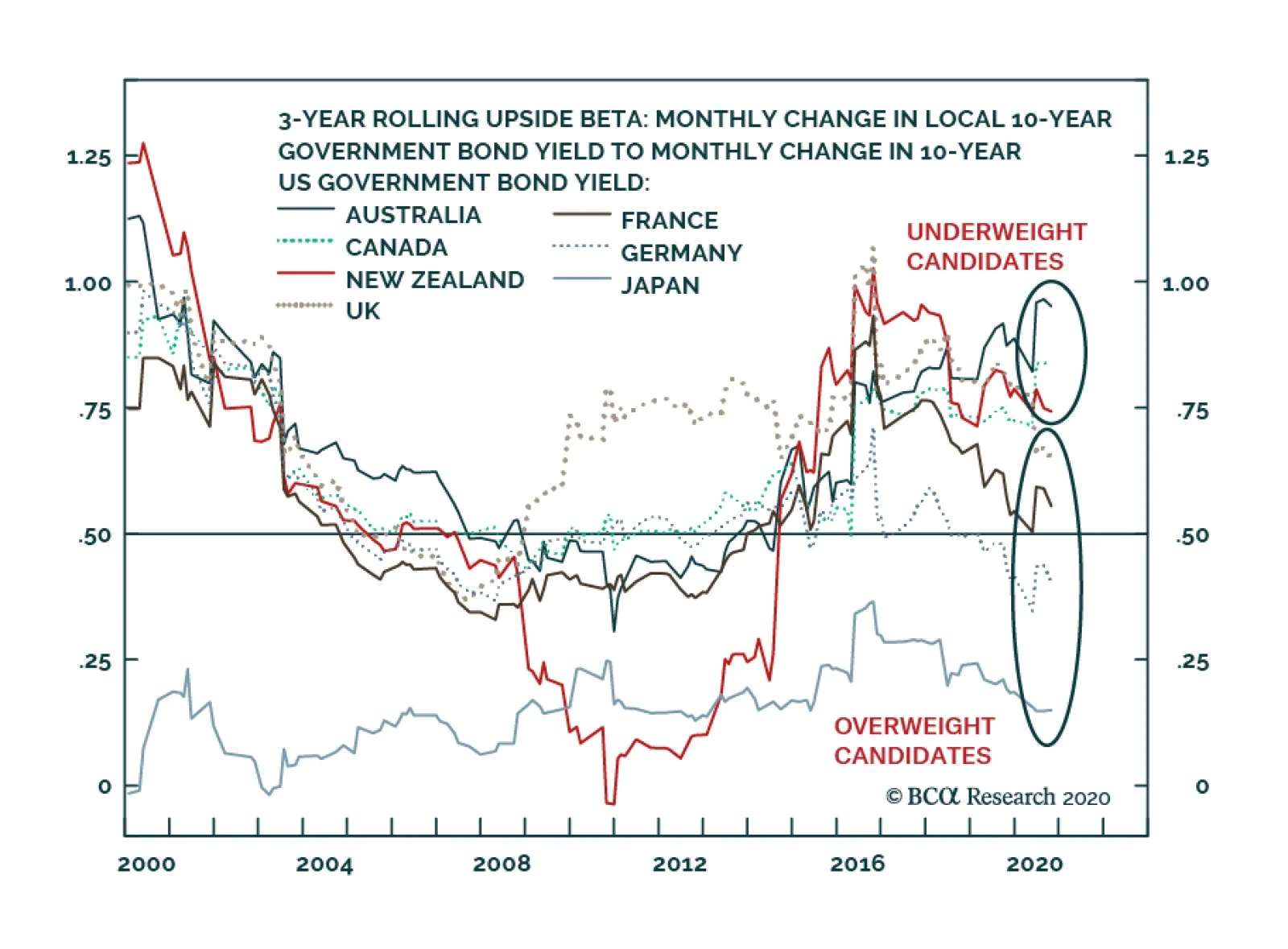
One of BCA Research’s Global Fixed Income Strategy service’s key views is to underweight the US in global bond portfolios, and favor countries where yields have a lower sensitivity to rising US yields. We expect the benchmark 10-year Treasury yield to rise…
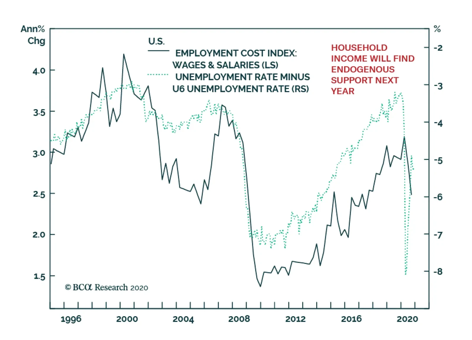
It is easy to be fearful that the eventual withdrawal of fiscal stimulus next year would result in a significant shock to household income. Once support runs out, there would be some pain, but important fundamental improvements will decrease the impact of…
2021 High-Conviction Underweight Calls: S&P Homebuilders
2021 High-Conviction Underweight Calls: S&P Homebuilders
Underweight We deem that most, if not all, of the good news (low mortgage rates, low inventories, high demand, work-from-home reality, all-time highs on the overall NAHB housing sentiment survey) is already priced in galloping homebuilders stock prices and exuberant expectations. If our economic reopening thesis proves accurate next year, then the COVID-19 winners – homebuilders included – will take the back seat. Historically, interest rates and relative share prices have been inversely correlated and a steep selloff in the bond market is bad news for homebuilding stocks (top panel). On the operating housing front, some cracks are forming. New home sales, while brisk in absolute terms, are losing out to existing housing sales and homebuilders have resorted to price concessions in order to drive volumes (second & third panels). Profit margins are at the highest level since the subprime crisis and are vulnerable to a squeeze courtesy of rising input costs. Framing lumber comprises roughly 15% of a new home’s commodity related costs and lumber prices have been expanding all year long (bottom panel). Bottom Line: Put the S&P homebuilding index to the high-conviction underweight call list. The ticker symbols for the stocks in this index are: BLBG: S5HOME – LEN, PHM, DHI, NVR.
Highlights Global growth will accelerate over the course of 2021 as COVID-19 vaccines are distributed and economic confidence improves in response. Longer-term global bond yields see some upward pressure as growth picks up, but global real yields will stay negative with on-hold central banks actively seeking an inflation overshoot. Maintain below-benchmark overall global duration exposure, and position for steeper government bond yield curves and wider inflation breakevens. The rise in global bond yields we anticipate will be relatively moderate, with US Treasury yields rising the most. Underweight the US in global bond portfolios, and favor countries where yields have a lower sensitivity to rising US yields (core Europe, Japan, UK). Also overweight Peripheral European debt given supportive monetary and fiscal policies that are helping to reduce credit risk (Italy, Spain, Portugal). The US dollar will remain soft in 2021, providing an additional reflationary impulse to the global economy. Overweight global inflation-linked bonds versus nominal government debt. Lower-quality global credit should outperform against a backdrop that will prove positive for risk assets: easy money policies, improving growth momentum and a reduction in virus-related uncertainty. Upgrade US high-yield to overweight through higher allocations to lower rated credit tiers, while downgrading US investment grade, where valuations are far less compelling, to neutral. Favor US corporates versus euro area equivalents, of all credit quality, based off less attractive euro area spread valuations. Within US$-denominated emerging market debt, favor corporates over sovereigns. Feature Dear Client, This report, detailing our global fixed income investment outlook for next year, will be our last for 2020. Please join me for a webcast this coming Friday, December 18 at 10:00 AM EST (3:00 PM GMT, 4:00 PM CET, 11:00 PM HKT) where I will discuss the outlook followed by a Q&A session. Best wishes for a very safe, healthy and prosperous 2021. We’ve all earned that after a difficult 2020 that none of us will soon forget. Rob Robis, Chief Global Fixed Income Strategist BCA Research’s Outlook 2021 report, “A Brave New World”, outlining the main investment themes for next year based on the collective wisdom of our strategists, was sent to all clients in late November.1 In this report, we discuss the broad implications of those themes for the direction of global fixed income markets in 2021. In a follow-up report to be published in the first week of the New Year, we will translate those themes into specific recommended allocations and weightings within our model bond portfolio framework. A Summary Of The 2021 BCA Outlook The tone of the BCA 2021 Outlook was generally positive, with conclusions that are supportive for the outperformance of risk assets relative to safe havens like government bonds (Chart 1). Chart 1How To Play Recovery & Reflation In 2021
2021 Key Views: Vaccination, Reflation, Rotation
2021 Key Views: Vaccination, Reflation, Rotation
Global growth will strengthen over the course of next year, after an initial soft patch related to the late-2020 COVID-19 economic restrictions in Europe and the US. Economic confidence will improve as the COVID-19 vaccines become more widely distributed, at a time of ongoing substantial monetary and fiscal stimulus in most important countries. A major release of pent-up demand is likely, fueled by the surge in private sector savings in the US and Europe after households and businesses cut back on spending because of the pandemic. The lingering impact of China’s substantial fiscal and credit stimulus in 2020 will still be felt throughout the world for most of 2021, even with Chinese authorities likely to begin curtailing the expansion of credit around mid-year. The tremendous amount of global spare capacity created by the virus and associated economic restrictions will keep inflation subdued in most countries. Thus, both monetary and fiscal policymakers will be under no pressure to pre-emptively tighten policy. The pace of monetary/fiscal stimulus will inevitably slow on a rate-of-change basis after the massive ramp up of government spending, income support, loan guarantees and central bank asset purchases. However, policymakers are expected to pull any and all of those levers once again in the event of a severe pullback in economic growth or a major bout of financial market turbulence. After a wild 2020 in a US election year, geopolitical uncertainty is expected to recede a bit next year. Although US-China tensions will remain elevated even under the incoming Biden administration, European politics are expected to be a tailwind for financial markets. A UK-EU Brexit deal is expected to be reached given economic realities, increased fiscal cooperation within the EU will support fiscally weaker countries like Italy, and the threat of the US imposing tariffs on Europe will disappear after Donald Trump leaves office. Our Four Main Key Views For Global Fixed Income Markets In 2021 The following are the main implications for global fixed income investment strategy based off the conclusions from the 2020 BCA Outlook: Key View #1: Maintain below-benchmark overall global duration exposure, and position for steeper government bond yield curves and wider inflation breakevens. Chart 2COVID-19 Lockdowns Will Not Last Forever
COVID-19 Lockdowns Will Not Last Forever
COVID-19 Lockdowns Will Not Last Forever
COVID-19 was the elephant in the room for financial markets in 2020, influencing sentiment whenever cases flared up or subsided. Yet the impact diminished steadily since the first wave of the virus stretched beyond China in the spring. The broad span of global risk assets – equities, corporate credit, industrial commodities – has performed very well during the current, and much larger, surge in cases occurring in the US and Europe. One big reason for this is that investors now understand that lockdowns, and the associated drag on economic growth, do not last forever. In addition, investors know that policymakers in most countries will react to any sharp downturn in economic confidence with more fiscal and monetary stimulus to help offset the negative growth impact of the lockdowns. In Europe, many European governments enacted harsh national lockdowns in a bid to “flatten the curve” during the latest surge. This has helped successfully reduce the growth rate of new cases and hospitalizations (Chart 2). This will eventually lead to an easing of restrictions, and a recovery in economic activity, in early 2021. While US case numbers are also surging, the response by governments has been much less widespread, and severe, compared to Europe. There is little political appetite (even with a new president) for another wave of harsh restrictions along the lines of what took place last spring. Some slowing of economic activity is inevitable because of increased regional restrictions in large states like California and New York, as is already evident in some late-2020 data. However, any downturn should not be expected to last long with the growth rate of US COVID-19 hospitalizations having already peaked. The big game-changer, of course, is the introduction of COVID-19 vaccines which have already begun to be distributed in the UK and US. While there are uncertainties related to the operational logistics of a worldwide vaccine rollout, including whether enough people will voluntarily choose to be vaccinated to achieve herd immunity on a global scale, the very high announced efficacy levels of the various vaccines mean that an end of the pandemic is now achievable. Investors should see through the current surge in COVID-19 cases, and any short-term hiccup in economic growth, and focus on the bigger picture of the introduction of the vaccine and the positive implications for global economic confidence in 2021. Growth has already been holding up well in the US and China in the final months of 2020, with both manufacturing and services PMIs remaining solidly above the 50 line indicating expanding activity. As the euro area lockdowns begun to ease up, growth there will catch up, which already appears to be underway with the sharp uptick in the December PMI data (Chart 3). Those three regions account for one-half of worldwide GDP, so that is already a solid footing for global growth entering 2021. A sustained improvement in the pace of global economic activity is important, as it is becoming increasingly harder for governments to sustain the extreme levels of policy stimulus delivered in 2020. In China, policymakers are starting to rotate their focus away from aggressive stimulus and fighting deflation back to the cautious risk management approach to credit expansion that was in place prior to COVID-19. BCA Research’s China strategists expect the latest Chinese credit cycle to peak by mid-2021, with the credit impulse set to decline in the second half of the year (Chart 4). Combined with the tightening of monetary conditions through a strengthening yuan and higher local interest rates, some slowing of Chinese growth is inevitable. Although given the lags between stimulus and growth, the impact is more likely to be felt toward year-end and into 2022 – good news for much of the global economy that still relies heavily on exporting to China as an engine of growth. Chart 3A Growth Recovery Without Inflation
A Growth Recovery Without Inflation
A Growth Recovery Without Inflation
Chart 4China Stimulus Will Peak Out By Mid-2021
China Stimulus Will Peak Out By Mid-2021
China Stimulus Will Peak Out By Mid-2021
Overall global fiscal policy is on track to be less supportive in 2021. The latest estimates from the IMF show that the “fiscal thrust”, or the change in the cyclically-adjusted primary budget balance relative to potential GDP, in most developed economies will turn negative next year (Charts 5A and 5B). Such a swing is inevitable given the sheer magnitudes of the fiscal stimulus measures first introduced to combat the economic damage from COVID-19 that will not be repeated in 2021. By the same token, less fiscal stimulus will be necessary if overall global growth improves, especially if vaccines can be successfully distributed to much of the world. Chart 5ANegative Fiscal Thrust In 2021 …
Negative Fiscal Thrust In 2021 ...
Negative Fiscal Thrust In 2021 ...
Chart 5B… But Governments Will Spend More If Needed
... But Governments Will Spend More If Needed
... But Governments Will Spend More If Needed
What does all this mean for global government bond yields? We believe that it signals a continuation of the trends seen towards the end of 2020 – a slow grind higher in longer-term yields, led by better growth and rising inflation expectations, but without any need to discount a move to tighter monetary policy because of a sustained overshoot of realized inflation. The current economic projections of the Fed, ECB, Bank of England (BoE), Bank of Canada (BoC) and Reserve Bank of Australia (RBA) all show that policymakers there expect unemployment rates to remain above pre-pandemic levels to at least 2023 (Chart 6). At the same time, central banks are also projecting inflation to be below their target levels/ranges over that same period. In response, the forward guidance from these central banks has been very dovish, with policy interest rates expected to remain at current levels at or near 0% for at least the next two to three years. Interest rate markets have taken the hint, with a very low expected path for rates over the next few years discounted in overnight index swap curves. Chart 6Central Banks Projecting A Slow Return To Full Employment
2021 Key Views: Vaccination, Reflation, Rotation
2021 Key Views: Vaccination, Reflation, Rotation
Chart 7Markets Expect Years Of Negative Real Policy Rates
Markets Expect Years Of Negative Real Policy Rates
Markets Expect Years Of Negative Real Policy Rates
The implication of this is that central banks are projecting a sustained, multi-year period where policy rates will remain below forecasted inflation (Chart 7). Or put more simply, central banks are consistently signaling that negative real interest rates will persist for a long time. This means that one of the most oft-discussed “oddities” of global bond markets in 2020 - the persistence of negative real long term bond yields in most major economies, most notably in the US Treasury market, even as inflation expectations increase – is unlikely to disappear in 2021. Those negative real yields reflect, to a large part, the expectation that real global policy rates will stay persistently negative (Chart 8). At some point in 2021, markets could challenge this dovish guidance from central banks that could temporarily push up both future interest rate expectations and longer-term real yields, especially in the US. However, it is more likely that central banks will not validate that move higher in yields for fears of pre-emptively short-circuiting an economic recovery. Such a hawkish shift could be more plausibly delivered in 2022 at the earliest, with the Fed the most likely candidate to change its guidance. Summing up all of the above points with regards to our recommendations on overall management of government bond portfolios, we arrive at the following conclusions (Chart 9): Chart 8Rising Inflation Breakevens With Stable Negative Real Yields
Rising Inflation Breakevens With Stable Negative Real Yields
Rising Inflation Breakevens With Stable Negative Real Yields
Chart 9Moderately Higher Global Bond Yields In 2021
Moderately Higher Global Bond Yields In 2021
Moderately Higher Global Bond Yields In 2021
Duration exposure should be set below-benchmark. Our forward-looking Duration Indicator, comprised of leading economic indicators and economic expectations data, is strongly signaling that global yields should head higher in 2021. Position for a bearish steepening of yield curves. This will be driven more by rising longer-term inflation expectations, as the short-ends of yield curves will remain anchored by dovish on-hold central banks. Key View #2: Underweight the US in global bond portfolios, and favor countries where yields have a lower sensitivity to rising US yields Moving beyond the overall global duration view, there are significant country allocation decisions that derive from our outlook for 2021. First and foremost, we recommend underweighting US Treasuries in global bond portfolios, as we anticipate the biggest increase in developed market bond yields next year to occur in the US. We expect the benchmark 10-year Treasury yield to rise to the 1.25% to 1.5% range sometime in 2021. This move will come mostly through higher inflation expectations. The 10-year TIPS breakeven inflation rate is expected to reach the 2.3-2.5% range that we have long considered to be consistent with the market pricing in the Fed sustainably achieving its 2% inflation goal. Any additional Treasury yield increases beyond our 2021 forecast range would require the Fed to shift to a more hawkish stance signaling future rate hikes. With the Fed now operating with an Average Inflation Target framework, allowing for temporary overshoots of inflation after periods when inflation was below the Fed’s 2% target, the hurdle for such a shift in Fed guidance is much higher than in previous years. The Fed has also changed the nature of its forward guidance compared to years past, signaling that any future monetary tightening will only occur once actual inflation has sustainably returned to the 2% target. That means that the Fed will no longer pre-emptively choose to hike rates on merely a forecast of higher inflation – it will first need to see a sustained period of higher inflation materialize before considering any tightening. Thus, any move beyond our expected 1.25% to 1.5% range on US Treasuries would require a hawkish signal by the Fed that it intends to begin removing monetary accommodation through rate hikes. Under the Average Inflation Target framework, that will not happen in 2021 but could happen the following year if inflation stays at or above 2% over the course of next year. Turning to other countries, we recommend favoring bond markets with a lower historical “yield beta” to US Treasuries. In other words, we prefer overweighting counties where government bond yields are typically less correlated to changes in Treasury yields. We show those historical yield betas, using 10-year yields, in Chart 10. Importantly, the betas are calculated only for periods when Treasury yields are moving higher. We call this “upside beta”, which is a useful tool to identify which bond markets are more sensitive to selloffs in the US Treasury market. Chart 10Favor Lower Beta Government Bond Markets In 2021
Favor Lower Beta Government Bond Markets In 2021
Favor Lower Beta Government Bond Markets In 2021
The highest “upside beta” countries among the major developed markets are Australia, Canada and New Zealand, while the lowest “upside beta” countries are Germany, France and Japan. The UK is in the middle of those two groupings, although the trend over the past few years suggests that it is transitioning from a high-beta to low-beta country. Note that for all countries shown, the upside yield betas are below one, indicating that no market should be expected to see a bigger rise in yields than the US. Strictly based on our forecast of higher Treasury yields and calculated yield betas, we would recommend more overweight allocations to markets in the lower-beta group and more underweight allocations to the higher-beta group. We are comfortable recommending overweights to the lower-beta group of Germany, France, Japan and the UK. Although among the higher-beta group, we are reluctant to recommend underweighting all three countries because of the policy choices of their central banks. The RBA, BoC and Reserve Bank of New Zealand (RBNZ) have all enacted aggressively large quantitative easing (QE) programs in 2020 as a way to provide additional monetary stimulus after cutting policy rates to near-0%. The BoC stands out as being extremely aggressive on QE with its balance sheet expanding more than three-fold on a year-over-year basis (Chart 11). Chart 11More Divergence In The Pace Of Global QE
More Divergence In The Pace Of Global QE
More Divergence In The Pace Of Global QE
None of these three central banks has discussed slowing the pace of purchases anytime soon. In the case of the RBA and RBNZ, they have gone as far as signaling the role of QE in dampening their bond yields to help stem the appreciation of their currencies. They may have limited success in driving down yields further, however. Measures of bond valuation like the term premium, which typically move lower when QE accelerates, have bottomed out across the developed markets even as central banks have absorbed a greater share of the stock of government debt in 2020 (Chart 12). Yet even if QE can no longer drive yields lower, it can limit how much yields can increase when under cyclical upward pressure. For this reason, we do not expect government bond yields in Australia, Canada or New Zealand to behave in line their historical higher yield beta that would make them clear underweight candidates in a period of rising US Treasury yields, as we expect. Net-net, we recommend that investors focus underweights solely on US Treasuries within global government bond portfolios. This suggests that yield spreads between Treasuries and other bond markets should continue to widen, as has been the case over the final few months of 2020 (Chart 13). We recommend neutral allocations to Australia, Canada and New Zealand, while overweighting core Europe, Japan and the UK. Chart 12More QE Is Less Impactful In Pushing Down Bond Yields
More QE Is Less Impactful In Pushing Down Bond Yields
More QE Is Less Impactful In Pushing Down Bond Yields
Chart 13US Treasuries Will Continue To Underperform In 2021
US Treasuries Will Continue To Underperform In 2021
US Treasuries Will Continue To Underperform In 2021
We also are maintaining our overweight recommendation on Italian and Spanish government debt, which was one of our most successful calls of 2020. We view those markets more as a credit spread story versus core Europe, rather than a directional yield instrument like US Treasuries or German Bunds. On that basis, the spread of Italian and Spanish yields versus German yields has room to compress even further, as both are strongly supported by ECB bond purchases. Also, the introduction of the European Union’s €750bn Recovery Fund is a strong signal of greater fiscal co-operation within Europe – another important factor that has helped reduce the risk premium (credit spread) on Italy and Spain. When looking at the yields currently on offer in the developed world, Italy and Spain offer very attractive yields in a global low-yield environment (Table 1). Stay overweight. Table 1Developed Market Bond Yields, Both Unhedged & Hedged Into USD
2021 Key Views: Vaccination, Reflation, Rotation
2021 Key Views: Vaccination, Reflation, Rotation
Key View #3: Overweight global inflation-linked bonds versus nominal government debt We have discussed the importance of rising inflation expectations as a core driver of the rise in global bond yields that we expect in 2021. This has been in the context of improving global growth, reduced spare economic capacity and central banks staying very dovish, all of which are necessary ingredients to boost depressed inflation expectations. A weaker US dollar will also play a significant role in that boost to inflation expectations and bond yields that we expect next year. The decline in the greenback seen in the latter half of 2020 has been driven by the typical factors (Chart 14): Chart 14More Negatives Than Positives For The USD
More Negatives Than Positives For The USD
More Negatives Than Positives For The USD
The Fed’s aggressive rate cuts, dating back to 2019, have reduced much of the relative interest rate attractiveness of the US dollar Accelerating global growth after the sharp worldwide plunge in growth in Q2/2020 benefitted non-US economies more, eliciting a standard decline in the “anti-growth” US dollar Uncertainty and risk aversion declined after the initial COVID-19 shock at the start of 2020, easing the safe haven demand for dollars. Looking ahead, rate differentials continue to point to additional downward pressure on the US dollar, even with the moderate rise in longer-term US Treasury yields that we expect next year. Risk aversion and uncertainty should also decline in a dollar-bearish fashion with the US presidential election behind us and the COVID-19 vaccine ahead of us. Improving global growth should also be supportive of more dollar weakness, especially as Europe recovers from the current lockdown-driven slowdown. A weaker US dollar is a key variable to trigger faster global inflation through the link between the currency and global traded goods prices. On a rate-of-change basis, a weakening US dollar has a strong negative correlation to the growth rate of world export prices and commodity prices (Chart 15). Thus, more USD weakness in 2021 will lift realized global inflation through commodities and traded goods prices, especially against a backdrop of faster global growth. Chart 15Global Reflation Through A Weaker USD
Global Reflation Through A Weaker USD
Global Reflation Through A Weaker USD
Chart 16Stay Overweight Global Inflation-Linked Bonds In 2021
Stay Overweight Global Inflation-Linked Bonds In 2021
Stay Overweight Global Inflation-Linked Bonds In 2021
BCA Research’s commodity strategists expect oil prices to move higher next year on the back of an improving demand/supply balance, with the benchmark Brent price of oil averaging $63/bbl over the course of 2021. A weaker USD could provide additional upside to that forecast, giving a further lift to realized inflation rates around the world. To position for this boost to inflation via a weaker dollar and rising commodity prices, we recommend that fixed-income investors continue holding a core allocation to inflation-linked bonds versus nominal government debt. We have maintained that recommendation since last spring after the collapse of global breakeven inflation rates that left breakevens very undervalued according to our fair value models (Chart 16).2 The valuation case is far less compelling now after the steady climb in breakevens over the latter half of 2020, with only French and Japan breakevens below fair value. However, given our expected backdrop of improving global growth and highly accommodative global monetary policy, breakevens are likely to continue to climb to more expensive levels. Our preferred allocations are to US and French inflation-linked bonds, while we would be cautious on Australian inflation-linked bonds which appear extremely overvalued on our models. Key View #4: Within an overweight allocation to global corporate debt, overweight US high-yield versus US investment grade and favor all US corporates versus euro area equivalents. Global corporate bond markets have enjoyed a spectacular rally over the final three quarters of 2020 after the huge pandemic related selloff of last February and March. The benchmark index yields for investment grade corporates in the US, euro area and UK have all fallen back below pre-COVID levels, while index yields for high-yield in the same three regions are back at the pre-COVID lows (Chart 17). The story is similar on a credit spread basis. The benchmark index option-adjusted spread (OAS) for investment grade corporates is only 11bps away from the pre-COVID low in the US and 4bps from the pre-COVID low in the euro area, with the UK spread now slightly below the pre-pandemic low (Chart 18). High-yield spreads still have some more room to compress with US, euro area and UK junk index spreads 67bps, 68bps and 110bps above the pre-pandemic low, respectively. Chart 17Corporate Bond Yields Falling To New Lows
Corporate Bond Yields Falling To New Lows
Corporate Bond Yields Falling To New Lows
Chart 18Corporate Bond Spreads Approaching Pre-COVID Lows
Corporate Bond Spreads Approaching Pre-COVID Lows
Corporate Bond Spreads Approaching Pre-COVID Lows
Supportive monetary policy has played a huge role in the global credit rally. Central banks have used their balance sheets aggressively to help ease financial conditions, including the direct buying of corporate bonds by the Fed, ECB and BoE. Looking ahead to 2021, it is clear that credit markets are still benefitting from loose monetary policy while also enjoying a tailwind from better global growth. The global high-yield default rate is rolling over and the US default rate has clearly peaked (Chart 19). There is now less of a need for direct buying of corporates by central banks with credit markets seeing major investor inflows with a robust pace of corporate bond issuance. Corporate bond markets can now walk on their own with the support of central bank crutches. This means that investors should pivot away from the more cautious “buy what the central banks are buying” approach that we had advocated for much of 2020 and be more selectively aggressive. First and foremost, that means increasing allocations to US high-yield corporate debt, both out of US investment grade and euro area corporates. Default-adjusted spreads in the US, which measure the high-yield index OAS net of realized default losses, will look far more attractive as the US default rate peaks (Chart 20). If the US default rate moves back below 5% over the next year from the current 8% rate, the US default-adjusted spread will climb back into positive territory. This will compare more favorably to the default-adjusted spread for euro area high-yield, which has been higher because the euro area default rate did not suffer a major spike this year despite the sharp downturn in euro area growth back in the spring. Chart 19Easy Money Policies Supporting Global Credit
Easy Money Policies Supporting Global Credit
Easy Money Policies Supporting Global Credit
Chart 20High-Yield Looks More Attractive With Fewer Defaults In 2021
High-Yield Looks More Attractive With Fewer Defaults In 2021
High-Yield Looks More Attractive With Fewer Defaults In 2021
US high-yield also looks most attractive using our preferred metric of pure spread valuation, the 12-month breakeven spread. This measures the amount of spread widening that must occur over a one year period for corporate debt to have the same return as a duration-matched position in government bonds. We compare this “spread cushion” to its own history in a percentile ranking to determine if spreads look relatively attractive. Within US corporate debt, the 12-month breakeven spread for investment grade credit is down to the 5th percentile, suggesting virtually no room for additional spread tightening (Chart 21). For US high-yield credit, the 12-month breakeven spread is still relatively elevated at the 60th percentile level, suggesting more room for spread compression. Within euro area corporates, the 12-month breakeven percentile rankings for investment grade and high-yield are at the 27th and 28th percentile, respectively, suggesting a more limited scope for spread compression compared to US high-yield (Chart 22). Chart 21Move Down In Quality Within US Corporates
Move Down In Quality Within US Corporates
Move Down In Quality Within US Corporates
Chart 22No Compelling Value In Euro Area Corporates
No Compelling Value In Euro Area Corporates
No Compelling Value In Euro Area Corporates
When comparing the 12-month breakeven spreads of all corporate debt in the US, euro area and UK, broken down by credit tier, to a more pure measure of spread risk - duration times spread – the attractiveness of lower-rated US junk bonds is most compelling (Chart 23). In particular, US B-rated and Caa-rated junk spreads offer very high 12-month breakeven spreads relative to spread risk. Chart 23Comparing Value (Breakeven Spreads) With Risk (Duration Times Spread)
2021 Key Views: Vaccination, Reflation, Rotation
2021 Key Views: Vaccination, Reflation, Rotation
Adding it all up, it is clear that lower-rated US high-yield debt offers an attractive value proposition for 2021. This is especially true given the positive global growth and monetary policy backdrop. The annual growth rate of the combined balance sheets of the Fed, ECB, BoE and Bank of Japan has been an excellent leading indicator of the excess return of US high-yield US Treasuries (Chart 24). The surge in balance sheet growth of 2020 is pointing to strong US high-yield bond performance versus Treasuries, and an outperformance of lower-rated US high-yield, in 2021. Chart 24Upgrade US High-Yield To Overweight
Upgrade US High-Yield To Overweight
Upgrade US High-Yield To Overweight
Chart 25Within EM USD Credit, Favor Corporates Over Sovereigns
Within EM USD Credit, Favor Corporates Over Sovereigns
Within EM USD Credit, Favor Corporates Over Sovereigns
This leads us to shift to an overweight stance on US high-yield, while downgrading US investment grade to neutral, as our key global spread product recommendation for 2020. Within other corporate credit markets, we recommend only a neutral allocation to euro area corporate credit, given the relatively less attractive valuations. Finally, within the emerging market US dollar denominated universe, we continue to recommend an overweight stance on corporates versus sovereigns, as the former will benefit more in 2021 from the lagged effect of Chinese credit stimulus and central bank balance sheet expansion in 2020 (Chart 25). Robert Robis, CFA Chief Fixed Income Strategist rrobis@bcaresearch.com Footnotes 1 Please see BCA Research The Bank Credit Analyst, "Outlook 2021: A Brave New World", dated November 30, 2020, available at bca.bcaresearch.com. 2 Our breakeven inflation models use the growth rate of oil prices in local currency terms and a long-term moving average of realized inflation as the inputs. Recommendations Spread Product Tactical Trades Yields & Returns Global Bond Yields Historical Returns
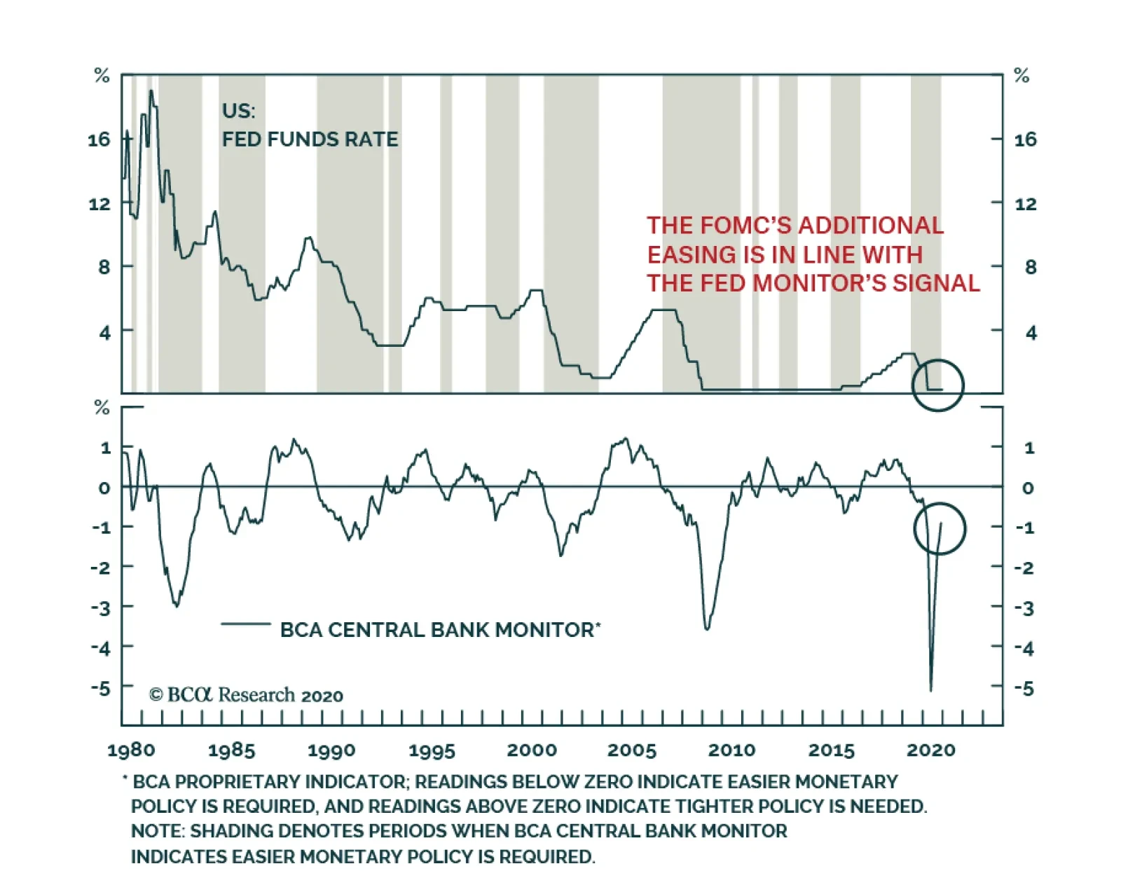
Yesterday, the Fed announced an extension of its $120 billion a month asset purchase program. The end of the program is now dependent on substantial further progress on the inflation and employment fronts. Many commentators expected more out of the FOMC,…
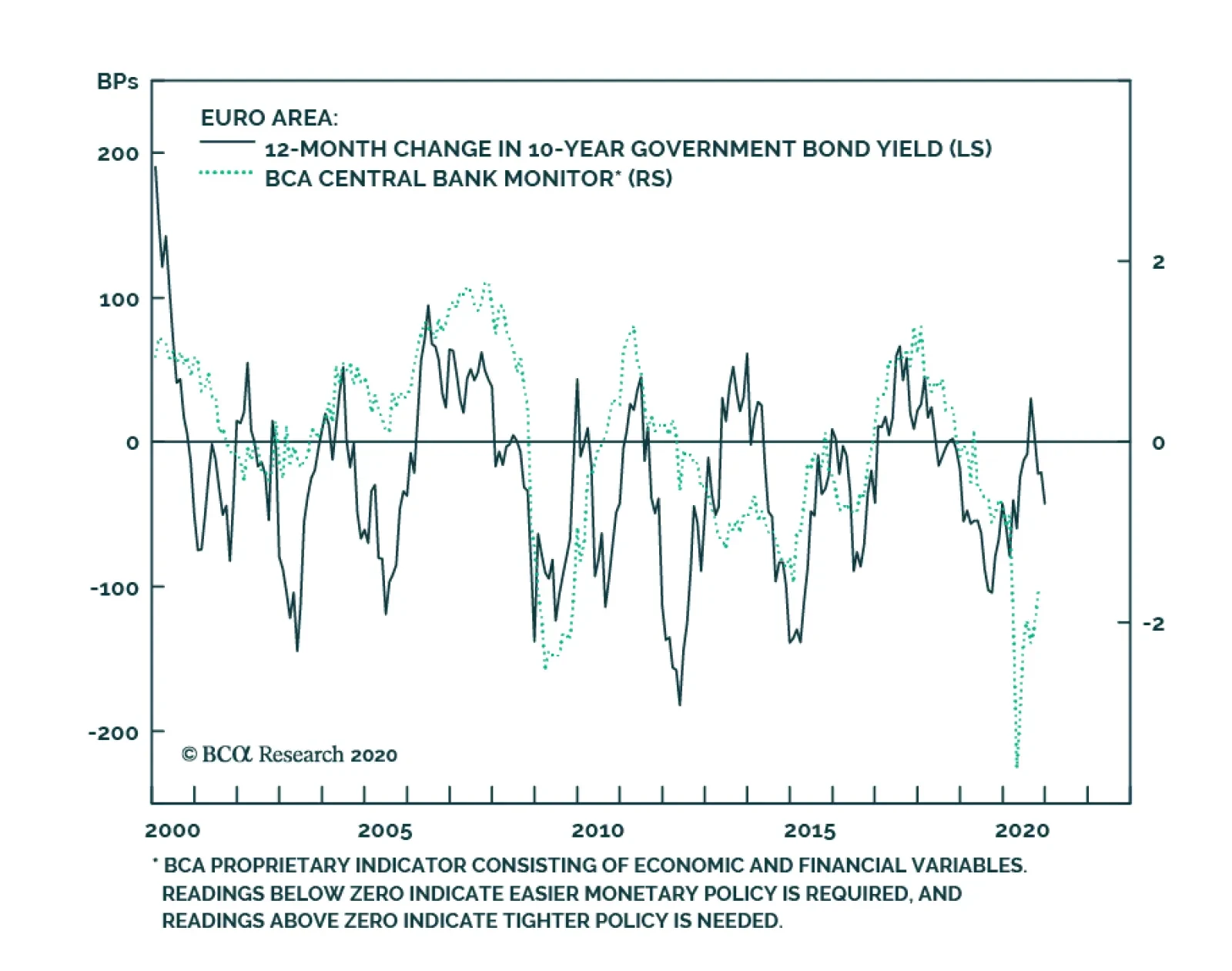
According to BCA Research’s Foreign Exchange Strategy & Global Fixed Income Strategy services, the depressed level of the ECB Monitor suggests that there is additional scope for lower euro area bond yields, although the impact will not be the same for all…
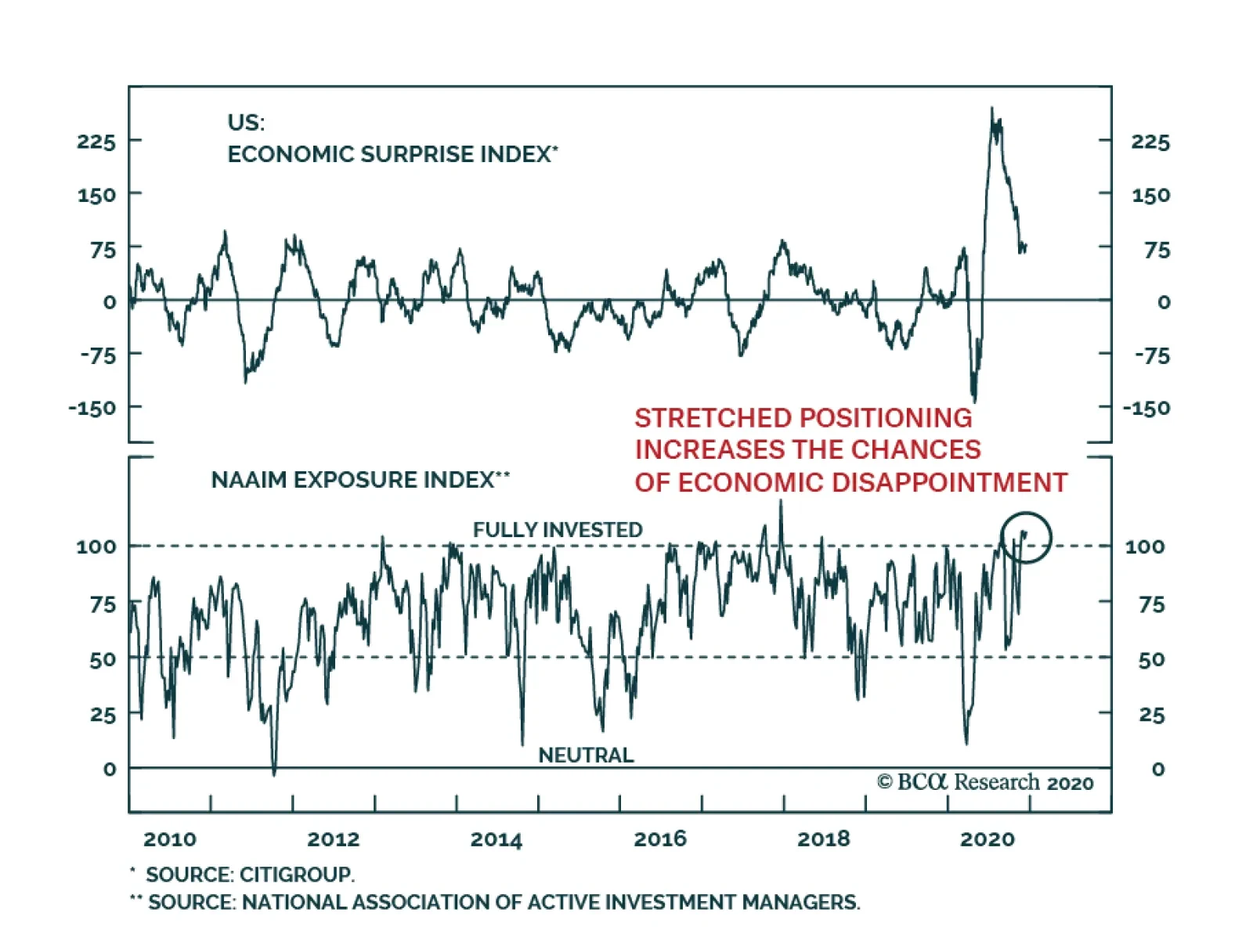
The chance of a tactical correction in risk assets remains very high. Risk assets of all ill are extremely overextended after their sharp rally since early November, yet the near-term weakness in the economy is growing as lockdowns continue to spread,…