United States
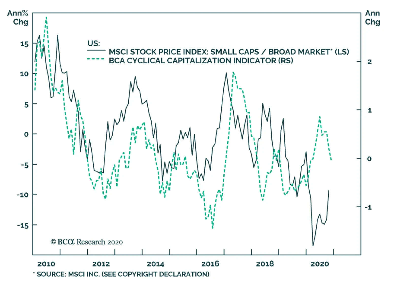
US and global small caps have outperformed their large cap peers significantly over the past month, after having sold off violently in March of this year. While US small caps remain below early-March levels in relative terms, the rally over the past month has…
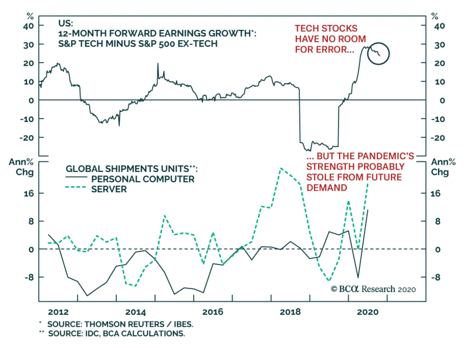
Tech stocks may be in for a rough earnings season, not so much because earnings themselves will be disastrous, but because those stocks embed stellar expectations. Anything short of perfection may prove problematic, and the impact of disappointments in this…
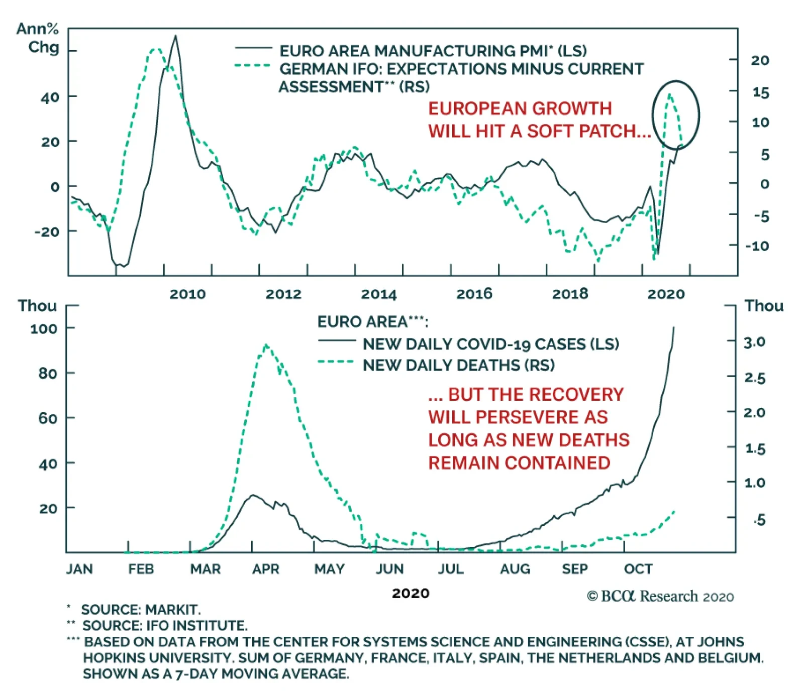
Yesterday’s German Ifo survey showed that businesses are growing wary of the impact of European toughened social distancing measures on their operations. After rising for five consecutive months, the headline IFO Business Climate series fell to 92.7 from a…

Your feedback is important to us. Please take our client survey today. Highlights Portfolio Strategy Today we recommend investors shift to a small versus large cap size bias on the back of rising inflation expectations, a steepening yield curve, a recovering commodity complex, a semblance of normality as the economy fully reopens in 2021, a looming fiscal stimulus package, and deeply oversold conditions. Recent Changes Prefer highly-cyclical small caps at the expense of more defensive large caps. Table 1
Vigilantes Gone Missing?
Vigilantes Gone Missing?
Feature The SPX was rudderless last week as another week of intense fiscal policy drama dominated headline news both in Washington, D.C. and on Wall Street, overshadowing Q3 earnings season. Markets remain hostage to the stimulus tug-of-war and the renewed uncertainty has cast a shadow on the short-term prospects of durable gains in the broad equity market. We continue to recommend investors stay patient and opt to put fresh cash to work after the election-related uncertainty lifts. Odds remain high that the SPX glides lower into November before it resumes its cyclical bull market. Recently, we read Marko Papic’s (Chief Strategist at Clocktower Group) seminal book Geopolitical Alpha and we participated in a vibrant webcast hosted by our sister Geopolitical Strategy service last Wednesday celebrating Marko’s milestone. Marko’s book is a page turner and lived up to our high expectations: he concisely delivered content full of bold out-of-consensus predictions. Pages 92/93 reveal Marko’s most important forecast in our view: “The transition from the Washington to Buenos Aires Consensus will dominate markets over the next decade. This transition is more relevant than the US-China geopolitical rivalry, risks to European integration, and technological change. All assets will be influenced by the deluge of fiscal and monetary policy”. In recent research, we have been writing about the transition to the fiscally irresponsible Buenos Aires Consensus, and COVID-19 has not only made the US government profligate, but also insensitive to rising debt loads (Chart 1). Chart 1Buenos Aires Consensus
Buenos Aires Consensus
Buenos Aires Consensus
However, borrowing from Marko’s framework and applying a material constraint in the form of interest rates is instructive. We turned cyclically bullish on the SPX in mid-March and on March 23 we published the QE shaded chart that we are updating today; from the three asset classes we showcase only the 10-year US Treasury yield has yet to rise to a level consistent with some semblance of economic normality (Chart 2). The Fed has likely slayed all the Bond Vigilantes, but the Fed itself is the mega Vigilante, at the moment in a multi-year hibernation. Pundits use the 1994 example for the massive selloff in the bond market (the one that produced Democratic political adviser James Carville’s great quote: “I used to think that if there was reincarnation, I wanted to come back as the president or the pope or as a .400 baseball hitter. But now I would like to come back as the bond market. You can intimidate everybody.”). However, they neglect to mention that the Fed doubled the fed funds rate (FFR) from 3% to 6% in a short time span, first igniting and then turbocharging the selloff in the bond market (Chart 3). Chart 2QE Is Always Bullish
QE Is Always Bullish
QE Is Always Bullish
Chart 3Lessons From History
Lessons From History
Lessons From History
This cycle, the Fed is acting as an enabler of the transition to the Buenos Aires Consensus. Thus the interplay between the Fed and the bond market will be critical to monitor in coming quarters and years. More specifically, understanding the Fed’s reaction function to a potential doubling in the 10-year US Treasury yield and jump in the FFR change expectations is essential. The most recent and relevant example was during the GFC, when the Fed held the FFR near zero from December 2008 until December 2015. In this seven-year period, the interplay between the FFR change expectations and the 10-year US Treasury yield reveals that the sensitivity of interest rates to FFR change expectations stood near 2-to-1; i.e. a 50bps increase in the FFR change expectations would push the 10-year yield 100bps higher and vice versa (Chart 4). Chart 4Rates Sensitivity At The Zero-Bound Back Then...
Rates Sensitivity At The Zero-Bound Back Then...
Rates Sensitivity At The Zero-Bound Back Then...
The most important divergence occurred in May 2013, with the now infamous Bernanke taper tantrum speech, following which the bond market sold off violently, but the FFR change expectations stayed relatively calm near the zero line (Chart 4). Year-to-date, the 10-year US Treasury yield’s sensitivity to FFR change expectations has ranged between 1-to-1 and 2-to-1 (Chart 5). Looking ahead post the election, the odds are rising of a mammoth fiscal package, especially if there is a “Blue Sweep” but also potentially in a renewed Trump administration. Under such a backdrop the 10-year US Treasury yield would spike and so will FFR hike expectations. Tack on the real possibility of a vaccine landing some time in 2021 and the economy will likely roar, creating a feedback loop further underpinning long bond yields. The only regulatory mechanism for fiscal prudence comes from the bond market. Put differently, only rising interest rates on an expanding debt pile can concentrate politicians’ minds (Chart 6). Therefore, the Fed’s reaction function will be critical in how they deal with the looming increase in interest rates and FFR hike expectations. Chart 5...And Today
...And Today
...And Today
Chart 6Interest Rates Are The Only Constraint
Interest Rates Are The Only Constraint
Interest Rates Are The Only Constraint
In that scenario, will the Fed try to talk the bond market down, utilize some form of yield curve control (YCC), or do nothing? With the YCC option similar to the 1940s as the most likely outcome as we posited in late summer, we expect that inflation will make a comeback and that would aid the Fed as it will accomplish its recent mission to finally generate inflation. It will also aid the government by inflating its way out of a debt trap by reversing the current dire debt-to-GDP arithmetic (please refer to our June 1 Inflation Special Report for more details on US equity sector implications). From an equity market’s perspective, the Fed’s reaction function poses a short-term risk: an unchecked selloff in the bond market will trigger a more pronounced tech sector underperformance period and unlock excellent value in beaten down financials (Chart 7). This week we continue to add more cyclicality to our portfolio and recommend a small versus large cap size bias on the back of rising odds of a “Blue Trifecta” and a massive stimulus package, and in accordance with our reopening of the economy theme we have been recently exploring. Chart 7Rotation Looming
Rotation Looming
Rotation Looming
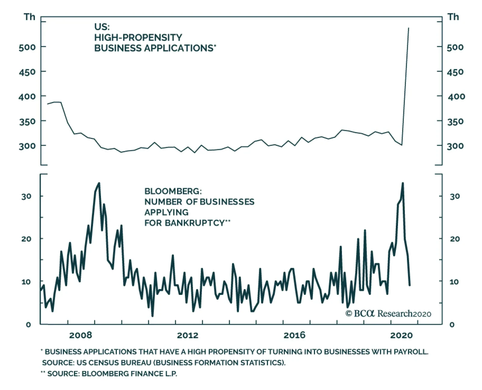
It’s A Small World After All We recommend investors implement a small size bias either via the Russell 2000 IWM:US exchange traded fund versus the SPY or via the S&P small cap IJR:US exchange traded fund at the expense of the SPY. These two small cap ETFs offer the most liquidity and each have roughly $40bn AUM. On March 20 in the middle of the pandemic and then on April 28 we monetized handsome gains for our portfolio by closing out our high- conviction and cyclical large cap bias, respectively. In hindsight, we should have flipped and implemented a small cap bias as up until early June, small caps were outshining large caps. Since then, they have retraced almost half the gains and now present an exploitable opportunity (top panel, Chart 8). The bearish small cap story is by now well ingrained. Small caps are plagued by a heavy debt load, have no or little trailing earnings to show for let alone nearly 1 in 3 small caps have no forward EPS and profit margins have collapsed near the zero line (Chart 8). While debt saddled small caps are a tough pill to swallow, the untold story is warranting some attention. First, according to a recent FT article, there is so much sloshing liquidity around that asset managers cannot raise private debt funds fast enough.1 Not only is the fiscal stimulus providing a lifeline to debt burdened small caps, but also the Fed’s opening up of the monetary spigots has pushed fixed income investors out the risk spectrum. Thus, the proverbial “kicking the can down the road” is boosting the allure of small cap stocks (junk spread shown inverted, top panel, Chart 9). Chart 8All The Bad News Is Priced In
All The Bad News Is Priced In
All The Bad News Is Priced In
Chart 9Catch Up Phase…
Catch Up Phase…
Catch Up Phase…
Second, the sector composition of small versus large caps represents a high-octane version of the SPX cyclicals/defensives portfolio bent that we have been exploring since late-July/early August. Table 2 shows that industrials comprise the largest market cap weight in small cap indexes. Tack on the materials and energy laggards and the deep cyclical (ex-tech) weight increases to 26% or twice the SPX weight. With regard to defensives the small caps have lower exposure compared with the SPX to the tune of 700bps (ex-telecom services). Taken together, the relative cyclicals (ex-tech)/defensives (ex-telecom) gap is 20 percentage points, confirming the small cap universe’s higher beta status. As a result we expect a narrowing of the gap as laggard small caps play catch up (bottom panel, Chart 9). Meanwhile, inflation expectations have recovered smartly from the depths of the COVID-19 accelerated recession and have formed an unmistakable V-shape (top panel, Chart 10). However, the small/large share price ratio has yet to follow suit. In fact, the Commodity Research Bureau’s overall index is also on fire signaling that commodity inflation is making a comeback. Relative share prices remain far apart from the budding recovery in the commodity complex including Dr. Copper’s flirting around with two-year highs (not shown). Table 2S&P 600/S&P 500 Sector Comparison Table
Vigilantes Gone Missing?
Vigilantes Gone Missing?
If our thesis that the economic recovery will accelerate in the New Year as a vaccine will make possible a full reopening of the economy, then the upshot is that relative share prices will converge higher to rising commodity prices (bottom panel, Chart 10). Chart 10…Looms Large
…Looms Large
…Looms Large
Another way to depict the deep cyclicality of the small cap index is to compare it with the emerging markets (EMs). The small/large ratio is back to where it was at the turn of the century, giving back 15-20 years of outperformance depending on which small cap index one uses (Russell 2000 or S&P 600). Similarly, EMs performance versus the SPX has returned to a depressed level last seen in the aftermath of the dotcom bust and is a carbon copy of the small/large ratio (middle panel, Chart 11). The implication is that small caps go as EMs go and an EM recovery bodes well for a small cap outperformance phase. Circling back to Table 2, the financials sector delta is also significant, with small caps’ exposure relative to their large cap brethren clocking in at over 700bps. Already, the yield curve is steepening and there are high odds of a selloff in the bond market as the economy continues up the reopening path and a vaccine is nearing (bottom panel, Chart 11). Similarly, the VIX has collapsed from north of 80 to below 30 recently confirming that the intense ‘risk off’ phase is over. Nevertheless, there is ample room for the VIX to fall further as it remains stubbornly at an historically elevated print 10 points above the mean. Importantly, the VIX has remained above 20 for over 160 trading days. Were it not for the GFC this would be a record streak (VIX shown inverted, top panel, Chart 11). Finally, the two year drubbing of small caps has worked off some of the overvaluation and our relative Valuation Indicator has returned back to the neutral zone. Importantly, small caps are so unloved and under-owned that our relative Technical Indicator is probing multi-decade lows. Historically, such a depressed relative positioning level has been contrarily positive and served as a launch-pad to significantly higher relative share prices on a cyclical time horizon (Chart 12). Chart 11High Beta ‘Risk On’ Beneficiary
High Beta ‘Risk On’ Beneficiary
High Beta ‘Risk On’ Beneficiary
Chart 12What’s Not To Like?
What’s Not To Like?
What’s Not To Like?
Adding it all up, a small versus large cap outperformance period looms on the back of rising inflation expectations, a steepening yield curve, a recovering commodity complex, a semblance of normality as the economy fully reopens in 2021, a looming fiscal stimulus package, and deeply oversold conditions. Bottom Line: Initiate a long small caps/short large caps trade today with a 9-12 month time horizon via the long IWM:US/short SPY:US exchange trade funds. Anastasios Avgeriou US Equity Strategist anastasios@bcaresearch.com Footnotes 1 https://www.ft.com/content/b7e29f0d-d906-421c-9a0a-910099e6eed9 Current Recommendations Current Trades Strategic (10-Year) Trade Recommendations
Drilling Deeper Into Earnings
Drilling Deeper Into Earnings
Size And Style Views October 26, 2020 Favor small over large caps July 27, 2020 Overweight cyclicals over defensives June 11, 2018 Long the BCA Millennial basket The ticker symbols are: (AAPL, AMZN, UBER, HD, LEN, MSFT, NFLX, SPOT, TSLA, V). January 22, 2018 Favor value over growth
Highlights We are upgrading Trump’s odds of winning to 45%. We have bet on a Democratic sweep all year. Incumbent parties rarely survive recessions, and President Trump has mishandled the pandemic. However, our updated quantitative election model – which relies heavily on short-term changes in the 50 states’ economies – points to a Trump victory with 279 Electoral College votes. The model puts Biden’s odds at 49%, i.e. “too close to call.” Opinion polls still favor Biden – and polls are generally accurate with sitting presidents. Yet Biden’s lead in swing states is comparable to Hillary Clinton’s in 2016. And we all know how that ended. Trump’s comeback, successful or not, will increase the chances of a contested election and will boost Republicans in Senate races. Our Senate model is also now flagging Republican control. The US fiscal policy outlook hinges on control of the Senate. Democrats would add 4%-7% of GDP to the fiscal thrust next year. We give 28% odds to a risk-off scenario, leaving a 72% chance that the policy setting will favor reflation. Feature We are upgrading President Trump’s odds of winning the US election from 35% to 45%. Looking at opinion polls, Biden is still favored as we go to press. But according to our quantitative election model, which relies heavily on the economy, Trump will eke out an Electoral College victory. What matters is that the media and financial markets are once again underrating Trump. The race is getting closer in the final days. Not only is our model flagging a Trump win, but the V-shaped economic recovery is boosting Trump’s popular support in the battleground states critical to winning an Electoral College majority. At very least investors should hedge their bets on former Vice President Joe Biden, who is not, after all, an extraordinarily charismatic challenger. Biden is not polling much better than Hillary Clinton polled against Trump four years ago (Chart 1). Chart 1ABiden Not Polling Much Better Than Clinton …
Biden Not Polling Much Better Than Clinton...
Biden Not Polling Much Better Than Clinton...
Chart 1B… Against Trump
... Against Trump
... Against Trump
The polling so far suggests that Trump suffered permanent damage from this year’s crisis and his support will hit a ceiling and relapse over the next week, confirming the month’s general tendency of a Biden win. But our confidence in the outcome is lower than before. The implication for investors is that the current volatility and risk-off sentiment could extend for one-to-three months, particularly given Congress’s failure to pass a new COVID relief package. However, beyond the near term, most scenarios are reflationary, positive for global equities and negative for low-yielding government bonds. There Are Still Undecided Voters Trump beat expectations in the final presidential debate on October 22, according to CNN polls. But debate performance does not accurately predict the winner of US elections. Moreover around 58 million voters have already voted based on prior information.1 Chart 2Still Enough Undecided Voters To Turn Election
Upgrading Trump’s Odds Of Re-Election
Upgrading Trump’s Odds Of Re-Election
Still, Trump’s recovery in swing state polling is simultaneous with a lot of early voting in October, and there are enough undecided voters to change the outcome in critical swing states. About 6% of voters are undecided – virtually the same as in 2016. While the number of third-party supporters has fallen by 5.7 percentage points (ppt), this trend will not hurt Trump (Chart 2). In swing states in 2016, Libertarian Party voters outnumbered Green Party voters by a ratio of four to one, which does not suggest that these voters will all flock to Biden. They could even lean Trump. A large third party vote points to popular discontent, which hurts the incumbent party, as in 1980 and 1992. A lower third party vote is thus neutral for Trump. This is a major difference in 2020 from 1980 and 1992, which are the only two modern examples of a president losing after his first term. The best demographic projections have long shown that a rerun of the 2016 election, albeit with a normalization of the third-party vote share, would lead to an Electoral College tie. While it is virtually impossible for Trump to win the popular vote, he has a lifeline if state results are contested and/or the Electoral College is indecisive. Quant Model Gives Trump 279 Electoral College Votes Economic activity in the US continues to bounce back, according to flash PMIs in services and manufacturing as well as the latest data release from the Philadelphia Federal Reserve’s Coincident Economic Index. This index is the key input in our quantitative US election models for the White House and Senate, both of which now flag Republican victories. The latest reading pushes Trump’s odds of winning re-election up by 2ppt, to 51%, thus predicting that he will win with 279 Electoral College votes, an increase of 20 votes since our September update (Chart 3). Obviously this is not a high-confidence reading but rather an outcome that says the election is “too close to call.” Our model correctly predicts all election outcomes since 1984 during in-sample back testing, and all elections since 2000 on an out-of-sample basis. Chart 3Quant Model Points To Trump Victory … A Risk To Our View
Upgrading Trump’s Odds Of Re-Election
Upgrading Trump’s Odds Of Re-Election
A Trump victory would be a massive upset – as in 2016. According to PredictIt.org, there is a 40% chance that Republicans will keep the White House. Other prominent forecasting groups, like FiveThirtyEight and The Economist, give Trump much lower odds, at 12% and 4%, respectively. In our model, Michigan has moved comfortably toward a Republican win (74% odds), opposite the conventional wisdom. Michigan is the crux of our subjective difference with our quantitative model – we don’t see a path for Trump to win as the polls currently stand. New Hampshire is the model’s only toss-up state, with a 53% chance of switching to Republicans, another surprising find, albeit one punctuated by President Trump’s decision to campaign in the state over the weekend. Pennsylvania and Wisconsin, states won by the Republicans in 2016, are still expected to flip to the Democrats. State-level coincident economic indices have the largest impact in determining the outcome in the model. Our other explanatory variables are state-by-state margins of victory in 2016, a “time for change” variable that favors incumbent parties, and the range of Trump’s approval rating. These variables have not changed recently and will not change in the final days of the election. Improving economic activity across the US is the basis for our model’s finding. Chart 4Improvements In Swing State Economies
Upgrading Trump’s Odds Of Re-Election
Upgrading Trump’s Odds Of Re-Election
The Philly Fed data show that 48 out of 50 states’ coincident economic indices increased over the past three months, an increase by 10 states since the previous month’s release. All swing states rose, while the previous toss-up state, Michigan, turned positive, according to our weighting method, which takes the three-month changes in the economic indicators and weights the final months of useable data more heavily than previous months in an election year (Chart 4). Michigan and New Hampshire account for 20 electoral votes, raising Trump from 259 to 279. Clients have asked us why we use the range of President Trump’s approval rating rather than the level (Chart 5). We found this measure more statistically significant than other measures. If we manipulate the data we find that the model would still favor Trump if we looked at the two-year change of the approval rating or the October momentum of the approval rating. However, the model flags a Trump loss if we judge by the July or October level of his approval rating (which is historically low), or if we exclude the approval rating data altogether. The result of these alternate versions of our model is a Trump loss, with 246 Electoral College votes and Florida and Michigan remaining the critical toss-up states (Table 1). We are sticking with our original model, as the range of approval predicts electoral votes with a higher confidence level than other measures. Chart 5Trump’s Approval Range Is Narrow, Stable
Upgrading Trump’s Odds Of Re-Election
Upgrading Trump’s Odds Of Re-Election
Table 1Variations In Quant Model Show Range Of Possibilities
Upgrading Trump’s Odds Of Re-Election
Upgrading Trump’s Odds Of Re-Election
Bottom Line: Our quant model now favors Trump for re-election with 279 Electoral College votes. This economy-heavy model suggests that Trump is once again underrated, that the odds of a contested election are rising (in which Trump has some institutional advantages), and that Senate Republicans will benefit from the final sprint. Uncertainty and volatility will affect the market if the election result is indecisive, delayed, or if the GOP keeps the Senate (see below). Why We Do Not Favor Trump Outright Biden has been our pick since March based on the year’s huge external shock. The pandemic and recession have been harmful to the material wellbeing of the American public and therefore have sharply reduced the odds that the current president and ruling party will be re-elected. Looking at the level of Trump’s approval rating, he is comparable to George Bush Sr, who lost re-election in 1992 after a recession and race riots in Los Angeles. He is well beneath George Bush Jr and Barack Obama, who were re-elected handily in 2004 and 2012 (Chart 6). Chart 6Trump’s Approval Rating Level Is Relatively Low
Upgrading Trump’s Odds Of Re-Election
Upgrading Trump’s Odds Of Re-Election
Joe Biden has a 7.9ppt lead in average national opinion polling. Looking at the breakdown across demographic groups reveals Trump’s serious liabilities. Biden has a 17ppt lead among women, compared to Clinton’s 15ppt lead in 2016 exit polls, and he is tied with Trump among men, compared to a 11ppt Trump lead in 2016 (Chart 7).2 Chart 7Trump Lagging In Key Demographic Groups
Upgrading Trump’s Odds Of Re-Election
Upgrading Trump’s Odds Of Re-Election
Ethnic white voters still favor Trump by 5ppt but Trump has lost ground with this group since 2016, when he had a 15ppt advantage. Biden leads among voters who have some college education, while Trump’s lead among non-college graduates has fallen from 7ppt in 2016 to 4ppt this year. Chart 8Consumer Confidence Sounds Warning For President
Consumer Confidence Sounds Warning For President
Consumer Confidence Sounds Warning For President
However, Black and Hispanic voters support Biden by a 74ppt and 31ppt margin, respectively, down from Clinton’s larger margins of 85ppt and 38ppt in 2016. While Trump is an exclusively commercial president, his approval rating never rose above 47% even when the economy was booming and consumer confidence soared. The collapse in consumer confidence has taken a toll on his approval, which struggles to break above 45% (Chart 8). Expectations have shot up, but voters are unhappy about current conditions. Consumer spending has not fully recovered and disposable income is in a freefall due to the failure of Congress to agree to a new fiscal relief deal since August, when benefits began to expire (Chart 9). Trump wanted a deal but so far Senate Republicans have proven unable to capitulate to House Democrats’ demands. Median family income has fallen over the course of Trump’s term. It spiked on the fiscal relief but then fell back when the latest phase of stimulus fell through (Chart 10). Chart 9Lack Of Fiscal Stimulus Weighs On Households
Lack Of Fiscal Stimulus Weighs On Households
Lack Of Fiscal Stimulus Weighs On Households
Chart 10Median Income Down Over Four Year Term
Median Income Down Over Four Year Term
Median Income Down Over Four Year Term
Under Trump’s watch the unemployment rate has risen from 4.7% to 7.9%. Obviously the surge was due to the pandemic and unemployment has fallen from its peak. But rising joblessness weighs on a president’s approval rating in the final reckoning – this is a good rule of thumb for identifying one-term presidents (Chart 11). Permanent unemployment is also rising, creating a group of unhappy voters that could make a difference in elections with thin margins. Chart 11AUnemployment Often Predicts …
Unemployment Often Predicts ...
Unemployment Often Predicts ...
Chart 11B... The Election End-Game
...The Election End-Game
...The Election End-Game
The pandemic is not over. COVID-19 hospitalizations and deaths are climbing in Arizona, Michigan, Pennsylvania, and Wisconsin (Chart 12). Trump’s net approval rating is deeply negative with regard to his handling of the crisis, as opposed to the economy where his approval is still net positive (Chart 13). Chart 12Pandemic Re-Emerging, Hurts Trump
Upgrading Trump’s Odds Of Re-Election
Upgrading Trump’s Odds Of Re-Election
Chart 13Trump Ailing On Pandemic Handling
Upgrading Trump’s Odds Of Re-Election
Upgrading Trump’s Odds Of Re-Election
Biden, a traditional Democrat, is an acceptable alternative to Trump. His lead over Trump is 7.9% in national polling and 4% in swing state polling. He polls considerably better than Hillary Clinton did. In Arizona his polling is rising; elsewhere it is flat (Chart 14A & B). Chart 14ABiden Polling Stable …
Biden Polling Stable...
Biden Polling Stable...
Chart 14B… And Better Than Hillary
...And Better Than Hillary
...And Better Than Hillary
Can the opinion polls be trusted? National polling is generally close to the mark – especially for incumbent presidents – and the winner of the national vote wins the Electoral College 91% of the time. Challengers who lose elections typically outperform their final polling by 1.4%. Those who win outperform by 3%. Whereas incumbent presidents who win outperform by 0.8% and those who lose outperform by 1% – i.e. they do better than expected but still lose (Chart 15A & B). Presidents are well known so they don’t tend to bring big surprises. However, there are major exceptions, namely Harry Truman. Chart 15AOpinion Polls Fairly Accurate On Sitting Presidents
Upgrading Trump’s Odds Of Re-Election
Upgrading Trump’s Odds Of Re-Election
Chart 15BOpinion Polls More Often Underrate Challengers
Upgrading Trump’s Odds Of Re-Election
Upgrading Trump’s Odds Of Re-Election
Chart 16Trump Is Rising In Battleground State Polls
Trump Is Rising In Battleground State Polls
Trump Is Rising In Battleground State Polls
What about state level polls? The big errors in 2016 occurred on the state level. However, swing state pollsters have improved their methods. This can be confirmed by the fact that Trump’s performance in battleground opinion polls closely aligns with his job approval rating (Chart 16). The approval rating is the most reliable of all US political polls. The fact that these two are in lockstep, as against Trump’s national support rate (which is weighed down by dyed-in-the-wool Democrats in populous states), suggests that swing state polling is not wildly off the mark. On the other hand, Biden’s 4ppt lead is not very large. Voter turnout will be very high this year. Both Professor Michael McDonald from the US Elections Project and Nate Silver of FiveThirtyEight expect turnout to be around 65%. High political polarization, get-out-the-vote campaigns by both parties, and expanded access to mail-in voting due to the pandemic have created a high-turnout environment. High turnout does not necessarily disfavor Trump, given that his political base consists of many low turnout groups. But it should hurt him in the context of higher unemployment, as was the case for the incumbent party in 1992 and 2008 (Chart 17). Bottom Line: History suggests the incumbent party will lose the White House. So do opinion polls, which tend to be accurate when it comes to sitting presidents. Trump’s momentum has picked up in swing state opinion polls this month, though it is pausing as we go to press. If he gains momentum in the final week then he could still win the election. Chart 17AHigh Turnout Amid High Unemployment …
Upgrading Trump’s Odds Of Re-Election
Upgrading Trump’s Odds Of Re-Election
Chart 17B…Hurts Incumbent
Upgrading Trump’s Odds Of Re-Election
Upgrading Trump’s Odds Of Re-Election
Trump’s Path To Victory Biden’s 4ppt lead in swing states is within the range of polling error. A last-minute Trump comeback is a risk. While presidents usually lose re-election if they suffer a recession, especially during the year of the election, there have been exceptions – namely in 1900, 1904, and 1924. The basis for Trump to make a comeback is the economic snapback and the fact that voters consistently rate the economy as the most important issue in the election. The crisis struck early enough in the year that the massive fiscal relief package has propped up demand in what could be the nick of time for the president (Chart 18).3 Chart 18Trump’s Biggest Help Is V-Shaped Recovery
Trump's Biggest Help Is V-Shaped Recovery
Trump's Biggest Help Is V-Shaped Recovery
Trump is generally polling better than he did in 2016 and his polling is ticking up in the final weeks of the race despite a disastrous year (Chart 19). His polling is improving in Florida and Arizona, meaning that a single victory in the upper Midwest would keep him in the White House. Chart 19ATrump Rallying In Some Swing States …
Trump Rallying In Some Swing States...
Trump Rallying In Some Swing States...
Chart 19B… Critical Trend If It Continues
...Critical Trend If It Continues
...Critical Trend If It Continues
Wage growth is also seeing a V-shaped recovery – particularly in the blue states, where services and knowledge-based sectors drive the economy, but also in “purple” swing states (Chart 20), though admittedly the purple states that voted for Trump are the laggards. The manufacturing sector is also bouncing back, which is critical for the Midwestern Rust Belt that got pummeled by Trump’s trade war prior to the pandemic. The surge in credit fueled by the Federal Reserve’s liquidity provisions is a positive for this region (Chart 21). Chart 20Swing State Wage Growth Bounces Back
Swing State Wage Growth Bounces Back
Swing State Wage Growth Bounces Back
Chart 21Midwestern Economy Snaps Back
Midwestern Economy Snaps Back
Midwestern Economy Snaps Back
The stock market rally is also positive for the incumbent. The S&P 500 predicts the election result 77% of the time going back to 1896. Specifically, its year-to-date performance as of October 31 of an election year is positively correlated with an incumbent party’s likelihood of winning the White House and is statistically significant at the 5% confidence level. Back in May, with the S&P down 13%, the stock market gave Trump a 16% chance of re-election. Today, up 6% YTD, it gives him a 66% chance (Chart 22). Chart 22Simple Stock Market Model Says Trump Favored For Re-Election
Upgrading Trump’s Odds Of Re-Election
Upgrading Trump’s Odds Of Re-Election
We would not put too much emphasis on this measure, as the market also rallied prior to Carter’s and Bush’s losses in 1980 and 1992. But Trump is uniquely tied to the stock market and it is clearly good for him if the market does not collapse (though the failure to pass fiscal stimulus is a liability). Simply put, Trump is stronger than Mitt Romney 2012 and Biden is weaker than Barack Obama. The 3.9ppt margin of victory in the popular vote that year should be narrower this year. Run-of-the-mill Democrats have not received more than 49% of the popular vote in recent memory. And that was the popular Bill Clinton in 1996 (Table 2). If Trump clocks in at 46%, as in 2016, then he could squeak through the Electoral College once again. Bottom Line: We are upgrading Trump’s odds to 45%. Table 2US Presidential Election Popular Vote
Upgrading Trump’s Odds Of Re-Election
Upgrading Trump’s Odds Of Re-Election
The Senate Is Too Close To Call Even if Trump’s comeback is “too little, too late,” it increases the chance of a contested election – in which he could get a lifeline through the Supreme Court or the House of Representatives – and also gives a boost to Republican Senators in tight races. Our Senate election model, like our presidential model, uses the Philly Fed coincident economic indicators. It has also flipped from favoring Democrats to narrowly predicting Republican control, with 51-49 seats. Specifically, Montana and North Carolina shifted into the Republican camp, though North Carolina remains a toss-up and would turn the overall balance of power (Chart 23).4 Chart 23Quant Model Says Senate Favors Republicans – A Risk To Reflation Trade
Upgrading Trump’s Odds Of Re-Election
Upgrading Trump’s Odds Of Re-Election
Again the proper way of interpreting this reading is that the election is “too close to call,” with a 49% chance of Democratic control. Notably our Senate model relies more heavily on opinion polling than our presidential model – it incorporates the president’s approval rating level as well as the incumbent party’s net support rate in the generic congressional ballot (a poll that measures which party voters generally prefer for Congress). The economic recovery is the source of the boost for Republicans but marginal improvements in Republican polling do not hurt. The Senate race is critical to the overall policy significance of the US election. You cannot pass major legislation in the US without control of the Senate. And the Senate races are clearly tightening. This means uncertainty is rising, not falling, as the election approaches. Position For Reflation, The Likeliest Policy Outcome In particular the US fiscal outlook depends on the Senate. Chart 24 simulates the different courses of the deficit depending on election scenarios. If the Democrats win the White House, Senate, and House of Representatives, the budget deficit will rise from 16% of GDP in FY 2020 to 23% of GDP in FY 2021, as Biden will largely execute his policy agenda. Chart 24Democratic Sweep Offers Massive Fiscal Boost
Upgrading Trump’s Odds Of Re-Election
Upgrading Trump’s Odds Of Re-Election
If Trump and the Republicans win the White House and retain the Senate, they will keep cutting deals with House Democrats as in recent years, and the deficit will at least remain flat. The only scenario in which the budget deficit contracts – i.e. a negative fiscal thrust threatens the US economic recovery – occurs if Biden wins the White House but Republicans obstruct his agenda. Realistically, this would result in something like the Republican status quo scenario in Chart 24 above, rather than the Congressional Budget Office’s baseline scenario. The baseline scenario would produce an intolerable 7.4% contraction in fiscal thrust under baseline scenario in 2021. GOP senators would not go so far. They are not the same as the House Freedom Caucus members who were so hawkish in 2010-16. Nevertheless investors cannot rule out the baseline scenario – which could cause a double-dip recession – until GOP senators allay their fears. The market will cheer if President Trump and the Republicans retain the White House and Senate, as the fiscal thrust will be neutral or slightly expansive. It will especially cheer if the Democrats win a clean sweep, adding anywhere from 4%-7% of GDP in fiscal thrust for FY 2021 – the most reflationary outcome. It will even cheer in the odd chance that Trump wins with a unified Democratic Congress, which would also be reflationary. But the market will not cheer if the election threatens premature fiscal tightening via Republican obstructionism under a Biden presidency. This is the only scenario that is deflationary. The market would have to riot to force Republican senators to cooperate with a Democratic president – and this would be the case in the lame duck session as well as for each new stimulus package and budget over 2021-22. Based on our updated quant models, this Biden+GOP scenario is about a 28% probability, a slight increase from our previous view. The flip side is that there is about a 72% probability of a reflationary outcome. Beyond the near term, a Biden presidency with a Republican senate is actually market positive. Republican senators would eventually have to agree to House-drawn budgets, but would prevent tax hikes and legislative overreach (the downside of a Democratic sweep). Meanwhile a President Biden would avoid sweeping unilateral tariffs against China and the EU (the downside of any Trump victory). Bottom Line: A Democratic sweep is the most fiscally proactive scenario but the odds have fallen from around 45% to 27% according to our quant models. The odds of Biden plus a GOP Senate have risen from 20% to 28%. The market would have to digest significant new fiscal risks in this case, so the dollar and US treasuries would initially rally. The other scenarios combine to a 72% probability and are initially reflationary, albeit less so than a Democratic sweep, with the likelihood of massive trade war risk in 2021. Trade Recommendations Courtesy Of The BCA Equity Analyzer As the US election approaches and the effects of the global pandemic linger, economic policy uncertainty remains elevated. Equity markets tend to behave very differently in times of acute uncertainty. In order to gauge the effects of uncertainty at the individual stock level, we turn to BCA’s stock-picking engine, the Equity Analyzer. We looked at factor performance when economic policy uncertainty (as defined by Baker, Bloom and Davis) exceeds the 150-line (Chart 25). This is quite high compared to history. Chart 25Policy Uncertainty: How High Will It Go?
Upgrading Trump’s Odds Of Re-Election
Upgrading Trump’s Odds Of Re-Election
We look at the 30 factors included in the BCA Equity Analyzer and examine the Sharpe Ratio (Chart 26). The Sharpe ratio expresses the risk adjusted performance of long/short strategies based on each factor. Long/short strategies, in turn, are defined as going long the top 25% based on a factor and going short the bottom 25%. Chart 26Equity Analyzer Shows Key Traits For Navigating Uncertainty
Upgrading Trump’s Odds Of Re-Election
Upgrading Trump’s Odds Of Re-Election
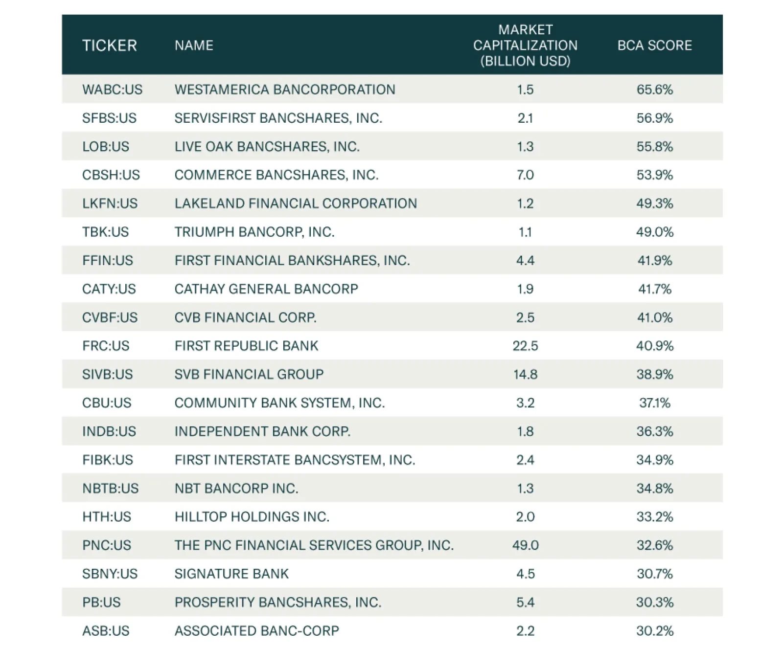
The results show that the best performing factors in times of high uncertainty are: Relative earnings yield Low accruals5 BCA Style, which is an in-house combined measure for (1) value versus growth and (2) small caps versus large caps. One-month momentum With these results, we go back to the BCA Equity Analyzer to extract the top 25 stocks filtered by our top 4 factors during times of uncertainty. The results are shown in Table 3.6 The BCA score in this table ranges from 0 to 100% (from a strong sell to a strong buy). It is based on 30 factors distributed among seven broad categories: Macro, Value, Safety, Sentiment, Technical, Quality, Payout. These picks will improve performance during the upcoming spike in uncertainty, which is now even more likely than it was given the rising odds of a contested election and/or deflationary partisan gridlock. Table 3BCA Equity Analyzer Stock Picks For Election Uncertainty
Upgrading Trump’s Odds Of Re-Election
Upgrading Trump’s Odds Of Re-Election
Matt Gertken Vice President Geopolitical Strategy mattg@bcaresearch.com Guy Russell Research Analyst GuyR@bcaresearch.com David Boucher Chief Quantitative Strategist DavidB@bcaresearch.com Footnotes 1 See Lauren King and Lauren Lantry, “More than 58 million Americans have already voted,” ABC News, October 25, 2020, abcnews.go.com. 2 See “An examination of the 2016 electorate, based on validated voters,” Pew Research Center, August 9, 2018, pewresearch.org. 3 Back in April, former Obama economic adviser Jason Furman predicted that the likely timing of the economic snapback would be very favorable for President Trump: “We’re about to see the best economic data we’ve seen in the history of this country,” he said. See Ryan Lizza and Daniel Lippman, “The general election scenario that Democrats are dreading,” Politico, May 26, 2020, politico.com. 4 Given the Senate’s critical importance to US fiscal policy, we weren’t joking when we said that Democratic candidate Cal Cunningham’s sex scandal in North Carolina could end up making the difference for the election’s overall consequences as well as the global macro outlook! 5 Accounting accruals are the non-cash component of a firm’s earnings and can be used as a metric to gauge the overall quality of a firm. Firms with high accruals tend to underperform firms with low accruals because of the potential to mask poor performance through the practice of accrual accounting. 6 Screener is based on US exchanges, top 30% based on market cap, Relative Earning Yield Score above 50%, Accruals Score above 50%, 1-month Momentum above 50%, and BCA Style above 50%.
In their latest joint Special Report, BCA Research’s US Bond Strategy and Global Fixed Income Strategy services argued that US yields have upside, especially in light of the growing likelihood that the US government will ease fiscal policy further in the wake…
BCA Research's Global Investment Strategy service concludes that the impact of the pandemic on productivity will be limited. It is quite possible that the pandemic will nudge society from various “low productivity” equilibria to “high productivity”…
Neutral – Downgrade Alert Sticking to the spirit of covering defensive sectors in this week’s US Equity Sector Insights, today we turn our attention to a major player by market cap weight in the healthcare sector – the S&P pharmaceuticals index. High odds of a Biden victory weigh heavily on this sector’s prospects as we outlined in the recent joined Special Report with our sister Geopolitical Strategy service (please see “Health Care Stands To Lose The Most From A Blue Sweep” section of the report). Simultaneously, the Fed’s almost overnight drop in the fed funds rate to zero in March, coupled with investors’ further rotation out of defensive and into cyclical stocks on the back of the reopening of the economy, further dampen the allure of Big Pharma (middle & bottom panels). The only reason keeping us from downgrading the sector is a potential spike in relative share prices due to a vaccine or other virus-related news. But our sense is that most of the good news is already priced in. Bottom Line: We are neutral the S&P pharmaceuticals index, but getting ready to pull the trigger on our downgrade alert and trim exposure to below benchmark. Stay tuned. The ticker symbols for the stocks in this index are: BLBG: S5PHAR – JNJ, PFE, MRK, LLY, BMY, ZTS, CTLT, MYL, PRGO.
A Sour Pill
A Sour Pill
Your feedback is important to us. Please take our client survey today. Highlights The dollar remains at risk of a countertrend bounce in the near term. The DXY could rise to 94-96 before working off oversold conditions. Nonetheless, the long-term outlook for the greenback remains bearish. The Scandinavian currencies are best positioned for outperformance over the next 12 months. Stay short USD/JPY as a core holding for now. Remain long silver relative to gold. Sterling volatility will remain elevated in the near term, but short EUR/GBP positions should provide handsome gains over the longer term. Feature The US election is just a week away. The market consensus is that a “blue wave” will usher in significant fiscal stimulus which will boost stock prices, buffet bond yields and drive down the dollar. The rationale behind these anticipated market moves is that the Democrats have been more aggressive in their demand for bigger government. Fiscal spending will widen the US twin deficits as aggregate demand rises. In anticipation of higher inflation, foreign bond investors are likely to continue fleeing the US market, driving down the dollar in the process. Fiscal spending will widen the US twin deficits as aggregate demand rises. We sympathize with this view, but it is unlikely to pan out smoothly. More specifically, a number of indicators suggest that the dollar is at risk of a countertrend bounce. This could lead to an air pocket for dollar-short positions in the near term. Our bet is that the DXY could rise to 94-96 before working off oversold conditions. The Case For A Countertrend Bounce A number of indicators suggest that conditions may be ripe for a countertrend bounce in the dollar. The velocity of money (V) is collapsing around the world (Chart I-1A and Chart I-1B). At a minimum, this suggests that realized inflation is bound to remain tame in the very near term. The dollar is a countercyclical currency, and tends to do well when global inflation is decelerating. In the case of the US, a temporary dip in inflation expectations will boost real rates, and encourage flows back into US fixed-income assets. In a general sense, V can be viewed as the interest rate required by the underlying economy (the neutral rate), since it is measured using economic variables. Once economic agents start to increase the turnover of money in the system as activity improves, it is an endogenous sign that the economy has escaped a liquidity trap and can handle higher rates. Chart I-1ADownside Risks To US Inflation
Downside Risks To US Inflation
Downside Risks To US Inflation
Chart I-1BDownside Risks To Euro Area Inflation
Downside Risks To Euro Area Inflation
Downside Risks To Euro Area Inflation
The balance sheet impulse of the Federal Reserve could peak soon, relative to a few other countries (Chart I-2). This will especially be the case if other G10 countries step up the pace of their quantitative easing. This is already occurring in Canada and could soon happen in Australia. Remarkably, long-term US interest rates have started rising faster compared to its G10 peers. This was bound to happen as we stepped into a world of competitive devaluations. For most of the post-2008 period, the EUR/USD exchange rate oscillated with the relative balance sheet impulse between the Fed and the European Central Bank. The story in Japan was similar after the Fukushima crisis in 2011 and the subsequent adoption of Abenomics. In short, central bank QE becomes an important driver at the lower bound, since it is the key signaling mechanism on the future path of interest rates. Chart I-2The Dollar And Balance Sheet Impulse
The Dollar And Balance Sheet Impulse
The Dollar And Balance Sheet Impulse
Currencies are about relative growth trends. Remarkably, relative growth tends to play a crucial role in currency dynamics even over the short term. For example, the upside growth surprise between the euro area and the US has started to reverse after a sharp V-shaped recovery (Chart I-3). Correspondingly, the euro has been consolidating its gains since August. On a broader scale, the OECD leading economic indicator for the US has picked up relative to its G10 peers (Chart I-4). Chart I-3EUR/USD And Relative Growth
EUR/USD And Relative Growth
EUR/USD And Relative Growth
Chart I-4The Dollar And Relative Growth
The Dollar And Relative Growth
The Dollar And Relative Growth
The exchange rate that best signals whether we are in a reflationary/deflationary environment is the AUD/JPY rate (Chart I-5). The AUD/JPY cross has consistently bottomed at the key support zone of 72-74. This defensive line notably held during the European debt crisis, China’s industrial recession, and the global trade war. This Maginot Line was clearly breached during the March drawdown, but we have since re-entered the safe zone. In recent trading sessions, however, AUD/JPY has been edging lower and could soon punch below the 74 level. Inflows into US equities are rising sharply (Chart I-6). Currencies tend to move in sync with the relative performance of their equity bourses. Correspondingly, non-US equity markets have relapsed relative to the US. Similarly, cyclical stocks have been underperforming defensive ones of late. The dollar tends to weaken when non-US equity markets, with a much higher concentration of cyclical stocks in their bourses, are outperforming. This is usually a clear sign that the marginal dollar is rotating outside of the US. Speculators are very short the dollar. Whenever the percentage of leveraged funds and overall speculators that are short the dollar is at or below 20%, a meaningful rally ensues (Chart I-7). Chart I-5AUD/JPY: Watch The 72-24 Zone
AUD/JPY: Watch The 72-24 Zone
AUD/JPY: Watch The 72-24 Zone
Chart I-6Strong Inflows Into US Equities
Strong Inflows Into US Equities
Strong Inflows Into US Equities
Chart I-7Many Dollar Bears
Many Dollar Bears
Many Dollar Bears
In a nutshell, the market has been ignoring clear bullish signals for the dollar such as the drop in money velocity and the relapse of global interest rates relative to the US. Meanwhile, the consensus is overwhelmingly bearish on the dollar, which could make any bounce or advance go much further than most expect. The catalyst in the near term could be a market reset, given uncertainty around the US presidential elections, the resurgence in COVID-19 cases and Brexit. Meanwhile, unless animal spirits are rekindled by an invisible hand, perhaps in the form of a vaccine, then the outperformance of cyclical stocks, which is needed to boost the aggregate market index higher, is not a sure bet. Similarly, the outperformance of non-US stocks, specifically those in Europe and Japan, is also needed to confirm the dollar bear market remains intact. Positive Catalysts Chart I-8Lumber Versus Copper
Lumber Versus Copper
Lumber Versus Copper
Despite our concerns of a near-term bounce in the dollar, there are still many signs that it will not be a durable one. Therefore, investors should use any dollar rally to establish fresh short positions. Lumber has started to underperform Dr. Copper. Lumber benefits greatly from a pickup in housing activity in the US and is very closely correlated to US domestic variables, while copper is strongly linked to Chinese and global industrial cycles. The dollar also tends to underperform higher-beta currencies when lumber is underperforming copper, as is the case now (Chart I-8). Similarly, the copper-to-gold ratio has bottomed and is heading higher from deeply oversold levels. Together with the stabilization in government bond yields, it signifies that the liquidity-to-growth transmission mechanism might be working. This is usually dollar bearish, as rising global growth leads to capital outflows from the US (Chart I-9). The gold/silver ratio (GSR) has rolled over following the recent bounce (Chart I-10). The GSR provides important information on the battleground between easing financial conditions and a pickup in economic (or manufacturing) activity. Gold benefits from plentiful liquidity and very low real rates, while silver benefits from rising industrial demand. Therefore, the GSR usually peaks as we exit a recession. The bond-to-gold ratio, as measured by the ratio of the US bond ETF (TLT)-to-gold ETF (GLD) remains below the key technical level of 0.90, which is bearish for the dollar (Chart I-11). The ratio measures the shift in confidence between the dollar and alternatives to the fiat reserve currency. The upside for the 10-year Treasury is much more capped than the upside is for gold, suggesting that this confidence measure will remain dollar bearish for the near future. Finally, currency volatility is high, suggesting that currency traders are no longer complacent. Usually, high volatility signals a more balanced and healthy market rotation. Over the last three episodes where volatility rose from these oversold levels, the dollar has benefitted (Chart I-12). Should volatility drop from current levels, especially in early 2021, pro-cyclical currencies will benefit. Chart I-9The Copper/Gold Ratio Leads The Dollar
The Copper/Gold Ratio Leads The Dollar
The Copper/Gold Ratio Leads The Dollar
Chart I-10The Gold/Silver Ratio Has Relapsed
The Gold/Silver Ratio Has Relapsed
The Gold/Silver Ratio Has Relapsed
Chart I-11Watch The Bond-To-Gold Ratio
Watch The Bond-To-Gold Ratio
Watch The Bond-To-Gold Ratio
Chart I-12Currency Volatility Is Rolling Over
Currency Volatility Is Rolling Over
Currency Volatility Is Rolling Over
In summary, many cyclical drivers still point to a lower ultimate resting spot for the dollar. Nonetheless, the character of any equity shakeout over the coming weeks will be worth monitoring. If cyclical and value stocks that are already at historically bombed-out levels start to outperform, it will signal an equity market leadership change – something that is required for the dollar bear market to resume. Investment Implications Chart I-13Sell EUR/GBP
Sell EUR/GBP
Sell EUR/GBP
Chart I-14Place Stops On Short GSR At 80
Place Stops On Short GSR At 80
Place Stops On Short GSR At 80
The investment implications are straightforward. Maintain a basket of the cheapest currencies, together with some safe-havens. Also, focus on trades at the crosses. Specifically: Stay long the Japanese yen, which sports an attractive real rate relative to the US. Focus on relative value at the crosses rather than outright dollar bets. We are short the NZD/CAD and EUR/GBP as a play on relative fundamentals. We also went short CAD/NOK a fortnight ago. EUR/GBP is at risk of a significant selloff if we get a Brexit deal (Chart I-13). We already have limit orders on a few currencies, including a Nordic currency basket, AUD/NZD and EUR/CHF. We are long petrocurrencies versus the euro, and will use any tactical bounce in the dollar to shift to USD shorts. Remain short gold/long silver with a target of 50, but tighten the stop loss to 80 (Chart I-14). Chester Ntonifor Foreign Exchange Strategist chestern@bcaresearch.com Currencies U.S. Dollar Chart II-1USD Technicals 1
USD Technicals 1
USD Technicals 1
Chart II-2USD Technicals 2
USD Technicals 2
USD Technicals 2
Recent data in the US have been positive: The preliminary Michigan consumer sentiment index climbed up from 80.4 to 81.2 in October. Retail sales increased by 1.9% month-on-month in September. This was a significant beat, relative to expectations of a 0.8% rise. Housing starts increased by 1.9% month-on-month in September. Building permits also increased by 5.2% month-on-month, overtaking pre-pandemic levels. Initial jobless claims increased by 787K for the week ending on October 16th. Claims have consistently come under 1000K since August 28. The DXY index fell by 0.8% this week. It remains evident from incoming data that the US economy is holding up well, relative to its trading partners. Bond yields have also moved in favor of the US dollar. While this could catalyze a countertrend bounce in the DXY, our bias is that it is not likely to be a durable one. Report Links: Does The US Save Too Much Or Too Little? - October 16, 2020 Tail Risks In FX Markets - October 2, 2020 The Message From Dollar Sentiment And Technical Indicators - Sept. 25, 2020 The Euro Chart II-3EUR Technicals 1
EUR Technicals 1
EUR Technicals 1
Chart II-4EUR Technicals 2
EUR Technicals 2
EUR Technicals 2
Recent data in the euro area have been positive: The seasonally adjusted trade surplus increased from €19.3 billion to €21.9 billion in August. This lifted the current account balance from €16.95 billion to €19.94 billion. Both headline and core inflation remained unchanged at -0.3% and 0.2% year-on-year, respectively, in September. Consumer confidence has been rolling over, but much better than you would expect given the resurgence in COVID-19 cases in Europe. The euro increased by 0.7% against the US dollar this week. The critical barometer for the euro outlook is the economic impact from the second wave of the pandemic. During an interview this week, ECB president Christine Lagarde said that the recovery could be “running out of steam.” Economic surprise indices in Europe are also rolling over, relative to the US. This sets the euro up for some indigestion before the bull market resumes. Report Links: Addressing Client Questions - September 4, 2020 On The DXY Breakout, Euro, And Swiss Franc - February 21, 2020 Updating Our Balance Of Payments Monitor - November 29, 2019 Japanese Yen Chart II-5JPY Technicals 1
JPY Technicals 1
JPY Technicals 1
Chart II-6JPY Technicals 2
JPY Technicals 2
JPY Technicals 2
Recent data from Japan have been mixed: The adjusted trade surplus significantly widened from ¥248 billion to ¥675 billion in September. Exports fell by 4.9% year-on-year in September, up from a 14.8% decrease the previous month. Imports continued to fall by 17.2% year-on-year. The Japanese yen appreciated by 0.7% against the US dollar this week. Sluggish imports reflect weakness in Japanese domestic demand, which is putting upward pressure on real rates. Meanwhile, Suga-san’s push to continue pressuring telecoms to drop prices does not bode well for the BoJ’s inflation target. As such, the yen remains a very attractive currency when real rates are compared across the G10. Report Links: The Near-Term Bull Case For The Dollar - February 28, 2020 Building A Protector Currency Portfolio - February 7, 2020 Currency Market Signals From Gold, Equities And Flows - January 31, 2020 British Pound Chart II-7GBP Technicals 1
GBP Technicals 1
GBP Technicals 1
Chart II-8GBP Technicals 2
GBP Technicals 2
GBP Technicals 2
Recent data in the UK have been robust: Rightmove house prices surged by 5.5% year-on-year in October. Headline inflation increased from 0.2% to 0.5% year-on-year in September. Core inflation also ticked up from 0.9% to 1.3% year-on-year. CBI trends continue to improve in terms of both orders, selling prices and business optimism. The British pound increased by 0.7% against the US dollar this week. Sterling action will continue to be dictated by the evolution of Brexit. The UK public sector has no choice but to step in as a spender of last resort amid the twin economic and health crises. In fact, net borrowing surged to £35 billion from £29 billion in September, which was more elevated than expected. Rising public debt has pushed Moody’s to downgrade the UK’s sovereign credit rating, warning that Britain “effectively has no fiscal anchor.” That said, positive action on the pound this week reflects the market’s laser focus on the terms of the UK’s withdrawal from the EU, and nothing else. Report Links: Revisiting Our High-Conviction Trades - September 11, 2020 Updating Our Balance Of Payments Monitor - November 29, 2019 A Few Trade Ideas - Sept. 27, 2019 Australian Dollar Chart II-9AUD Technicals 1
AUD Technicals 1
AUD Technicals 1
Chart II-10AUD Technicals 2
AUD Technicals 2
AUD Technicals 2
Recent data from Australia have been soft: The Westpac Leading Index declined from 0.49 to 0.22 in September. Retail sales declined by 1.5% month-on-month in September. The Australian dollar appreciated by 0.4% against the US dollar this week. The RBA meeting minutes released this week implied further easing from the central bank, which might include further rate cuts and some expansion in its QE program. Interestingly, softness in the AUD, particularly against the NZD is setting the stage for a nice entry point. AUD/NZD slipped by 0.7% on the dovish RBA minutes. Over the longer-term, our fundamentally bullish bias on the AUD is based on strong relative terms of trade, and a currency that remains undervalued. Report Links: An Update On The Australian Dollar - September 18, 2020 On AUD And CNY - January 17, 2020 Updating Our Balance Of Payments Monitor - November 29, 2019 New Zealand Dollar Chart II-11NZD Technicals 1
NZD Technicals 1
NZD Technicals 1
Chart II-12NZD Technicals 2
NZD Technicals 2
NZD Technicals 2
There has been scant data from New Zealand this week: NZIER business confidence fell by 40% quarter-on-quarter in Q3. Credit card spending fell by 9.9% year-on-year in September, but is a marked improvement from the 48.6% drop earlier this year. The New Zealand dollar surged by 1% against the US dollar this week. Prime minister Jacina Ardern’s election sweep over the weekend has boosted confidence on a more fluid government in New Zealand. That said, our updated PPP models shows that the New Zealand dollar is currently close to its fair value, while other major DM currencies, with the exception of the US dollar, are significantly undervalued. While NZD could rise against the US dollar in the near term, it should underperform at the crosses. We are short on NZD/CAD in our portfolio and it’s 2.5% in the money. Report Links: Currencies And The Value-Versus-Growth Debate - July 10, 2020 Updating Our Balance Of Payments Monitor - November 29, 2019 Place A Limit Sell On DXY At 100 - November 15, 2019 Canadian Dollar Chart II-13CAD Technicals 1
CAD Technicals 1
CAD Technicals 1
Chart II-14CAD Technicals 2
CAD Technicals 2
CAD Technicals 2
Recent data from Canada have been positive: Headline inflation jumped from 0.1% to 0.5% year-on-year in September. Most measures of core inflation have held steady, but still came in below the midpoint of the BoC’s 1-3% band. The core median CPI came in at 1.9%, similar to last month, in line with expectations. Retail sales continued to increase by 0.4% month-on-month in September, but came in below the expected 1.1% rise. Teranet/National Bank House Prices increased by 6.7% year-on-year in September. The Canadian dollar appreciated by 0.3% against the US dollar this week. The most important release for Canada this week was the Business Outlook Survey, which showed a notable improvement in Quebec, Alberta, and the other Prairies. The pickup in September’s inflation figures also lowered the possibility of further rate cuts when the BoC meets next week. We remain positive on the CAD, expecting it to touch 82 cents versus the dollar over a cyclical horizon. Report Links: Currencies And The Value-Versus-Growth Debate - July 10, 2020 More On Competitive Devaluations, The CAD And The SEK - May 1, 2020 A New Paradigm For Petrocurrencies - April 10, 2020 Swiss Franc Chart II-15CHF Technicals 1
CHF Technicals 1
CHF Technicals 1
Chart II-16CHF Technicals 2
CHF Technicals 2
CHF Technicals 2
Recent data from Switzerland have been positive: Exports increased from CHF 16.7 billion to CHF 18.7 billion in September and imports increased from CHF 13 billion to CHF 15.4 billion. As such, the trade surplus slightly narrowed from CHF 3.5 billion to CHF 3.3 billion. The Swiss franc increased by 0.2% against the US dollar this week. Since the March 19 lows, the franc has appreciated by nearly 10% against the US dollar. The unwanted strength in the Swiss franc has been a headache for the SNB. We believe the intervention from the SNB will limit how far the franc can rise, compared to other G10 currencies. Report Links: On The DXY Breakout, Euro, And Swiss Franc - February 21, 2020 Currency Market Signals From Gold, Equities And Flows - January 31, 2020 Portfolio Tweaks Before The Chinese New Year - January 24, 2020 Norwegian Krone Chart II-17NOK Technicals 1
NOK Technicals 1
NOK Technicals 1
Chart II-18NOK Technicals 2
NOK Technicals 2
NOK Technicals 2
Recent data from Norway have been negative: The unemployment rate rose from 5.2% to 5.3% in August. The participation rate dropped by 0.4% to 70.9% in Q3 compared with the same quarter last year. On a positive note, industrial confidence continues to rebound. The Norwegian krone soared by 1.2% against the US dollar this week. As we frequently highlight in our publications, the Norwegian krone is poised to benefit most from a weaker USD. Moreover, our PPP model shows that at 30% below its fair value, the krone is still the most undervalued DM currency. Report Links: Revisiting Our High-Conviction Trades - September 11, 2020 A New Paradigm For Petrocurrencies - April 10, 2020 Building A Protector Currency Portfolio - February 7, 2020 Swedish Krona Chart II-19SEK Technicals 1
SEK Technicals 1
SEK Technicals 1
Chart II-20SEK Technicals 2
SEK Technicals 2
SEK Technicals 2
There has been no significant data release from Sweden this week. The Swedish krona fell by 0.6% against the US dollar this week. Reuters polls now suggest that the Swedish economy is expected to shrink by only 4% in 2020, rather than by 5% as was previously forecast. The Swedish krona is one of the cheapest currencies in the G10 and will benefit from a post-pandemic recovery. Kelly Zhong Research Analyst Report Links: Revisiting Our High-Conviction Trades - September 11, 2020 Updating Our Balance Of Payments Monitor - November 29, 2019 Where To Next For The US Dollar? - June 7, 2019 Trades & Forecasts Forecast Summary Core Portfolio Tactical Trades Limit Orders Closed Trades
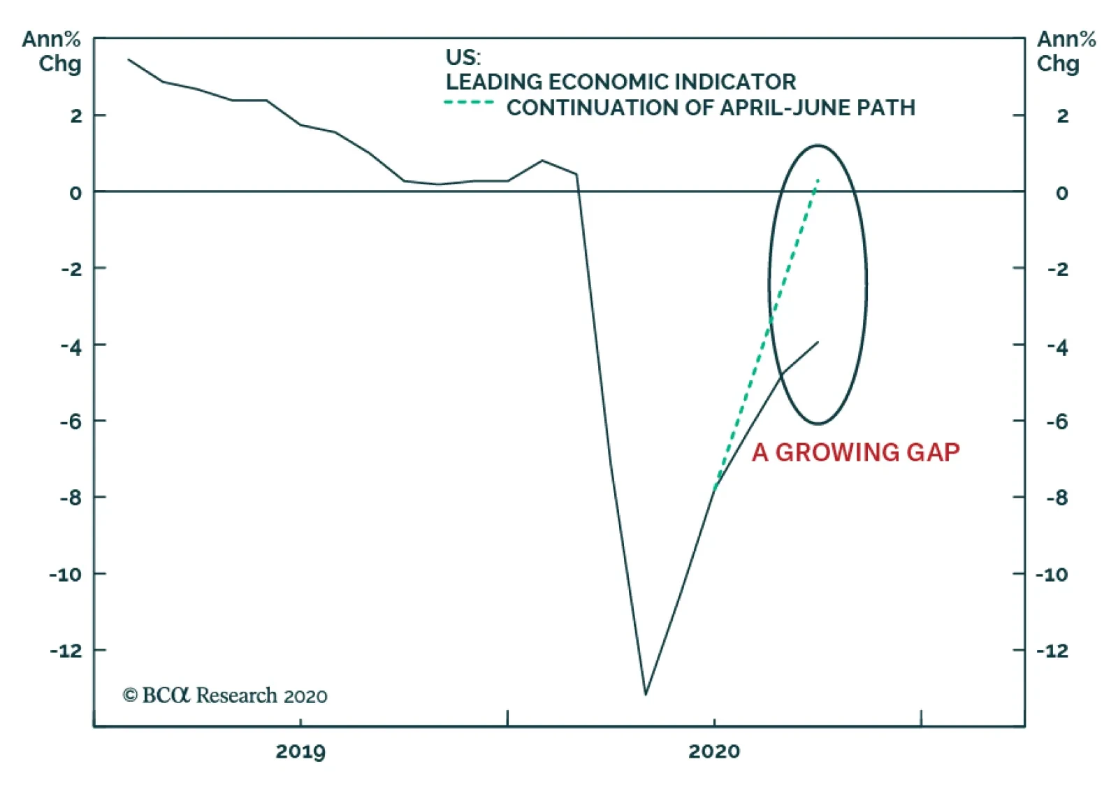
The September update of the Conference Board’s leading economic indicator (LEI) was released yesterday, providing more evidence that the pace of US economic recovery is moderating relative to what prevailed during Q2. The chart above shows the…