United States
BCA Research's US Investment Strategy service concludes that despite the recession, fiscal shock and awe made households flush. Fiscal transfers and monetary accommodation have forestalled the unchecked wave of defaults that might otherwise have occurred,…
BCA Research's US Equity Strategy service believes that volatility will remain elevated heading into the election. This phase offers an opportunity for investors to reshuffle portfolios and prepare for an eventual resumption of the bull market in early-2021. …
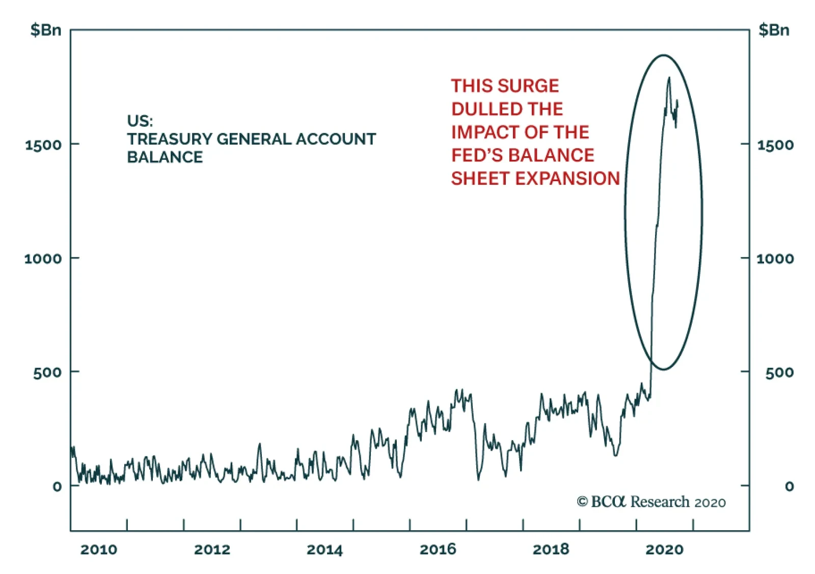
In recent months, the Treasury’s general account at the Fed surged to a record high of $1.66 trillion. The US government is parking an incredible sum at the Fed, not spending it. Many clients have questioned whether President Trump could unleash this pool of…

Highlights Portfolio Strategy We recommend investors participate in the equity market rotation during the ongoing correction and position portfolios for next year’s bull market resumption by preferring unloved and undervalued deep cyclical laggards. Ultra-loose Chinese fiscal policy, rising global demand and firming domestic operating conditions, all signal that the S&P machinery recovery has legs. Vibrant emerging markets and a recuperating China, a softening US dollar rekindling the commodity complex, the nascent recovery in domestic conditions and washed out technicals, all suggest that a significant re-rating looms for severely neglected industrials equities. Recent Changes Our trailing stop got triggered and we downgraded the S&P internet retail index to neutral for a gain of 20% since the mid-April inception. This move also pushed our S&P consumer discretionary sector weighting to a benchmark allocation for a gain of 15% since inception. Table 1
Riot Point Looms
Riot Point Looms
Feature The S&P 500 broke below the important 50-day moving average last week, but managed to bounce off the early-June 3233 level – also a level where the SPX started the year – that could serve as temporary support (Chart 1). We first highlighted that investors were turning a blind eye to (geo)political risks on June 8, and failure to pass a new fiscal package before the election will continue to weigh on the economy and on stocks risking a further 10% drawdown near the SPX 3000 level. Chart 1Critical Support Levels
Riot Point Looms
Riot Point Looms
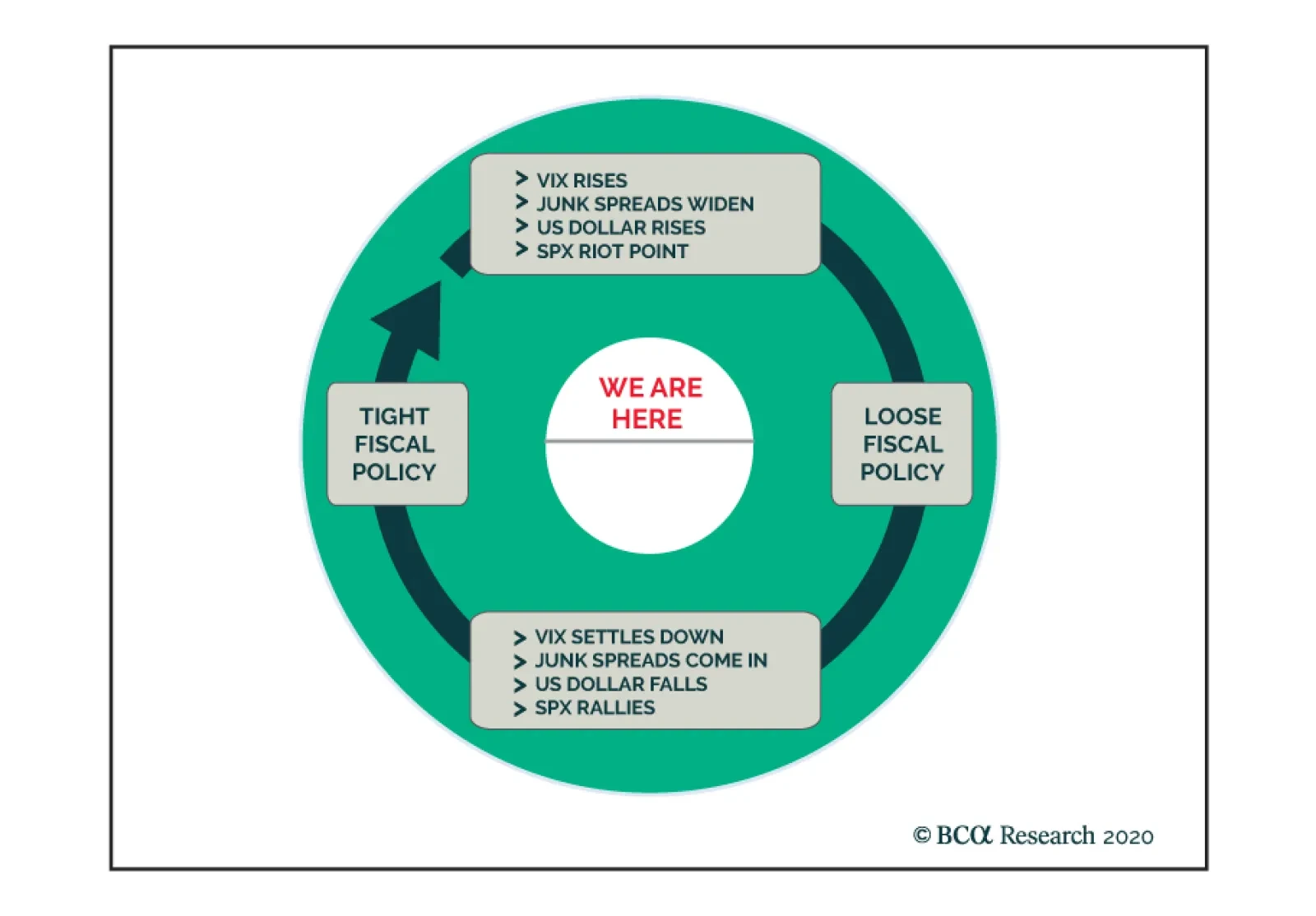
The Fed is now “out of the loop” i.e. a bystander on the sidelines, gently moving the foot off the accelerator as we illustrated last week. The FOMC’s, at the margin, less dovish monetary policy setting exerts enormous pressure on fiscal authorities to act as fiscal policy takes center stage. Our sense is that we have entered a Fiscal Policy Loop (FPL) where stalemate in Congress will cause a classic BCA riot point that in turn will force politicians’ hand to act in order to avoid a meltdown, and set in motion the next stage of the FPL (Figure 1). Keep in mind that the 2020s have ignited a paradigm shift from the Washington Consensus to the Buenos Aires Consensus1 and this is episode one of the FPL, more are sure to follow. Figure 1The Fiscal Policy Loop
Riot Point Looms
Riot Point Looms
It is no surprise that the Citi economic surprise index took off when the IRS started making direct payments to households in mid-April and leveled off toward the end of July when the stimulus money coffers ran dry (Chart 2). Chart 2In Dire Need Of Fiscal Stimulus
In Dire Need Of Fiscal Stimulus
In Dire Need Of Fiscal Stimulus
If Congress fails to pass a new fiscal package by October 16, the latest now that the Ruth Bader Ginsburg SCOTUS replacement seems to have become the number one priority, we doubt a fiscal package can pass during a contested election. Thus, realistically a fresh stimulus bill is likely only after the new president’s inauguration. Under such a backdrop, the economy will suffer a relapse despite households drawing down their replenished savings (middle panel, Chart 3). This is eerily reminiscent of the October 2008 and October 2018 fiscal policy and monetary policy mistakes, respectively, that resulted in a market riot. Similar to today, markets were down 10% and on a precipice and the policy errors pushed them off the cliff leading to another 10% gap down in a heartbeat. With regard to equity market specifics during the current FPL iteration, banks are most at risk as they are levered to the economic recovery, and commercial real estate ails remain a big headache. Absent a fiscal package bank executives will have to further provision for loan losses when they kick off Q3 earnings season in late-October as CEOs will err on the side of caution. Tack on the recent news on laundering money – including by US banks – and the Fed’s new stringent stress tests, and the risk/reward tradeoff remains poor for the banking sector (bottom panel, Chart 3). Odds are high that volatility will remain elevated heading into the election, therefore this phase represents an opportunity for investors to reshuffle portfolios and prepare for an eventual resumption of the bull market in early-2021. We continue to recommend investors avoid our “COVID-19 winners” basket and prefer our “back-to work” equity basket that we initiated on September 8. Similarly, this pullback is serving as a catalyst to shift some capital out of the fully valued tech titans and into other beaten down parts of the deep cyclical universe. Chart 3Show Me The Money
Show Me The Money
Show Me The Money
We doubt this correction is over as positioning in the NASDAQ 100 derivative markets is still lopsided; stale bulls are caught net long as NQ futures are deflating, thus a flush out looms (Chart 4). Chart 4Flush Out
Flush Out
Flush Out
The easy money has likely been made in the tech titans that near the peak on September 2, AAPL, MSFT and AMZN each commanded an almost $2tn market capitalization. Thus, booking some of these tech gains and redeploying capital in other unloved deep cyclical sectors would go a long way, especially if our thesis that the economic recovery will gain steam into 2021 pans out. Using a concrete rebalancing example to illustrate such a rotation is instructive.2 The tech titans’ (top 5 stocks) market cap weight in the SPX is 22%. Were an investor to take 10% of this weight or 220bps and redeploy it to the materials sector, which commands a 2.7% market cap weight in the SPX, would effectively double the exposure on this deep cyclical sector. The same would apply to the energy sector that comprises a mere 2.2% of the SPX, while industrials with an 8.4% market cap weight would get a sizable 26% lift (Chart 5). As a reminder our portfolio has an above benchmark allocation in all three deep cyclical sectors, and this week we reiterate our overweight stance on both the industrials sector and on a key subgroup. Chart 5Rotation Rotation Rotation
Rotation Rotation Rotation
Rotation Rotation Rotation
Buy The Machinery Breakout Were we not already overweight the S&P machinery index, would we upgrade today? The short answer is yes. Aggressive loosening in Chinese financial conditions have underpinned the economic recovery (second & third panels, Chart 6). Infrastructure projects are making a comeback and absorbing the slack in machinery demand caused by COVID-19. As a result, Chinese excavator sales have soared in the past quarter which bodes well for US machinery profit prospects (bottom panel, Chart 6). Beyond China, emerging markets demand for machinery equipment is robust as the commodity complex is recovering smartly (second panel Chart 7). The US dollar bear market is also bolstering global trade growth, despite the greenback’s recent technical bounce, and should continue to underpin machinery net export growth and therefore profit growth for US machinery manufacturers (third & bottom panels, Chart 7). Chart 6Enticing Chinese Backdrop
Enticing Chinese Backdrop
Enticing Chinese Backdrop
Chart 7Dollar The Great Reflator
Dollar The Great Reflator
Dollar The Great Reflator
The domestic machinery demand backdrop is also conducive to a renormalization of top line growth to a higher run-rate. The ISM manufacturing new orders sub-component is shooting the lights out, heralding a jump in machinery orders in the coming months (second panel, Chart 8). Simultaneously, a quick inventory check is revealing: both in the manufacturing and wholesale channels cupboards are bare which means that the risk of a liquidation phase in non-existent (third panel, Chart 8). Encouragingly, an inventory buildup phase is looming in order to satisfy firming demand. The tick up in machinery industrial production growth, the V-shaped recovery in the utilization rate and newly expanding backlog orders, all suggest that domestic demand conditions are on the mend (Chart 9). Tack on still prudent payrolls management that is keeping the machinery industry’s wage bill at bay (bottom panel, Chart 8), and a profit margin expansion phase is a high probability outcome. Chart 8What’s Not…
What’s Not…
What’s Not…
Chart 9…To Like
…To Like
…To Like
Our resurgent S&P machinery revenue growth model and climbing profit growth model do an excellent job in encapsulating all the industry’s moving parts and suggest that the path of least resistance is higher for relative share prices in the New Year (Chart 10). Finally, relative valuations have also recovered from the depth of the recession, but are only back to the neutral zone leaving enough room for a multiple expansion phase (Chart 11). Chart 10Models Say Buy
Models Say Buy
Models Say Buy
Chart 11Compelling Entry Point
Compelling Entry Point
Compelling Entry Point
In sum, ultra-loose Chinese fiscal policy, rising global demand and firming domestic operating conditions, all signal that the S&P machinery recovery has legs. Bottom Line: Stay overweight the S&P machinery index. The ticker symbols for the stocks in this index are: BLBG S5MACH– CAT, DE, PH, ITW, IR, CMI, PCAR, FTV, OTIS, SWK, DOV, XYL, WAB, IEX, SNA, PNR, FLS. Industrials Are Jumpstarting Their Engines We have been offside on the S&P industrials sector, but now is not the time to throw in the towel. In contrast we are doubling down on our overweight stance as the ongoing rotation should see some tech sector outflows find their way to under-owned capital goods producers. Industrials equities have been on the selling block and suffered a wholesale liquidation during the dark days of the COVID-19 pandemic, and have yet to regain their footing (top panel, Chart 12). The GE and Boeing sagas have dealt a big blow to this deep cyclical sector, but now this market cap weighted sector has filtered these stocks out as neither of these “fallen angels” is occupying a spot in the top 5 weight ranks. Relative valuations are washed out, and relative technicals are still deep in oversold territory (second & third panels Chart 12). Sell-side analysts are the most pessimistic they have been on record with regard to the long-term EPS growth rate that is penciled in to trail the broad market by almost 800bps (bottom panel, Chart 12)! All this bearishness is contrarily positive as a little bit of good news can go a long way. Already, relative EPS breadth is stealthily coming back, and net earnings revisions are rocketing higher (Chart 13). Chart 12Liquidation Phase…
Liquidation Phase…
Liquidation Phase…
Chart 13…Is Over
…Is Over
…Is Over
One reason behind this optimism rests with the domestic recovery. Capex intentions are firming and CEO confidence is upbeat for the coming six months. The ISM manufacturing new orders-to-inventories ratio is corroborating the budding recovery in the soft data. Green shoots are also evident in hard data releases. Durable goods orders are on the verge of expanding anew (Chart 14). Emerging markets (EM) and China represent another source of industrials sector buoyancy. The EM manufacturing PMI clocking in at 52.5 hit an all-time high. China’s PMIs are also on a similar trajectory, and the Chinese Citi economic surprise index has swung a whopping 300 points from -240 to above +60 over the past six months. The upshot is that US industrials stocks should outperform when China and the EM are vibrant (Chart 15). Chart 14Domestic And …
Domestic And …
Domestic And …
Chart 15… EM Green Shoots Are Bullish
… EM Green Shoots Are Bullish
… EM Green Shoots Are Bullish
Peering over to the currency market, the debasing of the US dollar should also underpin industrials stocks via the export relief valve (third panel, Chart 16). A depreciating greenback also lifts the commodity complex and hence industrials equities that are levered to the extraction of commodities and other derivative activities (top panel, Chart 16). Historically, an appreciating USD has been synonymous with a multiple contraction phase and vice versa. Looking ahead, the industrials sector relative 12-month forward P/E multiple should continue to expand smartly (bottom panel, Chart 16). The US Equity Strategy’s macro based EPS growth model captures all the different earnings drivers and signals that an earnings-led recovery is in the offing (Chart 17). Chart 16The Greenback Holds The Key
The Greenback Holds The Key
The Greenback Holds The Key
Chart 17Models Flashing Green
Models Flashing Green
Models Flashing Green
Adding it all up, vibrant emerging markets and a recuperating China, a softening US dollar rekindling the commodity complex, the nascent recovery in domestic conditions and washed out technicals, all suggest that a significant re-rating looms for severely neglected industrials equities. Bottom Line: We continue to recommend an above benchmark allocation in the S&P industrials sector. Anastasios Avgeriou US Equity Strategist anastasios@bcaresearch.com Footnotes 1 The Washington Consensus – a catchall term for fiscal prudence, laissez-faire economics, free trade, and unfettered capital flows – is being replaced by economic populism, by a Buenos Aires Consensus. Buenos Aires Consensus is our catchall term for everything that is opposite of the Washington Consensus: less globalization, fiscal stimulus as far as the eyes can see, erosion of central bank independence, and a dirigiste (as opposed to laissez-faire) approach to economics that seeks to protect “state champions,” stifles innovation, and ultimately curbs productivity growth. 2 Our example assumes benchmark allocation in all sectors for illustrative purposes. Current Recommendations Current Trades Strategic (10-Year) Trade Recommendations
Drilling Deeper Into Earnings
Drilling Deeper Into Earnings
Size And Style Views July 27, 2020 Overweight cyclicals over defensives April 28, 2020 Stay neutral large over small caps June 11, 2018 Long the BCA Millennial basket The ticker symbols are: (AAPL, AMZN, UBER, HD, LEN, MSFT, NFLX, SPOT, TSLA, V). January 22, 2018 Favor value over growth
Highlights An uptick in COVID-19 infections and squabbling on Capitol Hill are making investors newly uneasy, … : A rising 7-day moving average of new virus infections and falling probability of new fiscal aid weighed heavily on equities last week. … turning their focus back to the economy and equities’ seeming disconnection from it, … : Multiple retail, hospitality and entertainment concerns are under extreme pressure but the overall economy has held up far better than most commentators acknowledge. Households’ massive pile of new savings will help support consumption and credit performance well into next year even if Congress fails to provide a new round of stimulus. … and causing them to re-assess their comfort with dot-com-era valuations: We may not like the S&P 500 at 23 times forward four-quarter earnings, but the current valuation climate is a given and we have to figure a practical way to navigate through it. We are not abandoning equities yet. Feature COVID-19 appears to be making a comeback, in the US and around the globe, and its revival has investors reconsidering the sustainability of the spectacularly potent rally. How much longer can we go without a vaccine? How long before the economy succumbs without a new round of fiscal aid? How long can equities diverge from the economy? How long can equity multiples stay so high? COVID-19 infections have made another leg up and the 7-day average of new US cases is up over 25% since the second-wave bottom on September 12th (Chart 1). Even with most colleges and universities limiting in-person attendance and on-campus residence, the siren song of alcohol, fellowship and potential romance has turned many college towns into pandemic hot spots. The nation’s elementary and secondary schools could become another source of infections as children, teachers and staff return to classrooms, and the approach of cooler weather across most of the country brings no small measure of trepidation. The disease seems not to spread nearly as easily outside, but case counts threaten to pick up as activity moves indoors in fall and winter. Chart 1Daily New US COVID-19 Infections
Sustainability
Sustainability
A much-slowed mortality rate mitigates the gravity of the rise in infections. Improved treatment protocols and heightened efforts to keep the most vulnerable out of harm’s way have pushed fatalities well below their April peak and considerably shy of their late July-early August levels, when new cases peaked (Chart 2). Indeed, one benefit of outbreaks on university campuses is that young adults are apparently much less likely to succumb to the virus. Unfortunately, the likelihood that invincible 18-to-22-year-olds won’t suffer too terribly if they contract COVID-19 may encourage them to disregard social distancing measures, contributing to its spread across the entire population. Chart 2Daily US COVID-19 Deaths
Sustainability
Sustainability
Bottom Line: There is no reason to expect the virus to disappear when it is gaining new footholds in college towns across the country and a large measure of activity is headed back indoors. How Much Does The Economy Have Left? The good news about the reduced mortality rate is that it would seem to lessen the likelihood that state and local officials would feel the need to impose lockdowns as severe as the ones in early spring. The bad news, as our European Investment Strategy colleagues have stressed, is that lockdowns have less bearing on activity than economic actors’ personal perceptions of safety. If people are as unconcerned about contracting COVID-19 as many undergraduates appear to be, they’ll gather around the keg as closely as if they were riding the Tokyo subway at rush hour no matter how often they’re reminded that it’s unsafe. If they become fearful of getting sick, they’ll shun common carriers, offices, stores and gyms regardless of official rules giving them the green light to return. Last week’s release of European flash September PMIs may have illustrated the way personal concerns can override official rules. The divergence between solidly rising manufacturing PMIs, which comfortably topped expectations, and sharply and surprisingly weaker services PMIs, which crossed below the 50 expansion/contraction threshold, was stark (Chart 3). Modern manufacturing can be carried out in controlled environments by a comparatively modest number of workers whereas services demand is much more tied to public confidence, which appears to be fraying in Europe. Chart 3Europe's Demand For Services Has Slipped
Europe's Demand For Services Has Slipped
Europe's Demand For Services Has Slipped
Developed economies employ considerably more people in services than manufacturing. If progress in reducing unemployment stalls upon upticks in COVID-19 cases, and mass manufacturing and distribution of an effective vaccine is still at least six months away, economies will require more fiscal support than initially envisioned in the spring. In the United States, the need for additional support places attention squarely on the off-again, on-again negotiations to extend key CARES Act provisions. Although we would expect households to have more difficulty keeping up with their obligations now that CARES Act flows have ceased, the data don't yet reveal any signs of strain. With the federal unemployment benefit supplement having expired at the end of July, households with laid-off wage earners are clearly at risk and they could light the fuse to spark a chain reaction of defaults. Despite the withdrawal of some federal support, however, the apartment rent collection and consumer delinquency data we’ve been following continue to indicate that households are managing to stay current on their obligations. The wobble in apartment rent collections through the week ended September 6th was apparently a function of the late Labor Day, as they have returned to the 2-percentage-points-below-2019 level they've occupied since the CARES Act took effect (Table 1). TransUnion’s latest monthly consumer credit update showed that consumers didn’t skip a beat in August, maintaining their streak of reducing month-over-month delinquency rates and shrinking them relative to their year-ago levels (Table 2). Table 1US Households Are Still Paying Their Rent ...
Sustainability
Sustainability
Table 2... And They're Still Servicing Their Debt
Sustainability
Sustainability
The forward-looking question is how long they can keep it going in the absence of additional help. A simple analysis of the data in the monthly Personal Income release suggests that households stored up over $1 trillion of excess savings in the five months through July, possibly enough to tide them over through the rest of the year (Box 1). Our estimate in last week’s report1 that households will need at least $800 billion of direct aid to bolster consumption into the second half of next year did not address the possibility of deploying some of the new savings and may thus be a little high. Although we continue to believe a bill will be passed ahead of the election despite increasing worries that Congress will not be able to reach an agreement, the near-term impact may not be as severe as feared. Box 1: What About All The New Savings? The upward explosion in the savings rate (Chart 4, top panel) and the associated plunge in consumption (Chart 4, bottom panel) illustrate that households squirreled away a record share of income while they were under lockdown and CARES Act measures were in force. This analysis attempts to determine the size of the savings windfall and households’ capacity to deploy it to support consumption and debt service until the economy can return to operating at its pre-pandemic capacity. Chart 4Two Sides Of The Same Coin
Two Sides Of The Same Coin
Two Sides Of The Same Coin
Table 3 illustrates the steps we followed to estimate the quantity of pandemic-driven excess savings. The top two rows in the top panel show actual disposable income and outlays for each month from February through July and sum the five post-pandemic months in the Mar-Jul column. Savings are equal to the difference, and the savings rate is simply savings divided by disposable income. Table 3Household Savings, With And Without The Pandemic
Sustainability
Sustainability
The bottom panel of the table models the outcome that might have occurred had there been no pandemic, assuming disposable income grew each month at a 4% annualized nominal rate, in line with the US economy’s real trend growth rate of ~2% plus ~2% inflation. We held the savings rate constant at February’s 8.3% to solve for baseline monthly outlays and savings. We aggregated our annualized monthly savings estimates ($7 trillion) and subtracted them from actual annualized savings ($19.6 trillion) to get $12.6 trillion annualized excess savings, or slightly more than $1 trillion, de-annualized (all four savings figures circled in the table). Table 4 quantifies the monthly consumption shortfalls that may occur in the absence of a new round of fiscal aid, projecting the path of the six broad disposable income categories for the rest of the year. We assume that employee compensation, proprietors’ income and taxes maintain July’s modest month-over-month growth rate in August and September and are then flat for the rest of the year. Rental income and interest and dividends are assumed to be unchanged from their July levels, as are transfer receipts, which incorporate only the share of July transfers that resulted from automatic stabilizers. (Though we tried to err to the side of conservatism, there is a meaningful possibility that virus-driven pessimism could produce a consumption double dip, causing income to fall short of our estimates.) Table 4Excess Savings Could Cover Projected Consumption Shortfalls
Sustainability
Sustainability
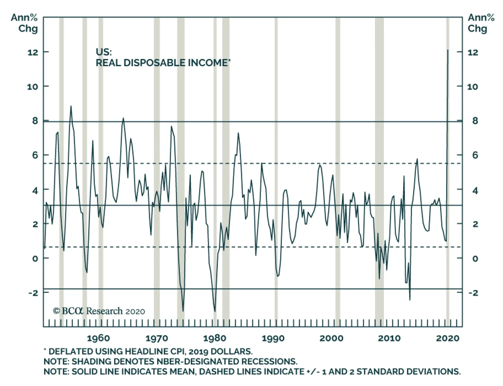
We assume that the savings rate declines to 16.5% in August (twice February’s pre-pandemic rate) but remains there the rest of the year as households continue to exercise caution. Using our assumed savings rate and modeled disposable income, we calculate monthly outlays and compare them to the outlays that would meet economists’ consensus third and fourth quarter growth projections. That comparison yields around $300 billion of consumption shortfalls through the end of the year, a modest sum relative to the $1 trillion of excess savings that were accumulated from March through July. Investors interpreting our simple analysis should recognize that the possible range of actual results is quite wide and projecting how animal spirits will drive household consumption decisions is inherently uncertain. It is clear to us, however, that the direct aid households received from the CARES Act is not yet exhausted. The massive savings that households built up from March through July will allow the second quarter’s fiscal thrust to act something like a time-release medication, especially when it comes to consumer credit performance. The surprisingly low delinquency rates reported so far do not appear to have been a fluke when viewed against a $1 trillion cache of unanticipated savings. How Long Can Equities Float Free Of The Economy? One would expect that a once-in-a-century shock like a deadly pandemic would induce a brutal recession. In terms of the unemployment rate and GDP contraction, COVID-19 has not disappointed, delivering the worst numbers this side of the Depression. Movie theaters, concert venues, pro sports franchises, airlines, car rental companies, retailers, gyms, restaurants and bars face significant losses and potential extinction. For all the disruption in select individual businesses and industries, however, there has not yet been significant systemwide damage. We don't think the economy is doing as badly as the majority ofcommentators believe, ... Fiscal transfers and monetary accommodation have forestalled the unchecked wave of defaults that might otherwise have occurred, shielding the banking system from stress and preventing a negatively self-reinforcing cycle of illiquidity and reduced credit availability from taking hold. Away from businesses that depend on physical crowds and their landlords and lenders, the economy is not doing too badly. Disposable household income grew at a record rate in the second quarter, four standard deviations above its seven-decade mean (Chart 5); corporations issued record amounts of bonds at low rates that will reduce their long-run funding costs; and private equity funds and other entities with visions of the post-GFC recovery dancing in their heads are itching to deploy the ample capital they’ve raised to buy businesses at deep discounts. There will be many pandemic business casualties, but at the level of the overall economy, we expect a reasonably orderly transfer of viable assets from weak hands to amply funded strong ones. Chart 5Despite The Recession, Fiscal Shock And Awe Made Households Flush
Despite The Recession, Fiscal Shock And Awe Made Households Flush
Despite The Recession, Fiscal Shock And Awe Made Households Flush
The bottom line is that we don’t think the economy is suffering all that badly, and that it won’t going forward provided that fiscal and monetary policy makers continue to pursue the measures that have successfully suppressed defaults and bankruptcies so far. Austrian School devotees may suffer severe emotional distress and deficit hawks will rant and rave, but investors should come out of it all okay. Equities quickly sized that up and the reversal of their steep losses can be viewed as a rational response to Congress’ and the Fed’s shock-and-awe measures. In our view, financial markets are not disconnected from the economic backdrop per se; they’re disconnected from the economic backdrop that would have unfolded were it not for policy makers’ extraordinary measures. Commentators with a more pessimistic bent seem to be focusing more on the scenario that didn’t occur than the one that actually did. And About Those Valuations? We frankly confess to discomfort with an S&P 500 valuation of 23 times forward four-quarter earnings. In forward estimates’ 41-year history, the index has only ever traded at a multiple of 23 or more at the 1999-2000 height of the dot-com mania (Chart 6). It is not a level that bodes well on its face for the index’s intermediate- and long-term prospects. By collectively bidding up the forward multiple to the 97th percentile as of the end of August, investors would seem to have pulled future returns into the present. ... because it seems that they've been focusing on the worst-case scenario that didn't occur, rather than the much milder one that policy makers have so far been able to engineer. Chart 6Back To The Future
Back To The Future
Back To The Future
When asked if we can justify current equity valuations and if they can be sustained, we tread carefully, replying that we can make our peace with them for short stretches of time. We are not trying to dodge the tough questions, we are simply seeking practical ways for professional investors, judged on a relative performance basis, to navigate through a tricky backdrop. For a professional manager to align his/her portfolios with a view that today’s valuations are unsupportable, s/he would have to possess two things: extremely high conviction in that view and clients willing to stick with him/her despite tracking error that would make a pension consultant faint dead away and may well involve extended underperformance. Table 5How Expensive Is Too Expensive?
Sustainability
Sustainability
Alpha is only earned by swimming against the tide but resisting a move like the rally from the March bottom is akin to an all-in bet, and all-in bets should be made sparingly if at all. Forward multiples have exceeded the dot-com heyday’s 20 level every month-end since April. Assuming the forward multiple series is normally distributed, there was only a 6% chance that the multiple would exceed its April level and the probabilities have shrunk every succeeding month as the multiple itself has climbed (Table 5). Based on valuation, a manager could have begun leaning against the rally in April and may have resisted participating in it at the end of March, given that the forward multiple never signaled that stocks were cheap. The dot-com mania, when the S&P traded two standard deviations above its forward multiple’s mean for fifteen straight months before peaking, presents an even starker example. Five quarters of sizable underperformance would have tested a manager’s commitment, not to mention his/her clients’. The bottom line is that valuations are a notoriously poor timing indicator. We tend to pay close attention to them only at extremes, but we never view them as decisive on their own – two standard deviations can become two-and-a-half or three before surges or plunges fully play out. The catalyst that might provoke mean reversion in the S&P 500’s forward multiple is still unclear, and we prefer to maintain a benchmark equity exposure until the potential catalyst(s) and the timetable over which it/they might emerge becomes clearer. If this really is a mania, there will be plenty of money to be made from betting against it over the last three quarters of its unwind; there’s no need to rush to be the first to call a top, which can prove to be a costly pursuit. For now, we are content to continue to watch and wait. Doug Peta, CFA Chief US Investment Strategist dougp@bcaresearch.com Footnotes 1 Please see the September 21, 2020 US Investment Strategy Weekly Report, "The Fundamental Theorem Of Macroeconomics," available at usis.bcaresearch.com.
BCA Research's Geopolitical Strategy service concludes that financial markets face more downside until Senate Republicans capitulate to Pelosi’s demand of a bill around $2-$2.5 trillion. We think they will, but that is not an argument for getting long now –…
According to BCA Research's Foreign Exchange Strategy service, the ebbing of the reflation trades remain the dominant force affecting global markets, and the FX space in particular. The equity market downdraft this past March and the subsequent recovery since…
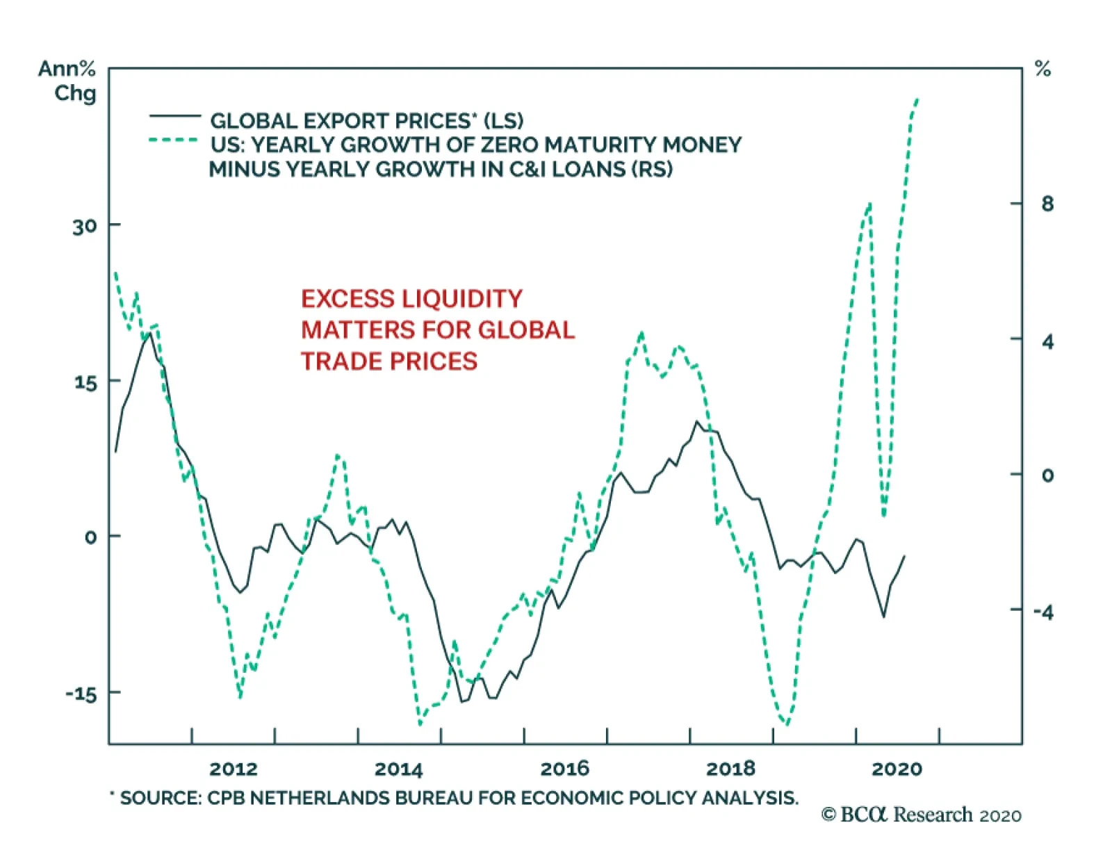
The lockdowns implemented around the world resulted in a collapse in demand that opened an enormous output gap. This excess capacity is deflationary, yet, global export prices have declined much less than they did during the manufacturing slowdown of 2015/16.…
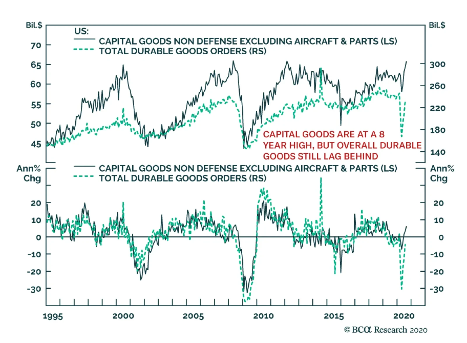
The August US Durable Goods report revealed an interesting split in the economy. Overall, durable goods orders missed expectations, but capital goods orders and shipments were stronger than expected. In fact, nondefense capital goods orders (excluding…
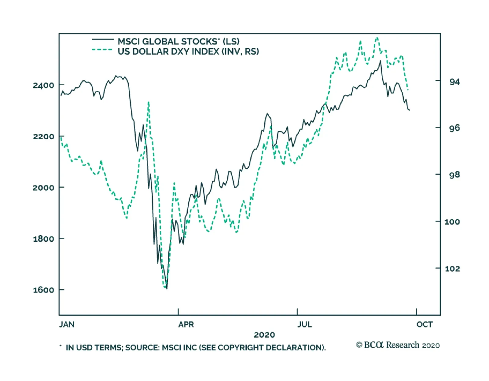
Highlights Most sentiment and technical indicators suggest the dollar is undergoing a countertrend bounce rather than entering a new bull market. However, the internal dynamics of financial markets remain short-term constructive for the DXY. The DXY could rise to 96 before working off oversold conditions. Stay short USD/JPY as a core holding. Look to rebuy a basket of Scandinavian currencies versus the USD and EUR at a trigger point of -2%. Go long sterling if it drops to 1.25. Remain short EUR/GBP. Feature Chart I-1The Dollar Is A Counter-Cyclical Currency
The Dollar Is A Counter-Cyclical Currency
The Dollar Is A Counter-Cyclical Currency
The world remains dominated by the reflation trade. The equity market downdraft this past March and the subsequent recovery since April has been a mirror image of the rise and fall of the dollar (Chart I-1). This suggests that at a minimum, the Federal Reserve’s actions and Washington’s policy decisions have served as important pillars in the global economic recovery. A falling dollar tends to reflate the global economy, so it is important to gauge whether the recent bounce is technical in nature or at risk of a more meaningful increase. From an investment perspective, the economic outlook as we enter the final stretch of 2020 is as uncertain as ever. Factors such as the potential for renewed lockdowns, a fiscal cliff in the US, political uncertainty due to Brexit, and the possibility of a contested US election all make for a very complex decision tree. As investors try to decipher the end game, we turn to the internal dynamics of financial markets for a more sober view. Sentiment and technical indicators make up an important component of our currency framework, and are usually good at gauging important shifts in financial markets. Given market action over the past few weeks, we are reviewing a few of these key indicators to help guide currency strategy into year-end and beyond. The Signal From Currency Markets The message from our currency market indicators suggests a technical bounce in the dollar rather than a renewed bear market. The exchange rate that best signals whether we are in a reflationary/deflationary environment is the AUD/JPY rate. Chart I-2DXY Is Testing Strong Resistance
The Message From Dollar Sentiment And Technical Indicators
The Message From Dollar Sentiment And Technical Indicators
From a broad perspective, the DXY index was oversold, having broken below key support levels this year. More recently, the bounce in the DXY index has brought it a nudge above the upward-sloping trend line, which had defined the bull market since the 2011 lows (Chart I-2). A significant bounce from current levels will be worrisome. More likely, the dollar will churn near current levels before resuming its downtrend. In other words, we expect that, going forward, this upward-sloped line will act as powerful overhead resistance. The exchange rate that best signals whether we are in a reflationary/deflationary environment is the AUD/JPY rate (Chart I-3). Since the Great Recession, the yen has been the best performer during equity drawdowns, while the Aussie has been the worst. As a result, the AUD/JPY cross has consistently bottomed at the key support zone of 72-74. This defensive line notably held during the European debt crisis, China’s industrial recession, and the global trade war. The frontier was clearly breached during the March drawdown this year, but we have since re-entered the safe zone (Chart I-4). Going forward, a break below 72 will be worrisome. Looking at the intra-day charts, we see a clear pattern of lower highs and lower lows since the September 10th peak. That said, speculators are still short the cross, suggesting that the level of complacency going into the February equity market drawdown is not there today (Chart I-4, bottom panel). Chart I-3The Reflation Trade
The Reflation Trade
The Reflation Trade
Chart I-4AUD/JPY: Watch The 72-24 Zone
AUD/JPY: Watch The 72-24 Zone
AUD/JPY: Watch The 72-24 Zone
High-beta carry currencies such as the RUB, ZAR, MXN, and BRL have been rather weak, even if they are still holding above their lows. These currencies are usually good at sniffing out a change in the investment landscape, specifically one becoming fertile for carry trades. Carry trades usually do well when US yields are low and the global growth environment is improving (Chart I-5). The message so far is that the drop in U.S. bond yields may not have been sufficient to make these currencies attractive again. This is confirmed by the performance of the Deutsche Bank carry ETF, DBV, which has been struggling to recover amid very low rates (Chart I-6). Chart I-5Carry Trades Are Lagging
Carry Trades Are Lagging
Carry Trades Are Lagging
Chart I-6Carry Trade ETFs Have Underperformed
Carry Trade ETFs Have Underperformed
Carry Trade ETFs Have Underperformed
Speculators are very short the dollar. Whenever the percentage of leveraged funds and overall speculators that are short the dollar is at or below 20%, a meaningful rally ensues (Chart I-7). However, because the dollar is a momentum currency, reversion-to-the-mean strategies work in the short term but not so much longer term. The dollar advance/decline line remains well below its 200-day moving average. Meanwhile, there is a death-cross formation between the 200-day and 400-day moving averages. This is a very bearish technical profile (Chart I-8). We cannot rule out rallies toward the 200-day moving average, but for now we remain well below this danger zone. Chart I-7Rising Number Of Dollar Bears
Rising Number Of Dollar Bears
Rising Number Of Dollar Bears
Chart I-8A Cyclical Bear Market
A Cyclical Bear Market
A Cyclical Bear Market
Finally, currency volatility is rising from very depressed levels. Usually, low currency volatility is a sign of complacency among traders and investors, while higher volatility signals a more balanced and healthy market rotation. Over the last three episodes where volatility rose from these oversold levels, the dollar soared and pro-cyclical currencies suffered severe losses. For example, the most significant episodes were 1997-1998, 2007-2008, and 2014-2015 (Chart I-9). The one difference this time around is that the dollar is expensive, while it was very cheap during previous riot points. This argues for a technical bounce, rather than a renewed bull market. Chart I-9Currency Volatility Has Spiked
Currency Volatility Has Spiked
Currency Volatility Has Spiked
In a nutshell, the message from technical indicators is that the bounce in the dollar was to be expected. However, we are monitoring a few worrisome developments. First, the consensus is overwhelmingly bearish on the dollar, which could make this bounce advance much further than most expect. Second, spikes in volatility, especially as the equity market corrects, are traditionally dollar bullish. The Signal From Commodity Markets Commodity prices hold a special place as FX market indicators, since they are both driven by final demand and financial speculation. Over the years, we have found that the internal dynamics of commodity prices usually send key signals for underlying FX market trends. Overall, the signals are also mixed: The copper-to-gold ratio has bottomed and is heading higher from deeply oversold levels. Together with the stabilization in government bond yields, it signifies that the liquidity-to-growth transmission mechanism might be working. This is usually dollar bearish, as rising global growth leads to capital outflows from the US (Chart I-10). The Gold/Silver ratio (GSR) tends to track the US dollar, and its recent rebound is worrisome (Chart I-11). The GSR provides important information on the battleground between easing financial conditions and a pickup in economic (or manufacturing) activity. Gold benefits from plentiful liquidity and very low real rates, while silver benefits from rising industrial demand. Therefore, the GSR rallies during periods of financial stress that forces policymakers to act, and peaks as we exit a recession into a recovery. Chart I-10The Copper/Gold Ratio Leads The Dollar
The Copper/Gold Ratio Leads The Dollar
The Copper/Gold Ratio Leads The Dollar
Chart I-11The Gold/Silver Ratio Is Rebounding
The Gold/Silver Ratio Is Rebounding
The Gold/Silver Ratio Is Rebounding
We had a limit-sell order on the GSR at 75 that was triggered this week, putting our position offside by 7%. The key driver of GSR price action over the next few weeks will be silver prices. The next important technical level for silver is the $18-to-$20-per-ounce zone. This has acted as a strong overhead resistance since 2015, which should now provide strong downside support. If silver is able to stabilize around this level, it will indicate that the precious metals bull market remains intact. We eventually expect the GSR to drop toward 50. The Signal From Fixed-Income Markets The fixed-income market is a very powerful sentiment barometer for the dollar. Both cross-border flows and global allocation to FX reserves provide important information about investor preferences for the dollar. Below, we go through the indicators that we track frequently and which constitute an integral part of our framework. The bond-to-gold ratio is an important signal for the dollar, since both US Treasurys and gold are competing assets. Chart I-12Gold And Treasurys Are Competing Assets
Gold And Treasurys Are Competing Assets
Gold And Treasurys Are Competing Assets
The bond-to-gold ratio is an important signal for the dollar, since both US Treasurys and gold are safe-haven assets and thus, by definition are competing assets (Chart I-12). As the Fed continues to increase the supply of bonds, the ratio of the US bond ETF (TLT)-to-gold (GLD) will be an important proxy for investor sentiment on the dollar (Chart I-13). For now, the ratio is sitting on the key 0.94 support zone. Remarkably, the ratio of the total return in US government bonds-to-gold prices has tracked the dollar pretty well since the end of the Bretton Woods system in the early ‘70s (Chart I-14). This makes it both a good short-term and long-term barometer. Chart I-13Watch The Bond-To-Gold Ratio
Watch The Bond-To-Gold Ratio
Watch The Bond-To-Gold Ratio
Chart I-14Competing Assets And The Dollar
Competing Assets And The Dollar
Competing Assets And The Dollar
Inflows into US government bonds are falling sharply, while those into gold are rising sharply (Chart I-15). With interest rates near zero and real rates deeply negative, this pattern is likely to continue in the near future. This should pressure the bond-to-gold ratio lower. It is remarkable that in recent days investors have begun pricing even more negative real rates in the US compared to other G10 countries (Chart I-16). Again, should this materialize, this will send gold prices higher and cause further erosion in foreign bond purchases. Chart I-15Gold And USD Inflows Diverge
Gold And USD Inflows Diverge Gold And USD Inflows Diverge
Gold And USD Inflows Diverge Gold And USD Inflows Diverge
Chart I-16Real Rate Expectations Are Relapsing
Real Rate Expectations Are Relapsing
Real Rate Expectations Are Relapsing
Overall, the signal from fixed-income markets remain US dollar bearish. The Signal From Equity Markets Equity market indicators continue to flag that the rally in the dollar has a bit further to go, but should remain a counter-trend bounce. Currencies tend to move in sync with the relative performance of their equity bourses. Chart I-17Cyclicals Have Outperformed Defensives
Cyclicals Have Outperformed Defensives
Cyclicals Have Outperformed Defensives
Cyclical stocks have been underperforming defensive ones of late, but the pattern of higher lows in place since the March bottom continues to persist (Chart I-17). The dollar tends to weaken when cyclical stocks are outperforming defensive ones. This is because non-US equity markets have a much higher concentration of cyclical stocks in their bourses. Thus, whenever cyclical sectors are outperforming defensives, it is a clear sign that the marginal dollar is rotating outside of the US. Correspondingly, currencies tend to move in sync with the relative performance of their equity bourses (Chart I-18A and I-18B). So far, non-US equity markets have relapsed relative to the US, but are not yet breaking down. Earnings revisions continue to head higher across all markets. Bottom-up analysts are usually too optimistic about the level of earnings, but are generally spot on about their direction. That said, higher earnings revisions have been concentrated in the US so far, and will need to improve in other markets for the dollar bear market to resume (Chart I-19). Chart I-18ACurrencies Follow Relative Equity Performance
Currencies Follow Relative Equity Performance
Currencies Follow Relative Equity Performance
Chart I-18BCurrencies Follow Relative Equity Performance
Currencies Follow Relative Equity Performance
Currencies Follow Relative Equity Performance
Chart I-19V-Shape Recoveries In Earnings Revisions
V-Shape Recoveries In Earnings Revisions
V-Shape Recoveries In Earnings Revisions
In a nutshell, corrections in equity markets are usually a healthy reset for the bull market to resume, but the character of this particular selloff is worth monitoring. Cyclical and value stocks that are already at historically bombed-out levels have started to underperform. This is usually dollar bullish. Whether the correction ensues or the bull market resumes, it will require a change in equity market leadership from defensives to cyclicals for the dollar bear market to resume. Investment Implications It is very difficult to gauge whether the current market shakeout will last just a few more weeks or continue into year-end. Given such a lack of clarity, our strategy is as follows: Stay long safe-haven currencies. Our preferred vehicle is the Japanese yen, which sports an attractive real rate relative to the US. Focus on relative value at the crosses rather than outright dollar bets. We are short the NZD/CAD and EUR/GBP as a play on relative fundamentals. Stick with them. We already have limit orders on a few currencies, and are adding the Nordic currency basket to this list if it drops another 2%. We initially took profits on this trade last week, when our stop loss was triggered. As Scandinavian currencies continue to fall, they are becoming more compelling buys. Chart I-20Place Stops On Short GSR At 85
Place Stops On Short GSR At 85
Place Stops On Short GSR At 85
We have been long petrocurrencies versus the euro, and the drop in the EUR/USD has helped hedge that trade against market volatility. That said our stop-loss of -5% was triggered amid market volatility. We are reinstating this trade today, and will be looking to rotate into USD shorts once there is more clarity on the economic front. Our short gold/long silver trade was triggered at 75, putting the position offside. For risk management purposes, we are implementing a tight stop at 85 (Chart I-20). Chester Ntonifor Foreign Exchange Strategist chestern@bcaresearch.com Currencies US Dollar Chart II-1USD Technicals 1
USD Technicals 1
USD Technicals 1
Chart II-2USD Technicals 2
USD Technicals 2
USD Technicals 2
Recent data from the US have been mixed: The current account deficit widened from $111.5 billion to $170.5 billion in Q2. The preliminary Markit Manufacturing PMI increased from 53.1 to 53.5 in September while the services PMI declined from 55 to 54.6. The Michigan Consumer Sentiment Index increased from 74.1 to 78.9 in September. Existing home sales increased by 2.4% month-on-month in August. Initial jobless claims increased by 840K for the week ending on September 19. The DXY index appreciated by 1.8% this week amid an equity market correction. While the risk-off sentiment provides a positive backdrop for the US dollar, rising twin deficits and unfavorable real rates both suggest a weaker dollar in the long term. Meanwhile, any incoming positive news on the vaccine will support cyclical currencies against the US dollar. Report Links: Addressing Client Questions - September 4, 2020 A Simple Framework For Currencies - July 17, 2020 DXY: False Breakdown Or Cyclical Bear Market? - June 5, 2020 The Euro Chart II-3EUR Technicals 1
EUR Technicals 1
EUR Technicals 1
Chart II-4EUR Technicals 2
EUR Technicals 2
EUR Technicals 2
Recent data from the euro area have been mostly generally constructive: The current account surplus narrowed from €20.7 billion to €16.6 billion on a seasonally-adjusted basis in July. While the preliminary Markit Manufacturing PMI increased from 51.7 to 53.7 in September, the services PMI dropped from 50.5 to 47.6. Consumer confidence marginally increased from -14.7 to -13.9 in September. The German Ifo Business Climate index rose to 93.4 in September. The expectations component has broken above pre-pandemic levels. The euro declined by 1.6% this week against the US dollar. The ECB Economic Bulletin released this Thursday warned that the unemployment rate will continue to rise in the euro area as current figures are skewed by job subsides. The ECB also sees little upside in demand for consumer goods and repeated that it is ready to further adjust its policies to support the economy and boost inflation. Report Links: Addressing Client Questions - September 4, 2020 On The DXY Breakout, Euro, And Swiss Franc - February 21, 2020 Updating Our Balance Of Payments Monitor - November 29, 2019 The Yen Chart II-5JPY Technicals 1
JPY Technicals 1
JPY Technicals 1
Chart II-6JPY Technicals 2
JPY Technicals 2
JPY Technicals 2
Recent data from Japan have been positive: The manufacturing PMI was largely unchanged at 47.3 in September. The services PMI ticked up from 45 to 45.6. The All Industry Activity Index increased by 1.3% month-on-month in July. The Japanese yen depreciated by 1% against the US dollar this week. The latest BoJ Monetary Policy Meeting Minutes released on Thursday expects economic activity to pick up in the second half of 2020 through pent-up demand and supported by accommodative monetary policies, but it also warned about a slower recovery in the event of an upturn in COVID cases. Moreover, the Minutes said that core inflation is likely to be negative in Japan for now. Japan’s higher real rates make the yen an attractive safe-haven hedge. Report Links: The Near-Term Bull Case For The Dollar - February 28, 2020 Building A Protector Currency Portfolio - February 7, 2020 Currency Market Signals From Gold, Equities And Flows - January 31, 2020 British Pound Chart II-7GBP Technicals 1
GBP Technicals 1
GBP Technicals 1
Chart II-8GBP Technicals 2
GBP Technicals 2
GBP Technicals 2
Recent data from the UK have been mixed: The Markit Manufacturing PMI declined from 55.2 to 54.3 in September. The services PMI also dropped from 58.8 to 55.1. Retail sales increased by 2.8% year-on-year in August. House prices increased by 5% year-on-year in September. The British pound plunged by 1.9% against the US dollar this week amid broad USD strength. Besides global synchronized risks, the internal risk from Brexit uncertainties still poses a big threat to the British pound. That said, the pound is still undervalued at current levels and its year-to-date performance lags behind those of other risky G10 currencies. The pound is poised to rebound with positive vaccine and Brexit news. Report Links: Revisiting Our High-Conviction Trades - September 11, 2020 Updating Our Balance Of Payments Monitor - November 29, 2019 A Few Trade Ideas - Sept. 27, 2019 Australian Dollar Chart II-9AUD Technicals 1
AUD Technicals 1
AUD Technicals 1
Chart II-10AUD Technicals 2
AUD Technicals 2
AUD Technicals 2
Recent data from Australia have been mostly positive: The manufacturing PMI increased from 53.6 to 55.5 in September. The services PMI also ticked up from 49 to 50. The ANZ Consumer Confidence index increased from 92.4 to 93.5 for the week ending on September 20. Retail sales declined by 4.2% month-on-month in August. The Australian dollar dropped by 4% against the US dollar this week, only slightly above the pre-crisis level. We continue to favor the Australian dollar due to lower domestic COVID cases and effective measures for containing the virus. Moreover, China’s data continues to surprise to the upside, which bodes well for the Australian dollar. Report Links: An Update On The Australian Dollar - September 18, 2020 On AUD And CNY - January 17, 2020 Updating Our Balance Of Payments Monitor - November 29, 2019 New Zealand Dollar Chart II-11NZD Technicals 1
NZD Technicals 1
NZD Technicals 1
Chart II-12NZD Technicals 2
NZD Technicals 2
NZD Technicals 2
Recent data from New Zealand have been negative: Exports declined from NZ$5 billion to NZ$4.4 billion in August, while imports increased from NZ$4.6 billion to NZ$4.8 billion. The trade balance shifted from a positive NZ$447 million to a deficit of NZ$353 million. The New Zealand dollar plunged by 3.8% against the US dollar this week. On Wednesday, the RBNZ held its interest rate at 0.25%, but warned that the economy needs further support and implied further easing. The rising possibility of negative interest rates in New Zealand would hurt the kiwi especially against the Aussie dollar. Moreover, New Zealand’s services trade surplus evaporated as tourism continues to suffer. We will go long AUD/NZD at 1.05. Report Links: Currencies And The Value-Versus-Growth Debate - July 10, 2020 Updating Our Balance Of Payments Monitor - November 29, 2019 Place A Limit Sell On DXY At 100 - November 15, 2019 Canadian Dollar Chart II-13CAD Technicals 1
CAD Technicals 1
CAD Technicals 1
Chart II-14CAD Technicals 2
CAD Technicals 2
CAD Technicals 2
Recent data from Canada have been positive: Retail sales increased by 1.1% month-on-month in August. New housing prices increased by 2.1% year-on-year in August. Bloomberg Nanos Confidence edged up from 52.9 to 53.1 for the week ending on September 18. The Canadian dollar fell by 1.2% against the US dollar this week. Both retail sales and the housing market have been quite resilient so far, providing support for the Canadian dollar. We are long the Canadian dollar against the New Zealand dollar. Stay with it. Report Links: Currencies And The Value-Versus-Growth Debate - July 10, 2020 More On Competitive Devaluations, The CAD And The SEK - May 1, 2020 A New Paradigm For Petrocurrencies - April 10, 2020 Swiss Franc Chart II-15CHF Technicals 1
CHF Technicals 1
CHF Technicals 1
Chart II-16CHF Technicals 2
CHF Technicals 2
CHF Technicals 2
There have been scant data from Switzerland this week: Total sight deposit declined from CHF 704.1 billion to CHF 703.9 billion for the week ending on September 18. The Swiss franc fell by 1.4% against the US dollar this week. On Thursday, the SNB kept its interest rate unchanged at -0.75% and warned of a longer coronavirus impact on economic activity. We like the Swiss franc as a safe-haven hedge especially during a second COVID-19 wave. Moreover, if the October US Treasury Report lists Switzerland as a currency manipulator, it will limit downward pressure on the Swiss franc against the US dollar. Report Links: On The DXY Breakout, Euro, And Swiss Franc - February 21, 2020 Currency Market Signals From Gold, Equities And Flows - January 31, 2020 Portfolio Tweaks Before The Chinese New Year - January 24, 2020 Norwegian Krone Chart II-17NOK Technicals 1
NOK Technicals 1
NOK Technicals 1
Chart II-18NOK Technicals 2
NOK Technicals 2
NOK Technicals 2
There is no significant data from Norway this week. The Norwegian krone dropped by 2.8% against the US dollar this week. The Norges Bank held its key policy interest rate on hold at a record low 0% on Thursday, as widely expected, and said no rate hike is likely within two years. That said, with core inflation at 3.7% year-on-year in August, it’s unlikely that the Norges Bank will further lower rates into negative territory. Our NOK/USD and NOK/EUR trades from the long Nordic basket were stopped out last week with profits of 18.4% and 9.5%, respectively. We continue to like the Norwegian krone in the long term. Report Links: Revisiting Our High-Conviction Trades - September 11, 2020 A New Paradigm For Petrocurrencies - April 10, 2020 Building A Protector Currency Portfolio - February 7, 2020 Swedish Krona Chart II-19SEK Technicals 1
SEK Technicals 1
SEK Technicals 1
Chart II-20SEK Technicals 2
SEK Technicals 2
SEK Technicals 2
There is no significant data from Sweden this week. The Swedish krona fell by 3.2% against the US dollar this week. On Tuesday, the Riksbank kept its interest rate unchanged at 0% and implied that the rate will likely remain unchanged at least through late 2023. However, the Bank is also ready to further lower the repo rate if necessary. The Swedish krona remains one of our favorite procyclical currencies among the G10 universe supported by its cheap valuation. Kelly Zhong Research Analyst Report Links: Revisiting Our High-Conviction Trades - September 11, 2020 Updating Our Balance Of Payments Monitor - November 29, 2019 Where To Next For The US Dollar? - June 7, 2019 Footnotes Trades & Forecasts Forecast Summary Core Portfolio Tactical Trades Limit Orders Closed Trades