United States

Highlights Portfolio Strategy We opt to stay patient and refrain from deploying fresh capital especially in the tech sector in the near-term; a better entry point will likely materialize between now and the end of the year. The softening demand backdrop that is weighing on selling prices, the rekindling of the US/China tech-related trade war and the risk of a reflex rebound in the US dollar, all warn to shy away from semi cap stocks. A balanced outlook keeps us on the sidelines in the S&P home improvement retail (HIR) index. Recent Changes There are no changes to the portfolio this week. Table 1
Churning
Churning
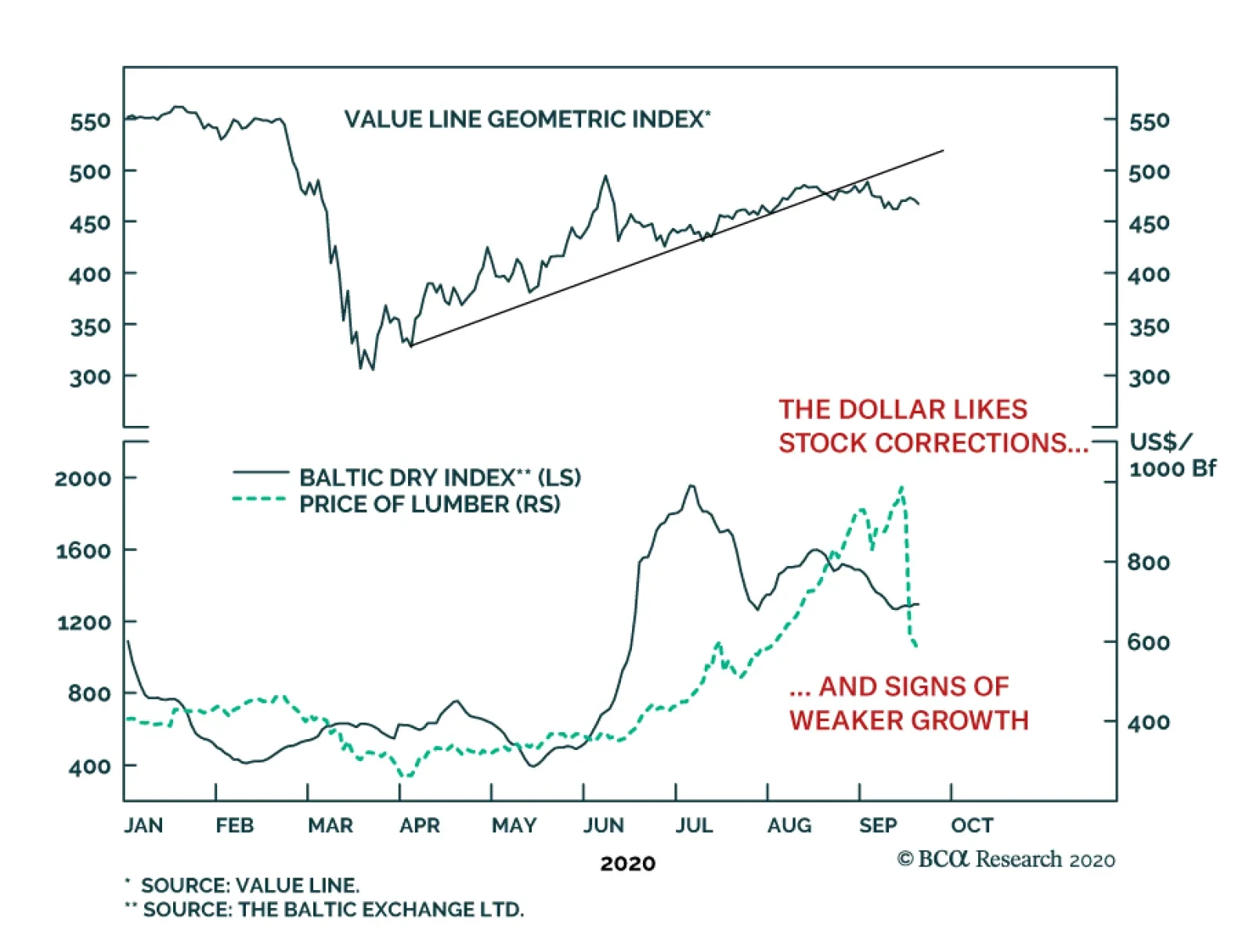
Feature Equities tried to regain their footing last week, but risks still lingering on the (geo)political front should sustain the tug of war between bulls and bears and rekindle volatility. While monetary and fiscal policies will remain loose, the intensity of easing is waning as both the Fed’s impulse (i.e. second derivative) of asset purchases has ground to a halt and Congress has hit a stalemate over the next round of stimulus. Crudely put, the thrust of monetary and fiscal policies is at heightened risk of shifting from stimulative to contractive (Chart 1). As a result, we remain patient with fresh capital and will wait to deploy it when the dust settles hopefully by the end of the year. Turning to equity market internals and other high frequency financial market data is instructive in order to get a clearer picture of the direction of the broad equity market. The value line arithmetic and geometric indexes and small cap stocks that led the March 23 SPX trough are emitting a distress signal (Chart 2). Chart 1Running Out Of Thrust
Running Out Of Thrust
Running Out Of Thrust
Chart 2Market Internals...
Market Internals...
Market Internals...
Drilling deeper on a sector basis, hypersensitive chip stocks, energy shares, and discretionary versus staples equities will likely weigh on the prospects of the broad equity market (Chart 3). The VIX index, the vol curve and the yield curve, all excellent leading indicators of the S&P 500, have crested and warn that the shakeout phase has yet to run its course (VIX shown inverted ,Chart 4). Chart 3...Say It Is Prudent...
...Say It Is Prudent...
...Say It Is Prudent...
Chart 4...To Remain On The Sidelines
...To Remain On The Sidelines
...To Remain On The Sidelines
Trying to quantify the SPX drawdown, we turn to CBOE’s equity put/call (EPC) ratio. The EPC ratio is nowhere near recent extreme readings. SPX pullbacks since the early-2018 “Volmageddon” have corresponded to significantly higher EPC ratio readings. In the past 10 such iterations, the median EPC ratio has been 0.86, the mean 0.93, with a range of 0.77 to 1.28 (Table 2). Currently, the EPC ratio is hovering near 0.58 suggesting that downside risks persist (EPC ratio shown inverted, Chart 5). Chart 5Downside Risks Persist
Downside Risks Persist
Downside Risks Persist
Table 2Equity Put/Call (EPC) Ratio During Pullbacks Since 2018
Churning
Churning
Finally, the commodity complex is also firing warnings shots. Lumber has collapsed nearly $300/tbf from the recent peak, oil is trailing gold bullion and silver is also cresting versus the yellow metal, iron ore is petering out and the Baltic dry index is wobbling. True, copper and materials stocks are holding their own, but overwhelmingly commodity market internals are waving a yellow flag (Chart 6). Chart 6Commodity Yellow Flags
Commodity Yellow Flags
Commodity Yellow Flags
Netting it all out, we opt to stay patient and refrain from deploying fresh capital especially in the tech space in the near-term; a better entry point will likely materialize between now and the end of the year. This week we reiterate our underweight stance in a niche technology index and shed more light on our recent downgrade to neutral of a key consumer discretionary subgroup. Chip Equipment Update: Tangled Up In The Trade War We remain committed to our intra-tech strategy of preferring defensive software and services tech names to aggressive hardware and equipment tech stocks. In that light, we reiterate our underweight stance in the niche S&P semi equipment index. Recent news of the Trump administration’s potential tightening of the noose on Chinese chip company SMIC (the country’s largest foundry) was a net negative for US semi cap names, similar to export restrictions of American technology to Huawei was a net negative for US semi cap names. As a reminder, these manufacturers count China as one of their largest export market alongside Taiwan and South Korea. Thus, this flare up in the US/Sino trade war bodes ill for semi cap companies’ future sales and profit growth projections (Chart 7). There are high odds that relative share prices have plateaued earlier this month and a fresh down cycle has commenced. Under such a backdrop, this hyper-sensitive manufacturing group will likely overshoot to the down side as is evident in the historical tight correlation with the ISM manufacturing survey: these violent oscillations are warning that a cooling off in the ISM will be severely felt in this niche manufacturing intense index (Chart 8). Chart 7Lofty Expectations
Lofty Expectations
Lofty Expectations
Chart 8Violent Oscillations
Violent Oscillations
Violent Oscillations
On the global demand front, there is an element that COVID-19 is stealing sales from the future and bringing demand forward. Already global semi sales are rolling over, and a couple of industry pricing power proxies are deflating at an accelerating pace: Asian DRAM prices are topping out in the contraction zone and Taiwanese export prices are sinking like a stone, warning that a deficient demand down cycle will squeeze semi cap profit margins (Chart 9). Importantly, Taiwanese tech capex, which TSMC dominates, has crested, warning that all the euphoria behind 5G deployment and uptake is likely baked in the relative share price ratio. The implication is that semi cap names remain vulnerable to any global 5G-related hiccups (top panel, Chart 10). Chart 9Waning Selling Price Backdrop
Waning Selling Price Backdrop
Waning Selling Price Backdrop
Chart 10Cresting
Cresting
Cresting
Finally, the tight positive correlation between Bitcoin prices and the relative share price ratio remains intact. Were a knee-jerk rebound in the US dollar to knock down Bitcoin, at least temporarily, it would serve as a catalyst to shed chip equipment stocks (bottom panel, Chart 10). Moreover, 90% of the industry’s sales originate abroad, thus a rise in the greenback would eat into their P&L via FX translation losses. Adding it all up, a softening demand backdrop that is weighing on selling prices, the rekindling of the US/China tech-related trade war and a reflex rebound in the US dollar, all warn to shy away from semi cap stocks. Bottom Line: Stay underweight the S&P semiconductor equipment index. The ticker symbols for the stocks in this index are: BLBG S5SEEQ – AMAT, KLAC, LRCX. Home Improvement Retailers: Stay On The Sidelines Two weeks ago our trailing stop was triggered in the S&P home improvement retail index (HIR) and we monetized gains of 15% since the mid-April inception and moved to the sidelines. Today we reiterate our benchmark allocation in this consumer discretionary sub group. Clearly, HIR was a major beneficiary of the lockdown as the US and Canadian governments deemed these retailers “essential” and allowed them to stay open during the peak of the pandemic. These Big Box retailers saw their sales soar as the fiscal easing package replenished consumers’ wallets, and coupled with the lockdown, caused a surge in DIY remodeling activity. Our portfolio also greatly benefited from the stellar performance of the S&P HIR index, as existing home sales staged a significant comeback and inventories of homes for sale receded substantially thus further tightening the residential real estate market (top & middle panels, Chart 11). As reminder, historically a vibrant housing market is synonymous with handsome returns in relative share prices and vice versa. But now a number of stiff headwinds, which our HIR model encapsulates, signal that a lateral digestive move is in store in the coming months (Chart 12). Chart 11Unsustainable Front Running
Unsustainable Front Running
Unsustainable Front Running
Chart 12Stiff Headwinds
Stiff Headwinds
Stiff Headwinds
First, a repeat of the spike in demand for home improvement projects is highly unlikely, especially given that demand was brought forward. Also during the autumn and winter months there is a natural slowdown in the take-up of remodeling projects until the spring home selling season arrives. Second, the industry’s sales-to-inventories (S/I) ratio is literally off the charts (bottom panel, Chart 11). An inventory build-up and easing in demand will bring back the S/I ratio back to a more reasonable level. Lastly, lumber prices have taken a beating of late collapsing from over $900/tbf to below $600/tbf. This drubbing of this economically hypersensitive commodity directly cuts into HIR earnings. These Big Box retailers make a set margin on lumber sales so as prices fall they take a big bite out of profits (bottom panel, Chart 13). Nevertheless, a few offsets prevent us from turning outright bearish in this early cyclical retailers. Namely, the industry’s profit growth bar is on a par with the broad market and thus does not pose a large hurdle to overcome. Importantly, given that HIR earnings have kept pace with the massive run-up in stock prices (second panel, Chart 14), they have kept relative valuations at bay. While, the S&P HIR 12-month forward P/E trades at a market multiple, the relative forward P/E changes hands at a 20% discount to the historical mean. Thus, HIR enjoy a significant valuation cushion (bottom panel, Chart 14). Chart 13Timber!
Timber!
Timber!
Chart 14But There Are Powerful Offsets
But There Are Powerful Offsets
But There Are Powerful Offsets
Finally, the Fed just explicitly committed to stay on the zero interest rate line until 2023! This easy monetary policy as far as the eye can see is a powerful tonic to early cyclical and interest rate-sensitive home improvement retailers (fed funds rate shown inverted, top panel, Chart 14). Netting it all out, a balanced outlook keeps us on the sidelines in the S&P HIR index. Bottom Line: Stick with a benchmark allocation in the S&P home improvement retail index. The ticker symbols for the stocks in this index are: BLBG S5HOMI – HD, LOW. Anastasios Avgeriou US Equity Strategist anastasios@bcaresearch.com Current Recommendations Current Trades Strategic (10-Year) Trade Recommendations
Drilling Deeper Into Earnings
Drilling Deeper Into Earnings
Size And Style Views July 27, 2020 Overweight cyclicals over defensives April 28, 2020 Stay neutral large over small caps June 11, 2018 Long the BCA Millennial basket The ticker symbols are: (AAPL, AMZN, UBER, HD, LEN, MSFT, NFLX, SPOT, TSLA, V). January 22, 2018 Favor value over growth
Feature In last week’s US Bond Strategy report, we presented the results of a scenario analysis on consumer spending.1 The goal of that analysis was to assess how much additional federal government income support is required to achieve consumer spending growth targets that won’t disappoint markets. The calculations regarding the amount of additional stimulus required to hit different spending targets are correct. However, a typo in our code (in fact, a missing letter “c”) caused us to specify the wrong targets. Last week, we targeted -3% 12-month over 12-month consumer spending growth for the period between March 2020 and February 2021. The rationale being that -3% was the worst spending growth seen during the 2008 Great Recession and would likely be the minimum that markets could tolerate this time around. As shown in the second panel of Chart 1, this number should have been -1.9%. Chart 1Consumer Spending Driven By Income & The Savings Rate
Consumer Spending Driven By Income & The Savings Rate
Consumer Spending Driven By Income & The Savings Rate
We also considered spending growth targets for the 12-month period between August 2020 and July 2021. Last week we set our target range for that period at between 2% and 6%, the growth rates seen during the recovery years that followed the Great Recession. That range should have been set at 2.5% to 5%. We present revised results from our scenario analysis in Table 1 and Table 2. These tables are identical to the ones presented last week, except that they now have the correct consumer spending targets. Table 1Without More Stimulus COVID's Impact On Consumer Spending Will Be Worse Than The GFC
A Correction To Last Week's Report
A Correction To Last Week's Report
Table 2At Least $600 Billion More Government Income Support Is Needed
A Correction To Last Week's Report
A Correction To Last Week's Report
Our conclusion remains similar, though our corrected numbers suggest that more income support from the federal government will be required to hit reasonable spending targets. Last week, we concluded that extra income support on the order of $500 - $800 billion is the minimum that will be required. Our corrected numbers suggest that more stimulus will be necessary, on the order of $600 billion to $1 trillion. Ryan Swift US Bond Strategist rswift@bcaresearch.com Footnotes 1 Please see US Bond Strategy Weekly Report, “More Stimulus Needed”, dated September 15, 2020, available at usbs.bcaresearch.com
Highlights Consumers are the beating heart of the US economy, … : By showering cash on the newly unemployed, and issuing checks to more than half of all taxpayers, the CARES Act arrested April’s free fall in consumption and helped households meet their financial obligations. … and if they’re waylaid by the pandemic, only a forceful fiscal response stands in the way of reduced future growth: Bankruptcies and widespread displacement of workers would turn a nasty cyclical shock into lower trend growth. How big does the next round need to be?: Applying a framework developed by our US Bond Strategy colleagues, we estimate that consumption growth will get back to trend if Congress provides $800 billion of aid to households through the first half of next year. Is it likely something that size can get through Capitol Hill?: Assistance for reeling states is a potential sticking point, but we continue to believe that a major aid package will pass. If it doesn’t, the election outcome will loom large over the 2021 outlook. Feature Over BCA’s 70-plus years, our research teams have developed hundreds if not thousands of proprietary indicators to project where financial markets and the major economies are headed. They are central to our process and we are continuously engaged in trying to improve them. Sometimes, though, it helps to take a step back and look at the landscape from the broadest and simplest perspective. When we do, we remind ourselves of what we have come to think of as macroeconomics’ fundamental lesson: My spending is your income and your spending is my income. Consumption isn't just four times as large as each of the other two main components of US GDP, it also exerts a gravitational pull on them. The truth of this simple formulation is especially easy to see in the United States, where consumption accounts for two-thirds of GDP (investment and government spending each contribute one-sixth, ignoring net exports’ modest drag). The US economy would shrivel if household spending were to fall sharply, and the second-order effects on investment and government receipts would prolong the agony. The former is a function of consumption; businesses only invest once it’s clear that demand has overtaken existing capacity or will soon do so. Reduced consumption would pressure employment and profits, squeezing federal revenues that are almost entirely composed of individual income taxes, payroll taxes and corporate income taxes (Chart 1). Transfers from the federal government account for one-third of the states’ total revenues (Chart 2); since most of them are forbidden to run budget deficits, they would face immediate cutbacks if the flows from Washington were to slow. Chart 1Consumption Exerts An Outsized Impact On Federal ...
The Fundamental Theorem Of Macroeconomics
The Fundamental Theorem Of Macroeconomics
Chart 2... And State Government Revenues
The Fundamental Theorem Of Macroeconomics
The Fundamental Theorem Of Macroeconomics
Plugging The Gap Recognizing that a wobbling consumer has the potential to topple several economic dominos, Congress undertook extraordinary measures to keep a vicious short-term shock from impairing growth into the intermediate and long term.1 The CARES Act included provisions to support ailing industries and small businesses, but its efforts at shoring up vulnerable households have been the most effective by far. Direct payments of $1,200 to every adult and $500 to every child in households earning less than $99,000 ($198,000 for married filing jointly taxpayers) and weekly $600 supplemental unemployment benefits helped push personal income well above February’s pre-pandemic level (Chart 3). Chart 3The CARES Act Gave Lower-Income Households An Enormous Boost
The Fundamental Theorem Of Macroeconomics
The Fundamental Theorem Of Macroeconomics
With income rising, especially for those at the lower end of the income distribution, households were able to stay current on their rent (Table 1), their mortgage and all their other obligations (Table 2). They were even able to pay down their credit card balances, an unusual occurrence at the start of a recession (Chart 4). Residential landlords and personal lenders breathed a sigh of relief, along with the entities that have lent to them, though they must be wondering how their obligors will fare now that the CARES Act’s supplemental unemployment benefit has expired. Households built up $325 billion of savings from March through July, which helped tide them over in August and is presumably doing so in September, but we expect that cracks may be beginning to show and that they will emerge in force in October if another round of aid is not forthcoming. Emergency CARES Act fiscal transfers were so large that they more than offset the drag from declining compensation as employees were laid off or worked less than full time during the lockdowns. Table 1September Slowdown?
The Fundamental Theorem Of Macroeconomics
The Fundamental Theorem Of Macroeconomics
Table 2Credit Performance Across Personal Loan Categories Was Solid Through July
The Fundamental Theorem Of Macroeconomics
The Fundamental Theorem Of Macroeconomics
Chart 4Strapped Households Usually Run Up Their Credit Card Balances When Recessions Hit
Strapped Households Usually Run Up Their Credit Card Balances When Recessions Hit
Strapped Households Usually Run Up Their Credit Card Balances When Recessions Hit
How Much Will It Take? Deficit spending is a charged issue, especially among those at the upper end of the income distribution who will ultimately be taxed to repay the debt to fund today’s deficits. However, we agree with the mainstream economic consensus that issuing another two or three trillion dollars of debt at negative real yields is preferable to suffering the hysteresis effects of an uncontained surge of bankruptcies. From a short-term perspective, vigorous fiscal support is the only thing that can preserve the seeming dichotomy between the real economy’s struggles and the equity and credit markets’ bliss.2 The key practical question is how big the next round needs to be to allow policymakers to extend the bridge over the gap opened by the pandemic. Our US Bond Strategy colleagues addressed that question head on last week.3 They proceeded from the assumption that a certain minimum level of consumer spending growth is necessary to meet market participants’ generally sanguine recovery expectations. They then focused on how household income (what comes in) and the savings rate (how much is held back) might evolve under pessimistic and optimistic scenarios and a base-case scenario that splits the difference between the two. Their estimates of required support from a new round of fiscal transfers are simply the difference between the spending that would occur without the transfers and the minimum required spending. Looking at the 12-month moving average of consumer spending to smooth out single-month swings, and comparing it to its year-ago level (a 12-month-over-12-month basis), we map out three nominal growth targets for the August 2020 to July 2021 period: 3%, 4% and 5%, consistent with the range that prevailed once the economy found its footing after the global financial crisis (Chart 5). Instead of performing the analysis under all three of our colleagues’ scenarios, we simply use the split-the-difference base case that has household income ex-CARES Act transfers (Chart 6, top panel) and the savings rate (Chart 6, bottom panel) returning to their pre-pandemic level by September 2021. Chart 5Outside Of Recessions, Consumer Spending Growth Typically Occupies A Tight Range
Outside Of Recessions, Consumer Spending Growth Typically Occupies A Tight Range
Outside Of Recessions, Consumer Spending Growth Typically Occupies A Tight Range
Chart 6Recovery Scenarios For Consumption's Drivers
Recovery Scenarios For Consumption's Drivers
Recovery Scenarios For Consumption's Drivers
The results are shown in Table 3. The 4% nominal rate of consumption matches the economy’s trend growth since the GFC (2-to-2.25% real plus 1.75-to-2% inflation), 3% allows for a sluggish recovery in which the virus only slowly loosens its grip and 5% covers the possibility of a burst of above-trend growth that might follow a better-than-expected virus outcome. We project that households will require an average of $70-to-94 billion of monthly income support to grow 12-month-on-12-month consumption by 3-to-5%. A repeat round of stimulus checks would chip in $23 billion, leaving supplemental unemployment insurance benefits and the extension of benefits to workers that would not otherwise be covered by their state unemployment insurance program to pick up much of the rest of the $50-to-70 billion tab. Once those programs were fully up and running in May, June and July, they distributed an average of $92 billion per month ($77 billion supplemental benefits and $15 billion expanded eligibility). Those numbers suggest that unemployment-related transfers amounting to 55-to-75% of the CARES Act transfers would suffice, which is encouraging because the Senate and the White House now view its $600 weekly supplement as too generous. The unemployment rate has fallen since the spring, however, with fewer households in line to receive payments, so lawmakers will have to devise other ways to get money into the hands of consumers. Given that states and municipalities face an acute cash crunch and Democrats have insisted on addressing it, there is a good chance that states will receive a healthy allocation and some of the state funds will eventually find their way to households. Table 3Another Round, Please
The Fundamental Theorem Of Macroeconomics
The Fundamental Theorem Of Macroeconomics
The bottom line for investors assessing the adequacy of a stimulus bill is that we think it should allocate at least $800 billion to support household income. A bill in the mid-to-high $1 trillion range that would split the difference between Republican and Democratic proposals should suffice and it would leave ample room for desperately needed support for state and local governments. Public transit systems like the gasping New York city subway, which suffered ridership declines of as much as 80-90% at the height of the lockdown while incurring significant new cleaning costs, may otherwise have to impose draconian service cutbacks that undermine their local economies’ efforts to reopen. The Fundamental Theorem Of Microeconomics At the University of Chicago’s Booth School of Business, Introductory Microeconomics is called Price Theory to keep the central lesson of the course in every student’s mind: people respond to incentives. We have come to think of this as the fundamental rule of microeconomics. It is the foundation of public policy’s attempts to shape behavior: If you want more of something, subsidize it; if you want less of something, tax it. When mulling the prospects for the passage of a significant new aid bill, we begin and end with a consideration of the key players’ incentives. The Democrats want a bill to demonstrate that government can be the solution and to push back against the anti-government narrative that has taken root over the last 40 years. The administration should be doing its utmost to obtain a robust spending package since recessions have reliably sunk incumbent presidents’ re-election prospects. Republican senators, even those who are not up for election this year, should want a bill because control of the Senate is likely to go to the party that wins the White House and individual senators’ power and influence are magnified when they are in the majority. Despite months of posturing and foot-dragging, we second our geopolitical strategists’ view that an aid package aligning with all the major players’ interests will pass soon. Investment Implications Much of our constructive take on markets and the economy proceeds from our view that another significant round of fiscal aid is forthcoming. If it is not, we would revisit our bullish 12-month asset allocation recommendations and we would close out our overweight on the SIFI banks’ stocks. An assumption that humankind will find a way to tame COVID-19 on a timetable in line with market expectations is also embedded in our 12-month equity overweight. If a second wave of infections takes hold, the mortality rate moves significantly higher and treatment and/or vaccine progress unexpectedly reverses, our recommendations will get more cautious. If it is in the interests of all of Washington's key players to pass a bill, there's an awfully good chance that bill will get passed. Although those in the know have lately become more optimistic that the first installment(s) of an effective vaccine(s) will become available in the next two quarters (Chart 7), such an outcome is not assured. A client asked us last week what would ensue if a vaccine is not available until the third or fourth quarter of 2021. As we talked through it with her, we could not escape the idea that the election could be hugely consequential for markets if the lack of a vaccine coincides with a failure to pass a stimulus package before the election, or with a stimulus package that does not extend beyond the end of March. Chart 7Rising Odds Of A Vaccine Within The Next Six Months
The Fundamental Theorem Of Macroeconomics
The Fundamental Theorem Of Macroeconomics
If the next round of stimulus is not passed before the election, or if it is set to expire two or three quarters before an effective vaccine will be available in sufficient quantities to turn the public health tide, fiscal policy would become the single most important driver of the near-term market and economic outlook, given our view that the Fed has already done nearly all it can do. Congress would then take center stage, with the White House playing a secondary role based on its veto power and the influence of the bully pulpit. In that case, we would expect equity and credit markets to fare much better under a Blue Wave outcome in which the Democrats sweep the election than they would in any outcome that leaves Republicans in control of the Senate. Think of it like this: if the economy needed fiscal aid to counter six-to-twelve more months of pandemic disruptions two years before Congress again had to face voters, would you rather appeal to Pelosi, Schumer and Biden, champing at the bit to demonstrate how government can alleviate suffering, or Mitch McConnell, itching to teach profligate cities and states a lesson? Doug Peta, CFA Chief US Investment Strategist dougp@bcaresearch.com Footnotes 1 The Fed leaped into the breach as well, but we have already discussed its efforts in detail. This report focuses on fiscal policy. 2 Please see the September 18, 2020 BCA Research Special Report, "The US Economy vs. The Stock Market: Is There A Disconnect?" available at www.bcaresearch.com. 3 Please see the September 15, 2020 US Bond Strategy Weekly Report, "More Stimulus Needed," available at usb.bcaresearch.com.
BCA Research's Global Investment Strategy service still favors global equities over bonds on a 12-month horizon. However, stocks remain technically overbought and vulnerable to a further correction. Tech stocks rallied hard into September. Aggressive…
The risk of a dollar rebound is only getting larger. As we previously highlighted, our Dollar Capitulation Index is now consistent with an elevated chance of a counter-trend move in the Greenback. However, such a move requires a catalyst. The equity market…
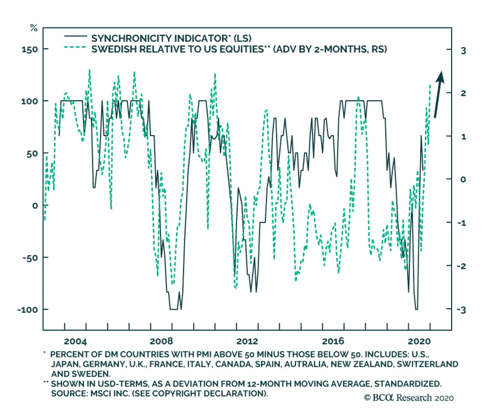
Our BCA Synchronicity Indicator was designed to capture the extent to which countries’ business cycles are moving in sync. To do so, we compute the proportion of countries that have PMIs above 50 versus those below 50. A 100% reading tells us that all the…
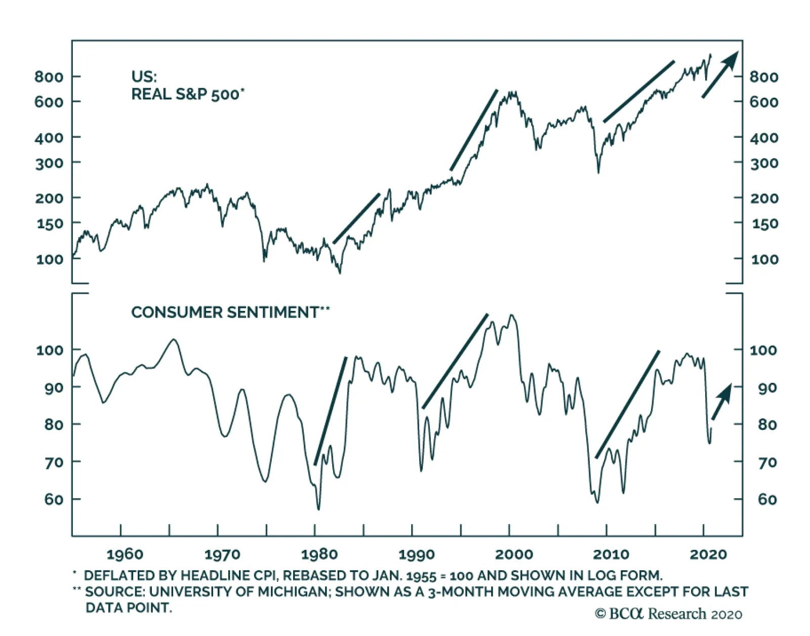
Despite the expiry of the CARES act, the University of Michigan's Consumer Sentiment index rose to 78.9, easily beating expectations of 75. Moreover, both the Current Conditions and Expectations components managed to best anticipations. This strong…
Languishing Buybacks
Languishing Buybacks
This summer we have been highlighting unsustainable trends in the US equity market and today we turn our attention to buybacks. As we first pointed out in the late-2019 Weekly Report, share buybacks have been a key pillar underpinning stocks since the GFC averaging roughly $500bn/annum since 2010, and reaching nearly the $1tn/annum mark in 2018 on the back of President Trump’s massive fiscal easing package. Clearly, such breakneck pace was unsustainable and a renormalization was overdue. Fast forward to Q2, and even our conservative quarterly $125bn equity retirement estimate proved overly optimistic. From the recent peak to just below $90bn/qrt, SPX buybacks have fallen by a whopping 67%. Such a corporate buyer’s strike is negative for the near term prospects of the S&P 500 (top panel). Drilling deeper beneath the surface is revealing. When we disaggregate the headline buybacks number into GICS1 sectors, we observe that once again the tech titans (comprising the S&P technology and the S&P communication services indexes) are doing all the heavy lifting accounting for 70% of the overall number (bottom panel). Q2 was the first time in recent memory that a cross has occurred where tech accounts for more buybacks that all the other sectors put together! Bottom Line: We continue to recommend investors keep some powder dry and refrain from deploying capital at the current juncture. A better entry point in the broad equity market will likely materialize in late Q4.
“Based on a broad set of indicators, it is hard not to see a certain amount of daylight between risky asset prices and economic prospects” – Claudio Borio, Head of Monetary and Economic Department, BIS, September 14, 2020 A pandemic, the resulting sharpest downturn in modern times and soaring government debt have made 2020 an annus horribilis for the US and world economy. Growth has rebounded strongly as economic lockdowns have ended, but most forecasts suggest that the level of activity will not return to its pre-virus level before the end of next year. That implies a lingering problem of high unemployment and there will be ongoing concerns about the eventual consequences of policymakers’ extreme monetary and fiscal actions. The long-run outlook for the US economy was already challenging before Covid-19 appeared on the scene. And this year’s events cannot have improved prospects relative to pre-crisis expectations. Thus, it is reasonable to wonder why the S&P500 hit a new all-time high in early September and currently is only slightly below that level. Is it a classic case of irrational exuberance or a sign that the economic outlook is much better than generally assumed? If we cannot come up with a convincing case for the latter then irrationality is left as a likely explanation. The sharp decline in interest rates certainly supports higher equity valuations, but a bull market that depends largely on stimulative monetary policy is problematic. The Stock Market Is Not The Economy, But… Finance theory states that equity prices should reflect the discounted long-run stream of expected dividend payments. In turn, those payments should be correlated with earnings growth which one would expect to have a close relation to underlying economic conditions. While prices often deviate significantly from so-called fundamentals, it is perfectly reasonable to assume a long-run correlation between the stock market and the performance of the economy. In practice, there is a loose relationship with occasional large deviations. Chart 1The US Economy vs. The Market
The US Economy vs. The Market
The US Economy vs. The Market
Chart 1 shows the five-year annualized growth in US real GDP versus both real total returns from the S&P500 and real earnings.1 In making these comparisons, there are a few issues to consider. The stock market only represents quoted companies while GDP also includes the economic contribution of unincorporated businesses and the government. The sectoral composition of the S&P 500 is different from that of businesses at large. Many large US companies earn a significant share of their earnings from overseas operations that may be uncorrelated with domestic economic conditions. The price performance of stocks can reflect large swings in valuations driven by investor sentiment rather than fundamentals. Starting with the first point, corporate sector GDP accounts for only slightly more than half of total GDP, moving within a range of around 55% to 60% for the past 50 years (Chart 2). Yet the real growth in corporate GDP has moved in lockstep with that of total GDP. And aggregate sales of S&P500 companies have broadly tracked the swings in GDP. Thus, it cannot be argued that quoted companies can somehow miraculously avoid the ups and downs of the overall business cycle. The economy is based on a complex set of interconnected relationships and it would be remarkable if the performance of the country’s major corporations could deviate significantly from the economy at large for any length of time. Chart 2The Corporate Sector And Total GDP
The Corporate Sector And Total GDP
The Corporate Sector And Total GDP
There certainly is an issue with the second point because the sectoral breakdown of the S&P500 does not exactly match that of the overall economy. While that does not always protect the stock market from general economic trends, it can help explain occasional large equity price moves. Table 1 shows the sector composition of the S&P500, weighted by market capitalization, sales and earnings, versus the composition of GDP. It is difficult to break down GDP exactly in line with the sector classifications of the market, but we have done as close a job as the data allows. Notable differences between the structure of the market and GDP are the relative weightings of the health care, industrials and information technology sectors. The following explanations seem plausible. Table 1Sector Composition: A Comparison
The US Economy vs. The Stock Market: Is There A Disconnect?
The US Economy vs. The Stock Market: Is There A Disconnect?
For health care, the GDP weighting shown in the table is understated because it also is a significant part of the government sector’s contribution via Medicare and Medicaid. Other data show that total spending on health care accounts for around 18% of US GDP, broadly in line with the S&P index weighting. The large weighting of industrials in GDP compared with its share of the equity index probably reflects the fact that this broadly-defined group has a very large number of small and unquoted companies. On that point, it should be noted that unincorporated businesses account for 21% of national income – a non-trivial share. Last, but not least, there is the huge discrepancy in the weightings of information technology. This is a bit harder to explain, but two reasons come to mind. First, the S&P index market cap weighting has been boosted by the strong share price performance of these companies and high valuations thus flatter their index importance relative to underlying business activity. The IT weights based on sales and earnings are much lower, but still significantly exceed that in GDP. Secondly, some of these companies (Apple being a prime example) produce very little in the US relative to what they sell in the country. As GDP measures domestic output, this affects the relative weightings. Chart 3Growth In Overseas vs. Domestic Profits
Growth In Overseas vs. Domestic Profits
Growth In Overseas vs. Domestic Profits
Let’s explore the issue about overseas earnings more closely. According to national income data, 45% of the corporate sector’s after-tax profits come from overseas earnings. And that is broadly consistent with the overseas share of sales for S&P500 companies. While the relationship is not perfect, the growth of overseas profits roughly tracks that of domestic profits (Chart 3). And where there have been large divergences, such as in 2009, that often has reflected large swings in oil prices. Overall, it hard to make the claim that the large share of earnings coming from overseas has been a factor supporting the strong performance of stocks relative to the underlying economy. This is especially true given that the US has performed better than most other economies in recent years and the dollar has been a strong currency. In sum, our analysis does not give compelling support to the idea that the fundamental performance of large quoted companies can sustainably diverge from that of the underlying economy. But that does not mean that share prices cannot deviate because of large swings in valuation. Is The US Equity Market Overvalued? This should be a simple question to answer, but often is not. Alternative approaches to valuation are sometimes in conflict and that is the current situation. Various valuation measures are shown in Chart 4 with the following observations. Chart 4AMeasures Of US Equity Valuation
Measures Of US Equity Valuation
Measures Of US Equity Valuation
Chart 4BMeasures Of US Equity Valuation
Measures Of US Equity Valuation
Measures Of US Equity Valuation
All the measures based on earnings (trailing, forward and cyclically-adjusted) suggest that the market is very expensive. While current earnings are affected by the economy’s second-quarter collapse, there remains considerable uncertainty about the speed of recovery. The current forward price-earnings ratio (PER) assumes that earnings will increase by around 30% over the next 12 months and that could prove to be optimistic. The market also looks significantly overvalued based on the ratios of price-to-book, price-to-sales and total market capitalization to GDP. While the valuation of the aggregate index has been boosted by the exceptional performance of the technology sector, it is important to note that the ratios of price to trailing earnings and to sales also are very elevated using the medians of 58 sub-groups, as calculated by BCA’s US Equity Strategy Service (Chart 5). In other words, this is not a story about overvaluation simply reflecting the hot technology sector. Chart 5Overvaluation Is Not Just About Technology
Overvaluation Is Not Just About Technology
Overvaluation Is Not Just About Technology
The market looks much more attractive when comparing dividend and earnings yields with the returns available on cash and bonds. This is the so-called TINA argument (there is no alternative). It is hard not to prefer stocks when the dividend yield is above the yield on long-term government bonds. During the market overshoot of the late 1990s, the dividend yield was 500 basis points below the 30-year Treasury yield, highlighting that stocks were in a very risky phase. Moreover, the current environment of unusually low interest rates is unlikely to end any time soon. The Federal Reserve’s newly-released projections indicate that interest rates are expected to remain at current levels at least through the end of 2023. The Fed has made it abundantly clear that it is prepared to take risks with inflation in order to support a revival in economic activity. It is relatively straightforward when the different valuation metrics are all giving the same message, as was the case in the late 1990s. Even then, the market overshoot lasted longer and became more extreme than generally expected. Our composite valuation indicator takes account of 10 different measures and currently supports the idea that the market is indeed very expensive (Chart 6). Chart 6BCA Equity Valuation Indicator
BCA Equity Valuation Indicator
BCA Equity Valuation Indicator
It currently is very difficult for institutional investors to favor fixed-income instruments over a higher-yielding equity market. However, there is no free lunch here. We cannot ignore the argument that low interest rates reflect a very bleak long-run outlook for economic growth and thus for earnings and stock prices. The secular stagnation view put forward by Larry Summers looks even more apposite today than when he outlined it several years ago. We are fortunate to have Larry as the opening speaker for our virtual Investment Conference on October 6th and it will be extremely interesting to hear his latest thinking. Some Thoughts On The Economic Outlook Equities are a long-duration asset so it makes sense to consider valuations in the context of the long-run economic outlook rather than the near-term ups and downs of activity. Of course, short-run economic moves do affect investor sentiment so cannot be ignored. The near-term outlook is extremely cloudy because of uncertainty about the future path of the pandemic. While the virus appears to have become less virulent, infection rates could climb sharply over the winter months as schools re-open and people spend more time indoors. In addition, there are doubts about the scale and timing of much-needed additional government stimulus. Chart 7Mixed Data On The US Economy
Mixed Data On The US Economy
Mixed Data On The US Economy
Some recent data have been impressively strong. The value of retail sales has surpassed pre-virus peaks as have new and existing home sales (Chart 7). On the other hand, manufacturing and construction output and overall employment remain far below previous peaks. And we have yet to see the impact of the ending of the $600 a week income support. There are legitimate concerns that early 2021 will see a surge in home evictions and a marked increase in small business bankruptcies. Most likely, the economy will experience a bumpy and moderate recovery after its post-lockdown strong third-quarter growth. The Fed forecasts US growth of 4% in 2021 after a 3.7% drop this year and the OECD’s latest projections are similar. That still means that it will take until the end of 2021 before real GDP gets back to its end-2019 level. And there are downside risks to that forecast if the virus remains a lingering problem. Our conference on October 6th will have what is sure to be a lively debate about the US economic outlook between Ed Yardeni and Dave Rosenberg. These two very smart economists have a very different take on how things are likely to play out and what it means for the markets. This debate will follow the presentation by Larry Summers and after that, Peter Berezin, our Chief Global Strategist, and myself will discuss our views and will be open for audience questions. Should be very interesting! Let’s talk about the longer-run economic outlook. As noted at the outset, it was less than inspiring even before the virus arrived on the scene. The two drivers of long-run economic performance are demographics and productivity and the growth in both has been trending lower. Chart 8Demographics Are A Problem
Demographics Are A Problem
Demographics Are A Problem
The demographics story is straightforward and essentially locked in place. A falling birth rate means that the working-age population will rise at a meager 0.2% a year over the next ten years compared with more than 1% a year in the 1980s, 1990s and 2000s. Moreover, growth is projected to remain low in subsequent decades (Chart 8). And even these forecasts may be optimistic if the current antipathy toward immigration leads to a more closed-door stance. Demographic trends not only imply a slow-growing workforce (impacting potential GDP) but also create a worsening picture for government finances. An aging population boosts spending on health care and pensions when the number of taxpayers is growing very slowly. This shows up in a dramatic drop in the ratio of the working-age population (i.e. potential taxpayers) to those aged 65 and above.2 This is happening when government finances are already in dire straits and implies that future tax rates can only go higher, regardless of which political party is in power. The issue of productivity is more contentious because it is hard to measure, and future trends are less predictable than for demographics.3 Nevertheless, the data present a relatively clear picture: the growth of output per hour in the non-financial corporate sector has slowed markedly after a tech-driven spurt in the second half of the 1990s (Chart 9). We show the trend as a five-year growth rate to smooth out the short-term noise in the series. Chart 9Productivity Growth Has Slowed
Productivity Growth Has Slowed
Productivity Growth Has Slowed
We discussed the outlook for productivity in a recent Special Report and highlighted some worrying trends.4 These include weak growth in business investment, a retreat from globalization, increased government involvement in the economy and friction caused by new pandemic-related protocols to protect the safety of customers and workers in several industries. On a more positive note, the virus has forced many businesses to streamline their operations and the move to remote working should boost productivity in some cases. What about the issue of technological advances such as artificial intelligence (AI) and autonomous vehicles? These clearly have the potential to boost productivity in many areas but with a caveat. Previous major technological breakthroughs (often called general purpose technologies or GPTs) such as steam power, the internal combustion engine, electricity, and the internet had major impacts on both supply and demand. Generally, they were associated with creating completely new activities. For example, steam power led to the locomotive which in turn allowed the opening of the country and the movement of goods to distant markets. Similarly, the automobile led to the development of the suburbs and the associated demand for housing and related services. More recently, the internet boosted the demand for a wide range of tech goods and services. While that is still ongoing, its peak effect has passed, helping to explain the decline in productivity growth from late-1990s level. In contrast, a lot of current ‘new’ technologies simply are associated with doing existing tasks more efficiently (3-D printing would be an example). That is still important but not on the same scale as GPTs. There is no doubt that AI will be a big disruptor in many sectors but its impact on demand is less clear. Maybe one day all households will have a domestic robot but that is still far enough away to be in the realm of science fiction. The bigger near-term impact will be job displacement. And the same can be said for autonomous vehicles. The demand for new self-driving cars will rise, but these will simply replace gas-powered ones and perhaps the overall number of vehicles on the road will decline. In sum, there will be both positive and negative forces acting on future productivity growth and any predictions need to be treated with caution. Nonetheless, a base case should probably assume any improvements will be relatively modest. Finally, any discussion of long-run economic prospects cannot ignore the alarming rise in government debt. The US was already running $1 trillion federal deficits before this year’s crisis led to a further extraordinary explosion of red ink (Chart 10). Chart 10Soaring Government Debt
Soaring Government Debt
Soaring Government Debt
Current large deficits are not fazing investors. In the past, the spread between 30-year and 10-year Treasurys widened as the deficit rose, but this relationship has weakened recently (second panel Chart 10). Fed buying of bonds may have had some impact, but it also reflects the weak economy and low inflation. It is hard to know at what point investors will take fright at US fiscal trends. The experience of other countries that faced sovereign debt crises suggests problems can arrive with little advance notice. One day investors seem complacent and the next they are running scared. The dollar’s status as the world’s main reserve currency gives the US more protection than other countries had when facing debt problems. And central banks’ willingness to be the bond buyers of first and last resort gives debt burdens more room to grow than in the past. However, debt arithmetic is relentless and will turn very ugly when bond yields eventually rise. It is futile to try and pin a date on when bond vigilantes might reassert themselves in the US. But it will happen at some point. Moreover, even before that happens, there will be political pressure to do something about soaring debt levels. Even without a market revolt, the burden of increased spending on entitlements and debt servicing will force the government to pursue austerity. Taxes will rise and spending growth will be curtailed. That is a further reason to be cautious about economic prospects. Increased debt is a way to bring spending forward but unless the money is used to invest in productive assets, the process eventually goes into reverse. Unfortunately, the surge in US government borrowing has been used to prop up consumption rather than to finance capital spending. The short- and long-run economic outlook would have been worse if there had not been a powerful fiscal response. Consumption would have suffered an even sharper decline with a catastrophic impact on employment, profits and capital spending. In that sense, the government really had no choice: the health of government finances becomes irrelevant in the midst of a pandemic-related economic collapse. Market Implications There are several explanations for the remarkable strength of the US equity market. Prime place goes to the Fed’s hyper-easy monetary stance. A policy of zero interest rates with a stated intention to keep them there for a long time has the desired effect of boosting risk-taking. A second factor has been excitement about technology that has created a bubble in that sector. And then there is the view that novice retail investors have been seduced into the market by online applications such as Robinhood that make day trading very easy. Missing from the above list is the suggestion that investors expect the economy to be strong enough to validate the market’s current level. That just does not seem plausible because it is not credible that earnings could grow strongly enough to lower valuations to more reasonable levels over the next five to ten years. If the bull case for stocks rests simply on the TINA argument, then it implies equities will remain in a bubble over the medium term. That certainly is possible but not the foundation for a sound investment strategy. It is not easy to come up with an investment strategy when no asset is cheap. BCA’s House View is still to prefer equities on a cyclical basis and the challenge will be timing when to jump off the train. In conclusion, my answer is that there is indeed a disconnect between the economy and equity market. This may persist for quite a while but does not appear sustainable. I am reminded of the late 1990s when the bull market lasted much longer and moved far higher than I and many others expected. Yet, fundamentals eventually did matter with the S&P500 dropping by almost 50% over the space of 30 months. I am not suggesting that a similar decline is imminent and if the 1990s example is relevant, then the market can continue to rise for quite a while, and I am sure the BCA view will prove to be correct. However, ever the skeptic, my bias is to err on the side of caution rather than try to maximize returns. Let me end by giving our upcoming conference another plug. The outlook for US equities will be discussed by Liz Ann Sonders and Ned Davis, two highly-respected market analysts and we will have a separate important session on coming up with the ideal investment strategy from three different perspectives: the buy side, the sell side and independent research In addition, over the four days of the event, we will have high-level discussions of all the other key issues that will drive markets including China, geopolitics, the US election, currencies, and policy challenges. Find out more at https://www.bcaresearch.com/conference2020. Martin H. Barnes, Senior Vice President Chief Economist mbarnes@bcaresearch.com Footnotes 1Total returns and earnings were deflated using the corporate price deflator. 2Obviously, not everyone of working age pays much in the way of taxes and there are many aged 65 above who pay lots of taxes. But that does not abstract from the dramatic change in the ratio. 3If you want to know how many 70-year old people there will be in 10 years’ time, simply count the number of 60-year olds today and apply an appropriate mortality rate. 4Please see BCA Special Report "Beyond the Virus," dated May 22, 2020, available at bca.bcaresearch.com
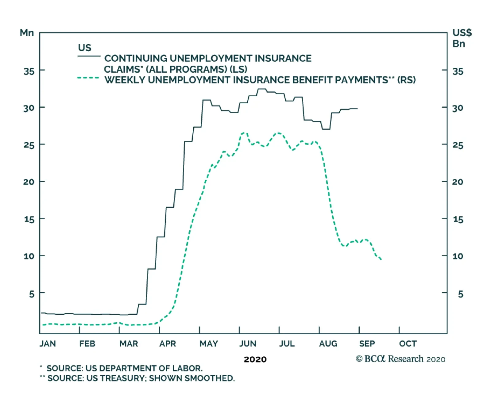
Dear Client, We will be working on our Fourth Quarter Strategy Outlook next week, which will be published on Tuesday, September 29th. We will also be hosting a webcast on Thursday, October 1st at 10:00 AM EDT (3:00 PM BST, 4:00 PM CEST, 10:00 PM HKT) where we will discuss the outlook. Best regards, Peter Berezin, Chief Global Strategist Highlights Investors should favor global equities over bonds on a 12-month horizon. However, stocks remain technically overbought in the short term and vulnerable to a further correction. Investors are not fully appreciating the degree to which fiscal policy has already tightened in the US. While we ultimately expect a deal to be reached, it may take a stock market sell-off to force Republican leaders to accede to Democratic demands for more spending. US monetary policy will stay accommodative for at least the next two years, a view that this week’s FOMC meeting further validated. Investors should pivot into cheaper areas of the stock market – in particular, deep cyclicals and financials, non-US stocks, and value stocks. Value stocks are especially appealing, as they are now trading at the biggest discount on record relative to growth stocks. The “pandemic trade” will give way to the “reopening trade.” The latter will benefit value stocks. In addition, stronger global growth, ongoing Chinese stimulus, a weaker US dollar, and modestly steeper yield curves all favor value indices. Value investors who want to accentuate their returns should pay special attention to smaller value companies outside the US. Market Commentary Chart 1Drastic Drop In Weekly Unemployment Insurance Payments
Drastic Drop In Weekly Unemployment Insurance Payments
Drastic Drop In Weekly Unemployment Insurance Payments
We continue to favor global equities over bonds on a 12-month horizon. However, stocks remain technically overbought in the short term despite correcting modestly over the past few weeks. Tech stocks rallied hard into September. Aggressive buying of out-of-the-money call options helped fuel the rally. While some big institutional players such as Softbank have reportedly scaled back their positions, many retail investors remain unfazed. The triple leveraged long Nasdaq 100 ETF, TQQQ, experienced the largest weekly inflow on record in September. In addition to being technically stretched, equities face near-term risks from the impasse in the US Congress over a new stimulus bill. Investors are not fully appreciating the degree to which fiscal policy has already tightened in the US. Chart 1 shows that weekly unemployment payments have fallen by $15 billon since the end of July, representing a drop of more than 50%. At an annualized rate, this amounts to 3.7% of GDP in fiscal tightening. On top of that, the funds in the small business Paycheck Protection Program have run out, while many state and local governments face a severe cash crunch. BCA’s geopolitical strategists expect a fiscal deal to be reached over the next few weeks. The fact that Speaker Nancy Pelosi has said that Congress will stay in session until both sides agree on an aid package is good news in that regard. Nevertheless, given all the acrimony in Washington in the run up to the November election, there is still a non-negligible chance that a deal falls through. Why, then, are we still bullish on stocks on a 12-month horizon? Partly it is because voters want more stimulus, which means that fiscal policy is likely to be loosened again, even if this does come after the election. It is also because the pandemic seems to be receding. While the number of new cases is rising again in the EU and some other regions, fatality rates remain much lower than during the first wave. Progress also continues to be made on developing a viable vaccine. According to The Good Judgment Project, about 60% of “superforecasters” expect a mass-distributed vaccine to be available by Q1 of 2021, up from 45% just four weeks ago. Only 2% expect there to be no vaccine available by April 2022, down from over 50% in May (Chart 2). Chart 2High Odds Of A Vaccine Within 6-To-12 Months
Pivot To Value
Pivot To Value
Lastly, monetary policy remains exceptionally accommodative. The Fed this week formally incorporated its new flexible average inflation targeting strategy into its post-meeting statement. The FOMC promised to keep rates at rock-bottom levels until the economy has reached “maximum employment” and inflation “is on track to moderately exceed two percent for some time.” The dot plot indicated that the vast majority of FOMC members did not expect rates to rise until at least the end of 2023. As Chart 3 shows, the global equity risk premium remains quite elevated. This favors stocks over bonds. Not all stocks are equally attractive, however. Four weeks ago, in a report titled “The Return of Nasdog,” we made the case that investors should pivot away from growth stocks towards value stocks. The report generated quite a bit of interest from readers. Below, we review and elaborate on some of the issues raised in a Q&A format. Q: Being long value stocks relative to growth stocks has been a widowmaker trade for more than a decade. Why do you think we have reached an inflection point? A: Value stocks are cheaper now compared to growth stocks than at any point in history – even cheaper than at the height of the dotcom bubble (Chart 4). Chart 3Global Equity Risk Premium Remains Quite Elevated
chart 3
Global Equity Risk Premium Remains Quite Elevated
Global Equity Risk Premium Remains Quite Elevated
Chart 4Value Stocks Are Extremely Cheap Relative To Growth Stocks
Value Stocks Are Extremely Cheap Relative To Growth Stocks
Value Stocks Are Extremely Cheap Relative To Growth Stocks
Admittedly, valuations are not a good timing tool. One needs a catalyst to unlock those valuations. Good news on the virus front may end up being such a catalyst. The “pandemic trade” benefited tech stocks, which are overrepresented in growth indices. It also favored health care stocks, which are similarly overrepresented in growth indices, at least globally (Table 1). The “reopening trade” will support companies such as banks, hotels, and transports that were crushed by lockdown measures and which are overrepresented in value indices. Table 1Breaking Down Growth And Value By Sector
Pivot To Value
Pivot To Value
Chart 5 shows that retail sales at physical stores are rebounding, while online sales growth is coming down from highly elevated levels. Bank of America estimates that US e-commerce penetration doubled in just a few short months earlier this year. Some “reversion to the trend” is likely, even if that trend does favor online stores over the long haul. Meanwhile, PC shipments soared during the pandemic as companies and workers rushed out to buy computer gear to allow them to work from home (Chart 6). To the extent that this caused some spending to be brought forward, it could create an air pocket in tech demand over the next few quarters. Chart 5Are Brick-And-Mortar Retailers Coming Back To Life?
Are Brick-And-Mortar Retailers Coming Back To Life?
Are Brick-And-Mortar Retailers Coming Back To Life?
Chart 6The Pandemic Has Caused Global Server And PC Shipments To Surge
The Pandemic Has Caused Global Server And PC Shipments To Surge
The Pandemic Has Caused Global Server And PC Shipments To Surge
Q: How are investors positioned towards value versus growth? A: According to the September BofA Global Fund Manager Survey, tech and pharma were the two sectors with the largest reported overweights. Thus, there is significant scope for money to shift out of these sectors. Q: What about the overall macro environment underpinning growth and value? A: While the relationship is far from perfect, value stocks tend to outperform growth stocks when the US dollar is weakening (Chart 7). Recall that growth stocks did very well during the late 1990s, a period of dollar strength. In contrast, value stocks outperformed between 2001 and 2007, a period during which the dollar was generally on the back foot. As we have spelled out in past reports, we expect the dollar to weaken over the next 12 months, which should benefit value stocks. Value stocks also tend to do best when global growth is accelerating (Chart 8). Provided that governments maintain adequate levels of fiscal support and a vaccine becomes available by early next year, global GDP should bounce back swiftly. Chart 7Value Stocks Tend To Outperform Growth Stocks When The US Dollar Is Weakening
Value Stocks Tend To Outperform Growth Stocks When The US Dollar Is Weakening
Value Stocks Tend To Outperform Growth Stocks When The US Dollar Is Weakening
Chart 8Value Stocks Also Tend To Do Best When Global Growth Is Accelerating
Value Stocks Also Tend To Do Best When Global Growth Is Accelerating
Value Stocks Also Tend To Do Best When Global Growth Is Accelerating
Q: Won’t lower real bond yields favor growth stocks? A: By definition, growth companies generate more of their earnings further in the future than value companies. As such, a decline in real yields will tend to increase the present value of cash flows more for growth companies than for value companies. We do not expect real yields to rise significantly over the next two years. However, given that real yields are already deeply negative in almost all countries, they probably will not fall either. Q: You seem to be making the cyclical case for the outperformance of value stocks. But what about the secular case? It appears to me that the stronger earnings growth displayed by growth stocks will ultimately translate into higher long-term returns. A: Historically, that has not been the case. As Chart 9 and Table 2 illustrate, value stocks have outperformed growth stocks by a wide margin over the past century. In particular, small cap value has clobbered small cap growth. Chart 9Value Stocks Have Outperformed Growth Stocks By A Wide Margin Over The Past Century
Pivot To Value
Pivot To Value
Table 2Small Caps Vis-A-Vis Large Caps: Comparison of Total Returns
Pivot To Value
Pivot To Value
How did value stocks manage to triumph over growth stocks if, as you say, growth stocks usually experience faster earnings growth? The answer has to do with what is priced in and what is not. If everyone expects a company’s earnings to grow next year, this will already be reflected in its share price. It is only unanticipated earnings growth that should move share prices. For the most part, both analysts and investors have tended to overextrapolate near-term earnings growth. As we discussed in a special report titled “Quant-Based Approaches To Stock Selection And Market Timing,” while analysts are generally able to predict which companies will display superior earnings growth over the next one-to-two years, they systemically overestimate earnings growth on longer-term horizons (Chart 10). As a result, investors tend to overpay for growth, causing growth stocks to lag value stocks. Chart 10A Mug’s Game
Pivot To Value
Pivot To Value
Q: That may have been true historically, but it seems that more recently, investors have been guilty of underpaying for growth. A: Yes and no. If one looks at the period between 2007 and 2017, the superior performance of growth stocks was broadly matched by their superior earnings growth. As a result, relative P/E ratios did not change much. Since 2017, however, the P/E ratio for growth indices has soared relative to value indices (Chart 11). Chart 11AThe Outperformance Of Growth Stocks Over The Past Three Years Has Been Turbocharged By A Rapid P/E Multiple Expansion
The Outperformance Of Growth Stocks Over The Past Three Years Has Been Turbocharged By A Rapid P/E Multiple Expansion
The Outperformance Of Growth Stocks Over The Past Three Years Has Been Turbocharged By A Rapid P/E Multiple Expansion
Chart 11BThe Outperformance Of Growth Stocks Over The Past Three Years Has Been Turbocharged By A Rapid P/E Multiple Expansion
The Outperformance Of Growth Stocks Over The Past Three Years Has Been Turbocharged By A Rapid P/E Multiple Expansion
The Outperformance Of Growth Stocks Over The Past Three Years Has Been Turbocharged By A Rapid P/E Multiple Expansion
Q: What has happened since 2017 that has caused growth stocks to become so much more expensive? A: FANG, FAANG, FANGMAN, whatever acronym you want to use, it was mainly a story about investors becoming infatuated with mega cap tech stocks. After seeing these companies beat earnings estimates quarter after quarter, investors decided that they deserve to trade at much higher valuation multiples. Q: What about other tech companies? A: For the most part, they were left in the dust. Our proprietary Equity Analyzer system allows us to sort companies based on all types of fundamental and technical factors. Chart 12 shows that “value tech” companies trading in the bottom quartile of price-to-earnings, price-to-operating cash flow, price-to-free cash flow, price-to-book, and price-to-sales have gotten completely clobbered by “growth tech” companies trading in the top quartile of these valuation metrics. Chart 12Value Tech Versus Growth Tech
Pivot To Value
Pivot To Value
Interestingly, the opposite pattern was true among financials: “Value financials” – financials that trade cheaply based on the valuation measures listed above – have outperformed “growth financials.” The net result is a bit surprising: Since “value tech” underperformed the average tech stock, while “value financials” outperformed the average financial stock, the average “value tech” stock has delivered a return over the past decade that was almost identical to the average “value financial” stock. Chart 13There Was No Money To Be Made By Shifting Value Exposure From Financials To Tech In Recent Years
There Was No Money To Be Made By Shifting Value Exposure From Financials To Tech In Recent Years
There Was No Money To Be Made By Shifting Value Exposure From Financials To Tech In Recent Years
Q: This seems to suggest that value managers would not have made any money by shifting exposure from financials to tech? A: Correct. Consider the iShares MSCI USA Value Factor ETF (ticker: VLUE). It is structured to have the same sector weights as the overall US market. It currently has 27% of its assets in technology and 10% in financials. Compare that to the Vanguard Value Index Fund ETF Shares (ticker: VTV). It has 10% of its assets in technology and 19% in financials. As Chart 13shows, VTV has actually outperformed VLUE over the past five years. Year to date, VTV is down 10%, while VLUE is down 15%. Q: While value managers would not have made money by shifting capital from financials to tech, I presume the same thing could not be said for growth managers. A: You can say that again. “Growth tech” outperformed the average tech stock, while “growth financials” underperformed the average financial stock. Thus, shifting money from “growth financials” to “growth tech” would have supercharged returns. Q: This still leaves open the question of why mega cap stocks were able to grow earnings so rapidly? A: Two explanations come to mind. First, tech companies often gain from so-called network effects: The more people there are who use a particular tech platform, the more attractive it is for others to use it. Second, tech companies benefit from scale economies. Once a piece of software has been written, creating additional copies costs nothing. Even in the hardware realm, the marginal cost of producing an additional chip is tiny compared to the fixed cost of designing it. All of this creates a winner-take-all environment where success begets further success. Q: It seems this process could go on indefinitely? A: Not indefinitely. No company can control more than 100% of its market. There is also a limit to how big the overall market can get. Close to three-quarters of US households already have an Amazon Prime account. Slightly over half have a Netflix account. Nearly 70% have a Facebook account. Google commands 92% of the internet search market. Together, sites owned by Google and Facebook generate about 60% of all online advertising revenue. Q: These companies have plenty of cash. Can’t they try to enter new types of businesses if they want to keep growing? A: They can try, but there is no guarantee they will succeed. Kodak was one of the pioneers in digital photography. However, it could never really reinvent itself and ended up fading into oblivion. Moreover, while first-mover advantage is a powerful force, it is not invincible. At one point during the dotcom bubble, Palm’s market capitalization was over six times greater than Apple’s. The Blackberry superseded the PalmPilot; the iPhone, in turn, superseded the Blackberry. History suggests that many of today’s technological leaders will end up as laggards. Q: And I suppose government policy could also turn less friendly towards tech? A: That is a definite risk. Republicans have been cheap dates for tech companies. Republican politicians have showered tech companies with tax cuts and allowed them to exploit a variety of loopholes in the tax code. They also kept tech regulation to a minimum. All this happened despite the fact that many tech leaders have publicly panned conservative viewpoints, while tech company employees have rewarded Democratic politicians with the lion’s share of campaign donations (Chart 14). Chart 14Tech Company Employees Donate Heavily Towards Democrats
Pivot To Value
Pivot To Value
Going forward, Republicans are likely to sour on big tech. According to a recent Pew Research study, more than half of conservative Republicans favor increasing government regulation of tech companies (Chart 15). Tucker Carlson, a leading indicator for where the Republican party is heading, has frequently lambasted tech companies on his highly popular television show. Chart 15Conservatives Favor Increased Government Regulation Of Big Tech Companies
Pivot To Value
Pivot To Value
For their part, the Democrats are moving to the left. Alexandria Ocasio-Cortez, a leading indicator for the Democratic party, has voiced her support for Senator Elizabeth Warren’s calls to break up big tech. She has also accused Amazon of paying starvation wages, adding that "If Jeff Bezos wants to be a good person, he'd turn Amazon into a worker cooperative." Q: The political climate for tech companies may be souring. But couldn’t one say the same thing about banks and energy companies, which are overrepresented in value indices? A: One difference is that tech companies trade at premium valuations, while banks and energy companies trade near book value (Chart 16). Another difference is that banks have already felt the wrath of regulators. Thanks to Dodd-Frank and pending Basel III regulations, banks today function more like utilities than like the casinos of yesteryear. While private credit growth is unlikely to return to its pre-GFC pace, banks will still profit from a revival in global growth and increasing consolidation within their industry. Stronger global growth should also allow for modestly higher nominal bond yields and somewhat steeper yield curves. This will benefit bank shares (Chart 17). Chart 16Tech Firms Trade At Premium Valuations
Tech Firms Trade At Premium Valuations
Tech Firms Trade At Premium Valuations
Chart 17Modestly Higher Bond Yields Will Benefit Bank Shares
Modestly Higher Bond Yields Will Benefit Bank Shares
Modestly Higher Bond Yields Will Benefit Bank Shares
As far as energy stocks are concerned, again, we need to benchmark our views to what the market expects. Oil is not going back above $100 per barrel anytime soon, but it does not need to for energy stocks to go up. Bob Ryan, BCA’s chief commodity strategist, sees Brent averaging $65/bbl in 2021, $19 above what is currently priced in forward markets. Q: What about materials and industrial stocks? They are also overrepresented in value indices. A: Both materials and industrials tend to outperform the broader market when global growth accelerates (Chart 18). To the extent we expect global growth to rise, this is good news for these two sectors. They also trade at attractive valuations. Q: How does China figure into this value/growth debate? A: As we saw during the 2001-2007 period, strong Chinese demand for commodities and industrial goods benefits value indices. Even though trend Chinese GDP growth has decelerated over the past decade, the Chinese economy is five-times as large as it was back then. In absolute terms, Chinese consumption of most metals continues to increase (Chart 19). Chart 18Materials And Industrials Usually Outperform When Growth Accelerates
Materials And Industrials Usually Outperform When Growth Accelerates
Materials And Industrials Usually Outperform When Growth Accelerates
Chart 19Chinese Consumption Of Most Metals Continues To Rise
Chinese Consumption Of Most Metals Continues To Rise
Chinese Consumption Of Most Metals Continues To Rise
Chart 20 shows that Chinese GDP would need to grow by about 6% per year over the next decade to keep output-per-worker on track to converge with, say, South Korea by the middle of the century. Thus, Chinese demand for natural resources and machinery is unlikely to weaken anytime soon. Chart 20China Still Has Some Catching Up To Do
China Still Has Some Catching Up To Do
China Still Has Some Catching Up To Do
Q: Let’s wrap up. What final tips would you give investors who want to pivot towards value? A: There are a number of ETFs that track value indices. We expect them to outperform the broad indices over the coming years. For investors who want even higher returns, a selective approach would help. Distinguishing between value stocks and value traps is not easy. True value stocks have often congregated in the shadows of the market, where there is limited analyst coverage and thin institutional ownership. The small-cap sector offers more opportunities for finding such mispriced stocks. Hence, it is not surprising that historically, the value premium has been greater in the small cap realm. The same is true for emerging markets and smaller developed economies (Chart 21).1 Thus, investors who want to accentuate their returns should pay special attention to smaller value companies outside the US. Chart 21AHistorically, The Value Premium Has Been Greater In The Small Cap Realm In Emerging Markets And Smaller Developed Economies
Pivot To Value
Pivot To Value
Chart 21BHistorically, The Value Premium Has Been Greater In The Small Cap Realm In Emerging Markets And Smaller Developed Economies
Pivot To Value
Pivot To Value
Peter Berezin Chief Global Strategist peterb@bcaresearch.com Footnotes 1 Please see Global Asset Allocation Special Report, “Value? Growth? It Really Depends!” dated September 19, 2019. Global Investment Strategy View Matrix
Pivot To Value
Pivot To Value
Current MacroQuant Model Scores
Pivot To Value
Pivot To Value