United States

Highlights Bygones will no longer be bygones for the Fed when it comes to inflation, … : It has yet to define the parameters of its new approach, but the Fed is promising a sizable break with the past by adopting an average inflation target. … and it’s getting out of the business of pre-emptively tightening in response to a too-tight labor market: The Fed will still intervene to combat the effects of underemployment, but it’s done with trying to cool off a labor market that appears to be too strong. The dovish bias should be good for equities … : Over the last 60 years, large-cap US equities have performed considerably better when monetary policy is easy than they have when it is tight. … and it just might help workers: Tightening to prevent hot labor markets from getting too hot had the effect of making labor market strength self-limiting, circumscribing unions’ bargaining power. If the Fed follows its new plans, workers might benefit at bondholders’ expense. Feature At the Kansas City Fed’s annual Jackson Hole conference at the end of last month, Chair Powell took the opportunity to highlight the results of the Fed’s extended policy review. Though the announcement was short on details, the adjustments to the Fed’s longer-run aims should translate into a more accommodative monetary policy stance over the next several years. Promises made when inflation is moribund may be hard to keep when it begins to perk up, so it’s not written in stone that the Fed will stick to its guns when the backdrop changes, but the shifts in its approach could have meaningful impacts for investors and workers. For nearly five years, it's been the Fed's policy to lament past inflation shortfalls; ... From Inflation Targeting To Average Inflation Targeting1 The Fed may be approaching its 107th birthday, but it is still a relatively new institution practicing a relatively new discipline, and its policy goals and the ways it attempts to carry them out regularly shift. Congress gave the Fed its “dual mandate” in 1977 in a bill that spelled out three aims, “maximum employment, stable prices, and moderate long-term interest rates,” though the third has receded to the point of disappearing amidst a four-decade bond bull market. The dual mandate only entered common parlance in the mid-‘90s and the Federal Reserve Board did not explicitly mention “maximum employment” in its policy directives until 2010, after the FOMC first cited it in a post-meeting statement (itself a fairly new invention).2 ... going forward, it's pledging to do something to make up for them. The Fed only introduced an explicit inflation target in January 2012, a concept pioneered by the Reserve Bank of New Zealand in 1990. (It did so in its inaugural statement of longer-run goals and policy strategy, which it has since reviewed annually and adjusted as necessary.)3 When it first introduced an inflation target, the Fed said it was doing so to “help keep longer-term inflation expectations firmly anchored, thereby fostering price stability ... and enhancing [its] ability to promote maximum employment.” Long-run inflation expectations have fallen well below the bottom end of the 2.3-2.5% range consistent with the Fed’s 2% target (Chart 1). Describing its target as “symmetric,” which it began doing in January 2016 to make it clear that persistent shortfalls would be as unwelcome as persistent overshoots, has not helped. Inflation expectations ground higher for the first two symmetric years but ultimately backslid below their January 2016 level as measured inflation showed no signs of recovering. Chart 1Falling Short
Falling Short
Falling Short
The Fed is therefore upping the ante, going beyond expressing its concern about inflation shortfalls to pledging that they will be made up for in the future under a new strategy that condones corrective overshoots. It expressed its new intentions as follows: In order to anchor longer-term inflation expectations at [2 percent], the Committee seeks to achieve inflation that averages 2 percent over time, and therefore judges that, following periods when inflation has been running persistently below 2 percent, appropriate monetary policy will likely aim to achieve inflation moderately above 2 percent for some time.4 [Emphasis added] In other words, the Fed’s inflation target will no longer be fixed at 2%, and it will no longer be set in a purely forward-looking vacuum. Its target could now float above 2% for lengthy periods, depending on the recent history of realized inflation data. In meeting the price stability element of its mandate going forward, the Fed will be managing to something much more like a price level target than an annual inflation target. The upshot is that bygones will no longer be bygones when it comes to inflation undershoots; instead of forgetting past shortfalls, the Fed will actively seek to remediate them. The remediation aspect is a profound change, and it will presumably lead to greater policy accommodation over periods that have been preceded by inflation shortfalls. The Fed has apparently made this change to provoke a resetting of inflation expectations more in line with its aims, but long-run inflation expectations are principally a function of long-run trends in realized inflation. The 5-year/5-year forward CPI swap rate correlates much more closely with the 8-year rate of change in CPI inflation (Chart 2, top panel) than it does with the 1-year rate of change (Chart 2, bottom panel). Headline year-over-year inflation readings will therefore most likely have to exceed 2% for an extended stretch before long-term TIPS breakevens sustainably return to the target range our fixed income strategists judge to be compatible with an annualized 2% target. Chart 2Long-Run Inflation Expectations Are A Function Of Actual Long-Run Inflation
Long-Run Inflation Expectations Are A Function Of Actual Long-Run Inflation
Long-Run Inflation Expectations Are A Function Of Actual Long-Run Inflation
A New Take On The Full Employment Mandate The Fed also put some distance from the Phillips Curve framework that many investors had come to view with outright disdain.5 The Phillips Curve’s initial assertion that the unemployment rate and inflation were inversely related was debunked in the stagflationary ‘70s, but the view that too-low unemployment could presage inflation remains embedded in mainstream economic models. Chair Powell has repeatedly questioned that premise, as inflation remained persistently below target even after the unemployment rate had fallen a full percentage point below estimates of its natural rate. The Fed’s new statement formally swears off it, saying that policy will seek “to mitigate shortfalls of employment from [its] assessment of its maximum level,” where it previously aimed to mitigate all deviations from its estimated maximum level [Emphasis added]. The wording change suggests that the Fed has caught up to investors when it comes to being fed up with the Phillips Curve’s false signals. As our fixed income colleagues put it, the Fed had previously viewed a negative unemployment gap (unemployment below its estimate of NAIRU)6 as a signal that inflation was poised to accelerate. That view often led to premature tightening, contributing to the pattern of inflation target shortfalls. The Fed now says it will no longer overreact to signs of labor market overheating, waiting instead for potential wage pressure to show up in the actual inflation data before removing monetary accommodation. Its new one-sided employment reaction function (ease if the labor market is soft, stand pat if it seems to be tight) reinforces the idea that the Fed will have an accommodative bias well into the intermediate term. Equity Market Implications Monetary policy is hardly the only influence on equity prices, and it is not possible to assess its state precisely in real time. It would certainly appear to be easy now that the Fed returned to ZIRP in the blink of an eye after the pandemic spread to the US, but no one can always say with certainty in real time that policy is easy, tight or neutral because no one knows exactly what the neutral rate is at any moment. Using our own in-house estimate of the equilibrium rate (the fed funds rate that neither encourages nor discourages economic activity) to divide the monetary policy cycle into four phases based on the fed funds rate’s level and direction (Chart 3), however, the S&P 500 has exhibited a robust and enduring performance pattern. Chart 3The Fed Funds Rate Cycle
The Fed’s New Game Plan
The Fed’s New Game Plan
Over the 60 years covered by our equilibrium rate estimate, large-cap US equities have surged when policy was easy and run in place when it was tight (Table 1). Adjusted for inflation, they have posted juicy real returns when policy was easy but sapped investors’ wealth when policy was tight (Table 2). The significant return spread across easy and tight settings suggests that the state of monetary policy is an important contributor to equity returns and that our equilibrium estimate must be in the ballpark. Our practical takeaway is that investors should have a bias to overweight stocks in balanced portfolios when Fed policy is accommodative. That bias can be overridden by other factors, but we have found it to be a reliable starting point. The Fed's new one-sided employment reaction function (ease when employment falls below its estimated maximum level, but do nothing when it exceeds it) reinforces the accommodative leanings of average inflation targeting. Table 1A 9-Percentage-Point Nominal Return Gap ...
The Fed’s New Game Plan
The Fed’s New Game Plan
Table 2... And An 11-Percentage-Point Real Return Gap
The Fed’s New Game Plan
The Fed’s New Game Plan
Labor Market Implications To translate the natural-rate-of-unemployment concept into a graph-friendly format, let the unemployment gap equal the quantity (u – u*), where u is the reported unemployment rate and u* is NAIRU, as estimated by the Congressional Budget Office. When the unemployment gap is negative (u < u*), employment exceeds its maximum level and the labor market is tight. When the unemployment gap is positive (u > u*), employment falls short of its maximum level and the supply of labor exceeds the demand for it. An emphasis on promoting full employment over price stability favors labor over fixed income investors. The Phillips Curve’s shortcomings and the difficulty of accurately estimating the natural rate of unemployment in real time notwithstanding, wage growth is stronger when the labor market is tight and the unemployment gap is a good general proxy for the balance between labor supply and demand. Nominal and real earnings have grown faster when the unemployment rate has broken through NAIRU since the average hourly earnings series began to be compiled in 1964 (Chart 4). Broadly speaking, a negative unemployment gap is good for labor while a positive gap is bad for it. Chart 4Wages Rise More In Tight Labor Markets
Wages Rise More In Tight Labor Markets
Wages Rise More In Tight Labor Markets
From the perspective of the Fed’s dual mandate, then, labor benefits when the Fed places greater emphasis on promoting full employment and suffers it emphasizes price stability. Many factors have been cited as contributors to unions’ struggles over the last four decades,7 but monetary policy is not typically one of them. We would argue that it has played an underappreciated role, as unions’ golden years of the ‘50s, ‘60s and ‘70s coincided with the Fed’s hands-off approach to tight labor markets and their demise coincided with the Fed’s shift to leaning against them (Chart 5). From 1950 until Paul Volcker became Fed chair, the unemployment gap was negative in two out of every three quarters; since Volcker took over, it’s been negative in just one of three (Table 3). Chart 540 Years Of Removing The Punch Bowl Before Labor's Party Gets Going
40 Years Of Removing The Punch Bowl Before Labor's Party Gets Going
40 Years Of Removing The Punch Bowl Before Labor's Party Gets Going
Table 3The Volcker Divide
The Fed’s New Game Plan
The Fed’s New Game Plan
When it comes to a hot labor market, workers’ gains are bond owners’ losses. Prioritizing full employment over price stability works to the benefit of labor and debtors and to the detriment of capital and creditors. We can’t know the strength of the Fed’s new employment commitment until it’s tested by events, but if we take it at its word, four decades of policy that have favored bond owners are at risk of reversing. We reiterate our fixed income underweight over the tactical and cyclical timeframes. The equity impact is more nuanced. Compensation is far and away the largest component of corporate expenses and a policy to intervene only to mitigate employment shortfalls will compress profit margins. Tighter margins, however, should be offset by increased revenues as consumers have more money to spend. The shift in the Fed’s strategy is broadly labor-positive and capital-negative, but the ill effects for capital will be mostly borne by creditors and easy monetary policy has historically given equities a sizable boost. We reiterate our tactical equity equalweight and cyclical overweight. Doug Peta, CFA Chief US Investment Strategist dougp@bcaresearch.com Footnotes 1 The discussion of the Fed’s revised approach to achieving its price stability mandate, and the following section’s discussion of its full employment mandate, borrow heavily from our Global Fixed Income and US Bond Strategy colleagues’ joint September 1, 2020 Special Report, "A New Dawn For US Monetary Policy," available at usbs.bcaresearch.com. Those interested in a fuller discussion of the policy changes, and their implications for the bond market, are encouraged to review the original report. 2 Steelman, Aaron, "The Federal Reserve’s ‘Dual Mandate’: The Evolution of an Idea." Richmond Fed Economic Brief, December 2011, No. 11-12. Accessed September 1, 2020. 3 "Federal Reserve issues FOMC statement of longer-run goals and policy strategy," January 25, 2012. 4https://www.federalreserve.gov/monetarypolicy/guide-to-changes-in-statement-on-longer-run-goals-monetary-policy-strategy.htm 5 Please see the February 26, 2019 US Investment Strategy Special Report, "The Phillips Curve: Science Or Superstition?," available at usis.bcaresearch.com. 6 NAIRU stands for non-accelerating inflation rate of unemployment, also known as the natural rate of unemployment. 7 Our Labor Strikes Back series of Special Reports, January 13, 2020 "Labor Strikes Back, Part 1: An Investor’s Guide To US Labor History", January 20, 2020 "Labor Strikes Back, Part 2: Where Strikes Come From And Who Wins Them", and February 3, 2020 "Labor Strikes Back, Part 3: The Public-Approval Contest", discuss them in full. All available at usis.bcaresearch.com.
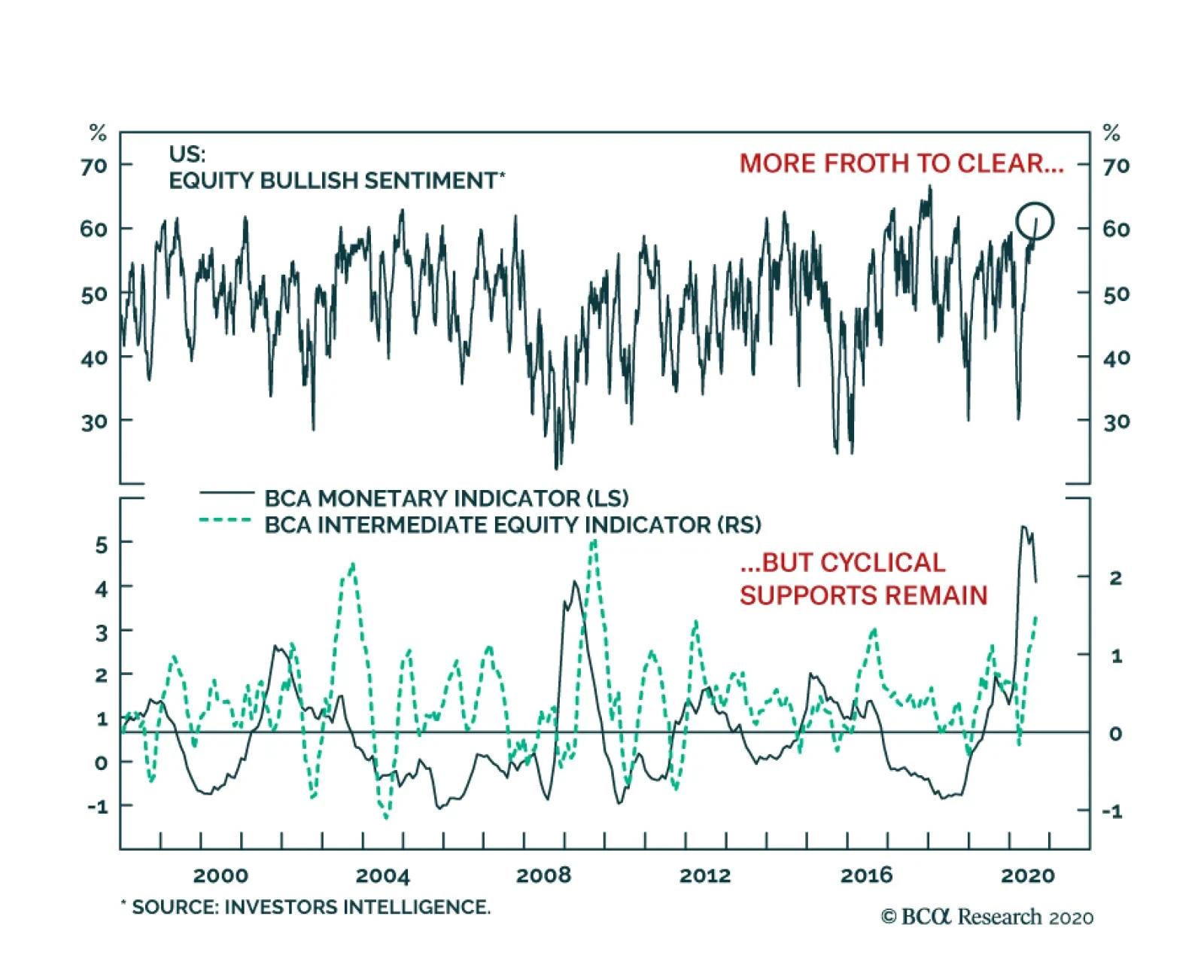
Highlights Stocks, particularly tech stocks, are technically overbought and highly vulnerable to a further correction. Nevertheless, investors should continue to overweight global equities relative to bonds on a 12-month horizon, while rotating equity allocations into cheaper sectors and regions. What should policymakers do if they wish to maximize growth and restore full employment? In the feature section of this report, we argue that the optimal course of action for most countries is to loosen fiscal policy until labor slack has been eliminated and the central bank’s inflation target has been met. Once this has been achieved, governments should trim the budget deficit to keep inflation from accelerating too much. What will policymakers actually do? While today’s budget deficits are smaller than what most economies need, they will ultimately prove to be too big once private sector demand recovers. The upshot is that inflation will increase by the middle of the decade, first in the US and then everywhere else. The secular bull market in equities will end only when central banks are forced to scramble to contain inflation. Fortunately, that day of reckoning is at least a few years away. Feature Apparently, Stocks Don’t Always Go Up After a relentless rally, stocks buckled under the pressure on Thursday. The MSCI All-Country World index lost 3%, the S&P 500 shed 3.5%, and the tech-heavy Nasdaq Composite plunged 5%. Two weeks ago, in a report titled “The Return Of Nasdog,” we argued that the leadership role was set to pivot away from tech and health care, as pandemic angst subsided and investors began to price in a recovery in the sectors of the stock market that had been crushed by lockdown measures. Chart 1A Weaker Dollar Is Generally Associated With Non-US Equity Outperformance, But Not Since The Covid Crash
A Weaker Dollar Is Generally Associated With Non-US Equity Outperformance, But Not Since The Covid Crash
A Weaker Dollar Is Generally Associated With Non-US Equity Outperformance, But Not Since The Covid Crash
Historically, non-US equities have outperformed their US peers when the dollar has weakened (Chart 1). This relationship broke down this year because of the outsized weight that tech and health care command in US indices. If the relative performance of tech and health care stocks peaks over the coming weeks, this should translate into a clear outperformance for non-US stock markets. Value stocks should also start outperforming growth stocks. Stock market leadership changes often occur within the context of broad-based equity corrections. Our near-term view on stocks, as illustrated in the view matrix at the end of this report, is more cautious than our 12-month view. Thus, we would not be surprised if the major indices sell off over the coming weeks, with tech stocks leading the way down. The same sort of technical factors that amplified the move up in stocks over the past few weeks could exacerbate the move down. Most notably, so-called delta hedge option strategies, in which an investor sells calls and hedges the risk by purchasing the underlying stock, can create a self-reinforcing feedback loop where rising call prices force investors to buy more shares, leading to even higher call prices. Once the stock market starts falling, the process goes into reverse. Nevertheless, we do not expect tech stocks to suffer the sort of crash they experienced in 2000. Tech valuations are not as stretched as they were back then, earnings growth is stronger, and balance sheets are much healthier. Moreover, unlike in 2000, when the Fed lifted rates to as high as 6.5% in May, monetary policy is at no risk of turning hawkish. All this suggests that tech stocks are more likely to go sideways than down over a 12-month horizon (albeit in a fairly volatile manner). Investors should continue to overweight global equities relative to bonds on a 12-month horizon, while tilting equity allocations towards cheaper sectors and regions. Feature: Should Versus Will Investors want to know what the future will bring. As such, our primary interest at BCA Research is in predicting what policymakers will do rather than what they should do. Sometimes, however, it is useful to ask the “should” question since the answer may shape one’s view on the “will” question. This is especially the case when a particular set of goals is aligned with both the incentives and constraints that policymakers face. With that in mind, let us ask what the optimal mix of monetary and fiscal policy should be, assuming that policymakers have the goal of maximizing growth and moving the economy towards full employment. As we argue below, this is a relevant question to ask not because we necessarily share this goal – our personal value judgments are besides the point here – but because most policymakers think this is the correct goal. Propping Up Demand Chart 2Labor Markets In Developed Economies Have Rarely Overheated Over The Past Few Decades
Labor Markets In Developed Economies Have Rarely Overheated Over The Past Few Decades
Labor Markets In Developed Economies Have Rarely Overheated Over The Past Few Decades
Maintaining full employment requires that spending match the economy’s productive capacity. In theory, this should not be a difficult objective to achieve. After all, people like to spend. Increasing demand should be easy. The hard part should be raising supply. In practice, it has not worked out that way. Even before the pandemic, unemployment rates rarely fell below their full employment level across the G7 economies (Chart 2). High Unemployment: Cyclical Or Structural? Some will argue that surplus unemployment is necessary to shift workers from sectors of the economy where they are not needed to sectors where they are. The failure to facilitate such resource reallocation could, it is alleged, stymie long-term growth. This is largely a spurious claim. As Chart 3 shows, there is always a huge amount of churn in the labor market. In 2019, a year in which total employment rose by 2.1 million, a total of 70 million people were hired in the US compared to 64 million who quit or lost their jobs. In fact, labor market churn tends to decrease during recessions as workers become reluctant to quit their jobs. Chart 3Labor Market Turnover Tends To Increase During Expansions
Labor Market Turnover Tends To Increase During Expansions
Labor Market Turnover Tends To Increase During Expansions
Chart 4Residential Construction Accounted For Less Than 20% Of The Job Losses During The Great Recession
The Outlook For Monetary And Fiscal Policy: What Should Be Done Vs. What Will Be Done
The Outlook For Monetary And Fiscal Policy: What Should Be Done Vs. What Will Be Done
Far from reflecting structural factors, the vast majority of the rise in joblessness during economic downturns is gratuitous in nature. For example, more than 80% of the jobs lost during the Great Recession were outside the residential real estate sector (Chart 4). Moreover, employment growth is highly correlated with investment spending (Chart 5). The easiest way to induce firms to boost capex – and, in the process, augment the economy’s productive capacity – is to adopt policies that raise overall employment. A stronger labor market will generate more demand for goods and services. It will also make labor more expensive in relation to capital, thereby incentivizing labor-saving capital investment. Chart 5Employment Growth And Investment Spending Go Hand-In-Hand
Employment Growth And Investment Spending Go Hand-In-Hand
Employment Growth And Investment Spending Go Hand-In-Hand
Today, unemployment is elevated once again. As was the case during prior recessions, some workers will need to transition from sectors of the economy that will be slow to recover (retail, travel, and hospitality, for example) to sectors where jobs will be more plentiful. The risk is that there will not be enough job vacancies in the latter sectors to compensate for job losses in the former. The fact that permanent job losses have been creeping higher in the US over the past few months, even as temporary layoffs have come down, is evidence that such an outcome is a clear and present danger (Chart 6). Chart 6Many Are Returning To Work, But The Number Of Permanent Layoffs Is Slowly Increasing As Well
Many Are Returning To Work, But The Number Of Permanent Layoffs Is Slowly Increasing As Well
Many Are Returning To Work, But The Number Of Permanent Layoffs Is Slowly Increasing As Well
Central Banks Can’t Do It All One does not need to refill a leaky bucket through the same hole the water escaped. As long as there is enough demand throughout the economy, workers who lose their jobs in declining sectors will eventually find new jobs in other sectors. So why has the bucket seemed chronically short of water in recent years? The answer is that monetary policy has been tasked to do more than it is realistically capable of achieving. Monetary policy operates with “long and variable lags.” When unemployment rises, the best that central banks can do is cut interest rates and hope that the more interest-rate sensitive parts of the economy eventually perk up. If the interest-rate sensitive sectors of the economy are tapped out, just as housing was following the financial crisis, or policy rates are near their lower bound, as they are now, monetary policy will be even less potent than usual. The Role Of Fiscal Policy This is where fiscal policy ought to fill the void. Even if monetary policy is exhausted, governments can cut taxes, raise transfers to households and businesses, or increase direct spending on goods and services. The extent to which fiscal policy is loosened should not be preordained. Rather, it should simply reflect the state of the economy. There is no limit to how much money governments can transfer to the public. In fact, one can easily imagine a system where governments cut taxes and increase transfer payments whenever unemployment moves up. Such a powerful system of automatic stabilizers would go a long way towards keeping the economy on an even keel. Why have governments been reluctant to embrace such a system? One key reason is that such a system would produce open-ended budget deficits. That would not be much of a problem if the red ink lasted just a few years, but what if the need for large budget deficits did not go away? The Japanese Example Consider the case of Japan. Starting in the early 1990s, Japan’s private sector became a chronic net saver, as demand for credit evaporated amid savage deleveraging (Chart 7). In order to keep the economy from falling into a full-blown depression, the government started to run continual budget deficits. Effectively, the government had to soak up persistent private savings with its own dissavings. As a result, the debt-to-GDP ratio ballooned from 64% in 1991 to 237% by 2019 and is set to rise further this year. Many people predicted a debt crisis would engulf Japan. Takeshi Fujimaki, a former banker turned politician, has been forecasting a debt crisis for more than two decades.In 2010, financial pundit John Mauldin described Japan as a “bug in search of a windshield.” He reckoned that the country would “implode within the next two-to-three years,” with the yen falling to 300 against the dollar. Kyle Bass has made similarly dire predictions.1 How was Japan able to escape what seemed like certain doom? The answer is that the same factor that necessitated persistent budget deficits, namely excess private-sector savings, also allowed interest rates to fall. Despite a rising debt-to-GDP ratio, government interest payments have been trending lower over time (Chart 8). Today, the government actually earns more interest than it pays because two-thirds of all Japanese debt bears negative yields. Chart 7The Japanese Government Runs Persistent Budget Deficits Amid The Private Sector's Desire To Save
The Japanese Government Runs Persistent Budget Deficits Amid The Private Sector's Desire To Save
The Japanese Government Runs Persistent Budget Deficits Amid The Private Sector's Desire To Save
Chart 8Japan: Ballooning Debt And Declining Interest Payments
Japan: Ballooning Debt And Declining Interest Payments
Japan: Ballooning Debt And Declining Interest Payments
If anything, Japan erred in not easing fiscal policy by enough. Had Japan run even larger budget deficits, deflationary pressures would have been less acute, and as a result, real interest rates would have fallen even more than they actually did (Chart 9). Chart 9Japanese Real Yields Are Higher Than In Many Other Major Economies
Japanese Real Yields Are Higher Than In Many Other Major Economies
Japanese Real Yields Are Higher Than In Many Other Major Economies
A Fiscal Free Lunch? The standard equation for public debt sustainability says that as long as the government’s borrowing rate is below the growth rate of the economy, the debt-to-GDP ratio will converge to a stable level no matter how large the fiscal deficit happens to be (See Box 1 for details). The caveat is that this “stable” debt-to-GDP ratio could turn out to be quite high. For example, if the government wants to run a primary budget deficit of 10% of GDP indefinitely, and GDP growth exceeds the real interest rate by two percentage points, the debt-to-GDP ratio will eventually converge to 500%. If interest rates were guaranteed to stay at zero forever, even a debt-to-GDP ratio of 500% would be no cause for alarm. But, of course, there is no such guarantee. For a country such as Italy, letting debt levels soar into the stratosphere would be highly risky. Countries that do not possess a central bank capable of acting as a lender of last resort could find themselves in a vicious spiral where rising bond yields raise the probability of default, leading to even higher bond yields (Chart 10). Chart 10Multiple Equilibria In The Debt Market Are Possible Without A Lender Of Last Resort
The Outlook For Monetary And Fiscal Policy: What Should Be Done Vs. What Will Be Done
The Outlook For Monetary And Fiscal Policy: What Should Be Done Vs. What Will Be Done
For countries that do issue debt in their own currencies, default risk is less of a problem since their central banks can set short-term rates at any level they want and, if necessary, target long-term rates with yield curve control strategies. Nevertheless, even these countries would face difficult choices if the excess savings that permitted interest rates to stay low disappeared. A decline in national savings would raise the neutral rate of interest (the rate which equalizes aggregate demand with aggregate supply). If policy rates remained unchanged, the neutral rate of interest would end up being higher than policy rates, which would eventually cause the economy to overheat. At that point, policymakers would have two options: First, they could simply let the economy overheat such that inflation rises. If inflation is very low to begin with, modestly higher inflation would be welcome, as it would make the zero lower bound constraint less of a problem.2 Higher inflation would also speed up the pace of nominal income growth, leading to a lower debt-to-GDP ratio. That said, if inflation were to rise too much, it could have destabilizing effects on the economy. Second, they could tighten fiscal policy. A smaller budget deficit would add to national savings, while giving the government more resources to pay back debt. Tighter fiscal policy would also subtract from aggregate demand, thus reducing the neutral rate of interest. This would diminish the need for central banks to raise rates in the first place. Putting it all together, the optimal course of action, at least for countries that can issue debt in their own currencies, is to loosen fiscal policy until full employment has been restored and the central bank’s inflation target has been met. Once this has been achieved, the government should trim the budget deficit to keep inflation from getting out of hand. What Will Be Done Okay, so much for the idealized strategy. What will actually happen? As was the case following the Great Recession, there is a risk that some countries will tighten fiscal policy prematurely, causing the economic recovery from the pandemic to be slower than it would otherwise be. In the US, this is already happening. Federal emergency unemployment benefits under the CARES Act expired at the end of July; funding for the small business paycheck protection program has run out; and state and local governments are facing a severe cash crunch. BCA Research’s Geopolitical Strategy team, led by Matt Gertken, expects the logjam in Washington to be resolved in September. Most voters, including the majority of Republicans, want emergency unemployment benefits to be restored (Table 1). Additional fiscal stimulus would cushion the economy in the lead up to the November election, which would arguably benefit President Trump and the Republican party. Hence, there is a good chance that Congressional Republicans will accede to a fairly generous fiscal package. Table 1The Majority Continues To Support Expanded Unemployment Insurance
The Outlook For Monetary And Fiscal Policy: What Should Be Done Vs. What Will Be Done
The Outlook For Monetary And Fiscal Policy: What Should Be Done Vs. What Will Be Done
Globally, the prevalence of negative real rates (and in some cases, negative nominal rates) should incentivize governments to run larger budget deficits than they have in the past. Increasing political populism will amplify this trend. Thus, despite some near-term hiccups, fiscal policy will remain highly stimulative. The Inflation End Game Chart 11The Ratio Of Workers-To-Consumers Is Now Falling
The Ratio Of Workers-To-Consumers Is Now Falling
The Ratio Of Workers-To-Consumers Is Now Falling
What will happen when unemployment rates return to their pre-pandemic level in three or four years? Will governments tighten fiscal policy to prevent overheating or will they let inflation run loose? Our guess is that they will let inflation rise. National savings can shrink either because the private sector is spending more or because the private sector is earning less. Looking out beyond the next few years, the latter is more likely than the former. This is because the ratio of workers-to-consumers globally will decline sharply over the coming decade as more baby boomers exit the labor force (Chart 11). Spending will decelerate, but output and income will decelerate even more by virtue of this demographic reality. It is difficult to boost tax revenue in an environment of slowing real income growth. If output falls in relation to spending, inflation will rise. At least initially, central banks will welcome the burst of inflation. They have been trying to push up inflation for years. Past inflation undershoots will be used to justify future inflation overshoots, a doctrine the Fed officially blessed at the virtual Jackson Hole symposium last week. Other central banks will be loath to raise rates if the Fed stands pat for fear that their own currencies will surge against the US dollar. The end result is that inflation will increase, first in the US and then everywhere else. A quick glance at long-term inflation expectations suggests that markets do not discount this risk at all (Chart 12). What does all this mean for investors? For the next few years, the combination of ample fiscal stimulus and easy monetary policy will foster a supportive backdrop for global equities. Despite the rally in stocks since March, the global equity risk premium remains quite elevated, especially outside the US (Chart 13). Investors should remain overweight global stocks versus bonds on a 12-month horizon. Chart 12Investors Believe Inflation Will Stay Muted In The Long Term
Investors Believe Inflation Will Stay Muted In The Long Term
Investors Believe Inflation Will Stay Muted In The Long Term
Chart 13Non-US Stocks Look Cheaper Than Their US Peers In Both Absolute Terms And In Relation To Bond Yields
Non-US Stocks Look Cheaper Than Their US Peers In Both Absolute Terms And In Relation To Bond Yields
Non-US Stocks Look Cheaper Than Their US Peers In Both Absolute Terms And In Relation To Bond Yields
Looking further out, the secular bull market in equities will end only when central banks are forced to scramble to contain inflation. Fortunately, that day of reckoning is at least a few years away. Peter Berezin Chief Global Strategist peterb@bcaresearch.com Footnotes 1 Ben McLannahan, “Japanese Bonds Defy the Debt Doomsters,” Financial Times, dated August 8, 2012; Mariko Ishikawa, Kenneth Kohn and Yumi Ikeda, “Soros Adviser Turned Lawmaker Sees Crisis by 2020,” Bloomberg News, dated September 27, 2013; and Dan McCrum, “Kyle Bass bets on full-blown Japan crisis,” Financial Times, May 21, 2013. 2 For example, if inflation is 3%, a central bank could produce a real rate of -3% by bringing policy rates down to zero. In contrast, if inflation is only 1%, the lowest that real rates could fall is -1%, which may not be stimulative enough for the economy. Box 1The Arithmetic Of Debt Sustainability
The Outlook For Monetary And Fiscal Policy: What Should Be Done Vs. What Will Be Done
The Outlook For Monetary And Fiscal Policy: What Should Be Done Vs. What Will Be Done
Global Investment Strategy View Matrix
The Outlook For Monetary And Fiscal Policy: What Should Be Done Vs. What Will Be Done
The Outlook For Monetary And Fiscal Policy: What Should Be Done Vs. What Will Be Done
Current MacroQuant Model Scores
The Outlook For Monetary And Fiscal Policy: What Should Be Done Vs. What Will Be Done
The Outlook For Monetary And Fiscal Policy: What Should Be Done Vs. What Will Be Done
The recent market selloff continues to bear the mark of a correction. A pullback had become nearly unavoidable. Growth stocks had moved vertically and reached furious valuations. Yet, bond yields were not declining anymore. The correction could run further as…
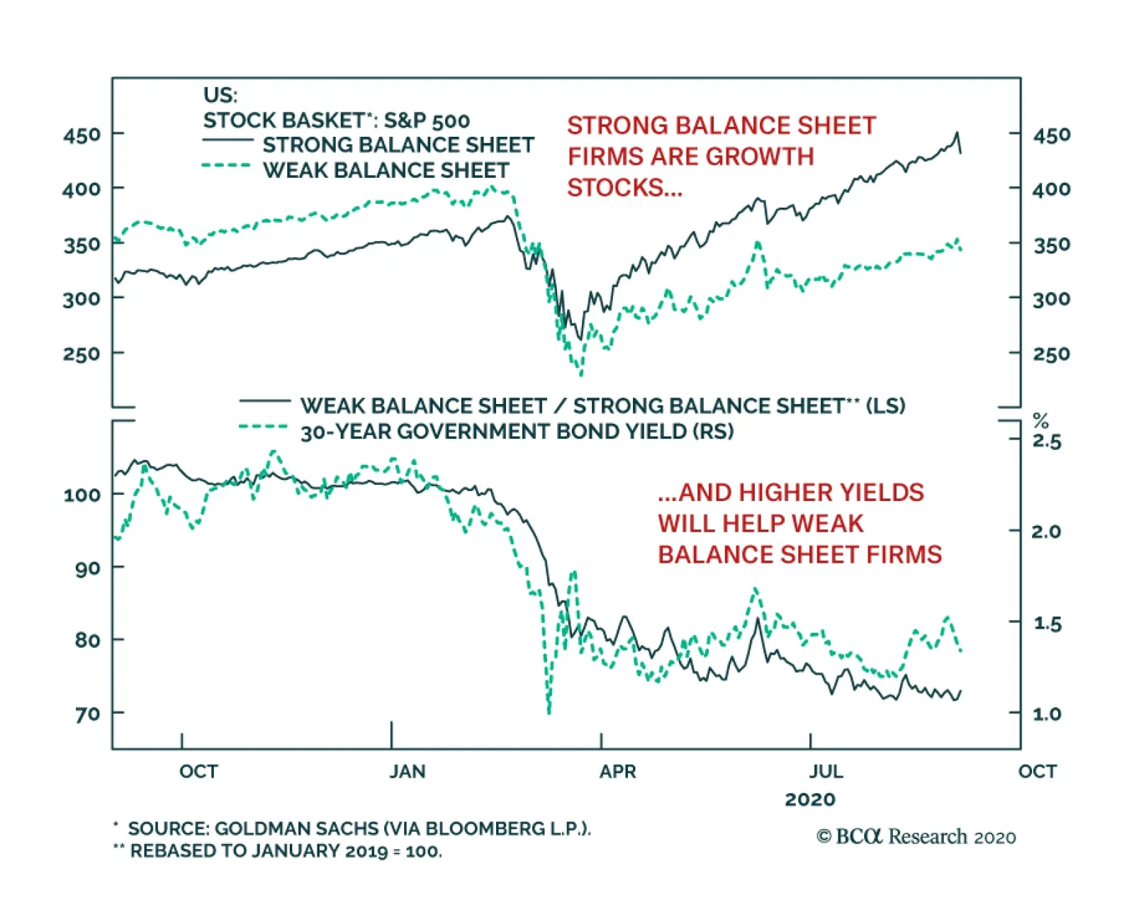
Even after the stock rally began on March 23, companies with strong balance sheets have been outperforming companies with weak ones. At first glimpse, this is a strange phenomenon, because the implosion of interest rates (especially real ones) and the…
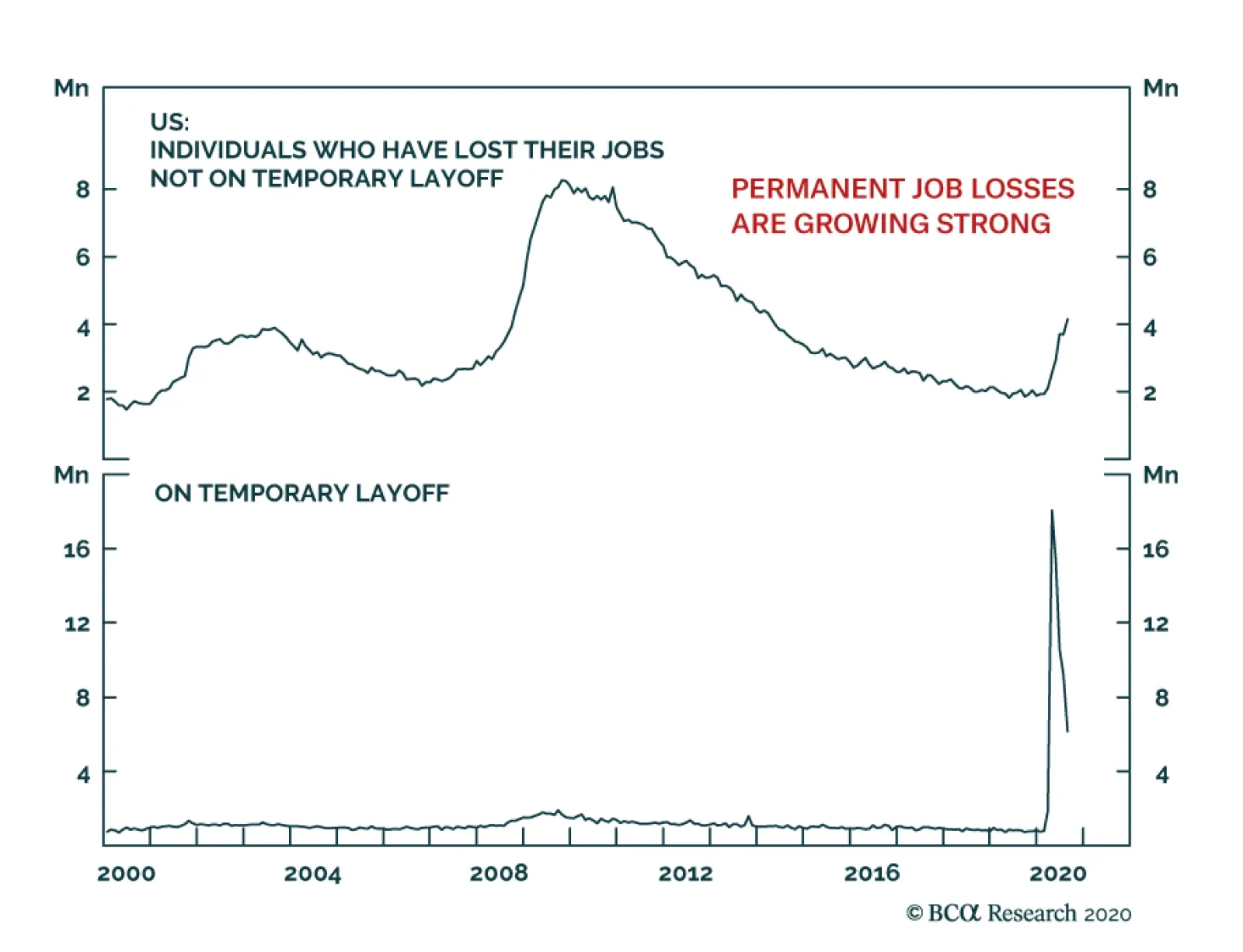
At first glance, the US August Payrolls number was encouraging. The US created 1.37 million jobs when expectations stood at 1.35 million. More spectacularly, the unemployment rate declined from 10.2% to 8.4%, generously beating expectations of 9.8%.…
Highlights The dollar has entered a structural bear market but is at risk of a countertrend bounce. The catalyst for such a bounce will be the underperformance of G10 economies, specifically the euro area relative to the US. The immediate trigger is a renewed surge in infections in the euro area. Eventually, in a post-COVID-19 world, the structural growth rate of the euro area should improve relative to the US. The Federal Reserve’s resolve to allow for an inflation overshoot will amplify the global supply of dollars. This will lead to a self-reinforcing spiral of better global growth, and a weaker dollar. Emerging market currencies have underperformed the drop in the dollar but will play catch up. We continue to recommend a three-pronged strategy for playing dollar shorts: Hold Scandinavian currencies, precious metals (especially silver and platinum), and the Japanese yen as insurance. We were stopped out of our tactical short GBP position. Stand aside for now. Our FX model remains dollar bearish and is recommending shorting the DXY for the month of September. Feature August is seasonally a strong month for the dollar (and other safe-haven currencies, for that matter), but this year bucked that trend. Despite the DXY index punching below key support levels since the March highs and becoming very oversold, the downtrend continued in August unabated. Technically, it suggests that the forces against the US dollar are quite powerful. Our trade basket has benefitted tremendously from the drop in the dollar this year, and we continue to advocate short dollar positions over a 12-month horizon. That said, we had tried playing a tactical bounce in the DXY via a short GBP position last month and got stopped out. September remains a seasonally weak month for the pound, but the dollar also tends to be weak against most other procyclical currencies (Chart I-1). As such, our bias is that while the dollar is due for a countertrend bounce, it might not be a playable one. Technical indicators also suggest that the dollar is likely to consolidate losses in the weeks ahead. Technical indicators also suggest that the dollar is likely to consolidate losses in the weeks ahead. Our intermediate-term indicator is oversold, and speculators are quite short the cross (Chart I-2). However, any bounce should be used as an opportunity to establish fresh short positions, as the DXY is likely to punch below 90 by year end. Chart I-1September Is A Good Month For Dollar Shorts
Addressing Client Questions
Addressing Client Questions
Chart I-2Rising Number Of ##br##Dollar Bears
Rising Number Of Dollar Bears
Rising Number Of Dollar Bears
What Are The Catalysts For A Countertrend Bounce? While the dollar has entered a structural bear market, two catalysts are lining up which could trigger a countertrend bounce: The Eurozone, which was well into its reopening phase, has been hit hard by a second wave of COVID-19. Meanwhile, new infections in the US have started to flatten out (Chart I-3). As a result, economic momentum, which was higher outside the US, has rolled over. Improving relative economic performance between the US and other G10 countries could be a key catalyst behind dollar strength (Chart I-4). It is true that the number of new deaths in both France and Spain remain low compared to the surge in the number of new cases. But, while it might ease draconian government lockdowns, citizens are likely to have concerns and may pay heed to the potential of being infected (and dying). This could slow economic activity. Chart I-3US Cases Are ##br##Flattening
US Cases Are Flattening
US Cases Are Flattening
Chart I-4Economic Momentum Rolling Over Outside The US
Economic Momentum Rolling Over Outside The US
Economic Momentum Rolling Over Outside The US
The US stock market is overstretched and is at risk of a more significant correction in the near term, which could introduce some volatility in global bourses and buffet the dollar. The fall in the DXY has been a mirror image of the rise in the S&P 500 (Chart I-5). Renewed geopolitical tensions between China and the US as well as the upcoming US presidential election are sources of risk, and a catalyst to hedge short positions. Historically, the dollar has tended to rise with both increasing equity and geopolitical risk premia. This is the benefit of being a reserve currency. Chart I-5The Dollar & S&P 500
The Dollar & S&P 500
The Dollar & S&P 500
In a nutshell, the US economy had been relatively weak compared to the rest of the world. Tentative August data is showing that this trend may now be reversing. While one cannot use one data point to extrapolate a trend, it is worth monitoring. What Does The Federal Reserve Shift Mean For The Dollar? Beyond a countertrend rally, the balance of forces are still stacked against the US dollar. The Fed’s pivot to target average inflation will only accentuate these forces. In a special report this week, our fixed income strategists outlined the major takeaways from the Fed’s policy shift.1 In a nutshell, the Fed will now allow for an inflation overshoot on a going-forward basis. Part of the reason the US dollar outperformed from 2011 on was because economic growth was relatively better, which allowed interest rates to be higher. With economic growth in the US held hostage by the pandemic, the Fed has been forced to drop rates to zero, effectively wiping out the nominal US interest rate advantage (Chart I-6). The fall in the DXY has been a mirror image of the rise in the S&P 500. Going forward, we know two things. First, the Fed (or any other central bank for that matter) will not raise rates anytime soon. But more importantly, the Fed has telegraphed that they will allow for an inflation overshoot. This means that real rates in the US are bound to become even more negative. It is impressive that countries like Switzerland and Japan, with negative policy rates, have much higher real rates than the US today (Chart I-7). This does not bode well for the dollar. Chart I-6Interest Rates In The US Have Collapsed
Interest Rates In The US Have Collapsed
Interest Rates In The US Have Collapsed
Chart I-7Real Yields Could Be Lowest In The US
Addressing Client Questions
Addressing Client Questions
Has The Euro Rallied Too Fast? The rise in the euro has certainly stirred discussion among policymakers and investors, with some commentators pointing to some measures of the trade-weighted currency being near record highs. While the euro certainly has scope to correct towards the 1.15-1.16 level, this should be used to accumulate long positions. In our view, there is little indication that currency strength is becoming a headwind for the economy. Indeed: The euro area continues to sport a very healthy trade and current account surplus, a sign that the euro remains very competitive among its trading partners (Chart I-8). This is remarkable in a world of slowing global trade. Correspondingly, the euro still remains 12% undervalued against our fair value purchasing power parity (PPP) models (Chart I-9) Chart I-8Is This An Expensive Currency?
Is This An Expensive Currency?
Is This An Expensive Currency?
Chart I-9The Euro Is Cheap
Addressing Client Questions
Addressing Client Questions
Much ink is being spilled over the fact that headline inflation in the euro area fell below zero for the first time since 2016. Quickly forgotten is that a fall in inflation actually increases the fair value of the currency in a PPP framework. It also makes European goods more competitive. In the long term, that could be the difference between whether foreigners buy Cadillacs or BMWs. The structural appreciation in the trade-weighted Swiss franc is a case in point. As intra-European trade represents a large share of cross-border transactions, currency considerations become more of a moot point. In 2019, most member states had a share of intra-EU exports of between 50% and 75% (Chart I-10). Chart I-10Europe Exports A Lot To Europe
Addressing Client Questions
Addressing Client Questions
Going forward, an agreement on the mutualization of European debt means we can begin to expect more synchronized business cycles as fiscal stabilizers kick in.2 The reality is much more complicated, of course, but the biggest roadblock to mutualized debt (which is that it could never happen) has been toppled. This will allow the neutral rate of interest in the euro area to head higher (Chart I-11). The reason is that both fiscal and monetary policy can now be synchronized across member states: Chart I-11Can Euro Area Growth Accelerate?
Can Euro Area Growth Accelerate?
Can Euro Area Growth Accelerate?
The European Central Bank and European Commission have successfully lowered the cost of capital in the euro area, probably well below the return on capital. With Italian and Spanish bond yields now collapsing towards those in the core, liquidity is flowing to where it is most needed, significantly curtailing euro break-up risk. Social distancing might remain in place for a while, meaning services will suffer more than manufacturing. More importantly, a huge proportion of the service sectors in the euro area is tied to tourism (Chart I-12), while it remains domestic in places like the US. So, as the tourism season wanes and we get into the winter months where social distancing is all the more important, the underlying trend growth in manufacturing could be higher. A more drawn-out services recovery raises the prospect that countries geared more towards manufacturing such as Europe, Japan and China, could experience better growth (Chart I-13). Chart I-12Tourism Is Important For Europe
Addressing Client Questions
Addressing Client Questions
Chart I-13Higher Service Share In The US
Addressing Client Questions
Addressing Client Questions
This will occur at a time when European equities, especially those in the periphery, are very cheap. Part of the reason is that most Eurozone bourses are heavy in cyclical stocks that are well into a 10-year relative bear market.3 A re-rating of cyclical stocks, especially banks and energy, relative to defensives could be the catalyst that carries the next leg of the euro rally. This could push the EUR/USD towards 1.25. Does Abe’s Resignation Change The Yen’s Outlook? Chart I-14More Jobs, More Savings
More Jobs, More Savings
More Jobs, More Savings
Japanese Prime Minister Shinzo Abe’s health has pushed him to resign from office. The front runner from the Liberal Democratic Party (LDP), Yoshihide Suga, is likely to be his successor. Suga-san has publicly said he would like to continue with “Abenomics” and even enhance it. As such, the status-quo is more likely than a draconian policy change, as argued by our geopolitical colleagues.4 That said, there is a narrative floating around that he could be more of a fiscal hawk. Our belief is that economic forces are usually more powerful than political ones over the long term. And the economic force holding Japan hostage right now is the real threat of a deflationary spiral, which will send the yen higher and lead into a negative self-reinforcing feedback loop. Japanese companies certainly do not appreciate an excessively stronger yen, due to negative translation effects on profits. And neither does the Japanese government, since it is deflationary, and high government debt levels cannot be inflated away. With Japan having one of the highest real rates in the G10 right now, Suga-san’s more moderate fiscal stance might be overcome by a powerful deflationary wave in Japan. It is remarkable that while Japan had been able to keep a lid on the pandemic, it did see a short resurgence of new cases. That has since subsided, but it remains a clear reminder to the public that going out to spend money is risky business. As a result, the worker’s saving ratio continues to surge as unemployment rises and consumer confidence drops (Chart I-14). This is a trend any politician will find very difficult to ignore. As Suga-san stumbles to establish his stance, the yen could rise. Emerging market (EM) currencies such as the BRL, ZAR, INR, or even until recently the CNY, have lagged behind the drop in the DXY index. As we outlined in our weekly report in June, we remain yen bulls.5 This view rests on three pillars. First, Japan has one of the highest real rates in the G10, meaning outflows from Japanese fixed income investors will fall. Second, the yen is very cheap relative to the US dollar. And finally, during dollar bear markets, the yen more often than not outperforms the USD. This suggests holding a long yen position is a “heads I win, tails I do not lose much” proposition. EM Currencies Have Underperformed, Why? A lot of skepticism on the dollar rally has centered on the fact that emerging market (EM) currencies such as the BRL, ZAR, INR, or even until recently the CNY, have lagged behind the drop in the DXY index (Chart I-15). While this has been a historically rare event, so has the pandemic. As a result, we have witnessed a few economic shifts: Chart I-15EM Currencies Are Lagging
EM Currencies Are Lagging
EM Currencies Are Lagging
Since 2014-2015, central banks have been aggressively trying to diversify out of dollar reserves. Unfortunately for most currencies, their alternative has been other safe-haven assets such as gold and the yen. IMF reserve data show that both the yen and gold have borne the brunt of dollar diversification. This trend has been supercharged in 2020, with the addition of the euro (Chart I-16). To put this in perspective, Russia now over 24% of its FX reserves in gold versus under 3% in 2008. Russia has very little dollar reserves. China has risen from less than half a percentage point of gold reserves in 2008 to over 3%. Imagine if China were to shift half of its gargantuan Treasury holdings into alternative assets? The perfect “robust” portfolio in simple terms has been a 60/40 one: 60% in equities, 40% in bonds. This has delivered low volatility and exceptional returns. But with government fixed income rates near zero, managers are now looking for alternatives. Gold and precious metals look like a perfect candidate in a world where central banks want to asymmetrically generate inflation (Chart I-17). Chart I-16Diversification Out Of Dollars Into Gold
Diversification Out Of Dollars Into Gold
Diversification Out Of Dollars Into Gold
Chart I-17Would You Bet On US Bonds Or Gold At Zero Rates?
Would You Bet On US Bonds Or Gold At Zero Rates?
Would You Bet On US Bonds Or Gold At Zero Rates?
The pandemic raged in a lot of EM countries while it was falling in DM. This has weakened EM fundamentals relative to their developed-market peers. The EM Markit PMI index has been falling sharply relative to that in the US, a sea-change from what we saw earlier this year (Chart I-18). As a result, many EM central banks have aggressively cut rates, narrowing interest rate differentials with the US. In their latest report, our emerging market colleagues contend that EM fundamentals remain poor, but could improve Chart I-18EM Relative Growth Relapsing
EM Relative Growth Relapsing
EM Relative Growth Relapsing
EM currencies have a lot going for them. First, some are extremely cheap by historical standards. This should greatly help ease financial conditions. Second, our technical indicator shows that the dollar decline is becoming a lot more broad-based at the margin (Chart I-19). The percentage of countries with rising exchange rates versus the dollar has surged. Within EM, we continue to favor precious metal producers (in line with our BCA Research bullish precious metals view) and oil producers, versus a basket of oil consumers. Chart I-19Dollar Drawdown More Widespread
Dollar Drawdown More Widespread
Dollar Drawdown More Widespread
The Message From Our Trading Model Our FX trading model remains bearish on the US dollar for the month of September. It has upgraded Australia and Norway, while downgrading New Zealand (Chart I-20). The white paper for the model can be found here. Chart I-20AModel Recommendations For September
Model Recommendations For September
Model Recommendations For September
Chart I-20BModel Recommendations For September
Model Recommendations For September
Model Recommendations For September
Our bias, however, is that the dollar is due for a tactical bounce. We tried to implement this via a short GBP position but were thrown offside. So far, the UK PMI continues to outperform both that of the US and the euro area, suggesting the UK economy has been relatively more resilient to the pandemic. As such, we prefer to tighten stops on our profitable trades as a way to manage risk. Chester Ntonifor Foreign Exchange Strategist chestern@bcaresearch.com Footnotes 1 Please see US Bond Strategy and Global Fixed Income Strategy Special Report, "A New Dawn For US Monetary Policy", dated September 1, 2020. 2 Please see Foreign Exchange Strategy Weekly Report, "EUR/USD And The Neutral Rate Of Interest", dated June 14, 2019. 3 Please see Foreign Exchange Strategy Special Report, "Currencies And The Value-Vs Growth Debate", dated July 10, 2020. 4 Please see Geopolitical Strategy Weekly Report, "Abenomics Will Smell As Sweet By Any Other Name", dated September 4, 2020. 5 Please see Foreign Exchange Strategy Weekly Report, "An Update On The Yen", dated June 12, 2020. Currencies U.S. Dollar Chart II-1USD Technicals 1
USD Technicals 1
USD Technicals 1
Chart II-2USD Technicals 2
USD Technicals 2
USD Technicals 2
Recent data in the US has been solid: The Markit manufacturing PMI rose from 50.9 to 53.1 in August. The ISM manufacturing PMI also climbed from 54.2 to 56, expanding for a fourth straight month. Notably, the ISM new orders index soared from 61.5 to 67.6. The goods trade deficit widened to $79.32 billion from $70.99 billion in July. Initial jobless claims decreased to 881K for the week ending August 28th. The DXY index recovered by 1% this week, supported by promising PMI releases. In the long run however, our bias is that the USD might be on the verge of a long bear market. Diminished advantage of interest rate differentials, higher twin deficits and negative sentiment all point to a lower dollar going forward. Report Links: A Simple Framework For Currencies - July 17, 2020 DXY: False Breakdown Or Cyclical Bear Market? - June 5, 2020 Cycles And The US Dollar - May 15, 2020 The Euro Chart II-3EUR Technicals 1
EUR Technicals 1
EUR Technicals 1
Chart II-4EUR Technicals 2
EUR Technicals 2
EUR Technicals 2
Recent data in the euro area have been negative: The Markit manufacturing PMI remained flat at 51.7 in August while the services PMI fell from 54 to 50.5. Headline consumer price inflation fell from 0.4% to -0.2% year-on-year in August. Headline inflation sank from 1.2% to 0.4%. Moreover, producer prices decreased by 3.3% year-on-year in July. The unemployment rate ticked up from 7.7% to 7.9% in July. The euro fell by 1.2% against the US dollar this week. The negative inflation rate raises questions about ECB’s baseline inflation scenario and inflation forecasts, putting more pressure on the ECB to adopt a more dovish stance ahead of the monetary policy meeting next week. Report Links: On The DXY Breakout, Euro, And Swiss Franc - February 21, 2020 Updating Our Balance Of Payments Monitor - November 29, 2019 On Money Velocity, EUR/USD And Silver - October 11, 2019 Japanese Yen Chart II-5JPY Technicals 1
JPY Technicals 1
JPY Technicals 1
Chart II-6JPY Technicals 2
JPY Technicals 2
JPY Technicals 2
Recent data in Japan have been mostly negative: The manufacturing PMI increased from 45.2 to 47.2 in August, while the services PMI slipped to 45 from 45.4. Retail trade fell by 2.8% year-on-year in July, following a 1.3% decline the previous month. Moreover, industrial production plunged by 16.1% year-on-year in July after an 18.2% decrease in June. Construction orders fell by 22.9% year-on-year in July. Housing starts also plunged by 11.4%. The jobs-to-applicants ratio fell from 1.11 to 1.08 in July. The unemployment rate increased from 2.8% to 2.9%. The Japanese yen remained flat against the US dollar this week. We continue to favor the Japanese yen as fears grow for a second wave of COVID-19. Moreover, Japan now sports the second highest real interest rates in the G10 universe. Report Links: The Near-Term Bull Case For The Dollar - February 28, 2020 Building A Protector Currency Portfolio - February 7, 2020 Currency Market Signals From Gold, Equities And Flows - January 31, 2020 British Pound Chart II-7GBP Technicals 1
GBP Technicals 1
GBP Technicals 1
Chart II-8GBP Technicals 2
GBP Technicals 2
GBP Technicals 2
Recent data in the UK have been positive: The manufacturing PMI rose to a 30-month high of 55.2 in August from 53.3 in July. The services PMI also increased to 58.8 from 56.5 the previous month. Mortgage approvals increased by 66.3K in July, up from 39.9K in June. Housing prices grew by 3.7% year-on-year in August. The British pound appreciated by 0.9% against the US dollar this week. While the latest PMI release showed fast expansion in the manufacturing sector for the month of August, the employment outlook remained unfavorable. Moreover, COVID-19 and Brexit uncertainties remain headwinds for the British pound. Report Links: Updating Our Balance Of Payments Monitor - November 29, 2019 A Few Trade Ideas - Sept. 27, 2019 United Kingdom: Cyclical Slowdown Or Structural Malaise? - Sept. 20, 2019 Australian Dollar Chart II-9AUD Technicals 1
AUD Technicals 1
AUD Technicals 1
Chart II-10AUD Technicals 2
AUD Technicals 2
AUD Technicals 2
Recent data in Australia have been mostly negative: GDP slumped by 7% quarter-on-quarter in Q2, the worst figure on record, confirming the nation’s first recession in almost 30 years. The commonwealth manufacturing PMI increased from 48.8 to 49.4 in August. Exports tumbled by 4% month-on-month while imports surged by 7% monthly in July. The trade surplus shrank by A$3.6 billion to A$4.6 billion. Building permits increased by 6.3% year-on-year in July, following a 15.8% contraction the previous month. AUD/USD fell by 1.6% this week. The RBA left its interest rate unchanged at 0.25% on Tuesday. However, it has increased the size of the term funding facility and extended the banks’ access to low-cost funding through the end of June 2021. Report Links: On AUD And CNY - January 17, 2020 Updating Our Balance Of Payments Monitor - November 29, 2019 A Contrarian View On The Australian Dollar - May 24, 2019 New Zealand Dollar Chart II-11NZD Technicals 1
NZD Technicals 1
NZD Technicals 1
Chart II-12NZD Technicals 2
NZD Technicals 2
NZD Technicals 2
Recent data in New Zealand has been mixed: The ANZ business confidence index increased marginally from -42.4 to -41.8 in August, while the activity outlook index slipped from -17 to -17.5. Building permits fell by 4.5% month-on-month in July. The goods terms of trade index rose by 2.5% quarter-on-quarter in Q2. The New Zealand dollar depreciated by 0.7% against the US dollar this week. In the Wellington speech this Wednesday, RBNZ Governor Adrian Orr said that “We strongly believe that the best contribution we can make to our monetary and financial stability mandates is ensuring we head off unnecessarily low inflation or deflation, and high and persistent unemployment”, suggesting a more dovish stance in the coming monetary policy reviews. Report Links: Currencies And The Value-Versus-Growth Debate - July 10, 2020 Updating Our Balance Of Payments Monitor - November 29, 2019 Place A Limit Sell On DXY At 100 - November 15, 2019 Canadian Dollar Chart II-13CAD Technicals 1
CAD Technicals 1
CAD Technicals 1
Chart II-14CAD Technicals 2
CAD Technicals 2
CAD Technicals 2
Recent data in Canada has been mostly negative: Annualized GDP slumped by 38.7% quarter-on-quarter in Q2. The manufacturing PMI rose to 55.1 in August from 52.9 the previous month. Building permits fell by 3% month-on-month in July. Exports rose to C$45.4 billion from C$40.9 billion in July. Imports also increased to C$47.9 billion from C$42.5 billion. The trade deficit widened by C$0.9 billion to C$2.5 billion. The Canadian dollar depreciated by 0.6% against the US dollar this week. The contraction in Q2 GDP is more than twice as bad as the lowest point reached during the GFC. On the positive side, the June monthly GDP increase of 6.5%, compared with the previous month, is showing signs of recovery with the easing of COVID-19 restrictions at the end of Q2. Report Links: Currencies And The Value-Versus-Growth Debate - July 10, 2020 More On Competitive Devaluations, The CAD And The SEK - May 1, 2020 A New Paradigm For Petrocurrencies - April 10, 2020 Swiss Franc Chart II-15CHF Technicals 1
CHF Technicals 1
CHF Technicals 1
Chart II-16CHF Technicals 2
CHF Technicals 2
CHF Technicals 2
Recent data in Switzerland have been mixed: The KOF leading indicator surged from 86 to 110.2 in August. Real retail sales increased by 4.1% year-on-year in July. The manufacturing PMI increased from 49.2 to 51.8 in August. Headline consumer prices remained in deflation territory at -0.9% year-on-year in August. The Swiss franc remained flat against the US dollar this week. The SNB Governing Board Member Andrea Maechler said on Tuesday that negative interest rates are “extremely important” for Switzerland. Being deeply in deflation for seven consecutive months, Switzerland now sports the highest real rate in G10. Report Links: On The DXY Breakout, Euro, And Swiss Franc - February 21, 2020 Currency Market Signals From Gold, Equities And Flows - January 31, 2020 Portfolio Tweaks Before The Chinese New Year - January 24, 2020 Norwegian Krone Chart II-17NOK Technicals 1
NOK Technicals 1
NOK Technicals 1
Chart II-18NOK Technicals 2
NOK Technicals 2
NOK Technicals 2
Recent data in Norway have been negative: The current account surplus narrowed to NOK 20.5 billion in Q2 from NOK 27 billion in the same quarter last year, the smallest surplus since the fourth quarter of 2017. The Norwegian krone depreciated by 2.2% against the US dollar this week, making it the worst-performing G10 currency. That said, we remain positive on the Norwegian krone. Our FX model indicator for the NOK increased from 1 to 2 for the month of September, signaling a strong buy for the currency and pushing the sentiment component up from neutral to long. Report Links: A New Paradigm For Petrocurrencies - April 10, 2020 Building A Protector Currency Portfolio - February 7, 2020 On Oil, Growth And The Dollar - January 10, 2020 Swedish Krona Chart II-19SEK Technicals 1
SEK Technicals 1
SEK Technicals 1
Chart II-20SEK Technicals 2
SEK Technicals 2
SEK Technicals 2
Recent data in Sweden have been mixed: GDP fell by 7.7% year-on-year in Q2, or 8.3% quarter-on-quarter, the steepest contraction on record. The manufacturing PMI increased from 51.4 to 53.4 in August, the fourth consecutive month of manufacturing expansion. The new orders index surged from 52.2 to 56. The Swedish krona fell by 1.1% against the US dollar this week. As one of the most pro-cyclical currencies, the Swedish krona will benefit the most from the global business cycle recovery. Moreover, the SEK is still trading at a tremendous discount against its fair value, as compared to the US dollar. We continue to overweight the Nordic basket to both USD and EUR but are tightening the stop loss this week amidst potential market volatilities. Report Links: Updating Our Balance Of Payments Monitor - November 29, 2019 Where To Next For The US Dollar? - June 7, 2019 Balance Of Payments Across The G10 - February 15, 2019 Trades & Forecasts Forecast Summary Core Portfolio Tactical Trades Limit Orders Closed Trades
Odd moves have been taking place between different asset classes lately. Since early-July, the US dollar has been taking a beating and while commodities have been rising, high-beta emerging market and euro area stocks have been uncharacteristically and unsustainably trailing the SPX (not shown). Something is clearly off. Within the US market place, the interplay between the VIX and the SPX is also raising some eyebrows, as we highlighted again on Tuesday. Not only has the correlation between these two asset classes slingshot into positive territory, but also realized vol has collapsed compared with the recent jump in the VIX (see chart). According to empirical evidence, it pays to short the VIX when realized vol is above implied vol and buy the VIX when realized vol undershoots implied vol. Currently, we are in the latter phase and we reiterate our tactical view of buying some protection in the form of December VIX futures first recommended in late-July, refrain from chasing stocks higher in general, and in particular resist the temptation to stampede into tech stocks. Bottom Line: Keep your powder dry, a better entry point to redeploy capital will materialize late in the year, as the US Presidential election uncertainty recedes.
What Is The Signal From The Delta In Implied Vs. Realized Vol?
What Is The Signal From The Delta In Implied Vs. Realized Vol?
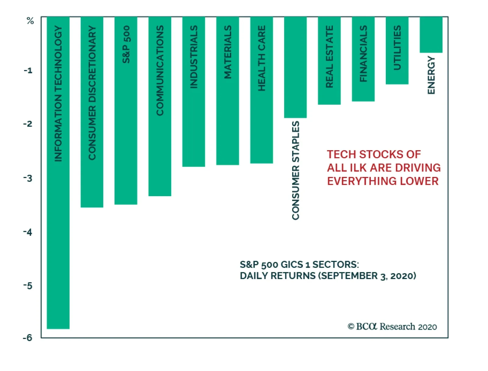
The overstretched tech stocks finally buckled after an exceptional run. The correction taking shape in those widely held stocks that have driven the entire S&P 500 higher has caused the whole market to fall as well. However, value stocks are…
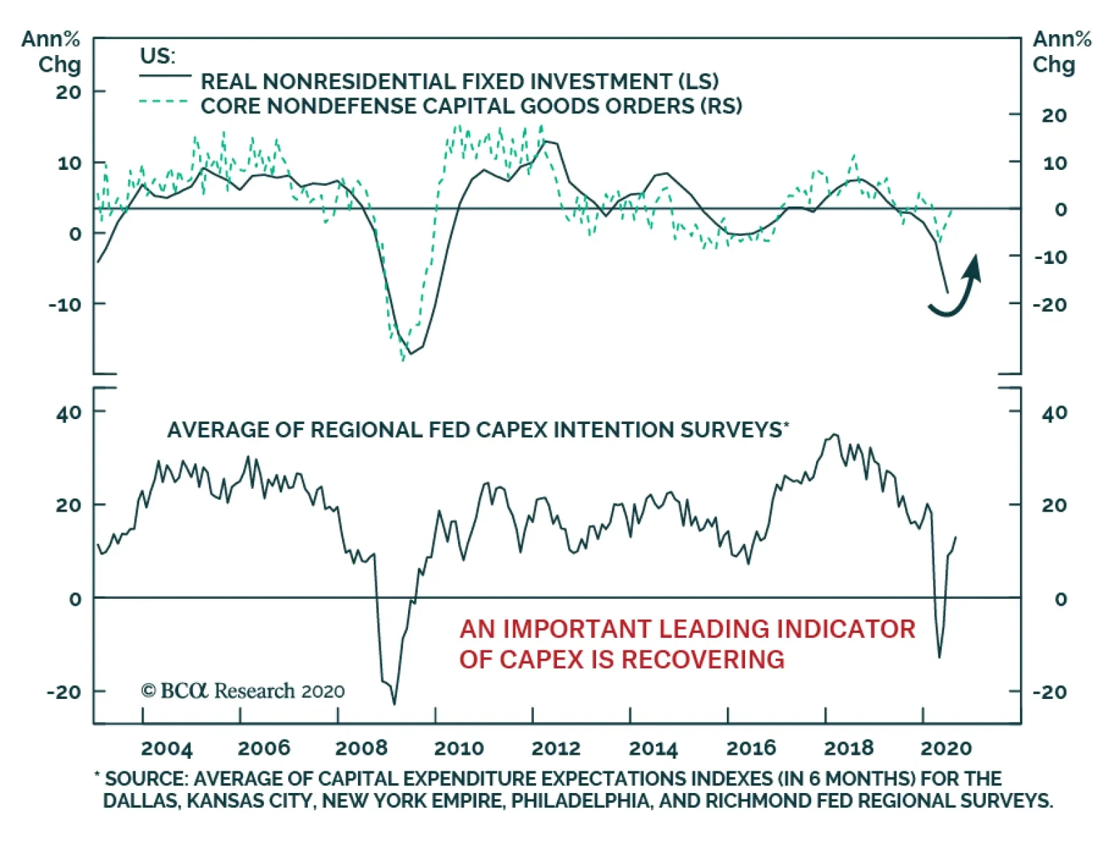
Capex will become an increasingly important component of the post-pandemic economic recovery. Already, the improvement in capital goods orders is consistent with a turnaround in US nonresidential fixed investment. Crucially, capex intention surveys are…
Chart 1
Chart 1
Chart 1
Today, we continue cautioning investors about how overstretched the equity market is and highlight a few key reasons not to chase it higher; especially technology stocks. The top five stocks in the SPX (AAPL, MSFT, AMZN, GOOGL & FB) have added $5.8tn to the S&P 500 market cap since 2015, whereas the bottom 495 stocks have added $5.1tn. Crudely put, as a contribution the SPX’s return the former account for 53%, whereas the bottom 495 stocks account for the remaining 47% of the advance over the same time frame. In percent return terms, these five tech titans’ market capitalization has more than quadrupled or risen by 350% over the past 5 ½ years from $1.67tn to $7.5tn. In marked contrast, the S&P 495 market cap has gone nowhere rising a mere 31% (increasing from 16.57tn to $21.7tn) during the same time frame (Chart 1, top panel). If investors have not been in these tech titans, then they have not really participated in the SPX’s run up. The measly return since 2015 in the Value Arithmetic index and negative return in the Value Line Geometric index gauging the mean and median US stock, respectively, corroborate our analysis (not shown). Chart 2
Chart 2
Chart 2
Drilling deeper, the over concentration risks become even more apparent, even within the tech universe itself. Chart 2 shows that the S&P tech sector excluding AAPL & MSFT is just above the February highs, and nearly all the tech related return sits with the top five titans that are up almost 60% year-to-date (ytd). Worrisomely, the remaining S&P 426 stocks (which exclude all the tech names) are down 6% ytd. Once again, Chart 2 further reiterates the message that even the tech sector is a bifurcated market where only a handful of stocks have been generating all the alpha. Such extreme concentration, while not unprecedented, is a sign of an unhealthy overall market backdrop which makes it vulnerable to a significant shock. Chart 3
Chart 3
Chart 3
Naturally, the overconcentration in the SPX is even more acute in the NASDAQ. While the top five SPX stocks comprise over a quarter of the index, the same five tech titans carry a 50% weight in the NASDAQ 100. True, the collapse in interest rates has boosted the NASDAQ forward P/E to the stratosphere, but the longer these high-flying stocks defy gravity the more painful the eventual snap will be (Chart 3, bottom panel). Already there are signs of trouble brewing beneath the surface. NASDAQ breadth is sinking, and this has proven a reliable leading indicator in the recent past, warning that a pullback is looming (Chart 3, top panel). The hypersensitive chip stocks are also suffering from exhaustion, unable to outperform the tech titan led NASDAQ (Chart 3, middle panel). Any hiccups in the tech space will negatively reverberate in the SPX: currently the S&P tech sector plus the FANG (FB, AMZN, NFLX & GOOGL) comprise 41% of the S&P 500. Chart 4
Chart 4
Chart 4
Switching gears and drilling deeper into an S&P tech sub-group doesn’t brighten the short-term picture. The S&P technology hardware storage & peripherals (HS&P) index is in unchartered territory. The second panel of Chart 4 shows that the relative share price ratio is at the highest level as a percentage of its 200-day moving average since the late-1990s. Shown as a z-score, this technical indicator is stretched to the tune of almost four standard deviations above the historical mean (Chart 4, third panel). The last two times technical conditions were so overbought, it marked a multi-year peak in relative performance (Chart 4, top panel). Given that this sub-sector is home to AAPL, such extreme readings even on the index level confirm that the market is vulnerable to a snapback. Chart 5
Chart 5
Chart 5
Finally, going down to a stock level a couple of historical parallels are also in order. Specifically, Chart 5 compares the titans of the late 20th century with the current market leaders. The second and bottom panels of Chart 5 reveal that the market capitalization concentration of the top five stocks in the S&P 500 surpassed the late-1990s. However, there is an offsetting factor. In terms of valuation overshoot, the current 12-month forward P/E of these top five stocks near 45x is 3/4 that of late-1990s parabolic episode (Chart 5, top & third panels). Bottom Line: While we maintain a cyclical and structural (please see upcoming Weekly Report after Labor Day) bullish stance in the broad equity market, the shorter-term risk/reward trade-off is tilted to the downside, especially in the technology universe.